
As I’ve mentioned on the blog, I’m working on a series of abstract drawings based on comics pages from my youth. The most recent one I’ve worked on is a page from Asterix and the Olympic Games.
Copying the page has been a real eye-opener (semi-literally.) I first read Asterix when I was living in England during the third grade (my dad was on sabbatical at the time.) At that time, I probably liked Uderzo’s art well enough, but is was Goscinny’s (translated) stories — the manic, over-heated dialogue, the slapstick, the goofy puns, the running gags — which really appealed. For that reason, some of the later volumes, when Goscinny had died and Uderzo was doing the writing as well as the art — were especially unsettling. Everything looked right, but the writing was completely wrong: it was like seeing a corpse walking. The form was there, but the soul was gone.
Looking at the comic again, the writing is still marvelous, but I’m also amazed at the quality of the art. This sequence in particlar floored me:
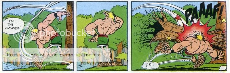
The way the movement lines are incorporated as a composition element is lovely. The character occupying the left side of the panel is neatly balanced by the intersecting lines showing the circle of the hand and the flight of the sapling/javelin. Uderzo also narrows and twists the main big arc; looking at the lines, you can actually see the moment when the throwing hand turns over. The little puff and jump by the foot is eloquent — you can actually feel him hopping forward as he releases the javelin. Everywhere you look in the panel there’s movement, and your eye arcs from one path to the next. The position of the body is also amazingly well done, especially considering that this is a very cartoony figure. The twist of the torso, the slightly separated fingers of that left hand, the jaw lifted to watch the flight, and (again) that amazing little jump with the foot.
The body language in the second panel is perfect too. It’s narrower, so the figure is more centered, and it’s the first panel on the page with no movement lines, emphasizing that it’s a moment of stillness. The curve of the back and the cocky turned-out hand on the hip suggests the outthrust chest and the smirk that we can’t see. It’s a great pause for comic timing —followed by the climax, with all the comic tropes trotted out — stars, giant sound effect, stars, and impact effect. Again, the little detail of the puff of smoke and the movmeent lines by the feet kill me (and him!) The tightened hands are perfect, and I love the way that the left hand and foot are drawn on top of each other, so that at first it looks like his fingers are a blur. That roots on that tree he’s been bashed with are also really nice. And, of course, the movement lines showing the path of the tree mirror the ones in the first panel, as does the whole composition. Throw left-pause-bashed right: it’s a stream-lined, efficient comedic delivery system, professional in absolutely the best sense — as elegant as Bushmiller’s Nancy with, to my mind at least, a lot more energy and panache. After looking at it, I wonder if I should go back to those Uderzo-written volumes just for the art.
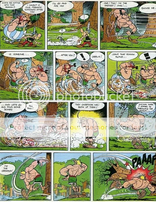
So, yeah, there’s nothing like trying to copy somone’s art to give you an appreciation of their craft (and the limitations of your own.) For those interested, here is the whole page, copyright Goscinny and Uderzo.
And here’s my version:
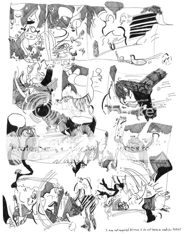
There’s a quote from my son in the bottom corner of mine: it says, “I am not married because I do not have a watch.”
Some credit goes to whoever translated these things. French puns don’t work in English and so the translator has to pull you through the basic story (not to complicated in these cases) and give you what are essentially an entirely different set of puns and jokes. Even the character’s names are vastly different from the French originals…and have been different in U. S. and British versions of the Asterix books from time to time. Maybe they just changed translators and that’s why the Uderzo-written volumes suck eggs. But probably not.
The translators for the British editions of ASTERIX are the same throughout. It’s true — Uderzo on his own is not as sharp as Uderzo with Goscinny. It’s more pronounced on some volumes than others, but it FEELS thinner somehow. I wish I could explain it better than that.
That’s really nice, Noah. Here’s one I did a couple of years ago based on a Little Lulu strip:
http://blotcomics.blogspot.com/2005/09/other-abstract-comics.html
(the second one, obviously)
And this one was based on a Spider-Man page:
http://img.photobucket.com/albums/v83/Andreim/spidermanb2.jpg
Are these the first abstract comics you’ve made?
Noah–I can’t find your email address. Please email me (my address is in my blog profile). I’m editing an anthology, and this piece would fit right in.
Ok, I was wrong, I guess since Google took over Blogger, they don’t display email addresses anymore. In any case, you can find it in my TCJ profile, here:
http://www.tcj.com/messboard/profile.php?mode=viewprofile&u=8