
1. Slapstick
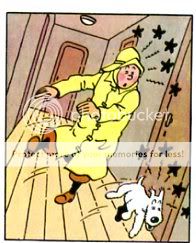
Rereading Tin Tin, what struck me most was just how French it is (or how Belgian, I guess.) Everything’s just so darn greasepaint-precious. “Ooooh hooo hooo…the cursing captain…he fall down and bump ze head! Oh stop — the Thompson Twins, they’re hats, they are pulled down over their eyes so only ze bristley mustachios are showing! Oh, ze little doggie, he is drunk!” In Asterix, the physical humor is explosive and go-for-broke; when you hit the roman soldier, he rockets out of his sandals in a riot of motion lines and explosive puffs; when he lands in the next panels on his head, you get to watch his toes violently twitching. In Tin Tin, on the other hand, the slapstick almost seems to be in quotes, like you’re watching mimes. Motion lines are little curlicues, and the bashed tend to look startled and dizzy rather than actually bashed about. If Asterix is analogous to Bugs Bunny, Tin Tin is Disney; skilled, tasteful, and kind of boring.
2. Characterization
A Wikipedia entry on Tin Tin compares Herge’s characters to Dickens’. It’s not a comparison that serves Herge well. Dickens did use caricature, but those caricatures are multi-layered, encompassing both biting satire and a knowing humanism. In Bleak House, for example, Richard Carstone’s rationalizations around money are both funny and tragic, and feed naturally into his gradual embitterment. Or there’s this passage from the same novel:
“There has been only one child in the Smallweed family for several generations. Little old men and women there have been, but no child, until Mr. Smallweed’s grandmother, now living, became weak in her intellect and fell (for the first time) into a childish state. With such infantine graces as a total want of observation, memory, understanding, and interest, and an eternal disposition to fall asleep over the fire and into it, Mr. Smallweed’s grandmother has undoubtedly brightened the family.”
The Smallweeds here are a very particular kind of stultified; enlivened by the one senile figure in their midst. The joke comes out of that specific contrast.
Herge’s caricature’s on the other hand, seem much more broad and tired. Captain Haddock is a sailor who curses and drinks too much. Professor Calculus is an absent-minded (and deaf) professor. The Thompson twins are bumbling cops. Those are the jokes, and they were pretty old, I have no doubt, even 50 years ago when Herge was writing these. Not that they’re handled poorly or that they aren’t often funny or surprising…but overall, and especially if you read a bunch of them in a row, they start to feel decidedly thin. The truth is that Herge’s penchant for racist caricature and easy anti-semitism wasn’t an accident; virtually all his characters are based around easy stereotypes and fusty gags; it’s just that making fun of sailors looks more innocuous these days than ridiculing the stupidity of black people or the avarice of Jews. Fagin is offensive as well, of course, but he’s also got enough depth and texture that you feel that there’s something to him beyond the anti-semitism…or at least that the anti-semitism is somewhat textured. But when Herge uses a stereotype, as he almost always does, the stereotype is pretty much all there is happening.
3. Art
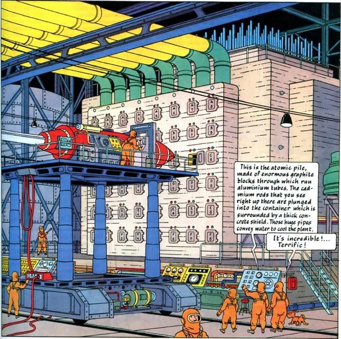
Herge’s obviously a very skilled illustrator, with an amazing facility and capacity for rendering detail. And in the abstract, I can certainly appreciate a complicated tour de force like this:
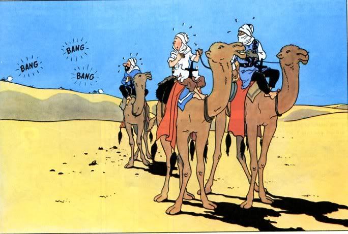
But in terms of visceral appeal, though, his art just doesn’t do that much for me. The cleanness and perfection of it, the evennness of the lines; it almost seems produced by machine. For example, compare Herge’s camels:
with Harry G. Peter’s elephants.
Herge’s drawing is much more correct anatomically, but it’s also much less fun to look at. The camels are too smooth; they have the same weight as everything else. They might as well be boxes, for all the character they have. The bits of personality — the one camels’ smile, the other camel’s knowing look — actually comes across as irritatingly smug. Again, it feels Disneyfied to me — a lack of personality gilded with cutesiness.
4. Layout
Given his status as one of the great figures in comics, it’s amazing how little interest Herge seems to have in the page as an aesthetic unit. He does vary panel sizes to accommodate action, and so he can fit big objects like planes:
And he will use bigger splash panels for effect, as with the camel image above. But in terms of unifying an entire page….he just doesn’t bother. Look at this for example:
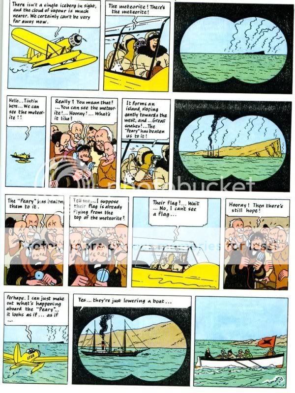
The most striking visual motif on the page is the binocular frame. It’s used in three panels…but that’s pretty much all that can be said for it. Those three images aren’t balanced out in any particular way that I can see; they’re just placed on the page at the point where they logically occur in the narrative.
You really see this in the use of text as well, which sometimes just overwhelms the pictures.
That’s gratuitous as well; that text is just restating things you already know. It’s off-putting, ugly, and unnecessary. I don’t think it’s laziness, — Herge is never less than entirely professional and meticulous, and writing out all those words was probably actually a fairly irritating task. But it does suggest that he doesn’t have much of an eye for, or interest in, design.
_____________________
Overall, then, Herge’s perfectionism and professionalism, which are impressive in small doses, become irritating and burdensome the more you realize that that’s all he has to offer. I remember being a bit bored by them as a kid, and as an adult…I’m maybe even more bored by them. The plots bop along, and there are still some excellent gags: the Thompson twins bizarre affliction — whereby their hair grows excessively fast and changes myriad hues, is visually spectacular and completely ridiculous. And I had forgotten how weird and disturbing some of the dream sequences are. Tin Tin turning into a giant bottle of wine with his head as the cork which Captain Haddock tries to twist out; the weird fever dream of a prophet grasping a picture of a giant spider — such moments come close to thematizing the oppressively flat unreality of Herge’s world. Mostly, though, that flat unreality isn’t disturbing or affecting. It’s just flat.
_______________
You can read the entire roundtable here.
Noah,
This is the "Black Gold" story right? I always loved those Thompsons hair growing/coloring bits… Two things to consider…
1) Herge originally wrote many of the books for serial publication with a different shape than the collected albums. He would actually cut up the panels and rearrange them for the albums we see today. Some panels would have to be removed, trimmed, occasionally redrawn, and all reordered for the sake of getting them in. This may contribute to your sense of his lack of use of the page. I think you're wrong about this, actually, but it may depend on which version (and which albums) one reads. The later albums were made explciitly for a "complete book" with the same size and shape specs… Thierry Groensteen does some great readings of a few Tintin pages in System of Comics which basically convinced me that he was working on the level of the page (at least in King Ottakar's Spectre–that's the example I remember). When I taught Tintin in Tibet, the thing I noticed most was the great use of "cliffhangers" in lower right panels. The clever thing was how these cliffhangers almost always were deflated or inverted on the following page. You keep waiting for the giant splash explosion, or plummeting to death or whatever, but you always get something quiet, humorous, and deflating. The surprises, when they come, are that much more surprising because of the persistent tendency to deflate the big moment. Tintin is Tibet is an early 1960's book, I think..One of, if not the, last ones, and it is brilliant in this regard. I also think it's design sense is more varied and unified than what you suggest here. He becomes very adept with tiny panels in a variety of ways. Maybe page design wasn't his biggest strength, but he definitely knew how to use the page in clever ways for narrative purposes.
2) Herge's easy caricaturist racism also changes over time because of his friendship with a Chinese man (I think he was Chinese…). Can't remember all the details, but some of those easy stereotypes are also undercut or treated differently in the later books.
I too always enjoyed Asterix more as a kid…They have a sheer exuberance that Tintin doesn't…but Tintin has its charm and if one is looking for a lexicon of the things one can do with narrative comics, Herge trots out most of the tools. I'm also a sucker for repeated gags–Haddock's cursing and alcoholism always make me chuckle–and there is something Dickensian about them. Some of Dickens' characters obviously have more depth–but some are pretty one-note.
Anyone read any Moebius? Just curious.
That's interesting about the different shape. I can believe that easily enough. The use of page in the later albums sounds interesting…though use of page in terms of narrative and use of page in terms of design and layout aren't exactly the same thing.
I think you have more tolerance/appreciation for corny repetitive gags than I do. This is why you're able to stand a lot of sitcoms that I find more or less unwatchable…
Noah,
I hate to say this, but you haven't done your homework. And worse, your reading seems willfully petulant to a degree where your judgment becomes unconvincing.
Eric is right that all the early Tintin stories were reformatted — and to an extent — redrawn, as well as coloured, by Hergé and his studio to fit in the new context of the Tintin Magazine, which Hergé started after the war.
This applies in the case of three of the four books you seem to have read: The Crab with the Golden Claws, The Shooting Star, and the Land of Black Gold (in the case of the latter, the philology is more complicated, but I won't get into that here). The Crab also has full-page inserts that were originally independent illustrations for the Petit Vingitème, in which the stories had first seen publication in black and white.
While your criticism still stands, this, then, accounts for the page construction of those books, which — as Eric says — differs considerably in complexity from the later books, all of which are clearly laid out with the page, and indeed the whole book, in mind. Different priorities on the part of Hergé from your preferences for page construction may make up the rest of the difference.
All that's fine and good, but saying that Hergé — who invented a pictorial/storytelling style that pretty much became the blueprint of Franco-Belgian comics storytelling, as well as a paragon of cartoon style, and is endlessly repeated across media as well as in merchandise to great effect, "doesn't have much of an eye for, or interest in, design" is patently absurd. You may not like what he does, but that statement flies in the face of half a century of design after his example.
Your comparison with the quirky drawing of Gary Peter is also off the mark. It's apples and oranges. Hergé was not aiming for the same effect as Peter — he was trying to create a sense of clarity and egality of line that eschewed the expressive. Again, you may not like it, and that's fine, but the comparison is not very useful. I have previously written about his images, by the way, so instead of reiterating my views, I refer those interested to this text.
(incidentally, the image of the machinery you've pulled is substantially drawn by Hergé's assistant Bob de Moor, who provided much of the technical/background in many of the later books. While that particular book, the first part of the Moon story, is fascinating in its almost fetishist presentation of the technical and scientific research Hergé and his studio had carried out, de Moor is not a great artist; to me his art is dead in the way you seem to regard that of Hergé himself, which I find to be extraordinarily animated.)
As for your take on the characters, I also disagree. Yes, there isn't as much depth in Hergé's characterisation as there is in Dickens', but there is frequently much more going on under the surface than meets the eye — feelings of wonder, estrangement, melancholy, and friendship are evoked with strange power, especially in the later books.
"your reading seems willfully petulant to a degree where your judgment becomes unconvincing."
You sound pretty petulant yourself, actually. Though that may just be the word. It's hard to say "petulant" without sounding a bit oneself. "Insouciant" is like that too.
And as far as homework goes…it's Harry Peter, not Gary! You lose the whole joke your way.
As I've sort of discussed elsewhere, I don't necessarily think one has to do a ton of (or indeed, any) homework to talk about an aesthetic object, whatever it may be. But obviously folks differ about that. In any case, I am interested to look at some of the later books now and see if I enjoy them more. Not sure when I'll get to it, but if I do I'll probably blog about it, no doubt irritatingly.
Just to be clear Matthias; I haven't replied to your points more in depth because…well, I started to, but I felt I was just repeating myself. Maybe the main thing to say is just that I certainly don't question Herge's talent or influence. I'm not taken with what he's doing, and I tried to explain why that's the case as best I could. In any event, I do appreciate your taking the time to put the (much more knowledgeably argued, obviously) counter-argument.
Noah,
Thanks, and don't think I don't appreciate your criticism, petulant or not. Do please continue to be irritating.
*Harry* Peter, oops! I should know that by now, having followed your blogging here… (when are you going to do a book on Marston, by the way? It seems the natural next step).
Bill Randall has also been urging me to do a book on Marston, bless both of your hearts. I'd certainly love to do one. I haven't yet found anyone willing to pay me for it is the problem, alas.
Don't take this the wrong way, but I almost always tend to love your writing when it's advocating an under appreciated dark horse (the Marston/Peter duo being a great example, but there are many more on the site), while your willfully contrary articles do seem a little undercooked, this one perhaps most of all. Have to say it, but I agree with Mr. Wivel 100% here.
Also, calling Herge too Francophone is very strange; it's like calling Ozu too Japanese (which many did, and prevented him movies from being screened in the US for years).
Plus, any thoughts on Herge's color sense? That's an enormous part of the art's appeal; have you read the black and white albums? Later books, like "Tibet" or "The Castafiore Emerald"?
I mostly agree that one doesn't need to do homework to respond to artwork, but in a case like Herge, not reading having read the work makes a comics scholar seem terribly uncommitted. Like, as long as we're comparing apples and oranges, I would take something seriously written by a film critic who hadn't seen more than one Eisenstein or Griffith, but I probably would think twice about attending his silent film round table.
I would probably also buy that book on Marston, if it were to exist.
I should say, I didn't set out to dislike Tin Tin. I was curious what I'd think at this point, not having read it in a while.
"I would take something seriously written by a film critic who hadn't seen more than one Eisenstein or Griffith, but I probably would think twice about attending his silent film round table."
The distinction here is eluding me. You would take the critic seriously, but you wouldn't want to attend a roundtable he attended where other folks who were more knowledgeable would be represented? I'm probably just being dense, but I don't get that.
"Don't take this the wrong way, but I almost always tend to love your writing when it's advocating an under appreciated dark horse (the Marston/Peter duo being a great example, but there are many more on the site), while your willfully contrary articles do seem a little undercooked, this one perhaps most of all."
It's hard for me to be even mildly irritated at anyone who loves any of my writing, for whatever reason, honestly. I'm a sucker like that.
Blog posts in general are more undercooked than things I write for publication. And, like most people, I tend to spend more time with things I really like than with things I don't. Not a refutation of your point; maybe more an elaboration of it, actually.
Reading this "case", I am reminded of an aside from the excellent Tintin and the Secret of Literature by Tom McCarthy:
"The expression faire tintin means, as the dictionary of French slang points out, 'to be deprived of a satisfaction expected or due to one, to be frustrated in something'."
I'm afraid criticism of Tintin on grounds that it is not "visceral" enough is pretty much missing the point entirely. Tintin, in both art and story, is all about economy, clarity and directness, even, paradoxically, to the point of utter blankness (Zen-like or otherwise). There is a fairly consistent structure underlying almost every page (stillness – development – minor cliffhanger/gag, repeat), which makes sense considering how many of these stories were originally serialized a page at a time. The result, in my opinion, is sort of a meditative/musical regularity to the unfolding story. That's part of the appeal to me. When I want dynamism, I head for Kirby. I am actually inclined to think of Tintin as being just a few steps removed from the pared down world of Bushmiller (Karasik & Newgarden's "How to Read Nancy" mentions Buster Keaton and Jacques Tati, both of whom seem more analogous to Tintin than Disney in your slapstick section. Andy Hardy might be even closer, still).
The PBS P.O.V. documentary "Tintin & I" attributes Herge's friendship with the Chinese artist Tchang Chong-chen as a philosophical and motivational underpinning for his mature cartooning style, and delves into the deep personal crises that found expression in "Tintin in Tibet". Towards the end of his career, at least, he was actually rather conscientious about avoiding cheap stereotypes and aimed for more sophistication in his characterizations. The thoughts and the processes are all in there somewhere (to a bewildering degree, if we are to believe half of McCarthy's essays), but buried under that same unnerving surface of stylistic opacity. That's Tintin for you.
The other commenter pointing out that the detailed backgrounds (I would say "refined" though- Geof Darrow is "detailed") were mostly done by assistants is correct (there is another book in print that tracks down all the reference materials he and his staff had gathered from story to story). The coloring on Tintin, which basically set the standard for a whole continent and remained unmatched in the states up until the relatively recent Photoshop revolution at Image, was also produced by a separate crew of technicians (here the Disney comparison may be more apt). If I recall correctly, I think this "factory" approach had something to do with Herge's appeal to Andy Warhol and other Pop artists…?
Lastly, being struck at how Franco-Belgian Tintin seems is almost like being surprised at how American Captain America is. On this point, Chris Ware (who apparently had more or less the same reaction to reading Tintin in his youth as you do now) pointed out in his PBS interview for the P.O.V. special that certain aspects of Tintin are downright "antithetical" to the American character.
Tintin is Tintin, and intentionally so! (Wouldn't have him any other way, well…excepting a nice, raunchy detournement or two…)
Detournement? I got yer Detournement!
http://savagecritic.com/2009/05/desastre-hurlant-t18-suivre.html
Or Mr. Jog and Chaland do, I guess.
With the print/online dichotomy: I have read one hundred times more of your online work than your print work, and I buy a lot of books (considering my income level, especially). I figure most of your readers have a similar relationship to your writing, unless I'm making stupid assumptions?
Noah: How about trying The Calculus Affair? I read that album tons of times as a kid and I still think it's a masterful adventure comic as an adult. Following on from "Anon", I'm wondering what your reaction is to Bushmiller's Nancy.
Suat, Nancy's a good comparison. Like Tin Tin, I can see that it's accomplished and why people like it, but it leaves me pretty cold overall. I think I like Tin Tin better overall, though.
I'll try the Calculus Affair; I never read that one, I don't think.
nrh; when I said "print" I meant "things people pay me for" (not that I was very clear; my comments are even more undercooked than my blog posts.) Stuff for the Reader or Comixology or whatever is mostly online, and I link to it from the blog.
Most of the work that is only print is probably for the Comics Journal at this point, and that generally gets recycled for the blog eventually (the Zot essay for example…though I think I remember you feeling that was undercooked as well.)
I loved the "Calculus Affair" too (which probably means Noah read it at some point, since we used to share those books)…
I do think the color is often the best thing about Tintin–they're beautiful really.
I think I agree with Eric B, Noah, you really can't seperate the story from the context in which it was created. Beacause the sory was created in an episodic fashion, the narrative functions in a different way as it must also consider new readers starting at any point, as well as those who have been with it from the start. Cutting and pasting the work into a new structure can't have been easy with story flashbacks, cut-backs, and reiteration that all needed either removed or altered.
Herge's flat line-clear style looks superficially boring, but there is an incredible amount of skill involved in adjusting perspective to make up for the illusion of depth, more easily created with a more dynamic line-style. Often the only effective way to make sudden and swift movements obvious is to resort to pantomime-like exagerration.
Of course the fact that clowns like Chaplin, Laurel and Hardy, Jaques Tati, Jerry Lewis and latterly Mister Bean have all been hugely successful in France and Belgium make also suggest a cultural reason for the use of such humour in Herge's work – which maybe what you were getting at, and which I suspect is at least partly right.
Keep up the good work though, enjoying it immensely.
Noah – I'd never try to deny a critic his opinion, or tell him it's wrong because it differs from mine, but, well, your persistence in spelling "Tintin" as two words suggests you haven't paid nearly enough attention to the work to be quite so definitive in your assessment of it. I generally enjoy your posts, but I don't think you've done yourself justice here.
Hergé's genius is not in comedy or in sumptuous visuals, but in distilled storytelling, and at his best he effaces the authorial voice to that end. Your comparison of Hergé's camels with Harry G Peter's camels is interesting in that sense – I immediately process the Peter drawing as a drawing, and the Hergé one as three men on camels in the desert startled by gunfire – experiencing the event before seeing the artifice. Your mileage, of course, may vary.
The Shooting Star, from which you choose your next example, is one of Hergé's most problematical books. It was the first one he did under Nazi occupation, and is undoubtedly tainted with anti-semitism. Hergé is not an especially politically admirable artist, it has to be said. His early works are naive and often outright racist, and his mature ones suggest a tendency to patronising paternalism and a certain fondness for benevolent dictatorships.
But if you want to appreciate him as a visual storyteller, my recommendations would be the Secret of the Unicorn/Red Rackham's Treasure two-parter, Tibet, and his absolute masterpiece in my view, The Castafiore Emerald.
Secret of the Unicorn and Red Rackham's Treasure were two of the ones I reread, for what that's worth.
Noah–I like Tintin a lot more than you do ("The Castafiore Emerald," at least, is an unqualified masterpiece, and I have a real fondness for the bizarreness of "The Shooting Star"), but overall I think you are right about Herge's lack of interest in unifying a page (he does it in a couple of striking instances, but those are much more the exception than the rule). But I think this is also a more general characteristic of bandes dessinees as a whole: American comics are much more concerned with page unity, while Franco-Belgian artists (especially mainstream artists) still treat a page as four strips of panels on top of each other. Again, there are exceptions–especially Tardi and Moebius–but if you go into a FNAC and pick at random a hardcover "album," be it humor, adventure, or comedy, that's what you will find.
Hey Andrei. As I mentioned, I am fond of the weirdness in the Shooting Star as well; that dream sequence is really creepy.
I didn't say it because I don't feel knowledgeable enough, but as long as you brought it up…yeah, my sense of BD is that they don't work much at the level of the page. I think that's really a shame; much of the point of comics happens on the level of page design, for me. The folks who do this best tend to be Japanese, actually, which is one of the reasons I find manga exciting.
Going to second suggestions that you try Castiafore Emerald and Tintin in Tibet. My two favorite in the series. Benoit Peeters (of Ng's post) wrote a whole book on the Castiafore Emerald.
"I think this is also a more general characteristic of bandes dessinees as a whole: American comics are much more concerned with page unity, while Franco-Belgian artists (especially mainstream artists) still treat a page as four strips of panels on top of each other."
Traditionally, that's probably true, but things changed in the 70s, as Andrei also suggests. Just like many of today's superhero comics still channel Kirby et. al., however, many contemporary Franco-Belgian genre comics continue, deadeningly, to replicate the tropes of earlier times.
This is also what I was hinting at when I wrote that Hergé's narrative priorities lay elsewhere. He did not generally approach the page as an autonomous design unit (although in some instances I believe he did, and very successfully), but he certainly thought of the page's role in the narrative.
As someone pointed out, this is the case of the 'cliffhangers' that often end his pages, but also many other aspects of panel-to-panel storytelling, where elements in one lead the eye naturally to the next, and so on.
And of course, there are things like the switch, at the end of Tibet, from left-to-right storytelling to right-to-left, which expresses the theme of friendship and the motif of the quest that are at the heart of the book at a subtle formal level. Hergé was a deeply reflexive artist.
Regarding the comparison with Nancy, I think its apt to an extent, but ultimately Tintin is much less of an essentialist strip. There's *a lot* going on, emotionally and thematically, in it. Tintin is about clarity, yes, but it is also about the unsaid.
Thanks for a great, thought provoking article. You touch on many issues, far too many to respond too, but I was interested in your comments about page layout.
Tintin has always been true to its roots as a newspaper strip, and this form forces creators into certain artist approaches due to the limited space. Even post-war, when it appeared in the Tintin Magazine, only a couple of pages of the story would appear in each issue.
With such limited space, it is not possible to do the sort of layout that regularly found in modern comics. Because of the episodic nature of the work, where small fragments appear daily or weekly, there is a constant need to remind the reader of where the story has got to and to set up the next cliff hanger.
(It is also worth noting that most of Herge's writing appeared between 1930s and 1950s. Not many comic artists of that period were pushing the limits page layout.)
But Herge turned these disadvantages into advantages. The mark of a great designer in any field.
His narratives are fast paced and encourage the readers quickly move from one panel to another. Exactly what the newspaper strip format is good for. Complicated layouts and splash pages would sit uncomfortably with his narrative style.
Looking at the example from the Shooting Star. The three 'binocular' panels build on the tension. In the first, the asteroid is barely visible, the second it is larger but a ship is visible as well, and in the third, we zoom in on the ship. The cutting between the different scenes of the plane, the binoculars and the radio room also builds the tension inherent in the narrative.
This is what Herge does best, combining striking visuals and skillful use of form with a strong narrative.