
Astonishing X-Men #30 by Ellis, Bianchi, et al.
I picked this up because the art looked cool. And, you know, the art is cool. The inks are interesting, with washes as well as lines and a very grimy palette of off green and brown and blue. The anatomy is well-done overall. The facial expressions, while not perfect, are realistic. There are some clear artistic patterns like large pouty lips. There are attempts to make the layout interesting by using weapons as layout lines. See?
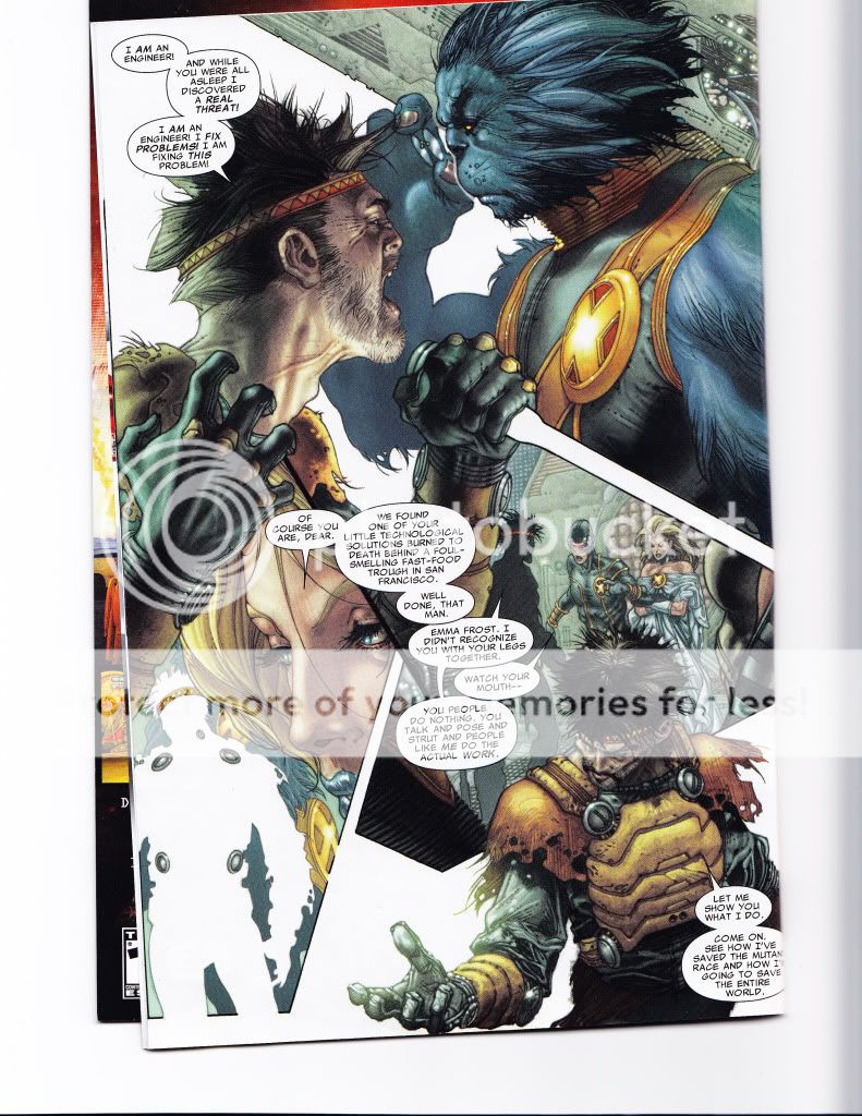
Pretty, isn’t it?
But it was not enough.
For one thing, the art is very realistic. It’s not picture perfect (blue lion mutants with glasses don’t actually exist), but it’s styled to be real. The artist likes to include things like red lines in the eyes, to show the craziness of the villain or spittle flying to show that people are shouting.
Unfortunately, the craziness comes off more like caaaaaaaarrrraaaaaziness and the spittle just seems sort of gross. The story is just–irritating, and the art could be so awesome, and yet it doesn’t all mesh the way a visually told story should.
Instead of making me look forward to more or compensating, the art just reinforced those parts of the story that pissed me off. The basic plot is that the X-Men have found the source of some fake mutants. Their ex-fellow, Forge, has gone bastshit (as one does) and started to make fake mutants to combat evil warriors from an alternate dimension. They’ve denned Forge in his lair in order to stop him.
And Forge proceeds to act like a cartoon villain, right down to the rolling red eyes and the spit and the dramatic gestures and weird poses. It’s sad. I actually felt bad for the guy.
Especially when they cut off his leg and then laugh about it. I mean, jeez, people. Aren’t you the heroes? Wasn’t this guy your old pal? 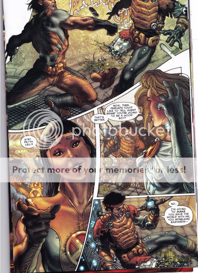
(And maybe Forge really is a terrible person worthy of laughter, but really, people. Cutting off someone’s leg and then laughing is just bad form. Tacky! Yes, he had some mutant-dampener in it, but I don’t care. Show a little respect!)
The X-Men battle the fake-o mutants with no trouble. Forge wanted to lure the X-men into dealing with the cause of the interdimensional warriors by mounting an attack via a large cube (as one does). The X-Men tell Forge off, then whack off his leg in response. Which is gratitude for you, I guess.
You’d think, after the random amputation and cracks about how dumb/crazy Forge is to believe that the interdimensional warriors are a Threat To Humanity As We Know It, that they’d all just leave. But no. The blue lion guy has his girlfriend nuke the place from orbit, just to be sure. Which blows up the special cube and therefore through it to the interdimensional warrior scout dudes’ homeworld, which, blue lion now explains, is probably toast.
Well, that’s nice, isn’t it? I mean, clearly Forge was blood-thirsty and crazy for trying to send a couple of mutant warriors through to make sure no one messed with our Earth. So much better to just toss in a great big old world destroying bomb without bothering to make contact.
I really don't like the art in those pages. The coloring is way too dark. And the costume designs are terrible. I can appreciate a team logo, but it seems like everyone is wearing giant, X-themed dinner plates on their chest.
Superhero art is usually so generic that I appreciate any attempt to jazz it up, to do something a little different. This doesn't look too great though. I think the attempt to play with the layouts just winds up making everything cluttered and confusing, and the thing with the weapon defining a panel border is just clumsily executed. So, meh. Sounds like a really lame story, too. Ellis is phoning it in at least half the time, in my experience, or else just tossing off loony ideas helter-skelter, and this sounds like him in the latter mode. It's a shame, he can be a great pulp writer when the circumstances are right.
Richard,
The art is really dark. There's some good stuff in there, I swear, but you're right, they're using too much of the same dark value. When they do use lighter colors, it's too stark. I tend to hate all the costumes anyway, so I usually la la la hands over my eyes that part. But these are especially egregious.
Ed,
I really wanted to love it because it is so different. They're clearly taking a lot of risks and often it's interesting, but not really effective. I wanted it to be good, I really did. That's interesting about Ellis. I read his Preacher (I think?) many, many years ago and so had hoped for some good or at least OK writing, but this was really meh. I would love to see what this art team would do with a better story. Overall it just really feels like some sort of mismatch.
I'd love to see the artists do something like an underwater world, where the curving lines and dark tones could convey something beyond a kind of cliched grimness.
Wait, it's Warren Ellis who wrote this, right? Because Garth Ennis wrote Preacher… Easy to confuse them, though they're very different besides the names. Ellis has written some quality mainstream stuff: Planetary, Transmetropolitan, and lesser-known things like his sci-fi space exploration tale Oceanic, or the surreal urban noir Fell, or his multi-artist genre experiment Apparat. He's worth checking out.
As for real experimental superhero art: have you seen J.H. Williams III's current run on the Batwoman stories in Detective Comics? It's really inventive and gorgeous. Jog has an appreciative overview that I pretty much agree with.
Ed,
Oh, well, that would explain why it was so different! Yes, this is Warren Ellis.
Oh yes, Batwoman. *long happy happy sigh* I love this run of Batwoman. I've blogged about it, if you're interested:
http://hoodedutilitarian.blogspot.com/2009/09/face-down-in-mainstream-batwoman.html
and
http://hoodedutilitarian.blogspot.com/2009/09/face-down-in-mainstream-batwoman-pt-2.html
Thanks for the link to Jog. I'll check it out.
You know, I've actually read both those pieces but didn't remember that I'd read them here or that you wrote them: I've been reading a lot about this Batwoman arc since I'm actually excited by it and that so rarely happens with DC or Marvel stuff. I agree with your reservations about Rucka's story as expressed in that 2nd piece, but it doesn't really get in the way of my enjoyment too much. The story is kind of typical and does what it needs to and not much more. It provides opportunities for Williams to craft gorgeous art, much of which actually says more about the character of Kate Kane and the emotional stakes of these stories than anything in the writing. I think Williams helps bring out the subtexts of the stories in his layouts and art.
"As for real experimental superhero art: have you seen J.H. Williams III's current run on the Batwoman stories in Detective Comics? It's really inventive and gorgeous. Jog has an appreciative overview that I pretty much agree with."
Personally, I haven't read the Batmwoman stuff, but when I see images from it or scan through it at a store, I'm like, "Hey look, it's Promethea characters in a Batman comic."
I wonder how many people praising the art in Batwoman have read Promethea? Not that J.H. Williams isn't great, but its like people are just discovering him…
I'm betting a lot of people who love the Rucka/Williams Detective Comics also loved Promethea. I know the Moore series was my first big exposure to Williams, and I thought he was amazing then too. I love that book, and would rank it among Moore's best, though I know many others wouldn't. On the other hand, while obviously Batwoman and Promethea are products of the same artist, I wouldn't go so far as to have a "been there, seen that" reaction to Williams' new stuff. For one thing, his output is small enough that any new work is welcome. For another, I don't think the two books are really comparable except that both feature Williams' formalist experimentation and distinctive art. They're very different books. Why this assumption that those who like Batwoman haven't read Promethea?
"Why this assumption that those who like Batwoman haven't read Promethea?"
Its probably just me being biased.
re: writing
What is it with Ellis's X-Men?? He is writing them so utterly boring. The characters seem to talk about things and not make sense. I found the storyline hard to follow. I still didnt get exactly how Forge was a villain. Like you said he was trying to stop an invasion. And he is crazy. And then the x-men basically kill him. I am usually not a dumb reader; I read text books for fun. But please connect the dots and tell me what is going on. Cause the story really went over my head.
Re: art
I liked the art when I got the first issue. I thought it was gorgeous. But then some of the looks were too odd. Storm and Emma sometimes look like skeletons; their faces look emaciated. Then on the other hand sometimes Bianchi draws them beautifully. And the big lips on Cyke made him look like a woman.
re: Detective comics
Yes the artwork in the Batwoman storyline is gorgeous. I think its even better than in Promethea. But I haven't finished the entire Promethea series so I can't say for certain
– Seafire