Hooded Polyp: Rampant Formalism

I tend to be a careless reader on first reading a book. I’m distracted. I’m too interested in just getting through. I’m testing the waters too much: do I like this, will I like this? For this reason, I’m a big rereader. I try not to review anything on only one read. Better with two or three reads, then I have a sense of the book as a whole, the overarching picture, and I can start looking at the details and putting together the pieces. If I can’t make it through a second time, then I know I shouldn’t be writing about the work. I can make it twice through most books. Three times, though, four times, those are the ones that go a little further, where there are always new connections to make between the words, the pictures, and the ideas.

I read Asterios Polyp very quickly when I first got it. I had picked it up at MoCCA last year and had a train ride through New Jersey to spend reading. I read it again a week or so later. And only a couple months later did I actual write something on the book, sticking to a discussion of the book’s ending (an interpretation, I have stuck to, after my most recent rereadings).

Picking up the book again in anticipation of this roundtable, I found myself a little reluctant. There was a point between then (first reading) and now where I started thinking about the story at the heart of the book. The basic story of Asterios Polyp (both the character and the book) is rather banal. Middle aged man is at a low point in his life and takes a life changing journey that causes him to realize his mistakes and reunite with a loved one. Damn, that sounds real lame, like dozens of popular “indie” films and no doubt hundreds of midlist novels written by middle aged professors.

But, what story isn’t, in some way, a familiar tale. Someone’s always trying to break the plots down into a list (Polti’s Thirty-six Dramatic Situations) or a handy quip (John Gardner: “There are only two plots in all of literature, someone goes on a journey, or a stranger comes to town” [I can’t find the source for this…]) It’s not the base story that really matters, we’ve seen them dozens of times, it’s the execution, it’s the layers piled on top (or hidden underneath), it’s the art and the artifice. It comes down to the author/artist.

And where David Mazzucchelli really shines is in the formal invention he brings to the comic. He’s taken this story and added layers of complexity and formal ingenuity. I’ve read the book a handful of times now, and paged through reading various sequences a few more. I keep finding more elements to attract my attention and stimulate my creativity. Everything feels constructed and purposeful, which some may dislike (I feel like I’ve read complaints in that vein), but to me it breaks me out of thinking “this is real” and allows me to engage on a less mimetic level. I don’t want to think of these characters and events as real. A big part of the enjoyment for me is taking note of how Mazzucchelli uses elements of comics to varying effects, an enjoyment that is no doubt affected by my interest in expanding my work on my own comics. Asterios Polyp often feels very insider-y, despite it not being about a cartoonist.

I’m not one to make larger arguments about theme (I’ll leave that to some of my co-roundtable mates), I’m more of a formalist. I love looking at how comics work and how individual artists make comics work differently. So, in that vein, here are five elements of the work I noticed as I reread it this time around. Some are more developed than others, but maybe the less developed ones can at least spark some discussion in the comments.

1. Balloons and Text

Word balloons are often overlooked in comics, despite being one of those quintessentially iconic images that scream “comics.” Artists tend to vary balloons only slightly: larger or smaller, smooth (speech) or scalloped (thought) or spiky (shouting), ellipse or rectangle. And from one character to the next, artists tend to maintain their style. Hergé uses his rectangles with the cut out corners, Ware seems to stick with rounded rectangles, most use the classic oval balloon (such an inefficient use of space for displaying words). Dave Sim is a master of word balloons, added aural and emotional inflection through the shapes, sizes, and placement of his balloons (not even getting into his use of the text itself), but these moments are for the heightened moments: the shouting, the worry, the whispers, the frantic internal dialogue (lots of internal dialogue in Cerebus). The normal everyday talking is still shown in fairly plain balloons.

I remember early in my comics reading career, being surprised at the way Todd Klein used different types of word balloons for some of the characters in Sandman (I’ll credit Klein, but the idea could have come from Gaiman or one of the artists). Each of the Endless seemed have their own way of speaking: Dream with his black balloons with the wavy white border, Delirium with her rainbow hued balloons, Despair with a more craggy bordered balloon (see early on in the “Seasons of Mist” storyline for an example with them all together). These variations are an overt way to give those special characters their voices, so to speak.

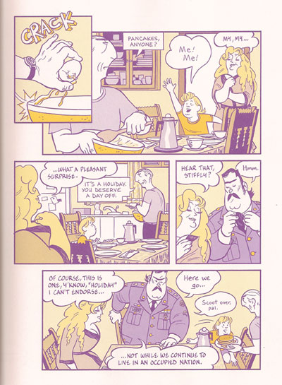
Note different shaped balloons.

Mazzucchelli takes it to another level. Pretty much every character in Asterios Polyp (even minor ones) has his or her own balloon shape. Asterios’s are rectangular with hard edges. Hana’s are like teardrops. Stiffly’s are wavy. Ursula’s are like a large, smoothed out scallop edge. Their son, Jackson, has balloons that are kind of mixing of the two, a larger more wavy scallop (see image above). On one page we see balloons from Hana’s off-panel mother, and they have a distinctive shape: hard edged and chaotic with overlapping corners and oddly sharp angled tails. Even the word balloons coming out of the television that Asterios is watching in the first scene take on slightly distorted shapes of the characters in the video (Asterios and Hana).

Word balloons like narrative captions.

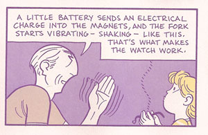
I don’t think it’s a coincidence that Asterios’s rectangular balloons can take on the appearance of the traditional rectangular narrative captions at the top of panels. Asterios is so often pontificating that his words often act like narration. This is rather explicit in the scene where he is explaining his magnetic watch to Jackson. His rectangular balloons fill the top of the panel, just like a caption would.

One unusual one I only noticed on after starting this post, is the balloon that shouts “Hey” after Asterios as he skips under the subway turnstyle. The balloon and lettering takes on the same style and shape as the MTA logo used on the NYC Metrocards. In a similar way, slightly different lettering is used for many of these characters: all caps, normal caps, italic, bold, large, small, and different font faces. Together the combinations give a visual voice to the characters in a way that I don’t recall having ever seen done in such a consistent and extensive way.

I don’t see Mazzucchelli doing this in the book, but his consistency with the balloons and their varied shapes/fonts is such that the reader could identify the speaker without seeing the character. I’d find this type of vocal recognition quite helpful in some manga I’ve read where balloons are often used without tails or without any characters in the panel to mark the speaker.

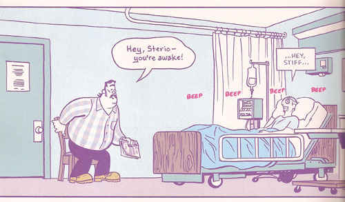
Let me offer one important thematic use of the word balloons. Throughout the dream sequences, Asterios’s dead twin brother Ignazio speaks with a scalloped balloon that is quite reminiscent of a thought balloon. Towards the end of the book, just before Asterios wakes up in the hospital, he dreams about Ignazio. Asterios finds him at the garage, working on a car. Ignazio starts talking, reusing many of the words from his narration about Asterios at the beginning of the book. He is talking in the first person as if he had lived Asterios’s life, and slowly his word balloons transform, morphing from a round scalloped shape into the sharp rectangles of Asterios’s balloons (see image below).

Word balloons transform.

This scene is an important moment in the book, one I neglected to realize the significance of before I noticed this use of the word balloons. Ignazio, with his thought balloon like speech, is just Asterios’s obsession with duality taking on life. And here, at the end of the book, Asterios has his epiphany. Ignazio transforms back into Asterios, the pompous Asterios of the past, and Asterios kills him.

2. A Bit on the Colors

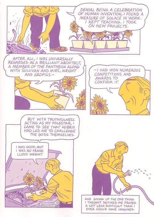
Mazzucchelli’s color work in Rubber Blanket was a revelation of sorts to me about the power of a limited color palette using transparency to create blends (I wrote a bit about that previously). Asterios Polyp at first seems like it’s using a similarly harshly restricted color palette. When I read it, I try to pick out the colors, to count the shades. I never really succeed in figuring out how many colors there are, it always seems to be more than I first think.

But, there is a limit on the number of hues used at any one time, and Mazzuchelli makes great use of these variations and shifts in palette. The purple and yellow of Asterios’s journey in the present presents itself early on in the book, but only after the strike of lightning seems to steal all the blue. The blue and pink are the colors of the past, taking the clichéd blue=boys pink=girls and making it a powerful visual cue to the relationship between Asterios and Hana. In a sense these palettes play into the duality tension that fills the book. The purple/yellow palette are complements, opposites on the color wheel, yet they are more than just two colors. There are the shades of both. There is the fact that purple itself is a mixing of blue and red. The duality is surface, and it dissolves with attention.

Various hues also take prominence to create shifts in the narrative. Dreams are suffused with yellow. Flashbacks (see Asterios remembering his father as he rides the bus holding his lighter) are suffused with blue. In a way, this use of color is a variation on the classic trope of the altered panel border to indicate flashbacks or dream sequences.

Greenish tones enter.

The color I noticed this past read is green. After the dominance of purple, blue, yellow, and pink, green sneaks in late in the story. When Asterios wakes up in the hospital after getting hit by the drunk in the bar (and after the dream sequence I mentioned above), some of the blues take on a greenish hue (see image above). The greenish blue seems to become more bluish green over the course of a few pages until Asterios is in his solar-powered car leaving town, and a bright green interstate sign jumps forward at the very top of the page. This green sign is in itself a sign that a fuller color palette has arrived. We can easily connect this expanding palette with Asterios’s new perspective and all the commentary in the book about perspective and “coloring” the way we experience life.

It must be telling in some way that Hana, in her final scene appears wearing a green shirt. In a way, the couple have almost switched colors in this scene. Asterios wears a pinkish purple shirt, while Hana wears bluish green pants. A final color shift to represent their reconciliation.

3. Back to that Ending

Asterios Polyp is both a comedy and a tragedy, in my reading. It ends with marriage (reconciliation) and death (I continue to read the asteroid as about to strike the house where Hana and Asterios sit). Furthering the idea that once you start looking for those dualities they are everywhere, but the two poles never seem to stay clearly separated.

4. Brushwork

When I saw Mazzucchelli at MoCCA when the book made it’s debut, he was drawing Asterios’s head with a compass as he did in the book. Much of the comic has a similar precise line and flat, sharp color fields. But there are moments of looser brushwork that has an almost dry brush appearance. Only a few of these tiny moments pepper the book. I’m at a loss to explain this tiny stylistic shift spread out across the book. Perhaps they have no explanation other than being the best way to portray the image in question. These moments catch my attention and are quite lovely in themselves.

It starts with the storm clouds and lightning strikes and ends with the asteroid hurtling towards Hana’s house. But in between are these two moments that are almost polar opposites in their placement of the Asterios/Hana relationship. First:

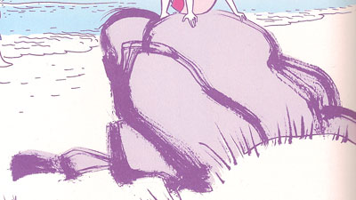
The large rock Hana sits on at the beach when they find the Swiss Army knife. (Sidenote: In the MoCCA Mazzucchelli show that was up, they had the original art for this page, including the second version of this rock that he drew on a separate paper and edited (Photoshopped, one assumes) into the page over the original one.) This image is accompanied by narration concerning their marriage.

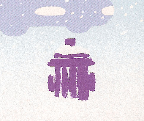
Walking home from the composer’s apartment, later in the story, just before their relationship really breaks, this snow covered fire hydrant sits in the lower corner of a panel.

Could these perhaps be another case of the coloring of perception? Tiny moments of grace in another wise cut and dried world. A tiny nod towards paying more attention (as Hana has it) to the world around us. Each of these images are nature based, a softness against the hard edges of Asterios’s architecture.

5. Large Panels of Rooms

Mazzucchelli uses a lot of large panels (usually about two-thirds of the page) to show us interiors. From our first view of Asterios’s apartment to him shivering on the couch of Hana’s house after his long snowy walk, these large panel rooms set scenes, expose psychology, and position relationships. Many of these panels show the rooms from the same point of view, in particular, we see Asterios’s living room a number of times through the course of the book.

Perhaps the most effective use of these large rooms is Asterios sitting on a bed with a blister on his foot. His static position is placed onto two separate bedrooms at two different times, his repeated phrase bringing on a torrent of memories (and one of the best scenes in the book, in my opinion).

So there you have it. A few thoughts on the book.

Having written all of this before reading Noah’s post from yesterday, should I be chagrined to have fallen into the traps of “what I’m supposed to do with the book”? Oddly, I agree with Noah about the characters and the story, the thing is, I just “so don’t care.” I’ll get my pleasures from other parts of the book.

This is the second post in a roundtable on Asterios Polyp. Regular Utilitarian, Richard Cook will weigh in tomorrow, with other Utilitarians and guests posting through next Monday. You can read all the posts in the roundtable on this page.

Hooded Polyp — Stupid Spaces

Asterios Polyp takes an impeccable sense of visual design and layer upon layer of sophisticated allusion to tell a clichéd, tedious, poorly imagined, ruthlessly uninsightful story. It’s like listening to a musically brilliant opera with the book taken directly from a TV movie of the week, or (to take an analogy perhaps closer to my heart) listening to classic Slayer perform a John Updike novel. You can’t but be impressed by the technical skill and control…but it’s hard not to feel that, skill and control notwithstanding, a person who could expend such time, energy, and passion on such vapid idiocy must be, on some level, a fool.

Of course, with a book this intricate and complicated, it’s always possible that the person who doesn’t get it is the fool. I know what I’m supposed to do with this book; I’m supposed to start googling all the names that have flagrant double-meanings; I’m supposed to read and reread looking for connections, following up secret paths. How is the theme of doubling worked through the book? How do the different styles link to different moods and themes? Why does the guy who pokes out Asterios’ eyes at the end seem to recognize him? When exactly did Asterios give up smoking and what does it mean?

I figured out a few of these answers despite myself — but, man, overall, I so don’t care. And I don’t care because, with all the twists and turns and clever games and beautiful drawings, this is, at bottom, a character study, and Mazzucchelli’s characters are all as tediously second-hand and tired as his designs are inventive and new. Asterios Polyp, the character, walks out of the massive towering edifice of literary fiction via rote Hollywoodization, and he’s as utterly devoid of interest as he was the first thousand times I saw him. Hey, look, it’s a Successful Professor Whose Intellectualism Has Disconnected Him From Life. And there’s his younger, also brilliant, but more tentative wife — and…wait! He’s driving her away through his callous self-absorption! Didn’t see that coming. And now he’s undertaking a spiritual journey which involves interacting with common people and/or ethnic minorities! And, look, he learns his lesson and spiritual renewal is his — and happy, happy love! Yay! The end. And if I want to see it all happen again, I can just rent The World According to Garp.

I don’t know. Here are a couple of moments of emblematic shittiness.

That’s our hero, Asterios Polyp, the great snobbish architect who has never built a house, committing himself to help his working-class boss and landlord build a rickety little treehouse for said boss’ adorable son. Can you savor the gentle irony? Do you feel the tear in your eye? Can you hear the inspirational music from various Kevin Costner vehicles welling up to play over the heartwarming montage?

Here’s the boss’ wife, who is into new age nonsense (which we shouldn’t just reject as nonsense because we’ve already been informed that too much rationality is bad bad bad) looking deep into Asterios’ soul and seeing the wounded longing therein. It’s like his heart is just like that giant hole in the ground they looked at a few pages ago, which is a big ironic irony, because Asterios’ heart isn’t a hole at all. How could it be when he got it spackled over with moments of trenchant revelation borrowed from every half-assed rom-com script of the past quarter century?

Look! His wife is the victim of sexual abuse! That adds emotional depth, doesn’t it! Hey, this book is really about something, damn it!

Matthias Wivel suggests that the story appears “reductive” because Mazzucchelli leaves out most of the connections; we don’t learn more about Hana and Asterios’ relationship because the point is that we’re to fill it in ourselves — figuring out the spaces in the architectual plan for ourselves. It’s a generous reading, and may well be what Mazzucchelli had in mind. The problem is that the plot and characters he’s given us — the frame in which we are to perceive the spaces — have little of genius, or even elegance. Instead, what he has erected is made out of shoddy, second-hand, thoroughly pissed upon fragments of mediocre pop culture detritus. Which is to say, the problem I have with Asterios Polyp is not, alas, that Mazzucchelli doesn’t give me enough. He gives me plenty.

__________________
This is the first post in a roundtable on Asterios Polyp. Derik Badman will weigh in tomorrow,(He’s now done so) and we’ll have various other Utilitarians and guests posting through next Monday.

Update: You can read the whole roundtable so far here.

Utilitarian Review 5/29/10

Asterios Polyp Roundtable

In the coming week (and a few days) we’re going to have an extended roundtable on David Mazzucchelli’s Asterios Polyp. Besides the usual Utilitarians, columnists Matthias Wivel and Domingos Isabelinho are also planning to weigh in — and we’ll also have guest posts from Derik Badman and Craig Fischer. So please check back!

On HU

I started off the week by explaining why I wasn’t that into Urasawa’s Monster.

Domingos Isabelhino devoted his first monthly column, called “Monthly Stumblings”, to Pierre Duba’s Racines.

Vom Marlowe pointed and laughed at the art in Brave and Bold #33. Several commenters protested, and I did a follow up post speculating on visual tropes in super-hero art.

Richard Cook provided a history of Wonder Woman’s panties in covers.

Caroline Small looked at Barbarella the movie and why it should not be a target for feminist ire.

Suat sneered at Gantz.

And finally Suat expressed some skepticism about the excesses of the market for original comic art.

Oh…also, here’s a download of some semi-schlocky country weepers.

Utilitarian Everywhere

Former Utilitarian and current comics creator Miriam Libicki has been doing some guest blogging over at Jewish Books. You can see her talk about her creative process here.

Columnist Matthias Wivel is over on the tcj.com mainpage talking about the Komiks.dk festival in Copenhagan.

At Splice Today I talk about the best super-hero movie of all time.

Why is it the best superhero movie of all time? If you saw the TV show you know the general outlines. Adam West does not have foam-rubber pecs like his bat-successors, but he does have a cute little paunch which is clearly outlined in his skintight bat-costume, said paunch sitting unashamedly atop his shiny external bat-underwear. It seems Robin has poured a quart of rabid bees down his green short-shorts and is bravely fighting the pain by punching his fist into his palm while imitating a (much) skinnier William Shatner. And, of course, there’s the Batmobile, Bat Repellant Shark Spray, Bat Knockout Gas, and all other kinds of Bat ephemera, each carefully labeled for those who otherwise might confuse the Bat Repellant Whale Spray with the Bat Ladder.

At Madeloud I provide an introduction to black metal.

Whiteface corpsepaint, church burning, ungodly screams, and the odd unpleasant foray into fascism — from the outside, black metal looks fairly foreboding. But while that image isn’t exactly wrong, it is a little misleading. Some black metal performers have really and truly been associated with extreme excesses and ugly ideologies (Varg Vikernes, we are looking at you). But, if you can put that aside, the music is in general quite accessible — in some cases, even pleasant. If you enjoy shoegaze or indie rock or ambience, a lot of black metal will sound like a slightly satanic twist on some familiar tropes. Here are some places to start for those ready to immerse yourself in surprisingly friendly evil.

Also at Madeloud, I review the latest releases from folk black metal horde Blood of the Black Owl and indie folk band The Clogs.

Other Links

This is an adorable illustration of Lovecraft’s Shadow Over Innsmouth.

I enjoyed this part of Kristian Williams’ massive discussion of Oscar Wilde illustrations.

Even though I have no idea what House of M is, this is still a great post about the X-Men by Tim O’Neil.

Feminist Hulk Smash Patriarchy on Twitter!

Original Art: Conspicuous Consumption

It’s been about a week since the close of the May Heritage Comics Art Auction and the dust is settling on another set of controversial results. The topic has been talked out on various list and message boards and collectors have moved on to the next spectacle. The rest of the comics world remains largely oblivious to these very insular and obsessive goings on. I present the following news brief as a kind of time capsule and, as with many such things, perhaps it will be looked upon with mirth and a sense of irony in years to come.

Two covers in particular set tongues wagging at this auction. The first was the cover art to Miracleman #15 which sold for $53,775 (with commission).

Continue reading

Gantz: A Comment

(Being a sideways response to Noah’s review of Monster Volume 1)

Synopsis: Ordinary Japanese are being snatched from the jaws of death by an alien force (Gantz) which puts them to work hunting down extraterrestrials prowling the streets of Tokyo. Armed with cybernetic suits and devastating guns, their lives are constantly on the line in this video game made flesh. Limbs are sliced off, heads explode and aliens are blown away. Girls take off their clothes, smile and then lean forward. The reader ejaculates into his warm sweaty palm.

***

In his review of Monster, Noah advises us that he would “rather pursue the trashier Gantz, which manages to be a lot more thoughtful and truthful about morality by the simple expedient of not idolizing its central characters.” Having read a few more volumes of the series, I would suggest that Noah mistakes base instincts, unfiltered onanism and self-indulgent stupidity for those more virtuous attributes.

I first came across Gantz sometime in early 2000 (a few years before the Dark Horse editions came out) at my local manga shop where a member of the sales staff enjoined me to purchase the latest hot tittie from the shores of Japan – all prominently displayed and soaked up by an adoring male audience. The first volume left me rolling my eyes and the latest ones I’ve read (on Noah’s “exhortation”) have merely confirmed my suspicions.

Gantz is 4 parts action and 1 part titillation. The boring parts first. There is little which differentiates this title from your average shonen manga in terms of action (see Naruto and Bleach). Gantz being a seinen title, there are more decapitations and dismemberments on display but the routine is established and time honored: enemy of the day, technique of the day and boss fights. Deaths and mutilations are frequent and uninvolving. I suppose that some might call Gantz a brilliant evocation of the loneliness of the long distance video gamer but I’m not listening.

In the comments section of Noah’s review, “Subdee” suggests that the series is a “moral black hole” but my disappreciation of Gantz has nothing to do with morality. Unlike Noah, I’ve generally found morality to be troublesome (though not totally ineffectual) as an aesthetic yardstick. Rather the essential nature of Gantz can be addressed in much more organic terms – it is, quite simply, a cesspit of raging hormones.

It would be easy to imagine this manga being put together by a bunch of sexually deprived nerds huddled around a computer screen but, no, I’m going to be kind here and just call them a group of over-sexed wankers. Gantz is clearly aimed at young males with a history of gaming, buying gravure idol magazines and indulging in H games. Nothing particularly unusual or pathetic here. Everyone can do with a bit of interactive porn now and then, but let’s not mistake this for great entertainment much less great art. Artistic dedication in Gantz can be narrowed down to the use of CGI to churn out as much dreck as possible. The creator’s idea of high drama is the schoolyard bully as tooth collector, reimagining educational institutions as prison yards (people who can’t stand anal overtones please look away) and auditorily frying a grandmother and her grandchild’s innards. Can we really be surprised that Gantz reviewers are so often reduced to talking about bosoms, guns and bursting flesh?

Tucker Stone would have us believe that “Gantz is fucking mean, gnarly shit” and that “it’s yet to reach the point where the shocks don’t bring surprise” but he’s wimping out here. These guys probably wanted to do Guido Crepax’s version of The Story of O before deciding they preferred to make as much money as possible. Or maybe they just didn’t have the balls.

Instead we get a cute dog licking the heroine’s pussy (no medical terms required here since this is pornography) not a Doberman viciously penetrating a reluctant female. Gantz is a limp dick in the violence department, exactly the kind of thing you expect from gentlemen who prefer adorable mutts to large angry canines. It’s the popcorn of transgression, the missionary position of entertainment.

I don’t care to read any interviews by the team behind the manga but I imagine their idols must be Buronson, Koike and Ikegami. Those guys had more style when it came down to the blood, sex and misogyny. Gantz, on the other hand, is manga as masturbation and my only advice to those who can’t do without Gantz is to engage a high class call-girl or to go out and shoot some small animals for a change.

Don’t waste your time on this one, Noah.

Feminine Dignity and the Empowered Sexpot, Part 1

The film version of Barbarella gets a semi-bad rap as an over-the-top sex farce with an almost-camp sensibility and a genuinely bad rap as a film either completely disengaged from its own gender politics or completely sexist:

While women strove to clothe their gender with dignity, Barbarella endeavored to strip them of it…Barbarella’s sexual appeal proves to be her most powerful weapon, but she does not control it as much as it controls her. Each episodic dilemma moves to the next by Barbarella’s sexual encounters with alien strangers, at first a pittance she pays them for saving her life. Notably, circumstances leading up to this event strip Barbarella of most of her clothes. The only exception is when she has sex with Duran Duran’s machine, in which her multiple orgasms ruin the device and foil his scheme to kill her. Opening with an erotic scene of Barbarella undressing herself, the film begins with the statement, woman equals sex [Ed.: italics added], for by that point the audience does not know who she is, and spends the remainder of the time underscoring their assertion. [Source here.]

This is a particularly egregious example of feminist critique, but the fact that anybody can seriously advance the notion that a simple striptease is sufficient to denote “woman equals sex” indicates that we may be to the point where we’re so deft with the feminist critique of objectified female bodies that we overlook the ways in which those bodies function not just as oppressive representations of women but as ambivalent representations of cultural dynamics about women. (Not to mention for not-inherently-problematic aesthetic pleasure.)

One of the most striking lines from the film in this context is “The Mathmos has created this bubble to protect itself from your innocence.” The line is spoken by the Great Tyrant, after she and Barbarella are dunked into the ever-hungry Mathmos expecting to die, only to find themselves protected by a spontaneously generated enclosure that looks a little like the Jetsons’ car (I failed to find a decent picture online.) Delivered in the film’s final minutes, after Barbarella has eagerly rewarded three rescuers with sex and survived the Orgasmotron, the line encapsulates the film’s characteristically 1960s’ stance on the inherent goodness of sexual pleasure. Like much popular culture from the era, Barbarella works to recast the traditional, Puritanical distinction between innocence and corruption, making “purity of body” almost entirely inoperative and advancing the idea that the “good-hearted” (male and female) enjoy sex too.

This is not “woman equals sex.” This is “sex is really, really, fun but mostly irrelevant.”

As an artifact of sexual liberation, Barbarella is certainly subject to the more-limited feminist critique that the sexually liberated woman is a male wish fulfillment, but in the world of the film, Earth culture has evolved to a future state where the Hippie premises are simply business as usual and the power dynamics that inform them in the present have evaporated. Sex is casual; pleasure is paramount; goodness is manifest; and power is besides the point. The other stereotypical Hippie assumption, that mind-altering drugs are benign and progressive, has a surprisingly ambivalent status: on Earth, a drug that allows for the “rapport” of minds has replaced physical intercourse. Although the film doesn’t strongly disparage the use of the drug, it definitely depicts physical sex as both more “primitive” and better.

Thematically, Barbarella’s fantasmic sexual receptiveness is a function of that “primitive goodness” – the merging of physical sensuality with a nurturing and anti-violent sensibility – a concept not entirely unrelated to the later feminist concept of “woman’s wisdom.” The fantasy extends significantly beyond access to the desirable female body, and the film’s politics – sexual and otherwise – are consequently more complex. The critique of Barbarella as brute objectifiation is one of those reductive arguments deriving from an adherence-to rather than an awareness-of the contemporaneous feminist dictum that the personal is political, and it misses the extent to which there’s a lot of politics in this film that has nothing to do with Barbarella’s breasts.

Countercultural exoticism, in both its erotic and philosophical modes, often reflected the influence of the “Hippie trail” – the search for enlightenment in the uncorrupted cultures of the East, viewed as more primitive, authentic, or “in touch” with nature. This affection for primitive eroticism drives the film’s motifs, although the space-exotic aesthetic owes more to the curvy “woggles” of Morris Lapidus than to primitive art or the ethnic tapestries of the subcontinent so characteristic of more earthbound 60s mythologies. Barbarella’s primitivism takes a particularly Western formulation: She is Eve in the Garden of Eden before the Fall: a helpmeet and sexual partner to man, but “innocent” and “pure,” uncorrupted of spirit, naïve about the ways in which her sexuality is both powerful and political.
Released in 1968, the year of the Battle of Saigon and the My Lai massacre, the movie is also ambivalent about violence: the opening sequence, in which the President of Earth sends Barbarella to locate and stop Durand Durand from an as-yet-unknown nefarious plan, establishes that “the Universe has been pacified for centuries.” When the (completely nude) Barbarella receives weapons to help her in the mission she campily complains about being “armed like a naked savage.”

Societies with a propensity to war are described as “in a primitive state of neurotic irresponsibility.” Without even a hint of contradiction, primitive violence is every bit as bad as primitive eroticism is good. Make love, not war.

Aesthetically, the film is a shaky and rollicking hybrid of this hippie utopia with space age bachelor fantasy: Barbarella is beautiful, strong, available for sex at the drop of an innuendo, handy with gadgets, and pacificist, but a perfect shot, able to destroy aircraft from an entirely unbelievable distance with merely a handgun. The world she inhabits is fashionable, uninhibited, and full of stylized villians who are easily defeated.

But perhaps the most illuminating element of the hybrid lies in the residue of domesticity. Barbarella does not keep house; she does not cook; she is not waiting around for the men she sleeps with to take care of her or provide for her. She is a “five-star, double-rated astronavigatrix” with her own spaceship who gets direct calls from the President of Earth. She is also immensely kind, consistently nurturing, and completely not manipulative in any way. This is surely male fantasy, but it is not the oppressive “barefoot and pregnant” male fantasy of first wave feminism or even the “hang around the Mansion and look gorgeous” fantasy of Hugh Hefner. If Barbarella dressed in a smart polyester pantsuit and unzipped it less frequently she would be as unobjectionable as Mary Tyler Moore.

Watch this spot for a link to part 2.

Star-Spangled Panties (and some alternatives): A History in Covers

1940s

Cover by Harry G. Peter (1942)

Note: Harry Peter was the first artist to draw Wonder Woman.


Cover by Harry G. Peter (1944)

Cover by Harry G. Peter (1949)

1950s

Cover by Irv Novick (1953)

Cover by Ross Andru and Mike Esposito (1958)

1960s

Uncredited Cover (1961)

Cover by Ross Andru and Mike Esposito (1962)

Cover by Ross Andru and Mike Esposito (1966)

Cover by Mike Sekowsky and Dick Giordano (1968)

Note: Noah wrote about the new, hip Wonder Woman created by Denny O’Neil and Mike Sekowsky here.

1970s

Cover by Mike Sekowsky and Dick Giordano (1970)

Cover by Dick Giordano (1972)

Cover by Bob Oksner (1974)

Note: Wonder Woman returned to the star-spangled panties in 1973.

Cover by Jose Garcia-Lopez and Vince Colletta (1977)

Cover by Dick Dillin and Dick Giordano (1979)

1980s

Cover by Dave Cockrum and Dick Giordano (1980)

Cover by Jose Luis Garcia-Lopez (1986)

Cover by George Perez (1987)

Note: The Wonder Woman comic was rebooted in 1987.

Cover by George Perez (1987)

Cover by George Perez and Chris Marrinan (1989)

1990s

Cover by Brian Bolland (1992)

Cover by Brian Bolland (1993)

Cover by Brian Bolland (1995)

Note: Diana briefly lost her position as Wonder Woman in 1994, but continued to fight evil in this get-up.

Cover by John Byrne (1996)

Cover by Howard Porter (1997)

Note: Third volume of Justice League of America.

Cover by Adam Hughes (1999)

2000s

Cover by Adam Hughes (2001)

Note: the “Screaming Chicken” armor was created by Alex Ross in the alternate reality storyline, Kingdom Come (1996).

Cover by Adam Hughes (2002)

Cover by J.G. Jones (2005)

Cover by J.G. Jones (2005)

Cover by Terry and Rachel Dodson (2006)

Note: the Wonder Woman comic was rebooted again in 2006.

Poster by Alex Ross (2007)

Note: Served as two variant covers for issue 12 of Justice League of America (vol. 4).

Cover by Ed Benes and Alex Sinclair (2008)

Cover by Aaron Lopresti (2008)

___________________________

All scanning credit (except the Alex Ross poster) belongs to AmazonArchives.com.

And if you’d like to read a (much) longer history on the Wonder Costume, wonder-fan Carol Strickland has one on her website.