
Vom Marlowe posted earlier today talking about the visual mess that is Brave and Bold #33 Among the pages she pointed out was this one:
Vom said:
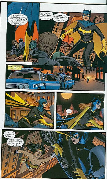
I stared at this page and tried to figure out what the heck is happening. Finally, I decided that her bike flies between panel 4 and 5, although I don’t know why. Apparently so we can see Wonder Woman hanging onto the middle of the bike? I don’t even know.
David Brothers felt this reaction was disingenuous.
The Batgirl thing is similarly dishonest. We see street in the background, and then we see skyline. Two plus two: Batgirl is higher now than she was before. Next panel: the reason why.
This isn’t hard. This isn’t being steeped in continuity with no lifeline. This is basic stuff that is in almost every comic book ever made. You can find yellow pee lines in Peanuts. Done in Schulz’s style (thin lines, with maybe sweat marks around the lines), of course, but it’s the same effect. How did Wonder Woman lift the bike? By getting low to the ground and scooping it up, I assume, same way everyone has ever lifted everything.
I was talking this over with another non-superhero comics reader, and she said that she too couldn’t make heads or tale of the Batgirl sequence either. Whereas, I — who have read way too many superhero comics — parsed it instantly. I presume David’s experience was more like mine, which may be why he just assumed that others’ confusion was a put on.
This seems pretty interesting to me. I can’t necessarily point to anything in that sequence and say “well, this is why I followed it”, but I do wonder if there are tip offs you don’t necessarily even know you’re getting when you’re familiar with an art form or genre. I think things which “feel” natural and obvious can really not be at all.
In thinking about it more: the panel/panel/pull back and reveal move — that seems like something that’s done a lot in modern superhero comics. In this case, it’s done really confusingly; among other things, I think the horizontal movement of the panels works against the fact that the action is vertical. That is, from the panels, it looks like Batgirl is going side to side, but she’s supposed to actually be going up. I think this is in theory intended to make the reveal more surprising. In practice, though, it messes with the visual rhythms; it doesn’t feel from the panels like she’s going up at all, so even when you’re told (via the skyline) that she’s going up, you kind of have to convince yourself.
Rotating the angle of the bike messes with the rhythm too; the camera isn’t so much pulling back as it is swooping out and swinging around, though all in a single leap. It’s disjointed and clumsy; its like Cliff Chiang, the artist got to the bottom of the page and didn’t have enough panels, so he just cut out bits and hoped it would work.
And for me it does work — not in the sense of being a stylish or pleasurable progression, but in the sense that I can follow what’s happening. And I think I can follow what’s happening because I’ve seen it so often before. I mean, this is clearly somebody who loves Watchmen too, and who’s used to seeing comics imitating film movement more-or-less poorly, the way superhero comics these days tend to. I can follow the page better than VM not because I’m especially visually ept or because VM is pretending not to get it, but because it’s using tropes so familiar to me that I can parse them even when they’re not deployed very skillfully.
Another interesting thing about this to me is that, if I were reading this comic on my own, I don’t think I’d even notice that the tropes weren’t used very well. I’d read that page, understand it, and just go on. In some ways, being familiar with the tropes makes you see the comic less clearly. I can follow the images, but I wouldn’t have actually seen what they was doing if Vom (and David as well) hadn’t pointed it out to me.
Update: Telophase has a mess of fascinating comments (starting here) explaining the different ways in which manga and western readers read comics. Basically, manga readers look for clues in the art first, then if that doesn’t work go right to left; western readers go left to right first, and if that doesn’t work look for clues in the art. Telophase kindly marked up the page above to show how a manga reader (going left to right of course!) would parse the page.

The visuals at the bottom of the page end up to be particularly nonsensical, which might help explain why VM had such trouble figuring out what on earth was going on.
Huh. That’s fascinating. See, even with the explanation I am puzzled. I’m tempted to draw out the progression with stick figures to show you how my brain keeps parsing it.
For one thing, Wonder Woman has the bike by the center at the bottom. Unless Batgirl was already in the air, then Wonder Woman had to come up from below, which would mean from the ground. If she swooped in from the side or the top, she’d be holding the bikeseat, right?
I get that the skyscrapers are supposed to indicate the sky now, but before they just looked like a continuation of the same panel with a slight variation to show time passing. I’m used to hair being much more evocative of space–the hair should be straight down if she’s going straight up–here it’s only slightly less horizontal.
Yeah, the cues are all fucked up — especially if you’re coming from manga where (for example) hair would often be really important. Where she’s holding the bike is obviously wrong too — but the familiar tropes just flatten all that stuff. As I said, if I were reading it on my own, all I’d see would be panel/panel/reveal. I wouldn’t even think about the hair or how she was holding the bike.
I’d be fascinated to see the stick figure progression, actually. If you feel like it wouldn’t be too much trouble, I’d encourage you to go for it.
Arg! I had a huge comment here about how internalizing manga tropes made reading American superhero comics difficult for me, and the CAPTCHA claimed I have cookies turned off and ate it!
Short version: the rules of the visual language of many (not all!) manga go: “Follow where the lines and cues in the art point. If they’re confusing, then just read right to left.”
Rules for the visual language of most (not always!) superhero comics tends to be: “Read the page left to right. If there’s a bit of confusing, check to see if the art holds some clues.”
I drew lines on the page above that show how I read it following manga rules:
http://www.magatsu.net/pic3/flying2.jpg
For more on manga rules, check out the linked posts 3 and 3.1 in the page linked to my name above – it’s an index of posts I wrote about the visual language of manga back in 2005 or so.
(Try 2 failed as well – claimed I had the wrong CAPTCHA and told me to use the BACK button and try again, which wiped out the comment. Luckily, I cut-and-pasted it into a text file…)
I should point out that in the picture I linked, I did start out reading the page in the upper left – I haven’t internalized manga rules so much that I automatically read Western comics that way! If I started with manga rules, I’d start that top circle on Batgirl’s face in panel 2, then jump to her face in panel 4 after the top 3 panels were read.
Jump to her face in panel 5 via Japanese manga-reading rules, I meant, not 4, as the “read from right to left” rule would kick in once no lines led naturally from panel 3 to the next panel.
I really need to put the keyboard down and get some sleep.
Damn it; it said you didn’t have cookies turned on? What does that even mean?
Sorry we just started with the captcha, so I fear it’s still a little rocky.
That marked up page is fascinating. Am I right that it looks like you’re saying the cues in the art would take you first panel, third panel, second panel, fourth panel, sixth panel, then up to the fifth panel?
I’m tempted to post that at the bottom of mine if it’s okay with you. Would you mind?
I turned my computer off and am checking this on my iPhone so forgive any typing weirdness.
Following manga rules, except for starting at the top left instead of the top right, I go 1, 3, 2, and then jump to 4, skip 5, and read 6 from right to left, ending up shooting off the page to the left. Skipping panel 4 occurs because the rule that takes priority in a lot of manga is the one that says to follow thelines in the art over the direction of reading, which is opposite the usual Western comic rules, where reading left to right often takes priority over the cues in the art.
And yes, please post it if you’d like. :) (captcha didn’t work at first on the iPhone, but the comment was preserved when I went back and the second time worked, FYI)
Although i was able to follow it, one thing for me is that Wonder Woman doesn’t really look to me like someone who can fly. She just looks to me like a super athlete type. I’m not sure if this is because I’ve only read some of the older issues when she couldn’t, or because of the lack of visual cues like a cape, or because the skimpy costume accentuates her “athletic” features, rather than her supernatural abilities.
That’s interesting…she wasn’t originally meant to fly, obviously — not sure when that got added on (was it George Perez?)
Wonder Woman was, as I recall, able to “ride the wind currents” at least as early as the ’70s. I never thought of it as flying in the same way as Superman flew, more like a controlled float. I also think it was sporadically used. Certainly in combat she kept her feet mainly on the ground. And she had that plane all along until the Perez reboot, which she used for long-distance travel.
Perez, though, did give her the “sandals of Hermes” to get around at the beginning of his run. At some point she began to fly innately, and the sandals wound up in the possession of whatserface who’s now Wonder Girl, until it was revealed she was the daughter of Zeus so she had innate powers of her own.
It looks to me like Chang was going for the classic trope where Superman flies under a car and lifts it up before the driver realizes what’s happening.
But this trope doesn’t work with a bike, unless we assume that the rider has no peripheral vision or feel for her vehicle.
But, like Noah, I’ve read so many superhero comics that I recognized this trope and understood what was going on even though it wasn’t executed particularly well.
Aha! That’s almost certainly where they’re getting it from, Richard. And yes, it makes no sense on a bike; good call.
I parsed this page pretty easily (despite having never read a superhero comic other than Swamp Thing.) The three little WTF lines above Batgirl’s head in the “Hi” panel are what tipped me off — at least that’s what I thought at the time. Maybe I just watched too much Lynda Carter as a girl…
All that pee pants nonsense in the page Vom discusses over on the original post, though? Not in a million years could I parse that. Not even after it was explained. That’s just ridiculous.
The Captcha caught a post of mine too, Noah. It would be lovely if we had a draft function. In the meanwhile, Chrome seems to save posts a little better than IE and Firefox.
Damn it. I am enjoying the lack of spam deluge, but the captcha thing is obviously a problem. .I’m hoping to be in touch with the tech guru soon, and I’ll try to bring that up…..
They basically need another panel, between the 2 “Batgirl on Bike” panels in the middle of the page. Showing an ascent requires three panels, really (on ground, on the way up, in the sky). Not doing so leads to confusion (Is she suddenly up high? Or is she suddenly just outside the city—where you can see it in the distant background (as in the second panel). It’s basically pretty crappy art—but it’s not impossible to follow.
The bright light squiggle/motion/energy thing is harder to follow because of all the shifts in perspective/camera angle. This shifting serves no real purpose except to disorient the reader. Again, it’s not impossible to follow–but it is annoying to have to “puzzle out” a pretty basic “action” sequence. This isn’t “art” or “abstract” comics–so I kind of appreciate some simple “continuity” from panel to panel to lead me as reader/viewer through. This happens alot in contemporary comics. Clear progressions from panel to panel is more the oddity than the norm these days—It makes a big difference. Cameron Stewart’s issues of “Batman and Robin” were basically pleasurable for this very reason. While Philip Tan’s issues were basically incomprehensible on a simple “action” level, Stewart’s read smoothly. Since there’s no really intellectual heavy lifting in the comics in any “content” way, I would appreciate not being made to lift heavily for no reason–and with no tangible reward.
Yes, that was the thing with the Aparo art; you had to work a little sometimes to figure out what was going on, but when you got it you’d be able to say, “Hah! We’re looking up from groundlevel between someone’s legs to see action on a distant rooftop — that’s hysterical!” That doesn’t really happen here, unfortunately….
Personally I’m wondering to what degree the writer is responsible for the layouts here. While the confusing action on the Wonder Woman page is probably all on Chiang, JMS did come up with the scene of Wonder Woman lifting Batgirl’s bike. Chiang didn’t execute it well, but he was handed a nonsensical situation to begin with.
Follow the word balloons. I’m as visually oriented as anybody you’ll meet, but that’s the way I read this page several weeks ago, and I had nothing close to the difficulty you seem to be having.
Johnny Bacardi (and others), I think the reason you didn’t have close to the problems reading it that others did is because you’re used to having to decode art where the storytelling is unclear, and this has given you super-story-discernment powers. That may sound snarky, but it’s not meant as such; it’s a real problem in bringing in any new readers to mainstream comics.
Personally, I’d be curious to see whether the problems in tier 3 are a result of the writer’s script or the artist. If the script says “same shot, but with tops of buildings,” then its on the writer. I assume that the reason Batgirl doesn’t notice her sudden elevation shift is due to the fact that her eyes are contentedly closed as she’s racing down a public street into which a child might run at any moment, and that her motorcycle skills do not rely at all on her sense of touch.
It could be a cute gag, and the idea behind it is sound, it’s just poorly executed.
Although, to be fair, if the lettering in the first panel was over just a smidge to the right, it would lead us straight into the second panel’s balloons. Were that the case, the directional reading arrows would still mostly apply, but our eyes would follow down Batgirl’s body to the in-the-distance motorcyle, past the cop cars, to the non-flying panel, to the flying panel, through Batgirl to the big reveal of Wonderwoman. That first panel throws a kink in it, but remove it and the directional reading is actually remarkably adept. So maybe we should blame the letterer?
I think there’s probably enough blame to go round, all told….
Does she have any dramamine in that utility belt?
Ummm … my 11 year old son who reads more manga than any “mainstream” comic had no problem reading that page. Sorry.
Why are you sorry? You’ve got a smart kid!
Noah, I enjoy reading your blog. But I have to say the review of Brave and the Bold #33 was one of the most ridiculous reviews I’d ever encountered.
I’m not a very sophisticated comics reader. I’ve only been reading them obsessively for a couple of years (after spending the first 30 years of my life paying very little attention to them), and I had no problem figuring out what was going on in any of the pages that were posted in the review. Like David and others, who commented on the original post, I assumed that the author was deliberately pretending to be too stupid to figure it out for the sake of some lame jokes.
I’ll admit that the scenes with the yellow speed lines weren’t laid out very clearly. I’ll even grant that the specifics of the action in those pages might have been a bit confusing. But assuming those lines are pee just because they happen to be yellow is neither clever, nor funny, nor particularly helpful in conveying what is wrong with the art and/or the comic.
I know a lot of the pieces on this blog tend to have a fairly intellectual/academic tone. Which is not a fault – I enjoy reading a more cerebral take on comics and it’s one of the reason why I continue to follow this blog (among many others that I have in my RSS feed reader). But in this context especially, the review came off as simultaneously pretentious and immature – like the author was placing herself so high about this super-hero nonsense that it was not even worth taking seriously or making an effort to engage with it on its own terms.
I hope you will take this comment as constructive criticism, rather than a mere diss.
Oops. Typo in my previous post. Penultimate paragraph: “high about” should be “high above.”
Hey Basque. Well, as with all things, mileage will vary. I think the Wikipedia dictum, “assume good faith,” is generally worthwhile though. VM says she was not putting you on, so I think it’s reasonable to assume she was not putting you on.
I enjoy a good pee joke myself. But that is me.
Myself, I would draw the “visual path” lines a bit differently in the third tier; it seems to me that the line would go down Batgirl’s arm and then into the next panel and up her cape, pointing right to her surprised expression. The glove and cape being the same color even provides a good visual indication there. I would also say that while her hair doesn’t angle downward all that dramatically, her cape certainly does, so that seems like a good indication of vertical ascent there.
I would also say that Telophase’s assumption about the visual path in the first panel may be colored from a lot of manga reading; as she says, American readers generally go left-to-right, so the eye would naturally move horizontally across the top tier, and since that first panel overlaps with the second, and there is a gap between the first panel and the third, reading vertically doesn’t seem correct. The difference with manga is that, since Japanese text is often read vertically, sometimes manga layouts do work that way, which might be why readers look for visual cues in the art to help see which direction the eye is supposed to move.
So, maybe that’s the source of the disconnect here; this page makes perfect sense to someone used to reading Western comics, but it’s just different enough from the norm in manga that it can confuse those who are more familiar with Japanese comics. Myself, I don’t really care to defend the comic itself, but I do like Chiang’s art a lot, so it’s a shame to see him called a terrible artist here. Ah well, opinions are opinions.
Is this a good example of Chiang’s art? I’ve heard a number of folks praise him now…but I can’t see it from these pages. On the other hand, mainstream work can vary widely depending on various factors (how long the person had to work on it, whether or not he was engaged, etc.) He’s certainly not the worst mainstream artist I’ve seen; I can imagine him doing something I liked in another context.
For example, this is okay. I don’t think I’d go so far as to say I like it, but the giant dog is cute, the trees in the background are evocative, and since it’s just one panel there aren’t the kinds of problems we’ve talked about here….
Hey, sorry I’m late to the party, but I did my own pretentious analysis over on VM’s page.
Regarding Noah’s Aparo reference (that’s all the opening I need) — Aparo was the master storyteller. Without ever being flashy, he used backgrounds, facial expessions and angles to sell whatever the writer was trying to get across. I never know how important art was to the story until I realized I’d never read an Aparo story I hated.
Toward the end of his life, he collaborated with Bill Sienkewicz on a Batman-Joker-Ra’s al Ghul piece. It was the perfect combination of storytelling and style. Sienkewicz’s inks made Aparo’s work beautiful. It was like one of those teen movies where the cute-but-nerdy girl gets made over and becomes the homecoming queen.
I know I’ve strayed way off topic, but let’s all blame Noah for giving me an opening. Besides, my wife deserves a break from being the audience for rants like this. Consider this a sacrifice for the institution of marriage.
You’re welcome to come by an praise Jim Aparo anytime. I’d never heard of the Sienkewitz collaboration. That sounds awesome.
Thanks, Noah. Your response inspired research. It turns out I was mostly wrong. The comics I was thinking of (Batman: Legends of the Dark Knight) were inked by John Cebollero, and in addition to great art, they were notable for portraying Joker as temporarily sane and distraught from guilt due to a dip in the Lazarus Pit.
It turns out I was confusing that story with one of several Aparo-Sienkiewicz collaborations — Batman #533-534. This story also featured Ra’s al Ghul and was just as visually appealing. A & S also did a 1996 Batman: GCPD miniseries, as well as some non-Batman books.
Anyway, thanks for affirming my praise of Jim Aparo.
Oh, and the Cebollero books were LOTDK #142-145, “The Demon Laughs.”
I think the best I’ve seen from him is Doctor 13: Architecture and Mortality, written by Brian Azzarello. That was some really sharp art, and it made the goofy metafictional plot really sing. Here’s my review: http://warren-peace.blogspot.com/2007/09/doctor-13-if-i-was-architect-i-would.html. I don’t know if he’s done enough else that I’m really into (I think he was one of the artists on Milligan’s Human Target?), mostly superhero stuff. He does have an interesting one coming out later this year: the adaptation of Neil Young’s album Greendale, published by Vertigo. I don’t know if that will be any good, but I bet the art will look nice.