
We’ve had a fair amount of discussion about how to approach comics critically here at HU lately, and I figured I’d expand a little upon some of the points I’ve made previously regarding cartooning as a visual phenomenon.
From a modernist critical perspective, it seems clear that comics’ artistic achievement through their modern history — i.e. the last 200 years or so — is predominantly visual, and it seems equally uncontroversial to say that the visual aspect of cartooning has generally been given higher priority by cartoonists as well as fans. This has to do with comics’ history as a low culture mass medium produced primarily to entertain and the genre constrictions this has placed upon its development.
The absence of a sophisticated, independent tradition for the appreciation of comics as art — in the broad sense, not just visual — means that critics have to start somewhere else, and given comics’ focus on narrative and their appeal to students of culture, the point of departure has more often than not been literary.
Unsurprisingly, comics have fared badly. Rote humor and trite genre exercises permeated by cliché and unfortunate stereotyping just don’t hold up to critical scrutiny when compared to the achievements of literature of the kind written in just words, no matter how pretty it looks.
To an extent, this is healthy. For comics appreciation — and indeed comics — to evolve, the medium needs to be subjected to the same probing scrutiny under which other artistic media have developed. Comics should be given no condescending breaks. However, they also need to be recognized and valued for what they are, for their particular synthesis of word and image and its fascinating cultural permutations.
Paradoxically for such a visually effective and attractive medium, very little attention is paid by critics to their visual aesthetics, and what little theory we’ve had — from McCloud to Groensteen — has concentrated primarily on their means of making narrative meaning.
Although it would certainly do some good, more criticism from a traditional visual arts perspective wouldn’t be sufficient. It would probably take to comics’ weird mix of simplification and exaggeration only slightly more charitably than has traditional literary criticism (consider the place satirical and gag cartoonists occupy in the art historical canon for reference). What we need is a new way of looking — one that doesn’t start by separating “story” and “art.”
Unsurprisingly, some of the most promising steps in such a direction have been taken by cartoonists, who have always been aware, if often only intuitively, of the special nature of their craft. In his recent foreword to the first volume of his collected Village Voice strips, Explainers, Jules Feiffer writes:
“I thought [the drawings] were stylistically subordinate; words and pictures are what a comic strip is all about, so you can’t say what’s more important or less. They work together. I wanted the focus on the language, and on where I was taking the reader in six or eight panels through this deceptive, inverse logic that I was using. The drawing had to be minimalist. If I used angle shots and complicated artwork, it would deflect the reader. I didn’t want the drawings to be noticed at all. I worked hard making sure that they wouldn’t be noticed.”
This notion is echoed in Chris Ware’s oft-repeated notion of cartooning as a kind of drawing that you read rather than look at, and in the old truism that great cartooning is akin to signature — the cartoonist’s handwriting. Think the inseparable entity that is Schulz and Peanuts and it pops.
Although it doesn’t apply equally to all forms of cartooning, this is an essential insight, not the least in that it connects the art form at a fairly basic level to the origins of the written word in ideograms. But it simultaneously runs the risk of devaluating aspects of comics’ visual life, once again making image subordinate to writing and reducing comics to “texts.”
Let me propose an example. Hergé’s Tintin is one of the most influential comics of the European tradition. It has entertained generations of readers all over the world and pretty much established the blueprint of clear storytelling in long-form comics, much like Schulz did for self-contained comic strips.
And while it is one of the rare comics that has been enshrined in high culture, at least in French-speaking countries, it still provides a good example of how great comics art may suffer in the encounter with traditional high culture criticism. It is very easy to reduce the Tintin stories to fairly unremarkable genre romps leavened with wholesome humor and only occasionally packing a certain and never particularly sophisticated satirical bite, all the while being stirred by troubling — if significantly also troubled — ideology.
The enduring popularity and greatness of Tintin, however, runs deeper, and it is inextricably bound up in the cartooning, not merely as storytelling but as personal handwriting. Peanuts wears Schulz’ emotions on its sleeve and is therefore more immediately appreciable as a work of literature than Tintin, which encrypts those of Hergé in a consciously dispassionate representational vocabulary.
The ligne claire, as it has become known, eschews hatching, downplays contrast, eliminates cast shadows, and maintains a uniformity of line throughout, paying equal attention to every element depicted. In his mature work, Hergé took great care to describe everything accurately, giving the reader a sense of authenticity and place. He did this not through naturalism, but rather through a careful distillation process, rendering every phenomenon in a carefully calibrated visual vocabulary that presents a seemingly egalitarian, ostensibly objective view of the world.
Reflecting his Catholic upbringing and the boy scout ethos which had been so formative to him, his cartooning is about imposing order on the world. His art is a moral endeavor that traces its roots back to the Enlightenment. At the same time, however, it reflects the futility of this endeavor, suggesting more mercurial forces at play.
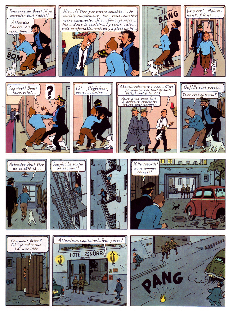
One of his most sophisticated works, The Calculus Affair (1954-56), articulates this tension beautifully. Page 50 is as fine example as any: the story is a fairly straightforward cold war cloak and dagger yarn, with the present sequence concerning Tintin, Haddock and Snowy’s escape from a police-guarded hotel in the Eastern Bloc country of Borduria.
The storytelling is characteristically clear and one might find sufficient an analysis of how the choice of viewpoint supports the action depicted, how the characters’ move from panel and how the space in which they move around is so clearly articulated, etc. But this would primarily be an analysis of how we read the sequence — what I’m interested in here is rather the vision it manifests.
As a comics maker, Hergé was acutely aware that he was speaking through fragments. Much of his art is concerned with this issue and the present book is among his most disciplined and intelligent treatments of this basic condition of comics. Framing clearly is the unsettling factor in his vision.
Most obviously, it occurs in his arrangement, both of the page — where the odd number of panels disrupts slightly its seemingly ordered construction — and in the composition of individual panels. He is an expert at this, keeping each panel interesting without cluttering it unduly: a cropped lamp and picture frame suggest a hotel room interior (panel 2), but also provide surface tension in an image of slight disorder. Tintin’s figure is disrupted by the outheld cap and line defining the wall paneling. Hergé’s is a controlled, subjectively ordering gaze.
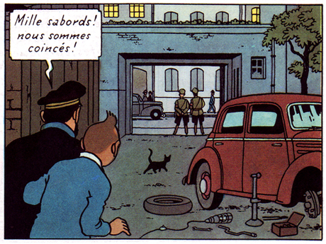
The sequence is about movement and liberation by means of a metaphor of illumination. Dividing the page almost evenly between light (interior) and dark (exterior), Hergé (and his team) poignantly extend this concern to the images themselves. Every image is occupied by frame-like constructs — doors, windows, carpeting, gates — through which the characters move, or aspire to move. Diagonals suggest depth, but also deliver avenues of blockage or passage, both for the characters and the reader’s eye as it crosses the rectangular grid of the page. A black cat discretely blocks the path out (panel 12), while an immobile car meet the characters. A disarray of tools are left at their disposal on the ground.
The cable from an unlit lamp — the sixth on their path through the page — snakes its way towards them, literally and metaphorically embodying their ambition, in that it provides Tintin with the idea of using its bulb as a distraction for the guards, to move them away from the twin, (finally) lit lamps that frame his and Haddock’s eventual route of escape. The page ends the way it started, with sound signaling an opening.
Hergé was fascinated by psychoanalysis and worked through these years with an Increasing awareness of the subconscious. In his comics, he attempts to articulate the knowable and the unknowable with equal clarity in a rich world of signs, of meaning. By presenting his subjective choices, he offers us an an avenue by which to make sense of things.
For more thoughts on Hergé by yours truly and cartoonist Thomas Thorhauge, go here.
Update by Noah: I’ve added the Dyspeptic Ouroboros label to make this part of our ongoing series on meta-criticism.
“And while it is one of the rare comics that has been enshrined in high culture, at least in French-speaking countries…”
Not to distract too much from the main thrust of your essay (which I like), but how is Tintin enshrined in high culture in France?
The French and especially the Belgians are crazy about Tintin — he’s everywhere there and Hergé’s work and career have been the object of major exhibitions, a large swathe of scholarly work, an insanely detailed luxury edition of his complete works, and now an official major museum.
I really like this, and am still trying to figure out where I agree and disagree. I think that the idea of comics as a signature makes a kind of sense…but I wonder how it is distinguished from style, and how different it really is in particular from visual art style. That is, you can recognize a picasso as a picasso the same way you recognize Peanuts as being by Schulz; how is the second a distinctive feature of comics?
Also, while Schulz/Peanuts works as a signatue (more or less) I think you’d have a lot more problem making the case with folks who work in genre (either Western or manga.) And what do you do with collaborations between writer and artist?
Your reading of the page is fantastic…but I don’t know that it ultimately overcomes my lackluster appreciation of Tintin. You certainly make clear (as it were) his genius for design…but there’s still a glib cleverness to it that I find tiresome (the black cat crossing the path is a case in point; very clever detail, but also too precious by half.)
The reading your doing in fact seems closer to discussions of film — in terms of how the shots and mise en scene are used thematically. To me, in those terms, I feel like many films integrate more interesting narratives with equal care in pacing/thematic visuals…..
So as it turns out (and to no one’s surprise) I disagree with most of it. It is a great essay though; makes me think you should write a book on Tintin. I think I’d enjoy it more than the comics!
Yes, but none of this really says “high culture” to me. Revered, yes, but I don’t know if we’ve reached the point where Herge, Proust and Braque can be mentioned in the same breath without some form of special pleading. Anyway, all this is beside the point and I would rather people focus on the main body of your essay.
The idea of “high culture” isn’t very French. You know the traditional Anglophone distinction between highbrow, middlebrow, and lowbrow? There’s no equivalent in French.
The French would place a potboiler writer such as Dumas on the same level as Proust.
Hergé, by the way, loved Shultz and Peanuts; I was also shocked — shocked! — to discover that he knew the work of R.Crumb, and liked it very much.
That’s an interesting point Alex. There’s certainly a tradition of the French appreciating and thereby elevating American pulp works — Poe and PK Dick are the two examples that leap to mind….
Hi Matthias, thanks for taking the time to restate/reframe this cluster of issues on their own terms; I think it’s really helpful and much more clear.
It seems to me that two kinds of “reading” are collapsed, perhaps inadvertently, here: traditional literary close readings that focus on storytelling and narrative, and semiotic close readings — the kind that most literature scholars would associate with the term “literary criticism” today — that focus on how concepts are conveyed (in both images and words, plus whatever else). Because “literary criticism” today includes both the traditional and the “semiotic”, when you talk about literary close readings in this way you end up capturing in the “literary” net any discussion of concept, as if ‘concept’ is a literary thing while ‘aesthetic’ is somehow more proper to analysis of visual objects/culture/art.
I’m not entirely sure whether you would say that semiotics is somehow more “literary” than it is visual. I can say with some degree of certitude that no competent semiotic reading would privilege one over the other — but your issue may be not with semiotics’ “literary” origins but with its roots in linguistics. However, it’s worth noting that the semiotics which has most informed contemporary theory is not straight Saussure, but the anthropological strain that goes from Levi-Strauss to Derrida.
When contemporary theory talks about “reading culture as a text” it includes visual culture not because there’s some hostile takeover by literary thought of visual culture but because there was in the ’60s and ’70s a seduction of literary thought by the multi-disciplinary and pan-artistic semiotic approach that already included visual culture as an object of study. When you take semiotic insights and brand them “literary,” you not only elide much of that history, but you ignore the work of visual semioticians and the extent to which many of the insights of semiotics were uncovered through analysis of visual objects, art, and culture.
I don’t mean that to say that you can’t advocate for an anti-semiotic approach, but I think this argument would really benefit from more recognition that contemporary semiotics is not literature. Because that’s missing, sometimes it seems to me that you object to the analysis of concept or cultural functioning or anything at all other than aesthetics, style and form…
So to try and get some clarity around that: would you say that existing criticism of comics is literary rather than semiotic, or that a more mature semiotic criticism of comics still would not be the right direction to capture the essence of this visual form?
Hello everyone, and thanks for commenting!
Noah, re: “handwriting”, it’s not a term I find particularly flexible when describing cartooning and share some of your doubts, though I do think there’s something to it. The difference from personal “style” in other kinds of visual art is its connection to the written word, calligraphy, etc. — i.e. this idea of cartooning as a form of picturewriting.
I may not have been clear, but I actually try to problematize it a little bit here by arguing that this perspective on what cartooning does, or is supposed to do, leaves out important elements of what’s going on in any visual artform, including cartooning.
As for the cat being precious, maybe, but it’s very discrete — I doubt most readers even notice it, much less give it second thought. And what’s amazing really, is that this kind of thing is going on in almost any page of Hergé’s mature period. I chose this page for analysis, because I thought it looked interesting, but hadn’t studied it in depth prior to doing so, and immediately all these connections sprung forth. It’s quite wonderful.
Which leads my to Caroline’s thoughtful questions: my own analysis of the page here clearly owes a debt to semiotics, so I can’t say I’m opposed to the approach, and I definitely believe we could do with more semiotically informed comics criticism — there isn’t much of it around!
I do think, however, that semiotics tend to perform less well with images than with text. This, I’m sure, has to do with its roots in linguistics — if you apply the logic of language to images, you may come up with interesting results, but at the same time you blinker yourself to a lot of what is going on beyond the rather rigid framework you’re operating within. And I think describing any object for analysis as a “text” is symptomatic of this issue, in that it invokes literary prejudice.
I think Groensteen’s “Systeme de la bande dessinée” is a good example — yes, he isolates some building blocks of what makes up a comic, but so what? Firstly, they are more or less arbitrary; secondly, the terms he uses for them are largely clunky and impenetrable; and thirdly, they are so abstracted from the experience of reading a comic that thinking about them ultimately alienates you from the form. It’s a kind of structuralism that I find most unenlightening.
But just to be clear: I don’t object to analysis of concept of cultural functioning in comics — or visual art more broadly — at all: what I’m trying to say here is separate from the discussion of theoretical approaches; it’s a more basic point that many of the people who have applied serious analysis of this sort to comics have naturally approached it with methods honed in different domains, and often literature (film is another one; thanks for mentioning it, Noah; I’m one of these people myself!), and that the particular nature of comics need to be considered more carefully if we want to understand them better.
” It is very easy to reduce the Tintin stories to fairly unremarkable genre romps leavened with wholesome humor and only occasionally packing a certain and never particularly sophisticated satirical bite, all the while being stirred by troubling — if significantly also troubled — ideology.”
Well, that’s what they are, isn’t it?
But I don’t want to discuss _Tintin_ at all (and I don’t think that the French and the Belgians enshrined it to the status of high-culture; I could be wrong though: I don’t live in either country and there’s a dumbing down going on all over the place).
What I really want to do is to ask if you read Bruno Lecigne’s books? Not because of his book about the ligne claire, but because of his visual arts criticism approach.
Also: Chris Ware’s views of drawing as handwriting (you could also cite Töpffer’s ideas about “bad” drawing) are just one approach to drawing in comics. There are other approaches that are as legitimate and defensible as this one.
No, Domingos, that’s *not* what they are. That’s my point. But we’ve already had that discussion of course.
Regarding Tintin as high culture, it isn’t as consolidated as, say Proust or Braque (to take Suat’s examples), but for a comic, it’s pretty damn broadly considered great art in the French-speaking countries and taken very seriously at an institutional and academic level.
I haven’t read Lecigne, where should I start? I’m aware that there’s been a fair amount of good criticism written about especially Hergé in French. My own approach above is, for example, indebted to Pierre Fresnault-Deruelle’s structuralist approach. I’m not that into his methodology or style, but he has a great eye and his books on Tintin are essential reading.
And yes, I totally agree that the “cartooning as handwriting”-idea is not exclusive or more true than many others — as I wrote, it carries with it a number of problems.
Not that anybody cares, but I did say in an earlier thread that I didn’t like Herge’s design work. I think I should formally recant.
A fine write-up!
One thing that’s striking about that Hergé page are the repeated rhythms employed, the most apparent ones of which I’ve highlighted here:
http://img138.imageshack.us/img138/2981/tintinrhythm1.jpg
The panels which are obviously “out of rhythm” – the seventh and last – gain added emphasis by not fitting so smoothly in the narrative flow. Their compositions (the former, a straight profile view, the latter, a bird’s-eye view) serve to make them “not fit”…
Right, repetition is important to that page, and Hergé knows when to punctuate it with larger, contrapuntal panels, such as the 7th, or enunciative keys, such as the 12th.
Matthias: there’s this one: http://tinyurl.com/32umos7
And this one: http://tinyurl.com/3xlfptn
The one about the clear line is not cheap: http://tinyurl.com/2v69sgo (but that’s what happens when sacred cows are involved).
Lecigne was in his twenties when he wrote these books and, then, he stopped writing about comics (!).
Mike: if you want to see those kinds of rhythms check out Edgar Pierre Jacobs’ books. He was Herge’s teacher in that matter, and others, I suppose. It’s a shame that he spent his talent doing children’s comics. If you read French check out Renaud Chavanne’s great book: http://www.lexplosion.net/index.html
An interesting analysis — and a nice page from Tintin.
You argue that critical readers should learn to ask, or to ask in better ways, not only questions of narrative action, such as why Herge has Tintin do X rather than Y; but questions of visual design, such as why Herge places the black cat where he does in panel 12, or why he divides “the page almost evenly between light (interior) and dark (exterior).” And this seems fair.
What I’m less clear on, although drawn to, is your claim for a tension between the necessarily fragmented representation of scenes in comics and Herge’s “controlled, subjectively ordering gaze.”
I like how panels 5 and 6 of your example here repeat aspects of the example of fragmentation you provide in your conversation with Thomas Thorhauge. But in neither example does the pictorial incompleteness seem at odds with the general clarity and consistency, the graphic openness, of the representation.
Things would be different, I think, if what was obscured was information that the reader needed, or otherwise was made to want, to know. Or if the clarity of the composition where more markedly upset by the fragmentation.
I see the many partly depicted objects and bodies in the sequence. But I don’t see how the framing works to create a desire to see more than what is shown — or to otherwise make the reader experience the fragmentation as a source of tension.
Thanks, Domingos — I now remember having planned to read “Les Héritiers D’hergé”, but it never happened. I guess I should take a look now — which of them is essential, would you say?
And yeah, Jacobs is a fantastic designer and storyteller — the Blake and Mortimer comics are well worth seeking out. Plus he was an important creative partner for Hergé on one of the greatest Tintins, “The Seven Crystal Balls”, plus the redrawn “King Ottokar’s Scepter”.
Jonathan, those are great questions. I guess I would say that Hergé’s objective isn’t really openly to suggest fragmentation, it’s just there by default and he uses it to great effect by composing such perfect panels.
The subtexts I’m talking about are present at a deeper level — the creeping presence of the unknown in “The Seven Crystal Balls”, a book permeated by strange symbology, the quiet desperation of the quest in “Tintin in Tibet”, the unresolved presence of patriarchal and colonialist thinking and guilt that runs through several of the books and culminates in failure in the final completed story “Tintin and the Picaros”, etc.
I think these are very much present in the imagery, and the very fact that everything is ostensibly distanced and neutral, but in fact visualized by a highly subjective gaze that picks and chooses for us, creates a fascinating tension at the heart of the work.
It’s as if the ligne claire was created to ward off something, but actually shows it.
Matthias: I have a soft spot for _Avanies et mascarade_, but maybe that’s just me. Also, there’s Lecigne’s great fanzine (I hate the word) _Controverse_ (4 issues).
Pingback: The Daily Cross Hatch » Cross Hatch Dispatch 6.21.10
Thanks Domingos, I’ll seek it out.
Pingback: The Comics Podcast Network » Deconstructing Comics #286: Herge’s “The Adventures of Tintin”
Pingback: » #286 Herge’s “The Adventures of Tintin”Deconstructing Comics: A podcast about the craft of comics