Die, Little Girls! Die!

I plan to do a number of posts blogging my way through n Moto Hagio’s Drunken Dream, released recently by our kind hosts at Fantagraphics. I’m a fan of Hagio’s work…or of as much of it as I’ve seen. (See my review of AA’.) And I have great, great respect for translator and editor Matt Thorn, (who was kind enough to facilitate the inclusion of this piece in an online project I did some years back.)

So basically I was hoping to be wowed by this book. And I don’t think that that’s entirely impossible even still — I skimmed ahead to reread “Hanshin: Half-God,” the one story here that was reprinted in TCJ #269, and that’s still awfully, awfully good (and I’ll discuss it in order in the next post or so.)

However, the first four stories do not live up to expectations. Because they kind of suck. And not just “suck in comparison to what I was hoping for.” They’re out and out crap — presuming you drew little hearts and flowers on your crap and maybe put a little schoolgirl dress on it, and then nailed it to a tree and sang to it odes about the transcendent power of art as it oozed with limpid bonelessness down the trunk to finally crunch ineffably on the leaf-strewn forest-soul.

Anyway. We’ll take them in order. (There are lots of spoilers here, if that concerns you. In fact, I pretty much spoil everything. Fair warning.)

Bianca

This is framed as a conversation between some guy with an aggressively patterned suit and the great painter Clara Heimer. Aggressive suit guy asks Heimer who that little girl is in all her paintings and she says it’s her lovely inner-child/nature spirit and then she looks up meaningfully as an infinite number of self-help books fall from the sky and crush her and the guy dead, leaving only the empty and aggressive suit to dance wildly, desperately, transcendently upon their moldering corpses.

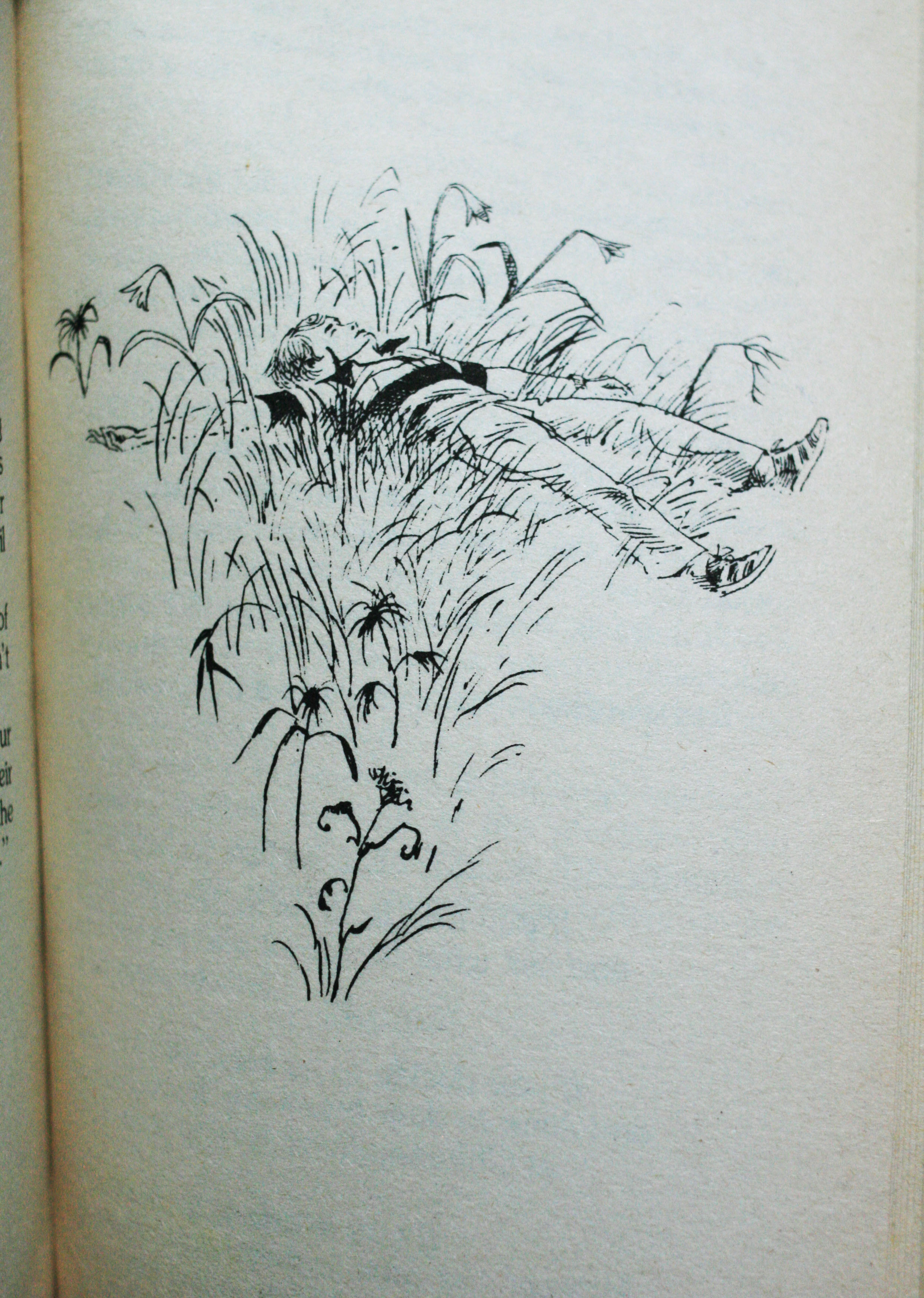
I wish. Actually she says the girl in the pictures is the titular Bianca, a young ten-year old cousin Heimer met for the first time when she was 12. Said cousin is a free spirit who cannot be contained, which translated means that she likes to run outside and dance in the forest “like some kind of dryad” as aggressive suit guy says. Clara doesn’t understand her free-souled cousin and makes fun of her dreams, causing said cousin to lash out and go dance in the forest some more. But, hark! Free-souled cousin also has a Dark Secret, which is that her parents are breaking up. The final news of their divorce sends free-soul (you guessed it) back out into the forest, where she is so distracted that she falls off a convenient cliff, taking herself mercifully out of the story. But she has, alas, inspired Clara forever. Or as Clara says, “I saw the wind. I saw a dancer. I saw the world of a girl who became one with the forest.” So Clara goes on to spend the rest of her life drawing trite dryad pictures about the wounded child inside all of us and how the trembling spirits need to be free and how you shouldn’t make fun of people’s dreams no matter how clichéd and irritating they are. Let’s…let’s save all the children. Save the babies…save the babies…

Here, look. Save this, damn it!

The light and trees criss-crossing; Bianca in the center with the airy thin lines of her dress — it’s impressively designed. But it also seems too perfect, with those trees at the side conveniently framing the imge, and Bianca herself stuck dead center. Her pose even makes her look like she’s a decoration on a cake. Hagio’s style is delicate and pretty; layered on this delicate and pretty narrative, it just makes the whole thing so precious it’s hard not to gag.

Girl on Porch with Puppy

The opening visual here, on the other hand, uses pretty to contrast with creepy — which only makes the whole thing more disturbing.

I wish those weird, semi-faceless ghosts hung around for the whole story. Unfortunately they don’t. Instead, as far as narratives go, this is basically more “Bianca”, except worse. Like the title says, a sweet little girl sits on the porch and communes with her sweet little lap dog. Various adults (doctor, mother, father, etc.) wander past and wonder what’s up with her and/or express disapproval because she likes to sit outside in the rain. She muses self-consciously about vapidly trite saccharine hallmark card drivel and about how much more wonderful she is than boring old adults (“I don’t know what the doctor’s thinking either. But I don’t think it’s about the sky or windows or flower buds or the fairies behind the leaves”).

So the boring old adults get together and decide “we can’t have one person thinking differently from everyone else like that.” Then they point at her and she explodes. Admittedly, it would have been better if they did that on the first page rather than the twelfth. But beggars can’t be choosers: it’s an unexpected but welcome happy ending as far as I’m concerned.

Autumn Journey

A young boy named Johann sets off to meet his favorite author, Meister Klein. He ends up hanging out with Klein’s daughter, and there’s some romantic tension, until…she discovers Johann is Klein’s son, from a family Klein abandoned. Johann isn’t mad at Klein, though, because he read one of Klein’s books and realized that “He had lived so much longer than I, known so much sorrow, and yet he told his stoires with such warmth, such sincerity.” You can tell he’s sincere because…flowers!

In short, if you’re a great artist, you can’t be a complete asshole and moral failure — an insight flagrantly contradicted by everyone from Pablo Picasso to Ezra Pound to Kanye, but what the hell. Johann’s enormous eyes leave little room in the skull for grey matter, so I guess he can’t really be held responsible for lapses in logic. Anyway, at the end his father runs after him as he rides away on a train. That’s redemption, kiddies.

Perhaps it’s not fair, but I’ll admit this is kind of a pet peeve of mine. Maybe it’s because I have a number of friends whose fathers walked out on them; maybe it’s because I’m a dad myself. In any case, leaving your kid flat in order to go start a new life strikes me as one of the most contemptibly loathsome things a person can do, definitively worse than any number of minor felonies. The idea that all is well if you write good novels and shed a few tears a bunch of years down the road — that’s just not okay. I mean, is this guy going to start coming through with child support or what? I know, I know — Hagio doesn’t actually care about such mundane issues, or, for that matter, about the characters or the moral issues as long as she can have her final tear-stained moment of sentiment and reconciliation. And you know what? That’s not okay, either.

Marie, Ten Years Later

This is a classic love triangle; nerdy guy loves girl; hot guy loves girl; hot guy gets girl; girl dies mysteriously and conveniently; hot guy and nerdy guy get together and dance around the fact that they actually love each other and never really cared all that much about the dead girl; cue reminiscences about how happy they all were when they were young; fade out.

If this were by a guy, I’d definitely be pissed off by the way that the girl in question is reduced to a cipher for male (heterosexual and homosexual). But you know, since it’s by a woman — I’m still kind of pissed off actually. I guess maybe what saves it is the fact that the two guys are also utterly uninteresting, so even though we learn nothing about the girl except that the guys desire her, it doesn’t really feel like Hagio shortchanged her all that much. The insistent nostalgia by vapid characters for a vapid ill-defined past is irritating, but so empty it’s hard to get worked up about it. The first three stories really made me angry; this was just boring. So maybe that means this was my favorite of the four?
__________________

I’d like to think these were all juvenelia, but that doesn’t seem to be the case. The first three were from 1977 and the last from 1985 — Hagio wrote them in her late 20s and early 30s, by which time she was already an established and lauded mangaka. I’m forced, therefore, to conclude that Hagio is capable of producing dreck, at least some of the time. [Update: JR Brown in comments points out that the stories were actually printed earlier, before Hagio was established.]

Still, the kind and heft of the dreck are interesting. Sometimes you can get more insight into an artist from her failures than from her successes. Reading these stories it became clearer to me than it had before how much of Hagio’s work (or at least what I’ve read) seems to be about not just repression, but displacement. She’s obviously obsessed with themes of child brutalization and abandonment, the pressures of social conformity, and illicit love. But she explores these ideas through deliberate misdirection and metaphor, cutting the core of the stories loose from the material that inspired them so that the emotions suffuse the material, breaking through at unexpected moments or in odd ways.

For instance, in that first story, “Bianca,” the tragic dryad cousin who dies when her parents are breaking up — it seems likely that the break up problem stands in other problems, specifically physical abuse (which is much more likely than divorce to lead to a child’s death.) And, as I suggested above, Bianca is clearly meant to be the artist’s own traumatized childhood; a childhood linked, through the artist’s powerful feelings for Bianca, to repressed same-sex emotions. And love the can’t quite speak its name surfaces as a trope in virtually all the stories; the girl in the second is reprimanded for kissing her dog; in the third Johann is linked, teasingly but still, to a girl who is his foster sister; in the last, as I said, there are intimations of homoeroticism between men.

The point, for Hagio, then, are the buried meanings and how they resonate. This worked well in AA’, where the vague sci-fi setting turned everything into a metaphor; the world didn’t need to hold together since the world wasn’t real in any case. In contrast, the stories here are all too specfic; she doesn’t seem to have room to move around in them. “Bianca” and “Girl on Porch With Puppy” make their metaphors too straightforward, trilling “Flower Power!” over and over in piercingly crystalline tones. “Autumn Journey” and “Marie”, on the other hand, exist too firmly in the real world — they demand some sort of actual psychological insight on the level of character, while all Hagio wants to do is get to the darned emotional catharsis. Hagio is an artist who thrives on spaces and emptiness — she goes astray when, as in these stories, she tries to say what she means.

The Forked Path- Childhood, Death and the Choose Your Own Adventure

Conception/ Sugarcane Island/The Cave of Time


“What is time?” you ask.

The oracle is silent for a moment, but then answers in a firm voice, “Time is what keeps everything from happening at once.”

“When did time start?” you ask.  “And when will it end?”

“Would you like to see?”

You gulp in amazement.  “Sure.”

“What then- the beginning, or the end?”

– Edward Packard, Return to the Cave of Time,  1985


He’s told the story many times over the past forty years, and so the words come quickly and easily, spilling out over the gulf between the two of us.  In this story it is 1969 and he is the father, and the children are his children, eager for a gripping bedtime narrative. And all Edward Packard has is Pete, washed ashore on a deserted island. And so the father asks the children, “What do you think Pete should do?”

With the power of hindsight we can find some precedents to the Choose Your Own Adventure, forked-path fiction format. But when the concept first hit Edward Packard, it was like a bolt of lightning.

It would have a similar effect on his audience.

But his ultimate audience was not as immediately accessible as his biological children. Packard wrote the manuscript for his first book in the format, Sugarcane Island, in 1969 and 1970, and had an agent shop it around for years. “They all turned it down- they didn’t see the potential.” So he shelved the book, the whole concept. Several years later Packard saw an article about a start-up publisher named Vermont Crossroads Press, co-owned by one Ray (R.A.) Montgomery. Encouraged by the article, Packard contacted Montgomery and ultimately struck a deal with him, and in 1976 Sugarcane Island finally saw print, as the first in what was intended as a series of books entitled “The Adventures of You.” Montgomery followed up Packard’s book with a manuscript of his own, “Journey Under the Sea.”

Deadwood City, Lippincott edition

Barbara Carter illustration from the Lippincott edition of “Deadwood City”

Packard, frustrated with the lack of marketing muscle behind the releases, shopped around his concept and some new manuscripts and was eventually able to secure himself a deal with the J.B. Lippincott company. But unbeknownst to Packard, Montgomery and his newly acquired agent were working on a deal of their own with a much bigger company- Bantam Books. “Bantam decided that half of the books would be written or subcontracted through me and half of the books through Ray Montgomery,” Packard told me in a phone interview, almost thirty years after the deal finally went down. “Ray and his agent were really the ones who set it up. I was brought in because I’d started the whole thing.”

Youth/You are a Shark/Secret of the Ninja

cover image- You are a Shark- Written by Edward Packard, and illustrated by Ron Wing

There are no stars or suns or moons or wisps of light; not a breath of air; no sound; no smell or taste; no up or down or sideways; no motion; no feeling; nothing but silence.  Suddenly there’s a point of light so brilliant, it feels like pins driven into your eyeballs!  Even before you can blink, the light expands into a million lightning bolts radiating in all directions. Your eyes shut, but the light is still painfully bright. As you move your hands to cover your eyes you scream- but no sound comes.

– Edward Packard, Return to the Cave of Time,  1985

In the summer of 1988 my family moved across Orlando to a new home in a new neighborhood. When I entered third grade a few months later, it was with more than a little anxiety- I didn’t have any friends, didn’t know the school or the neighborhood at all. But I soon found compatriots, including a sandy-haired boy named Chris M., who would end up being my best friend for the rest of elementary school. And Chris had an inheritance.

stack of Choose Your Own Adventure books

The books were a gift to him from his older sister’s boyfriend- a box full of Choose Your Own Adventures from a few years earlier. We poured over them, relishing the illustrations, the variety of settings and the sometimes lurid titles and subject matter. But what we loved most was the central, binding concept- the branching paths. The feeling it gave of inhabiting someone else’s skin, of living a new situation and being able to explore it in relative safety.

It was a kind of mania for us. The books were still coming out, and we bought as many as we could get our hands on. When we’d have sleepovers we’d pool our books together into one big collection, in chronological order of course, and talk about the missing books, what they might be like, and brag about how big our joint collection would eventually be when we were roommates in college together. Eventually we found that the earlier books were readily available on the cheap at garage sales and second hand stores of all types, and so our collections continued to grow.

huge stack of Choose Your Own Adventures

All this emphasis on collection might imply that we didn’t read them- we did- we even had strong opinions about the book’s authors. (Edward Packard’s books, we deemed, were the most “fair”, and internally consistent, and often the most fun as well. Although we often were drawn to the concepts and themes of R.A. Montgomery books, we were put off by the lack of narrative logic and internal consistency, and what we saw as didactic, judgmental and sometimes capricious results from each choice.)

So I loved the reading. But the aspects of collectability were what fueled the mania. Firstly, they were numbered, which meant that after having acquired a handful gaps started to appear. Secondly, the books by various authors were often indirectly related to each other, or sometimes even direct sequels. The small connections from book to book served to heighten my interest in obtaining the other books.

Chris and I were obsessed enough with the format that we produced several Choose Your Own Adventure-format books of our own over the next two school years, including such classics as Escape From School, Math Escapes, More Escape From School, Gut Squisher, Save the Big Dudes, and a revised version of Math Escapes, with added violent behavior.

Escape From School, a hand-made CYOA-style book
Escape from School, by Chris M and Sean Michael Robinson, age 8

Rereading the particular books that obsessed us as children, it’s not hard to see what fascinated us. For more than a decade Edward Packard was one of the most innovative writers working in children’s fiction. He found the perfect formula in his first book, and so he could spend the next several years breaking, manipulating and stretching it.

For Packard the formula wasn’t just the concept of branching path fiction– it was also the emphasis on you, the reader, the traditionally robust role of protagonist making way for the ego of the audience to fill in the gaps. This intention was often undercut by the Bantam illustration concept, which more often than not represented the protagonist as a ten-to-fifteen-year-old white boy. In rare instances this tendency was reversed , such as many of the female-protagonist (or even gender-unidentifiable) fantasy-themed books (Outlaws of Sherwood Forest, Mystery of the Secret Room, and the Enchanted Kingdom, all written by Ellen Kushner and beautifully illustrated by Judith Mitchell).

“Mystery of the Secret Room” written by Ellen Kushner and illustrated by Judith Mitchell

I disagree with Packard as to the importance of the empty vessel– I don’t really believe such a thing is possible, even without illustrations. If the author is doing her job creating an environment and situation for you to explore, a natural result will be a character, even if it’s a character created solely by inference. Additionally, even as a younger reader I was very aware of which “characters” I liked and identified with, and how this changed my interaction with the book. I remember as a young boy finding the stories in which “you” were represented as a female strangely compelling, and finding myself drawn to the images of the female protagonists, studying them, trying to read their intentions and motives.

The Enchanted Kingdom, written by Ellen Kirshner and illustrated by Judith Mitchell

In the very early books, Packard himself deviates from this empty vessel prescription, and this makes for some of the more varied books in the series. You can sense him playing with the formula.  In “Your Code Name is Jonah” you are a C.I.A agent, in “Who Killed Harlowe Thrombey?” a detective, two jobs not typically held by ten-year-olds.  Perhaps a result of the wider variety of protagonist roles, these early books seemed a lot more off-the-rails and experimental than many of the later ones.

Packard wrote a lot of books, and not all of them are classics. A great deal of them are simply his treatments of standard adventure fare (Deadwood City, Survival at Sea, Sugarcane Island). And then… there are the few books of his that defy categorization. How would you describe “You are a Shark” to someone that’s never read it? It’s at once almost idiotically simple and yet profound and strangely moving- you visit the ruins of a temple in Nepal and enter, despite knowing you shouldn’t. And you find an impossibly old man inside the temple, who stares straight ahead, gazing into space, as you feel a flash of panic, and slide helplessly to the floor.

You are a Shark- illustrated by Ron Wing
“You are a Shark” by Edward Packard, illustrated by Ron Wing

Though your body is alive your spirit has moved on to the body of another being. You move over and over again against your will, from animal to animal, while your body slowly perishes. For my third grade self, this was deeply moving stuff.

Adolescence/You are a Monster/ You are a Superstar

cover to CYOA book "You are a Monster"

Pain. That’s the worst part of it. You can hear your bones cracking as you grow. Your muscles are growing too. They ache as they stretch to keep up with your bones- especially your arm bones, which are lengthening and thickening the most. Your skin is expanding, trying to cover your widening body surface. Sometimes it’s stretched so thin, you’re afraid it’ll split, but it always seems to cover.

– Edward Packard, You are a Monster, 1988

In those fevered two years of Choose Your Own Adventure obsession, I had no way of knowing that the best creative years for the series were already past. With more than eighty books already out, the past itself seemed infinitely rich, and so if I saw the signs I didn’t understand them. Eight years in the series had settled into a comfortable formula- easily explicable concept, punchy title, early dump of the author’s research in the setup to the story, and a decreasing amount and variety of choices and endings. Packard told me, at least in his case, that this was largely “a trade-off,” but it “wasn’t deliberate. I tended to want to expand the plot more, to try to make it richer, and the more a particular storyline gets involved, the less you want to branch it off.” Page count staying the same, the functional result of this was fewer choices, fewer random deaths, and less of the metaphysical wackiness that defined the books in opposition to other adventure books of the time.

From an aesthetic standpoint, the books also finally made the transition to the eighties, with bright gradient backgrounds and hideous photo-realistic paintings on each cover. Although many of the excellent pen and ink interior illustrators managed to hang on for a while longer, they were gradually replaced by heavily-photo-referenced, toned pencil illustrations that completed the aesthetic transformation.

You are a Superstar illustration
a heavily referenced illustration by Stephen Marchesi for the book “You are a Superstar”

As for my interest in the books, and my friendship with Chris, both were long gone. Choose Your Own Adventure survived them both, in publication, if not in spirit.

Even as I moved through middle school I still found places to get my fix of interactive fiction. In sixth gradel I finally acquired a Nintendo, followed a year or two later by an SNES, and I discovered in short order a whole new realm of interactive fiction, namely the Japanese console-based role playing game.  I would have become disinterested in the books eventually anyway, as they were aimed at fourth to sixth graders- but having a viable substitute certainly helped accelerate the process.  Strange rumblings were happening at school too, every time we visited the computer lab.  The school had replaced their Apple IIGS lab with an entire room of Macs, all of which came preloaded with a piece of software called Hypercard that felt strangely familiar to many of the students who used it.  We were encouraged to build our own stories- draw a picture, have some text, and have some picture or text element that could be clicked through to advance the story.  And from there the cards could branch out into many different directions.

From “The Manhole,” a Hypercard adventure game from 1989
from “Electronic Whole Earth Catalog,” an educational Hypercard stack from 1989

I didn’t need to make the direct connection myself- our teacher pointed it out to us the first day we used it.  “We’re going to make stories, like Choose Your Own Adventures.  You guys can draw and write your own stories, and we’ll make logic trees, little maps, to keep track of the whole thing and make sure you don’t leave any loose ends.” (although Hypercard itself has been long forgotten, many more people seem to remember Myst, once the biggest-selling PC game of all time.  Myst was a series of Hypercard stacks.)


The most successful Hypercard stack of all. Myst, Robyn and Rand Miller, 1993

It took me several months of computer lab time, but by the end of sixth grade, my one and only Hypercard creation, “Revenge of Abraham Lincoln” was complete.

Another year later and I had my first experience with the Internet.  Another year after that and the web was on the horizon.  Edward Packard, Apple and a vengeful clone of Abraham Lincoln had successfully prepared me to embrace the hypertext environment.

Adulthood/”The Worst Day of Your Life”/”You Are a Millionaire”

You are a decider,” she says. “Because you are from a primitive culture you do not understand that constant pleasure is superior to freedom of choice- though that should be obvious to anyone.”

– Edward Packard, Return to the Cave of Time, 1986

In 1998 Chris and I both graduated high school, the same year that Bantam ceased ordering new books from Packard and Montgomery, effectively ending the CYOA series. Was it part of the natural cycle of the market, or had the need for interactive fiction been satisfied by increasingly complex story-based console role playing games? Or had CYOA been done in by some factor much more mundane, like the continual paper price hikes of the mid to late nineties? I never saw the books at the time, but I’ve read some of the nineties books recently, and there is a feeling of desperation in the air- too many concepts that seem to be chasing trends or rehashing past successes, and a drastic (and aesthetically disastrous) mid-series visual makeover.

Before our graduation Chris and I had a brief reunion, worked on a comic together in our Physics class, and even kicked around the idea of writing some more interactive fiction. Sadly for us, we never got farther than a list of rather promising titles, before we were waylaid by life, girls, and more bitterness towards each other. (for the curious, the prospective titles were- “You are Homeless,” “More Math Escapes” and “You are a Teenage Girl.”)

1990s Choose Your Own Adventures
Photoshop, format changes and robotic martial artists- it was the end of the road for CYOA

Edward Packard and his former business partner R.A. Montgomery had a falling out of their own, one that has indirectly led to the odd state of the Choose Your Own trademark today. Currently the CYOA trademark is owned by Chooseco, which is in turn owned by one R.A. Montgomery, prolific writer of mediocre children’s fiction. The consequence of this is that the brand itself no longer features any work by the originator of the concept the brand is based on- no Edward Packard books will ever again be issued under the CYOA moniker.

And yet- we live in the future, and in the future nothing is dead forever. And so the trademark-less Edward Packard has teamed up with Simon and Schuster to re-imagine some of his CYOA books as iphone apps, under the new mark U-Ventures. And so time marches on.

As for the books themselves, it’s still possible to pick them up at rummage sales, book stores and ebay for pennies on the dollar, and the first sixty or so in the series, in addition to being the best, also happen to be the easiest to find. If you’ve never read a CYOA and would like to do so, or if, like me, you were obsessed as a child and now find yourself curious again, may I be so bold as to recommend a few titles for you?

  • Cave of Time (1)- Edward Packard- Not an excellent book, but very interesting to see how expansive the concept was from the very beginning. Long before a certain hot tub made time travel much more convenient, you wander through a cave in which every corridor leads to a different era.
  • Your Code Name is Jonah (6)- Edward Packard- I seem to have a soft spot for Cold War political thrillers involving secret messages embedded in whale song.
  • Hyperspace (21)- Edward Packard- Off-the-wall metaphysical gamesmanship meets buckets of pseudoscience, and what emerges is delightful, eccentric gobbledygook.
  • Supercomputer (39)- Edward Packard- Has the distinction of being one of the goofiest books about technology written in the eighties, in an era not exactly known for its skepticism about technology. Fascinating, fun tangents into world politics and theories of wealth and happiness.
  • You are a Shark (45)- Edward Packard- Reincarnation and bloodletting in an ancient temple in Napal. See above.
  • Outlaws of Sherwood Forest (47)- Ellen Kushner. Guess what it’s about? More beautiful illustrations by Judith Mitchell.
  • Return to the Cave of Time (50)- Edward Packard- A mess of adventure, theory and possibility.
  • Magic of the Unicorn (51)- Deborah Lerme Goodman- Fun fantasy with nice illustrations by Ron Wing
  • Enchanted Kingdom (56)- Ellen Kushner- Fun funny faerie adventures with sometimes brutal endings. Beautiful illustrations by Judith Mitchell.
  • Mystery of the Secret Room (63)- Ellen Kushner. Two boxes and a mess of trouble. More beautiful illustrations by Judith Mitchell.
  • The Worst Day of Your Life (100)- Edward Packard- An extreme, and extremely raucous, adventure book that also happens to be a meditation on the nature of disaster. A fine return to form for Packard.

The End

The End


The End

The End

The End

The End

The End

The End

The End

The End

The End

The End

The End

The End

The End

The End

The End

“There’s not one perfect path. Usually there’s a whole spectrum of outcomes, of adventures. The idea is to try to mirror life in a way, all the possibilities of life. It isn’t either you get a pot of gold or you die. [There are] all kinds of things in between.”

-Edward Packard, interview, 2010

[special thanks to Edward Packard for his kindness and consideration.  illustrators at the end, from top to bottom- 1-3 by Paul Granger, a.k.a. Don Hedin; 4 by Ted Enik; 5 by Anthony Kramer; 6 by Judith Mitchell; 7 by Paul Granger, a.k.a. Don Hedin; 8 by Ron Wing; 9-10 by Judith Mitchell; 11-13 by Paul Granger a.k.a. Don Hedin; 14 by Ted Enik; 15 by Paul Granger a.k.a. Don Hedin; and lastly, 16 by Judith Mitchell.]

Strange Windows: Draw Buildings, Build Drawings (part 3)

In the two previous parts of this essay, we surveyed the intersection of comics and architecture in a one-sided way: showing how comics draw on architecture.

But what do comics have to offer architecture in return?

In conjunction with the Archi et BD exhibition reviewed in part 1, several architects were asked about their relationship to comics.

Francis Rambert and Jean-Marc Thevenet , curators of the exhibition

David Trottin, co-founder of the Peripheriques architectural collective:

“Many are the architects who have been marked by Gotham City and all those American cities you’d see in Strange [a French superhero reprint mag] and other comics. More recently, I’ve been attracted by the strips of Charles Burns or Daniel Clowes (…) I like this vision of the city, cleaving to reality while leaving the door open to the supernatural. These authors create a sideways banality (“un banal decalé”).

The city, anyway, is never so beautiful as when it is the medium of a story.

We architects are not supposed to tell stories.

And at the same time, our role is to imagine places for living. This debate about the ‘scripting’ of life in the architect’s work is extremely interesting.”

So it would seem that comics provide a source of inspiration, but also of reflection.

As Trottin indicates, narrative is inherent to architecture yet secretive, difficult to articulate; one can, however, follow possible architectural narratives in comics. Comics can serve as a sort of test lab for the liveability of a space. It is always a challenge, in an architectural drawing, to show how human beings will occupy and inhabit a space.

But if there’s one thing comics characters do well with architecture, it’s to inhabit it– and architects are very much aware of this.

Reza Azard, from the Projectiles studio that designed the Archi & BD exhibition:

“For architects, drawing is primordial, it even represents a great part of our work. Before construction, there’s the project that must be drawn and, in order to convince, the drawing must express life, emotions, things one finds in films and in comics, which are media that place man in his context. Many architects are inspired by films and comics.”

As a parodic, playful witness to this inspiration, this tribute to Winsor McCay’s Little Nemo by cartoonist Marc-Antoine Mathieu:

(Comics certainly are also useful for presenting the architects’ work: Trottin’s Peripheriques agency produced its 2003 catalogue in the form of a comic book. The same goes for the Danish agency BIG, which has sponsored a travelling exhibit of its work– ‘Yes is More’, a parody of Mies Van der Rohe’s dictum ‘Less is More’ — jointly with a comics-formatted catalogue; see the result here)

And architects also revel in the sheer invention and vitality of comics. Here’s the cover of a manifesto by the 1960s British architectural agency Archigram:

Yes, this draws on the Pop Art and Camp vibe of the times, but I prefer to think the Archigram crew was attracted by the brashness, the childishness, the sense of play of comics — of illicit creativity.

They certainly proposed fantastical projects that could, indeed, have come straight from the comics, such as their Walking City:

Norman Foster has done more than any other architect to bring to life some of the spirit, and even the fabric, of the optimistic, technologically underpinned world celebrated in the futuristic British strip Dan Dare by cartoonist Frank Hampson.

Foster is in no doubt that Dan Dare has been a genuine influence on his work. In 1983, he even commissioned John Batchelor, a former Eagle artist, to draw the new Renault Distribution Centre in Swindon as a pullout poster for the Architectural Review, which ran a feature on Foster’s approach under the headline: The Eagle has landed. (The Eagle was the comic magazine in which the strip ran.)

“I loved the coloured, cross-sectional, technical drawings that appeared in the middle of the Eagle after Dan Dare,” says Foster.

One Dan Dare episode features Big Ben housed in a Perspex sheath, shaped exactly like Foster’s famous Swiss Re building in the City of London, the so-called ‘gherkin’ (pictured above).

Laurie Chetwood, born in 1957, is one of Britain’s leading architects. His most recent proposal is a $300m space-age sanctuary for world leaders in the Nevada desert. It looks exactly like something Dan Dare would manoeuvre his rocket around.  Says Chetwood:

Architects don’t often seem to have had childhoods. Or at least, they pretend they can’t remember them, in case they appear to be less than earnest. My cousins handed me down their Eagle annuals, and I became a Dan Dare fan. I drew loads of space rockets and strange machines.

The draftsmanship skills required of a cartoonist and those required of an architect are similar– rigor, clarity, mastery of perspective and space, a controlled line, a good sense of measure and proportion.

(These skills, however, may seem less and less relevant to young architects in this age of computer-aided design; I once had a book entitled Perspective for Architects — incidentally the most useful book on drawing I have ever owned– in which the author scolds architects for their poor draftsmanship, comparing them unfavorably with illustrators and cartoonists.)

Many cartoonists have had training in architectural or technical drawing. Dave Gibbons, of Watchman fame, trained as an engineer ( he points out that not only could he draw a window, he could also build one), as did Jacques Martin, the author of the Alix series set in ancient Rome:

Jacques Martin, Alix

The late Marshall Rogers trained as an architectural draftsman, a fact readily apparent from his city backgrounds:

Marshall Rogers and Terry Austin, Detective Comics

Some cartoonists, however, go beyond depictions of buildings and get involved in building design and decoration.

The most basic way is the painting of exterior murals. And, indeed, the city of Brussels — one of the historic capitals of comics creativity — has commissioned 32 of them to adorn its streets with the works of popular cartoonists:

Le Chat, by Phil Geluck

Cory Moussaillon, by Bob De Moor

However charming these be, for the most part the murals don’t integrate well with the buildings — merely adding an illustrative layer on the facades– sometimes to add a gag:

Gaston Lagaffe, by Franquin

Here is a complete series of photos of this delightful urban phenomenon

But one in the series does seem to dialogue with its support:

… and this doesn’t come as a surprise, for the comics artist who designed it has thought much about architecture over his three-decade- plus career’s span: François Schuiten.

A typical architectural fantasia by Schuiten

And another one

His most renowned series in that vein is Les Cités Obscures, written by Benoit Peeters.

Francois Schuiten and Benoit Peeters

These stand-alone but thematically connected works deal in an often fantastic or metaphoric mode with humanity’s relationship with the city and with buildings.

In Les murailles de Samaris (the Great Walls of Samaris) a mysterious city seems to be in a perpetual state of flux, with shifting walls and morphing buildings:


From Les Murailles de Samaris

In La Fièvre d’Urbicande (Fever in Urbicand) two cities that have always been separate are joined by a strange grid that starts out as a desktop toy and grows slowly to immense size, overlaying the cities:

La Tour (The Tower) is Schuiten’s take on the Tower of Babel legend, with a nod to Borgès, featuring a Medieval-style tower of seemingly infinite height and depth.

All in all, there are nine Cités Obscures albums so far; several are available in English from NBM.

And another urban landscape…these are addictive

It comes as no surprise that an artist of his accomplishments should be solicited to realise those architectural “dressings” known as scenographies. And, indeed, Schuiten has done several; most spectacularly, a platform on the Paris Metro’s ‘Arts et Métiers’ subway station:

Schuiten’s preliminary sketch

The finished station

You step into a dream of “steampunk”, a Jules Verne setting made real, a way station in the Cités Obscures.

In walls of copper sheathing, portholes worthy of Captain Nemo’s Nautilus display models of marvellous inventions from the Arts et Métiers museum.

In the tunnel’s ceiling, we see the ominous edges of gigantic gearwheels…for what obscure purpose?

Schuiten has also designed scenographies for the Pavilion of the Grand Duchy of Luxemburg at the Seville World’s fair, and the Pavillon des Utopies (A Planet of Visions) at the Hanover World’s Fair.

World’s Fairs? How appropriate for a designer of architectural utopias.

Schuiten comments:

“The risk in drawing utopia, is that it isn’t incarnate, it distances itself from reality, that it is complacent in its own invention and detaches itself from the roughness of reality. So, when one works on worlds, one wishes to test them> my drift into scenography allowed me this, and in exchange has modified my draftsman’s gaze. This back-and-forth between the two forms of expression creates a new awareness of what drawing can bring and what reality cannot.”

What the heck, I can’t resist… Schuiten adapts Jules Verne’s ‘Paris au XXeme Siecle’

François’ brother and erstwhile collaborator, Luc Schuiten, has abandoned comics altogether and become an architect full-time.

His projects, though, show definite comics influences in their utopian designs:

Jean-Claude Mézières, the artist on the noted science-fiction series Valérian, was commissioned by the city of Lille, France — the European Capital of Culture for 2004 — to transform a boulevard into a spaceport landing strip: ‘ Le Chemin des Etoiles’ (The Way of the Stars):

The Dutch illustrator and cartoonist Joost Swarte is also known for the strong architectural presence in his drawings; he is yet another artist with training in industrial design:

Joost Swarte


Swarte has collaborated with architects to actually design and realise buildings.

His first major project was the Toneelschuur Theater in Haarlem, in partnership with the Mecanoo agency:

Swarte:

“Architecture projects are big puzzles to be solved… An architect friend pointed out that a wall is a pen-line on paper, while it has thickness in the real world. I’d forgotten that when I had started organising the different spaces in the theater. But walls make up about 15% of a building’s area! Comics also have this advantage over architecture that you can launch a project with zero budget…”

The Swarte/Mecanoo design for the Toneelschuur Theater in Haarlem

The director of the Hergé foundation, Nick Rodwell, then asked Swarte to design the Herge Museum in Louvain-la Neuve; with Thierry Groensteen — a man possessing great experience as a comics curator — and Philippe Godin, the foremost Herge scholar, as consultants, he came up with a design for the building that was completed by architect Christian de Portzamparc.

The Musée Hergé under construction

Front approach to the museum

The main hall


Footbridges link the four main exhibit rooms; Pontzamparc compares them to the gutters between panels


Note how the spaces reserve surprises and summon the spirit of exploration and adventure of a Tintin album:

Side view; note the colors, all carefully matched to those in the Tintin albums.


Swarte:

“It’s bizarre, but when I’m working on an architecture project, I think about the comic I could make of it. And on the other hand, when I’m doing a drawing, I start drawing facades, and imagine what I can put behind them. I can’t fight it! It’s natural.”

The Musée at dusk

Christian de Portzamparc:

“The Musee Hergé is perhaps the only example of a comic transformed into architecture. At least, it has materialised in three dimensions”.

Joost Swarte also designs for other media. Here he presents his tapestries at the Stadhuis (City Hall) of Haarlem

Hob-nobbing with architects is all very well, but why shouldn’t the guys who actually build the building inspire cartoonists? Why this snobbery towards the hard-hats? Cartoons may lead to construction, but can’t construction — with your own two hands — lead to cartoons?

The cartoonist Alan Weiss spent a summer on a construction site; it got him thinking about the lack of real proletarian heroes in mainstream American comics.

Thus was born Steelgrip Starkey, a genuine blue-collar fusion of Li’l Abner, Edison, and Doc Savage: a superhero who disdains violence for the kicks of building huge wicked cool projects the world over! Check out this quirky but good-natured series from Marvel Epic.

Yes, I know — the full title sounds like a porno movie. So sue me already.

***********************************************************************************

There is a final, compromised but creative way for cartoonists to “realise” their architectural ambitions, through a third artform: the cinema.

Directors and designers have not been slow to call on the creativity of comics artists. Ron Cobb designed the ship Nostromo’s interiors for Ridley Scott’s Alien; Mike Ploog designed for films such as Tomb Raider.

Two of France’s top science-fiction comics artists were the chief designers of director Luc Besson’s The Fifth Element, and that film’s futuristic New York: Jean ‘Moebius’ Giraud and Jean-Claude Mezieres. Here are a few of Mezieres’ preliminary sketches:

And here’s Meziere’s designs come to life:

Mèzière’s city comes to cinematic life in this clip.

Enki Bilal has gone further, directing as well as designing Immortel (Ad Vitam), an adaptation of his Nicopol series of albums:

A trailer for the film.

Another option for cartoonists who wish to concretise — if only virtually — their designs is video games. Such was the path chosen by Benoit Sokal, the creator of the anthropomorphic noir series Inspecteur Canardo.

Inspecteur Canardo, the police duck, in an introspective moment

Sokal was the designer behind the games Amerzone and Syberia.

From Amerzone

From Syberia

This concludes my essay on comics and architecture; as a valediction, this advice:

Architects, draw more; cartoonists, build more.

****************************************************************************

“Concludes”? I wish! this is too vast a subject.

Where, for example, have I mentioned Alan Moore’s and Eddie Campbell’s From Hell, in which architecture is used narratively in such an innovative way?

What of the Japanese comics masters?

In other words, I can’t exhaust this subject, and follow-up columns on it will appear from time to time; as ever, your suggestions are welcome.

********************************************************************************

This is part 3 of a 3-part series. Click here for part 2 and part 1

Time Capsule, Part 1

I turn thirty this month, which means I’m officially an old fart. And like all old farts, I enjoy reminiscing about the past when everything, especially comics, were better. It’s time for some good, ole’ fashioned nostalgia. And since nostalgia tends to be infantile, why not look back at the comics being published during my first days as an infant? For the next two weeks, I’ll be reviewing the mainstream comics of September 1980, starting with the output of DC Comics.

Batman #327
Writer: Len Wein
Pencils: Irv Novick
Inks: Frank McLaughlin

I don’t care for Irv Novick’s artwork. It’s genre hackery at its most tiresome: generally competent, but lacking any sense of location, character, or emotional intensity. Backgrounds are practically nonexistent, and not for any creative reasons that I can detect, but probably because Novick is lazy. To avoid drawing backgrounds, he brings the action close to the characters or fills the panels with talking heads. On the plus side, I’m amused that his depiction of Dr. Milo resembles an anorexic Moe Howard.

The shitty artwork is all the worse because it drags down a half-way decent story. Wein appreciates that Batman straddles the line between superheroes and pulp crime, and he liberally steals ideas from the latter genre. Rather than a straightforward hero vs. villain slugfest, the narrative is mostly a detective story with disguises, drugging, and identity confusion.

Unfortunately, the main story is only 18 pages long (to make room for a tedious Batman and Robin back-up), so Wein has to rush through the plot, spending just a few panels on each of the pulp crime tropes. The result is a story that practically begs to be a two-parter. On the other hand, that would require reading another issue drawn by Novick.

Action Comics #511
Writer: Cary Bates
Pencils: Curt Swan
Inks: Frank Chiaramonte

I’ll lay out my prejudices at the start: Superman is boring. He’s a boring character who stars in boring stories. Action Comics is probably not the worst comic being published in any given month, but I can’t remember when it was ever any good. And judging this comic solely as a superhero adventure, it largely confirms my bias. Lex Luthor goes good (I’m guessing it doesn’t last) and helps Superman in an unremarkable fight against two unremarkable villains. There’s also a section devoted to Clark Kent’s job as a TV anchorman, which is sadly no where near as entertaining as it could be. At the very least Curt Swan’s art  is attractive, but he can’t elevate tedious plot or characters.

But for all it’s faults, I was actually entertained while reading this comic, thanks to to the fact that it’s incredibly gay (more so than Superman usually is). The opening splash page features Lex Luthor relaxing in a room decorated entirely with pictures of Superman doing heroic things, like flying, punching, um … standing, and … I’m not quite sure what he’s doing on the right. Rolling up a newspaper? Maybe it’s supposed to be an iron rod (insert your own joke here).

Plus, it ends with manly hand-holding…

Bros 4 Life

And in-between, Superman and Lex fight a gay, space cowboy. I suppose unintentionally entertaining is better than nothing.

Wonder Woman #271
Writer: Gerry Conway
Pencils: Jose Delbo
Inks: Dave Hunt

Poor Steve Trevor. DC would kill him off, only to bring him back, and then kill him off again in a desperate bid to wring some drama from Wonder Woman. Apparently, issue 271 was a big deal, because Steve Trevor is brought back to life (again). Except it wasn’t the “real” Steve Trevor, but another Steve from a parallel Earth who crashed through a dimensional barrier.

I don’t give give a shit about the DC multiverse, but I approve of this plot point. If there’s any real benefit to having parallel Earths, it’s that they provide a quick and easy way to throw out the previous writer’s terrible ideas. And then the current writer is free to introduce his own terrible ideas, which comprise the rest of this issue.

Justice League of America #182
Writer: Dave Cockrum
Pencils: Dick Dillin
Inks: Frank McLaughlin

I really liked this, even though Dick Dillin’s artwork is uneven, and even though the the main plot was a rote conflict with Felix Faust that I already forgot. What stands out is the B-plot, starring DC’s premier asshole, Green Arrow. In the real world, nobody likes an asshole, but assholes are an essential ingredient for any great superhero team. Assholes get the best lines, assholes create drama, and, unlike the other good guys, the assholes possess something resembling a personality. And it’s always fun to see an asshole get his comeuppance.

The best part of this comic comes at the end. In an earlier issue, Green Arrow threw a temper tantrum and quit the Justice League. He spent most of this issue whining because he got stuck helping the other heroes save the world. After they defeat Faust, Superman offers Arrow a place on the League again, but, being an asshole, Arrow throws the offer back in his face. Then he reacts with outrage when he learns that Black Canary, his girlfriend/enabler, wants to have a life of her own in the League.

What an insufferable prick. I am entertained!

Jonah Hex #40
Writer: Michael Fleisher
Pencils and Inks: Dan Spiegle
Colors: Bob Le Rose

Even though superheroes dominated its line-up, DC never entirely abandoned the other genres. Jonah Hex was DC’s (ultimately unsuccessful) attempt to keep a Western in continuous publication. Why and how the Western genre declined across all media is a topic for another blog post. For the purposes of this post, I’ll note that Jonah Hex is a pretty good Western. Fleisher and Speigle don’t do anything groundbreaking, and they don’t have to. The tropes of the Western are simple, and they either appeal to the reader or they don’t: Indians, revolvers, saloons, and rugged individualists imposing order on a lawless environment. All Fleisher needed to do was take the tropes and construct a morality play where Hex acted tough and the villain was punished in a suitably ironic manner. Fleisher did just that, but he also added a comedic touch by treating Hex as a reckless idiot who managed survive mostly due to dumb luck.

I’m not familiar with Dan Spiegle, but his work on Jonah Hex is impressive, particularly the rich backgrounds and expressive faces. But much of the credit should also go the colorist, Bob Le Rose. Rather than the vibrant palette of the superhero genre, Le Rose used muted colors and earth tones that evoked an earthier, more “real” appearance for the Old West. And the colors add a darkness to the story, even during the daylight scenes, that echoes the darker, more brutal themes of the genre.

House of Mystery #284
Writers: J.M. DeMatteis (story 1), Carl Wessler (story 4)
Pencils and inks: Noly Zamora (story 1), Jess Jodloman (story 4)

That is a great cover.

House of Mystery was DC’s long-running horror/thriller/dark fantasy anthology. I’ve already talked at length about horror comics here, so I won’t belabor my earlier points. Suffice to say, comics are not an ideal medium for scary stories. Perhaps the best a cartoonist can hope for is to create a story that’s unnerving.

The lead story, “Ruby,” had some potential. DeMatteis crafted a decent plot about an evil little girl (20 years before the Japanese cornered the market on stories about evil little girls). Noly Zamora provided dark, atmospheric artwork. But at only seven pages, the story has no room to develop. Racing from one plot point to the next, what should be creepy descends into camp. And DeMatteis’ corny narration doesn’t help matters:

It’s worth mentioning that Alan Moore’s narration in Swamp Thing was equally overripe, and yet he somehow avoided diminishing his own story.  But perhaps that’s an unfair comparison.

The rest of the issue consisted of similarly disappointing short stories. The last one, “Deadly Peril at 20,000,” is memorably solely due to its unabashed sexism (women are prone to violent hysteria, and the best way to deal with hysterical women is to kill them).

________________________________

Overall, September 1980 seemed like a lean month for a struggling DC. Marquee titles like Action Comics were stuck in perpetual auto-pilot, and the company’s non-superhero efforts were a mixed bag.  But in November DC would launch New Teen Titans, which grew into an X-Men-sized hit.

And speaking of X-Men, next week I’ll take a look at what Marvel was doing 30 years ago.


Review: It Was the War of the Trenches

When two specks in the distance start shooting at Ferdinand Bardamu on the first page of Céline’s Journey to the End of the Night, he quickly comes to the unshakable conclusion that it is all a big mistake. His only viable option is to get out of that situation as soon as possible. The colonel overseeing his fate, a man with no use for fear, is deemed a “monster” and “worse than a dog”, but absolutely typical of the army as a whole:

“…I realized that there must be plenty of brave men like him in our army, and just as many no doubt in the army facing us. How many, I wondered. One or two million, say several million in all? The thought turned my fear to panic. With such people this infernal lunacy could go on forever….Why would they stop? Never had the world seemed so implacably doomed.”

Bardamu’s attitude is one of absolute revulsion for his commanding officers. The report that his sergeant has been blown up while going to meet a bread wagon is an occasion for celebration (“that makes one less stinker in the regiment!…In that respect you can’t deny it, the war seemed to serve a purpose now and then!”). The countryside? Even on the best of days “dreary” and godforsaken, “if to all that you add a war, it’s completely unbearable.”

Continue reading

Gluey Tart: Scarlet

Hiro Madarame, 2010, BLU

Pretty! Pretty, pretty, pretty!

That is all.

No, of course it isn’t. You didn’t believe that, did you? Really.

There are a couple of multi-chapter stories in Scarlet, and they are – odd. I honestly don’t even know what I mean when I say a yaoi story is odd – I mean, they range from full-on crack to quasi-realistic depictions of human existence (leaning heavily toward the crack, of course). I suppose this one is an unexpected mixture of the two. Which makes it not only pretty but worth reading, as well.

The first story arc, for which the book is named, kind of messed with me. It’s about Akio, who is a nice guy, and Ryo, who is not. But it’s not simple. Ryo looks like a beautiful, aloof womanizer, but he is in fact a shy, lonely mess. Well, he is beautiful, and certainly a cheat. But mostly a lonely mess. He starts following Akio like a puppy after Akio makes the only offer of friendship Ryo receives after moving to a new school. They become lovers, by Ryo goes out with any girl who approaches him. He has epically poor judgment and impulse control. He is also largely unable to take responsibility for himself, and he’s a big crybaby as well. One is left kind of wondering why Akio, who seems like a pretty normal, together guy, keeps putting up with this shit. Except that one might possibly remember what it’s like to be young and desperately in love.

Anyway, Ryo makes love to Akio and then leaves him hanging because some girl asks him out. The pattern repeats itself over and over, and Akio is pretty much OK with it. He obviously loves Ryo, and he understands that Ryo is fucked up, and that’s how it is.

Things more or less work out, until Ryo hooks up with Tae, who is one cold bitch by anybody’s standards. And a truly disturbing plot twist ensues. It’s more than hinted at on the first page of the manga, but I’ll just say there’s a bizarre and distasteful bit of violence, and the resolution, while played as a mostly happy ending, is perhaps even more disturbing for that. Because they wind up together, and Akio is, as I said, a nice guy, and Ryo is an unstable freak.

This all sounds unpleasant, and it is. But what intrigues me is that Madarame manages to also convey the love and the tenderness in this relationship. This story contains some really moving romantic bits. Some of the panels are breathtaking – beautiful lines, deftly physical poses, and very hot sex. Her kinetic style (did I really just write that? “Her kinetic style”? Good grief.) really conveys Ryo’s frantic clinging, and Akio’s helpless love for him. (There are also a lot of hyper-deformed panels – I mean, a lot a lot – which I’m not especially into, although I’d like it less if it didn’t fit so well with all the frenetic pushing and pulling throughout the story.)

The second story, “One Night Stand,” is much less worrisome, while retaining the troubled intimacy I liked so much in “Scarlet” (the story). Nobody appears to be mentally ill, for example. I don’t rule that out the way I do, say, a young-looking boy with big eyes and short shorts, but if the character does actually seems psychotic, that is, well, grueling. So I was ready for a break. The second story is all about repressed passion. A nondescript young salaryman, Harumi, watches a not-nondescript hottie in the elevator every day, working himself up into a (very quiet-looking) fervor. When he sees said hottie, whose name is Toki, in a gay club one night, he’s built up enough steam that he can’t help going after him. Toki is there on a dare, and Harumi isn’t wearing his glasses, and as everyone who’s ever seen Superman knows, people are completely unrecognizable when they have their glasses on. So Harumi assumes he’s safe; he’ll live his fantasy for one night, or try to, and go back to stalking Toki in the elevator with no one the wiser.

Um, sure. Whatever. Toki is interested and goes to a love hotel with Harumi, and some really nicely imagined and beautifully rendered sex ensues. It is lovely, gentle, and hot.

The next day, Harumi is shocked – shocked – that Toki recognizes him. Toki stays on the elevator past his floor, waiting for everyone to get off, and then says, “Good morning, Harumi.” Such small details, but the body language conveys the swirl of emotion they’re both feeling. Harumi tells Toki he must have him confused with someone else, and Toki says, “So that’s how it is. Sorry.” No! The agony! The longing! Oh, it’s delicious. Harumi wrestles with his disappointment and his need and his shyness after that moment, but he can’t get up the courage to change things. Until he sees Toki at the bar again one night, when all the bottled-up emotions come out and he makes a scene. Tender declarations and hot sex ensue. Very satisfying. There’s a short third chapter, an epilogue told from Toki’s point of view, which is less heaving with terrified lust and more, er, straightforward. Which is obviously the wrong word. But it’s a refreshing ending to a very cute story.

There’s another short sequence at the end, about a hot player who’s slowly and gracelessly coming to terms with having fallen hard for a dork. This appeals to me for obvious reasons.

Scarlet is a beautiful book. The cover is beautiful, the color splash page is beautiful, and the art is beautiful. I really hadn’t expected to like it; this was one of my “I’m so smitten by the cover I’m going to buy it anyway, even though I’ll hate myself in the morning” purchases. Sometimes those lapses in judgment work out after all.

Utilitarian Review 9/18/10

Submit to the Hooded Utilitarian!

As regular readers have probably noticed, HU has been taking tentative steps away from group-blogness and towards kind-of-sort-of-magazineness. I don’t think we’ll ever abandon having a regular roster of bloggers, but I do hope to continue to get more guest writers.

Which is where you come in. I would love to hear from new writers. If you have an idea for an article, please contact me at noahberlatsky at gmail. The best way to get a sense of what sorts of things we write about is to look back through the archives…but if you don’t see the kind of thing you want to write about there, don’t let that discourage you. We probably just haven’t gotten to it yet!

Also, this seems like a good time to announce that we are planning to debut several new columnists over the next couple of months.

Sean Michael Robinson, a cartoonist and art teacher (who you may remember from this article) will start with a new monthly column next week.

Stephanie Folse (aka Telophase), a former columnist for Tokyopop (and author of this article) will also be joining us as a monthly columnist starting in October.

Artist and critic Derik Badman will also be joining us. Derik is going to be organizing a feature where we reprint academic articles or (if we’re lucky) excerpts from academic books that focus on comics. We hope to run this feature once a month, if we can find willing academics (if you are such an academic, and would like to see an article of your reprinted on HU, please contact Derik Badman: first name . last name AT gmail dot com (no spaces, all lower-case)).

In addition, Domingos Isabelinho, Derik Badman and possibly Alex Buchet are working on some translations of French comic criticism, which we should be publishing over the next few months.

And we’ve also got several interesting guest posts lined up, as well as some roundtables and, of course, our regular bloggers will keep doing our thing. Thank you all for reading and commenting!

On to your regularly scheduled Utilitarian Review….

On HU

We started off the week with a long post by Matthias Wivel about the great mangaka Yoshiharu Tsuge.

Ng Suat Tong followed up with a post focusing on Tsuge’s manga Red Flowers.

Richard Cook discussed his experience at SPX.

Alex Buchet continued his series on comics and architecture, including a gallery and a half of examples.

Vom Marlowe discussed an anatomy book from ImagineFX.

I wrote about Alex Toth, minimalism, and realism, inspired by a post by Matt Seneca.

And death, sludge, doom, and some mud in your weekly music download.

Utilitarians Everywhere

At Splice Today I got paid to write poetry! Only five haikus, but still. This is the best one:

Drat. I have no pants.
The days are cold; the nights, cold.
Here I sit. Help me.

At Madeloud I reviewed the new album by the electronica outfit Dead Fader.

At the Chicago Reader I recommended an exhibit of Chinese Buddhist cave art at the Smart Museum.

Other Links

Robot 6 talked to Dirk Deppey about what he read last week.

Melinda Beasi continued the discussion of gender and shojo manga.

I enjoyed Tom Spurgeon’s review of the latest complete Peanuts volume.

And I thought Nicole Ruddick’s review of A Drunken Dream at Comics Comics raised some interesting issues.