
Robert Binks is a Canadian illustrator and cartoonist with a fresh, wry and humane touch. His drawings and art pieces are still delightful thirty and even sixty years after their creation.
His illustrations for the Ogden Nash collection The Old Dog Barks Backwards (1972) can be seen in four posts gathered here. As a result of these posts, Mr. Binks got in touch with me and sent along more of his works, which I will be presenting over the next few weeks. I’ll note that everything Mr. Binks produced for himself is © Bob Binks. Works that he produced for the Canadian Broadcasting Corp. are © CBC/Bob Binks.
Mr. Binks wrote me the following:
I retired 20 years ago after a 35 year career as a graphic designer at the Canadian Broadcasting Corporation. During those years I also free-lanced for 2 Toronto newspapers doing editorial art and had an agent in New York where I illustrated several books including The Old Dog Barks Backwards.
A personal endeavor I have enjoyed all my life and continue to do, is making Xmas and birthday cards for my friends and relatives.
Since retirement I continue to be productive in art — fine art painting, small ironic wood constructions and clay creations.
We’ll be seeing samples of all the above during the next few weeks.
Born in 1926, Mr. Binks studied commercial art at a Toronto technical school, then fine art at the Ontario College of Art. In 1947 he became a display designer at Eaton’s, a department store giant that was a Canadian institution. Ten years later, at age 30 or 31, he joined the Canadian Broadcasting Corp, where he spent the rest of his professional life.
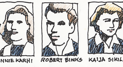
His work combines simplicity with unexpected detail and craft. These student caricatures from his days at Central Technical School provide an example:
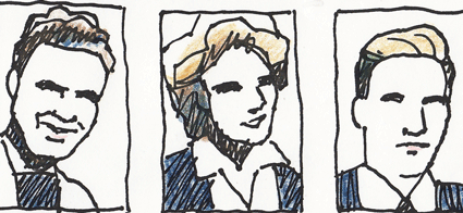
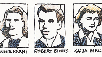
As you see, they’re from the same set as the self-caricature that opened the post.
Now a far less characteristic work, but an interesting one. Mr. Binks produced this beach scene at age 14, during his second-year illustration course at Central Tech. He was trying to be like the painter Paul Cadmus (1904-1999) and made a good job of it:
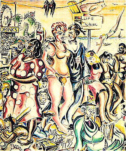
Most of Mr. Binks’s work is, to put it mildly, not much like that of Paul Cadmus, who was a bitter moralist and who specialized in elaborate, pyrotechnically designed canvases that are heavy with detail. The best Binks-Cadmus parallel I can come up with is that the two reverse each other. Mr. Binks produces clear, appealing works that show more detail than expected. Cadmus produced improbably dense works that communicate themselves with surprising clarity and speed.
At age 22, Mr. Binks painted columns in the women’s wear department at Eaton’s. A display from his time at the department store provides an example of his clear but subtly detailed work:
From the 1970s, we have some CBC work that shows a Binks trademark: the combination of simply outlined figures with involved but bold composition. From left foreground to right foreground, the artist turns a series of squiggles — dress pattern to hand-mike cord to snake to giant-mike cord — into a sort of meta-squiggle. It coils toward us where the reporter is standing with his hand-mike, then coils away, passing from snake to giant-mike cord:
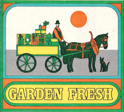
Below is an item done freelance for the recipe page of the Globe and Mail. Mr. Binks tends to amplify the effect of the texture in a given work by creating high, narrow rectangles jammed with detail. In this case the cart’s vegetable bins do the job:
Below we see the same trait, only more so. This picture makes texture its centerpiece; usually texture is more of an accent, from what I’ve seen.
Here we have a page from a mod dictionary that Mr. Binks illustrated. The pictures remind me of his work in the Odgen Nash collection. His strengths come together very nicely here. The illustrations have the simplicity cartoons need, but with a good deal of weight to the drawing:

Another favorite, this one from the cover of a Toronto paper’s weekend magazine supplement. I like the nimble but unobtrusive way Mr. Binks handles the three interlocking compositions of cityscape, the first group of authors, and the second group of authors:
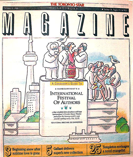
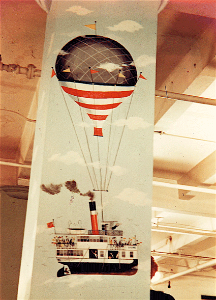
Again, the drawing still works as a cartoon. The composition is involved but clear, and it doesn’t produce a brushback effect, as when the reader’s jaw is supposed to drop a little and she/he to stand abashed at the sight of improbable ability. I find the drawing cuddly in a way, comforting. For example, take the tourist boat chugging along in the foreground.
To close, a Christmas card Mr. Binks designed for his own use. The paisley Santa and his colors grab me:
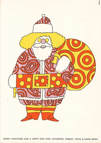
The card has pulled off a neat trick, which is to survive the pop art ’60s without having become dated. I love the way the raspberry, gold and tan patterns look trapped against the white.
Unfortunately I don’t know how to analyze the card’s use of color and patterns, beyond saying that Mr. Binks sometimes uses contrasting patterns to kick up a drawing’s effect, and that here he adds high-contrast colors and a white background. The result is a caricature that jumps out at you, a trippy Santa Claus whose trippiness doesn’t rely on the usual signifiers of psychedelia (beyond paisley, anyway).
Next week we’ll have some intensely involved line work and a sequence about a cow traveling by subway. Hope you can make it!
I love this.
Re the penultimate paragraph: I was just thinking about how I don’t know how to analyze the use of pattern in this excellent poster: http://martinklasch.blogspot.com/2011/04/radio-aria.html I’d especially like to be able to articulate why its different from yours — one screams ’50s and the other ’60s — but how to explain why in words?
It would be cool if someone with some art know-how helped us out.
I just have to comment again to say how much I love this. ‘Cause I really love this. Do we have to wait until next week for part 2?
Yeah; I think Tom needs some time to put them together, among other things. There’s going to be 4 of them altogether I think, though, so there’ll be a weekly fix for a while….
Lovely work. Reminiscent of Seymour Chwast.
…And Milton Glaser!
(Not to take anything away from Mr. Binks’ talent, wit and inventiveness; in the graphic design/illustration biz, being influenced by designers or looks which are currently “hot’ is taken for granted.)
Indeed, splendid work…
Re his The Old Dog Barks Backward illustrations:
———————
Tom Crippen says:
…I’ve seen one other Nash book, illustrated by Milton Glaser…
To tell the truth, I wouldn’t put the Glaser illos ahead of what Binks does here, despite the difference in the artists’ reputation and professional standing…
———————–
I’ve got that Nash/Glaser book (in a stack of tomes I meant to scan-and-post in the late TCJ message board), and yes, Binks acquits himself admirably.
Chwast and Glaser were both co-founders of Push Pin Studios, of course…