
Our look at Robert Binks and his work comes to a close, at least for now. My thanks to Noah for hosting us. I gather that a number of people have liked (or loved) what they saw here of Mr. Binks’s work. That makes me very happy, and it was splendid of Noah to provide the opportunity.
Later this year I plan to post images from the 20 or so other works that Mr. Binks has sent me. They include some wonderful items, so there’s more to look forward to.
The first three posts in the present series can be found here, and you can click here to see scans of the illustrations Mr. Binks did for the Ogden Nash collection The Old Dog Barks Backwards.
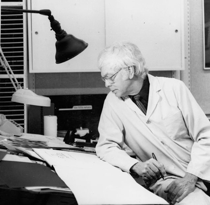
Above we see Mr. Binks in 1991, the year he retired as a staff illustrator at the Canadian Broadcasting Corp. The previous posts focused on his CBC work and his work as a freelancer. Today we’ll focus on his paintings and sculptures and the homemade greeting cards that he sends out to friends.
Mr. Binks wrote me:
I see very little difference between my private work and my professional work. I feel fortunate to have had the freedom to express myself in so many ways … I never want to work by a recipe and do things in the same style all the time — that would drive me bonkers. So, in my personal life as an artist, I will try anything.
Very true, so I’ll add just that all the works in this post are © Bob Binks.
First, the dickybird, a card Mr. Binks did during the mid-’90s. He writes: “the dickie bird quote takes me back to when I was a kid — having my photo taken.”
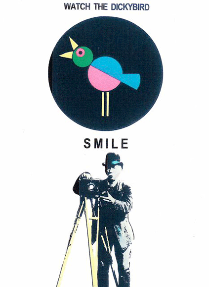
He says that using photos is nothing out of the ordinary for him. “If it helps the design I will use a photo to enhance the overall look.”
Now a charmer. The boy-and-turkey illustration was originally used for station breaks by the CBC, but Mr. Binks used it as a Christmas card in 2008.
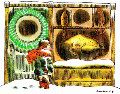
I find that picture so comforting because it’s solid without being heavy. There’s the firm, dense line work Mr. Binks likes to do, and the composition is blocked together thru big, simple shapes placed in rows and columns. But the drawing is lit up by a gentle and understated color scheme that still grabs the eye: the lineup of orange, green and yellow against the brown, and everything placed against white. And the patterns created by the big, simple shapes intersect so that the right-angled grid that makes the picture so secure is lightened by the circles and big oval tucked inside it.
Add in the scene proper, a boy walking home in midwinter, and you have an effect that’s peaceful and secure instead of oppressive. It’s also a bit forlorn, given that the poor fellow is out there by himself.
Next, a card made strictly for private consumption, in 2000:
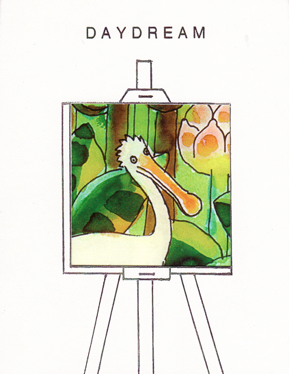
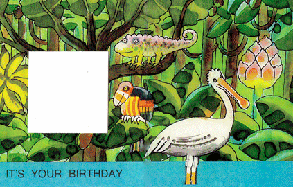
Where you see the white square, there should be a window hanging in the middle of the jungle. The card’s message, Mr. Binks says, is that “it is okay to do a little bit of daydreaming on your birthday.”
On making the card: “I used markers and luma water colors. By adding white to the cerise color I get a wonderful hot pink as in the jungle flower.”
And, from the late 1980s, a card like no other:
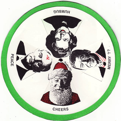
That’s Reagan, Thatcher and Gorbachev sharing space with Santa Claus.
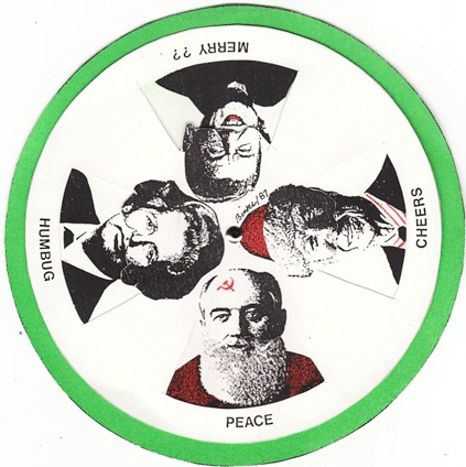
The card was actually a cardboard wheel, with heads, shoulders and written mottos changing place whenever the wheel was turned.
Below we have “Cowgratulations,” a card Mr. Binks created in 2009 by photographing a sculpture and painting, also his creations, that he keeps on display in his dining room.
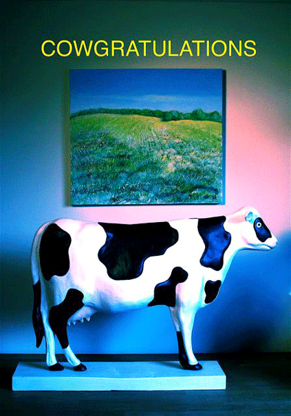
Cows pop up a good few times in Mr. Binks’s work. He writes me that the first was in “a black-and-white animation that I did for CBC around 1963 for a program called All About Toronto. The animation was about a cow that is threatened by the build up of the big city.” Two weeks ago we saw a CBC animation sequence Mr. Binks did in 1987 about a cow on the subway. Now we have “Cowgratulations.”
“They are a wonderful graphic symbol, taking you from the country to the city,” Mr. Binks says. He suggests that the cows may be his way of looking at rural life imperiled by industrialization.
More than that, he just gets a kick out of them. “I like them as a graphic object,” he writes. “I used eight cows to celebrate my 80th birthday party, each cow representing 10 years — why use flamingos when you can use cows? The party was on a farm in the country, my wife’s place of birth and childhood.”
Another addition to the cow lineup, from 2010.
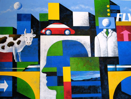
“This 30 by 40 inch painting started out as an abstract of colored squares and rectangles,” Mr. Binks says. “It wasn’t going anywhere so I started to think of a cityscape — an ultra-modern city. I then started to think of the details — is the city real? — do we like our toys — cars, trains, etc.? And of course I had to put a cow in somewhere to break up the hard edge of the city.” He worked with acrylic paints and used stencil brushes to create a graded effect.
We end up with a sculpture that, like the painting and statue in “Cowgratulations,” takes pride of place in Mr. Binks’s home. “I have this wood construction — 12 inches high and 9 inches wide and 5 inches deep — hanging in the living room,” he writes.
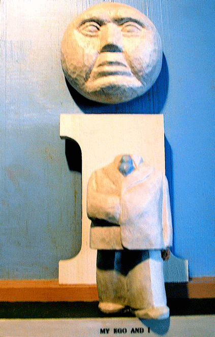
Very funny! The composition is deft, what with the strong double vertical set off against itself — that is, the “I” versus the man’s body — and punctuated by the space between body and head. The statue has the same simple but involved charm as Mr. Binks’s illustration work but thrown into three dimensions. The effect makes for a fantastic sight.
And on that note I’ll sign off. My thanks to Mr. Binks for sharing his work. It’s been a great pleasure for me, and I look forward to doing another round.
Thank you for this, Tom. It’s a sweet reminder that one of the great functions of art is to delight.
More Binks, please!
As Tom says, we’re going to take a hiatus, but after that Binks will return.
I look very much forward to it.
Canada can be so terrific for subsidising the arts…