Walt Disney’s Donald Duck “Lost in the Andes” by Carl Barks
The book with the title above is the first (the seventh, according to editor and publisher, Gary Groth) of a new Carl Barks Library published by Fantagraphics (the first CBL was published by Another Rainbow). There are a few differences between the two: CBL 1 was published in 30 handsomely made volumes encased in 10 slipcases – CBL 2 will probably also be 30 volumes, but with a more comic booky look (i. e. smaller); color wasn’t completely absent from CBL 1, but it was way above 90 % b & w – not so CBL 2 which will be in color. That last aspect occupied most of the pre-publication discussions about the project on the www. We all know how bad the coloring of the classics has been until recently, but new printing technologies solved said problem. The only obstacle to a good coloring in comics reprints these days is the absolute disrespect for both the material and the readers that most comics publishers always showed. Not so Fanta, right? Well… yes and no…
Only a fool could think that in a colored drawing the color isn’t part of the art. So, how come that we can continue to say that a drawing is by Carl Barks alone when it was colored by someone else? The fact is that we can’t and that’s all good and dandy if the colorist is the original one because those were the creators of said drawing even if we have no idea of what the latter’s name was. In this reprint we do, don’t we?: Rich Tommaso. So, what we’re buying isn’t really “Lost in the Andes” by Carl Barks… what we’re buying is “Lost in the Andes” by Carl Barks and Rich Tommaso.
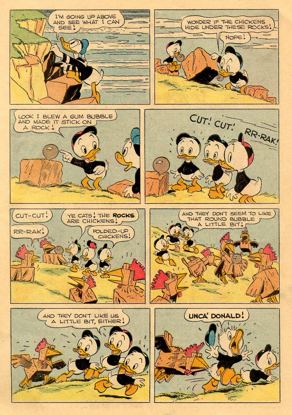
“Lost in the Andes!” by Carl Barks and an anonymous colorist working at the Western Publishing Production Shop (I can’t believe that no one was curious enough to investigate who these colorists were): Four Color # 223, April 1949.
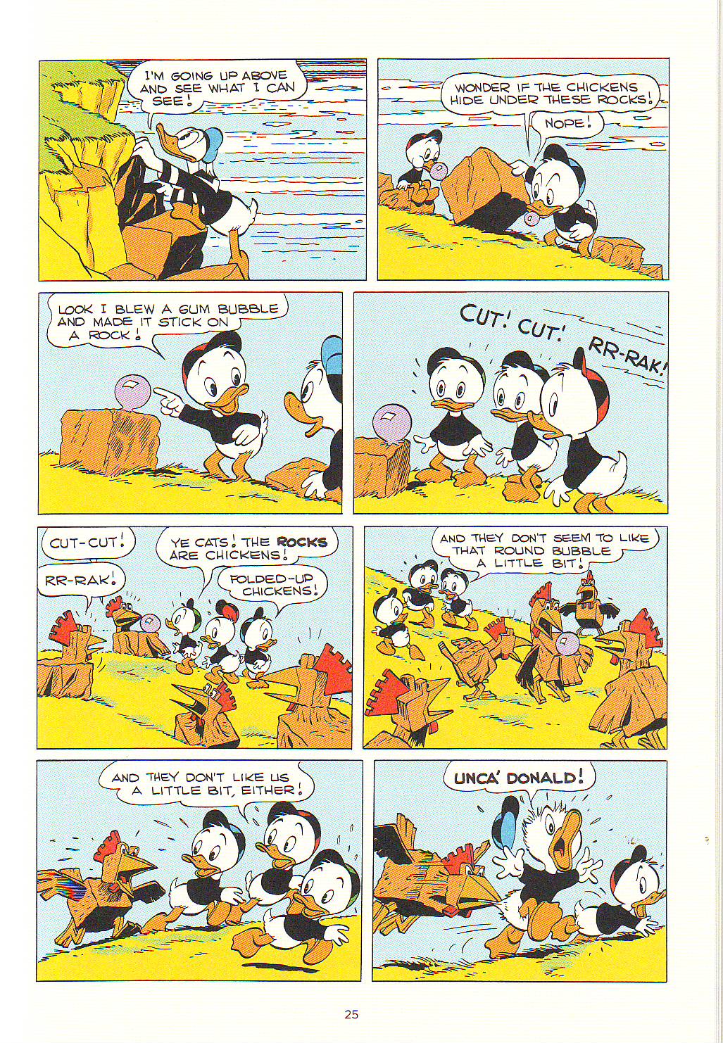
The Same page by Carl Barks and Rich Tommaso, Walt Disney’s Donald Duck “Lost in the Andes,” 2011.
When there’s no contour line the colors are really the drawing and there’re differences between the original and the recolored page. This can be seen above, but it’s more clear in “Truant Officer Donald” (Walt Disney Comics and Stories # 100, January 1949). In said story’s reprint the shadows in the snow are completely different. Another problem is caused by the absence of the old Ben-Day Dots. Some may think that these were a nuisance, but the dots had a transparency sorely lacking in modern coloring: while the old shadows look like shadows, the new ones look painted on the ground and lack flexibility. Even if mostly true to the original (all the one-pagers were originally published in black and magenta but “Ornaments on the Way” – Four Color # 203 – and “Sleepy Sitters” – Four Color # 223) many of the colors are also too saturated in the reprint version (which is odd because Rich Tommaso said that he toned the colors down), but that’s a problem even in Fantagraphics’ excellent Prince Valiant reprints.
To be blunt: if kitsch is something pretending to be something else this edition is definitely kitsch, but you know what Abraham Moles said: kitsch is the art of hapiness…
All these problems were avoided in the Popeye series. Why did Fantagraphics proceed differently in their CBL project? Beats me, but I can guess: Fanta wants to have its cake and eat it too. They want to produce a collection both for the serious collector and for children. Well, this serious collector is perfectly happy with CBL 1, thank you!…
Another hint suggesting that I’m right is the time period in Carl Barks’ career selected to start this new CBL. Any collector would expect a reprint in chronological order, but no such luck. What we have is a potpourri of longer stories, ten-pagers and one-page gags from December 1948 to August 1949. In this Gary Groth did agree with Barks himself who considered this to be his most and best creative period. Besides he also said that “Lost in the Andes” was his favorite Donald Duck story. I beg to differ: I prefer later, darker, more satirical, Barks, but that’s irrelevant, really, because I would start a CBL where most things usually start: at the beginning. Yet another Barksian coincidence re. the commercial part of the enterprise is the quantity of Christmas stories included in a book that was published just before… Christmas. If you can’t see the irony of this in a Carl Barks book I gather that you don’t know much about his work…
None of this matters much though. The above mentioned potpourri isn’t that bad (I would repeat what was done in CBL 1, but that’s just me) and collectors can always put this tome on the shelf in the seventh place.
To favor interested adult readers and smart inquisitive kids each story has a presentation by a comics critic. The critics are very good. Their texts are interpretations of the stories; convey information (I was pleased to learn about American life during the forties reading Jared Gardner’s comments), and give us close formalist readings that are brilliant: Donald Ault is particularly good at this (his intro is also great if slightly hagiographic; his analysis of “The Crazy Quiz Show” – originaly published in Walt Disney’s Comics and Stories # 99, December 1948 – is an instant classic of comics criticism).
Don’t get me wrong , I love Barks. He’s one of four or five genre mass media artists that I admire… but… is there really a need to whitewash him? Because that’s what we see in the above mentioned comments. This book has its share of racist imagery and the critics don’t hide the fact. The problem is that they make up excuses. Jared Gardner does it commenting “Voodoo Hoodoo” (Four Color # 238, August 1949). To quote him:
[…] our “villain,” Old Foola Zoola [fool Zulu?] is drawn with all the maniacal monstrosity of similarly racist representations of African witch doctors that remained largely unchanged from nineteenth-century cartoons in Puck and Life through Abbott and Costello’s Africa Screams (1949). And yet Foola Zoola’s outrage for the wrongs done to him and his people by Scrooge and his hired thugs is presented as entirely justified.
That’s just the problem: it isn’t presented as justified at all. If it did he wouldn’t be a fool and he wouldn’t be a racist caricature, would he? Also, why are there quotation marks on the word “villain”? That’s what Foola Zoola is, period.
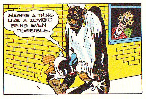
As can be seen below (panel from “Voodoo Hoodoo” in CBL 2; is that a Barks cameo at the window?) Bombie the Zombie was inspired by the above illo drawn by Lee Conrey (American Weekly, May 3, 1942; as published in CBL 1).
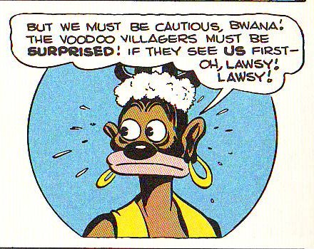
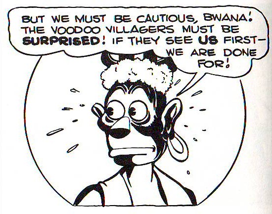
Whitewashing, as it were, in another “Voodoo Hoodoo” panel (in CBL 1, this time). Not much of an improvement if you ask me (November 1986). Above: the same panel as published in Fantagraphics’ CBL 2.
Uncle Scrooge may be presented as an impossibly rich miser, but he’s never a villain. Carl Barks (in an interview with Michael Barrier, 1974):
I never thought of Scrooge as I would think of some of the millionaires we have around who have made their money by exploiting other people to a certain extent. I purposely tried to make it look as if Uncle Scrooge made most of his money back in the days before the world got so crowded, back in the days when you could go out in the hills and find the gold.
If Uncle Scrooge is or isn’t a thief is just a matter of perspective. He would be if he exploited white people, but oh, no!, he could never exploit the noble savages because they have no use for their riches. Dorfman and Mattelart saw this perfectly well (in How to Read Donald Duck, Imperialist Ideology in the Disney Comic, 1975 [1971] – translation by David Kunzle):
There they are in their desert tents, their caves, their once flourishing cities, their lonely islands, their forbidden fortresses, and they can never leave them. Congealed in their past-historic, their needs defined in function of this past, these underdeveloped peoples are denied the right to build their own future. Their crowns, their raw materials, their soil, their energy, their jade elephants, their fruit, but above all, their gold, can never be turned to any use. For them the progress which comes from abroad in the form of multiplicity of technological artifacts, is a mere toy. It will never penetrate the crystallized defense of the noble savage, who is forbidden to become civilized. He will never be able to join the Club of the Producers, because he does not even understand that these objects have been produced. He sees them as magic elements, arising from the foreigner’s mind, from his word, his magic wand.
That’s what Francesco Stajano and Leonardo Gori refused to see when they mentioned the people abused by Gladstone (in “Race to the South Seas,” March of Comics # 41, 1949) while failing to mention the stereotyped natives mumbling “Ola eela booka mooka bocko mucka!” and worshipping Uncle Scrooge or Uncle Scrooge’s spats, of all things, or both… The above is also valid to describe the Plain Awfulians in “Lost in the Andes.” Said people is just one in a series of noble savages that Scrooge and Donald meet over the years. Barks had a bucolic sensibility: against superficial interpretations that present Uncle Scroge as an apology of Capitalism, he believed that the earth is the true value and gold is worthless (cf. for instance “The Twenty Four Carat Moon,” Uncle Scrooge # 24, December 1958). These inhabitants of utopia live in a primeval innocence: Donald Duck (at the end of “Lost in the Andes”):
[they get their warmth] […] from their hearts! They had so little of anything, yet they were the happiest people we have ever known!
Stefano Priarone says that “Lost in the Andes” is a satire of conformism. A leftist reading would say that it is a comment on the vulnerability of third world peoples to American mass culture. Both readings are possible and it is also possible that, following Donald’s speech above, there’s no satire at all. All interpretations are ideological, of course… One could expect a Marxist reading from David Kunzle, but here’s what he wrote (Art Journal Vol. 49, No. 2, Summer 1990):
How much real sympathy does Barks show for natives, the victims who through weakness and stupidity, or else innocence and simplicity, become willing accomplices to, indeed the very instruments of, their own dispossession? It is hard to say. The facts that our contempt for Scrooge, the great dispossessor, is mixed with admiration for his energy, that Huey, Dewey and Louie are cast as virtue incarnate, and that Donald himself is a victim (actually, a loser on the winning side) tend to neutralize our sympathy for the foreigner-victims. But their resistance, funny and futile as it so often is, lends them a measure of dignity – and reality.
The star of the show isn’t Uncle Scrooge, though. The star is undoubtedly Donald Duck. Even to Dorfman and Mattelart Donald is a sympathetic character (Carl Barks: interview with Edward Summer, 1975):
Instead of making just a quarrelsome little guy out of him, I made a sympathetic character. He was sometimes a villain, and he was often a real good guy and at all times he was just a blundering person like the average human being, and I think that is one of the reasons people like the duck.
Dorfman and Mattelart (in How to Read Donald Duck – translation by David Kunzle):
We Latin Americans tend to identify more readily with the imperfect Donald, at the mercy of fate or a superior authority, than with Mickey [Mouse], the boss in this world, and Disney’s undercover agent.
David Kunzle (also in How to Read Donald Duck):
Donald Duck […][is] an example of heroic failure, the guy whose constant efforts towards gold and glory are doomed to eternal defeat.
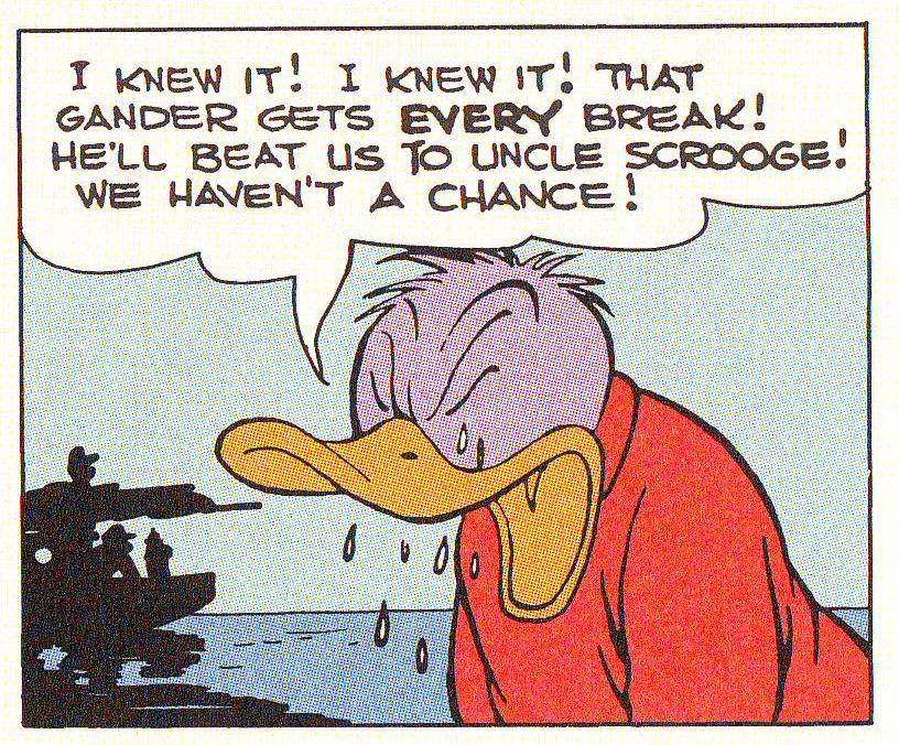
Donald Duck, the eternal loser, becomes purple with envy, in “Race to the South Seas” as published in Walt Disney’s Donald Duck “Lost in the Andes.”
Carl Barks was no ordinary genre creator. He followed some tropes of pulp, but he also had his own formula (Donald Ault cited by Thomas Andrae and Geoffrey Blum in the CBL 1):
Th[e] emphasis on cosmic irony led Barks to create a formula for his ten-page stories: a six-to eight-page buildup of our expectations against mounting probabilities, following by a two-to four-page reversal culminating in the fulfillment of our original expectations, but in a surprising and ironic manner.
[F]our narrative impulses […] inform Barks’ stories. In the order of their complexity, these are: 1) excessive coincidence; 2) conflicts escalating in a chain reaction; 3) events threatening to move beyond control of both the characters and the narrator; and 4) reflection on the narrative processes controlled by Barks himself.
The cosmic irony mentioned above is my favorite Barks’ trait: he was a master satirist. Carl Barks (in an interview with Donald Ault, Thomas Andrae and Stephen Gong, 1975):
I read some of my stories recently and thought, ‘How in the hell did I get away with that?’ I had some really raw cynicism in some of them.
I told it like it is. I told the kids that the bad guys have a little bit of good in them, and the good guys have a lot of bad in them, and that you just couldn’t depend on anything much, that nothing was going to always turn out roses. (Interview with Donald Ault, 1973.)
Readers can attest to that reading and viewing his masterfully paced, written, drawn and designed pages in Walt Disney’s Donald Duck “Lost in the Andes. All this in spite of this edition’s recoloring problems… if these are viewed as problems at all, that is… which I very much doubt…

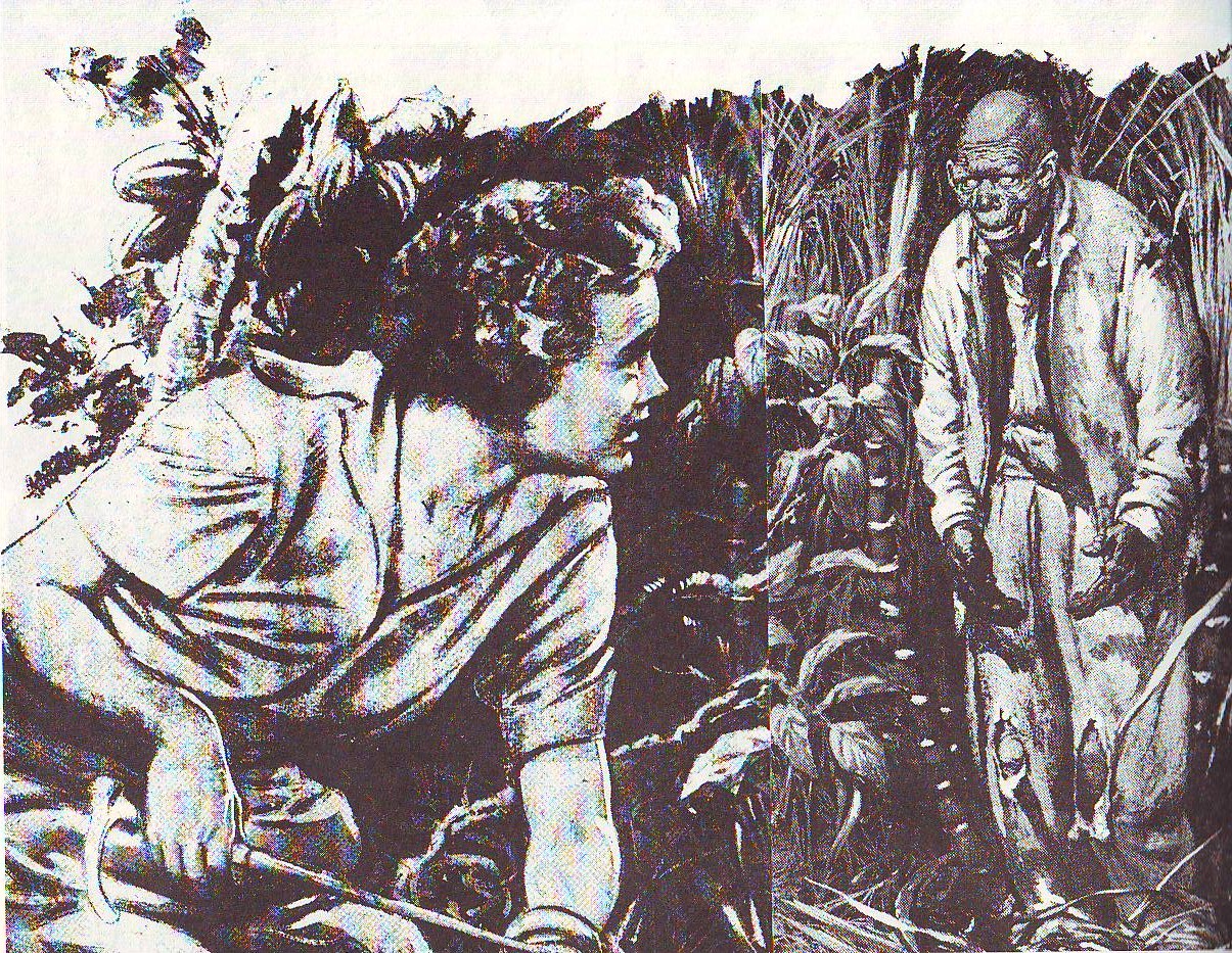
Carl Barks circa the end of WWI. Photo as published in Carl Barks and the Art of the Comic Book by Michael Barrier, 1981.
I didn’t know you liked Barks. My impression was anything on the entertainment side of things was anathema to you.
Yeah, that new coloring is hard on the eyes. I’d rather stick with the 70s Gold Key/Whitman reprints. Groth on the coloring choice:
We’re using the original comics as our color guide. We’re going to be trying as best we can to reproduce the same colors. The reason we didn’t scan the comic books is we didn’t want it to be a facsimile edition like some of our reprints are. When you do that, it’s obvious that you are reproducing from the comic and there is a specific reason you do that, because you want to capture that old comic book look. Neither Disney nor we wanted to do that, but we both thought it would be best reproduced in color, so the question was how do you go about doing the color?
Barks is the exception that tests the rule for Domingos…though he’s expressed qualified appreciation for other popular artists as well (If memory serves Domingos believes that Schulz is not bad, albeit woefully overhyped.)
That Groth quote is interesting. It doesn’t exactly confirm, but does dovetail with Domingos’ note that they wanted it to be aimed at kids as well as (or even more than) collectors.
Domingos, have you convinced me to try this book? I’m not sure.
Your point about losing the ben day dots is one that isn’t brought up much. It’s certainly possible with photoshop to recreate that sort of coloring (I think they did that with Afrodisiac and part of… that comic Lethem wrote that I can’t think of the name of for Marvel). I’d actually like to see some recolored comics done that way.
Some mass cult I partially like (I understand why people like Kirby’s or Ditko’s drawings, for instances, I’m not completely blind, yet…). Other things I like a bit more, but I think that they’re overhyped, as Noah said (Schulz has his moments, but it’s impossible to be equally good over a period of 50 years). There are only a couple of things that I like without any reservations (or very few). Some of Carl Barks’ duck stories are one, the others are some of Héctor Germán Oesterheld’s stories (with Hugo Pratt, Carlos Roume, Solano López, Arturo del Castillo), Matt Marriott by James Edgar and Tony Weare (the 70s’ stories especially).
I have to start a Ben-Day Dots’ fan club. This writer will be president.
Derik:
Answering your question: it depends on how much Barks’ books you own. If you own nothing by Barks or very few books this edition is a good way to start collecting. I prefer Another Rainbow’s CBL, but those books are out of print and are a lot more expensive.
I own no Barks books, but I haven’t really been convinced he’s worth all the hype.
Barks is on record (see John Benson’s Panels #2) that he had no say in the original color schemes used for his works; any notes he did make were not followed by his publishers. Gary Groth told me that Fantagraphics tried to improve their version by incorporating any comments Barks had made in interviews about what the coloring should have been. I do think the yellows in the Fantagraphics version pop a bit too much, but that can be addressed in future volumes.
And, although I omitted the exchange from my PW interview, I asked Gary about Barks saying in interviews that his wife Gare for many years had done all of the lettering, the background inking and indeed the brushwork blackspotting even on the figures. I believe that she should be credited for those efforts. Gary said that he would consult with Barks experts as to whether or not a credit was justified for the future volumes.
James:
Re. Garé: absolutely! I’m sorry that I forgot her in my post.
Derik:
I see. This isn’t a good place to start, then. The next volume is a lot better methinks. But you know how these things go: either the reviewer is preaching to the converted or he is bound to give someone a pleasant or unpleasant surprise. It’s a risk that you must decide is worth taking or not.
James’ interview with Gary about Barks is here, by the by.
Pingback: Comics A.M. | Bandai halts new manga, anime releases | Robot 6 @ Comic Book Resources – Covering Comic Book News and Entertainment
I can’t see a thing wrong with the colour in these books; in fact, i think they look great — superior to most reprints that draw on material from this era. Further the format (size, mostly) is near-perfect with this book. They are just about right for adults and ideal for kids (by which I mean they are easy to hold and open easily — and stay open.) God forbid kids should enjoy reading comics about talking ducks.
Brad:
I’m not going to comment what you can’t see. If you can’t see it you can’t see it, period. Steven and James surely can. On the other hand I did say “[w]e all know how bad the coloring of the classics has been until recently.” No one on earth hates gradients more than I do (except this blogger; he will be the vice-president of my Ben-Day Fans’ Club).
I merely described the size of the collection, I said absolutely nothing about it being appropriate or not. I find it fine, by the way…
Also: I’ve nothing against children’s books being done with children in mind. What I think is dubious is to try to do a book with children and serious collectors in mind. That is not possible, I think, but I may be proven wrong…
Derik — I really don’t think one can over-hype Barks’ best comics.
I come from that 1960s era of comic book readers who initially did not know the names of the various Disney artists — even Barks. But I could tell that there were different artists with different drawing styles, and that the duck stories drawn by one particular artist were more special than the others. And it wasn’t until 5-10 years later that I finally knew the name of the artist with the distinctive style and flavor I liked so much.
Barks’ stuff was really that different.
Ah, but your description just plays into the nostalgia I see in the most effusive comments about Barks. You grew up reading it, which surely colors your opinion of them.
Pingback: Comics AM | Bandai halts new manga, anime releases | Truy?n Tranh | Truy?n Tranh Online
Derik — Perhaps, but I don’t think so. If it were simply nostalgia, then ALL of the Disney stuff back then — regardless of WHO did the stuff — would have given me the same warm fuzzy. Barks’ duck books stood out to me, just as did Walt Kelly’s “Pogo,” Harvey Kurtzman’s “Mad,” Lee and Ditko’s “Amazing Spider-Man,” etc. In fact, I read my first Spider-Man comic book in 1967 after Ditko had departed Marvel, yet upon reading the Ditko reprints being published concurrently at the time, I found I preferred the earlier Ditko stories and actively searched them all out. That wasn’t nostalgia in action, that was deliberate artistic discernment. I was actively sifting through the art and stories available and making conscious choices.
And I made these differentations in a vacuum during the 1960s. I knew nothing of organized fandom until about 1969, and I didn’t see my first fanzines until a year or two later. So when I did start reading articles written by long-time fans gushing over certain creators, I was surprised to find out that I apparently had a pretty good taste in comics creators.
I don’t have a problem with the color, I just note that the 100% yellows are a little too intense.
And while I’m sure I must have read some Barks growing up, I didn’t actually READ Barks until I got a copy of the book in question to do the interview for PW, so I certainly wasn’t approaching it from a sentimental child-mind sort of place. I did have a problem with some of the stereotypical representations in the book, but Scrooge to me represents the worship of money that degrades American culture; I do not believe that Barks intended him as a character to emulate.
————————–
steven samuels says:
…Yeah, that new coloring is hard on the eyes.
————————–
Sure looks more harshly glaring. But, how accurate is the scan of the new version? I see rainbow-like “artifacts” (especially under one of the chicken’s wings)…
————————–
Derik Badman says:
…Your point about losing the ben day dots is one that isn’t brought up much. It’s certainly possible with photoshop to recreate that sort of coloring (I think they did that with Afrodisiac and part of… that comic Lethem wrote that I can’t think of the name of for Marvel)…
—————————
Hm, was that Omega the Unknown?
Re the dots ( http://en.wikipedia.org/wiki/Ben-Day_dots ), Eddie Campbell — as I recall — also mentioned how they added a vibrating energy to areas of color, which in modern printing (which uses far finer dots, to the eye reading as solid areas) just lay flat.
One of the sites on how to create them in Photoshop: http://brianfies.blogspot.com/2010/08/dots-part-1.html .
Some sort-of-related commentary by Mr. Campbell:
http://eddiecampbell.blogspot.com/search/label/coloring
http://eddiecampbell.blogspot.com/search/label/zipatones
And, http://eddiecampbell.blogspot.com/search/label/fumetti , which is not at all related, but contains (among other virtues) the delicious line, “…in order to do what they do, artists need to be single minded to the point of thinking everybody must do things their way.”
—————————
Domingos Isabelinho says:
…I’ve nothing against children’s books being done with children in mind. What I think is dubious is to try to do a book with children and serious collectors in mind. That is not possible, I think, but I may be proven wrong…
—————————–
What “serious collector” would let his (it’s always a “his”…) sticky-fingered kids lay their hands on his treasured books?
Seriously, though, many older folks have fond memories of as kids getting to enjoy the Howard Pyle illustrations in their fathers’ Robin Hood or King Arthur and his Knights books; so, couldn’t a collector-quality hardcover of Barks’ duck tales be likewise appreciated by youngsters?
Do “children’s books” need to be cheaply-produced, skinny little things? Can’t little ones learn there are some books that are to be handled gently, be taught to appreciate something of higher quality at an early age?
——————————-
R. Maheras says:
…If it were simply nostalgia, then ALL of the Disney stuff back then — regardless of WHO did the stuff — would have given me the same warm fuzzy.
——————————–
An excellent point. And, how many people as adults look again at something they LOVED as kids/youngsters, and are massively disappointed to find it’s drek?
——————————-
Barks’ duck books stood out to me, just as did Walt Kelly’s “Pogo,” Harvey Kurtzman’s “Mad,” Lee and Ditko’s “Amazing Spider-Man,” etc. In fact, I read my first Spider-Man comic book in 1967 after Ditko had departed Marvel, yet upon reading the Ditko reprints being published concurrently at the time, I found I preferred the earlier Ditko stories and actively searched them all out. That wasn’t nostalgia in action, that was deliberate artistic discernment. I was actively sifting through the art and stories available and making conscious choices.
——————————-
For a similarly discerning attitude, check out the young R. Crumb’s letters to friends collected in Your Vigor for Life Appalls Me: Collected Letters (1956-1972) http://www.amazon.com/Your-Vigor-Life-Appalls-1958-1977/dp/1560973439 . (What, “1 new from $194.74, 9 used from $29.95, 2 collectible from $89.99”? I should’ve bought a bunch instead of just one! [Ah, but elsewhere new copies are available for fifteen bucks…])
You know guys, these are great, smart kids comics; but they are primarily that: comics for kids. That doesn’t mean that a lot of sweat and creative energy hasn’t spent on them — they should be recognized as being a cut above — but taking an adult critical lens to them always seems kind of pointless to me.
Do any of you have children? If so, take a copy of the Another Rainbow Barks books and a copy of the new FBI book and give them a choice btwn the two. I guarantee you they will ignore the black and white in favour of the colour. And don;t even get me going about the colour gradiations btwn the original comics and the new ones.
It’s all extraeneous to the experience of reading these enjoyable fun stories. I remember reading dog-eared copies of Tintin albums from my school that had pages missing. Did I care? No way! I just made up the missing pages in my head.
I’m all for critical evaluation of comics, but when that strays into minute technical aspects it’s kind of farcical. (Unless you wnat to discuss The Someday Funnies…yeesh!)
I have an 8 year old. He’s just read like 32 volumes of Ranma 1/2, which is in black and white. The first real book he read front to back was the black and white massive collection of Bone comics. He likes color comics too, but black and white certainly is no barrier.
I’ve never read Barks. But he’s widely acclaimed as one of the masters in the comics field. Lots of adults are interested in his work. If you don’t want to read critical evaluations, you’re welcome not to, but there’s no reason other grown-ups shouldn’t if they like.
For that matter, I regularly have critical discussions with my son about the things he’s reading or watching or thinking about. I talked about racism in the Tintin comics with him, for example. He understood what I was talking about without any problem. We talked about why the recent Muppet movie was kind of crap. We don’t always agree, but that doesn’t mean that he’s too young to think about what he’s reading. The idea that kids should uncritically absorb whatever they’re reading or consuming seems wrong-headed. I don’t see any reason why a kid couldn’t have an opinion on ben-day dots, though it might not be the same as Domingos’.
————————
BradM says:
You know guys, these are great, smart kids comics; but they are primarily that: comics for kids. That doesn’t mean that a lot of sweat and creative energy hasn’t spent on them — they should be recognized as being a cut above — but taking an adult critical lens to them always seems kind of pointless to me.
————————
Certain aspects of work aimed at a less-than-sophisticated audience won’t stand deeper scrutiny, but others — such as, say, Barks’ mastery of visual narrative flow — will. In the same fashion that a short-story Stan Lee comics script may be hokey, derivative, while the Ditko art for it sublime. Ditko’s work handicapped by its schlocky raison d’être from rising to the heights, but still outstanding in many ways.
————————
Do any of you have children? If so, take a copy of the Another Rainbow Barks books and a copy of the new FBI book and give them a choice btwn the two. I guarantee you they will ignore the black and white in favour of the colour.
————————
Sure; and given a choice between some sugar-crammed crap and actual nourishing food, they will go for the former.
The thing is, do we consider children utter morons to be blithely indulged in whatever type of garbage (culinary, aesthetic) that’s the most easily accessible pleasure, or do we take the time to teach them to appreciate quality?
Of course, these harried days, giving kids whatever the mass media tells them they should whine for, what “all the other kids” have, and plunking them in front of the idiot box, letting them watch whatever screeching, crass, hyperactive, poorly-animated malarkey they’re hooked on overandoverandover, is what passes for “parenting.”
Never mind that throughout human history, children were considered “little adults”; the idea of creating dumbed-down work for them — instead of expecting them to make an effort, stretch to appreciate what their elders did — would’ve been considered ludicrous, if not condemned outright.
—————————
It’s all extraeneous to the experience of reading these enjoyable fun stories. I remember reading dog-eared copies of Tintin albums from my school that had pages missing. Did I care? No way! I just made up the missing pages in my head.
—————————
Yes, when the original work is lively, accessible, and masterful as Hergé’s, certainly a fancy presentation deservedly takes a back seat.
Moreover, there’s something about the intimate, handy classic comics format that better fits the subject of most mainstream comics far better than a hefty hardcover. (While, say, a Maus or Fun Home in “pamphlet” form would be…inappropriate packaging.)
Just as a yellowed, battered old paperback with a luridly sexy cover painting is more pulpily appropriate for a “hard-boiled dick” thriller than a bland public library hardcover binding…
We certainly can examine children’s entertainment through whatever lenses are appropriate. Americans tend to assume that all of their culture should be universally beloved, as if every country must want a Disneyland. My question to Gary about the racist representations in the book was posed because children of color looking at that book will see themselves reflected in negative ways: in Bombi who even though dead is used by the (white) ducks as a weapon against his own people, or in the people of Lost in the Andes who need the ducks to find the explanation for the square eggs since they are presented as too backwards to discover it for themselves.
Barks was apparently more aware, perhaps instinctively, than most artists of his time of these problems, I think, because he addressed some of them more thoughtfully in other stories in the same book. Eisner and Caniff were less thoughtful and their racism is often justified by saying that “everybody else was doing it” at that time, but that simply isn’t true. They had a choice, they made the wrong one and it forever taints their work. It doesn’t mean that everything they did that is good is invalidated, but the bad aspects should not be dismissed by those ignorant or insensitive enough to complain about “P.C.”
BradM — I don’t agree that creative material aimed at kids isn’t worthy of serious/adult criticism. There is some amazing material out there, such as the original Oz books, any number of Dr. Seuss books, various comic books and comic strips, etc.
By the way — my oldest daughter, who’s 31, prefers Rosa’s Scrooge McDuck over Barks’ version, and just a few weeks ago specifically listed two Rosa hardcover compilations of Scrooge on her Christmas wish list.
I don’t want to give the impression that a children’s edition of the Barks duck stories should have no quality, or be dumbed down, or something… It’s not what I meant at all. It’s just that, for a collector’s edition, there are philological considerations that work against a more glossy and commercial look. I talked about the absolute respect for the original color (good or bad, that’s what it is, Ben-Day dots and all…). Another aspect to have in consideration is that the print paper shouldn’t be white (cf. Chris Ware’s Gasoline Alley‘s Drawn & Quarterly reprints, for instance).
I need to read more Pogo to have an opinion about it (what I read didn’t impress me much), but Carl Barks is in a completely different league than Mad (parody) or Spider-man (sup soap), methinks… Barks was an auteur with a vision and the chops to convey it. That, for me, is the mark of genius (sorry if the word is terribly old-fashioned). That said, many (most, perhaps) of his stories do nothing for me…
Even geniuses have off days (or off decades), which is why I try to only judge a creator by his/her best work.
“Sure; and given a choice between some sugar-crammed crap and actual nourishing food, they will go for the former.”
I don’t think this is necessarily more true of kids than of anyone else.
That’s true: it’s a good metaphor to explain the dumbing down.
—————————
Domingos Isabelinho says:
I don’t want to give the impression that a children’s edition of the Barks duck stories should have no quality, or be dumbed down, or something… It’s not what I meant at all. It’s just that, for a collector’s edition, there are philological considerations that work against a more glossy and commercial look.
—————————-
To the last statement, certainly. But, should a children’s edition necessarily have “a more glossy and commercial look”? Something with tasteful design, color that isn’t glaringly intense, might have a tad less immediate attraction, just as color would’ve at first made those Ranma 1/2 books Noah’s son read look more appealing. But getting into the first b&w volume, he went on to read over thirty of them!
So again, why shouldn’t parents encourage their children to make the tiny bit of extra effort to get into reading something whose presentation doesn’t have the equivalent of Froot-Loops glued all over it?
—————————–
I talked about the absolute respect for the original color (good or bad, that’s what it is, Ben-Day dots and all…). Another aspect to have in consideration is that the print paper shouldn’t be white (cf. Chris Ware’s Gasoline Alley‘s Drawn & Quarterly reprints, for instance).
——————————
Would kids be so turned off by print paper that isn’t white, by color that isn’t so bright? If they found a copy of the 1949 Four Color #223, within a page or two of reading Barks’ story, they’d be just as utterly engrossed.
Personally (and I’m guilty of assuming the worst too), I think children are not necessarily as utterly devoid of taste as adults — who shove this stuff down their throats — think they are. Just as my wife, an avid bicyclist, complains that women’s bikes are so frequently made in pink and sappy pastels. Do adult women truly demand these colors, or it just the overwhelmingly male marketers who think “that’s what ladies want”?
I agree “that the print paper shouldn’t be white”; in that 1949 comic, the wonderful yellowing of the paper mellows the colors, serves to tie the page together as a visual unit.
Although of course the paper didn’t look so when the comic was new (even if the pulpy stock wasn’t glaringly white as the more expensive coated paper in new editions); as with the Rembrandts whose age-yellowed varnish gave a golden look that was appreciated as particularly “Rembrandtesque,” this was an accident of time-altered materials that people came to appreciate.
——————————-
R. Maheras says:
By the way — my oldest daughter, who’s 31, prefers Rosa’s Scrooge McDuck over Barks’ version, and just a few weeks ago specifically listed two Rosa hardcover compilations of Scrooge on her Christmas wish list.
——————————–
I just reread that comment again; how did I miss that “who’s 31” part? How the time flies…
Rosa’s great; I’ve only seen bits online of his Duck stories, but delighted in his The Pertwillaby Papers (later gathered by Fanta) in one of the very first fanzines I’d read — an outstanding one — The Rocket’s Blast Comicollector. He later redrew them as Duck stories, which is how he said he wanted to do them in the first place. (Though inescapably the Pertwillaby stories ended up “softening” for a kiddie audience.)
http://en.wikipedia.org/wiki/Don_Rosa
http://en.wikipedia.org/wiki/The_Pertwillaby_Papers#The_Don_Rosa_Archives_1_.E2.80.93_The_Pertwillaby_Papers
——————————–
Noah Berlatsky says:
“Sure; and given a choice between some sugar-crammed crap and actual nourishing food, they will go for the former.”
I don’t think this is necessarily more true of kids than of anyone else.
——————————–
Yeah, but parents can to a degree control what goes into a child’s belly and brain, at least at home; exert a positive influence.
Mike:
I’m just putting my “publisher’s” hat (I never was one, hence the quotation marks). It seems to me that a children’s book (especially just before Christmas) has to appeal to a large public (parents, rich aunts, etc…) while a collector’s edition is addressed to the happy nerdy few.
As for the brownish paper I said nothing about the hue (light yellowish brown is OK). Also, I’m not encouraging kitsch (this has nothing to do with the duplication of an effect caused by the passing of time; you know?, like those forgerers who put holes in furniture and cracks in paintings), it’s just that, as you said: “the wonderful yellowing of the paper mellows the colors, serves to tie the page together as a visual unit.”
From a reading enjoyment point of view, I’ve always found “neon coloring” on comics to be off-putting and hard on the eyes. I prefer softer colors.
It’s similar to my reaction when I see an SR-71 Blackbird at a museum or “air park” painted gloss black. I worked on the SR-71 for eight years, and that’s just plain wrong. It’s original radar-ablative paint was flat black.
I think Tommaso did a great job with the coloring. I always prefer the texture and dimension created by Ben-Day dots, but this coloring is more than faithful enough for me. Whether or not it resulted from a marketing compromise is interesting to me, but not all that relevant in my assessment of it; it looks really good.
One thing I really liked in your piece is that you said: “Only a fool could think that in a colored drawing the color isn’t part of the art.”
I believe that it is only in comics that we see a division of “color” and “art”. Color wasn’t credited in comics until relatively recently, I think the first credit I ever saw for a colorist on the cover of a comic was in the team of Miller/Varley. Color in comics is most often devalued to the status of a mechanical function. So people like Steranko and Neal Adams had to do what I think is the pretty much the best part of what they did literally for pittances, while fighting all the way for the right to do so. Moebius’ early impact was in large part because of his brilliant watercoloring, but since those early short masterpieces he has been colored by other people, with the result that I lost interest in his work.
Rich Corben’s early underground work like Cid Opey was full of inventive separations—well, I didn’t care for his later color overworkings such as Den, but now he is almost always colored by other people, which makes his work much less interesting. A few contemporary alt/lit cartoonists seem to comprehend the importance of color: Dan Clowes, Dash Shaw and Frank Santoro come to mind. But in the mainstream!!! yuck. Generally now the digital color in comics is almost all absolutely hideous, it looks like it is done by hyperactive robots and I believe it is one reason for the decline of readership. Hard to blame it all on the colorists though—-coloring pays poorly and the better colorists are ridiculously overloaded with work. The attitudes of editors and publishers about color is absurdly dismissive, it shows their ignorance and flies in the face of rationality, since color is a major part of the initial and lasting impact on the reader. BTW, this is not meant to reflect on Fantagraphics, who seem to have some idea of its importance.
James:
The greatest colorist in comics must be Lorenzo Mattotti, or Alberto Breccia, or… I’m sure that there are a couple more (Guido Buzzelli, I suppose, but he worked mostly in b & w; I also love Vincent Fortemps colored piece – I’ve seen just one; there’s also Ricard Castells)… It’s strange how little has been done with colors in comics though…
Ken:
I also said that the colors are mostly faithful. For a recoloring it’s the best I’ve seen. I also must admit that this is not a great achievement since the bar was so incredibly low…
————————-
Domingos Isabelinho says:
…It seems to me that a children’s book (especially just before Christmas) has to appeal to a large public (parents, rich aunts, etc…) while a collector’s edition is addressed to the happy nerdy few.
—————————
(??) Sorry, I love to quibble; but what is there about one of these Fantagraphics Barks books that makes it so unsuitable as a gift to kids from “parents, rich aunts”?
Sure, there is attention to detail that collectors would rightly be picky about, such as faithfulness to the original coloring. But it’s not as if (presumably) the book is loaded with behind-the-scenes minutiae, annotations for every panel, preliminary sketches and printing technical info, which children or those buying the books for children would find off-putting.
Therefore, as with the collected Peanuts, it seems to me these books occupy that “sweet spot” of appealing both to collectors and youngsters…
Only now checking out this link you’d provided (and after writing the above), I see where Gary Groth had a similar aim in mind:
——————————–
I’ve always lamented what lousy job publishers have done with Carl Barks. I like the Another Rainbow editions, but they are purely collector editions made for guys like you and me. What I want to do is publish books that will find a general readership, because he deserves one. He deserves as wide a readership as possible. He’s accessible enough. He’s not one of those arcane, obscure cartoonists that the general public wouldn’t understand. His stuff can be read by children or adults, it can be understood on different levels. One of my goals is to publish it in a format that will reach that wider readership. I’m hoping parents buy it, read it themselves and also give it to their kids to read.
———————————-
http://robot6.comicbookresources.com/2011/01/exclusive-fantagraphics-to-publish-the-complete-carl-barks/
From the original article:
————————-
Domingos Isabelinho says:
…Only a fool could think that in a colored drawing the color isn’t part of the art.
—————————
Pfft! Not a “fool,” but someone using the term to mean something other than the complete physical totality of a work.
Though the term “art” may be employed, the “comicscenti” are perfectly aware that in a piece of original Kirby art, unless it’s a pencil sketch or painting, the original Kirby pencils have been inked over by other hands.
In the same way we may praise Gustave Doré, though knowing he had a stable of talented engravers who converted his drawings into the “printable” forms that made him famous.
Or praise Fallingwater ( http://en.wikipedia.org/wiki/Fallingwater ) for showing the brilliance of Frank Lloyd Wright, being of course aware that “divers hands” helped make that home a physical reality.
——————————
So, how come that we can continue to say that a drawing is by Carl Barks alone when it was colored by someone else?
——————————-
Because the “drawing” — meaning, in this case, the linework, which is routinely in comics correctly considered the overwhelmingly creatively crucial and primary factor — “is by Carl Barks alone.”
——————————-
The fact is that we can’t and that’s all good and dandy if the colorist is the original one because those were the creators of said drawing even if we have no idea of what the latter’s name was. In this reprint we do, don’t we?: Rich Tommaso. So, what we’re buying isn’t really “Lost in the Andes” by Carl Barks… what we’re buying is “Lost in the Andes” by Carl Barks and Rich Tommaso.
——————————-
Well, following your argument, even if you bought the original 1949 comic, you wouldn’t really be buying “Lost in the Andes” by Carl Barks either, then.
——————————–
As for the brownish paper I said nothing about the hue (light yellowish brown is OK).
——————————–
Though “yellowing” is the term widely used (“beiging” probably better), for an effect as subtle as the color changes of aging paper stock, most color names are hardly suitable.
———————————
Also, I’m not encouraging kitsch (this has nothing to do with the duplication of an effect caused by the passing of time; you know?
———————————-
Why would “the duplication of an effect caused by the passing of time” necessarily be kitsch, when in the case of using tinted paper stock it’s such a subtle effect, elegantly enhancing the whole? When kitsch is considered to be gaudy, sappy, stuff aimed at the tasteless masses?
Now, adding “airbrushy,” heavily-shaded tones to the Barks art — er, linework — would certainly be kitsch.
———————————-
R. Maheras says:
…It’s similar to my reaction when I see an SR-71 Blackbird at a museum or “air park” painted gloss black. I worked on the SR-71 for eight years, and that’s just plain wrong. It’s original radar-ablative paint was flat black.
————————————
“Ablative”; a new word to add to the rhetorical armory!
Hmm, wouldn’t painting the SR-71 Blackbird a more slick-looking gloss black be kitsch?
————————————-
james says:
I believe that it is only in comics that we see a division of “color” and “art”.
————————————–
On some other thread I mentioned how old-time (Victorian-era, as I recall) would say that one painter, such as Rembrandt (!), was an inferior colorist, another better for the drawing of the figures (meaning anatomical correctness, expressiveness, etc.), another for a more sublime subject…
—————————————-
Color wasn’t credited in comics until relatively recently…Color in comics is most often devalued to the status of a mechanical function.
—————————————-
Well, for a long time the “colorists” were fairly noncreative artisans in factory-type setups, who followed color guides in paint-by-the-numbers fashion, made the grass green, skies blue, duck legs orange, etc. By cutting out rubylith/amberlith stencils (as I did early in my commercial-art career) to separate areas which the printing “stripping” department would set up to receive ink.
Dunno when truly expressive coloring (i.e., an enraged character “sees red,” the scene tinted crimson) was first used in mainstream comics; EC, with Marie Severin doing the honors, perhaps?
But naturally a fine colorist can add immeasurably to the power of a work. I don’t see anything necessarily lesser about such a collaboration; Lynn Varley with Frank Miller, Lovern Kindzierski with P. Craig Russell are long-time, mutually-enhancing collaborations.
And, is a “pencil artist” necessarily the best colorist of his work? Peter Bagge has said he found inking his own art a nuisance; comparing his inks to those by one of his inkers, say, Jim Blanchard, the latter’s are far more subtle, supple.
In the realm of art photography, where it’s said “the negative is the score, the print the performance,” Edward Weston’s prints of his photos are widely considered inferior to those done by his son Cole. But, the “sole artist” attitude being what it is, Edward’s prints are far more costly…
Mike:
“(??) Sorry, I love to quibble; but what is there about one of these Fantagraphics Barks books that makes it so unsuitable as a gift to kids from “parents, rich aunts”?”
Where did you get the idea that I think these Fantagraphics Barks books are “unsuitable” for a general public? My point was the complete opposite.
“Pfft! Not a “fool,” but someone using the term [art] to mean something other than the complete physical totality of a work.”
In other words that putative person thinks that the color isn’t part of the art.
“Well, following your argument, even if you bought the original 1949 comic, you wouldn’t really be buying “Lost in the Andes” by Carl Barks either, then.”
Of course not. It’s a disrespect for all involved (Garé Barks included) to think otherwise. Even in the case of architecture. I defended ages ago on TCJ messboard that buildings should come with filmlike credits.
Also: we mean different things when we use the word “kitsch.” I’m not saying that you are wrong (you’re not), but, in this context, I mean “something pretending to be something else.”
Marie Severin was certainly a great colorist, but you can see a color diegetic effect above (which is in the original comic book; I checked): Donald purple with envy.
<<>>>
Mike: Yes, although it is hard to say if the colorists were creative or not when they were treated like shit and paid next to nothing. Because color is at the bottom of the production chain, colorists often apparently didn’t even read the pages for cues on how to handle them. I like to use the DC reprint of Kirby’s The Losers as a good example…the recolorist simply copied the original, pathetic color schemes. On the first page of the first story the text clearly says the action is taking place at night, yet the images are colored as if they a taking place during midday, so we see blue skies and all figures are colored standard(caucasion) flesh-color. The potential drama is dissolved. This is so all through the book with the result that some of Kirby’s most personal work is drained of atmosphere. Note that when Kirby colored his own work he took full advantage of the lighting cues he put into the drawings. But I have seen many oblivious mentions online of the “blobs” he put into his figures and backgrounds, nearly everyone thinks they are arbitrary markings for linear effect rather than the indications of multiple lighting sources they were intended to be.
<<>>
Yes, and she did some of her best work with Harvey Kurtzman, one of the few in comic books to ever understand the importance of color…he always used it to further the narrative. But there are many d/s strips that did use color effectively—-have a look at Caniff’s Terrys and Foster’s Prince Valiants and you can see clearly how potent thoughtful coloring can be.
<>
Yes again. I give Lynn Varley (and earlier, Klaus Janson, another good colorist) a lot of credit for making Miller’s work have the impact it did. Russell is a good colorist himself. I can point out that Michael Golden is a very effective colorist. But more recently we see people like Dave Stewart or Jose Villarrubia so overused that it is not possible for them to do good work on everything. But, they no doubt have to do so much to make a decent living. My wife Marguerite was given a few jobs apart from me for Vertigo and every time she was expected to complete whole books over a weekend. That is a big indicator to me of how color is percieved by the people in charge.
Also: the colorists’ work was dismissed because many of the colorists were women.
It’s probably a feedback loop, unfortunately. Menial jobs are given to women because they are perceived as menial, and the feminization of the profession further devalues it.
Although…I believe there is some biological evidence that women are better at perceiving colors than men are.
Checking out (as I daily do) http://www.comicsreporter.com/ , saw “Happy 52nd Birthday, Domingos Isabelinho!” With a link to your site!
Congrats, youngster!
—————————-
Domingos Isabelinho says:
Where did you get the idea that I think these Fantagraphics Barks books are “unsuitable” for a general public? My point was the complete opposite.
——————————
Oh, OK…
——————————-
“Pfft! Not a “fool,” but someone using the term [art] to mean something other than the complete physical totality of a work.”
In other words that putative person thinks that the color isn’t part of the art.
——————————–
Well, “art” can mean a lot of things. When people talk about Jack Kirby comics art, are they necessarily including the specific paper stock it was printed on? (Which for even something aesthetically humbler like graphic design for printing, is an important consideration for the final effect.)
What about when the same stories — with identical coloring, paper, printing — were collected in a, er, “fat comic” format, instead of in their original “pamphlet,” which had featured a main story, then a backup shorter story featuring a secondary character? That surely affects the aesthetic effect of the tale, as does interruption by advertisements.
(Meantime, in all the critical examinations of the Watchmen comic, what short shrift was given to the massive emotional difference — and changes in “packaging” design — that there was between reading it in the original divided format, and gathered in one book.)
In the spirit of Magritte’s great http://ronosaurusrex.com/metablog/files/pipe1.jpg , what is more truly a Jack Kirby comics page? His original penciled artboard, the reproduction-ready “mechanical,” inked and with lettering affixed, stat of a logo layered on? Or the printed page? Or that page in the context of the whole “first edition” actual comic book?
I’d argue they’re all slightly different versions of Jack Kirby’s art, with the “original creator’s touch” predominant in the pencils, the “as it was planned to be in the end” version embodied in what ended up in the spinner-racks.
———————————-
“Well, following your argument, even if you bought the original 1949 comic, you wouldn’t really be buying “Lost in the Andes” by Carl Barks either, then.”
Of course not. It’s a disrespect for all involved (Garé Barks included) to think otherwise. Even in the case of architecture. I defended ages ago on TCJ messboard that buildings should come with filmlike credits.
———————————–
I like that “filmlike credits” for buildings idea! (Couldn’t it get ridiculous, though? “The bricks for the lower rear left corner of the building were laid by Joe Schlopotnik”?)
———————————–
Also: we mean different things when we use the word “kitsch.” I’m not saying that you are wrong (you’re not), but, in this context, I mean “something pretending to be something else.”
———————————–
Oh, OK…
————————————-
Marie Severin was certainly a great colorist, but you can see a color diegetic effect above (which is in the original comic book; I checked): Donald purple with envy.
————————————-
Yes, true! (That particular, drastically “off-model” color surely added following Barks’ directions, though; rather than an individual “creative decision.”)
————————————–
Also: the colorists’ work was dismissed because many of the colorists were women.
————————————–
Aren’t there a lot of males — like the superb craftsmen doing the woodwork on an architectural masterpiece — whose work is likewise dismissed? And surely stuff like…
————————————–
james says:
…Because color is at the bottom of the production chain, colorists often apparently didn’t even read the pages for cues on how to handle them. I like to use the DC reprint of Kirby’s The Losers as a good example…the recolorist simply copied the original, pathetic color schemes. On the first page of the first story the text clearly says the action is taking place at night, yet the images are colored as if they a taking place during midday, so we see blue skies and all figures are colored standard (caucasion) flesh-color. The potential drama is dissolved. This is so all through the book with the result that some of Kirby’s most personal work is drained of atmosphere.
————————————–
…doesn’t exactly make one want to hail the creative contribution of those old-time colorists. (And being “at the bottom of the production chain” is no excuse for doing a sloppy-ass job.)
In all fairness, though, they might have faced the “expected to complete whole books over a weekend” situation James cited; the kind of time crunch — for books HAVE to be ready to go to the printer at a certain time — that led to shortcuts such as Vince Coletta’s infamous erasing of Kirby figures.
—————————————
Noah Berlatsky says:
It’s probably a feedback loop, unfortunately. Menial jobs are given to women because they are perceived as menial, and the feminization of the profession further devalues it.
Although…I believe there is some biological evidence that women are better at perceiving colors than men are.
—————————————
“…there is some biological evidence that women are better at perceiving colors than men are”? The horror! Watch out, you’ll be turning into Dave Sim next!
Seriously, though, I’ve heard that women as a group are better at detail-oriented work. And cutting out tiny film overlay sections with X-Acto knives to mark out the color areas for, say, the earrings of Bombie the Zombie is finicky stuff indeed. Which is why they’re also favored for work such as assembling electronic components. Or…
————————————–
…the nation’s forensic labs are at least 60 percent female. At Virginia’s Department of Forensic Science, 36 of 47 scientists hired since 2005 were women.
Studies have shown men place more importance on salaries than women, and forensic scientists start at about $30,000, much less than many science laboratory jobs.
Women also are more detail-oriented, Glass and others said, which comes in handy when matching up fingerprints or comparing striations on bullets…
————————————–
http://www.lawofficer.com/article/forensics/more-women-choosing-careers-fo
That women overall still get paid less than men is not necessarily because their jobs are perceived as menial, but because they’ll routinely accept lower pay. Either through economic pressure (stuck raising the kids while the ex won’t pay child support) or internalized “it’s not ladylike to ask for more pay” insecurities:
————————————–
– Women, on average, ask for 30 percent less money than males.
– Men are four times more likely to negotiate a first salary than women.
– Men are eight times more likely than women to negotiate their starting salary and benefits.
– Women ask for raises or promotions 85 percent less often than their male counterparts.
– 20 percent of women (22 million people) say they never negotiate at all, even though they recognize negotiation as appropriate and even necessary.
– 2.5 times more women than men said they feel “a great deal of apprehension” about negotiation.
– When asked to pick metaphors for negotiations, men picked “winning a ball game match,” while women picked “going to the dentist.
—————————————
http://www.techrepublic.com/blog/career/negotiating-a-higher-salary-how-women-differ-from-men/459
Rather than a “patriarchal” society, with all men getting a great deal and all women getting the proverbial shaft, what we have is an utterly exploitative society, which seeks to rip off, bleed dry, and take advantage of anyone not in the “upper classes” by any way possible: legal, economic, emotionally manipulative (“It’s an HONOR to ‘serve your country’ in the military!”).
Anyone:
—————————————-
GOP debate audience cheers child labor
The audience at Saturday night’s Republican presidential debate gave their loud seal of approval to the idea of removing restrictions on child labor.
For over a week, former House Speaker Newt Gingrich (R) has been suggesting that poor children should be in the workforce. He has said that janitorial jobs are appropriate for children, and has lauded the idea of 5-year-olds working…
GOP debate crowds at previous debates have cheered the death penalty and letting a man without insurance die. They have also booed a gay U.S. soldier…
—————————————-
http://www.rawstory.com/rs/2011/12/10/gop-debate-audience-cheers-child-labor/
Is this a great country, or what?
Re, color and gender: mild forms of color blindness are statistically more common among men.
Sorry Mike, because women are so used to being shit on that they don’t dare to negotiate with some dickhead for more salary is not an indicator that they love being oppressed.The longest standing underclass is women, across societal borders and across history. I tend to think we will have a gay mutant two-headed micromidget president before we will ever have a female one. The fight for gay rights is more generally a fight for more rights for men, note that the term gay indicates male homosexuals while homosexual women are termed lesbians. And, why do think someone would have a reason to any kind of coloring job beyond the least effort possible for pathetic money and zero credit is beyond me.
Damn it Russ, now I have to go back to Udvar-Hazy to see what color black the thing is. (Unless you can tell from the photo? Doesn’t look all that glossy but photos can be deceiving… http://www.nasm.si.edu/imagedetail.cfm?imageID=1043)
————————-
james says:
…because women are so used to being shit on that they don’t dare to negotiate with some dickhead for more salary is not an indicator that they love being oppressed.
————————–
Who says “they love being oppressed”? How about, are used to being oppressed, therefore are far less likely to fight for better pay?
People — of all genders — who have suffered abusive childhoods, or denigrative behavior though their “formative years,” are far more likely to put up with abusive/demeaning relationships, stay in jobs where they are exploited and undervalued far longer.
There is a psychological phenomenon called “learned helplessness” ( http://en.wikipedia.org/wiki/Learned_helplessness ), where humans or other animals who’ve learned they cannot escape an unpleasant or painful situation, “learn” they cannot change things for the better; and retain this belief — and act helplessly — even when circumstances change, and they could escape.
Moreover (as I’ve noted in earlier posts), society and the ruling class has always been insidiously adept at manipulating and distortingly enhancing general gender qualities for its exploitative uses.
Male assertiveness is fueled into violent aggressiveness, the better to make “warriors”; male hesitance to show weakness is used to get them to put up with dangerous, stressful jobs.
While female “wish to get along” attitudes, empathy, nurturing qualities are encouraged, the better to get them in poor-paying (or totally non-paying, like motherhood) caretaker “shit jobs” like teaching, nursing. Discourage them from “making waves” or “being unladylike” by demanding raises, better positions.
—————————
And, why do think someone would have a reason to any kind of coloring job beyond the least effort possible for pathetic money and zero credit is beyond me.
—————————
Pride in one’s own skills and creativity, in doing a good job?
Mike:
Thanks! And thanks for calling me a youngster. I certainly am young if compared to the world’s oldest film director still making films.
Authenticity has nothing to do with reception. It’s a question of genesis. It must come from the original art, the original lettering, the original coloring, the original layout. If good proof stats are available, good, if not, a fac-simile is the only option. It’s not the same thing (the reception isn’t the same) to see a religious painting in a church or in a museum, but no one says that the same painting is a fake in the latter situation. Since comics are reproduced in multiple formats over the years (as you say) I wouldn’t include the print paper in the equation, but, as someone with the responsibility of art directing a reprint, I certainly would think about it.
Noah, it wasn’t until you linked to that article on color blindness that I remembered my ninth grade Biology teacher teaching me that same thing. Who knows, maybe something else I learned in school will some day appear in my life.
Here are my thoughts on the new edition.
Great review Matthias. Two comments: 1) you like the stories in this book a deal lot more than I do (that’s not news though); 2) re. Tommaso’s recoloring you end up being more of a journalist than yours truly above. It makes me want to ask you: yes, but what do you think?
Well, I like it. I think it’s probably as good as one could have hoped for, even if there’s still room for improvement. I don’t agree with your very purist position, first of all because it’s utopian, secondly because I simply don’t find the differences between the old and new to be all that problematic.
Yes, the coarse halftone is gone in favor of finer grain and I love the look of the old printing techniques too, but replicating it is impossible and doing so would in any case give the book a retro, archival feel rather than a current, living one. As I write in the review, there’s also an authenticity to be found in approximating the fresh experience the original readers had when holding a new duck comic, even if it’ll never be more than an approximation.
I’m not so sure if it’s not possible to restore the old coloring (warts and all) instead of falsifying the whole thing with a passable recoloring. Fanta’s own Popeye and Cpt. Easy series are proof enough that it can be done. Another thing that baffles me is the ease with which the same people who would never accept a recoloring of a painting or a film accept such a falsification in comics. I’m used to this kind of incoherence in the comics milieu, of course. People who would never give a second look at a B series movie love pulp in comics.
To give you another example from Fanta (reprinting comic book stories instead of Sundays), there’s the incredibly uneven B. Krigstein Comics which ranges from the excellent (“Blacksmith Belle Malone”) to the utterly mediocre (“Lily-white Joe”).
I agree on the Krigstein, definitely, and understand your sentiment. The difference between comics and film here is that comics were regarded as so much more industrial junk and given the color treatment accordingly, and that one may therefore in fact, or at least arguably, improve things by recoloring.
As Kim explains over on TCJ, the scan-and-clean option used for Popeye and Capt. Easy was not really an option for Barks because of the inferiority of the material from which they were working.
Can you imagine someone wanting to improve a Picasso? Or coloring a black and white fil… er…
Right, but let’s face it — this isn’t Picasso.
Imagine someone wanting to improve any painting, then… I was half joking, but, being a bit more serious, if the problem is authenticity (which, for me, it is) quality or reception are hardly the point. As I said before: this is a problem of genesis.
Caro — The SR-71 at the Smithsonian has its original paint scheme (I viewed it about three years ago). With that lighting it looks a little lighter and shinier, but that’s just an illusion.
Sorry it took so long for me to comment — I missed the latter part of the thread.