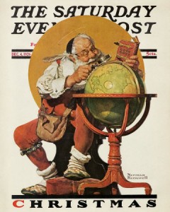
Christmas illustrations, like Christmas decorations, careen toward kitsch even when they’re relatively tasteful. Always reminiscent of childhood, the ultimate in nostalgia, the kitschiest ones are a sort of superhero pantheon for the masses – from Santa Claus to Santa Mouse, with some Wise Men and Nutcrackers thrown in for good measure. Even Norman Rockwell, who is rarely incisive but often effective at reflecting early-century American life, collapses into full-on kitsch when Christmas is the theme.
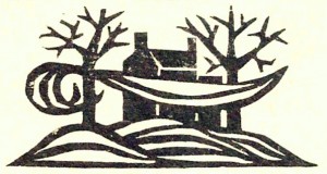
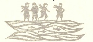
Not so for illustrator Ellen Raskin’s cool, evocative illustrations for the 1954 New Directions edition of Dylan Thomas’ “A Child’s Christmas in Wales”.
Raskin’s Christmas – unlike Thomas’! — is calm and still and festive. Her woodcuts create atmosphere and tone. They attempt no semiotic significance; their effects are independent of their sequence and even of the narrative’s sequence.
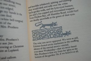
They are barely even “illustrative” – only vaguely representative of some key word or phrase on the page where they appear, like cats:
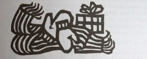
Or mittens:
And yet they influence the story — it is different in other editions, surrounded by different imagery. This edition, beloved, has remained continuously in print since its original publication. Raskin’s eloquent depictions have something to do with this, opening in their gentle abstraction a magical space for the little boys of Thomas’ narrative to throw their snowballs, attack their presents, brandish their candy cigarettes, eat and examine and explore.
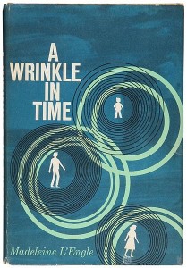
Raskin worked as an illustrator from the mid-1950s through the 1970s, and wrote and illustrated her own children’s books beginning in 1966. At the age of 17, while a student at the University of Wisconsin, she visited an exhibition of abstract art at the Art Institute of Chicago and changed her major to fine art. Like many of her contemporaries in mid-century design, she often put elements and techniques from abstraction to work in loosely representative contexts; in her drawings it works consistently to create this evocative and palpable sense of space. Her most famous illustration, for the original cover of A Wrinkle in Time, evokes both the tesseract and the alienation of Camazotz.
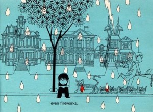
In her own picture books, her through-drawn illustrations depict space in a more literal way, place, but setting is still foregrounded (as here, from her first book, Nothing Ever Happens on My Block.)
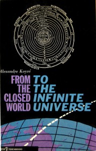
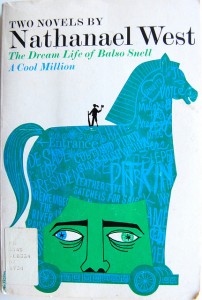
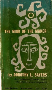
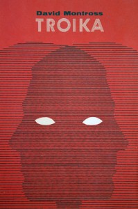
Likewise in her cover illustrations:
There is a sense of space and body even when the images are less about place:
(A Flickr set of covers is available from the Bennington College library.)
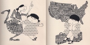
What is so marvelous, I think, about this illustration is that it draws from abstraction a kind of conceptual quality without aiming for narrative or semiotics – an embodied, tactile concept dominated by space and sensation. But never didactic, always suggestive and atmospheric. Even in a more conventionally “cartoony” book like The Mysterious Disappearance of Leon, she avoids caricature and thematic reduction and instead offers an embodied concept so compelling to a book-loving child — everything is literally made of words.
Raskin called herself a “bookmaker” rather than an illustrator, and her love of books and writing comes through in her art, even though she doesn’t ask her art to do the work of words. Her description of books reflects her heightened awareness of the vitality of imaginative space: “A book is a wonderful place to be. A book is a package, a gift package, a surprise package — and within the wrappings is a whole new world and beyond.”
Indeed.

Damn, I love those covers! Less taken in by the figure work. One question: when you write that Raskin isn’t aiming for semiotics, do you mean specific meaning? You probably don’t, but I’m unsure…
Thanks for this post!
Aren’t the covers fantastic? I have a bookmark folder with Alvin Lustig stuff in it and I added that Flickr set to the same folder so I can indulge myself ever so often — I wish publishers still made book covers like the midcentury ones. I remember staring at that cover for A Wrinkle in Time when I was a child.
By semiotic, I was thinking that the Rockwell, for example, is really thick with reference and representation, whereas hers are more loosely representational and reference much more non-specific things. Properly I guess “non-mythological” in Barthes sense, maybe. It’s inaccurate to say it’s not semiotic at all, of course, but I don’t think it’s pointedly so in any way…
Wait, what about Godard?
Caro’s still working on it. Never fear!
“Wait, what about Godard?”
Who?
Some schill for Schick: http://www.youtube.com/watch?v=En1P8CWmL-A