Respect my Hobby!

A few weeks ago I visited The Art of Video Games exhibition at the Smithsonian American Art Museum in Washington, D.C. The exhibition is relatively small, and if you don’t stop to play any games you can easily walk through all the rooms in about half an hour. It’s divided into three main sections: an introductory area, an “arcade” area where visitors can play famous games such as Pac-Man and Super Mario Bros., and a “best of” area where various gaming devices (consoles, PCs, etc) were on display along with video samples of well-regarded games. It was also completely free, which is the right price for me.

Setting aside the particulars, the basic idea of video games in an art museum is an odd one. Paintings and sculpture are designed to be viewed, but games are meant to be played (preferably while seated in a comfy chair). While the “arcade” section makes a certain amount of sense, the rest of the exhibition involves looking at games rather than actually playing them. The traditional manner of museum display (look but don’t touch) is inappropriate for the medium.

But a more significant problem is that the exhibitors never show how video games are art. To be fair, “art” is difficult to define even when discussing a more established medium. However, common definitions of art usually mention creativity, the unique expression of an idea, or an aesthetic accomplishment above mere craft. How does something like Pac-Man qualify as art? It was certainly unique when first released, but is there any underlying idea beyond cute ghosts and a chomping circles? How is Pac-Man more than mere craft? I suppose if you define art in the broadest possible terms – including Michael Bay movies, talk shows, and Superman dolls – then there’s no reason not to accept Pac-Man as well. But if art is simply a synonym for entertainment, then the entire exhibition is nothing but pretense. Displaying video games in an art museum is clearly a statement that video games are on par with the fine arts that usually appear in museums or galleries. But if any amusing diversion can qualify as art, then the only reason to put it in a museum is the “snob factor.” It’s in a museum/gallery, therefore it’s respectable.

On a more favorable note, the strongest feature of the exhibition is the evolution of graphics and visual design, with numerous examples from each decade. One of the earliest games, Pong (1972), is nothing more than a white square on a black background that bounces between two white lines on opposite sides of a television screen. Flash-forward to 2010, and games like Mass Effect 2 sport cutting-edge graphics, 3-dimensional environments, and a visual design that rivals any sci-fi blockbuster. The technological progress that allows for flashier visuals also allows for a full musical score and voice actors. While the exhibitors no doubt want to draw attention to the increasing sophistication of gaming narratives, that sophistication would not be possible without technological breakthroughs. In fact, no other entertainment medium has experienced such radical change in such a short time, and that was all driven by improvements in computing technology (film experienced several technological leaps, such as synchronized sound and the switch to color, but these changes were spread across a century, and many other aspects of filmmaking have changed little).

And yet the  actual  technology of gaming is mostly absent from the exhibition. There’s a small exhibit that explains some technical terms like the difference between 16-bit and 64-bit, but the attendees are never allowed to “look under the hood.” The wires, chips, processors, hard drives, and other do-dads are not on display. There are obvious reasons why this is the case. After all, this is an exhibition in an art museum, not a science and technology museum. But the science cannot be easily separated from the art (if we’re willing to call it that), so the exhibition feels incomplete.

The Art of Video Games exhibition reminds me of the similar effort by comic professionals to gain academic and institutional respectability. Comics have largely been successful in this regard, and scholars now refer to the medium as art without rolling their eyes.  Perhaps video games will find equal success, though it probably won’t happen any time soon. When comic creators made their bid for respectability they could at least point to a few works that were acclaimed by critics from outside the comics community (Maus, Jimmy Corrigan, and classic strips such as Peanuts). By comparison, few critics outside the insular gaming community speak of Pac-Man with reverence. And even the best video games are little more than addictive diversions (Angry Birds, Tetris) or solid genre product (Mass Effect, Grand Theft Auto).

But then again, who am I to argue with the Smithsonian? If they say shooting zombies in 1080p resolution qualifies as art, then I’ll go along with it. I’m an art lover.

Voices From the Archive: Kurt Busiek on Why Batman Is Not Green Lantern

Way back in 2009, Tom Crippen asked why Batman wasn’t given the poewr ring instead of Hal Jordan. I suggested that this showed that the whole shared world concept was idiotic. Kurt Busiek took the opportunity to explain the pluses and minuses of DC’s shared world.

[Noah]:My point is just that the whole continuity/shared world aspect of the big two’s output has some real downsides; it’s kind of ridiculous and incestuous and can lead to a lot of idiocy. I think Tom’s question gets at that. The real question, for me, at least, isn’t so much — why doens’t Bruce Wayne get a ring? As, why is it a good idea to have this kind of fan-fiction shared world in the first place?

Because it’s fun to have the characters meet.

It’s fun to have Batman stories, and it’s fun to have Superman stories, but it’s fun to have Justice League stories, too. It’s not really any more complicated than that. It’s entertaining.

The stories are the cake, and the shared-universe stuff is frosting. Things tend to go horribly wrong when people start to think the frosting is more important than the cake, and then get better when they remember that it’s about the cake after all.

The real answer to questions like, “Why doesn’t the Flash clean up Gotham City, too?” is “It would make Batman’s cake lousy. People read BATMAN because they like crimefighter stuff where Batman’s cool, and don’t really want to see Superman or the Flash or Green Lantern mess with that particular cake.” On the other hand, people who like stories where Batman and Superman and Green Lantern work together have the JLA cake, and some people like both kinds of cake.

But if you start to tie it together with logic foremost rather than entertainment, then you need to explain why Superman doesn’t help all the other heroes almost all the time, and why aren’t the crimefighters turned into SF-type heroes to make them more effective, and you end up with everything being JLA cake, and no solo Batman cake left. Or you come to the conclusion that it doesn’t work, so Batman shouldn’t be in the JLA, which maybe preserves the Batman cake, but it messes up the JLA cake.

So in the end, the answer to all of these questions is: Don’t mess with my cake.

Batman cake, when well done, is good. JLA cake, when well done, is good. But if you pay too much attention to the frosting, the cakes all start to taste the same, and that might be logical, but it’s boring.

This is also known as the Go ‘Way Kid, You Bodda Me school of comics continuity. Shared universes are fun as long as they make reading comics more fun, and not fun when they start to tangle things up and mess with the individual series concepts. When that happens, you can either go with it even though it messes things up, in the name of logic and continuity maintenance, or you can sweep it under the rug and look the other way.

Much as I love continuity, I’m a big fan of sweeping it under the rug and looking the other way. If it serves the X-Men series better to let Kitty Pryde age while it serves FF better to have Franklin age a lot slower, then that’s good — that’s cake, and both the FF cake and the X-Men cake should be good on their own terms. You just don’t have the characters talk about how they’re aging at different rates.

And if Batman could solve most of his cases by getting on the JLA communicator and asking Superman or Rip Hunter or someone to use time-travel or super-powers to solve the mystery, then you ignore it, because that’s frosting, and the important thing to do is make it a good Batman cake. He can do all that stuff with Superman or Rip Hunter in the other cakes, where those flavors enhance the story rather than messing it up.

[Noah:] But that’s probably just me…

Not really. But just like readers who don’t let it bother them that Nero Wolfe was 40 years old for 40 years straight, or that Linus was in kindergarten when Sally Brown was an infant, and later they were in the same class, there gets to be a point where you decide whether you want it to be strictly logical, or you want it to be fun.

Used to be, things sold better when they didn’t tie in too much, and nobody asked why the Avengers didn’t show up to help out with Galactus or where Spider-Man was that day. Nowadays, it seems like you can’t do a big story without it sprawling over most of the other books in the line, and that’s selling well…for now. But next year, or five years from now, who knows?

Maybe the individual cakes will be more important. Or maybe it’ll be mostly frosting, and Batman _will_ have a power ring.

Kurt has several other comments on that thread, so be sure to click through. Also, I discovered while putting this post together, Kurt actually collected his comments together on his own blog here (and that’s where I got the nifty image below by Joe Quinones.)
 

Time Spent With An Invisible Book: Recent Work by Jeff Gabel

Half of Jeff Gabel’s recent gallery show doesn’t exist anymore. You can probably track down a series of graphite miniatures, but even these were “installed” into the walls with captioning that spilled off or back onto the drawings, now permanently lost.  The other two walls beheld a giant, micrographic mural composed of text from the same source, the very out-of-print Salware oder die Magdalena von Bozen by Carl Zuckmayer, (English title The Moons Ride Over.) Chicken-scratched in pencil, the mural developed over the course of the show. By the end of the first day, it was possible to see a face and swirling patches. By the next week there was a fist, and then the lips of a second face appeared. Finally, like a sandpainting, the walls were painted over a day or so after the mural was finished.

The ephemerality of the installation was striking for several reasons. It was spontaneously announced, and it had a very flexible deadline. Half the show was uncollectible, and a charming sense of installation-for-installation’s sake pervaded the space. Additionally, The Very Best of Firmin Graf Salawar dej Stries engages many technological developments, (the usual suspects: mass production and distribution, the collapsing of language and media-specific borders, the rise of visual communication and marketing,) but tells the wrong story about them, and without being nostalgic. The Moon Rides Over was not a book that reached millions and was fragmented through a slew of iterations, even if it was a product of the same market forces. Gabel’s work was an elaboration of a cultural accident, his encounter with a book that failed to be a classic, didn’t make money, and became disposable. This is the forgotten flip side of a culture that is increasingly focused on omnipresent and socialized entertainment. The Very Best of Firmin… evidences that encountering a forgotten paperback and administering your private translations, interpretations and visualizations is as revealing of our cultural climate as going to seeing the new Great Gatsby movie, or The Hunger Games, or reading the originals.

Walking around the show, visitors are surrounded by snippets of stories, but with no clear place to start reading. The most memorable passages share an exaggerated, (and maybe ironic,) visual intensity—a gleaming fish snagged by a woman’s hand, an electric shock, the narrator stranded in the glow of a country inn. Its easy to tell that the story is set in the European Alps, where a group of aristocrats carouse and converse on the grounds of a mansion. There is a good supply of misanthropic monologues about art, sex and war, and from what can be gleaned of Gabel’s show, The Moons Ride Over appears to be a stereotypically modernist novel.  But grasping who Firmin, Thomas, Magdalena, Mena and Mario are is difficult, akin to piecing a whole person together from a bit of eavesdropping.

Gabel further muddles visual and literary aspects in his line-work. The miniatures might not be micrographic, but its sometimes hard to tell, as the snatches of graphite resemble his handwriting.

The separation between handwriting and drawing is clearer on the micrographic murals, where the text itself makes up the images. While Gabel’s handwriting is scratchy and casual, the letters are unambiguously drawn and easy to read. I was surprised by this. The doodly, unfinished quality of much of Gabel’s work supports the uncomfortable over-analysis of his biographical work, which better resemble margin notes in a high school library book than developed theorizing. Gabel’s work captures the indulgence and desperation of the eureka moment, where the insight’s implausibility is not grasped until the thought is embarrassingly put to paper. I was impressed to see that Gabel cleanly renders the text while maintaining a adolescent aura. However, the murals lacked the mysterious snail-trail pencil-work of his miniatures, and I felt that the drawings would have benefited from the layering of more text, which would have given them more weight.

If the timing was right, it was possible to catch Gabel at work.  I was lucky to run into him the third of four times I visited the show. If I had not asked him, I would never have known that the mural depicted Firmin and the narrator, Thomas. I would never have guessed that the book wasn’t about Firmin in the first place, and that Gabel selected passages that involved him. While I’m reluctant to favor an artist’s interpretation of his work, or treat him like an ambassador to it, Gabel’s presence was built into the show. After I had just walked into the gallery one Saturday, and he asked me for a synonym of “glowing,” I knew there was no going back.

Gabel is a librarian and linguistic auto-didact living in Brooklyn, who taught himself German and stumbled across a copy of the book. On his first read, he was confused by the plot, which involves supernatural (but non-werewolf) moon cycles, incest, and two love interests with the same name. He began to better grasp the book on his second and third time through, when it then began to bloom. While he became increasingly aware of the book’s flaws, he has found its moments too. For example, he’s the first to admit that the prose is unforgivably clunky, but can quickly turn to passages of unassuming and unconscious brilliance, like an enraptured, non-pejorative likening of Firmin’s wife to a cow. But Gabel is honest—he never implies that it was unjust for this book to have been forgotten, and understands that his fascination with it is idiosyncratic and biographical. One brilliant passage doesn’t forgive The Moon Rides Over, but its also worth questioning what is damning it in the first place.

Gabel finished his eighth reading of the book, and has explored it through several projects at this point. I find it touching, maybe wishfully so, to see him working so deeply with such an obscurity. He’s not becoming a Proust scholar, and The Moon Rides Over has no community of fans. But isn’t this the fate of most art out there, that when a work does not become phenomenon, it is treated as a failed attempt? Sometimes you watch a very weird film on TV late at night, or you find a paperback in the trash, or you spend the entire afternoon listening to a iffy local group on Bandcamp. And the point is not that you found something secretly brilliant, and you’ve gained 500 points of social cache. The point is not that you can share this secretly brilliant thing with your friends, or that you scratched something off your bucket list, or that you are studying it anthropologically. There are reasons that the book never became a phenomenon, but in a world with exploding amounts of entertainment and artistic choices, can we justify spending time on something that falls short? Especially as entertainment and art are further and further conflated.

The Very Best of Firmin… is uplifting, but not sentimentally. It’s not that I’d like to see all the terrible books in the world ‘given the attention they truly deserve.’ Gabel’s work suggests that what is meaningful about reading is the way we absorb, process, adapt and translate a story, the way the mind can warp and reorganize it, fixate on certain visuals, forget others, and convert the book into something else.

Adaptation is a huge part of this. Linda William’s research with melodramas shows that great stories/franchises have ‘leapt’ from books to stage plays to merchandising since the nineteenth century. In The Very Best of Firmin…, Gabel performs a counter-intuitive translation—where a film version is more accessible than a book, a book is much more accessible than a gallery installation somewhere in the middle of SoHo. Yet his adaptation of The Moons Ride Over into a gallery context is key. Contemporary fine art suffers an enormous schism between canonical mystique and personal practice. The juxtaposition of a mass-produced print and your sister’s watercolor can be found in many households. Gabel’s work skirts the public and the personal, the artifact and the heirloom, genius and the work-only-its-mother-could-love, and makes it hard to tell where one side begins, and the other ends. The show is also a reminder of how much art is not making the jump into digital, and will be doubly lost—it is very difficult to find a copy of The Moons Ride Over, just as it will be a little hard to find a record of this show.

Finally, from the very specific perspective of comics as gallery art, Gabel engages multiple layers of illustration, from the flourishing of the visual in the text, to the micrography and miniatures, to the warp and weft of interpretation. The Very Best of Firmin… didn’t adapt and illustrate The Moons Ride Over as much as explore the psychology of an un-rigorous adaptation and illustration.  Perhaps ‘interpretation,’ ‘translation,’ ‘adaptation’ and ‘illustration’ are just facets of the same mental mechanism at play whenever we read something and pass it on. And while human exchange favors certain works over others, great meaning can be taken from a poor book, simply from spending enough time with it.


Images courtesy of the artist and Spencer Brownstone Gallery 

Wikipedia page for Jeff Gabel

Spencer Brownstone Gallery: Jeff Gabel

Adapting Lovecraft

Yet who shall declare the dark theme a positive handicap? Radiant with beauty, the Cup of the Ptolemies was carven of onyx.

Supernatural Horror in Literature, H. P. Lovecraft

Comics and its continuities have long been happy receptacles for H. P. Lovecraft and his machinations. Noah’s appreciation of the author’s “ham-fisted” charms can be found in the archives of this site together with a review of a predictably mediocre adaptation, the Eureka Graphic Classics production of H. P. Lovecraft.

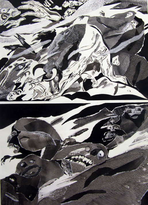
The adaptation of The Dunwich Horror by Norberti Buscaglia and Alberto Breccia is a more distinguished example which found its and first and only translation in the pages of the October 1979 issue of Heavy Metal. For the uninitiated or forgetful, the story concerns the mysterious and possibly inbred Whatley family; in particular the newly born, preternaturally intelligent child of unknown paternity, Wilbur Whatley, a veritable Baphomet. Ugly, wicked, and inhuman in anatomy, he is slain mid way through the narrative allowing investigations to begin under a certain Dr. Henry Armitage. Occult books are consulted and cryptograms decoded even as a mysterious force lays waste to the small town, slaying whole families in the thick of night. A final confrontation occurs on the hills of Dunwich where Wilbur’s monstrous twin brother is defeated and  unmasked.

The presentation in the English language Heavy Metal is more than aptly named considering the debasements inflicted on it over the course of the production process.

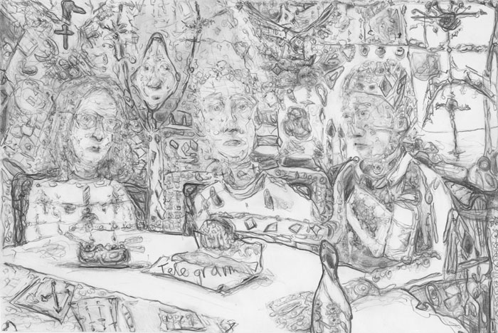
[Spanish and English editions of The Dunwich Horror]

Yet even in the original, this seems to be a job approached with proficiency by Breccia rather than the excitement and innovation one finds in a work such as Rapport sur les aveugles (Breccia with Ernesto Sábato). Lovecraft’s slow meanderings (the delays, forebodings, and suspicions) don’t lend themselves well to the narrative ease found in comics adhering to classical forms. It must be said though this adaptation was probably never meant as a substitute for the original but as a sort of primer and graphic aide. It may be that even a moderately long short story of this ilk would probably need twice as many pages to achieve its desired effect. Examples of this watering down may be seen on every page. The secret rites practiced by mother and child seem strangely innocuous and are not followed by the ambiguity of a witness’ testimony that the child had:

“…some kind of a fringed belt and a pair of dark trunks or trousers on” and that “Wilbur was never subsequently seen alive and conscious without complete and tightly buttoned attire, the disarrangement of which…always seemed to fill him anger and alarm.”

The occult sharings between grandfather and child found in the original are also omitted, these moments and their closeness suggesting not merely some demon spawn but unspoken incest and a deformed offspring (vehemently denied by Lovecraft as being too innocuous through his proxy Dr. Armitage), a parasite drawing knowledge and lifeforce from his grandfather who eventually dies by the child’s tenth year. Gone is that accumulation of fanciful and misanthropic detail: the cattle paid for in “gold pieces of extremely ancient date” which disappear (presumably consumed or sacrificed) at a prodigious rate; the town consumed by the ordinary rites of All-Hallow’s eve and Walpurgis Night; or the suggestion that “in 1917 [when] the war came…the local draft board….had hard work finding a quota of young Dunwich men fit even to be sent to development camp” and were “alarmed at such signs of wholesale regional decadence.” There are exceptions of course. The page and sequence showing the final dispostion of Wilbur Whatley is particularly excellent with its rough cut rabid cur and disintegrating form.

It occurs to me that almost all comic adaptations of Lovecraft seem to function best when seen more distinctly as illustration. The central panel on the third page of Buscaglia and Breccia’s adaptation works better than all three panels which follow it at showing Wilbur contempt for his mother, his overbearing presence like some evil Christ; the hills of Dunwich replacing that wedding at Cana and the messiah’s tarrying in the Temple in Jerusalem, an anti-Christ with altars on the high places. What better place to find a depiction of…

“…something almost goatish or animalistic”, “thick lips, large-pored, yellowish skin, coarse crinkly hair, and oddly elongated ears”

….or the corpse of Wilbur Whatley with skin “thickly covered with coarse black fur, and from the abdomen a score of long greenish-grey tentacles with red sucking mouths protruded limply” —

…or that final epiphany on the hills of Dunwich.

a “grey cloud – a cloud about the size of a moderately large building…Bigger’n a barn… all made o’ squirmin’ ropes… hull thing sort o’ shaped like a hen’s egg bigger’n anything with dozens o’ legs like hogs-heads that haff shut up when they step… nothin’ solid abaout it – all like jelly, an’ made o’ sep’rit wrigglin’ ropes pushed clost together… great bulgin’ eyes all over it… ten or twenty maouths or trunks a-stickin’ aout all along the sides, big as stove-pipes an all a-tossin’ an openin’ an’ shuttin’… all grey, with kinder blue or purple rings… an’ Gawd it Heaven – that haff face on top…’

Artful homage remains Lovecraft greatest legacy to comics, its practitioners like the aesthetes in The Call of Cthulhu, dreaming dreams and drawing monsters conceived of decades before. From that point of view, the Lovecraft issue of Heavy Metal was only making a point explicit for images from Lovecraft have ever been the center of one of the founders of that magazine, namely Philippe Druillet.

The 6 Voyages of Lone Sloane is an adaptation by any other name but here transferred to the vast emptiness of space and incalculable eons, not unlike his space faring version of Wagner’s Ring Cycle. The stories are largely nonsensical but intermittently involve forgotten fairways, secret words of power, cultic allegiances, and old dark gods—not just a testament to Druillet’s limitations as a writer, but also his singular focus on the sense of wonder and awe one finds in Lovecraft’s stories. As China Miéville writes in his introduction to At the Mountains of Madness:

“H. P. Lovecraft is the towering genius among those writers of fantastic fiction for whom plot is simply not the point.”

The imagery here is redolent of the third part of The Call of Cthulhu (“The Madness from the Sea”) in which the crew of the Emma lands on an unknown island, the “nightmare corpse-city of R’lyeh” and encounter Cthulhu himself. In not quite the same words and at various points in Druillet’s anthology of tales, we see the pirate ship Alert with its “queer and evil-looking crew of Kanakas and half-castes”…

[Images from Lone Sloane by Druillet and Watchmen by Joe Orlando]

…and then 

“a coastline of mingled mud, ooze, and weedy Cyclopean masonry which can be nothing less than the tangible substance of earth’s supreme terror — the nightmare corpse-city of R’lyeh, that was built in measureless aeons behind history by the vast, loathsome shapes that seeped down from the dark stars” …where ” the hideous monolith-crowned citadel whereon great Cthulhu was buried, actually emerged from the waters.”

…before apprehending the very image of Cthulhu himself—mechanical, rampaging, and yet curiously driven away by music.

No other cartooning acolyte of Lovecraft has delineated the author’s Cyclopean landscapes quite as effectively as Druillet, an artist who has yet to show any devotion to moderation, logic or good sense to this day.

[Gail, Philippe Druillet]

Beyond this point, there is the total assimilation of Lovecraft’s innards by Alan Moore, a comic literary criticism not unlike Martin Rowson’s adaptation of The Life and Opinions of Tristam Shandy, Gentleman. Lovecraft’s madness is resolved to science in Watchmen, the stories distilled to a metaphor for creation itself. Ozymandias’ monster is the product of literature, art, and sound, a psychic wave from the future if not an alternate dimension; driving “sensitives” to distraction or outright insanity; its god-curators slaughtered and forgotten; perhaps an “origin story” for Lovecraft himself.


“It was from the artists and poets that the pertinent answers came, and I know that panic would have broken loose had they been able to compare notes…These responses from esthetes told disturbing tale. From February 28 to April 2 a large proportion of them had dreamed very bizarre things, the intensity of the dreams being immeasurably the stronger during the period of the sculptor’s delirium. Over a fourth of those who reported anything, reported scenes and half-sounds not unlike those which Wilcox had described; and some of the dreamers confessed acute fear of the gigantic nameless thing visible toward the last.” (The Call of Cthulhu)

Scattered throughout are the pirates beckoning from penny comics, the surfeit of voyages by ship, the mysterious island of genesis, the incipient insanity and death.

At other times, Moore’s concept of worship becomes less rational and reverts to the high places.

[From Hell, Eddie Campbell]

This literary dissection of Lovecraft is played out in earnest in both The Courtyard and Neonomicon, the latter’s title hinting at Moore’s own penchant to see beneath the surface to the genital horror, the unspoken orgies, and the seasoned racism of Lovecraft. Concerning the latter and the members of a New Orleans cult (shot like dogs in The Call of Cthulhu the better to control them) Lovecraft writes:

“…the prisoners all proved to be men of a very low, mixed-blooded, and mentally aberrant type. Most were seamen, and a sprinkling of Negroes and mulattoes, largely West Indians or Brava Portuguese from the Cape Verde Islands, gave a colouring of voodooism to the heterogeneous cult. But before many questions were asked, it became manifest that something far deeper and older than Negro fetishism was involved. Degraded and ignorant as they were, the creatures held with surprising consistency to the central idea of their loathsome faith.”

[from The Call of Cthulhu by John Coulthart]

These words finds their counterpart in the works of Herge and the Inca mummy in The Seven Crystal Balls of which Noah Berlatsky once wrote:

“This, then, is really a case where I don’t like the sequence despite its racism and imperialism. As far as I can tell, I like it because of them. The fascination/repulsion Herge feels towards the strange gods of colonized cultures generates real creative frisson. Which makes me wonder if maybe that’s true of racism and stereotypes in general. It seems like, beyond their other uses, they sometimes have an appeal which might be called aesthetic. A certain amount of cultural creativity goes into shaping the person in front of you into a phantom monstrosity, and that creativity can itself be exciting and fascinating. The dream’s appeal is its vividly imagined ugliness; the exhilaration of imposing on the world the gothic products of one’s skull.”

Moore’s reversal of Lovecraft’s xenophobia is patent in Neonomicon, a Lovecraft homage so thick with references that it probably demands a companion book (see The Courtyard Companion and an extensive discussion at Comics Comics). Like the tales which inspired it, the plot is all investigation, exposition, and interrogation. The art by Jacen Burrows is strangely cartoonish like a point and click video game adventure or a Saturday morning cartoon; which may seem strangely serendipitous to some, that coyness being a subset of Lovecraft’s own dread of sexual description.

The main protagonists are two FBI agents named Merril Brears (white, female sex addict) and Gordon Lamper (black male, conspicuously “normal”), the object of their investigation a cult invested in the Old Ones. The Dagon worshippers might as well be gentrified East Village baby boomers, almost everyone white as a sheet and sagging with years of excess, the new Satanism, an antidote to the privileged old biddies lacing Polanski’s Rosemary’s Baby. Where Lovecraft frequently took care to situate his cultists in distant habitations  in deference to their paganism (from the Latin paganus meaning villager or country-dweller), Moore opts for the new heathens in their old squats. The only African Americans in Moore’s comic are investigating officers, a reversal of their position in Lovecraft’s stories where they are invariably abominations.

In chapter 2 of the comic (“The Shadow Out of America”), Merril strips and literally dresses like a whore in front of her black partner, all this without the slightest sexual arousal on both their parts, a counterpoint to a conversation about the “asexual” nature of H.P. Lovecraft. Gordon is duly shot and necrophilically abused once he is brought into the orgone-filled sanctum of the nearly racially exemplary cultists (the group includes an Oriental couple; a nod to the Chinamen and “unclassified slant-eyed folk” so beloved of Lovecraft ). Moore has never been shy about heavy-handed symbolism.

It is of course, stressed repeatedly that Merril is a recovering sex addict. Yet she resists her partner in a kind of temperance aided by racial purity; a chastity which repudiates miscegenation and hides from the conception of “foreign mongrels” (see The Call of Cthulhu). Far better to be coupled to a demon god for that is exactly what happens at the close of that chapter where Merril is raped repeatedly by Dagon—thus a latter day Lavinia Whatley of Dunwich who will bear the incarnation or avatar of Cthulhu.  The protagonist of The Shadow over Innsmouth is of course repulsed both visually and olfactorily by the presence of innumerable half-breeds in that town; his fear of contamination realized in full at the tale’s denouement when he discovers his own mixed heritage (he is of the Deep Ones). [1]

*          *          *

“It represented a monster of vaguely anthropoid outline, but with an octopus-like head whose face was a mass of feelers, a scaly, rubbery-looking body, prodigious claws on hind and fore feet, and long, narrow wings behind.”

If genre is a multi-tentacled monster with a gaping vaginal maw then no one should be surprised at the mucoid sheen of Alan Moore’s countenance. These comics are concentrated deconstructions of everything treading gently on the surface of Lovecraft’s stories, far more interested in evil than mirth; a fact which separates them from metatextural films like Drew Goddard and Joss Whedon’s The Cabin in the Woods.

That film has been self-described as a loving hate letter to horror movies and a rejection of the torture porn industry. The saviors in Cabin are the classics of the genre—werewolves, zombies, marionettes, the works of Clive Barker and Stephen King et al.—once locked in a labyrinthine glass walled prison like the Minotaur but then loosed upon benighted entertainment industry moguls to the violent cathartic delight of most of the audience. Beneath that cabin and entertainment complex lies an old god destined to destroy the world and the human race. Strange then that this jocular criticism fails so completely in conveying (perhaps intentionally) any of the unease and trepidation which those idolized exemplars so hoped to challenge their audiences with. Horror for Goddard and Whedon would appear to be a place of solace and entertainment not fear, dread, and revulsion. They remain quite unconvinced by that which they write. Not for them is Lovecraft’s suggestion that:

“The one test of the really weird is simply this — whether or not there be excited in the reader a profound sense of dread, and of contact with unknown spheres and powers; a subtle attitude of awed listening, as if for the beating of black wings or the scratching of outside shapes and entities on the known universe’s utmost rim.”

Moore on the other hand is eager to translate this knowledge of depravity to us, to initiate his readers into the mysteries of authorship and creation. Together with John Coulthart [2], he imagines the Old Ones in a Kabbalistic structure where Dagon is Netzach (astringent kindness, the union of the human and divine) and Cthulhu is Yesod. The Aklo is a drug, the “Ur Syntax”, the transforming proto-human language of theophoric words, allowing us to look within to the sexual revulsion and the racial hatred; the fear of contagion and Syphilitic dementia; the horror of “cosmic sin”. His comics a mirror for the evil within our souls.

Notes

[1]  Michel Houellebecq’s essay titled H. P. Lovecraft: Against the World, Against Life is quoted by both China Miéville and Tim Hodler at Comics Comics. Houellebecq denies any latent sexual symbolism in Lovecraft’s stories quoting a letter in which he writes, “I do no think that any realism is beautiful.”  Here are some excerpts from the essay:

“Paradoxically, Lovecraft’s character is fascinating in part because his values were so entirely opposite to ours. He was fundamentally racist, openly reactionary, he glorified puritanical inhibitions, and evident found all ‘direct erotic manifestations’ repulsive.”

“Absolute hatred of the world in general, aggravated by an aversion to the modern world in particular. This summarizes Lovecraft’s attitude fairly accurately….if he refused all sexual allusions in his work, it was first and foremost because he felt such allusions had no place in his aesthetic universe.”

“…it was in New York that his racist opinions turned into a full-fledged racist neurosis. Being poor, he was forced to live in the same neighborhoods as the ‘obscene, repulsive, nightmarish’ immigrants…But what race could possibly have provoked this outburst [a racist diatribe describing Lower East Side immigrants]. He himself no longer knew…The ethnic realities at play had long been wiped out; what is certain is that he hated them all…His descriptions of the nightmare entities that populate the Cthulhu cycle spring directly from this hallucinatory vision.  It is racial hatred that provokes in Lovecraft the trancelike poetic state in which he outdoes himself by the mad rhythmic pulse of cursed sentences; this is the source of the hideous and cataclysmic light that illuminates his final works.”

[2]  Presumably a natural extension of the wild utterances of Robert Suydam in The Horror at Red Hook:

“Malone did not know him by sight till duty called him to the case, but had heard of him indirectly as a really profound authority on mediaeval superstition, and had once idly meant to look up an out-of-print pamphlet of his on the Kabbalah and the Faustus legend, which a friend had quoted from memory…When he spoke it was to babble of unlimited powers almost within his grasp, and to repeat with knowing leers such mystical words or names as ‘Sephiroth’, ‘Ashmodai’, and ‘Samaël’.”

Further reading

(i) The French edition of Les mythes de Cthulhu (drawn by Alberto Breccia) – The gold standard for comic adaptations of Lovecraft. One of the greatest artists to grace the comics form. I suspect Breccia’s adaptation of The Dunwich Horror was chosen for translation by Heavy Metal magazine because it is also the most “conventionally” drawn. The rest of the stories in this collection are more experimental in technique. Breccia’s depiction of Cthulhu and the Deep Ones is also typically unusual.

(ii) The Lovecraft Anthology Volume 1 (SelfMadeHero) – This is the PG-rated version of Lovecraft by a host of British artists. Low on evil, mystery, racism, and violence, this is for the Scooby-Doo set.  Give this one to your kids.

(iii) Haunter of the Dark – John Coulthart is the way to go if you’re an adult.

(iv) Yuggoth Cultures – a smattering of Lovecraft ephemera from Alan Moore. Antony Johnston’s Yuggoth Creatures demonstrates what a mediocre pastiche of The Shadow over Innsmouth (and others) would look like.

Dying at Home, and Found

Satan Is Real is a dramatic title.  The album of that name, the Louvin Brothers 1959 gospel doomfest, lives up to the name, from the title song’s vindictively mournful recitative (“Preacher, tell them that Satan is real too,”) through a litany of terror, sin, remorse, and moral scolding, all the way to the closing prayer for death (I’m Ready To Go Home”).  And then of course there’s the famous album art, with its giant clearly cardboard, buck-toothed devil towering over the white-suited Louvins as flames crackle in the background — the hyperbolically campy package for the hyperbolically moralistic interior.  No wonder hippie authenticity-worshippers like Gram Parsons and Emmylou Harris couldn’t resist the Louvins. Listening to this album meant you could bathe in the salt of the earth by listening to your lifestyle condemned in sublime harmonies, then turn to the record cover, toke up, and laugh your ass off.


Charlie Louvin’s autobiography is also called Satan Is Real, and it has the same cover photograph as the album.  It makes a go at the fire and brimstone in the text as well — the book opens with Ira Louvin drinking himself into a stupor, calling his mother a bitch, and getting cussed out by his brother.


Where the Louvin Brothers might turn a (cleaned up version) of that anecdote into a moralistic tale of repentance and/or eternal damnation, though, Charlie’s prose version never breaks out the flames or the cardboard devil.  It’s just a sad story about his sad drunkard brother.


That’s the case for the book as a whole, too.  There’s certainly a lot of unpleasantness; the Louvins dad beat them, especially Ira, mercilessly, and set them to work in the cotton fields till their hands were cut and bloody.  Ira was a temperamental artist and a mean drunk, breaking mandolins, chasing women, and generally behaving like a horse’s ass.  In one famous incident, Elvis came to the Louvin’s room to tell them that the gospel they played was really his favorite music.  Ira, in his usual people-pleasing way, grabbed the King by the throat and hissed out, “If that’s the music you love, then why do you play that nigger music!”


Or at least, that’s the story.  Charlie, who was there, insists that Ira didn’t strangle Elvis and wasn’t shouting. Apparently, his dickishness was sufficient to keep Elvis from ever recording a Louvin-brothers tune, though — not the first or last time that Ira cost Charlie a heap of money.


The brush with Elvis is in part well known because it’s emblematic.  Charlie and Ira were playing old timey brother duets at a time when country was morphing into rockabilly, grabbing up a whole new generation of listeners and leaving a generation of artists behind. Charlie grumbles a little about contemporary country and those damned kids on his lawn, but mostly you see the shift play out in his career.  Ira and Charlie wanted to be Roy Acuff, but they never got as famous as their idol. By the time they were on the Opry, the demographic gold was kids shaking their booties, not new urbanites looking to their radios for a reaffirmation of rural values.


As a result, Charlie was a second-tier star,  the less mercurial half of a moderately successful duo — and his autobiography reads quiet.  It’s not a rag-to-riches story so much as a rags-to-decent-comfort story. Charlie’s got a ringside seat to Ira’s mess of a life — the alcoholism, the serial divorces, the fights, the whining, the typical grinding, pointless stupidity of addiction, the early death (in 1965, on the highway where, improbably, it was the guy in the other car who was drinking.)  But a ringside seat isn’t  being in the ring, for which, I’m sure, Charlie was grateful.  He himself didn’t drink and managed his career carefully — he had a number of minor solo hits after he finally broke with Ira. He also had a long, happy, untumultuous marriage to his wife Betty.  In fact, the most affecting part of the book is practically the first thing in it; the dedication.


And for my wife, Betty.  I remember when the country singer Carl Smith’s wife died, and I went to her funeral.  Carl was the steadiest man I’d ever met, just as solid as a table.  But when they were doing the last eulogy, he absolutely went to pieces.  It shook me up so bad that I had to go out into the yard to get over it.  And right there in the yard, I prayed to God for one request, that whenever I go, I’d go before you.  I’m just not that tough that I could make it without you.  I know that.  Just as I know that I’ve needed you with me every step of the way.


Charlie’s God isn’t a God that throws drunkards into the pit. Instead, he’s a God who understands and forgives human love and human weakness.  It’s maybe not a God who makes for an especially dramatic song or book, but it does seem to be a God who makes for a decent life. And a decent death as well; Charlie got his wish.  He passed away shortly after he finished the book. His wife survived him.
__________
This first appeared on Splice Today.

The Sun Also Sits There

This first appeared on Comixology.
__________________

Ernest Hemingway is one of those writers I return to again and again, and each time I like him less. When I was an adolescent, I found the strong, silent protagonists mouthing stark declaratives profound, or at least engaging. The older I got, though, the less patience I had for the tired modernist schtick. “I cannot say what I feel. But it is deep. And potent. And involves fishing.” Yeah, whatever jack. I prefer authors who have thoughts complicated enough to require the occasional dependent clause, so I’ll be over here reading Jane Austen, if that’s okay with you.

I certainly prefer Norwegian cartoonist Jason to Hemingway. For one thing, Jason doesn’t hate women, as far as I can tell. And for another, his new book of short graphic stories, Low Moon, has a bunch of clever touches that made me chuckle out loud. The story “Proto Film Noir,” for example, is “proto” because it’s about sexual jealousy and betrayal amongst cavemen (or cave-anthropomorphic –animals, to be more precise.) “Low Moon” features wild west desperadoes who settle their differences not by dueling, but by playing chess.

Still, it’s no accident that Ernest shows up as a character in one of Jason’s earlier graphic novels — the two definitely share some avant-garde common ground. Jason’s graphic style has a Hemingwayesque flatness. His animal protagonists lack both pupils and varied expressions; they’re all indistinguishably deadpan, all the time. The style overall is an approximation of Herge’s clear-line approach, but without Tin-Tin‘s detail or fantastic settings. Most of the backgrounds here are skillfully rendered, but sparse; some bushes, a horizon line, or, often, just a primary color. Even the flora of an alien land, in Jason’s hands, seems determinedly matter-of-fact; a space-flower is drawn as a simple, almost unadorned circle, which spits out plain, sperm-shaped seeds in a ragged, unassuming burst. One of Jason’s usual expressionless characters watches it — well, expressionlessly.

As this indicates, Jason’s stories, like his pictures, are resolutely stripped of filigree. There’s no text boxes, and often not a lot of words. Open to any page and you’re likely to find some blank-faced animal staring meaningfully at something or other. The narratives unfold with a bleak, unexplicated inevitability. In “Emily Says Hello,” a hit man reports to his female employer on a series of successful murders, in return for which he receives an escalating series of sexual favors. Then things end badly. In “Proto Film Noir,” guy and gal meet, fuck, and kill gal’s husband…repeatedly, because he keeps coming back form the dead to have breakfast. Then things end badly. In “You Are Here,” a woman is abducted by aliens; her husband spends the rest of his life building a spaceship while her son grows up, gets married, gets divorced, and eventually joins his dad seeking her in the vastness of space. Then things end badly. And also poignantly.

There’s no questioning Jason’s skill as a cartoonist; the seamless ease with which time telescopes in “You Are Here” is both lovely and impressive. Yet that mastery can also be alienating. My least favorite story is the most formally complicated: the cutely named “&”. It involves two narratives. In the first (on the left-hand pages) a man’s mother is dying. He has to pay for an operation, so he performs a bumbled, slaptick burglary, finally gets the money for the operation…and his mom dies anyway. In the second (on the right hand pages) a guy proposes to a woman, discovers she has another fiancée, and kills him. Then she gets another fiancée, and our anti-hero kills him too. And so forth, until she agrees to marry the anti-hero…but hangs herself on their wedding night. The last panel of the comic is the bereaved son and the bereaved husband sitting at a bar, where they exchange the requisite empty glance.

And, indeed, that’s where all the stories seem to end. In silence, gazing at the black absurdity of life. The smooth, empty surface is meant to evoke a deep profundity. But is it deep to reflexively gesture towards the modernist emptiness? Or is it just glib? Silence can contain meaning, certainly, but when it’s the same silence and the same meaning, it starts to get a little tiresome. Hemingway and Jason are laconic, in other words, not because they have a lot to say, but because they don’t.

Utilitarian Review 5/26/12

News

Well, we’ve finally, finally got our entire archive over here. It was brutal, but finally finished. To celebrate, I’ve posted a bunch of things from the archive this week, including:

—Robert Boyd with a comment on TCJ’s mainstream coverage.

—Caroline Small on the fecundity of Alan Moore’s Swamp Thing.

—me on why women like boy’s love.

— Miriam Libicki on Terry Moore, Jaime Hernandez, and soap operas.

—A voices from the archive post highlighting a comment by Miriam Libicki on Lost Girls.
 
On HU

I talk about dick vs. fanny in male genre comics.

Ng Suat Tong on Alison Bechdel’s Are You My Mother?

Qiana Whitted on what cigarette warning labels tell us about comics.

Charles Reece with a two part explanation of why the Marston/Peter Wonder Woman is a fascist tool. part one; part two.

With Charles’ pieces, we’ve finally completed our Marston/Peter Wonder Woman roundtable. The index for the entire thing is here.

I talk about the Zen of John Porcellino’s Christmas Eve.
 
Utilitarians Everywhere

At Splice Today I review Rye Rye’s new album.

Also at Splice I ask why the fuck NATO exists, and why won’t they leave us alone.
 
Other Links

Isaac Butler interviews Laura Miller on fandom.

Alyssa Rosenberg on D’Angelo’s body issues.