
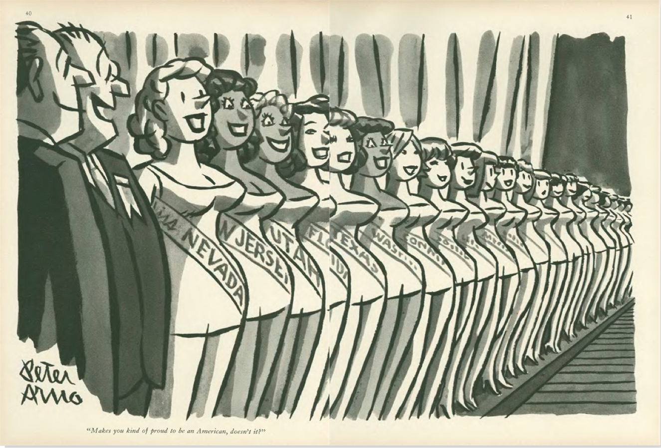
Peter Arno, “Makes you kind of proud to be an American, doesn’t it?”, September 10, 1960
I
The standard line on The New Yorker’s cartoons is that they are the first thing most readers turn to when they get their hands on a new issue. Well, I don’t. I actively try to avoid looking at them, difficult as it is. Peppered through articles of serious journalism, strong criticism, and pieces of often very good fiction, they are meant, I suppose, to induce some kind of alchemical understanding of what it is to be a New Yorker, or — failing that — a New Yorker reader. To me, and I suspect quite a few others, they remain obnoxious non-sequiturs, like tired notch-notch, wink-wink routines insistently dropped into an otherwise lively family conversation by your borderline senile uncle.
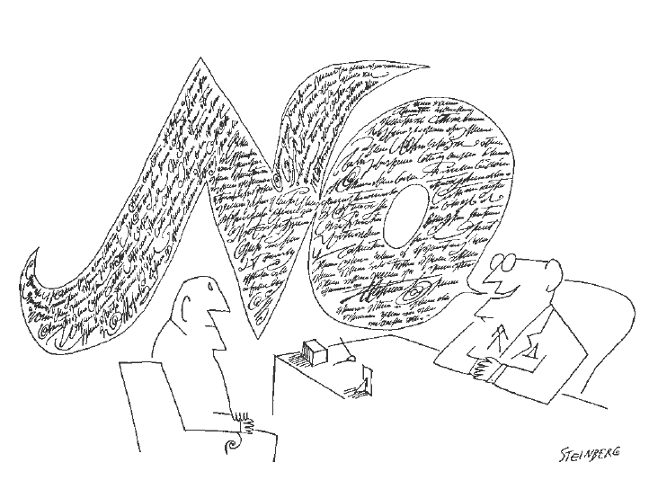
The other oft-repeated line about the New Yorker cartoons is that a lot of people ‘just don’t get them,’ with the frequent corollary that this is part of their point, and once you realize it, you feel ‘in’ with those in an authentic New York state of mind, I suppose — you know, those whose worldview Saul Steinberg summed up so incisively in what remains arguably the most famous New Yorker cover of all time.
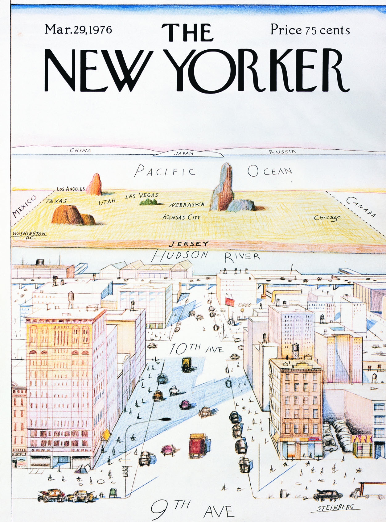
Saul Steinberg, cover, March 29, 1976
Thing is, if you actually review a substantial selection of cartoons from the magazine’s octogenarian history, the vast majority of them are totally straightforward. You understand the joke. No Mystery. Only in the last decade-and-a-half or so has editorial showed a preference for a certain brand of light absurdity that at times borders on the impenetrable. Nothing wrong with absurd humor, but the problem in this case is that one of the main strengths of cartooning, clarity, is sacrificed in a vain bid for ingenuity.
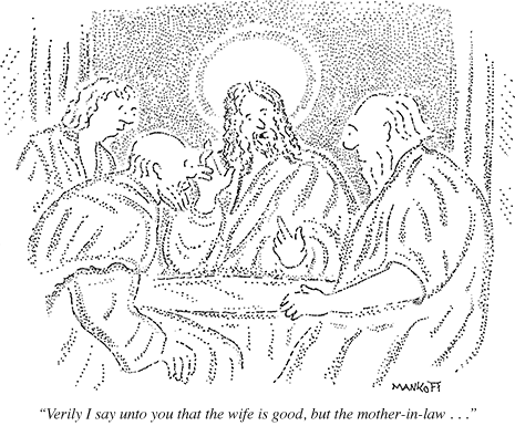
From this week’s issue: Robert Mankoff, October 8, 2012
This more or less corresponds to the period in which hack cartoonist Robert Mankoff has served as cartoon editor. He has been a hugely successful manager of his part of the New Yorker brand, merchandizing the cartoons through the online Condé Nast Cartoon Bank to the tune of millions of dollars a year, as well as editing the monumental Complete Cartoons of The New Yorker (2004), which bundled all 68,647 cartoons thitherto published in the magazine on two CDs. Bonus info: he has had over 800 cartoons published in the magazine.
Mankoff furthermore is the instigator of the popular New Yorker Cartoon Caption Contest. And far be it from me to suggest we deny people their fun, but the concept is revealing of his editorial philosophy, where the visuals become so generic that they accommodate just about any joke. Absurd or not, the naughts have been the nadir of New Yorker cartoons in every respect, from idea to execution. More than ever, one suspects that the notion that they harbor some elusive brilliance available only to the in-crowd really just euphemistically expresses a general puzzlement about how unfunny they are. As in, ‘can they really be that bad?’

More from this week: Tom Cheney, October 8, 2012
We are, after all, talking about the Holy Grail of American cartooning. The one publication countless cartoonists would hack off their non-drawing arm to be published in. The New Yorker, somehow, has managed to convince a wide, generally discerning and highly cultivated readership that their cartoons represent the acme.
Try as I may, I have been unable to assimilate this View from Ninth Avenue. Reading through several thousand of the cartoons assembled by Mankoff in his 2004 book, I cram to understand it. From the very beginning in 1925, the New Yorker cartoons as a rule have been unambitious, unimpressive, and unfunny. Not to mention frequently sexist. As a platform for cartooning, the magazine has (with a few exceptions, to be addressed presently) been a deadening force at the heart of the art form, smothering the field in bourgeois mediocrity.
Helen Hokinson, December 11, 1937
II
In a 1937 article in the Partisan Review, The New Yorker’s bête noire of the time Dwight McDonald — later a significant contributor to the magazine — criticized the cartoons for their “Jovian aloofness from the common struggle”, identifying “…something inhuman in [their] deliberate cultivation of the trivial.” This critique was part and parcel of McDonald’s, and the Partisan Review’s, ongoing criticism of the The New Yorker more generally. McDonald concomitantly described the typical writer for the magazine as having “given up the struggle to make sense out of a world which daily grows more complicated. His stock of data is strictly limited to the inconsequential.”
William Galbraith Crawford, October 13, 1934
This is not the place to enter into the long and complex history of The New Yorker and its critics. Suffice it to say that any institution, cultural or otherwise, that achieves this kind of success and influence will be met with criticism — and indeed McDonald’s words are echoed in those of many a critic of the magazine since. But whatever the problems of ‘New Yorker fiction’ as a phenomenon, of the blind spots exhibited by the magazine’s critics, or of its at times timid or problematic treatment of important political issues — most recently perhaps the 2003 invasion of Iraq — it is undeniably one of the publications of record in all three areas.
In other words, McDonald’s critique, however accurate it might be in diagnosing a fundamental aspect of founder Harold Ross’ vision, does not render justice to the ambition and quality of the magazine, then or now. Where it does ring true, however, is in its characterization of the cartoons, then and now.
Reaction shot: Rea Irvin, December 20, 1941
Reading the introductions to each decade of The New Yorker’s publication history in Mankoff’s Complete Cartoons, each written by a different author connected with the magazine — from Roger Angell and John Updike to Lillian Ross and Calvin Trillin — one is struck by their apologetic tone. They are forced to acknowledge the obvious: that The New Yorker’s cartoonists almost never managed to comment intelligently — or indeed at all — on the important events of their time, be it the Great Depression or the Second World War, the civil rights movement or Vietnam.
An exception to the rule: Carl Rose, December 20, 1941
This was all in keeping with Ross’ sensible if not unproblematic vision that The New Yorker would “not be iconoclastic”, marketing it as he did to “intelligent and discriminating men and women who appreciate fine things and can afford them.” While it would be a fair question to ask why the magazine has shied away from political or otherwise editorializing cartoons, especially when their other content is much less hands-off on such matters, this in itself is not the problem. The point is that choosing gags as your calling does not let you off the hook. Major national and world events belong as much to the social sphere (the domain of gag cartoons), as it does the political or economical. The New Yorker, however, was content with serving up endless iterations of two guys in a bar, desert islands, and bosses and their secretaries — a dull superfluity of safe inanity.
Warren Miller, April 6, 1968
III
The gag cartoon is a difficult discipline. The trick, of course, is to make the reader laugh. The joke’s the thing. And there is no accounting for humor, which makes accessing your own in its purest form the noblest avenue of expression for the cartoonist. Not to mention the funniest. It is not so much that there are not a fair amount of fairly funny jokes in The New Yorker, but rather that they are almost invariably of the generic variety, with cartoonists content to act as warm bodies on the mic stand, interchangeable and disposable. Too few of them present a truly original, unexpected, idiosyncratic, intelligent, or imaginative point of view, and judging from just how consistent the magazine has been in this regard, it seems editorial has rewarded them for thinking inside the box.
Peter Arno, April 12, 1930
Let us forego the banal swill that bulks up the bibliography and focus on some of the canonized artists; the best the magazine has had to offer, according to public opinion. First there is Peter Arno, the quintessential dandy cartoonist, a kind of real-life Eustace Tilley, cuffs stained with india ink.
No doubt, Arno is one of the great visual stylists of American cartooning, and arguably the most effortless major graphic contributor to the magazine. His cartoons are master classes in composition and narrative, at times carrying an almost abstract beauty in their distribution of forms, light, and shade. Yet, his visual characterization, while extremely precise and frequently funny, is invariably trite, serving up conservative stereotypes spritzing the safe clichés of the masculine bourgeoisie — from Martini jokes to silver fox slickers ogling chorus girls. Very little of Baudelaire’s flâneur remains in his and his various gag writers’ myopic, self-sufficient perspective.
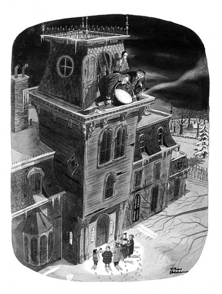
Charles Addams, December 21, 1946
Another icon is Charles Addams, possessed of a genuine yen for the absurd yet ultimately toiling it in service of warm reassurance. His earlier cartoons boast some inspired ideas and occasionally reach toward the surreally unsettling, but by the time he had established the Addams Family, those lovable munsters in their plush Halloween mansion, he started descending irrevocably into comfy family camp. Worst is the utter lack of visual ambition — one plump Addams character pretty much substitutes for another, any signs of individuality listlessly muddied up in drab wash.
Helen Hokinson shows some self-awareness: May 1, 1937
Helen Hokinson suffers from similar problems of visual realization. Drawing her characters small and indistinct, it is frequently hard to glean anything significant, relating to the gag or otherwise, from their facial expression or body language. A pity, because her wit (or that of her gag writers) is sharp, if limited in scope — lots of rotund society ladies, lots of hat, dress and jewelry jokes. Her irony cuts a little deeper than that of most of her peers, but dissipates with a dispiriting ‘aw shucks’ fizzle.
Jack Ziegler, November 24, 1980
Of later comers, Jack Ziegler is one of the most prominent, I suppose both for his versatility and consistency in terms of joke content, but also, surely, because he is somehow quintessential. Beyond the shoddiness of his rendering—more complex of course, but essentially no different from the arid cartooning of a Scott Adams — he lacks a core: emotional, personal, what have you. To him a joke is just a joke, and he can be relied upon to makes us laugh and forget, issue after issue.

Roz Chast, December 7, 1998
Then there’s Roz Chast, The New Yorker’s current cartoon fig leaf for artistic respectability. She is to be commended for introducing into the magazine a kind of poetic whimsy previously unknown, and for deprioritizing the punchline in favor of more ineffable humors. Unlike most of her colleagues, she actually has a personal voice, but it is never particularly revealing: a step beyond the imaginative dazzle, it is cute and cosy, keeping anything difficult at arm’s length.
This complacent tone is apparent more than anywhere else in the lazy drawing, which remains unimproved after more than thirty years. The telephone doodle charm only goes so far, because the small, overcrowded, inarticulately composed, and sluggishly washed drawings rarely contribute more than a very general — if persistent — sense of caffeinated giddiness, ending up placeholders for ideas worthy of a more articulate cartoonist. It’s like watching Ted Rall impersonating Lynda Barry.
Bruce Erik Kaplan, September 17, 2012
Next to Chast, Bruce Eric Kaplan is the seeming exception that proves the rule that current New Yorker cartoonists all lack personality. His graphic style is his big draw: everything is drawn as if by etch-a-sketch, centering on a supposedly existential emptiness. It is indeed spectacular in the dull context of the magazine, an easy standout, but it’s a shtick: the cartoons are interchangeable, their links to individual jokes tenuous at best, and the general sense of alienation is unmodulated to fit the content. The same idea executed ad nauseam.
III
I could go on, but the point should be clear. These are highly overrated cartoonists, elevated by their august platform. And keep in mind that they are the wheat to the vastly more abundant chaff. One might argue that gag cartooning is simply not suited to the kind of artistic expression lacking in the pages of The New Yorker, that I’m setting the bar too high here, but besides questioning the wisdom of focusing so one-sidedly on gags at the expense of other forms of cartooning, you could point to Mad Magazine — a publication whose cultural impact, however different, is commensurate — as a much more reliable source of quality humor cartooning, despite its own faults. The critically overlooked Don Martin easily trumps any of the above-mentioned for originality and plain laughs. As do a number of cartoonists working in similar formats never — or rarely — published in The New Yorker, from H. M. Bateman and Virgil Partch to Basil Wolverton and Gary Larson.
William Steig, March 24, 1986
In a way, however, the most damning factor is that The New Yorker harbored a few cartoonists whose example — if it had been internalized instead of merely idolized by editorial — would surely have helped shape a truly innovative cartoon platform. One is William Steig, a cartoonist of fertile imagination, a well-honed instinct for portraying the human animal, and — as he matured — a nervous line crackling with personality. One might argue, however, that he did his best work elsewhere, primarily in children’s books.
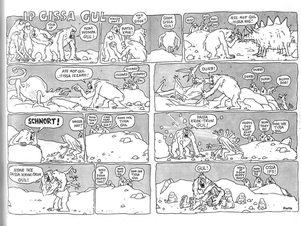
George Booth at his best with the early “Ip Gissa Gul”, January 20, 1975
A bright spot in the dim latter half of the William Shawn years was George Booth. Although not the most gifted gag writer, his anarchic humor as manifested in his ratty line, and trademark rat-like dogs, is an unexpected delight in the murk that is any given issue’s cartoon selection. At times, he comes off not a little unhinged, not unlike the aforementioned Don Martin. More of his kind would have been a help, but not enough in itself.
James Thurber, March 16, 1935
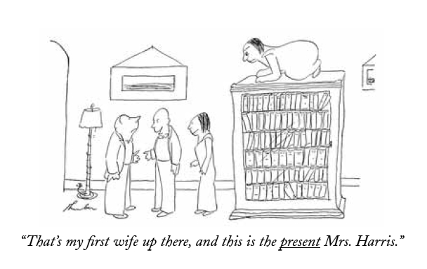
The true paragons — of course, I suppose — are James Thurber and Saul Steinberg, however. The half-blind Thurber was a natural cartoonist, possessed of a genuinely original vision that included as acute an eye for human behavior as any of his fully-sighted peers, condensed on the paper in sprightly notation. His treatment of his main theme, gender, may initially seem a little banal until one notices the disturbing irrational undertones pushing at the edges — the ex-wife lurking on top of the bookcase, the seal behind the bed, the sudden fencer’s head-lop. Thurber’s is a cold world, and the gleam in his live eye is humor.
The strange thing is how little his approach came to shape The New Yorker’s cartoons. Of course, few cartoonists can be expected to be as original, but he remains an example of what can happen if one admits and nurtures the personal sensibilities of a gifted cartoonist. Although this was initially Thurber’s good friend E. B. White’s doing, Ross clearly grew to appreciate Thurber, who became one of the magazine’s graphic constituents (and literally part of the architecture by way of his graffiti, a piece of which has been transposed into an oblique corner of the current offices in the Condé Nast building). It is hard not to see it as an editorial failure that his example wasn’t followed.
Saul Steinberg, November 25, 1961
Except with Steinberg, one of the century’s great cartoonists. Although just as unique, he became much more central to the magazine’s graphic identity than Thurber, and his influence on it remains much more pervasive, if in all the wrong ways. A cartoonist of brilliant facility and mind, he unassertively situated himself in the continuum of modernist art, but with a distinctively post-modern sensibility, Steinberg was the quintessential meta-cartoonist. He elevated the discussion of what cartooning is and, by consequence, the significance of The New Yorker to the art form.
Now, I must confess to some reservation vis-à-vis Steinberg. It’s easy to appreciate his cleverness and I do love his line, but I largely agree with Tom Lubbock’s critique that there is something too controlled, too detached, too safe about his cartooning, which is obviously witty and intelligent, but neither really funny nor really troubling. This takes us back to the central problem with The New Yorker’s cartoon tradition and how Steinberg validates its ethos, despite his outsize talent: New Yorker cartoons are often witty, if rarely intelligent; they are occasionally funny, but never troubling. They perpetuate an escapist bourgeois utopia, detached, controlled and safe.
What’s frustrating is that it could have been different. The New Yorker could have exerted the same level of ambitions on the part of their cartoons as they developed with regard to journalism, criticism, and fiction. Ross’ project to endow the magazine with a strong graphic identity was smart and it worked, not the least because of the often excellent illustrations and the famous covers. But the cartoons remain a monument to mediocrity, a would-be canonical example of wasted opportunity, were it not so bafflingly extolled as a high watermark. As it stands, I don’t doubt that The New Yorker would have been better off without them, and in my darker moods I feel as if the art form as a whole would have too.
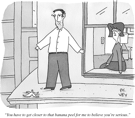
P. C. Vey from this week’s issue, October 8, 2012
__________
Click here for the Anniversary Index of Hate.
The comparison with Mad seems particularly telling. Not just Don Martin, but Sergio Aragones, Al Jaffee, even Dave Berg — whether or not you think they’re great cartoonists, they all had distinctive styles and were given room to explore them. I wonder if the difference is that for Mad the cartooning was more central, whereas it’s always been more of a decorative side-note for the New Yorker?
The difference between Mad and the New Yorker is that the former has always been crassy commercial, while the latter has always been a refined and genteel part of the New York intelligentsia. A wry, restrained grin at the sad absurdities of life is the worst that is allowed in those circumstances, while great cartoons need emotion.
Now this is a worthy target.
Sorry but I strongly disagree with some of your assessments of the aforementioned cartoonists. Your expectations are personal to your own needs. Cartoons are like music, they don’t have to be anything nor answer any questions. If they do, great. If they raise questions better. But to make them accountable to documenting 20th century history or fulfilling your criteria of the cartoon curve seems “inside the box.” Do you only listen to protest music? To compare work from 80, 90 years ago is like lumping in classical music with the Beatles. Our society’s sense of humor is not completely different by now? To me, that is lazy and unfair to late cartoonists of past. Finally, let me state in full disclosure that I do do cartoons for the New Yorker as well as other places worldwide. So I do have a dog in this race. And I’ll agree with you not every cartoon is hilarious but thank goodness we all don’t agree on which ones.
Hey Bob. Of course Matthias’ opinions are his opinions…but I don’t think your defense is very effective. Matthias criticizes them for aesthetic timidity, and for failing as cartoons focusing on society, not politics. If we’re able to say today that Shakespeare was great, I don’t really see why it’s wrong to say that the New Yorker cartoons (which are much closer to our time, obviously) aren’t so good.
If you want to defend some of the particular cartoons Matthias dislikes, that’d be great. But a general claim that we can’t criticize old things, or that the cartoons don’t need to be political — when Matthias didn’t say they did — seems unconvincing.
Finding good cartoons in “The New Yorker” is like panning for gold in gold country. It may take a lot of work, but sooner or later you’l find some nuggets.
I purchased “Complete Cartoons of The New Yorker” and nearly went blind looking through the collection. But I can’t remember if I looked through them all. That may be an indication of the blandness and interchangeability of the majority of the cartoons, or it may just be that the cartoon overload numbed my brain.
I’ve never supported myself by cartooning, but I’ve been a cartoonist for about 45 years, and have sent ot a few gag cartoonist during that stretch of time.
I sent “The New Yorker” one about five years ago because it was funny in a wry way, and was set in a Times-Squarish backdrop. It was rejected, but I STILL think it’s funny.
Here’s the reject: http://home.comcast.net/~russ.maheras/Asteroid-72dpi_copy.jpg
Hey Bob, thanks for replying, and for doing it so civilly, after my admittedly harsh piece. I think Noah’s more or less answered for me, so I just wanted to say that I agree with you that cartoons can be like music and don’t have to answer for themselves according to one specific set of criteria, but I had hoped that that was actually what was conveyed in my essay. The point about their engagement with social issues of their time is just one criticism, but if you check back I hope you’ll see that it’s not a demand. What I would have liked to have seen, and to see, in The New Yorker are cartoons that express more of a personal vision, a good to high level of craft, and which are funny. Pretty much. I don’t see much of that in the back catalogue, and I certainly don’t see it today — as I wrote I think the cartoons are, on average, worse than ever, plus they feel almost totally anachronistic in a way I guess they didn’t use to as much.
As for the comparison with Mad, Noah and Martin, I think you’re both right, although I disagree that The New Yorker’s chosen position and target audience precludes challenging, original cartooning.
Russ, thanks for sharing!
YES.
Well, this is certainly a discussion hard to capsulize in a comment box and I don’t claim to be a scholar in humor or this publication but I don’t want to be rude and give the impression I left the room in a huff.
Yes, Shakespeare stand the test of time. But surely he ws funnier back then. Secondly, my conclusions were based on your adjectives; just one example; calling Mankoff a hack. His book and the work contained in it alone, The Naked Cartoonist, demonstrates the force he is in this field and that’s hard to debate. Specifically,your request to see cartoons “that express more of a personal vision, a good to high level of craft, and which are funny.”…I ask you to search in that catalog or easier the Cartoonbank.com, just off the top of my head, Bob Weber or Charles Saxon. Present day? Granted, in the current issue there be may a spectacular range of funniness, the highs ARE bright (and be my guest to critique mine, it’s the second cartoon on pg 38. It’s not even my favorite in the issue but I promise I used some personal vision and a good to high level of craft.).
I was out all day but at lunch I engaged in this conversation at a diner and handed out four recent issues of the NYer to the foursome. All are college educated and two are writers for the NY Times. I asked everyone to pick their favorites and the one they thought were the turkeys. Some people’s worst were other people’s favorites. That’s how cartoons get in. They’re picked by humans. Thanks for listening to my two cents.
“But surely he ws funnier back then.”
It’s hard to say. Shakespeare’s comedies are really kind of amazingly funny today. Some of the jokes can get lost a bit in translation, but a lot of it is slapstick and dick jokes, and those are things that never grow old….
“Absurd or not, the naughts have been the nadir of New Yorker cartoons in every respect, from idea to execution.”
I don’t agree that the magazine has historically been a failure cartooning-wise. But I do agree whole-heartedly that overall in recent years the gags lack the bite that they used to have.
Matthias, do you think Francoise Mouly deserve any of the blame for this?
If I may, Miss Mouly deals solely in the NYer cover selections.
Shakespeare is a genius and SO many great expressions you would never think of are still used today. I love Shakespeare (and regret I picked that as a point to challenge). But it’s not possible to compare his humor and I don’t find him hysterical like a good Danny Shanahan cartoon or Alex Gregory cartoon. http://www.condenaststore.com/-sp/You-re-right-things-are-funnier-in-threes-New-Yorker-Cartoon-Prints_i8540123_.htm
If you pick up 68,647 of anything most of it will be crude.
Well, yes, but my argument is that there has been an overall editorial problem. Also, this is the reason I chose to critique, however briefly, a selection of the best-regarded (and, frankly, best) cartoonists the magazine has published, instead of a bunch of lesser hands.
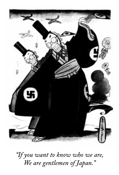
Also, absurd as it is with this microscopic a selection of the whole, I’ve tried to be representative, mostly showing fairly high quality work from the cartoonists I talk about, and also — for example — tempering the Gilbert and Sullivan racist jab at the Japanese with Carl Rose’s really quite excellent cartoon from the same issue, published when tempers were understandably high.
Regarding Mankoff, he clearly is “a force in his field”, but to me that’s more due to his work with the cartoon bank and his activism, and — inevitably — his editorship at the New Yorker (even if I think he’s terrible at it). But none of that makes him a good cartoonist. I mean, just look at the one I posted. For those unfamiliar, I assure you that it’s quite representative.
No critique of Mouly is implied. I not necessarily wild about all the choices she’s made, but overall she’s been a great cover editor. In any case, my article is not about the covers.
Well done, Matthias; overall, I tend to agree with some reservations. For example, we should bear Sturgeon’s Law in mind: 90% of everything is crap.
I once had a volume of cartoons celebrating 30 years of the New yorker, and they’d obviously cherry-picked the best of 3 decades.It was magnificent! And funny!
Personally, I think they made a big mistake, under Shawn’s editorship, in banning writers other than the cartoonists themselves from contributing gags; under Ross, often the idea came from such comedy masters as E.B.White, Robert Benchley, S.J.Perelman or James Thurber.
Disagree about Addams, agree strenuously about Roz Chast.
The comparison to Mad seems to be a bit apples and oranges; perhaps it’s more instructive to look at other magazines such as Esquire, True, or Playboy…even at Punch, which really revitalised itself over the ’60s.
It’s ridiculous that great gag cartoonists such as Virgil Partch or Ronald Searle weren’t part of the NY stable!
Agree that the present period is particularly dire…
Bob Eckstein, thank you for commenting so graciously.
I think covers like this one are an embarrassment. I don’t think an image like that would’ve ever passed muster in the old days. Even in the Tina Brown years. I’d say overall the post-RAW cartoonists have not held up the same standards of the magazine of old.
“you could point to Mad Magazine — a publication whose cultural impact, however different, is commensurate — as a much more reliable source of quality humor cartooning”
That’s highly dubious. MAD could have its virtues. But for decades I think it was editorially stagnant and wedded to formula, the talents of the cartoonists notwithstanding. It wasn’t until the mid-to-late nineties (or so it seems to me) that it finally got back some of that spark.
And are “laughs” really the most important goal for a cartoon?
Another problem is what else can you compare it to? Alex mentions the sixties, but in the decades after that what else was there? Playboy always had cartoons of course, but the editorial strictures squeezed the life out of most of the cartoons.
Actually, Steven, I think that cover’s pretty neat! Different strokes…
In the 70’s National Lampoon was a terrific source for gag cartoons, notably those of Rodrigues…Penthouse, Omni and (yes) Hustler featured superb stuff. In the ’80s and early ’90s, Spy magazine was pretty great.
This isn’t even to mention overseas gems like Britain’s Private Eye or France’s Charlie Hebdo…
Actually I guess the New Yorker looks pretty sickly.
True, Playboy
(oops, web hiccup)
True, Playboy really compromised itself with kitschy, fake-sexy leering illos, but it still publishes good stuff by Gahan Wilson and R.O. Blechman, among others…
I kind of hate that cover. The intellectual cutesiness is just like sandpaper on my eyeballs.
It seems very New Yorker, though; don’t know that Clowes is letting the side down so much as keeping on keeping on.
Well, I think you may hate it because you’re more familiar with the Sci-Fi tropes involved than the average NY reader is.
It’s true that apt comparisons are hard to come by. The reason I chose Mad is because it’s a cultural institution of comparable significance, and that fundamentally is what my critique is about. Whatever one thinks of individual New Yorker cartoonists, whatever one finds funny, and whatever level of credence one puts in Sturgeon’s law, my problem with the magazine is basically that it has never nurtured the same level of ambition for its cartoons than it has had for its other content. Ross’ vision has been an increasingly deadening factor that no-one’s really cared to challenge, it seems to me.
I definitely agree with this assessment of the New Yorker’s cartoons, but I have to quibble with one little aside here about the magazine itself. In contrast to, say, the New York Times, the New Yorker acquitted itself admirably during the lead-up to and invasion of Iraq, probably most notably by publishing Seymour Hersh’s exposes about the abuses of prisoners at Abu Ghraib (and a good deal of other excellent reporting by Hersh about the rush to war).
That’s not my memory of it. I remember reading it, and the New York Times, in the run-up to the war and feeling frustrated that neither wanted to come out and state what was obvious: that Colin Powell lied at the UN and that the rationale for war was almost entirely bogus. Or at least suggest it. The editorial position was instead timidly supportive. As for Hersh, I can’t remember his articles that well, I may not have read them (except the Abu Ghraib one, and that came later, obviously), but I’m sure you’re right. In any case his contribution was more than outweighed by Jeffrey Goldberg’s biased and manipulative reporting, of which there was a lot.
The lack of genuine political/social content during the classic era of New Yorker cartoons is indeed problematic, though there were a few exceptions. Dana Fradon (ex-husband of Ramona!) did a few rather pointed cartoons such as one showing a group of “natives” worshiping a figure of Uncle Sam while an “explorer” type who is observing this notes that the CIA has been especially active in this area. Given that the “native” and “explorer” were standard tropes of magazine cartooning of the era, this can be seen as at least mildly subversive. That cartoon doesn’t seem to be available through the cartoon bank, but some of Fradon’s other stuff is: http://www.condenaststore.com/-sp/Corporate-Leaders-Gather-In-A-Field-Outside-Darien-Connecticut-Where-One-New-Yorker-Cartoon-Prints_i8476957_.htm
“The difference between Mad and the New Yorker is that the former has always been crassy commercial, while the latter has always been a refined and genteel part of the New York intelligentsia.”
I think I get what you mean here, (that Mad is pitched to a wider audience), but it’s worth mentioning that Mad didn’t accept advertising until really recently, where the New Yorker has been sick w/perfume and scotch ads for as long as I can remember.
Good point Nate. I looked through some New Yorkers from the sixties/early seventies recently at a used book store and I was amazed to see how many ads there were, including pages where the “content” was just one narrow column in the middle of the page. I don’t think they do that too often any more.
Matthias,
This is a great piece, though I disagree with nearly everything in it!
I tend to think of the cartoons in The New Yorker as an intentional counterpoint to the magazine’s serious writing, and even its spot illustrations, which are more openly ambitious than the cartoons are — they may be my favorite part. The cartoons are fairly light: a lot of jokes about stuffy alienated urban intellectual types and technology. Not my real preference, but most are fine and many are really good and some are great. If I had my own magazine, I would hire Kaz, Lisa Hanawalt, Matt Furie, Johnny Ryan, Tom Gauld, Jen Sorensen, and Abner Dean.
Most of my disagreement comes down to issues of taste and expectations; mine are the opposite of yours, in this case. I see what you are saying about a lack of aesthetic adventurousness and political content, but that’s not what the NY goes for in its cartoons; I don’t read it expecting that, though if you do or if that’s what you want in cartooning, it makes sense you would be disappointed. It’s a reasonable response, I just don’t share it.
I think the magazine shows a real stylistic diversity in the cartoonists it uses, which I like, even if none of them are all that innovative or challenging. I even think the caption contest is great; I’m repeatedly surprised by how clever the submissions are. And I don’t think the contest has much to say about the magazine’s shtick, though. Its presence is justified by its funny-ness.
“Another icon is Charles Addams, possessed of a genuine yen for the absurd yet ultimately toiling it in service of warm reassurance.”
If there’s one thing I don’t see in Addams, it’s “warm reassurance” . . . I can see how that term might apply to many of the magazine’s current cartoonists, but not him.
“Worst is the utter lack of visual ambition — one plump Addams character pretty much substitutes for another, any signs of individuality listlessly muddied up in drab wash.”
They don’t look alike to me, and if he lacks visual ambition, that’s ok with me too, as I love his style, as un-ambitious as it may be . . .
Anyways, a very smart essay!
I agree with Ken P. about Addams, I simply don’t see “warm reassurance” in most of his best stuff.
Another of my favorite New Yorker cartoonists not mentioned here is Geo. Price. Not only was he a spectacular draftsmen, but his portrayals of families (often depicted as quite poor) were anything but sentimental or lovable.
Thanks for commenting Ken and Daniel!
I sort of agree with your argument about the cartoons providing counterpoint, Ken, and actually considered mentioning it my essay, but ultimately what use is counterpoint when it contrast serious journalism with lame mother-in-law jokes? To me it remains the most obnoxious conceit of the magazine.
I also get your defense of Addams — he does have a delightful, dark sense of the absurd, but it rarely if ever gets *really dangerous or disturbing. To me, there’s just something annoyingly cuddly about his plump characters and I think having Hollywood horror tropes take over most of his work with the Addams family ultimately limited the relevance of his cartoons. The Addams family and their ilk presents us with a comforting, well-known and frame of reference almost totally removed from reality. I mean, Hollywood monsters — they were clichés from the outset.
It’s true that the Addams Family members are clearly distinguishable from each other — they’re classic stereotypes, after all — but Addams’ everyman characters are cookie cutter types: round heads, pointy noses, non-plussed expressions. Take his famous cartoon of Uncle Fester at the movies, everyone else is pretty much a variation on the same vapid character.
Oh, and I hasten to repeat: I’m not looking for political content in the strips, merely *some reflection of awareness that there’s a real world happening beyond the pages of the magazine. Something I forgot to mention is that the current crop of cartoonists at the New Yorker are actually often inserting more overt political content than ever before and seem to be encouraged to do so — the problem with that is that they’re generally irredeemably lame compared to most real editorial cartoonists.
Daniel, I considered including Price in my run-through of major cartoonists at the magazine, but decided not to for reasons of attempted, but clearly failed, brevity. To me, Price was a virtuoso who gradually slackened his line, which in some ways helped his cartooning even if it made his drawings less attractive-looking.
I find him too slick and impersonal — you can tell he was trained in advertising. It is true that his character types are a cut above most of the rest, but he is hampered by the generally mediocre writing of his gag providers.
Anyway, thanks for the responses. I would love to hear more about why I’m wrong!
It’s interesting that this post has generated only a moderate number of comments — nothing like the V for Vendetta of Maus posts, for example. I guess the point is fairly obvious, but…people just don’t care about New Yorker cartoons that much. They’re fairly highly critically ranked when people rank such things, but there’s obviously not the visceral level of enthusiasm that there is for (say) the old EC comics.
I think you’re right to an extent — there’s not so much to get passionate about there, I suppose.
But, and I’m less sure of this, the readers of HU seem to skew more toward a comics-reading audience for whom panel cartoons (historically as well as currently) are not really on the radar, and less toward the kind of (probably older) media consumer for whom such cartoons either were or continue to be a factor. I know that for me, a semi-regular reader of The New Yorker, the extent to which they factor into my interest in the magazine at all it is as an annoyance.
Definitely true that HU focuses more comics than cartoons. It’s possible that that’s just idiosyncratic to the site…but my sense is that it’s true more broadly as well? Maybe that’s wrong though.
Okay, before I get to the heart of the matter, my personal statement of eternal love for New Yorker cartoons, let me give you my New Yorker cartoon-reading history: I’m 46 years old and I grew up reading New Yorker cartoons in the collections, which were a big part of my childhood. As with my longstanding love of Walt Kelly’s POGO, this love of New Yorker cartoons is actually very much a family thing, since both of my parents and my paternal grandparents were fans of New Yorker cartoons as well. As with so many others, I read New Yorker cartoons (in the collections, but also in doctors and dentists offices) long before I actually started reading the magazine regularly, though I eventually became (and remain) a fan of the magazine and began reading it regularly about 22 years ago. I can even remember the article that pushed me into thinking that it was a magazine worth reading regularly: a long profile of Merle Haggard that ran in the spring of 1990.
It’s worth mentioning that I became a resident of New York city itself about 2 years ago. This is important but I’ll explain why later.
I’ll also reiterate the point made by several others that as always, Sturgeon’s Law applies, particularly with regard to the 2004 Complete Cartoons of The New Yorker collection. In addition to the “trying to take a sip from a firehose” quality of a comprehensive collection, that particular book has always bugged me since it seemed like a rush job, with a number of classic cartoons being badly printed or scanned from inferior sources and featuring generally unattractive layouts and design. My preferred overview of what I think of as the classic years is The New Yorker Album of Drawings 1925-1975 which is easier to handle and represents a curated collection rather than a complete reprinting.
As I’ve been reading this thread and mulling over what it is I particularly love about New Yorker cartoons, the thing that I keep going back to is that these cartoons had a very active role in defining my mental image of New York itself. Like most people who didn’t grow up there (and perhaps those who did as well), my mental impression of the city has been formed by the media: King Kong, Barney Miller, John Dos Passos, Spider-Man and countless other movies, books, comics and television shows have contributed to the New York of my mind, but I think that in many ways, New Yorker cartoons probably formed the strongest impression. In New Yorker cartoons I saw Grand Central Station (which I now see regularly) or the now-vanished old Penn Station (which I never saw in real life), its museums, apartment buildings, skyscrapers, subway stops and even its suburbs long before I experienced them in reality. A few examples:
Richard Decker: http://imgc.allpostersimages.com/images/P-473-488-90/61/6147/LY2G100Z/posters/richard-decker-i-can-t-help-that-these-invoices-have-to-be-in-the-mail-tonight-new-yorker-cartoon.jpg
Not only is this a genuinely funny cartoon and an excellent drawing but it also has a certain sadness about it. Many of my favorite New Yorker cartoons seem to feature individuals dwarfed by the sheer scale of the city.
Another favorite example (which I can’t seem to find a decent scan of) is by Alan Dunn from the sixties, showing a tiny car arriving at a giant high rise apartment with the caption “It’s good to get home again.” Shades of J.G. Ballard!
Another one, by Bernard Tobey depicting an all-too common feeling among city residents: http://imgc.allpostersimages.com/images/P-473-488-90/61/6150/XRCG100Z/posters/barney-tobey-this-neighborhood-sure-has-changed-since-i-was-a-kid-new-yorker-cartoon.jpg
There are many other examples of this type of cartoon and while I realize that this only represents one type of New Yorker cartoon, these are often the ones that made the biggest impression on me when I first read them and they’re still the ones I love best. And since I’ve moved to the city, I often see elements of those strips in my own experience of it: feeling dwarfed by the immensity of it all, but still finding small moments of beauty and humor in it.
Of course there are other types of New Yorker cartoons and cartoonists and I love them as well for the reasons I’ve already outlined. (Another overlooked favorite from the earlier days would be Mary Petty who, like Helen Hokinson, generally depicted the foolishness of the upper classes)
And just to get to some specific comments you made, I would argue that the things you don’t like about Chas Addams can be as much strengths as weaknesses. The humor of the “Uncle Fester at the movies” cartoon that you mentioned actually benefits (IMO) from the fact that the figures are generic with Uncle Fester’s happy grin contrasted with the look of horror on the faces of the other audience members. It wouldn’t be as funny with Morticia or Gomez, despite the fact that the running gag of the entire Addams Family series is essentially a variation on the “Bizarro World” concept: what we think of as awful, they love. (As an aside, it’s a pity that the Addams Family, which constitutes a fairly small part of Addams’ body of work, has overshadowed the rest of it in the mind of the public.)
My only real issue with the overall history of New Yorker cartooning is that they perhaps overemphasized their regulars over their more occasional contributors. I’d put John Glashan right up there with Geo. Price or Chas Addams as a gag cartoonist and as an artist, but they never ran all that many of his cartoons. In his case it might be regional prejudice, though his depictions of London often seemed to have that same quality of tiny individuals dwarfed by architecture that I see in New Yorker cartoons.
In conclusion Matthias, I am never going to change your mind. But I hope I can at least give you some insight into why someone else might find much to cherish in these cartoons.
Perhaps in another post I can talk about more recent developments. Surely we can all agree that the appearance of Emily Flake’s cartoons in recent years indicates that the worlds of New Yorker cartooning and “indie” cartooning are not so distant?
Sorry, this out of topic, but what happened to Penn Station?
I was referring to this, which all happened before I was born:
http://en.wikipedia.org/wiki/Pennsylvania_Station_(New_York_City)#Demolition_of_station_building.3B_construction_of_Madison_Square_Garden
The old station appears in older New Yorker cartoons and its demolition is noted in later cartoons, including this one by Roz Chast: http://imgc.allpostersimages.com/images/P-473-488-90/60/6005/AXFB100Z/posters/roz-chast-how-the-old-penn-station-got-demolished-new-yorker-cartoon.jpg
And just to bring things back to my comments, here’s one by Alan Dunn: http://imgc.allpostersimages.com/images/P-473-488-90/61/6149/QBCG100Z/posters/alan-dunn-where-do-you-want-penn-station-new-yorker-cartoon.jpg
Another New Yorker cartoonist who really captures the idea of the individual dwarfed by the city is Jean-Jacques Sempé, though usually on the cover rather than the interior. Do a Google image search on his name to see many examples (including a few of Paris. Oops! Does this strengthen or weaken my case?)
Ok, thanks! Dunn was a great cartoonist who used the medium to criticize architecture.
And Sempé can only strenghten any case.
Compare and contrast.
Jean-Jacques Sempé: http://www.artvalue.com/image.aspx?PHOTO_ID=2315174
John Glashan: http://boogalaxy.blogspot.com/2008/02/anode-enzyme-iq-12790.html
Okay, now I’m the one getting off topic here. But one point I want to add is that New Yorker cartoons really should be discussed in the context of “gag cartooning” in general in the US and the rest of the world. The New Yorker is simply the last output of a once-vibrant scene.
One more. This is in the “upper class twit” mode of New Yorker cartoons rather than the “individuals dwarfed by the city”-type thing that I was talking about above, but it’s a wonderful cartoon, filled with lots of little details that you can get lost in: http://www.fulltable.com/vts/n/y/rose/SH328.jpg
Seriously, what’s not to love here?
———————-
Noah Berlatsky says:
It’s interesting that this post has generated only a moderate number of comments — nothing like the V for Vendetta of Maus posts, for example. I guess the point is fairly obvious, but…people just don’t care about New Yorker cartoons that much. They’re fairly highly critically ranked when people rank such things, but there’s obviously not the visceral level of enthusiasm that there is for (say) the old EC comics.
———————-
(Cocks gun; looks down at the fishies swimming about their cylindrical wooden enclosure; aims…)
First, “V for Vendetta” and “Maus” are individual works, easier to appreciate, assess — or attack — than a widely-varied body of work over a span of decades, by dozens (hundreds?) of individual creators.
Next, the overall accusation against the “New Yorker” cartoonists was simply “mediocrity,” rather than the far more inflammatory case made against V for V: “brazenly misogynist, horrifically violent” earning it (I believe) the greatest number of responses…
…or the utterly idiotic (but response-stimulating) “I hate Maus. Let me count the reasons why. I’m not allowed to hate it, for one thing; I always find that annoying…”
Further, the “New Yorker” is (brace yourselves!!) aimed at an entirely different audience than that which hangs out at HU, or the TCJ message board, where a similar anti-New Yorker-cartoon attitude prevailed.
Does this dearth of response = “people just don’t care about New Yorker cartoons that much”? Why, I’d bet a “New York Philharmonic — A Legacy of Mediocrity” piece would’ve elicited a similarly ho-hum reaction here.
There are actual, “reality-based” reasons why one could find current “New Yorker” cartoons a come-down from the Good Ol’ Days. The size of reproduction has, on average, drastically diminished; visual panache and rendering skill are no longer to be expected (that Mankoff’s drawings are abysmal likely leading him to the “it’s the idea that’s more important” mind-set); the humor is far more insular, catering to a narrower audience (a cartoon a few months back took for granted the reader would know who Calatrava was, while in the Olden Days, we’d get stuff the man in the street would laugh at, featuring prizefighters, chorus girls, clueless society dowagers.
Instead, we get griping about how they’re “sexist.” Helen Hokison’s 1937 cartoon featured below this charge; featuring…a woman who likes to go shopping! The outrage! (I guess we can be glad that “misogyny” wasn’t tossed in…)
…and their “aloofness from the common struggle”; that “The New Yorker’s cartoonists almost never managed to comment intelligently — or indeed at all — on the important events of their time, be it the Great Depression or the Second World War, the civil rights movement or Vietnam.” Oh, so they should have featured political cartoons? Yet, in another HU thread it was argued that those were likewise inherently doomed to mediocrity.
Addams is put down for his “utter lack of visual ambition.” Never mind that for the illustrative function of cartoon rendering, experiments into, say, Cubism or Impressionism would get in the way of the gag; be too visually intrusive.
To the overall tone of the magazine (to which I remain a devoted, and delighted, subscriber), an angry, “edgy” subject-matter and approach (á la George Grosz) would’ve likewise been disruptive.
Still, though, this is by far the most intelligent of the “Hate Fest” offerings I’ve read (which regrettably ain’t saying much), Wivel particularly astute when parceling out praise…
Mike:
‘Addams is put down for his “utter lack of visual ambition.” Never mind that for the illustrative function of cartoon rendering, experiments into, say, Cubism or Impressionism would get in the way of the gag; be too visually intrusive.’
What about Saul Steinberg?
If you haven’t seen the “Nicholas” books Sempé did with René Goscinny (of Asterix fame), you should…They’re pretty hilarious…and Sempé’s illustrations are great.
Steinberg’s an interesting case, but I think he may have been a one-of-a-kind.
William Steig is worth mentioning again as a New Yorker cartoonist willing to experiment. Matthias points out that Steig’s style evolved, but as I understand it, his change was actually quite abrupt and that he essentially changed his whole approach to cartooning mid-stream and stopped doing pencil roughs which were then inked in favor of working directly in ink, for a more spontaneous feel.
“Surely we can all agree that the appearance of Emily Flake’s cartoons in recent years indicates that the worlds of New Yorker cartooning and “indie” cartooning are not so distant?”
Yes, unfortunately. The introduction of indie cartoonists over the years has coincided with a dropoff in rigor. Rather than a finely honed idea being the goal the current status quo is a complacent “it’s all good” illustration-first vibe.
Wow, lots of great comments, and lots for me to address I guess. Thanks Daniel, for that fine defense of the cartoons — I agree that the Decker cartoon is good, really atmospheric, and I also agree than Dunn had his moments (The Penn station cartoon is wonderfully pithy). And Sempé is of course great, but as you say he kind of falls outside the scope here, since he didn’t do any gag cartoons for the magazine.
Carl Rose is also often good — his cartooning is a bit dull, but often works well in service of very strong ideas. The one you reproduce is a fine satire of the 1%, and one might imagine an effective contemporary update of it.
That being said, I’m not overly impressed by mockery of the upper classes by such cartoonists as Hokinson or Petty — yes, they are often quite witty, but there’s something snobbish about them, made as they are in appeal to an upwardly mobile middle class. It’s insular.
Again, since it doesn’t seem to have been made sufficiently clear, I want to repeat that I’m not looking for political cartooning. I know that was never the point, but as I wrote even social criticism can show intelligent engagement in relevant issues of their day, just as the Rose cartoon I reproduced does. This is what I’m talking about, though it’s not something I would demand of *every cartoon.
As for the cartoons as a visual-verbal record of New York life, I suppose that comes down to what one’s experience of the city is like. To me, the magazine has mostly offered either romanticized (e.g. the Reuben sandwich being hoist up to a high rise construction worker) or snobbish (see above) renditions, none of which ring true to my experience of living there, but I’m just one, one-time New Yorker out of millions…
Re: Addams, I made the point about genericness using that famous cartoon, but I think it applies much more generally. Also, although Addams did much non-“Family” work, but much of it works within the same comfortable fantasy framework, eliciting humor from SF/horror/etc. tropes with very little relation to life as lived.
Oh, and I agree that The Complete Cartoons is a deeply flawed publication, with lots of inferior reproduction and a generally uninspired selection of cartoons on the printed pages of the book itself.
——————
AB says:
Mike:
‘Addams is put down for his “utter lack of visual ambition.” Never mind that for the illustrative function of cartoon rendering, experiments into, say, Cubism or Impressionism would get in the way of the gag; be too visually intrusive.’
What about Saul Steinberg?
——————–
Touché!
Though Steinberg is an exceedingly special case; a unique genius…
Ah! reading on (as usual, I started answering without reading what came after) I see someone anticipated that remark:
——————–
Daniel C. Parmenter says:
Steinberg’s an interesting case, but I think he may have been a one-of-a-kind.
———————
———————
Matthias Wivel says:
…I want to repeat that I’m not looking for political cartooning. I know that was never the point, but as I wrote even social criticism can show intelligent engagement in relevant issues of their day,
———————–
Fair enough! Certainly there’s much that’s cartooning “comfort food” therein.
It should also be mentioned that (bizarrely for a magazine that regularly features “conspicuous consumption” advertising) “The New Yorker” has printed some of the most powerful, well-substantiated attacks on the American Right of any mainstream U.S. publication; only “Rolling Stone” comes close. So, there’s more than mere “catering to the comfortable” in this truly great magazine.
Though, there is one “New Yorker” cartoonist — I canna remember his name — who’s made “class war” cartoons his field; featuring predatory-looking CEOs and execs…
(…Can we at least agree that the poetry that litters its pages is horrendous?)
————————
…although Addams did much non-”Family” work, but much of it works within the same comfortable fantasy framework, eliciting humor from SF/horror/etc. tropes with very little relation to life as lived.
————————
What, he should have done “ashcan realist” cartoons? And, certain creators have an affinity for certain types of material. Do you think Richard Sala would be as inspired with Adrian Tomine’s fave subject of dyspeptic 20-something whiners, and vice versa?
————————–
Re: Addams, I made the point about genericness using that famous cartoon, but I think it applies much more generally.
————————–
Maybe as a long-time commercial artist I “get” the realities of workaday cartooning and such a bit better; to me, it’s ridiculously obvious that the very “genericness,” the subdued visual approach of Addams, the mundaneness of settings, serves to highlight by contrast the outré events therein:
http://www.trappedbymonsters.com/wp-content/uploads/2009/02/charlesaddamscreeps-2.jpg
http://2.bp.blogspot.com/_bBDFciBWIFU/Sdg2tf8yF6I/AAAAAAAACYc/ErSSaO-oIBU/s400/medium_Telephone.jpg
http://theinvisibleagent.files.wordpress.com/2010/02/charles_addams_cartoon_dscn6917-451×620.jpg?w=460
http://3.bp.blogspot.com/-OsfMpiBGvkE/T9S-XPxt2TI/AAAAAAAABKE/XgyJAHkTcVk/s1600/Charles+Addams+%281940s%3F%29.jpg
http://3.bp.blogspot.com/-z0FCRssLLCc/TwkKXNFFwmI/AAAAAAAACIs/Gs6WlO5Gc-4/s1600/charlesaddams1.jpeg
…In this he demonstrates a similar approach to one of the greatest Surrealists, Magritte. Some of whose work is almost “gag”-like. Consider:
http://blogs.artinfo.com/lacmonfire/files/2012/06/rene-magritte-castle-in-the-pyrenees.jpg
http://4.bp.blogspot.com/__c9qWlUD8Qs/TNMeyCVG8jI/AAAAAAAAM1U/3ufXKe49dvg/s1600/magritte48.JPG
http://files.myopera.com/xanna-lilly/albums/8296512/N%20-%20Rene%20Magritte,%20Call%20of%20the%20Peakseaks.jpg
http://blogs.artinfo.com/secrethistoryofart/files/2011/01/magritte_the_key_to_the_fields_1936-.jpg
http://ep.yimg.com/ca/I/artbook_2075_347149906
http://1.bp.blogspot.com/-HkK70rQ9mIo/T8GvgmMdlCI/AAAAAAAAAWE/hBrhOBkuqHQ/s1600/magritte49.jpg
Some quite Addams-ish:
http://4.bp.blogspot.com/_0HBA442vft0/SVpCjSPKOdI/AAAAAAAAFoc/QHGTio6w_jE/s400/Ren%C3%A9+Magritte.+The+Month+of+the+Grape+Harvest.+1959.jpg
http://upload.wikimedia.org/wikipedia/en/7/7c/The_Portrait.jpg
http://www.mattesonart.com/Data/Sites/1/magritte/reproduction%20prohibited%201937.jpg
There are also correlations:
Magritte: http://blistar.net/images/photos/medium/4027ed7a359e9373e0bba47f586a4fdd.jpg
Addams: http://2.bp.blogspot.com/_UKr9URsCkeE/S5KZuY8IZzI/AAAAAAAAHQ4/LLPxCQqU4ng/s400/12051.jpg
Magritte: http://www.oilpaintingsreplica.com/upimages/Rene%20Magritte%20Paintings/Horse-Riding.JPG
Addams: http://static.neatorama.com/images/uploads/2007/07/charles-addams-skier-of-insanity.jpg
Magritte: http://nursemyra.files.wordpress.com/2009/02/magritte_recamier.jpg
(A take-off on this, by David: http://www.studiolum.com/wang/indrikov/david-madame-recamier.jpg )
Addams: http://1.bp.blogspot.com/_zBbk7VOCdHI/RZLk-5klvrI/AAAAAAAAAC0/mo7Ru0lFNzo/s1600-h/addams.butcher.shop.jpg
(Of course, inspired by http://1.bp.blogspot.com/-vlQ2w4AiCPw/TZbqjQBXDMI/AAAAAAAAC4c/UpPtfEY0s3Y/s1600/mythology30.jpg )
And: http://bronxbanter.arneson.name/wordpress/wp-content/uploads/2011/01/ChasAddams1.jpg
(Why, yes, I madly love both Addams and Magritte. And no, I’m not holding Addams up to Magritte’s level, though first encountering his work was like a bolt of delight flashing through my soul. )
Neil Gaiman on Addams: http://journal.neilgaiman.com/2005/10/addams-thing.html
(Now Noah, compare Alan Moore on superheroes and me, debating on HU threads; who is the true “obsessive”?)
Far be it from me to suggest that you are anything but obsessive, Mike….
and sorry your comment got caught in the filter for a second there. I think it must be all those links….
Thanks for your thoughts Matthias, and everyone else as well. I’m really enjoying this thread a lot.
Re: Sempé, I’m pretty sure he did at least a handful of interior cartoons. Also I would argue that at least some of the covers, particularly during the classic era, were often essentially large captionless “New Yorker cartoons” and should be considered at least partly relevant to this discussion.
Re: Hokinson and Petty, it’s true that there’s a snob factor about Petty (and occasional overt racism, unfortunately), though I love her drawing style. But Hokinson’s whole shtick, once she started working with staffers such as James Reid Parker, seemed to be to be about deflating the pretensions (social, intellectual, artistic) of upper-class women of a certain age and shape. Certainly they’re intended as lovable, but one is laughing at them, not with them I think. (As an aside, one of the first things I noticed about the BBC television series “Keeping Up Appearances” was that its social-climber protagonist Hyacinth (portrayed masterfully by Patricia Routledge) was essentially a Helen Hokinson type. Her matronly bearing, her “candlelight suppers” and the recurring bit about answering the phone with “The Bucket residence, the lady of the house speaking” seemed right out of Helen Hokinson’s world to me.)
Re: The absence of social criticism, I can certainly see your point and the fact that the classic era was indeed squarely aimed at the upwardly mobile class is particularly problematic when it comes to someone like Charles Saxon. I genuinely love his drawings, but there’s a particular series by him depicting vapid small talk at a garden party where all of the captions could easily be replaced by “You do realize that we’ll all be first against the wall when the revolution comes, don’t you?”
Re: Chas Addams, I think we’re just going to have to agree to disagree. I love his stuff unreservedly. He was one of the first New Yorker cartoonists that I really glommed onto in fact and for me, those aspects that you identify as weaknesses in his work are things that I see as strengths. I love his miniature people, his gorilla who “might be making a citizen’s arrest”, his department store Santa Claus who takes off his fat suit and dons street clothes before climbing into his flying sleigh etc. It’s true that Addams’s work seems utterly disengaged from life as it’s really lived, but I guess I’m not looking for that in his stuff and so I’m not disappointed by its absence. One of his collections is even rather aptly titled “Creature Comforts”.
Thanks Mike, especially for the Magritte comparison! Not a connection I’d have made, though I can see your point about some of them having a certain Addams-ish quality to them.
My pleasure!
———————–
Noah Berlatsky says:
Far be it from me to suggest that you are anything but obsessive, Mike….
————————
Yes: http://laughingsquid.com/someone-is-wrong-on-the-internet/
————————
and sorry your comment got caught in the filter for a second there. I think it must be all those links….
————————-
No problem, I’ve seen it happen before!
—————————-
Daniel C. Parmenter says:
…Hokinson’s whole shtick…seemed to be to be about deflating the pretensions (social, intellectual, artistic) of upper-class women of a certain age and shape. Certainly they’re intended as lovable, but one is laughing at them, not with them I think.
—————————–
Hm! Which reminds of a certain one-panel cartoon series (called something like “The Girls” or “The Ladies,” but neither of those) which, I dimly recall, ran in a magazine (“Saturday Evening Post”?) and specialized on that group of clueless dowagers.
In one, a batch of these grande dames are laying about, catching the sun in a Western-themed spa, attendants ferrying drinks to them. One says to another, “You have to live like this to appreciate the courage of the pioneers who first settled the Old West!”
Sounds like Helen Hokison fare, but it’s not mentioned here. Hokison’s life and dramatic death at http://en.wikipedia.org/wiki/Helen_E._Hokinson .
That “New Yorker” cartoonist with the “class war” specialty is Charles Barsotti:
http://2.bp.blogspot.com/_GRSId-tHKhk/TQaCR13dpJI/AAAAAAAAAEw/CwPZopD_nJ8/s1600/barsotti.PNG
http://imgc.allpostersimages.com/images/P-473-488-90/60/6006/FWGB100Z/posters/charles-barsotti-move-to-sweden-new-yorker-cartoon.jpg
http://hecatedemeter.files.wordpress.com/2011/12/charles-barsotti-no-i-didn-t-i-never-said-there-should-be-no-government-regulation-new-yorker-cartoon.jpg?w=473
http://1.bp.blogspot.com/_6zFiwogUkPk/TJbSQPnMD-I/AAAAAAAACao/2JEcRZMWpB4/s1600/New+Yorker+Cartoon+-+we+can%27t+all+work+at+GS+%28by+Charles+Barsotti,+10-26-2009%29.png
(Can’t…stop…linking ! I’m “obsessing” again…)
http://4.bp.blogspot.com/-3B8_ZhyyRh8/TxZWuhi2jSI/AAAAAAAACOg/VusSxf1ws48/s1600/charles-barsotti-i-got-it-this-far-don-t-stop-me-now–new-yorker-cartoon.jpg
http://ronbyrnes.files.wordpress.com/2012/05/charles-barsotti-hey-everybody-quigley-is-practicing-his-perp-walk-new-yorker-cartoon.jpeg?w=584
————————–
Daniel C. Parmenter says:
…It’s true that Addams’s work seems utterly disengaged from life as it’s really lived, but I guess I’m not looking for that in his stuff and so I’m not disappointed by its absence. One of his collections is even rather aptly titled “Creature Comforts”.
————————
On the theme of “creature discomforts,” Addams put together “Dear Dead Days,” which — though featuring his lovably ghoulish cartoon family on the dustjacket — is a collection of creepy real-life, old-time stuff; along the theme of that “The Good Old Days – They Were Terrible!” book. I distinctly recall one photo of a corpse frozen in a block of ice; a system for “electroplating a baby”: http://www.goodreads.com/book/show/2918889-dear-dead-days
See, also:
http://www.addamsfamily.com/addams/ddtitle.jpg
http://addamses.blogspot.com/2009/04/dear-dead-days.html
Hmmm, some photos from that book here:
http://bencatmull.blogspot.com/2009/04/dear-dead-days.html
Interesting stuff, though the book seems to be a bit of a bait-and-switch. Addams Family on the cover, pre-Internet compendium of weirdness on the inside. Presumably this was due to the fact that there weren’t really all that many actual Addams Family cartoons.
A good opportunity to mention again that the “A-Fam” cartoons are (IMO) not necessarily Addams’ best stuff. I suppose they’ve been good for the estate, what with the TV show (which I never liked), movies, etc. but I still prefer his miniature humans, apes, etc.
Just got my latest “New Yorker” in the mail: http://media.photobucket.com/image/new%20yorker%20october%206/Greg94501/October/Cover-6.jpg
Heh, that butchershop Laocoon is kind of funny, I’ll give you that Mike. Look, it’s not that I find Addams totally without merit or anything, but to me he is very much surrealism lite and cutesified. For example, what does that gag with the kid and the monster on the stairs tell us about anything? It’s just wrings humor from a cliché, and the gag in the one with the aliens — which is among the more visually adventurous in Addams’ catalogue — is just so *lame.*
Magritte himself is pretty uneven, but does admittedly have some fantastic, unsettling ideas. I don’t see that much of a connection though.
I like the Hyacinth-Hokinson connection, Daniel!
As for Sempé, I can’t find him anywhere on the Complete Cartoons discs.
Thanks Matthias! The Hyacinth/Hokinson thing seems like a good fit, though I doubt very much that the show’s creators had Hokinson in mind. I suspect it was just a case of parallel evolution, based on the comedic possibilities of a particular “type”. KUA digs a lot deeper into class implications, particularly in regard to how Hyacinth interacts with her family. One gets the sense that Hyacinth is striving to be what Hokinson women are born into.
Re: Sempé, I could have sworn I saw a gag cartoon by him last time I was going through that 1925-1975 collection, but right now I’m on a Lucky Star bus on my way from NY to Boston so I can’t check! But I suppose the Complete Cartoons disc is the final word on the matter.
————————-
Matthias Wivel says:
…it’s not that I find Addams totally without merit or anything, but to me he is very much surrealism lite and cutesified.
————————-
Yes; and your point is…?
Must I dig out and post yet again that true story about the guy who loudly griped the “Oklahoma!” wasn’t “Macbeth,” and vice versa?
So you want Addams to be truly, not tamely, creepy and unsettling, deeply psychologically disturbing?
Like Munch, Ensor, or the splendid Alfred Kubin?
http://themorbidimagination.com/art/alfred-kubin/
http://beautiful-grotesque.posterous.com/the-art-of-alfred-kubin
Uh, did it ever occur to you that for a gag cartoonist, this might be a trifle…self-defeating?
A work should be assessed not only for its own merits, but for what it’s trying to do, and how successfully it meets the desired goals.
The work may not have particularly elevated goals, but it’s absurd and unjust to attack a nicely-cooked hamburger for not being adventurous, taste-challengingly innovative cuisine; to bash Ian Fleming for not being John LeCarré, Agatha Christie for not being P.D. James.
Which, in reverse, is my latest literary consumption: gone from rereading James’ “The Skull Beneath the Skin” to rereading Christie’s “The Body in the Library.” Certainly, Christie’s people are cardboard — even if brightly-colored cardboard — compared to James’, the settings barely sketched out; there is no real sense of dread or horror.
Yet Christie (though this is hardly one of her finer efforts) has her own compensating qualities. For instance, Hercule Poirot is so splendidly wrought a character, in his charm, eccentricities, peculiarities and vanity, that he quite outshines James’ complex, three-dimensional characters, with all their shades of Grey.
Moreover, if the writerly virtues P.D. James — or John LeCarré — have were to be injected into Christie’s or Fleming’s books, the works of the latter authors would not gain, but suffer; be thrown out of whack by all the complexity and seriousness.
————————–
For example, what does that gag with the kid and the monster on the stairs tell us about anything?
————————–
How…insubstantial can you get? Why, it utterly fails to deal with The Meaning of Life, or Man’s Place in the Universe!
(Can one fling rotten tomatoes at critics?)
————————-
Magritte himself is pretty uneven, but does admittedly have some fantastic, unsettling ideas. I don’t see that much of a connection though.
————————-
Well, they’re there, and couldn’t be more blatant. That “reclining coffin” canvas, for instance, is pure Addams. (The very fact that it’s so beautifully painted, in color, and detailed, oddly detracts from its being effective as a cartoon.)
Elsewhere, Magritte is brilliant, subtle, thought-provoking, poetic. Why, this is not only eerily surreal, but moving, melancholy: http://www.artwallpapers.org/paintings/ReneMagrittePaintings/images/Rene%20Magritte%20Painting%20023.jpg .
But, as a gag cartoonist; sorry, Magritte! Just not funny enough…
(Am reminded of a “National Lampoon” bit about Marc Chagall’s [invented] career as a police sketch artist: “He was unwittingly responsible for instigating several pogroms…everyone he drew looked Jewish!” See, also: http://www.cartoonstock.com/directory/p/Police_sketch_artist_gifts.asp )
Magritte has some truly discombobulating ideas, Addams just some quirky ones. They’re not in the same league. Forget about gags or not.
I’m all for judging things for what they are, and going by that I find Addams’ general strategy of wringing humor from Hollywood tropes and other clichés too insular. He doesn’t come close to his disciple Gary Larson, for instance, who generally presents a really original and surprising view on things.
I’m not talking about cartoons exposing the Meaning of Life, merely cartoons that feel relateable to life. Larson’s are, they make you see things differently, they observe little things that are very real, plus they a carried by an admirable ethos.
I like Gary Larson a lot more than I like Magritte.
And it totally makes sense to think of Magritte as a (mediocre) gag cartoonist. He’s all about the one-liner.
He is also a very bad painter. His works look much better in reproduction than in the flesh.
It shows, even in repros.
Daniel: your memory didn’t fool you. There are indeed some drawings by Sempé in the 1925-1995 book (pp. 134, 135). According to Lee Lorenz these were published as spreads published under the title “Par Avion.”
It pleases me that even Domingos and Matthias can agree on the crappiness of Magritte. He really is an iconic nadir of glib postmodernism….
Thanks for looking it up. The whole subject of non-gag illustrations, covers, “spot” illoes, random filller, title headings, etc. in the New Yorker over the years is a whole other fascinating topic. Some of the spot drawings recently have been great. The science fiction-themed issue for example featured a series of these that made up a narrative sequence about a murderous robot. A couple of weeks ago several featured a recurring tiny Superman-like figure. I think Loustal even did a series with a mini-narrative.
—————————–
Matthias Wivel says:
Magritte has some truly discombobulating ideas, Addams just some quirky ones. They’re not in the same league. Forget about gags or not.
—————————–
Indeed, “Magritte has some truly discombobulating ideas.”
But, in order to dismiss a gag cartoonist as inferior to Magritte, you say, “forget about gags”? That’s an…interesting tactic.
And as I said earlier, if a cartoonist goes too far into strangeness, it becomes a self-defeating approach. (See the Larson “Cow tools” story farther down.)
——————————
I’m all for judging things for what they are, and going by that I find Addams’ general strategy of wringing humor from Hollywood tropes and other clichés too insular.
——————————
Sorry; there are a great many Addams cartoons that fail to fall within those narrow parameters.
——————————
He doesn’t come close to his disciple Gary Larson, for instance, who generally presents a really original and surprising view on things.
——————————
Yes, Larson’s work is — if not as visually tasty — indeed more imaginative and inventive.
(Not quite as much as Kliban; though in bizarrerie such as “Cow tools” Larson could come close: http://ericdurso.com/2010/02/16/cow-tools-why-is-gary-larson-so-funny/ .)
——————————-
I’m not talking about cartoons exposing the Meaning of Life, merely cartoons that feel relateable to life.
——————————-
I agree with Hitchcock; rather than art which is a “slice of life” — or bears too much resemblance to that noxious, fortunately finite condition — I prefer that which is a “slice of cake.”
And the idea that Larson’s “feel more relatable to life” than Addams’ is utterly absurd. Why, weren’t you arguing in the previous line (how soon they forget!) that “Larson…generally presents a really original and surprising view on things”?
Alas, in life the humdrum and predictable are the rule rather than the exception. As a commercial artist, I can testify that the “original and surprising”are routinely despised, trampled into the ground, and “mediocrified.”(Which is why I’ll have another slice of cake, please!)
——————————
Larson’s are, they make you see things differently, they observe little things that are very real, plus they a carried by an admirable ethos.
——————————-
Yup, there’s a gas station! Very real! Why, Addams never observed things that are “very real” or “relateable to life” like someone packing lunch in a kitchen; or, say, people going to the movies…
…Oops!
http://1.bp.blogspot.com/_zBbk7VOCdHI/Shr_cCg40DI/AAAAAAAAClY/p8pRITGn49M/s1600-h/Addams_lunchBoxBomb.jpg
http://2.bp.blogspot.com/-vIzEuf4F3rk/UEt2VgvAHiI/AAAAAAAAB4M/8rieKOGJoKQ/s1600/4+Charles+Addams.jpg
And what’s this “carried by an admirable ethos” bit, now? What’s next, shall we critique by who’s the sharpest dresser?
——————————
Noah Berlatsky says:
…it totally makes sense to think of Magritte as a (mediocre) gag cartoonist. He’s all about the one-liner.
——————————-
I was deliberately picking his “gag cartoonist”-like paintings. There is much of his work — I have books and books’ worth — which is not.
Like…
http://www.artwallpapers.org/paintings/ReneMagrittePaintings/images/Rene%20Magritte%20Painting%20023.jpg
http://www.dailyartfixx.com/wp-content/uploads/2010/11/The-Voice-of-The-Winds-Rene-Magritte-1928.jpg
http://www.wallcoo.net/paint/magritte/images/Magritte_Artwork_ml0002.jpg
http://www.mattesonart.com/Data/Sites/1/magritte/Memory%201942.jpg
http://www.mattesonart.com/Data/Sites/1/magritte/La%20Page%20Blanche%20%20%20%28The%20Blank%20Page%29%201967.jpg
———————————
Matthias Wivel says:
He is also a very bad painter. His works look much better in reproduction than in the flesh.
———————————
Oooh, a “very bad painter”! Forget about Magritte’s concepts, playing with perception, the emotions his workd evoke, their visual poetry.
…Because the all-important factor in painting quality is the finish, lissome textures, rich impastos and dancing brushstrokes!
(John Simon had once said, “In discussions, I often find myself out of my depth.” [Surely not!] “This time…I’m out of my shallowness.”)
As I’d written earlier, “…to me, it’s ridiculously obvious that the very ‘genericness,’ the subdued visual approach of Addams, the mundaneness of settings, serves to highlight by contrast the outré events therein…In this he demonstrates a similar approach to one of the greatest Surrealists, Magritte.” (Emphasis added)
——————————–
Noah Berlatsky says:
It pleases me that even Domingos and Matthias can agree on the crappiness of Magritte. He really is an iconic nadir of glib postmodernism….
——————————–
Why am I not surprised?
Noah: I didn’t say that I don’t like Magritte. I interpreted Matthias’ “[h]e is also a very bad painter” as “he is also a very bad technician.” Which he was. Maybe not “very bad” exactly, but bad enough. Still, I largely prefer Magritte to Frank Frazetta (a hugely talented technician).
I prefer Frazetta. I really don’t like Magritte at all.
I like Magritte just fine myself, though “surrealism lite” seems about right for a lot of his stuff.
Interesting points re: Gary Larson though. Larson is pretty clearly a child of Addams and yet I agree w/Matthias that Larson seems a bit more engaged with the world at large. Hard to imagine Addams coming up with the idea of a children’s book about a family of worms called “There’s a Hair in My Dirt” and using it to touch on scientific and environmental themes.
BTW, apropos of nothing, here’s another favorite Alan Dunn cartoon, complete with beautifully-drawn architecture and a drug reference, in 1957 no less! This small version doesn’t do it justice, but here it is:
http://imgc.allpostersimages.com/images/P-473-488-90/61/6147/DX2G100Z/posters/alan-dunn-what-was-the-name-of-that-tranquilizer-we-took-new-yorker-cartoon.jpg
Mike, I think we just gotta agree to disagree here, but your post is marked by a number of misreadings and -perceptions that I can’t leave as is.
First of all “relatable to life” doesn’t mean kitchen sink realism. I’m puzzled why you think it would, and why an original or surprising take on life somehow does not constitute relating to it in your book. I mean, the word I used, “observation”, directly implies something real being observed. No?
Similarly, I’m kind of dumbfounded by your statement that the execution of a painting somehow only constitutes “finish.” Without that “finish” there’s no art. I already wrote several times that Magritte had many good ideas, but his art is still compromised by his bad visualization. It’s not just a technical problem, it compromises his ideas. When you look at his work in the flesh you imagine how good it could have been had it been painted by somebody else. As is, it’s stale and uninvolving.
Finally, the “slice of cake” line is delightful, but of course utterly untrue: Hitchcock at his best is perfectly releatable to real emotion and trauma. Plus, cake is real too.
Though I understand Mike’s original use of the term, I can’t help but think of this George Price cartoon with regard to “kitchen sink realism”: http://www.condenaststore.com/-sp/I-heard-a-bit-of-good-news-today-We-shall-pass-this-way-but-once-New-Yorker-Cartoon-Prints_i8642137_.htm
——————————-
Matthias Wivel says:
…I’m kind of dumbfounded by your statement that the execution of a painting somehow only constitutes “finish.” Without that “finish” there’s no art.
———————————
Uh, I was being sarcastic; I thought pretty blatantly so. (Note to self: “Insert more SARCASM ALERT warnings.“) Here is the exchange in question:
===================
———————————
Matthias Wivel says:
He is also a very bad painter. His works look much better in reproduction than in the flesh.
———————————
Oooh, a “very bad painter”! Forget about Magritte’s concepts, playing with perception, the emotions his works evoke, their visual poetry.
…Because the all-important factor in painting quality is the finish, lissome textures, rich impastos and dancing brushstrokes!
===================
As if that wasn’t obvious enough — I thought so, anyway — I went on to explain that with Addams and Magritte, such flashy stuff distracted to, rather than added from the visual message being conveyed:
===================
As I’d written earlier, “…to me, it’s ridiculously obvious that the very ‘genericness,’ the subdued visual approach of Addams, the mundaneness of settings, serves to highlight by contrast the outré events therein…In this he demonstrates a similar approach to one of the greatest Surrealists, Magritte.” (Emphasis added)
====================
Let’s look at your even earlier words:
———————————
[Magritte] is also a very bad painter. His works look much better in reproduction than in the flesh.
———————————
I’ve apprenticed with a professional photographer, studied photography and lighting techniques, photographed many paintings for artists, as well as possess a substantial collection of art books where it’s striking how different angles of lighting, different types of lighting, the size of the film negative (back in the pre-digital days, when all the art for these books was photographed, a larger negative could yield substantially sharper photography)…
…and am aware how there are a great number of creative choices to make when shooting a painting; in other words, how much do you emphasize the texture of the material the art is painted upon, how much do you bring out (via raking, angled lighting) brushwork textures, impastos; which gives more of the physicality of the art, but can interfere with “reading” the subject of a painting, by making its textures overly intrusive.
Thus, when you say “His works look much better in reproduction than in the flesh,” you thereby assert (whatever you were thinking, that’s the argument that came across) that the fact that photographic reproduction, with the massive loss of detail, surface texture, artist’s brushwork that photography, drastic reduction, screening for 4-color printing wreaks upon a work, even in the best cases, actually makes his paintings “much better”…
…well, that sure seems to be arguing that if the “surface finish” of a painter’s work is so blah that its drastic curtailment in reproduction actually improves his work…
…therefore the artist is a “very bad painter.” And that — to follow your argument — “the all-important factor in painting quality is the finish, lissome textures, rich impastos and dancing brushstrokes!”
Before proceeding further, let’s nail down some terms. Re “finish”; as the term is used in art:
———————————
finish – Something that concludes, completes, or perfects, especially the last coating or treatment of a surface, or the surface texture resulting from such a coating or treatment. A finish in this sense might be described as matt, semi-gloss, or glossy, lustrous, luminous.
———————————
http://www.stars21.com/arts/art_dictionary.html
In this highly circumscribed definition, it could be that last paragraph of a novel, a “final draft” revise; even a coat of varnish to pull together the various color in an oil painting. (Which, having varying degrees of oil in them — white lead the least of all — dry with different degrees of glossiness.)
But, let’s cast our net wider; say that “finish” can also be the last set of translucent glazes on a canvas employing classic oil-painting techniques; or, where the ground and underpainting (sometimes in color, sometimes in grisaille; sometimes simple, sometimes highly detailed ), the final surface brushwork. While impasto is minimized in undercoatings, in this last stage the paint can be laid on thickly, the brushwork be vigorous, free.
We now return to our regularly-scheduled programming:
———————————-
Matthias Wivel says:
I already wrote several times that Magritte had many good ideas, but his art is still compromised by his bad visualization. It’s not just a technical problem, it compromises his ideas. When you look at his work in the flesh you imagine how good it could have been had it been painted by somebody else. As is, it’s stale and uninvolving.
————————————
Many years ago, one top-of-the-line graphic design magazine (it might’ve been “Communication Arts”) devoted a lengthy, lavishly-illustrated article to the tremendous popularity and influence Magritte enjoyed among graphic designers and art directors. Somehow they — for whom visual communication is paramount — didn’t think Magritte was hampered by “bad visualization.”
And, what do you mean by “bad visualization”? Again, it sure sounds like you’re talking about that “surface finish” thing: “When you look at his work in the flesh you imagine how good it could have been had it been painted by somebody else.”
A photo of his paintings — even a mediocre one — perfectly communicates what Magritte is trying to say; only “in the flesh” can one note subtleties (and consider them flaws, if one is so superficially-minded [literally!]) like dull finishes, by-the-book brushwork.
As I’ve said earlier, though, sumptuously theatrical, Rembrandt-like lighting effects, exquisite replication of textures of fur, glass, wood would get in the way of what Magritte is trying to do.
In likely his most famous painting, http://www.thinkparadox.net/thinkparadox/wp-content/uploads/2011/05/magritte-pipe-011-435×334.jpg , that pipe could not be more generic, is virtually clip-art-like in its personality-less “pipeness.”
While in describing a Rembrandt painting, a universe of visual richness is unavoidably lost, the substance of “This is Not a Pipe” can be captured as, “a painting of a pipe with, underneath, the words in French, “This is not a pipe.”
Does this make Magritte a “bad painter”? No; only one who is not after juicily “painterly” effects.
And who has utterly different goals in mind:
————————————
1 Images of Resemblance:
Magritte’s semiotic explorations
…Magritte was not making a primer in semiotics: he was making art of the special, modern, “meta” kind which deautomatizes the conventionalized and makes us aware of the processes by which we see and read the world. His probing of seeing and grasping, to be sure, is general and philosophical, almost Kantian, in its insistence and rigor, and it is easy to see why Michel Foucault was intrigued enough to write a short book in 1973 on the multiple readings and cancellations of “This is not a Pipe,” and why Magritte would see in Foucault’s Mots et Choses both a familiar title and a sweeping scope of inquiry similar in spirit to his own “research.”
Magritte has become much more readable—his mode of thinking and working more mainstream—as Conceptualism and Poststructuralism have moved visual art so much closer to language and philosophy than it was under High Modernism. Thus Peter Sterckx articulates Magritte’s experiments in representing representation along lines similar to those developed here by describing them as working out the rhetorical scheme of syllepsis (one construction changing into another)…
———————————–
Much more, at http://courses.washington.edu/hypertxt/cgi-bin/book/wordsinimages/magritte.html
Terry Gilliam on Magritte:
————————————
It wasn’t until I’d seen Magritte’s work collected together in an exhibition at the Tate, at the end of the 1960s I think, that I realised just how incredibly funny his stuff was. People walk around these exhibitions in a religious state of awe and I just walked round this one laughing uncontrollably. Until then, I’d always thought of Magritte as having an interesting and intriguing mind – the way he would turn things inside out or make that which was solid suddenly not solid. But suddenly here he was, this wonderfully dry joke teller. The work that really struck me that day was The Man in the Bowler Hat [1964]. He’d spent months painting a guy in a bowler hat and then, for his last brush strokes, paints a dove flying in front of the man’s face. What’s happened there could happen only in a photograph and he’s done a painting of it. What a comedian! I thought he was so clever. If it wasn’t for the ideas I wouldn’t say he was a great painter because others have a better technique. But he does what he needs to do and does it so well.
————————————–
Emphasis added; much more at http://www.guardian.co.uk/artanddesign/2011/jun/19/rene-magritte-surrealist-favourites-tate .
Ah, but for some, if the technique isn’t good — never mind the ideas — then the artist must be a “bad painter.”
(BTW, that Magritte painting in the article above; does not “The Lovers” express with perfect precision how those in the throes of romantic madness routinely fail to see their love-object for who they are?)
———————————
Daniel C. Parmenter says:
Though I understand Mike’s original use of the term, I can’t help but think of this George Price cartoon with regard to “kitchen sink realism”…
———————————–
Thanks for the link! In all fairness, must point out that “kitchen sink realism” can be beautiful. (Even if the subjects don’t exactly “float my boat.”) From one of my favorites in that school, John Sloan:
http://4.bp.blogspot.com/_CvDCiEFbNy8/THT0g9wKETI/AAAAAAAAXKY/dvNjp3_sODY/s1600/l4+John+Sloan+%281871-1951%29+Women+Drying+Their+Hair+1912.jpg
Paintings by Sloan and others on the subject of “doing the laundry”: http://bjws.blogspot.com/2010/08/laundry-day.html
Jeez, Mike, all that work, and all that contorted formatting, to make the uncontroversial point that technique is not an integral factor for great art? A point I would never dispute, and certainly haven’t in this debate.
Magritte made those paintings to be seen, and couldn’t have had modern reproductive techniques in mind. And even if he could have, he painted them. He must have expected people to see them first hand, and when you do the lackluster execution springs in your eyes and interferes with the ideas. Even in “The Treachery of Images” the execution leaves something to be desired if one compares with contemporary commercial illustration, but I agree it’s not so much a problem there as it is in his many paintings where atmosphere really *does play a role. This one for example.
————————
Matthias Wivel says:
Jeez, Mike, all that work, and all that contorted formatting, to make the uncontroversial point that technique is not an integral factor for great art? A point I would never dispute, and certainly haven’t in this debate.
————————-
Oh? Then why argue that…
————————-
[Magritte] is also a very bad painter. His works look much better in reproduction than in the flesh.
……….
When you look at his work in the flesh you imagine how good it could have been had it been painted by somebody else.
————————-
The difference that is most noticeable between a reproduction and the original piece is the surface finish, its technical execution. (Why, I was astonished when seeing actual Ansel Adams prints at the way his retouching stood out; book reproduction finessing over those surface flaws.)
Moreover, before the second quote, you wrote:
————————–
I already wrote several times that Magritte had many good ideas, but his art is still compromised by his bad visualization. It’s not just a technical problem, it compromises his ideas. When you look at his work in the flesh you imagine how good it could have been had it been painted by somebody else. As is, it’s stale and uninvolving.
—————————
Which sure sounds like maintaining that bad surface finish/technique = bad visualization.
But, re that term:
—————————-
visualize – To see or form a mental picture of something.
—————————-
http://www.stars21.com/arts/art_dictionary.html
So he had “good ideas,” apparently as words only (because a painter wouldn’t think in pictures [Oh, wait: SARCASM ALERT]); because his mental images (visualization) were “bad.”
And, Magritte’s inadequate — excuse me, “bad” — mental images and concepts would have been “good” if “painted by somebody else”?
Oh, wait, some more ammo just got handed to me:
—————————–
Matthias Wivel says:
…the lackluster execution springs in your eyes and interferes with the ideas. Even in “The Treachery of Images” the execution leaves something to be desired if one compares with contemporary commercial illustration…
—————————–
Why, thank you, sir!
Here are Magrittes compared to fashion shots by photographer Andrew Matusik inspired by his imagery:
http://trendland.com/wp-content/uploads/2009/01/magritte-fashion-1.jpg
http://trendland.com/wp-content/uploads/2009/01/magritte-fashion.jpg
http://trendland.com/wp-content/uploads/2009/01/magritte-fashion-la-magie-noire.jpg
http://trendland.com/wp-content/uploads/2009/01/magritte-fashion-castle_in_the_pyrenees.jpg
http://trendland.com/wp-content/uploads/2009/01/magritte-fashion2.jpg
The Photoshopped images’ lighting is more subtle, figures anatomically superior in rendering, fleshly rather than stiff, textures richer, more convincingly solid. These are the equivalent of Magrittes “executed” by a more technically-accomplished artist.
So have the “bad” Magrittes, in effect “painted by somebody else,” now become “good”?
What, photography is not the same as painting? Well, here’s where someone patched a bit of a Magritte onto an exquisite Holbein portrait of Erasmus: http://behance.vo.llnwd.net/profiles2/233907/projects/761766/1c6b8cf2487aed0ef1f7f7cdb8ff3612.jpg . The supple gracefulness of the hands, textures of fur and book-binding leather…superb!
Magritte’s original:
http://connections-jazzage.wikispaces.com/file/view/rene-magritte-the-man-in-the-bowler-hat.jpg/54989394/rene-magritte-the-man-in-the-bowler-hat.jpg
Once again, I maintain that what makes the Holbein so visually luscious, tactile, actually takes away from the conveying of strange concepts and incongruities which is the function of Magritte paintings.
P.S.:
———————
Matthias Wivel says:
Magritte made those paintings to be seen, and couldn’t have had modern reproductive techniques in mind.
———————-
Why not? Was he a caveman, or a Medieval painter? Living totally cut off from all civilization?
Belgium is not such a backwater…
And when people looked at magazine photos of his paintings, Magritte would not consider the paintings to have actually been “seen”? An awfully Puritanically purist attitude to imagine from an artist who so delighted in playing games with perception.
In “Magritte and Photography,” we learn how “The sublime visions of Surrealist master Rene Magritte often began in a viewfinder. In this major study, the first of its kind, noted photography critic, author and Magritte scholar Patrick Roegiers draws eye-opening connections between the artist’s enduring paintings and his use of the emerging medium of photography, which he used as a hobby, as well as a serious component of his painting, and as an art in itself.” http://www.amazon.com/Magritte-And-Photography-Patrick-Roegiers/dp/9055445622
More on that subject: http://www.mattesonart.com/magritte-and-photography.aspx
You know color reproduction wasn’t as good then as it has become, right? Magritte doesn’t necessarily look better in pre-war photos as he does in ones taken in the last three decades or so when color reproduction of art really has changed quite tremendously.
That’s what I meant. Plus, I think ‘execution’ is more than mere ‘finish.’ Sorry. The rest of your comment is sophistry in my book. I have nothing to add.
Far beyond this particular debate, there is a point to my “why a better painter would make Magritte’s paintings worse” argument which extends to other art and literature.
…But, come to think of it, it deserves to be expanded upon. To be continued…elsewhere!
————————–
Matthias Wivel says:
You know color reproduction wasn’t as good then as it has become, right? Magritte doesn’t necessarily look better in pre-war photos as he does in ones taken in the last three decades or so when color reproduction of art really has changed quite tremendously.
—————————
Weren’t you arguing that Magritte’s “execution” was so “bad” that his paintings looked better in books than in reality?
Thus, wouldn’t better, more accurate, reproduction bring out Magritte’s surface flaws all the more?
Instead, as you say (ah, the “sophistry” of quoting peoples’ remarks back at them!), his paintings “look better…as he does in ones taken in the last three decades or so…”
As a graphic designer/photographer/bibliophile, I am perfectly aware that overall, accurate and vibrant reproduction of color art has significantly improved.
Indeed, much older art books simply offered black-and-white (but excellently printed) repros, with maybe a color plate or two.
But, when cost is no object, better results can be achieved in older times; I’ve a copy of the lavish 1968 Abrams book on Dali, bought when it came out ( http://www.ebay.com/itm/SALVADOR-DALI-1968-First-Edition-Hardcover-Art-Book-Abrams-/110958024986?pt=US_Nonfiction_Book&hash=item19d59d191a ), which is gloriously sumptuous in its reproduction.
And in b&w reproduction, as an Addams collection purchased five or so years ago shows, there usually is a sad decline from the rich, inky depths, heavy glossy stock to be found in old Addams or “New Yorker” cartoon collections.
I guess his also looks better in old, good quality B/W repro than it does in real life, but my point was that the improved color reproduction of the last decades tends to bring out the best in those paintings (particularly when backlit on a screen) although you’re right that images of particular high resolution and detail would expose them in all their dull physicality.
In this one the head is a doll’s head; it’s completely devoid of any hint of life. For the Surrealist sensibility it adds to the strangeness of the scene though. I doubt that Magritte could do much better, but that’s not relevant, of course.
I grant that, and am in no way averse to the artificiality of his aestehtic, but it is still more convincingly surreal in reproduction than in real life where the bad execution is distracting.
Dalí is a bad painter too, as is Max Ernst.
Dalí would be heartbroken if he could read your comment. He wanted to be Vermeer incarnated. I don’t remember him being especially bad though, but I was too distracted decoding his paintings the last time I saw them. Dalí after the 30s: I don’t even bother about.
I must have seen a Max Ernst somewhere (I never visited the Guggenheim in Venice though; I was too busy visiting the Academia), but I can’t remember.
Darn! I dropped a “c” in “Accademia.”
Yeah, I agree that it’s best to forget about Dalí after the 30s. And trust me: he is bad. In some ways more damningly so, in that his paintings rely more on illusionism.
With Max Ernst it’s less of a problem, as his work is more abstracted, less reliant on the accurate rendering of knowable form, but it’s still pretty dreary. I much prefer his collages to his paintings.
Lest you think I’m bashing all the big surrealist artists, however, I do think De Chirico is a good painter. For really soaring surrealism in painting, however, Piero della Francesca is your man.
Oh, and don’t worry about not having been to the Guggenheim in Venice. It’s really not a big deal. The Accademia on the other hand… OK, this is getting very OT.
Matthias, are you simply saying that you feel that Magritte’s reach exceeded his grasp? That perhaps his concepts were good, but his execution was bad? That seems to be what you’re getting at with earlier comments like this:
> I already wrote several times that Magritte had many
> good ideas, but his art is still compromised by his bad
> visualization. It’s not just a technical problem, it
> compromises his ideas.
I actually dislike his ideas as well, FWIW.
Paul McCartney is a big Magritte fan and he and Linda even went so far as to buy his easel, some unused canvasses and his glasses when they came up for sale in when his widow began auctioning off stuff from the estate. In what seems like a rather vulgar affectation, Paul even uses the easel and canvasses for his own crappy paintings.
Interestingly enough and of minor relevance to this discussion, McCartney has also spoken how he first encountered one Magritte painting, not as a reproduction, but in real life. In Macca’s own words:
‘I was out in the garden in my London house, making a little film for Mary Hopkin. And it’s a very buzzy summer’s day – hot, lots of little insects in the air, and she was just sittin’, playing with an acoustic.
‘And Robert [Fraser, the hip art dealer of the time] showed up and he knew I liked Magritte. And he’d found this fantastic little painting.
‘He could see I was busy, so instead of just blurting in, saying, “Ooh, ooh, er, er um, I’ve got this painting”, he just left.
‘So when I went back in the house, there, propped on the table, was this Magritte of a giant apple, with the words “au revoir” written across it. He’d just left it, and I thought: “That is super cool.”
Thanks also for the exception regarding Max Ernst’s collages btw. When his name came up I pulled down “Une Semaine de Bonté” off the shelf and it still looked pretty brilliant to me.
Magritte is definitely paintings to look at while listening to Wings.
———————–
Domingos Isabelinho says:
In this one ( http://trendland.com/wp-content/uploads/2009/01/magritte-fashion-1.jpg ) the head is a doll’s head; it’s completely devoid of any hint of life.
———————–
Not for nothing are fashion models referred to in the trade as “mannequins”…
———————–
Matthias Wivel says:
Dalí is a bad painter too, as is Max Ernst.
———————–
Sheesh! Again with the “bad” and “good”; it’s like Mr. A doing art criticism for five-year-olds.
Can we have a little nuance, please? Some precision?
———————–
Domingos Isabelinho says:
Dalí would be heartbroken if he could read your comment. He wanted to be Vermeer incarnated.
————————
Dali could achieve some exquisitely glossy detailing, but his art indeed massively declined after the 30s; became fixated on optical trickery. And when not relying on models, his anatomical renderings were mediocre to abysmal.
http://dali.urvas.lt/forviewing/pic06.jpg
http://0.tqn.com/d/arthistory/1/0/c/2/1/Salvador-Dali-Portrait-of-my-Dead-Brother-1963.jpg
And as far as “ideas”…forget it! Hopelessly barren territory. And his absurdly acclaimed religious art is utterly empty of true devotion, all empty rhetoric:
http://4.bp.blogspot.com/_4rnVa4wRPVQ/TE5PLOBn15I/AAAAAAAAA1o/DufdYbt1Smw/s1600/300px-Dali_Crucifixion_hypercube.jpg
http://sherryx.files.wordpress.com/2011/03/dali-christ-of-st-john-of-the-cross1.jpg
http://www.allartclassic.com/img/Salvador_Dali_DAS036.jpg
http://madamepickwickartblog.com/wp-content/uploads/2010/12/bomarzo6.jpg
The Worst Dali Ever (amazingly, could find no bigger image online), his “Homage to Picasso”: http://www.iknow-spain.co.uk/tourist_pictures/roses_05.jpg
Still, in his prime, he was a vital contributor to the richly varied school of Surrealism, which encompasses almost-abstract art like Miró and Tanguy, the stylized, “real but not real” look of De Chirico and Magritte, dreamlike erotic visual poetry of Delvaux…
With Max Ernst the greatest of them all, and the second greatest painter of the 20th Century after Picasso; approaches changing radically:
https://d30dcznuokq8w8.cloudfront.net/works/r/bal/8/7/9/188978_full_769x1024.jpg
http://2.bp.blogspot.com/_3ZpOXzSXCzQ/SwGmvn_k7nI/AAAAAAAAAUY/DngSC5_HTck/s1600/oedipus-max-ernst.jpg
http://uploads3.wikipaintings.org/images/max-ernst/the-eye-of-silence-1943.jpg
http://www.metmuseum.org/toah/works-of-art/1999.363.21
http://www.spamula.net/blog/2005/01/the_late_max_ernst.html
Oh, and the Worst Magritte Ever: http://pinterest.com/pin/180073685070790681/
Daniel, yeah, I think his abilities as a painter somewhat hampers *some of his work. As noted, it’s not a big problem with something like “The Treachery of Images”, which is such a conceptual work in the first place, but when he goes for more ineffable surreal effect that relies on atmosphere, as in “The Empire of Light” series, I think it’s a real problem.
Plus there’s a general feeling of dullness to his paintings when you see them in the flesh that takes away at least some of my enthusiasm, even though I do like some of his ideas quite a lot.
“Une Semaine de bonté” is wonderful.
———————
Matthias Wivel says:
…when [Magritte] goes for more ineffable surreal effect that relies on atmosphere, as in “The Empire of Light” series, I think it’s a real problem.
——————–
What is there in “The Empire of Light” that indicates the aim is a “more ineffable surreal effect that relies on atmosphere”?
http://cdn.jimonlight.com/wp-content/uploads/2012/08/afd459c1d0c1853795f21a2d5eea4ba7.jpeg
It’s just a standard Magritte trope, this playing upon contradictions; a nighttime scene set against a daytime sky.
Oh, but if one attacks a creator for failing at achieving something they weren’t remotely aiming at (“Jack Kirby’s war comics don’t show the true horrors of violence, or moral complexities!”), that makes it easier to sling the rotten tomatoes…
But Kirby’s (best) war comics *do show that…
And to say that a painting meant to upset your ideas of light and dark as natural phenomena would not have to rely in some measure upon atmosphere (i.e. the correct rendering of these phenomena) seems to me to be missing the point.
Just to steer things back to the original topic, did y’all see Mankoff’s latest in this week’s issue?
http://www.condenaststore.com/-sp/No-it-s-not-prewar-yet-New-Yorker-Cartoon-Prints_i9147811_.htm
It’s not particularly funny or well-drawn, but at least the target demographic of anyone who has looked at apartments in NYC will get it!
Who says New Yorker cartoons don’t address real-life concerns now?
I get it.
In that same issue, we also got another pair of Barsotti’s predatory capitalists (infinitely preferable as a depiction of the breed to the absurdly outdated, incomprehensible-to-the-masses top-hat and spats-wearing “Monopoly Man” images of the 30s):
http://www.condenaststore.com/-sp/The-key-is-for-the-wannabes-to-think-they-have-a-chance-in-hell-to-be-New-Yorker-Cartoon-Prints_i9201560_.htm
(Indeed, studies have shown how people accept economic inequality more if they deceive themselves they actually have a real chance of getting to the top. )
And yes, I saw this too: http://www.condenaststore.com/-sp/No-it-s-not-prewar-yet-New-Yorker-Cartoon-Prints_i9147811_.htm ; God, it’s ill-drawn!
With Magritte, rendering refinement would get in the way of conveying each painting’s reality-questioning “joke.” just as Mozart’s complex musical approach of “too many notes” would be fatal for a rousing John Philip Sousa march.
With Mankoff — unlike with Magritte or Addams — there are jarring bits of ineptness everywhere. Rather than the cartoon’s visuals being an efficient “delivery mechanism” for the gag, we are distracted by uncertainties and distractions such as,
– Is that realtor a man or a woman? Likely a woman, but the androgynousness distracts.
– A naked, unshaded light-bulb? In some tenement dive, sure; but not in a place this professional couple would be checking out.
– Has any realtor ever worn such an atrocious, checked suit?
– The realtor’s nose half-merges with the number-plate on the door. As with their gender, we can figure it out, but again another distracting touch.
With Thurber, we had naive rendering that was still flowing, confidently assured, with a personality and charm all its own. With Mankoff, we start with stippling. With which masters can achieve glorious results, but which is routinely used to disguise/compensate for ineptness. Then we go on to generically humdrum nonentities, with no hint of animating personality beyond the minimum signposts for emotion that are appropriate for the joke:
http://art-design.umich.edu/images/uploads/lectures/mankoff_LARGE.jpg
http://www.boston.com/news/local/articles_of_faith/Mankoff.jpg
http://www.boston.com/bostonglobe/editorial_opinion/outofline/081006_cartoon_5_a13721_p465.gif (That could be a smile on her face)
http://2.bp.blogspot.com/_EBmpqCL3evc/SnRjoYnqLRI/AAAAAAAACmI/fZVyMAckdnI/s400/Cartoon.jpg
http://executiveeducation.wharton.upenn.edu/ebuzz/0605/images/cartoon1.jpg (He looks sad…see how the eyebrows go up? Nothing else saying “sadness.”)
http://howtosavetheworld.ca/images/bob-mankoff-suicide.jpg (The same “sad eyebrows” bit!)
On the other hand… http://2.bp.blogspot.com/_lPBRHZBGm-M/TEz3mHhDVpI/AAAAAAAAFc8/ZO7Ex9E3Oxw/s1600/addams+4.jpg
I’ve spoken with Bob Mankoff about his approach to the New Yorker cartoons and what he said largely matches with the criticisms above. Mankoff has actually articulated that he doesn’t want gut-bustingly funny cartoons because that would distract, detract, or disrupt the reading of text. He strives to go for something funny-ish.
It’s possible that he has a similar view of the cartoon’s appearance as well. Anything too busy or interesting might be too much for his pages (though that doesn’t explain why Roz Chast keeps showing up).
Interestingly, when I spoke to him about pure absurdity, he dismissed it as overly simple. An easy play for laughs.
Food for thought, I suppose.
“…because that would distract, detract, or disrupt the reading of text.”
You mean the text of the cartoon or the text of the articles? Either way, it sounds like he’s striving for Muzak.
Distract from the text. Sorry, I should have been clearer on that point.
Hmmm, the pre-Mankoff regime allowed for cartoons like this:
http://www.condenaststore.com/-sp/This-one-might-be-a-bit-out-of-your-price-range-sir-It-costs-eighteen-z-New-Yorker-Cartoon-Prints_i8642435_.htm
This one actually made me laugh out loud when I first saw it.
Thanks for those insights into Mankoff’s editorial approach! Illuminating.
———————-
steven samuels says:
“…because that would distract, detract, or disrupt the reading of text.”
You mean the text of the cartoon or the text of the articles?…
———————-
———————-
Marx Colcannon says:
Distract from the text. Sorry, I should have been clearer on that point.
———————–
Uh… which “text”?
Anyone read the Steinberg bio yet?
Dear Matthias,
If you would actually like to know my editorial approach to cartooning, come visit me at The New Yorker so I can explain it to you in person. I think you’ll find it illuminating. Looking forward to it.
Best,
Bob
P.S. To all commentators. The New Yorker Cartoons of The Year 2012
http://www.newyorker.com/online/blogs/cartoonists/2012/11/something-to-be-thankful-for.html
is on fine newsstands everywhere and a few lousy ones as well. More grist for the mill, guys. Enjoy!
Dear Bob,
I might just take you up on that offer when I’m next in New York. Thanks for your gracious response.
Best,
Matthias
This interview with Edward Koren from the Comics Journal site (http://www.tcj.com/the-beastly-beatitudes-of-edward-koren/) gets at something that I was trying to say in my defense of the classic era of New Yorker cartooning:
You, sir, have no sense of humor.
Hello! I simply want to give a huge thumbs up for the good information you could have right here on this post.
I will likely be coming again to your weblog for more soon.
Hiya! I simply would like to give a huge thumbs up for the great
info you may have here on this post. I will likely be coming back to your weblog for more soon.
I like to disseminate knowledge that I have accumulated with the
12 months to assist improve team overall performance.
Overdosed on political cartoons and jarring reminders of immense social problems, I find the insouciant and irreverent cartoons of the New Yorker a delightful respite from the more sombre aspects of existence. It’s not that I like them all of course, but lots of them resonate very well in Australia. Readership of the New Yorker extends a long way beyond America.
MAD lost its soul and its status as an “institution” many years ago, when Bill Gaines sold it out. Today it’s nothing more than a brand being propped up by a mega-corporation that probably thinks it might be able to somehow make use of the brand again. It would be like branding “YIPPIE!” or Abbie Hoffman and trying to sustain that today. The very thing that made MAD great in its early years was its originality and its subversiveness and its relationship to the advertising world and culture of the 1950s and early to mid 60s. By 1972, it had been displaced by National Lampoon. By 1977, by Hustler. Today, The Onion is more of an institution than MAD. And possibly more than the New Yorker, come to think of it.
You didn’t s@#% on George Booth; I suppose that’s all I could have asked.
This screed seems to be nothing more than a reflection of your personal obsessions and limitations. Your characterization of Charles Addams is a case in point. The assertion that his cartoons and character drawings, some of the most iconic and immediately recognizable images in American culture, lack visual ambition is nothing less than bizarre. And can a group of creepy characters pouring a vat of liquid over a group of wassailers really be called “comfy family camp”?
An exercise in critical narcissism, nothing more.
“Iconic” and “recognizable” don’t really have anything to do with visual ambition. Just fyi.
But just look at that house, at the background, at the perspective. If you like, scroll up and down and compare it to the other drawings. From a purely visual perspective, few compare. Hell, most of them scarcely register. And that is part of what makes them iconic. Take the same gag and imagine it drawn with the techniques of the other cartoonists here. Would it work? I don’t think so.
It’s a very pretty drawing. I may like his art more than Matthias does. I think the main point, that the cartoons lack bite and verve, seems to fit that one quite well, though. Monsters are mean seems to be the point; hard not to shrug. (Or go back to looking at the pretty building.)
I confess I’m puzzled. Don’t you think that a group of malicious people preparing to pour a vat of hot liquid on merry yuletide waissailers has bite or verve?
It seems to me that Addams dealt with the most horrifying of subjects, albeit in a good-natured and humorous way. I suppose one could say that he tamed them for the middle class, but then, one could also say that his cartoons poke a hole in modernity, decency, and middle-class self-assurance — hence his frequent use of a viewpoint character. (This particular cartoon is one of the exceptions, insofar as the viewpoint is that of the creeps — we are in on their joke, as the wassailers are not.)
Not really. It’s just basic slapstick, delivered with inoffensive joviality. It’s nowhere near as weird or original as a second-rate Far Side gag. (Though obviously it’s more elegantly drawn.)
I’m genuinely puzzled. How can you say that cartoons like this are less original than the Far Side?
http://cdn.comicartfans.com/Images/Category_13622/subcat_146143/AddamsSmall.jpg
That’s cute; I chuckled. It’s pretty inoffensive though; low-key howzabout that. It’s not bad, but it doesn’t suggest a whole, cracked narrative like this does:
http://landofblogging.files.wordpress.com/2011/07/poorfifi.gif
Less disturbing too. The dog’s face there is positively poignant.
Or this one:
http://37.media.tumblr.com/tumblr_lsblod0BAc1qz6f9yo1_500.jpg
That’s not just a visual gag; it’s a very odd genre pastiche.
Again, Larson’s drawing is a lot less elegant. But the clunkiness seems to fit well…and the elegance is part of what’s off-putting about New Yorker cartoons. It’s all so pat; everything’s in its place. It’s like you don’t want any gag that’ll make you snort out your tea.
Well, if you want a comparable Addams cartoon — perhaps the inspiration for Larson’s? — check this out:
http://www.theboywhodeniedwolf.com/ChasAddamsCrop.jpg
I’d never really thought about the Addams/Larson connection before, but of course the former would have influenced several generations of cartoonists. I see Edward Gorey in this one:
http://www.bonus-level.com/Bonus_Level_Uploads/2010/10/6a00d8341c145e53ef0120a8731227970b-800wi.jpg
In all fairness to Larson, whom I always enjoyed, he was writing a daily cartoon rather than a weekly one, which leaves less time for complex drawing. In any case, I think his sensibility was his own — both he and Addams had distinctive voices. Larson was intentionally in-your-face, Addams went for the creepy or spooky. Both deal with the worst of human behavior:
http://chetart.com/blog/wp-content/uploads/2010/04/Charles-Addams.jpg
Addams’s cartoons inevitably make me laugh, but I agree, the New Yorker is after wit rather than belly laughs. New Yorker cartoons tend to be sly and, at least in its earlier days, often required a moment’s intellectual effort on the reader’s part. The magazine is, in essence, written for educated upper middle class Manhattanites.
Also — forgot to mention this — I think Larson’s cartoons and drawing style represent a post-60’s aesthetic.
I’m glad that this thread keeps returning from the dead and I agree completely that the Chas Addams cartoon with Uncle Fester in the car really seems to point the way to Gary Larson.
On a related note, I just got the latest New Yorker in the mail. Adrian Tomine did the cover, depicting the opening of the 9/11 memorial. Here it is:
http://cdn.0daydown.com/wp-content/uploads/2014/07/P5DX1.jpg
I generally like Adrian’s stuff a lot and I think that he’s developed tremendously as an illustrator and cartoonist in the time I’ve been paying attention to him, but I found myself thinking that while the lower half is very good, the upper part seems a bit weak and phoned in and that the crowd receding into the distance seems sort of lost in dust. I suppose one could make a stretch and claim that it evokes the falling towers, but I suspect that its appearance has more to do with a looming deadline than any kind of statement on the subject matter.
I also began to notice that the composition and “camera angle” reminded me of an old Gluyas Williams illo depicting Coney Island (that presumably also ran in the New Yorker):
http://media-cache-ec0.pinimg.com/736x/d1/ac/06/d1ac0605263e96e5e84512b603c15874.jpg
The similarities and differences between the two are worth noting, particularly Tomine’s more diverse crowd. But the thing that really gets me is how much more alive and animated Gluyas Williams’ drawing is. Both drawings feature nice little moments of action and interactions between figures, but the crowd that stretches off into the background in Tomine’s version is a lifeless backdrop whereas in Williams’ drawing even the figures in the distance, only visible by the tops of their heads, still seem to have a sense of movement and life.
I think you’re right on all counts. Of course, Williams had a different objective. While I’m not wild about the way Tomine handled the crowd in the rear, the humor and charm of the Williams is based on his depiction of New York crowds. Tomine needed to depict a crowd, but the visual complexity that makes the Williams telling and amusing would have detracted from the necessary focus on the foreground figures. Also, it occurs to me that Tomine suffered from the mediocrity of the architecture.
Stumbled upon this discussion while looking for one of the cartoons referenced in the piece, but must say I found myself skipping the tedious opinion and looking at the cartoons instead, which were much more enjoyable.
And why do you assume that your opinion on opinion is any less tedious than the opinions you demean? The cartoons are available for those who enjoy them, the opinions for those who find them of interest.
True that, Josh. One of the other great things about the GW piece is how the various gaudy attractions of Coney Island loom over the scene inn the background. But the more I look at the two, I really think Tomine modeled his drawing on GW’s. In both cases I can almost see the still image as animated and even imagine voices and other sounds.
I think you may well be right, although as with the Addams Fester and Larson Fifi cartoons, it’s just a surmise, based on similarities of composition and the capably-rendered slice-of-life crowd scenes. The Tomine does though have an element that sets it apart, the contrast between the disengagement of the indifference of the tourists and the grief-stricken woman in front.
Pingback: Quotes of the day: ostensibly about grief, but really about value | Mistress of the Animals