
It’s easy to see that comics do not enjoy the prestige or financial backing of the fine arts. It’s harder to justify why not. Many arguments are primarily emotional– the textbook Art Since 1900 discusses comics with thinly veiled disgust, and a cartoonist or publisher can self-righteously reply that art world acceptance is something owed to them. Some argue that differing treatment is a matter of different histories. The broadsheet ancestor of comics branched off from the ‘fine art’ lineage centuries ago, but this ignores the rampant interbreeding of art and comics, and the intersection of their audiences, for the last fifty years. An alternative, manifold hypothesis is given by the prolific comics scholar Thierry Groensteen in his book, Un Objet culturel non identifie (An Unindentified Cultural Object, 2006). Groensteen proposes five ‘symbolic handicaps’ crucial to the devaluation of comics. Beaty offers an aggressive treatment of these in his book Comics Versus Art (2012):
“First, he argues that comics are a ‘bastard’ genre resulting from the ‘scandalous’ mixture of text and image; second, that they are intrinsically infantile and consumed by adults who are seeking to prolonge their adolescence; third, that comics are associated with one of the most degraded branches of the visual arts, caricature; fourth, that they have not been integrated into the development of the visual arts throughout the course of the twentieth century; and finally, that the images produced in comics do not command attention as a result of their multiplicity and tiny format.”
Beaty disregards the first two handicaps only in that they rely “heavily on the intersection of the form with pre-existing aesthetic discourses that had little to do with comics per se… “ Yet he only seriously considers handicap number four, comic’s segregated development from the contemporary art-world, as an obstacle to wider readership.
While this angle a deserves a book on its own, Groensteen’s third and fifth handicaps are worth a harder look. Beaty points out that comic’s relationship to caricature is used to elevate comics more than devalue them, but this association also creates a glass ceiling, where comics can not rise above the marginal place of caricature in the art-world. Beaty dismisses Groensteen’s last handicap, saying,
“Similarly, when Groensteen suggests that comics suffer because of their format, their small printed size and the multiplicity of images, it is difficult to accord this factor any great weight. Groensteen himself devotes very little attention to the suggestion and is not able to mount a particularly compelling case for it. While monumentality has been an important aspect of the visual arts for centuries, it does not seem to follow that small-formatted works have been particularly disparaged specifically for their size.”
Yet perhaps without realizing it, Beaty cites at least three major examples where a comic panels was magnififed and isolated from their sequence in order to elevate their source.
Comics Versus Art presents a thorough history of comic-centric art shows. One of the first major gallery shows dedicated exclusively to comics was held by SOCERLID (Societe civile d’etude et de recherché des literatures dessinees) in 1967 at Paris’ Musee des arts decoratifs, which is part of the Louvre. The show featured three sections on comic art, although the curators didn’t showcase any original strips or pages. Instead, they hung ektachromes and photographic enlargements of individual comic panels, with the coloring removed. The curators argued “thanks to the quality of the paper and clarity of the blacks and whites, the photographic enlargement makes it possible to free the comic strip from the small size that stifles it and to exhibit it in the usual dimensions of the works of art to which the public is accustomed.”
Many more gallery shows sidestep comic narrative altogether in favor of what the curators believe to be the form’s mosts substantial contribution to society—its characters. In a survey of several museum shows that drew inspiration, but did not include, comics, Beaty concludes, “these exhibitions indicated that it is the iconography of comics, rather than the formal—that is to say sequential—elements that is mostly commonly appropriated by artists influenced by comics.” The Institute for Contemporary Art’s 1987 show Comics Iconoclasm featured sections on cartooning technique as well as sequential storytelling, rare for most comics-centric gallery shows, yet both of these sections were dwarfed by the section on cartoon icons.
The legacy of Roy Lichtenstein and his comic panel appropriations, often accused of barring comic’s high-brow acceptance, could be the best example of all. Lichtenstein’s work has ensured immortality for the ‘look’ of mid-twentieth century romance and war comics. Museums adore and celebrate Lichtenstein’s accessible iconicity in their marketing, even as this look has been endlessly adopted by advertising. The look engulfs whatever meaning Lichtenstein has an artist, or his paintings have as individual works, and today the ben-day dot women function as stylistic, feminized stick figures. Yet this wouldn’t have happened without Lichtenstein’s blow-up treatment, and the strange prestige it accorded it.
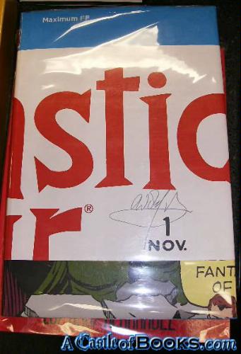
Beaty documents related examples in the world of mainstream comics publishing. Maximum FF, a deluxe-edition book published in 2005 by Marvel Comics, was one telling attempt.
“An oversized hardcover with an elaborate fold-out dust jacket, Maximum FF is a 234-page version of the first issue of Fantastic Four, by Stan Lee and Jack Kirby, originally published as a twenty-five-page comic book in 1961. Mosley and Sahre expanded the original work almost ten-fold by dramatically restructuring it: by disaggregating the individual panels and presenting them one per page, one per double-page spread, and even, on two occasions, as quadruple-page gatefolds.”
Beaty goes on to say that the ‘splash’ page and double-page spreads,
“…are particularly valued by collectors of original comic book art because they often present characters drawn on a larger scale than is typical for a comic book and, consequently, are more impressive when framed. For some collectors, the splash page and comic book cover are the most valuable parts of the comic because they are most akin to traditional gallery and museum aesthetics—they are not tainted with the sequentiality that is often held to define the comics form.”
Groensteen would agree with the idea that comics is tainted by its sequentiality, or at least sequentiality is not very relevant or attractive to most of society. Tellingly, the earliest definitions of comics focused on its use of recurring characters and speech bubbles than on its sequentiality—something Beaty recognizes in the first chapter of his book.
It’s worth wondering about the phenomenology of the splash page and double-page spread, and what happens when they are used in comic books. The splash page is a ubiquitous element of many comics, from American superhero books to manga to independent minicomics. It’s use isn’t random—splash pages most often introduce a story, establish the grandiosity of a setting, or monumentalize the climax of a single issue or narrative arc. The effect is always intended to be eye-catching, attention-grabbing, and big.
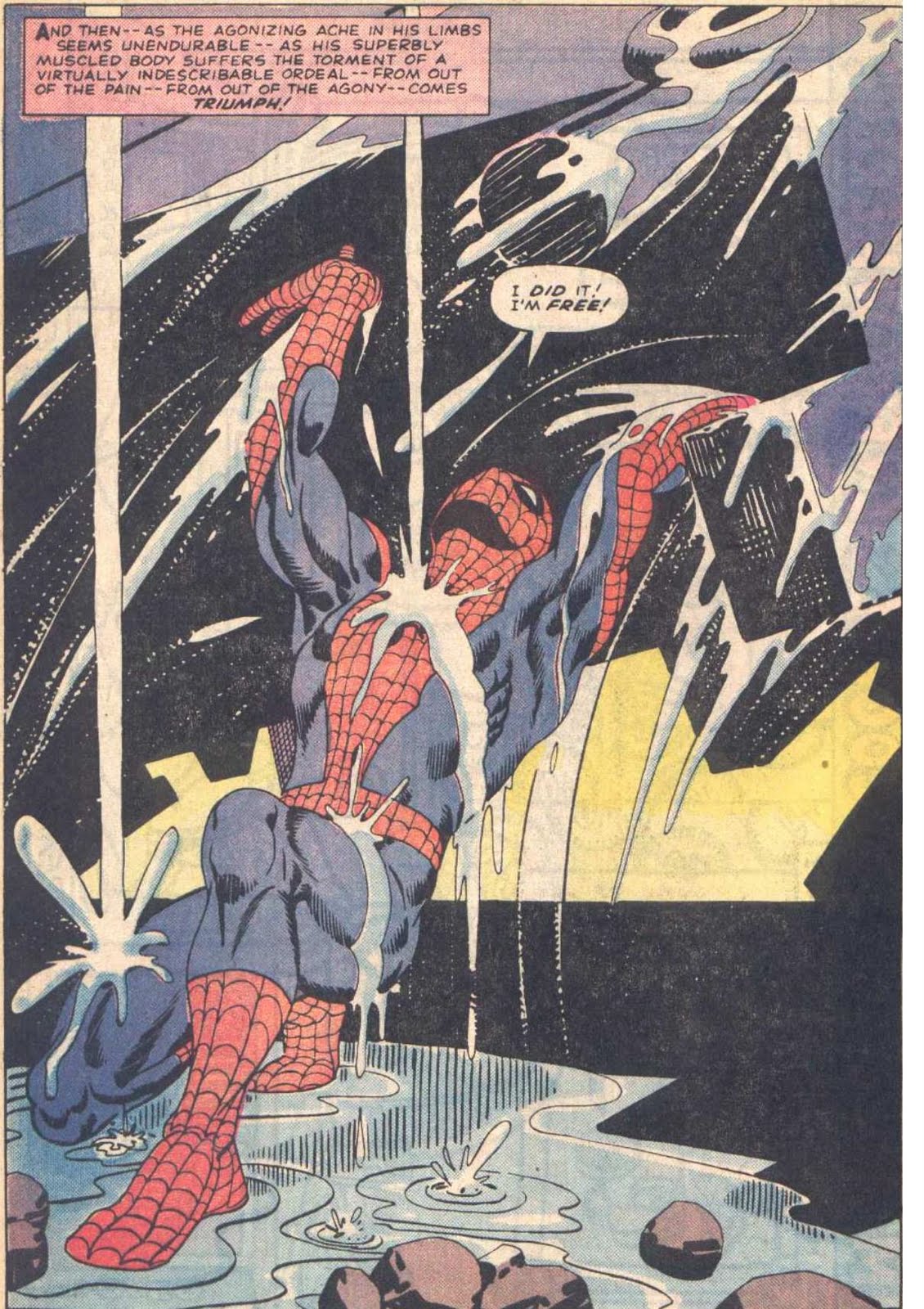
Steve Ditko and Stan Lee, Amazing Spider-Man, Issue #33
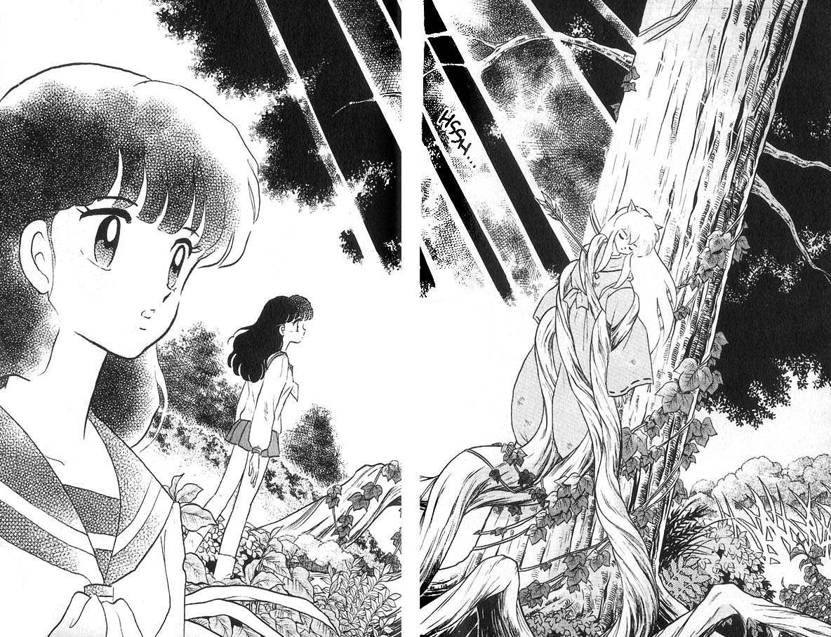
Rumiko Takahashi, Inuyasha, Book 1
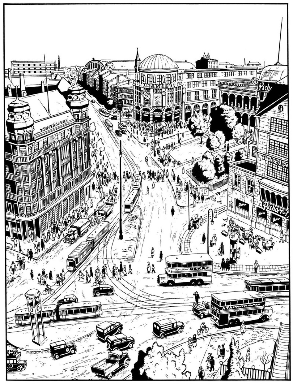
Jason Lutes, Berlin, Volume 1
The splash page is a part of the vocabulary of comics, (or at least its grammar,) and some cartoonists play with or complicate the concept more than others. Within the limited scopes of alternative comics, a few recent examples come to mind. In Craig Thompson’s Habibi, (2011) (which I reviewed here,) a preponderance of splash pages marks the end of the book. Thompson’s loud pages erupt with obvious, mystical-religious imagery, asserting not only that an epic moment has been reached, but that moment is ever-present. The artwork grasps at transcendence, and the narrative, increasingly interrupted, begins to break down.
Skim, by Mariko and Jillian Tamaki, (2008), paradoxically uses splash pages to transition between scenes, layer impressions, and create a sense of passing time, even though only a single moment is presented. Both approaches use splash pages earnestly, but where Habibi’s splash-pages-on-steroids amplifies their stillness and power, Skim converts this potential energy into emotional movement.
In Chris Ware’s Building Stories, (2012), the cartoonist ironizes the epic quality of the splash page by depicting banal moments in the life of his characters. However, the splash page has the last laugh, fostering a sort of ‘epicly banal’ or ‘very depressing’ feeling, which hasn’t escaped the notice of critics like Douglas Wolk. Perhaps Ware’s splash pages are better read as mislaid covers; they share the cheeky realism of his illustrations for The New Yorker, and one of these pages was featured as a ‘joke cover’ on the New Yorker site. It seems difficult to use the splash page insincerely– it transforms its content into something remarkable, whether the artist meant it to be read that way.
It’s funny that one of the most prominent and dramatic techniques in comic storytelling is one that makes a comic behave a little less sequential, fragmented, even hybrid-like. While captions and speech balloons are often present, they feel less like a competing element, especially in terms of scale, (aside from the author credits and copyright jargon jammed into some mainstream pages.) The splash page isn’t actively read as much as it is passively gazed upon, or absorbed, as if on a wall. That jump from reading to gazing is partially what makes experiencing a splash page feel profound. But only one moment can be presented, and there often isn’t much to figure out. The splash page is the opposite of the comics gutter, the space between the panels that contains the ‘unshown,’ and according to Scott McCloud, generates the medium’s storytelling power. While splash pages and individual panels are the easiest to display, a cartoonist’s panels and gutter transitions better capture the essence of a narrative work.
Its not surprising that the art-world and collectors, unsure of how to hang comics on a wall, would favor panels and pages that behave more like paintings. But is it possible to successfully bring comics narrative– small, printed, sequential and ambiguous– into a museum setting? Or is its special breed of profundity incompatible with what attendees expect from a gallery show? Outside of more people reading actual comics, (and how would they be convinced to do that?), is there a venue, or a kind of oration, that better matches the type of transcendence a comic book achieves, rather than what it reaches on one page or panel? As long as the gallery-show remains the standard by which high-brow acceptance is judged, discussion of what makes the comics medium work, (or even great,) will be locked onto their resemblance of fine art. Artists with greater technical skill will be rewarded most, despite the fact that the art world has bucked judgements of skill, chaining comics to a quaint nostalgia for draftsmanship. And severing panels from their original sources does not an art movement make– shows will remain an oddity, a fun, occasional diversion from looking at real art. Many people would not mind. Some readers will always need comics to act a little bit more like other things, in order to love them in those kinds of ways.
Art in the last few centuries has been all about recontextualizing things, it’s true. Even abstract geometric art is kind of a recontextualizing of printed layouts.
Not tat that’s the only thing– but Mike Kelley’s “Sad Sack” comics, with all the pictures removed, or the serial Imagist pieces (Ray Yoshida, etc.) are not exactly narrative in the way a comic book is.
But there are books-as-art zine-making efforts (Paper Rad, Superflex’s Copyshop and so forth), but the problem is that reading is not usually what happens in a gallery. Splash pages kind of operate in a tableau format, but that may be the only narrative function galleries can tolerate.
Nice piece!
Reading does happen in a gallery, but off to the side. It’s the show curator who translates what’s going on visually into words for the people looking at the art.
There’s modern art that’s about text, though. Sometimes the piece is about sloganeering, sometimes the lettering is highly decorated, and there are a lot of kind of photojournalist pieces where the photographs come with captions. There are also things like imaginary maps.
Conclusion: you could get a comic into a modern art museum as a work of imaginary photojournalism?
The narrative I associate w/gallery art is the narrative of the catalog, which is (barring conceptual tomfoolery) considered secondary or parasitic on the exhibit. I propose a gallery of blank walls with a catalog explaining a comic art exhibit that isn’t there. You can’t buy the catalog or take it home. But you can read it while you mill about the space. But on your way out you can buy a mug or a wine cozy featuring an image of the catalog.
I’ll be curious to see if there are any responses that aren’t overly hostile to contemporary art. I mean, contemporary art has a small wealthy collector base, and institutional support, but no massive Hollywood movies injecting cash and audience into its moribund shtick. I don’t really feel like comics are a victim.
Well, subdee’s response is not hostile. Journalism is a good angle, I agree, which is why journalistic comics have been getting critical points for quite some time. It would be nice if there could be some fantasy comics in a gallery, though.
And there are always visual mandala-koans, a la Raymond Pettibon.
I like Nate’s idea. That’s hysterical.
There’s some space between galleries and museums here, isn’t there? Smaller galleries seem like a place where you could have zine exhibits; museums generally less so. Or am I wrong about that?
I really like the reading of Chris Ware’s splash pages.
Depends on the museum. MCA Chicago right now has displayed readings in the Goshka Macuga installation that Dieter Roelstrate curated, sort of a history of propaganda. Comics could certainly be worked into something like that (smirk).
For the record, I’m not at all hostile to contemporary art. If anything, I probably enjoy a greater proportion of it than I do comic art.
Great, thought-provoking post. I’d love to hear about specific strategies for encouraging the reading or readability of comics within the gallery space.
Thanks for the responses!
I actually helped curate an artist’s books and zine show at Carleton College a few years ago, and installed and de-installed a zine show at the Family Business gallery last summer. (I nearly lost my fingernails peeling linoleum off of cement.) Why didn’t I bring up this alternative, exciting gallery experience in the article? Because I was selfish, and wanted to keep the piece a whole lot simpler. Now that I have this one under my belt, I’ll incorporate it into a piece on zine culture… maybe next month? There’s a lot to say about them. They are far from a magical translation of book-art to the gallery… both shows ended up revolving a lot around events, my hypothesis being that the weird insularity of zine reading needed to be balanced by actual group participation.
Subdee– I’m a big proponent of understanding how more-run-of-the-mill (aka not zine) gallery exhibits work narrativistically, how they are ‘read,’ especially when the curators don’t want their show to be read that way. I think we… narrarate? narrativize? reality in order to make it meaningful. This doesn’t mean we construct a formal story– I think its more loose and reflexive. I think art can feel extraordinarily meaningless unless it’s incorporated in some narrative level.
Nate– That’s hilarious. I especially like the last part.
Bert– Me too! I logged on with trepidation, thinking I was going to have to read a million comments on Lichtenstein.
Noah– I’m going to do a post (all these future posts) that specifically focuses on the recent Chris Ware show– it’ll be fun.
Charles– Thank you! And I’d jump at the chance to talk about this.
However, I’m at work at a wine shop, and had to sneak onto a computer to quickly scrawl this out. I’ll be back later. Thanks everyone for reading.
The narrative I associate w/gallery art is the narrative of the catalog, which is (barring conceptual tomfoolery) considered secondary or parasitic on the exhibit.
Oh man, it’s so true. Even a lot of contemporary art is the art of the catalog. Like the piece where the artist photographs her trash in front of the same white wall every day for a year, or photographs the insides of houses in Malaysia, or takes a photo of every member of a family involved in some atrocity. And now that I think about it, the text that goes along with these photojournalist pieces is more of a catalog than a narrative. The whole piece is like a pre-curated museum exhibit.
I think we… narrarate? narrativize? reality in order to make it meaningful.
Totally I agree. I think the reason art museums work this way – insist on the visual over the textual, insist on catalogs over narratives – is exactly because everyday life does not usually work this way. In a fight between words and images, words win; in a fight between narrating and collecting/arranging, stories win. So if you are primarily a visual thinker, then you have a genuinely different way of seeing the world from others and the gallery is where you can express that.
I just remembered another place I saw a lot of text in a museum. There was an exhibit on illuminated Torahs at the Jewish history museum in Amsterdam. Some of them had illustrations and one was even mostly illustrations. The highlight of the exhibit was these three tiny fragments of the Dead Sea Scrolls and the exhibit was about the sacred-ness of books and reading in Jewish culture. I remember coming out of it thinking ‘well that explains why everyone on my mom’s side of the family is an author, a journalist, or a newspaper editor’.
And I’ve seen Chinese and Russian propaganda poster exhibits too. It’s kind of funny that when text makes it into an art museum, it’s often viewed with a kind of distrust or wariness, like it’s trying to sell you something or infringe upon your reality in some other way.
No time to give this fine and thoughtful commentary the attention it deserves, but on the subject of “make it bigger,” I’ve heard of modern-day painters being advised to make their canvases bigger, to look more impressive on a gallery wall, more “important,” salable…
The narrative that I’ve heard is that American painters (the abstract expressionists, to be exact) started doing big pieces and the fashion spread from there. I’m not saying that big formats didn’t exist before,of course they did, but they were mainly used for important matters (religious or historic scenes). Genre painting was more intimate and, consequently, smaller. Maybe the abstract expressionists were giving themselves a sense of self-importance (?). Did anyone study this? Is it published anywhere?
That “paint big” advice I’d read (Gad, when? 20, 30 years ago?) was from one established gallery artist to a wannabe; mentioning that, in a group showing situation, puny pieces will attract less attention than larger ones, come off as weak in comparison.
And by “big,” it need not be abstract-expressionist proportions. But this 2012 story mentions…
——————–
A penchant for small, modestly-scaled works that is often evident in these shows is at its most extreme at Sikkema Jenkins in “The Big Picture,” a slyly titled show of works by eight artists whose efforts rarely exceed 20 inches on a side.
An implication here is that small is not only beautiful but also might actually be radical, or at least anti-establishment, in a time of immense, often spectacular artworks.
———————–
http://www.nytimes.com/2012/06/29/arts/design/in-five-chelsea-galleries-the-state-of-painting.html?pagewanted=all&_r=0
…that paintings “20 inches on a side” (which I’d consider medium-sized) are considered small, “radical, or at least anti-establishment”…
On the other hand:
————————
Q: I paint big– between 3 x 5 feet and 4 x 6 feet. I’m having lots of trouble showing and selling my work. Any suggestions? Are there special galleries or places to show big art?
A: Here’s the deal with big art– people who buy big art (and galleries that show big art) generally like it to be by big artists, big in name that is. A few galleries cater to commercial concerns like corporate clienteles who need art for large spaces, but again, they tend to have very specific requirements for what they show. The truth is that most people who buy big art do so to impress, and one of the best ways to impress is with the stature and reputation of the artist who makes it. So if you’re early in your career or are still building your resume, think about sizing down. Big paintings are OK to a point; they generally make your smaller pieces look better– kind of a coattail effect. But the key here is to think seriously about producing more medium or smaller sized works, not only because they take up less wall space (and storage space), but also because they’re more affordable. In general, the more options you can offer to buyers size-wise, especially early on in your career, the better.
——————————-
http://www.artbusiness.com/osoquestions2.html
With Kailyn Kent’s commentary upon splash pages, this scene from “7 Miles a Second” came to mind:
http://www.slate.com/content/dam/slate/articles/arts/books/2013/03/SBR/7_MILES_IMAGES/130227_SBR_7Miles_Image8.jpg
…and TCJ.com featured this excerpt from an upcoming print piece, with William Blake’s “composite” art featured: http://www.tcj.com/the-comics-journal-302-authors-meet-images-by-gavin-callaghan-excerpt/ . (Predictably — and it’s hardly alone — the site’s search feature was worthless; I had to use Google to locate this fairly recent piece.)
From Romberger to Blake to Steranko:
http://4.bp.blogspot.com/-QBcSjod24jk/Td36pjmiTUI/AAAAAAAANGU/6fdp8rmYdr4/s1600/jim+steranko.+dark+moon+rise%2C+hell+hound+kill.+page.+001.jpg
http://2.bp.blogspot.com/-G18pGHPUG6E/Tc5P5RoMe1I/AAAAAAAAMy8/qcMA4-sIUhk/s400/jim+steranko.+dark+moon+rise%2C+hell+hound+kill.+page.+002.jpg
http://4.bp.blogspot.com/-ucaOhTlkGq0/Td36o2VJWtI/AAAAAAAANGE/ItTuphQ3Vvg/s1600/jim+steranko.+dark+moon+rise%2C+hell+hound+kill.+page.+011.jpg
http://4.bp.blogspot.com/_whcRtBG5UeU/TKVqFquemRI/AAAAAAAAFs0/cEUvsXI0ZSQ/s1600/jim_steranko__dark_moon_rise,_hell_hound_kill__page__017.jpg
Rather than failing as comics (that last piece referred to in the perceptive write-up at http://supervillain.wordpress.com/2010/11/17/seneca-vs-witzke-vs-steranko-vs-everything/ as Steranko’s Worst Page Ever), this approach deserves to be appreciated for its own virtues…
From a comic book artist’s point of view, a panel’s size serves two purposes: Punctuation and stage-setting.
The former is obviously a characteristic of literature, while the latter is a characteristic of stage (including opera) and film.
In general, for interior panels, the bigger the panel, the bigger the story emphasis. A full-page interior panel is frequently used as an exclamation point. The two-page spread is often the equivalent of multiple exclamation points — a convention frowned upon in traditional literature, but entirely appropriate in the relatively new tenets of comics language.
But just as the exclamation point can be overused in literature, the comics splash page “punctuation” can be overused in comics. Such misuse, however, does not make the usage of splash pages inherently invalid, just as the misuse of traditional punctuation by some does not invalidate the usage of punctuation as a whole.
Splash pages and double-page spreads are also great for stage-setting — particularly if the location depicted is new and striking in some way, or simply grand in scale. Opening splash pages also traditionally set the stage for the story that follows.
As a comics artist telling a story, I never thought to myself, “I’m going to add a splash page here because I want my story to be perceived as true art.”
Splash pages are a story-telling tool. Nothing more and nothing less — regardless of what folks like Lichtenstein or other non-comic book artist storytellers may think.
And yes, I honestly believe Lichtenstein knows little or nothing about the tenets of comic book storytelling. It’s as if he likes painting pictures of cars but has no idea how cars are designed or built, nor how they actually work.
” It’s as if he likes painting pictures of cars but has no idea how cars are designed or built, nor how they actually work.”
Why would that be a problem? Surely lots of folks pain cars — or for that matter, people — without having much sense of how the inner mechanics work. Again, I don’t really see why that would be a diss on the painters…?
And…part of the way that splash pages are a story telling tool, surely, is that they’re dramatic and art-like? That is, saying they’re a storytelling tool, or even saying that you, personally, didn’t perceive the connection to art, doesn’t mean that monumentality doesn’t have a narrative link to art, nor that other folks don’t use them dramatically (I’d bet that Chris Ware is fully aware of the link between splash pages and art — as Kailyn says, he seems to be pretty consciously playing with that link.)
Comic book art is distinctly different than traditional gallery art, and thus traditionally-schooled artists may not necessarily understand or be able to recreate effective or even competent comic book stories. There is much more involved with the creation of comic book stories than simply single-panel composition skills. There is story pacing and timing, the effective sequential linking of multiple panel compositions (which is essentially the ability to tell an interesting visual story sequentially), and the ability to fuse words and pictures into a coherent whole.
This is far more difficult to do than stand-alone painting or illustrating, and even life-long professional comic book artists may never master the intricacies of telling a compelling sequential art story.
I liken the difference between traditional art and sequential art as the difference between still photography and filmmaking. Ansel Adams may have been one of the best ever still photographers, but if you stuck him in front of a movie camera, he may never be able to create a “Citizen Kane” in 10 lifetimes.
The two skill sets involved in mastering traditional art and sequential art are truly that different.
I have a lot more respect for Chris Ware’s artistic chops than I do of Lichtenstein’s. At least Ware has shown he can tell an effective sequential art story. All Lichtenstein has done is reimagined individual panels.
Frank Frazetta is a great example of an artist who was a genius at “single panel” composition, but had great difficulty telling stories sequentially. His sequential art composition is usually choppy and all over the place in a given story, which tells me he had trouble deciding from one panel to the next what he was going to do.
Jack Kirby, on the other hand, was a genius at sequential art composition and storytelling, so his stories flowed with a visual smoothness Frazetta never mastered. To this day, I think Kirby, if given the chance, could have been one of the best directors Hollywood had ever seen.
Lichtenstein did a lot of different kinds of paintings, actually. Also sculptures, for that matter.
“This is far more difficult to do than stand-alone painting or illustrating”
That’s silly. It’s a different skill, sure. But you’re telling me most comics artists can paint like Rembrandt, or that what Rembrandt did was relatively easy compared to writing a superhero comic? It takes nothing away from comics to point out that other mediums present other challenges.
Neither Ansel Adams nor Citizen Kane are particularly interesting to me, I have to admit. I much prefer Lichtenstein to both.
Noah — If you don’t understand the big differences between “single panel” composition and sequential art, how can we ever hope art experts totally ignorant of the sequential art process to be able to understand?
Yes, Rembrandt may have been a lousy sequential artist. Then again, he may have been great at it. We’ll never know.
As I mentioned, as skilled an artist as Frazetta was, he still never mastered sequential art. He was good at it, but not great.
John Buscema, on the other hand, was outstanding at both.
“If you don’t understand the big differences between “single panel” composition and sequential art, how can we ever hope art experts totally ignorant of the sequential art process to be able to understand?”
I understand that there are differences. I just don’t think those differences are well summarized by saying that comics are harder to do than paintings.
I also don’t think that the fact that they’re different means that they can have, or do have, nothing in common.
Russ:
“All Lichtenstein has done is reimagined individual panels.”
Maybe he did that, but who cares? That’s not what’s important in his work.
“I think Kirby, if given the chance, could have been one of the best directors Hollywood had ever seen.”
Is that a compliment?
Noah — Keep in mind I didn’t say comics were “harder.” What I said is it requires a very different skill set than does “single panel” art. And not every artist — regardless of how great their skills are at “single panel” art — is able to draw great, or even competent, sequential art stories.
For example, Bob Montana was a much better sequential art creator than was Frazetta, even though Frazetta’s “single panel” painting skills were light years ahead of Montana’s.
You see what I’m saying?
And what 99 percent of the traditional art community does not realize is is just how frickin’ difficult it is to create exceptional sequential art stories.
in fact, I’d argue that many comics fans/creators probably don’t really understand how few comics artists, historically, actually excel at the drawing portion of sequential art. And of that number only a tiny handful of artists are good at the writing aspect of sequential art as well.
It’s a tough, tough gig.
Domingos — Apparently unlike you, I consider filmmaking to be a respectable art form.
Re: Lichtenstein. So, in your words, what exactly is the importance of Lichtenstein’s work?
It’s not filmmaking that I disrespect, it’s Hollywood. On top of that it’s precisely the Hollywood of superhero films that I have no respect for.
What’s important in Lichtenstein’s work is that he continued a Dada tradition. A contradiction in terms, maybe, but that’s how it is…
Russ:
“This [he creation of comic book stories] is far more difficult to do than stand-alone painting or illustrating”
“Noah — Keep in mind I didn’t say comics were “harder.” What I said is it requires a very different skill set than does “single panel” art.”
What’s in the above quotes to misread?
I’d favor Russ’ original comment; with the significant caveat that comics are harder to do well.
Isn’t it easier to be a “one-trick-pony” than multitalented? Doesn’t creating a single image require a far narrower set of skills than drawing, writing, narrative and visual pacing, composing not one image but an array of them, planning out a series of “sets” through which the characters move, action unfolds?
In the world of literature, it’s a truism that perfection is far more easily achieved in a short story than in a novel. The focus is tighter, there is less “ground to cover.”
Following that rule, the less a creator has to do, the easier it is to succeed.
—————————
R. Maheras says:
…I honestly believe Lichtenstein knows little or nothing about the tenets of comic book storytelling.
—————————–
That may well the case; however, he was after a different effect than storytelling; he had a knack for picking out iconically “comic-booky” moments, as Warhol wittily “iconized” the graphic design of Campbell’s soup cans, rendered them monumental.
BTW, the “all in one piece” original of Rembrandt’s “The Blinding of Samson”: http://uploads7.wikipaintings.org/images/rembrandt/the-blinding-of-samson-1636.jpg
The “panelized” version: http://i1123.photobucket.com/albums/l542/Mike_59_Hunter/Blinding_Samson_comic2.jpg
The second is more effective as comics; the first a far greater work of art.
—————————-
Domingos Isabelinho says:
Russ: “I think Kirby, if given the chance, could have been one of the best directors Hollywood had ever seen.”
Is that a compliment?
[Explaining] It’s not filmmaking that I disrespect, it’s Hollywood. On top of that it’s precisely the Hollywood of superhero films that I have no respect for.
—————————–
But, who says Kirby would’ve necessarily directed superhero movies? I can’t see him doing Merchant/Ivory-type fare, but war movies, science fiction, Westerns, 30’s gangster flicks; if not a Kubrick, he could’ve been another Howard Hawks ( http://en.wikipedia.org/wiki/Howard_Hawks ).
“Isn’t it easier to be a “one-trick-pony” than multitalented?”
Painters don’t have just a single skill any more than comics creators do. Any art requires a multitude of talents to do well. Arguing that comics is more difficult than painting or than writing or than music or than whatever is just silly.
Russ, if you’re just arguing that it’s different skill sets, then I agree with you.
“From a comic book artist’s point of view, a panel’s size serves two purposes: Punctuation and stage-setting…. Splash pages are a story-telling tool. Nothing more and nothing less — regardless of what folks like Lichtenstein or other non-comic book artist storytellers may think.”
Russ, I completely, wholeheartedly agree with your point that very few people understand/appreciate the labor it takes to craft a competent comic book, and the many skill sets it requires. In line with this, I think that the use and creation of a splash page comes down to a lot more than punctuation and stage-setting. Some splash pages are far from punchy– I’m thinking of some Marvel comics introductory pages, where every single X-man has something to say. Or Tamaki’s illustration above. And I think that the many ways a splash page can be interpreted, past its artist’s intentions, are what make it such a rich convention in comics storytelling. For example, splash pages are monetarily valued more than other pages. It’s not farfetched to assume that by some collectors, a splash page is viewed as a more essential, even ‘authentic’ manifestation of its creators’ essence– the characters are drawn large, the page size affords more virtuosic draftsmanship. It’s hard to believe that this hasn’t created a positive feedback cycle– comics readers grow up to be comics creators, with nebulous understandings of the splash page’s function and value. These understandings find their way into their splash pages… I think artists like Thompson, Tamaki and Ware were informed this way. And I think the artists who deliberately don’t use splash pages, (like Chester Brown ala Paying For It,) are trying to steer clear of the weird prestige and hyper-dramatics that a splash page carries. But its just a guess.
All in all, The Gallery has become a psychic battleground for comics. I think that The Gallery’s understanding of ‘the best parts of comics,’ or ‘the parts worth hanging’ or whatever must definitely make it back into the subconsciousnesses of at least some comics creators. Particularly those who cross over into the art world, like Ware.
It’s telling that a meaningless splash-page (the spectacular for the spectacle’s sake) is called a pin-up. This kitschy thinking is pervading in original comic art’s collectors’ minds. I’ve nothing against splash-pages, mind you, but maybe that’s why someone with good taste (I’m not exactly talking about subject matter, ahem…) like Chester Brown avoids them.
For a good taste comic art’s exhibition cf. the last part of my post about Jochen Gerner.
———————–
Kailyn says:
…splash pages are monetarily valued more than other pages. It’s not farfetched to assume that by some collectors, a splash page is viewed as a more essential, even ‘authentic’ manifestation of its creators’ essence– the characters are drawn large, the page size affords more virtuosic draftsmanship…
————————–
Interesting! Back when I was making far more money, and could do some original comics-at-collecting (even if my budget didn’t stretch to Kirby or Hernandez pages), it never would’ve occurred to me to pursue those. What I relished were pages where a sequence more or less fully unfolded…
—————————
It’s hard to believe that this hasn’t created a positive feedback cycle– comics readers grow up to be comics creators, with nebulous understandings of the splash page’s function and value. These understandings find their way into their splash pages…
—————————-
Come to think of it, can’t there be individual panels (within a page of other panels) which are “splash-pagey”? In other words, not easily fitting within the visual flow of a sequence, but feeling “stand-alone,” routinely focusing on a single character posing dramatically? (The cinematic equivalent is the tiresome modern trope of having a monster interrupt its pursuit of the hero to just stand there, pose, and roar, fearsomely toothed jaws a-gaping, at the camera.)
With some doofuses thinking that, if a splash page looks cool, a page FULL of “splash-pagey” scenes would be the ultimate in awesomeness? (And no, this is not to say that all panels should have the same visual and dramatic weight; just that they should better integrate with the narrative flow.)
Rob Liefeld is a particular offender; his pages frequently filled with characters striking up melodramatic poses.
The first (why, each of the four characters are frozen, posing dramatically!) and third panels here: http://s3.amazonaws.com/resourcel/1257558202_X-Force%20%281991%29_3_p19_Art.jpg
First and third panels: http://dyn2.heritagestatic.com/lf?set=path%5B9/5/4/5/9545552%5D,sizedata%5B450x2000%5D&call=url%5Bfile:product.chain%5D
First panel: http://consequentialart.files.wordpress.com/2009/03/liefeld1.jpg
Re the last page, Sean T. Collins writes:
——————————
…the above is really the nadir of sequential art…What the hay is going on up there? I have no idea what the relationship is between any of the images, whether sequentially, spatially, or compositionally. There is absolutely no storytelling taking place here. It is like a teenager’s notebook cover: a collection of “cool” things to draw (scratchy borders, screaming open mouths, speedlines, crosshatching) with no relation to each other. Why are pieces of bodies breaking out of panel borders? Why is a diagonal panel bisecting the whole page with a body covering half of it up? How can time function between these two panels if they both overlap each other? Why is the impact of one hit important enough to cover-up another panel, but the impact of another unimportant enough to be behind panels and half-off the page? Who is winning? How long did any of this take? Is anyone even hurt?
The answer to all of these questions seems to be: Who cares? It looks cool.
Comic books are not notebook covers. They are not collage. They are not posters.
——————————–
http://consequentialart.wordpress.com/category/action/
(Collins then goes on to to show and analyze other pages that do work as sequential art.)
To be fair to the art form of comics, and even Rob Liefeld, it’s not as if they had a monopoly on incoherent scenes. You see clarity of visual narrative sacrificed for the sake of “coolness” all over the place in cinema. (At least there choppy editing, lots of close-ups, are often a necessity: to disguise that their lead can’t dance, or fight…)
Hm! I see the complete URL I’d posted for my second Liefeld example had brackets removed by the posting process, so that it doesn’t work. What ended as file:product.chain should be [file:product.chain] …
Mebbe if I add these chevrons:
Ah, for a preview feature!
Well! The make the URL disappear! Luverly…
I dunno Russ. Speaking as an artist who has done both comics and painting (traditional, representational oils), I’d say that it’s much easier to transfer the painting skills to a comics medium than vice versa.
Yes, there are some differences. It takes a while to get used to moving a reader’s eye through a series of images instead of keeping that eye on one big piece.
But… I’ve known several good comic artists and if I set them up and said here, Make me a painting with decent chirascuro, it would, well. Not go well.
OTOH, sometimes if you look at the archives of great painters, you’ll see little comics they sent to friends and relatives in their letters or scribbled in their sketchbooks.
This isn’t to say that it’s impossible, what you’re saying, but I don’t think it’s generally the case. JMHO.
This is great. Thanks, Kailyn. I’ve been looking for a fine essay on splash pages and the grandiose for some time.
Talking about painters and comics artists, here’s the amazing story of a painter who also created cross-dressing hero Madame Fatal
——————–
vommarlowe says:
… I’ve known several good comic artists and if I set them up and said here, Make me a painting with decent chirascuro, it would, well. Not go well.
———————
Hummph! You mean, as professional artists, they’d not be up to the brain-blasting challenge of rendering the interplay of light and shadow?? Puh-leeze. (Maybe if they’re of the school of “deskilling”…)
———————
…sometimes if you look at the archives of great painters, you’ll see little comics they sent to friends and relatives in their letters or scribbled in their sketchbooks.
———————-
99% of which are single-panel cartoons. Of those which are not, how many are lengthy, sustained narratives?
Of creators who made lengthy careers in comics, then went on to be excellent painters, a few off the top of my head:
Frank Stack (AKA Foolbert Sturgeon, who did what is likely the first UG comic, “The Further Adventures of Jesus”): http://deniskitchen.com/Merchant2/graphics/00000001/A_FS.SUPERMAN.B.jpg and http://www.frankstack.net/index.php
Bill Wray: http://images.darkhorse.com/covers/300/h/hbhsp.jpg , http://www.comicartcommunity.com/gallery/details.php?image_id=7560 and http://www.cartoonbrew.com/wp-content/uploads/wray_ca99.jpg , http://michaelnewberry.com/av/wray/wray.html
Lyonel Feininger: http://madinkbeard.com/blog/wp-content/images/feininger6.jpg , http://madinkbeard.com/archives/the-comic-strip-art-of-lyonel-feininger and http://www.midcenturia.com/2010/11/lyonel-feiningers-prismatic-art.html
Bernie Krigstein: http://www.lambiek.net/artists/k/krigstein_b.htm , http://www.bpib.com/illustrat/krigstei.htm and http://upload.wikimedia.org/wikipedia/en/thumb/c/cf/Bkrigsteinselfportrait.jpg/270px-Bkrigsteinselfportrait.jpg
Moebius/Jean Giraud: https://shamanism.files.wordpress.com/2012/03/moebius-arzach-002.jpg , and http://www.comicartcommunity.com/gallery/details.php?image_id=8558 , http://25.media.tumblr.com/tumblr_lnodxuH6MQ1qm215yohttp://1.bp.blogspot.com/-aL0A7Cgqu3w/TfDy0g5QJII/AAAAAAAAGmo/W9-HmspRPVQ/s1600/Spirit-World-%23001_17.jpg1_500.jpg , http://3.bp.blogspot.com/-Qrb1xi4Z1PU/T19F744obBI/AAAAAAAAAmg/tByFGidh3_0/s1600/IMG_0077.jpg
Jack Kirby: http://1.bp.blogspot.com/-aL0A7Cgqu3w/TfDy0g5QJII/AAAAAAAAGmo/W9-HmspRPVQ/s1600/Spirit-World-%23001_17.jpg and http://beyondthebunker.files.wordpress.com/2012/02/jack-kirby_0002.jpg , http://revenire.files.wordpress.com/2009/09/tribes-trilogy-1-of-31.jpeg?w=450&h=607 , http://images.tcj.com/2012/04/kirby-machine-650×236.jpg , http://25.media.tumblr.com/tumblr_m4e1gbHT7h1qja3wqo1_1280.jpg
Barry Windsor-Smith: (an early effort) http://spaceintext.wordpress.com/2011/02/01/the-boy-who-loved-trees-barry-windsor-smith/ and http://1.bp.blogspot.com/_e-T6mUQ1KtQ/TQrBGfoXrBI/AAAAAAAAAkE/6UU01XBJEfc/s1600/pandora_barry_winsor-smith_75.png , http://www.wizards-keep.com/graphics/RTE/RTEPage-014_Icarus_cover.jpg , http://4.bp.blogspot.com/-9jhOZzIA2H4/TZEuR3TNC2I/AAAAAAAAE-I/DGsK1DR95f0/s1600/img052.jpg
Mike Kaluta: http://spaceintext.wordpress.com/2010/11/19/sunstroke-mike-kaluta/ and http://www.illustrationartgallery.com/acatalog/KalutaDolly1.jpg , http://media.comicvine.com/uploads/5/55549/2432319-kalutamagikpainting.jpg
Jeffry Catherine Jones: http://4.bp.blogspot.com/-TgIhyu1UZDs/TdYjInr1t2I/AAAAAAAAM4M/pYBIXPqUGOA/s1600/post-1606-052492100+1286482149.jpg and http://www.comicbookbrain.com/_imagery/_2011_05_19/jeff-jones-384.jpg , http://www.linesandcolors.com/images/2006-07/jones_450.jpg
Frazetta: http://ic.pics.livejournal.com/dr_hermes/14666255/51948/51948_original.jpg , http://www.comicbookbrain.com/_imagery/_2010_04_21/frank-frazetta-white-indian.jpg and http://www.arts-wallpapers.com/fantasy_galleries/frank-frazetta-art/images/fantasy_artist_frank_frazetta_beyondtheforeststar.jpg , http://wednesdaysheroes.com/wp-content/uploads/2010/05/frank_frazetta_themoonsrapture-1.jpg , http://paintings-art-picture.com/Fantasy-Art/Frank-Frazetta/imagepages/image744.htm , http://25.media.tumblr.com/tumblr_lz09ohPJPh1rofvodo1_500.jpg
..Need I go on?
Mike, “This isn’t to say that it’s impossible, what you’re saying, but I don’t think it’s generally the case. JMHO.”
Again, someone who generally draws in black and white is not, in my experience watching fellow artists play around with materials, going to be all that great at traditional painting style chiarascuro. (I’m talking Caravaggio’s John the Baptist type, to be clear.) Pen and ink, pencil, very different from blending colors in oil or watercolor. Etc. Not impossible, like I said, but IME not generally the case. Whereas many painters naturally spend a lot of their time working in the comic materials (pencils, pen, ink, or building depth with conte, cross hatching, etc) as part of their preparation for larger work.
While some of the people listed by Mike are great painters, others are just fair to middling if you compare them to an artist in an issue of Juxtapose magazine, and few rise to the status of “excellent.” I don’t think this makes them lesser artists. It’s just that painting is a sideline for many of them.
Also, there’s as much variation in skill among gallery artists as comic artists. That is to say, while there are plenty of gallery artists totally incapable of drawing a comic, there are many gallery artists who could, if given some paper, a pen, and a copy of “How to Draw Comics the Marvel Way,” could piece together a decent comic, and with practice even an “excellent” one. On the flip side, just as there are some excellent cartoonist/painters, there are a lot of comic book artists who just barely make the grade as cartoonists, and would be lost if given a paint set, a canvas, and a book on color theory. Making blanket statements about relative difficulty, or predictions about capacity seems really misguided and provincial regardless of which group of artists one favors.
This is a silly discussion if I ever saw one, but, anyway, of the “painters” that Mike listed, and judging from the examples, some are decent technicians (Stack, Wray, Krigstein), others are pompier painters (Moebius, Frazetta, Jones), others aren’t even painters (Kirby, Kaluta, Smith) only Feininger is history of art material, of course.
I agree that this is a silly discussion, but it’s one that comes up.
I think what’s most interesting about it is the idea that difficulty of task somehow translates into artistic merit, or that draftsmanship is a good unto itself. Where else but comics do these sorts of assumptions apply? Nowhere that I’m aware of.
———————-
vommarlowe says:
Again, someone who generally draws in black and white…
———————–
Does that mean that comics artists never do anything else but linearly “draw in black and white”? If they’re pencil artists, they routinely include shading effects, unless it’s someone like Mike Mignola, whose “look” is stark…
————————-
…is not, in my experience watching fellow artists play around with materials, going to be all that great at traditional painting style chiarascuro. (I’m talking Caravaggio’s John the Baptist type, to be clear.) Pen and ink, pencil, very different from blending colors in oil or watercolor. Etc. Not impossible, like I said, but IME not generally the case. Whereas many painters naturally spend a lot of their time working in the comic materials (pencils, pen, ink, or building depth with conte, cross hatching, etc) as part of their preparation for larger work…
————————–
Uh, you’re saying that the fact that “many painters naturally spend a lot of their time working in the comic materials (pencils, pen, ink, or building depth with conte, cross hatching, etc)” somehow means they’ll be automatically adept at writing, narrative and visual pacing, composing not one image but a combined array of them, planning out a series of “sets” through which the characters move, action unfolds?
“Hey, I draw with pencils, pen, and ink, just like all those comics creators, so it’s just a small step for me to make comics!”
Why, that’s like the people who ask a famous artist what pen he uses, a famous photographer what camera she uses, as if somehow employing the same “instrument” will pump up their talent.
And, alas, attitudes based on “in my experience” situations routinely lead to absurd misconceptions, even tragic ones.
BTW, it’s not spelled “chirascuro” or “chiarascuro,” but chiaroscuro…
———————
Nate says:
While some of the people listed by Mike are great painters, others are just fair to middling if you compare them to an artist in an issue of Juxtapose magazine, and few rise to the status of “excellent.”
———————–
Back when Juxtapoz had not gotten so “fine arty,” and suffered such a massive decline in the quality of those featured, there were indeed plenty of amazing talents therein. But, was every artist then or now of the brilliant caliber of, say, a Mark Ryden? Hardly.
———————
Also, there’s as much variation in skill among gallery artists as comic artists. That is to say, while there are plenty of gallery artists totally incapable of drawing a comic, there are many gallery artists who could, if given some paper, a pen, and a copy of “How to Draw Comics the Marvel Way,” could piece together a decent comic, and with practice even an “excellent” one. On the flip side, just as there are some excellent cartoonist/painters, there are a lot of comic book artists who just barely make the grade as cartoonists, and would be lost if given a paint set, a canvas, and a book on color theory.
———————-
Sure, there are exceptions; there are some twelve-year-olds who are more psychologically mature than some thirty-year-olds. There are some people who drink heavily and chain-smoke, and are healthier than those who avoid those vices.
———————
Making blanket statements about relative difficulty, or predictions about capacity seems really misguided and provincial regardless of which group of artists one favors.
———————-
Nah! Isn’t it obvious that “blanket statements” such as that thirty-year-olds are more mature than those barely into their teens, that dwarves would find it more difficult to be good NBA players, boozing and smoking harm your health, perfectly reasonable assumptions to make?
Moving on to the arts, a little thought experiment: who’d make a better filmmaker, an Ansel Adams or Edward Weston, or a Jack Kirby or Will Eisner?
Some (ahem!) would say, the first two use cameras and film, therefore they’re practically filmmakers already!
Being “misguided and provincial,” to me being experienced in creating visual narratives, with changing viewpoints and orchestrating series of images to tell a story, creating characterizations, plotting, etc., means that comics creators as a group would be far more endowed with the skills to be successful filmmakers.
———————-
Domingos Isabelinho says:
…of the “painters” that Mike listed, and judging from the examples, some are decent technicians (Stack, Wray, Krigstein), others are pompier painters (Moebius, Frazetta, Jones), others aren’t even painters (Kirby, Kaluta, Smith) only Feininger is history of art material, of course.
———————-
Aren’t even painters?
———————-
painter
(Fine Arts & Visual Arts / Art Terms) an artist who paints pictures
———————-
http://www.thefreedictionary.com/painter
Sorry, but elevated aesthetic merit is not necessary to qualify one as to be working within a certain art form.
And did I say these were all great artists? At the least, they can all easily kick the butts of much of the modern art world, which isn’t saying much. See the mostly-mediocre samples pictured at http://www.artnet.com/magazineus/reviews/robinson/robinson12-5-08.asp .
———————-
Nate says:
…I think what’s most interesting about it is the idea that difficulty of task somehow translates into artistic merit, or that draftsmanship is a good unto itself. Where else but comics do these sorts of assumptions apply? Nowhere that I’m aware of.
———————–
Those silly, provincial comics, valuing technical skill as “a good unto itself”! As if every single artistic medium did not, for major stages in its development (until we got to the “everybody gets a gold star” egalitarian nadir of today) highly esteem dexterity and mastery.
From rock guitarists in awe of Hendrix’s “chops,” to African tribals valuing one sculptor’s ritual masks over another’s (I’d read they’re pretty astute and discerning critics of art they know), technical proficiency and finesse are highly valued throughout history and cultures.
Until (in a country that was aptly described as going prom primitiveness to decadence without a period of civilization in between) we get idiocies like James Kochalka’s infamous “craft is the enemy” screed: http://www.drunkduck.com/forum/topic/154169/ .
As for “the idea that difficulty of task somehow translates into artistic merit,” certainly a simple work can be fine, a complex one cruddy. But (until modern times, anyway) is not complexity, added symbolic depths and meanings, multifacetedness universally considered “pluses” which add to the artistic worth of a work?
Which is why something like this: http://images.bwog.com/wp-content/uploads/2011/08/6453-050-1B1B91C4.jpg
…would be held in higher esteem than this: https://www.stoneforest.com/gardenstore/products/view/75 ;
…why Beethoven’s Fifth gets more artistic kudos than “Chopsticks,” “Gravity’s Rainbow” soars over “Jonathan Livingston Seagull.”
Nate: “I agree that this is a silly discussion, but it’s one that comes up.
I think what’s most interesting about it is the idea that difficulty of task somehow translates into artistic merit, or that draftsmanship is a good unto itself. Where else but comics do these sorts of assumptions apply? Nowhere that I’m aware of.”
You are absolutely correct. That’s an assumption that comics people share with those who know nothing about art and say things like “my five year old son could do it.”
—————————–
Domingos Isabelinho says:
Nate: “I agree that this is a silly discussion, but it’s one that comes up.
I think what’s most interesting about it is the idea that difficulty of task somehow translates into artistic merit, or that draftsmanship is a good unto itself. Where else but comics do these sorts of assumptions apply? Nowhere that I’m aware of.”
You are absolutely correct. That’s an assumption that comics people share with those who know nothing about art and say things like “my five year old son could do it.”
——————————
Yes, all those erudite but conservative art critics of the past who rejected the paintings by Cezanne, Van Gogh, Gaugin as “unfinished” or inept, were utter ignoramuses. No different than those moronic “comics people” and “those who know nothing about art and say things like ‘my five year old son could do it.’ ”
But, gee, aren’t there “comics people” — like myself — who can appreciate a Thurber or Gary Panter as being, respectively, superb and outstandingly brilliant? Ah, but that would get in the way of stereotyping the group as Eltingville or “Comic Book Guy”-type fanboys, forever arguing the number of the issue Robin changed the color of his underwear in…
Wish Jim Woodring’s response to Kochalka’s “Craft is the Enemy” manifesto was online. But I’m afraid his argument that it’s better to possess draftsmanship skills than not, even if you then choose to downplay them (as Picasso did) “is a good unto itself” would then cause him to be characterized as an Alex Ross worshipper…
“Nah! Isn’t it obvious that “blanket statements” such as that thirty-year-olds are more mature than those barely into their teens, that dwarves would find it more difficult to be good NBA players, boozing and smoking harm your health, perfectly reasonable assumptions to make?”
False analogy.
“From rock guitarists in awe of Hendrix’s “chops,” to African tribals valuing one sculptor’s ritual masks over another’s (I’d read they’re pretty astute and discerning critics of art they know), technical proficiency and finesse are highly valued throughout history and cultures.”
By this measure Yngwie Malmsteen is a great artist. So is Joe Satriani. And John Buscema is a better artist than Kirby.
I realized that the better analogy would be:
Alex Ross is a better artist than Kirby.
“But I’m afraid his argument that it’s better to possess draftsmanship skills than not, even if you then choose to downplay them (as Picasso did) “is a good unto itself” would then cause him to be characterized as an Alex Ross worshipper…”
It sort of depends on what you do with them. There really is no “good unto itself” in art. It’s all context and how you do it. Alex Ross really might be a better artist if his technical skills were more limited and he were forced to concentrate on something else. Similarly, folks with limited skills (like Kirby) sometimes have to come up with interesting workarounds or different styles. It just depends. Setting down rules or laws for this stuff seems like it’s more of a distraction than a help.
Noah: “Alex Ross really might be a better artist if his technical skills were more limited and he were forced to concentrate on something else.”
Not doing silly superhero stories do you mean?
The whole issue of skill and draftsmanship is a huge, Gordian Knot in the relationship of comics and art– its so weird that Beaty didn’t discuss it in his work at all. It makes me happy to see it discussed here….
While the art world has progressively devalued craftsmanship over (about) the last hundred years, the major framework galleries have for showcasing comics art is for its draftsmanship. This is not so different from the display of woodwork, metalwork, pottery, but it traps comics-art in an antiquated art discourse, when comic-books are already perceived by a lot of Americans nostalgically.
I’m also guessing that these types of shows bias artists with a more virtuosic drawing style, (Crumb, Thompson, Ware) as opposed to cartoonists who use a lot fewer lines.
That’s a good guess Kailyn. But the first choice wasn’t done by the art world. You just need to take a peek at the comics canon to see a desert of ideas (not to mention loads of silly content) and a ton of craftsmanship.
Now that you mentioned it it’s obvious that this is a huge gap in Beaty’s book.
“But the first choice wasn’t done by the art world.”
I don’t know. One of the things Kailyn’s suggesting in her piece about splash pages is that comics’ value system is a lot more influence by the art world than comics is sometimes willing to acknowledge. Did R. Crumb become an art star because he was in the comics canon, or is he in the comics canon because he’s an art star? I don’t think those are necessarily exclusive choices or anything; on the contrary, I think it’s probably both.
I think Kailyn’s formulation (comics is valued for its draftsmanship both *against* art standards and *by* the art establishment) is brilliant. There are some hiccups though, right? Alex Ross is not beloved by the gallery scene…presumably because he’s just too kitschy, and perhaps because his skill set maps too easily onto a tradition of naturalist illustration in which he’s too clearly underwhelming in comparison to, say, Rembrandt, or even Norman Rockwell. On the other hand, Art Spiegelman is not a great draftsman, but galleries are interested in him because he’s got tons of connections and writes about the Holocaust. Again, I don’t think any of this refutes Kailyn’s insight; just maybe complicates it by pointing out that the relationship between comics and art is at least somewhat multiple….
I don’t think Gary Panter has too much problem with art cred. I think it’s more that the comics world doesn’t tolerate much sloppy draftsmanship– I’m pretty sure the art world would (cf. Pettibon, Paper Rad). So the art world is really only stuck with competent illustrators that are eccentric, versus merely competent, if they want to canonize any comics artists whatsoever.
So you’re with Domingos in arguing it’s all comics fault, then….
Darnit– eaten comment!
Domingos– Very true! But even if comics had a conceptual renaissance, I wonder if the film-art relationship foreshadows another glass ceiling… It’s probably old hat to summarize, but even though film has a very strong tradition of both craftsmanship and concept, fine-art still mostly mines it for its pop-cultural significance, or its technology. I know there are a good many films that can function both in a gallery and a movie theater, but many pieces of video art or film art wouldn’t… I’m just not sure that art-world has a lot of interest for things that aren’t dedicated, first and foremost, to being in a gallery.
Noah– Thank you! I love that complication, and it makes me really want to research Spiegelman’s gallery history. I think I’ve always weirdly grouped him in with those who breach the comics-literature boundary than the comics-art boundary– I think that pushing one isn’t always pushing the other. But as you point out, Spiegelman has made himself an important modern character (or at least a fixture in the NYC literati,) with a sticky subject. I have a crazy theory that the art-world’s most fervent impulse is to intensify, develop and nostalgize its own web of narratives, often about its artists, in order to diffuse its vertiginous arbitrariness. I think this is why it systematically downplays other competing levels of narrative– like narrative artwork. (I’d like to talk with subdee about photojournalism with this one.) If this were true, I’d imagine the art-world would be happy to annex any sort of significant figure to its history, especially if it only had to give him a niche role.
And this is a great segue into saying that I agree wholeheartedly with Bert’s point!
————————-
Nate says:
[Mike says] “From rock guitarists in awe of Hendrix’s “chops,” to African tribals valuing one sculptor’s ritual masks over another’s (I’d read they’re pretty astute and discerning critics of art they know), technical proficiency and finesse are highly valued throughout history and cultures.”
By this measure Yngwie Malmsteen is a great artist. So is Joe Satriani. And John Buscema is a better artist than Kirby.
————————
Did I say that “technical proficiency and finesse” were the ONLY factors of creators’ abilities considered important? Or, even the MOST important? I did not…
However, as Jim Woodring and others have written, possessing a solid grounding in technical proficiency and finesse gives a creator the ability to, should they wish, ignore them (as did Picasso); expands the range of their repertoire; should they wish to “go cartoony,” they can base their distortions upon solid knowledge of anatomy and rendering.
See Heinrich Kley:
http://www.animationschooldaily.com/?p=607
http://www.bpib.com/illustrat/kley.htm
Check out how the superb T. S. Sullivant cartoons animal forms:
http://en.wikipedia.org/wiki/File:T._S._Sullivant_%281898-05-05%29_The_First_Pun.jpg
http://robot6.comicbookresources.com/wp-content/uploads/2009/01/sullivant11-big-700×668.jpg
In the blog of John Kricfalusi ( http://johnkstuff.blogspot.com/2007/02/being-enslaved-to-someone-elses-style.html ), we read “Here’s Sullivant’s caricature of a real lion. Very observant of what cats actually look like but cartooned with an original opinion of which parts of a lion’s features were interesting.” He then goes on to show how Disney animators watered down his “look”: “Here’s what happens when you steal someone else’s copy of a copy of a copy of a design superficially but don’t draw construction well and can’t commit to the design because you live in bland times.”
By contrast, when even a cartoonist as talented as Peter Bagge, who does not have this expertise in anatomically-solid rendering, tries to go outside his “comfort zone,” such as when he drew horses on “Apocalypse Nerd,” in a scene that was intended to be dramatic, the results were ludicrously inept. He’d have done far better drawing from his daughter’s “My Pretty Pony” toys. (And no, I’m not suggesting he should have rendered “realistically” precise horses; the results would’ve been visually jarring.)
And even Gilberto Hernandez, in one utterly dead-serious story, featured a ship that looked like a plywood cutout in an elementary-school theatrical production; rifles wielded by a murderous group that looked like — and were about as menacing as — sliced-out pieces of cardboard.
————————–
Domingos Isabelinho says:
…You just need to take a peek at the comics canon to see a desert of ideas (not to mention loads of silly content) and a ton of craftsmanship.
—————————-
Certainly, craftsmanship without ideas, or heart, is utterly empty. As the epitome of such, we happened to see (rented from the library) Michael Bay’s “Dark of the Moon” Transformers movie. Such visual drama, elaborately orchestrated FX, and such noxiously empty/unbelievable cardboard excuses for human beings, or heroic behavior! (“Let’s roll” run out no less than three times.)
But craftsmanship — such as a rich vocabulary, and the ability to produce grammatically-correct sentences — is a powerful tool in the creative arsenal…
It’s not like all aesthetic presentations don’t deal with their format– the modernist preoccupation has been about questioning and bracketing the material and discursive basis of art viewing. The gallery is still there, but fine art is certainly not the most hidebound aesthetic venue known to man.
Mike: I don’t disagree with anything that you’re saying, now, but judging from what you said earlier you can’t blame people from concluding something that you, apparently, didn’t mean.
Plus: your defense of craft, or lack thereof if one chooses to not use it, merits to be questioned. Did Picasso really choose to forget craft? Isn’t craft related to balance, color harmony and contrast, etc… or do you mean to say that craft is just related to naturalist rendering? On the other hand craft may be out of the picture completely, pardon the pun (for instance in Conceptual Art). You seem to simply reject that.
I’ll echo Domingos… Apparently I misunderstood Mike’s earlier point.
“that dwarves would find it more difficult to be good NBA players, ”
Not exactly an NBA player, but I think this video pretty much demolishes your point:
https://www.youtube.com/watch?v=wx1YNft8MP8
“I think it’s more that the comics world doesn’t tolerate much sloppy draftsmanship”
I don’t know if agree with this. It’s true that there have been plenty of solid draftsmen in comics. But that might be less true in recent decades. I saw a blog post the other day which heavily criticized Frank Miller’s drawings.
“I don’t know if I agree with this.”
Coloring is part of the draftmanship of comics. Like many people have said, these days the coloring is as bad as its ever been. Perhaps worse.
Definitely in mainstream superhero comics. A lot more sophisticated in Chris Ware comics, for instance. But I agree that the comics canon includes some artists that aren’t that good like Frank Miller. This happens not because they accept that his drawings are no good though, it happens because they view him as a good draftsman.
I would argue that the great draftsmen in the comics canon worked in newspaper comics. People like George Herriman and Winsor McCay.
Definitely worse.
I’m forgetting Europeans though. In Europe the great draftsmen worked for children’s comics mags: Franquin, Moebius, Hugo Pratt…
Crumb’s drawing is really good. I still love Berni Wrightson. There are some impressive draftspeople in comic books. Winsor McCay is in a class by himself, though, I’d agree….
Bernie Wrightson has dropped considerably from his peak period.
People think Frank Miller is a great draftsman? I think they like his hard boiled stories, the characters he created and defined, and some of his stylistic quirks (like his Sin City stuff which is partially derived from Steranko). A lot of it is also mixed with nostalgia – he produced stuff when people were just getting back into comics.
Wrightson’s Frankenstein is amazing though…
Domingos, is it possible you could like that? It’s Frankenstein, after all — lovely draftsmanship in service of a worthy text. Or is it too pulpy?
Frankenstein is certainly impressive but Batman: The Cult was the beginning of the end. A truly atrocious comic. The Weird mini-series was even worse.
Domingos isn’t against draftsmanship I’m prety sure. He likes Hal Foster on Prince Valiant and Tony Weare on Matt Marriott. But the former mainly for the art (?)
Re. Frank Miller, maybe I’m wrong. I just assumed that people paying K’s for his art think highly of him as an artist, but people can’t pay even more for Action Comics # 1 thinking that it’s a great work of art, or can they?
Re. Wrightson, it’s possible that I could like Frankenstein, I don’t know… I just saw a couple of images, maybe I should check that out. On the other hand of course I agree that Crumb is a great craftsman and a few more great craftsmen worked in comic books (Alex Toth, Bernie Krigstein). I should have used the cautious “mainly” above.
As for Hal Foster and his Prince Valiant I think that he loved nature and his landscapes are great, but that’s about it. I put Tony Weare way above Hal Foster though. “Matt Marriott” is a great work of art while Prince Valiant isn’t.
I’m not against craft, I think that craft can be important in a work of art. I just don’t value it much per se as comics people seem to do.
About Wrightson, please bear in mind that his skill was awfully diminished by an accident that broke his drawing hand. I believe this is why “The Weird” was inked by Dan Green.
His recent Frankenstein comic is impressive, though. Let’s face it, much as I love Wrightson’s art, he really flourishes in a very narrow bandwith of subjects.
——————–
Noah Berlatsky says:
Wrightson’s Frankenstein is amazing though…
Domingos, is it possible you could like that? It’s Frankenstein, after all — lovely draftsmanship in service of a worthy text. Or is it too pulpy?
———————–
I can’t imagine him liking it. The art’s certainly beautiful, but from the first, Wrightson’s work is melodramatic as silent movie acting. As far as an artist of horror and the weird, he’s psychologically shallow.
http://www.jlroberson.org/scansdaily/bernifrank2.jpg
Technically, that’s superb; but, look at the lumpy, schlocky-looking brute that is his creature, the way all that bric-a-brac distracts from the conflict that should be the focus of the image.
http://fc07.deviantart.net/fs70/f/2010/008/8/4/Bernie_Wrightson_Frankenstein_by_Dre_Artwork.jpg
This creature above is even more of an anatomical absurdity than Rob Liefeld’s rightly infamous Captain America rendering: http://1-media-cdn.foolz.us/ffuuka/board/tg/image/1340/60/1340608167555.jpg
More:
http://m1.paperblog.com/i/56/569209/bernie-wrightson-frankenstein-L-8qI_wX.jpeg
What detail lavished on the clutter; what clichéd, uninteresting characters, boringly posed, their interaction stiff and dull. The Spanish-language site I’d found this in dared to compare him with Doré. Blasphemy!
By contrast, see the spiffy, far more sophisticated Golden Age of Illustration work of Joseph Clement Coll. Subtly detailed yet light, airy, dynamic. The anatomy is perfectly convincing throughout, the usage of negative space is lively, imaginative. The lovingly rendered props do not detract from, much less overwhelm, the characters:
http://globedia.com/imagenes/noticias/2011/3/25/joseph-clement-coll-ilustraciones_3_638046.jpg
http://mateitudor.files.wordpress.com/2009/05/josephclementcoll020a.jpg
http://4.bp.blogspot.com/-FZnpiz6-EOc/UFEyhUSLNJI/AAAAAAAB38Y/MA_jabmXmVg/s1600/1912_06_02_jccoll_lostworld_roxtonneverhesitated.jpg
http://1.bp.blogspot.com/-4nYeeWnMZW8/ToBy4qLQHYI/AAAAAAAACLE/9Ad08quKCa4/s1600/JosephClementColl011.jpg
http://www.munchkinpress.com/cpg149/albums/userpics/10414/Coll_unpublished.jpg
http://24.media.tumblr.com/tumblr_loemtqxnzg1qgf3d3o1_500.jpg
Actually, I can’t imagine Domingos liking Coll either, except dismissively as a technician.
You’re right. Also: notice how the three heads look the same in the first example.
But, it’s “The Case of the Terrorizing Triplets!”
Oh, OK, then… This just proves that one can’t judge an illustration divorced from the text.
Pingback: » Make It Bigger