Panorama du feu (a view of fire) by Jochen Gerner
Jochen Gerner was a founding member of the OuBaPo (Ouvroir de Bande Dessinée Potentiele – or, the Workshop for Potential Comics, best represented in the US by Matt Madden, Jason Little and Tom Hart). Modeled after the OuLiPo (Ouvroir de Literature Potentielle – workshop for potential literature) created by Raymond Queneau, the OuBaPo aimed to explore new ground for comics using, paradoxically, constraints as a creative motor. The OuBaPo published four books to date (the last one in 2004) all by the dominating force behind the project, Jean-Christophe Menu and L’Association publishing house. Even if engaged in other projects the work of Jochen Gerner is never very far from OuBaPian creative processes.
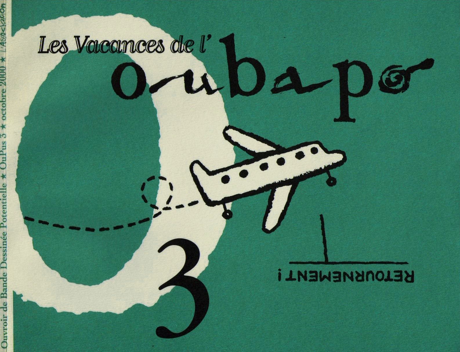
Les Vacances de l’OuBaPo (the vacations of the OuBaPo), Oupus 3, L’Association, October 2000, illustration by Jochen Gerner.
Jochen Gerner views himself as a draftsman who does comics among other things. Represented in France by Anne Barrault Panorama du Feu was part of Jochen Gerner’s second exhibition at said art gallery in 2009 (the first one happened in 2006). The theme of the exhibition was the four elements: earth, air, water, fire. A year later L’Association published Panorama du feu (the “fire” part of the exhibition, of course) in a cardboard box, surrounded by a paper ribbon with the word “Guerre” (war) written on it, containing fifty-one booklets numbered from zero to fifty. Each booklet is the reworking of what’s called in France the “petits formats” (the little formats), cheap, mass art comics imported mainly from the UK (published there by Fleetway) and sold in newsstands from the 1950s (or even earlier) until their decline in sales during the 1980s and disappearance in the early 1990s. The genres included in Panorama du feu are War, of course, but also Western, Espionage, and even a Tarzan look-alike produced in Italy, Akim. In each of these eight page booklets (cover and back cover included; booklet number zero has twelve pages with an introduction by Antoine Sausverd) Jochen Gerner used two creative strategies: (1) the cover was blacked-out with India ink leaving a title formed by expressions found in the book and the name of the collection plus explosions and signs (circles, crosses) in (not so) negative space; (2) the interior retained some didactic essays, advertisements and other paratexts published in the original comic books, plus what Thierry Groensteen called “reduction” in Oupus 1 (L’Association, January 1997): the stories were reduced to four, five or six panels (one per page).
In Panorama du feu Jochen Gerner chose visual rhymes (airplanes or trucks in all the panels, for instance). He also favored more abstract images and close-ups.
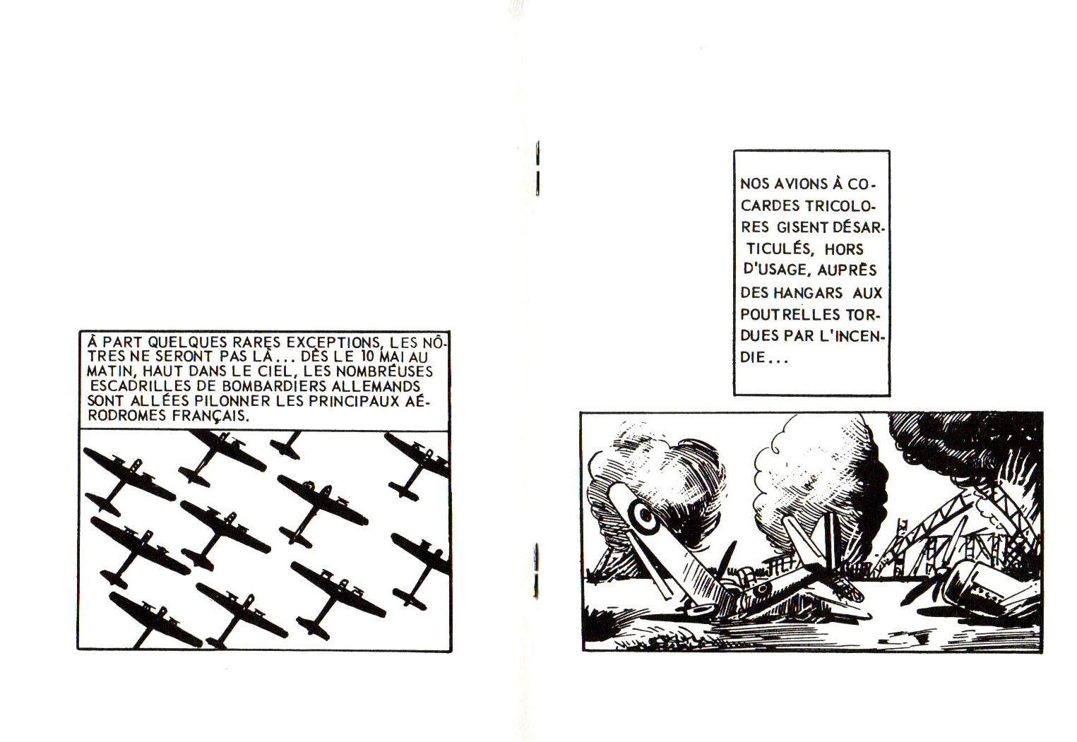
Airplanes (in perfect order and in chaos) in booklet # 40 of Panorama du feu, L’Association, September 2010: visual rhymes.
Besides being a non-conceptual reflexion (as Jochen Gerner stressed, saying that his is not a theoretical approach) on violent representations in petit format comics during the Cold War, what I find fascinating in the comic book reductions performed by Jochen Gerner is the contrast between said supposedly entertaining violence and a clear intention to be didactic including in the books many scientific essays. Below there’s an unexpected encounter between something as frivolous as Bettie and Veronica (Archie is here called Robert, by the way) and yet another image of violence. By mixing didacticism and comicality with the violence of war, the violent message was somewhat undermined or, at least, balanced by a variety of things, advertisements included.
Given the fact that Jochen Gerner reduced whole stories to a few panels it’s no surprise that many make little sense letting the reader with the strange sensation that something incomprehensible is going on (cf. below: infra-narrativity).
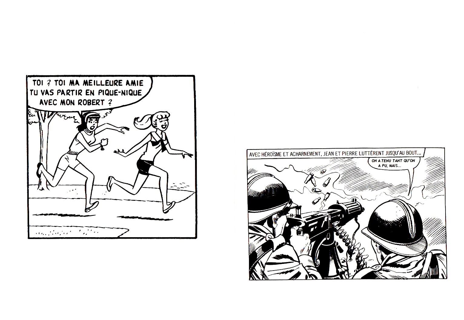
Betty and Veronica run to join the French war effort during WWII? booklet # 33 of Panorama du feu, L’Association, September 2010: comicality undermines seriousness.
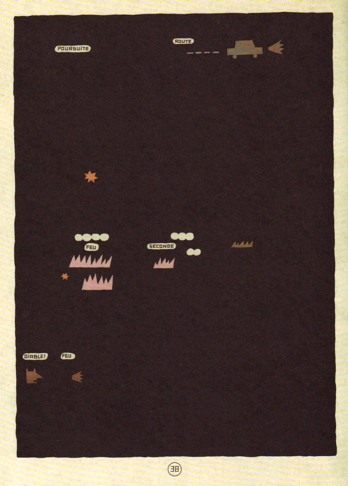
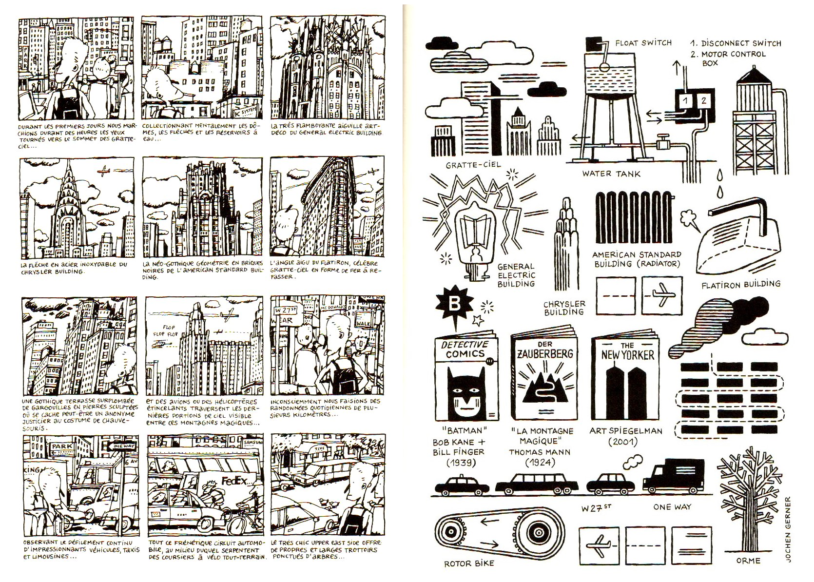
Page 38 of TNT en Amérique by Jochen Gerner, L’Ampoule, 2002.
The blacking-out of covers and interior pages (as seen above: a détournement of Hergé’s Tintin en Amérique – Tintin in America -, 1946 version) has its roots seven years before. In the above page the word “feu” (fire) appears (twice) and pictographs representing flames and smoke (plus a car and the words “poursuite” – “chase” -, and “route” – “road”) are similar to the covers in Panorama du feu. A look below at Hergé’s page blacked-out by Jochen Gerner in TNT en Amérique helps us to reach interesting conclusions:
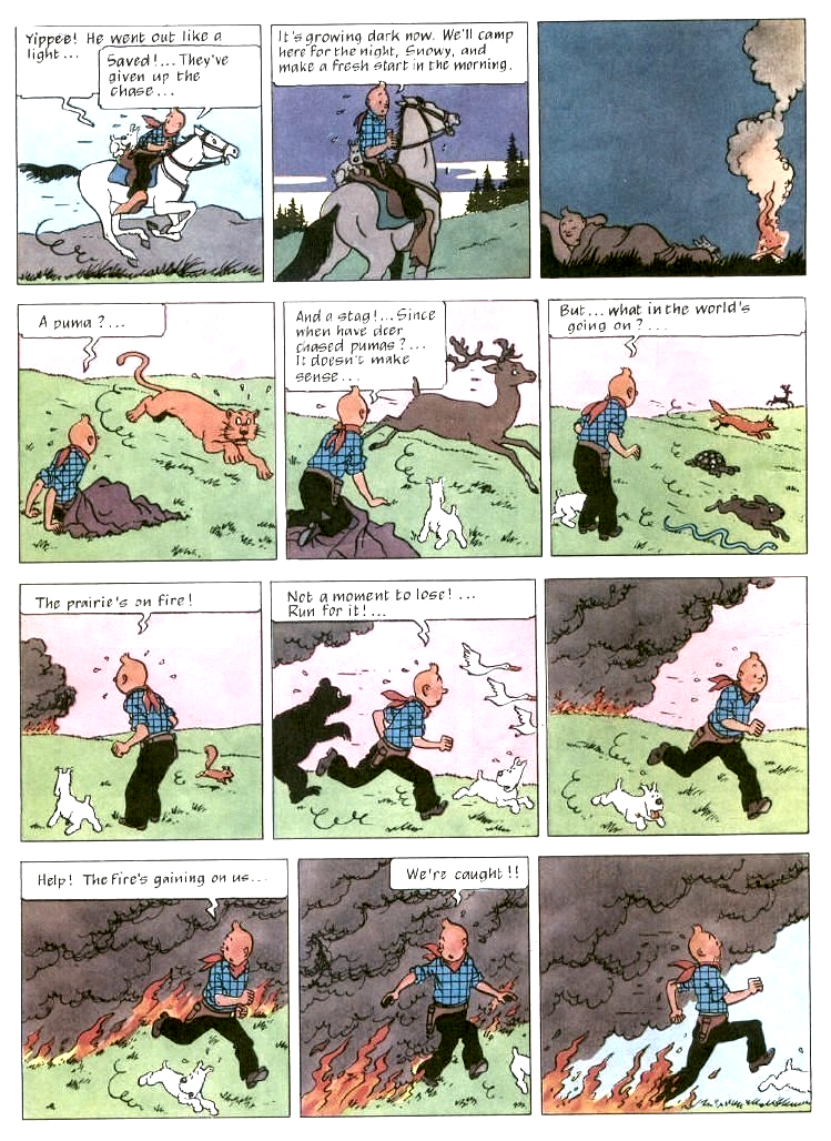
Page 38 of Tintin in America as published in 1973 by Methuen (originally published in black and white in 1931 /32 and reworked by Hergé in 1946).
Diegetically two things happen in this Tintin page: Tintin escapes a persecution and flees a fire. In the tradition of creating suspense at the end of every odd page Tintin is almost caught by the flames in the last panel. The persecution (by the baddies) is represented in TNT en Amérique by a car and the words “chase” and “road.” In spite of Tintin riding a horse (the stereotype of the American cowboy imposes itself to a formulaic narrative) Jochen Gerner used a car pictogram to update the story. The animals on tiers two and three are almost ignored (the “almost” goes to the star pictograph, a symbol of trouble – emanata would have been more effective, maybe, but who am I to question Jochen Gerner’s choices?, maybe he sees emanata as too blunt a sign?). Most of the attention goes to the fire with an ironic devil chasing the hero: can he be a villain destined to burn in hell’s eternal flames in spite of his virtuous persona?
The general conclusion that we may extract from the TNT en Amérique example is that the two creative tactics described above (blacking-out and reduction) have the exact same result of reducing the deturned story to a skeleton.
On the left: page from Courts-circuits géographiques (geographical short-circuits), L’Association, 1997; on the right, the same page as reworked for XX/MMX, L’Association, 2010.
The image above shows, on the left, a page of Jochen Gerner’s autobiographical book Courts-circuits géographiques; the image on the right shows the same page reworked for publication in XX/MMX (an anthology commemorating L’Association’s 20th anniversary). As Jean-Christophe Menu noticed in his thesis La bande dessinée et son double (comics and their double, L’Association, 2011), the evolution from representational (even if caricatural) to ideographical is clear, but even the older page shows a tendency to what Thierry Groensteen called, in Bande dessinée récit et modernité (comics, narrative and modernity, Futuropolis, 1988) “the inventory” (a subset of his concept of the infra-narrative).
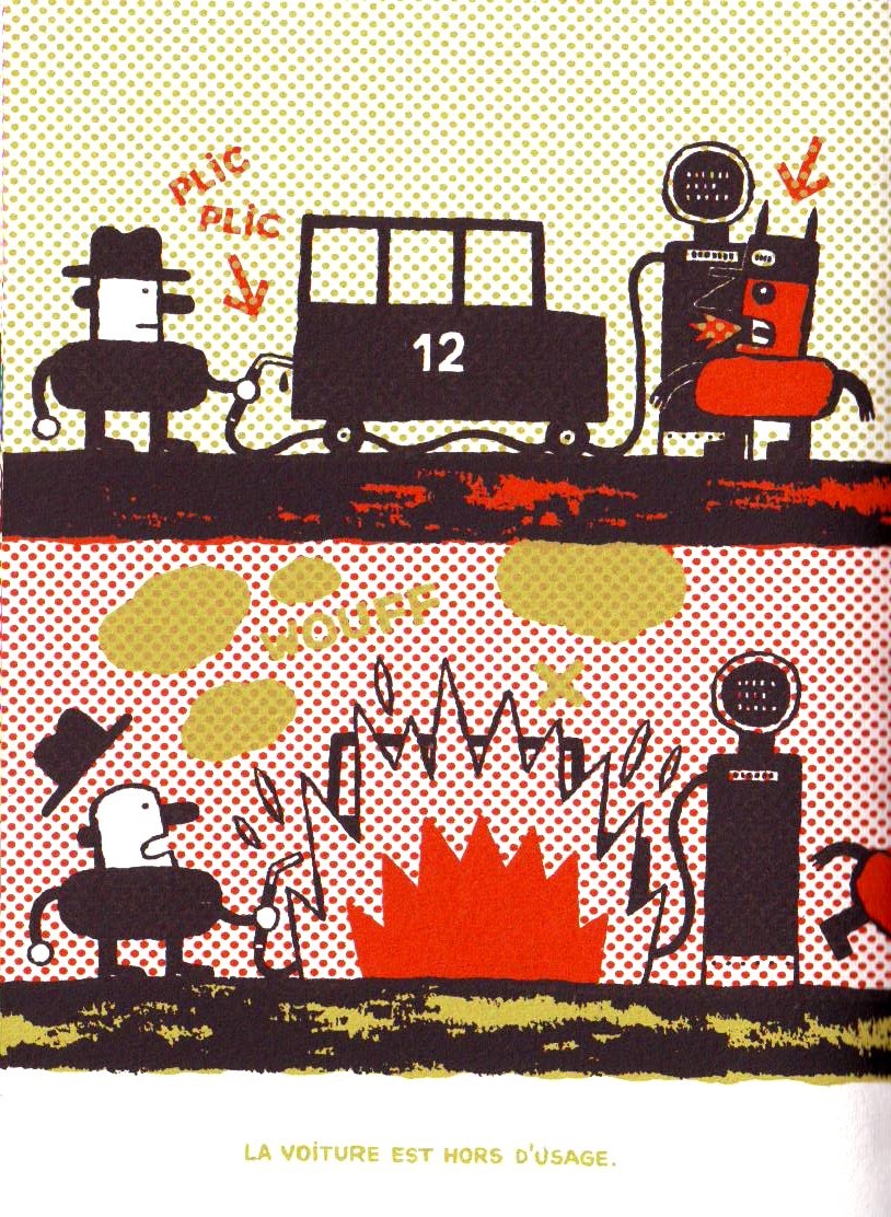
Malus by Jochen Gerner, Drozophile, 2002. A boon to a Ben-Day fetishist like me.
In Malus, as seen above, a silk-screened comic, Jochen Gerner illustrated real traffic disasters reported in newspapers. A creative tension is caused by the caricatural and schematic drawings depicting tragic events. A distance is created by the inadequate relation between form and content, or, to be more precise, the content isn’t exactly what one would expect given the source material. An ironic Dadaistic distance pervades all of Jochen Gerner’s work, but Malus is the height of this propensity. It shows Gerner’s tendency to explore – and short-circuit; cf. the Betty and Veronica example above – violent undercurrents in the mediasphere. TNT en Amérique lays bare, by reduction, how violent Hergé’s stories really are (TNT being, obviously, a reduction of Tintin’s name and an explosive). The same happens in Panorama du feu.
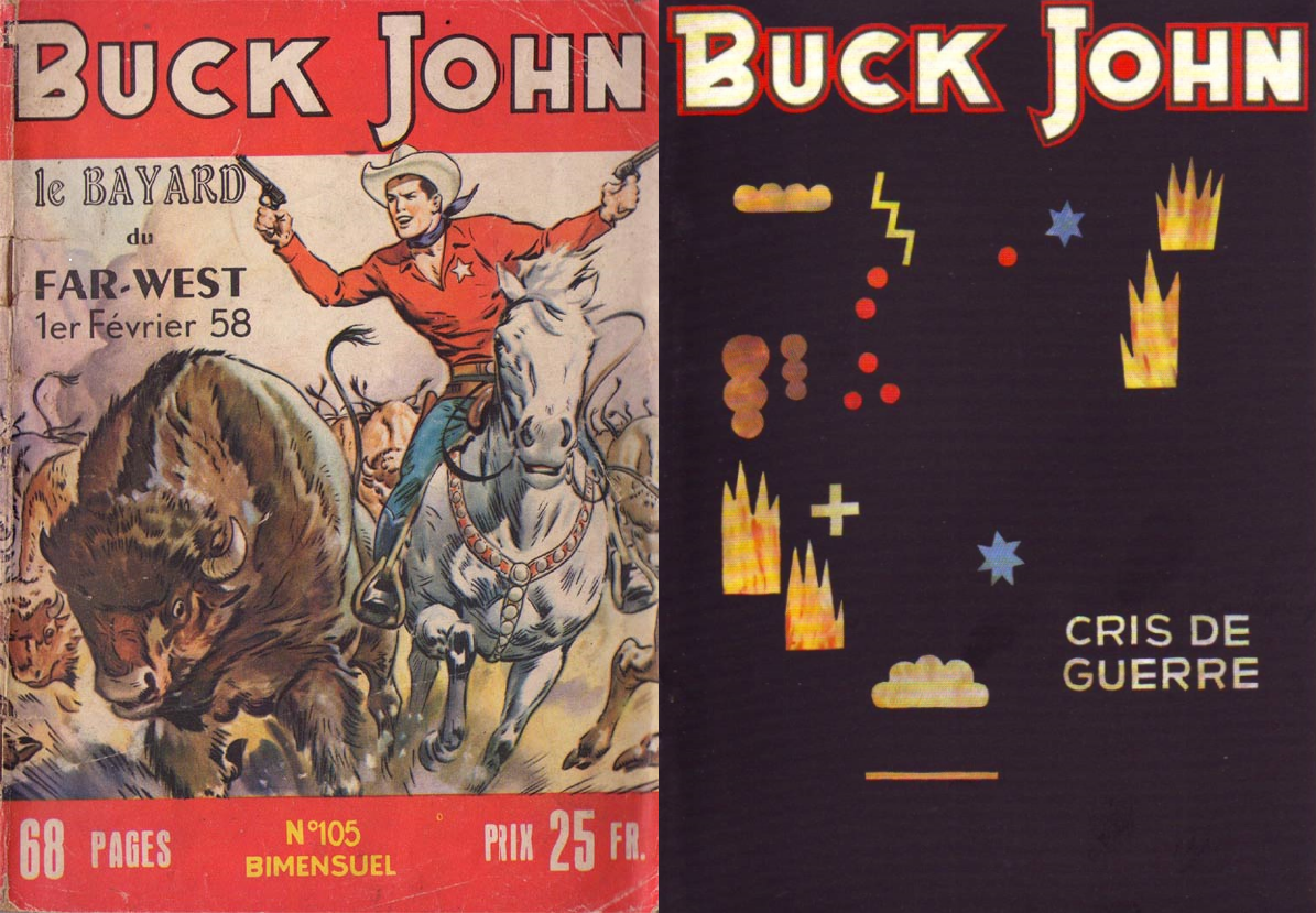
Left: Buck John # 105 (Buck Jones, I guess), Imperia, February, 1958; right: a deturned by black-out Buck John comic (not necessarily # 105, of course), Panorama du feu, L’Association, September 2010.
As we can see below Panorama du feu is a dual object corresponding to its two lives in 2009 (in an art gallery) and 2010 (as a series of fifty one comic books):
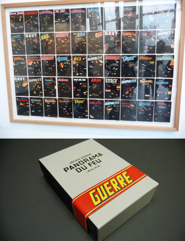
Up: Panorama du feu as exhibited in Anne Barrault’s gallery, September 2009; down: Panorama du feu as a box containing fifty one booklets, L’Association, September 2010.
In 2009 the fifty books were, as Jochen Gerner put it, like a giant battle ground as seen on a big control panel. Seeing the deturned covers behind glass encased comics come to mind. The act of reading is out of the question. On the other hand L’Association’s edition does almost the opposite, readers have access to the booklets’ content, but the ensemble is lost. Can these two forms of presentation be reconciled? I don’t think so, but one of the best solutions, I think, involved Jochen Gerner. I’m talking about Salons de lecture (Reading Rooms), an exhibition at the La Kunsthalle in Mulhouse:
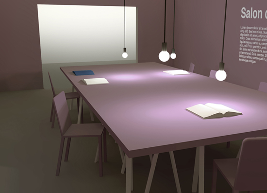
Salons de lecture, La Kunsthalle, Mulhouse, February 3 – April 3, 2011.
In Salons de lecture readers /viewers were invited to sit and read, as we can see above. As I said, reading and viewing can’t be reconciled, but I like this Duchampian solution: it’s a visual arts exhibition because the La Kunsthalle is a place where contemporary art is shown. Plus: there’s the design with different colors for the six rooms available.
Here’s Jochen Gerner’s opinion:
Simply to place the boards adjacent to each other in a linear fashion is like trying to reproduce the phenomenon of reading a book. This can’t be right. But the exhibition Reading Rooms plays effectively with the principle of the book on a flat surface. The effect in this exhibition is almost that of a wall placed horizontally on trestles. The exhibition design and the graphic systems used to mark the placement of the books, plus the captions printed on the table propel these books into another dimension.
Damn, Domingos, now I want to get a copy of Panorama du feu. I have Gerner’s Abstraction (1941-1968) which I thought was pretty much like Panorama. But it turns out Abstraction is more like a cross between that and TNT. It’s based on the war comics, but it’s all drawn over and abstracted.
Unfortunately Panorama du feu is a bit pricey.
Put me in mind of this:
http://humument.com/
Yep, I thought of the Humument as well.
TNT en Amérique and the covers of Panorama du feu, yes, the interior pages of Panorama du feu, no.
Pingback: Negative Writing: ‘Home’ and Other Works by Jochen Gerner – SOCKS