
Part 1: What Is A Fight Scene?
Fighting is to superhero comics what fucking is to pornography, or singing to musicals: the raison d’etre, the sine qua non, the whole kit and kaboodle. It’s why skeevy guys creep around in trenchcoats with a box of tissues, bottle of lube, and a very special life-sized doll named Candy; or why other people watch porn or musicals.
All three genres demand that character, motivation, theme, incident and conflict be expressed in distinctive forms. In musicals, it’s song; in porn, it’s, well duh; and in superhero comics, intra- and inter-personal conflict above all else must be expressed and resolved through physical conflict. In other words: the fight scene.
Few cartoonists have understood this more than Jack Kirby, whose superhero comics, especially from the 1960s and onwards, are positively drenched with fight scenes. We can see this by comparing Kirby’s 1960s work for Marvel with some roughly contemporaneous superhero comics published by Marvel’s chief competitor, DC. Take, for instance, the Superman comics produced by Curt Swan, Kurt Schaffenberger, Wayne Boring and others, under the tyrannical editorship of Mort Weisinger. There are vanishingly few fight scenes in these comics; Superman himself rarely gets to punch anything, which makes a certain kind of sense — since he is, after all, essentially invulnerable and nearly omnipotent, how could he possibly get into a fight that lasted more than three panels?
Panel one: bank robbers running out of Metropolis First.
Panel two: Superman swooping down to punch them into submission.
Panel three: Metropolis’ streetsweepers and janitors scrubbing splatters of brain and flesh off the street.(1)
It’s surely no coincidence that, of Superman’s cast of recurring villains, only a handful are memorable, and of those, two are defined entirely by their intellect — evil scientist genius Lex Luthor and evil alien genius Brainiac (!).
By contrast, the superpowers of many of Kirby’s chief 1960s characters are desultory, a thin excuse to motivate fighting, fighting, and more fighting. Consider: Thor is a strong guy with a hammer that he uses to beat the crap out of people. Captain America is just a normal guy (more or less), with a shield that he uses to beat the crap out of people (2). The Hulk is a strong guy with a, well, he just uses his own fists to beat the crap out of people. The Hulk’s whole power just is beating the crap out of people.
But we can say a little more about the visual logic of superhero comics than just “there is one”, and we can do so by thinking about the structure of a fight scene as abstractly and generally as possible. For what, exactly, is a fight scene? A scene with a fight, of course, but what does that actually mean? At the most abstract level, we can conceptualise a fight scene — in the narrow genre of superheroes, or any other kind of comic — as a sequence of aggressive or defensive actions and their effects — more precisely, a fight scene is
a sequence of events caused by the aggressive and defensive (and other) actions of two or more combatants
This needs some unpacking, so I’ll take you through it, in reverse order.
of two or more combatants
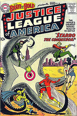
the Justice League battle Starro the giant starfish, from Brave and Bold #28 by Mike Sekowsky
The participants in a fight scene can be people, but they can also be animals, robots, zombies or anything else that can act — that can take action of one kind or another. In the simplest case, we have just two participants fighting, but superhero fight scenes — particularly so-called “team books” like The Avengers or Justice League of America — routinely feature three or more combatants. Where there are more than two participants, they can be distributed in any number of ways; that is to say, it could be one versus two, one versus three, two versus two, two versus one versus one… In principle there is no upper limit to how many combatants can participate in a fight scene, but in practice there are vague limits imposed by constraints like the size of a page, the quality of reproduction in printing, and the reader’s (and the artist’s!) patience.
events caused by the aggressive and defensive (and other) actions
In a fight scene, at least one participant is trying to damage, somehow or other, at least one other participant, who may be trying to damage the other in turn, or to flee, or merely to avoid damage, or to do any number of other things (but usually one of those three — fight back, flee, or avoid damage). At each stage, what happens depends on the actions of both combatants — what each of them is doing.
When somebody is trying to damage somebody else, let’s label the respective parties Attacker and Victim. In a fight scene, the Attacker makes an attack on the Victim — that is, Attacker takes some kind of aggressive action against Victim, such as throwing a punch, shooting a gun, firing a laser… The Victim also does something — dodges, projects a force-field, just stands there… What happens to Victim depends both on what Attacker has tried to do and what Victim tries to do (where doing nothing counts as a kind of doing something).
If Victim tries to dodge, then Attacker’s kick might miss. If Victim throws up her shield in time, Attacker’s laser might bounce off. If Victim does nothing to defend himself (perhaps he doesn’t know he is under attack, or perhaps he tries to retaliate without trying to avoid Attacker’s attack), then the attack might make contact. But even when an attack “lands”, what that actually means will depend, again, on the nature of Attacker’s attack and on what Victim is like. If Attacker has fired a bullet that hits Victim, it will have very different effects depending on whether or not Victim is wearing, say, a Kevlar vest.
a sequence
Fight scenes typically involve more than one thing happening — Batman punches the Joker, who then squirts back with acid from his trick flower, which Batman dodges while kicking out at the Joker, who topples… This is the prototypical kind of fight scene, in which two participants alternate between the roles of Attacker and Victim. First A attacks B, then B attacks A, then…
In principle, each action taken by Attacker and Victim could be depicted in their own panel, but usually an artist will collapse the panels (3) to one of four patterns:
1) Attack-Effect Dyad. Two panels, the first showing Attacker’s attack, and the second showing Victim’s action and the attack’s effect on him — e.g. panel one shows Attacker firing a gun at Victim, and panel two shows Victim successfully jumping out of the way so that the bullet whizzes past.
2) Attack Monad. One panel showing Attacker’s attack, with the resulting effect left off-panel, to be inferred by the reader as following this panel — e.g. we see Attacker firing a gun at Victim, who may or may not be shown (as yet unaffected by the attack) in the same panel.
3) Effect Monad. One panel showing the effect on Victim, with the initiating attack by the Attacker left off-panel, to be inferred by the reader as occurring before this panel — e.g. we see the Victim successfully dodging the bullet, which we infer to have been fired by Attacker immediately beforehand.
4) Attack-Effect Monad. One panel showing both Attacker’s and Victim’s actions, and the resulting effect on Victim — e.g. we see Attacker’s punch making contact with Victim within a single panel.
Naturally, an artist can use any combination of these patterns over the course of a fight scene, sometimes using one pattern and sometimes another. I’d guess — but I don’t have any figures to back this up — that the most common pattern, at least in American comics, is the Attack-Effect Monad, especially with fight scenes involving direct melee between combatants. Most fight scenes simply don’t parse action finely enough to differentiate between the moment when Attacker throws (say) her fist out in front of her at Victim and the moment when her fist actually makes contact with Victim. Instead, the easiest solution for most fight scenes is just to show everything all together.
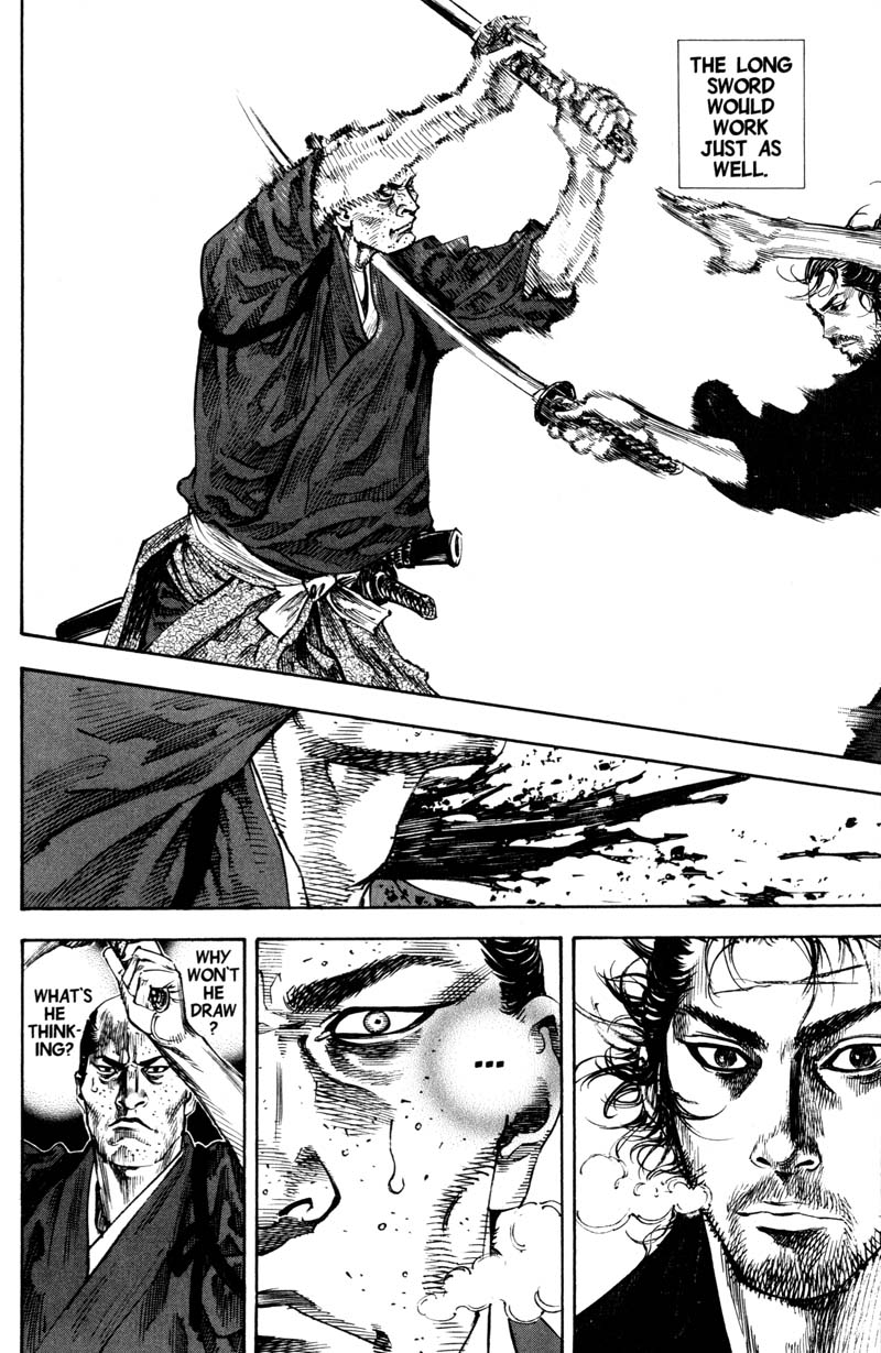
As with the number of participants, there is no upper limit to how long a fight scene can take. The Cerebus volume Reads has a remarkable fight sequence lasting for dozens of pages; Takehiko Inoue’s samurai manga Vagabond notoriously teases fight scenes out for hundreds of pages (although, to be fair, much of that does not involve actual fighting so much as flashbacks or other representations of the combatants’ streams of thought).
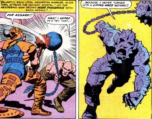
Kirby’s fight scenes can sprawl as long as an entire issue of twenty pages or more, although usually there will be some interruptions, such as a crosscut to a separate scene elsewhere. A fine example is the fight between Thor and the Absorbing Man in the main stories of Journey Into Mystery #121-#123. The entire sixteen pages of #121’s main story is given over to the fight, with a brief interruption in panels 3-6 on page 5 and panels 1-2 on page 6, in which we cut to Asgard and Loki (who has orchestrated the fight). The fight then continues in #122 from page 1 to the second-last panel of page 3, where we cut again to Loki who magically transports the Absorbing Man to Asgard. There the Absorbing Man fights basically the whole of Asgard, and eventually Thor again, until roughly page 10 of #123 (4).
As an illustration of this formal structure, let’s do a quick close-read of another Kirby fight scene, and specifically a single, famous page from Tales of Suspense #85, inked by Frank Giacoia and lettered by Sam Rosen, with two captions by Stan Lee. (The comic doesn’t credit a colourist, and the listing at comics.org leaves it unknown). In this sequence we see a fight scene between Captain America and Batroc the Leaper (or, to give him the pantomime-French title favoured by Stan Lee and his later epigones, Batroc zee Leapair), which breaks down as follows:
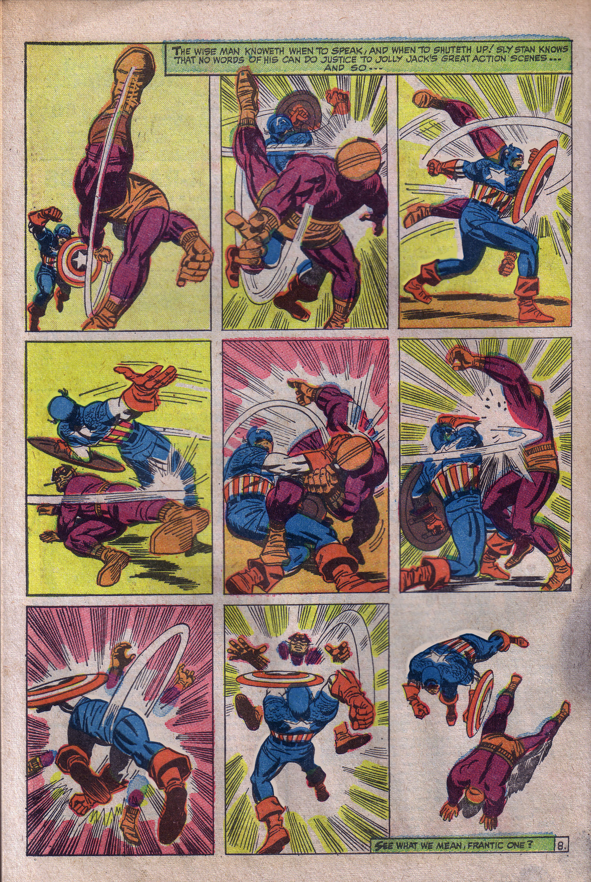
Panel 1: First panel in an Attack-Effect Dyad. Batroc and Captain America are, each of them, both Attacker and Victim.
Panel 2: Second panel in the Attack-Effect Dyad, showing the effects of their respective attacks in panel 1. Again, each character is playing the role of both Attacker and Victim.
Panel 3: Attack-Effect Monad. Captain America is still Attacker but no longer Victim, while Batroc is now just Victim. We see Captain America’s attack and its effect on Batroc.
Panel 4: Attack-Effect Monad. Roles are reversed, with Batroc now Attacker and Captain America Victim.
Panel 5: Attack-Effect Monad. Roles reversed again, Captain America attacking and striking Batroc.
Panels 6-8: As with panel 5.
Panel 9: A breather — no attacks.
So I think this is a helpful way to think about the formal structure of a fight scene, in any genre: it’s a sequence of events caused by the aggressive and defensive (and other) actions of two or more combatants. But I really don’t know anything about proper comics theory, so please let me know in comments whether I’ve reinvented the wheel with my formal description of a fight scene above. If anything, I’ve probably reinvented the wheel, only this time it’s square and doesn’t turn very well…
In Part 2 of this essay, I’m going to talk about how this structure constrains the imaginative space of superhero comics, using Kirby’s The X-Men as an especially vivid case-study. So, come back next time, true believer, for more hot fucking action the Marvel Way. Excelsior!
ENDNOTES
(1) Although this scene doesn’t occur in any actual Superman comic, it does occur in roughly 98% of post-Watchmen superhero revisionist comics.
(2) Well, Captain America was actually created by Kirby and Joe Simon in 1941. But the 1960s revival was Kirby’s third-longest work in that decade, after Fantastic Four and Thor, so he certainly counts as one of Kirby’s chief characters of that decade.
(3) Just for the sake of convenience, I’m assuming that fight scenes are drawn in a standard panel lay-out, with one moment per panel. Things are a little more complicated when you have panels showing more than one moment in the same space, or ill-defined panels, but the basic idea is the same.
(4) I say “roughly” because it’s debatable whether the fight proper ends there, or three pages later when we see the final result of Odin’s magically expelling both Loki and the Absorbing Man into space. Debatable, but not really debate-worthy, you know?
IMAGE ATTRIBUTION: Stan Lee centerfold from Sean Howe’s tumblr for his book on Marvel. Captain America v. Batroc, credits as above; I took the image from Eddie Quixote’s Campbell’s post “The Literaries”. [Other images grabbed by Noah, who is less careful about documenting these things — so blame him, not Jones.]
This article uses the term “cause and effect in a solitary comic panel”.
http://www.wizzywigcomics.com/?p=91
You could say “cause and effect”, “cause panel”, or “effect panel”, or something along those lines, without the “monad” jargon.
You might be describing a prototypical “Kirby” fight scene-but some manga are far more creative in where they set the point of view (“the camera”) and how they set the pacing. A sequence is not limited to two panels (making your “dyad” term somewhat confusing)- though I guess it might be for Kirby.
The trick to making a fight appear more dynamic and less repetitive is to vary the camera angles and background. Kirby and Ditko understood this fairly early on, but some great comics artists never mastered how to draw effective fight sequences stretching beyond a few panels.
Although both Kirby and Ditko were experts when it came to effectively manipulating fight sequences, Kirby seemed to lean on varying the camera angle to break up the boredom, while Ditko tended to vary the background.
The Batroc sequence you show above is an example of how Kirby would vary the camera angle for a fight sequence. An example of how Ditko would vary the background for a fight sequence can be found in “Amazing Spider-Man” #25, when Spider-Man battled the Spider-Slayer.
“The trick to making a fight appear more dynamic and less repetitive is to vary the camera angles and background. ”
Or the writer could come up with something more interesting than two guys repetitively hitting each other, but Kirby was probably drawing and writing 5 books a month or whatever, so likely didn’t have much time to do so.
Also, that Kirby page doesn’t look particularly dynamic or varied to me. This may be a matter of taste, but compared to, say this two page spread from a manga:
http://f.cl.ly/items/2q1N0c0j0i3D022j0G43/train_train_v01_p_0022.jpg
the Kirby page looks pretty flat and uninspired.
The main advantage of that Kirby page is it’s designed to be clear enough for a young child to follow without difficulty.
It’s interesting the extent to which the spectacular fight set pieces seem to be linked to the visual medium, at least for the most part. You don’t generally have long descriptions of fights like this even in pulp genre fare…at least I don’t think you do? Maybe there were some in Fafhrd and the Grey Mouser…but even there it’s more description of states of mind than actual, this person swung the sword that way, that person parried, etc. etc.
Maybe I’m just not remembering; it’s been a while since I read bog-standard sword and sorcery….
pallas — Actually, I tend to gravitate towards artists who are either writer-artists or working via the Marvel method — meaning they have little or no guidance from the writer when it comes to story layouts. One of the few exceptions is Kurtzman because he had such a unique talent when it came to visualization.
So, since I look at things from a Kirby/Ditko 1960s-style viewpoint, I have the creative freedom to make a fight one page, or 10 pages, depending on my mood.
You’re right, that Batroc page is not a great example of Kirby’s skill at laying out a fight sequence, but it is certainly passable for Kirby, and light years better than what other artists from that era could do.
A much better example, I think, is a Kirby fight sequence for the Captain America story in “Tales to Astonish” #62. Unfortunately, there’s only one 4-panel sequence I can find online, and from that, it’s impossible to get a good picture of the overall fight sequence.
That manga spread you linked to is OK, but if I were the editor, I’d have had the artist redraw several panels that are not at all clear.
Noah — Longer, more drawn-out fights ARE probably much more common in sequential visual mediums (comics, films, etc.), but I’d think there’d have to be at least some lengthy prose examples. But I can’t think of any offhand.
Dumas liked long descriptions of fight scenes in Musketeers and its sequels.
Homer really gives you the old blow by blow in The Iliad (less so in The Odyssey)
Good examples!
Great essay! I really like people’s thinking on camera angles too– I imagine there are subgenres of action-effect dyads, based on formulaic use of angles, and the meaning these formulas have accrued over time (bird’s eye action leading to extreme close up effect, versus extreme close up action to bird’s eye effect, for example.)
Pallas– For about half of the time I’ve read comics, I was only interested in reading manga, and mostly only action manga. In my opinion, while manga does a much better job of making fight scenes emotionally compelling, I feel like the artist’s struggle to depict the physicality of the fighting. Of course there are exceptions, but so many manga rely on the [static figure with speed lines] > [abstraction] > [protagonist lands a few feet away while the opponent’s halves slip apart]. There’s a lot of time manipulation– flashbacks, people thinking, freeze frames, blank panels… I remember drawing comics in a manga style, and really failing to understand how to construct my own fight scenes, based on the examples I was looking at.
Kailyn,
I actually agree with you to an extent, but I wonder if some of it is cultural. If kids in Japan can follow the stuff, it can’t be that hard, y’now?
That said, there are some manga artists who I find to be pretty solid. The one I linked to has pretty traditional panel construction, and the words and pictures blend together, which is possibly more than can be said for 60s products of Stan Lee’s Marvel method. The different panel sizes shows an awareness of pacing, and there’s thought given to point of view as we see the drama- and the panels are designed- from different character’s perspective, providing emotional affect.
Eric — you’re right, and that explains why the Iliad is so much more boring than the Odyssey. [Self-indulgent aside: I’ve only ever met one person who prefers the Iliad, and I was astonished that such people actually exist] There’s probably similar stuff in other epic martial poetry, like the Aeneid or Ariosto Furioso, but it’s been (!) 16, 17 years since I read any of that stuff.
The main reason you don’t see it in prose (or, usually, poetry) is, I think, that writers and readers don’t generally have the specific vocabulary to describe a fight with as much detail as a cartoonist can draw. e.g imagine trying to fully describe that Cap/Batroc fight in words, or a Jackie Chan setpiece. A choreographer could do it, but only another choreographer would be able to read it as anything but a fancier version of “this guy punches the other guy, then the other guy punches the first guy, who jumps out of the way”.
Pallas–
Oh, I think manga is actually more intuitively easy to follow than American comics at times… I think they take more time with transitions and establishing, and mangaka make beter use of reaction shots and caricaturization. Of course, this is a horrible generalization, coming from someone who has never really loved superhero comics. I worked at Marvel one summer though, and continue to give it a shot…
I’m actually not sure that page is the best example. Its unclear what’s going on in the last panel, and the masked figure is hard to figure out anatomically. I think this is a perfect example of an artist using extreme closeups and speed lines to give a sense of kineticism to very static and flat images. This isn’t generalized across manga though– just sticking to the mainstream artists, Tite Kubo, and Masashi Kishimoto showcase a great understanding of the body in space, and Rumiko Takahashi has her moments too– although I felt Inuyasha’s giant sleeves, sword and hair make for a blockier read than Ranma’s movement ripples. And when you start going into the super-cinematic manga, like Akira and Nausicaa, the drawings are hyper clear, with great anatomical understanding.
How to convey dynamism in a fight scene (or any other scene! compare how Caniff draws a talking heads sequence with any of Bendis’ collaborators) is a whole other post, but…it’s interesting you choose those 2 pages, pallas, because they don’t read very clearly to me at all. Part of that, I guess, is not knowing the context, but all I can tell from that sequence is that the pointy-eared dude runs at the other dude and does…something? BOOM.
This is actually a problem I’ve had with some of the shonen/seinen manga I’ve read, especially ones with more outlandish fantasy and superpowers. I really want to like Bo-bo-bo Bobobobo(or whatever it’s called), but I can’t parse the action sequences in a way that is satisfying to me. I just can’t tell what the hell is going on.
Comparing those two pages — which I do think are indicative of at least some of the other approaches in manga — with the Kirby page reminds me of what David Bordwell and others have written in recent years about the “intensified continuity” of modern Hollywood action films versus the “invisible style” of classical continuity editing. It seems to me that the appeal of that style of manga is similar to the appeal of intensified continuity: as you say, more dynamism (purportedly), more visual representation of the protagonists’ inner worlds; but the drawbacks are the same, viz. you lose clear depiction of spatial and causal relationships. The choice between them might be largely a matter of taste? (For the record, there’s loads of manga that I like a lot. If my copies of Bakune Young were nearby, I’d check how that portrays action — that’s pretty much my platonic ideal of an action manga)
Now, Kirby’s not necessarily the first guy you’d go to for invisible style, but…his panel layouts by the 60s are pretty solidified, and get even more so as that decade goes on: 2/2/2, or 2/1/2, sometimes 3/3/3 (as in the Cap/Batroc) or, especially near the end of his 60s work for Marvel, 2/2. Ditto Ditko.
Obviously that’s not unique to those two guys; you find the same kind of standard panel layouts in those Superman comics, or a lot of the other DC stuff from the same time. But earlier Kirby mixes it up more, which suggests that later on he was deliberately sticking to simpler panel layouts, for precisely the reason you (tongue-in-cheek) flag: to make it clear for a child. And to make it clear to anyone else, too.
Of course Kirby is incredibly, (in)famously ostentatious within any single panel, particularly his wild architectural or sartorial tableaux, but his panel to panel flow and layout — which is kind of analogous to film editing — do seem to show him trying to erase his own mark. Ideally you never see that kind of cartoonist doing any heavy lifting; the whole sequence seems to flow of its own accord.
Compare Kirby or Ditko panel-layouts with those of Kubert or Infantino at around the same time — those latter two break it up a lot more, with a mix of full-page horizontal or vertical panels, cameo insets and the like. There’s more than one way to dynamise a cat.
———————
Jones, one of the Jones boys says:
…This is actually a problem I’ve had with some of the shonen/seinen manga I’ve read…I can’t parse the action sequences in a way that is satisfying to me. I just can’t tell what the hell is going on.
———————–
Same here! I’ve read that the Japanese — because the nature of their writing — are more visually sensitive, hence able to easily apprehend that such-and-such a drawn squiggle is, say, the hero’s speeding fist
“how the brain processes kanji”: http://forum.koohii.com/viewtopic.php?id=4818
—————————
…reading Japanese textual material requires more integrated action on the part of both [brain] hemispheres that is the case for English..
…the right hemisphere facilitates pattern recognition, and…concrete kanji are high in imagery…
————————-
Thus, reading kanji stimulates and exercises the “pattern recognition” part of your brain! Emphasis added; more at http://tinyurl.com/d9zw9x6
On a lighter vein:
“Subliminal convergence of Kanji and Kana words: further evidence for functional parcellation of the posterior temporal cortex in visual word perception”: http://www.ncbi.nlm.nih.gov/pubmed/15969912
An interesting suggestion:
—————————
Kanji Causes Manga: Why?
Japan is a visually-oriented culture.
That makes sense. Why so?
Because of kanji of course.
…as Frederick Schodt has put it, in discussing manga cartoons, ‘the Japanese are predisposed to more visual forms of communication owning to their writing system. Calligraphy… might be said to fuse drawing and writing. The individual ideograph… is a simple picture that represents a tangible object or an abstraction concept, emotion, or action.. in fact, a form of cartooning.
—————————
http://neojaponisme.com/2006/12/13/kanji-causes-manga-why/
As for that Kirby Cap vs. Batroc fight scene, it’s a type of fight scene. Imagine if a movie were to feature two characters fighting in the confines of an airliner restroom; would that make it “bad,” or just operating within highly circumscribed visual parameters?
In that story, Jack ended up with only one page to devote to the battle. Contrary to what would make for the usual visual excitement, with some larger panels, varying panel sizes, he chose instead to render “concentrated action,” within a rigid grid.
—————————-
Jones, one of the Jones boys says:
…Comparing those two pages …with the Kirby page reminds me of what David Bordwell and others have written in recent years about the “intensified continuity” of modern Hollywood action films versus the “invisible style” of classical continuity editing. It seems to me that the appeal of that style of manga is similar to the appeal of intensified continuity: as you say, more dynamism (purportedly), more visual representation of the protagonists’ inner worlds; but the drawbacks are the same, viz. you lose clear depiction of spatial and causal relationships.
—————————
Superbly put; indeed so!
That manga page could be clearer, sure, in particular the last panel. But… with the Kirby sequence the lack of variety in the narrative, in terms of angles or events, makes it hard for me to care. The manga page is very invested in using point of view shifts to get me to care.
Maybe if I read the Kirby story up to that point I’d hate Batroc (whoever that is) and find cathartic enjoyment in seeing him beaten down, but it seems like even Stan Lee isn’t very convinced it works, choosing to throw in a (“we’re writing and drawing the comics”!) meta moment, rather than rely on the narrative framing.
Or maybe not, maybe he just wanted to draw attention to himself and Kirby for promotional reasons.
One interesting thing is that silver age comics are more oriented towards long shots and full figure shots, but that is somewhat out of fashion these days.
There’s was an interesting public argument between Jim Shooter and Francis Manapul over Manapul’s choice of camera angles on Legion of Superheroes, Manapul did a blog post where he wrote:
” The first issue I tried to infuse modern sensibilities to Jim’s traditional style. I really like cinematic storytelling, moving my camera around, and changing my angles to make them more dynamic. This was what I was told consistently when I was trying to break in as an artist, and here I was applying it… Jim is from an oldschool way of telling stories and he wanted me to do a lot of medium, front on, full body shots. He even said it was a cheat to do close ups. I complied. I knew that telling stories this way was a bit lacking in drama and dynamics, but Jim had the experience who was I to say other wise. I carried on like this until near the end of my run. I wasn’t having any fun with the book at all. In my attempt to follow Jim’s script closely I ended up drawing shots that were boring, and lacked life and excitement. The pacing just felt clunky and off to me. There was no beat.”
I think its a pretty fascinating argument about which approach to camera angles is best. Shooter obviously thinks Kirby is the Grade A standard, going from his blog posts on Kirby’s art. Link to Manapul’s blog post:
http://francismanapul.tumblr.com/post/10684621178/mr-shooter-and-the-legion-of-super-heroes
That manga page that pallas links to looks like a lot of gobbledygook to me, like modern day chaos cinema, where the viewer can only guess or be told by the story what’s going on from the rapid editing and extreme closeups.
On the other hand, that Kirby page isn’t great, either, if clarity of represented motion is what you’re wanting. What kind of battle ready pose is Balroc doing in panel 1? It’s like some clumsy ballet stance. Just try to figure out the motion in panel 2 — makes no sense. Balroc’s head is swinging upward while Cap punches through his leg? Not the best way to throw a punch, but I get 3. Panel 4 is good, but 5 is a mess; Balroc is standing on Cap’s leg but without any weight. And how did he get in such a position that Cap could do a karate chop to his neck like that? The rest is clear enough, I guess, but there’s no fluidity to the supposed motion on the page. That is, Cap hits Balroc in a downward motion in panel 7, then some time passes where the latter gets back up for Cap to hit him again, but this time in an upward motion with the shield in the way? The charitable way of putting all this is that it’s abstract action, like Michael Bay movies (not so charitable a comparison, unless you really like The Transformers). I’m skeptical of the connection to classic Hollywood style here, or that Kirby-action is all that much more “transparent” than manga.
The chaos cinema video essay.
Pallas: the point of view in the Kirby page (I’ll avoid “camera angle” because these are drawings) changes a lot. You don’t get that impression because there is no background.
Charles: as for Batroc fighting technique google “savate.”
I always wanted to post a link like this one.
Dominigos, point of view (as I’m using it) isn’t just where the “camera” is, it’s the implied narrative point of view.
If you look at the manga example, the first image has both opponents, so its a neutral third party sort of situation (like the Kirby image)
But panel 2 switches to the two bystanders watching the fight , gawking at the sword (“This chick has a sword!” perhaps they are thinking) although we’re not literally seeing it with their eyes, the point of view is that of those particular people watching the fight.
Then the extreme closeups show the scene from the bad guys point of view, angry, calling her a bitch, we see nothing other than his angry face and angry eyes.
next panel:
Extreme closeup of the heroine, wondering what he’s up to, now its from her point of view.
In contrast,
Kirby just neutrally depicts two guys slugging at each other. There’s no interest in their internal states. We’re just meant to be a fly on the wall cheering cap on.
I just realized I was mixing Balrog with Batroc.
Anyway, Domingos’ Google device tells us that the next Cap movie will likely have a better rendering of savate than Jack Kirby’s.
And of course, as any Tintin fan knows, Professor Tryphon Tournesol (or Professor Cuthbert Calculus if you prefer) is a master of savate:
http://24.media.tumblr.com/tumblr_loxjb4EjKx1qj6sk2o1_500.jpg
But could he beat Captain America?
Pallas: the word you want, then, is focalization.
Charles: maybe, but he will lose the fight just the same. No one can beat writer the almighty.
Thanks everyone for the stimulating discussion. Some thoughts:
Kailyn and Pallas — sooner or later, every discussion in comics turns into “Who’s stronger — Hulk or Thor?” (or Hulk v Monkey D Luffy, I guess); so too with clarity in manga v. American superhero comics (ASC). Obviously both publishing traditions have a wide range of ability and style; some “hyper clear” (thanks Kailyn), some hyper unclear. But I’d say that, if we might speak of a “classical tradition” in ASC running from (broadly) the mid-40s to the start of the 90s, that tradition generally valued clarity, with some exceptions such as Gene Colan, who was more of an atmosphere guy. Even hacks like Mike Sekowsky or Sal Buscema were usually clear enough.
By contrast, my mostly second-hand impression of current ASC is that the art is just terrible…and a large part of that is the Image/post-Image move to make their art more “dynamic” and “kewl”, to the point that it becomes illegible — not unlike some of seinen/shonen manga. I haven’t read widely enough in the latter to know how it compares on the whole.
Pallas — I’d agree that Kirby is often not interested in enacting the internal states of his characters through subjective povs or impressionistic effects. He is sometimes — witness his signature move of the close-up panel of eyes, but in general the internal states, when they’re salient, are expressed through outward facial expression; think of perennial sad-sack Thing, always moping or self-doubting about something or other. As Kirby went through the 70s, he increasingly turned away from psychology altogether, as part of his anti-humanist portrayal of pure power — or, at least, that’s my overall impression of his work in that decade.
(Cue Patrick Ford to tell us all how Moon Boy or Doctor Canus have a rich internal life to rival any of Virginia Woolf’s characters)
Incidentally, Manapul isn’t quite right, I don’t think, to label the relevant techniques “modern” — look at Caniff or Toth…
Charles, no doubt you know this, but for everyone else: chaos cinema is the endpoint of precisely the intensified continuity style that I mentioned.
I don’t want to turn this into a referendum on Kirby or anything…That’s hardly my favourite page; I just chose it because (a) it illustrated the formal apparatus, (b) it was salient because of the “literaries” thing, and (c) I’m lazy so I took the first thing that I thought of and that was easy to grab online. But it sounds like your qualms are with constructing a plausible, realistic sequence from the panels; not sure that that’s the same thing that I’m talking about as “clarity”. I’d be interested to know whether you had this trouble on an immediate first read, or only once you started to really examine it (if the former, than you’re a better reader than me — admittedly, not a high bar to clear).
…and, if Tony Scott can be rehabilitated (one of the odder things to watch in recent film criticism), then it’s only a matter of time before Michael Bay gets his turn as a serious auteur…
(thanks, btw, Noah for adding the extra images.)
I’ve been obsessed with One Piece lately, so it’s my current standard for examining fight scenes, and it makes an interesting lens to view this discussion through. As you mention, American superhero comics don’t usually parse the action especially finely, but manga fight scenes can really spread out the action to depict individual split-second moments, interspersing them with the expressions and thoughts of the characters involved, or people watching (or flashbacks, or environmental details, etc.). Here’s an example (please pardon the linking to my own blog). That one kind of functions as an Action-Effect Dyad that actually lasts at least four panels (plus cutaways to characters’ expressions) with an Action-Effect Monad sandwiched in the middle.
On the other hand, there are also scenes like this one, with a series of panels that mostly fit right into the four patterns you mention, so there’s room for a variety of approaches.
Interestingly, when you made this comment: “Most fight scenes simply don’t parse action finely enough to differentiate between the moment when Attacker throws (say) her fist out in front of her at Victim and the moment when her fist actually makes contact with Victim.” it made me think of this scene, in which we not only see Luffy’s fist get thrown out in front of him, but there’s a pause for an 80-page flashback before we get to the moment where the fist makes contact. In case it wasn’t clear before, I love this comic.
A few points on this great discussion:
“compare how Caniff draws a talking heads sequence with any of Bendis’ collaborators” — Jones, I may be the only one who wants to read about drawings of talking heads, but as a Caniff fan, I’d like to see you make that comparison.
I noticed years ago that prose writers handle fight scenes very differently, too, and I wonder if one of those controversial cross-media comparisons could be made. Hemingway’s fight scenes are very clear. The reader knows exactly what’s happening, and could probably recreate it. Steinbeck in The Pearl, in contrast, tells you what the protagonist experiences in the fight as it’s happening, e.g., “All of a sudden, the floor rose up and slammed into his face!” (not an actual quote). The reader has to read through the experience, then piece together the events afterward like a detective.
I find it interesting that Noah thinks of sword-and-sorcery when he thinks of long, drawn-out fight scenes. It seems to me there are two ways to draw out a serious fight: 1) a means of defense, or mitigating the attack, or 2) incompetence on both sides. Sword and sorcery characters have armor, swords, shields — all of which can be used to block or at least diminish a blow. In the b-movie sci-fi flick They Live, you see former wrestler Roddy Piper’s character in a fight with a character who subsequently allies with him against a common enemy, in very Marvelesque fashion. The fight lasts forever, precisely because neither of them seem to have any training or natural aptitude whatsoever. They miss finishing shots like they were exits you passed while messing with the radio, and their attacks look as painful to execute as to receive. That’s how I remember it, anyway. If you want to see a movie that seems to be intentionally made for MST3K -style commentary, I recommend it.
I haven’t looked closely at a Bendis comic in a long time, but I’m guessing Bendis + whatever artist he works with does not always do talking heads the same way… sometimes (In Powers, for example) he does a montage of close up shots of the heads, which he seems to have taken from the Frank Miller’s the Dark Knight Returns. Not sure how often the Marvel stuff is like that…
Regarding They Live and its infamous fight scene, Roddy Piper himself recently spoke about it: http://news.yahoo.com/roddy-piper-talks-big-fight-live-174900102.html
Also, while YMMV, I think They Live is an odd and fascinating movie that deserves a bit more respect than subjecting it to MST3K-style kibitzing. For better or worse, it certainly made an impression on young Shep Fairey, among others. As for me, I’m still trying to figure out if it’s anti-Semitic or not.
Jones: “…and, if Tony Scott can be rehabilitated (one of the odder things to watch in recent film criticism), then it’s only a matter of time before Michael Bay gets his turn as a serious auteur…”
Tony Scott is a perfect distillation of the 80s (i.e., back when people fucked standing up), so Bay will probably be redeemed along those lines with regards to the 90s to 00s. One favorable way of putting his style is that it’s phenomenological, like a Robbe-Grillet novel, only in motion … with fists … and robots. The action film as eidetic reduction.
They Live is a great film, one of Carpenter’s best.
You know, I brought up Steinbeck and Hemingway, but Charles and Daniel seized on the Carpenter flick. Whenever I think I’m not sophisticated enough for this audience, you all get right down into the plebeian, mainstream muck with me. You’re like gourmands that can talk about haute cuisine or street vendor food with equal enthusiasm and discernment.
So, agreeing that Bendis + artist X does not equal Bendis + artist Y, what are the pros and cons of different ways to render dialogue in comics? I’ll proffer another method: illustrated prose.
In a Batman (or was it Detective?) comic a few years back, Batman teams up with Deadman and goes to South America, where he has a conversation with an old shaman. The creators rendered the page as text, with an illustration of Batman on one side of the words and an illustration of the shaman on the other. Then the creators humbly asked what readers thought of it on the letters page.
I don’t think I ever saw the responses, but I liked it. They were able to show a real conversation, and neither of those characters was going to display much in the way of expression or body language anyway. If they had, it would have been Paul Newman-subtle, and it would have taken a Caniff to capture it. They saved the art pages for the action and gave me more story for my money. It might not work with more animated characters like the Beast or Hawkeye, but you could capture a conversation between Hank Pym and Shang Chi like that. Anyway, I submit the rendering of dialogue in comics as a topic.
I think you’ll find that most minds worth engaging will fit this characterization to some extent.
Good point, Daniel.
John — I haven’t read anything by Bendis for years and years…maybe since his first Avengers story? But these, to me, are prototypical pages of Bendis dialogue, at least back when I was reading some of his work: http://tinyurl.com/celmhur and http://tinyurl.com/coq466y. Either
(1) a page (or better yet, a double-page spread) of xeroxed shot-reverse shot panels — bang-boom-bang-boom — or even just xeroxed single head panels (like those Doonesbury strips that are three panels of the White House), or
(2) a page of, literally, characters standing around — the thrilling climax to Avengers Disassembled is Doctor Strange floating in the air delivering a wikipedia-esque plot summary.
So filmic! At least if your idea of dialogue, mise en scene, and editing begins and ends with Christopher Nolan.
The effect of this staging is to place all the weight on the scripter’s dialogue, and in case (1) particularly the beats of the dialogue; which is, in his case, an unfortunate decision. He may have gotten better since then, I don’t know.
By contrast, this famous page, to me, seems representative of Caniff: http://tinyurl.com/c6kxjac. He usually breaks the monotony of a dialogue sequence with a silhouette or two, or has the characters moving around or doing something, or switches between close-ups and midpanels or establishing panels to show their surroundings, or does all of these things. It’s surprising, when you look closely, how much of Terry and the Pirates really is just people talking; it doesn’t come off that way on a casual reading.
Oh, and re: the page of text for dialogue, Dave Sim used this a bit in Cerebus — not just for the infamous rants, but also for actual conversation. Funny, because one of his crowning achievements is his expressionist rendering of dialogue and stream of consciousness (e.g. Cerebus’ increasingly demented internal monologues in Guys and Rick’s Story). I think he nominated, at one stage, his use of the text-page as one of his key innovations, and likened it to novels which switch between straight prose and dialogue rendered in script form. (An innovtion he attributes to Fitzgerald, although the technique actually goes back at least to Melville, if not earlier).
For this reader, at least, the reaction to seeing one of those pages was always oh, fucking hell, not another one…
Yeah, Sim was really good at that type of lettering, but unfortunately its full flowering corresponded to the least-interesting parts (IMO) of his overall run. As I recall, he got several “best lettering” nominations for various comics industry awards, which always struck me as a bit odd somehow, applying as it did the standards of comics-as-piecework to such a non-assembly line comic (Gerhard’s contributions notwithstanding).
Thanks, Jones! That particular Terry and the Pirates strip is a favorite of mine for a host of reasons, and I agree with your point about how much more interesting it is than either of the Bendis examples. I do think Bendis has gotten better at making something happen on the page, or he’s getting to work with better artists. I think I would be much happier with a page of text than with your first example. There’s not even anything static that’s interesting to look at. Not even a talking aardvark. Hey, was there ever a Cerebus/PBS Kids Arthur crossover? ’Cause that would be Punisher/Archie epic. The second Bendis page — well, that speech could have been more concise, but maybe it wouldn’t have justified the full pin-up, which I think was the point.
The art is pretty good, I think, in Bendis’s Oeming’s Takio title:
Here’s a talking page:
http://www.comicsbeat.com/wp-content/uploads/2011/01/TAKIO_Preview7-tm.jpg
Nah, least-interesting rock bottom was that biblical exegesis in the 280s, which was typeset text + illustration. That shit was almost literally unreadable, and the best sign that Sim is genuinely mentally ill.
———————-
Jones, one of the Jones boys says:
…[For] Kirby…in general the internal states, when they’re salient, are expressed through outward facial expression; think of perennial sad-sack Thing, always moping or self-doubting about something or other…
…this famous page, to me, seems representative of Caniff: [ https://hoodedutilitarian.com/wp-content/uploads/2011/08/Caniff_speech_9_17_43.jpg ]
————————-
Kirby superbly using body language and “outward facial expression”: https://hoodedutilitarian.com/wp-content/uploads/2011/07/FunkyFlashmanMisterMiracle5Nov712tiers.jpg
As to that Caniff page, the subdued approach works well to keep the message from coming across as cornball. But, sheesh! As far as expressiveness, the characters might as well be lobotomized…
There was a very interesting (and totally unsellable) Warren Ellis spy-thriller-with-huge-English-balls book from DC called “Jack Cross” a few years ago that tried to kind of mess with this, and it was pretty cool. Whenever Jack hurt or killed someone, he and the other combatant would exceed the panel borders just slightly (this happened nowhere else in the story) and there’d the three or four interpolated panels of the gun being fired, the bullet whizzing through the air, X-rays of the gun or the bones being broken or penetrated, and then finally the bullet’s impact. In a weird way it made it look like the guns were being fired across the comic book.
Art was Gary Erskine. It was such a shitty seller that it’s never been solicited as a TPB but there’s a DC Presents 100-page special from ’10 that retailed for eight bucks, and anyone trying to mark it up is a thief.