The index to the Comics and Music roundtable is here.
_____________________
The album cover for Funeral Mist’s 2009 album Maranatha featured a dark chiaroscuro drawing of a cherub blowing his trumpet in the ear of a naked old woman, her eyes rolling back on her head as she masturbates for the apparent titillation of the viewer. Among the images within the liner is a very young girl, rendered in a similar style, holding a small, smooth stone delicately engraved with the word “Whore.” Really, no matter what you make of the message, it certainly qualifies as an attempt at humor, rendered with attention to traditional Western visual aesthetics.

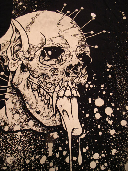
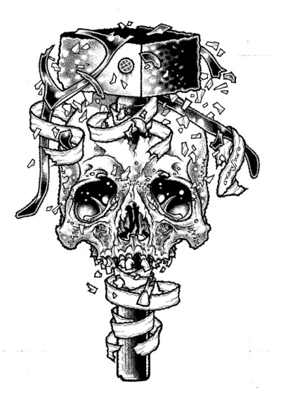
This cover was created by Funeral Mist’s only remaining original member, Mortuus, (nee Arioch), not by Brian Schroeder, a.k.a. Pushead, known best for his ‘80s and ‘90s illustration work for Thrasher magazine, Zorlac skateboards, Metallica and the Misfits. But the Maranatha art represents a revival of a Pushead-like appreciation of handicraft and fun that has been absent from Juxtapoz-style graphics for far too long. Despite his narrow range of subject matter (bones, skulls, bits of cloth or meat), Pushead’s work resonates with allegorical death tableaux from the northern European Renaissance, “ukiyo-e” Japan, revolutionary Mexico, and modern Symbolism, Expressionism, and Art Nouveau, realized in monochromatic tattoo-ready vignettes of sublime line and texture variation. Adorned with scarves, bandages, hair, wires, etc., Pushead’s skulls wink, leer, and grimace, eye sockets full of sparkly miasma and undead mirth.
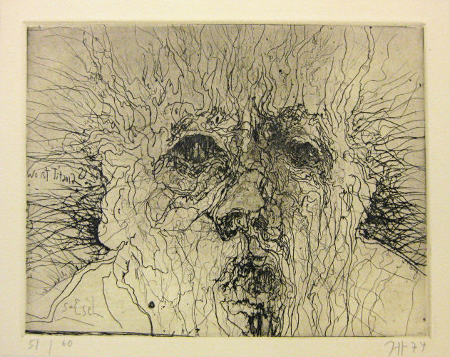
I don’t know if there was any conscious influence, but when I first saw the work of German printmaker Horst Janssen, shortly after his death in 1996, I could not help but be overwhelmed by the formal similarities. Thorny tangles emerging from shadowy recesses, suffused in a particulate cloud of decay, to resolve into a mass that may have once been alive, always rendered with a delicate sense of slightly sadistic absurdity.
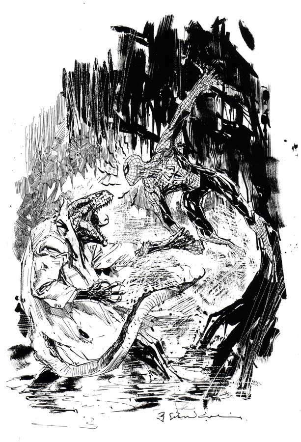
The other artist that Janssen, and perhaps by extension Pushead, recalled, was that other grotesque light of my teenage rendering pantheon, comics illustrator Bill Sienkiewicz. Which helps to make the point that this artwork is, at least at this point in history, “low” art. Not because it is in any way ignorant, but simply because it values craft over concept and fantasy over empiricism.
At least that’s what “low” art should value, according to me. The fact that so many design-based artists since the millenium want to cash in on their lack of craft or taste by painting a skateboard deck and hanging it in a gallery, and that the kind of trained, elegant modeling Pushead epitomized has been turned into pointless jungles of calligraphy screenprinted on to wraparound T-shirts at Kohl’s, is neither a judgment on “high” or “low,” fine art or illustration, but their troubled relationship. It’s a two-way sellout, much like the deliquescence of Metallica, post-Cliff-Burton, into therapy-empowered stadium-ready flight-simulator music, and the simultaneous aspirational decline of underground comics into faux-cinematic narratives of tortured magical-realist sincerity. The race for seriousness has done a lot of harm.
For years the door to my room sported a Thrasher page featuring Pushead’s Zorlac logo, a one-eyed pirate’s skull in which not only two locked cutlasses are embedded, but also a Christian cross formed by two bandage-bedecked bones.
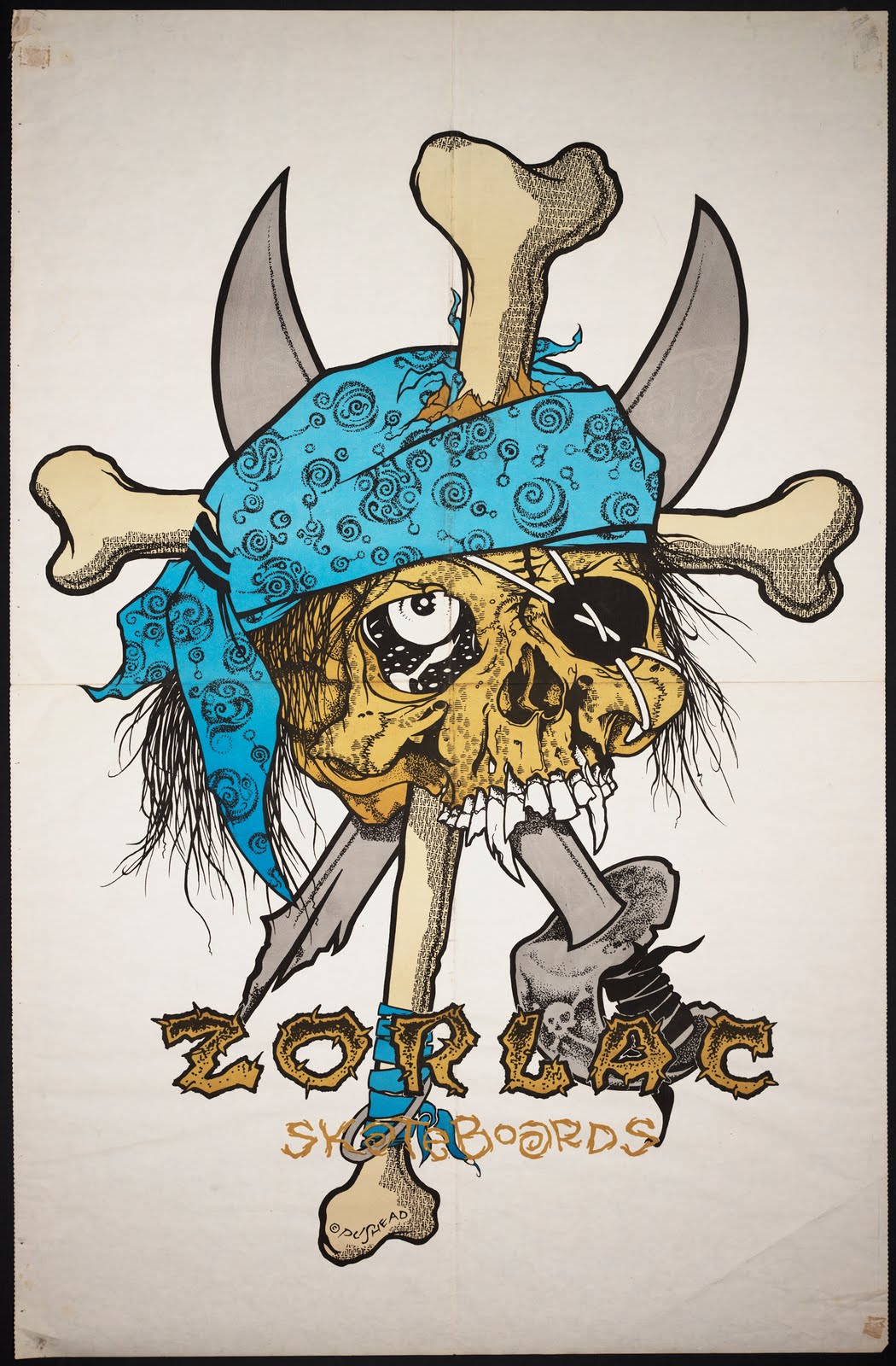
It was (and is) a provocatively ridiculous image, but was never an issue for my churchgoing mother. This was years before black metal band members had to cut their bodies and smear themselves with entrails onstage in order to achieve cred– although Gwar had been using roughly similar tactics, equal parts Gallagher and G.G. Allin, for quite some time. This was when Slayer sang songs gleefully extolling murder and hellfire, but was fronted by a faithful Catholic, and Deicide was soon to take off, untroubled by its majority Christian lineup. Anti-racist skinheads were beating up Nazis, but thy weren’t jumping random people coming out of a bar. It was a less extreme time for extreme culture posturing.
This may have been partially because the censorious culture warriors were far more militant in the ‘80s. You could get in real trouble just for drawing a comic called “Boiled Angel.” Insofar as the retreat of assholes like Jerry Falwell, Tipper Gore, Jesse Helms, and Ed Meese means, say, more freedom for gay teenagers to come out and not kill themselves, we are in a far better place. But, in a way, Pushead had a kinship with the politically and viscerally confrontational artwork of the 1993 Whitney Biennial, when a sense of humor and detachment did not reduce the ferocity of a statement, but saved it from the pious, solipsistic irrelevance that has dogged visual culture since shortly after that time.
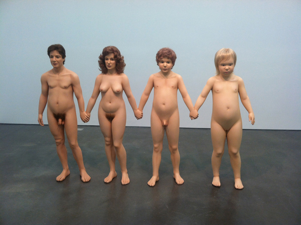
“Family Romance” by Charles Ray from the 1993 Whitney Biennieal
Looking at Pushead again makes me think that it may be time to safety-pin a bloody banner to our genitalia and get back out in the street. I find hope in the fact that Mortuus from Funeral Mist, despite his grand statements about devil worship, obsessively quotes the Bible in his lyrics, thereby emphasizing in-between space over mere fidelity. Sometimes a stance is just an attitude, which may be far better than an ideology.
That Charles Ray piece is terrifying.
And good call linking Pushead and day of the dead. I guess it’s obvious, but I’d never figured that out before.
Well, the guy in common between Day of the Dead and Pushead is Jose Guadalupe Posada, who made all these political (and just weird) block prints involving skeletons. He just made amazing connections between indigenous Mexico and Renaissance Europe, and came up with colonial slaughter.
Thanks for commenting!
Posada’s great. Also ubiquitous…even I know who he is!
Yay, it’s a Bert Stabler piece.
Sarcasm is hard to parse in text. So I’ll just accept the validation howsoe’er I can get it. Thanks!
I wasn’t being sarcastic at all! I always like your pieces, and I liked this one too, just couldn’t think of anything in particular to say about it. Next time I’ll remember the ! and the :D so’s you’ll know I mean it.
Subdee, do you have a take on lowbrow art? I know Juxtapox has a definite Japanese influence, aesthetic vibe, right?
I guess, as is often the case, I pretty much agree with Bert that Robert Williams, et. al. are both sort of nauseatingly earnest and tediously punk rock compared to Pushead’s cheerfully meticulous craftsmanship and blasphemy…
I think the images in this post are funny. There’s tons and tons of detailed black and white art with skulls in, including in tattoo parlors nationwide and on Joe Troeman from Fall Out Boy’s tumblr (er not recently – if you go back a long way), so the humor is kind of key.
I don’t know anything about Juxtapoz, but looking at their website, I like it. The gallery-style presentation of images, the way you can lightbox-scroll through them in individual blog posts, the way the page automatically loads more posts as you scroll down: I’d bet you anything this site is hosted by tumblr. The actual Juxtapoz tumblr – justpozmag.tumblr.com – is mostly reblogs of individual images, though.
That tumblr is a closer-to-lowbrow mix of popculture re-appropriation and street art, which might be the aethetic you are referring to? See also Jeremy Scott-style high fashion, etc. The website, on the other hand, doesn’t seem to have any unified aesthetic but is much more classy since the emphasis is on collections of images. The artists being spotlighted either have a defined style or are exploring a single idea. Possibly the ultimate intent is to sell, but there’s a lot of time, and sometimes material resources, going into these collections aforehand, which as Bordieu would say removes it from the marketplace and elevates the status of the work.
Maybe the concepts are too simple or inexpensively produced to count as truly high art… but then a lot of these seem to be actual gallery shows. Anyway, it’s all pretty cool, even if the emphasis seems to be more on good design than on weird states of mind. If you combined the morbid humor of the Pushman graphics with Juxtapoz’s gallery-style presentation of collections of images – where each image requires a lot in terms of time and materials to create – and throw in a political or cultural message, then the result is High Art.
Thanks for your detailed responses, subdee.
The trippy silhouettes and bunny-nerd cartoons on the Juxtapoz site really do not impres me on a Pushead level. But to each their own.
Pushead is enormously reminiscent of underground cartoonist Greg Irons, both in content and style. I’d be astonished if Irons weren’t an influence.
Agreed, re: Irons.
Thanks for this piece, Bert. I knew very little about Pushead, but as I was reading your essay, I suddenly remembered a Metallica shirt my mom bought for me when I was in high school. It featured a hand pulling a straw from a skull with the words, “The shortest straw has been pulled for you.” I remember wearing it to 4:15 mass one Saturday, but, of course, I didn’t get into any trouble because my mom had gotten it on sale at K-Mart. How could I get into trouble for wearing a gift from my mom?
I was not a Metallica fan, so I realize now she must have bought it because of the drawings–to her, they must have looked like many of the comics I was reading anyway. I guess this is my way of saying that, for her, a cartoon was a cartoon–she was responding to the style and not to the form.
I wish I still had that shirt. I see it going for over $100 on eBay!
That’s a great story. I love his Metallica shirts. I wish they had hooked up before Cliff died.
Cliff Burton that is, Metallica’s first bass player, and the train engineer whose absence caused them to depart from the rails.