
Jed Perl very satisfyingly tore into Art Spiegelman over at the New Republic, pointing out that he is incredibly pompous and can’t draw worth a damn. That led to a chat on facebook where I claimed that Spiegelman’s page design was pretty much crap, and was told I was wrong by various folks.
So what the hey, Dan Nadel was gushing over at tcj about the same Jewish Museum Spiegelman show that underwhelmed Perl. Here’s one page Nadel singled out to illustrate his piece.
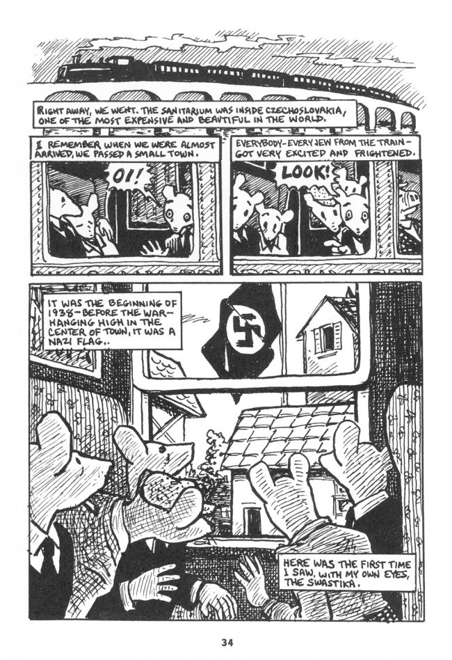
The train on top of the bridge is bung up against the panels below, so that it looks like some sort of cap perched atop the panels. The sense of motion is really confused too.The train goes from right to left up top, and but in the next row of panels the direction of reading makes it seem to go left to right. Spiegelman tries to fix this by shifting the image leftward in the second panel so you can see the next window, but that doesn’t so much create leftward motion as it just makes the motion of the page even more or a mess, especially since the window borders and the panel borders are exactly parallel, and so tend to visually distract get confused with one another.
I can’t for the life of me think of an explanation for why Spiegelman wanted to make the top of the page look like a decorative hat, or why he’d want to have you thinking about which direction the train is going in. I guess, though, you could argue that the confusion and clutter of the panels at the top is supposed to make the swastika pop. But that ends up feeling cheap; the top doesn’t work by itself, and setting everything up for a big reveal seems manipulative. That’s only intensified by the way the flag folds in such a wannabe but not actually lifelike way — Spiegelman’s melodramatic touch a la the splash of red in Schindler’s List.
Maybe the ham-fisted clutter and the transparent melodrama are supposed to be ham-fisted and transparent, undermining identification and foregrounding the comicness of the comic. Spiegelman deliberately combines incompetence and glibness to show us that this isn’t really a true image of the Holocaust, but a poorly designed and manipulative representation of the Holocaust. Maus is so great because it’s so self-consciously mediocre.
Actually, they are moving in the same direction as the smoke, which can be foreboding.
This page layout, esp. the last panel, with the panel-like window in the centre puts a lot of emphasis on the act of looking. In my interpretation it puts the reader in the position of a voyeur, spying on others looking.
If that was a 12-year-old artist, I think, that would be an artist with a promising career ahead.
“Hmm, I wonder which way that train is going — or if it changed direction when I read the next tier of panels.”
Said no reader about his page, ever.
*this* page
The top of the page begins with a wide, frameless image of the train because it creates a contrast against the previous pages of tight, crowded frames of domestic scenes that take place within the Spiegelman’s household (past and present). By opening up the page with the first unframed, long-distance image of the chapter, Spiegelman conveys an idea of travel, as the characters move out into the wider world. This also creates a sense of exposure as they leave the enclosure of their private home. That Spiegelman did not effectively convey motion between the image of the train and the admittedly visually cluttered mid-page frames seems like a lost opportunity. However, given that this was not a moment-to-moment transition or an action scene, I don’t see how conveying the movement of the train would serve much of a purpose. While these frames do feel cluttered, I doubt they would cause much confusion for the reader. It probably did not occur to Spiegelman that it might look like a funny hat.
The sense of exposure created by the top frame is reiterated by the image of the flag in the bottom frame, helping to convey the threatening presence of anti-semitism that was currently spreading outside their country and that would increasingly become a presence hanging over the characters’ heads. This is further reiterated in the following page, as the image of the swastika lurks in the background of recounted tales of Nazi’s abusing Jews. This notion of Nazism threatening to become a constant backdrop to their lives is driven home in the final image of the following page’s recounted tale, where the background swastika transitions into a sun/moon hanging over the ‘Jew Free’ city.
That the image of the Nazi flag is meant to pop is undeniable. That, in including this effect, Spiegelman is instilling his story with cheap melodrama is debatable. The threat posed by Nazism was sensational. In depicting it that way, perhaps he is accurately conveying the alarm that Jewish Europeans were feeling at that point in time. Then again, perhaps he is demeaning the subject matter by trying to artificially create drama. The tension that exists between the author’s desire to accurately convey his father’s experiences and his concern that he is writing over them with his own artistic impressions/sensibilities is one of Maus’ ongoing themes. Frankly, it’s what I find most interesting about the entire work and it is one of the primary reasons it is an object of ongoing debate and analysis.
The fold in the flag isn’t totally convincing. I give it a 6/10 as drawings of flags go (1 being the worst, 10 being the best).
hi noah. i enjoy your writing on gender and difference. you are very eloquent and clearheaded on the subject and i find myself in constant agreement.
i have never read anything interesting about page design or comic art. both operate on a level of subjectivity that denies any connection to a social text, leaving only reader-consumer and author-producer.
‘page design’ is the reader experience, almost always assuming a universal reader, almost always concerned with a ‘flow’ that i have never experienced in visual images (eye motion tracking produces scattered dots of focus, not lines), almost always unable to connect various levels of gestalt (panel,page,book), at each level’s expense. ‘comic art’ comprises the leftover visuals that can’t be described mechanically, leaving only ‘creative language’ which attempts to recreate the weirdness, beauty, etc, in words. both ‘page design’ and ‘comic art’ focus on the comic as simple reading experience on the level of product review.
i appreciate the insights that come from reading the text as a product of complexly interlocking mechanisms of society. i think you excel at feminist criticism. i would appreciate it if you acknowledged aesthetics in this system as well, including the work as subject, process-driven, contingent, archive, etc. this does not mean i am asking you to write about aesthetics, and in fact i may be asking you to refrain from such writing, at least for the moment.
austin english can describe a comic without defaulting to the viewpoint of passive consumer being led around the page. he still is limited by a mostly subjective reading, connecting process-driven artists but not connecting them to any larger structures.
Nicely put, Keith. I will take the charge of “manipulative” for this page’s design. But to accuse the thing of manipulation, one at least has to acknowledged its thoughtfully — perhaps excessively — designed nature. Just to name a few aspects, repeated some:
1. Three tiers that expand — short, medium, tall — ending in a single encompassing view, not unlike the structure of McCay’s “galloping bed” page.
2. An overall composition of values that creates a page-sized, darkly hatched frame around that lighted central window.
3. An entire sequence of panels organized around series of windows — to the point where panels become windows, and vice versa.
4. A steady shrinking of distance and perspective as you move down the page (through the growing tiers). Top half, outside; bottom half, inside. Top half, third person perspective; bottom half, a mediated (over the shoulder) first person perspective.
5. An entire page of gazes, indices, fingers, and lines, almost all pointing in the same central direction. Note the angle of the sleeping passengers, as well the the directionality of their heads after they wake up. (Of course, the angles and noses of the bottom half complete this framing, almost symmetrically to the those imaginary arrows in the top half.)
6. A central frame-within-a-frame that reflects the structure of the page as a whole: smaller top half, larger bottom half.
7. The page, as Keith notes, mirror and interacts with the facing page, where the semi-representational Nazi flag transforms into a symbolic icon, hovering over different scenes. One of many examples of how the pages shift between “what I [Vladek] saw” and “what I did not see” (but only, later, heard about).
8. For what it’s worth, even the open-framed panel atop the page and changing into enclosed — i.e., *increasingly* and insistently enclosed — panels of the lower tiers matches a technique that Spiegelman frequently uses to note a transition from the past (the time of the telling) into the past (the time of the tale).
9. It may be worth recalling that these pages were designed for a book that was originally (in RAW 3) approximately 5″x7″. The “movement” across pages and panels would have been minimal. It would have existed in your hand as a small dark object — smaller that the image in this post, and certainly dwarfed by the pages around it. The smallness of MAUS created part of its original impact, and I think that the page design and drawing style reflect that choice.
Again, you can say that all these are ineffective or used to melodramatic and cheap effect. But a reading that wants to slam Spiegelman’s sense of page design would/should have to take greater account of what it’s actually trying to achieve.
Yrs,
Peter
Hey; I’m traveling today, so don’t quite have time to comment now. Be back later, hopefully.
What you call manipulative I call rhetorically effective.
It will always be possible to fault such effectiveness, on the grounds that it’s cheap, ham-fisted, banal, melodramatic, etc., but what those words come down to in your criticism is simply a warrant for striking attitude. Very tired tools in your rhetorical arsenal, man.
I could stack up examples of Spiegelman’s effective page design in MAUS all day long, and odds are you’d find fault with every one of them for precisely the reasons I find them effective. When a device demands attention in a work you admire, it’s effective; when it demands attention in a work you’re determined to dislike, it’s ham-fisted, etc.
This difference in viewpoints, yours and mind, is not a phenomenon that the word “mediocre” can explain. Rather it’s a classic case of de gustibus non est disputandum. What Peter says applies: if you’re going to take the discussion beyond the assertion of taste, you’re going to have to “take greater account of what [Spiegelman’s] actually trying to achieve.”
Aaargh! Yours and MINE, yours and MINE! Sorry for the glitch.
I just want to know if “blahs” was a parody comment.
Also I haven’t read Maus in a long time, so I have no dog in this fight, but I have to agree with Charles on the general point that, “When a device demands attention in a work you admire, it’s effective; when it demands attention in a work you’re determined to dislike, it’s ham-fisted, etc.”
Sorry but your left-right/ right-left part of the argument doesn’t make sense.
The bottom frame in on the inside so logically the motion would be opposite to what is viewed from the outside.
While I do think Art Spiegelman’s work deserves less blind praise and more objective critic this one doesn’t come across as one.
*the motion would be SEEN as opposite
I don’t get the impression the direction we’re seeing the train move in is flipped on the second tier. If panel two had no dialogue and didn’t depict a reaction, making panel three the moment the someone saw the flag, this would be the case, but clearly in the second panel we’re meant to see the first sighting and reaction, followed by further reactions. Furthermore, the train shifts to the left from panel 2 to panel 3 (the father starts to get cropped off, while the reader sees more of another passenger), indicating right-to-left movement. Once this is established, the switch to the interior/passenger POV does not confuse movement (though one could argue the rooftops and flag are way closer than they should be, given the establishing shot).
I’m curious what gave the impression it did?
Sheesh. Post about how Herriman is awesome, no one gives a crap; sneer at Spiegelman and everybody wants to put in their two cents. You folks are all giving me the wrong incentives here.
“It probably did not occur to Spiegelman that it might look like a funny hat.”
Yep. I doubt he did either. I don’t think he’s very attentive to how the visuals work, or to the positioning of that train. That’s my point.
Isaac and Charles:
“I have to agree with Charles on the general point that, “When a device demands attention in a work you admire, it’s effective; when it demands attention in a work you’re determined to dislike, it’s ham-fisted, etc.””
Or, you know, possibly I dislike them when they’re ham-fisted and like them when they’re well done? I could just as easily turn this around; when someone says something folks don’t like, then it’s in bad faith or illogical; when you like it, it’s insightful. I don’t really see that deliberately steering the argument into ad hominem adds much light though.
Peter:
““Hmm, I wonder which way that train is going — or if it changed direction when I read the next tier of panels.”
Said no reader about this page, ever.”
That’s obviously false; I’m a reader, and it’s the first thing I thought when I looked at this. I talked to another reader, and that’s the first thing she thought of as well. You can certainly say that it’s not your experience, but to say it’s nobody’s experience is empirically false.
I think the confusion of the directions in those first panels might not register for most people instantly, in part because a lot of people probably aren’t paying much attention to the banal images in the first place. If you’re just reading text obviously it wouldn’t matter much. I do think that the sense of clutter and confusion at the top is in part because Spiegelman isn’t visually attentive to the action and motion he’s trying to convey.
“But to accuse the thing of manipulation, one at least has to acknowledged its thoughtfully — perhaps excessively — designed nature. Just to name a few aspects, repeated some:”
You’re saying that art can only be manipulative if it’s competently manipulative. I don’t think that’s true. As I said in the piece, it seems to me that the reveal of the flag is over-determined and obvious, at the same time as the top of the page is clumsily designed, and even self-parodic, since the train-hat up top just looks ridiculous.
Charles, I’d be happy to discuss other pages. The fact that you don’t want to basically because you don’t want to be contradicted seems kind of ridiculous. Sure, I don’t like Maus, and I probably don’t like those pages as much as you do. So what? You’re not arguing to win, right? You’re chatting about comics you like. I often enjoy hearing from folks who don’t agree with me about comics I like (like Watchmen for example) — it provides new insights often and makes me think through my own opinions more clearly.
Re: melodrama. It’s ironic that I actually try to give an account of why the page affects me as it does, and then you accuse me of not being sufficiently attentive while providing no reading yourself, nor even any reference to any aspect of the page.
I mean — the flag is basically framed in the center of the page. It’s a big, blaring effect. Keith’s argument that Nazism was horrible is of course true. But is the crescendo and simplistic effects which basically shout “Nazism is terrible!” an effective visual and rhetorical tool to tell this story? Isn’t the narrative Hollywoodization of the Holocaust cheapening? I do like Maus better than Schindler’s List, but the way the two approach their material is not nearly as dissimilar as I would like.
Nobody has really made an effort to do a reading suggesting that this page is an example of top-flight page design, right? Keith and Peter are basically arguing that it’s somewhat better than I say it is, not that it’s actually great (I mean, comparing it to Herriman just seems embarrassing for Spiegelman, it seems like.)
Hey, unfair! I crapped on the Herriman post too! We just happened to like the same crap in that case.
I think my Point 9, above, remains more important than many are allowing. I doubt that there is any substantial question of “motion” or “guiding your eye” or whatever when your page is 5×7. This page exists as an object first — an object that you take in completely and in one glance. Any effects of sequence are minimal compared to the presence of the multiframed, high-contract central image.
Even when you’re not looking at it — and there is no real sequence that forces you to “read” it (indeed, you read around it) — you see it. Think of it as a miniature version of what Chris Ware is doing with his ghostly central images (at a different scale).
Best,
Peter
I know you commented on both Peter! You were my sole validation….
I missed the point about the small size obviating sequence. That’s really interesting, and I can see it in some cases…but not for Maus. Following the words is so central to it; it’s just very much about it’s narrative, and following that. This page seems to rely heavily on the panel flow, right? It’s all about, we see something, we see something, big reveal. The comparison to Chris Ware seems to undermine the point you’re attempting to make. He really conceives of the page as a page, often; it becomes a diagram rather than narrative, and the anti-narrative elements are incorporated often explicitly thematically. That’s just not going on here. You have a story, and the story is illustrated in a way to produce fairly standard drama (or melodrama.)
The fact is that Mauz WORKED, moved thousands of people to think about the Holocaust differently and about comics differently. What is the direction of a train on a page compared to putting us in the seat with some Jews seeing the Swastika for the first time? By all means, if you feel you can do a better comic, go for it. But this type of article sounds like you are nurturing a grudge.
I’m not sure why people are responding so thoughtfully to this. In his very first sentence, Mr. Berlatsky announces that he has a grudge against the work of Mr. Spiegelman. He describes another critic who “very satisfyingly tore into Art Spiegelman over at the New Republic, pointing out that he is incredibly pompous and can’t draw worth a damn.” If a person finds it very satisfying to tear into someone and call that person pompous, and then shares that with us in the first sentence, he’s inviting us read any subsequent rant in that context. As he notes in his second sentence, “That led to a chat on facebook where I claimed that Spiegelman’s page design was pretty much crap.” The sheer preposterousness of the “pretty much crap” line, followed by the off-handed “So what the hey” (as Mr. Berlatsky launches his screed) underscores a casual indifference to the art of serious criticism.
In the following paragraph, Berlatsky becomes the first person to read Spiegelman’s bridge as the rim of a cap — presumably one of those new-fangled caps that has a train running across its rim.
In this piece, Mr Berlatsky announces himself as a writer indifferent to judgment. And I, for one, find that very helpful. When encountering his name in a byline, I know henceforth that I can simply ignore whatever he has written. Indeed, I wish that more critics were so frank about their shortcomings.
I don’t have a grudge against Spiegelamn in the sense that I have anything personal against him. I don’t know him at all. I don’t think his comics are very good; that’s the extent of my grudge (though Maus is better than In the Shadow of No Towers, certainly.)
I don’t see much evidence that Maus made anyone think differently about the Holocaust. It certainly helped validate comics, which is important if you think validating comics is virtuous or necessary, I guess.
Oh, and Philip — you can refer to me as “Noah.” It’s a blog; informality is the norm.
The validation of comics does actually have significant meaning for lots of folks intimately involved in and invested in comics as an art form and as a living. Which explains the general reaction to negative criticism of Maus from Day 1 (this includes more prominent stuff like Pekar’s dissent in TCJ).
So it’s telling that both Jed Perl and yourself feel that comics don’t need validation. At the time, readers attributed Pekar’s feeling concerning Maus to jealousy (which is fairly typical when comic artists write negative critiques).
Noah, I get that you don’t like Maus that much and that you’re trying to articulate some of what bothers you about it, but it really seems like you’re kind of grasping at straws for things to dislike about it in your discussion of this page. Along with Peter Sattler, I certainly had no trouble parsing the change in direction that you mention and while perhaps you and one other reader you asked about it did (“honey, does this page look sort of weird to you?”), my gut feeling is that most readers would have no trouble understanding what’s going on here. Of course, as I’ve mentioned over in one of the many Herriman threads, I have my doubts about some of the claims comics theorists have made about how readers parse comics pages so as always, YMMV.
Spiegelman has acknowledged that he’s not really all that great a drawer, but I absolutely think that his drawing in Maus serves the material perfectly. I also think that his page layouts in general, even in his lesser work (i.e. his nonMaus comics, which I generally have not liked) are quite good and that he puts a lot of thought into them. I think that this particular page works quite well and that its layout and its use of black and white almost suggests a short sequence in an old film, not unlike the first few pages of Frans Masereel’s Passionate Journey; furthermore, to my mind, that railway bridge at the top that bugs you so much actually evokes Lyonel Feininger, whose work often incorporated bridges of this design, (e.g. this woodcut: http://www.moma.org/collection_images/resized/648/w500h420/CRI_117648.jpg) though I have no idea if either of these were conscious shout-outs on Spiegelman’s part. Even that badly-drawn flag contributes to the dramatic effect; note that the swastika isn’t fully shown, which I think heightens its impact, as does the stark black (indicating red in black and white) surrounding it.
The first volume of the collected Maus came out in 1986 (though it had been serialized since 1981), which as it happens, is also around the same time that Frank Miller’s Dark Knight was coming out. Strange as it may seem, in those days one often saw the two on the same shelves in book stores and of course both were often mentioned in all those “Zap! Pow!” articles that were appearing at around the same time. Strange bedfellows indeed, but as a result, the two sort of became linked in my mind, different though they were, since this was also around the time that I was starting to think about comics with a critical eye. One of the things that struck me at the time about both books was that neither Spiegelman or Miller were particularly good at drawing. Miller could barely handle the human form, even the distorted comics version, and when he had to draw say, a car or a telephone, forget it! (Miller of course had Klaus Janson to flesh his drawings out a bit.) But I always felt that both Miller and Spiegelman were actually quite effective at laying out pages with an eye towards their overall design, even if the contents of individual panels weren’t that well-drawn.
BTW, here are some better examples of Feininger’s viaducts:
http://www.michaelspornanimation.com/splog/wp-content/t/_FEININGER075%201911%20-%20Viaduct%20near%20Meudon%20with%20two%20trains.jpg
http://uploads1.wikipaintings.org/images/lyonel-feininger/railroad-viaduct-die-eisenbahnbr-cke-1919.jpg
Whether Spiegelman had these in mind or not, these are pretty great, no? Sorry to go off on a tangent.
I don’t think people would have trouble following it. But doesn’t it matter to anyone that it’s visually congested and confused, and that the narrative and the visual flow are at odds? Is this an example of good page design or not? Is the standard, well, this doesn’t actually prevent people from following the text? Or do you want the visuals to work to enhance the experience and the meaning? How low does the bar have to be put for us to make Spiegelman a great cartoonist?
Frank Miller has a really distinct visual style; it’s certainly in the Kirby outsider art tradition of sacrificing technical skill for expressive power. I wouldn’t say Miller is a great artist necessarily, but he’s much more effective than Spiegelman, IMO.
Man, but my mileage varies. I’m honestly not sure why you have such trouble following that page. As I said earlier, it’s very easy for me to see in film-like terms: a long distance shot of the train, followed by a close-up showing people’s reaction to the flag, and finally a 180 degree POV shift showing the flag itself.
I really don’t think any bar-lowering is required, though I will say that I consider Spiegelman a kind of special case since for me Maus stands so far head and shoulders above of his other work that my second-favorite, The Wild Party (for which he only provided illustrations) is a distant second at best. Most of his other comics have left me cold as did most of his New Yorker covers.
Of course, in terms of his place in comics, he’s also got RAW and his formidable work as a critic/theorist, curator and anthologist to consider. I fully admit that some of his efforts are pretentious nonsense. Hell, I even attended a preview of the opera that he was working on for a while. Believe me, you haven’t lived until you’ve heard a bunch of opera singers enacting the Kefauver comic book hearings. We can only thank the gods that he dropped that project!
The “Kirby outsider art tradition of sacrificing technical skill for expressive power”? Noah, here you parrot Spiegelman to malign one of the most skillful artists of the form.
I’m not maligning Kirby. For pity’s sake.
And, again, the point isn’t that it’s har to follow. The point is that the visual logic of the page isn’t logical; the motion of the drawing and the motion of reading distract rather than add to each other. Good page design doesn’t just mean being able to read the thing. It means using the layout and design as an expressive medium. Spiegelman doesn’t do that here.
Kirby is no “outsider artist”. He could draw very well. In fact, he had a much greater grasp of perspective and the way the human form operates in motion and space than any other cartoonist I can think of. He drew people and objects in complex interlocking group compositions within convincing deep space and his figures have weight. He avoided figurative templates insomuch as was possible for a man who worked under such time constraints. His handling of drapery is unique. His multiple source lighting was also comprehensive, but completely misunderstood due to incompetent inking. This is all without even getting into the merits of how he constructed his panels and pages to read in comprehensible sequence and the quality of his characterizations and staging. He chose to simplify and abstract his work, increasingly so as time went on, but that is true of many artists in all sorts of forms.
Spiegelman discusses this page in Meta Maus. The page layout is mirrored towards the end of book 1, I think, with the sight of the flag replaced by the Auschwitz gate: http://static.mercadoshops.com/the-complete-maus-art-spiegelman-edicion-25-aniversario_iZ20XvZxXpZ4XfZ133298867-449709627-4.jpgXsZ133298867xIM.jpg
I’d say this latter page has better design, though personally I find the train direction “correct” – as other have mentioned, reading left to right enhances the idea that the passengers are moving right to left, imo.
At any rate, Miller is certainly nowhere near as accomplished an artist as Kirby. If anything, he sits right around the level of Art, in that his drawings work well enough to do the job at hand, telling a story on the artist’s own terms.
Noah:
“The train goes from right to left up top, and but in the next row of panels the direction of reading makes it seem to go left to right.”
That’s a flawed premise, and it’s flawed for cultural reasons.
In American trains, all seats are facing the direction of travel. Since we can see the seats in panels 2 and 3 facing the right, the assumption would seem to follow that the train is going from left to right.
But this isn’t an American train, it’s a European one. European carriages are divided into compartments of 8 seats, four facing forwards opposite four facing backwards.
This arrangement is revealed in the last panel.
Therefore, it’s impossible to tell what direction the train is going in those middle panels. It can just as easily be perceived as going right to left.
Noah, this page seems to many people (here at least) SO easy to follow, myself included, that it is difficult to imagine someone as familiar with comics as you are claiming for it to not flow or not be logical without being disingenuous.
If you were arguing it was too basic or too based in the language the visual language of film, I could understand that better – but you’re not.
I think there are much better examples of poor panel/page layout in many comics. At worst, this page of Maus is simply workman-like.
Okay Noah, so you agree that it’s not hard to follow but nevertheless, you find it “visually congested and confused” and you find that “the narrative and the visual flow are at odds”, further observing that “The sense of motion is really confused too. The train goes from right to left up top, and but in the next row of panels the direction of reading makes it seem to go left to right.” Again, we’re back in Ignatz-throwing-from-right-to-left territory here and I guess I will simply have to respectfully disagree with your take. It’s not at all clear to me that drawing an object in motion from right to left interferes with the tendency to read from left to right, otherwise no cartoonist could ever depict right to left motion in such a panel, or series of panels. Similarly, your claim about the next tier and how it “[shifts] the image leftward in the second panel so you can see the next window” isn’t even accurate. He doesn’t simply shift the image, he shows two distinct moments in time with the train moving in exactly the same direction as it has been for the previous two panels. Note that in the second panel of the second tier there is now a pig (or perhaps “Alf”) visible, which emphasizes the effect. As Thom Cuschieri says, the left to right reading may even enhance the sense of right to left motion. (Good point about how it mirrors the later scene at Auschwitz too, btw.) The business about the window borders and the panel borders isn’t compelling at all; indeed, much of your analysis here seems to me to be of the “too many notes, Mozart” school, a willful misreading in order to make your point.
James says: “At any rate, Miller is certainly nowhere near as accomplished an artist as Kirby. If anything, he sits right around the level of Art, in that his drawings work well enough to do the job at hand, telling a story on the artist’s own terms.”
Which is related to the point I was making originally, that both Spiegelman and Miller are pretty good at laying out pages, even though their drawings aren’t all that great taken as single panels. The art of cartooning isn’t necessarily about great drawings, but how the drawings work collectively and in sequence.
OK, to clarify what I said. I think that Mauz presents a very accurate depiction of what goes on in the families of some holocaust survivors. I base this on talking to the children of holocaust survivors in my own family. Yes, there have been other books on that subject. But I think Art’s vision of that is specific and unique. I also think that you have to look at any work of art in it’s historic context. At the time that Mauz came out, there were only a handful of American comic artists taking on this type of subject material. So it is ground breaking work. Also, about Harvey Pekar, I remember as a kid, going by Harvey’s place, and him being very excited to show me the first printing of Prisoner Of The Hell Planet. So if Harv later became a critic of Spiegelman, that probably was personal jealousy. Hey, there was plenty of pettiness in comic fandom back then. And I guess this article shows there still is.
Here are Pekar’s thoughts regarding Spiegelman:
http://www.tcj.com/blood-and-thunder-harvey-pekar-and-r-fiore/
I honestly think his views were a bit muddled on this topic and others as well, specifically his puzzling comments about the Hernandez brothers and their failure to be as good as Spain Rodriguez and other cartoonists of the underground comix era, which come across as a kind of “these kids today”/”old man yells at cloud” thing.
The problem as I see it is that the train at the top sets up an expectation of motion occurring in the next two (middle) panels. And it seems as many here are defending that interpretation with the suggestion that the left to right motion of the train creates a left to right speed to those panels looking in at the mice. I agree that it does make those two panels look like they’re moving along with the train. Plus, the way the next train window with the pig encourages that effect. However, they’re clearly sitting still or moving very slowly as revealed by what they’re looking at: the Nazi flag in a courtyard, not something off of that train bridge. That seems to be a good reason for seeing the design as junky.
So, it’s a bit junky because it looks like the whole page is supposed to be a narrative moment (the train panel is without borders, bleeding between the borders of the following panels), while it truly only works if you read the train as being in the past and everything else as a shot-reverse shot, i.e., a single moment in the present. It seems to me that Spiegelman should’ve, at least, put a border around the train panel.
not the best sentence fragment in the world, but read “and it seems as many” without the “as.”
Actually, I am surprised that the relative merits of Art’s, or Miller’s, or Kirby’s drawing and layouts ever even come up for discussion here, because so many writers about comics so obviously have no knowledge about or interest in art, since they consider the “scripters” and/or editors to be the primary creators in the medium.
Then again, one might read the lack of a border as creating the effect of the train receding into the past with panels popping into the present. But it doesn’t look like anyone is reading it that way.
Kirby’s a better artist than Miller. I like Miller’s art significantly better than Spiegelman’s, though.
Ignatz throwing the brick against the panel motion generally works well for Herriman, who is always playing with anti-narrative effects and foregrounding the strips’ artifice. There’s no reason for Spiegelman to be doing that here which I can see. No one has really presented one. Why do we want to raise questions about the direction of travel? Since the point is supposed to be motion interrupted by frozen moment, why have the sense of motion be so confused or squandered? There’s no reason for it except that he’s not paying much attention. I think it’s sub-workmanlike; it’s strained and clumsy.
Anyway, this panel was singled out in a post to show how great the Jewish museum show is; I’m also responding to folks saying that Spiegelman is a master of page design. He’s not.
And one last time; the fact that you can follow the narrative without being confused seems like a pretty low standard to claim that the page is well designed. The visual design can be confused and clumsy without interfering with the ability to follow the narrative, esp. in something like Maus where the narrative is so heavily (even dare I say it monotonously) driven by the text.
We are conditioned, in map-reading, to conflate top of the page with north, bottom with south. (Thus residents of Manhattan, a north-south oriented island in New York, speak of going “uptown” for going north, and of “downtown” for going south.)
By the same token, we think of “left” as “west” and of “right” as “east”.
That is why the train at the top of the page is going right to left: it is going east to west — to be specific, from Poland to Germany.
Spiegelman being the obsessive formalist he is, I wouldn’t be surprised if the contrary-to-reading east to west direction of that train weren’t a hint at future difficulty and danger from willingly travelling in Nazi Germany.
I’m perplexed and a bit saddened by this article. It really is a major FAIL on Noah’s part. And, ‘pace’ his warnings against ‘ad hominem’, I think this failure stems from Noah’s very bitter desire to ‘crush’ Spiegelman.
I can’t apprehend any other interpretation of such an incompetent ‘takedown’ of a magnificently successful storytelling page than sheer bad faith. I mean, I’ve experienced that page many times and each time it grabs me. And analysing the “grab” only reinforces the masterful craft and thought behind it.
Honestly, Noah, this is starting to look like a vendetta.
Good point AB, re: the east-west thing.
I find the insistence that either Noah or Pekar not liking Maus must be about something personal rather bizarre. Maybe they just don’t like Maus. I don’t like Maus. I also don’t like a whole lot of other art about the Holocaust, in comic or other form. The Holocaust is a tough topic to do well and I don’t think AS does it well. It is true that at the time it was innovative to take on this kind of topic in comic form and sure he deserves a credit for that. But that doesn’t make it good.
To risk sinking to the ad hominem level of so much of this thread, though admittedly on the non-prevailing side: Lots of comic critics seem to be deeply invested in the ability of comics to take on _serious topics_. And so are predisposed to like and defend Maus since the Holocaust is absolutely a serious topic. And this basic prejudice seems to inform a lot of the folks attacking Noah here.
All of which becomes kinda bizarre if you look at Holocaust art in a larger context. There is so much more mediocre and sentimental art about the Holocaust than genuinely good stuff about it. Perhaps not more so than a typical topic, but certainly not less so. I will say about Maus that it is better than most of this stuff, but I do find it odd in this context that Maus is valorized because it is about the Holocaust.
Well, when you consider that Noah’s opening shot was this: “Jed Perl very satisfyingly tore into Art Spiegelman over at the New Republic, pointing out that he is incredibly pompous and can’t draw worth a damn.” it’s not difficult to come away with the feeling that he’s not crazy about Art Spiegelman in general. What follows moves from the general to the particular, a single, widely-reprinted page of Maus, and all of its perceived weaknesses.
Sure; I definitely think Spiegelman is wildly overrated. But that isn’t based on any personal dislike of Spiegelman, who I don’t know at all. It’s based on my not liking his work very much.
Well, I admit that Maus’ standing as a sort of canonical classic does call for the occasional shakeup.
And I retract what I said about Noah’s attitude. A critic who doesn’t engage for or against, who seeks an impossible neutrality, generally produces bland on-the-one-hand-but-on-the-other-hand mush; something nobody can accuse Noah of writing.
Pingback: Spiegelman’s Movements Through Time and Space | Left in Flyover Country
Whether or not you like or dislike Spiegelman personally isn’t really relevant here Noah. But the tone of your initial piece suggests (to me at least) that you rather enjoying the prospect of knocking Spiegelman, as a creator, down a peg, gleefully taking note of Jed Perl’s TNR takedown and then piling on with your own criticisms of a specific page from Maus based on what seem to me like contrived and unconvincing arguments.
There are certainly grounds for criticizing Maus. I do occasionally wonder if the anthropomorphic angle was really necessary and I’d even agree with some (but not all) of Pekar’s arguments, particularly with regard to the unpleasant, one-sided picture of Vladek that he paints as opposed to his self depiction as Vladek’s long-suffering victim. But these are complaints common to any work that specifically draws upon its author’s own life and experiences, whether it’s Spiegelman, Marjane Satrapi, Jack Kerouac or Harvey Pekar himself. All narrators are unreliable, “autobiographical” narrators, doubly so!
I think Maus should be taken down a peg, because I think it’s not very good and it’s centrality to the comics canon is poisonous in various ways (which I may well talk about some time soon.)
So yeah, I’m “biased” in that I have particular likes and dislikes and critical axes to grind. I strongly dispute the idea that this makes what I have to say somehow more prejudiced or less valid than all the other folks (like, say, Dan Nadel) who are super-eager to praise Maus and celebrate the retrospective.
Whether my arguments are good or not is a different matter, of course. But the way I see Maus (including the crappy page designs) is why I dislike it, not the other way around.
That’s my point about not knowing Spiegelman personally. What possible motive would I have for ginning up dislike for his work? I don’t have any. The only reason I’m prejudiced against his work is that I think it’s not very good. You can agree with me or disagree with me about that, but imputing my bad arguments (if you think they’re bad) to bad faith seems both unnecessary and, as David says, kind of bizarre.
I guess people sometimes think that being contrarian gets you hits or notoriety or whatever. But the truth is, as far as career advancement, my experience is that you’re way better off liking stuff everyone else likes. There are a lot more opportunities to write positive blurbs about things you’re supposed to be positive about than there are to write takedowns. Maybe a couple folks like Perl can make a living being the token contrarian, but the reason they’re “contrarian” is that the vast majority of people are getting paid to say something different.
The issue for me, for one example, isn’t Spiegelman’s lack of craft (which is distractingly significant) but rather his choice of subject matters and the reasons for his interest in those matters.
The dude’s a vainglorious narcissist authoritarian, plain and simple. He inserts himself at the center of great calamities and current events so that he himself feels important and so that others will view his work as important. He picks more or less critic proof situations and issues and writes and draws about them in a politically correct way, which is what a coward does. Anyone who dares counter the quality of his convictions or the merits of the work is either professionally jealous or an anti-semite (right!).
I don’t doubt his parents’ experience in the holocaust, or his proximity to 9/11, but there’s more a reek of opportunism than a search for understanding in what he does and how he does it. You’d think Hitler himself came the Spiegelman’s front step in new jersey and slapped little artie in the face with a white glove, demanding satisfaction. You’d think artie dove into the smoldering ruins of the WTC and emerged with his children under one arm and ten other children under his other arm and on his back.
That train at the top of the page, BTW, is filled with money artie is taking to the bank.
That’s maybe harsher than I would be (at least w/Maus; No Towers is another issue.) But, yes, I think his position towards the “big issues” is worth questioning.
Should artists not deal with such themes? Is Picasso to be reproached ‘Guernica’, or Hemingway ‘A Farewell to Arms’?
No; it just ends up looking particularly bad when you handle them poorly (which is why Schindler’s List is exponentially worse than some random piece of Hollywood dreck.)
I agree, but I was really referring to Kris Swanberg’s assertion that Spiegelman has no legit right to treat large and grave subjects. That’s obviously false.
James wrote: “He (Jack Kirby) could draw very well. In fact, he had a much greater grasp of perspective and the way the human form operates in motion and space than any other cartoonist I can think of.”
Very true, although I think John Buscema and Joe Kubert were right up there with him. I think where Kirby outshined even those two is his sheer creativity not just with “set design,” but with MOTION design. When Kirby choreographed a fight or other action sequences, he added stuff or created innovative action elements and points of view no one else had done before or since. And in doing so, he made such bombastic action scenes seem plausible.
Ditko had a similar “out of the box” viewpoint, but while still innovative and believable, was more subtle than Kirby’s.
Stan does not realize (or if he does, he’ll never admit it) that when he allowed Kirby and Ditko free creative reign via The Marvel Method, he allowed two latent geniuses the opportunity to re-write the book on action comics.
(An aside: Yes, I realize Kirby had been re-writing that book for 20 years before Marvel’s Silver Age, but it’s clear to me that his work became significantly more refined and creative when he went back to work for Timely/Marvel circa 1958 — and by 1963, he was in a universe all to himself)
AB, you misread my point. Anyone has a right to address any issue, and to be as reverent or as subversive as they like. Nothing riles me more than some hack like Spike Lee “laying claim” to Jackie Robinson or Malcom X (my favorite mutant, BTW) or a Jew saying only they can tell “their” story, or an ex-pat Russian saying (this actually happened to me!) I couldn’t possibly understand Tarkovsky because I couldn’t ever understand “the Russian soul” which is fucking horsehit.
Spiegelman’s problem – as I stated – is that he so eagerly and predictably grabs onto these issues, and manhandles them in an obvious way. Maus isn’t necessarily obvious in its approach (I do think it’s well thought out and somewhat novel) but everything since (No Towers, all of his “controversial” New Yorker covers) are tired and adolescent.
I dissent.
I wish I had something to say that hasn’t already been, except that rule one of web writing is not to engage in the comments, though I guess it’s different here. I will say though that (a) the parallel Auschwitz page in my view demolishes your argument because it provides a larger context for the layout in the overall storytelling of the book. And (b) frankly the argument itself is pretty rickety, as the number of valid rebuttals here seems to indicate. It seems like something written in anger, somewhat clumsily, on the coattails of another, better-known writer who himself doesn’t even seem to understand comics storytelling(Perl).
Frankly, I think this is just trolling for pageviews(and it worked!), and Berlatsky’s responses all sound tellingly defensive.
PS That said, I also think Spiegelman has stagnated since MAUS–he hasn’t even attempted anything of similar ambition since then, and has turned MAUS into a cottage industry. (The brilliant BREAKDOWNS was after all mostly a retrospective, half made of a reprint)
I think the most valid anti-art speigelman argument is that, unlike his peers, he rested on his laurels. But he is quite valuable as an advocate for comics as art.
Well…folks tend to sound a little defensive when they’re being attacked!
I don’t find the everybody agrees with me so you’re wrong defense very effective. Of course everybody agrees with you; everybody loves Spiegelman. We knew that already.
I think the Auschwitz page is better designed. The fact that he repeatedly uses the same manipulative money-shot reveal to demonstrate the evil of Nazis doesn’t seem like a sign of genius page design to me, though.
I don’t really get the “it’s all for pageviews!” thing either. The best way to get pageviews on a blog is to cover news regularly. Being contrarian just pisses people off mostly; long term (or even short term) it’s way better to like the same stuff everybody else does. If I’d written a point by point refutation of Perl, I’m pretty sure it would get more traffic as comics folks high-fived each other and passed it around.
I don’t think comics needs an advocate in that way, so I don’t see Spiegelman’s contribution there as especially valuable. Though I think his work on Raw as editor is important for the medium aesthetically.
And, as I said to others above, you can call me Noah.
You don’t even have any advertising on this site, so do pageviews really matter that much, aside from just tracking your own popularity/notoriety?
I don’t know if I’m all that intelligent about page design, but I’m no great defender of Spiegelman, and I kind of like this page. I don’t really get the description of the top panel as a hat, and I read the second tier of panels as the train moving from right to left as my eyes move from left to right as I read them, so I don’t see any discrepancy in motion. And I think the framing of the flag in the window is effective, signifying that Naziism is being unleashed in the full light of day and consigning the Jews to the darkness in the edges of the panel. Overall, I think it works.
Now, does that mean it’s heavy-handed or manipulative? Maybe, I dunno. It’s been a while since I’ve read Maus, so I don’t recall the full context of the page or anything, but it seems like it’s very hard not to approach the Holocaust in that manner. Whatever the case, even though I disagree with Noah’s take on this particular page, it does give me stuff to think about, as usual.
“it seems like it’s very hard not to approach the Holocaust in that manner.”
I think that’s true. It’s one of the reasons making art about the Holocaust is difficult, I’d argue.
Very true. I think I might be kind of lenient toward a lot of Holocaust-related art for that reason; the enormity of its horribleness is hard to even contemplate, so any approach more complex than “Holocaust=bad” gets the benefit of the doubt. Also, not being Jewish means I probably haven’t experienced quite as much Holocaust-related material as someone who is; I expect someone who has been immersed in Holocaust stories all their life or has relatives who did or didn’t survive it comes at it from a different perspective.
No comment, except it’s good to see John Roberson online again.
–Alex Buchet
I never left! (God knows, a Google search will confirm that) I just haven’t been ’round here.
There’s plenty of art that isn’t much good concerning the Holocaust, though it is true it’s a VERY safe subject. It’s one reason why it’s usually brought out when a filmmaker wants an Oscar.
But I would attack SCHINDLER’S LIST long before I went after MAUS(and have). For one thing, how it personalizes the oppressor characters and leaves the actual victims of the Holocaust(except basically two characters, meant as stand-ins for the rest) as one big suffering mass thankful to the nice Gentile for saving them. (It’s basically just MISSISSIPPI BURNING transposed in that attitude)
You want overrated? You want manipulative? There’s an example. MAUS is far less so, its documentary structure leavening that considerably.
PS Okay, so the pageviews thing might be off-base, given there are no ads. I concede on that one.
I actually have a much bigger beef with Perl than Noah, and wrote a piece about it last night, but I don’t want to be accused of linktrolling so I’m not putting it here.
Oh, link your piece, damn it! I want to see it.
I absolutely agree that Schindler’s List is much worse than Maus. I don’t like Maus much, but I think Schindler’s List is probably the movie I would say is the worst of all time.
Oh all right, if I have permission:
http://jlroberson.blogspot.com/2013/11/jed-perl-is-attacking-art-spegelman-for.html
It’s really more an emotional reaction. I don’t claim it’s logical.
In re: AS by the way and his draftsmanship, I would compare Lou Reed’s singing. No, he couldn’t technically sing, but what he created wouldn’t be the same without it, and what he created was far, far bigger and richer than any number of technically-virtuosic music. Consider that in light of Spiegelman.
I’m not a technique fascist by any means; I like John Porcellino; I like Berkely Breathed. I like lots of folks who aren’t technically gifted in the conventional sense. I think there’s little endearing in Spiegelman’s clumsiness though. He’s not interestingly stylized, the way Reed is (at his best.) It just looks blah.
The Lou Reed comparison is intriguing; indeed, it’s one that I’ve made myself on occasion, though it’s worth mentioning that in the early days at least Lou Reed could actually sing pretty well. “Sunday Morning” for example, from the first VU album has Lou singing, though many people think it’s Nico.
From John Linton Roberson’s blog post (sorry to reply here, but I want to keep this thread going):
Um…no?
First of all, Spiegelman was never the art director at The New Yorker, that was Françoise Mouly. Spiegelman was a regular contributing artist for the magazine for 10 years and while I agree that most of his covers weren’t all that great, some of the interior strips that he did for them, particularly the one he did with Maurice Sendak called “In the Dumps” were excellent. Certainly Maus opened doors, but the idea that his secret agenda all along was to get a job at The New Yorker is ludicrous. That’s like claiming that John Lennon got into music so that he could get a job co-hosting The Mike Douglas Show (which he and Yoko Ono did for a week in 1972. Oh those power couples!).
I could have sworn it was him that was art director at the NYer for a while. Well, color me corrected. That said, what I was saying was that AFTER the fact he was using it as a vehicle into mainstream NY publishing. But that point too is moot, so I will correct that.
…in case that wasn’t clear, I was NOT suggesting that was his plan in making MAUS. I am not accusing Spiegelman of mercenary motives. What I’m saying mainly is that he’s kind of rested on his laurels since then, and drastically scaled down his ambition from where it seemed to be even before MAUS. His peers at the time by contrast became more and more ambitious–Alan Moore first with BIG NUMBERS and then the actually-completed FROM HELL, to name two. Dave Sim with the rest of CEREBUS. (whatever you think of it you can’t fault Dave for lacking vision & ambition) There are more examples. I find it puzzling that in many ways MAUS was the climax, artistically, of his career. And he’s never even tried to get out of its shadow.
This criticism is only in the vein that I’d like MORE from him. Not more MAUS, but more meaty work. Though I love the new portions of BREAKDOWNS–I think it explains comics far better than McCloud ever did.
PS Noah–WHAT did you just say about Breathed? I think you mean Trudeau, who is quite limited (which didn’t matter till he started trying to spice up the look of Doonesbury and rendered the character designs absurd). Breathed has some serious technical chops, something that I was surer of after seeing his influence on my colleague Emily Kaplan.
I love Breathed, and he’s certainly a better artist than Trudeau, but I wouldn’t say he’s a technical genius or anything. But I’m happy to have folks like him for whatever reason.
He didn’t start OUT well, but the latter years of Bloom County, I think, have a beautiful loose-but-tight craft to them that certainly would have been beyond Trudeau. (seriously, when he came back from the hiatus and decided to show us those noses from anything but profile, what was he thinking? It worked best as a dialogue strip, plain & simple)
And I’m sorry, but it takes skill to draw Bill the Cat. (one that looks right) Seriously.
Back to Spiegelman: I think criticizing Spiegelman’s draftsmanship is besides the point–to some degree its looking almost diagrammatic suits his approach, which I would argue is narrative, but with a conceptual-art POV and strategies. It’s what’s UNDERNEATH the images, and what he accomplishes by warping, dismantling, and indeed playing with the images, to bring across multiple meanings at once (drawn from Will Elder’s “chicken fat” image-overload approach) where the true goals of his work can be found.
If you look at his pre-MAUS work, however, I would say–especially compared to many of his underground contemporaries in the 70s (you can talk about Crumb and Williamson and any number of others, but if you actually go back and look at a LOT of UG comics, not just the well-known ones, there’s a LOT of shitty artists in there as awful as any in the 90s bw boom) that he was a hell of a draftsman. Look at BREAKDOWNS for godsake. I think he consciously abandoned that attractive surface when he did MAUS–he even said as much: he drew it on bond paper with a fountain pen(until he found the pages would decay fast and changed about halfway through) so he would fell as though he was writing, not drawing. So MAUS looks that way on purpose. And I think he since retained simple surface to leave space to concentrate on the conceptual stuff I describe above. Which was actually always his concern, it’s just now I think it’s the sole one.
With Spiegelman–and I actually agree with this POV–comics are another kind of word, images that serve the functions of words, panels that serve the functions of paragraphs. So I think judging him by his draftsmanship(by the way, layout is not draftsmanship, it’s design–separate thing) is missing what’s unique about his approach. It’s like judging Alban Berg because there’s no traditional melody. Maybe, but he wasn’t TRYING to make one, he was trying to make a different kind of music. Or to criticize Warhol because he didn’t paint Marilyn Monroe’s face, when that wasn’t what he intended to do. Judging a new kind of art by criteria that apply better to another. (whether you think the new approach is of value is a separate issue; you still have to evaluate: was the artist successful in what they set out to do, to me the minimum criterion of a work’s success) You can’t judge a baseball game with the rules of football.
So with Spiegelman. It’s the “meta” aspect one always has to keep in mond.
So many typos. Just one correction:
“With Spiegelman–and I actually agree with this POV–comics are another kind of WRITING”
But surface polish is not the same as draftsmanship. I agree w/ many of your points above, but wanted to just point out that the flag in the page above would be a badly drawn flag, no matter how much sophisticated rendering or cross-hatching it was made up of.
The body language in that panel tho is pretty great, as is the “window as frame” design element. Only awkwardness in this page for me is whatever the hell is happening at the bottom of the first panel.
Yeah, the single mouse seeing the flag and then the others reacting to it has an animated cartoon vibe, which in this case works really well with the anthropomorphic thing, which admittedly kind of falls apart in other places in the book. As I said earlier, I see a bit of Frans Masereel in this page and Spiegelman’s combining that with body language straight out of Terrytoons is, it seems to me, an impressive achievement.
Not quite sure what your issue is with the bottom of the first panel though? It’s a bridge over water. Kind of like this one: http://www.castlesofpoland.com/prusy/postcard/memel006.jpg
Aha! Didn’t read the white bridge as positive space, but as negative background with strange tombstone shapes in the foreground.
Not as a decorative hat?