
A couple days back I wrote a post in which I argued that the story in Hellboy: Wake the Devil was thoroughly mediocre, and wondered why the series has garnered such praise. A couple folks responded in various venues that the series gets better (which it well may.) And several folks said that what I really needed to do was look at the art, not the narrative.
I’d sort of suspected as much, but hadn’t really thought about the art because it made little if any impression on me. But, what the hey, I thought I’d go back and see if looking closer changed my mind.
So here’s a page from Mignola’s Baba Yaga story, included in the third Hellboy collection.
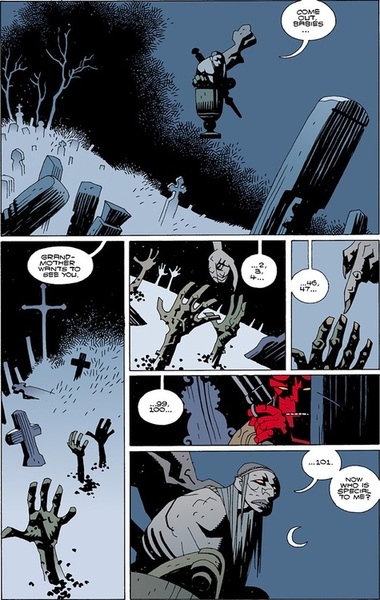
I like this page as much as I like any of the art in Hellboy I think, more or less. It’s fairly stylish; the top panel has a nice use of negative space for example. Baba Yaga floating in the air there is a weird image; the pestle streaming out behind her looks like smoke made out of rock; I had to look at it a few times to figure out what it was, which I think adds a nice sense of wrongness to the image. The color palette is good too; different shades of grey and black, the coffins fading out into nothing over at left. The hands reaching up like crosses is a good conceit; the little patches of dirt around them arranged in a kind of Kirby krackle, a nod to one of the most obvious influences on Mignola’s style. Counting the corpses fingers is goofily macabre as well — maybe the single best idea in the issues of Hellboy I’ve read, and that panel of her reaching down to touch the fingers reaching up glances towards abstraction in a way I can appreciate, her claw a twisted organic thing, detached from the rest of her by the panel borders.
So that’s the good. The not so good is the last two panels. The image of Hellboy there seems pointless. It looks like a default pulp tough guy lift from a Frank Miller comic; there’s nothing particularly interesting about the pose or the image, and it just jettisons all the spooky tension or weirdness. Even the color pallet is fucked up; your grooving on all these washed out greys and bleak blacks, and suddenly there’s that red. After that odd image of the hand touching the hand, you cut back to your hero, so the destabilized severed uncertainty doesn’t freak anybody out too much.
And finally, the last panel of Baba Yaga is just not all that. This is the first time we really get a look at her, and she’s a big disappointment. Yellow eyes, check; big nose and mouth, check. Mostly she looks like a not very intricate or interesting gargoyle.
The Baba Yaga reveal is especially underwhelming because there’s no shortage of superior takes on that character. For instance:
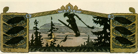
That’s an image by Ivan Bilibin, and it manages to do just about everything that Mignola is reaching for and missing. Even though this Baba Yaga is distant and only in silhouette, you can feel the tension in her posture, the sweep of hair away from her head and her bent knee above the pestle turning her into a bird of prey about to launch. The use of negative space and the positioning of the moon is superior too. In Mignola’s image, the moon sits just off to the side of Baba Yaga’s head; there’s no real feeling of motion — it’s just a marker to tell you she’s in the sky. In Bilibin’s, on the other hand, the moon’s set far below and under Baba Yaga, and the angle of her pestle makes it seem like she’s just about ready to tip over it in a vertiginous rush, flying up into space.
There’s no shortage of other Baba Yaga versions. Here’s another amazing one by Bilibin.
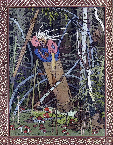
That’s the expression Baba Yaga should have, damn it; a look that could curdle milk and dry up your testicles.
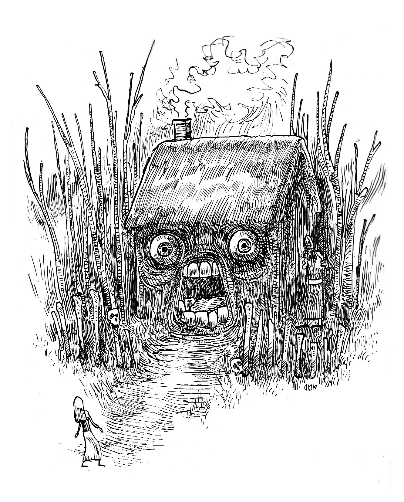
Here’s one by an artist named Rima Staines.
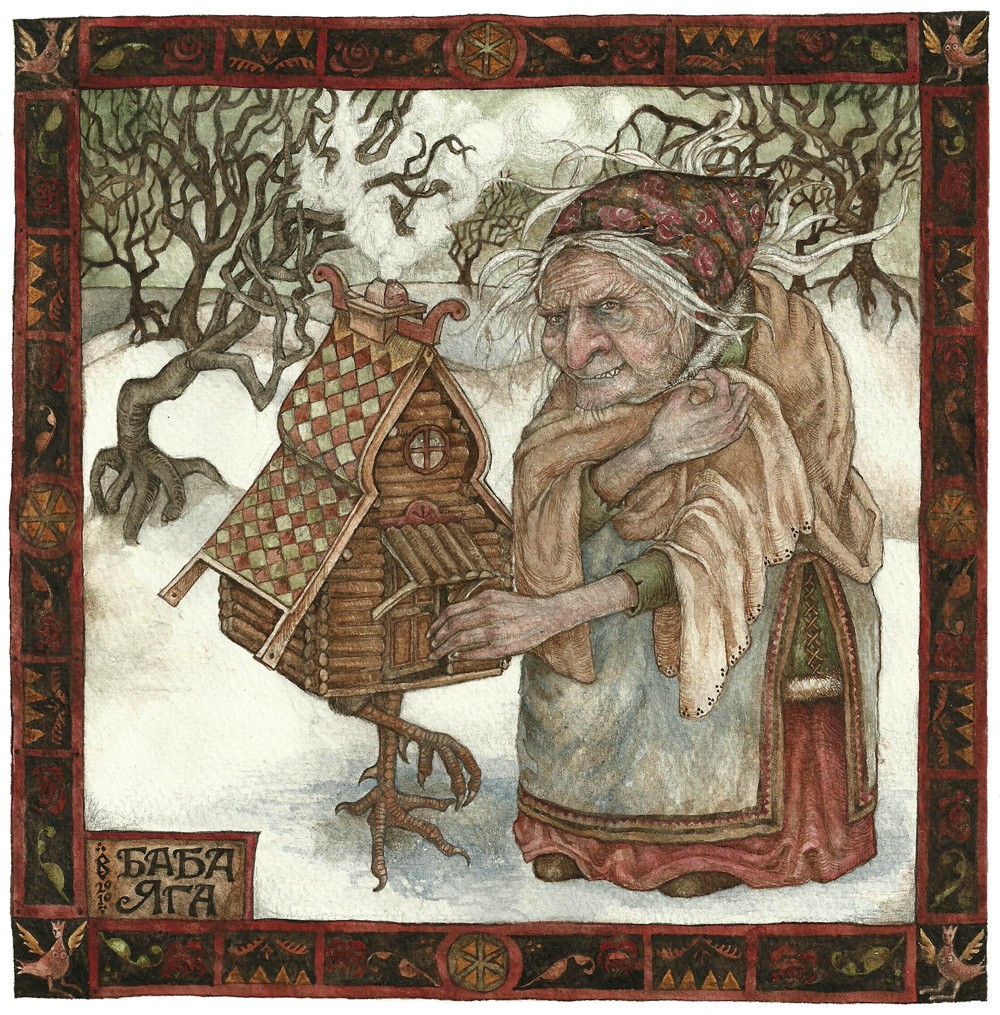
Again, that seems not just technically superior, but much more powerfully imagined. Her expression looks almost nice-old-woman friendly till you look closely and see the sneer and those teeth. And I do believe she’s feeding that cute little house — though what she’s feeding it I wouldn’t want to speculate.
One more maybe; this is by Dario Mekler.
That’s a more cartoony take, but it’s got a ton of energy. I love the scribbled smoke coming out of the roof, the way the moire patterns in the hut seem to make the eyes vibrate, the simple, stick-figure lines of the girl, so that she looks fragile and just about ready to snap apart…and Baba Yaga herself, barely visible, meshing with the lines of her hut, like another one of those twisted trees, waiting.
Bilibin’s drawings of Baba Yaga are famed classics; Staines and Mekler both seem to be significantly less famous than Mignola. But their versions are all much more imaginative, inventive, and engaging than the one in Hellboy. They all also, I think, have more narrative tension or interest. “What is Baba Yaga feeding the house?” and “What is going to happen to that girl?” are both significantly more intriguing, and more energized, questions in the art than the banal pulp violence that one image of Hellboy promises.
Again, I don’t think the Mignola art is horrible. It’s certainly better than most mainstream comic book illustration. It’s clear, it has some flair to it. But with a subject like Baba Yaga, and a reputation like Mignola has…well, it seems weak. Why would I want to look at this when my browser can take me to an infinite number of more interesting Baba Yaga’s? I’m just having trouble seeing how mediocre to bad pulp writing and decent but nothing special pulp art add up to a great comic.
The thing with Hellboy is that the series gets better after Mignola ceases drawing it and starts focusing on writing it. He can’t really handle both duties at once and the artists he eventually works with– particularly Duncan Fregrero– do a very good job of picking up the torch he lights with the first few arcs and running with it.The writing of the first few arcs is so underwhelming that eventually the character of Hellboy has a crisis because he’s always doing the same thing over and over again.
THAT SAID: I disagree with you about Mignola’s art, and I’m not sure comparing sequential panels that are serving a number of different purposes, including keeping the reader’s eye moving and brain invested in the story, with individual illustrations proves your point.
In directing we have a saying “if everything is important, nothing is” because importance, of course, is relative. I would say that the point of most of this page (the parts you like) is establishing the otherworldly spookiness that you discuss and then at the end of the page, the point is to get the ball rolling. Those last two panels say to me “The Pulp is a-comin’ dear reader, so turn the page!” much like the way that in Brian K Vaughn comics, the last panel of the right hand page always contains some mini-mystery (Generally a word bubble from an unseen speaker) that creates a small moment of narrative tension that demands you turn the page.
I suspect that if every panel were as invested as the illustrations you highlight, we’d be talking about HELLBOY as static and overly mannered, much like how I feel about, say, Chris Ware. You could argue that Ware’s tactic is totally appropriate to the kinds of comics he makes (which may be true, I dislike his writing so I guess I’m not interested in the kinds of comics he makes) but that kind of illustration i think would be a poor match for the Hellboy material.
TYPO CORRECTION: It’s Duncan FEGREDO
I feel like at some point you start to get into “Nothing can be compared to anything” territory. The illustrations above are all quite different. The last one is quite cartoony,and not especially labored. It’s less labored than the art Mignola’s got in a lot of ways. The first Bilibin drawing is a silhouette.I don’t think the things I like about that drawing and single out (like layout) are things that would make Mignola’s comic worse.
I mean, obviously mileage varies in this as in all things. But all the illustrations I posted above seem to me a lot more imaginative and fun to look at than this page. Moreover, there’s not really anything comics-specific making up for the relative mundanity of the design. There aren’t clever rhymes or pacing a la Watchmen, for example; I don’t see anything particularly interesting happening with the page rhythm or layout. I have problems with Chris Ware, but there’s just no question in my mind that he’s a better artist than this.
I think the main touchstone is Kirby and Ditko, with some nods to Japanese design. I could have compared it to those things. I still don’t think it comes off especially well. Not horrible or anything; just nothing there to excite me.
I disagree a little about Mignola’s color scheme– I think the red works quite nicely among all the slate blue and gray.
However, how it’s used is wearisome. Even the coloring emphasizes that Hellboy is THE thing going on this page, THE focal point of the page. No matter how boring a character he is, how dully he quips, or numbingly he exterminates the bad guy, the comic still positions itself around him “yes, this comic is called Hellboy and he’s the most vital thing going on here.”
Yeah, that’s a great point. Again, I feel like, why am I supposed to root for him? I’d much rather have the awesome witch win (especially if she was drawn better.)
This whole collection is a bunch of folk tales with Hellboy inserted into them in order to borify each of them by the requisite 50 or 60%.
I really do hope there is better Mignola/Hellboy product out there because the enthusiasm for these depresses me more the more I think about it.
I’d hate to think that it takes a draughtsman to appreciate Mignola’s graphics; indeed, i hardly imagine that everyone buying Hellboy comics approaches it from this angle, but
it is difficult not to admire how he has found a style that he has managed to deepen and evolve over the years rather than turn into an empty collection of mannerisms; the way, for example, the wrinkles around the corpses’ knuckles are at once decorative and realistically descriptive; the baba yaga’s shoulder blade in the last panel jutting up against the line of her back; the simple lines used to signify trees, or wood- those are choices it takes years to discern how to make, and when. There is a singular grace to Mignola’s style, despite its pulp demeanour, and i think audiences,
consciously or unconsciously, respond to that.
I really don’t see it. Bilibin’s use of posture in that silhouette seems miles more effective and subtle than Mignola’s; the use of decorative rendering is way superior in Mekler; again, the Bilibin silhouette seems like a much more eleegant use of simplicity.
I don’t think Mignola is bad at any of those things; it’s just not hard to find examples of people doing it better, it seems to me.
I mean, do you really prefer Mignola to Bilibin? Or even see them as vaguely in the same class? I just have trouble getting my head into a space where that would make sense to me.
I keep a copy of that exact Bilibin book within reach near my drawing table, of course i appreciate Bilibin. But in comics -as comics-i prefer Mignola. The equivalent of
Bilibin’s style would be something like mid-period Mike Kaluta, which i find mannered, and jarring to read-as comics(also, remember that Bilibin and his like were trained and technically proficient in ways that very few artists are these days, whether in comics or in fine art) the equivalent -the comic book equivalent, including pacing, layout, narrative poise and clarity- the comic book equivalent in terms of technical excellence- yes Mignola is that, i think. Also, courage. No-one in mainstream comics is pushing
the visuals as close to abstraction as Mignola does at times…
Well, I guess we’ll just have to agree to disagree.
A few thoughts, written in haste, that fall far short of being a cohesive argument:
I think the irruption of Hellboy Red in the panel serves an important narrative function. It doesn’t so much jettison the weirdness as intrude upon it, which is arguably the point of the story. Here’s the stately grey-blue situation, and here’s the garish red come to upset it. One is of course free to groove or not groove on whatever one pleases, but this is a story about a protagonist upending a situation, and the color choices bear that out.
Hellboy’s beastly eyes and brows make him look ahuman, emphasizing his beast-human hybrid nature. Maybe not an artistic triumph, but not exactly as generic as Miller’s phoned-in tuff doods.
I recall looking at the designs for Totoro, disney’s Aladdin, and Paul Chadwick’s Concrete, and thinking they looked like bland clip art. After following them in their narrative moves, though, they won me over. I wouldn’t go to the barricades for Mignola’s Baba Yaga design, but I agree with Isaac that how Mignola uses her in his narrative matters more than the intensity of any given image of her does.
I’m still working on Wake the Devil; Mignola’s play with abstraction in the battle with Hecate is the kind of thing I come to comics for.
“I wouldn’t go to the barricades for Mignola’s Baba Yaga design…”
I think this gets to one aspect of the problem in that Hellboy has probably been oversold to Noah. The truth is that hardly any one in comics would consider Hellboy one of the Top 100 comics ever made. Consider the degraded nature of comics discourse – despite this, no one voted for Hellboy in either the TCJ or HU Top 100 list.
Hellboy is sort of a cult favorite and no longer a top seller. There’s even a bit of nostalgia attached to the property in that it’s one of the few indy comics properties to have survived the torrid early 90s (+/-20 years).
So as Noah says, its “not hard to find examples of people doing it better” just as it is quite easy to find examples of people doing it better than most things in comics. For people “into” the history of comics, Hellboy is a nice throwback to its roots in long form (dedicated-single creator) serialization of genre characters, Kirby power visualizations etc.. It’s just superior entertainment to those who like this kind of thing. It doesn’t need much defending since it’s like the apple pie of comics. I suppose you might get some looks of incredulity if you say you don’t like apple pie in general but, you know, some people just hate apples. It’s only when you begin labeling apple pie Haute cuisine that you might run into problems (see Buffy the Vampire Slayer as applied to TV).
Hellboy probably reads better in a single sitting – that means all 6 big Dark Horse hardcover reprints at once. It has its ups and downs and I’ve never had a huge amount of enthusiasm for it. But it’s much more entertaining when approached that way. Mignola has improved considerably as an artist since his early days on DC/Marvel – his grasp for the comics page, blocky-abstracted figure work, mood, action and movement through the page etc. And it’s sort of fun to follow Hellboy’s progress through his failed quests if you can spare the time (he’s actually quite hopeless if you think about it). Still not a comics masterpiece though.
That makes sense. I should be looking at it more in terms of “somewhat above average for comics” rather than in terms of “great thing on its own merits.”
It is above average for comics, especially the art. I’ll agree with that. I think I prefer Buffy overall — content is a lot more thoughtful — but then again there’s some really awful Buffy, so….
I’m an easy mark for anything that could be described as “Scooby Doo for Kidults,” and that’s at the core of my fondness for Hellboy.
Huh. I prefer Mignola’s Baba Yaga over all your examples. They seem to folksy to me. Could it be that art is subjective?
If you’re still not enjoying it at this point, maybe it’s time to call it a day and just stop reading.
I tried getting into Hellboy a few years ago, but found it too dull. Had I been in my teens though, I can easily imagine getting really invested in it.
Art’s somewhat subjective, but not entirely. It’s intended to communicate, which means that it has to occur outside one person’s head. That’s why you can talk about it. And say something like “too folksy” and have it make sense, even if I disagree with it.
I think you have to be pretty committed to pulp comic art to think that 2nd or 3rd tier Kirby knock-off is better than Bilibin. But obviously some folks are.
I may try reading more at some point…or maybe trying B.P.R.D. But I think I’m done with Hellboy for the moment, anyway.
Not committed to pulp art per se, but committed to Logic, perhaps…
Let’s turn the argument around: that guy Bilibin makes pretty bad 21st century comics: the panel to panel transitions are indecipherable, the whole thing is far too
text-heavy, and the drawings are posed, mannered and nostalgic, oh wait, they
aren’t comics…
You can think of print series as comics. I’ve talked about Japanese print series in that way here.
I haven’t seen Bilibin’s entire set of prints for the Baba Yaga story, but pulp ease of flow isn’t necessarily the only way to think about image juxtaposition.
You are verging on an argument that nothing can be compared to anything else. Which I tend to think of as the equivalent of admitting that the main selling point of the work in question is that it’s comics and you like comics. Which is fine. But for folks not committed to the form above all others, it doesn’t make much of a case for why we should care about Hellboy, I don’t think.
Why haven’t you read Seed of Destruction first? Noah, when you watched Buffy for the firt time, did you just watch some random episode or started with the first episode? If it was the latter maybe that’s reason for some of your problems. I have a hard time caring about what’s happening in a random episode of a TV show with continuing storyline. Not that SoD is that great IMO.
If you ever want to give Hellboy a shot again but want to read some of the supposedly better stories from later on, Right Hand of Doom and Weird Places are good jumping on points.
I think I probably did watch some random episode of Buffy first, would be my best memory. I think I went back and watched them all because I got a little obsessed, as sometimes happens.
I read the 2nd and 3rd Hellboy volumes because that was the earliest ones the library had. No volume 1 for whatever reason.
Maybe I’ll try Right Hand of Doom if I see that. Thanks for the rec.
Huh; almost forgot about this. Here’s a pulpy Japanese print series by Kuniyoshi; or two series really. I think the aim is probably similar to Mignola; cool as shit pulp violence and some goofy pulp humor thrown in.
I’ve read Seed of Destruction, and I seriously doubt it would accomplish anything more than reinforce Noah in his view of the series. One’s reading of Wake the Devil isn’t going to be the least bit deepened by it. It’s just more of the same.
The notion that one has no business commenting on anything unless one has established the proper nerd credentials is an old fanboy defensive maneuver. It’s just another way of complaining that something was said that the complainer didn’t like.
Isn’t The Corpse one-shot supposed to be *the* classic early Hellboy comic? I think Noah should try that one and give up if he finds it too boring for words. There are way too many things out there to waste your time on to spend it on something you hate.
When did I say he has no right to complain? I just said that I think this isn’t a good way to start. Not that his opinion is invalid.
And I’m not arguing it’s a better story. Just I personally have hard time getting into something if I haven’t read it from the begining.
“Fanboy”? I don’t even care that mucz about Hellboy.
Just because something is considered a classic, doesn’t mean it really is or should be. Hush and Long Halloween are “classic” Batman stories and they are complete crap. I still like Batman.
Strejda–
I apologize for misunderstanding. The attitude I described is a bugbear of mine, and my impression when I first read your comment was that it was cut from that cloth.
Here, FWIW, is a guest-blogger on Parabasis talking about a particular moment (and page) of Hellboy he loves:
http://parabasis.typepad.com/blog/2010/03/hellboy-fairytales-scary-puppets.html
I went through a year where i was just over the moon for Hellboy. But now I feel much like Suat. I like it. I don’t really care if other people don’t. I don’t any longer think it’s genius, but I do think it’s better than Noah does.
That’s a nice piece. That story seems to be better than the ones I read.
Referencing Mondrian is interesting. I’ve always felt his work was super creepy; something about the way the borders aren’t clean, so you feel like you’re looking at this snapshot of an infinite grid. Mignola’s use of Mondrian abstraction there seems in comparison very domesticated; it serves a clear narrative purpose, the borders are neat, it’s carefully slotted into its place so as not to derail or undermine the pulp. So for me, at least, while I see and appreciate the point about the pulp in this instance not being allowed to undermine the fairy tale weirdness, the art pushes in the other direction, taking care that the avant garde weirdness doesn’t overwhelm the pulp.
Reading Baltazar and Franco’s “Itty Bitty Hellboy” with my daughter made me interested in checking out the original comics. I think Mignola’s artwork is dramatically better than most stuff out there, but like Noah, found the few titles I borrowed from the library to be a bit uncompelling. I guess I just can’t get that interested in fight scenes (which is what drove me away from mainstream comics as an older teenager). The mix of humor, absurdity, and cute art in “Itty Bitty” is a lot more appealing to my taste.
I didn’t realize Balthazar and Franco did that. I love their Tiny Titans.
If you like Tiny Titans, you’ll definitely dig Itty Bitty Hellboy! Pretty similar in style and execution.
I’d add a point to this thread that I think may explain the gap between like or not of this piece (apart from personal taste that is). Comics like all mediums is contextual. Andy Warhol is a great example, or Lichtenstein. To truly appreciate their work you need to understand the milieu. Not comparing Mignola to these artists directly, but my point is appreciation for the value of this book means you need to see what Hellboy meant in 1990s during the Image craze, when everyone wanted to draw like liefeld (oops) and when Jim Lee style became the eternal face of a superhero drawing. I remember seeing the only X Force book I had when Mignola drew the main flashback story and liefeld did the intro and outro I was taken aback by th abrupt style change. What he brought to the table artistically in my mind is very far removed from the mainstream, and that in itself gives his work here value.
Now when you go back, 20 years later when we have a whole new generation of artists, many who were influenced by Mignola, it is only logical that a relative outsider to his work (I’m in that boat as well) would fail to see why it is so revered. And those that revere it do so with all of that context and have trouble seeing why others cannot appreciate it. Here’s a corollary. I’m a huge Grendel fan. If you know anything about wagner’s series, you know it is incredibly intertwined and self-referencing. My father who never was into comics but is open to the idea of a graphic novel, picked up at random one of my Grendel tpbs. He kind of thought it was interesting but didn’t get why i loved it. (“It’s like a bad batman right?”). Same thing. And he doesn’t have the breadth of comics background that Noah has.
This maybe is the “curse” of niche art. You are simultaneously going at an inside crowd but also hope to draw in outsiders. You can’t always do both; maybe you shouldn’t.
A second point I would bring up is Noah’s comparison of one panel of a monthly comic series to other genres of illustration. I’m not sure that is a fair comparison. I think you can stand back and say “ok this panel by this comic artist isn’t as good as Edward Hopper”. But that clearly isn’t fair for many reasons. I have no stake in the argument here, but I think it may be hard to take seriously a critical comparison of apples to pears. What if you made a comparison to a similar creature from Sandman or some other comic? Doesn’t have to be the same folk persona.
This should be filed under ” Stuff Noah Doesn’t Like.”
Opinion isn’t criticism, at least it’s not a very effective form of it. When you begin with ” I don’t really like this.” and proceed to “It doesn’t wow me.” and sum up with ” I think this one is better.” You’re not really telling us what’s lacking in your review subject, as much as describing your personal tastes.
Personal reaction is part of a review. Would you prefer that I say “this is objectively a piece of crap?” I talk pretty specifically about what I do and don’t like, and why. If you get hung up on a couple of phrases,that’s more about your personal reaction than what’s in the piece, I’d say.
Mignola’s art is generally lazy, lacks detail and expression, and mostly looks like a child’s copies of Picasso’s style.
Ouch.
Comic books aren’t about pretty pictures, they’re about storytelling. And Mignola does that in spades. Also, while the drawing are simple if you’re into a highly rendered style, everything is correctly drawn so he has technical chops.
I don’t like his storytelling either! But different strokes and all that….