The downside to teaching a course on comics is discovering that no textbook quite matches the way you want to teach the material. The upside is writing that textbook yourself. And so here’s the first draft of an intended series of “Analyzing Comics 101” blogs. My actual course is called “Superhero Comics,” but I’m hoping this will be useful to other students, teachers, fans, etc.
So here goes . . .
ANALYZING LAYOUT
Layout: the arrangement of images on a page, usually in discrete panels (frames of any shape, though typically rectangular) with gutters (white space) between them, though images may also be insets or interpenetrating images. Page layouts influence the way images interact by controlling their number, shapes, sizes, and arrangement on the page, giving more meaning to the images than they would have if viewed individually. Layouts are the most distinctive and defining element of graphic narratives.
Layouts tend to be designed and read in one of two ways, in rows or in columns.
Rows: panels are read horizontally (and from left to right for Anglophone comics, but right to left for Manga). Types of row layouts include:
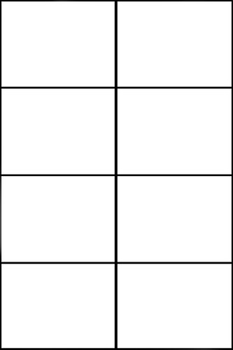
Regular 2×2, 2×3, etc.; 3×2, 3×3, etc.; 4×2, 4×3, etc.: vertical panel edges line-up, creating uniform panels in all rows. 3×3, 3×2 and 4×2 are the most common regular layouts.
3×3:

3×2:
Regular 4×2:

2×3:

2×4:

4×3:
3×4:

4×4:

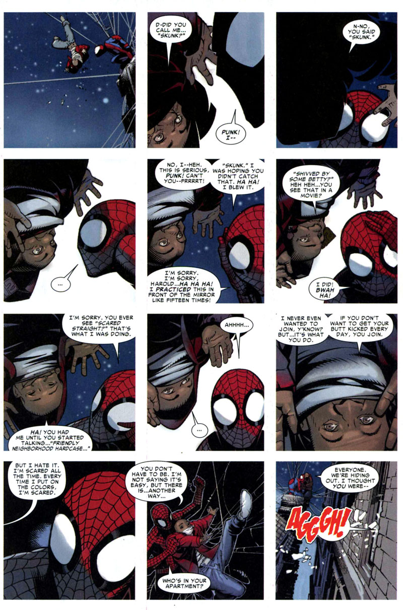
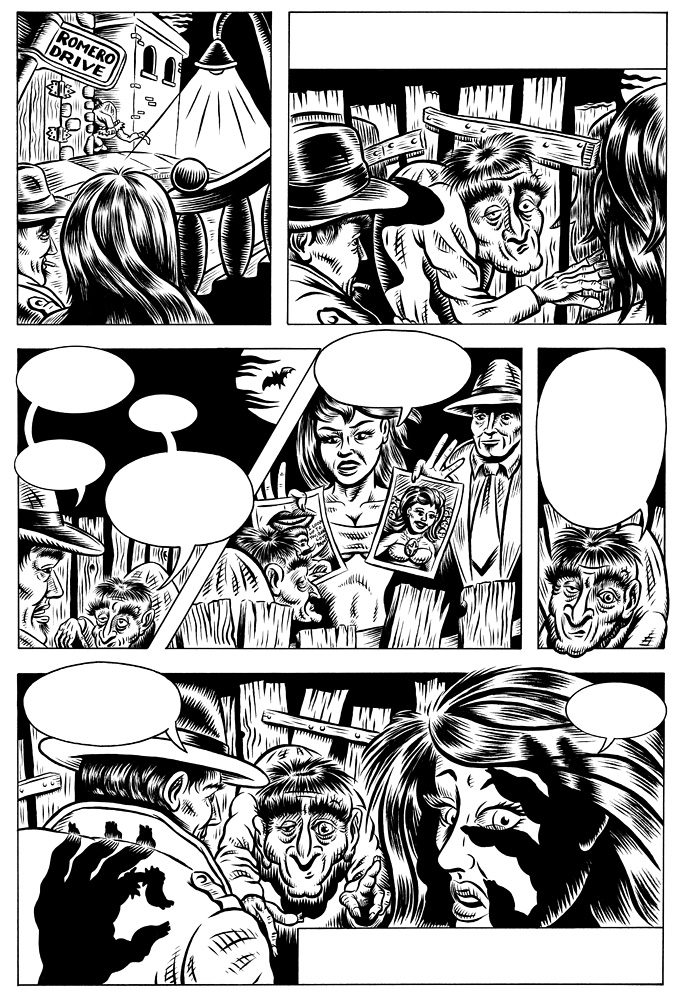
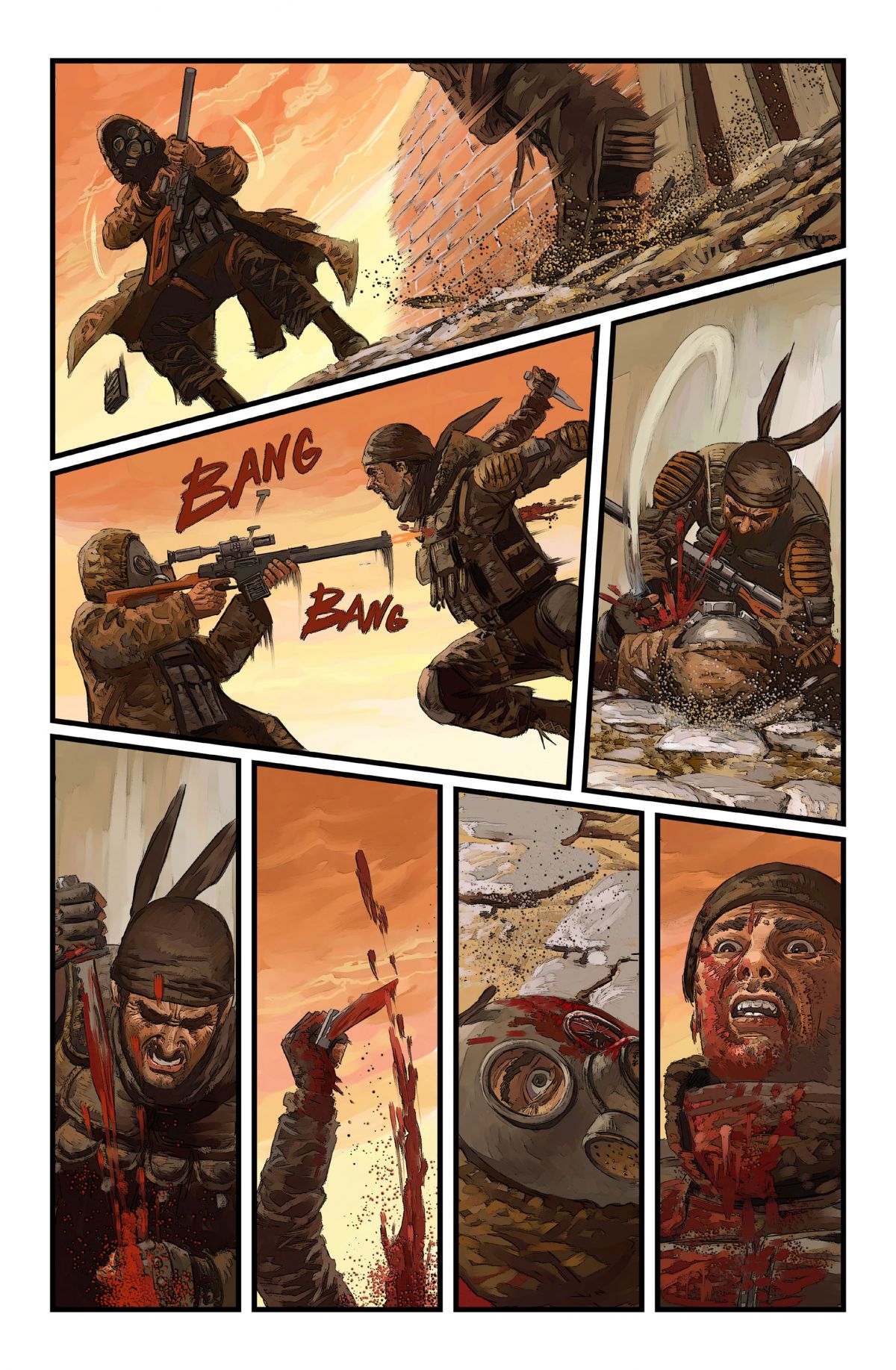
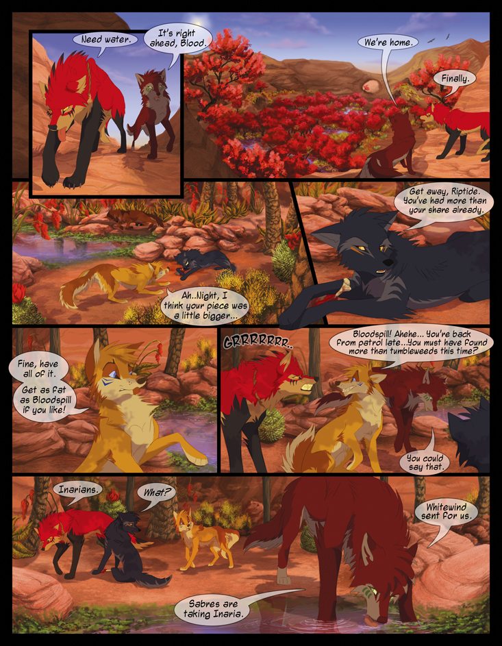
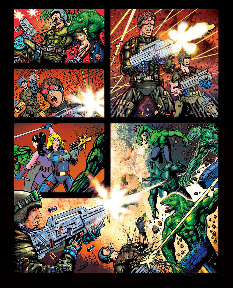
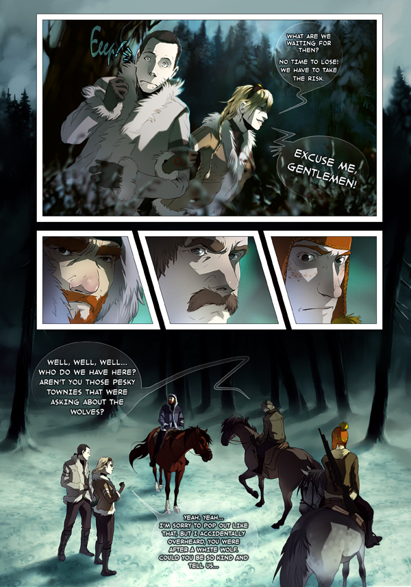
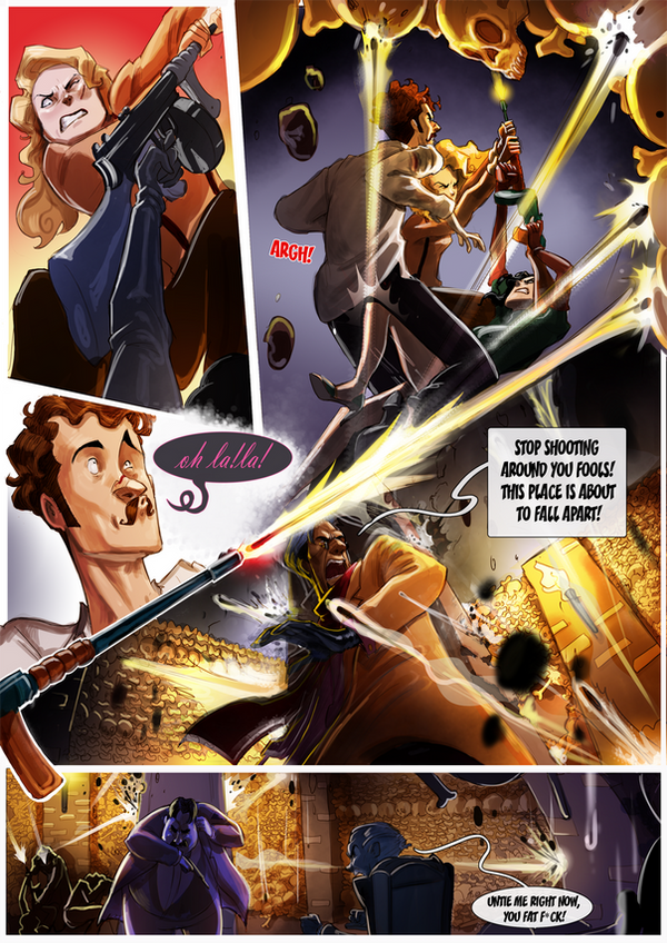
Irregular 2-row, 3-row, 4-row, etc.: vertical panel edges do not line-up, creating a different number of or differently sized panels in one or more rows. The irregularity may include a full-width panel, which extends horizontally across the whole page, or rows divided into 2, 3, 4 or more panels. Irregular 3-row layouts are among the most common layouts in comics, followed by 4-row and 2-row.
3-row:


4-row:


2-row:


Columns: panels are read vertically, from top to bottom. Because of the Anglophone tendency to read horizontally before vertically, columns are less common in Anglophone comics. Column layouts include:
Regular 1×2, 1×3, 1×4, etc.; 2×2, 2×3, 2×4, etc.; 3×2, 3×3, 3×4, etc.: horizontal panel edges line-up, creating uniform panels in all columns. To counter horizontal reading norms, columns often use one or more full-height panels, which extends vertically down the whole page. The absence of segmented panels within a full-height panel column reduces establishes the column layout, preventing a horizontal reading path.
1×4:

1×3:
1×2:
Irregular 2-column, 3-column, 4-column, etc.: horizontal panel edges do not line-up, creating a different number of or differently sized panels in one or more columns. Because horizontal reading is an accepted default, segmented columns tend to be irregular, with one or more taller panels breaking the left to right norm. Often a single, full-height panel establishes an irregular 2-column layout, with the second column divided into multiple panels. Irregular 2-column are the most common column layouts.
2-column (with establishing full-height panel):


.jpg)


Row and column patterns, however, are indistinguishable without content to determine reading direction. A 4×2 layout, for example, may be read as four rows divided into two panels each, or it may be read as two columns divided into four panels each. However, because Z-path reading (first right then down) is the norm for Anglophone comics, 4×2 is typically read as a 4-row layout not a 2-column.
Rows and columns can also be merged by including only full-width panels within a single column. These are irregular 3×1, 4×1, 5×1, and 6×1:


Combinations: panels must be read both horizontally and vertically, combining rows and columns on a single page. In practice, combinational layouts are always irregular. Common combinational layouts feature one or more paired sub-columns (one sub-column divided into two panels, the other the height of those two panels combined, with the two sub-columns sequenced in either order) or a single, full-height column in an otherwise row-patterned layout.


Diagonal layouts: panels do not follow vertical or horizontal divisions, and so are neither clearly rows nor columns:


Caption panel: a panel that contains only words. These tend to be smaller, subdivided panels.

Inset: a panel surrounded entirely by another image.


Overlapping panels: a framed panel edge appears to intrude into or to be placed over top another framed panel, with not gutter dividing them.


Broken Frames: image elements of one panel extend beyond its frame into the gutter and/or into the frame of an adjacent panel.


Insets, overlapping panels, and broken frames are often combined:


Interpenetrating images: two or more unframed images with no distinct gutters or borders so that elements of separate images appear to overlap.


Page panel: A page-sized panel, typically visible in the gutters between smaller panels. When white, black, or otherwise uniform, the page panel appears as the page itself and so as a neutral space outside of the actions and events of the drawn images. All other panels are insets superimposed over the page panel. If the page panel includes drawn images, those images should be understood as the underlying and so in some way dominating background element to all other images on the page. If one panel is unframed, its content may be understood as part of the larger page panel.


A page panel with no insets and a single unified image is a full-page panel:

A full-page panel with author credits is a splash page.

Two-page panel: two facing pages designed to be read as a unit. A two-page spread are two facing pages not designed as a unit.


Panel accentuation: a panel may be formally differentiated and therefore given greater importance by its size, frame (including shape, thickness, and color, and by being unframed) or position on the page (first, center, and last panels tend to dominate).
Panels accentuated by border shapes:

Base Layout Pattern: a panel arrangement repeated on multiple pages.
Strict: repetitions from page to page contain no variations in a base pattern.
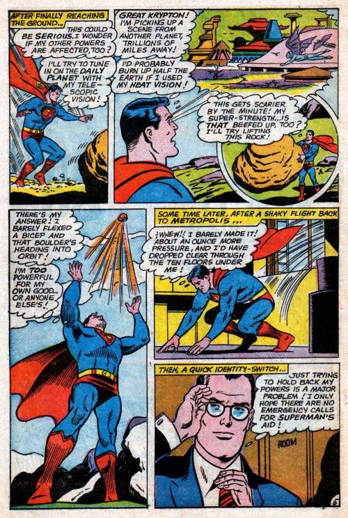
For the Superman episode of Action Comics #10, Joe Shuster uses a strict 4×2, as does Fletcher Hanks for “Stardust the Super Wizard” in Fantastic Comics #12:


Flexible: some variations, especially through combined panels and divided panels. Often the base pattern is only implied.
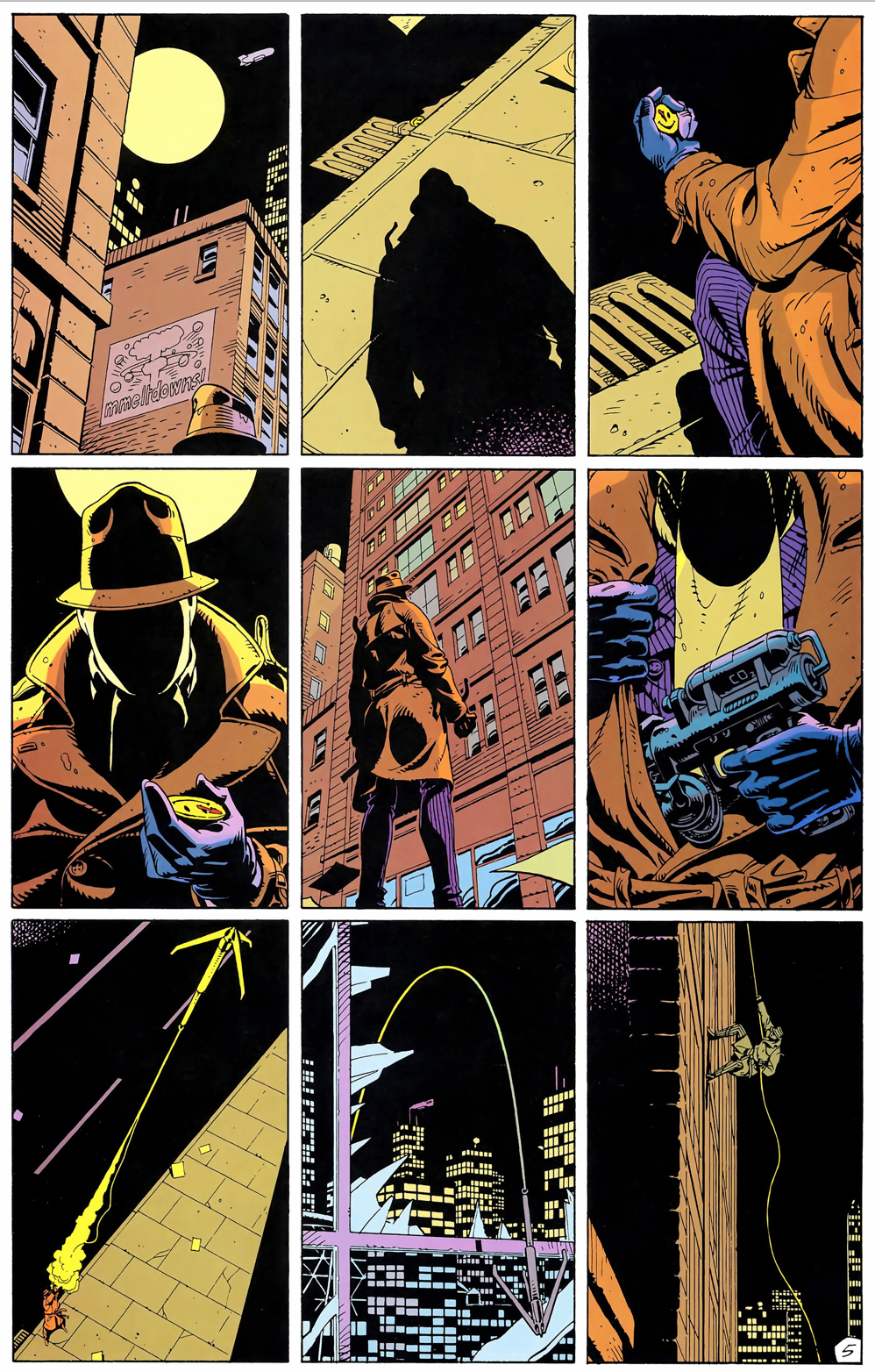
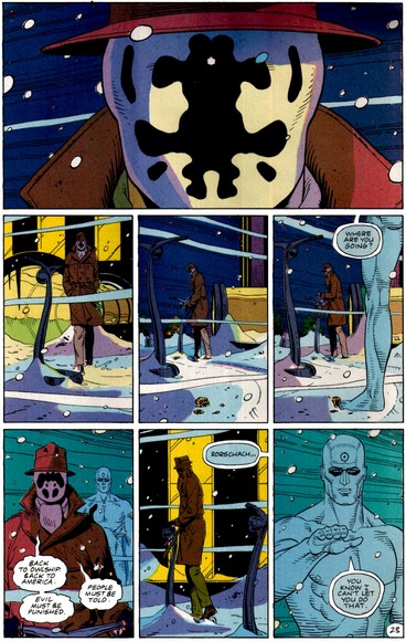
Watchmen is the best known example of a flexible 3×3 base pattern:


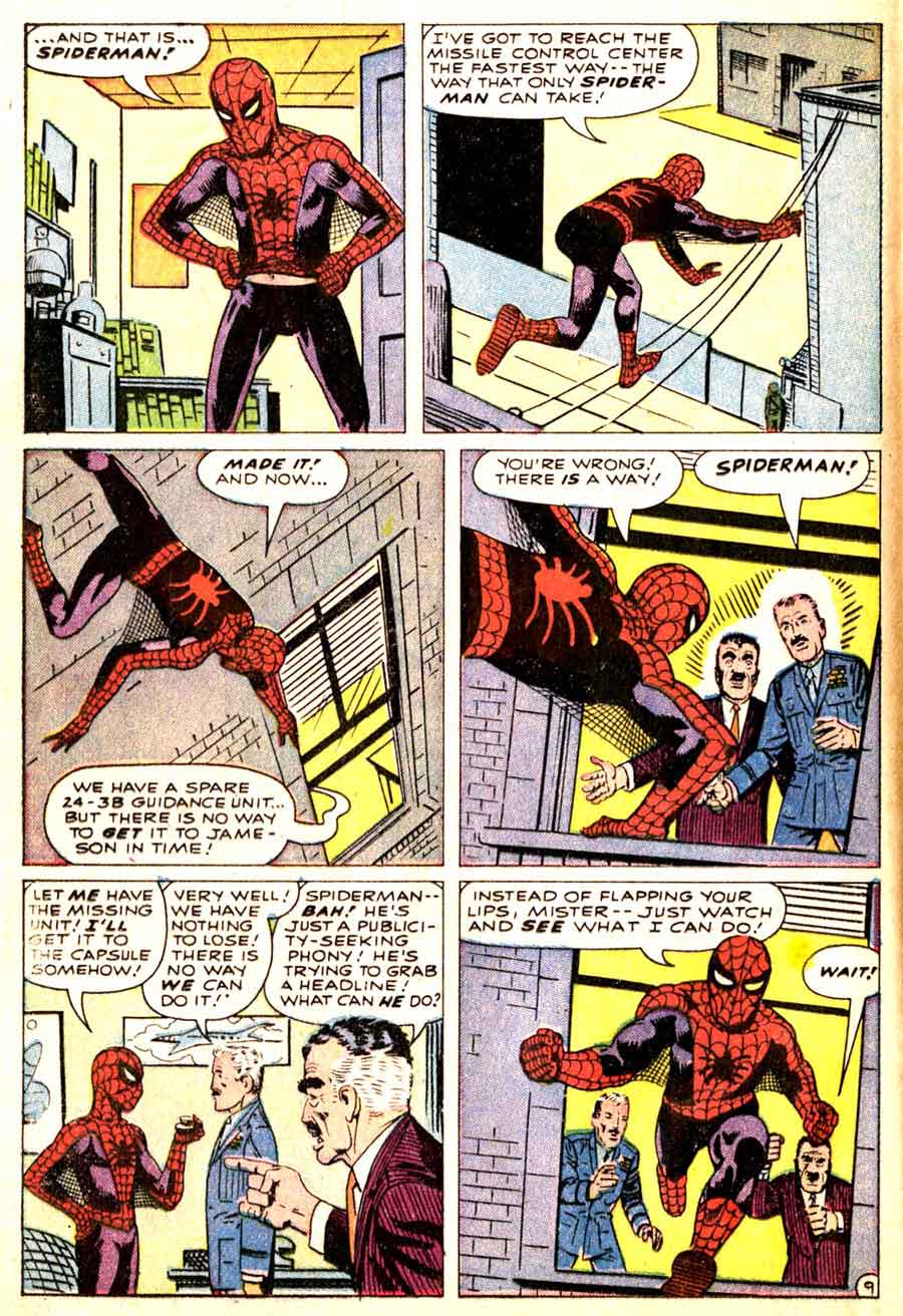
Comics more often use a flexible 3-row base pattern. Steve Ditko fluctuates between rows of three panels and rows of two panels in Amazing Spider-Man:


 .
.


Irregular: no base pattern.
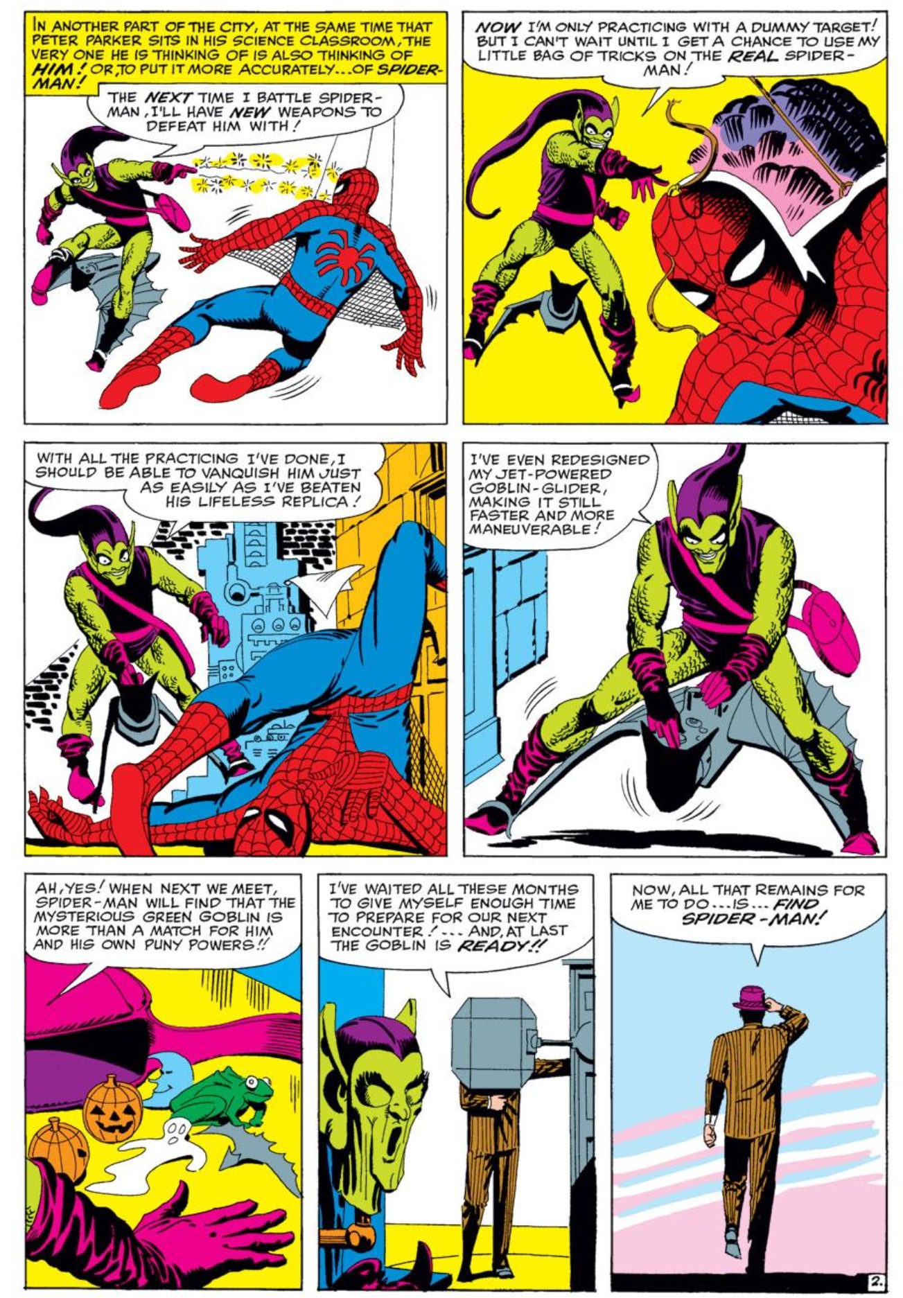
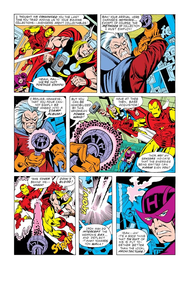
The Avengers #174 fluctuates between 3-row and 4-row layouts:
S(5dhqryzjtk4qcdgjv1lbpdjy))/superhero-library/Img/Pages/A1/A1-174-page-004-l.jpg)
S(5dhqryzjtk4qcdgjv1lbpdjy))/superhero-library/Img/Pages/A1/A1-174-page-003-l.jpg)


If more than one arrangement repeats, each pattern may be distinguished descriptively (3×3, irregular 2-column, etc.) or by chronological appearance (layout A, B, C, etc.). Pages that repeat earlier layouts may be said to rhyme. A comic book’s page scheme may be analyzed for layout repetitions, creating a page scheme. But let’s save that topic for later . . .
In my classes, I use “splash page” to refer to any page-size panel, no matter where it appears in the comic. For “row,” I use “tier,” and a tier-wide panel is a “panorama panel.”
This is a great resource, thanks for posting this.
Rob beat me to the splash page thing.
Your use of splash page doesn’t follow how most writers seem to use the term SPLASH PAGE, which is just “a full panel page”
Denny O’Neil complains in the DC GUIDE TO WRITING COMICS that people incorrectly think any full panel page is a splash page, but I think insisting the term splash page means something other than full panel page just adds to the confusion. Most people seem to use the term just to mean full panel page.
Rob, I grabbed “full-width panel” from Groensteen. “Panorama” works too, but it also can imply content, and it’s not quite as precisely descriptive as “full-width.”
And I debated for a while between “row” and “tier.” Neither is better, but “row” is used a little more widely.
And, yes, to pallas too, I had O’Neil’s definition in mind. I like having a term to describe a page with credits (“title page” in other book forms), though you’re right that splash page is used pretty widely as just a full-page panel. But, again, full-page panel is both more descriptively precise, and two terms for one thing is redundant, so I went with the term that seemed clearer.
I actually prefer the less prosaic names precisely because it forces the students to learn a vocabulary. In my experience, “full-page panel” and “full-width panel” slide right off their minds, leading to papers where they’re making up their own slightly off-kilter vocabularies. (YYMV.) I’ve literally had this problem with “panel”–students will talk about the “cells” on a page or the “boxes,” even though I always say “panel” in class. I suspect it’s because “panel” is too prosaic, too normal a term. Whereas you have to spend a little mental energy to remember what splash pages, panorama panels, polyptychs, and spreads are.
As for poor Denny O’Neil, well, a Google search on “splash page” proves that the ship has sailed there on the broader understanding of the term.
To be fair, some of this comes from teaching Kurtzman’s EC war comics in Fall 2013: you just can’t call an EC title page a “splash page” because the “splash” panel is really only a “half-splash.”
Yeah, that’s a good counter argument. I’ll see how my students responds next semester.
I see you’re going height x width for your grid designations; I have been using width x height (so in my class Shuster’s classic Superman grid is 2×4 instead of your 4×2). I’m curious if anyone knows of an authoritative source for how to represent a grid. :)
Yes! That’s been driving me nuts too. I decided to go with number of rows first because rows seem more central, at least traditionally. But I couldn’t find any authority on the subject.
My “authority” was the Lowes website. :)
I’d use splash page to refer to a full page panel as well. Certainly if you look at manga which doesn’t usually worry about title pages, but certainly knows how to use “splash pages” effectively–and that’s the term that has been used for full page panels when discussing manga going at least as far back as Manga! Manga!
This is great, Chris.
You could use modifiers like “opening splash” and “credits splash” to distinguish the particular kinds of splash pages you have in mind
wikipedia has sources for the standard use of “splash”, but, uh, well you can see for yourself what those sources are…
Great article, hope this will be an ongoing series of articles. As for the width x height issue, i also found it confusing you put rows before columns. This could be my background as a graphic designer though, where its common practice to describe grids, image proportions, screen resolutions etc. the other way around, i.e. x-axis before y-axis. Guess this goes back to Euclidean geometry? But Im never sure if things arent done the opposite way in the US :)
maybe this helps:
https://en.wikipedia.org/wiki/Aspect_ratio
https://en.wikipedia.org/wiki/Cartesian_coordinate_system
My inclination is to read 4×2 as 4 rows by 2 columns.
Like Tim, this is because of a background in another field, in my case Linear Algebra.
Pingback: Locate, shots and brainstorm – Week 7 – Nurul Illustration