
Earlier this week Suat wrote a post on Frank Miller’s recent artwork, which shows signs of steep technical decline. Miller’s draftsmanship was never stellar, but he had a strong, dramatic sense of design, and a consistent, idiosyncratic stylization that mixed Kirby, Frazetta, and manga in a way that wasn’t off-puttingly derivative of any of them.
As Suat says, Miller’s recent work shows a steep decent from this good-if-never-great peak.
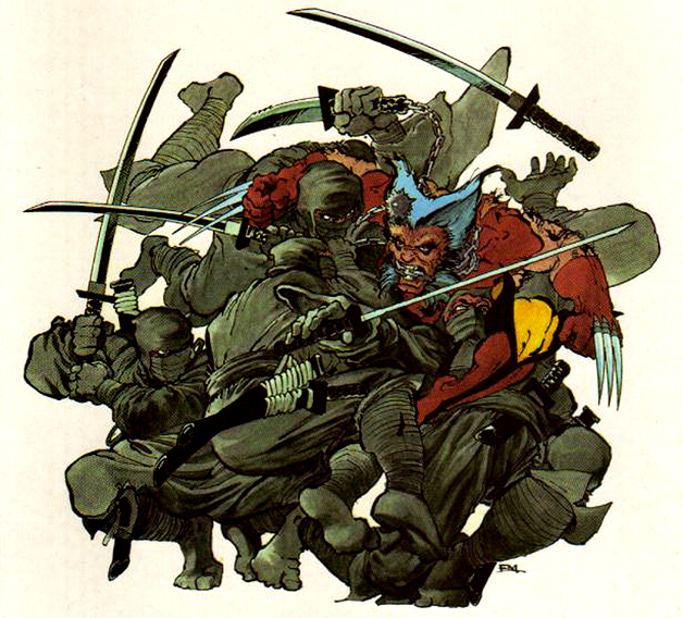
Interestingly, Dan Nadel expressed some appreciation for this late Miller of the ugly Frankenstein zombie Elektra with arms taken from some other, bigger zombie woman.
I understand why people would dislike this new stuff. It’s ugly and incoherent, but coherent Miller isn’t that interesting to me, and I like ugly sometimes. Free of his obvious influences — Eisner, Adams, Moebius, Kojima — he just made weird work. Intentional? Maybe not. Maybe so. We’ll probably never know. It’s not genius or anything… just odd end-of-career work by a pulp artist, kinda like Lee Brown Coye’s late work. Consistent in its weirdness. Certainly the covers he’s drawn in the last year are all of a piece, and make sense as slightly deranged mark-making.
That’s an outsider art take; Miller gets more interesting as he gets less controlled and less coherent. As the control over the material disintegrates, you can appreciate the images not as representations of superpeople, but simply as lines on the page; “deranged mark-making”, which happens to look like zombie Elektra, but really could just as easily be something else for all Miller, or the viewer, cares.
I don’t know that I entirely buy Nadel’s take; Elektra is too obviously a struggling picture of Elektra to appreciate it as simply disincorporated pencil tracings,and the ugly isn’t quite weird enough to send me. This isn’t Harry Peter, where confused proportions and oddly defined composition create a vertiginous sense of spacelessness, with the figures hovering between characters and two-dimensional pen marks.
There’s incompetence and then there’s incompetence. Peter’s scattershot drafting and compositional skills resolve into an alienating, sublime effect. Miller’s ugliness just sits there, sadly, asking you to admire it as beauty.
Still, I don’t actually hate that Elektra drawing the way I hate, say, the art in Spiegelman’s In the Shadow of No Towers, or for that matter the art in a lot of mainstream superhero books.
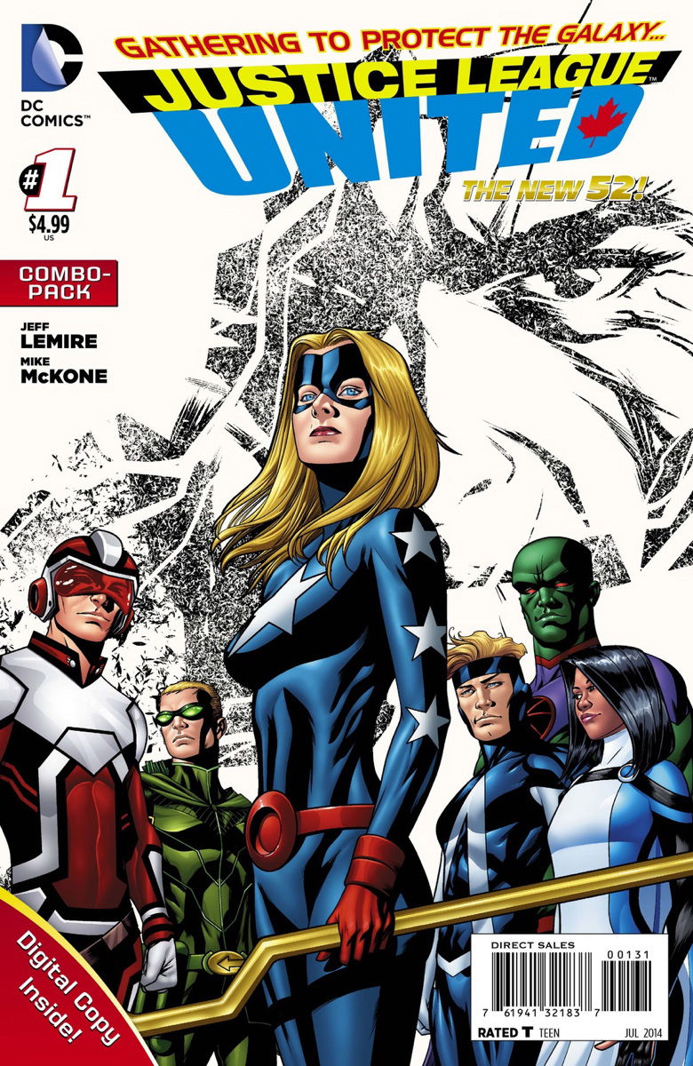
I guess that’s by Mike McKone. I guess this is the sort of thing that comics fans think is acceptable, as opposed to Miller, but…that’s pretty sorry shit, isn’t it? There’s something seriously wrong with the foreground character’s anatomy; her stomach seems to trying to escape through her backbone. The composition is static and awful; they’re all just standing there looking serious, thinking deep thoughts like, “wow, we’re really poorly drawn, aren’t we?” The coloring is slick and bland, they’re all thin and bland and straight; it’s a bunch of superbored supersticks. If you could pan down, you’d expect to see that they all have wooden feet hammered into the ground.
Miller’s Elektra isn’t cool as shit action art a la Frazetta, and it’s not outsider art interesting—but at least it’s trying something. Elektra is supposed to be sexy and badass, and she fails at that…but at least the failure registers as a failure. He tried something and it didn’t work, and it’s kind of funny and kind of sad. It doesn’t get to ugly enough to be good or interesting, but it’s got enough ambition to get to ugly. Mike McKone’s drawing, on the other hand, is so bland it makes no impression; like much superhero art, it might as well just be a scrawl declaring, “art needed here on deadline.”
Frank Miller is a big enough deal that when he turns in art, he actually turns in art. Not good art, necessarily, but not personalityless corporate default, either. You look at Elektra, and you feel like Miller put some of himself in there, even if that self is an indifferent draftsman far past his prime. I guess that’s what it is to be a mainstream superhero artist these days; you work and work in the hopes that you’ll become popular enough that someday, somehow, you’ll be allowed to make the crappy art you’re truly capable of.
hmm so i still need to hear an argument against Miller (the artist) that doesnt work against Kirby as well. “Kirbys draftsmanship was never stellar, but he had a strong, dramatic sense of design, and a consistent, idiosyncratic stylization …”? I mean how do you separate draftsmanship from design and stylisation? Maybe you do refer to correct anatomy and perspective in a traditional, academic sense?
Maybe you do think Kirby is not that good actually? Im sure one could make this argument. I guess the draftsmanship vs idiosyncrasy argument would actually work against most of my favourite Marvel artists, i.e. Ditko, Steranko and Colan.
I also wondered if it wasnt besides the point to criticise the skills of a comic book artist based on (fan commissioned?) pin ups and cover art, its a bit like judging the abilities of a director based on a film still or the advertising art.
I like Kirby pretty well. I think hsi sense of design is better than Miller’s by a lot, and his stylization is more original and just more fun to look at. I think they’re similar in many ways; Kirby’s just better. (and has more entertaining ideas about what to draw as well.)
Kirby is really creative and funny and weird.
And that Justice League cover really is utterly disposable. That lettering too– did they assemble that crap clip-art cover in Word?
… Also, Frank Millers pulp-art-crappy drawings does a good job of stearing the attention away from his, shall we say, conservative opinions.
Incidently, my latest poster job resulted in something similar to Millers drawings, where it is hard to totally separate style from incompetence. I wanted the style to be chaotic. I wanted to hurt the viewer real bad. The result was ugly (as intended) but had an impact:
http://the-missing-ink.org/hb-poster-2016-may-web.pdf
hm yeah we could also assume Miller is doing this intentionally, and Miller 2016 is to Miller 1986 what Benjamin Marra is to Paul Gulacy :)
Mike McKone has his own style, but I got intensely bored by it as he was doing Teen Titans. Most artist’s lost their touch as they get older, so that McKone cover is beyond my dislike for his style, it’s super-bland.