Kirby vs. Steranko! Silver Age Layout Wars!

When did the Silver Age of comics end and the Bronze Age begin? There’s no definite year, but the 1973 “SNAP!” of Gwen Stacy’s too-perfect neck in Amazing Spider-Man #121 is a contender. 1970 is a bigger year, with Jack Kirby’s move from Marvel to DC, plus the start of Neal Adams and Dennis O’Neil’s Green Lantern / Green Arrow. Steve Ditko left Marvel for Charlton in 1966, turning both Spider-Man and Doctor Strange over to new artists for the first time. Marvel veteran Bill Everett took on Doctor Strange with Strange Tales #147, but for me Strange Tales #154 is the sea-changing Silver-to-Bronze moment. It’s the first episode of Nick Fury, Agent of S.H.E.I.L.D. that the recently hired Jim Steranko wrote, penciled, and inked in 1967.

Like other artists Marvel hired in the 60s, Steranko imitated Jack Kirby, first auditioning by inking two of his penciled layouts for a proto-S.H.E.I.L.D story, and then by adopting the Kirby-defined Marvel house style. Gil Kane, who started freelancing at Marvel in 1966, explained during a 1985 panel discussion at the Dallas Fantasy Fair:

“Jack’s point of view and philosophy of drawing became the governing philosophy of the entire publishing company and, beyond the publishing company, of the entire field…. They would get artists, regardless of whether they had done romance or anything else and they taught them the ABCs, which amounted to learning Jack Kirby…. Jack was like Holy Scripture and they simply had to follow him without deviation. That’s what was told to me, that’s what I had to do. It was how they taught everyone to reconcile all those opposing attitudes to one single master point of view.”

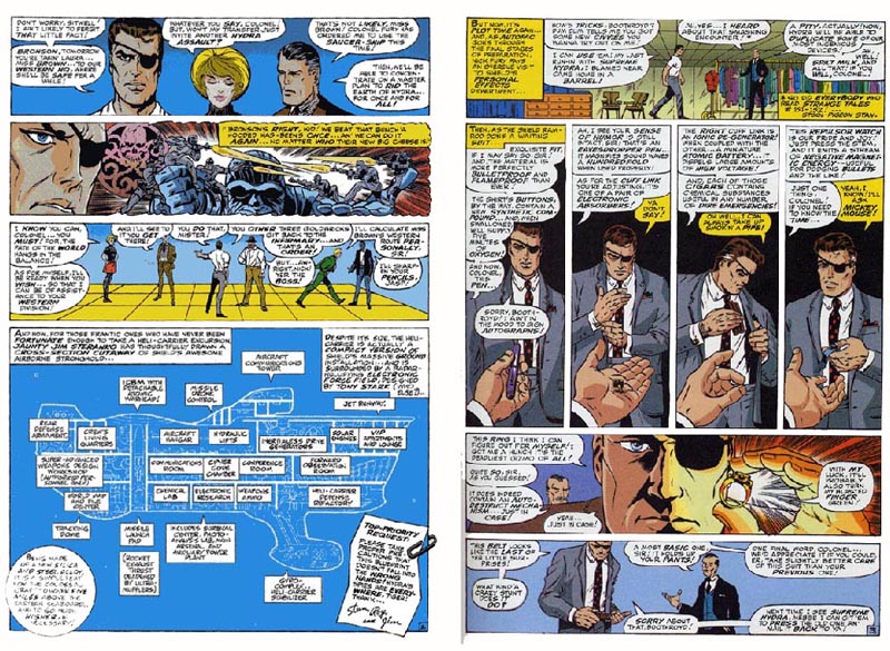
After passing his employment test, Steranko apprenticed by inking three of Kirby’s twelve-page Nick Fury episodes. Kirby had co-created the series with Lee in 1965, but after the inaugural Strange Tales #135, nearly a dozen different artists had worked on the title. Kirby also co-penciled the two issues leading up to Steranko’s run, which suggests that Steranko’s credited “illustrations,” “artwork,” “rendering” may include more than just inking. Kirby is credited only for “layouts,” and they certainly look like his. Issues #151-3 are a close match to Kirby’s first Nick Fury episode:

#135: Seven regular 3-row pages

-= story 1, page 06 =-

-= story 1, page 12 =-

(including three implied 3x2s),

-= story 1, page 03 =-

-= story 1, page 07 =-

three regular 2-row pages (including two implied and one actual 2×2),

and two full-page panels (including the opening splash).

#151: Ten regular 3-row pages (including four implied and two actual 3x2s), one regular 2-row page, one full-page panel (splash).

#152: Ten regular 3-row pages (including seven implied and two actual 3x2s) one regular 2-row page, one full-page panel (splash).

#153: Nine regular 3-row pages (including seven implied and one actual 3×2), two regular 2-row pages (one implied and one actual 2×2), one full-page panel (splash).

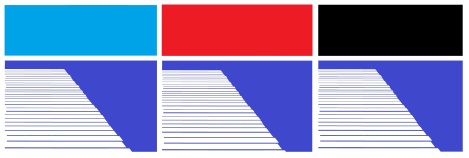
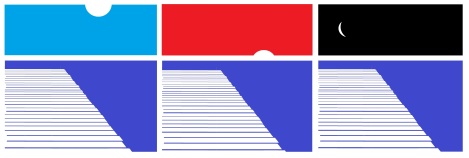
Kirby draws no irregular layouts, so panel heights are consistent on each page and, since three-quarters of the layouts are regular 3-row based, across a majority of pages too. Of the thirty-six 3-row based pages, twenty-six are also 3×2 (typically implied, occasionally actual). The percentage is higher in Kirby’s last two issues, with seventeen of nineteen regular 3x2s. All rows include either one, two, or three panels of equal width. When he does vary from 3-row layouts, he uses 2-rows instead, averaging two 2-row pages per issue. Each issue begins with a full-page splash panel and ends with a 3-panel row in a regular 3-row page. Excluding full-page panels, each issue includes between five and eight pages with a full-width panel; twice in one issue, two full-width panels appear on the same page. Kirby draws no full-height panels or sub-columns, so all reading is horizontal. All panels are also rectangular and framed by gutters. Kirby draws no insets or overlapping panels. The overall effect is lightly varied and highly orderly.

The Nick Fury layouts changed with Steranko’s first solo issue:

#154: Four regular 3-row pages (including one implied 3×2), three irregular 4-row pages, two full-page panels (including the opening splash), one irregular 2-row page, one regular 2×3, one mixed column-row page.

Only three of Steranko’s layouts appear in Kirby’s issues: two full-page panels and an implied 3×2. Like Kirby, Steranko favors regular rows, although not exclusively. Unlike Kirby, Steranko’s 3-row based layouts are a minority, comprising one-third rather than three-quarters of the total pages, and where slightly more than half of Kirby’s pages are 3×2 based, Steranko’s one implied regular 3×2 is the rarity.

Three of Steranko’s regular 3-row pages lightly modify Kirby by including three new elements. First, two rows are divided into four panels; Kirby’s rows never exceed three panels. Second, some panels are irregular, and so their widths vary within the same row; Kirby’s panels are always divided equally. Third, two full-width panels include insets, effectively creating a row of two irregular panels; Kirby draws no insets.

Six of Steranko’s layouts contradict Kirby completely: three irregular 4-rows;

a regular 2×3; an irregular 2-row; and a mixed column-row page. Although the final page features the first instance of vertical reading, the concluding two-panel sub-row echoes the regular 3-panel row that concludes each of Kirby’s issues too.

Despite the range of differences between Kirby’s #153 and Steranko’s #154, most of Steranko’s additions can be found in Kirby’s earlier work:

 The Fantastic Four #1 (August 1961) includes irregular 4-row pages, regular 2x3s, rows of four panels, and rows of irregular panels. Fantastic Four #2 include the same variations, but 4-rows and 2x3s vanish afterwards.

With the exception of splash pages, The Incredible Hulk #1 (May 1962) is also entirely regular 3-row based, with only three pages that vary the format with irregular panels or a regular four-panel row.

By The Avengers #1 (September 1963) Kirby’s layouts are also almost entirely 3-row based, with no more than three panels per row, and only two rows of irregular panels; the one irregular 2-row implies a 3×3 grid.

The X-Men (September 1963), published simultaneously, has even fewer variations: a subdivided panel in a regular 3×2, and one row of two irregular panels.

The twelve pages of Kirby’s Captain America feature in Tales of Suspense #59 (November 1964) are even more rigid, containing only regular 3-row layouts, all but one implying a 3×2 grid.

The Nick Fury episode of Strange Tales #135 (August 1965), Kirby’s last new series for Marvel, is comparatively diverse. Becoming the Marvel house style seems to have required Kirby to regularize his layouts, presumably so they could be more easily imitated. Variation and innovation are not qualities easily taught, and they do not produce a unified style across titles.

Although Kirby appears to have curtailed his own style to create the Marvel house style, insets and columns are still rare in his early Marvel work too. Fantastic Four #3 does include one, partial inset with its own gutter, and #5 features a highly atypical 1×3 page—which Steranko echoes in his next Nick Fury issue with a three-column page of his own.

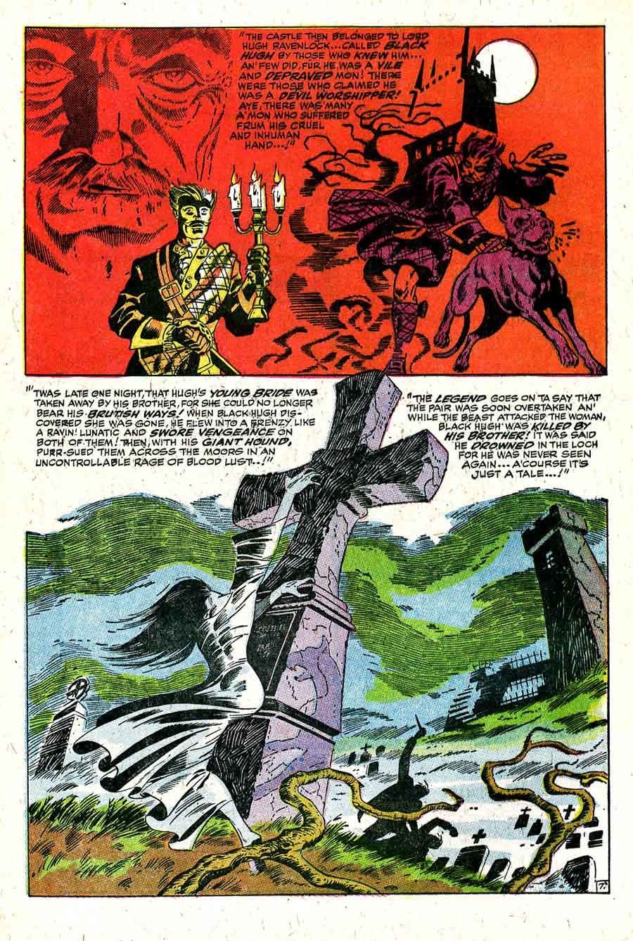
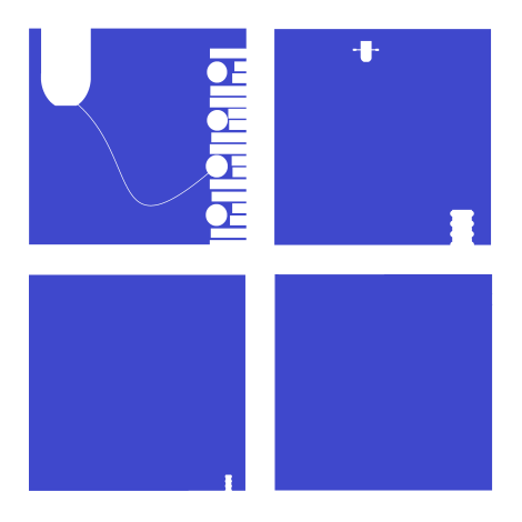
One of Kirby’s very first comic books, the eight-page “Cosmic Carson” in Science Comics #4 (May 1940), includes four sub-columns, but no page-height ones. The following year, Captain America #1 includes sub-columns too.

“Cosmic Carson” also shows Kirby’s early use of a regular 2-row with a top full-width panel; identical layouts appear in Strange Tales #s 135, 151, and 152 as well as Steranko’s later #157.

Overall, however, Kirby uses columns rarely, while for Steranko they would become part of his signature style. His next column concludes #160, then beginning with #166, at least one appears in nearly every issue. #166 includes two: a regular 1×2 and, more distinctively, an irregular 1×2 in which the first column is an unframed, full-height figure defining the panel edges of the second column.

#167 includes no columns—in part because of its seven full-page panels, including Steranko’s innovative fold-out “quadruple-page spread,” which also doubled the price of the issue from twelve cents to twenty-four.

#168 then includes three columned pages in a row: an irregular 1×2 with no panel divisions;

an irregular 1×2 with the first column divided into five regular panels; and a highly irregular 1×2 in which the unframed full-height figure overlaps with the three panels of the second column.

Nick Fury, Agent of S.H.I.E.L.D then switched to its own independent title, and #1 featured another irregular 1×2 with an unframed, full-height figure.

#2 includes a lone column and a later half-column of insets on a full-page panel, as does #3, and #5, Steranko’s last, includes a new column layout of a regular 1×3 with only the middle column divided into six irregular panels.

Because Steranko fell behind schedule, another creative team filled-in #4, marking the beginning of the end for Steranko at Marvel. He would leave the following year, 1969, after objecting to Stan Lee’s editing of his work. Steranko’s penultimate issue, Nick Fury, Agent of S.H.I.E.L.D #3, bears little relationship to Kirby’s earlier layouts:

1: full-page splash panel

2-3: mixed column-row, a two-page panel with a column of letter-shaped panels

4: irregular 3-row with irregular panels

5: irregular 2-column with three irregular insets over the page-panel

6: irregular 3-row with two insets in the middle row and one inset in the bottom row

7: irregular 2-row with two full-width panels

8: mixed column-row, beginning with a full-width panel, followed by a nearly full-page panel with a two-panel column of insets

9: mixed column-row, an irregular 3-column of full-height columns, with a top row of four regular insets

10: regular 3-row with irregular panels

11: mixed column-row, an irregular 2-row with a two-panel column of insets over a full-width half page bottom column

12-13: two-page panel

14: irregular 3-row with irregular panels

15: irregular 3-row with irregular panels and one inset

16: mixed column-row, an irregular 3-row with a three-panel column of insets over a middle full-width panel

17: irregular 3-row with irregular panels and one inset

18: irregular 3-row with irregular panels

19: irregular 2-row with a column of text beside a nearly full-page panel

20: mixed column-row, an irregular 3-row with a sub-column of two insets

Although nine of the twenty pages are exclusively row-based, only one features rows of uniform height, and six additional pages include a mixture of rows and columns. The complexities are greater when also considering unframed and overlapping panels, but the contrast to Kirby’s last issue, published a year and a half earlier, is already stark:

1: Full-page splash panel

2: regular 3×2

3: regular 3-row with top full-width panel implying a 3×2

4: regular 3-row with middle full-width panel implying a 3×2

5: regular 2×2

6: regular 3-row with middle full-width panel implying a 3×2

7: regular 3-row with bottom full-width panel implying a 3×2

8: regular 3-row with bottom full-width panel implying a 3×2

9: regular 2-row with a top full-width panel implying a 2×2

10: regular 3-row with a bottom full-width panel implying a 3×2

11: regular 3-row with a bottom full-width panel implying a 3×2

12: regular 3-row

Kirby built the Marvel house style on a 3×2 grid and punctuated it with an occasional 2×2. After both Kirby and Steranko left Marvel, Kirby’s flexible page schemes would give way to a norm of irregular layouts, fluctuating between 2-, 3-, and 4-rows, with an open base pattern.

Kirby’s Silver Age layouts were gone.

Is Marilyn Monroe a Character in a Comic Strip?

I’ve been obsessed with Andy Warhol’s Marilyn Monroe series lately. When I found out the poster art for Night of the Living Dead isn’t copyrighted, I made this Warhol-inspired knock-off:

Zombie Girl FINAL

Warhol painted his series in 1962, as a kind of requiem for Monroe after her August death. Because it is a grid of nine squares–a classic 3×3 comics panel layout–it looks a lot like a comic strip to me. And so a part of me wants to say it is a comic strip. Consider Scott McCloud’s definition: “Juxtaposed pictorial and other images in deliberate sequence, intended to convey information and/or produce an aesthetic response in the viewer.”

Clearly the nine images are “juxtaposed.” And that would be true even if the images were all identical, as in my variation on Warhol’s source photo (like I said, obsessed):

Marilyn 3x3

But it’s the “deliberate sequence” part that gives me pause. I’m not exactly sure what “deliberate” means here (can a sequence be non-deliberate? even if the process of composition is random, the resulting arrangement becomes deliberate once finalized by the artist), but “sequence” is fairly clear. Most dictionary definitions include the phrase “a specific order.”

So the individual images form a specific path for the viewer to follow. That implies there are wrong paths–or at least paths that don’t produce the aesthetic result that following the intended sequence will produce. I don’t think that’s true of Warhol’s painting or my two variants though.  Their arrangements are aesthetically deliberate, but your eye needn’t begin, for example, in the top right corner and proceed to the right in a Z-pattern in order to best appreciate all those juxtaposed Marilylns and Zombie Girls. If you instead focused first on the center square and then scanned up and to the left or any other direction, the aesthetic content doesn’t change. If order doesn’t matter, then the arrangement must not be a sequence. And if comics are sequences, Warhol’s painting isn’t one.

The term “image” is a problem too. Comics have to have more than one. As I mentioned in a previous blog, that’s why the French flag is not a comic. Though it is composed of three parts (a blue rectangle, a white rectangle, and a red rectangle), we read it as a single, unified image:

So is Warhol’s Marilyn Monroe a sequence of images or just a single, flag-like image?  Is it made of nine juxtaposed images (and so then possibly a comic), or is it one image made up of nine parts (and so definitely not a comic). It’s hard to say since there’s not always a clear distinction between a visual element that is an “image” and a visual element that is “part of an image.”

This variation on Roy Lichtenstein’s “Crying Girl” is, I think, clearly a single image–even though it is made of the identical component image flipped and juxtaposed four times:

Crying Mouths

Would it be a comic if I divided the four quarters with frames and gutters? I doubt it. What about images that don’t repeat any of their parts? Consider this entirely abstract composition I’ve ingeniously titled “39 Lines”:

39 lines

It consists of thirty-nine visual elements, but I would say it is only one image.  No individual lines or clusters of lines produce a response that’s separate from the composition as a whole. Now consider this:

Words are imagers

It is also composed of thirty-nine visual elements–the same thirty-nine that make up its sibling image. But it is also a sentence, one quoted from comics artists Will Eisner. Unlike “39 Lines,” “WORDS ARE IMAGES” also has linguistic meaning. It is composed of three, separable linguistic units. The first eleven lines form the word “WORDS,” not because of some intrinsic qualities of the lines themselves, but because of an English-reading viewer perceiving that particular conceptual unit. That linguistic property is so obvious that it’s easy to forget that words are also always rendered images–which was Eisner’s point.

But, unlike the French flag or the Warhols, sequence does matter. The lines that compose the sentence “WORDS ARE IMAGES” must be perceived in a very specific order for the linguistic meaning to occur. That’s why McCloud includes the adjective “pictorial” in his definition, to distinguish comics from sequences of lines that produce only letters, words, sentences, etc.

“39 Lines,” in contrast, has no specific order for taking in its constituent visual elements. Your eye is free to enter the image at any spot and then wander at will. There’s no sequence that produces additional meaning. The same is true of “26 Parts”:

FACE 2

It’s just lines arranged to form an abstract image. But consider those same twenty-six visual elements in this arrangement:

FACE

Your eye is still free to enter and wander freely, but the arrangement of the same ink (or pixels) now conveys an additional meaning. It represents a face. That’s another kind of conceptual unit. The arrangement produces a meaning that is not an intrinsic quality of its individual parts. Like “39 Lines” and “26 Parts,” it’s a single, unified image made of individual parts, but, like “WORDS ARE IMAGES,” the face-lines produce an additional aesthetic response, one that’s pictorial rather than linguistic. The difference is that linguistic images must be perceived in a specific order, and pictorial images do not.

So pictorially, my next Warhol variation isn’t a sequence either:

Superhero Girl FINAL 4

Your eye is once again free to wander through the nine faces in any order. But this time, some of the visual elements are letters, and if you read them in the right order, they spell “SUPERHERO.” That’s a sequence. Since those letters are also part of juxtaposed pictorial images, this 3×3 grid fits McCloud’s definition of a comic, while all of the previous examples do not.

But is “SUPERHERO” a comic when expanded with wallpaper-like repetition?

superhero girls new FINAL 12x12

The repetition isn’t itself the problem. I could create a wallpaper-like expansion of this three-panel arrangement of Rodin’s “The Thinker” and still produce sequential meaning:

Thinking

Unlike my earlier layout of the identically distorted Monroe photo, the left-to-right repetition of this identical image can suggest a continuation of behavior through increments of time. It’s ambiguous how much time is passing (seconds, hours, months, etc.), but the figure can be understood as a living figure who is holding a pose as he sits and thinks. That’s not the case with this next Warhol-esque variation on “Crying Girl.”

3x3 crying girl roygbiv

Like the repeating Thinker figure, the repeating Crying Girl figure doesn’t change her pose. But because the pose is transitory and unmotivated (why and for how long would someone look askance like that, and the laws of physics would have something to say about those suspended teardrops), time does not seem to be passing. The face, like Warhol’s Monroe, does change colors–but those seem to be changes to the image of the woman, not the woman herself. This is not a left-to-right sequential representation of time passing. It is a sequence though. Unlike Warhol’s Monroe, the changes follow a specific order: ROYGBIV. Which produces a pun: “ROY” and “Roy.” So is that sequential element enough to call that 3×3 grid a comic?

What about this one?

Crying ROY (Lichtenstein & Warhol Parody)

Here, finally, is something that strikes me unequivocally as a comic. It’s a sequence of an incrementally changing image. In addition to color changes, twenty-six parts of “Crying Girl” move from their face-signifying positions to a non-pictorial clump in the bottom half of the final frame. It tells a kind of story. Which I think is what McCloud means by “deliberate sequence.” He wants comics to be narratives.

That produces another problem. While the vast majority of comics are narratives, some are not. Check out Andrei Molotiu’s Abstract Comics and you’ll find meaningfully juxtaposed images that include no words, no people, nothing but non-pictorial lines:


Some of the pages in Abstract Comics, however, appear no more sequential than Warhol. Which could mean some of them aren’t actually comics. They might just be subdivided images. Many are even subdivided into panels and gutters, but do they use those visual elements as panels and gutters? Do they produce a sequence?

Part of the confusion is the non-pictorial content. Visual storytelling typically involves drawings of settings and characters. But it doesn’t have to. Consider this four-image sequence:

4 abstractions

There’s no setting but a white background, and there’s no character in any traditional sense. But it does tell a kind of “story.” The first abstract image appears to change into each of the subsequent abstract images. Even though the image doesn’t represent anything else, it does represent itself. According to Bill Blackbeard’s definition, comics are “about recurrent, identified characters, told in successive drawings.” The cluster of black shapes is both identifiable and recurrent. That makes it a kind of “character,” one able even to undergo a change or “character arc.”

I can apply the same narrative to Monroe:

Marilyn

In this case, the first image, because it’s a photo of Monroe, does represent something other than itself. But that’s not true of the rest of the sequence. Each change is a change to the photo only. They don’t represent changes to Monroe herself. She’s not the character of this abstract, four-panel comic. Her photo is. The same is true of my previous “Crying Girl” variations. Even though they’re representative images of a woman, the woman is not the character of the narrative. Her representation is.

Incremental changes to a repeated visual element, however, don’t guarantee a story. These chessboard permutations strike me as a single image made up of many, evolving but ultimately dependent parts:

CHESS

There’s no specific order to the parts, and so there’s no story, and so it’s not a comic. Characters, especially abstract characters, need a sequence in order to become characters. That’s true of  images that have linguistic rather than pictorial meaning too. Even words, because they’re images, can be visual characters in their own abstract but sequential plots:

Comics Have Characters

So is the Monroe image in Warhol’s painting a “character” too? It undergoes similarly abstract changes, but those changes still aren’t sequential. Neither Monroe nor the repeated representations of Monroe are segments in a visual story.

Which is all a very long way of saying: No, Warhol’s painting is not a comic.

It just looks like one.

Queen Kong vs. Ms. Jones

eerie 81


I don’t know what Warren Publishing had in mind when they commissioned Frank Frazetta’s “Queen Kong” in 1971, but Eerie devoted an entire issue to the image in in 1977.  The cover of No. 81 declares: “SHE’S BIG! SHE’S BEAUTIFUL! SHE’S ATOP THE EMPIRE STATE BUILDING! WHY? READ THIS STARTLING ISSUE FOR SEVEN TOTALLY DIFFERENT ANSWERS!”

Each of the 5-10 page comics offers an explanation for Frazetta’s giant naked woman:

a) breast enlargement injections gone terribly wrong

b) espionage at the 2090 Worlds Fair

c) King Kong blood transfusion

d) “physiological freak”

e) lab-grown mutant engineered to terraform alien planets for colonization

f) giant robot suit

g) Little New York populated by tiny, human-imitating aliens

Explaining the ape in her fist proved even harder, but Queen Kong’s size isn’t her most fantastical quality. It’s her breasts, because a) perfect circles are only possible in space, and b) no nipples. The issue’s other artists offered their Frazetta imitations:

IMG_1294   IMG_1289   IMG_1290

IMG_1288   IMG_1293   

IMG_1291   IMG_1292

The first tale, “Goodbye, Bambi Boone,” I remember best, perhaps because the artistic style was so familiar. Carmine Infantino and Dick Giordano were renown artists at DC in the 70s, and both had just contributed to the 1976 DC-Marvel team-up, Superman vs The Amazing Spider-Man. The two heroes also battle atop the Empire State Building.

SupermanvsSpider-Man1976

My copy was supposed to be signed by the two companies’ top editors, but it arrived with only Stan Lee’s faux-scribble on the cover because DC had just dethroned Infantino. He went from DC publisher to Warren freelancer. Giordano would become editor a few years later, but meanwhile both were earning extra paychecks by drawing naked women on skyscrapers.

Infantino pencilled writer Bill DuBay’s “The Bride of Congo: The Untold Story,” the most comically subversive of the seven stories. Like Peter Jackson in his 2005 King Kong remake, DuBay depicts a Fay Wray deeply in love with her giant ape, and the two even elope and raise a family. Louise Jones and David Micheline give their Queen Kong a happy ending too, sending the colonizing starships away so the narrator’s genetically engineered mutant sister can live a peaceful life alone with her little monkey friends.

And that’s it for Queen Kong survivors. Roger McKenzie’s is just a machine operated by a thug for power and profit–which is as close to feminist allegory as Eerie gets. The rest of the writing staff murder their heroines, some more misogynistically than others. Cary Bates’ teary-eyed manager replaces biplane blanks with real bullets because his beloved actress was dying anyway. Bruce Jones’ mother-exploding freak dies unloved and alone after growing so large she displaces the Earth from its orbit. But Nicola Cuti’s finale is the worst of the batch–a tale of a money-obsessed “Golden Girl” whom aliens kill and then erect as a gold-embalmed statue of liberty.

The stories strip Frazetta’s painting of any quasi-feminist edge by punishing its female hero-victim for her uppityiness. But Eerie and Ms. weren’t the only 70s magazines with nakedly revolting women on their covers. Newsweek began the trend in 1971, the year before Frazetta painted “Queen Kong.”

women-in-revolt-march-23-1970

“Women in Revolt” triggered the first female class action suit when 46 Newsweek employees sued for sex discrimination the day the issue hit newsstands. The magazine allowed no women on its writing staff. A second suit followed in 1972, but this time the owner of the parent company, Katherine Graham, stepped in. Graham was friends with Gloria Steinem and the giant Wonder Woman who appeared on the cover of Ms the same year. Newsweek agreed that by 1976 a third of its reporters would be women, including a senior editor.

James Warren, the king sitting atop Eerie‘s 1977 masthead, made no such agreement. Of the sixteen writers and artists in No. 81, Senior Editor Louise “Weezie” Jones is the lone woman–Gloria Steinem was long gone. Jones entered comics in 1971 as the model for Bernie Wrightson’s cover for House of Secrets No. 92, edited by her first husband, artist Jeff Jones. She is fully clothed and only somewhat imperiled since hero and threat are ambiguously merged into the monstrous first appearance of Swamp Thing.

houseofsecrets92cover

According to the Eerie bio page, she “worked in advertising/promotion before moving to Warren, where the thirty-year-old editor scripts an occasional story. She lives in Manhattan with her daughter.” “I was willing to work in any kind of publishing,” she told CBR. “One of my friends said there was an opening at a comic book company that paid more than the job I had!”

Jones (originally Alexander, later Simonson) was hired in 1974. She described the process of scaling the Warren skyscraper to Bleeding Cool: “I essentially twisted James Warren’s arm into giving me the line of books as an editor. . . . Warren said to me ‘Girls can’t do superhero comics.’. . . I just kind of rolled my eyes and said, Look, I will edit the line for six months on my Assistant Editor salary . . . So of course I did it and then he made me the editor of the line, then he made me a Vice President.”

In 1980, Jim Shooter hired Jones for Marvel, where she edited The Uncanny X-Men and New Mutants and created the supervillain Apocalypse (featured in the latest X-Men film). Marvel in the early 80s was still a “boys club,” she said, but “I was always kind of one of the guys.” Her pay was “as good as the guys around me,” she said, “as far as I knew.” Ultimately, she concluded, “gender doesn’t come into play if [your work is] good enough.”

After moving to DC in the 90s she was instrumental in the Death of Superman and the Reign of the Supermen story arcs, but aside from Red Sonja, she never worked on superheroines: “I had generally avoided doing female characters and being put on female character books — in part because I felt it was a great way to get stereotyped as a person who does female characters, and that’s all you do. . . . I kind of regretted that I hadn’t gone more in that direction when I was younger, because it was so much fun. But you do what you do.”

In Jones’ Eerie story “Starchild,” the mutated giant Janey does her job too, builds a city on a suitable planet for Earth’s growing multitude. But after a week of biblically hard work, she finds “acceptance” and “friendship”: “‘Cause y’see, Janey’d never had friends before. And those tittering monkey-things filled a gap in her childlike heart she never knew existed. . . . And for the first time in her prearranged life, she had fun. . . ”

weezie jonesWeezie

“Starchild” offers Frazetta’s Queen Kong a happy ending, but unlike “The Bride of Congo,” the revolting giantess escapes even the fetters of marriage to live as a nurturing and playful God to the “monkey-things” of her adopted planet. Unlike King Kong, she is not a monster but the narrator’s secretly beloved sister. Her telling, however, receives only five pages, and so is the shortest of the issue’s tales. It is also fifth in sequence, denied the privileged positions of opening, closing, or colored middle story–all of which feature Queen Kong’s cathartic and/or admonitory deaths. “Starchild” is the best in the book.

“I think the women who make it in superhero comics don’t make it because they’re as good as the guys,” said Jones, “they make it because they’re better than the guys.”

 King-Kong-1933-king-kong-2814496-2400-1891

My Favorite Childhood Softporn

eerie 81

It’s 1977, so I’m eleven, older if the magazine I found in one of my cousins’ bedrooms wasn’t his most recent newsstand purchase. The cover price is $1.50.  I paid $8 after pulling it from a vendor’s long box at the Roanoke Comicon. Frank Frazetta painted it in 1971 for Warren Publishing’s planned POW!, a magazine that was never published. I don’t know what his fee was, but Warren must have paid it, since they used it six years later for Eerie.

The timing is no mystery. No. 81 is cover-dated February, so it was on newsstands after the Christmas release of King Kong. My father probably took me to see the remake that same month. I was annoyed that the promotional poster featured King Kong straddling the twin towers, while in the movie he has to take a running leap. The poster hung on my bedroom wall for years. It’s also on the Eerie back cover.

Kingkong1976

 
I was a Frazetta fan in middle school and high school, but I doubt I recognized the artist as a sixth grader. “Queen Kong,” like most of his other artwork, is about titillation. It’s a picture of a giant naked woman. Warren Publishing used it on the cover to sell copies of the issue to heterosexual males. My eleven-year-old self felt it too–but I was puzzled by the nonchalant placement of the magazine on my cousin’s bed, his bedroom door left wide open. Where was the Catholic shame? I apparently still felt enough residual embarrassment that, after giving into nostalgic urges, I did not share my new purchase with my fourteen-year-old son on our drive home from Roanoke.

And yet if you’re going to indulge in softporn, it’s not the worst choice. Type a Google search, and you’ll find Caroline Liddell includes “Queen Kong” on her Pinterest page “Images of Powerful Women,” explaining: “The male fear of what happens when women refuse to behave according to expected gender stereotypes–they run amok! It’s a wonder we all haven’t climbed up the Empire State building, swatting away annoying little gnat like buzzing planes since the vote made us all too big for our britches!!”

Maybe Frazetta was influenced by Dick Giordana’s Gulliver-esque cover art for the July 1971 issue of Lois Lane.
 

loislane111

 
Those are actualy tiny Justice League clones tying her down, but the effect is the same. Gloria Steinem, a former assistant at Warren’s Help! magazine, also featured a Kong-sized Wonder Woman on a 1972 Ms. cover:
 

ms_shadow

But not even a titillated eleven-year-old could mistake Eerie for second-wave feminism. Look over the previous year of covers, and all of the women are damsels in distress incapable of saving themselves from the monster of the month.

eerie 77eerie 76eerie 7160-1

Rape is a thinly-coated subtext.

62-163-1eerie 80

Frazetta, one of Warren’s most employed cover artists, was a big fan of women-in-peril. Each sprawls uselessly on the ground while a muscular hero battles to protect her. In terms of composition, the women are foreground, the heroes are central, and the on-coming threats are furthest from the viewer. In order to be heroic, the hero must be smaller than the threat, and so the woman crouches to give him comparative stature.  The pose is inherently absurd, but the repetition is comic.

47_land_terrorfrank_frazetta_themoonmenfrank_frazetta_thesonoftarzan

Frank Frazetta - Battlefield Earth 2images

But Frazetta was okay with women-in-peril minus the heroes too. That sometimes requires her to take a more active position, occasionally substituting twirling hair for the missing hero’s combat gestures. Sometimes Frazetta even reverses angles.

wolfpackdownloadmini-Escape_on_Venus_frank_frazetta

frank_frazetta_kingkongfrank_frazetta_attheearthscore

When not in peril, Frazetta women fall into typical good girl and bad girl poses, the eroticism unmitigated by other action. Rather than presenting their backs, they face the viewer, though only a seductress offers direct eye contact.

Frazetta_Girl_Bathingfrank-frazetta-egyptian_queenfrazetta_sketch-016

0030acb423a39aa5b536ede8a5534a2efrank-frazetta-02

Though all of Frazetta’s women are sexualized, and many are imperiled, not all are powerless–or their power is not always exclusively sexual. Erase the heroes, and the threatening animals can become an extension of the woman’s power.

frank_frazetta_luanaFRAZETTA_img_07

frank_frazetta_savagepellucidarfrank_frazetta_004-thumb-400x324-2057

Although the body of a Frazetta woman is too idealized to be monstrous in itself, she can command other larger and more monstrous bodies.

54-frank_frazetta32012-09-12_230547 The Sea-Witch

Frank Frazetta-ArosFrank-Frazetta158

Which is why “Queen Kong” is unique. When not climbing the Empire State Building, Frazetta’s Fay Wray is just another seductress or imperiled-woman-sans-hero.

0030acb423a39aa5b536ede8a5534a2e frank_frazetta_kingkong

But Queen Kong is the monster herself. She follows the gender-flipping impulse of Attack of the 50 Foot Woman, the 1958  knock-off of The Amazing Colossal Man. Although previews warned that actress Allison Hayes, “once a beautifully voluptuous woman,” would become “the Most Grotesque Monstrosity of All,” Hayes appears no different after her transformation. It is simply the sight of a giant woman (even an initially unconscious one) that produces Horror, Shock, Frenzy, and Devastation!

50 foot woman

Queen Kong is beautiful and revolting too. Since all Frazetta women are first and foremost sexual objects, her body remains proportionally unchanged, but the context establishes her monstrous size. Her twirling hair isn’t emblematic of her gendered helplessness anymore. It is an extension of her combat pose, a nearer equivalent to a hero’s bow or sword.  And though the foregrounded biplane is nearly her size, she is larger than the threats circling her–and so compositionally larger than Frazetta’s typical heroes.

Queen Kong embodies what Carol J. Clover terms “the female victim-hero,” that gender-disrupting monstrosity born from Stephen King’s 1974 Carrie and first embodied by Sissy Spacek in the 1976 film adaptation–both still popular when Eerie No. 81 shipped. We’re happy when Carrie kills all those high school bullies–just like we rooted for Kong against those pesky biplanes.

carrie

Provided, of course, the sympathetic monster knows when to die. “Monster” shares its etymology with “warn” and “demonstrate,” and a giant woman usurping King Kong’s crowning spectacle is a warning against and a demonstration of 70s gender revolution. Frazetta doesn’t paint her corpse after its plummet, but her death is implied. Queen Kong’s beautiful revolt must fail. Even a titillated eleven-year-old reading softporn comics on his cousin’s bed understood that.

queen kong

Is This a Story?

I rowed my father's boat 4 panels square

 
I’m going to say yes. And not just because the four-panel comic strip is titled “I rowed my father’s boat to sea.” The sequence tells a visual story whether those words are included or not. And the best way I know of discussing wordless storytelling is Neil Cohn’s visual grammar, which includes five types of narrative panels.

My first panel is an Establisher, which “sets up an interaction without acting upon it.” I’m not entirely clear what Cohn means (how is a set-up interaction not itself an interaction? if the panel content is the interaction, then how does the panel content also act upon the interaction?), but the panel does establish the two main visual elements: the boat and the dock. There’s also minimal tension between them. The panel by itself would not imply a story. If instead the rope were taut and the boat were pointed away from the dock, then there would be a plot.

My second panel is an Initial, which “initiates the tension of the narrative arc.” I’m not sure an awareness of the  future arc  is technically possible, but the panel has tension. The boat and the dock are now much further apart–presumably because someone in the boat is rowing it away. A lot of narrative information occurs between panels: the rower climbed into the boat, untethered it, and began rowing. All of that could be a visual sentence too, using the same panel one as an Orienter, which “provides subordinate information, such as a setting.” Instead, the rower is undrawn, and so the visual sentence is only between the boat and the dock.  This second panel might instead be a Prolongation, which depicts a “medial state of extension.” If so, the Initial is implied as the sequence leaps to a later a moment in which the tension is already extended.

My third panel is either a Peak, the “height of narrative tension,” or it is the Release, which of course “releases the tension of the interaction.” Personally, I think the Peak, like the Initial, occurs in the gutter. The boat has already rowed out of sight, and so the tension is over. Alternatively, the boat and the dock are still interacting, because we project the existence of the still moving boat beyond the panel frame. Either way, the story is basically over.

My fourth panel is more clearly a Release, either of the third panel’s Peak or as a secondary Release which extends the third panel’s Release further. The blue is ambiguous. Has our perspective continued to move higher and so now the dock is so small it is effectively invisible? Regardless, the boat and now the dock are out of the image and so there is no tension.

That’s all pretty straightforward. But notice that it all works on the assumption that pictures are pictorial. They picture something. While they are actually pixels on a screen, they are also representations of objects that are not pixels on a screen. So the story is about something that’s not actually present. The images are a little like words that way. Although, unlike words, pictures do to some extent resemble what they represent, they are also dissimilar to them. Even radically dissimilar. The “sea” is a blue square. The “boat” is an outline in negative space. The “dock” in panel two and three are recognizable only because they vaguely resemble the dock in panel one.

But what happens if there are no representational elements? If I replace the “boat,” the “dock,” and the “rope” with different visuals, do the four panels still tell a story?

panel one B

The content of the revised panel one is now entirely abstract. Does Cohn’s Establisher panel type still apply? I want to say yes. The diamond in the upper left area and the random shapes along the right edge are still “set up,” and the overlapping circle between them suggests little or no compositional tension. The image is roughly balanced.

panel two B

The second panel shrinks the first two elements, adding a few shapes to the diamond cluster, and doubling by mirroring and then simplifying and shrinking the second cluster of shapes. Are the two clusters interacting? Again, I want to say yes. The compositional tension is still low–but this was true in the representational version too. Although abstract, the tension is prolonged but waning.

panel three B

The third panel is still either a Peak or Release–though now the diamond cluster can not be understood as having traveled out of frame. It simply does not appear. Also the former “dock” is not shrinking because our perspective is higher. There is no perspective. The shape is simply reduced in size.

panel four

The final panel again is all Release–no visual elements but the solid blue square and the white surrounding it. There is no tension. The image is perfectly balanced.

So the two versions of the four-panel sequence both follow the same visual grammar. Does that mean they tell the same “story”? Probably not. The first visual sentence is about a boat and a dock and someone rowing the boat out to sea. Things happen in time and space. The second visual sentence is about clusters of pixels. The only space is the space of the screen, and the only time is the time experienced by the viewer.

I’m not certain a “story” is possible without some kind of representation of time and spatial subject matter, but if it is, the second story is not the first story. They do, however, overlap. The abstract sequence and the representational sequence have the same arc. Is this inevitable? Since all representational images are also abstract marks (ink or pixels), do the two visual sentences always overlap?

Maybe. Unlike the above example, there would only be one set of images–whether analyzed abstractly or representationally. But that’s true of “I rowed my father’s boat to sea” too.  The second just illustrates the innately abstract qualities of the first. Delete the second, and the first sequence is still open to both readings.

In both, blue dominates each successive panel until all white elements stop repeating. If blue is “water,” then the water dominates as the white of the “boat” and “dock” decrease in presence. In representational terms, this is because the boat rows out of frame as the viewer’s perspective grows higher until the dock is too small to see too. That’s not how I originally summarized the story though.

Using the grammar of the visuals as abstractions, blue has overwhelmed everything else. Not only has the boat moved far from the dock, the dock has shrunk away too. Since both decrease in size and then vanish, both are in visual tension with the water. I think Cohn would call the water “subordinate information, such as a setting,” but it actually serves as the sequence’s most dominant visual element. If this were a superhero comic, we might say the blue vanquishes the white. And since we begin the sequence identifying with the only human character, the implied rower of the boat, the blue is the villain. It destroys everything. 

This reading occurs mostly at the abstract level. If we rely only on the representational qualities of the images, the water’s increase is primarily a side effect of the perspective and framing of the boat and dock. We are more prone to dismiss the blue as mere setting. Read abstractly, the blue is the story. The two visual sentences are not the same.

Does this mean that the meaning of any comic is incomplete if its content is read entirely or primarily in representational terms?

dock with word texture 2

Is This a Comic?

Sunset three panels no dock no moon and noon no nothing

I’m going to say no. Though why, I’m less sure. The image does include three panels, and if you read then sequentially, then that’s a comic. It’s even a kind of narrative: a short page’s descent into black. The three panels of color might even take on metaphorical meaning.

The problem is whether that descent from light blue to red to black really is sequential, or if you read the three blocks of color simultaneously, like a flag:

The French flag is not a comic strip. It’s also not a narrative. Though I’m not sure whether narrative is a requirement for a comic. Comics can be abstract, but can an abstract image still have a narrative? Does narrative require representational imagery in order to divide the page into a sequence? Can a purely abstract image even have sequence? If I rearrange “a short page’s descent into black” into “a wide strip’s left-to-right progression into black,” is it more narrative-ish?

Sunset three panels no dock no circles

Not really. But if I add minimal representational elements, do the same three blocks of color become a narrative?

Sunset three panels no dock

Each block has its own partial white circle, and those circles have iconic meaning. So instead of a progression into generic black, is it now a progression into Night? Is the blue also Day and the red Evening?

Read that way, the three panels are not only representational, they now represent the same space. Though your eye moves left to right to read them, your brain understands that within the world of the image your eye is stationary as you blink through three snapshots, each divided by a time span of something like six hours. The bottom edge of the frames also becomes a repeated horizon line.

Which is a lot of information for just three partial circles to convey. So what if I include only one of the circles? What exactly is the minimal requirement for an image to be representational?

Sunset three panels no dock no moon and noon

Of course now that you “know” the middle circle is the sun, it’s probably impossible not to read the image representationally, and therefore narratively. I could instead leave out all of the partial circles and include some other detail to establish a representational setting.

Sunset three panels no circles

Now we’re looking at the changing sky beyond a seaside dock. The noon sun is “above” the top frame of the first panel; the newly set sun is “beneath” the horizon line of the middle panel, and the sun is even further “beneath” the same internal line in the last panel. Compared to the water and the blocks of sky, the boards of the dock are teeming with detail. But if that’s still too abstract, drop the partial circles back in.

Sunset three panels

I could call the three-panel strip “Dock Sunset.”

More weirdly, I could call the first flag-like sequence the same thing. The three formerly abstract rectangles of color are now both representational and fully narrative.

Sunset three panels no dock no moon and noon no nothing