An Introduction by Domingos Isabelinho
Fabrice Neaud should need no presentation, but his work is virtually unknown in the United States. Between 1996 and 2002 he published an impressive series of four autobiographical highly recommended books at the French boutique publisher Ego Comme X (ego comix, an association of comics artists that Fabrice helped to create in Angoulême, France). What’s even more confidential is that he was, for a brief time, a comics critic (he wrote a couple of articles for Critix zine). One of these is about Conte démoniaque (devilish tale), a massive graphic novel of 300 pages by another great French comics artist, Aristophane Boulon (issue # 2, Winter 1996 – 1997). (It’s this essay, translated by Derik Badman – thanks Derik! –, that you are about to enjoy; needless to say that Conte démoniaque is also highly recommended. If you don’t believe me and can read French, listen to Fabrice…)
How could one of the best comics artists ever write about another great comics artist of the same generation (Fabrice Neaud was born in 1968; Aristophane was born in 1967 and suffered an untimely death in 2004) without being noticed by a wider audience (Critix had a print run of 150)? Neaud was far from being a celebrity back then and Critix had poor distribution (besides, a comics magazine isn’t likely to achieve best-seller status). This momentous fact may achieve mythical proportions: a young, sophisticated graduate from the École européenne supérieure de l’image (the European school of visual arts) wrote intelligently about the work of one of his brilliant peers, but very few knew about it back then or know about it now… In time people start to doubt that it even exists. A cult begins…
I’m joking, of course, but, anyway, in order to prevent such a thing from happening, here’s the www coming to the rescue.
Critix, on the other hand, is part of a chain of great French and Belgian magazines about comics that started with Thierry Lagarde’s STP (1977 – 1980) and finished with Thierry Groensteen’s and Jean-Pierre Mercier’s 9e art / Neuvième art (1996 – 2009). After a first run in 1992/1993 it was relaunched in 1996 and twelve issues appeared until 2001. The writers were Évariste Blanchet, Renaud Chavanne, Jean-Philippe Martin, Jean-Paul Jennequin, Christian Marmonnier, but there’s also a couple of invited contributions (Jan Baetens’ “Bande dessinée et politique” (comics and politics; Critix # 5, Winter 1997 – 1998) or Pierre Huard’s very important series of essays about comics criticism : “Question de méthode“ (a matter of method; Critix # 8 – 10; Winter 1998 – 1999 – Spring 1999).
The critics at Critix wrote about individual authors (Tardi or Goossens), but they also had thematic issues: about computer comics, for instance… They wrote comics metacriticism a lot inventing a few interesting concepts like Renaud Chavanne’s “polish syndrome” (Critix # 7, Fall 1998): “[…] comics criticism suffers from a few shortcomings that we, at Critix, refer to frequently, sometimes angrily, sometimes showing pity, most of the times with distress. Even so, to those who search for a comment, an explication, an understanding of comics, the path is well hidden. It’s not that the stuff doesn’t exist because those who seek will find lots of fanzines and a few books easily. Unfortunately these are carbon copies of a formula: an interview with an artist in which the interest of the questions and answers is doubtful, followed by a long bibliographical list. Here’s, then, comics criticism’s orthodoxy, it’s litany, but also, if I dare say so, its polish complex [by comparison with the queues during communist times]: the pleasure of lists, the [sterile] erudition that they display, the pleasure of the lineup.”
Sounds familiar?
Conte Demoniaque: The End of Times
(Originally published in French as Conte Démoniaque: La fin des temps by Fabrice Neaud[1]. Critix 2 (1997): 37-53. This translation by Derik A Badman.)
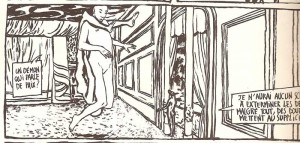
Conte Démoniaque [Demonic Tale] was published by L’Association in January 1996. Begun in 1992, Conte Démoniaque is, for the moment, the most colossal work of Aristophane[2], at no less than 300 pages in length. Fifty original pages were shown at the “Angels and Demons” exhibit in the Centre National de la Bande Dessinée et de l’Image during the Salon de Bande Dessinée ’94 at Angoulême. Apart from Lewis Trondheim’s Lapinot et les carottes de Patagonie[3] (from the same publisher), there isn’t, to my knowledge, a work of comics[4] as imposing as this. You would have to look towards Japan to find similar monsters, although, there the monstrosity of volumes can sometimes have the same poverty as the 48 page albums which hold sway in our part of the world. Only through the courage of the author and the publisher can such a brick distinguish itself from the rest of the comics produced. Of course, quantity isn’t sufficient to make quality, but be assured that with an author like Aristophane, quantity was a prime component of a project which, had it been narrower in scope, would have been only a summary.
Context
Conte Démoniaque resembles nothing else in comics. The story takes place in Hell. This Hell is nothing like those described by other stories, often just approximate reinterpretations of the old myth. This is Hell seen through the prism of the religion which officially gave it birth: the Judeo-Christian. Though, as will be seen later, Aristophane’s vision of Judeo-Christian Hell has been considerably enhanced. The reader is immediately plunged into a radical vision of this hell. Its basic principle is simple: to each sin corresponds a punishment, and the intangible spirit which decided it all doesn’t seem to be joking. It is interesting to note that to enjoy the inspirations of the devil, it is necessary to be in a time marked by faith. This is far from the case; even if the media continues to wave the ghost of religious intolerance over our heads, we must admit that the 20th century was far from being a century of religion. Therefore we don’t err in thinking the believer is a race on the path to extinction. The vision of the divine question proposed here is positively archaic and assumed as such. Of course, comics already overflow with deities, it delights in them, it loses itself in them. There is something aesthetic in the divine. But what citizen, tickled by a mystical streak, knows the true implications of faith? It is enough to look to The X-Files to realize that the pervading secularity cheerfully conflates faith and supernatural nonsense. Don’t be mistaken here: the aesthetic joy of our cheap mysticism has nothing more seductive than Roswell aliens. The most disastrous consequences of this are the results seen in comics: a soothing bestiary of small deities who boast of ruling the universe when they can’t even hold a candle to what scientist’s speculate about the power of particles. Depicting the gods has a particular joy, often the guarantee of special effects or the chance for the author to make use of his visual pyrotechnics. But on closer scrutiny, those gods don’t have the hoped for power, even less the mystery. In the end, who do they resemble? Only what the authors who created them are capable of imagining: themselves at their best, which is to say, nothing much.
Whether in comics or elsewhere, God is dead.
If only he had lived at least once in the former.
On the prevailing impossibility of being an author
Those who have read Comment faire de la bédé sans passer pour un pied nickelé [How to make comics without being taken for a stooge][5] by Cestac and Thévenet will remember Jeunot Boutonnex (Pimply Boy) who proposed a titanic adaptation of Dante to the publisher. Cestac and Thévenet’s small work, comical in its own right, taught everyone who feels a fiber of artistry a small lesson in humility. It puts everyone in their place while counseling the young, inexperienced author. It enumerates a plethora of people, each stupider than the rest, who do exactly what shouldn’t be done to obtain the favors of a publisher: too vague projects, excessive timidity, impertinent pretentiousness. While it is true that you must be methodical to get published, the lesson of Thévenet, finally, applies to what? It will be surprising to note: only on the manner of carrying yourself in front of a publisher. In this respect, “making comics” comes down to “knowing how to sell yourself,” and from there, no advice on the work itself, just a reading list. In fact, under the cover of giving advice on what path to follow, the single legitimate ambition of an author is outlined: don’t aspire to great works or, at least, make it only a secondary concern.
Cestac and Thévenet only confirm the common consensus about the making of comics: don’t aim too high from the beginning, tow the line like everyone else. The author, instead of being concerned with the essence of his vocation (for example, the search for meaning beyond technical skills), learns only to know how to stride down the alcoves of the publisher or the corridors of the A.N.P.E. [National Agency for Employment].
However, Comment faire de la bédé(…), which blatantly refuses all pretension, becomes a perfect little manual on the renunciation of all artistic ambition. What could have been “Letters to a Young Poet” is in fact only a scorecard.
Attempt towards and against everything
Following the example, but in another way, of the character described by Cestac and Thévenet, Aristophane began his Conte Démoniaque against all reason. He had at the time realized only Loghorrée [Logorrhea] from the publisher Lézard in 1993 and a book for children, Tu rêves, Lili [Lili, You Dream], but in his mind already, the threads, still loose, but never imprecise, of a dante-esque panorama, in the strictest sense of the word. Everything necessary, according to Cestac and Thévenet, for an author at the beginning of his career to get it all wrong.
Chance or justice, L’Association existed then and planned the publication of this work. It was possible to hope to see the day come that all other publishers would have refused.
L’Association certainly isn’t Glenat[6], and so much the better! I wouldn’t dare imagine a story such as Conte Démoniaque passed through the editorially correct filters of the big publishing houses. In our eyes, stories which offer a vision of the divinity lack inspiration, genius, a true “Visitation,” probably because God and the Devil, much like human nature, seem to be concepts too deep for comics creators.
Genre-based comics often lack a sense of the epic. They lack as sense of being full, complete, fierce, or monolithic. Authors of science fiction and fantasy (genres that are supposed to bring together the aforementioned concepts) lack either ignorance of the genre or the ability to transcend it. At times, a true sense of megalomania is missing, that which allows expression in the work and not in the ego (after a few cocktails or in the presence of photographers from a ministry).
Those who try to find their path following the examples of those who-do-well, only laboriously flaunt a gallery of citations. They so often put these after “as x said so well.” They make comics as we write high school essays: give the teacher what he wants, here giving the public what it wants while giving the publisher what it demands. And these last two always accuse each other of enabling those demands. As a result: “okay overall, pay attention to form, don’t take on ideas you haven’t mastered, C+.”
The industry passes over Spiegelman for daring to psychoanalyze on the background of the death camps. It passes on Baudoin for talking of love, and it misses Aristophane for talking of God.
God, as tempted as we are to evoke him, is defined negatively, at least, as: “that which isn’t… because…”
From what isn’t, it is possible to draw up a list. For want of anything better, everyone can rather easily find a definition by default. He isn’t that type of dull businessman limned with two strokes of the brush in Valérian (as mentioned elsewhere, all series become lame). We can laugh heartily thanks to the God of Gotlib, but that’s a matter of laughing and not God.[7] Above all, he isn’t one of those types who haunt the panels of heroic-fantasy (see above). He is… well, what is he then?
Aristophane, who engages this problem, doesn’t try to define him, let alone represent him: that would be a challenge. In Conte Démoniaque, he will remain a stranger throughout the story, this being that all the demons (whom, like all self-respecting fallen angels, they are supposed to have seen at least once) doubt. Even an angel (Abdiel) who is supposed to abide by his side, responds only that he has faith in his Lord. How intangible is this being if even his servants apprehend him only through faith! To paint such a panorama it would be necessary to share this faith and to know that you can’t call up this being over Being – a Hegelian abstraction – with impunity and without assuming the full consequences: painting infinity, omnipotence, eternity, that essence beyond self and world that can only be evoked by the sound of the ode, the hymn, and the high mass. It requires thinking back to Wagner, Mahler, d’Aquin and the others more ancient: Seneca, Homer, or Dante. Aristophane has done it.
On the story: false hopes, true expectations, the sense of the story
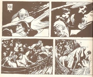
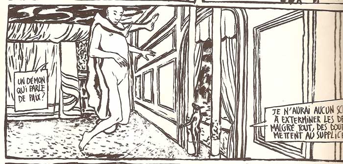
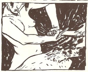
From page 4
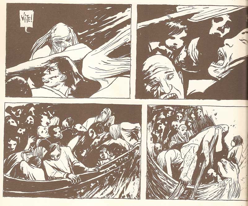
The tone is set from the first chapter: “The Reception of Souls.” Something surprisingly violent sleeps in this thick atmosphere: whether it is Caron who casts off with his strokes against the skulls of the damned (page 4), the sickly reception given to the damned by the first demons, or their sudden brawl amongst themselves.
The reader is immersed in a space both infinite and confined, immersed also in a court intrigue which won’t cease to degenerate until it reaches some inevitable denouement. Of the denouement, if it can be foreseen at all, we guess nothing, so much do the demons seem principally concerned by their personal ambitions. We let ourselves be convinced by the possible victory of Lucifer over his creator, so much does the existence of the latter seem questionable. As the demon miner Barbariccia says on page 41: “each living being, each of their acts testifies in my favor of the improbability of a unique power.” This is the blasphemous credo of all Hell. This credo resonates with the end of our century, essentially secular and atheist.
This infernal credo, strikingly clear in its empirical logic and objective doubt, doesn’t stop extracting its truth from the crucible of events. With each torment endured by the damned, with each demonic deceit, this improbability is there in reply. Everything works to the contrary of this “unique power”, even if the faith of Abdiel, already mentioned, reassures us on pages 110 to 118. By this time, the existence of God remains pure speculation for the angels. Making the former inaccessible to the experience of both sides, but above all inaccessible to that of the angels themselves, makes him a singular object for the speculative reasoning of his servants. This exceeds the simple issues of the blind belief in vogue today. This simultaneously renews the fixed doubt in force since the Enlightenment (and since Kant) and also makes this doubt moving, making it a condition of Heaven itself to render null and void the temptation of sects to raise their future members to the state of initiates capable of freeing themselves from this doubt. This puts into question the possible accessibility of certitude. It also becomes a lesson in eradicating all foundations of a lighter mystique, which comics know so well (even involuntarily paving the way for such). In this way the speculative doubt of angels and men becomes a moving interrogation, a mise en abime of the divine fractal.
This most empirical celestial genealogy that emanates from Conte Démoniaque quickly leads us to conceive of a universe divided in two: on one side the infernal world, on the other, the celestial world, in strict equality. God, the “unique power,” leaves space for a cosmic oligarchy.
Leaving aside this architectonics, the intrigues and conflicts which divide Hell face the reader as the dominant story: the complexity of the alliances that the demons take up amongst themselves through the fratricidal struggle between Bélial and Belzéboul, Lucifer’s two generals. The nature of the demonic character would let one suppose that no hierarchy is possible, that no order could be respected. However, as the narrator on page 70 summarizes, there does exist a hierarchy which, although knocked about by so much fury, has not really evolved from its original state. But this hierarchy, maintained essentially by violence and repression, is respected only as much as each party can profit from it. It is easy to imagine that Lucifer is the most powerful of the demons, and no one can overthrow him. What’s more, the order here is really just a parody a order, a derisory pantomime which is played out rather than a following of true order, that of God, each taking the least occasion to overthrow and humiliate those weaker than themselves, or to substitute an equivalent power.
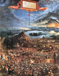
Altdorfer's La Bataille d'Arbele
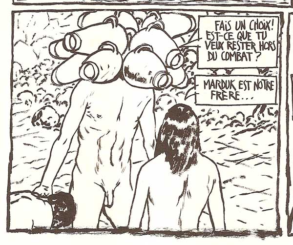
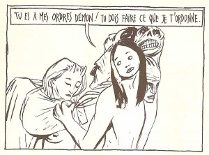
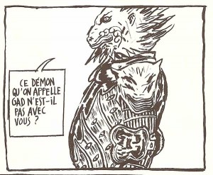
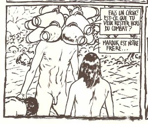
So goes the diverse alliances, and the consequences don’t matter when Baalbérith, by simple stupidity, chooses to make mincemeat of the demon Mot, who is jealous of Baalbérith because of his lover Gad. Lucifer having left to battle God himself with “a thousand legions” (62) in the “belly of chaos” (61), alliances and treachery continue to weaken the minor hierarchy in the absence of the masters. The real force of the story is born from the apparent importance of these conflicts. We feel that the real combat occurs elsewhere, in the “belly of chaos”. Everything evolves as in the celebrated painting of Altdorfer, “La Bataille d’Arbèles,” where above the clash of armies, another more terrible battle is fought between the light and the dark, and so that of man (here, the demons) is only of minute consequence, a distant echo. Through the actions of Baalbérith, Lilith, Nijt, Azazel, or Marduk, we perceive how their battles are barely a rustling of the universe, the quivering of a bubble which breaks the surface of the ocean. Returning again to the “improbability of a unique power”, the reader is surprised to believe in, even to hope for, a possible demon victory. But with the liberation of the great Leviathan, that which was forgotten from the quietly unfurling story reappears relentlessly. Then nothing seems able to stop the destiny which, from that time on, condemns Hell to annihilation. We are confronted with a remarkable rise in power, as if time has accelerated at the height of the “Leviathan” chapter. Perhaps Lilith and Mastemah will manage to stop the foretold cataclysm? A strange call to technology then intervenes, a call already evoked on page 26, backed up by the threats of Marduk on page 69. A truly appropriate image appears for talking about today’s devastating fire: the A-bomb.
This incursion of technology into the divine has the double effect of increasing the fear of the possibility of the demons’ extermination (resonating in this way with an actual threat to the reader) and pushing in the other direction against the limitations of their power. This interest brought to technology shows us the demons submitted to a kind of temporality that is implicit in the concept of progress. The impression of danger in the face of atomic arms, through its extreme menace, underlines the weakness of Hell even more in relation to the divinity which it opposes. After all, what can a nuclear arsenal do faced with the divine power, a priori limitless, when such an arsenal already seems pathetic in the face of the Hell-devouring Leviathan? From this point on, what demon can be sure of his blows? What we see as the last hope of victory begins to look more and more like defeat.
In the space of 3 or 4 pages, Aristophane has us truly see this raging Apocalypse. Here the improbable “unique power” stands out by its absence. Nothing is explicitly shown of Heaven’s victory (a representative of God would be an error). If victory it is, it is written in the negative: the failure of Hell implies it. By its own nature Hell condemns itself, each demon’s illusory state of freedom is only a poorly run deviation of the free arbiter, and in the end there is no need for Heaven to intervene (Massebah, presented as an angelic being, is hardly made the instrument of divine Providence, Marduk having already made his choice long ago).
If Aristophane chooses to paint in a rather brief way the final catastrophe, it is because he tries to show us how useless it is for Heaven to intervene in Hell’s drive towards its own defeat. Not intervening proves and manifests in the negative its omnipotence. Not acting is truly a God who acts.
Outside of the radicality of the fate reserved for the damned, with this story Aristophane renews the classical tragedy where nothing happens which hasn’t already been foretold. One could see here an allegory of man’s future doomed to destruction if he continues in his short term plans or in the arms race, but this would make of Conte Démoniaque a very poor parable. It would be better to just read into the book a care for rendering the human condition under a more existential light: a metaphor for the implacable destiny which mires our passions. Perhaps Aristophane even talks to us of himself and the anguish that torments him, with the secret hope of one day seeing them domesticated by a strong internal discipline or purified by fire. Whatever the case, and naming the chapters as “Spirals” seems to prove this, Conte Démoniaque, even if it doesn’t illustrate a strongly Jansenist intention, is quite readily inspired by the forces which animate the great karmic wheel.
On the form
It must be tempting to paint Hell full of sulphur with high angled shots over panoramas of teeming armies, breaking out of the panels, giving it theatrical lights and painting grand scenic backdrops. In place of this, one is almost surprised to see the poverty of the expected scenery in Conte Démoniaque. If the drawing alone takes on a very refined expressionism, the breakdown of the page into three equal strips seems opposed to the demands of the subject. The point of view is almost exclusively frontal, “at demon height” which we can estimate to be from 10 to 40 times larger than the damned.
From page 7.
Graphically, Conte Démoniaque has no precursors. Perhaps at the beginning of its conception (previous to what we already know) there was still a slight Baudoin[8] influence, especially in the character of Cella Créanga, but it is quickly digested, leaving in its place a stiff, slashing brush line, occasionally at the limits of legibility. A relative equality of treatment brings unity to the whole, even if it is easy to observe an evolution. The final scenes are certainly much looser then the first ones, but this changes in concert with the urgency of the story and the violence of the events they produce.
The complexity of the relationships between the demons is such that the chaotic aspect of the drawing can make reading Conte Démoniaque a little difficult. To understand the events it becomes necessary to flip back in the book to identify characters. But this dissolution of the narrative sense, this loss on the level of detail, is to the benefit of a strongly sensory global perception. In this way, the whole of the work, constructed of six vast chapters (“Spirals”), moves forward more as an uninterrupted flow of pure forces than as a sum of machinations skillfully plotted by crafty characters. Attesting to this are the frequent images of the infernal rivers that tempt governor Béhémoth-Resheph. The incredible rise of power, which culminates in the freedom of Léviathan, confirms the wish of Aristophane to talk to us in terms of flux, flow, typhoon, plasma.
Aristophane uses a tactic which subtly intensifies the imminence of the catastrophe: a shift towards white. As the story advances, the weight of the black leaves way for more space. While the protagonists’ range of action seems restricted to a few mountains, the visual field, on the other hand, is enlarged to lead us, with increasing speed, to the vision of Leviathan, in acknowledgement of its voracity. The use of white is not only symbolic, it becomes palpable, sensory. A sensation of warmth covers the page.
In this respect, the representation of Leviathan is a perfect success. The doubling of the line, owed to the exploitation of the deterioration of the brush’s tip, points, through an effect of the flow, at the same time to the fury of the monster, the blaze it emits, and the immensity of its size. The final disintegration is only a matter of the moments when the drawing itself seems to crumble. The vibration of the line which thins out towards the light evokes as much the melting of the rocks (which Behemoth-Resheph, the basaltic demon, can no longer contain) as the belated reconversion of Marduk, Asmodee, Lilith, or Gad.
Work on the body
The fierceness of the story, whether linked to the events told or the the cruelty of the characters, is also conveyed through the nakedness of the bodies represented. This nudity, different than that found in nightmares of humiliation or offered to the gaze of others, here evokes the fragility of the bodies, treated as slave labor and tortured at will. No doubt we believe that the soul can no longer feel after death, but, like the promise of the resurrection of the body, and unlike the glorious bodies of the elect, we await in Hell a body of suffering.
On page 9, a damned cries out: “I thought I had no more blood, the soles of my feet are red.” And even if we doubt it, the experience of demons pouring a bowl of molten lead down one of the damned’s throat, which follows on page 12, doesn’t incite us to cry victory.
Conte Démoniaque, which attempts to paint the delights that await us, besides being a metaphysical parable, claims to evoke, with the same force as the pictorial intentions, our very sensitive skin. What surprises then is that the demons are also prey to an equal sensitivity, prisoners of flesh which no longer benefits from the care of the dead, since it lies in that place where everything is eternal. And everyone evolves through moaning, through writhing, creators of their own misfortune.
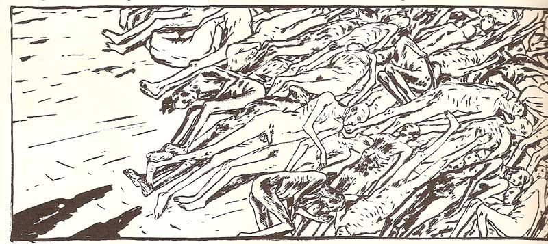
The drawing of Aristophane testifies to its undeniably classical origins. The surface appearance: shaky, sketchy, covered with brief marks, is only the surface of a remarkable figural work. Few comics draftsmen manage to render skin in such a palpable manner. As mentioned above, this work of representation could be a domain reserved for the painter, but here it reaches an expressive quality comparable to that of Lucian Freud, for example: the texture of the skin, the materiality, a skin pigmentation which seems to tremble to the touch and, here principally, suffering. The scenes with the damned which most speak to this subject are those of torment (pages 93 to 99) or their “escapade” (pages 169 to 210).
From page 188
It is impossible to not think of the Holocaust when reading page 188. The display of the emaciated bodies evokes a story that we know without knowing. Aristophane stops himself here, no doubt so as to not wallow in this tragically rich iconography.
The only difference, which keeps Aristophane from prolonging the parallelism, lies in the fact that here the torture is meant to be justified by a divine order, the sole authority capable of weighing our acts. The problem of the death camps remains the fundamental gratuity of the punishments. If the author borrows from the drama of the Shoah it is essentially to draw out that the ultimate meaning of torture remains archaically physical, and that there is nothing more painful than the body when the soul has for a long time been reduced to shreds. What we place so high then becomes only an epiphenomenon of matter reduced to ashes much more by the fickleness of its nature than by the insult of the sins attributable to it, and is, in fact, only its infinitesimal consequences.
However, the idea that punishment can be totally gratuitous, as was the case in the death camps, is, in a certain manner, legitimate. In fact, thinking that damnation is really the work of God, returns to suffering the meaning that it lacks, a way to be able to “survive” it. But Hell isn’t supposed to be a stay that can be survived. It is stipulated that one must abandon all hope. In what way can suffering be rendered unbearable? The nazis understood it: in removing the meaning from it, in allowing belief not in the objectivity of the judgement but in its absolute gratuity, allowing belief in its purely arbitrary decision, taking from contempt all possible transcendence. Besides, isn’t the ultimate sin in the eyes of God, this contempt that the damned carries during his earthly life for the Divine? It would be too easy to raise the veil after death so as to bring to the damned what would be only the beginning of certainty, certainty which would validate the absolute legitimacy of his fate. For the damned, the contempt or the denial of God which guided him all his life must continue to guide him in the infernal abode. In this way, the doubt brought to the existence of God leads the damned to suffer through what he always detected in his life: the absence of meaning in the universe. And the most terrible way to be subjected to the absence of meaning is to suffer eternally without reason. Therefore the damned can’t have knowledge of the divine judgement in Hell since it would be a way to get out. Just like the defeat of Hell manifests in the negative, the victory of Heaven, the full horror of punishment requires total gratuity.
The references
For the global structure of the story’s Hell (circles, monsters, hierarchy of punishments…) Aristophane clearly borrows from Dante’s Divine Comedy. But he equally drew from his culture, which gives his story the invention, richness, and diversity necessary for its singularity. It’s almost tempting to talk of ecumenism.
The representation and nomination of the demons borrows from a global demonology. If the Divine Comedy orients the general intention, if the Bible is implicit in Conte Démoniaque, it isn’t any less necessary to look towards the Flemish bestiary, Afro-Oceanic statuary, and even Japanese theatre to take in all of Aristophane’s fields of inspiration.
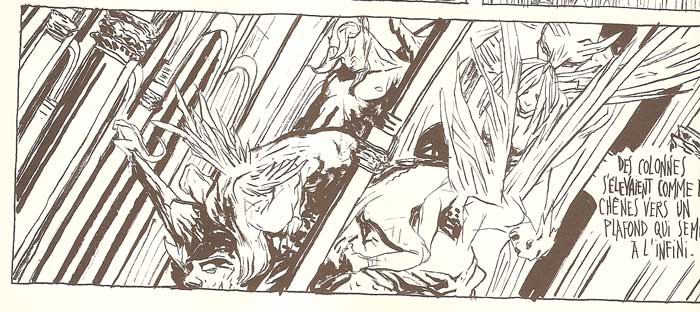
The columns of the palace of Saachem from page 8.
For the graphic technique, Aristophane owes, in part, his work to the drawings of Rodin, whether by method or direct citation. It is difficult to miss “The Gates of Hell”, cited on the first page, and recalled in the gargoyles pouring down the length of the immense columns in the palace of Saachem. Although one must think, in the form of comics, of the sacred androgyne Imperoratrix from the Incal, the character of Massebah (the angelic entity who will guide Marduk to the liberation of Leviathan) comes above all from a sketch by Rodin representing two bodies back to back; a sort of Yin-Yang of the flesh. As for Siyim (page 124), he can recall, by his position, the disturbing stability of Giacommeti’s “The Walking Man” (L’homme qui marche).

The sacred androgyne from The Incal.
Massebah from page 242.
In a quick overview, we can take pleasure in spotting the source of inspiration for each character. This game, better than putting on a display of culture, can make the reader participate in the joy of it’s richness. Because Aristophane never cites what would give the appearance of erudition: one can read Conte Démoniaque in ignorance of its sources.
If Siyim can evoke Rodin, and recalls the crimson Endoguard of the Incal, he is drawn, like Debet, from the collages of Max Ernst. Ernst used the figure of a man with the head of a tiger several times, which must have permitted Aristophane to more easily limn his character.
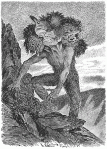
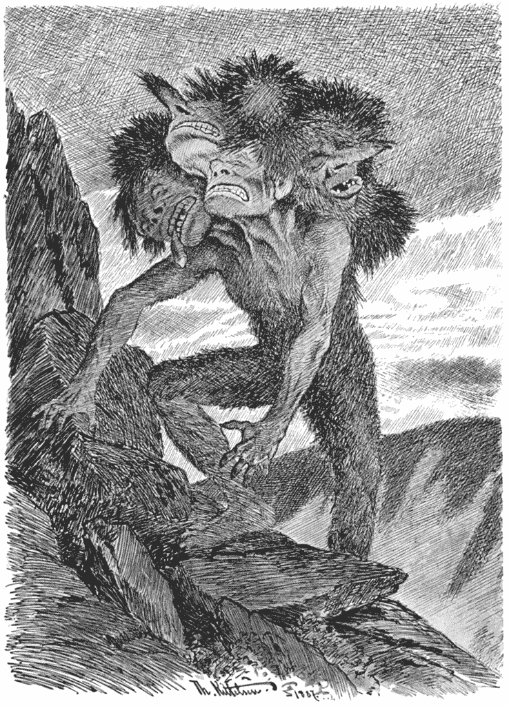
Théodor Kittelsen's Der Herbende Bergtroll
Ballberith from page 24.
Baalbérith, the strange and unpleasant multi-headed demon who greets the first damned, is borrowed from a drawing of Théodor Kittelsen Der Herbende Bergtroll (some kind of “rock troll”).
Péor, a minor demon who appears towards the end of the story, strongly recalls one of the tormenting creatures of Martin Schongauer’s Saint Anthony.
Asmodee from page 219.
Asmodée, who also appears towards the end of the story, isn’t a direct citation. He is inspired from the representation of sea monsters on maps from the beginning of the Renaissance: the head of a lion with its mouth circled by curls. One can note that he is equally the only clothed demon. He wears armor, which suggests both his strong imagination and his impetuousness. In the traditional demonology, Asmodée is the demon of anger and lust; he is both conquering warrior and artist. Everyone must cede to his desire, and it is primarily to obtain the favors of Gad that he chooses to fight against Marduk.
Behemoth-Resheph, in his way, could refer to Incan statuary, but equally recalls the antique deities of the Mediterranean basin. The telluric function of the demon could be illustrated by this choice, more iconographic than symbolic.
Lilith from page 268.
Lilith is, if I’m not mistaken, is a figure from Kabuki theater. Page 268 is in this regard a striking example. As for Ninmah, the surprising demon with heads of amphorae, is a direct citation of an etching of Gustave Doré representing a bearer of… amphora.
Ninmah from page 274.
Besides Rodin’s “Gates of Hell,” you can’t look at the battles which punctuate the whole of Conte Démoniaque without thinking of Aldorfer’s “La Bataille d’Arbèles,” already cited. But the heaps of bruised skin and pestilential buboes, reminiscent of “The Temptation of Saint Anthony” and “The Crucifixion” of Gruenwald’s Isenheim altarpiece, aren’t any more foreign to this world of decomposition.
Of course, Aristophane doesn’t stop at visual references. Apart from the essentials, drawn from the crucible of The Divine Comedy, the rest, like those mentioned above, all enrich the details rather than overburdening the whole, which is already sufficiently complex. During chapter four, “The Escapade of Shadows”, a strange demon with the head of a bull (recalling Moloch, demon of children) cites in the text a passage from Romeo and Juliet[9]. This passage acts as an ironic counterpoint when one knows the fate of the damned, lost in the infernal labyrinth. It is hard to not also think of the minotaur, when the idea of the labyrinth is associated with the monster. Much earlier, on page 27, a passage from The Damnation of Faust by Hector Berlioz, reads: “the path to the abyss / similar to the great birds of prey.”
It would be too much to make an exhaustive list of all the references which fuel the present work. It is hoped the long summary above is sufficient to make note of its amazing richness.
The end of the story
Thus, everything overlaps, clashes, weakening the reader, shaking him. Conte Démoniaque, despite the abundance of its sources, becomes the key to itself. Nothing is there due to chance; nothing is there which requires specialized knowledge. It is a delight for those who find the references during the course of the panels, but it is not a handicap for those who ignore them. What could be lost in readability is gained in power, so much so that in the end one asks if the voice-over narration, identified in the end to Massebah, isn’t that of Aristophane himself who, as a good narrator, situates himself in relation to his story. He easily juggles several points of view, disrupting the reading in several places through diverse levels of commentary. This artifice has the merit of creating a sort of instability or disruption. Aristophane flirts with omniscience in his story while avoiding giving away future events, which provokes a supplementary doubt in the reader, an anticipation and fluctuation more on the global sense of the story than on the story told, obliging him to make a back and forth movement in his own position.
However, like Dante led to Hell, Aristophane testifies to what he has seen with terror and fascination. If Massebah uncovers a piece of the veil at the end, Aristophane equally confides in us his desire to eradicate the totality of the evil which sleeps in him and which is annihilated in a great fire.
We could criticize ourselves for not getting more attached to the damned. After all, it is perhaps they that we risk resembling some day. But in the end it is very hard to identify with souls presented as guilty, not in the gaze of man but in that of God, in the same place where supreme mercy is not granted them. We say to ourselves: “After all, they had to have done something bad to end up there!” and saying this, we find ourselves like those innocent fools who pronounced those same words after the projection of Night and Fog, from which the use of the reference to the extermination camps, keeping in mind the profound and obvious injustice of the place, only shows our incapacity to comprehend and to tolerate the unfathomable mystery of divine providence: shadows among shadows. But this non-attachment to the fate of the damned reminds us also of the essential goal of the story: it is not a clash of characters with opposing desires or ambitions, it is a virtual war which abstract entities devote themselves to with the goal of summing up the universe in a unique equation.
With Conte Démoniaque, it is no longer the end of times which is proposed but the end of fiction, the end of the possibility of all fiction, the end even of our imagination beyond the single hour guaranteed of our capacity to project a future, to represent abstractions. After the passage of Leviathan, nothing survives. It is the great return to “eternal things”. Retroactively, it couldn’t be anything else, the weakness of other stories of the same genre being that something always remains: a gem, a sword, a spell buried somewhere that an innocent could dig up and so spread Evil anew. But here, there isn’t that weakness. It is truly the ultimate story, since the annihilation of Evil makes all idea of movement, all change, all history, disappear. It is impossible to hope for future developments after Conte Démoniaque, since it is the place where the future stops. Naturally, in postulating an all powerful entity, one infers its indubitable victory.
Many authors have struggled with this: renouncing, during the course of a story, the concept of the all-powerful to the benefit of the “very” powerful, as if the radicality of an entity endowed with absolute power prohibits the possibility of narration, as if this same entity contends with the ego of the author. Courage is certainly necessary as is the determination to dare paint such a universe, such an entity. But isn’t this the essential condition for getting past the only problem of contemporary comics, which makes the ego of the author so sacred that it no longer knows the great responsibility which is owed to the “telling”?
The success of Conte Démoniaque is essentially pinned on this way of having chosen to augment the sphere of doubt, and therefore to reduce the possible temptations to the omniscience of the author, of the reader, of the human condition in general, these days a prisoner of the freedom painted for us in the media and through illusory popular wisdom. Conte Démoniaque becomes one of the first stories in comics which imposes itself with the effulgence of a theophany obtained under electro-shock. The Apocalypse which closes it makes the work revolve entirely around a principle question: if God exists, can there also be a Hell which doesn’t abolish itself, in the short term, on its own? And the reader could almost hear in response the final verse of The Legend of the Centuries by Victor Hugo: “I have only to blow and everything would be shadow.” It is in another way, but in response to the same question, that, after the cataclysm which signals the End of Times that the angels will live through, Aristophane chooses to say: “in a perfect light, a perfect bliss.”
Translator’s Notes:
Thanks to Fabrice Neaud for allowing this translation and apologies for any distortions I have made of his words. If anyone wants to read the original version let me know. Thanks to David T for helping me with some of the French. Thanks to Domingos for providing the idea and the scans of the article.
[1] Fabrice Neaud is a French artist. His four volume Journal (Ego Comme X, 1996-2002) is a massive, diaristic comic drawn in a realist style that has won numerous awards and is considered one of the major works of the genre. You can read an English translation of an excerpt from Journal 1 as well as an English translation of his short story “Emile.”
[2] Aristophane Boulon (who published just as Aristophane) (1967-2004). His Les Soeurs Zabime (Ego Comme X, 1996), published the same year as Conte Démoniaque, will be published in English translation on October 26 as The Zabime Sisters (First Second, translation by Matt Madden). It was his last work of comics.
[3] One of Trondheim’s earliest (and largest?) comics. I wrote a bit about it here.
[4] Throughout I use “comics” in place of “bande dessinée.”
[5] A comic album about an editor (or a group of editors) at a comics publisher.
[6] L’Association is one of the major independent French comics publishers (and surely one of the biggest publishers ever to not have their own website). Glenat is the second largest French comics publisher.
[7] Valerian is a very popular and long running science fiction series by Pierre Christin and Jean-Claude Mézières (British publisher Cinebook put out the first volume of an English edition this summer). Gotlib is a very popular French cartoonist, primarily of humorous work. I’m not familiar with him or his use of God as a character.
[8] Edmond Baudoin, a French comic artist, whose work is primarily drawn with bold brush strokes, that do seem like a clear influence of Aristophane. I wrote about his Le Voyage (1996) last year.
[9] Romeo and Juliet (end of Act 2):
Ah, Juliet, if the measure of thy joy
Be heap’d like mine and that thy skill be more
To blazon it, then sweeten with thy breath
This neighbour air, and let rich music’s tongue
Unfold the imagined happiness that both
Receive in either by this dear encounter.