Freedom

I recently deserted the mainstream of comics and this month, the first product of my emancipation, an improvised comic with a flexidisc attached called Post York done in collaboration with my son Crosby is being released by artist Tom Kaczynski’s alternative imprint, Uncivilized Books. Although there may be little financial compensation forthcoming, I couldn’t be happier. Because I am free now, free of digital fonts and color, free of the dictates of corporate editors, marketers and number-crunchers, all fearful of offending middling demographics. Some of my contemporaries have likewise abandoned corporate comics; perhaps because of the increased visibility of inequities like the Kirby family’s loss in court to Marvel/Disney’s crush of lawyers (largely due to testimony by an invested individual with a famously faulty memory), as well as anti-creative projects like DC’s Before Watchmen.

While the mainstream seems locked into a suicidal transition into collector-unfriendly digital formats;  the print alternatives are taking advantage of the fact that comics and graphic novels are a fast-growing portion of the dwindling book market. As the mainstream devalues individual accomplishment in favor of collective product that is actually primarily intended for adaptation to other entertainment forms, the alternative gains ground in sales and critical attention. In fact, by their near-universal acceptance, the leading luminaries of the alternative like Art Spiegelman and Chris Ware now risk becoming a new establishment, which will eventually need to be overthrown in order for the next alternative to be formed.
___________________________________________________

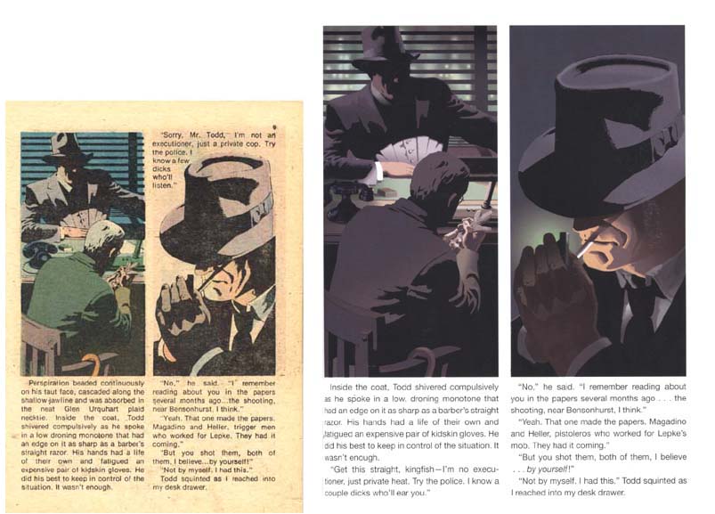
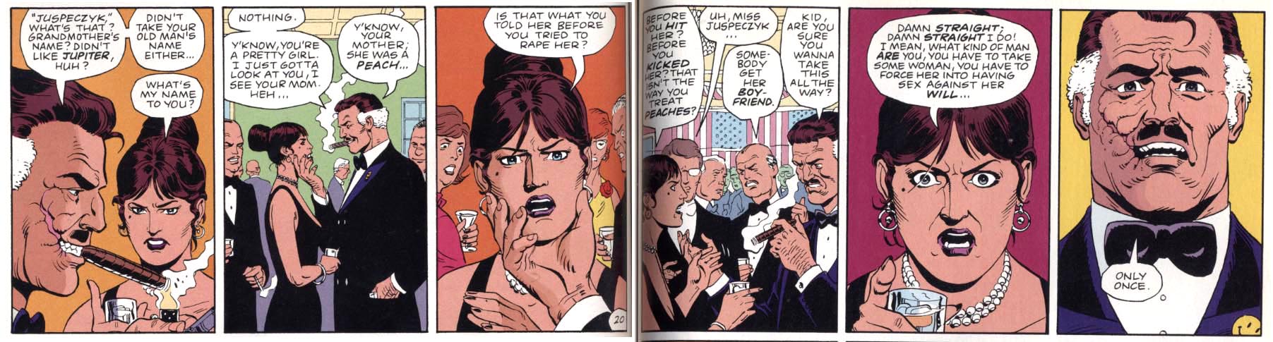
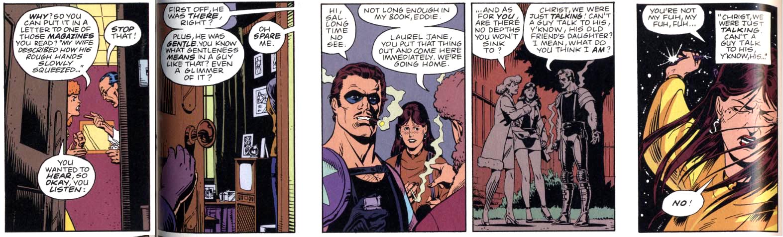
But that revolution is still a ways off. And, some alternatives have not yet completely divorced from the look of the mainstream. In 1999 I drew one of writer Greg Rucka’s earliest comics scripts, “Guts” for Vertigo’s late horror title Flinch. Rucka writes stories that might as easily be realized in the mediums of film or television, but he became an acclaimed comics writer for DC and Marvel. However, he has in recent times taken a stand against their abuses and his newest work Stumptown is published by a small alt-comics firm Oni Press. While it has a digital surface similar to that of the mainstream, it is bereft of the focus-group mentality of the corporate comics product purveyors. The story has a downscale title, it features a female lead character of funky agency and wry humor and Rucka’s collaborator, the artist Matthew Southworth is not slick, but still gives the work the seemingly effortless video realism that it needs to be believable, and more: Southworth is capable of hard-to-accomplish nuance. For instance, he manages to make it quite clear that the lead character’s brother has Down’s Syndrome without resorting to caricature.

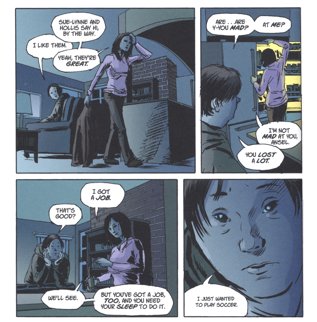
Matthew Southworth’s video realism

Southworth’s layouts are exceedingly clear and his inking is contemporaneous but organic, and although I have an aversion to digital color, here it works and is particularly effective in the nocturnal concluding sequence. As with many recent book trade repackagings of periodical comics, the $29.99 hardcover of the first four issues can seem an overly upscale presentation of what is essentially pulp crime fiction, but the book gives the reader a complete story that is as absorbing as an HBO miniseries and also has the appeal of pure comics storytelling.
___________________________________________________

Koyama Press puts out elegantly designed books that are more distantly removed from the look of mainstream comics. Koyama’s recent output shows quite an extreme range of publications, their only unifying factor their beautiful production values. I have been taken aback by the prices of alternative comics, but as Marguerite Van Cook points out, Koyama’s efforts and those of other alt/lit comic books reflect a sensibility that opposes the mainstream model. Mainstream pricing is not cheap either and is supported by advertising. Their books are apparently geared primarily as concept generators, to which end they privilege character/property and devalue artists. The comics can be published at a loss because they are underwritten by the corporation as pools for movie ideas. By contrast, a Koyama comic, for instance, is an individual accomplishment that is facilitated by the publisher;  the final product is all about the value of the artist, all about being the most clear expression of the person who made the book.

Eat More Bikes by Nathan Bulmer is a collection of one or two-page jokes, literally a “funny-book”. The book is nicely printed and although digitally toned,  the art is scratchy and clearly drawn by hand—it reminds me a little of early Peter Bagge.  I found the pages to be sometimes mystifying, at times disturbing, some were hilarious even, but I’m thinking that I may not be the ideal audience for this thing.

Nathan Bulmer: the tribe clown

The photograph of the author on the back page depicts him with the beard that he grew while drawing the book, thus he takes ownership of his product and self-identifies as a member of a tribe, a generation perhaps, of shared sensibility—-who more than I may greatly appreciate his humor and want to support his efforts by paying 10 dollars for the comic he made.

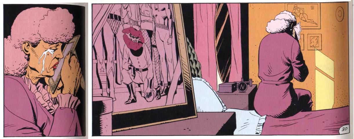
I can relate better to another, identically priced Koyama offering, Sunday in the Park With Boys by Jane Mai. The striking cover depicts a black and white figure of a young girl decked out as Sailor Moon with a monstrous bug crawling over her head, on a blue ground. This image and the quiet desperation of the contents counter the sweetness of the title. The protagonist is a teenaged girl, however she is not well socialized with her peers but rather a terribly isolated individual who often wears an eyepatch (whether by necessity or for affect is unclear) and works a job in a rarely used wing of a library. The pain of her loneliness, however self imposed, is palpable.

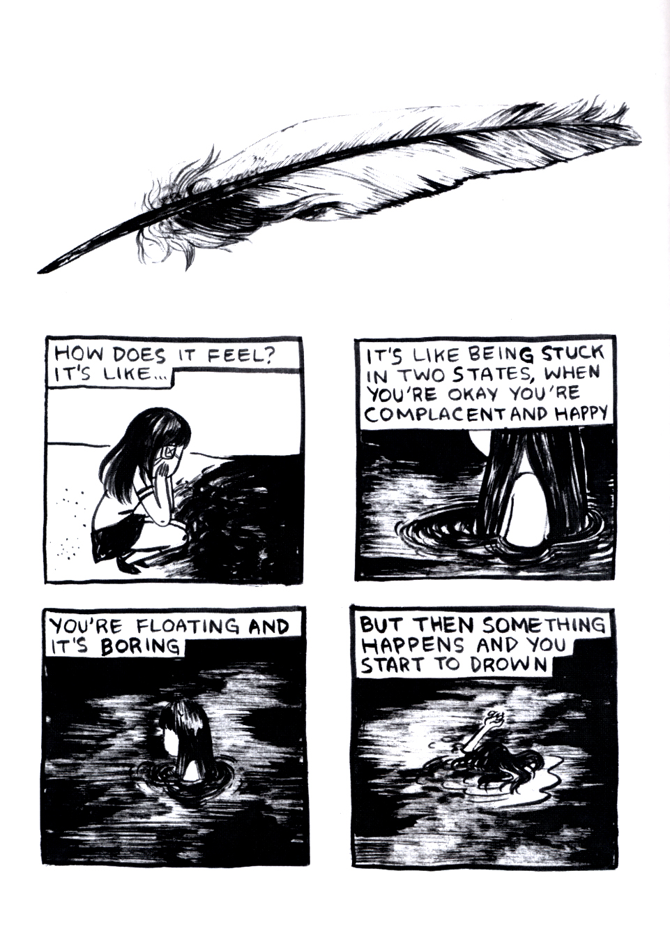
Jane Mai: the ache of isolation

The panels are stark and simple but heavily inked with a drybrush technique and each short sequence in the story begins with a more realistically rendered drawing of an object: a key, a cellphone, a quill, a hand mirror, a pair of panties; these and the bug motif that creeps through the comic anchor the narrative to the “real world”. The first time I read the comic, I found it depressing; on rereading I began to see how the character comes to grips with what is going on in her mind to transcend it and that the story expresses a sort of universality of lonesome youth.

Two other Koyama books, entitled Wax Cross and Baba Yaga and the Wolf, are the work of a collaborative duo, Pat Shewchuk and Marek Colek, that call themselves Tin Can Forest. These full color magazines are astounding efforts and disorienting reads.  They are “comics” only in a broad and strangely fluid sense, because the panels run together, due to faint or nonexistent boundaries between them and across the spread of the pages. The panels themselves are done in techniques that I am unable to identify; they look to be full paintings, perhaps partially done with stencils.

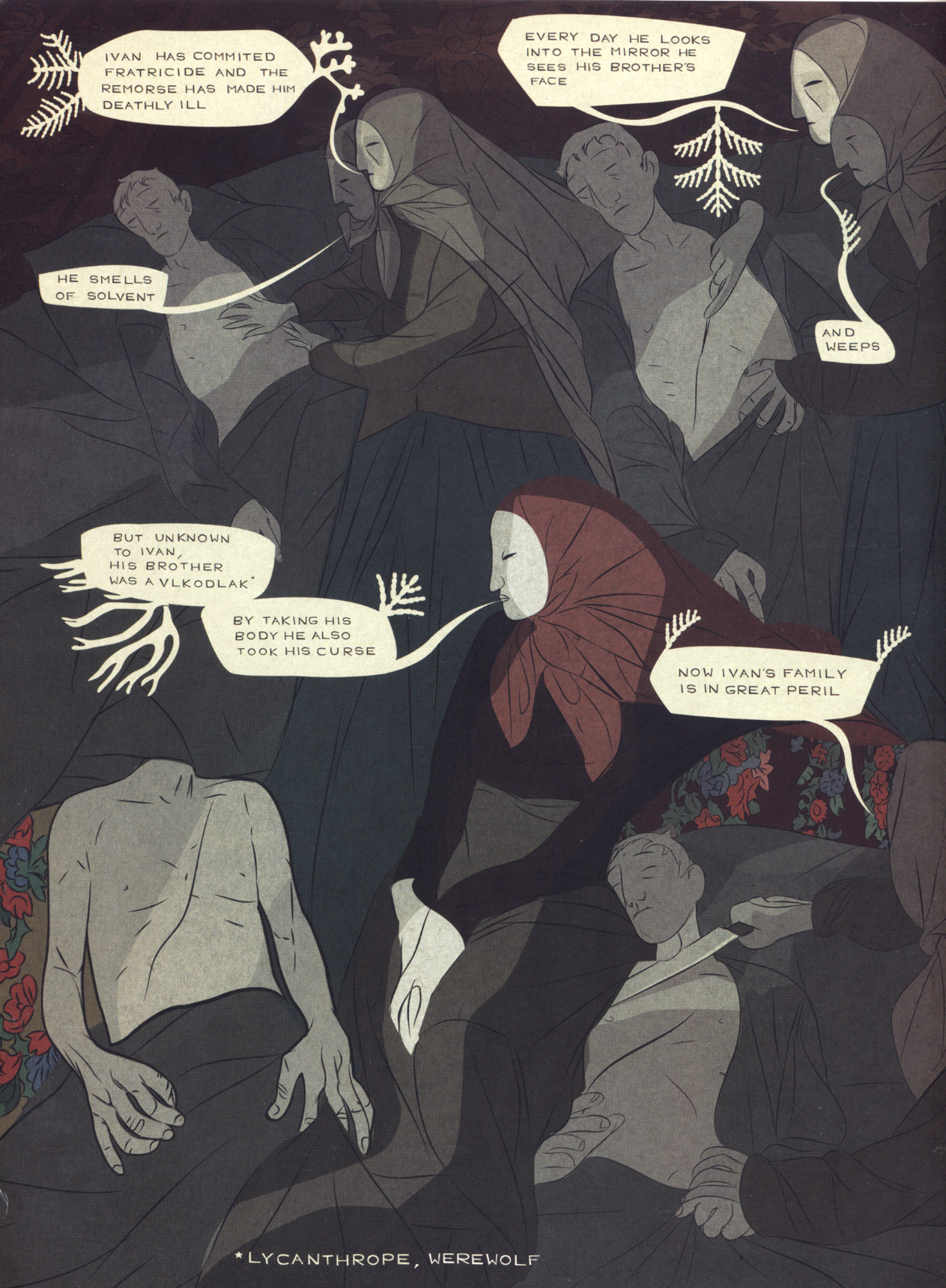
Tin Can Forest: finely wrought

Beautiful and confusing, the levels of thought, skill and effort involved in these publications justifies their cost of $20.00 each and they surely push towards the realm of finely printed art.

___________________________________________________

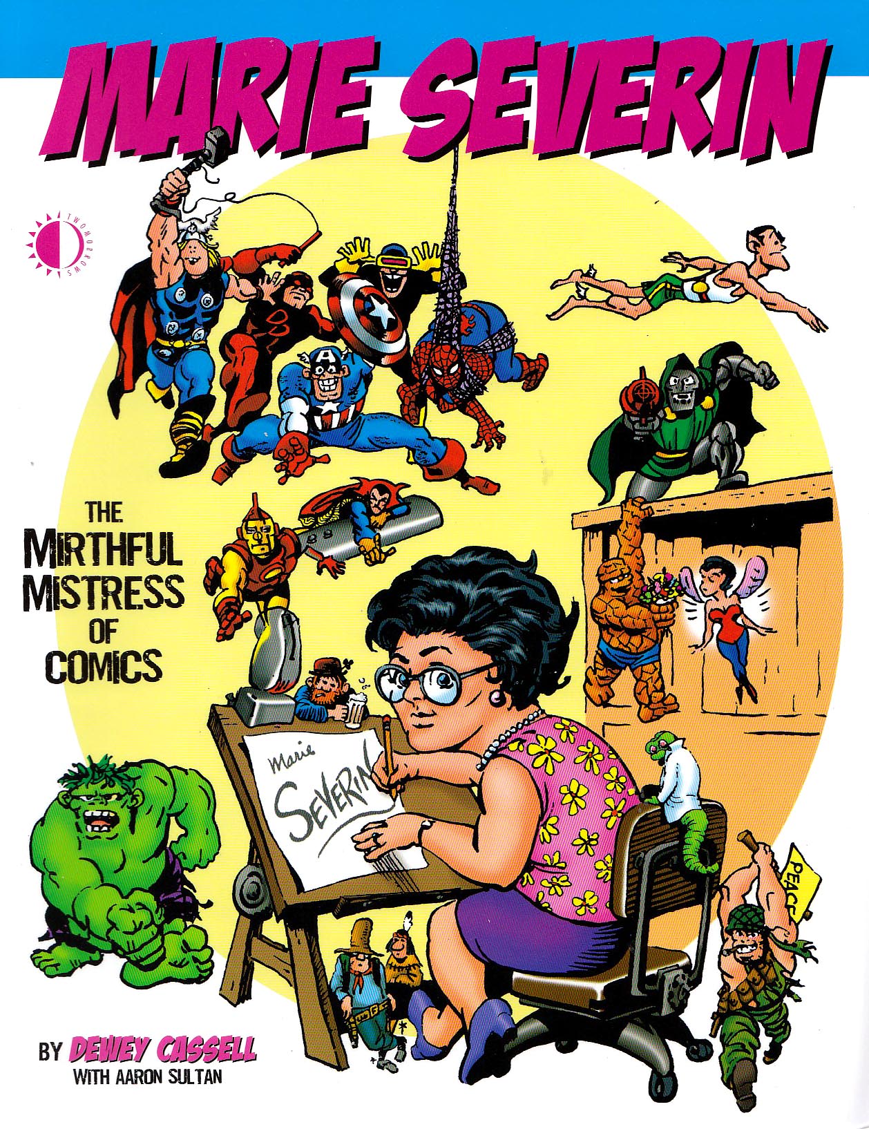
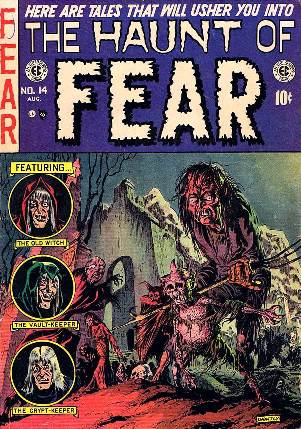
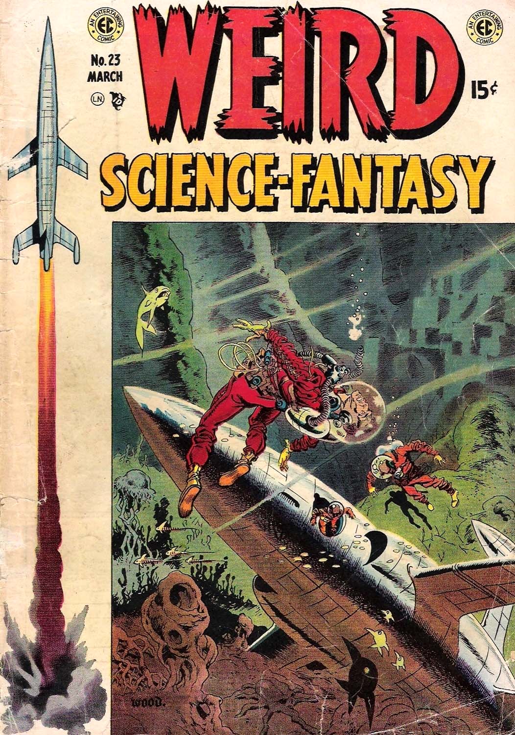
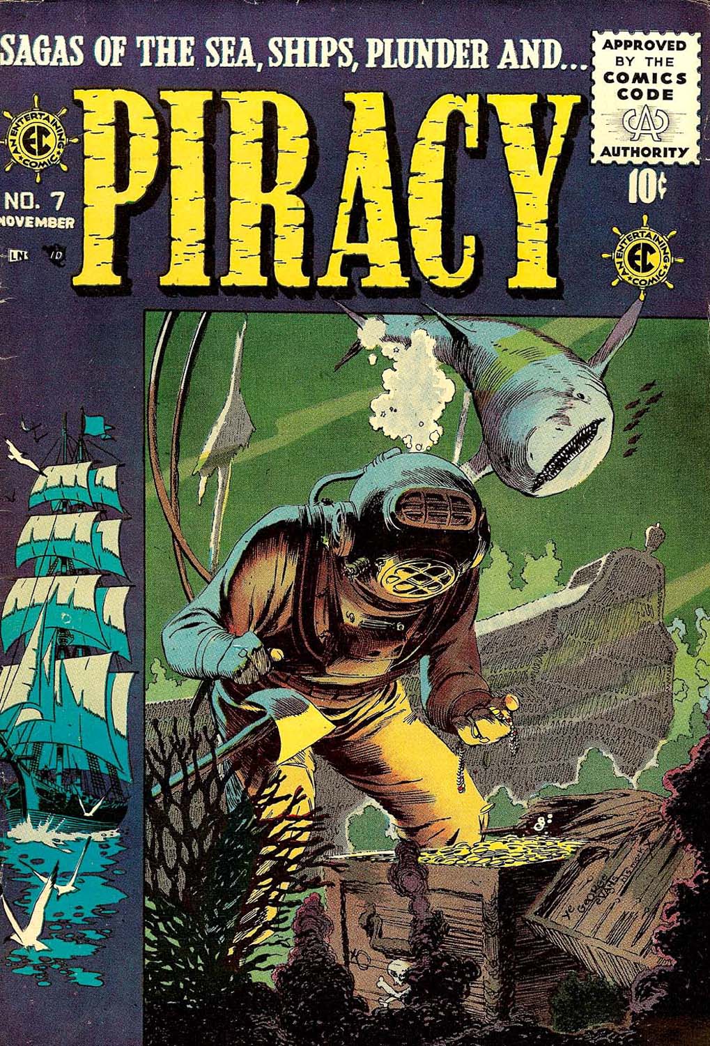
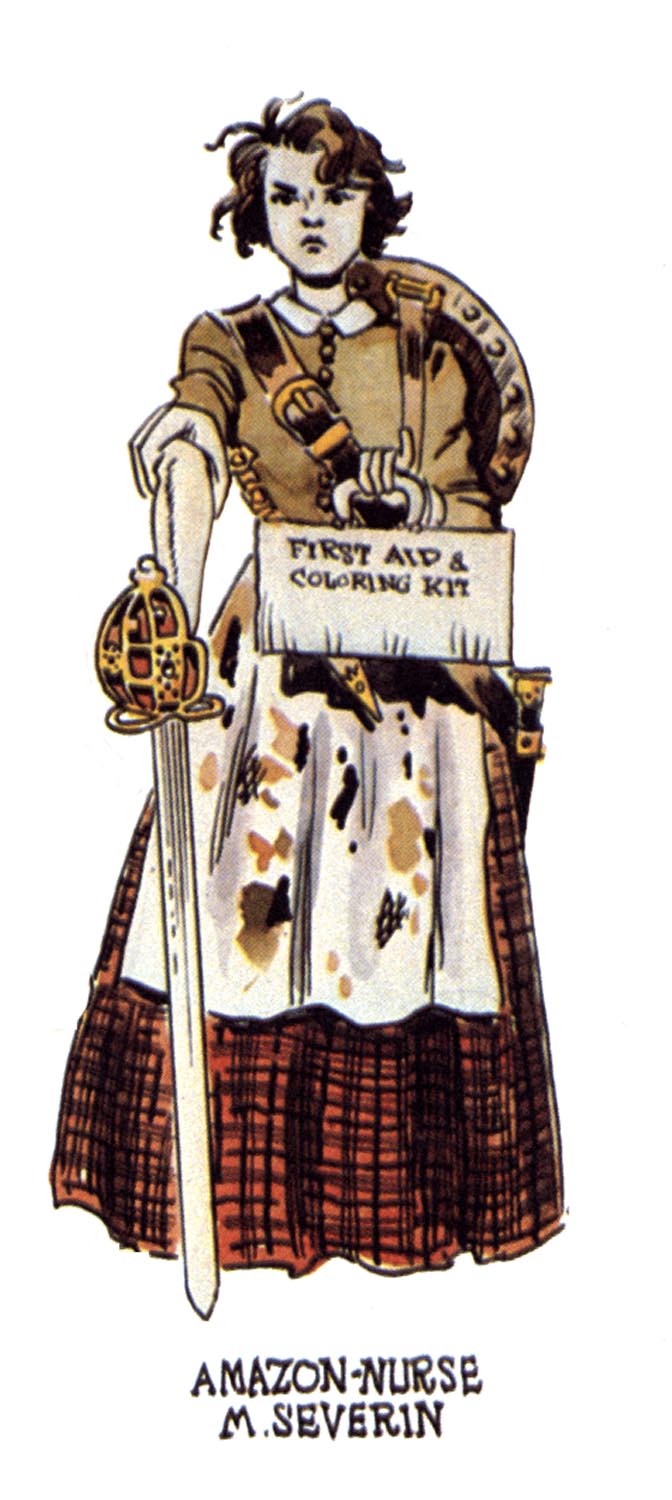
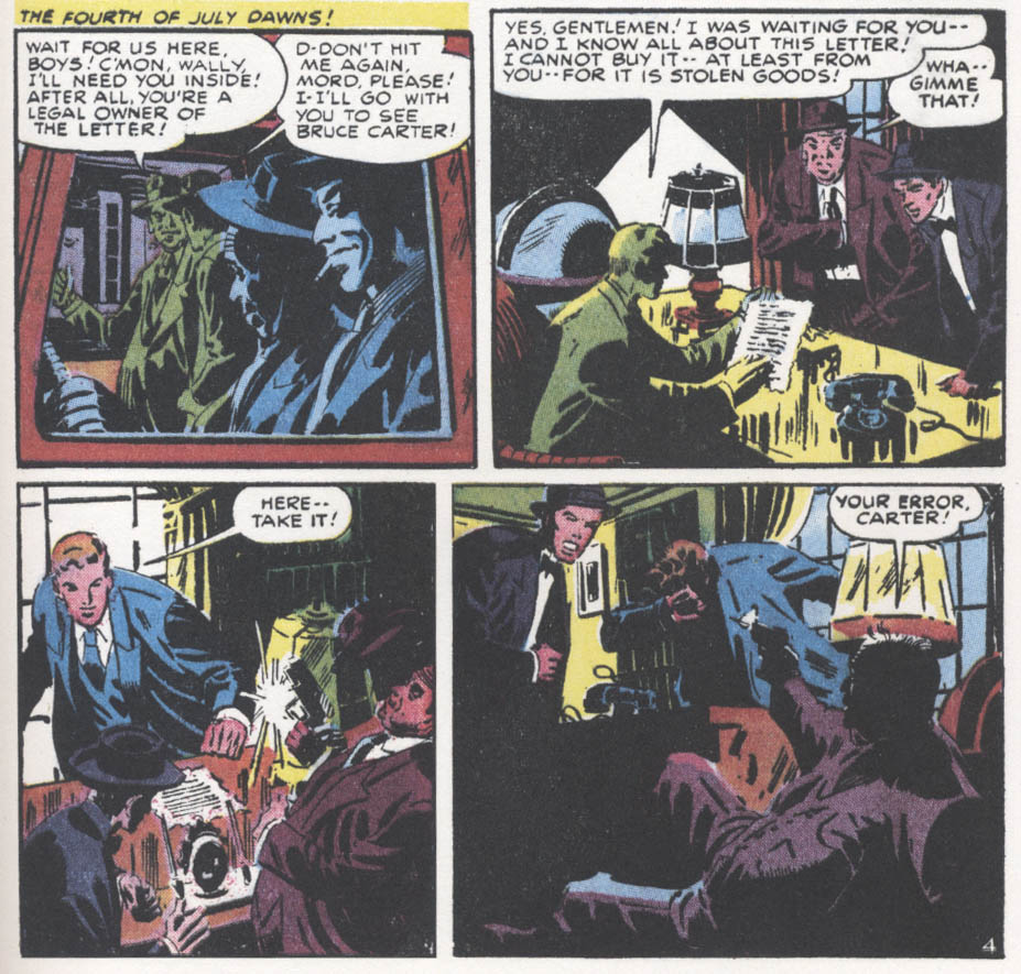
Fantagraphics Press is the standard-bearer and highest exemplar of alternative comics in America. Not only did they bring the greatest of the current generations of literary cartoonists to prominence in the first place, plus they continue to fearlessly publish groundbreaking new talents as they emerge,  but they also have made it their business to ensure that the greatest works in the history of the medium are put back in print in handsome, durable volumes. In fact, to continue the tone of blatant self-promotion that I started this piece with, in a few months they will release a new edition of 7 Miles a Second, another work of mine (with Marguerite and the late David Wojnarowicz)  first seen at DC/Vertigo.  But I digress. A project that Fantagraphics have undertaken recently is a set of hardcover books reprinting the stories of select E.C. Comics artists, in black and white. I imagine the series will be quite satisfying for anyone who wants to see the linework of various artists represented such as Jack Davis, Wallace Wood and Al Williamson unadorned by Marie Severin’s very well done but sometimes obscuring colors. I have the Harvey Kurtzman volume, Corpse on the Imjin and as usual the design and printing of the book are beyond reproach. Now, here’s a little criticism about the Kurtzman book.  Perhaps I should have read the copy on the solicitation more carefully, because when the book came it was close to comic book size…I had expected something a bit oversized, to be better able to appreciate the drawings.

Kurtzman solo forms a standard unto itself

And while I greatly admire the beautifully constructed and moving solo stories by Kurtzman from his two war titles Two-Fisted Tales and Frontline Combat that are included and anyone who knows me, knows I absolutely LOVE the sophisticated stories he did with Alex Toth, and that I admire as well the stories finished by other artists that Kurtzman wrote and laid out that are included, I had somehow assumed this book would first and foremost be a collection of solo stories! He did other stories on his own at that company that are NOT included: the first thing he did for E.C., the V.D. story “Lucky Fights it Through” that can only be found in an old issue of John Benson’s fanzine Squa Tront(#7); and he did solo tales for other titles in E.C.s horror and science fiction lines, some that have seriously detailed artwork, all show his singular and distinctive style. In my opinion, including them would have made for a more comprehensive and essential collection of Kurtzman’s E.C. comics work than including works finished by others. But all that being as it may, still at $28.99 the book is a goodly chunk of high-quality material.

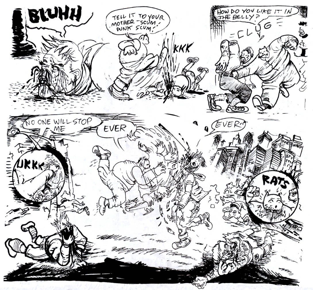
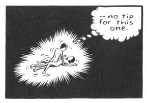
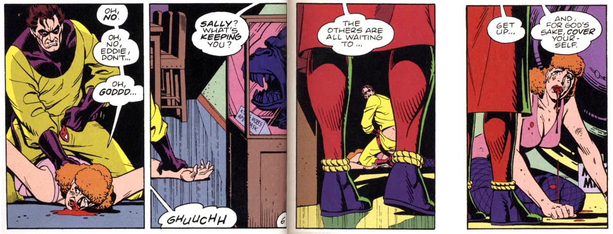
The publishers are at their best, though, when they display the courage needed to print books like Josh Simmons’ horrific The Furry Trap. I realize I am a little belated in reviewing this, but for some unknown reason, I only just got to it—and then, I was stricken by its contents! Let’s not even go near how they got away with printing the story about a certain caped crusader; suffice to say that as degraded as it is, it is the most accurate depiction I have seen of what I know in my heart of hearts the nature of America’s favorite fascist vigilante hero to be in essence. But to get there, first one has to endure Simmons’ initial foray: an elf, wizard and dragon story of such onerous and persistent perversity that it is nearly enough to inspire one to burn the book with the remainder unread. It is as if  the penis-hacking doctors smashing their patient’s faces with huge mallets in Chester Brown’s Ed the Happy Clown were taken as the starting point to a brave new world of semi-humorous but unfettered graphic ultraviolence.

Josh Simmons’ “In a Land of Magic”: you don’t want to go there

My personal favorite of the stories is “Jesus Christ,” reprinted from where I somehow missed its original appearance in MOME. Loving as I do extravagant crypto-religious statements, this apocalyptic vision certainly suits my preferred image of the fate that awaits the throngs of pious middle American fake-Christians when and if the Lord returns. It is funny that the Publisher’s Weekly review of the book dismissed this story as “flimsier than (the) others”, when to me this is the most obvious masterpiece of the book, a short but densely drawn epic of utterly fearsome aspect and attenuated gesture that the artist apparently labored on over the course of two years!

Josh Simmons: Jesus fucking Christ

There is plenty more; the $24.99 book is packed cover to cover with shudders that cannot be anticipated, that grow worse as they progressively become less clearly defined. The last narrative is the most frightening because it is a straightforwardly articulated bit of cinematography on paper that, as with the most effective of suspenseful creations, gains in impact from what is never shown, the reader’s mind having already been prepared by the foregoing tales to expect the worst. And so this is where the freedom of the alternative leads, not just to horror but to push further, into the unknown, good and bad and never-before-seen.

________________________________________________________________________

Marie Severin’s Due

Click on images to enlarge

There can be no doubt that Marie Severin deserves a book about her lifelong efforts in comics. More recognition than that would be appropriate even if she wasn’t one of the few well-known female practitioners in the last century. One would think that for her essential role as E.C.’s colorist alone, Severin should at least have previously had an issue of Squa Tront dedicated to her, since a special edition of that beautifully-produced E.C. fanzine is thus far the only significant acknowledgement that her brother the late John Severin has recieved from the American comics industry to which he dedicated decades of consistently high-quality, naturalistic work. But so far, the only publisher to undertake the rightful honoring of Severin is TwoMorrows, the imprint that fan John Morrow grew from the humble beginnings of his first thin issue of The Jack Kirby Collector in 1994.

Not only is coloring a particularly misunderstood aspect of comics, but the efforts of women have been traditionally discouraged in the medium. And though there is now occurring an explosion of comics scholarship, those scholars are often more interested in analyzing printed comics than they are in talking to the humans who made them. Since the higher-end critical forums such as Fantagraphics’ Comics Journal and Todd Hignite’s Comic Art are now published annually or otherwise infrequently, the bulk of in-print documentation and discussion of previous generations of cartoonists has been left to such publishers as J. David Spurlock’s Vanguard Productions and Morrow’s TwoMorrows, which also puts out Roy Thomas’ zine Alter Ego, the primary venue for many elder cartoonists’ only (or final) interviews.

So, TwoMorrows has published a book about Marie Severin and for that I am grateful. Nonetheless, this book, which features interviews by Dewey Cassell and Aaron Sultan with the artist and her contemporaries, shows the best and worst tendencies of the explosion of unapologetically fannish tomes that TwoMorrows has been releasing in the last few decades. The bad is overshadowed by the good, so let me get the few outstanding deficiencies out of the way immediately. The most heinous offense committed here is that the book is subtitled The Mirthful Mistress of Comics.
 

Severin is known for having a clever and cutting sense of humor. However, in utilizing Marvel overlord Stan Lee’s nickname for Severin (“Mirthful Marie”) and adding the usually pejorative feminine descriptive “Mistress,” the artist’s versatility and the essential nature of her many and varied contributions to comics history are diminished, even as images of a sort of cackling floozy ensconced seductively in the predominantly male confines of the bullpen are conjured.

One is relieved that other books about Marvel’s artists don’t all similarly utilize Lee’s corny alliterations; that, for instance, the many books about Jack Kirby have in their titles avoided Lee’s appending of “Jolly” to the artist’s name, since it is an even less appropriate description of Marvel’s founding dynamo than the unbecomingly anti-democratic royalism of the more familiar “King”. Speaking of Kirby, a bizarre prejudice rears up when co-interviewer Sultan asks Marvel mainstay John Romita, “What about Marie and Jack Kirby? Did she ever resent his ego at all?” Romita sets Sultan straight in short order, telling him of Severin’s (and his other contemporaries’) absolute admiration of the humble and accessible Kirby.

The other drawbacks here are lackluster book design and the counterintuitive use of the color section. For an artist known primarily if dismissively as a colorist, the decisions regarding color here are hard to fathom. Of 16 pages allotted for color reproduction, the equivalent of five of those pages are taken up by reproductions of original art, i.e. black and white linework and the other pages do not well represent  Severin’s best work. Her important and exemplary early E.C. coloring is shown in 4 small reproductions on a single page. Perhaps Cassell and TwoMorrows were unable to get the rights to use larger reproductions by those who hold the copyrights to her work for E.C., and so this specific disservice to Severin is not their fault. But as can be seen in the covers below, Severin added significantly to the art of such luminaries as Graham Ingels, Wally Wood and George Evans.

Graham Ingels, cover for Haunt of Fear #14, color by Marie Severin


Wallace Wood, cover for Weird Science-Fantasy #23, color by Marie Severin


George Evans, cover for Piracy #7, color by Marie Severin

The strength of TwoMorrows’ books is usually in the varied interviews and such is the case with Marie Severin: the Mirthful Mistress of Comics. The authors speak to her brother, to her childhood friends and to her surviving co-workers at E.C. and Marvel. I wish that there were comments by more of the now-deceased artists that Severin colored over the years and who respected her efforts such as Kirby and that her employers such as Stan Lee had graced the book with more than perfunctory tribute. However, there are substantial contributions by such reputable sources as Al Feldstein, Jack Davis, Jack Kamen, John Romita, Roy Thomas, Flo Steinberg, Herb Trimpe, Linda Fite, Ramona Fradon, Trina Robbins, David Anthony Kraft and Mark Evanier.

The E.C. section is particularly well done. Severin began coloring for them when editor Harvey Kurtzman wanted to upgrade the look of the books, in Severin’s words “to look more like Prince Valiant in the newspaper.” For the next few years she colored first Kurtzman’s war books, then the entire line, with the exception of some covers and stories colored by the perfectionist Kurtzman, as well as a few stories colored by the similarly autonomously-minded Bernard Krigstein (both of whom Severin typically characterizes as “artsy-fartsy”). When Cassell tells Severin, “you’ve been credited with a lot of the success of EC because of those vibrant covers,” she effaces herself to credit instead the quality of the “content,” but truly, covers are the primary selling factors on the newsstand and the color is the more significant part of the initial impact of the visuals on the reader. And, Severin’s interior coloring is no less sensitive and considered. Still, assisting Kurtzman on his comprehensive research, drawing caricatures on the fly of her co-workers and coloring were the art Severin was able to do at E.C.

She was always capable of more, but it wasn’t until the 1960s and she had been working at Marvel for a while that she was given the opportunity to draw comics herself. It wasn’t the usually canny Stan Lee who realized her talents, either; instead it was Marvel’s publisher Martin Goodman that noticed how good she was when she did some superhero drawings for Esquire and so Severin began to draw sporadically for the company: a few episodes of Dr. Strange here, issues of The Hulk and Sub-Mariner there. Severin understands the comics medium well and her work can be as energetic and muscular as that of any male superhero artist, even on her many strips for the Marvel humor titles Not Brand Echh and Crazy.

Marie Severin’s cover for Not Brand Echh #9.

Marie Severin, from Not Brand Echh #3.

Perhaps her best known Marvel Comics work is her early-seventies tenure on their adaptations of the Robert E. Howard hero Kull the Conqueror; these stories are beautifully inked by her brother John. Their collaborative run is considered to be a classic of adventure comics and both siblings certainly deserve credit, but it is Marie’s great storytelling skills that drive the narratives. And, she is one of the few artists in comics who can match Kirby for compositional thrust, which is why she became the chief cover designer for Marvel for the next few decades.

Marie Severin solo cover for Kull #1.

Splash page for Kull #2 by Marie and John Severin.

The interviews in the book give a remarkable account of Severin’s career and personality, but one gets the sense that Cassell and Sultan don’t truly comprehend how difficult and abusive the workplace was for women in the last century. That may be in part because Severin herself tends to diminish progressive issues that might be seen to be about political correctness, but it is sometimes only by reading between the lines that a fairly full picture of what her life in comics was like emerges. There can be little doubt that the sexual innuendos in the office went beyond simply “forgetting” about the presence of women in the room, that unwelcome comments and physical advances were directed to them. And Severin definitely faced a glass ceiling.

She succeeded John Romita to operate as a virtual art director for Marvel, but the position was unheralded as well as unpaid. In the present volume, Romita actually details how in order to gain points with Goodman, Stan Lee took credit for the substantial extra work that he and Severin did in that capacity. This seems typical of Lee’s manipulative treatment of even his most stalwart workers (and there is even mention here of Lee claiming as his property substantial amounts of original artwork, a questionable provenance at best given the subsequent troubled legal status of those pages). Neither Romita nor Severin hold anything against their “fearless leader”—it seems that Lee casts a sort of magic spell of obvious bullshit to make the people he uses, but never sticks up for, still somehow love him. Later, when Jim Shooter  cut a vicious swath through Marvel’s  elder talent, he also disrespected Severin’s art directorship, calling her instead “head artist” and she had no choice but to endure; as usual, there was no one in upper management to take her side.

Flying against Severin’s conservative nature, Trina Robbins hails her as a true feminist and she surely is an example of a woman excelling in a male-dominated field through sheer perseverance. Severin had a career in comics, but was not facilitated as she should have been; it was with her sense of humor that she was able to shine.

Marvel editor David Anthony Kraft on Marie Severin’s cover for the in-house fanzine FOOM #16: “That is exactly how the office looked….She’s got everyone in character, in the place where they were in the office, doing what they did.”

Severin’s ability to effectively nail her contemporaries is impressive, but these rare skills are unfortunately easy for some to underestimate; in the end she had to take what she was given and put a smiling face to it. Perhaps the most telling testimony to Severin’s skills and the misuse of her talents by the comics companies she worked so faithfully for is provided here by Mark Evanier. Firstly, in reference to MAD magazine, begun under the banner of her first employer E.C. and more recently published by DC Comics:

“People used to always say, ‘Marie belongs in MAD magazine.’ And she did…And I hate to think it’s true, although it possibly is, that the reason that she wasn’t was that she’s a woman. If you noticed, while Bill Gaines was running MAD magazine, they never had a woman artist there…Every so often, they would tap her for a coloring job, or a production job, but they never thought of her as somebody who could actually draw, say, a movie parody. And she would have drawn a better parody than a lot of other people they used. She obviously could do likenesses and at that time, MAD was paying ten times what a Marvel artist was getting paid for a page. It would have been fascinating to have seen her spend two days drawing a page of comics, as opposed to three hours. I would have loved to have seen what she would have done because it would have been amazing…she was considered family up there and they loved her, but she was family for production…I think she should have been drawing for MAD, because she was so good, and if a guy had been doing that same quality of work, probably would have been a regular in MAD. She probably would have had the job that Angelo Torres ended up getting…(doing) movie parodies up there.”

—and at Marvel:

“…I always thought she was an amazingly talented artist. She probably should not have been doing super-hero or adventure comics, but when she did, she always did a very fine job of them. I just thought she had this wonderful sense of humor…it is a shame, to me, that Marvel never really did a project where they let Marie Severin work exclusively on humor material, and develop her style more, and encourage her, and let her be as wonderful as she could be, because she had the skills, obviously, she had the sense of humor, and she had a unique viewpoint.”

Marie Severin by her brother John, detail of a watercolored drawing of Harvey Kurtzman’s E.C. war comics staff, from Squa Tront #9.

Into the Inkwell

Mort Meskin: Out of the Shadows, edited by Steven Brower. Fantagraphics Books.

Mort Meskin’s studiomates in the bullpens of mid-20th century comics production remarked that he was a sensitive soul who was known to face a blank sheet with an artist’s block akin to sheer terror, until someone would scribble some random lines on the page, which he could then be sufficiently motivated to transform into his brilliant chiaroscuro images. Meskin’s best work was a powerful formative influence on other great comic book cartoonists such as Jack Kirby, Alex Toth, Steve Ditko and Jim Steranko. As the years passed, though, he became obscured in comics history. I was first made aware of him when he came up as I was interviewing Steranko. To identify the initiator of a comics storytelling technique, we consulted with the late, sorely-missed Dylan Williams, who had built a website about Meskin. Sure enough, MM turned out to have been the first to use the device in question, a Muybridge-like means of depicting rapid movement with multiple figures that Steranko called “strobing”. In more recent years, former Print magazine creative director Steven Brower has championed the artist, first with his 2010 Meskin biography Shadows to Light and now with a  career-spanning collection of complete stories.

Meskin’s drawings seem to emerge from blackness

Some of his greatest early work in Out of the Shadows like Fighting Yank and collaborations with Jerry Robinson such as The Black Terror display particularly dramatic drawing and effective storytelling. In some of the stories, the  color is unusually good; it is all wonderfully restored. Another highlight is that some of Meskin’s linework for Golden Lad is presented in incredibly crisp black and white. Sadly, there are no representations of Meskin’s work for his main client DC Comics on such inventive strips as Johnny Quick or even his later, apparently generic but no less animated and well-rendered short strips for their mystery and sci-fi titles, presumably because DC jealously protects its assets, even to the detriment of the legacies of its most innovative artists like Meskin and Toth. Still, it can be seen from Brower’s thoughtful selections that Meskin was a strong narrative draftsman and an architect of arresting images.

______________________________________________________

The Shark King by R. Kikuo Johnson. Toon Books.

In this graphic novella produced under Francoise Mouly’s Toon imprint, Johnson appears as an heir apparent to Meskin and Toth. Adapted from a Hawaiian mythology, The Shark King reportedly truncates and makes more palatable its source story, but it is a sharply rendered and very effectively colored short children’s book that displays a tremendous amount of kinetic energy. The characters move around the pages in a manner which deliberately facilitates and enhances the reading experience. Johnson is a very clean and controlled artist who gives his book an almost “golden age” feel. His use of black and colors define the forms and spaces with a rare mastery.

Johnson’s color is apparently built from hand drawn separations.

I am a little unclear as to the value of the message the story sends boys regarding their relative relationships with their mothers and their willfully absent fathers, but still, I much prefer this book to Johnson’s earlier adult graphic novel effort, his beautifully brush-drawn but callow coming-of-age tale, The Night Fisher.

______________________________________________________

Ragemoor #s 1-4 by Jan Strnad and Richard Corben. Dark Horse.

In an interview on TCJ last week, Rich Corben speaks of his upcoming Edgar Allen Poe adaptations and honestly, I wasn’t overly excited by the news; I have a pile of his previous Poe work and enlarging it seemed to me to be a redundant reworking of relatively quiet, morbid tales that do not show off the artist’s best abilities.  But maybe I should give him the benefit of the doubt. In recent years Corben has been doing a lot of work, some of the best of it in Mike Mignola-written Hellboy comics for Dark Horse. These have offered him ample opportunities to indulge in his trademark over-the-top horrific imagery, as well as the type of  inventively articulated, muscular fight scenes that he excels at. And, although I admit I’d prefer that Corben colors himself, the Hellboys have been very well colored by Dave Stewart. I also admire a few stories that writer Jan Strnad and Corben did together in the past, but as their new miniseries Ragemoor came out over the past few months, it was a little hard to love.

Perhaps the best art in the series, the cover to Ragemoor #2

For one thing, the art is black and white, not color and Corben does his own tones, but my initial impression was that the work here often looks a little awkward and rushed. His blacks are plenty juicy and his digital greys augment the maniacal depression that permeates the pages, but there is a chunkiness to the construction of the forms—a simplification of the drawing that often subverts Strnad’s scenario; it makes it quite difficult, for instance, to buy that the hero is smitten with the female character, who must be one of Corben’s least appealing ever for the pulpiness of her features…and that is saying something. He is known for constructing clay models to draw from, but here she seems smooshed by all thumbs. Yeesh!

The “splendorous angel” Anoria takes a dive in Ragemoor #3

However, it wasn’t until I had all four issues that I was able to truly appreciate this effort. In the end, Corben doesn’t disappoint….it works much better taken as a whole than it did as a serial. So buy them and read them all in one sitting. There are some genuinely frightening moments, not least what becomes of the hideous heroine.

______________________________________________________

Prophet #22-26 by Brandon Graham, Simon Roy, Farel Dalrymple and Giannis Milonogiannis, with Fil Barlowe, Frank Teran, Emma Rios and others. Image Comics.

I have Brandon Graham’s thick King City book, although I haven’t yet had a moment to read the whole thing. I can say, though, that his solo comics strike me as one of the few times (Damion Scott is another) that I have seen a cartoonist whose work effectively evokes the imagery of Hip Hop,  which through aerosol innovators like Phase 2 evolved from the graphic forms of Vaughn Bodé and Philippe Druillet to become commercially appropriated by corporate America, but criminalized in its public art form.

Graham recently took over the Rob Liefeld vehicle Prophet and is using it as a collaborative engine to work with other artists and in so doing to reinvent the esoteric science fiction promise of France’s Metal Hurlant, that has informed the cinematic science fiction of the past few decades but whose power disintegrated in the comics medium because of the mainstream American banalization of bad translations and airbrushed van-artiness of Heavy Metal.

Graham and Dalrymple form a compelling argument for collaboration in Prophet #24

I have no idea what Leifeld did in his earlier issues of this title, but bless him for enabling us to jump in on Graham’s stories for Prophet, which are dark and forbidding but keyed to the unique properties of comics,  written as they are to accommodate many double page spreads depicting far-flung vistas of more than passing strangeness and with odd diagrammatic passages that explain technical details. These disturbing scenarios have been drawn by a range of inventive talent, from several issues of Simon Roy’s fluid linework, to one with Giannis Milanogiannis’ slashing penstrokes, to one with some of the best work I have seen from Farel Dalrymple and then, the most recent issue is sparely drawn by Graham himself with echoes of Kirby and Druillet. All of the issues are beautifully colored. As the series goes on, an unusual sense of excitement, of discovery is engendered, a feeling that I have rarely had since my first exposure to Les Humanoïdes.

Graham draws his own script for Prophet #26

In addition, Graham has solicited some very interesting backup stories: #22 sported a short piece by the Australian Fil Barlowe, whose Zooniverse was a singular exponent of intergalactic multiculturalism in the early 1980s; #s 23 and 25 boast two parts of a Frank Teran strip and #26 has a piece by Emma Rios with an absolutely extraordinary panel configuration.

______________________________________________________

Spotting Deer and Lose #s 2-3 by Michael DeForge. Koyama Press.

I’m very encouraged when I see people such as Graham, Dalrymple and C.F. who seem to be influenced by sci-fi junk as much as anything and who are not afraid to work in genres that were formerly discredited by the alternative. Reality is fine as far as it goes, but comics also have potentials for world-building that aren’t scratched by stories about drinking coffee in cafes whilst bullshitting with one’s peers. Michael DeForge is another of the younger generation of cartoonists who uses sci-fi in his strips and this guy not only draws aliens, he draws LIKE an alien.

DeForge’s Spotting Deer: freaky deaky

His stuff reminds me a bit of my old friend Steven Cerio—-hmmmm…I wonder what happened to him?—like Steve, the work is bizarrely well-drawn while being frighteningly “othered” in conception. DeForge’s oddly shaped and thin but amazingly colored Spotting Deer book, for example, about a race of slug beings that mimic mammalian deer, is a real mindfuck prize and his erratic but engaging floppy comic Lose rewards examination, as well.

From Lose #3: nowhere to go but up

I don’t get why his main story in Lose #3  features an apocalyptic landscape with flying dogs who interact as if they are in a contemporary technological society, but it hardly matters; what counts is that DeForge uses the freedom of comics to make characters and places that follow his own rules. My favorite strip in this issue is “Manananggal”, a fearsome but indecipherable cinematic progression of otherworldly bioforms.

______________________________________________________

Raw Power Annual by Josh Bayer. Retrofit Books.

It can be difficult to explain to anyone, let alone someone not versed in the language of comics, the appeal of a Meskin, a Corben or a DeForge.  I find it equally hard to describe Josh Bayer’s fierce comic Raw Power. I’ll try, though. I could say his massive figures bring to mind a sort of Kirby on amphetamines (and he milks and remilks a line from Jack’s “Street Code”), that the art seems sometimes as if it is drawn with a stick dipped in mud, but then, it also has some quite delicate passages and the entire thing reads with an invigorating, furious energy that is impossible to ignore. The story veers wildly; a description of Jimmy Carter’s war to suppress punk music  (that I find completely believable and which was apparently imparted to Bayer by Jello Biafra and Ray Pettibone) segues from the origin of Bayer’s ultraviolent superhero Catman to a version of Watergate sociopath G. Gordon Liddy with the aspect of a fiendish motivational speaker and then goes into a revisioning of an issue of one of Marvel’s cheesy 1980s comics, DP7  (a little like Jonathan Lethem and Dalrymple’s reworking of Omega the Unknown), which I am certain is far more interesting than the original comic could have been.

Josh Bayer’s Raw Power: faster, harder, WTF.

Comics like these are why I still love comics—-they are full of the odd things that artists do that are personal tics, that perhaps are mistakes or maybe they are done on purpose, but they are what makes the stuff memorable and make us think that we also could make comics—-and we can! We can make them and print them ourselves! They are why, as I have discovered,  the healthy part of comics is not in the pathetically over-edited and suicidal mainstream, but in the alternative where the artists, writers and readers are in charge. We can make lines coalesce on paper to form worlds in our own image and share them. We don’t have to answer to authority.

______________________________________________________

Exes and Ohs

Click images to enlarge

Jaime Hernandez uses the temporal flexibility of the comics medium to work like memory: moments that are far separated in time recontextualize when put in proximity to each other. He shows that the ways people treat each other resonate unpredictably through their lives. In the world he has built on paper and in ours, passion can be fleeting, violence can happen in the blink of an eye and both can have long-lasting repercussions.

Hernandez’s recent comics show psychological insight and a command of expression and gesture that transcends his earlier efforts. As he refines the economic grace of his storytelling, he delves into the formative years of his characters to motivate them.

Secrets hinted at over the years are overtly revealed in Browntown, which is cut with flashbacks to a time when the teenaged Maggie’s family moves from Hoppers to Cadeeza to be closer to where her father Nacho works, so he can spend more than just alternate weekends with them. But, Nacho’s infidelity is revealed by his behavior at a party attended by both his wife and his young employee/mistress Miss Varga, who makes a point to cruelly inform Maggie of the disparaging nickname of her new neighborhood. Nacho thinks he has uncovered a betrayal when a drunken former workmate of his wife says he visited her house while they lived apart; here perhaps he displaces his own guilt to her and so to their daughter.

Maggie in her innocence percieves his half-serious disowning of her as only a joke and then does not understand her father’s violent reaction to her affectionate embrace. Now, on the one hand, he is freaking out because his wife and his girlfriend are both in that panel, a significance that Maggie and her mother are both unaware of. But also, possibly a baser sexual instinct provokes his panic; certainly Maggie could not imagine that he might be subject to arousal as a young girl climbs on his lap, even if she is his daughter. Perhaps, here is some of the rationale of misogynistic fundamentalism, men who repress women because of their own lack of self-control.

When Maggie later sees Nacho parked having an emotional scene with his lover, she places her as Miss Varga from the party and as the girl seen earlier leaving what she and his siblings had decided couldn’t be his car. The depth of her father’s betrayal destroys her trust, her idea of how the world is structured and when she then tells her mother what she saw, the family fully dissolves. Nacho won’t control himself and he isn’t protecting his family, which enables the ordeal that Maggie’s brother Calvin goes through and forces that little boy to take on the role of protector.

Left to his own devices and vulnerable, Calvin is initiated into a club of boys of varying ages that sit around in the grass with their pants down. Hernandez shows the boys mime heterosexual sex, though not engaging in actual sex. But, the older boy who leads this supposedly harmless homosocial group draws Calvin away from the rest to rape him repeatedly.

Hernandez shows the progression of abuse with understated taste in his increasingly appealing style, which makes it all the more horrific. The period shown is protracted, enough that both characters’ hair grows significantly longer. What is done to Calvin is long-term bullying and rape: he says “no” repeatedly, he expresses that it hurts again and again. The older kid threatens Calvin’s family several times when he tries to refuse to submit; his arm is twisted behind his back, he is forced. Ice pops are shoplifted and shared with Calvin as a show of exchange, which also makes him complicit in crime and solidifies the kid’s hold on him.

When the sociopath begins to spend time with Maggie, Calvin knows the boy’s practices and does not want him near his sister. He erupts and attacks the bigger kid for violating their pact: that if Calvin endures the abuse, his family will be safe. Calvin is badly beaten. When he gets home, there is a problem occurring involving Maggie that he doesn’t understand. Everything happens quickly; the family is breaking up, they are leaving town because of something unspoken, something bad that no one will tell such a young child. He mistakes the upset caused by Maggie’s exposure of her father’s cheating for something involving Maggie and his rapist. This is why Calvin does what he does, here and later in The Love Bunglers. His older, traumatized and disassociated self is still trying to protect Maggie.

A terrible irony of the revelations in these stories is that the reader knows much more than the characters do. As Calvin acts because he does not comprehend the true reason his family is falling apart, Maggie remains ignorant of what Calvin does out of love for her, she doesn’t realize who the older Calvin even is and eventually she denies her brother entirely.

__________________________________________

The first time I read The Love Bunglers, it unnerved me. A few days ago, I read it again and thought it was perfect. Still, I should restrain my interpretation until I see where Hernandez goes next, as I had to do with L&R NS #3, which is clarified by what transpires in the next issue. The scale of the lateral expanse he has developed makes it so he can continue to explore the spaces between and around what he has already established.

The most obviously outstanding aspect of Hernandez’s work is that his female characters are afforded, in their mesh of word and image, a depth of agency and complexity rivaled by no male cartoonist but Milton Caniff. It is hard not to single out Maggie for her particular charisma and I’m very impressed with Jaime’s most recent issue’s visual deglamorizing of such a beloved construct. His male characters are no less considered. Below, for example, Hernandez counterpoints Maggie’s subtle interaction with Ray by his frenzied coupling with “The Frogmouth,” a conflicted and sometimes tragic figure in her own right:

But it is Maggie who is imbedded in Ray’s consciousness; she’s unforgettable. Here’s one of my favorites of all of Jaime’s panels:

It reminds me a lot of one of my favorite Kirby panels since I was a kid, that I suspect Hernandez noticed as well:

Obviously such montages are well-worn romance comics devices, but Kirby was one of the initiators of the genre and Hernandez is one of his best students. In both stories these are significant moments in much larger, painstakingly set-up spreads of narrative; they are timed and emotionally keyed in the interaction of word and image so that the reader is driven to empathize with the characters’ yearning and to associate it with a similarly displaced attachment in their lives.

With Hernandez’s work, this identification goes well beyond sentimentality or nostalgia. I once sent him a letter that said, “Your work is great art because it is not only a pleasure to behold but also makes one consider one’s own experience with added perspective.” I can’t think of a better way to say that and it’s true, his work has given me many such moments of reflection. The director Jean Renoir wrote to François Truffaut, “It is very important for us men to know where we stand with women, and equally important for women to know where they stand with men. You help dissipate the fog that envelopes the essence of this question.” When I first read that quote, I thought of Jaime Hernandez.

________________________________________

The index to the Locas Roundtable is here.

Clarity and Intent

A few books by some of comics’ (male) best and brightest of several eras. Some of these have been out for awhile, but I only just got around to them.

_____________________________________________

Jon Fury in Japan

Alex Toth’s only extended stint on a continuity strip was done for his post newspaper when he was stationed in Tokyo in the Army in 1955. Jon Fury was his first effort writing for himself. While he could brilliantly interpret the scripts of others, Toth faced nearly insurmountable difficulties to construct his own. He tried to emulate Milton Caniff’s narrative mastery, but he certainly didn’t “get” one of Caniff’s greatest assets: his use of female characters of depth and agency. Toth is strictly old boy’s club, but truthfully his male characters are not much better defined. The storylines feel forced and they are riddled with overlong exposition to the extreme.  Despite these drawbacks, his art is highly developed and constrained only by the sheer weight of text; these are dynamic, elegantly designed episodic pages in the Caniffian Sunday format. More than any of his contemporaries, Toth reached for clarity of comics expression and here he exhibits his mature style in a serialized form, where weekly deadlines dissolved the hesitations dictated by his perfectionism.

The late Toth did the work for black and white reproduction and so that is how it is seen in IDW’s recent Toth bio Genius, Isolated. The original art  was done in a process similar to mimeograph, basically drawn directly on waxy plates, which quickly begin to degenerate in the process of printing, even in such a small print run as these strips had, with the result that a complete pristine set is probably impossible to put together. The art restoration in the panel below from the slick color comic book version, Jon Fury In Japan, is definitely better than it is in IDW’s hardcover bio. In both recent versions, there are many minute amendments to the drawings by other hands; these are more pronounced in the color comic.


One panel’s restorations: left, from IDW’s version, right, from the comic.

IDW’s reconstruction of Toth’s original lettering of the later pages is readable, but in the comic book version, Toth’s lettering has been removed on most of the pages, which are re-lettered with a cold and inconsistently scaled digital font. This may read easier, but the artist’s hand is lost. And, emphasis via bold type has been added to Toth’s dialogue. As well, if art done for black and white must be colored, Toth’s is better suited to flatter hues, a four color comic book or Sunday strip-like color. The example shown above is atypical; overall, the too-plastic fades and color modeling feel anachronistic to the period piece. Plus, although effort is made to color the protagonist as a native American, many color decisions are counterintuitive, for instance in the pink jacket of the thug also seen on the cover.

Left: xerox from the original printing. Center: IDW version. Right: color comic version.

Granted, the pages needed repair, but work so pared to its essence is subverted by overt interference, much less the overkill of the comic package. Fortunately, Jon Fury in Japan also contains Toth’s final interview, significant for its emphasis on his animation career. Other than a few questionable photos, this has a good selection of panels by Toth and his influences and the coloring imposed on these is more appropriately restrained. (Paul Power, $11.00)

_______________________________________________________

“Red Tide” in Dark Horse Presents #3

Chandler: Red Tide was released to the  book trade in 1976 as the first American original full-color mass-market graphic novel. It represents Jim Steranko’s longest, most ambitious auteur effort in the comics medium to date. The two-panel-a-page layout with dual type blocks underneath is constructed in such a way as to be unusually immersive; in the act of reading, the obviously separated art and text come to simultaneous apprehension. The art was drawn in pencil without feathering and with minimal holding lines; Steranko’s excellent comics-like color separations often define the forms. The original book has a pulpy chiaroscuro feel that echoes the great noir films to which the story effectively pays homage. The representations are likewise mostly typical of the hard boiled dick genre; for instance, the protagonist and the leading lady have a prior history and her passion is reignited when she senses “something more than anger behind” his slap. On the other hand, there are appearances by a lesbian cab driver.

A reissue of Red Tide enhanced by the author has been looming  for years and now here’s a taste with an excerpt of the first chapter, in Dark Horse’s slick house anthology title. Steranko expands the possibilities of digital color while reiterating that cartooning devices like holding lines, heavy outlines developed to contain badly-registered color inks, are no longer essential with tight full color printing. He transforms and rebuilds his images into layered digital paintings that greatly resemble the airbrushed Art Deco graphics and advertising art of the period depicted. There is an impressive depth to some of the images that far outstrips what he was able to do in the method of the first printing.  He is able to amplify the visual connection to Chandler’s milieu with contemporary tools while exploring the intrinsic qualities of those tools with imaginative verve.

Perhaps this new version puts undue emphasis on the images, in terms of the time involved in the readers’ perception of them relative to the reading time of the text. The expanded density of the art as well as the altered justification of the type blocks conspire to disrupt the 2/1 art-to-type ratio which is key to Steranko’s immersion formula, one of the most important virtues of the book.

Still, any new (or newish) comics by Steranko are welcomed. What he did with these pages is very interesting and no doubt the completion of the augmented edition will be impressive. I can see the amount of time and effort he has to put in to finish the whole book to the level of this excerpt though, and so perhaps in the meantime, Red Tide can be put out in a nice facsimile edition so it can get the attention it has long deserved and he can finish this new enhancement as he will, without pressure. (Dark Horse, $7.99)

_______________________________________________________

Is That All There Is?

I recently read a review of Joost Swarte’s collection of most of his comics work that complained of the scale of this small hardcover, but I think it has a jewel-like quality. It is a beautiful little book that one can delve into periodically to simply enjoy Swarte’s exactingly rendered, beautifully colored comics pages.

The art is the thing here. While there are some engagingly animated sequences, the stories seem mostly clever, sometimes flimsy cause-and-effect variations created as supports for Swarte’s meticulous cartooning science. As with Toth, the more interesting aspect of the work is the way that the art manifests the ideas, such as they are—Swarte is a master of page architecture and image construction and he also has a tendency to reflexively expose his practice, which is why he is so revered by comics structuralists such as Art Spiegelman. The Franco-Belgian clear line derived from Herge and his forms of representation have their most refined outlet in Swarte’s short absurdities, reprinted from his Modern Papier and a host of other comics periodicals here and abroad including Metal Hurlant, Charlie and Raw. (Fantagraphics,$35.00)

_______________________________________________________

Madwoman of the Sacred Heart

I love the recent translation of Alexandro Jodorowsky and Moebius’  Madwoman of the Sacred Heart. A black and white version published in the USA in 1996 contained only the first two parts (it was completed in 1998). This  full color trade paperback of the complete Madwoman shows the best efforts of both men, far outstripping their earlier collaborations on The Eyes of the Cat and The Incal trilogy. Jodorowsky’s scenario is hilarious, an incisive and compulsively readable satire of sex and religion, for starters, that offers Moebius the opportunity to draw his single most immersive work of comics storytelling. The seemingly effortless flow of Moebius’ panels here rivals the reduced clarity of the best of Alex Toth’s 1950s Dell comics.

The book is a prime example of text and art reading together as equal forces at the service of the narrative. There are plenty of places for writer and artist to shine, but one is rarely brought out of the narrative to marvel at the construction, even when it frequently veers to philosophical discourse or transcendent visualization. I usually complain if Moebius does not do his own coloring, but here several colorists did an effectively punchy but tasteful, organic job of it; even if it is digital, most of the color looks like painted bluelines.

My first impression was that it takes some considerable suspension of belief to accept that the Heinleinesque protagonist (who is apparently an amalgam of the authors) holds such sexual magnetism for beautiful young women (and men), but Marguerite informs me that the French have such high regard for their intellectual heroes that an elder philosophy professor from the Sorbonne might indeed be considered quite sexy. At any rate, Jodorowsky and Moebius’ trangressively libidinous epic is played out so beautifully, without ever feeling forced, that the ride is taken willingly and has many rewards. (Humanoids,$24.95)
_______________________________________________________

Paying For It

Chester Brown has represented freedom to me for such brilliant improvisations as his original complete version of Ed the Happy Clown and The Little Man and I also admire his Biblical adaptations and Louis Riel—but Paying For It is a constricted,  joyless business. As a comic by Brown this has a certain mastery of form and the art is technically as good as ever, but the reader barely notices it, because to a large degree the art serves only to drive the reader through the book. It is primarily a reading machine and one is driven to focus on what is being said in Chester’s voice in the form of a memoir.

I would have little interest in reading such a john’s-eye view in prose form and as johns go, I am not made to feel sympathetic to Brown. He frets briefly about the possibility of an undercover sting, but where prostitution is a crime, it is one that prostitutes are prosecuted for, not johns. He worries a lot about being robbed and the expense, the money. He is concerned about girls that look too young, but for his  liability alone, one assumes, because he can hardly tell if they are of the age of consent, or not:  he declines to have sex with any women above a very young age, although he himself is forty and stretched a bit tight, at that. I’m no oil painting either, but really, it can’t be much of an aesthetic experience for the women that have to deal with him and they could be his daughters.

The exhibitionism here is similar to his ruthlessly honest explorations of his teenage years in the later Yummy Furs, but here, the whole gives off an aura of creepiness on the part of its author. Sex is to Brown reduced to a physical function, it’s all about him and his pleasure or release. Brown doesn’t draw the faces of the prostitutes he visits—well, except for panels such as those I scanned. Ostensibly for the reason of preserving their anonymity, his ploy effectively dehumanizes and reduces them to 3-dimensional versions of the bodies of the Playboy playmates he masturbated over in his youth. He essentially jerks off with real people! Actually, drawn as cartoons, they again become 2-dimensional and there is little variation to distinguish the progression of faceless women at all.

I don’t dispute the case he makes in his comic and annotations for the escorts, but the show of concern he makes for their circumstances. One gets the sense that Brown wouldn’t care about or do art about any of it, if he wasn’t trying to justify his involvement. In practice he seems devoid of empathy or affection. We are treated to many panels drawn from an overhead, Brueghelesque perspective of Brown banging away hell-bent for leather, getting his money’s worth. He can motivate himself to solicit prostitutes and then do the years of work involved in a graphic novel and share himself with the world, but he can’t get it up to fight for love. All the effort that goes into a relationship…who needs it?  In this case, listening to his friends might have helped; they all try to give him good advice. But, as his pal Seth says, “Chet’s a robot.”

He’s also a cheapskate:  he’s not the one “paying for it.” We who buy the book are and in addition, this thing was subsidized by generous grants! It’s fucking depressing. (Drawn and Quarterly, $24.95)

_______________________________________________________
“Amber Sweet” in Optic Nerve #12

Adrian Tomine uses his work to thoughtfully explore multicultural and  interpersonal relations. His work exemplifies the reader immersion and simultaneous cool remove that a refined visual orchestration can lend to a narrative.  “Amber Sweet” is an expanded version of Tomine’s great piece from the massive Kramer’s Ergot #7. His concise and elegant drawings and color give a measured, airy tone to his ironic tale of the torments endured by a young woman because of her resemblance to a well-known porn star. When they meet, the contrast is telling: the real Amber is self-possessed; she handles her admirers with a blithe “Hey! What’s up?” or poses with them for a picture, butters them up a bit and then brushes them off. It is her choice to do what she does, but her choice has inadvertently isolated her doppleganger, who is continually harrassed by aggressive men. This destroys the relationships of “not-Amber,” whose eventual distrust of all men is often justified. This is underlined by Tomine in the scene below, in which two young men impose themselves upon her, denying the implications of their simultaneous wanking while assuming her companion’s complicity in their homosocialism. (Drawn and Quarterly, $5.95)


Post to Incestuous Sheets

The Rub at Magic Futurebox

This last weekend I traveled into the depths of Brooklyn to witness The Rub, a re-envisioning of Shakespeare’s Hamlet done by a small troupe, the Tremor Theatre Collective, which includes my wife and fellow Hooded Utilitarian Marguerite Van Cook in the role of the young prince’s mother, Queen Gertrude. After Marguerite’s many late rehearsals, she’d tell me of the unusual methods of director Nessa Norich, an innovative theatrical force emerging from France’s Jacques Lecoq International School of Theatre. Norich’s actors formed the production from improvisation, from physically interacting with each other and with the deep columned space of the host theatre Magic Futurebox. From weeks of coaxing and collating the freely invented dynamic interpersonal movement and gestural variations of her cast and imposing a anachronistic montage of verbal and visual references, Norich finally introduced a script in the last week of rehearsals. As I was trying to help Marguerite run her lines, they seemed almost peripheral to the source text with only scattered bursts of Shakespearian diction, but Norich’s presskit describes a “surreal and playful investigation of the frustration, anxiety, passion, complacency, selfdoubt, delusion, isolation and desire that come with being heirs to a state rotting from the inside out.” That’s basically what our Will was on about, as well as where we Americans seem to be at. When I actually saw the results of Norich’s intriguing construct, I found that Shakepeare’s narrative is well represented even as it is made part of something contemporaneous and electrifyingly involving.


The Rub: Gerson, Van Cook and Stinson. Photo by Nessa Norich

The character of Hamlet is effectively played by several actors: one (Micah Stinson) sulks and simmers while another (David Gerson) adopts a keenly fearsome, sinuous aspect of outrage held barely in check. Three more Hamlet alters argue by turns and interweave at breakneck speed through the cavernous room (Colin Summers, Daniel Wilcox and Steven Hershey, who also flow seamlessly into a mellow-voiced Laertes, a loquacious Polonius and an opportunistic King Claudius, respectively). Queen Gertrude’s role is here expanded to be a fiercely comedic whirlwind of Freudian complication. I can’t claim objectivity, but it’s awesome to see Marguerite use some of her many performative skills. As Gertrude she works the stage like a vaudevillian; she stalks with limber, cartoony malevolence, she flummoxes a game reporter (Chas Carey) like a Danish Ghaddafy, she purrs, cajoles and overtly schemes with her new husband against Caitlin Harrity’s earnestly vulnerable Ophelia. Site-specifically mapped projections cunningly use the architecture of the theatre to add ominous, surreal narrative elements. The audience is brought out of their seats to follow the scenes into the depths of the room, making them complicit in the action as it boils to its inevitable final conflagration. While it certainly adheres to the spirit of Shakespeare’s intent, The Rub also shows a freedom of conception that to me is the essence of Art. I love it and so does Magic Futurebox, who have extended the production through next Friday and Saturday.

The Rub @ Magic Futurebox: 55 33rd Street, 4th Floor, Brooklyn, NY (D, N, R trains to 36th St) on Friday Feb. 17th at 8pm and Saturday Feb. 18th at 8pm

______________________________________________________

Before Watchmen: Too Sullied Flesh

Shakespeare’s plays are in the public domain; he left no heirs but he is always credited as the source of any use of his works because his efforts are of undisputed quality and value. I suppose it is possible that the more extreme liberties taken by the Tremor Collective might put some Shakespeare purists’ noses out of joint, but theatre is by its nature an act of interpretation. It is a given that a source play is subject to adaptation.  Plays are meant to be reimagined through the efforts of the director, actors, set designers and other members of the ensemble putting up the production.  This is not the case with the current news cycle bummer about DC Comics’ reworking of co-authors Alan Moore and Dave Gibbons’ Watchmen, a book that was not conceived with the intent that it should be re-interpreted by other creative talents, on the contrary: Watchmen could not be a more deliberately complete work than it is.

As it has stood for 26 years, Watchmen has gone through many editions and enriched DC Comics financially and in terms of credibility. In fact, this multifaceted work is virtually the jewel of their crown. It is one of the key books that began to give comics a degree of critical acceptance, and it is one that deserved such attention—it gave the company a cache to build on, which they have sometimes tried to do with their more ambitious efforts such as the Vertigo line and their similarly convoluted graphic novels, story arcs and miniseries. They could have continued to profit from Moore and Gibbons’ book and striven to emulate their example of excellence, without violating the bounds of decency. But that was not to be. First, Moore disowned the adaptation of Watchmen to a film by Zack Snyder and for a good reason: the comic stands as a finished and hermetic work of Art in the form of a comic. I doubt that he could anticipate how bad the movie would be, though; it reglamorized the violence which Moore and Gibbons had taken pains to deglamorize, changed the ending entirely and amplified what I see as the flaw of the book.


Watchmen: Sally Jupiter is sodomized offpanel; and the “cover-up.”

Make no mistake, what Edward Blake does to Sally Jupiter is not attempted rape, it is rape. He assaults and beats her, then sodomizes her. This is a DC comic and so we are not shown explicit penetration. Instead, the rape happens in a space of indeterminate timing between the first two panels shown above and outside the cropped image of the second panel, where the two characters’ relative positions, Sally’s choked scream of pain and the symbolic bestiality represented by the ape’s head in the case make abundantly clear what is happening. In panel 3, Blake isn’t removing his pants, he’s pulling them up. The colorist has obscured where Gibbons drew Sally’s shorts and stockings pulled down in panel 4, which represents a typical male reaction to rape, at the time and often still. Hooded Justice’s harsh direction to Jupiter to cover herself can be seen as an indicator of why both her daughter Laurie and Hollis Mason (in his book excerpt within the book) are unaware that the rape was actually perpetrated in full: the truth had been suppressed.


Laurie is given clue #1 that Blake is her father.

Jupiter’s previous flirtations with Blake are used as justifications for her contemporaries to think that she had somehow “brought it on herself” and Jupiter’s own feelings of shame and what can be seen as typical victim psychology cause her to diminish the crime, to the extreme that a decade later she has an affair with Blake, which produces a child: Laurie.


In Laurie’s childhood memory, Sally tries to explain to her husband why she has a tryst with Blake, the rapist; confronted by Sally, Blake gives out with clue #2; and their daughter’s epiphany on the moon.


Hammering the offensive flaw: Sally loves her rapist.

Sally kissing the photo of the late Blake amplifies the flat note in what is otherwise one of the most carefully and sensitively composed comics ever done. In a medium predominantly directed to males, an often overtly misogynistic form oblivious to the consequences of sexual violence, this rare realistic depiction of rape in comics comes to represent a offense a woman could forgive, that she even might even come to love her rapist. Even more offensively, Snyder in his film made the fact of Laurie’s very existence through Sally’s forgiveness be the salvation of the world. This concept unfortunately lurks in the book, but shorn of the larger rationale of Moore and Gibbon’s ending which involves the human race uniting in the face of a manufactured outside threat, in the film the forgiveness of the unforgivable, the purpose of conception superceding a woman’s rational sensibilities, the “miracle” of the existence of even the product of a rape, all become the primary lynchpins of a narrative seemingly altered to pander to Christian Americans.

For his part, Moore removed his name and refused to profit from this adulterated mess, while he ensured that his collaborator and co-author Gibbons was the sole beneficiary of any royalties. Moore and Gibbons always steadfastly declined to do any more comics with the characters of the book and for 26 years DC respected their contribution to DC’s standing enough to let it go. It should be noted that a production of new comics like Before Watchmen did not happen under the watches of the more sensitive Jenette Kahn or Paul Levitz. No, it takes a corporate pitbull like Dan Didio to make such a decision. With the recent announcement, Moore immediately registered his protest and Dave Gibbons—well, unlike Moore, he still works for DC on occasion, so I’d guess that he couldn’t risk anything but a vague “good luck with that” statement. DC’s behavior, along with Marvel’s recent anti-creative legal victories, should send a cold chill through comics professionals.

And that brings one to question the involvement of all participants. Now, I shudder to imagine that I was more of a “team player,” that I hadn’t bitterly complained about such things as inequities of cover credit, that I drew in a still gritty but somewhat prettier style and had somehow “moved up the foodchain” of artists who draw for DC, or that Brian Azzarello in a generous mood had decided to throw me a bone for drawing his very first professional script, the results of which pleased Axel Alonso so much that he made his new writer a star, and Azzarello had actually recommended me for a gig. Okay, that’s a little poke at Brian, but let’s pretend that for any of these reasons I had been actually offered the Rorschach title. Then I would have been faced with the painful prospect of turning down such a very high-paying, high profile job for reasons of ethics. It’s hard to come down on people who need work. “Tough economic times” can be a powerful incentive to ethical compromise. But one wonders whether people as successful as Azzarello, Darwyn Cooke and J. Michael Straczynski need the work. Rather, they seem to all believe that they are entitled to presume on Moore and Gibbon’s masterpiece, because they are bursting with their own “stories to tell” about the characters. One wonders how they would feel if the shoe is on the other foot and it was their brainchildren at stake. Regardless, their presumption shows a disregard for comics as an art form of any significance and disrespect for the accomplishments of their contemporaries.

It gets worse: given that the actuality of the rape has been debated, one wonders how the re-interpreters will further mangle Moore and Gibbons’ intent. One might dread Cooke’s version of the adolescent Laurie in Silk Spectre, even if it will be drawn by Amanda Conner, because Cooke, known mainly for his reinterpretions of others’ creations, in his first adaptation of the appallingly misogynistic Parker books invalidated any claims of sensitivity or irony in his approach by having the lack of taste to render all the female characters with his typical cute Batman Beyond template. What one gets is interchangeable, expendable girls dying cutely for no reason at all, while the main character could care less. It doesn’t bode well and the covers of the new comics released so far carry out a theme of disempowerment, some directed deliberately at women, as Noah showed in his HU post yesterday. A general theme of uncaring seems to blanket Before Watchmen; as Azzarello stated in The New York Times what seems to represent mainstream comics’ overall regard for their audience’s intelligence: “a lot of comic readers don’t like new things.” Jack Kirby must surely be spinning in his grave. Perhaps Azzarello in his case was being ironic, but he couldn’t be more clear that one won’t be seeing anything new in Before Watchmen.

Genius, Clarified


CLICK ON IMAGES TO ENLARGE

Greg Sadowski and Fantagraphics’ Setting the Standard is perhaps the best book on Alex Toth that has been published thus far, because it represents the complete body of Toth’s 1950s work for Standard Comics, reproduced as closely as possible to its original printed color form (1). Toth did his art with the intent that it be colored and so, even though the colorists at the time ignored the artist’s color notations and most often made uninspired color choices, still the art can only be considered complete in the form for which it was intended. For this volume, editor/designer Greg Sadowski meticulously cleaned up the pages of the original comic books.

Sadowski takes a straightforward, comprehensive approach and so Setting the Standard can rest comfortably on the bookshelf next to Fantagraphics’ other excellent recent collections of essential comics such as Hal Foster’s Prince Valiant, Roy Crane’s Captain Easy and Buz Sawyer and Carl Barks’ Disney epics. The Valiant and Easy volumes set a high bar for the reproduction of classic, beautifully colored Sunday strip pages, but comic books present a different set of difficulties, due to cheap, misaligned printing and often perfunctory coloring.

Recoloring might help, but as can be seen by various reprints where older works have been slathered with airbrushy digital effects, restraint is to be desired. Some options are the semi-faithful recoloring that Barks recieves in the handsome, just released Lost in the Andes, or the recoloring that Sadowski has been having Marie Severin do for his Bernard Krigstein books, though these approaches are dependent on access to clean copies of the black and white art. For Setting the Standard, Sadowski went back to the source to provide another practical model for the reproduction of old school four-color comics.

I have Best Romance #5 which contains Toth’s first job for Standard, “My Stolen Kisses”, which is also the first story in the Fantagraphics book.  This particular comic is dog-eared and scotch-taped but the color is actually not badly registered, however,  comparisons of panels from it and from the collection still show the effort that Sadowski put in:

Left: panels from the original comic. Right: Sadowski's cleanups

Sadowski painstakingly corrected the images where the color in the original comics was off-register, minimized the bleed-through of “ghost” images from the printing on the reverse sides of the pages (in some cases he replaced mottled single color backgrounds with clean areas of color) and restored the areas around the images and behind most of the lettering from the color of decomposing newsprint to white—daunting efforts when one considers that he did some 400 pages worth.

The stories themselves are not stellar, but that was “standard” for the time. This type of presentation is effective for the work of non-writing art stylists of 4-color comic books such as Toth, who all worked with scripts that were rarely intended to be more than cheap pulp entertainment; the onus was largely on the artists to make the material resonate. Here we are treated to many tales that are dignified only by Toth’s determination to wring feeling from them.

Even the best stories here are redolent of the banal false consciousness of 1950s America. They are mostly forgettable junk—humans prevail over the world domination plans of implausibly gullible aliens, foolish criminals get their just desserts, a woman is charmed when her suitor names a cow after her:

Or, they can be offensive junk: vengeful soldiers bury dehumanized “gooks” alive with a bulldozer, a woman struggles to prove to her husband that she can do better housework in order to preserve her marriage.

Toth’s oft-cited praise for the Standard scripts of Kim Aamodt falls flat when one actually reads them. A story described as one of Aamodt’s best portrays a woman torn between an older and a younger man. The dilemma is resolved when the older man bows out because “you kids…belong together.” Okay, it’s efficiently written and it is a great art job:

Page with my favorite Toth montage, from Man of My Heart

But, as in the other stories here, women are not allowed to make their own decisions. More so than Toth’s other assignments, the romance comics do give the artist a chance to draw a range of emotions and choreograph more intimate stagings, but they are also intended to program young girls to be subservient. In most cases, it is only that Toth drew these stories that elevates them from a justified place in the dustbin of comics history.

There are a few interesting stories though and thanks to Toth, many passages of thoughtful comics storytelling. The romance work is often brilliantly articulated and visualized with glamorous drawings that rival those of the illustrators famous for depictions of beautiful women who inspired Toth’s interpretations, Al Parker and Jon Whitcomb.

Toth’s handling of horror and suspense is intuitive, sometimes harrowing and exhibits his more radical inventions. “Grip On Life” is one story that sticks with me; it is a brutal rendering of an abusive husband who brings his wife back from the dead to serve him. Here and also in the shadowy peripheries of “The Shoremouth Horror” and “Galloping Chad Burgess”, Toth’s compositions are partially obscured and his extremes of emotion barely glimpsed.

A simultaneously realistic and abstract splash leads to atypically explicit abuse

IDW’s Toth biography proves its value as a companion to collections like this. In examining Genius, Isolated‘s appended timeline of published work for this period, one begins to see the progression of Toth’s efforts to address the critique of DC production ace Sol Harrison: “You don’t know what to leave out.” One sees the artist vacillating over years as he goes back and forth from clutter to simplicity and back and forth again.  1952 sees him end his first tenure at DC Comics with some beautifully realized collaborations with inker Sy Barry including the affecting “Queen of the Snows”, to move on to these works for Standard and his concurrent collaborations with Harvey Kurtzman at EC.

The three EC stories are spread over the same three years Toth was at Standard and form a learning curve of themselves. Kurtzman’s practice was much more sophisticated than anyone else Toth ever worked with and it seems that he absorbed a lot of storytelling information from acting in the subservient role that Kurtzman’s autonomy demanded of his artists. In the first, “Dying City” from 1951, Kurtzman inked Toth’s pencils and Toth appreciated that the inking “simplified my drawings and dropped in some blacks that I hadn’t even figured on. He made it simple, and powerful.”

Thunderjet, 1952: together, Kurtzman and Toth achieve a high level of realism.

Kurtzman knew his stuff and Toth took the lesson on board, to the point that he alienated Kurtzman on their third co-effort two years later by dropping in some blacks that his writer/designer/editor hadn’t figured on in “F-86 Sabre Jet”, 1953. To further the narrative intent, Toth’s silhouettes accentuate the disorientation experienced by the pilot protagonist (2).

At Standard, with a sympathetic art director/ inker in the person of Mike Peppe and with publishers who seemed to appreciate the value of Toth’s efforts, in the space of a few years profound changes take place in the artist. In particular, he has an epiphany of idiosyncratic simplicity in 1952 with his interpretation of the unfortunately now-anonymously written “The Crushed Gardenia”, which allows him to transcend his influences and find his own most pure style.

The Crushed Gardenia

The storytelling and drawing in this story is minimalist and oblique, with extremely cropped images in panels that are clearly designed with the interrelationships of the whole page compositions in mind. It furthers a tendency for distortion seen earlier, for example in the misproportioned splash of “Triumph Over Terror”:

Um, that's weird

The characters in “The Crushed Gardenia” have squarish heads with the features crushed into the center, which remind me of Milton Caniff’s year or so on Terry and the Pirates where everyone takes on what I’ll call a Flip Corkin aspect: compressed figures with boxy heads.

Caniff's Flip Corkin

The art in “The Crushed Gardenia” is so freshly reductive that it looks as if it might have been drawn yesterday, but a few months later Toth is drawing the densely composed “Geronimo Joe” which reflects the influence of Albert Dorne, later still the elaborately detailed “Lonesome for Kisses” which begins to resemble Neal Adams(!). There are plenty of experiments throughout the Standard stories, but the attenuated drawing of “The Crushed Gardenia”, that represents Toth at his most innovative, will hardly rear its head again until the 1960s.

Toth’s Standard period ends when he is conscripted into the Army, where he formulates his more elegant mature style in his solo Jon Fury strips for his post’s newsletter. After his discharge, he works on book-length stories for Dell and is forced to simplify further, at times drawing with a breezy, nearly generic realism, sans experimentation, then in the early 1960s he begins working for DC again and the drawings become more muscular, the panels become overstuffed with detail. This clutter may have been dictated by Toth’s DC editors, but Sol Harrison must have been scratching his head. Soon though, as the decade progresses through to the cusp of the seventies, Toth will hone it down.

Back at Standard, Mike Peppe is one of Toth’s better inkers and he does a credible job on such concisely pencilled stories as “The Eggbeaters”, “Geronimo Joe”, “Free My Heart” and “The House That Jackdaw Built”. Still, the greatest stylistic cohesion is seen in the instances where Toth inks and letters his own pages such as in “The Crushed Gardenia”, “I Fooled My Heart” and “Too Many Cooks”. But it was Toth’s romance work that was most influential to his contemporaries; John Romita and Ross Andru are noted here, but also for example one can see echoes of Toth’s “I Want Him Back” from Intimate Love #22, 1953 in Frank Frazetta’s Standard romance tale “Empty Heart” from Personal Love #28, 1954:

Toth and Frazetta did some hella good kissing scenes

I’m not claiming this is a swipe, but the first time I saw the Frazetta panel years ago, I immediately thought he’d been looking at Toth. I am inclined to think that Toth exhibits some influence himself, from Bernard Krigstein, in the linear qualities of “The Mask of Graffenwehr” and “Images of Sand”. Then, there is the odd 4-panel split image in “The Phantom Ship”:

The singular tier

This compound panel is a single image broken to imply the passage of time between the individual component panels; the sound effect superimposed on the whole thusly becomes more protracted and the frenzied scene takes on the qualities of an epic battle. It’s a very unusual effect that resembles Krigstein and probes into areas later explored by Steranko. Toth did a romance story with Peppe, “I Do…” in 1955 for Atlas that also has some layouts that remind me of Krigstein.

I had believed that a clue to Mike Peppe’s inking was that it was he who would ink noses with a line along the edge of the nostril that defines a plane between the side of the nose and the underside of the nostril. It is present in the stories attributed to Peppe and it looks wrong to me….it wasn’t something that Toth would do, I thought.

Inked by Peppe, with too-sharp nostrils

Yet in “I Want Him Back”, which Toth signed alone and so is thought to have inked, there’s lines on the nostrils! And maybe I’m crazy, but the main figure in the opening panel of that story looks to me like someone else drew it. Perhaps Toth didn’t ink everything in some of the stories he is credited with?  Or, maybe there were editorial changes to his work?

Toth inked five full stories and a few odd pages here. Apart from the two episodes of Joe Yank, which are inked by his best DC inker Sy Barry (with the main characters’ faces reworked by Art Saaf), the rest are credited or attributed to Mike Peppe and John Celardo.  The hands of Mike Sekowsky and Mike Esposito are noted as present in some of the many stories attributed to Peppe; the book also mentions Ross Andru as a possible inking assist, plus I believe I see Carmine Infantino in a few places as well. I noticed this previously in Greg Theakston’s two-volume black and white Standard collections Toth: Edge of Genius, but I was unable to get Infantino to confirm or deny this when I asked him at a con a few years ago. Some of these questions may be addressed now that this work is readily available to be absorbed by the public and comics scholars.

In Setting the Standard, the choice of supporting material is excellent. The fairly comprehensive interview with Toth from Graphic Story Magazine (and later, The Comics Journal #98) is reprinted with a new selection of reproductions, including appropriate pages by artists who influenced Toth such as Irwin Hasen:

Left: the Hasen repro. Right: my scan of Toth's much later, very Golden Ageish and Hasenesque version of the character

The stories are also annotated in the back with a selection of relevant or at least semi-relevant quotes from Toth’s letters (3).

In the end, interpretive cartoonists such as Toth must be judged by the quality of their realizations of the scripts they were given, good or bad. Isolated or excerpted pages don’t give any idea of the work; only whole stories can provide the intended reading experience. In Sadowski’s book, Toth’s work speaks for itself and the artist likewise. The book’s assemblage and design are very well done to make a package which is pulpy but tasteful, not cheap nor overly slick, not high/low cute or old-boy sentimental. It provides a complete and important body of work by a great cartoonist.

___________________________________________________

Footnotes

1. My other favorite Toth book is Manuel Auad’s One for the Road, which collects all of the black and white comics Toth did for Pete Millar’s 1960s hot rod magazines, which I like for similar reasons: it collects an entire body of often-outstanding comics from obscure periodicals, that would be exceedingly difficult and expensive to track down, which can now be read/appreciated in their entirety. Similar collections of Toth’s Warren and DC Comics work should now be published.

2. I only found one mistake, one that has been replicating in Toth books for a while: Frontline Combat # 12 is actually dated May/June 1953, rather than November 1952 as it is listed in Jim Vandeboncoeur’s Toth index; when corrected, “F-89 Sabre Jet” comes after “The Crushed Gardenia” in the timeline. Their proper placement clarifies Toth’s progression; that is, apart from the possibility that either story was held for a time in inventory by their editors.

3. In Setting the Standard there are references to Toth’s annoyance with the efforts of Standard’s chief letterer Herb Fields. In researching this article, I came upon a letter in John Hitchcock’s compendium of his Toth postcards, Dear John, which amusingly depicts and describes a visit the artist had with Fields: