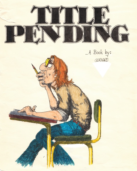
This interview originally appeared on TCJ.com in February 2011 in a slightly different format. Several images have been added throughout the interview. A follow-up post with further analysis and thoughts can be found here. Gerhard has recently launched a website as well.
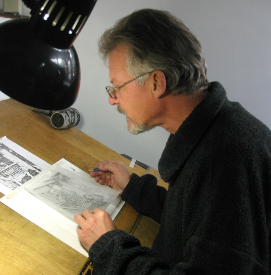
Gerhard at his drawing board, the same one he’s been using for 30 years.
He’s soft spoken, self-effacing. Thoughtful. He worked on almost 5,000 pages over 20 years, but in the past seven years has struggled to draw at all. His former partner is one of the most well-documented figures working in comics, and yet he himself has given only a handful of interviews.
For 20 years, Canadian artist Gerhard worked as a background artist and environmental designer on Cerebus, one of the most sprawling pieces of visual fiction ever created. His designs and meticulously crafted drawings served to ground even the most fantastic of events, or drastic of stylistic shifts. Sim and Gerhard worked in a way that to many may seem unimaginable — Sim penciling and inking his characters in vast fields of white, and handing them off to his collaborator sometimes with the barest of instructions. A pencil line for a table, a hastily written note reading “door.” And yet the resulting work almost always seem unified, of a piece. It’s a remarkable tribute to Gerhard that no matter what was happening in the foreground of the books, the characters always seemed grounded in a reality, capable of exploring and interacting with their richly textured world.
Gerhard and I spoke to each other over the course of a few hours on Boxing Day, December 26th, 2010. On each end of our respective phone lines we both had an intimidating stack of books — the almost five thousand pages that Sim and Gerhard created together over the course of those 20 years. We flipped through the books chronologically, with the idea of discussing the evolution of Gerhard’s process and techniques, focusing on his development as an artist and a craftsman. I find that when cartoonists get together to talk, they almost inevitably end up circling around issues of craft, grilling each other on the “how to” and the “what for.” I consider Gerhard a master draftsman, and one of the greatest pen and ink renderers of the last 50 years, and so I thought that such a conversation with him would be compelling for pen and ink enthusiasts, for Cerebus admirers, or for or those curious about a job whose quality depends on its invisibility. He did not disappoint.
For those of you who are hoping for a juicy expose on Gerhard and Sim’s working relationship, or the dissolution of their partnership, I’m afraid you might be disappointed. I hope you stick around anyway, though, and enjoy — there’s a lot to take in.
— Sean Michael Robinson
Robinson: Do you remember much about your formative art experiences? Were they in a classroom, with your parents, or …?
Gerhard: My mother’s told me I was the easiest kid to keep occupied. If she was busy with housework, all she had to do was give me a piece of paper and a pencil or some crayons and I was quiet for hours. Drawing is just something that I’ve always liked to do. In school I would doodle more often than I would take notes.
 In high school, I had three notebooks. One was for math and science, and one was for English and geography and those were empty and pristine. And the third notebook was just jam-packed with blank paper, and I would just doodle in it constantly. And when I filled up that notebook I would take all the pages out and usually just throw them away and fill it up again with blank paper, and off I’d go.
I remember one particular time in math class the teacher had given us these assignments to work on. He wasn’t teaching — everyone was working quietly on the math problem or whatever it was — and of course I’m sitting there lost in my own little world doodling stuff. And unnoticed by me, he was walking up and down the aisle seeing how everyone was doing. And he came up behind me and sort of reached over my shoulder and picked up this notebook with all my doodles in it. And I thought, “I’m screwed. I’m totally screwed.” This wasn’t intended for anyone but me, so there was anything and everything in there. So I thought, “This is it. I’m going down to the office. I’m dead, I’m dead.” And he closed the book, started at the beginning, and he flipped through it until he got to the page I was doodling on. Then he put it back down on my desk and continued walking up the aisle helping people with their math problems, and I thought, “Whew.” Because he could have really hung me up to dry.
 I’ve been thinking about this — I thought you might ask me about my early influences. And I would love to quote all these great names, Bernie Wrightson and other brilliant artists. But I realized that one of my biggest early influences was my babysitter. I was maybe in grade three. And she was probably just late teens, just a girl, I have no idea what her name was. I had a paint-by-numbers coloring book, a Stingray coloring book, the TV show with the marionettes and the submarine. But I only had the book — I didn’t have the paints, the colors. So she was trying to get me to sit down and draw. And I said, “I can’t because I don’t have the paints to put the colors in.”
She said, “OK, why don’t you try this?” She pointed out that the number one on the page was yellow, the lightest color. So she said “leave that one blank.” For the number two, the next darkest color, orange or whatever, she said, “Put in just one set of lines. [Laughing.] And then for three, the next darkest color, put in two sets of lines. And for the four, put in three sets of lines.” She basically taught me right then and there how to think in a greyscale. [Laughter.] Once I started doing that, I realized it actually worked and I was amazed. I remembered that just recently.”Oh my God, that’s really where I first learned to crosshatch and think in a greyscale!”
As far as any other art training goes, I never took any sort of extra classes or anything like that. Actually I was not a good student in high school. I majored in drugs, mostly.
Robinson: Which drugs in particular?
Gerhard: Oh, marijuana mostly. I actually had to take grade 10 art three times before I passed it.
Robinson:Oh my God.
high school doodles, 1975 or 1976
Gerhard: Mostly because the curriculum was divided — the first half of the year was drawing and painting, which I was fine with, and the second half of the year was ceramics and sculpture, which I didn’t care for at all. My one pottery thing that I built blew up in the kiln and wrecked everybody else’s stuff that was in there. I guess you could say I’m self-taught. For the longest time I had a lot of trouble talking about this kind of stuff. You know, influences and technique — because basically I was learning on the job. And I was embarrassed to look at the early stuff. As I’m sure Dave is to look at a Cerebus #1. He probably cringes every time. [Laughter.]
Robinson: When you say early stuff, which particular period are you referring to? How long would you consider that journeyman stage?
Gerhard: I don’t think there was ever one particular turning point. It was a very gradually evolving thing — I just slowly got better. Thank God. [Laughter.]
Strangely, Gerhard and a friend used this aardvark (adapted from the anteater in the BC comics) as a logo for years, well before they’d ever heard of Dave Sim or Cerebus.
Robinson: In the first 300 pages you worked on in Church and State, it’s amazing the amount of techniques you’re adding through that time — and subtracting too.
Gerhard: Right, yeah. Get rid of what doesn’t work, keep what does work, and you slowly build up a bag of tricks. Like when something worked, you kept that. “OK, remember how you did that.” And when something didn’t work, it was like “Don’t do that again.”
Robinson: It’s interesting to me to look at the very first issue. You seemed to avoid contour lines a lot for the backgrounds and more focused on the value relationships, but you almost immediately ditched that.
Gerhard: That’s the problem with learning on the job — all these thousands of people get to see all of your mistakes. And luckily I managed to muddle through that. It was a learning process for both Dave and I. He has this incredible ability to mimic almost any drawing style. And when he got stuck, when he had a page where he’s thinking “How should this look? How should I present this? What is the effect I want here?” — all he had to do was to pull out a Bernie Wrightson book or Jeff Jones or whoever, and he could emulate that. He tried to get me to do the same sort of thing. And I would look at those references, but ultimately it would always work out best if I just drew the way that I drew. Not trying to fight it. I would try to make it look a little more like that, but I would still have to do it the way I do it. That was just the way it worked best. And it usually involved a whole lot of little lines. [Laughing.]
Robinson: Well, you certainly modified your inking style at times. Not to jump too far ahead, Going Home is very pattern focused, and Form and Void has the stark contrast.
Gerhard: And that was actually really difficult for me, because I really do think in a greyscale, in those tonal values. I realized at some point that it sort of defines the differences in the personalities of Dave and I: He’s very much a black-and-white kind of guy, even in his thinking, and I am more shades of gray. He was a master at spotting blacks. In High Society, before I started on the book, there was a lot of black. He was concentrating on the writing and the characters and there’d be a whole lot of black on the page, which was basically why he asked me to come on board and flesh out the world that Cerebus lives in.
Robinson: To take that up, how much back-reading of Cerebus did you do before you actually worked on the Epic stories, or the series? Did you actually sit down and read all of the issues?
Gerhard: At the time before I started on Cerebus, I was working at the local art supply store, which was appropriately named The Art Store. And I was doing some commercial jobs on the side, trying to make some money and trying to build up a portfolio of published, or at least printed, work. So a lot of it was commercial work. I would have to draw snow tires and meat pies. One assignment was to draw a frozen beef pie using pointillism and “make it look delicious.” [Laughter.]
Above: Two examples of Gerhard’s commercial work ca. 1982 or 1983
Robinson: Is that possible?
Gerhard: Well, I gave it my best shot. But this was the sort of thing that I was doing at the time. I was also working at the art supply store and doing the deliveries. And Dave was on my route. I would drop off the Letratone that made Cerebus gray. And that’s how I met Dave. Also Deni, his wife at the time, is a sister of a friend of mine. So we met at parties and stuff too. At the time I had done a whole bunch of pen-and-ink pieces and colored them with watercolor wash on top of the pen and ink, and framed all of those up to try to do a show, and that met with, let’s call it limited success? Because it takes a long time to put all those pieces together, costs a lot of money to frame them up and takes a long time to sell them and get your money back. So I had a whole bunch of unsold pieces hanging up in the apartment. I had a party and Dave and Deni came. I was aware he was doing a comic at the time, but I wasn’t into comics at all. I had seen an issue here or there, and thought, “That’s pretty cool,” but I hadn’t got into the story or anything. And then when Dave saw these colored pieces that I had done, he mentioned that Archie Goodwin at Epic had approached him about doing some color pieces, and Dave was never big into doing color. And so he asked if he laid out the pages and inked the characters and the word balloons, would I be able to do backgrounds like this behind it? So I said, “Let’s give it a shot.” And that’s how the Epic pieces came about. Then when he asked me if I wanted to do the backgrounds on the monthly book, I sat down with issue 1 and read all the way up to the current one, and sort of dove in from there. I read the whole thing pretty much in one sitting.
Robinson: What was your impression at the time?
Gerhard: I remember going into the studio the next day after reading them and I just started gushing. Just “I love this part, I love that part, this is great, that’s great, when he does this, when he does that …” and Dave’s just sort of rolling his eyes like “Oh, God, he’s turned into a fawning fan.” What he wanted was a collaborator. “No, no, it’s OK. I’m just saying, I’m really blown away, I’m really excited about working on this stuff.”
And he was like, “Well, let’s get to work.” [Laughter.] And of course the first few pages were just brutal. Here I am — I figure basically all I’m doing is ruining Dave’s pages. [Laughter.]
Robinson: Did that feeling last a long time?
Gerhard: Let’s see here. We’re in Church and State 1. Here we go. Looking back on this stuff is just …
Robinson: I’m sorry to do this to you.
Gerhard: Well, I knew it was going to happen. [Laughter.] No, especially the first few issues …. the thing too is Dave was using a crow-quill pen [Long sigh.] I’d been using mostly technical pens. So not only was I trying to learn technique and whatnot, I was using a completely new medium… oh, God, I can’t look at this, that’s just awful. [Much laughter.]
Robinson: What page?
Gerhard: Church and State page 282. Booba’s at the desk writing and there’s all these horrible bricks in the background. [Laughter.] But again, I was learning on the job. I remember saying to Dave at this point, “I’m drawing individual bricks. What I have to draw is a wall.” Learn how to draw a wall instead of a bunch of bricks.
Robinson: That’s a great way to say that. I was noticing on … 233 was the first monthly page you were on, right?
Gerhard: Let’s see … [hums] Yes.
Robinson: There’s some techniques in those first few pages that you don’t really come back to. Is that stippling on 275?
Gerhard: What happened there was I inked it as a contour and though it was too distracting, too stark, so what I ended up doing was putting a sheet of white Letratone on that breaks up the black line. The other stuff on the page is a sheet of stipple Letratone. I wanted a gray value in there, but I didn’t have the confidence, especially with a new pen, to do it with crosshatching, so I did it with the stipple tone instead.
Robinson: Had you used much of that before?
Gerhard: Not to that extent. I was familiar with it. Now that I’m flipping through the pages, I see that I abandoned it pretty quickly. It’s not like I used it on very many pages directly after that.
Robinson: And when you did bring it back it was on top of some of your crosshatching.
Gerhard: That’s the thing. Sometimes I would put all the layers of crosshatching down and decide there wasn’t enough contrast, so, rather than trying to add another layer of crosshatching, I would just put the stipple tone on top.
Robinson: 277 is one of those pages I was noticing trouble with the line weight. Making the chair appear like it was really attached to her hand or not.
Gerhard: Oh yeah. That’s actually a very good point. OK, we’re very early on here. We’re — What? — four or five pages into this. In the Epic stories, all the background stuff was very much in the background, and, other than the bottle he was drinking from, there wasn’t anything that the characters were directly interacting with. So when she picks up that chair all the sudden it still looks like it’s too much of a background chair, it’s not enough of a foreground chair. So I did my best at the time. But even looking at it then I’m going,“That’s not right. I have to do it differently than that. Not sure how yet, but differently.” So there was a distinction. A few pages later on Cerebus is in the courtyard playing cards, and the chair he’s sitting on there looks more like a foreground chair, not a background chair.
 So I had to learn that distinction. The stuff that the characters are directly interacting with needs to be more cartoony, more contour line, and as things go further in the background, I could break up the contour line, use more value, or whatever.
Robinson: When you came back to those locations, sometimes a couple of hundred pages later, did you feel kind of stuck with the design that you had instigated?
Gerhard: In a lot of ways, yeah. That was one thing that I was probably overly concerned with, was trying to keep things looking consistent. At the same time I didn’t want to go back and make this thing exactly the same as before. I knew this was all one big long continuing story, and I knew it was going to be looked at in that way, especially when it would be reprinted in the phone books. I didn’t want any jarring stylistic change from one issue to the next, one page to the next. It was a bit of a struggle to not repeat the same mistakes I made before. It was a balancing act — make it look like it did before, but better.
Robinson: When we hit 305, is this some type of splatter on top of a Letratone?
Gerhard: Nope, again it’s the stipple tone. I would use two layers of it. The lighter gray is one layer, and I would put another layer of the stipple tone on top of it. If you look at the original pages it looks really good. If you look at this page reduced and printed on newsprint, it’s like “Ugh, that looks muddy. Don’t do that again!” That was the other thing learning to draw for reproduction. Most of the stuff I had done up till then was for framing, not reduced and reproduced. I would do the pages and I wouldn’t actually see how it turned out until the printed book came in. And I would look at it and go “Oh, that didn’t work; that did. Do that again; don’t do that again!” These issues were pretty much done without the knowledge of what it was going to look like in the final book.
Robinson: One small thing. On 328, there’s a crowd scene.
Gerhard: Hold on, let me find it. I think I know which one you’re talking about- it’s going to make me cringe again. [Pause.] oh yeah. We did a lot of stuff with photocopying. I would draw it on a separate piece of paper and photocopy it, and paste it on the page. This was a long time ago. I think I drew a small section of the crowd, just the faces as ovals, because I didn’t want them all to look the same. So I had a little segment of faces and then photocopied them and pasted them up, and then just went in and put in different hair and stuff, tried to make each one a little different.
Robinson: How much adjustment do you think Dave was doing at this point knowing what you were going to be coming up with?
Gerhard: Well, when he was working, he was starting on a blank piece of paper. I think initially anyway his drawing style didn’t change too much. Did you notice on 331 the top right panel there’s no turn on Cerebus’ arm? [Laughter.] That was my job too — I took over the toning responsibilities, and I just completely forgot to tone his arm on that one. Anyway, this was sort of our philosophy too. No matter how good the original art looks, whatever it looks like printed is the important thing, because that’s what everybody’s going to see. Not the original art. So if it worked on the original art and it didn’t work in print, then I had to change that. It was a learning curve for the both of us as we got the printed book back. We both sort of adjusted our styles and techniques down until we sort of met in the middle and finally gelled and it looked like one cohesive … I wonder when that started happening.
Robinson: In my estimation, around 466, 500, somewhere around there, it really starts to gel.

Gerhard: Even this one, 444, where Cerebus goes down in the basement and he gets the case of whisky. I like that. That bottom panel. That’s very reminiscent of the Epic stories too. Yeah, more like that.
Robinson: There’s a kind of coordination that seems to be at work there.
Gerhard: Yeah. 449’s not too bad.

Lost it for a little bit there. And then … Oh yeah, the room with Jaka. I think that’s when it really started. I was still doing too much grain on the door — that’s too much. The stipple stuff worked out well. And I started putting down the stipple and then having just a little bit of crosshatching in the corner to give it some weight. That would come back from the printer and I would go, “Ohh, OK, that works. That’s one.”
Robinson: It’s an unusual combination. I don’t think I’ve ever seen that before: stipple tone on top of crosshatching.
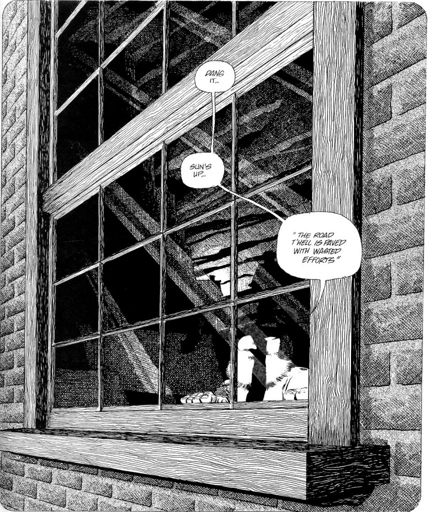
Gerhard: In some cases I would do it the other way around — I would put the stipple tone down, say, “That’s too flat,” then I would crosshatch on top of the tone. On the job training. And one of Dave’s philosophies, which I really credit him for, was to do stuff just because it occurred to you. I remember where the little farmer guy comes in and there’s one panel where he’s looking out the window — there it is — 573 — and as I was penciling it I said to Dave, “Oh shit. All of a sudden it occurs to me that I want to do the reflection of the sun coming up in the window.”
And he said, “How are you going to do that?”
I said, “I dunno.”
He said, “Do you think you’re gonna be able to pull it off?”
And I said, “I dunno.” [Laughing.]
Robinson: From then on it seems like the experiments are constructive and expanding the boundaries. More than just confidence, it seems like you have some mastery over your skills.
Gerhard: Wow, mastery already, huh? That’s very generous of you. Well, we’re that many issues into it, and it does like a lot better already. So, I guess, thankfully, I’m a fairly quick learner. [Laughter.] I wouldn’t quite call it mastery.
Robinson: Well, of the things that are in the repertoire.
Gerhard: Yes, slowly building up the bag of tricks. Get rid of the stuff that doesn’t work, refine the stuff that does. But you know, it’s funny. Just because of the sheer size of this story and the sheer number of pages involved, after a while your bag of tricks slowly fills up and you can refine them. I would look at the page, and I would see what needed to be done in my estimation, and I would decide which technique, which little trick from my toolbox I was going to use in any given situation. And as the years go by that starts to feel like hackwork. I’m just doing the same stuff over and over again. And it’s like, I would almost become hesitant to try new techniques, because it was a monthly book. We had to average a page and a half a day to get this thing out every month. I guess every once in a while if the situation was right and I was feeling confident I would try something else, but otherwise it was stick with what works. Day in, day out, month after month, year after year. It just started to feel like hack work, almost.
Robinson: It must have been tempting to get more conservative in a certain way.
Gerhard: Yeah. But it was also just developing a style; you have to stay with a style. Also, because I stayed fairly consistent, it gave Dave the freedom to change up styles, a different feel for a different character, and as long as the backgrounds stayed the same it wasn’t a jarring change in the overall look of the book. I guess my point was that after so long the bag of tricks gets full and it seems like I’m doing the same thing over and over again.
Robinson: On 416, there’s a couple of visual devices that you inherited from issues that you didn’t work on.
Gerhard: Are you talking about the streams of light?
Robinson: Yeah. What was your reaction to those things that you were called upon to replicate?
Gerhard: Not happy. Not happy, no. It was difficult to try to emulate some of the things that Dave had done. I would have much rather he had done those streams of light, because I think he was better at it.
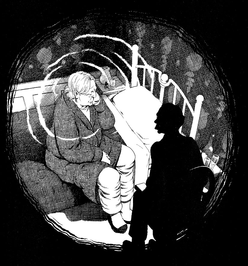
Robinson: So 513 is the “Odd Transformations” story. And it seems like the first time that what’s happening in the foreground is completely dependent on what’s happening on the background.
Gerhard: I loved all the dream sequences. I loved doing that stuff.

Robinson: So how did you guys coordinate those types of things? [Long pause.] Or did you coordinate? [Laughter.]
Gerhard: Well, this is probably the reason I loved doing them so much. Because it was a dream sequence, I guess I didn’t feel that I was constricted as much. It could look different and it didn’t matter. Because it was a dream somehow that liberated me from feeling like I had to stay just in the background. You know, page 512 I always liked, the panel on the bottom.
Robinson: That’s another one where the lighting is so dramatic that it’s hard for me to imagine how you guys could coordinate that without doing some type of joint planning.
Gerhard: From the shadows on the character I could tell which way the light was coming from. So I knew where I would have to put the table lamp. Then it was just a matter of designing the room around him and getting the perspective right, and then putting the shadows where they would fall if there was a light sitting on the table. And then bingo bango, there you are.
Robinson: How did you develop your pre-visualization? I would imagine it wasn’t always that keen. When you’re looking at a page like that, what process is going on as far as being able to visualize the elements you need on the page?
Gerhard: With this one, there’s two elements I’m considering first. The first one is where’s the light source, and the second one is finding the horizon line. For this, he’s on the floor and we’re looking straight down like we’re a fly on the ceiling, so I knew right away that this one would be one point perspective. And again, determining the light source from the shadows on the character. After I’ve determined those things it’s just a matter of building the room.
Robinson: Of construction.
Gerhard: Yeah, constructing a room and then going back to the light source and figuring out where the shadows would be. So getting back to the dream — when the characters interacted with the background, Dave would usually just draw with a pencil line — indicating, say, the edge of a table. Sometimes if it would be important to the story he would draw a rectangle or whatever with the word window in it — or he would just very quickly sketch a window in.
 On page 516 where the nurse character is in the partial sphere there, and she’s getting enveloped in the water, I remember that was me — I’m not exactly sure what Dave had intended there — he gave me no real indication. And again, because it was a dream issue, and because of Dave’s philosophy of doing something just because it occurs to you, well, that’s what I did. And then at the bottom left, where Cerebus breaks through the panel borders, and you can see all the reflections in the water, that was me too. There was no indication from Dave that that was supposed to happen. The dream issues were always a little liberating for me because all bets were off. On 521 where the one tree snakes from one panel to the other, that was my decision. Dave really gave me free rein on the backgrounds.
For the longest time Dave would work only a page or two ahead of me, and I was on a need-to-know basis. I still enjoyed reading the book one page at a time. So if there was something really important to the story that needed to be on the page, he would either quickly rough it in, or write window or whatever.
Robinson: So if you wouldn’t mind moving to Church and State 2… In a certain way I have less to ask you about as your skills …
Gerhard: As it became more obvious what I was trying to do? [Laughter.]
Robinson: You added so much in the first 600, 700 pages, there’s just an incredible amount of forward progress. And your technique becomes more invisible.
Gerhard: That was another thing that I was always trying to do, not to make what I was doing too obvious. All the early stuff just looks too obvious.
Robinson: The first section in Church and State 2, you guys introduced the fingerprints.
Gerhard: That was Dave’s thing too, something he had done in an earlier issue, and again somehow I thought he managed to do better than I did. His always seemed more spontaneous, grainier and messier, and mine seemed too finicky.
Robinson: The overall value got a little bit darker too.
Gerhard: I was getting more confident in putting in solid blacks. Part of the thing was, because all I was doing was the background, my Judeo-Christian work ethic compelled me to put in as many lines as possible. I figured that just doing Dave’s trick of using an entirely black background was cheating. I would see it in his work and think, “That’s brilliant,” but if I did it in my work I would think I was somehow slacking off. [Laughter.]
Robinson: I’m looking at these early scenes now. How much of this wood was drawn in reverse, in white on black?
Gerhard: None. That’s all black.
Robinson: None? That seems so impractical. [Laughter.]
Gerhard: Tell me about it. [Laughter.] But it was almost fun.
Robinson: So you got a kind of hypnotic effect.
Gerhard: Yeah, I’d get this kind of zen-like effect.
Robinson: I find that inking in general can be like that.
Gerhard: Well, for me laying out the page and penciling and working out the perspective and lighting and all that is mentally engaging. It takes a lot of concentration and focus and thinking to do it right, especially in the penciling stage. There were a few times when I would have trouble inking a page, and I would think, “Why am I having so much trouble with this?” And then I would realize “I’m not done penciling.” So I would put the inking stuff down and tighten up the pencils more. When the pencils are tight enough, when I ink I can just put my mind in neutral and away I go. All I have to do is turn what I see in pencil into ink
Robinson: It has a kind of performance aspect to it, where you might rehearse for a hundred hours on a set of songs before you play them.
Gerhard: Yep, there’s definitely an element to that. That’s very good. But inking for me was always nerve-wracking in some ways too. Because that’s the final version. If I screw up on the inking, I’ve screwed everything up.
Robinson: I wanted to ask you about the snow …
Gerhard: Oh, the snowstorm! [Chuckles.] Yes.
Robinson: So were you using a toothbrush for the splatter?
Gerhard: Yep. It always made a huge mess, but it was fun to do.

Robinson: Well, it looks great. It gives a kind of randomness to the pages that wouldn’t be there otherwise.
Gerhard: On the 708-709 spread look at the cityscape at the top of the page there. All those little lines and all that crosshatching and stuff and then I just cover it all with splatter. [Laughing.]
Robinson: Where did you pick up that particular technique from?
Gerhard: Oh, Dave had used it in previous issues. He showed me how he had done it, and I thought, “Well, that’s just the coolest thing. I’m going to do that.” It’s the same technique I used for the moon as well. After I was done splattering on my cityscape, I would go in and ink out any blobs that were too big, if any of them individually drew my attention. You know, I tried an airbrush once and that didn’t go too well, so I went back to the toothbrush. I guess I’m more of a toothbrush kind of guy. [Laughing.]
Robinson: Let’s skip way ahead here. These are beautiful pages here by the way. So in this next dream sequence [897] there are a few pages of full-bleed. You guys used actual full-bleed so infrequently. Was that a function of the printer, pricing or an aesthetic decision?
Gerhard: I remember our printer, Kim Preney, saying something at some point about full-bleed being a pain because it made a big mess of the press, but those were done as full-bleed. Notice they don’t actually bleed off the side of the page in the phone book, but they did in the monthly book. The reprints are a slightly different aspect. That’s why you have the rough, unfinished edges on the left and right, although it bleeds off the top and the bottom. Anyway, Dave wanted the full bleed for the dream quality. I remember Dave did a solid black full bleed in one of the earlier Mind Games issues, and someone wrote to him and said they didn’t like it because their fingers would get dirty when they were turning the pages. [Laughs.]
Sean Michael Robinson: What was it like having a fresh starting place for the first time with Jaka’s Story?

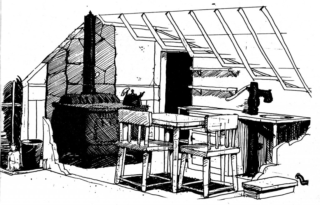
Preliminary drawings — Jaka’s apartment floor plan and kitchen design.
Gerhard: Well I completely designed the environment — the interior of Jaka’s apartment, the interior of Pud’s store and tavern — before we started doing any actual pages. I gave Dave all those items. There were floor plans, there were 3-D views. I designed all that stuff because we wanted a real sense of place. The Church and State story arc was done and this was the first book we were starting on together. So I created those environments and Dave stuck to them as well as he could. I think I spent a month on the designs. This is where we started getting behind the monthly schedule. We were also falling behind at the end of Church and State because we were doing a lot of promotional stuff, traveling, signings and conventions.
Robinson: Well, you guys did that double issue in attempt to catch up …
Gerhard: Yeah, we did a lot of things later in an attempt to catch up. But at the beginning of Jaka’s Story we decided to take the time at the expense of the monthly schedule. Especially since Dave let me know we would be in this location for a while. I really did want to establish right off the bat where we were and what it was going to look like. Because up until this point the only recurring location was the hotel that Cerebus was in, but it was done on the fly. If I drew a room once I would have to refer back to it — try to figure out what it might look like from another angle. And I wanted to have all that established ahead of time so that when it came time to actually do the pages, all I’d have to do was look at the characters Dave had drawn, where they were supposed to be standing, and then from my floor plan I could extrapolate what you should be seeing behind them.

More preliminary drawings — Oscar’s living room.
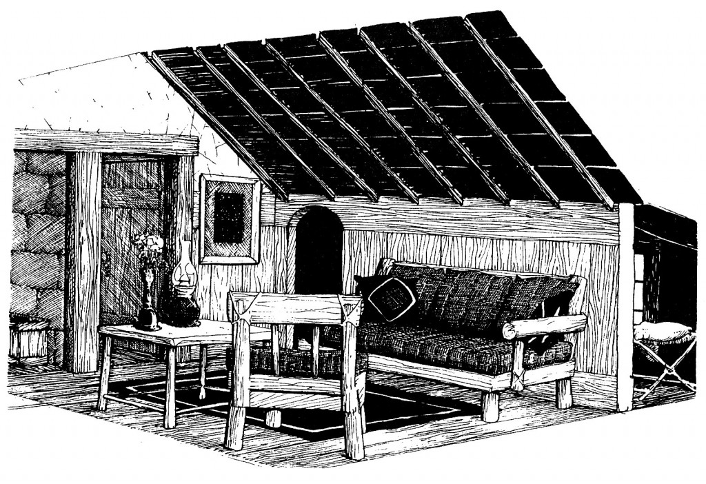
More preliminary drawings —Jaka’s living room.
It was almost like transcribing. My first considerations would be light source and horizon line. And a lot of the stuff was done pretty close to Cerebus’ eye level. And it was just a matter of looking at the floor plan and establishing the view.
 Robinson: There’s some more extreme lighting, for instance, shadows from the windows on top of the characters while they’re sleeping. Are there any instances where you’d go back in and put lighting on top of the characters?
Gerhard: Very rarely. With the shadows from the cross-pieces of the window, sure. But very rarely would I put a crosshatched shadow across a character — more often than not I’d just move the shadow.
Robinson: Did you have any physical models at this point?
Gerhard: For Jaka’s Story? I don’t think so. It was all pretty much floor plans and elevations. I didn’t actually make a physical model until Melmoth.
Robinson: And that was primarily because of the canted streets?
Gerhard: Yes [Laughter.] That made my head hurt. “I’m not doing this any more. I’m building a model.”
 Robinson: The only major ink technique you seem to have added was using that fine dot tone for clouds.
Gerhard: Yeah. I tried cutting out the clouds but it would just have too hard of an edge. I tried using white paint on top of the tone but wasn’t happy with that. I found that if I pressed hard enough I could erase the dots on the tone to just soften that edge.
Robinson: I was wondering because it’s pretty common in manga, but I hadn’t seen it in North American comics before. But I didn’t think you had any direct exposure to manga.
Gerhard: Nope. It was just something I made up.
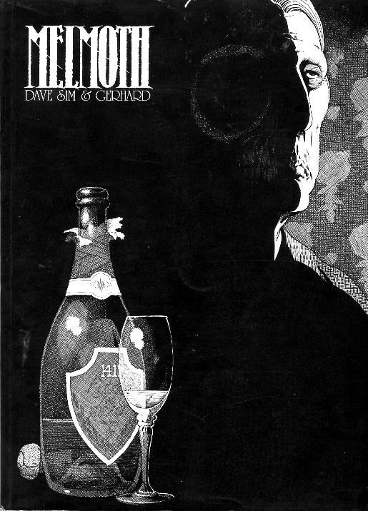
Robinson:Moving on to Melmoth … I was interested to see that you had a lot more overt atmospheric effects, in terms of weather reflecting characters’ emotional states. Obviously it’s thematically related, but was that directly from Dave or were you just responding to the morbid nature of the material itself?
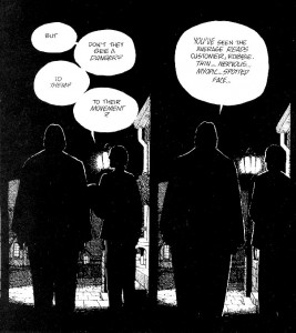
Gerhard: By this point, we had an unspoken understanding. I don’t think there was a whole lot of discussion. He really left the backgrounds up to me. Like the scene where they’re walking up the street and the characters are all in silhouette, it’s obvious that it’s night and it’s very dark. My challenge is: How do I make it dark and make it so you still see silhouettes?
Robinson: I suppose if you handed him back a page and it’s completely black that might not be …
Gerhard: That might not go over so well. [Laughter.]
Robinson: The other thing I noticed in this particular one is having selected portions of the page whited out reflecting Cerebus’ emotional state — 121.
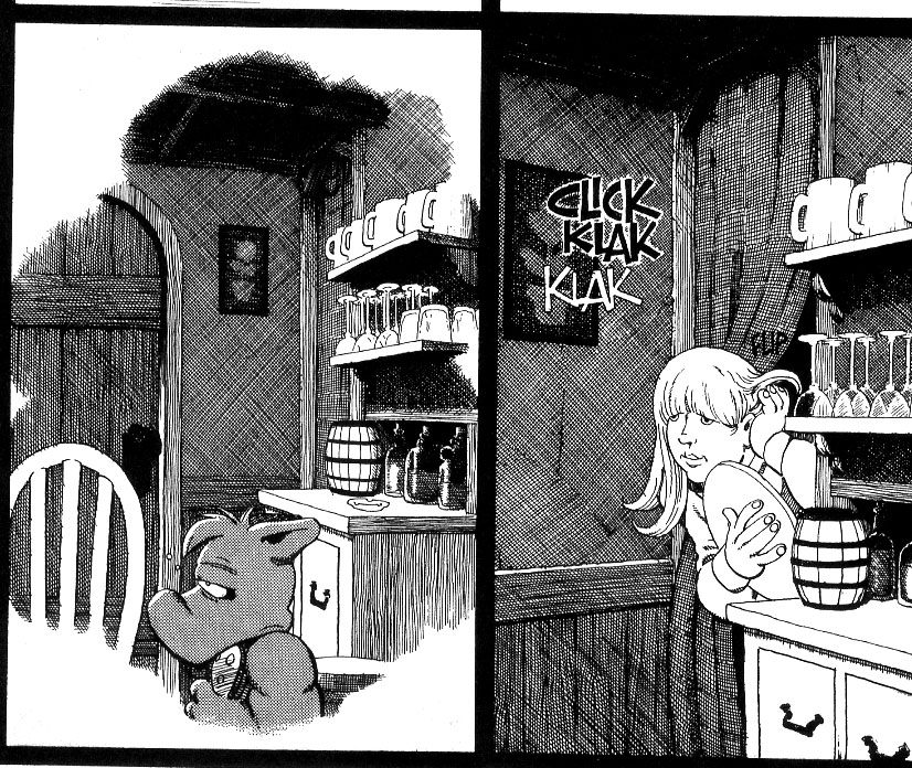
Gerhard: Yeah, having the background collapse in on him. That was Dave’s suggestion. On page 122, for example, where he’s in the kitchen, the background’s all foggy around him, but when the other character comes in, there’s a full background.
Robinson: Was Dino’s Cafe modeled on any particular building?
Gerhard: The cafe itself? No. But Dino is.
Robinson: Yeah, I recognized him. [Laughter.] What was your architecture background then?
Gerhard: I took drafting in high school, but that was about it.
Robinson: On 130, we get a pretty good view of the exterior.
Gerhard: Melmoth was another one where I basically designed the street before we got too far in the story. When it came time to design the buildings, I’d go to the library and take out a bunch of books and just take any architectural features that I found interesting and use those. Photo books from Europe.
Robinson: In the doctor’s office, and Oscar’s final resting place, were any of those researched details?
Gerhard: I couldn’t find anything specific. All I knew was that the wallpaper had to be really ugly. [Laughter.] Because of Oscar’s famous last line.
Robinson: Mission accomplished. [Laughter.] That’s a beautiful rendering of the ugly wallpaper. Although I think you’d be hard-pressed to find attractive wallpaper.
Gerhard: That’s true. Although I had a lot of fun with the covers from Reads, with the wallpaper motif. Those were all based on Barry Windsor Smith’s stuff.
Robinson: I was wondering how many classic ink illustrators you’d looked at. Did you ever see the Arthur Guptill book Rendering in Pen and Ink?
Gerhard: Geez, I’ve got a book named that. I wonder if that’s the same one.
Robinson: It’s the one written in the ’30s and reprinted sporadically since then.
Gerhard: Here it is! Arthur Guptill.
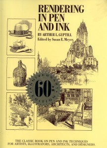
I would refer back to it. Not that I would want to emulate anything in particular, because, again, I was just better off drawing the way I draw, but I would look through that and think, “Wow, that’s the stuff.” Well, here we go, I just flipped it open and I obviously used some of that in Church and State, in the room that Jaka was in. Page 211. And here on 212 was the basis for one of the Epic illustrations. Not the color stories, but one of the individual illustrations we did and I colored up. That was definitely a reference for one of them.

So, yeah, this book was something I would refer to often. But not too often, because sometimes I would just get out-and-out intimidated, as in “I can’t do that.” Another one was Winsor McCay, Daydreams and Nightmares, and towards the end of the doing Cerebus I found Franklin Booth’s Painter with a Pen. It’s phenomenal.
Robinson: Booth was incredible. He’s got a bunch of work in the Guptill book too.
Gerhard: Obviously, he would have to be in there. When I first started on Cerebus, I was over-rendering, using way too many lines. I tried to be more economical as I went along. But there was definitely a big learning curve for me.
Robinson: The reason I brought up that book is that you’re the only comic artist I can think of working in black and white that actually gave a full range of value, like the classic pen-and-ink illustrators would. Although there are some exceptions, in the American idiom of working in black and white, people are reaching for that Milton Caniff-like using contour as a container for color that never appears.
Gerhard: I know what you mean. That goes back to the grayscale that is in my head that was ingrained by my babysitter.
Robinson: That’s a crazy story. I really love that.
Gerhard: It’s amazing where influences come from. I remember I was doing an interview a long time ago with someone who said they really admired my use of light and shadow, and it suddenly dawned on me that that’s what it’s all about. Without light and without shadow you wouldn’t see much of anything.
Robinson: I know you’ve expressed frustration with the pen-and-ink medium in the past. I was wondering if you’d considered the idea that pen-and-ink is in a way a more permanent medium than any other visual artistic medium in the sense that I can take a cheap, printed-on-newsprint copy of a drawing you worked on and make a million copies of it and it’ll have some fidelity to the original in a way that no other medium can.
Gerhard: That’s true to an extent, but you know, it’s amazing to see the difference between the printed book and the original artwork. If you ever see a copy of the Winsor McCay book, look at the difference between the illustration on the cover, which is a giant multi-layered, multi-winged multi-engined airship, and then it’s reproduced much smaller on the title page, and all that delicate line work is filled in to solid black. And that’s sometimes the difference between the original art and the printed version. I look at that and I think, “I’m not going to do all that crosshatching when it’s just going to fill in to solid black anyway.”
Robinson: So you think that’s largely an illusion, because the reader hasn’t seen the original.
Gerhard: In some cases. As the book went along I tried to draw for how it was going to reproduce rather than how it was going to look on the original art. For me the cover of this Winsor McCay book, with all the crosshatching and the gray values that are on the cover, I’m sure this is how Winsor McCay intended it. There’s almost no solid black on here. That’s more towards my way of thinking. And in the smaller reproduction on the title page, that would be more Dave’s interpretation of things. The small one works too. It just doesn’t look like a Winsor McCay drawing.
Robinson: So, moving on to Flight. On page 24 is the Red Marches, which we’ve heard about for a long time, but every exterior up till this point has been in 22-year-old Dave style. What’s on your checklist of things to accomplish?
Gerhard: Well, I tried to refer back to whatever Dave might have done, but in this case there really wasn’t much to refer to. So it was pretty much left up to me. And what I was going for was a big wide-open nothing. At one point, Dave told me that when he’s drawing the characters standing around an empty page of solid white that he’s got an idea of what it will look like when I’m done. Sometimes it would be pretty close to what he was thinking, and sometimes it would be completely different from what he was thinking. [Chuckles.]
Robinson: On 94, there’s a beautiful image that would make my head hurt — of the foundry. What type of research was involved in this?
Gerhard: Dave and I made it up.
Robinson: Really.
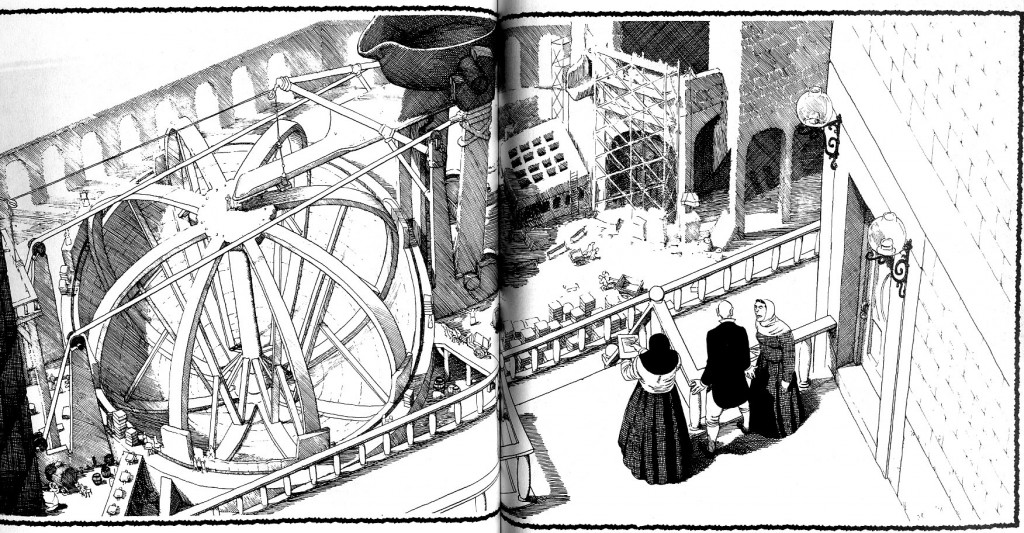
Gerhard: Yeah. I thought, “How the heck would you pour a sphere of gold?” That was another thing that Dave said early on that stuck with me. He said you can do research and you can find out how it was done, but he preferred to just make it up. That this is how it’s done in Cerebus’ world. This is an instance where I took that and did that myself. What would a mold look like for a giant sphere of gold? So I just started thinking about it and did a bunch of little sketches and this seems at least somewhat feasible [laughing] and then it was just a matter of drawing it. Now that I think of it, though, I seen to recall that Dave might have made a very rough indication of how this was done. But most of the particulars were left up to me. This is the blast furnace up here, and it would pour out of this spout into the big ladle thing that would be kept warm; this is like a warming pad that would keep the gold warm until they could hoist the ladle up to the chute that would pour it into the spherical mold.
Robinson: That’s the perfect illustration of what I was hinting at before. Whatever else is happening in the story, you’re providing a grounding for those things.
Gerhard: Well, my job was just the backgrounds, so I gave the backgrounds a lot of thought. When it was just close-ups of the characters and a lot of dialogue then I would try to focus more on the design aspect, try to keep it simple. That’s when I started using more solid blacks and whatnot. But when it came to panels like this I would give it considerable thought toward trying to make Cerebus’ world a little more real.
Robinson: A texture to it. So I was wondering if you ever had trouble working out perspective with the figures as they were given to you.
Gerhard: Oh, absolutely. If I actually went through some of these pages, I know there’s many instances where Cerebus is interacting with other characters, where if Cerebus is only three feet tall, he would be hovering a foot above the floor. So there are all sorts of instances where I would have to put a step or a platform for one or the other characters to stand on so they wouldn’t be hovering above the floor. Sometimes I just could not find a horizon line. There would be some conflicts where some of Dave’s characters would not fit into the perspective. I would take the perspective from the largest character, or the majority of the characters, and work from there, and anyone that didn’t fit into that perspective, that’s just the way it is.

Robinson: Moving to Reads, other than making up some time, was it a relief to work on some individual illustrations?
Gerhard: Yeah. I liked doing that, getting a more illustrational quality.
Robinson: Of course, in opposition to that you have the tremendous amount of time spent in the throne room.
Gerhard: Yeah. If I had that to do over again, I would not do it the same way, that’s for sure.
Robinson: Which aspect?
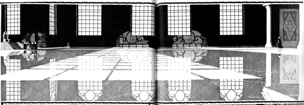
Gerhard: The reflection. [Knowing laughter.] I wouldn’t make the floor quite so shiny. [Laughter.] Maybe a big area rug in the middle.
Robinson: Did you know going in that you were gonna have a slow-motion fight that was going to last 80 pages?
Gerhard: Had I known that was coming up, no. No way. I definitely would have done the floor differently. It still comes back to haunt me. Dave and I did a commission for a fella, he wanted a scene from the throne room, and Dave drew it from a high perspective, looking down. So 75 percent of it was the floor. Before I did this commission, I had done the cover for the Following Cerebus “Dreams” issue, the Escher thing, where you can see both down and up. And I used the same sort of perspective trick on this thing. Now that I’m looking at it I’m not a hundred percent sure that it works, but I did the best job I could.
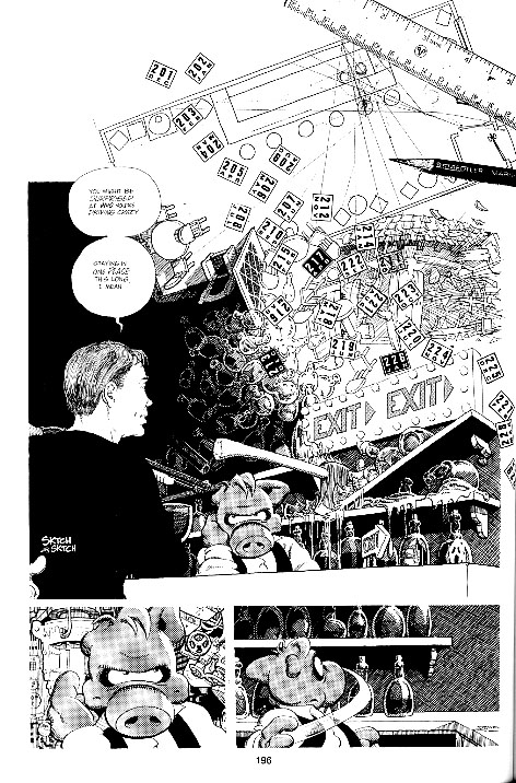
Cerebus commission, 2008 or 2009
Robinson: The scenes in the throne room in Reads are really beautiful. I noticed you seemed to use ruled lines for the first time.
Gerhard: Some of the lines were just too long. I developed this technique where I would pivot on my elbow holding the pen lightly, but, because of that, the longer the lines get, the more they would arc, and the harder it was to keep the lines a consistent distance from each other. And some mornings I was just too shaky for that. I don’t like doing the crosshatching with a ruler, but sometimes it’s just unavoidable.
Robinson: It works for me because the surfaces are just a little colder, and so the lack of texture of the line adds to that.
Gerhard: I guess that’s why I figured I could get away with that there.
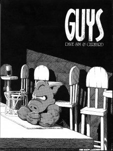
Robinson: When I was looking back through these books I was surprised at how stylistically consistent the Mothers and Daughters books are for the most part. They’re all pretty close to Church and State 2, whereas Jaka’s Story and Melmoth seem of a piece to me. I suppose that’s pretty natural, since they take place in pretty similar environments. So anyway, if you wouldn’t mind skipping ahead to Guys …
 Gerhard: The one thing with this book is the lack of a panel outline. That actually proved to be quite challenging sometimes. If I didn’t have something in the corner defining the panel, then I needed to have something in the corner in the next panel. I’m glad we tried it, but I’m glad we stopped. We used white Letratape for the nice, sharp edges.
Robinson: Where did the jagged Letratape come from?
Gerhard: Dave just started using that. He liked the hand-drawn quality to it. It became an iconic thing. I liked it because I could crosshatch on top of it and not have to stop the pen lines right at the panel border. For longer crosshatched lines, it was useful for me to have a large area of solid black for me to dump the line into so I didn’t have to stop. With the tape on the borders, whether it was the jagged stuff on the clear carrier or the white, I could just ink right on to the tape and I didn’t have to stop the line. And when I was done I would just take my knife and scrape the ink off, leaving a nice, crisp straight edge.
Robinson: That active edge is the curse of the crosshatcher.
Gerhard: Definitely.
Robinson: On 114, there’s that great seasonal change.
Gerhard: Oh yeah. That kind of worked, didn’t it?
Robinson: It’s a lot better than a caption box that says “later …”
Gerhard: And I liked those pages. Working on the other pages was great, but working behind something Dave already inked there was always this fear in the back of my mind about ruining one of Dave’s pages. Plus, like you said, the curse of the crosshatcher, I couldn’t just dump the line into the character; I would have to stop the line right on the edge of the character or the word balloons — I was always working behind something else. So a page like this that was completely blank when I started — those were pretty rare.
Robinson: I’d imagine it was a relief too to not be drawing the inside of the damned bar.
Gerhard: Yeah, any chance to get out of the bar.
Robinson: I’m curious what it’s like to do that kind of passive drawing. Passive in the sense that you’re working from a template that you’ve already planned out, and just mapping it to something that’s not under your control whatsoever.
Gerhard: Well, it goes back to what I was saying earlier. I’ve already worked out what’s in the bar, and what you would see from that angle. It’s a very formulaic thing. But one of the other things to consider is that I can’t have grey behind Cerebus — if I had grey tone or crosshatching he would just disappear. Nothing works better behind Cerebus than solid white or solid black. So that was always a consideration too.
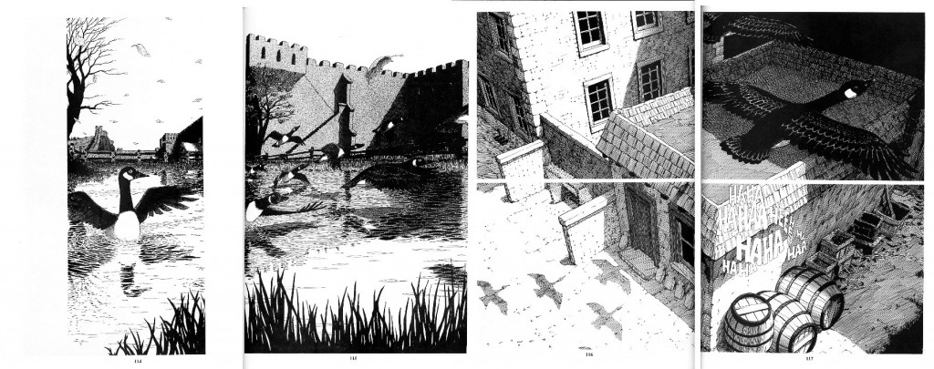
Robinson: Nice work with the bar chairs, then. [Laughter.]
Gerhard: Yeah, bar chairs, shadows, windows. Throw something in behind the stupid little grey thing. Otherwise you can’t see him. And it really is his book, so you should be able to see him. In a lot of ways it was also a time saver, because I did know I could use a lot of solid black, and it’s just chairs and the bar and a few bottles or whatever, and it left me more time to do the pages where we were outside the bar — either playing Five Bar Gate, the geese or whatever. The interior ones were “Boom, boom, boom, move on.” The whole thing with the bar, too, the intention of it thematically is that this is where guys go to drink themselves to death. So it couldn’t be cheery — it had to be stark. It doesn’t have any decoration. It’s just like a jail cell.
Robinson: Is there a point where working on Cerebus became a job? Maybe that’s a naive question — maybe it was always a job for you …
Gerhard in the studio: notice the row of pages on the wall to the right
Gerhard: It was always treated like a job. In a lot of respects Dave treated it that way too. Although Dave lived and breathed this book — he was always writing and he was always thinking about it. But for me I would go in every day and it was a 9-to-5 thing. I would try to get so much done before lunch, and try to get my page and a half done by 5-6 o’clock, pack up and go home. So in a lot of respects it was a job from day one. But — especially early on — it was a learning thing and very exciting and challenging in that way. But by the time we were at Guys, at least for me, the important thing was to get the pages done by the end of the day. At the same time I had to be happy with or at least accepting of how the pages turned out. And some of the days were better than others. One of the nice things was we always had twenty nails in the wall with clips on them and when the pages were done they would go up on the wall, and you could stand back and look at what you had done that day or that week or that month. The depressing part was taking them all down and having a wall to fill up again. [Laughing.]
Robinson: There’s not an awful lot of jobs where you have a physical product like that that you can point to.
Gerhard: Yeah. But like I said, some days are better than others. That early stuff. But you have to consider the time constraints. I look back on it now and look at the stack of artwork that we’ve got, you know, it’s 6,000 pages. Who in the hell does 6,000 pages? Who were those guys? How did we ever manage to do that?
Robinson: Flipping through now, are you really having a lot of those cringe moments?
Gerhard: Not that we’re in the later stuff, no. But Church and State was brutal. Even with the later stuff, some pages work better than others. When we first flipped to the pages with the geese, I was like “Hey! That’s not so bad.” That was the funny thing, too. We would get the original art done, and that gets sent off to the printer, and the monthly book would come back in, and at first we were concerned with the print quality. “OK, that filled in, that was too light.” But we’re always making adjustments a month behind. And I was always striving to do better, never really satisfied with the results at the time. But when the reprint book would come in, enough time had passed. We’d sit down and look through it, just to make sure that the pages were all in the right order and that sort of thing. But inevitably we’re flipping through going, “Geez, that’s pretty good. That’s not so bad — what the hell was I complaining about? Geez, lighten up!” Or even worse, “That worked really well. Why can’t I draw like that now?”
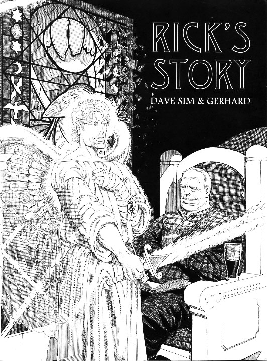
Sean Michael Robinson: Moving on to Rick’s Story, there are some interesting things happening here, some new tricks. I really like the faux stained glass on 130. This has got to be what your coloring book looked like when you and your babysitter were done with it.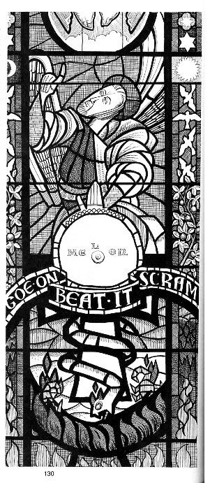
Gerhard: Right.
Robinson: So on these where the figures are really integrated into the panel, how many of these were worked out by Dave?
Gerhard: You know, in this particular example, I believe Dave probably did most of this. I probably just did the decorative strips on the side.
Robinson: How about, say, 128.
Gerhard: Right. Dave did the foreground figures and I did the rest of it.
Robinson: I like the combination of the optical and the medieval perspective.
Gerhard: I spent so much time and thought trying to get the perspective right on the backgrounds, and I was now trying to do this and have to figure out “How did they do it wrong?” We had some reference books on medieval stained glass and I’d see that they would flatten the perspective. They would see the top of the bar stool as round instead of an ellipse from there. I had to unlearn everything that I was trying to get right.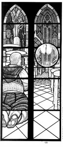
Robinson: I really like how when you guys have the figures that hearken back to classical sculpture, you both drop the contour line. That’s really nice.
Gerhard: Yeah.
Robinson: I suppose I should put some of these in the form of a question, huh? [Laughter.] So on 143 there’s this mind-boggling portrayal of a cracked fresco in ink …
Gerhard: That’s all Dave.
Robinson: Really.
Gerhard: I may be just flattering myself, but I think he was trying to emulate me there.
Robinson: So that was a surprise when it came to you?
Gerhard: Yeah. Every once in a while he would just decide to do something. You know, we had this kind of unspoken competition, where I would look at something like that and go “Shit! If he’s gonna pull this out of his ass I’d better straighten up and fly right.” And over the next couple of pages my line work would get even more tight and meticulous, and then he would see that and his line would get more tight and meticulous. We were trying to out-meticulous each other. [Laughter.]
Robinson: Towards the end of the book, on 196, we’ve finally almost left the bar, and you get your big stepping-out moment.
Dave’s dialogue — “You might be surprised at who you’re driving crazy- staying in one place this long, I mean.”
Gerhard: After I finished that page, I was wondering if people would get it. That’s a photocopy of the Staedler pencil and my ruler and my floor plan. Those are all the issue numbers that we’ve been in the bar. And the bottom left panel is a reference to way back when, when Dave said that if I wanted to, I could draw the interior of a submarine behind the characters, the backgrounds were up to me. Well, I finally got to draw my interior of a submarine. I wonder how many people actually got that, or were they thinking, “What the hell is going on here?”
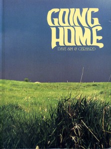 Robinson: In Going Home, it seems to me like there’s a pretty significant stylistic shift at the beginning of the book. There seems to be a shift toward more pattern, especially in the exterior scenes. I was just curious about the design-y-ness of some of the pages.
Gerhard: It has a lot to do with there being no outline to the panel border again. It made the design aspect more important. The only thing that defines the top of the panel on page 57 is the line of the clouds and the corn and the fence going through.
I need something here to show where the edge of the panel is. As far as the corn went, I would draw the contour of the front row of corn, and then it was a matter of putting little indications of corn behind the front row. It was quick and efficient and looked good, so into the bag of tricks it goes, and then belabor it to death.

Robinson: On 76, there’s that great quilt. Did those designs come from anywhere in particular?
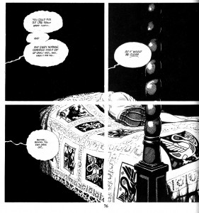
Gerhard: Dave had some books around the studio on medieval times and that kind of stuff. Those designs were in that book, I’m sure.
Robinson: I didn’t want to ascribe too much intentionality to the stylistic shift …
Gerhard: It’s all intentional when it comes to Dave.
Robinson: When we get to “Fall and the River,” the screen tone technique is interesting.
Gerhard: At the beginning of a new story arc it was a chance for me to stylistically change what I was doing, so I wasn’t stuck doing the same thing again. Looking back on it now it doesn’t look too bad, but I think I got better at it as I went along.
It was a change for me, because before if I was going to use tone on the background, I would use that stipple tone stuff, because it had a non-mechanical, organic feel to it — as if it could have been hand-drawn as opposed to using a dot tone, because again I can’t use a dot tone behind Cerebus. But especially on the boat itself I didn’t want to have a lot of crosshatching, but I still wanted to define shadows. So I selected a very fine tone, with a much finer dot per inch, that was much lighter than Cerebus. I didn’t want that Church and State, rough hewn look. This was another case where I actually built another model — I had a physical model of the barge.
Robinson: I didn’t know if you had gotten to the computer era yet.
Gerhard: I used a little of both. I had a computer model of the staterooms, and a physical model of the whole thing. It was a pretty crude computer program by today’s standards, but it did what I needed it to do. This is where we started putting the panel borders back in, so I didn’t have to worry about defining every edge.
Robinson: There’s a really interesting panel on 265.
The perspective is so flat, I don’t know why, but when I did it, I thought, “That’s what I want.” The moiré pattern happens because you put one dot screen on top of another. And I thought “I like that too.”
Robinson: You managed to get the sun glinting off the water from the moiré pattern. It’s interesting, in Japan, the comics industry is huge — there are a ton of books on really specific techniques you can use with screen tone, that kind of thing. But I guess intelligent people using the same tools will sometimes come up with really similar solutions.
Gerhard: I discovered the moiré effect quite early on working with tone. It’s hard not to — all you have to do is accidentally put two pieces of tone on top of each other and you go “Isn’t that cool?” Of course it’s also distracting — more often than not it’s something you’re trying to avoid. But when you can use it as an effect …. like Dave said: “If it occurs to you…”
Robinson: So where did the photo covers come from?
Gerhard: Vacation pictures, mostly. Some of them are from across the street or the backyard, but a lot of them are photos from travel. Dave decided that we would do photo covers; one reason was then we wouldn’t have to draw them. I used to take slide photos all the time, so I sat down with all my slides and my projector. We’re talking thousands of slides. So over the course of one or two nights I literally saw my life flash before my eyes one slide at a time. And I just pulled out hundreds, all that I thought might be appropriate, that didn’t have any anachronisms, any that might make a nice cover or could be used thematically for the book. So I gave all those to Dave, and he picked out the ones he wanted to use for the covers.
Robinson:It’s inspiring to see the stylistic shift you pulled off in this book.
Gerhard:They do stand apart from each other. 292’s interesting — dense. Where it’s supposed to be foggy, there’s gray on everything.
Robinson: Did you draw in reverse on the back of the page for the tone that didn’t have any contour?
Gerhard: No, I just cut out a strip of tone and stuck it on there. Man, I went through a lot of Letratone on this one.
Robinson: It’s not cheap.
Gerhard: No.
Robinson: But at least they were still making it.
Gerhard: Yeah, that became a problem before we finished the book. We were having a tough time finding the Cerebus tone. Letraset stopped importing Letratone to Canada. It’s not like we could suddenly change the gray on the main character. It was always the same numbers too, depending on how big the Cerebus was on the page. LT 10,LT 17, LT 30 or whatever.
Robinson: Just thinking about the thing you were saying about looking at all those slides and watching your life flash before your eyes, when you look back on all of these pages, as we’ve covered about 16 years of your life, do you look at certain pages and think about what you were actually doing at the time?
Gerhard: It’s odd. We actually talked about that. When the reprint book would come back from the printer and we would sit down and page through, to see if it would reminds
Robinson: So they’re capable of existing as objects for you at this point?
Gerhard: Absolutely. There are very few pages where when I look at them I can picture what was going on at the time.
 Robinson: So, next up is Form and Void. Where did the contrast come from?
Gerhard: That was a stylistic choice from Dave. Because it was a new story arc, he wanted it to look completely different.
Robinson: Did he have any particular artist he referenced, or was it like “let’s cut out the greys.”
Gerhard: Whenever he wanted me to cut out the grays he would say, “Al Williamson.” “Jeff Jones.” That sort of thing. And by this time I was finally able to let it go. A lot of times I look at other people’s stuff I would think, “Geez, I wish I could draw like that, but it’s just not what I do.” And it seemed to me that every time I would try to do that stark black and white stuff it would be … unsatisfying, to say the least. Just flipping through the book and looking at it now, some pages work better than others, but for the most part I got a better handle on it. But it took a long time! We’re near the end of the book here. But for the most part I think it works OK.
Robinson: So, for instance, 407, is that primarily brush?
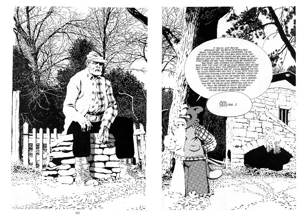
 Gerhard: I could never really ink with a brush. Oh, yeah, that’s part of a larger drawing. If you go to pages 422 and 423, that’s the master drawing that everything in this sequence is based on. There was a lot of photocopying. We had a photocopier in the office that produced really good solid blacks. If you look at the top left corner of page 422 and then go back to page 407, that’s where it came from.
Robinson: So that’s why I thought it might be a brush. It’s expanded so much.
Gerhard: Well, looking at the master drawing, I probably used a brush for the larger branches, and then a pen for the finer ones. And then I would blow up that top left corner probably about 300 percent, and then go in with a pen on the photocopy and add some detail to the branches and some of the leaves, things like that. All of the next pages are photocopied parts of that master drawing. Again, on page 413 that’s a good chunk of the master drawing there. The real pain in the butt in doing that was the process. The master drawing was done on a completely separate piece of illustration board. I would photocopy it and photocopy the page that Dave drew with the characters on it, and I would take the copy of the master drawing and put that on top of the photocopy of the page, and with a light box cut out around the characters and the word balloons. And then I would spray the back of the photocopy with adhesive, line it up carefully and stick it onto the illustration board around Dave’s characters, and then I would have to go in with a pen and fill in the gap between the characters and the photocopies.
Robinson: It sounds excruciating.
Gerhard: Time saving on one hand and excruciating on the other, yup.
Robinson: Looking at all these stark blacks, it’s hard for me to imagine how you’d visualize some of these things without photo reference.
Gerhard: That master drawing probably was photo referenced. I know the building was, because that building actually appears on one of the photo covers of these issues. I don’t know if the tree in the foreground was. That’s the way it went a lot of the time. I would use certain elements from photos and the rest of it I would make up. It’s just a matter of making the invented elements look not too dissimilar from the photo-referenced stuff.
Robinson: There seems to be a divide between cartoonists that are generating something that acts as a symbol for an object or using construction to build an object, whereas a lot of fine-arts training is almost completely about using your eye to record what you see. It seems to me that it’s kind of rare for someone to have both those skills working on all cylinders. So, how much reference did you use on, say, 444 + 445?
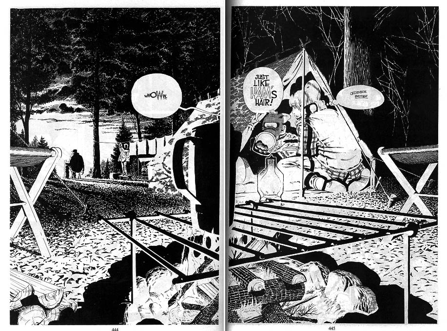 Gerhard: That was all made up.
Robinson: And at this point you start to bring in some grays again.
Gerhard: Mostly on the tent. And the rest of it is all still pretty much either black or white. In each of these sequences, for the first panel it’s not immediately apparent what we’re looking at. And then we pull back more and more until we arrive at the master drawing. On 390 it’s basically one big camera move. We dolly down into this room where we see the two of them sitting there, on 392 and 393, and then we start to pull out of this room. That sequence on page 395, that’s supposed to be the edge of the doorway, the cracks in the plaster and the paint. I remember Dave telling me, “It’s got to be just cracks and flakes,” and I remember thinking, “What are you on about now?” And he said that thematically speaking, he wanted it to represent that nothing will stand up to that close scrutiny without dissolving into minor faults. Nothing was accidental when it came to Dave.
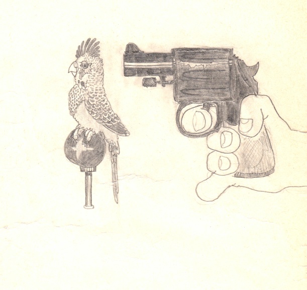
Robinson: The texture on the gun is incredible. It definitely makes it a red flag for the future sequences. So tell me about the airship. It must have been enjoyable to design that.
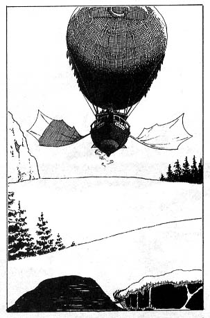
Gerhard: Yeah. This sequence is based on the Hemingway stuff. He gave me the book that he was using for reference, with the stories of the two plane crashes. And we were both sort of like, “How the hell do we get airplanes into Cerebus?” And he knew my affinity for airplanes — I’ve always been into them ever since I was a kid. It’s been airplanes and drawing for me for as long as I can remember. So he set the task for me to design an airship that could exist in Cerebus’ world. I knew because of the sound effects on 468 and 469 that it would have to be steam-powered. And obviously it would be a balloon, so the steam could provide hot air for the balloon.
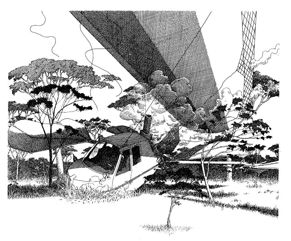
And I’ve always been interested in boating too, ever since I started sailing, so it was a matter of combining those elements. So I’ve got a hot-air balloon and a boat that uses a big wing-like or duck-feet-like paddles that uses those to push itself through the sky. This was another thing that I made a computer model of. On 524, the sequence where it’s circling the falls, is the actual sequence of how the paddles move. They go flat and straight for the forward motion so that there’s the least amount of air resistance, and they turn so they grab as much air as possible, and then they swing back and push the airship forward. And I had all that on a computer model, a very simple one, just to make sure I had the sequence right, so this thing could kind of paddle its way through the sky. Then there’s the big crash scene on 537 — that was fun to do.
Robinson: So it was similar to the foundry in that you didn’t research any early steps of flight.
Gerhard: No, this had to be something right out of left field, that only existed in Cerebus’ world. Because I’d been such a fan of airplanes and flight, I was already really aware of the early steps of flight. So it was more like, “How would I have done it?” I don’t actually have to physically do it myself, but in theory anyway, how would I approach it?
Robinson: 537 is a really beautiful page.
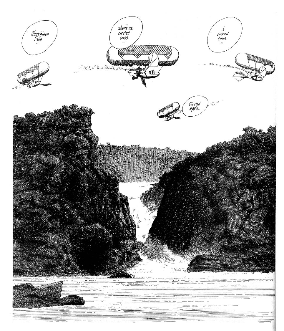
Gerhard:That was from a photo reference. That was the actual falls in Africa that they crashed near.
Robinson: Were you using Rapidographs at this point?
Gerhard: I believe I was. I was much more comfortable with them, and they were less of a pain. You know, I never got the hang of the variable line width, so I was mostly doing a consistent line width anyway, so I might as well just go back to the Rapidograph.
Robinson: For lines you needed to be thicker, larger contours and things like that, would you just build them up with the fixed width pen, or would you use a nib for some of those elements?
Gerhard: I think I had two or three different pen sizes. I would use the thicker ones for the darkest areas and work down to the finest ones.
Robinson: What are your impressions when you look through this book now, as far as the stylistic change?
Gerhard: Well, it certainly does have an impact. It’s completely different from the rest of the book. In a way that was a little odd — that was something I was trying to avoid all along. But Dave was very clear that it should be completely different.
Robinson: Well, it definitely looks freezing. Like your eyes are burned out from staring at the snow and the reflection of the sun.
Gerhard: Dave was glad we finally got there. I think he would have liked us to have used that look in some of the earlier stories, but like I said, I was having this thing about drawing the way I draw. And not being comfortable with other stuff. Even looking at it now, there’s a lot of empty space and a lot of empty panels and a lot of white. There wasn’t a lot for me to do on a lot of these pages. And again my Judeo-Christian work ethic would kick in and I would think, “You know, I’m not earning my paycheck here.” But I looked at it that the time I saved on the pages where I didn’t have anything to do, the more time I could spend on a page like 564, 565.
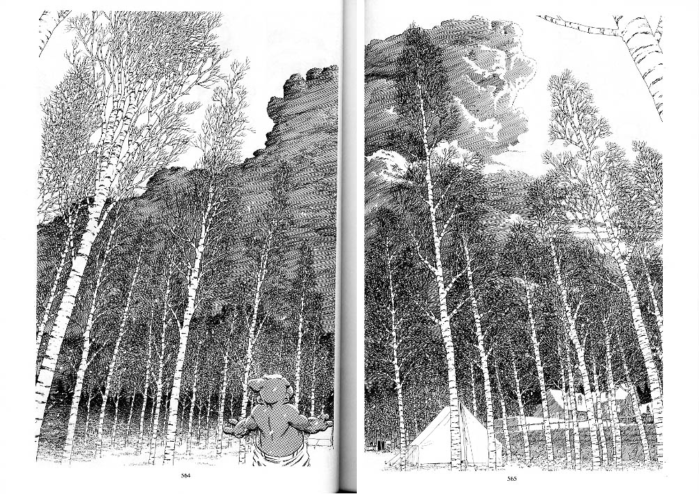
Robinson: That’s a great spread. That was actually one of the pages that made me wonder about the Guptill book, that if you weren’t familiar with the book in particular, you were at least familiar with some of the artists.
Gerhard: It’s well thumbed-through.
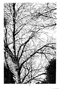
Robinson: Those birch trees — how would you build those up?
Gerhard: It was the same technique I would use with the corn: just sticking in the foreground ones and then working backwards, building up as you go.
Robinson: How often did you erase as a stage of your inking, as in inking up the foreground trees and then erasing and building up again in pencil?
Gerhard: Oh, no. Basically I ink from the foreground to the background, getting deeper into the page as I inked. Primarily my main concern when I’m inking is to ink from left to right, to avoid smudging. So I would do both at the same time, inking from the foreground to the background while working from left to right. And the same with the penciling. At this point we were doing our preliminary drawings on tracing paper and then transferring them over, but I’m not sure how much that really influenced my process.
 Robinson: So we’re on the last two books now. Dave talks a lot about the process in the back matter of the books, for instance, about you not wanting to go ahead when you were working on the two-page spread of the Sanctuary. Were things really that much different for you working on the last two books?
Gerhard: I’m not sure I’m understanding what you’re getting at.
Robinson: Well, in Dave’s portrayal of things in the notes at the end of the books, you come across as being very frustrated with your work, and on the verge of quitting, not really sure if you could continue, having a really tough time of it. I guess what I’m asking is, did it feel really different, or did you always have that level of frustration?
Gerhard: I did always have a level of frustration and it was also a cumulative thing. I’m looking at that Sanctuary spread now. I remember showing it to Dave when I was done with it and being completely disappointed with it. Not so much even the idea of having to draw it over and over, just disappointment at the end result, working within the time constraints.
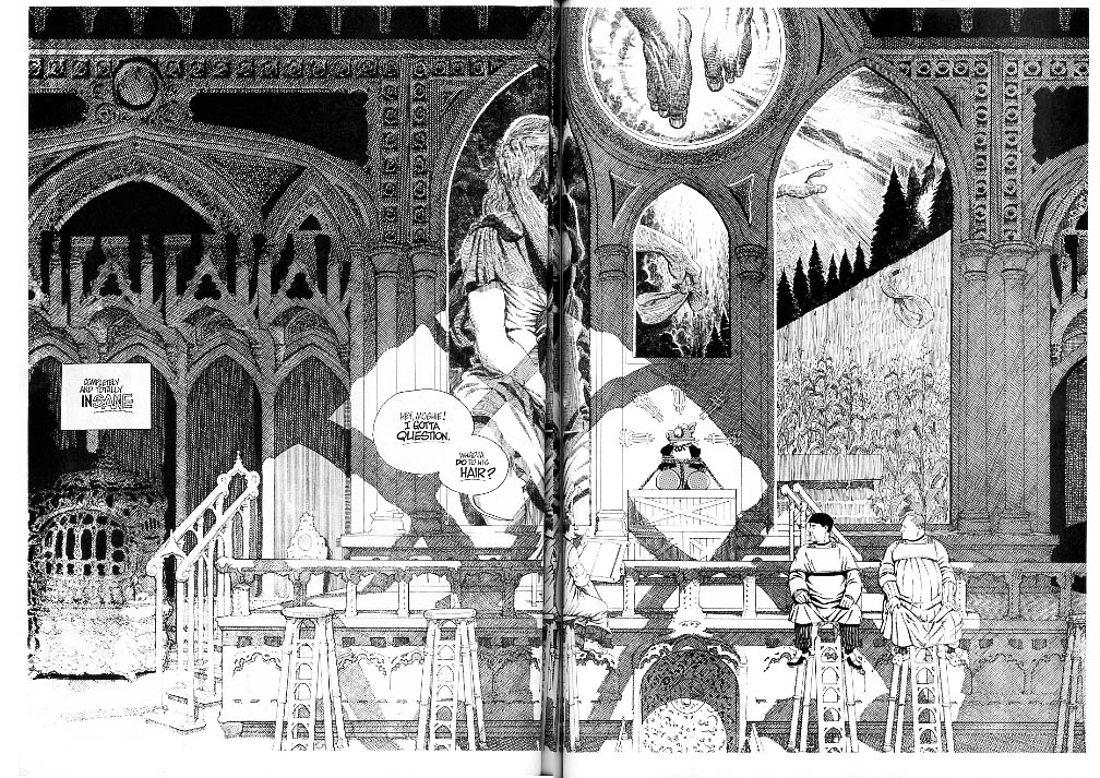
Robinson:Is that how you feel now?
Gerhard: Well, it’s hard to remember exactly what Dave said at the time, but it was something along the lines of any disappointments I have with it, someone else just isn’t going to see it. It is an impressive two-page spread, it works as far as light and shadow, although it didn’t reproduce very well — it’s starting to break up in the lower left hand corner. I must have driven the people at Preney crazy, trying to get all these little lines to not fill in but making sure they didn’t break up. I dunno. [Long sigh.] It’s almost as if going in I knew I wasn’t going to be happy with it, and I was right. If I had it to do over again, I don’t know that it would look all that different. It almost always got down to the time constraints. This was the best I could do with the time that I had. And Dave’s basic point was, given the time that you had, you’ve done a pretty damn good job. And I was like, well, I’d much rather have spent two or three times the amount of time on it than I had available.
Robinson: I noticed that you’ve added some new ink textures here in some of the outside scenes, like on 169. I’m such an ink nerd. “Oooh, look at this gravel texture!”
Gerhard: Oh yeah. I was pretty happy with how that turned out. There wasn’t a lot of crosshatching involved, it’s just paying attention to light and shadow. That was a good day — I had a good day that day. The good ones always seemed few and far between. When one did come along, I would always wonder, “Well, why did that work today?” There’s a story I read about Sir Laurence Olivier giving a performance of Hamlet. And at the end of the show the audience was giving a standing ovation, and the rest of the cast members were applauding. And this was just one show in the run, but for some reason this one just stood head and shoulders above the rest. And rather than taking the stage and accepting the accolades he left in a huff — he was very upset. And somebody finally talked to him in the dressing room or whatever and said, “What’s the matter? That was the most brilliant performance possibly of your entire career!” And he said, “I know, but I don’t know why!” [Laughter.]
Robinson: Conversely, there’s the person that’s become so inured to the applause and becomes dissatisfied with the fact that their best efforts and their mediocre nights essentially get the same reaction.
Gerhard: That’s the funny thing. There were certain pages where I would be really happy, and they would get no reaction at all. “Look, it’s another Gerhard page.” You know. And I’d think,”But no, this one’s really good!” Well, whatever. I don’t get it.
Robinson: On 252 when the real heavy text starts to creep in, you get a chance to stretch out a little on the individual illustrations.
Gerhard: Yeah, I like the illustrative, heavy contour of the foreground fading out into the fine pen lines of the background.
Robinson: On 272 there’s an unusual spread. Correct me if I’m wrong, but it looks like an animal drawn by you facing off with animals drawn by Dave.
Gerhard: Yup, the dog was me and the sheep were Dave. That one is a little jarring, because the two foreground sheep are kind of cartoony and the dog was based on a photo. It was my friend’s border
Robinson: I think it works. Passing through, I just noticed the differences between them. Part of it is the line weight, and part of it seems to be the bounciness of the figures in the foreground.
Gerhard: On that day, I thought, “This is the way I want to do it.” I spent so much time doing that, just trying to not have the backgrounds be too dissimilar from the foreground. And I guess on that day I just wanted to do what I wanted to do. And especially with that little Charlie Brown being so cartoony there, it just all seemed to not hang together as a cohesive thing. It just seemed like, “Oh screw it. I’m just going to draw Chester.” [Laughter.]
 Robinson: A couple pages later you have a beautiful printing press.
Gerhard: Yeah, that one turned out all right. I used a little bit of reference for that, but I think I made it look a little more Orwellian. [Laughter.]
Robinson: Printing presses in general have an appealing kind of crudity to them.
Gerhard: Yeah, and I forced the perspective on it. I really wanted it to be this intimidating mechanical thing.
Robinson: Looking back on this book, what are your overall impressions?
Gerhard: Yeah, this is a tough one. Dave tried to explain to me what was going on when the text pieces starting showing up. Doing all the single illustrations had some appeal for me. There was an exhibit at St. Bonaventure University where a lot of these pages were displayed, and I brought along my tracing paper versions of some of these pages. Those went over really big. People were blown away by those. In a lot of cases, I really like my pencils better than my inks.
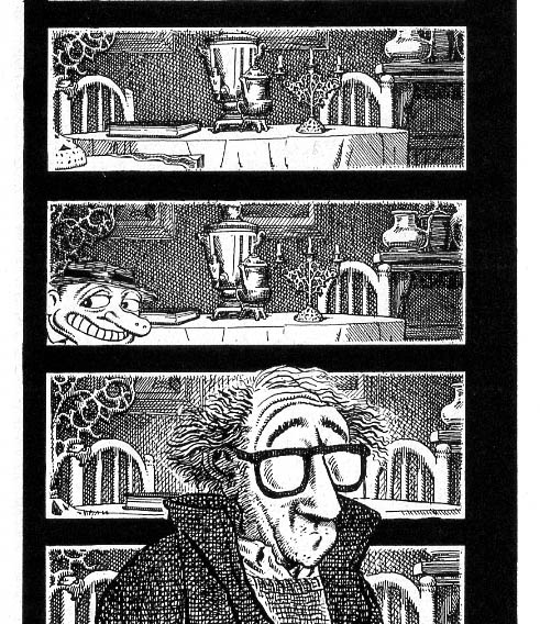
On 380, Dave’s done the R. Crumb style for these Woody Allen figures, and I tried to do a little more of the Crumb style. That was actually fun. And when we started working from references to the Fellini movies and stuff like that, I could just lean into that. I didn’t have to make sure it could fit into Cerebus’ world. The whole idea was to make it look like it did in the Fellini film. I rather enjoyed that. On 390, I was really happy with that sports car in the middle panel. That turned out pretty good. I remember spending a lot of time working on those spokes. [Laughter.] But reduced down like this, it doesn’t really look like an illustration in parts of it. It looks like I just pasted parts of the photocopy in there.

Robinson: I love the dense clouds — from The Seventh Seal. It must have been interesting looking at the gorgeous cinematography.
Gerhard: With all the heavy tiny text and these really weird and disparate elements … even the style changes between the heavy clouds on 390 and the sparse stuff on the next page … and I got to draw an airplane on the next page, so it was interesting in that way … and the movie camera on 396, I liked that — by this point it was actually good for me. I enjoyed doing the photo-realistic stuff.
Robinson: So you got a little release.
Gerhard: Change is as good as the rest, right? And then of course we’re back into the Sanctuary again for a little bit. But not too long. A lot of that was because Dave did know how frustrated I was, and he was trying to change things up. There were a lot of pages with no backgrounds whatsoever. But at this point, he had really lost me as a reader.
Robinson: In Latter Days, in the end notes, Dave does some dissection of who drew what in the double issue that opens the book. So when you had that time off from the book, what were you working on?
Gerhard: I was working on that 360-degree pan of the room that’s on the cover.
Robinson: I understand that caused some problems when Dave needed Cerebus to put the manuscript in the hiding place.
Gerhard: Yeah, Dave thought it was on the other side of the room and it was really more like two feet away. [Laughter.] Yup.
Robinson: Another nerve-wracking moment.
Gerhard: Well, it just turned out to be funny. Cerebus is going, “I need to make it all the way over here,” and it’s like two feet away.
Robinson: Once again, the text in the back makes it seem like it was a real struggle for you to cross the finish line, but the work itself is great.
Gerhard: Well, I was working on designing the room and doing the 360, which was really a lot of work. I had to figure out how many vanishing points I needed. I think it was something like eight of them, so I suppose it’s done in eight-point perspective [laughter]. So you figure that one out.
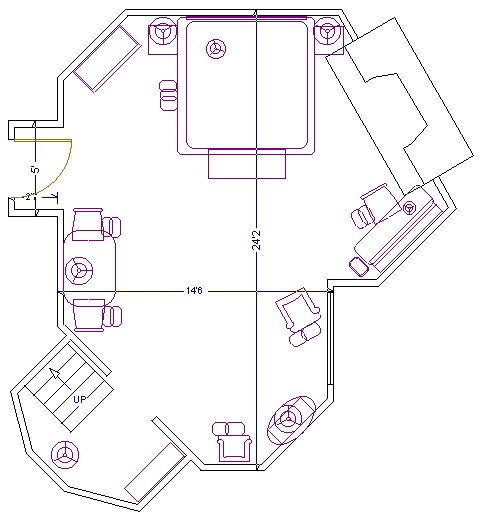
Robinson: Well, you’ve got a lot of non-parallel surfaces that are parallel to other elements in the room …
Gerhard: I had to draw with a fish-eye lens quality, so that objects that would be straight have a curve to them. The chest in front of the bed has a major curve to it. Especially anything closer to the “camera” becomes more distorted and curved. That one took a long time to figure out. That’s basically what I was working on. And Dave was thinking of doing this as a master drawing thing again and just taking photocopies of it. But I wasn’t really happy with how that turned out in Form and Void. So once I had the room designed and Dave sort of sat down and said, “If we can do X amount of pages a day, we can be done by Christmas.” And I heard angels singing. That got me through to the end. “Done by Christmas.” That became the mantra. “Done by Christmas, done by Christmas.”
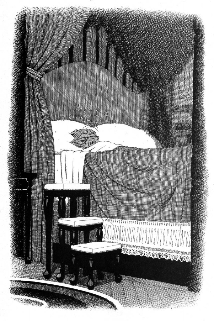
Robinson: So when you’re looking back on this book, is it pretty much the same feeling you have when you’re looking back on most of the stuff?
Gerhard: For the most part. There’s all these stars around Cerebus’ head depending on how out of it he is at the time, and the backgrounds shrink and expand from the edge of the panel boarder. And that actually saved a little bit of time because I didn’t have to ink to the edge of the panel. So the little panels with just his head, there really wasn’t much to do — just a little bit of crosshatching. So when I would get to a panel that actually had something for me to draw, it was good. I get to do what I do, the Gerhard thing. So it went fairly well, and getting it done by Christmas definitely motivated me .
Robinson: There’s something different happening on 110.
Gerhard: That’s all Dave. He just took a section of the master drawing and drew it how it would look without his glasses. He did a good job.
Robinson: How often would that happen?
Gerhard: Not very. Every once in a while something would strike him, probably when he had something very specific in mind. And he knew that I always preferred the more literal renditions of things. He had in his mind that he wanted it to look that way, and so he just did it. And I’m like, “Good. I didn’t have to do it, and it turned out really well. You go!”
Robinson: I’m looking at this huge stack of books next to me right now. And they obviously represent a tremendous amount of time and planning and sweat. Does all this work ever enter into your daily life now? I mean, when you meet a new person, do you tell them about it, point to the books on the shelf?
Gerhard: I did when I was actually still working on it. And [long pause] after the book was done, we did some things for Following Cerebus and quite a few other things that didn’t go anywhere. And I guess, to a certain extent, I was burnt out. And the course the book had taken at the end there … Like I said, Dave had basically lost me as a reader. It was a strange sort of phenomenon to be working on a book that I can barely even read any more. And with the things that we were trying to do after the book was done, and the direction Dave was taking with stuff, it became really apparent that we just weren’t on the same track. I remember back in the late ’80s, around issue 88, we had gone down to Gainesville, Fla. We had been there for a signing a few months before and really liked the town. It’s a university town, really a fun place. And you know, southern Ontario has some brutal weather conditions sometimes. We thought it would be fun and a unique experiment to try. So we went down to Gainesville and got adjoining hotel rooms and set up drawing boards in there.
We spent a month or two and did the book down there, and, you know, got away from the winter and any distractions that were back home. It went really well. We got to focus on the book during the day, and at night, well, like I said, it’s a university town. There’s lots of stuff to do, and there’s great bars and whatnot. And I remember we were having a really nice dinner and a really nice bottle of wine. And we toasted with a glass of this really nice wine and said something to the effect of, “Here’s to issue 300.” And it was like at that moment I had committed myself to stick it out to issue 300. Like I said, it got tough near the end there, and it was a huge undertaking, and that monthly schedule really was a bitch, but I always remember that dinner and that toast. I had committed myself to that, and that’s what I did. So after 300 was over, it was like, “OK, I did what I said I was gonna do.” And now Dave’s doing his thing, and it’s time for me to find out what my thing is.
Robinson: What do you think your thing is?
Gerhard: You know, I’ve been spending the last few years trying to figure that out. For a while there I just didn’t feel like drawing at all. Mostly I did home renovations. I think I repainted every room in the house. Redid the kitchen. All this sort of hands-on stuff. I spent more time on the boat, more time playing the bass and whatnot. I also spent more time pondering just that question: What is it that I want to do next? I’ve tried a couple of projects with a couple of different people and it just hasn’t grabbed me. I tried a couple things on my own. But just recently I’ve found a thing that’s got me really excited and I’m really happy with the way the drawings are turning out. It’s actually a children’s story. A friend of mine wrote it. She’s been writing as a hobby for a long time but hasn’t been able to get it to gel — life just keeps getting in the way. And this last summer, she wrote this wonderful little story, and when she read it to me I knew right away that I had to draw it. I could see the pictures in my head, and when she gave me the script I sort of broke it down: there’s a drawing, there’s a drawing. Around that time, I had also found a bunch of my high-school drawings. Remember the notebook I told you about with the doodling? I actually saved a few pages from one of those.
high school doodles, 1975 or 1976
Looking back through them, I did do a lot of cartooning back then. I was really influenced by Mad magazine and National Lampoon and that kind of stuff. I mean, they weren’t very good, but I was thinking, “What was I trying to do back then, and could I do better now?” There was all of that illustrative stuff I had been doing before Cerebus … And just working on the backgrounds on Cerebus all that time, I didn’t have a lot of experience since high school in actually drawing characters and people, or doing page layouts and starting from scratch. I was always just finishing what Dave had started. So it was a little intimidating at first, and I got off to a little bit of a rough start. But once I got into it, it really just seemed to fall onto the page, and I was having such a good time doing it. And once I got a better handle on the characters, I realized how much fun I was having! That was what I was missing most of all: the fun I needed to have while drawing. Like I said before, as long as I can remember I just liked to draw. And so it’s great to have the fun back.
From The Wish 2010
Robinson: That’s really great. So are you still working on it?
Gerhard: Well, I went through the whole story — it isn’t a very long story — but it has so much heart and magic and youthful exuberance to it, and I tried to get that into the drawings as well. So I went through and did a bunch of real quick sketches and scanned them into the computer and did a real quick mockup. It came in at about 42 pages. It’s not really a comic book with a lot of panels on the page — it’s mostly single illustrations on a page. So I went through and did this really quick version, and now I’m just going back through and redoing the drawings in a larger, more finished form. So like I said, I’m having fun, and for me now that’s the important thing. If this ever gets published or we ever make any money off of it, that’s all secondary for me right now. I’m having fun drawing it and that’s the most important thing. I’ve been looking for a long time for something like this.
Robinson: I think that’s a great place to end. Thank you so much for everything.
From The Wish 2010
Gerhard: Well, thank you. I have sort of distanced myself from the work. I knew that I would for a while because it was an intense experience and it was a major chunk of my life. I just needed to remove myself from it for a while. But this was very therapeutic for me. It was great to sit down and go through it with you, especially since you have such a keen interest. I’m glad we did it.
From The Wish 2010
Cerebus images ©Dave Sim and Gerhard; all other images ©Gerhard. Photo provided by Gerhard.
For more information on the Wish or to contact Gerhard for commissions etc, you can visit his new website.
Special thanks to Margaret Liss and Brian C. for assistance with images and contact information.
Further thoughts on this interview can be found here.


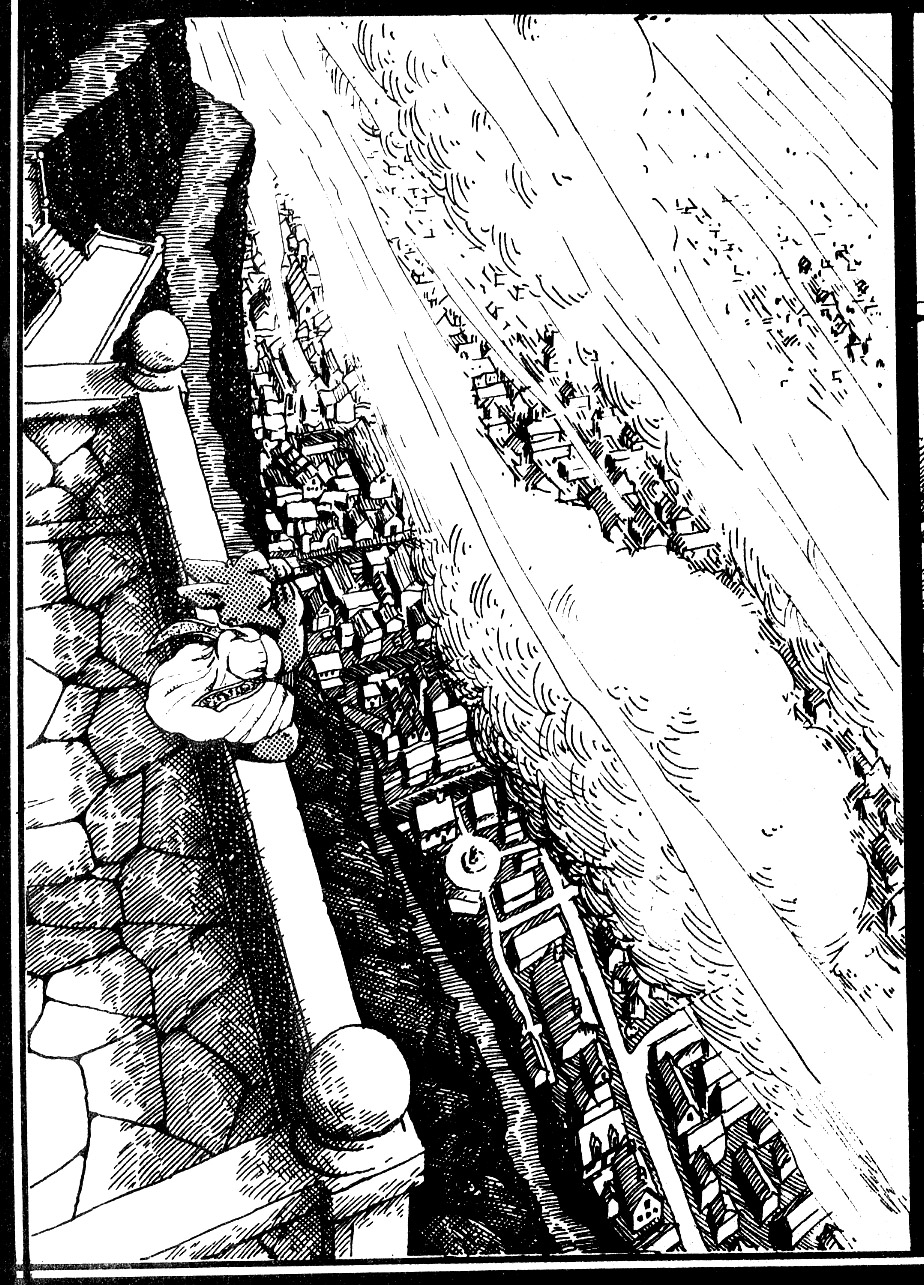
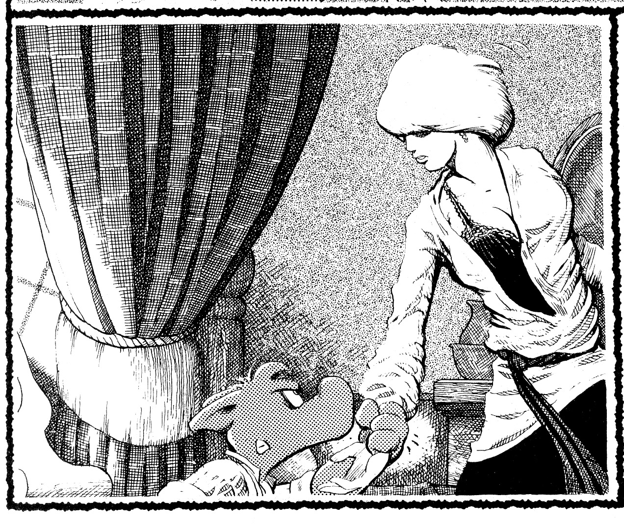
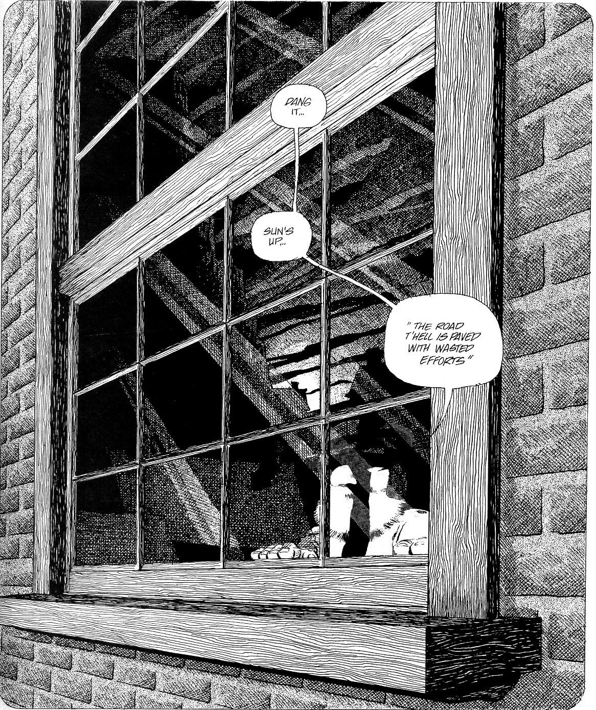
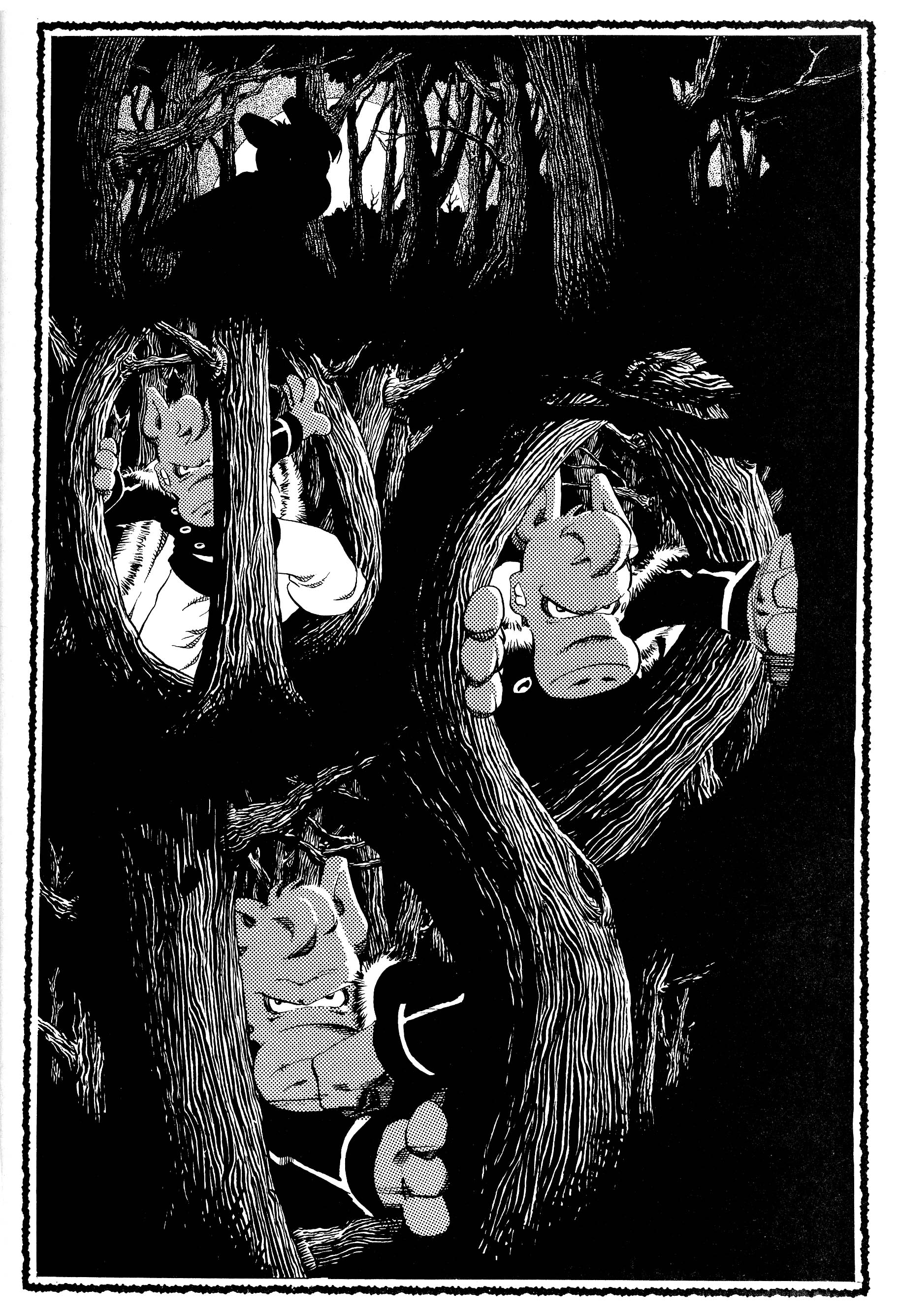

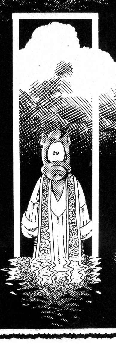
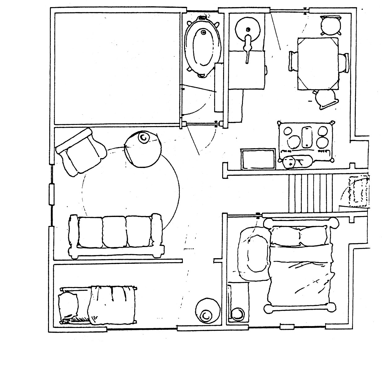

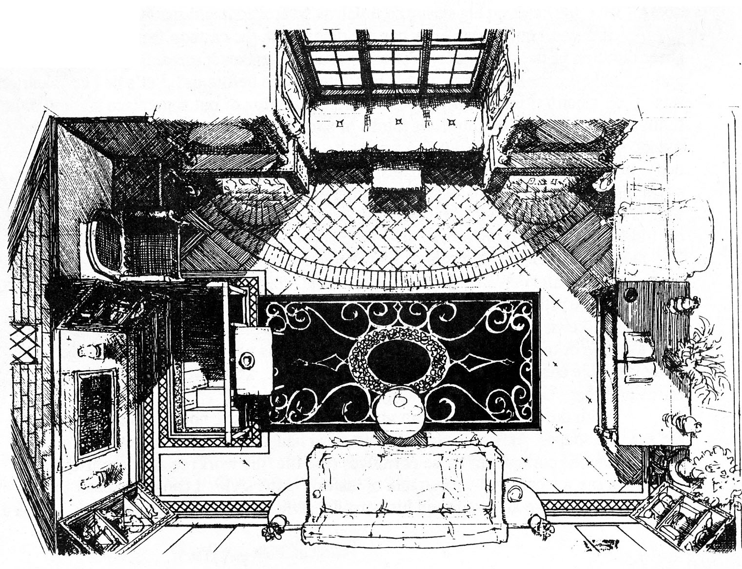
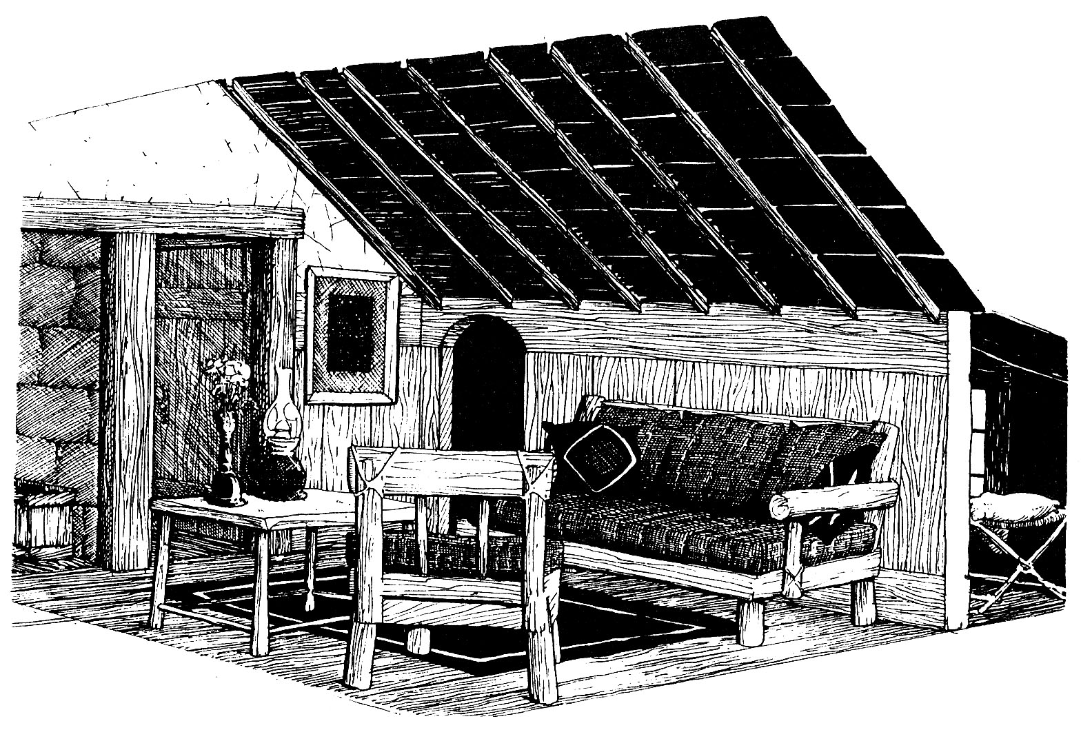


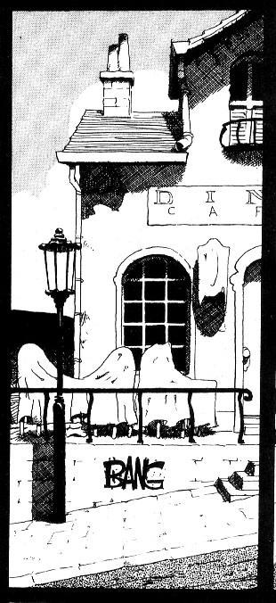
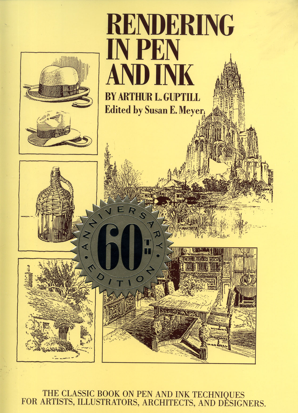
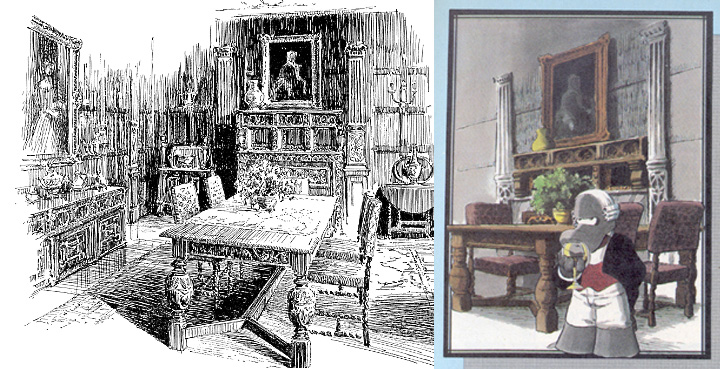
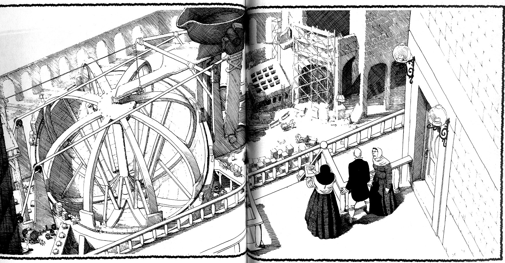
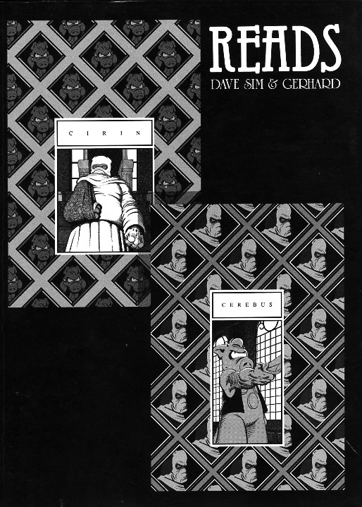
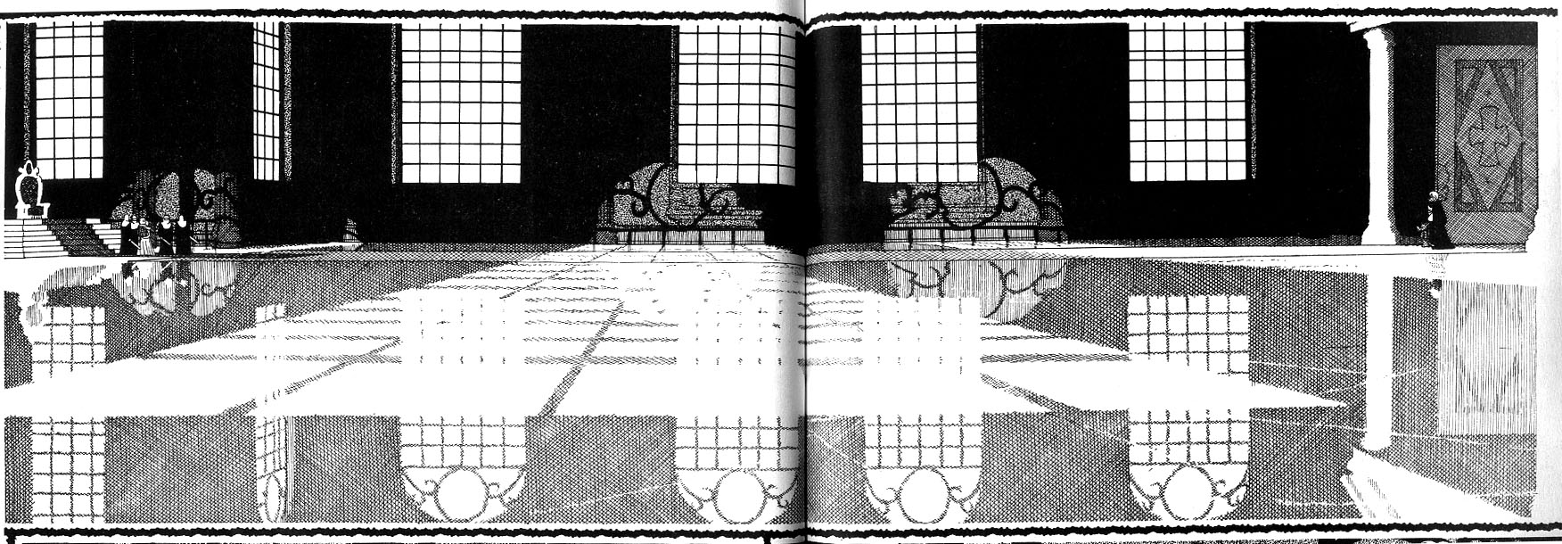
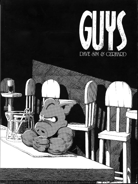
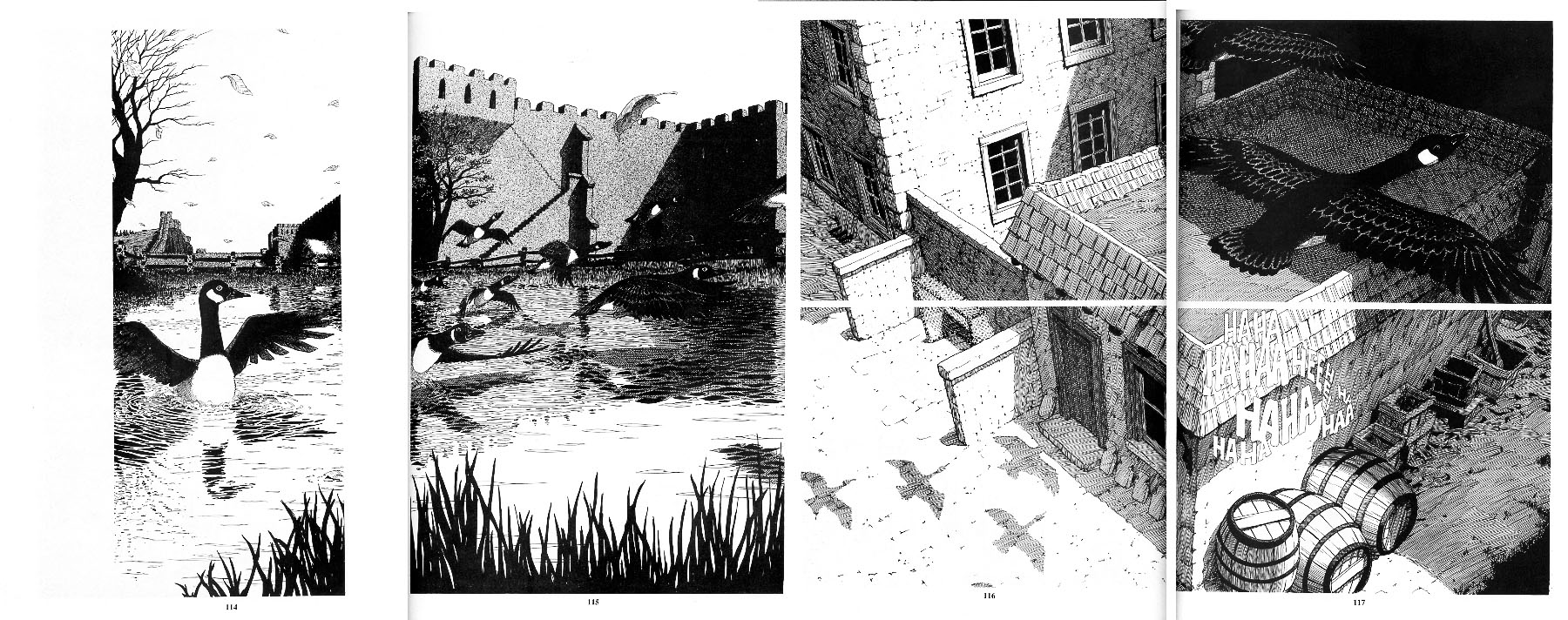
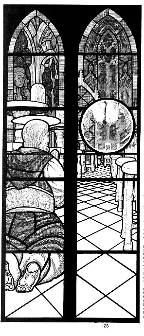

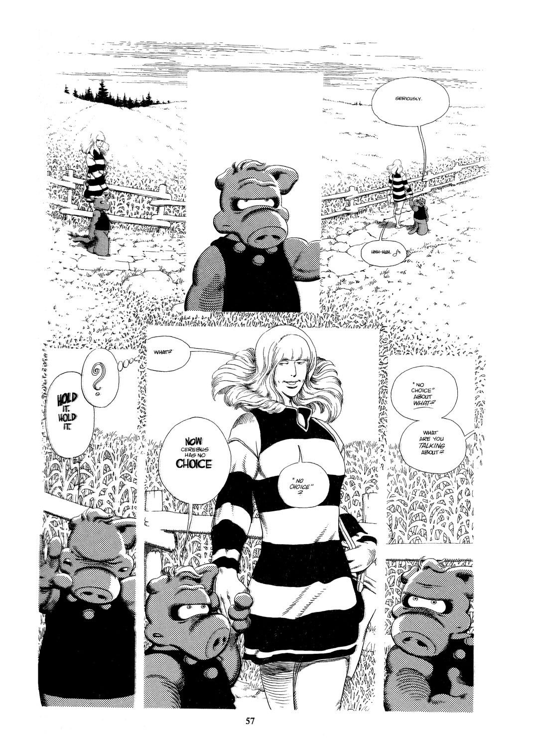
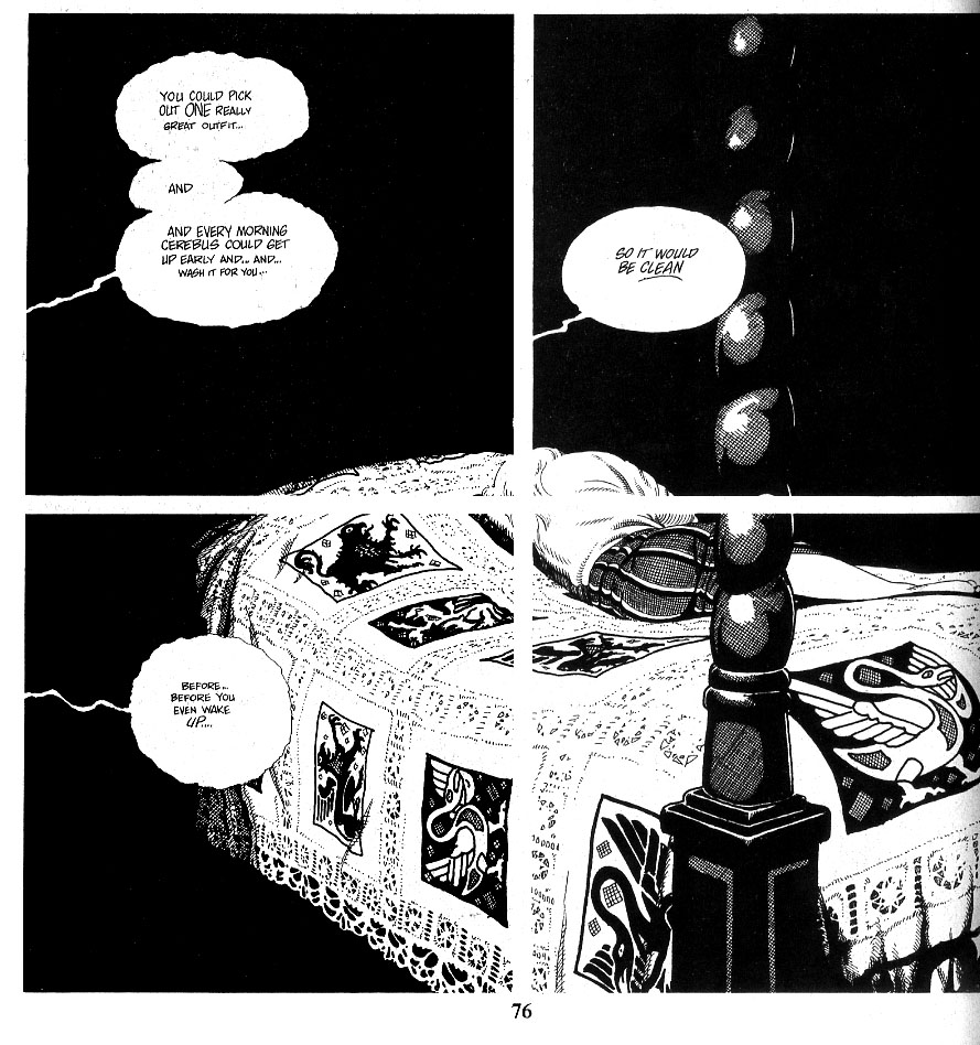
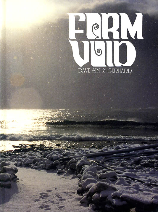
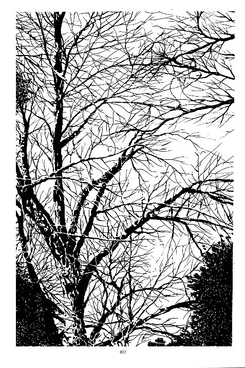
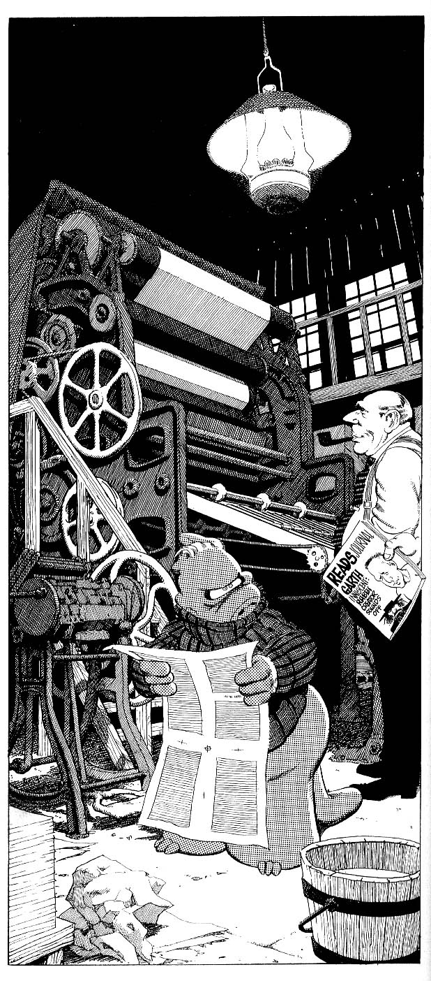


 “Not that far from paradise…”
 “An unintentional peek inside the process—a paste-up Mizuki head atop a photo-referenced body.”