Robert Binks and His Art ( part 2 )


Robert Binks has worked as an illustrator, cartoonist and artist for more than sixty years, during which time he has created a stream of inventive and delightful works. We began our sampling of his career last week, and scans of  his illustrations for the Ogden Nash collection The Old Dog Barks Backwards can be found here.

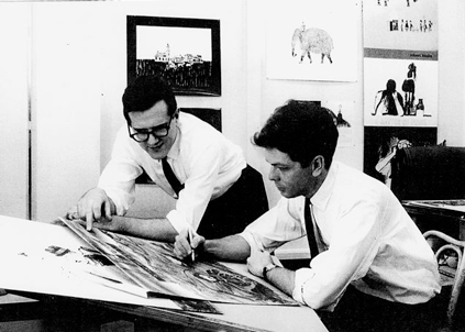
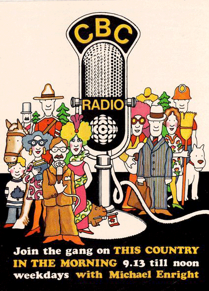
This week we open with some of Mr. Binks’s work for the Canadian Broadcasting Corp., where he was on staff from 1957 to 1991. (These works are all © CBC/Bob Binks.) Here we see Mr. Binks early in his career, posing at his drawing board for a publicity shot as a colleague leans an elbow next to him:


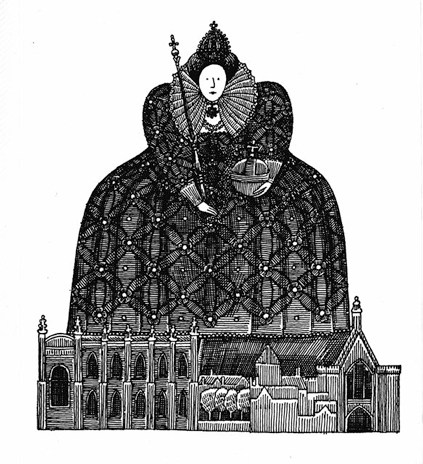
From 1966, two illustrations by Mr. Binks for a retelling of the parliamentary system’s history. The book accompanied a CBC radio series of the same name:


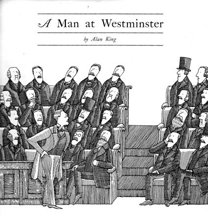
We see a young Winston Churchill in mid-oration. The way the MPs fall into well-defined, heavily drawn columns provides an example of the high, packed compositions Mr. Binks sometimes prefers. But the columns, most of them, are set at a slant, which brings the heaviness a bit of spring and bounce. All in all, the drawing manages to bring life to an arrangement of 25 men without giving each figure an individual posture.

The line work is very detailed. Mr. Binks does the same for Elizabeth I, in this case working up the patterns for her dress and, especially, her lace collar:


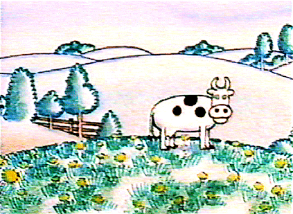
Now the sequence from which we took this post’s lead-off illustration. The four drawings are cells for an animated sequence the CBC inserted into Sesame Street so that there would be some material in French:


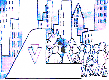
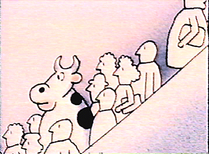
The look on the cow’s face when it’s in the subway … Come to think of it, I like the lady with the feathered hat too. The sequence shows Mr. Binks’s ability, when necessary, to get a certain amount of endearing personality into the bare minimum of lines for a character.

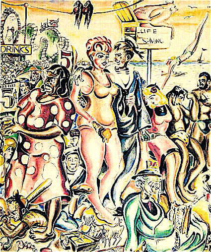
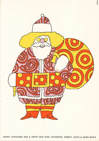
We’ll close with three of the artist’s freelance assignments. First off, there’s the card he did in 1970 as a work sample for his New York agent to show around:


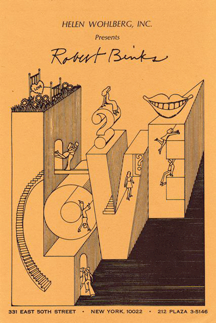
I’d call it a charming exercise in Peter Max/Yellow Submarine popism. The figures are reduced all the way to design touches, slender pen strokes that have no faces and end in bellbottoms. The approach is typical for Peter Max, unusual for Mr. Binks. As we saw above, he usually gets a face in there, stylized but with at least a touch of personality.

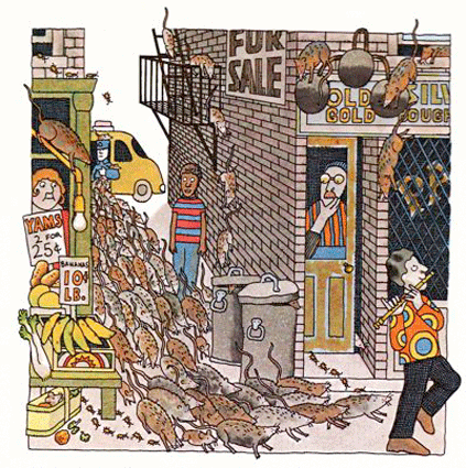
Now a page from “The Pied Piper of Harlem,” a story that appeared in a mid-1970s school book. The brick work and the crowd of rats show Mr. Binks’s vigorously detailed line work and narrow, stacked compositions:


We close with an illustration that ran in the Toronto Daily Star in 1979. The theme is familiar to anyone who knows the Canadian winter:


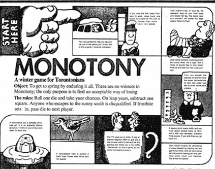
I think the nine cartoons in a row illustrate Mr. Binks’s knack for deceptively simple illustrations that grab the eye. The way they mix good humor, quick communication, and visual resourcefulness is very satisfying.

Next week we’ll focus on Mr. Binks’s private artwork. Drop by!

Robert Binks and his art ( part 1 )


Robert Binks is a Canadian illustrator and cartoonist with a fresh, wry and humane touch. His drawings and art pieces are still delightful  thirty and even sixty years after their creation.

His illustrations for the Ogden Nash collection The Old Dog Barks Backwards (1972) can be seen in four posts gathered here. As a result of these posts, Mr. Binks got in touch with me and sent along more of his works, which I will be presenting over the next few weeks. I’ll note that everything Mr. Binks produced for himself is © Bob Binks. Works that he produced for the Canadian Broadcasting Corp. are © CBC/Bob Binks.

Mr. Binks wrote me the following:

I retired 20 years ago after a 35 year career as a graphic designer at the Canadian Broadcasting Corporation. During those years I also free-lanced for 2 Toronto newspapers doing editorial art and had an agent in New York where I illustrated several books including  The Old Dog Barks Backwards.

A personal endeavor I have enjoyed all my life and continue to do, is making Xmas and birthday cards for my friends and relatives.

Since retirement I continue to be productive in art — fine art painting, small ironic wood constructions and clay creations.

We’ll be seeing samples of all the above during the next few weeks.

Born in 1926, Mr. Binks studied commercial art at a Toronto technical school, then fine art at the Ontario College of Art. In 1947 he became a display designer at Eaton’s, a department store giant that was a Canadian institution. Ten years later, at age 30 or 31, he joined the Canadian Broadcasting Corp, where he spent the rest of his professional life.

His work combines simplicity with unexpected detail and craft. These student caricatures from his days at Central Technical School provide an example:


As you see, they’re from the same set as the self-caricature that opened the post.

Now a far less characteristic work, but an interesting one. Mr. Binks produced this beach scene at age 14, during his second-year illustration course at Central Tech. He was trying to be like the painter Paul Cadmus (1904-1999) and made a good job of it:


Most of Mr. Binks’s work is, to put it mildly, not much like that of Paul Cadmus, who was a bitter moralist and who specialized in elaborate, pyrotechnically designed  canvases that are heavy with detail. The best Binks-Cadmus parallel I can come up with is that the two reverse each other. Mr. Binks produces clear, appealing works that show more detail than expected. Cadmus produced improbably dense works that communicate themselves with surprising clarity and speed.

At age 22, Mr. Binks painted columns in the women’s wear department at Eaton’s. A display from his time at the department store provides an example of his clear but subtly detailed work:


From the 1970s, we have some CBC work that shows a Binks trademark: the combination of simply outlined figures with involved but bold composition. From left foreground to right foreground, the artist turns a series of squiggles — dress pattern to hand-mike cord to snake to giant-mike cord — into a sort of meta-squiggle. It coils toward us where the reporter is standing with his hand-mike, then coils away, passing from snake to giant-mike cord:


Below is an item done freelance for the recipe page of the Globe and Mail. Mr. Binks tends to amplify the effect of the texture in a given work by creating high, narrow rectangles jammed with detail. In this case the cart’s vegetable bins do the job:


Below we see the same trait, only more so. This picture makes texture its centerpiece; usually texture is more of an accent, from what I’ve seen.


Here we have a page from a mod dictionary that Mr. Binks illustrated. The pictures remind me of his work in the Odgen Nash collection. His strengths come together very nicely here. The illustrations have the simplicity cartoons need, but with a good deal of weight to the drawing:


Another favorite, this one from the cover of a Toronto paper’s weekend magazine supplement. I like the nimble but unobtrusive way Mr. Binks handles the three interlocking compositions of cityscape, the first group of authors, and the second group of authors:


Again, the drawing still works as a cartoon. The composition is involved but clear, and it doesn’t produce a brushback effect, as when the reader’s jaw is supposed to drop a little and she/he to stand abashed at the sight of improbable ability. I find the drawing cuddly in a way, comforting. For example, take the tourist boat chugging along in the foreground.

To close, a Christmas card Mr. Binks designed for his own use. The paisley Santa and his colors grab me:


The card has pulled off a neat trick, which is to survive the pop art ’60s without having become dated. I love the way the raspberry, gold and tan patterns look trapped against the white.

Unfortunately I don’t know how to analyze the card’s use of color and patterns, beyond saying that Mr. Binks sometimes uses contrasting patterns to kick up a drawing’s effect, and that here he adds high-contrast colors and a white background. The result is a caricature that jumps out at you, a trippy Santa Claus whose trippiness doesn’t rely on the usual signifiers of psychedelia (beyond paisley, anyway).

Next week we’ll have some intensely involved line work and a sequence about a cow traveling by subway. Hope you can make it!

Dyspeptic Ouroborus: What am I doing? What are you doing?

I was wondering about what people do when they practice criticism. Everyone here writes out their thoughts about comics, movies, music, etc. What are you doing when you do that?

What I do is to feel my way. Whatever I’m writing about, I want to write about it as if I had never seen the thing before. What is this thing you call “comic”? How could it ever have come to be? Why do people keep it in existence? And how did this particular example of “comic,” the one I’m holding, fluke into being? What can we tell about ourselves from its existence?

I guess at answers by keeping my eyes open and noticing everything (trying to, I mean), and I refine my guesses by comparing them with what I know of the world, including the people and industry that produced the item in question (the comic, movie, or whatever).

So I start out pretending to know nothing, then I pull in what I know or think I know. It’s quite a change of gears, and in either case it’s like I have to take myself by surprise, ambush my perceptions from a direction I don’t expect.

Always getting blindsided and feeling like a dope can get your adrenaline up, even if you’re just typing your thoughts about Civil War. But it can also leave you ragged. The “ah ha” moment come by often enough to keep you playing, but most often it’s like you’re trying to find your cold medicine in an ocean liner and the lights have gone out and the damn floor keeps moving.

Possibly somebody else might follow the same approach that I do, the same “dream it up/check it out” two-step, and that person might not feel at all stupid. Instead of “Everything I know is useless,” the person might think “I see the universe in a plum!” Instead of “I can’t possibly be right,” he’d think, “My flashes of perception are transformed and broadened by my sure knowledge of the world.” Which makes that hypothetical second person sound like a fatuous ass, but whatever. You don’t have to suffer to do good work.

And it’s very likely that other people follow quite a different method. The thing is, I don’t know anything at all about how other people write criticism. I’ve never studied the subject and never thought about it, beyond noticing that critics I like don’t necessarily supply opinions I agree with. (For instance, Pauline Kael and Citizen Kane’s alleged “dime-store Freud.”)

Anyway, how other people write criticism. It involves theory, right? As indicated above, I proceed by sensibility and fact-checking. My ideology (which I won’t try to define) is always there, but it sneaks in. I never feel oriented, never proceed from an overview, and I don’t think I’ll ever be able to.

The march of the redshirts … is over

I’ve decided to leave the HU. My thanks to Noah, always a patient and generous host and the only man who could get me to look straight on at a page drawn by Harry G. Peter. I will also miss Kinukitty and her reviews of those comics about the skinny fellows who like to hang out together. Her jokes made me laugh, which is a rare thing.
The good news is that Wiki Trek, my personal adventure in OCD, will no longer drape itself over your long-suffering screens. The bad news is that I must sacrifice exposure to treasures of discourse that have brightened my life: the roly-poly prose of stately fangirls, the inane yipping of outraged fanboys, the plaintive truculence of the man who can’t draw necks (though he’s learning Photoshop), and the sheer stupidity of the clod who came stumbling along five months after the Watchmen movie to tell Noah and me we were Bolsheviks because we didn’t like that three-story cloud of stink. Wherever you are, sir, I sincerely hope you go fuck yourself — for you are the true voice of the Internet.

Morpheus Strip: Post-modern something

It looks like most of what I have to say will be in the Comments threads to Noah’s post, so go here if you’re curious. More important you’ll find Noah’s thoughts on Sandman, and over here is an illuminating discussion by the distinguished Ng Suat Tong.
In this post I’ll add a paragraph from an article about Gaiman that I did for TCJ (namely “My Gaiman Decade,” issue 273, January 2006). And I will add a one-liner that I took out for some reason. It goes like this: Gaiman is so temperamentally averse to big systems of thought that his idea of a cosmology is alliteration (Dream, Destruction, Death. etc.).

The TCJ article was about why I liked Sandman so much and why I felt let down by the series. A lot of me, me, me, which I think was an honest way to approach the subject. For a little while the series had somehow got into the center of my life, and I wanted to figure out why. But I put some ideas in there too, and the paragraph below has a couple.
For instance, wish fulfillment. Here are two secret little payoffs that I got from the series, and I suspect they’re hooks for other people too:

Gaiman’s universe is divided into a crowd of further universes, like folds in a paper fan, and the Endless can materialize in and out among them at will. That’s very comfortable; it suits me down to the ground. The characters can go anywhere, travel through any sort of story, change their surroundings like turning a knob. Not only are they superheroes, they’re media consumers; so am I. Go deeper and there’s a more embarrassing source of attraction. The Endless’s fundamental power is that they matter. Wherever they go, they count, and most often anybody else in the same panel counts for less. (The Endless are aware of this, as shown by Dream’s easy way with a high horse and Death’s ambling among the confused.) Superheroes beat each other up; Gaiman’s superbeings see who can matter the hardest. At their crudest, these contests are expressed through staredowns and well-seasoned rebukes. But what underlies the encounters is mana; to use Gaiman language, what underlies them is the fundamental stuff of mattering. [We have no idea what this stuff is, neither in the series or in real life.] Why some people have more self-possession than others is hard to pin down; so is why the universe cares so much about the Endless. After age eleven, fistfights are a lot rarer than simple contests in outfacing each other, in self-possession. If you’re nine years old and want to matter more, you’ll think of superhuman muscles. Past that age you’ll be thinking of other types of advantage, such as a superhuman source of mattering.

I stuck in the bracketed sentence, the one about “We have no idea what this stuff is,” because I still wonder if that section of the extract really makes its point. Ah well.
I’m going to break down the paragraph and expand on individual points.
1)  “Gaiman’s universe is divided into a crowd of further universes … and the Endless can materialize in and out among them at will … travel through any sort of story, change their surroundings like turning a knob. Not only are they superheroes, they’re media consumers …”
Kind of meta, I guess. These days most of us spend most of our lives being media consumers. Sandman is the only property I can think of whose characters act out a deluxe, all-power-is-in-your-hands version of same. Wotta hook!
A related point. As I read it, around about the early ’70s genre entertainment fans realized they could just pile all their favorite genres into any single work. Underlying the innovation was the idea that a story didn’t really have to take place anywhere, not even Middle Earth. The idea of a solid world was gone; instead there were just entertainment tropes, with nothing needed to house them but the ready-to-hand sf concept of billowing and necessarily undefined dimensions rolling one into the other.  The Man-Thing story that introduced Howard the Duck is the first example I can think of. The two issues had everything: pirates, space men, dragons, funny animals. If I recall right, Gerber shanghaied the idea of the multiverse, pioneered by Michael Moorcock, and refitted it from an assortment of sword-and-sorcery worlds into the broader sort of assemblage I have in mind.
It was part of Gerber’s sad life progress that, having wandered onto this rich territory, he then wandered off it again. Dave Sim took up the idea in the late 1970s, and he didn’t even need dimensions: pretty soon he was having superheroes pop up in Conan-land with no explanation, and eventually Oscar Wilde and Ernest Hemingway too. Terry Pratchett joined in during the ’80s with Discworld, again shoving disparate genre tropes into a place that didn’t really have to be any place. In the late ’80s Sandman came along and Gaiman hauled dimensions back into play as an explanation. To tie in with the paragraph just above: though all these works have settings that are less places than entertainment-trope warehouses, only Sandman simulates the all-powerful-media-consumer experience because the Endless get to flicker in and out pretty much anywhere they want to go. The people in the other series generally have to walk.
2)   “After age eleven, fistfights are a lot rarer than simple contests … in self-possession. If you’re nine years old and want to matter more, you’ll think of superhuman muscles. Past that age you’ll be thinking of other types of advantage, such as a superhuman source of mattering.”
I guess this in line with David Riesman and inner directed/outer directed. I say “guess” because I’ve never read Riesman, he admitted casually. But a muscles superhero gets his way thru straightforward physical instrumentality: he hits something and then it is no longer standing up, it’s lying down. The Endless, on the other hand, have a lot of big moments that rely just on how one person reacts to another, and these exchanges tend to be a matter of who can out-crust the other. It’s a bit like CSI, if you’ve seen that. Every damn episode has a moment where some poor guy has to swallow his gum and shift his gaze, look down and away in shame as a detective stares at him, and often enough these guys aren’t that important to the story. The episodes still make time for them because those moments are money shots. The audience loves the sight of a poor sap wilting in front of another because those are the moments people chase in their daily lives at the office. 
Put the two ideas together and you get, I don’t know, post-modern something. Physical reality downplayed, agreed-upon social realities played up. But to tell the truth, I’ve been up a long time and now I’m going to bed. 

Mel Brooks

Matthew Yglesias says of Jonah Goldberg:

… holding captives in secret where they’re hung by shackles from the ceiling and occasionally beaten to death is fine by him, but efforts to curb smoking are “liberal fascism.” And now this line of thinking seems to have completely taken over the right.


The difference: dark foreigners are hung from ceilings, whereas white Americans are kept from smoking. Which reminds me of what Mel Brooks said about stepping into a manhole versus getting a paper cut: if the first happens to you, it’s comedy; if the second happens to me, it’s tragedy.
(I think the Brooks quote was about cutting your finger, not specifically a paper cut, but it’s the same idea.)
update,  TPM quotes a reader who jogged by the big gathering of angry people in Washington today:

Interestingly not a lot of American flags but a lot of other flags including the yellow don’t tread on me flag. 

I had a similar thought when I saw a photo of one of the demonstrators, a guy carrying a modified American flag: the old 13-stars-in-a-circle flag but with a “II” in the middle to indicate that the Tea Party movement is like the second American Revolution. Basically, an American flag wasn’t good enough for this guy; he wouldn’t settle until the flag had been made into an emblem of the Tea Party movement.
I’m indifferent to flags unless they represent something I find hateful (the usual suspects: Third Reich, Confederacy). But I think it’s worth noticing that you can no longer predict what flag the flag wavers will be waving. For decades we’ve heard them talk about America-love as the one supreme virtue, and about the American flag as the supreme expression of this virtue, and now their love has frittered itself away. These days they’re into novelty items. That’s a big change.
I don’t claim to know the reason, though I guess many of my fellow liberals would point to the election of a black president; my preferred explanation, for which I have no evidence, is just the schlockification and t-shirt-ization of modern life. 
Another TMP reader is quoted:

Some in the crowd appeared to be low functioning zealots suffering from serious mental illness and/or undisguised racial hatred. However, most of the people who marched by my vantage point appeared to be rather earnest but misled members of the lower middle class who were just regurgitating Fox News memes concerning imagined threats to America.


Okay — lunatics and dumb people. But where are the venal con men

A reason to get married

If my wife bought me a magazine, I could write stuff like this:

He’s tall, trim, with shaved head, a confident demeanor, wearing a dark turtleneck, kind ‘a funny and Yale Law School. Cool. Co-o-o-l. Or maybe even wow!

Then again I get to blog about people who played redshirts on Star Trek 40 years ago, so the hell with it.
(Yeah, I heard he sold the magazine, but apparently on terms that allow him to continue driveling. update, David Weman says in Comments that Peretz has now bought the magazine back. So, okay then.)