The Color of Hate

I am a generally happy person. A cockeyed optimist. A Pollyanna. Hell, you know, I’m from the Midwest. I like to like things, and I try very hard to do so. As a self-directed blogger with no editorial mandate to adhere to but my own, I skip merrily through the world of East Asian comics, content to linger over what pleases me. I rhapsodize over the books I enjoy and blow through the rest as quickly as possible—like a panicked sprint through the unexpected cloud of gnats on an otherwise peaceful summer stroll.

For a person like me, “hate” is a fairly nebulous concept, and not all that easily accepted or even understood. For me to hate something—to really loathe a thing—it needs to hit me where it hurts. I can’t vigorously hate a book or a comic or a Broadway musical, say, for simply being incompetent (*cough* Baseball Heaven *cough*). I must be truly, inconsolably offended in order to come even close to real hate.

That said, there are a number of comics I’ve disliked intensely over the years—mainly since I began reviewing things I wouldn’t necessarily choose for myself. Notable objects of my rage have included gender-regressive shoujo manga like Black Bird; creepy, campy BL like Tricky Prince; and the fat-shaming caricature that is Ugly Duckling’s Love Revolution. One of these titles even prompted an experiment to discover how often and how thoroughly I must trash a single series before the publisher would stop sending me new volumes (answer: to infinity). The thing is, when I go back and read my reviews of these books, each of which has incited rage, they seem kind of… weak. Despite my wrath, I could never truly commit to hating these comics, due to their lack of serious intent. Nobody thinks Tricky Prince is Serious Business, including Tricky Prince, and it’s hard to work up genuine, lasting hatred over something that was intended to be disposable from the start.

Then came the Color trilogy.

In 2010, I volunteered to host the first manhwa edition of the Manga Moveable Feast. A number of titles were suggested and put to a vote, including some personal favorites, like Byun Byung-Jun’s quirky short comic Run, Bong-Gu, Run!, Uhm JungHyum’s moody romance Forest of Gray City, and JiUn Yun’s sumptuous collection of ghost stories, Time and Again. Unsurprisingly, however, the vote ultimately came down to Kim Dong Hwa’s critically acclaimed manhwa trilogy, The Color of Earth, The Color of Water, and The Color of Heaven, published in English by the lovely folks at First Second. Though I was a big fan of Korean comics in general (and certainly knew of Kim’s series), I hadn’t read read more than a few excerpts myself, so I dug in with verve. And then the hate… oh the hate… it was like nothing I’d experienced as a comics reader before.

The Color trilogy is a coming-of-age story revolving around Ehwa, a young girl in pre-industrial Korea who is being raised by her mother—a widow who runs the local tavern. The story spans Ehwa’s life from the age of seven (when she is first made aware of the existence of penises, thanks to a boys’ pissing contest) through her wedding night (when she gets to know a very special penis on more intimate terms). I choose these parenthetical descriptions purposefully, because that’s what this series is really about: penises and the pursuit of same—that is, when it’s not too busy going on about the lusty beauty of a ripening young woman (yes, these words are chosen purposefully as well).

First, the penises. As I mentioned, the story opens with Ehwa, at seven, stumbling upon a pissing match between two local boys. The boys are deeply proud of their own “gachoo” (chili peppers, also a euphemism for “penis”) and they ask Ehwa to show them hers. This sends Ehwa into a tizzy, as she wonders if not having one indicates that she’s deformed. One of these boys is so consumed by his love affair with his own penis that he will later be portrayed as being unable to take his hands off of it.

(click image to enlarge)

Hey, why should he? It’s a really awesome thing, that gachoo. As Ehwa’s mom explains to her later (after buying a whole lot of ginseng to cook with in order to boost the, uh, energy levels of her traveling suitor known only as “The Picture Man”) when a man’s gachoo comes into contact with a woman’s “persimmon seed” (seriously, this is the kind of language Kim uses throughout the series), something magical happens.

Fortunately, Ehwa gets to experience this magical, floaty, firework-y business for herself at the climax of the book (Get it? “Climax”??), as she’s losing her virginity to her new husband. Though in her case, fireworks and floating on clouds feels more like… a super-phallic bell choir? Mortar and pestle? Um… ?

(click images to enlarge)

Though I joke about this being the “climax” of the series, it actually is just a few pages from the end. Ehwa’s journey really does quite literally span the time between discovering penises and getting to be penetrated by one. The entire point of her existence as a character can be summed up this way.

What happens in the middle is largely waiting. Waiting, waiting, waiting. Both Ehwa and her mother fall for wandering men—the kind who spend most of their time traveling for work or simply out of restlessness, but stop in for sex every few months or so. (I once described this type as “… a big, strapping man who values the freedom to wander, is good in a fight, a stallion in the bedroom, and offers questionable financial security. Another male fantasy?”) While this is undoubtedly appropriate to the period and to these women’s circumstances, Kim spends so much time lingering on the wistful beauty of the lonely woman, it begins to feel like a bit of a fetish.

(click image to enlarge)

Scenes like this are peppered throughout, along with long-winded discussions in which the lonely, waiting women, the wandering men, and generally everything else of consequence in the story are described as various types of local flora and fauna—to the point that it eventually becomes difficult to remember what or whom all the different flowers, insects, and trees stand for. More than anything else, however, Kim lavishes over the beautiful pain of Ehwa and her mother with genuinely lovely artwork and flowery language worthy of Anne Shirley’s Rollings Reliable Baking Powder story.

But while Kim’s obsession with the feminine loveliness of his characters’ longing reads as simply insulting, his fascination with Ehwa’s burgeoning womanhood borders on downright creepy. Kim is quoted as saying that “the process of a girl becoming a woman is one of the biggest mysteries and wonders of life.” And it’s clear from his portrayal of Ehwa that he considers that process to be entirely sexual. Ehwa has no interests outside of sexual attraction and whatever else is happening with her body—not the tiniest thing. In fact, despite being the only child of a single woman running a tavern all on her own, she doesn’t even seem to have chores to take her mind off her dramatic puberty. Growing up mentally, emotionally, or even just practically seems to be of little consequence to Ehwa or her mother (who remembers just as Ehwa is about to get married that maybe she should teach her how to cook). And while I feel vaguely ashamed for wishing that a female protagonist might take some interest in housekeeping, it at least would give her something to care about besides the long-cherished promise of touching a man’s gachoo.

But while personal interests, hobbies or even standard domestic pursuits appear to be superfluous to “the process of a girl becoming a woman,” the relevant items seem to be:

Getting her period.

Learning to masturbate.

And attracting penises butterflies penises.

Yes, Kim Dong Hwa, these truly are the most important aspects of a young girl’s blossoming into womanhood. Thanks for noticing.

Of course, in the end, it’s not Kim’s romanticization of regressive gender roles that really bothers me here, or even his semi-creepy fetishization of womanly “blossoming” (seriously, everything’s got a flower metaphor in this series), not when you get right down to it. I’m a manga fan, after all. I’ve read Black Bird and Hot Gimmick. I survived the first omnibus of Love Hina. I’ve participated in a (not entirely scathing) column on boob manga. What makes me really hate the Color trilogy, is that it’s so widely praised and admired, by male and female readers alike. It is absolutely Serious Business, and that makes it rare fodder for my hatred.

In the books’ endnotes and in Kim’s official bios, he’s referred to repeatedly as a “feminist” writer. He is credited with possessing an “uncanny ability to write from a profoundly feminine perspective.” When, during the Manga Moveable Feast, Michelle Smith and I accused Kim of regarding his female characters’ limited life choices and oppressive environment with “loving nostalgia,” we were criticized in turn for expecting more progressive sexual politics from a period piece. The Color of Earth was published in 2003, yet even Tezuka never treated his (highly questionable) female characters with this kind of rosy condescension.

I tried very hard to like the Color trilogy, but even my most sincere, Pollyanna efforts failed me on this point. In the end, it may be one of the very few comics this midwestern optimist could ever truly hate.

__________
Click here for the Anniversary Index of Hate.

A Piercing Glimpse of Pants

I actually like superhero comics.

Since it’s a big genre I don’t love all the mainstream capes, obviously, but the idea of them, the inherent trope of extra-powerful characters helping others, is fun and interesting.

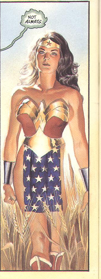
There’s something powerful about the mix of whimsy and gravitas in a comic like classic Wonder Woman.  Yes, she’s wearing spangled underpants, but she’s jousting on giant kangaroos and swimming deep under the ocean to rescue planes.  Anyone who spends a lot of time reading classic myths will recognize this kind of storytelling–there may be helpful woodland creatures flitting around your head, singing their adorable eyes out, but there’s also stepsisters getting their toes sliced off to fit the glass shoe of the prince.

Whimsy and gravitas, the stories we tell our children.  Be good, be brave, be honest, be loyal, and you will make the right choice at the crossroads.  You will help the little old lady who’s having trouble crossing the stream, and she is the fairy godmother who will save your butt when you get into a bad wood-gathering Ponzi scheme with your idiotic three brothers.

I doubt many people who wander into comics shops or cons feel like Levi-Strauss wandering around the jungle taking photos of penis sheaths and gathering mythos.

But perhaps they should.

For is it not the same?  Our cape stories take avatar-figures and set them upon bizarre quests.  The Princess in disguise must save the bumbling prince, and when she is back home, she dresses up like a deer to be hunted and ‘eaten’ by her fellow sisters.  The wealthy young scion loses his parents before his eyes–set upon a path of vengeance with the loyal family retainer and the local woodland creatures.  Certainly, these are not fluffy gray doves, but then, perhaps he is an urban scion.  He must battle another winged creature avatar–a bird who cannot fly is bested by a flying mammal who is not a bird.

Right.

So maybe superhero stories are myffic. Fairy stories told in bright crayon colors, yes?

As a kid, I tied a brightly colored towel around my neck and leaped off tall things (occasionally skinning my knee in the process, as one does) and I certainly got some underoos and clothesline and tied my long-suffering stuffed animals to a chair so I could interrogate them with my lasso of truth.

It was fun, and as time passed, as it does, I grew up.

Does that mean that I set those stories aside?  In some forms, sure.  I became too busy, what with college and then multiple jobs, to catch everything.

But I watched some of the various TV incarnations of the Supes.  A friend of mine loved Lois and Clark, and later, Smallville, so I watched them, too.  When Buffy came around, I fell hopelessly hard for the young blond high school kid who was a cheerleader by day and a warrior for the light at night.  I had a regular Tuesday night dinner with my enthralled friends and we watched, open-mouthed and silent, regular as clockwork.

I saw the movies. X-Men was good, and Spiderman OK, and what the hell was Aerosmith doing writing cheesy dreck like that as a soundtrack for god’s sake?   Seriously, Perry, that shit’s beneath you.

Where was I?

Right.  I saw the various Batmans, including Michelle Pfeiffer as Catwoman (inspired casting, but maybe not as inspired as Eartha Kitt….).  Hellboy.  Fantastic Four.  Iron Man.

I got into Saiyuki, which is another awesomely classic superhero story.  The boys have special weapons, tragic pasts, specific costumes, unique hairstyles.  One’s missing an eye!  Total classic mythic stuff.  Goku even wears a cape!

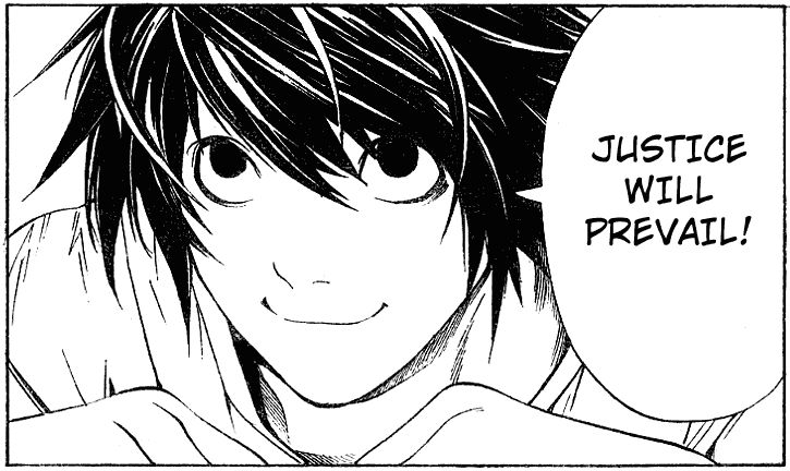
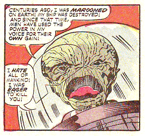
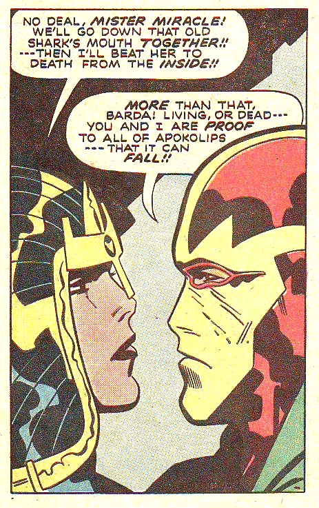
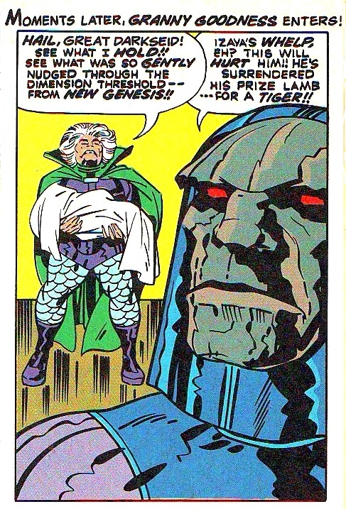
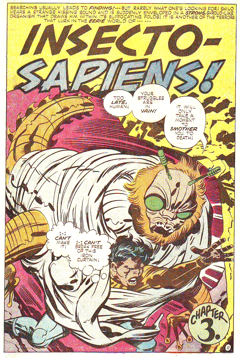
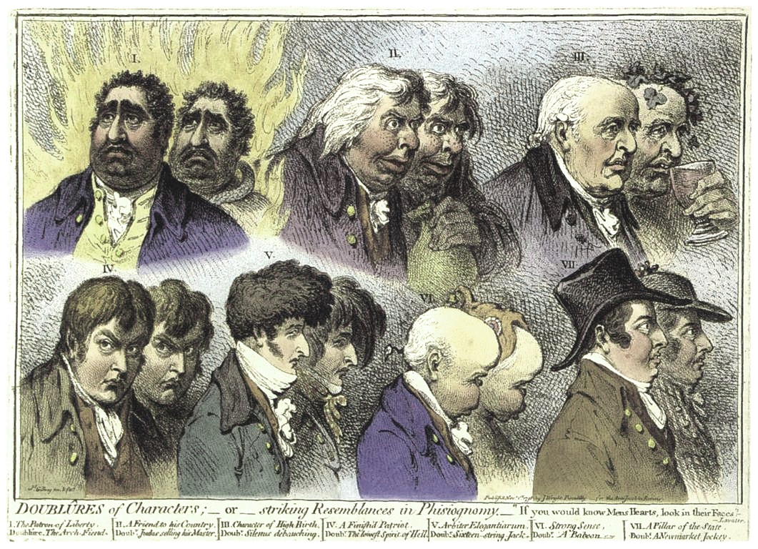
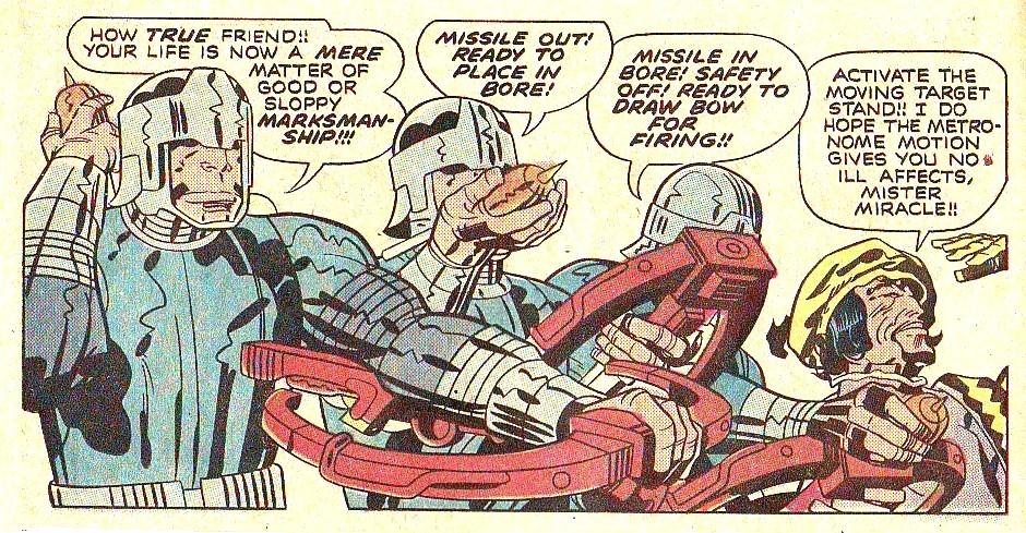
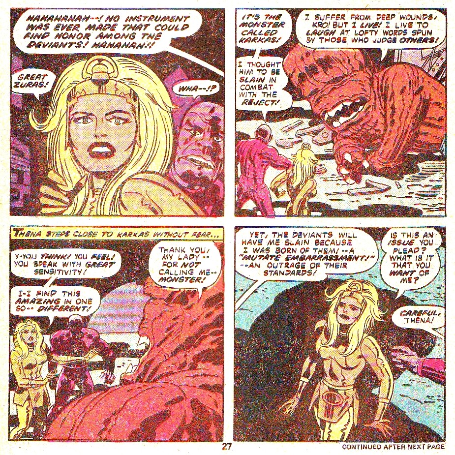
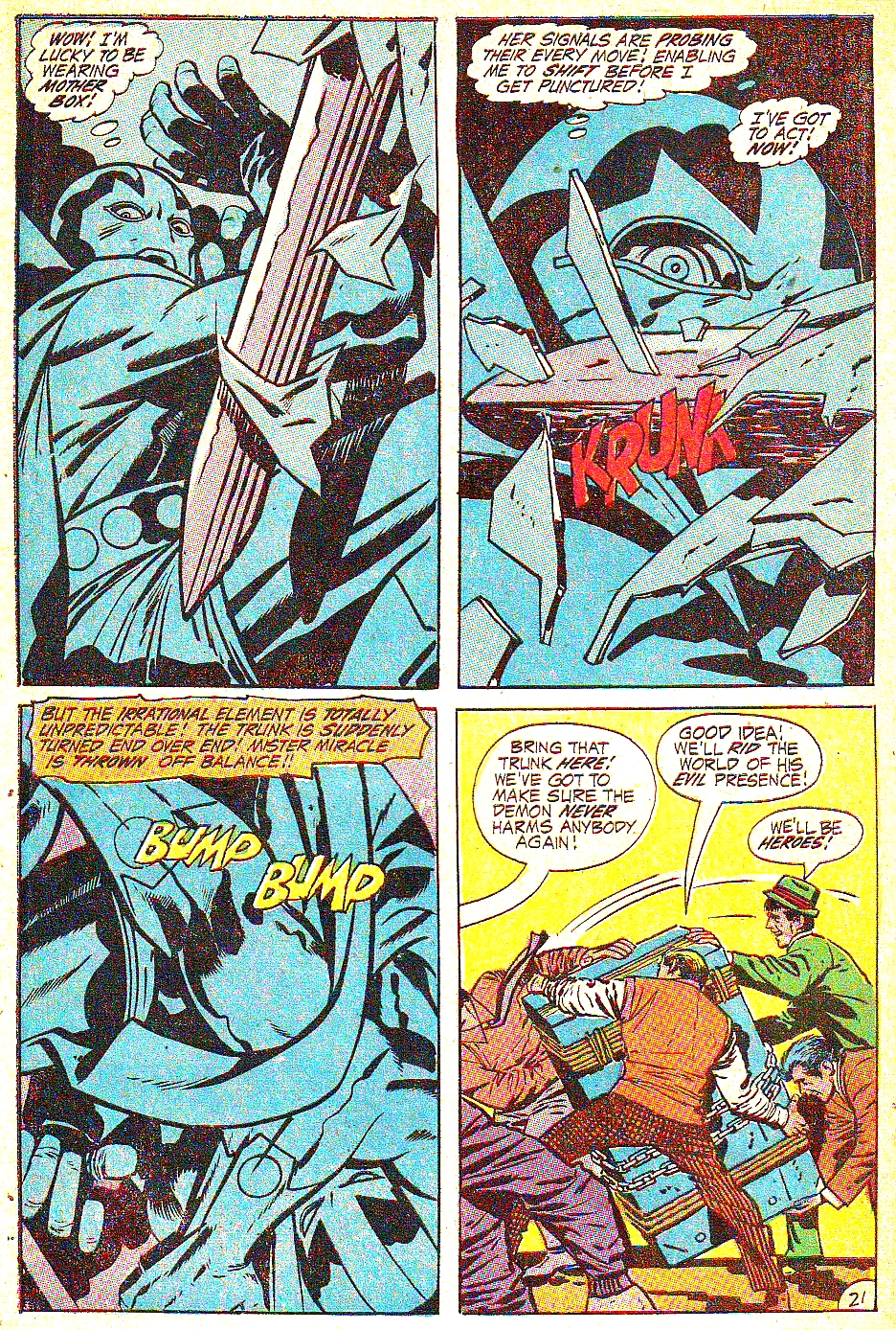
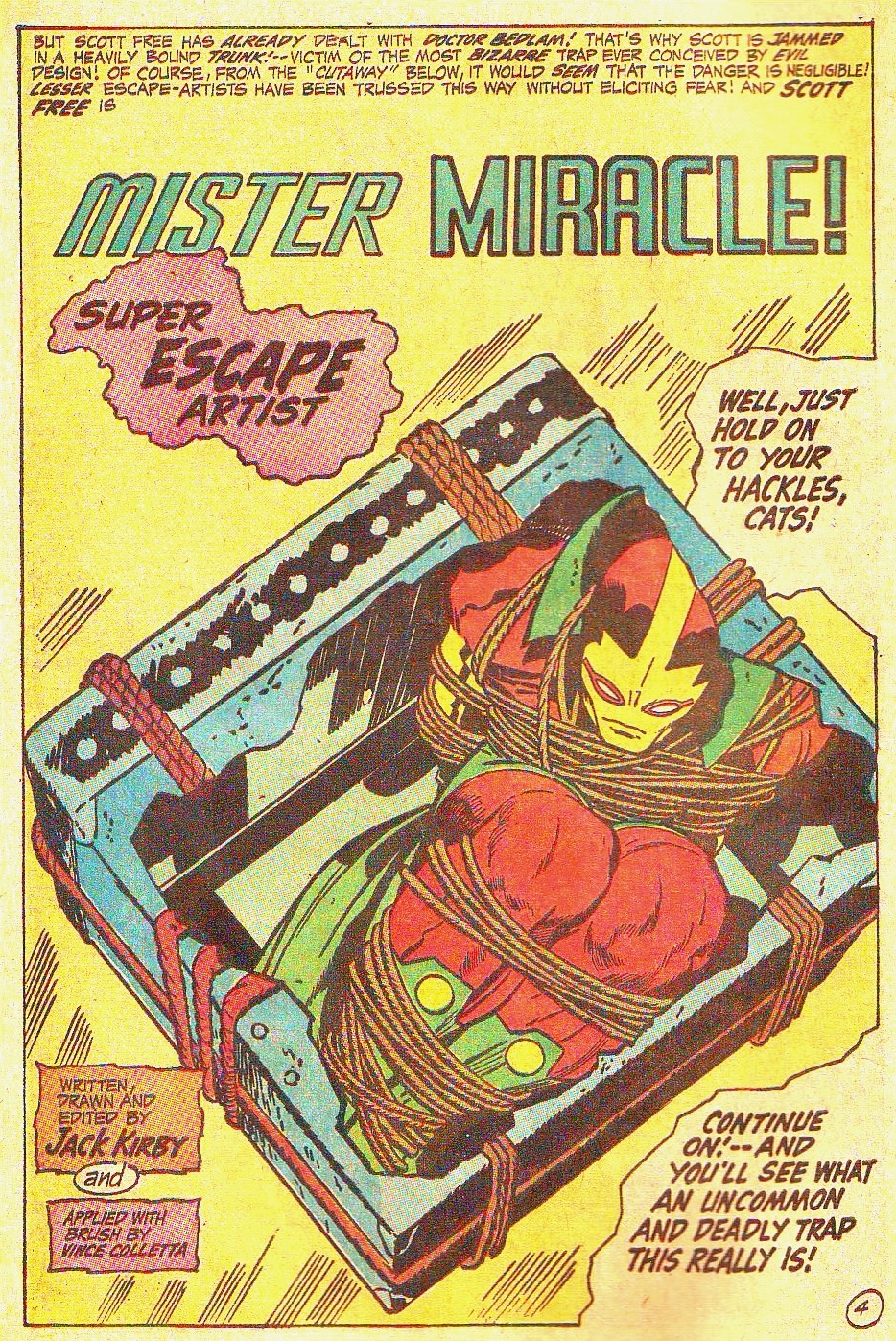
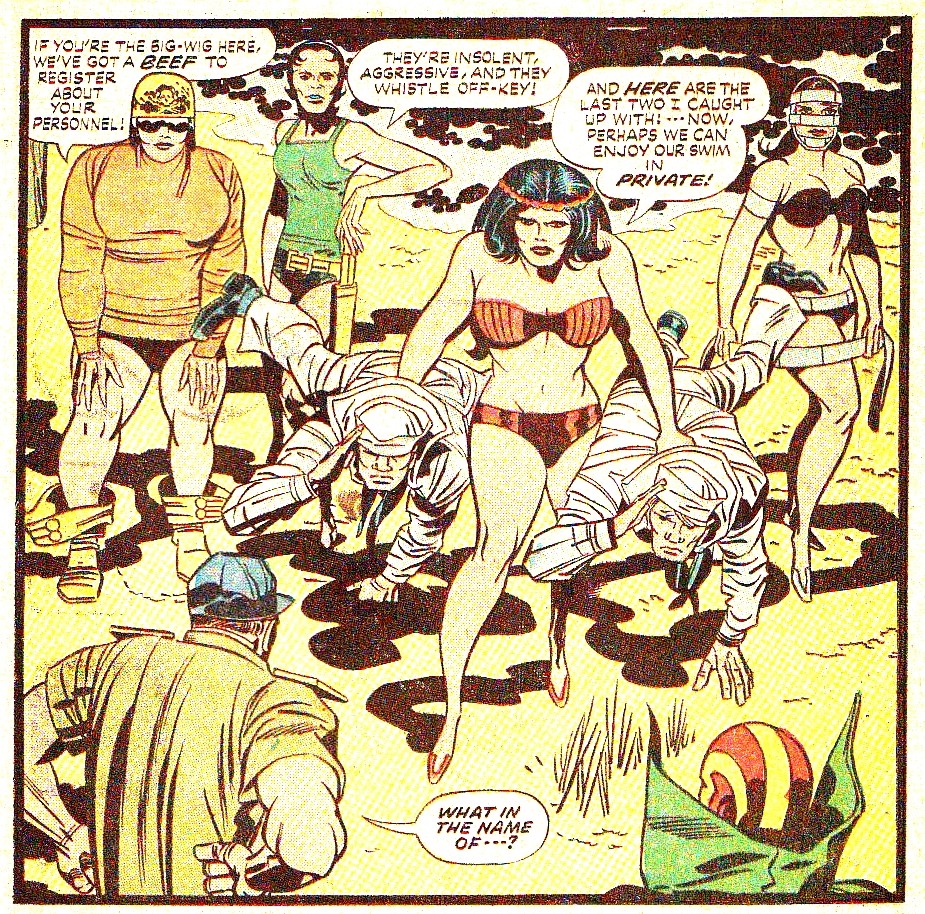
I read various comics, often shared between friends, in the supe vein.  Some I liked, some I didn’t.  You can see some of the ones I enjoyed here: Batwoman, Spidey, X-Men, Empowered.

I even did a long and heartfelt Wonder Woman fan comic.

The point is: I read this stuff because I like it.

I like the mix of whimsy and gravitas.  I like the juxtaposition of increased power and increased vulnerability.  I like wondering what kind of problems a caped crusader runs into.  I like seeing Good win over Evil.  I like it.

So, for some unknown fucking reason, my various friends and acquaintances kept pushing Alex Ross’s Kingdom Come at me like a drug pusher and a new victim.  This is the shit, they’d say.  I know you’ll love the art!  You have to read this! This is the best art I’ve ever seen, you have to read it!

I demurred.

Finally, one particularly vicious soul bought me the damn thing, or as many issues as were out at the time, and shoved them into my hands.

*

Reader, I hated it.

*

I hated everything about it.  The hackneyed plot.  The continuity porn.  The endless shoutouts to characters I couldn’t remember and wouldn’t have missed if I had.  The dumb as shit use of my state as a stand-in for the common people.

But more than anything else, I hated the art.

*

Fucking hated it.  Fucking hated everything this art stood for.  Hated it with all the passion in my soul.

*

Ahem.

*

Now, someone (probably everyone…) is likely to contradict me here, but I’m going to briefly outline my theory of art and craft.  I believe in craft, see.  A lot of people don’t.  But I do.  And since I believe, deeply and passionately, in craft, a lot of people seem to think that I should just luuuuuuuuuuuv that fucking Alex Ross art, because it is ‘realistic’.

But Alex Ross’s art is–well.

Craft.  What is craft?  Craft is skill, honed with with hard work, talent, and experience, of taking an image (be it a photograph, a live model, a mental imagining) and creating that image in a medium (inks, paper, sculpture, whatever).  Composition, line-width, colors, brushstrokes, etc, are all part of craft.

Certainly Alex Ross displays strong craft, of a certain type.

That type is realist copying to the point of dogmatism.  Copying, you ask?  Copying, I say.  For those who do not paint or draw a great deal, the ability to put an image on paper (or canvas, etc) and have it look exactly like a photograph or still life can seem a skill that is difficult to the point of miraculous.  It’s not, actually.  As an old teacher explained grumpily to us, the surly art class, if you have the hand-eye coordination to sign your name, you too could produce realistic drawings (or paintings).

There are several traditional ways to go about it.  You can use ‘Right Hand Side of the Brain’ method.  You can use photographs to flatten a scene.  You can make a view-finder (popular with the Dutch, back in the day).  You can train your mind to see not faces but slight oblong shape to paint with yellow ochre plus titanium white plus burnt sienna one half inch to the left of a center line.

The problem (or gift, for any flaw can be a strength if turned on its side like a knife) with these methods is that they are, at their heart, copying.  Is a Xerox machine miraculous?  Yes.  For skill and craft of reproduction, a Xerox machine is pretty amazing.  But it isn’t art.  You can make art by xeroxing–shrinking and reducing and enlarging and cutting and pasting and re-reducing and shrinking and enlarging and doing interesting things with various papers or toners.  But if art happens, it is because of the human element.  The artist chooses what part of an image (or their hand on the scanner, etc) to copy, how to use this amazing tool to create an image that is changed because of the passion and imagination and inner vision of the artist.

If photography is art, it is art because of what the photographer chooses to portray.  What composition, what lighting, what cropping, what juxtaposition between subject and scene.  Or what scene he had made himself with the help of his models, their costumes, their acting, their stylists.

Craft is the skill, the Xerox machine or camera or brush.

Art is the vision, the imagination, the choice of subject, the human element that steers the machine of Craft down the stream.

It is totally possible to be an amazing artist but have limited craft.  That’s like a singer who has a very limited vocal range but makes the most of what she has.  Or you could have a ton of craft and not much art.  That’s an amazing range, multiple octaves, used to sing crappy Barry Manilow tunes.   A waste.  (People, of course, can have both art and craft, or, not much of either.)

I’ve seen great art created by kids who were given disposable cameras and taught about composition and lighting.  If they choose powerful subjects and use the images to tell a story, even a two dollar Walgreens disposable can turn out some very moving art.

But the same camera in other hands could also churn out (and probably will) a dozen red-eyed blurry dog portraits and another dozen photos of drunk relatives at a birthday party.  Not evil, but not exactly a moving artistic triumph we must share with the world at large.

*

So what, you might ask, bewildered by this odd detour into my off-the-cuff art theory, has this to do with one of the most celebrated comics artists?

If the purpose of craft is to portray an artistic vision (in this case a comic story about the importance of superheroes), then we can say art is good when it adds to the story and bad if it takes away from the story.

And by that metric Alex Ross is very, very bad.

*

My friends who pushed Alex Ross on me were in awe of the talent on display in the pages of Kingdom Come.  They believed that the art was good because it was ‘so realistic’.

Looking at any given page in Kingdom Come, I can tell that considerable energy was expended to create the images.  I could tell, even before reading the end pages of my graphic novel release, that Ross had used props, models, and costumes.  To my friends, this was supposed to be impressive.

I guess if you’re not used to seeing the man behind the curtain, it is.

But many fine artists use costumes, photographs, and props.

To me, such preparations are neither laurel wreath nor black mark, it’s just another tool in the artistic arsenal.  My favorite artist, Alphonse Mucha, did many preparatory sketches and photographs, often lovely in their own right.  Other artists, often working in watercolors or Chinese style inks, use none of that kind of thing.

It has often been said that a true craftsman makes art look effortless.

I don’t know that I would say that, but I would say that a true craftsman makes the viewer see the art and not the effort.

*

So what about Ross?  If I like Mucha, then surely I don’t mind realism?  If Ross has some skill and craft, what’s the problem?

The problem, dear Reader, is that Ross chooses to remove every bit of whimsy from the mythos of superhero and replaces it with earnestness in the service of a kind of ugly realism that shatters the edges of the created world until heroism crumbles like a balsa wood model in an earthquake.

*

In the classic Wonder Woman stories, there are many ridiculous plots.  Is there really an island of women?  Do they really joust on giant kangaroos?

Well no, of course not.

In the real world, there are also no sky kangas.  (Alas.)

Superheros are pretend.

*

What Alex Ross does in Kingdom Come is take the mythic story of superheroes and paint them hyper-realistically.

The effect is obviously intended to be Serious.  Superheros are Needed, because Humanity needs to Battle Evil and the Forces of Good Must Triumph.

Except that by using this hyper-realistic style, by shoving a mythic story, with only slapdash revision and poor grasp of art, into a realistic world, Ross shatters the border of that story, again and again, until the frame cracks and every ugly border of the page is shown, every fourth wall is broken, and the superheros don’t project gravitas, but a kind of secondhand embarrassment so strong that I have to keep the damn comic face down on the table.

*

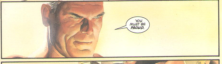
Let’s take a look at Superman, the hero of this tale.

He’s portrayed as an aging, graying, be-chinned older guy.  Which, OK, fine.

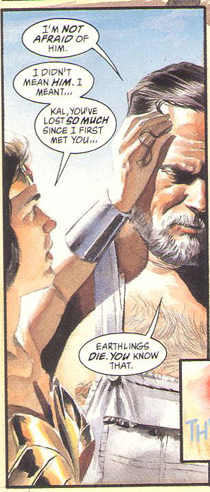
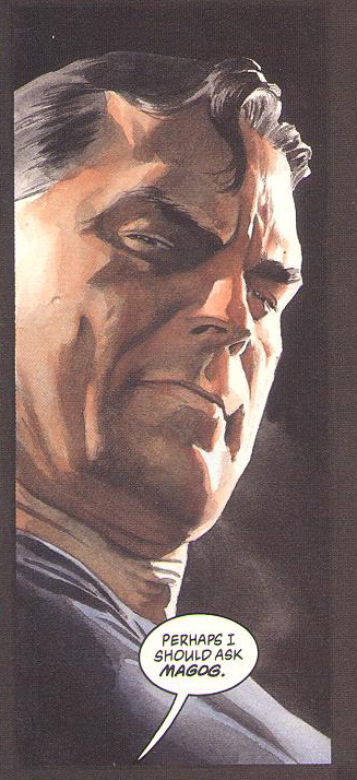
If Alex Ross has an artistic thesis in this story, it appears to be to prove, once and for all, that The Big Man’s chest hair is gray.  Gray, do you hear me?  Gray!

All right already.

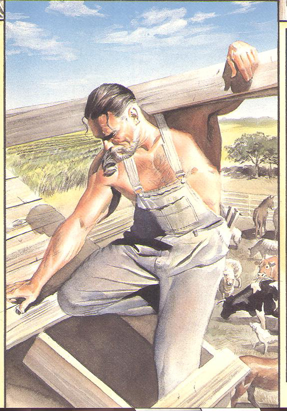
Now I actually wouldn’t mind having a middle-aged superhero, caped or not, portrayed as realistically aging, but what Ross has done here is not portray Superman as a middle-aged farmer, but as, well.  Look.

There’s one group of people who over-develop their chest muscles and neglect their legs.  They have long hair in ponytails and frankly, more tattoos, but otherwise, Clark is kind of a dead ringer for a guy who’s lived in prison for years.

Farmers and outdoorsmen have built calves and smaller chests, different body types.

The spandex outfits are also a mistake.  What self-respecting Kansas farmer would be caught dead in bright red and blue lycra?  None, that’s who.

Instead of creating imagery that conjures strength and the tenacity of age or using the crayon-colors to create instant pizazz and focus, or hell, even silliness, Ross’s tromp l’oel conjures unpleasant petty realities.

Anyone who wears polyester underpants that tight during a workout is just asking for a yeast infection.  Not to mention the chafing once he starts to sweat.  I hope there’s a good portion of CoolMax in that fabric.  Did he at least put on some runner’s nipple guards for men?  Maybe he’s getting free samples of Body Glide?  I hope so, because otherwise, ow.

And what about those red boots?  Surely they’re made of rubber.  A man that age needs decent arch support especially if he’s active.  Fancy wellies with no real soles just seems ill advised.  I hope he’s got decent arch inserts.

*

This is the problem with hyper realism that takes itself too seriously.

*

In a normal fantasy story, there are some rules from our real world and then a few extra laws added that, within certain constraints, allow the storyteller to bring us something new and special, something greater than a story that is mired in the muddy reality of the day-to-day.

Tolkien called this a piercing glimpse of joy.

*

If you establish rules in a fantasy world, you have to follow those rules or risk shattering the world.  It’s also important, as an artist, to understand and honor the fact that it’s a fantasy.  Kangaroos can’t really take Amazons to the outer rings of the galaxy, but, wouldn’t it be cool if they could?

(Answer: Yes!)

*

Kingdom Come tries very hard to portray its fantasy hyper-realistically.  The problem is that it obeys only some of the rules and pokes holes in the others, all while taking itself incredibly seriously and obviously expecting its audience to do the same.

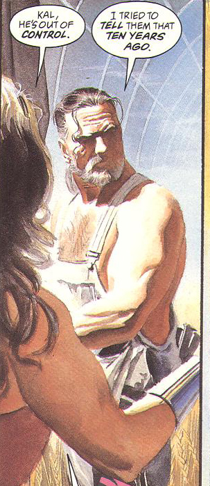
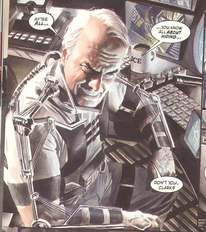
I have mentioned more than once that I’d like to have a broader range of ages and types of characters.  An aged superhero could be really cool.  But you can’t just age Clark Kent by giving him hyper-realistic chins and then bloat his shoulders like he’s an ex-con.  You can’t give Batman a metal exo-skeleton because of old injuries and then expect me to believe he’s got the same bull biceps of Clark Kent.  Where’s Bruce’s chronic pain pallor?  The weight loss caused by narcotics?  The shakes from  muscles that fail or from neuropathy-focused meds?

And if everybody else packed on a paunch so that their underoos are tight, why the hell does Diana have a teeny waist as if she’s got on an invisible corset?

Oh, because she’s a reward for the guy with the big red S on his chest, how silly of me to forget.  *rolls eyes*

You know what?  A woman who’s a warrior would not have a teensy waist.  (Nor do most middle aged ladies, but I digress.)  Nope.  If you look at practicing swordsmen of either gender, such as those who practice kendo, they have a broad belly, not one that is super-sucked in.  That’s because they have a low center of gravity.

You can see the same thing in those who practice a lot of yoga.  Amateurs tend to think that years of practice will lead to a six pack, but it ain’t so.  What it leads to is to a broad deep belly.  Why?  Diaphragmatic breathing.  Breathing into the lungs is nice, sure, but warriors (especially dare I say it Amazons) breathe into the lungs and all the way into the belly.  Lots more power.

If you want cheesecake, that’s fine.  Nothing wrong with the occasional cheesecake.  But don’t pretend it’s real.  Don’t expect the cheesecake to add to the feel of reality if you’re mixing sixteen year old photoshopped bellies willy nilly with older-woman bad hair day. Let Diana have a deep belly and and middle aged face and still be cheesecake.

Er, sorry, I got somewhat sidetracked.  Where was I?  Oh yes.  Hyper realism and seriousness and gravitas.

Right.

The problem is not the aging of the characters.  The problem is the patchy slapdash application of the aging rule.  Clark’s got gray hair and a flippy old dude pony tail, but Diana’s got a girlish figure and the same hairstyle she had in the forties?  Uh huh.  Batman’s managed to invent an exo-skeleton for his broken body, but–

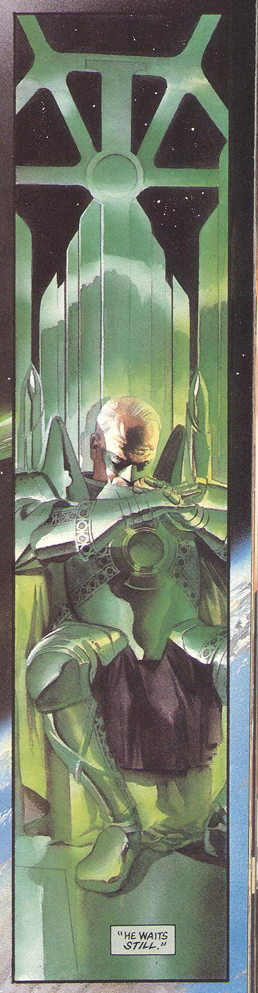
Look, in the real world, young guys wear spandexy football uniforms or whatever, but grown men normally do not wear  bowling-ball shaped glowing green armor.  Especially with a, what the hell is that anyway?  Some kind of black satin loin cloth?  Panty apron?  I don’t know, but it’s weird.  Weird and unattractive.

And loud.  Really loud.

It looks strange.  Sad.

In more abstract or symbolically painted comics, we’re not obsessively shown the seams of the spandex costumes.  We’re not shown the exact way a piece of green armor fits unpleasantly against a human body and then be expected as readers to believe it’s functional as a warrior’s uniform.

If you’ve ever seen a beat cop or an armed member of the military, their bearing changes when they’re wearing their gear.  I’m not talking about the shoulders back and head straight (although there is that), I’m talking about the way those heavy belts full of maglight/walkie-talkie/cuffs/gun/stunner/notepad impact the way those people move and stand.  Their elbows sweep differently.  They don’t bend at the waist in the same way.  Their hand will automatically move out to keep a truncheon or tool out of harms way if they turn quickly.  You can tell they are aware at each moment of the items they’re carrying, that these items have purpose, that it’s an important and serious uniform built on utility.

People wearing full and immovable body armor do not slump in a chair with their legs spread to reveal their black shiny panty crotch cloth!

They just don’t.  It’s not believable.  And why glowing green?  Yes, someone from continuity porn ville will be sure to point out endlessly why I am wrong wrong wrongity pants, but come on.  No self-respecting warrior would wear day glo green bowling ball shaped armor with a black loincloth in this day and age.  I mean, lol WHUT.  No.

It’s embarrassing.

Which is kind of a problem.

Every time I look at this page, I think, “Put on some pants!”

“Put on some pants” is a strong, visceral reaction but it’s the wrong reaction.  For the purpose of the story, I’m supposed to be feeling sadness or worry or fear for the characters and their plight, not slapping my hand over my eyes and thinking this is just like the time I went to an ill-advised Star Trek convention and got hit on by a man three times my age who was wearing some kind outfit made of what appeared to be bits of colored pantyhose, OK?

Just about every page has a panel like this.  I’ll just get into the story and begin to believe and then a panel will shove the impossibility of this story ever being even remotely true into my face.  Again and again and again.

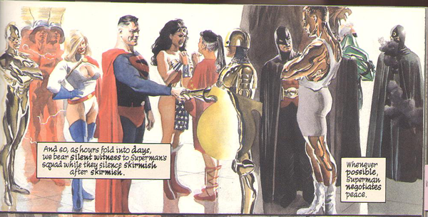
Here we see a kinkster in gold PVC, dial-a-naughty lady in a super girl outfit from Cirilla’s, the big man in underoos, a strange man in armor holding a shield that makes him look pregnant, and their obviously baby-oiled personal trainer in boxing boots.

And you know, that’s fine.  It’s not great, it’s not ideal, but–

The whole damn book is also ugly.

For the main theme of the book, Ross chose a complementary color scheme.  Since the colors are opposite, they’re jarring.  I have no doubt that Ross intended this jarring effect to increase the feeling of conflict.

Only problem?

He chose red and green.

Welcome to Christmas in comic town, boys and girls!

But enough.

The craft, the talent, the skill, does Ross have that? He can make images that have distinct features, sure, but according to Vom’s Theory of Art, he has failed.  Failed because each of these effortful, carefully crafted images betrays instead of supports.  The tone, the story, the essence, the theme, all of them are subverted instead of supported by the art.  I have no worry for the characters on their quest or joy in the characters’ triumph.

I just want them to put on some normal pants.

__________
Click here for the Anniversary Index of Hate.

Why I Hate Watchmen

When Noah announced this hate-fest, I knew immediately that I’d write about Watchmen. What was less clear to me was why—what is it about this book that irks me so much? Why do I silently roll my eyes every time someone starts waxing poetic about Moore’s genius?

The truth is, I should adore Watchmen.

It’s a comic book-loving English major’s wet dream—multi-genre, intertextual, metafictional. So much of what people identify as masterful in Watchmen matches up nicely with the things that gives me incredible intellectual joy in other books, the kinds of thing I try to get my students excited about in class.

Plus, it has superheroes in it. Despite the entrance fee to the comics scholars club being a complete disdain for all things superhero, I really love a good superhero story well told.

So, Watchmen should be a perfect storm of all things that fill me with geeky, intellectual joy. The only problem? I really, really dislike this book. So much so, that I’ve never managed to read all of it, despite numerous tries.

My husband bought Watchmen for me the first year we were married. Comic books moved into my house along with my new husband. I was hooked, powerless to resist the heady combination of new love and Spidey angst. While I would eventually develop my own comic book preferences (I quickly began to favor alternative, autobiographical, talky, snarky books), my comic reading tastes have been forever shaped by the books my husband loves best — Marvel’s superheroes. He loves Spider-Man; so do I. He adores Avengers; so do I. He thinks Kirby is a genius; so do I. He finds the X-Men insufferable; so do I. So when he, and every fanboy I knew, said I should read Watchmen, I fully expected to love it.

But I didn’t. Not even a little. I figured it was me, that there was some context or history or secret code I just wasn’t getting that prevented me from liking the book. But each time I’ve tried — when students ask about it in class, when the film came out, to write this piece — I have the same reactions.

I find Watchmen dull, flat, and, above all, pretentious. And I say this as a person who regularly tries to get students to see how funny Melville’s “Bartelby, the Scrivener” can be.

First, it is ugly. So ugly. I get that aesthetic and artistic quality are in the eye of the beholder. I love Jeffrey Brown’s and James Kolchaka’s styles, and wouldn’t call them pretty at all. My students and I regularly have arguments about whether or not Charles Schulz could draw well. So, yeah, I get that we can enjoy comics drawn in a bunch of different styles. But, c’mon, people. You can’t really enjoy looking at this book. It’s visually crowded, the people are unattractive, the colors are weird. And yes, the visual style is working actively to help tell the story of the ugliness of the world. I get it. But it doesn’t make this book any more pleasant to look at it.

I could let the ugliness slide, though, if the characters were in any way interesting. I feel no connection to these characters. I don’t care enough about Dan Dreiberg/Nite Owl to trudge through his ornithological articles. Laurie Juspeczyk and Dr. Manhattan’s relationship fails to induce any sympathy. Rorschach and Ozymandias are just dicks. I don’t have to like characters to enjoy a story, but I do need to care something about the narrative arc they travel. And in Watchmen, there’s no single character whose life I care enough about to carry me through to the end.

And don’t get me started on that fucking pirate comic. Good god, people!


Most of all, though, I find the books seeming raison d’être, a critique of the superhero concept, to be just plain annoying. I just don’t buy that superhero stories are necessarily fascistic, that enjoying a superhero story makes you necessarily suspect, that we should always be suspicious of do-gooders. The cynicism of the story, and, frankly, the cynicism of many of its fans, is just plain tiresome — not artful, not clever, not profound, just tiresome. Like the hipsters slouching in the corner, smoking American Spirits, harshing on the squares, I find Watchmen guilty of trying way too hard.

So, let’s make a deal: I promise to nod politely whenever you to start to gush about this book, as long as you don’t expect me to join in.
__________
Click here for the Anniversary Index of Hate.

I hate you because I love you: Shonen Jump boys’ club edition

Seconding other contributors that I don’t go out of my way to read comics I don’t like, so for this roundtable I had to reach back – way back – to when I’d read anything.

You know how it is: you read comics with your friends, and you’re all willing to spend more time on the things you don’t like – maybe because you haven’t worked out how to tell yet, within the first couple chapters, when a series is going to the dogs. Or maybe because you’re students or underemployed, with more time to spend on stuff that’s bad (in an interesting way) as well as on stuff that’s good. Or maybe because your friends are like me and mine, a bunch of fanfiction writers who are drawn to flawed art like wolves to wounded prey.


Not this kind of wolf, obviously

In any case, I don’t hate these flawed comics (or manga). Rather, I am fond of them: because they were good enough at the time, because even the bad ones were entertaining, and because I read them as a part of a community that didn’t expect perfection – and actually, probably, preferred some flaws in the first place.

So why read something you hate – I mean really, truly hate? Because you didn’t know you would hate it? Because other people – the in-crowd, the public – love it? Because the people who matter – your friends, critics you respect – love it? Or maybe because in another lifetime, you might have loved it too?

Though there are exceptions, it seems to me that very often, to hate something you also have to love it. A series you “hate” in this way is a series you would have loved, if it wasn’t for this one, specific, terrible thing that you hate. That’s the kind of hate I’ll be talking about in my article about Bakuman.

Bakuman is the second manga series by writer-artist pair Tsugumi Ohba and Takeshi Obata, who previously worked on Death Note together. Death Note was a mess by the end – and morally challenged from the beginning – but I have fond memories of it since it was the first manga series I got really into with other people on the internet.

There was so much bad faith moralizing in that series. A single sociopath high school student was going to make the world a better place by killing already-apprehended criminals, who were waiting in jail for their sentences to be decided, using a magic notebook. This would deter other criminals from committing crimes, leading to a better, crime-free world. Because it’s the countries that have a transparent, (semi-)functioning justice systems and active, (semi-)free cultures of journalism, that report on crime and imprison criminals according to the rules of law, that are the worst off, am I right?


You tell ’em, L!

The thing is, while Death Note did a pretty good job of painting Light, the megalomaniacal serial killer high school honors student who lucks into the possession of an instrument of mass murder, in a negative light (because power corrupts and only the corrupt seek power), it didn’t really have many characters who were much better – who were morally upright and competent. When a character with brains and morals did show up, s/he was first brought down below even Light’s level (supporting torture, for instance), or else shown up by Light, and then killed. And more importantly, Death Note never really questioned whether Light’s “plan” to become “God” of the “new world” would work. If you are smart, you are better than the system, but when you exercise that superiority, you become a monster, the series suggests. The System eventually catches up with you and kills you, justice is served, the end.


It’s not a spoiler because the series had to end this way.

But I don’t hate Death Note. In its own way, it’s an interesting morality story, or at least an interesting look into Ohba’s twisted mental landscape. It’s also a work of the zeitgeist, tackling – among other themes – Japan’s 2004 shift from trial by judge to trial by jury (see below) and whether torture can ever be justified. You can also, if you squint, see some questions about memory and identity, as Light becomes a very different person during the brief period when his memories of the Death Note are removed.


Japan’s shift to a lay jury system was also tackled by absurdist Nintendo DS series Phoenix Wright: Ace Attorney, now a live action movie directed by Takahashi Miike

We don’t know very much about Death Note author Ohba, other than that he – or she – is a bit OCD, draws him/herself as a woman on the album sleeves, and is rumored to be a well-known novelist when not moonlighting as a rookie manga author. Obata, meanwhile, is a very well-known artist, having previously illustrated Yumi Hotta’s critically acclaimed manga Hikaru no Go and worked as an assistant under Nobuhiro Watsuki on fan-favorite Rurouni Kenshin. Death Note’s success, as a comic and not a vehicle for Ohba’s wacky ideas or convoluted plots, is no doubt down to Obata, who reportedly handled most of the character designs and, especially in later volumes, the page layouts. In a comic where everyone either agrees with the hero or is hopelessly naïve – or is pursuing a private agenda – Obata’s distinctive character designs help to make every character unique and identifiable.


And he has great fashion sense, too

Flash forward to Bakuman. In an Ouroboros-like plot, this is a manga about making manga. The protagonists, childhood friends Moritaka Mashiro and Akito Takagi, are an artist-writer pair just like Obata and Ohba. They share a dream, of being published in Shonen Jump (the magazine that serialized Death Note and Bakuman), coming in #1 in the reader popularity polls, and having their comic adapted into an anime, at which point Moritaka’s childhood crush will be cast in the title role and they can finally be together.


Moritaka and his future wife have a pure love. There are no Freudian implications here at all.

It’s exactly the kind of thing I really like. As in a lot of other exaggerated, but ultimately (mostly) non-fantastical shonen manga, you can learn something by reading Bakuman. In this case, you are not learning about bread, or wine, or shougi, or go, or American football; rather, you are learning how to become a famous mangaka for Shounen Jump. There’s a lot of actually very good behind the scenes analysis in Bakuman, covering topics like: how the popularity poll results are counted, how to submit work to a contest, what kind of work sells for what reasons, how to work with an incompetent editor, and how to hire and work with assistants. Just like in Hikaru no Go, you don’t get the sense that the protagonists are “ordinary” or that their rise to the top is easy. In Bakuman, Moritaka and Akito live and breathe manga. At one point Moritaka – still in middle school – is hospitalized for overwork, proving he is off to a good start in his professional career.


Adhering to the friendship! hard work! loyalty! Jump formula, with a few notable twists: two middle school boys in pursuit of their dreams

Just like in Death Note, the plot is fast-paced, with the first three volumes already covering three years. Ideas come fast and thick and in this case, have a natural outlet, as Moritaka-Akito work on countless series and toss out countless ideas that mostly all sound like they could be pretty good B-titles or short films. Other mangaka come on the scene, each with a separate and plausibly developed title. It’s a good showcase for Obata, who uses a different art style for each series-within-the-series, with his signature, realistic style reserved for the pair’s main series about an eccentric inventor, a hapless child, and a punishing female authority figure. There’s a bit of the “Theory of Mind” that was on display in Death Note – characters either agree with and support the main pair, or are irrational – but again, as in Death Note, the character designs are distinct and memorable, leading to an interesting and entertaining main cast.


Obata uses his signature realistic style the most when drawing the protagonists’ own manga

It’s not Shakespeare, but it’s a perfectly serviceable diversion, especially if you like inside-baseball comics about the business of making comics. The main pair are also immensely appealing as a pair, the kind of BFFs who have each other’s backs in business as well as in romance, and can finish each other’s sentences. Who doesn’t want a partner like that?


Brainstorming session

Then there’s the thing I hate: and that’s that Bakuman is really, really sexist.

You can sense the hand of an editor, somehow, in the introduction of the martial-arts-loving writer’s girlfriend, who karate-kicks him whenever he does or says something particularly outrageous. Subtle, no! But effective, yes! Women are, after all, 30% of Shounen Jump’s readership, so it wouldn’t make good business sense to insult them too much.


This is a panel from early on before, I suspect, an editor intervened to stem the damage. Or alternately, here’s Jog’s excellent analysis, including speculation that the sexism in this series is somewhat knowing.

It’s something, but it’s not enough. A partial list of Bakuman’s sexist and misogynist plot points might include:

–Marrying your girlfriend so she will shut up about the other girl who likes you (and whom you might like a little bit, too)

–Training a female mangaka in the art of catering to men: only in this way can her work be validated/successful

–General insistence that girls’ opinions don’t count, that only pretty girls matter, but that smart and pretty girls who don’t cater to men are actually “dumb” and unattractive

–To even out the balance, there is a plot arc involving the repulsiveness of a fat, slovenly, otaku male mangaka, who ignores his cute geek girl assistant to focus on a woman who is way out of his league. He gets what he deserves when both women reject him.

And on and on. While really bottom of the barrel guys have their characters dragged through the mud, too, there’s a clear, obvious line between the basic decency and grooming required of men, and the flawless beauty and sainthood required of women.


I’m just gonna like… leave this here.

The funny thing about this is, while a lot of shonen manga series are passively sexist, in that they don’t have any strong or interesting female characters, Bakuman, because it is actively sexist and misogynist, paradoxically includes a lot more strong female characters – very beautiful, very smart women we are supposed to dislike for their “bad personalities” unless and until they prove they are willing to abase themselves to men. Thus, Akito’s karate-loving girlfriend is eventually tamed, and puts Akito first in everything. Once he is engaged to her, she can’t question his feelings for other women, and she can’t have goals beyond the promotion of his career.


Perhaps true love means accepting me even when I am a jerk to you?

Or there is Moritaka’s future wife, a pure and distant paragon of virtue, who proves her goodness when she turns down an offer to undress to further her acting career. Or Aoki Ko, the female author of a respected shoujo series, who for some inexplicable reason submits herself to the boys’ club at Jump. She’s smart, pretty, and humble, but she can’t be any good until she learns how to pander to the male readers.


Although OTOH, the idea of being “trained” in the manly art of drawing panty shots is admittedly pretty funny.

The thing is, a bunch of these issues are real issues for women. When’s the last time you saw a boys’ comic address rampant sexism within the industry (and within the voice-acting industry, as well)? Or the struggles of women in a sexist society?

These issues are addressed in Bakuman, but not from a place of love and understanding. More from a place of contempt and loathing. I haven’t read until the end of the comic, so it’s possible that the series does turn itself around. But I doubt it! There are just too many clues that Ohba and/or Obata really mean it.

In the final analysis, Bakuman is one of those series I would really love, if it wasn’t for this one specific thing that I hate. I think that makes it a pretty good candidate for this week’s roundtable.

__________
Click here for the Anniversary Index of Hate.

Matthew Brady on Kirby, the King

Matt Brady left a stirring defense of Jack Kirby on Domingos’ recent post. I thought I’d highlight it here.

I love, love, love me some Kirby, and “Himon!” is one of my all-time favorite comics stories (it’s the one I wrote about in the Team Cul de Sac zine), so I feel like I’ve gotta argue against this piece somehow, but I doubt anything I say will have much impact or change anybody’s mind. Still! I feel like every argument against the King here is a reason I like his work so much, and I see complexities and fascinating art where Domingos sees loud, violent simplicity. The take on good and evil might be black and white, but there’s depth to it, a reflection of how Kirby saw the world. Darkseid is more than just an evil dictator, he’s THE dictator, the very face of Fascism, wanting to subjugate and control everyone and everything. Mister Miracle is Kirby himself, learning to live through oppression and escape to inspire others, and his love for Barda is what keeps him going. Orion (a counterexample to the good=pretty, bad=ugly divide, given that he hides his Apokaliptian visage behind a Mother Box-created facade) is the warrior struggling to use his power for good and fight the evil that spawned him. Yes, it’s all loud, brash, explosive, but it’s pitched at the level that suits the conflicts, stirring the heart with the primal battles of good and evil.

And there’s more depth in the use of violence too. A scene in which Orion loses control and savagely beats an evil fiend to death while laughing maniacally is powerful in its evocation of the way the urge to violence can be seductive. In “The Death Wish of Terrible Turpin!”, a regular human gets in the middle of a fight between Orion and another New God, and he is nearly beaten to a pulp, the damage to his frail body evident and monstrous, a horrible reminder of the way war chews people up and spits them out. This stuff isn’t just punches and explosions for kicks; Kirby examined the meaning behind his bombast and made us feel it on an emotional level as well as a visceral one.

Even the glorification of technology is far from universal; most of Kirby’s cosmic machines were impossibly huge contraptions that loomed over characters and landscapes, frighteningly incomprehensible in their functions. As much as he might have reveled in the coolness of futuristic machinery, Kirby demonstrated how it can and will be used for control and death.

I dunno, I hope Charles Hatfield or somebody will show up and mount a better defense of this stuff than I can. I agree that most superhero comics can be dismissed as “corporate-owned dreck”, but not Kirby. He’s got so much more going on than black and white morality, simplistic characters, technological fetishism, and glorification of violence. I might not be able to do it very well, but I’ll defend him to my dying day.

__________
Click here for the Anniversary Index of Hate.

Funky Flashman

DC Comics’ “Himon!” by Jack Kirby (Mister Miracle # 9, Jul.-Aug. 1972) is not the comics story that I hate the most. That dubious honor, if I remember correctly, goes to Pedro and Me (2000) by Judd Winick, but since there’re 100 miles between yours truly and my copy of said “graphic novel,” “Himon!” will have to do as a target for my participation in the 5th Anniversary Hooded Utilitarian Hate Roundtable. “Himon!” isn’t even the worst Jack Kirby story… on the contrary, Charles Hatfield, in his book about Kirby Hand of Fire (2012, 206), included it among “the most deeply personal comics Kirby ever made.” Since Charles did such a good job analyzing “Himon!” I must agree with him that said story has its merits. This is good because I don’t want to incur in the same fault I accuse superhero comics artists and writers of (i. e.: of being Manichean). Then again is it fair to judge an artist for a really small amount of his input while most of it is big corporation owned dreck produced in a work-for-hire situation? In any case I’ll use other aspects of Boy Commandos, New Gods, The Eternals and the aptly titled Mister Miracle Super Escape Artist series to illustrate my points.

1 – Manicheism:

“Mystivac!,” Mister Miracle # 12, Jan.-Feb. 1973.

Jack Kirby’s superhero comics are Manichean. Reality is seen in black and white in these primary colored comics. From a purely visual point of view this means that the baddies are ugly (as seen above) and the goodies are mostly good looking. We can find the roots of this line of thinking in the ancient pseudoscience of physiognomy: the absurd idea that one’s outer appearance is a mirror image of our personality. To further examine how Jack Kirby used physiognomy we just need to compare Mister Miracle and Big Barda…

“Apokolips Trap!!,” Mister Miracle # 7, Mar.-Apr. 1972.

…two young athletes owning handsome physical appearances… with Granny Goodness and Darkseid below…

“The Pact!,” New Gods # 7, Feb.-Mar. 1972  (as reprinted in Jack Kirby’s New Gods # 4, Sept. 1984). Scott Free (Mister Miracle) arrives in Apokolips. (Stupid! Stupid! Garish colors! Give me old Benday Dots anytime! And yet, need I say it?, this is still thousands of times better than today’s gradient-ridden computer coloring.)

The former is an old woman and the latter is a stony faced Neanderthal. The baddies’ mugs are more masks than proper faces; their facial expression (it’s mainly one) shows that they’re always in a bad mood. In a Manichean war of good vs. evil Jack Kirby equated good with youth and good looks and evil with old age and other species or subspecies. We can’t also forget that young people were the reading target for these comics (Kirby’s clients) and our shallow hedonistic media revere youth and good physical appearances. Instead of choosing racist stereotypes like Ming in Flash Gordon (fortunately Jack Kirby may be accused of many things, but not of being a racist – Mister Miracle # 15, for instance, is there to prove it), Jack Kirby, as I mentioned above, advocated speciesism. His bad guys were surely insect-like and reptilian (with the occasional furious cat, mad dog, and devilish goat thrown in for good measure).

Insecto-Sapiens! Untitled, Mister Miracle # 16, Oct.-Nov. 1973.

(Below is an intelligent attack on physiognomy – I know, it’s an easy target, but still…)

James Gillray, “Doublures of Characters or striking Resemblances in Phisiognomy. “If you would know Men’s Hearts, look in their Faces.”,”  Anti-Jacobin Review and Magazine, November 1, 1798. On an unrelated note: look at the hand-coloring and weep!

Manicheism, of course, is part of an us vs. them ideology in which we, obviously, are always the good guys. Listen to Jack Kirby himself (in “Kirby on Survival,” Jack Kirby’s New Gods # 6, 1984):

They are evil, we are good. They are plotters and traitors, we are loyal and clever.

In “Himon!” Manicheism is still a problem, but at least it is aptly used to show how, in a dictatorship, almost everyone (Auralie, for instance, is an exception) is infected by the ugliness of the leader.

To paraphrase Charles Hatfield in Hand of Fire (219), everyone’s infected… “Himon!,” Mister Miracle # 9, July-Aug. 1972.

2 – Formula:

It’s no secret: superhero comics are formulaic. If you let me indulge in a personal note for a sec. I must say that this is reason enough to stop me from enjoying these stories: if the comic is Manichean and it’s just an endless row of fights why should I bother reading it if I know beforehand who will win? This is exactly what happens in most of the boring issues of the Mister Miracle Super Escape Artist series: Mister Miracle vs. Steel Hand; Mister Miracle vs. Overlord and Granny Goodness; Mister Miracle vs. Doctor Bedlam; etc… etc… ad nauseam… Trying to understand why people like these comics and films I suppose (and I use the word advisedly because this is no scientific conclusion) that readers and spectators like to feel the epinephrine of violent action (without the consequences produced by violence in the real world, of course). They also like to root for the righteous good guys… It’s kind of a sports thing, I guess…

Joe Simon and Jack Kirby in self-referential mode. Boy Commandos # 1, Winter 1942 – 43 (as reprinted in Mister Miracle # 6, Jan.-Feb. 1972).

In the image above two characters that stand for Joe Simon and Jack Kirby explain how “[They]’ve been getting [their] characters in and out of jams.” That pretty much sums it all up: in these formulaic comics the heroes get in a jam and, then, they get out of it. In Mister Miracle # 5 the baddie, Virman Vundabar, says to Mister Miracle, after he got out of yet another jam (to quote the fanboys when talking about art comics: “yawn!”):

I know! A mother box! [everything is emphatic in these stories] With the aid of a mother-box, you thinned your atomic structure and transferred yourself out of the coffer!!

To which the latter answers:

Not so! […] I play it fair — and you know it!!!

Mister Miracle won by three exclamation marks to two. On the other hand I reckon that he was wrong and the baddie was half right: it wasn’t the mother box that saved Mister Miracle, but he was far from playing it fair. He escaped because of the formula imposed by the author, Jack Kirby. The game is definitely rigged. In “Himon!” the same thing happens to ruin my enjoyment of the story. The dei ex machina are an easy solution to every problem: Scott Free (Mister Miracle) is blinded by the ideology imparted in Granny Goodness’ school?, no matter, Metron and Himon will put him out of his wrong ways; Himon is killed by an angry mob?, of course not, he has the ability to replicate himself (it was one of those replicas that seemed to be assassinated); Scott Free fights some of Darkseid’s minions?, piece of cake… he easily wins… etc… In conclusion: Everything is too easy for yours truly’s taste.

“Himon!,” Mister Miracle # 9, July-Aug. 1972: you bet that’s not him.

3 – Cardboard Characters:

These characters are as thin as the paper they were printed on. Mister Miracle barely exists. At the beginning he’s just a strange being who came from another world. We know nothing about him except that he’s a super Houdini. From Mister Miracle # 4 (Nov.-Dec. 1971) until Mister Miracle # 7 (Mar.-Apr. 1972) a series of short stories (two and four pages) give us some feedback to understand Scott Free a little better, but is that enough? He was born in Goodiesland (aka New Genesis), but because of some kind of pact between Darkseid and Highfather (a kind of Moses) he was transferred to Baddiesland (Apokolips) where he grew up in Granny Goodness’ orphanage to become part of Darkseid’s military elite. The truth is that no real characterization exists. If the hero (the main character) is flat what can we expect for the other characters? Nothing at all…

At the end of “Himon!” we find the melodramatic panel below:

“Himon!,” Mister Miracle # 9, July-Aug. 1972. Is that eye leaving stage left? 

That’s OK, by me, but… who are you exactly? How can one find something that doesn’t exist?

These cyphers can only be used as personifications in allegories, but we all know how heavy handed that can be. Plus: a Manichean one can only achieve kitchy results… Certainly not the status of great art that some claim for Kirby’s work…

4 – Glorification, Glamorizing, Sanitation of Violence:

This is the part in which my love/hate relationship with Jack Kirby’s art reveals itself. Not being completely blind I can see how (see above when I guess why people like action comics and films) the drawings are powerful. That’s exactly the problem: they’re too powerful. So much so that Art Spiegelman put the topic in the following terms (in The Comics Journal # 181, Oct. 1995, 106):

[…] the triumph of the will, the celebration of the physicality of the human body at the expense of the intellect, is very much an impulse in Fascist art. It has a lot to do with the motor for Kirby’s work, even though I understand that his work is filled with characters who fought the Fascists.

Kirby’s double-page spreads are particularly good examples of the above. With them Kirby aimed to grab the reader by the guts from the beginning. To do so he knew that he needed to create the most spectacular images that he could muster. This meant huge battle scenes with lots of what Charles Hatfield called Kirby’s technological sublime and the clash of titans. 

“Earth — The Doomed Dominion,” New Gods # 10, Aug.-Sept. 1972 (as reprinted in Jack Kirby’s New Gods # 5, Oct. 1984). The mannerist composition dividing the realm of the gods from the realm of the humans (or… whatever they are) is quite interesting.

We have seen that there are a few problems with Jack Kirby’s superhero stories, but enlightened readers tend to value the drawings and the drawing style instead of the narratives. As if the former can be, in comics, totally separated from the latter. It can’t: both the iconical content of the drawings and the lines as such are a unit, a meaning generator. The Manichean content, for instance, is in the text, but it is also in the narrative drawings, as we have already seen. Plus: it’s the lines, colors, and textures that convey the physicality and the powerfulness of the images; marks have meanings. Kirby’s graphic style is a cubo-futurism that underlines and glorifies, technology, youth and violence. In the above panel, for instance, extreme violence is given to us in awesome spectacle. Being a children’s comic the nasty consequences of such a shock are spared to us because these are super beings and nothing can really harm them. What escapes my reckoning is why do they attack each other if there are no consequences of the attack? Logic doesn’t matter though, what really matters is that the kinetic and colorful show must go on.

Czech writer Milan Kundera wrote the following about kitsch (in The Unbearable Lightness of Being, 1984, 248):

Kitsch is the absolute denial of shit, in both the literal and figurative sense of the word; kitsch excludes everything from its purview which is essentially unacceptable in human existence.

Also (253):

Kitsch is a folding screen set up to curtain off death.

Giving us not only a fascistic glorification and aestheticization, but also a sanitized version of violence Jack Kirby’s work is the perfect embodiment of kitsch.

Again, “Himon!” is a bit different. In the below panel we don’t see them exactly, but innocent people die (my question is: aren’t Jack Kirby’s readers so inured to violence that they couldn’t care less? Besides, who cares about cyphers?):

“Himon!,” Mister Miracle # 9, July-Aug. 1972. 

5 – Feminism?

Of course not. Even if Big Barda is a physically empowered woman (as we have seen, there’s no intellect in Jack Kirby’s comics) look below to see who the only scantily clad character is:

“The Closing Jaws of Death!,” Mister Miracle # 4, Sept.-Oct. 1971.

On the other hand the panel below could be a poster to announce a SlutWalk, so, I may be wrong…


“Mystivac!,” Mister Miracle # 12, Jan.-Feb. 1973.

In conclusion (a):

(After probing into a small part of a huge corpus):

On the mass culture side of things Jack Kirby not only contributed enormously to the superhero mythos, he also inspired ideas for films like Star WarsMan in Black, or Pure Steel (more than dubious feathers to wear in one’s cap, but anyway…).

Jack Kirby’s superhero stories are Manichean formulaic romps performed by cardboard characters. His drawing style and visual imagery are an emphatic cubo-futurist fascistic glorification and glamorizing of violence, youth and technology. On the positive side he was particularly good creating complex panel layouts and used the comics medium to great effect sometimes; for instance (note the sequence of the archers’ movements from left to right):

“Apokolips Trap!!,” Mister Miracle # 7, Mar.-Apr. 1972.

Jack Kirby could also surprise the reader from time to time breaking, for example, the dichotomy handsome/good vs. ugly/bad:

“Mother!,” The Eternals # 10, Apr. 1977.

Other times he committed crass mistakes. Probably because of an excess of work and deadline pressure:

The final sequence of “Paranoid Pill!,” Mister Miracle # 3, July.-Aug. 1971.

The continuation of the sequence above in “The Closing Jaws of Death!,” Mister Miracle # 4, Sept.-Oct. 1971. Where did those ropes come from?

Being such a loud comics artist Jack Kirby’s work seems to have been created by his character Funky Flashman. Even if said character is a caricature of Kirby’s, by then, rival Stan Lee…

Conclusion (b):

What about “Himon!,” then? It’s as simplistic and Manichean as all the other stories, but, at least, Kirby used Manicheism to show how the dictator’s ideology infects the people (the “lowlies”). The narrative formula is also there (the use and abuse of the dei ex machina, Metron and Himon, is too facile a device; on top of that Scott Free can’t lose a fight and he can’t be killed – even if “in a jam” we know that he will end up all right). The characters are flat, but, at least, there’s some internal conflict in Scott Free (that’s a slight improvement over other, more pedestrian, stories). Apart from the above there are some pursuits, fights, and explosions (yawn!) and the usual glamorizing followed by sanitation of violence. The sequence in which Willik orders the burning of the “lowlies” may go against the grain (up to a point, as we’ve seen above), but that’s one exception, not the rule. So is the story “Himon!” in Jack Kirby’s oeuvre.

__________
Click here for the Anniversary Index of Hate.

The Purest Hate of All

A little background…

This started as a comment on the Benjamin Marra interview over at The TCJ Website, but I wanted to make sure it didn’t get buried under the contract negotiations with Dave Sim. The danger of posting it here is that it’s going to get mixed in with the whole “Hate Week” thing, and I don’t want people reading this as inspired by hate. (That said, by the end you’ll see some self-hate in action, so if you’re here for hate you can just skip to the last paragraph or two.)

In actuality, two decidedly non-hateful things inspired the comment. The first was an aside made by Joe McCulloch some time ago, I think during one of his “This Week’s Comics” features over at TCJ. Bascially, he wondered why there wasn’t much controversy over Marra’s work given the content. The other inspiration was Darryl Ayo’s thoughtful post about Marra on his blog. Ayo’s piece moved me to read the interview, which in turn led me to write this post.

If I have these story ideas, I can’t censor myself or else I won’t do them, because I won’t think that it serves the artwork in the end if I try to water it down based on this illusion of how I think people will react. That’s not a viable gauge to base decisions on, because it’s not real. It’s only real after.

Benjamin Marra, from the tcj.com interview

Here’s the thing, when a person writes and draws a comic they have to make choices. They make choices about what to put into a panel and what to leave out. They make choices about how to present information within a panel. Marra understands this. At one point he says that a profile-shot at eye level is a good way to convey action. He’s basing this assertion on the imagined reaction of an audience. Yet later he says that anticipating reaction is not a “viable gauge” for making decisions about whether or not what goes in might come across as racist. Contradictions like these suggest intellectual laziness, and this laziness is particularly problematic when the goal is satire. It is problematic because the difference between effective satire and just playing stereotypes for shits and giggles largely comes down to careful consideration and execution. Based on this interview, Marra is committed to the execution but not to the consideration. However, he also realizes that for his work to come off as anything other than racist, it needs to come off as satirical:

“Gangsta Rap Posse is underground comics, it’s not on a lot of people’s radar, but the things is, I’ve never gotten anything but a positive reaction to it. I’m sure if it was distributed to a much wider audience it would get a really negative response, if people took it seriously — not as satire, not as a comment on myself as a white suburban artist making a comment on black urban culture from a specific time period. I think people might react negatively.

Note that Marra explicitly calls Gangsta Rap Posse a work of satire. It is, by his account, a self-referential commentary on commentary. This might very well be Marra’s intention, but it doesn’t really show up in the work itself.  This is because Marra’s stated goal of making comics that read as though they were created by someone who didn’t know what he was doing is at odds with the meta-commentary he’s after. Put another way, if you strive to make your work look earnest, then you can’t expect people to see it as self-reflexive commentary.

And Marra seems to recognize this tension, hence his over-the-top author photos designed to convey a “Hey, I’m only sort of serious about all this” attitude. However, even he seems to think that this sort of paratextual gesture might fall short of the goal. Note that in the same quote he imagines that given wider distribution Gangsta Rap Posse would get more negative responses. I think he’s right about this, and I think that this should be a red flag for us.

What Marra is saying is that we’ve failed as readers of and writers about comics. We’ve completely passed on the opportunity to discuss his comics from the perspective of race, gender, or any other political or ethical lens. Instead, we’ve decided to discuss them from the perspective of other comics. We’ve skipped over the tough questions about representation to play facile games of spot the influence. As a result, we’re missing out on some good conversation, something that gets beyond the usual “you’re so great, you’re so cool” stuff that gets passed off on us as a long form interview. Aren’t we bored of that by now?  That we don’t seem to be bored suggests a certain intellectual laziness on our part. Ah, self hate, the purest hate there is.
 
__________
Click here for the Anniversary Index of Hate.