Face Down in the Mainstream: Astonishing X-Men, Grumpy Vom is Grumpy

Astonishing X-Men #30 by Ellis, Bianchi, et al.

I picked this up because the art looked cool. And, you know, the art is cool. The inks are interesting, with washes as well as lines and a very grimy palette of off green and brown and blue. The anatomy is well-done overall. The facial expressions, while not perfect, are realistic. There are some clear artistic patterns like large pouty lips. There are attempts to make the layout interesting by using weapons as layout lines. See?
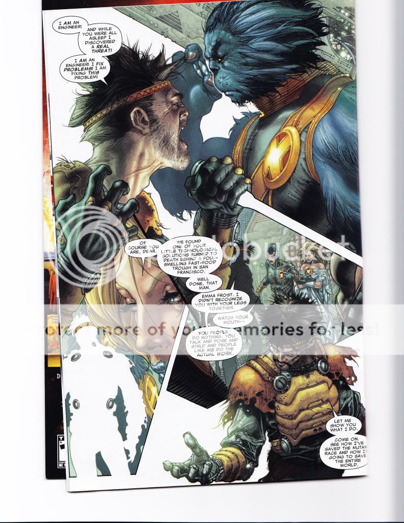
Pretty, isn’t it?

But it was not enough.

For one thing, the art is very realistic. It’s not picture perfect (blue lion mutants with glasses don’t actually exist), but it’s styled to be real. The artist likes to include things like red lines in the eyes, to show the craziness of the villain or spittle flying to show that people are shouting.

Unfortunately, the craziness comes off more like caaaaaaaarrrraaaaaziness and the spittle just seems sort of gross. The story is just–irritating, and the art could be so awesome, and yet it doesn’t all mesh the way a visually told story should.

Instead of making me look forward to more or compensating, the art just reinforced those parts of the story that pissed me off. The basic plot is that the X-Men have found the source of some fake mutants. Their ex-fellow, Forge, has gone bastshit (as one does) and started to make fake mutants to combat evil warriors from an alternate dimension. They’ve denned Forge in his lair in order to stop him.

And Forge proceeds to act like a cartoon villain, right down to the rolling red eyes and the spit and the dramatic gestures and weird poses. It’s sad. I actually felt bad for the guy.

Especially when they cut off his leg and then laugh about it. I mean, jeez, people. Aren’t you the heroes? Wasn’t this guy your old pal?

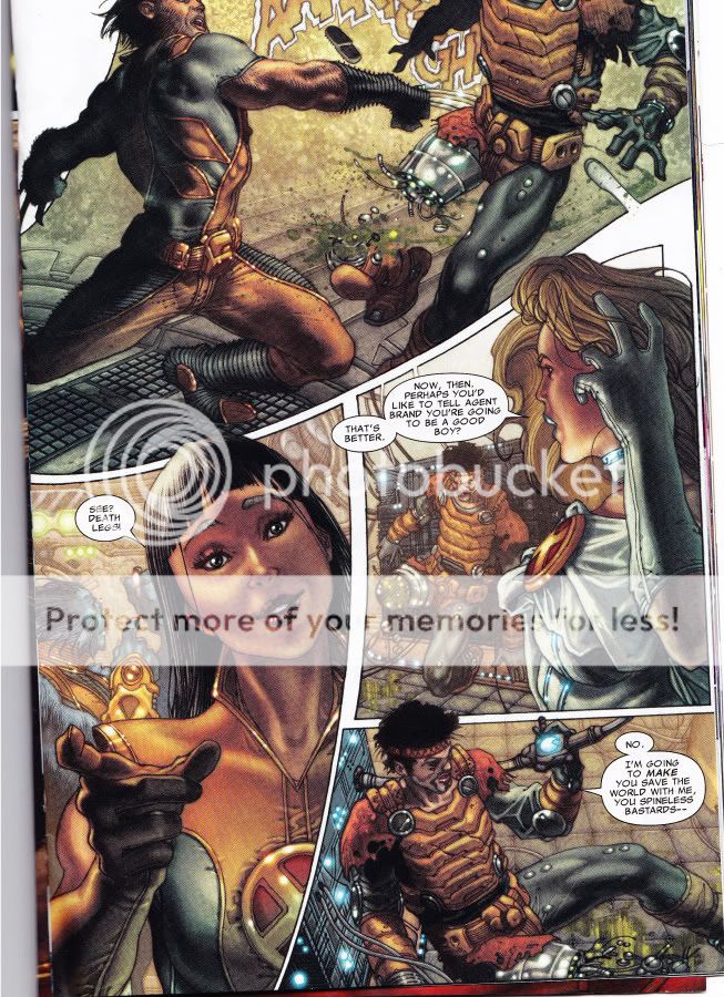
(And maybe Forge really is a terrible person worthy of laughter, but really, people. Cutting off someone’s leg and then laughing is just bad form. Tacky! Yes, he had some mutant-dampener in it, but I don’t care. Show a little respect!)

The X-Men battle the fake-o mutants with no trouble. Forge wanted to lure the X-men into dealing with the cause of the interdimensional warriors by mounting an attack via a large cube (as one does). The X-Men tell Forge off, then whack off his leg in response. Which is gratitude for you, I guess.

You’d think, after the random amputation and cracks about how dumb/crazy Forge is to believe that the interdimensional warriors are a Threat To Humanity As We Know It, that they’d all just leave. But no. The blue lion guy has his girlfriend nuke the place from orbit, just to be sure. Which blows up the special cube and therefore through it to the interdimensional warrior scout dudes’ homeworld, which, blue lion now explains, is probably toast.

Well, that’s nice, isn’t it? I mean, clearly Forge was blood-thirsty and crazy for trying to send a couple of mutant warriors through to make sure no one messed with our Earth. So much better to just toss in a great big old world destroying bomb without bothering to make contact.

Face Down in the Mainstream: Spider-man!

Marvel Adventures Spider-man (ISSN: 1548-5056) #55
Tobin, Camagni, and Sotocolor

Geekery question: The title page lists Jacopo Camagni as pencils, but doesn’t list any further artists besides Sotocolor for color. Does anyone know who does the inks? Is it Camagni?

I admit, I’m a little leery of Spider-man comics. Between the truly terrifying Spider-man lip glosses (who would put lipstick from spider-human mutations on their lips? Marvel, get a grip!) and my short but rage inducing brush with Amazing Spider-man’s innards, I was nervous when I got a suggestion last week from Tucker Stone that I should check out a Spider-man comic.

Now, usually I shop for my comics at the Borders, and thus was the case for this week’s haul. I dutifully pawed over the shelves, looking for the correct iteration of Spidy that was recommended. Fantastic? Awesome? Something-something Spider-man…I’d forgotten my list. Ah! I saw a fetching looking number with old skool inks and a limited pallete cover, and thought: Ah-ha! This must be it. I read the first few pages to check. Cute art: check. Funny: check.

I hauled it home and read it on the porch, with the dog at my feet, and laughed and laughed.

It turned out that I’d bought the wrong comic, but that’s OK. I’ll take my list with me next time.

Now, to re-iterate briefly the purpose of my column, since I haven’t been as clear as I should be. I’m a comic-loving manga addict, who has enjoyed some American comics in the past (Sandman), but who has never found and been addicted to a mainstream, superhero comic, despite knowing about and loving both superheroes and comic art of many types. I’m looking for a comic that stars a woman, that’s currently running, and that is awesome. Manga often run into the double digits or more (a volume is roughly a year’s worth collected) and I’ve hopped into the middle of many a manga, so I’m pretty good at catching on to what happens in a regularly told story. Some American comics are, shall we say, designed to require the person reading to collect all four or whatever, and so sometimes lose me. I think this is dirty pool, especially if the comic isn’t honest about it. I’m looking to fall in love, not have a long run of terrifying blind dates whose only redeeming quality is that I can tell my friends about them at our next bar night. /too long explanation of column digression

But back to Spidy.

This comic is hilarious and awesome. I had no idea who anyone was, besides Peter Parker, but I caught on fast, and had a rollicking good time. This comic has some of the best body language art I’ve ever seen. Check out the first page:
The principal is so menacing and Peter is such a doofus, the way he’s leaning back but still trying to defend himself, and the girl in the background is so sulky teenager. How is this not awesome?

Plus, the squirrels! Hee!

The comic has a great story format, too. It starts at the end, the time that Peter and Gwen are getting into trouble at school. Then it skips to the beginning of the day and tells us how they got there. It’s not new, but it’s clever and fun.

The start of Peter’s day is shown below. One of the things that I love about this comic is how wonderful the art is for all of the characters. It draws me in and makes me suspend my disbelief. It’s a lot easier to believe that Spidy can climb walls when his world looks so real:

The chemistry teacher is spot-on. She looks like a chemistry teacher I had once. And they really do pay attention, this artistic team, to the way people look and dress. That awful lime green is really in right now and it’s being paired with purple.

Peter’s friend, Chat, isn’t a superhero, but she’s fun and wonderful. She’s the brunette with the terrible taste in salads above.

The plot isn’t all that new: A baddie tries to kidnap Gwen, who is the daughter of a cop, and Spidy has to save her. She’s not completely helpless, though, which I appreciated. She’s the one who suggests climbing the building to get away from the cops who are radioing in their location and also tells Spidy what to do.

But what I really love about this page? After getting off the building, Gwen pulls down her skirt.

That’s what real girls do. We don’t leave our fannies exposed to the air for random fanboys to gawp at our panties. We pull down our skirts, so we don’t flash anyone and so we’re not cold. I loved this, because it’s so natural and so real. Gwen is a great girl and I really like her. What the realness of the comic allowed me to do is see her as a real person. At one point, when she’s running up some stairs, I thought Hey, cute boots. The chances of me thinking that in most comics I’ve read so far are nil. (Maybe Batwoman, but that would be in a Hey cute fetish boots way, which is not the same.)

Removing the voyeuristic sleaze that I always seem to feel when I read these comics was a great relief. There’s a kind of internal guard that always remains up. When I get together with just women, I relax my guard a bit. Reading this comic was a bit like that. I had some trust that this cool Gwen and this cool Chat wouldn’t suddenly be tied up in weird racy costumes and semi-tortured for the titillation of the reader. No, they’re characters who the writers respect, not objects. I found it relaxing.

The plot goes as plots go: Spidy gets to confront the baddie, with a bit of help, and there’s a cool fight. Then he has to go back to school and face the music. We wind up at the principal’s office at the end, and Spidy is just a kid again, getting in trouble for something the adults don’t understand. It’s fun and funny and great action.

Highly recommended. I will be buying the next issue, and the next after that, and the next after that.

Face Down In The Mainstream: Supergirl

Supergirl #44 October 2009

Gates, Igle, Sibal

In my relentless quest to find interesting and readable mainstream comics that have female characters in plots that don’t make me reel back in horror, I picked up Supergirl. Oddly, I thought that since the comic was named after her, it would feature her character.

Just goes to show that I am ignorant about comics.

The comic begins with no introduction or backstory and focuses on a strange, large, lumpy man in lavender spandex. He’s been captured by someone and he wants out. Eventually, he fights a John McCain lookalike and frees himself:

His eyes glow red and he speaks in Zapf Dingbats, so you know he’s crazy or possessed.

We switch to a scene with the Supe himself, walking with Lois Lane, who is looking dumpy and strange in loose and unattractive eighties style modular knits. There’s talk between various big dogs while Supergirl (I had to guess based on her outfit), looks left out and or pensive. Eventually, they allow her to go talk to her childhood best friend, as long as she is chaperoned by some other guy.

Meanwhile, a female reporter in Frederick’s Of Hollywood hookerwear tries to find some leads.

Supergirl fights her childhood friend and gets possessed, which you can tell by the cover of the comic and the odd overlay of purple glowy light on her face in the last panel.

That’s it, really.

Lumpy men in gross purple bodysuits and a sad, forlorn, actionless and directionless mini-superheroine.

Ugh.

Note to comic writers: Come on. Who thought this was a good idea? The heroine takes no action. She has zero growth. No initiative. Hell, she has no character! And the art sucks.

Face Down In The Mainstream: Batwoman Pt. 2

Eyecandy.

I like it. But it’s tough to have nothing but eyecandy. There needs to be a structure, a frame, a skeleton for the flesh to hang upon.

Unfortunately, the skeleton of this week’s Batwoman is sort of wimpy and dull. Which is too bad, because the art continues to be very very nummy.

In this episode (#855, Sept 09), Batwoman fights the loli-goth villainess, Alice. It should be tons of fun, but Alice is just regular old crazy instead of being interestingly batshit insane. The two tussle and Batwoman disarms her and then Alice slashes Batwoman with a razor hidden in her mouth. It’s laced with poison, which is also sort of boring, really, as villainous feints go, but it does give the artist a chance to do this, which makes is worthwhile:

Isn’t that pretty? I love the scrollwork and the design elements and the way everything becomes lush and strange.

So Batwoman has sad but very pretty insane imaginings and then we get to see Alice go back to her minions. Again, there’s some interesting play with the layout:


Then there’s another little tussle. It’s kind of stock and there’s a cliffhanger where what seems to be werewolves and octopus creatures show up. I had hoped that maybe they’d do something with the Alice theme, because I’m bored with stock weird monsters. It would be so much more fun if the werewolves were wearing top hats and vests with pockets and if the octopuses had to wear red and white livery. But oh well. Maybe things will be brought to an exciting climax in the last issue, but I’m not holding my breath.

In short: Beautiful art but boring story.

Face Down In The Mainstream: Batwoman

Batwoman Reborn: Batwoman in Detective Comics; 854 August 2009 (Part One of Three)

Greg Rucka ,writer

J H Williams III, art

This….This is art.

Beautiful, interesting, compelling art.

I picked this comic up because I heard it featured Batwoman, lesbian socialite by day and crime fighter at night, and I figured that I couldn’t go too far wrong there.

The story isn’t that exciting, so far, but I don’t really care. The art is absolutely exquisite. *flails hands around*

The plot is pretty much this: Batwoman is trying to find the person who is leading this religion of crime in Gotham. They’re organized by covens, and sometime in the past they caught her and tried to kill her. The leader is coming into town, and Batwoman plans to be there. Dun dun dun. Or whatever. I don’t even care.

The episode starts with a lovely little fight slash victim interrogation. Just look at this page:

The top panel is especially nice. The body torsion is correct and the leg is right, unlike my last foray into current comics, and the pose works well with the page as a whole. There’s kind of a weird, bat shaped panel thing going on, which is clever, but which I liked rather than hated. The comic takes some odd approaches to panels in general, but I very much like the way the artist moves into and out of the frames, zooming and then pulling back, choosing key bits—like her hand—to focus on.

What I like about this page is the movement. It goes from frenetic, chaotic, to quiet, wham, focus on her hand and his face, and the whole mood changes.

The comic deals with both sides of Batwoman’s identity. Her crime fighter night life, as above, and her daytime self. This is a page where she’s talking to Pop (her father I assume, but haven’t really read far enough to know for certain).

There are several fascinating things about it. One, she’s wearing crummy sweats that make her butt look big. This is not an attractive outfit; it’s the kind of thing a real woman would wear to workout in, though, if she was at home. It’s intimate and real; showing a different and fallible, human, breakable side of her.

The colors are all of a piece in the home scenes: her bright red hair fits in with the rest of the landscape of skin, wood floors and warm walls, sunlight. Very alive.

It’s quite a contrast to the fight scenes where she looks like a fetish dom.

There’s a heavy sexual element to this comic, and so far I’m finding it both sexy and well done, rather than skanky (unlike, say, Amazing Spiderman, which I picked up and would have stomped on except then I would have had to buy it). The villain—but maybe I should talk about the villain next week. No, I’m sorry, I cannot resist talking about her now:

Look at this villain! What a fantastic and fun artistic contrast. The previous pages (which I have resisted scanning, but only barely) often focus on Batwoman’s dark red lips. The villain also has painted lips. And a fetish outfit. White and innocent, very frilly and girly compared to Batwoman’s butch femme dom outfit. The boots, too, are a contrast. These boots are white and tightly laced; Batwoman’s boots are red red red with a bat in the sole.

The villain is a beautiful foil for Batwoman. When they fight—Ah, but that is a tale for next week.

In short, I thoroughly enjoyed this comic and I do not care that it was 3.99 and I do not mind the ads or the weird and badly drawn extra or the fact that I had to drive someplace special to get it. I only hope I can talk lots and lots of you into reading it and discussing it with me. My only real complaint was some truly random bolding in the dialog. Nobody would have emphasized those words in speech, but that’s kind of a quibble.

Now With Free Checking: X-Men Legacy

X-Men Legacy issue 226
Carey, Weaver, Tadeo, Reber

You know those people who read just the words in comics and kind of ignore the art? Yeah, I’m the opposite. I like the pretty pictures and often ignore the words.

So I’d been wanting to read some American comics and I circled my options at the Borders. I wanted superheroes (including female superheroes), some action, not too much gore and no zombies. This episode looked promising: Rogue on the cover, decent art, explosions in the background. Neat!

I picked it up and read it over coffee at the Squid Cafe, and I was….disappointed. First of all, this sucker cost me four bucks. It’s full of ads for cheesecake statues and Spiderman toothbrush holders. There’s a large excerpt in the back for some other comic. All of which is fine, except–there’s only twenty two pages of comic. For four dollars! That’s seventeen cents per page.

Well, it seemed a bit steep to me, considering I can get nearly two hundred pages of manga for 8.95 (or 5.37 if I have my Borders coupon).

Regardless, I persevered and read the art. The story isn’t that complicated. There’s this sort of riot on Castro Street (no, I don’t know why it’s there–go with it), and Rogue and company are trying to stop it from being bad.

Some of the art is really fun. Check out this page below. The colors shift from earthy and dark to this sexy, girly pink. The woman’s pose is tough, hot, and feminine. Those earrings! That attitude! I wanted to know more about her right away.

Unfortunately, most of the pages are just not this good. And she’s not in the rest of this issue.

So we switch to another scene, where Rogue is supposed to battle the big female baddie. This should be a fun scene–the big payoff for the issue. Rogue gets to strut her stuff, the baddie gets to be tough, and….

It’s weird, is what. I wanted to mail the artists a copy of a simple anatomy book. Take a look at this page:

In the top right panel, the torsion is just wrong. Completely and utterly wrong. Yes, she’s moving through her body, but the arms and body don’t add up properly. Then there’s the competing speed lines in the next section. Speedlines go one direction from the punch–Rogue is thrown. And then we have speedlines from the opposite direction with a couple of sexy boots stepping into them like they’re supposed to indicate a slipstream. What?

The leg in the second to the bottom was it for me. The force lines go up (near the foot), the baddie is kicking up, not out. But Rogue is moving to the right. What?

Wrong. All wrong.

So they battle, Rogue gets in some hits, baddie gets in some hits, Rogue goes crashing through a window and then we get this:

Keeping it classy, I see. Thanks Marvel. Cause showing a woman’s bra when she’s been in a fight and lost is what cheesecake is all about! Frankly, I took one look at this and thought about mailing Rogue a nice brochure for Enell.

So at this point I’m kind of two minds: the Rogue bits were meh, but the Lady in Pink is hawt. The colors are gorgeous, but the drawing is irritating. (Also, whoever does the inks for the eyebrows keeps leaving out a chunk of Rogue’s left eyebrow. Weird.)

Then we come to this, the US Bank portion of the issue. We’re tooling along, having a massive street showdown with lots of yummy explosions and baddie fights on Castro street and we come to this page:

At first, I thought Well, the artist traced some photo of Castro and just included a building logo in the prime center top position for verisimilitude. And then, when the logo appears right next to the baddie’s head, I thought Huh, that’s odd. And then we get to the next page.

And my eyes rolled forever.

I slapped the poor issue shut and ordered myself a consolatory cappuccino. Fortunately, I wandered into a local small comic shop and they hooked me up with a much more promising title. Batwoman! Lesbian socialite by day and crime fighter at night. Sounds good to me.