Oddbox Bookshelf: Ivan Bilibin’s Russian Folktales

For all but the most enthusiastic student of historical ballet (and for fans of Alan Moore), a passing mention of the Ballets Russes calls to mind the riotous 1913 premiere of Stravinsky’s Rite of Spring. Expecting classical ballet, with its tutus and fairy tale settings, the Parisian audience was caught off guard and put off their dinners by the intensely punctuated rhythm of the score; Vaslav Nijinsky’s aggressive, distorted choreography; and the brightly colored primitivist imagery of the costumes and set design.

I was taught, as a student of that aforementioned historical ballet, to interpret this aesthetic first as an effect of Nijinsky’s own mental illness and second as neonationlist entertainment targeted at the population of expatriate Russian aristocratic patrons. Both are surely true to some extent, but I was also taught to associate that neonationalism with the merchant-class Slavophilism of its original exponent, V.V. Stasov, who in the 1870s zealously opposed Western culture and idealized ancient Russia which he saw as ethnically and aesthetically pure. For Stasov, Russia belonged to the East, and the imagery of the neo-Russian aesthetic was fundamentally Asian.

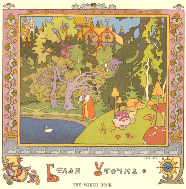
It is difficult to look at the illustrations of painter Ivan Bilibin and not see Western influences, although his affection for Japanese woodblocks is apparent.

Russian realism and the landscapes of the Peredvizhniki (particularly Levitsky) are certainly predecessors, but the aesthetic of Beardsley and Art Nouveau are palpable.

I was clearly mistaught to see so much of Stasov’s influence on the neo-Russism of the Ballets Russes. Stasov and Diaghilev, it turns out, were fierce antagonists. I think this error is an effect of oversimplification: neo-Russism did start with Stasov and was transformed by later visual artists to incorporate Western aesthetics. But dance history is closer to music history than it is to art history, and Stasov, tied to Rimsky-Korsakov and Tchaikovsky, is more important to nationalism in Russian music.

The incursion of art nouveau aesthetics likely dates to around 1894, when Princess Maria Tenisheva established an art collective on her estate, Talashkino, as part of a movement to revitalize nationalist art and preserve peasant arts and crafts culture. Aristocratic. pro-Western, and directly influenced by the English Arts and Crafts movement, Tenisheva established workshops to teach and preserve Russian and Slavic peasant techniques for manufacturing furniture, embroidering goods and making other crafts. She also set up an art school, elistist and intellectual but set against the Russian academy (which still favored the merchant-class aesthetic of the Peredvizhniki), that encouraged artists to study and depict Russian history and folklore. The style developed in these schools resembled art nouveau much more closely than any indigenous Russian folk art.

The estate became a meeting ground for a diverse group of artists and intellectuals, all of whom, including Ivan Bilibin, figured into Diaghilev’s theatrical enterprises. Beginning in 1889, Bilibin studied at Talashkino under Ilya Repin, at that time the most famous living Russian Realist, and in 1899, Tenisheva helped underwrite the journal mir iskusstva, co-edited by Diaghilev, which was the first magazine to publish the drawings of Aubrey Beardsley in Russia. In 1908, Bilibin designed the costumes for Diaghilev’s production of Mussorsgy’s Boris Gudonov.

In addition to his stage designs for Diaghilev, Bilibin is best known for illustrating Russian folktales, including famous depictions of Pushkin’s stories. In 1904, Bilibin published an essay in mir iskusstva called “Folk Arts and Crafts in the North of Russia” followed by a monograph on the same subject, based on his personal travels and investigations in the two previous years. During those travels he became interested in architecture, and continued to explore themes of folk art and architecture throughout his career. He died in 1943 during the Siege of Leningrad.

My scans of these drawings come from English translations made in the 1970s of a series of books of folktales commissioned by the Russian Department of State Documents between 1901 and 1903. There’s quite a bit of information about Bilibin online and in books and magazines — he is mentioned at least in passing in all the books I have on Diaghilev and a Google search pulls up many discussions of his art and some biography (see below) — but I haven’t been able to find anything enlightening about my editions: translated and printed in the USSR in 1976-1977, a time of detente, by Moscow-based Progress Publishing. The name of the publisher suggests proto-Glasnost, but for the time being I still have no idea why they were created or to whom they were marketed/distributed. It doesn’t stop me from enjoying them, though!

A excellent essay on Bilibin’s visual technique as well as a biography is available here.

More scans are available here.

Oddbox Bookshelf: Vassos Redux, Ultimo

What with the vast quantity of words spilled on Hooded Utilitarian’s fertile soil this week, I thought I’d go with an image post.

A couple of weeks ago I wrote about John Vassos’ Phobia. This post shows some of the highlights from his previous book Ultimo, a 1930 collaboration with his wife, writer Ruth Vassos. The story is a fairly typical Wells-inspired science fiction narrative about life in an underground city, after humans have been run off the surface of the planet by an encroaching ice age.

(Click on any image other than the front cover for a larger view. In captions, italics indicates a direct quote from the text.)

Front Cover (First Edition without jacket)

Frontispiece and Title

First Plate, with text

The images, with a couple of exceptions including the one shown below, don’t illustrate the facing text. They frequently don’t illustrate specific text at all but are atmospheric or supplemental.

Into the frozen earth bored the huge electric drills.

Cities like gigantic mushrooms

Inhabitants

In the underground city

In the Caves

Possibilities of future happiness

Oddbox Bookshelf: John Vassos’ Phobia

John Vassos is best known among mid-century scholars like me for designing the RCA Phantom – the see-through lucite television set on display at the 1939 New York World’s Fair that convinced skeptical visitors that, indeed, the pictures on the television were generated from within the machine.

A more opaque version eventually became the first mass produced TV set.

He’s also known as a defender of the streamlined Art Deco aesthetic: according to his 1959 correspondence with furniture-maker Hollis Baker, he removed the fins from his mid-‘50s Cadillac in protest of the “more is better” populuxe taste of the post-war decade and as early as 1938, he criticized Hollywood’s subtle semiotic derogation of modern design – they gave nice girls Colonial homes, while less virtuous women lived in Deco flats.

In Hollywood’s defense, there is something sensual and decadent about Deco. Although the eroticism was more overt in Art Nouveau, French Deco in particular tried to reimagine the same themes in a mode more comfortable for bourgeois sensibilities. In the United States, in the 1920s, as the modern consumer economy was forming, Deco was taken up by designers, like Vassos, who were working in advertising and industrial design and who believed that Deco’s “modern aesthetics” would elevate ordinary objects. From this, Deco became America’s iconic aesthetic of bourgeois luxury.

Mostly prior to going to work at RCA in 1933, Vassos illustrated a number of books – several by Oscar Wilde, some Thomas Grey – but he also created illustrated books on his own and in close collaboration with his wife, the writer Ruth Vassos. Most scholarly discussions of the Vassos’ books have focused on 1929’s Contempo: This American Tempo and Ultimo: An Imaginative Narrative of Life Under the Earth, released in 1930. Both books confront head-on the dehumanizing effects of the machine age, and deviate from much Deco advertising and design in that their representations of people are less stylized and impersonal, more like the sensual figures of Art Nouveau. This ambivalence about Deco’s modernity and that modernity’s dehumanizing edge is perfectly embodied by Vassos’ plates.

[Click here for an example of several plates from Contempo.]

1931’s Phobia continues this theme of dehumanization but with psychology’s inward-looking focus. The volume contains 23 plates illustrating various psychological phobias, preceded by descriptive/explanatory text that is often poetic but of inconsistent quality. Vassos explains in the introduction:

A phobia is essentially graphic. The victim creates in his mind a realistic picture of what he fears, a mental image of a physical thing. The sufferer from acrophobia, for example, sees his body hurtling through space, the aichmophobiac projects an image of himself in the act of stabbing; in this mental picture the thing that he fears becomes actual, for all that its projection is purely imaginative. It is this mental picture that I have endeavored to set down – the imaginal, graphic annihilation that the phobiac experiences each time his fear is awakened…they are intended to be inclusive – that is, to depict both worlds of the phobiac’s existence: the physical and the imaginary, the actual and the projected. The real world is replaced by the unreal as the pictorial pattern of the sufferer’s destiny parades ceaselessly through his mind.

Although influenced by the psychologist Henry Stack Sullivan, Vassos’s particular understanding of phobia’s graphic anchor appears to be his own. (Sullivan scholars can correct me!) But it remarkably prefigures the post-Freudian/Lacanian understanding both of the role of images in psychology as well as the abnegation and de-centering of the psychological subject.

When combined with the dehumanizing effect of industrialization, these themes become particularly palpable in the panel for Mechanophobia, which juxtaposes the fear of machines with the Machine Age’s emblematic aesthetic.

This connection of pre-war visuals with the psychology of the post-war era, when futurism and Deco had been left behind due to their associations with fascist propaganda, creates an aesthetic time-shift worthy of Philip K. Dick. It’s one of those rare and immensely satisfying moments where a postmodern ethos leaps out fully formed from a Modern work supposedly created decades before postmodern was first thought. But there are also visual displacements – can they be allusions if the referent hasn’t happened yet? – referencing the art of the 1960s, particularly in the lower left quadrant. These only further the disorienting out-of-time effect of the panel.

Similarly, the use of a vortex

to depict the generalized pantophobia (fear of everything) is also reminiscent of mid-century design to a present-day viewer. Saul Bass put the swirling imagery to the same purpose in the credits to Hitchcock’s Vertigo and psychedelic art used it to represent the disorientation and sometimes-paranoia of drug experience. It’s hard to tell whether the images are so culturally prevalent because they really do resonate psychologically at some unconscious level, or whether they’re simply so culturally pervasive that we unconsciously grab onto them to depict these experiences.

Of course, there are plenty of panels that are just palpably from the 1920s: Climacophobia (fear of falling down stairs) is particularly so.

But nonetheless there is in this volume an overwhelming sense of having encapsulated something vital about the 20th century before it actually happened. The argument can be made that America’s 20th century was dominated with the struggle between the needs of industrialization and the needs of the psyche. Vassos’ brilliant work embodies the tension between the two.