The Tragedy of Adrian Tomine

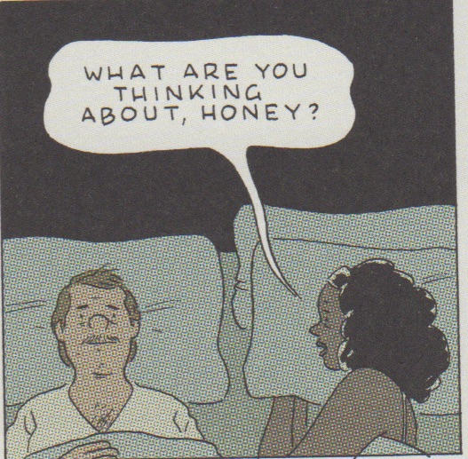
The tragedy of Killing and Dying isn’t that the collection is focused on hopeless men and their supportive spouses. Rather, it resides in the fact that Adrian Tomine hasn’t produced a comic of any real significance in years; perhaps over a decade. He is, for all intents and purposes, living on past glories, now precariously holding on to that faint promise of a youth filled with sketches drawn from an affable and compassionate realism.

Kim O’Connor is correct in suggesting that Killing and Dying doesn’t showcase a ‘complete’ writer. If an artist finds himself utterly incapable of inhabiting and recreating the life of women  he might, with the years, drift away from such representations. This seems to be the case with Tomine even if there are notable exceptions to this in his oeuvre. He was, of course, drawing long form nominally women-centric stories since as early as 1996 in “Dylan & Donovan” (from Optic Nerve #3), a typically morose but trivial tale of two sisters navigating sibling rivalry and a comic convention.

The early Optic Nerves were characterized by workmanlike tales of loneliness, ennui, and urban paranoia. The influence of Jaime Hernandez and Daniel Clowes was worn proudly, and the author’s calling card in those days seemed to be melancholic depictions of young love and relationship dramas, a topic which he revisited with some variations in 2007’s Shortcomings; here mildly enlivened by a foray into the sexual proclivities and hang-ups of Asian American males.

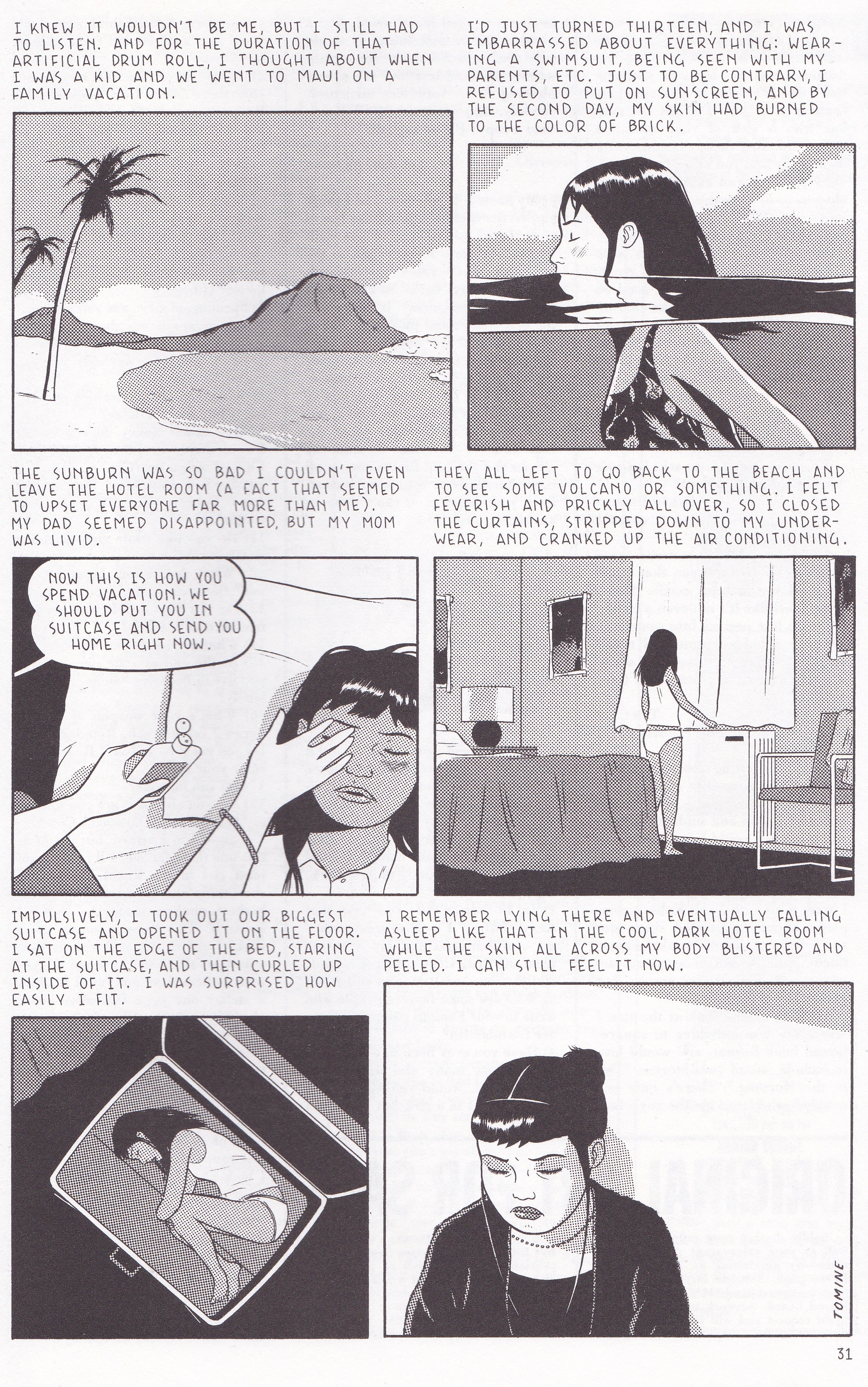
The high point from that period was probably “Hawaiian Getaway” from Optic Nerve #6 (1999), a story which refines and assembles Tomine’s themes into a satisfying whole.

Is Hilary Chan from that story a recognizable female human being or the kind of misanthrope (with a sex-change) so beloved of the alternative cartoonists of the late 80s and 90s? I’d say probably a bit of both. The Asian parental nagging she experiences is familiar but entirely plausible, as is Hilary’s reticence. This study of loneliness seemed groundbreaking for the young cartoonist at the time but now appears somewhat less epiphanic. Nor does it now carry the weight of expectation, for where others artists of his generation appear to have settled back into the comfortable settee of the cartooning gerontocracy, Tomine has largely remained in the background—a “known” artist who really doesn’t have any central work to his name. This despite being regularly included in various “best of” and bestseller lists over the years.

“Hawaiian Getaway” is filled with the juxtapositions which inform so much of Tomine’s work. Chan is a phone operator for a mail-order clothing company who finds it nearly impossible to open up in physical interactions. When fired from her job in the opening pages of the comic, she turns to telephones and other electronic devices to vent her frustrations and translate-record moments of intimacy. Almost all of her aggression, sadness, and distress is communicated through one end of a receiver. The phone device is obvious without being distracting; the ending filled with a kind of foreboding hopefulness; the significance of the story’s title hinted at but with a touch of ambiguity; a layered portrait of a person with an affinity for solitude which is at odds with the demands of modern human existence.

Adrian Tomine_0002

The merits of this story present a harsh reminder of the variable and uncertain trajectory of art and an artist’s career, especially when compared to the dry and ineffectual works which fill the pages of Killing and Dying.

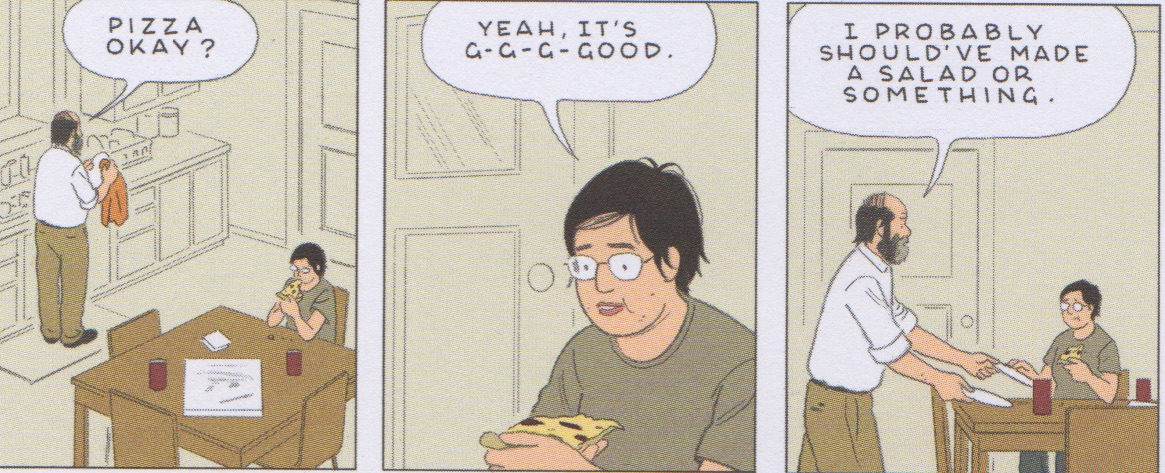
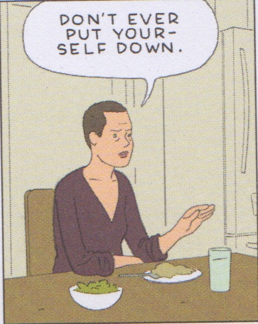
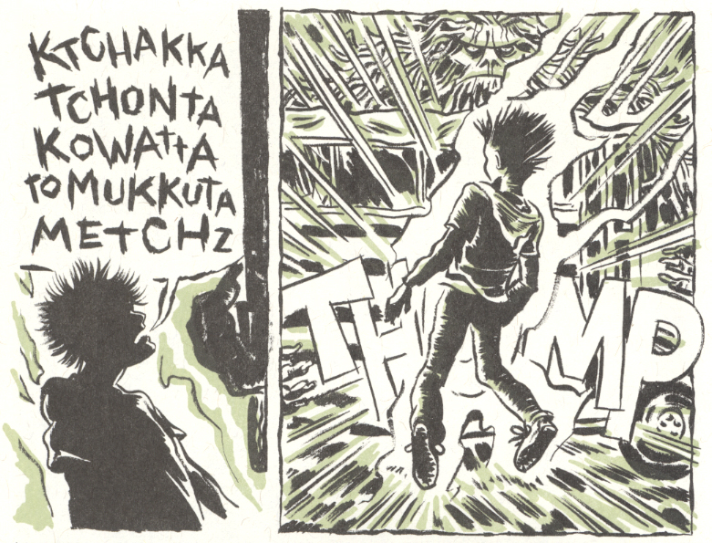
The title story of the new collection is composed on repetitive 4×5-panel grids to add a quick fire rhythm to the exchanges between the members of the family, and to mimic the repartee of a stand-up comic. The symmetry of the layout of these pages is meant to create connection and meaning between both the home and the stage—to forge tension between the unspoken tragedy of a mother’s sickness and death, and the act of dying on stage; the stunted family conversations alternating with acerbic comedic one-lines.

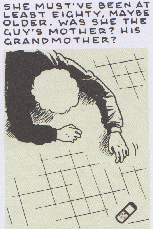
The daughter (Jesse) “kills it” on stage during her amateur comedy night just as (one assumes) cancer and chemo is killing her mother. The absent (presumed dead) mother of the latter half of the story is played alongside Jesse’s own failings at improv. At every point we see the husband-father’s failings, his helplessness in the face of both physical and artistic ruination, a portrait of the rigidity of old age and the tenacity of youth (and in some respects women). The half-figure drawings which populate the panels seem alienated from reality, as if watched from a height like the intentionally gridded floor plan which closes the story. The approach is playful yet academic; the effect devoid of emotion.

As in the first story of the collection, “A Brief History of the Art Form Known as ‘Hortisculpture'”, Tomine’s rather enervated formalism seems to drain rather than instill meaning.  In “Hortisculpture”, the gentle use of comic strip formalism is used to evoke the familiarity of the daily punchline but here tied with the bitterness of failure or perhaps existence in general (an approach widely used in Daniel Clowes’ Wilson). The vignettes are slight and might be seen as Tomine’s attempt at kind of levity which he is hardly known for or at least poorly practiced at. The artist’s benevolent attitude towards his characters, his kindly yet pensive hand when etching out their lives, is a poor fit for the strictures of the “weekly” strip. It has neither the harsh abruptness of Clowes’ Wilson (which I account a failure) or the tender simplicity of Frank King’s Gasoline Alley. The figures remain unrealized ciphers of no consequence filling us with neither disgust or compassion.

It should be noted that the overriding failure of most of the dramas in Killing and Dying is as much that of narrative finesse as that of plot. The barest of plot informs the best story from this collection, yet in leaving completely his comfort zone of insistent dialogue, Tomine manages to achieve something which stands out quite starkly.

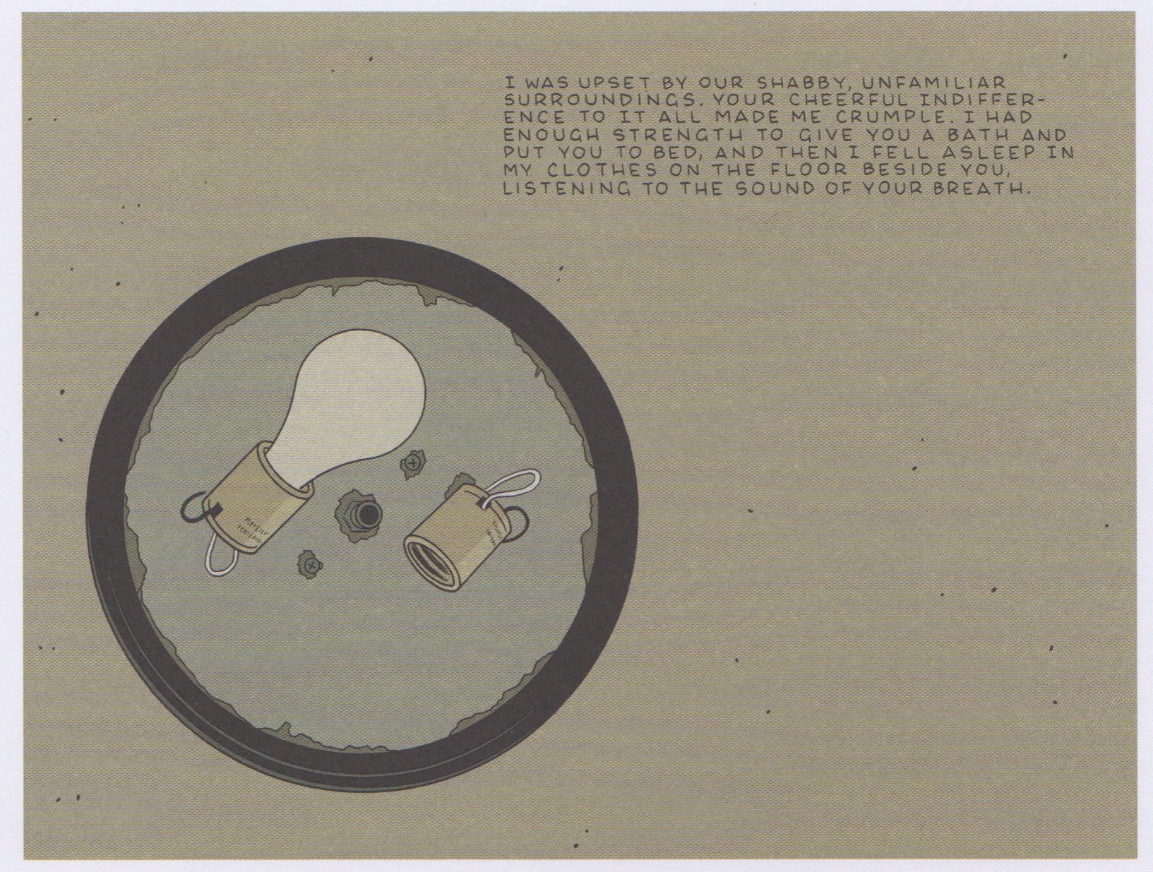
“Translated from the Japanese” begins with the opening page of a journal written in Japanese script, the translation of which marks the first page of Tomine’s illustrated story. We see this journal again turned faced down on an airplane tray 3 pages into the story proper, a ballpoint pen resting on its back cover, this information apprising us that the entry we are reading was written very close to the moment. The impact and meaning of the narrator’s emotions and actions are thrust on to seeming abstractions and inconsequential objects which drift into her line of sight: her anxiety is connected to a storage cabin; her solitary meditation to a lock on a lavatory door; an ambiguous and conflicted reunion to two symbolic bags on a carousel.

Adrian Tomine_0001

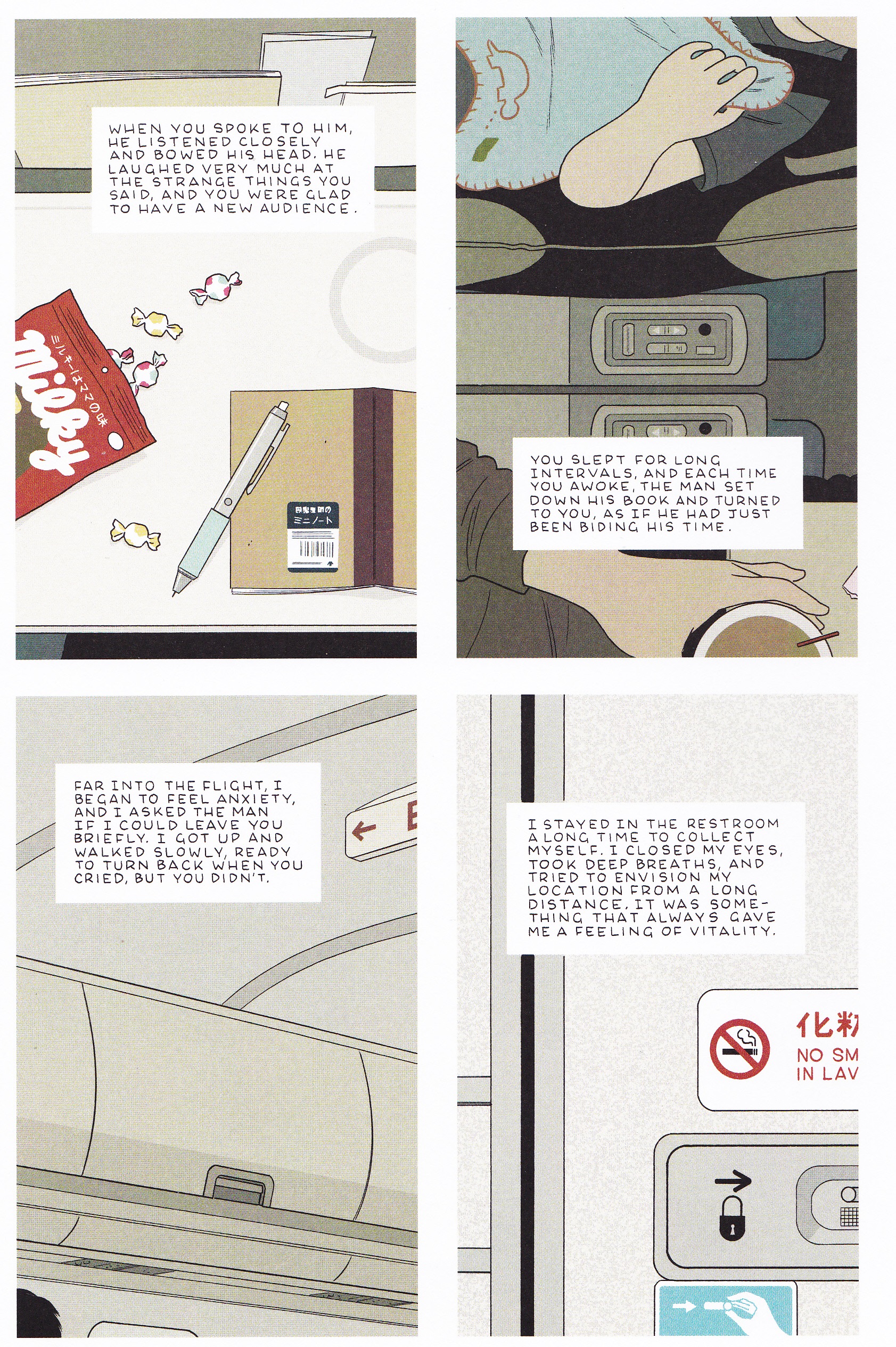
This story of only 8 pages is broken up at three points by long establishing shots of the Tokyo skyline, a tranquil depiction of commercial airliner in flight, and a nightscape of San Francisco—each being the narrator’s act of envisioning her “location from a long distance…something that always gave [her] a feeling of vitality.” It is a story which begins in the brightness of day before taking flight and descending into a glowing darkness; an entire life transcribed and bounded by moments of equanimity yet otherwise filled with the drabness of passage and taciturn resilience. The flavor of Tomine’s text gives the distinct feeling of translation which is further advanced by the evident culture of restraint. The lack of overt trickery serves him as well here as it once did in “Hawaiian Getaway.” The convulsions of black humor may be consuming Tomine’s writerly senses at present (at least on the basis of this collection) but it his mastery of discretion which has always served him best.

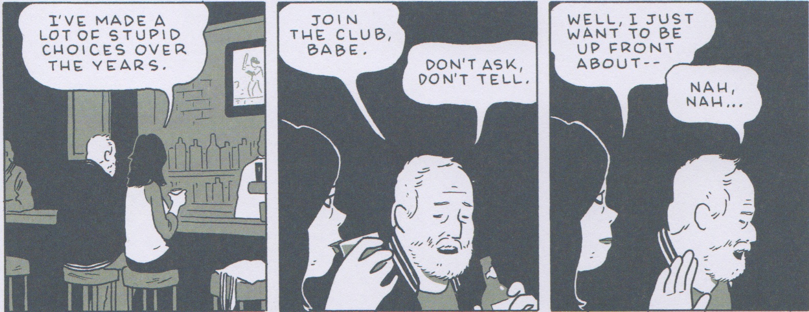
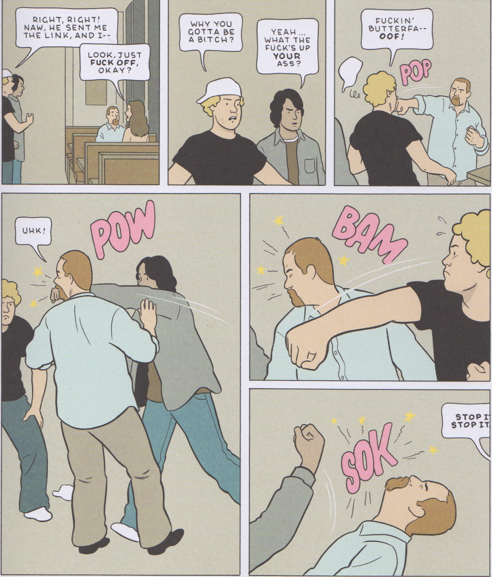
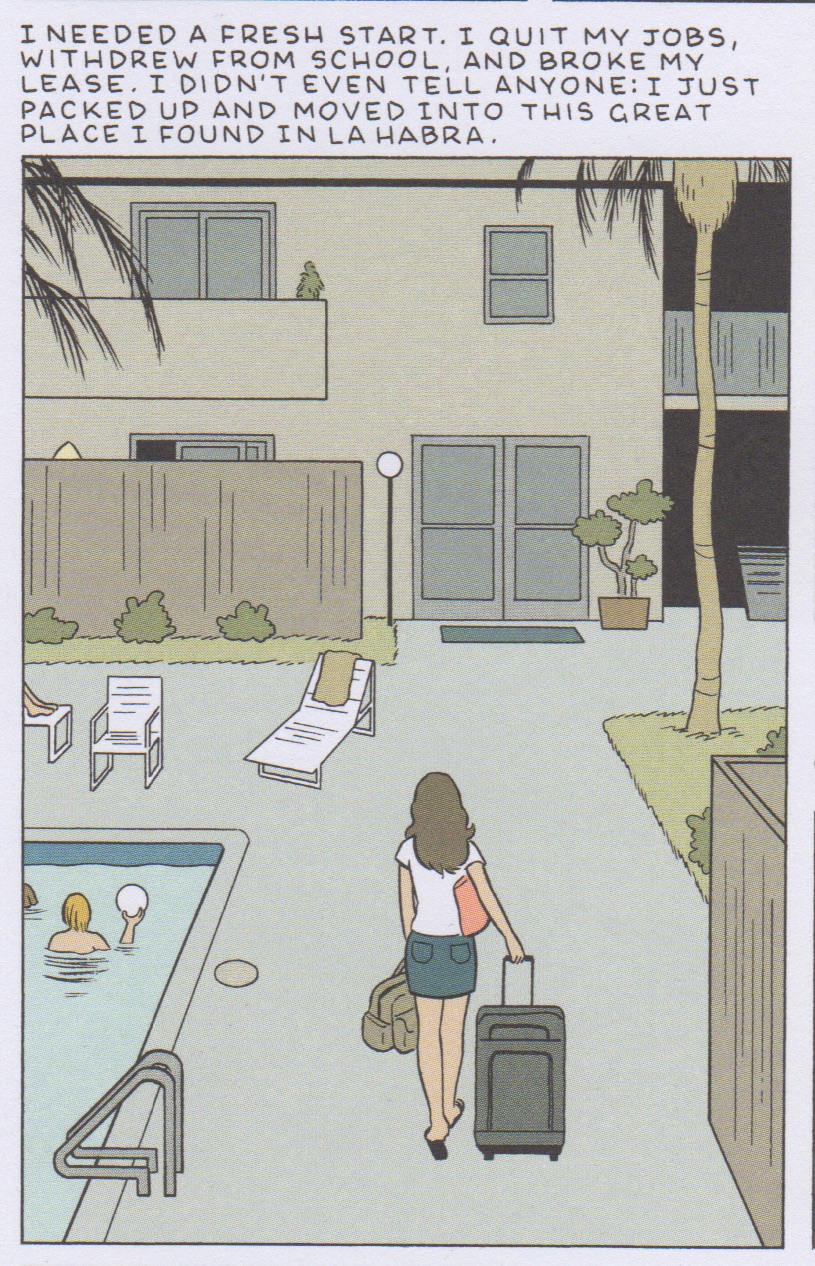
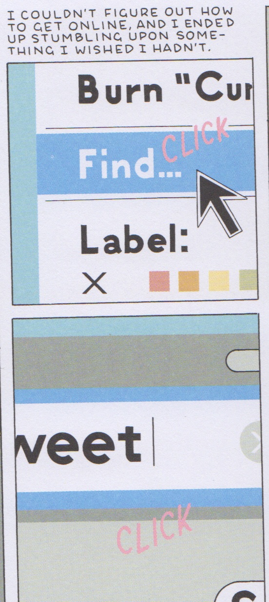
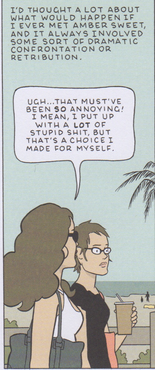
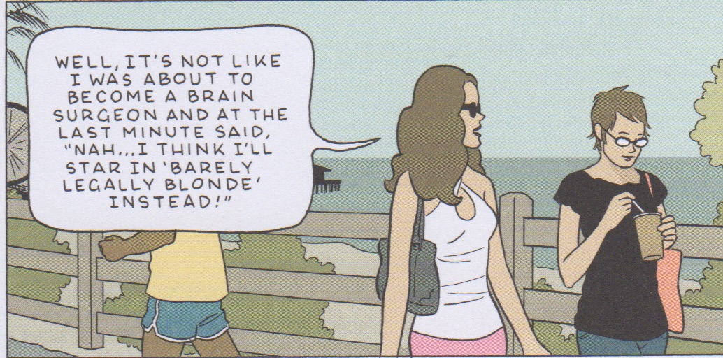
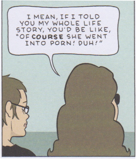
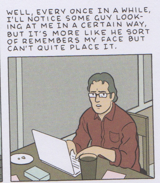
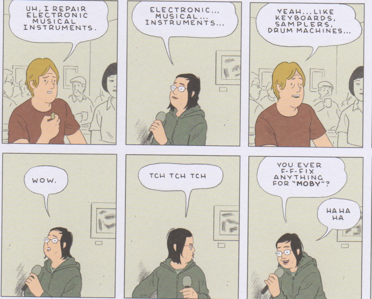
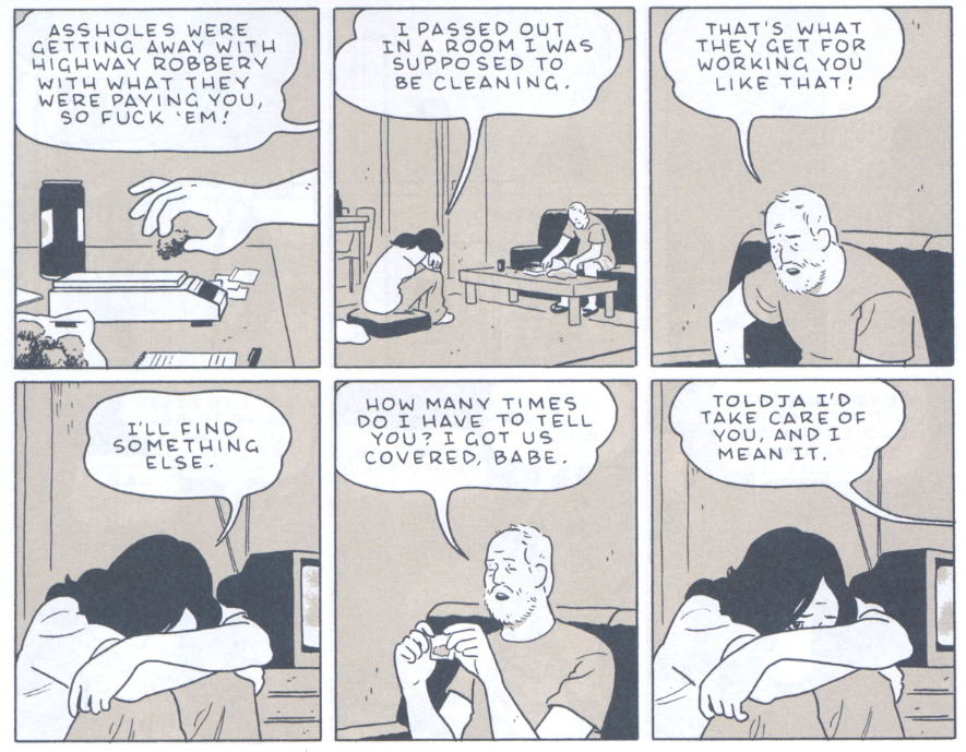
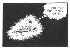
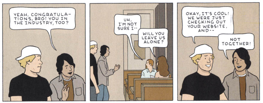
As for the rest of the collection, the less said about “Amber Sweet” and “Go Owls” the better. The former reads like a parody of the genre (see Kim’s review) and the latter is as edifying as watching someone dig the dirt from under his toe nails. It is in “Go Owls” that Tomine manages to mimic most closely the sheer poverty of imagination in so much modern American literary fiction.

It seems abundantly clear why many of these lesser stories exist. If one surveys Tomine’s oeuvre from the 90s to the late 2000s, it is not difficult to see the author settling into a kind of comfortable formula: the cultural arguments which reveal deeper insecurities; the young people mingling and touching in assorted diners, bedrooms, and bars. In terms of number of pages drawn, Tomine’s comic output is minuscule for a career which has spanned two decades. Yet the collective effect of viewing these works as a whole is a kind of worn familiarity. Killing and Dying seems both an acknowledgement of his age and a decisive attempt to get out of this rut even if it is largely a miscarriage.

________

Further reading

(1) A long and detailed interview with Adrian Tomine at Guernica magazine conducted by Grace Bello.

(2) And another interview at Salon with Scott Timberg.


Inflatable Dolls

Adrian Tomine gives good interview. He’s thoughtful and smart, which are two different things, and self-deprecating in a way that isn’t designed to mask false modesty. He’s doing a lot of press right now, and in each conversation he offers something new. When I read his Q&As, I’m always struck by how low-key and likeable and honest he seems. Maybe it’s me and maybe it’s comics (and definitely it’s the format of Giving an Interview, which makes it near impossible to not sound like a self-serious asshole), but cartoonists rarely strike me in this way. If I were to overhear any given interview (including the ones I’ve conducted) as a conversation in a bar, I’d probably think those people sound like dicks.

Killing and Dying was my first time reading Tomine, and I had high expectations. Part of that is his likeability and part is his legend as indie comics’ most sensitive son. For every man in Tomine’s audience who finds the phrase “graphic novel” problematic (lol), there’s a sap like me who thinks it’s adorable that he was drawing love comics at age 15. An unhappy teenager who has grown into a vaguely anxious and uncomfortable adult—this is a figure who speaks to me and my struggle. Many of those art comics guys in the 40+ crowd—Chris Ware, Seth, Chester Brown—are eccentric and cold sort of alien beings, from my vantage. Tomine is more relatable somehow. I can see myself in him.

But, as it turns out, I do not see myself in his stories. In fact, I don’t see anything resembling a real woman in his most recent work. The world of Killing and Dying is filled only with men and the shells of the women who orbit them. Each of these women is characterized, if at all, by the degree of ambivalence with which she loves some sad fucked-up failure of a dude.

The first story, “A Brief History of the Art Form Known as ‘Hortisculpture,’” is an allegory about comics in which a dutiful wife and loving daughter try to support the bumbling man of their house, an artist. His journey is in coming to terms with his failure. Along the way, he makes things and destroys things. We know about his job and his hobby and how those things sustain and haunt him in turns. His wife and daughter, in sharp contrast, are not autonomous beings in the world of this comic. Their inner lives, their conversations, and their actions all center on the male protagonist. They support him, or worry about him, or feel embarrassed by him. They exist only in proximity to his dim sun.
 

honey

“What are you thinking about, honey? It’s important that you tell me because I don’t have any of my own stuff.”

 
Similarly, “Go Owls” is the story of a pathetic man—Barry, a drug dealer—and his nameless female companion. Barry is a volatile person who is abusive and tender in turns. Tomine gives him both a backstory and a future. Barry even has an existence (such as it is) outside of the presence of his girlfriend, playing guitar and selling marijuana to soccer moms. Jane Doe, on the other hand, never appears on a page without Barry. Her long bouts of passivity are only punctuated by displays of one-upmanship when Barry says something dumb. (Even her cleverness exists only in analogy.) Otherwise the full extent of her characterization is a substance abuse problem and a sister she mentions in passing. Tomine’s subtle, expressive drawing clearly broadcasts her inner life, which seems to consist wholly of her contempt for Barry (unless you count her contempt for herself, which I don’t, since there is no “herself.”).

babe

“Listen, babe. We don’t need your story, babe. You’re a babe, babe. And that’s your thing.”

 
“Translated, from the Japanese,” the shortest and strongest story by a mile, is a sort of letter from a ghost to her son. From her innermost feelings to her outward actions, every detail this mother reports traces back to one of three guys in the story—her son, her estranged husband, or a college professor she happens to sit next to on a plane. You can pin all her thoughts and feelings on those three dudes. The only thing that gives the piece any depth is the suggestion that her story is a relic from a past from which she has since moved on. The emotional timbre of the story is that of a journal entry—and yet it’s addressed to the narrator’s son. Why?

mother

“You fell asleep, and then so did I. It’s almost as though when you close your eyes, I simply cease to exist.”

 
“Killing and Dying,” the central story, also involves an absent woman. Other reviewers seem to think the story is about a teenage girl, but it’s not. It’s about the struggle of her tortured father. My god, this man is such a cliché.
 

dad

Everyone knows dads don’t cook.

And so is his wife.

mom

Moms just believe in you so hard. That’s literally all they do (in this story).


This man’s ~j o u r n e y~ is about learning to let his daughter Jesse make her own mistakes. Though Jesse has more grace and maturity than her father, she doesn’t develop over the course of the story in a meaningful way. And the wife, well, she doesn’t have much of a journey either. I don’t want to spoil anything, but let’s just say that on top of being a cliché, she’s also a sort of gimmick/technical device.

I don’t have much to say about the last story, “Intruders,” which is about a loner. But it’s telling that even its female “extras” are conceptualized in terms of the dudes to whom they belong.
 

grandmother

 
It’s not that the artist hates women. There’s no doubt that, in the Tomine universe, women are superior to men. The ladies of Killing and Dying are, for the most part, hotter, smarter, more patient, more successful, less self-absorbed, less ridiculous, and better adjusted than their male counterparts. Even when they’re flawed (like the nameless woman in “Go Owls,” or Jesse, the teenage comedienne), they’re sympathetic because of the unpleasant, limited man that it is their lot in life to endure.

I haven’t read Tomine’s other work (and I’m not sure I will), but I’ll wager his whole thing is idealizing women. I think about his iconic New Yorker cover, which takes one of the most solitary acts in all of womanhood—reading on public transportation—and turns it into a sort of love story. Or his similar, if lesser known, cover, which fetishizes a teenage girl reading Catcher in the Rye. Tomine’s gaze is focused on their books, not their boobs, but it still represents the point of view of someone who imagines the stares a woman receives to be little romances that unfold throughout her day. I guess from his point of view, it probably feels that way. Wistful. Idyllic. Not creepy.
 

2004_11_08_Tomine_Subway_RGB-670


2007_06_11_Tomine_Tourbus

When Tomine does touch on the subject of harassment, as he does in his story about a nameless college student who looks just like an Internet porn star (“Amber Sweet”), its effects are visited most vividly upon—wait for it—a man.
 

punch

 
Unable to find a guy in college who will date her, Jane Doe quits her life and moves somewhere new.
 

move

 
This story is broad to the point of absurdity. Perhaps to some extent that’s on purpose. Maybe Jane Doe is in fact Amber Sweet and that’s why her life story—a lie she’s telling a new love interest—itself sounds like a half-baked porn plot. Certainly she’s an unreliable narrator, as we see in a panel where her description of “stumbling upon something” doesn’t match the deliberate search we see her carry out in the panels.
 

unreliable

 
But riddle me this: How come Amber sees harassment as a choice that she made for herself, rather than choices made by the men who harass her?
 

harass

 
Why is Amber’s backstory a tired cliché?
 

surgeon

duh

And, above all, how is it that every single man in the United States of America seems to watch the exact same Internet porn?
 

every

 
These are the kind of problems you run into when your character is a tool in your parable about fraught identity instead of a fully imagined person. And the same lack of attention to detail can be seen across Tomine’s female characters, who never quite ring true. Witness Jesse, a teenager whose top-of-mind pop culture references include Moby.
 

moby

 
MOBY. I just can’t even.

Despite these missteps, Tomine’s talent is plain. There are quiet moments of real insight, like when he writes about how your neighbors on a long flight transform back into strangers after you deplane. He has a natural ear for dialogue. His facility with his pen across multiple styles (which he employs to great effect throughout the collection) really can’t be overstated. And his palette is flawless, demonstrating a masterful use of color that surpasses even Ware’s.

Still, even if you adjust for this industry’s tendency to make overblown declarations about the significance of any given project, Killing and Dying has been heaped with unearned praise. The most reserved review I’ve seen named Tomine “one of the most significant artists working in a young, fluid, thrilling genre.” The Globe and Mail praised his “mastery as a writer” and “peerless” cartooning skills. “A deft, deadpan masterpiece,” raved Publisher’s Weekly. The Kirkus Review straight up referred to him as a wizard.

The truth is that Killing and Dying is not the work of a wizard or a genius or even someone at the top of his game. Adrian Tomine is very talented, yes—but he’s also a writer with bald limitations. I don’t want or need to see myself in every comic ever written, nor do I think that every story requires a round female character. But an entire collection of stories in which women are props defined by their feelings for broken men? That is pathologically bad writing.

Whether it’s autobio or ciphers in fiction, art comics are packed with male protagonists obsessed with their own loserdom. I think too often they hate themselves for the wrong reasons. It bothers me how often work that’s praised for its “unflinching honesty” is drawn by men who are, to my eye, hopelessly blind.

MegaReview

Optic Nerve #13 by Adrian Tomine (Drawn & Quarterly)

In his previous issue of Optic Nerve, Tomine seemed to be playing around with stylistic tics borrowed from Frank King and Dan Clowes. In the main story of the current issue, “Go Owls,” Tomine does some very assured drawing and storytelling in a naturalistic mode that in this case is a little reminiscent of Jaime Hernandez. But there is no doubt, he is his own man and he is getting better all the time. Here the artist breaks significantly away from his previous stories that dealt more with educated young urbanites to depict the relationship beween a Middle-American, more proletariat couple who meet in a recovery program. Reading it, I felt as if I knew them.

Tomine

The guy is an asshole, but Tomine manages to show that without hammering the point; he enables his story to unfold in a quite believable manner and elicit sympathy where he wants it directed with subtlety. The use of varying colors in a very limited palette throughout works nicely and is balanced by the exquisite control shown in the full color story in the back of the book, which also displays the high level of skill and delicacy that Tomine is growing into with his art.

_____________________________________________________________

The Daniel Clowes Reader, edited by Ken Parille (Fantagraphics)

This fascinating collection of some of Clowes’ best works is published in the form of a teaching guide, copiously annotated to the nearly absurd degree of including subglossaries defining miniscule details hidden in the author’s panels. In this way, editor Ken Parille begins to resemble Kinbote, the deranged poetry afficianado from Vladimir Nabokov’s Pale Fire, whose notes that introduce and permeate the posthumous edition of his idol/victim’s supposed masterwork begin to entirely supplant the work that they are supposed to supplement. It caused me to Google Parille to try to find out if he is real, or if he is an alter ego of Clowes himself. But, Parille apparently exists in his own right and while I might have chosen a few different stories if I had assembled this book, much of it is admittedly essential and well-served by the package.

Clowes

The collection includes the entirety of Ghost World, such seminal stories as “Like a Weed, Joe” along with relevant essays and commentary by sundry credible sources, plus Clowes’ excellent polemical pamphlet Modern Cartoonist and another of my favorite pieces of his, reprinted for the first time from Zadie Smith’s groundbreaking 2007 comics/prose anthology The Book of Other People: the brilliant color short “Justin M. Damiano,” a classic that needs to be read by anyone who writes criticism on the internet.

_____________________________________________________________

TEOTFW (The End of the Fucking World) by Charles Forsman (Fantagraphics)

Forsman’s epic minicomics series is collected into a small, thick trade paperback that I’d prefer was fully titled on the cover, rather than intialized as it is. The story resembles the real-life 1958 murder spree by Charlie Starkweather and Caril Ann Fugate, but transposed to modern times and with the gender balance in terms of sociopathy debatably reversed. Forsman’s pair of nihilists are shown to be the results of terrible parenting and are so estranged from human society that they have difficulty feeling emotions and pursuing a viable relationship together, much less to recognise when other people are not psychopaths.

Forsman

Forsman, a graduate of Vermont’s Center for Cartoon Studies, has a solid grasp of comics storytelling and his lightly drawn page compositions display an intriguing degree of variety. I’d imagine that this would have read in a much more disconnected way in serialized, episodic form; collected, the book reads smoothly and quickly.

_____________________________________________________________

Avery Fatbottom by Jen Vaughn (Monkeybrain)

To my mind, a good thing is that so many of the young cartoonists now emerging reject the contrived plasticity of technique and assembly-line methodology that defines contemporary mainstream comics to instead employ an auteuristic, handmade aesthetic in their work. This can be seen in the work of the cartoonists coming out of comics-oriented schools like that of the Center for Cartoon Studies. Another alumni of that program is Vaughn, who displays a breezy, humorous delivery for her comic Avery Fatbottom, a story of young renaissance fairgoers, which is expressively drawn with loose, appealing brushwork, handlettering and organic watercolor halftones.

Vaughn

Vaughn’s romantic sensibility does not take itself overly seriously and so, her evident pleasure in making her comics has an infectious quality. As with the works of Forsman, these efforts cause those who read them to also want to do their own comics, which is pretty much how I got into this game myself.

_____________________________________________________________

The Outliers by Erik T. Johnson (Alternative)

This comic, the first of a series which apparently is the result of a successful Kickstarter campaign (a large group of contributors are thanked in descending order of generosity inside), has some elaborate production values. It is a small square-bound “floppy” that is printed in two colors, including blue and a sort of lime green that gives it the look of a tract.

Johnson

The cover is comprised of sketches of alien-appearing creatures surrounded by squiggly lines and printed with silver ink on black paper, but one doesn’t notice this immediately because it is wrapped in a somewhat undersized full-color dustjacket. The story within has a sort of adolescent breathlessness and the art is brushy and dense while also suitably organic and (mostly) handlettered, as befitting a semi-underground coming-of-age fantasy comic featuring a Bigfootish monster.

_____________________________________________________________

Failure by Karl Stevens (Alternative)

Production values also dominate this handsome but ultimately frustrating trade paperback collection of panels from the author’s weekly strip in the now-defunct Boston Phoenix. Stevens’ clearly evident rendering abilities hark back to those of the engravers of yesteryear, but his photorealism makes me think of nothing so much as an alt/lit Alex Ross.

Stevens

After admiring the impressively labor-intensive application of crosshatched tonalities and watercolors, I wished that there was a bit more connective tissue to the semi-autobiographical bones and meat of the book than the most prominent theme of drunkenness.

_____________________________________________________________

Linen Ovens by Keren Katz/Molly Brooks/Andrea Tsurumi/Alexander Rothman (self published)

My favorite of the works I got at Brooklyn’s Grand Comics Festival, this is an anthology that takes advantage of the compatibility of poetry and comics. Poetry can be greatly enhanced by drawings which do not seek to be redundant with the accompanying words, but rather work in an oblique manner with the text, or run parallel to it.

Art by Keren Katz

Art by Keren Katz

Under Tsurumi’s striking cover, handlettering is intrinsic to these pieces; it guides the eye through the soft watercolors of Rothman, for example. Color figures most notably in the semi-abstracted panel transitions of Brooks and the unusual and effective pastel illustrations of Katz.

_____________________________________________________________

The Crow: Curare by James O’Barr and Antoine Dodé (IDW)

It feels to me like a thousand years have passed since the emergence of O’Barr’s pre-Vertigo character/property The Crow in comics and feature films, but here at this late date is a new miniseries drawn with rounded expressivity by Dodé, involving a cop’s desperate search for a child murderer, aided by the shade of one of the pathetic victims. In the two issues I read in PDF form, the title character has yet to rear his head, but the stage is certainly set in a most murky and moody manner by Dodé’s beautifully unforced storytelling.

Dode

The poignancy of the art is further facilitated by its being printed from uninked pencils which are then digitally colored with a limited palette of primarily sepia and pale blues. Of course, since this is an IDW publication, as with most mainstream comics, the lettering is digital, which tries but fails to detract from the rich personality displayed in the artwork.

_____________________________________________________________

March: Book One by John Lewis, Andrew Aydin and Nate Powell (Top Shelf)

This book is partly written by its subject, the distinguished civil rights pioneer Congressman John Lewis and since it details the early years of the struggle for desegregation in southern states by African-Americans, it justifiably boasts a back cover blurb by former President Bill Clinton. It is a story that we have heard before, but one that bears repeating in a time when a rotten cluster of power has gutted the voting rights that were so hard won.

Powell

One might have expected such a meaningful project to be published by a high-profile mainstream company such as Marvel or DC, who would presumably bring it to the widest possible audience; but instead it is the product of a smaller company known for artist-owned comics, Top Shelf. This makes it odd that the book is copyrighted only to Lewis and his co-writer/press secretary Aydin, omitting the artist who does much of the heavy lifting here, Nate Powell. Because, apart from the unquestionable historical importance of the very real experiences of Lewis, it is surely Powell’s dramatic layouts that make this narrative function as well as it does in the comics form and his lush halftones are some of the best I have seen since the glory days of Ditko and Wrightson in the Warren magazines.

_____________________________________________________________

XIII: The Irish Version by Jean Van Hamme and Jean Giraud (Cinebook)

I really looked forward to the English translation of this book because I wanted to see Giraud drawing in a contemporaneous mode—-and while I am not disappointed in his drawing and storytelling in any way, it is at the service of a somewhat standard adventure story in which the entire Irish/English conflict is boiled down to be the backdrop of the origin tale in a long-running superspy narrative that makes the artist’s Blueberry westerns seem progressive in comparison. Besides that, the art is printed in a format so reduced that it becomes difficult to read, much less show Giraud’s impeccable deep-space compositions to advantage.

Giraud

The coloring likewise suffers somewhat from a standardized approach, which drives the point home that Giraud is a much better colorist than anyone his work has been desecrated by since the peak years of Metal Hurlant. However, as he did on his final two Blueberry volumes, O.K. Corral and Dust, Giraud himself put his hand into the coloring to a limited degree to digitally “dirty up” the art, to add lighting effects and ruddier complexions, all of which go a long way to improving the look of what are, sadly, some of the last Moebius comics we shall ever see.

_____________________________________________________________

Clarity and Intent

A few books by some of comics’ (male) best and brightest of several eras. Some of these have been out for awhile, but I only just got around to them.

_____________________________________________

Jon Fury in Japan

Alex Toth’s only extended stint on a continuity strip was done for his post newspaper when he was stationed in Tokyo in the Army in 1955. Jon Fury was his first effort writing for himself. While he could brilliantly interpret the scripts of others, Toth faced nearly insurmountable difficulties to construct his own. He tried to emulate Milton Caniff’s narrative mastery, but he certainly didn’t “get” one of Caniff’s greatest assets: his use of female characters of depth and agency. Toth is strictly old boy’s club, but truthfully his male characters are not much better defined. The storylines feel forced and they are riddled with overlong exposition to the extreme.  Despite these drawbacks, his art is highly developed and constrained only by the sheer weight of text; these are dynamic, elegantly designed episodic pages in the Caniffian Sunday format. More than any of his contemporaries, Toth reached for clarity of comics expression and here he exhibits his mature style in a serialized form, where weekly deadlines dissolved the hesitations dictated by his perfectionism.

The late Toth did the work for black and white reproduction and so that is how it is seen in IDW’s recent Toth bio Genius, Isolated. The original art  was done in a process similar to mimeograph, basically drawn directly on waxy plates, which quickly begin to degenerate in the process of printing, even in such a small print run as these strips had, with the result that a complete pristine set is probably impossible to put together. The art restoration in the panel below from the slick color comic book version, Jon Fury In Japan, is definitely better than it is in IDW’s hardcover bio. In both recent versions, there are many minute amendments to the drawings by other hands; these are more pronounced in the color comic.


One panel’s restorations: left, from IDW’s version, right, from the comic.

IDW’s reconstruction of Toth’s original lettering of the later pages is readable, but in the comic book version, Toth’s lettering has been removed on most of the pages, which are re-lettered with a cold and inconsistently scaled digital font. This may read easier, but the artist’s hand is lost. And, emphasis via bold type has been added to Toth’s dialogue. As well, if art done for black and white must be colored, Toth’s is better suited to flatter hues, a four color comic book or Sunday strip-like color. The example shown above is atypical; overall, the too-plastic fades and color modeling feel anachronistic to the period piece. Plus, although effort is made to color the protagonist as a native American, many color decisions are counterintuitive, for instance in the pink jacket of the thug also seen on the cover.

Left: xerox from the original printing. Center: IDW version. Right: color comic version.

Granted, the pages needed repair, but work so pared to its essence is subverted by overt interference, much less the overkill of the comic package. Fortunately, Jon Fury in Japan also contains Toth’s final interview, significant for its emphasis on his animation career. Other than a few questionable photos, this has a good selection of panels by Toth and his influences and the coloring imposed on these is more appropriately restrained. (Paul Power, $11.00)

_______________________________________________________

“Red Tide” in Dark Horse Presents #3

Chandler: Red Tide was released to the  book trade in 1976 as the first American original full-color mass-market graphic novel. It represents Jim Steranko’s longest, most ambitious auteur effort in the comics medium to date. The two-panel-a-page layout with dual type blocks underneath is constructed in such a way as to be unusually immersive; in the act of reading, the obviously separated art and text come to simultaneous apprehension. The art was drawn in pencil without feathering and with minimal holding lines; Steranko’s excellent comics-like color separations often define the forms. The original book has a pulpy chiaroscuro feel that echoes the great noir films to which the story effectively pays homage. The representations are likewise mostly typical of the hard boiled dick genre; for instance, the protagonist and the leading lady have a prior history and her passion is reignited when she senses “something more than anger behind” his slap. On the other hand, there are appearances by a lesbian cab driver.

A reissue of Red Tide enhanced by the author has been looming  for years and now here’s a taste with an excerpt of the first chapter, in Dark Horse’s slick house anthology title. Steranko expands the possibilities of digital color while reiterating that cartooning devices like holding lines, heavy outlines developed to contain badly-registered color inks, are no longer essential with tight full color printing. He transforms and rebuilds his images into layered digital paintings that greatly resemble the airbrushed Art Deco graphics and advertising art of the period depicted. There is an impressive depth to some of the images that far outstrips what he was able to do in the method of the first printing.  He is able to amplify the visual connection to Chandler’s milieu with contemporary tools while exploring the intrinsic qualities of those tools with imaginative verve.

Perhaps this new version puts undue emphasis on the images, in terms of the time involved in the readers’ perception of them relative to the reading time of the text. The expanded density of the art as well as the altered justification of the type blocks conspire to disrupt the 2/1 art-to-type ratio which is key to Steranko’s immersion formula, one of the most important virtues of the book.

Still, any new (or newish) comics by Steranko are welcomed. What he did with these pages is very interesting and no doubt the completion of the augmented edition will be impressive. I can see the amount of time and effort he has to put in to finish the whole book to the level of this excerpt though, and so perhaps in the meantime, Red Tide can be put out in a nice facsimile edition so it can get the attention it has long deserved and he can finish this new enhancement as he will, without pressure. (Dark Horse, $7.99)

_______________________________________________________

Is That All There Is?

I recently read a review of Joost Swarte’s collection of most of his comics work that complained of the scale of this small hardcover, but I think it has a jewel-like quality. It is a beautiful little book that one can delve into periodically to simply enjoy Swarte’s exactingly rendered, beautifully colored comics pages.

The art is the thing here. While there are some engagingly animated sequences, the stories seem mostly clever, sometimes flimsy cause-and-effect variations created as supports for Swarte’s meticulous cartooning science. As with Toth, the more interesting aspect of the work is the way that the art manifests the ideas, such as they are—Swarte is a master of page architecture and image construction and he also has a tendency to reflexively expose his practice, which is why he is so revered by comics structuralists such as Art Spiegelman. The Franco-Belgian clear line derived from Herge and his forms of representation have their most refined outlet in Swarte’s short absurdities, reprinted from his Modern Papier and a host of other comics periodicals here and abroad including Metal Hurlant, Charlie and Raw. (Fantagraphics,$35.00)

_______________________________________________________

Madwoman of the Sacred Heart

I love the recent translation of Alexandro Jodorowsky and Moebius’  Madwoman of the Sacred Heart. A black and white version published in the USA in 1996 contained only the first two parts (it was completed in 1998). This  full color trade paperback of the complete Madwoman shows the best efforts of both men, far outstripping their earlier collaborations on The Eyes of the Cat and The Incal trilogy. Jodorowsky’s scenario is hilarious, an incisive and compulsively readable satire of sex and religion, for starters, that offers Moebius the opportunity to draw his single most immersive work of comics storytelling. The seemingly effortless flow of Moebius’ panels here rivals the reduced clarity of the best of Alex Toth’s 1950s Dell comics.

The book is a prime example of text and art reading together as equal forces at the service of the narrative. There are plenty of places for writer and artist to shine, but one is rarely brought out of the narrative to marvel at the construction, even when it frequently veers to philosophical discourse or transcendent visualization. I usually complain if Moebius does not do his own coloring, but here several colorists did an effectively punchy but tasteful, organic job of it; even if it is digital, most of the color looks like painted bluelines.

My first impression was that it takes some considerable suspension of belief to accept that the Heinleinesque protagonist (who is apparently an amalgam of the authors) holds such sexual magnetism for beautiful young women (and men), but Marguerite informs me that the French have such high regard for their intellectual heroes that an elder philosophy professor from the Sorbonne might indeed be considered quite sexy. At any rate, Jodorowsky and Moebius’ trangressively libidinous epic is played out so beautifully, without ever feeling forced, that the ride is taken willingly and has many rewards. (Humanoids,$24.95)
_______________________________________________________

Paying For It

Chester Brown has represented freedom to me for such brilliant improvisations as his original complete version of Ed the Happy Clown and The Little Man and I also admire his Biblical adaptations and Louis Riel—but Paying For It is a constricted,  joyless business. As a comic by Brown this has a certain mastery of form and the art is technically as good as ever, but the reader barely notices it, because to a large degree the art serves only to drive the reader through the book. It is primarily a reading machine and one is driven to focus on what is being said in Chester’s voice in the form of a memoir.

I would have little interest in reading such a john’s-eye view in prose form and as johns go, I am not made to feel sympathetic to Brown. He frets briefly about the possibility of an undercover sting, but where prostitution is a crime, it is one that prostitutes are prosecuted for, not johns. He worries a lot about being robbed and the expense, the money. He is concerned about girls that look too young, but for his  liability alone, one assumes, because he can hardly tell if they are of the age of consent, or not:  he declines to have sex with any women above a very young age, although he himself is forty and stretched a bit tight, at that. I’m no oil painting either, but really, it can’t be much of an aesthetic experience for the women that have to deal with him and they could be his daughters.

The exhibitionism here is similar to his ruthlessly honest explorations of his teenage years in the later Yummy Furs, but here, the whole gives off an aura of creepiness on the part of its author. Sex is to Brown reduced to a physical function, it’s all about him and his pleasure or release. Brown doesn’t draw the faces of the prostitutes he visits—well, except for panels such as those I scanned. Ostensibly for the reason of preserving their anonymity, his ploy effectively dehumanizes and reduces them to 3-dimensional versions of the bodies of the Playboy playmates he masturbated over in his youth. He essentially jerks off with real people! Actually, drawn as cartoons, they again become 2-dimensional and there is little variation to distinguish the progression of faceless women at all.

I don’t dispute the case he makes in his comic and annotations for the escorts, but the show of concern he makes for their circumstances. One gets the sense that Brown wouldn’t care about or do art about any of it, if he wasn’t trying to justify his involvement. In practice he seems devoid of empathy or affection. We are treated to many panels drawn from an overhead, Brueghelesque perspective of Brown banging away hell-bent for leather, getting his money’s worth. He can motivate himself to solicit prostitutes and then do the years of work involved in a graphic novel and share himself with the world, but he can’t get it up to fight for love. All the effort that goes into a relationship…who needs it?  In this case, listening to his friends might have helped; they all try to give him good advice. But, as his pal Seth says, “Chet’s a robot.”

He’s also a cheapskate:  he’s not the one “paying for it.” We who buy the book are and in addition, this thing was subsidized by generous grants! It’s fucking depressing. (Drawn and Quarterly, $24.95)

_______________________________________________________
“Amber Sweet” in Optic Nerve #12

Adrian Tomine uses his work to thoughtfully explore multicultural and  interpersonal relations. His work exemplifies the reader immersion and simultaneous cool remove that a refined visual orchestration can lend to a narrative.  “Amber Sweet” is an expanded version of Tomine’s great piece from the massive Kramer’s Ergot #7. His concise and elegant drawings and color give a measured, airy tone to his ironic tale of the torments endured by a young woman because of her resemblance to a well-known porn star. When they meet, the contrast is telling: the real Amber is self-possessed; she handles her admirers with a blithe “Hey! What’s up?” or poses with them for a picture, butters them up a bit and then brushes them off. It is her choice to do what she does, but her choice has inadvertently isolated her doppleganger, who is continually harrassed by aggressive men. This destroys the relationships of “not-Amber,” whose eventual distrust of all men is often justified. This is underlined by Tomine in the scene below, in which two young men impose themselves upon her, denying the implications of their simultaneous wanking while assuming her companion’s complicity in their homosocialism. (Drawn and Quarterly, $5.95)


Dyspeptic Oroborous: The Divine Hobby

A couple of days ago, my twitter feed displayed the following message from TCJ.com.

Today we worship the latest by @xaimeh with pieces by Dan Nadel http://bit.ly/oZjPF2, Frank Santoro and Adrian Tomine http://bit.ly/mV9U8W

I’ve liked things that both Dan and Frank have written in the past — Dan’s piece on the Masterpieces of American Comics exhibit was probably my favorite selection in the Best American Comics Criticism volume that Fanta published a year or so back. And tcj.com has been doing a lot of good things since they sent us packing (this lovely piece by Craig Fischer, for instance. So I was assuming that that “worship” was just a bit of jocular hyperbole. Obviously the pieces would be laudatory, but I had hopes they wouldn’t be sycophantic.

Alas, if you click the link you get what the tweet says; Jaime’s comics transubstantiated into communion wafers, less to be read and discussed than to be consumed as a path towards union with the divine. Thus, Frank expresses awe, reverence, and wonder, talks about breaking down into tears, lauds the purity and uniqueness of Jaime’s talent, and finishes up with what reads like literal hagiography.

No art moves me the way the work of Jaime Hernandez moves me. I am in awe of his eternal mystery.

Tomine’s piece is more of the same, albeit shorter. In comments, Jeet Heer suggests that it might be worthwhile to compare Jaime’s work to Dave Sim’s. This does seem like an interesting juxtaposition, but Frank nixes it insisting, “Lets be careful to not make this thread about Sim. This is a Jaime celebration.” No criticism at TCJ, please. Only celebration, worship, and gush.

To be fair, neither Frank nor Tomine are making any pretense of trying to explicate, or really even engage, with Jaime’s work. Instead, both of their pieces are testimonials — personal accounts of having seen the light. From Frank’s piece

Something extraordinary happened when I read his stories in the new issue of Love and Rockets: New Stories no. 4. What happened was that I recalled the memory of reading “Death of Speedy” – when it was first published in 1988 – when I read the new issue now in 2011. Jaime directly references the story (with only two panels) in a beautiful two page spread in the new issue. So what happened was twenty three years of my own life folded together into one moment. Twenty three years in the life of Maggie and Ray folded together. The memory loop short circuited me. I put the book down and wept.

We don’t need to see the two panels in question reproduced (or, indeed, any artwork from the story reproduced), because it’s not about the panels. It’s about the effect of those panels, and of Jaime, in Frank’s life. Jaime is transformative because Frank says he’s been transformed. It’s a witness to true belief by a true believer for other true believers. The imagery of short circuits and closed loops is unintentionally apropos.

Dan’s essay is nominally a more balanced critical assessment. In practice, though, it’s got the same religion minus the passion, resulting in an odd combination of towering praise coupled with bland encomium. Frank’s piece has the energy of an exhortation; Dan’s, on the other hand, reads like a painfully distended back-cover blurb. “The Love Bunglers”, Dan declares, is the story of Maggie “finally holding onto something.” Jaime’s art is great because it is personal, so that “this alleyway is not just any alleyway — it’s an alleyway constructed entirely from Jaime’s lines, gestures, and pictorial vocabulary.” And the big finish:

In the end we flash forward some unspecified amount of years: Ray survives and he and Maggie are in love and Jaime signs the last panel with a heart. “TLB” is also a love letter from its creator to his readers and to his characters. It’s a letter from an old friend, wise to the fuckery of life, to the random acts that occur and that we have no control over. Jaime, I think, used to be a bit of a romantic. He’s not anymore, but in this story he gives us something to hang onto: A piece of art that says that you should allow fear and sadness into your life, but not let those things cripple you. That sometimes life works out and sometimes not, but the things we can control, things like comics and storytelling, carry redemption.”

Let fear and sadness into your life but don’t let them cripple you. Sometimes life works out and sometimes not. It’s criticism by fortune cookie. And…signing the last panel with a heart to show us the power of love? Gag me.

The point isn’t that “Love Bunglers” isn’t great. I haven’t read it; I don’t have any opinion on whether it’s great or not. But I wish instead of telling us that this is one of the greatest comics in the world no really it is, Dan would have taken the time to develop an actual thesis of some sort — a reading of the comic that elucidated, unraveled, and interracted with its greatness, rather than just declaiming it.

I’m talking here specifically as someone who is interested in and conflicted about Jaime’s work. I would like Dan, or someone, to write something that would allow me to see why this particular sentimental melodrama dispensing life wisdom is better than all the other sentimental melodramas in the world that are also dispensing life wisdom. But instead all Dan provides is assertion (“It just works. They’re real.”), predictable appeals to vague essentialism (“There are no outs in his work — what he lays down is what it is.”) and paeans to nostalgic retrospection (“As I took it in, I realized that I remembered not just the moments Jaime was referring to, but also the narratives around those moments. And furthermore, I remembered where and how and what I was when I read those moments. I remembered like the characters remembered.”) If I am unconvinced by standard-issue authenticity claims and do not have years and years of reading Jaime comics to feel nostalgic about, what exactly does “The Love Bunglers” have to offer me?

Part of the trouble here may be that it’s difficult to write about something you like as much as Dan likes Jaime’s work. Love can sometimes reduce you to gibbering — which is understandable, though not a whole lot of fun to read for someone who isn’t under the influence of similar giddiness. I think it can also be especially tricky to write about soap-operas, where a large part of the point is personal emotional attachment to individual characters. If the narrative deliberately figures the reader as fan or lover; it can be hard to say anything other than, “I adore this character! I adore this author! I’m in love I’m in love I’m in love! It’s so awesome!”

I don’t have a problem with people writing to say that something they love is awesome. I’ve been known to do it myself even. But this is TCJ,…and it’s Jaime Hernandez — the most prestigious publication devoted to comics criticism focusing on one of the most lauded contemporary cartoonists. If they wanted to run one love letter, I guess I could see it…but two or three? Surely, nobody in TCJ’s audience needs to be told that Jaime is awesome. Everyone knows Jaime is awesome. Except, possibly, for a few weirdos like me who are waiting to be convinced. But if this is the case, why forego actual nuanced and possibly convincing discussion of his work in favor of vacuous cheering?

Partially no doubt it’s because comics remains permanently tucked in a defensive crouch. No matter how unanimous the praise of Jaime is, no matter how firmly he is canonized it will never be sufficient to undo the brutal unfairness of the fact that he’s not as popular as…Frank Miller? Harry Potter? Andy Warhol? Lady Gaga? Somebody, in any case, can always be trotted out to show that the really famous and canonical person you love is not famous and canonical enough.

But there’s also a sense in which TCJ’s tweeted fealty is less about Jaime (who surely doesn’t need the flattery) and more about the celebration of fealty itself. You worship at the altar of Jaime because worshiping at the altar of Jaime is what the initiated do. The sacramental praise both constitutes an identity and confirms it for others. You are in the club and enjoying the hobby in the proscribed fashion. Fellow travelers shall take you to their bosoms, and even the chief muckety-muck shall weigh in with a heartfelt and avuncular hosannah.

Comics was long a subculture first and a subculture second and an art a distant third. TCJ set itself to change that. Certainly, it has altered the list of holy objects. But the rituals remain depressingly familiar.

____________
Update by Noah: This is part of an impromptu roundtable on Jaime and his critics.