Silent film star Douglas Fairbanks (1883-1939) was hugely popular in his time. He was one of the first performers of whom it could be said that he was less an actor than a star who was considered to be “playing himself.” He was so universally recognized and his audiences’ expectations were so great that in his films, his actual name would come up on the intertitles as he was introduced onscreen. The first part of his career was spent making vigorous comedies full of antic chase scenes, such as His Picture in the Papers, Manhattan Madness and His Majesty, the American, all of which blended his facility for comedic timing with great acrobatic skills. He became the quintessential boys’ hero.
United Artists: Chaplin, Pickford and Fairbanks
By the time of his formation of United Artists with the even more popular stars, his wife Mary Pickford, Charlie Chaplin and D.W. Griffith, Fairbanks had come to retain considerable control over his movies. He produced, wrote and starred in his own films and was in a position to select his casts and crews from the best talents Hollywood had to offer. With his 30th film, The Mark of Zorro, he initiated the action genre in film. Thereafter, he dedicated the remainder of his career to the costumed adventure genre. He set a source precedent for all of the action stars to follow such as Errol Flynn, Burt Lancaster and the nameless protagonist of the My Name is Nobody spaghetti westerns, as well as even the semi-humorous performances of musical star Gene Kelly—and influencing contemporary stars of action/comedy like Jackie Chan, Arnold Schwarzenegger, Bruce Willis, Johnny Depp and “The Rock.”
Fairbanks’ 1920 silent feature film version of The Mark of Zorro derived from the prose serial adventure “The Curse of Capistrano” by Johnston McCulley that ran in six parts in the pulp periodical All-Story Weekly in 1919. Fairbanks’ son Douglas Fairbanks Jr. in his autobiography says that McCulley’s story was brought to his father’s attention by agent Ruth Allen, who was a friend of Anna Sully, his mother and Fairbanks’ first wife. Fairbanks initially was reluctant to diverge from his modernist comedic image to do a period piece, but eventually he was convinced and procured the option. The resulting film became so popular that it determined the trajectory of his future career:
(The Mark of Zorro was) by far the most successful movie he ever made…a more than minor classic of its kind, widely imitated and remade…the phenomenal success of Zorro convinced my father from there on to take more time and concentrate on producing a series of high-quality, expensive films that would be exhibited first for long runs in regular theaters (not movie houses) with reserved hard-ticket seats (Fairbanks Jr. 64).
The exclusivity implied in this type of limited engagement and the increasingly impressive budgets Fairbanks commanded for his productions served to elevate the formerly crass medium of movies into something more resembling an art form. Although, a factor in Fairbanks’ decision to make The Mark of Zorro was a consideration of economy: the events of the film, set in Spanish California at the end of the previous century, were placed in the same location as Fairbanks’ studio in the southern part of the state, which was tremendously convenient and served to keep costs down.
The Mark of Zorro was directed by Fred Niblo, who would also helm Fairbanks’ next adventure film The Three Musketeers, but as was typical for the star, he wrote the film scenario and took a firm hand in all aspects of the production. In his auteuristic capacity, Fairbanks took the initiative to deviate from his pulp source and alter certain story points to telling affect. Significantly, he added several tropes to the original source story that would be credited as the inspiration for Batman and other popular cultural vigilante heroes.
However, while Fairbanks’ Zorro is certainly one of the prototypes for the dark masked hero with a ubiquitous identifying symbol intended to strike fear into the hearts of evildoers (i.e. Zorro’s slashed “Z,” Batman’s “bat signal” and The Phantom’s skull ring, which leaves its impression on the chins of the villains he punches), the earliest precedent for the swordsman vigilante with a symbol and a “foppish” alter ego is Baroness Emma Orczy’s the Scarlet Pimpernel, a hero of adventures set in the Reign of Terror of the French Revolution. The Pimpernel’s other identity is Sir Percy Blakeney and at the scenes of his escapades, he’d leave a calling card on which was printed an image of the flower of his namesake. The character first appeared in book form in 1905 and the character debuted in Hollywood as early as 1917, when a silent feature directed by Richard Stanton and starring Dustin Farnum was released by the Fox Film Corporation.
It would seem that Fairbanks took inspiration from the Pimpernel to add the “Z” symbol and to emphasize Zorro’s “effeminate” plainclothes disguise, Don Diego de la Vega. Actually, Don Diego is not Zorro’s true identity, but another smokescreen for a hero who has two false faces. This has been counted as Fairbanks’ innovation by his biographer Jeffrey Vance: “Fairbanks’ exploration of the different natures of masculinity is a source of continuing comment…The Mark of Zorro’s juxtaposition of the effete Don Diego and the vigorous Senor Zorro is the most distinctive delineation…both identities are masks. Don Diego Vega is neither fop nor fox.”
Comics scholar Charles Hatfield concurs and further says that the dual deception of Zorro enables the hero to navigate “an ironic class mobility à la so many versions of Robin Hood” and displays a bending of gender expectations to denote a “masculinity…made triumphant, queerly enough, through flamboyance” (Hatfield 113). These descriptions run very much along the lines of Batman’s alter-ego, Bruce Wayne, who lives in a mansion with only his butler Alfred and his teenaged ward Dick Grayson, an arrangement that was decried as “like a wish dream of…homosexuals living together” by psychiatrist Frederick Wertham in his 1954 expose of supposedly degenerate comics, Seduction of the Innocent, which raised such a controversy that public sentiment turned against the comics medium and a congressional inquiry subsequently served to drive many publishers out of business (cited in Williams, 4).
Hatfield’s sources include an essay by Catherine Williams that takes the gendering questions that arise from considering these depictions much further. Concentrating on the Tyrone Power remake of The Mark of Zorro but making observations that are also applicable to Fairbanks’ original and his prose source as well, Williams first explicates the phallic symbolism of the ubiquitous swordplay of the Zorro films, then offers:
Zorro fights for the aristocracy without their support and, while becoming a folk hero of sorts for the peons, does little to improve their constrained circumstances. It cannot be mere coincidence that Zorro, the flamboyant guerrilla who is outside all political systems, has as his alter ego an openly gay man, an outlaw of sorts himself” (Williams 13).
Williams claims that such closeted homosexuality is deliberately used by the powers that be, which then begins to cross over into the non-fictional real world: “(Zorro) isn’t really about a revolution led by a gay man to alleviate the suffering of the poor. Diego/Zorro’s mission, it turns out, is about preserving the line of succession, about maintaining the system’s power to ‘reproduce’ itself” (13).
With the long-standing, long-accepted “don’t ask, don’t tell” policies of the American military, Williams asserts, “one can ‘be’ gay as long as one does not pursue gay sex or inform the military of one’s orientation” (14). For superheroes and homosocial institutions such as the military alike,
(They) must forego sexual relations in the line of duty while manufacturing a deliberately misleading persona. Thus their ability to serve as warriors is a direct result of a “secret” or closeted identity. What is most terrifying about this link between popular culture and government policy is the way the closet is reinforced as a ‘noble’ or ‘heroic’ institution—something that should be done for the good of the country (Williams 14).
Williams thusly links the closeted identities of fictional vigilante and superheroes to the agendas of the very real military-industrial complex, an enveloping conspiracy if ever there was one.
But, regardless of these implications and perhaps in ignorance of the earlier Scarlet Pimpernel, Batman’s creators credit Fairbanks and his Diego/Zorro as an influence. Bob Kane co-created the character in 1939 with writer Bill Finger, who said, “My idea was to have Batman be a combination of Douglas Fairbanks, Sherlock Holmes, The Shadow and Doc Savage as well” (Steranko, 44). The creators of Superman, Jerry Siegel and Joe Shuster, also claimed Fairbanks as a prime influence on their character, whose early appearance often depicted him in the star’s signature hands-on-hips stance.
In fact, Fairbanks’ amendments to Zorro’s character were also assimilated by author McCulley for his subsequent sequels. Such Fairbanks-initiated devices as Zorro’s slashed “Z” symbol and Diego’s ineffectual “handkerchief illusion”, prefaced by the character saying “Have you seen this one?” turned up in McCulley’s follow-up story in the now-renamed Argosy All-Story Weekly, “the Further Adventures of Zoro” (sic) which as I found, thanks to HU contributor Alex Buchet, was deceptively cover-subtitled with “In which Douglas Fairbanks will again play the Hero” :
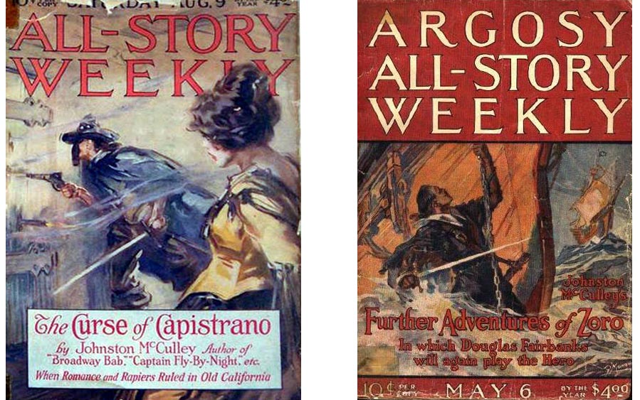
Left: cover of All-Story Weekly, 1919.
Right: cover of Argosy All-Story Weekly, 1922.
Fairbanks did not subsequently adapt that story for his own Zorro sequel, the 1925 Don Q, Son of Zorro— but rather, he appropriated some of its elements for another film property entirely, The Black Pirate. According to Fairbanks scholars John C. Tibbetts and James M. Walsh,
Similarities between McCulley’s sequel and the Fairbanks pirate film include scenes wherein the heroine is captured by a pirate ship, the hero scampering about the rigging of a pirate ship, a rescue affected by allies of the hero in a pursuing ship. Even the character of Barbados is echoed somewhat by Donald Crisp’s portrayal of a tough old pirate with a heart of gold. (Tibbetts & Walsh 124).
David A. Cook cites Fairbanks as the originator of the adventure spectacle, whose “star personality so influenced the character of his films that he deserves to be called an auteur”, who embodied the “all-American boy—boisterous, optimistic and athletic—who detested weakness, insincerity, and social regimentation in any form” (Cook 222). Additionally, Cook and other film scholars rank Fairbanks among the earliest champions of experimental film color for his use of the expensive two-color “cemented positive” Technicolor process for The Black Pirate.
It can’t be overstated just how profoundly Fairbanks set the heroic standard of his time. The star kept himself in extremely good physical condition—apart, that is, from his heavy smoking habit. He was famous for doing his own stunt work and a great part of his preparations for his films was dedicated to making his onscreen physical feats viable. For The Mark of Zorro, he engaged the assistance of stuntman Richard Talmadge. According to Vance,
In rehearsals, Talmadge mainly served as a model; Fairbanks, along with his trainer, Lewis Hippe, watched him go through the action in order to eliminate flaws and minimize hazards. Once a stunt routine was effectively refined to Fairbanks’ satisfaction, the star himself executed the feat for the cameras. (…) Invaluable expertise was also provided by a Belgian fencing master, Henry J. Uyttenhove…who choreographed all of the film’s dueling sequences (Vance 96).
Douglas Fairbanks Jr. corroborates his father’s stunt-training methodology with an account of the star’s preparation for Don Q:
One of the principle gimmicks of this Zorro sequel was the expert cracking of a giant Australian bullwhip. In order to learn how to do tricks with the monster lash, Dad had sent for the famous Australian athlete and bullwhip expert Snowy Baker. It didn’t take long before Dad was able to whirl the long blacksnake, make it crack like a pistol shot, and then snap a cigarette out of a brave and steady mouth fifteen or more feet away (Fairbanks Jr. 104).
In this way, Fairbanks used experts to give his stunts a feel of authenticity and won his audience over by displaying what seemed to be incredible feats of physical strength and stamina, in much the same manner as did the earliest incarnations of the “cinema of attractions.”
Fairbanks’ subsequent films were all action/adventures with his trademark comedic touch. One of the greatest is certainly The Thief of Bagdad. Fairbanks’ performance in this film is astounding; he seems more like a dancer than an actor as he moves in fluid choreography through sets which are built on a huge, vaulting scale, nearly dwarfing the performers. The climactic scene where Fairbanks attacks a city with a massive magical army that appears in puffs of smoke reminds me of nothing so much as director George Lucas’ first sequel to the Star Wars trilogy, The Phantom Menace. It is strange to think that in 1999 I waited with my son in line for hours to see what I recall mostly as a screen filled with legions of digitally created, exponentially replicated clone warriors that hardly look any more convincing than what Fairbanks was able to create onscreen in 1924.
____________________________________________________________
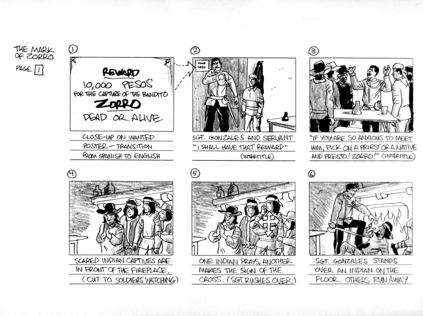
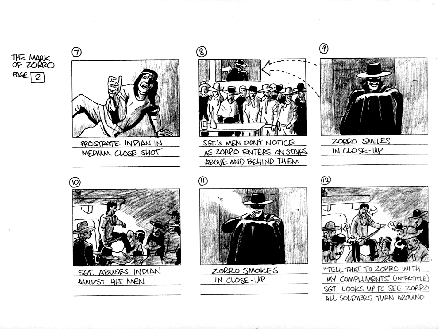
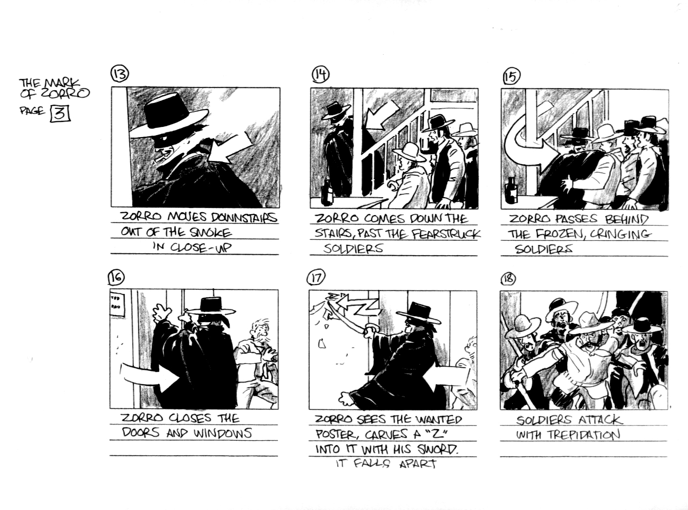
(Note: as with my other HU posts about film, this is a revised version of an essay originally done as a final paper for a recent class. In this case, I accepted my professor’s challenge to write about Fairbanks and to that end, I proposed to “reverse-engineer” a storyboard for one of the star’s silent films.)
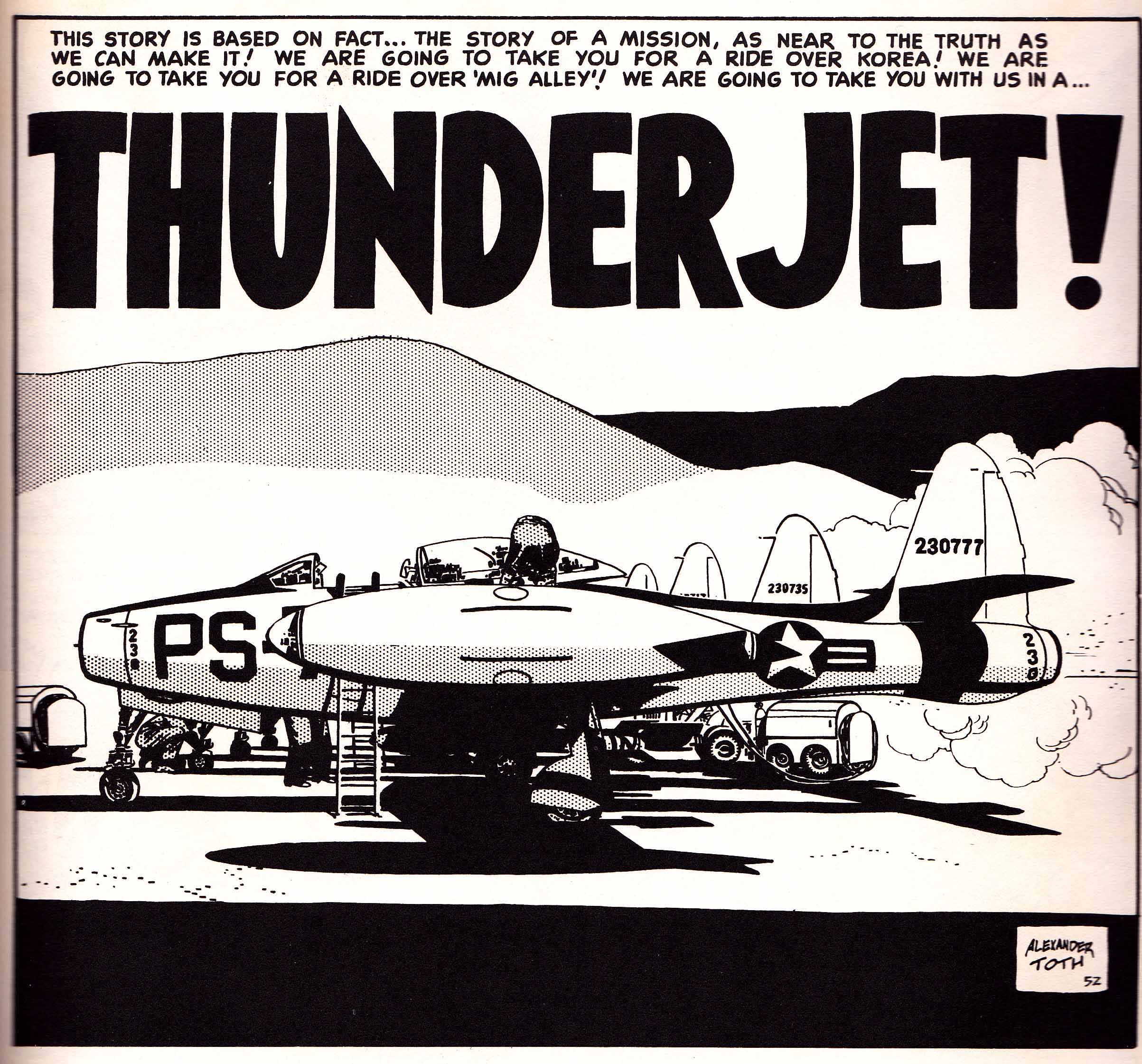
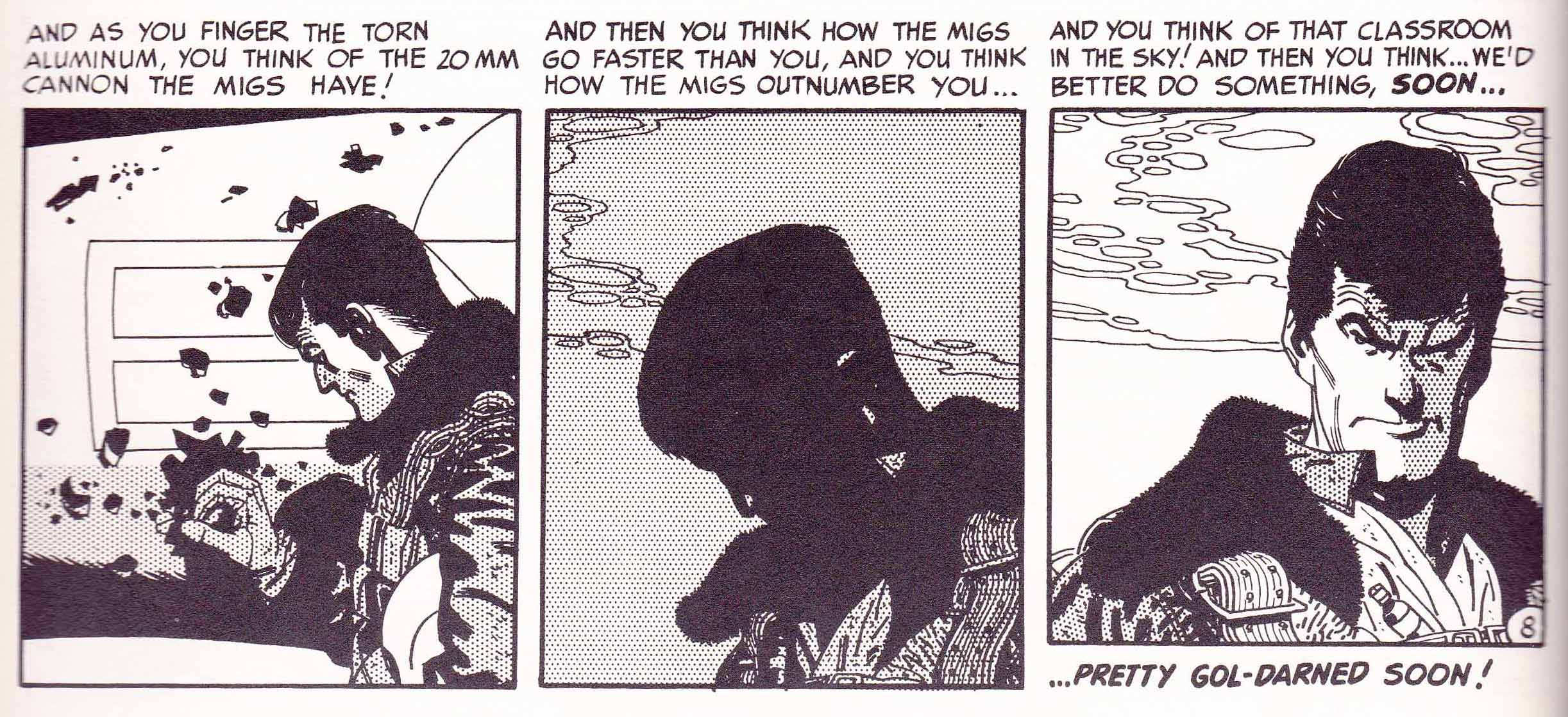
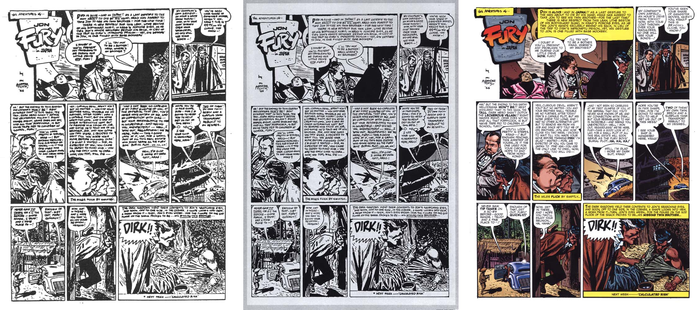
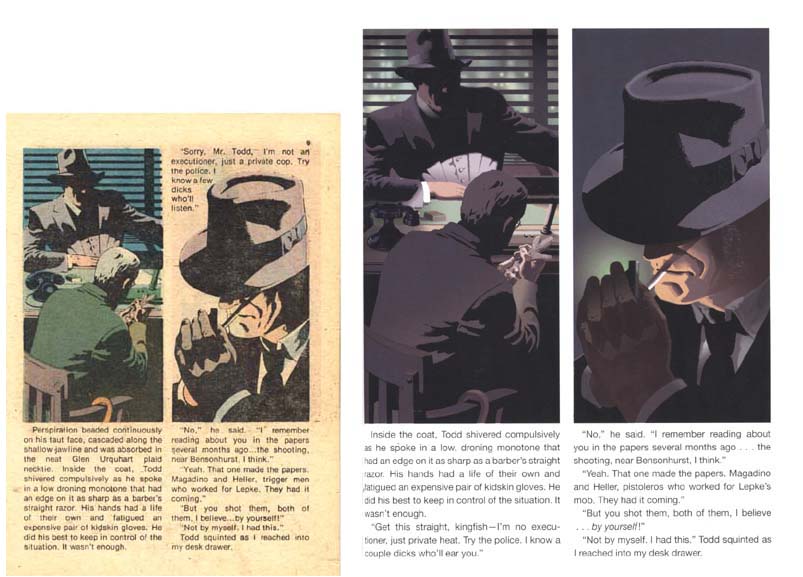
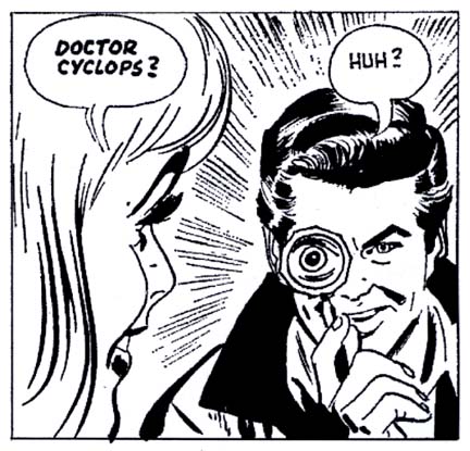
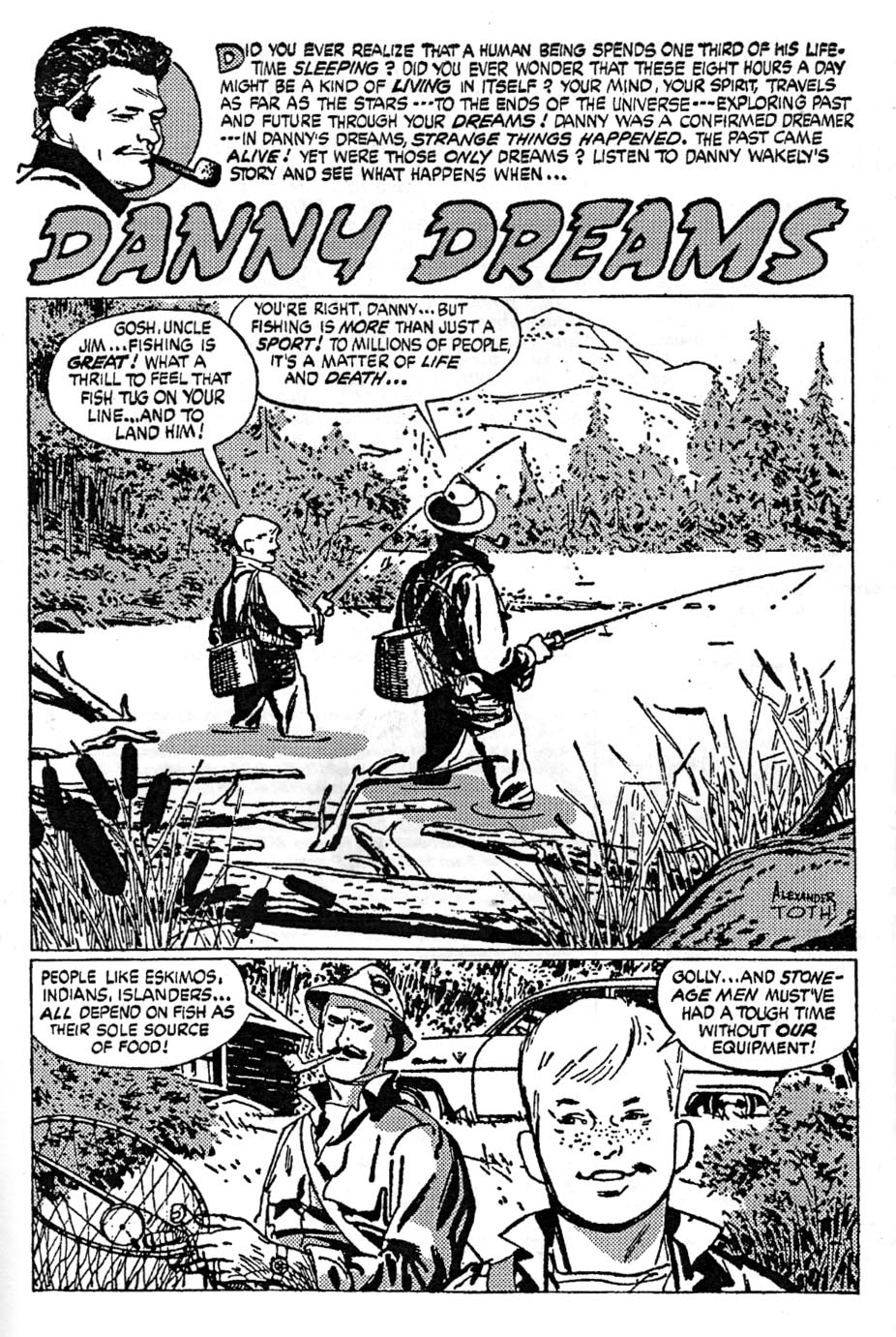
For the preparation of the storyboards that follow, I studied the narrative techniques of storyboard artist and legendary cartoonist Alexander Toth. It is coincidental that Toth is not only one of the most exemplary storyboard artists, but also an artist whose career is inextricably linked with the character of Zorro. In fact, Toth’s most famous comic books are his adaptations of the late 1950s, early 1960s Disney TV version of Zorro starring Guy Williams—and those are among the most refined products of the best-selling and family friendly but often relatively bland Dell imprint:
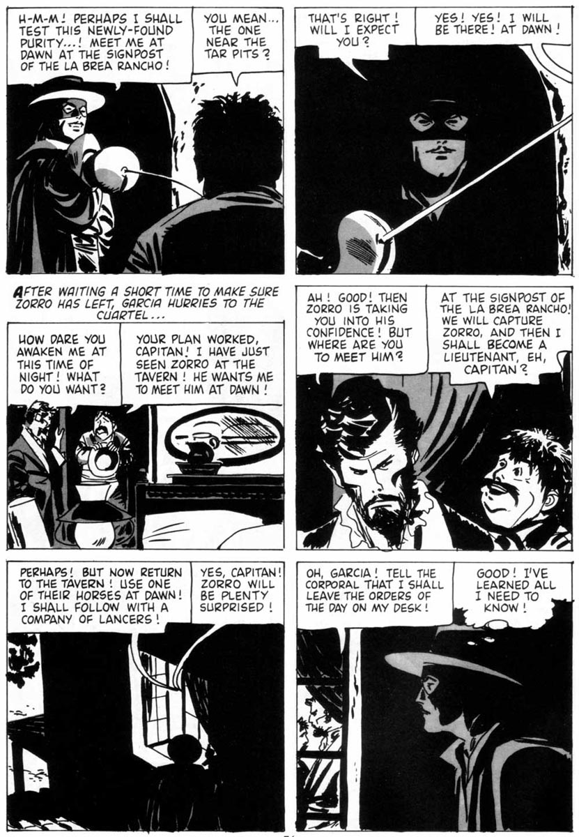
Alex Toth, “Zorro: Garcia’s Secret,” Four Color Comics #933, 1958
In his introduction to the reprint collection of his classic Zorro series, Toth wrote, “Fairbanks…created the visual film persona for all later renditions of Zorro to imitate.” However, Toth claimed to prefer the 1940 remake of The Mark of Zorro, directed by Rouben Mamoulian and starring Tyrone Power. Of Fairbanks’ original The Mark of Zorro, Toth recalled, “I did see this silent classic at NYC’s Museum of Modern Art film seminar series in the 1940s and enjoyed its zesty, witty gymnastics, but the film’s dated style pales in contrast to Mamoulian’s ageless 1940 epic” (Toth 11). Despite this disclaimer, Toth’s Dell comics depictions of Zorro often echo the feel of Fairbanks’ version of the characters and settings equally as much as Powers’ update.
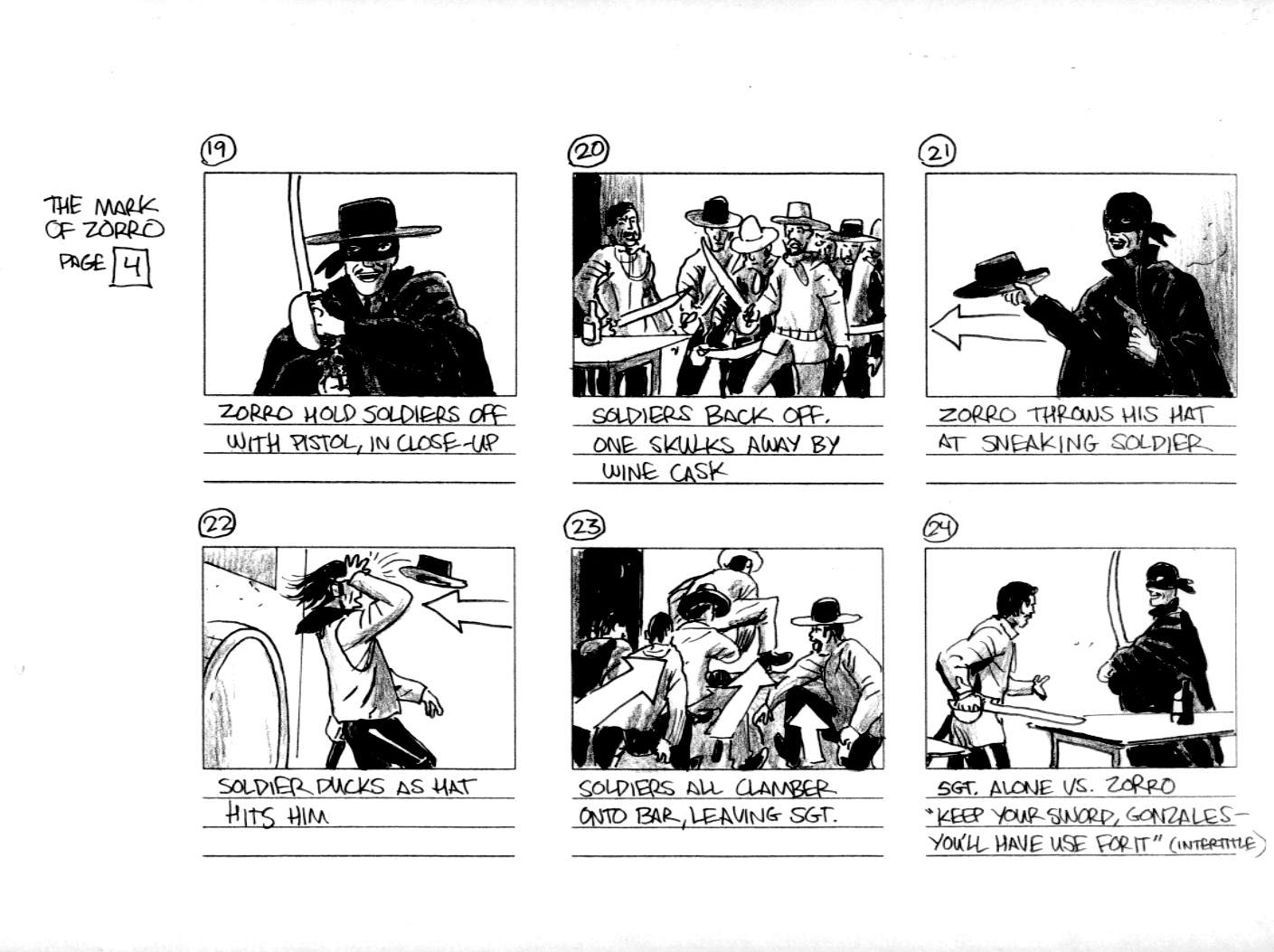
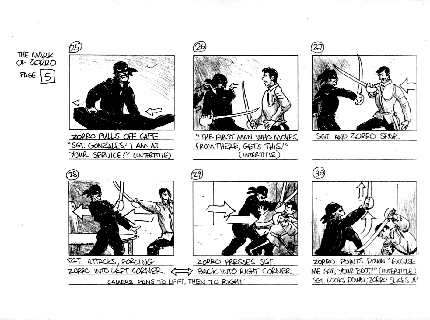
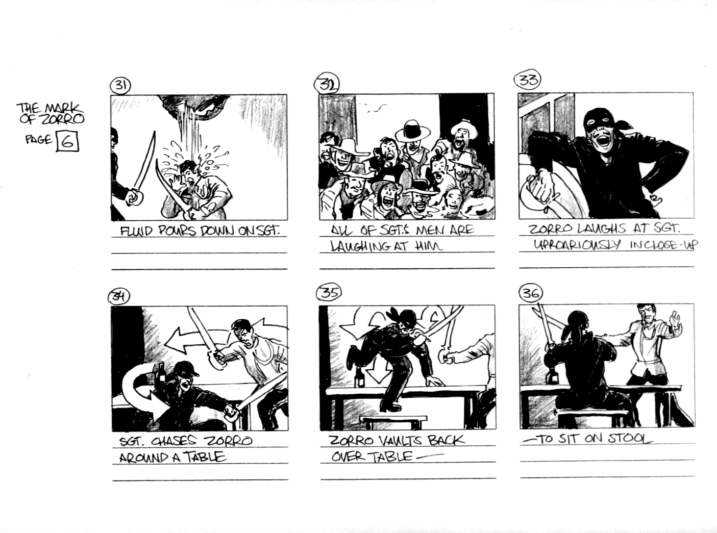
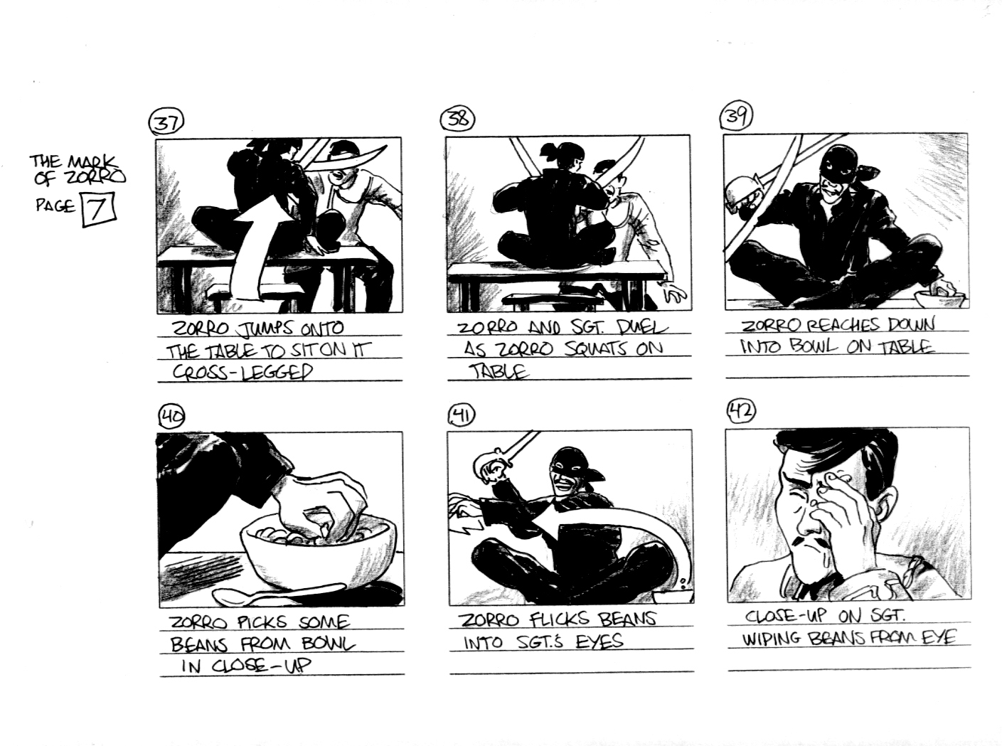
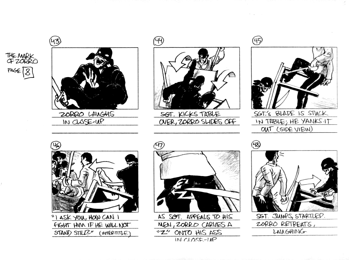
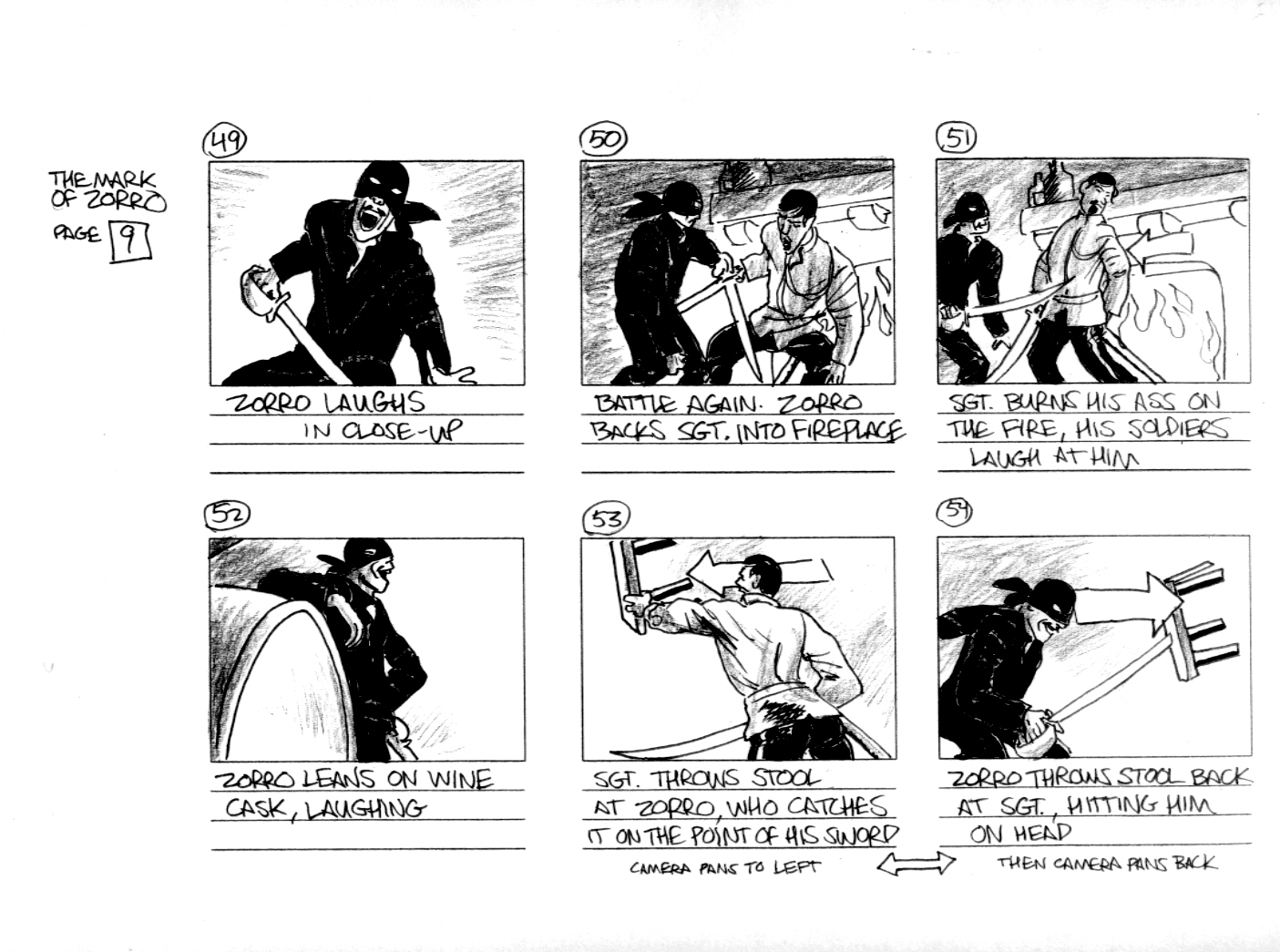
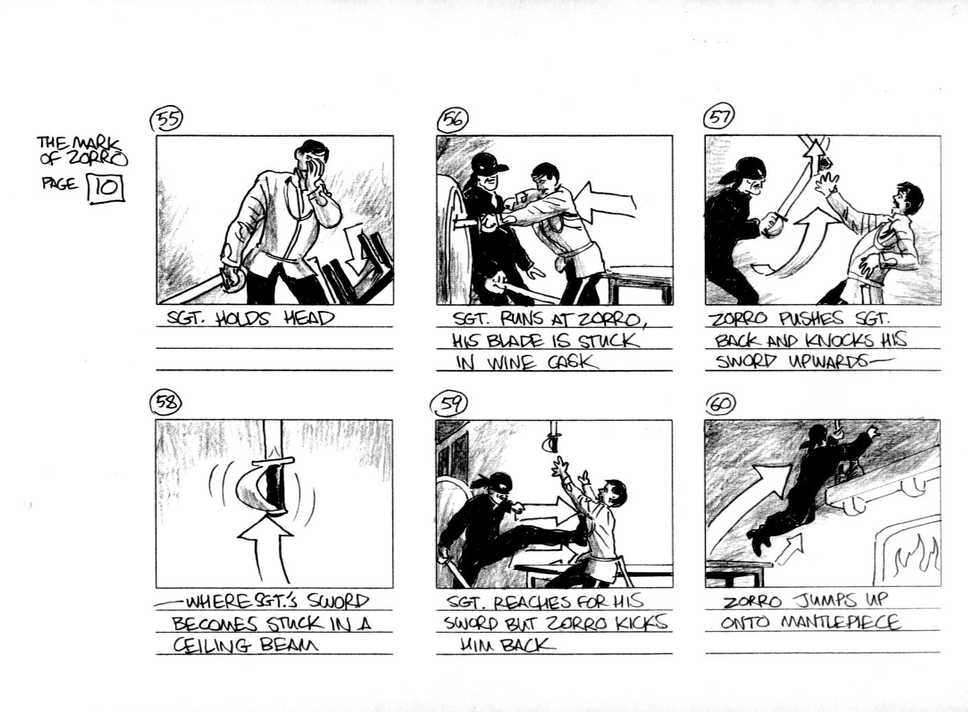
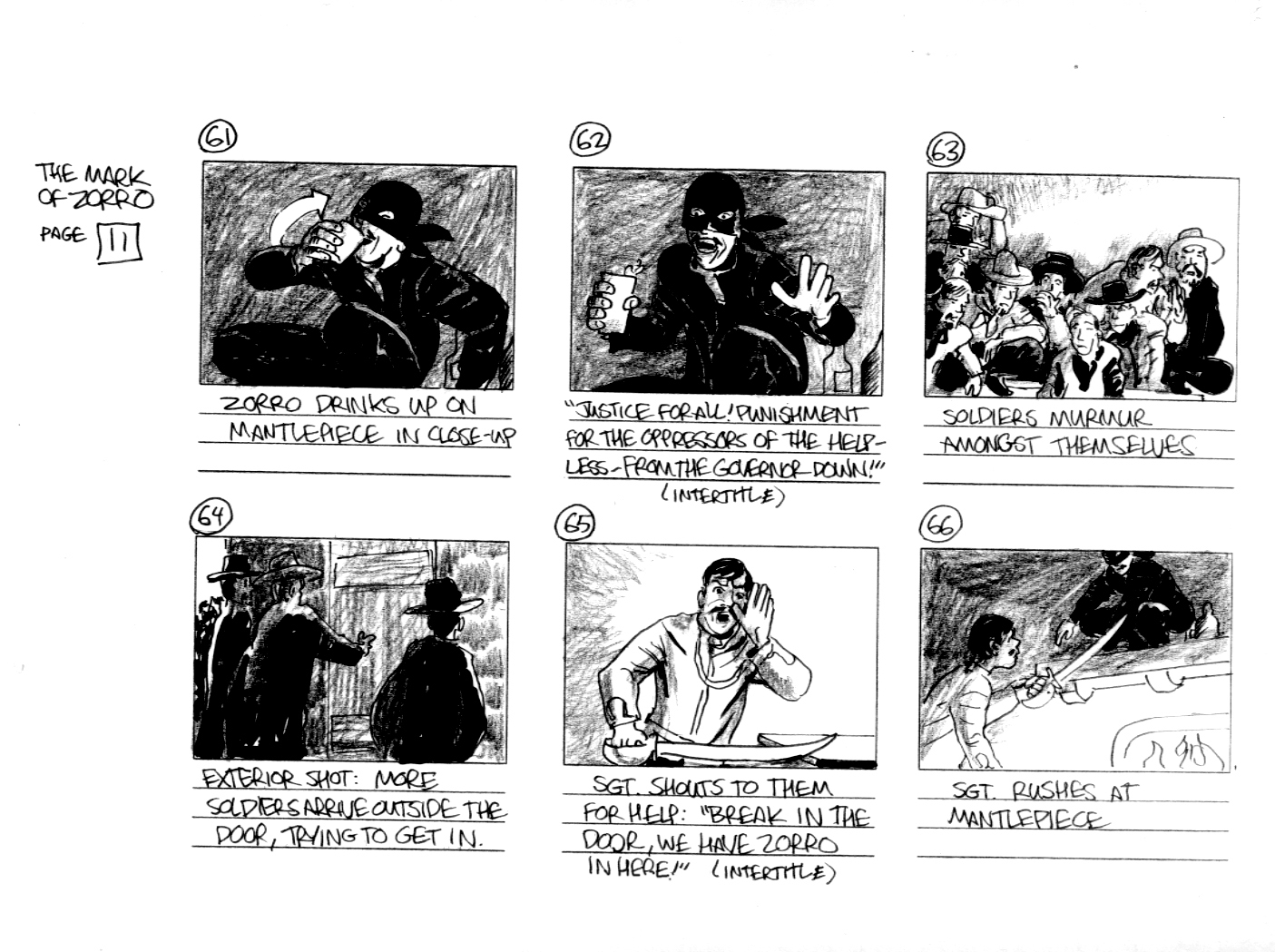
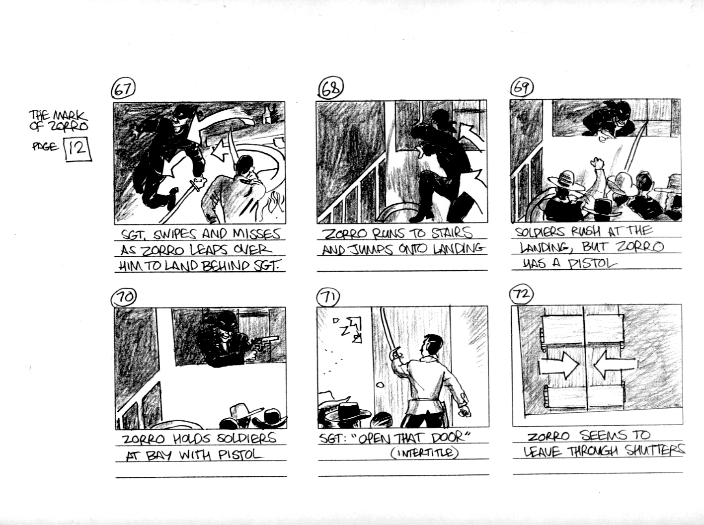
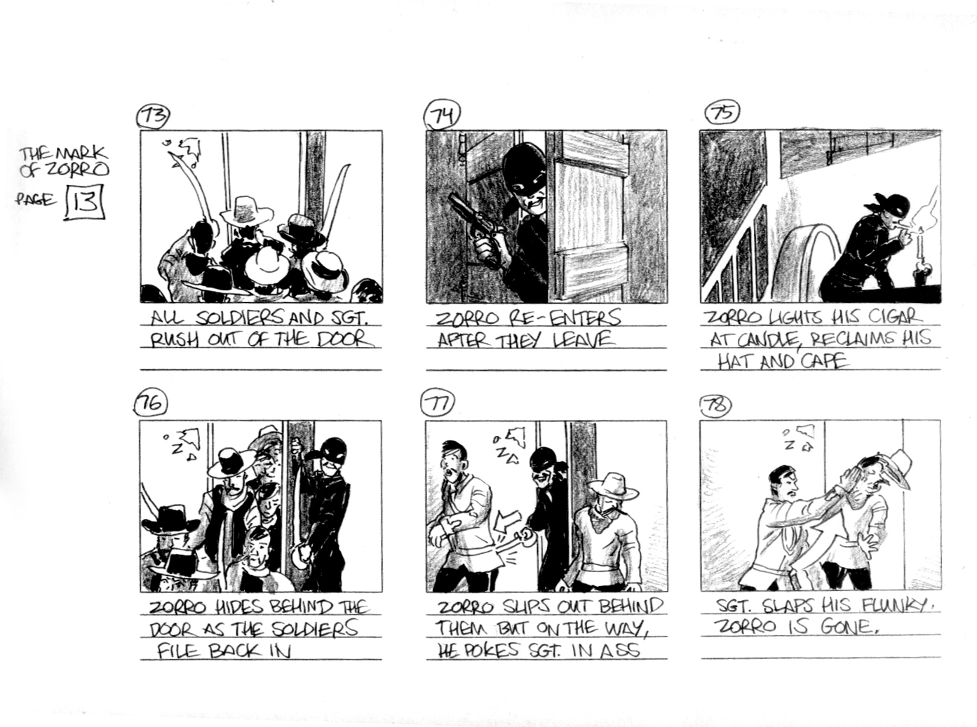
The storyboard is my fabrication to make a point. Fairbanks was unusual in that he not only produced and starred in his own films and did his own stunt work, but he wrote them as well. Though almost all films did eventually came to be done from scripts, in actuality the early silent films were rarely if ever scripted. Fairbanks was known to work from a relatively loose scenario, which left a good amount of leeway for improvisation in the filmmaking process. His films and indeed, all silent films were likely never storyboarded.
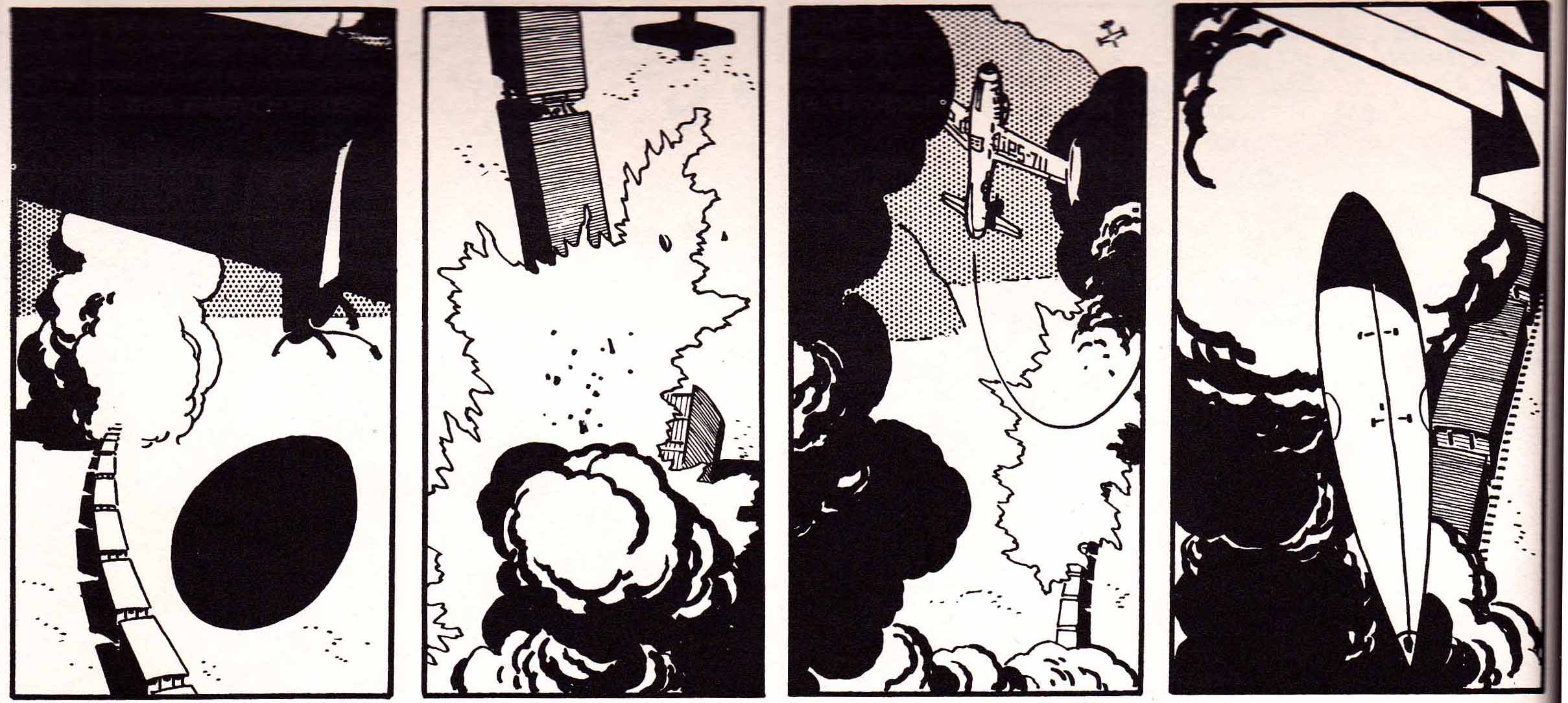
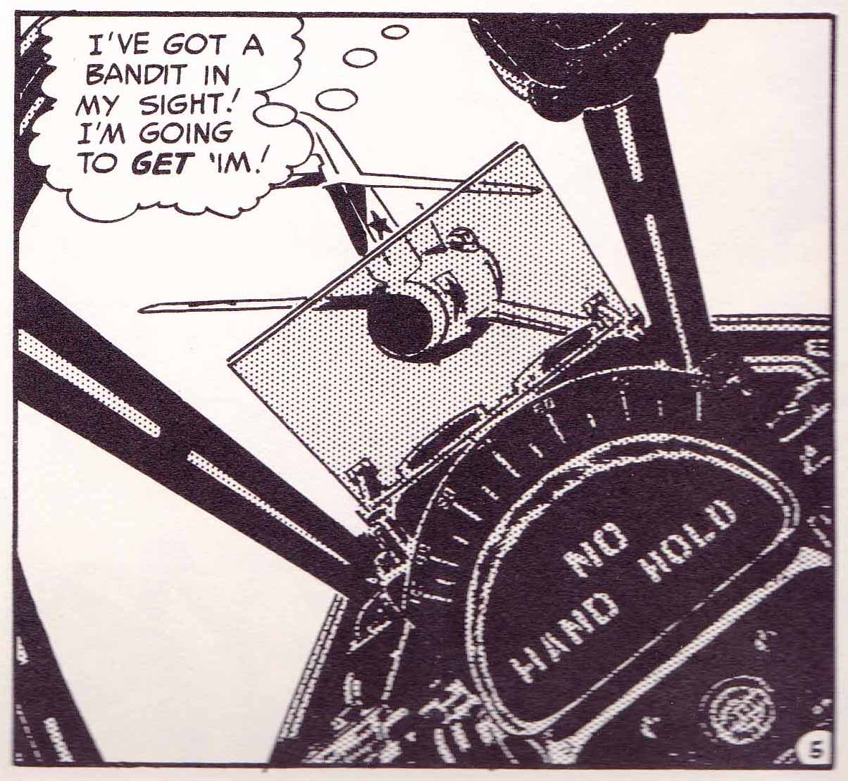
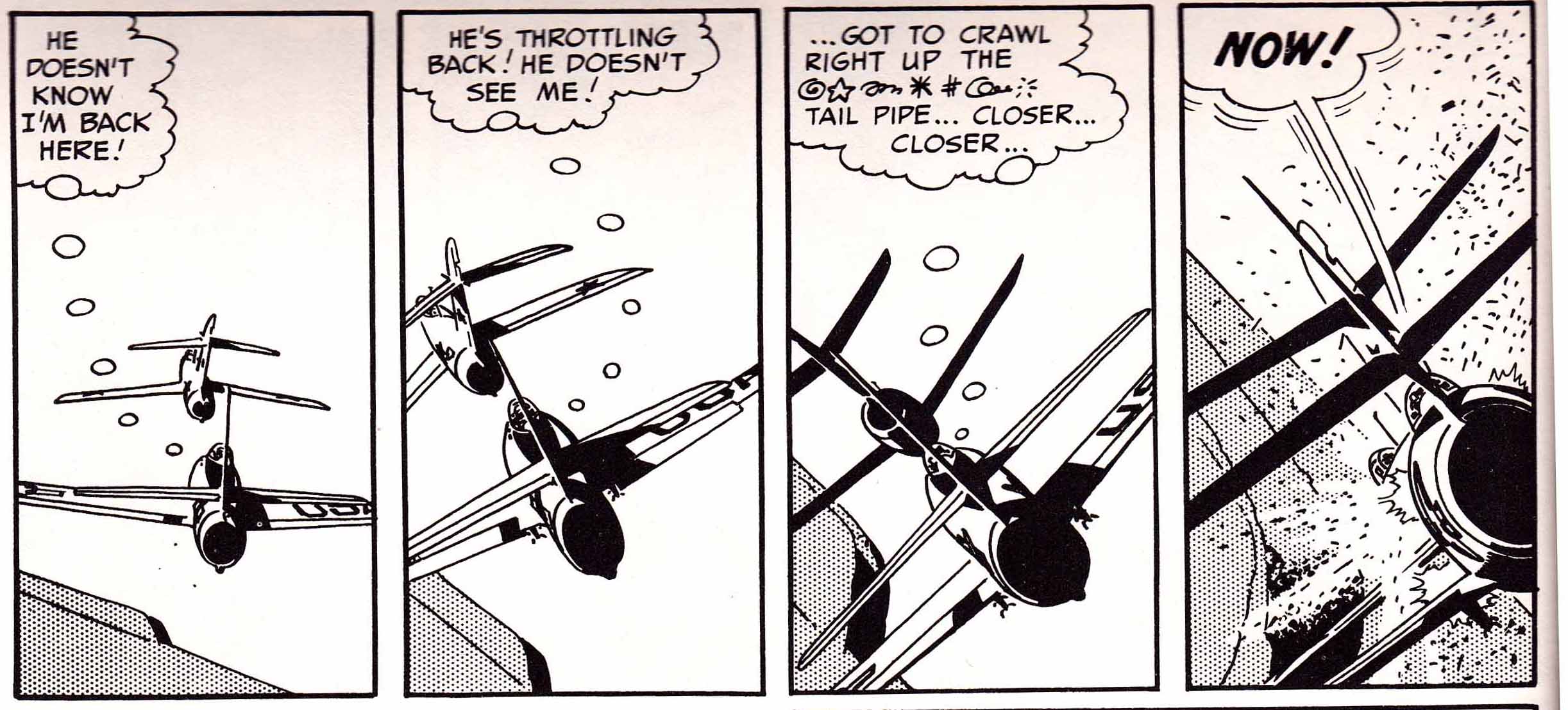
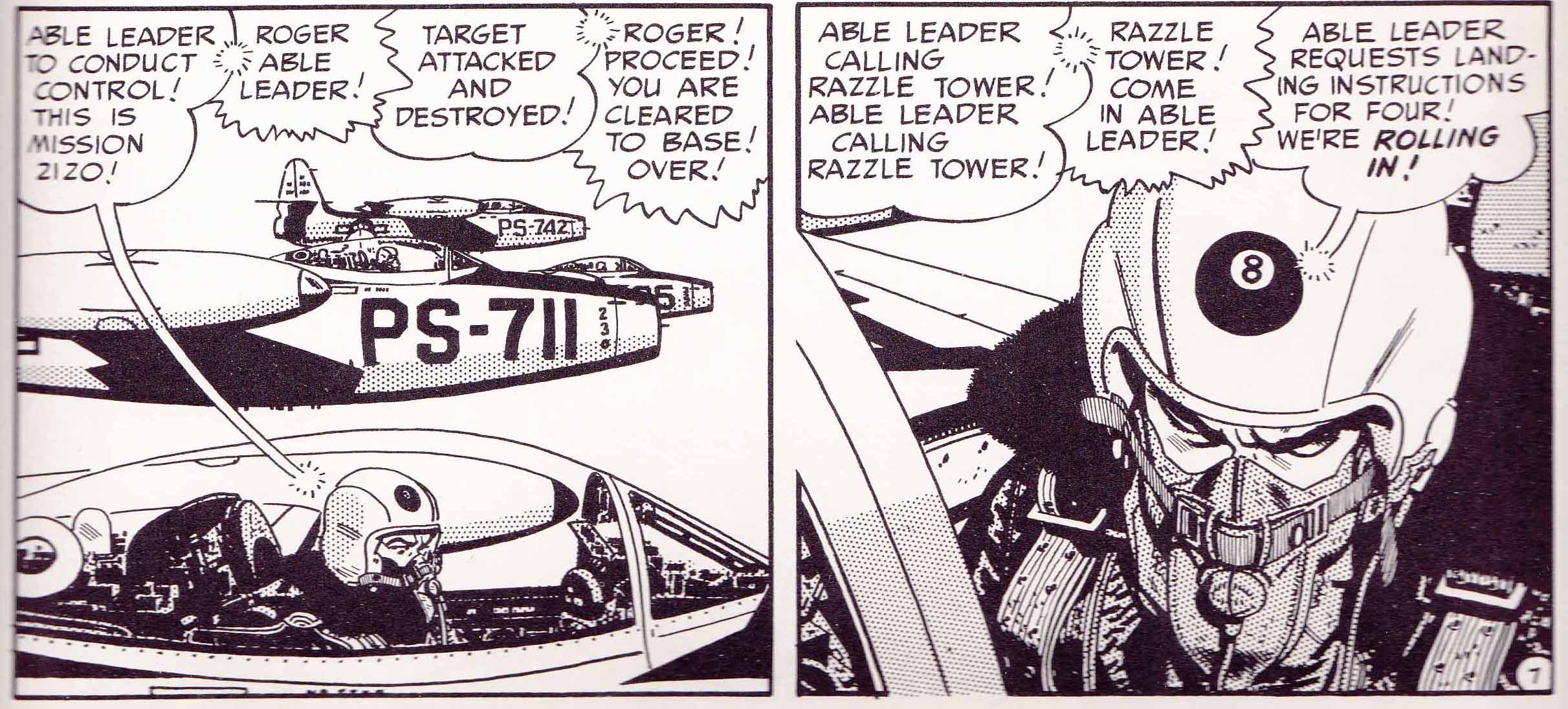
Storyboards first were used by the Walt Disney studio for a 1933 short, Three Little Pigs—and the first live action feature to be entirely storyboarded was the 1939 Gone with the Wind. But, Fairbanks is the founder of the action film, a genre that at the present time provides the bulk of storyboard artists’ employment, as action sequences are where their skills are most needed and in the most demand. And so, in order to study how Fairbanks articulated his action scenes, I undertook to make a storyboard for a six minute sequence in The Mark of Zorro. I did not have access to Fairbank’s script, or the source story he adapted his script from, so I watched the sequence in question once and as I did, I lightly sketched a bare-bones layout with action notations, which came out to 13 six-paneled pages. To render this, I then didn’t look further at the film, but wholly reconstructed the images from memory and in many cases simply invented the poses.
The result echoes my previous experience with storyboards, which is that the finished film looks quite a lot like what is drawn, but not exactly—a lot of detail and much greater precision of choreography in how sequences actually play out are developed in the process of filming. The storyboard is not intended to be particularly pretty; it looks and is a bit rushed—it is meant to provide a template, a starting point to guide the filmmakers; and that is what my storyboard looks like, to the best of my abilities within the time constraints I had to deal with, which also reflect the abbreviated schedules that many film productions labor under.
Click on images to enlarge:
Thanks to Professor Marc Bolan and Marguerite Van Cook.
____________________________________________________________
Sources
The Black Pirate. Dir. Albert Parker. Perf. Douglas Fairbanks, Billie Dove. United Artists, 1926. Web. 06 Dec. 2013. Link
The Mark of Zorro. Dir. Fred Niblo. Perf. Douglas Fairbanks, Marguerite De La Motte, Noah Beery. United Artists, 1920. Web. 06 Dec. 2013.
Entire film: Link
Storyboarded scene: Link
The Thief of Bagdad. Dir. Raoul Walsh. Perf. Douglas Fairbanks, Julanne Johnston, Anna May Wong. United Artists, 1924. DVD, Kino Video, 2004.
Basinger, Jeanine. Silent Stars. New York: Alfred A. Knopf, 2000. Print.
Buchet, Alex. “Prehistory of the Superhero (Part 6): The Fabulous Junkshop.” Hooded Utilitarian, October 24, 2013. Web. 09 Dec. 2013. Link
Cook, David A. A History of Narrative Film. 3rd Edition. New York: W.W. Norton & Co. 1996.
Print.
Fairbanks, Jr., Douglas. The Salad Days. New York: Doubleday, 1988. Print.
Hatfield, Charles. Hand of Fire: The Comics Art of Jack Kirby. Jackson, Miss: The University Press of Mississippi, 2012. Print.
Steranko, James. The History of Comics 1. Reading, Pa: Supergraphics, 1970. Print.
Tibbetts, John C. and James M. Welsh. His Majesty the American: The Cinema of Douglas Fairbanks, Sr. New York: A.S. Barnes and Co. 1977. Print.
Toth, Alex and Darrell McNeil. By Design. Los Angeles: Gold Medal, 1996. Print.
Toth, Alex. “A Forward’s Look Back and Askance” (author’s introduction). The Complete Classic Adventures of Zorro. Fullerton, Ca: Image Comics, 1999. Print.
Vance, Jeffrey with Tony Maietta. Douglas Fairbanks. Berkeley, Ca: University of California Press, 2008. Print.
Williamson, Catherine. “’Draped Crusaders’: Disrobing Gender in The Mark of Zorro”, Cinema Journal 36.2, (Winter 1997): p 3-16. Web. O9 Dec. 2013. Link