The Visual Superhero (Analyzing Comics 101)

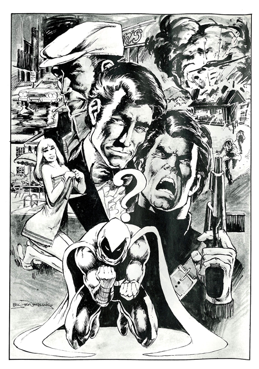
Having already talked about framing and layout and closure and abstraction, I’m backing up now to what should be square one for “Analyzing Comics 101.” Who are the creators doing all of this framing, etc.? Although Will Eisner’s 1940s Sunday newspaper section The Spirit is a significant exception, superhero comics are typically created by multiple authors, with production divided into five semi-independent roles.

Writer: Creator who conceives the story idea, plots the events, plans the content and sequence of panels typically through a written script, and/or composes the words that appear in caption boxes and word balloons. The various writing roles may involve more than one individual.

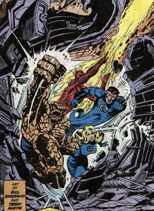
Penciler: Artist who sketches the pages, typically based on a writer’s script. A superhero comic typically has only one penciler.

Inker: Artist who finishes the pages by penning over the penciler’s breakdowns. More than one inker may be involved in a single issue, and a penciler sometimes inks her own pencils.

Colorist: Artist who designs or co-designs color or gray tones and adds them to the inked pages.

Letterer: Artist who draws the scripted words (but not sound effects) inside balloons and boxes.

The words and images in a comic book are the product a complex and sometimes overlapping creative process. Although rarely credited, a penciler often co-writes by making encapsulation and layout decisions and sometimes creating content based on the credited writer’s story summary. 1950s Marvelman writer Mick Anglo wrote no scripts, but “would instead suggest a basic plot outline to an artist, giving him a specific number of pages to fit the idea into. Once the art was complete, Mick would then write in the actual wording for the letterer” (“Miracleman Alias Marvelman”). Stan Lee followed the same process in the 60s, dubbing it the Marvel Method. Jack Kirby and Steve Ditko would also sometimes conceive and pencil stories independently, leaving margin notes for Lee to expand into dialogue and narration. Job applicants seeking writing positions were hired based on their ability to fill in four pages of empty talk balloons and caption boxes from Fantastic Four Annual #2, further suggesting that pencilers were often the primary “writers” at Marvel.

Even when working from full scripts, pencilers may exert a great deal of creative control. According to 90s Deathlok writer Dwayne McDuffie, penciler Denys Cowan “felt free to alter my panel breakdowns and shot descriptions whenever he had a better idea” (28).

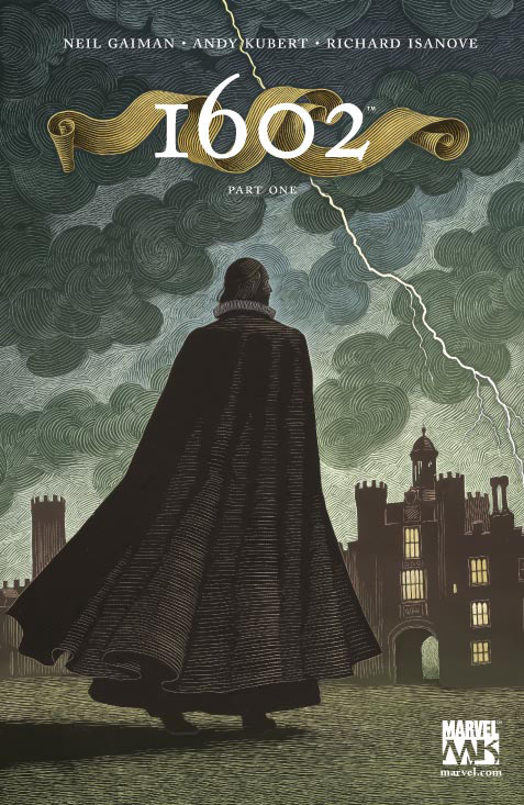
Neil Gaiman even encouraged Andy Kubert to alter his 2003 scripts: “Feel free to ignore my suggestions if you can see a better way of doing it. (You are the artist.) … Also, there’s an awful lot to cram in here, so let me know if you need more room, and if I’m trying to jam in too much…” (Marvel 1602).

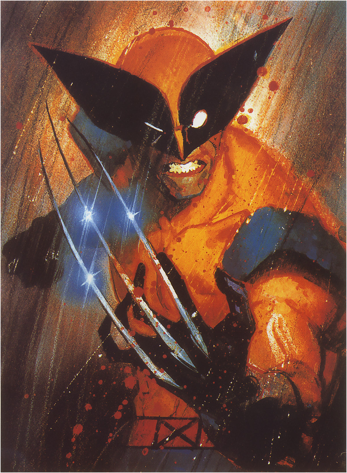
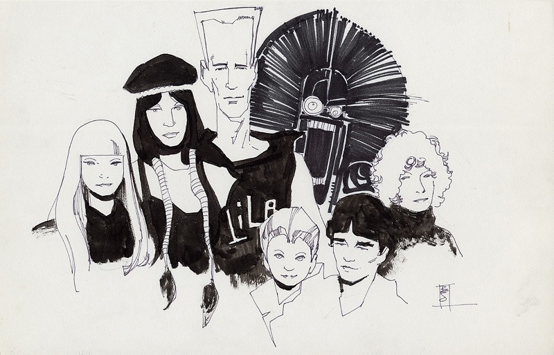
Penciler and inker relationships are complex too. Inker Eric Shanower was notorious for adding details to layouts, while Vince Colletta was notorious for eliminating them. John Byrne even voiced homophobic complaints about Bob Layton’s inking of his work:

I actually feel physically ill when I look at Bob’s stuff. […] It’s like everything is greasy and slimy. […] all his men are queer. They have these bouffant hairdos and heavy eye make-up and an upper lip with a little shadow in the corner which to me says lipstick. Even the Hulk. I will never forgive him for what he did to the Hulk’s face in the annual that we did together.

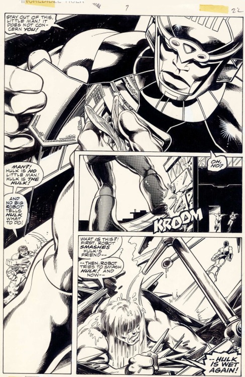
I remember my father looking at […] the finished inks […] and my father said, “Well this guy’s queer.” No, he didn’t look queer in the pencils, Dad.

When John Byrne inked Steve Ditko in the 80s, their styles clashed queerly too, creating Byrne-detailed figures arranged in signature Ditko poses.

comics 002

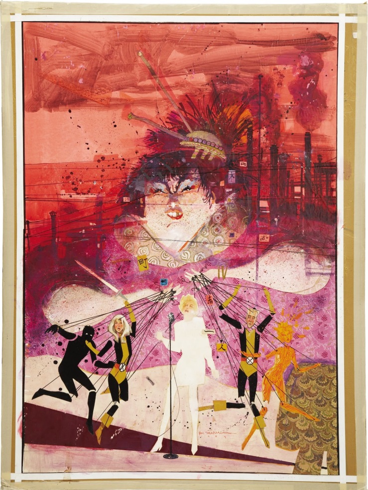
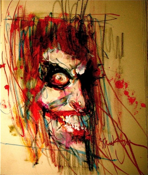
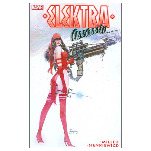
Unless the penciler is instead painting in a color medium—Alex Ross prefers gouache watercolors—color is added to comic pages last. Before Photoshop, this was accomplished during the printing process by overlaying color-separation boards and screening ink by percentages in dot patterns. The colorist would select color combinations for each discrete shape, and multiple assistants would cut the shapes from each board. Color decisions might also be indicated by the writer in a script or by the penciler in the margins of the layout. Because the artists’ boards remained black and white, colors can be altered with each publication. Alan Moore and Garry Leach’s first chapters of Marvelman originally appeared in black and white in Warrior magazine in 1982; the retitled Miracleman #1 was reprinted in color in 1985 by Eclipse Comics; and Marvel Comics reprinted it again in 2014 with a new color design by Steve Oliff. (Kevin Melrose discusses this in more detail here.)


The final product of a comic book consists entirely of ink on paper (originally the lowest grade, pulp paper), but the images are the result of multiple processes. At times it is useful to discuss each contribution independently, while at other times such divisions may be burdensome or indeterminable. Nathaniel Goldberg and I in “Economy of the Comic Book Author’s Soul” analyze contributors as a single, pluralistic author whose words and images display unified intentionality. We might also analyze a given comic as though it has agency itself. Unlike a traditional painting—which may be copied and mass distributed—a comic book is its multiple copies. The artboards may be considered works of art too, but the artboards are not the comic book produced from them. A comic book has no single original.

Superhero comics, because they tell stories through representational images, also create tensions between how a subject matter is depicted and the subject itself—in other words, between the story world of the characters (diegesis) and the physical comic book in the world of the reader (discourse). No tension between diegesis and discourse occurs in prose-only texts because the words on the page in no way resemble the world they linguistically evoke. But because comics discourse includes representational images, their diegetic content is ambiguous. Is a drawing of a superhero a photo-like document of the superhero as others in the story see him? Or is the drawing an interpretation of the character which may be in some way diegetically inaccurate?

This tension does not occur (or occurs much less) in the non-fiction of graphic memoirs and graphic journalism because the images represent real-world content and so are understood as interpretations. Graphic novels, because their content is fictional, create a greater tension, and superhero comics, because they are an amalgam genre that includes fantasy and science fiction, heighten it by depicting subject matter that both does not and often cannot exist. The diegesis-discourse tension poses a question: Do comic book superheroes exist as they are depicted, or do they exist independently from their depictions? This is a philosophical question I can’t resolve here, but the tension is a factor when analyzing superhero comics visually.

Words ‘n Pictures

That title means both “words and pictures” and “words in pictures,” because both phrases describe comic books. Although not all comics include words, essentially all superhero comics do. (A near exception, the five-page “Young Miracleman” story in the back of Miracleman #6 includes two talk balloons each containing the transformation-triggering word “Miracleman!” and a range of sound effects, newspaper headlines, and signage.) How images and text work together is one of the most complex and distinctive qualities of the form.

Words in comics have their traditional linguistic meanings, but they are also drawn images that must be understood differently than words in prose-only works. Their line qualities and surroundings influence their meanings. Dialogue and narration are traditionally rendered at a later stage of production by a separate letterer, after the penciler and inker have completed their work. The size, shape, and color of lettering can denote volume, tone, or intensity, especially when representing speech. Bolding is especially common, typically multiple words per sentence. Sound effects, however, are drawn by primary artists as part of the images. These are onomatopoeic words or letters that represent sounds in the story world. Often the lettering style is so expressive it communicates more than the letters’ linguistic meaning.

Words are typically framed within a panel. Spoken dialogue appears in talk balloons (traditionally an oval frame with a white interior), internal monologues in thought balloons (traditionally a cloud-like frame with a white interior), and unspoken narration in caption boxes (traditionally rectangular and colored, though sometimes narration appears in separate caption panels or in white gutters). Adding a pointer to a word container and directing it at an image of a character turns the words into sound representations or, if a thought balloon, into representations of an unspoken but linguistic mental process, both linked to the specific place and time of the depiction.

The absence of a pointer on a caption box indicates that the words originate from outside of the depicted scene. First-person narration with no pointer may be linked to a remote setting if the words are composed by a character from some other, implied moment and location that is not visually depicted. Though the words in talk balloons are understood to be audible to characters, the drawn words and containers are not visible within the story world even when drawn blocking story elements. As with lettering, the size, shape, and color of containers communicate additional meanings about the words. For talk balloons, the graphic quality of the balloon edges denotes how the words are thought, spoken, whispered, shouted, etc. Finally, the containers create semantic units similar to line breaks or stanzas in poetry.

Words also influence and are influenced by surrounding images that are part of the subject content. Pioneering comics artist Will Eisner identifies two kinds of images: a “visual” is a “sequence of images that replace a descriptive passage told only in words,” and an “illustration” is an image that “reinforces (or decorates) a descriptive passage. It simply repeats the text” (132). Scott McCloud goes further, identifying seven “distinct categories for word/picture combinations” (). Two of McCloud’s categories, “word-specific” and “duo-specific,” correspond with Eisner’s “illustration,” while the other five (picture-specific, intersecting, parallel, independent, montage) fall under Eisner’s “visual,” which “seeks to employ a mix of letters and images as a language in dealing with narration” (139).

To indicate the level of image-text integration, we combine and arrange McCloud’s and Eisner’s categories in a spectrum, beginning with the highest level integration.

Montage visual: images include words as part of the depicted subject matter. This is the only instance in comics in which words are part of the story world. All other words are discourse only.

Interdependent visual: images and words communicate different information that combines.

Intersecting visual: images and words communicate some of the same information, while also communicating some information separately.

Image-specific visual: images communicate all information, while words repeat selected aspects.

Word-specific illustration: words communicate all information, while images repeat selected aspects.

McCloud also includes two categories that are not integrated, and we add two more.

Duo-specific illustration: images and words communicate the same information. Although this might appear to be the most integrated category, there is no integration if each element only duplicates the other so that no information is lost if either element is ignored. Words and images are independent.

Image-only visual: isolated images communicate all information. Since comics do not require words, this is the most fundamental aspect of the form.

Word-only text: isolated words communicate all information. This requires the highest level of reader visualization, an approach at odds with graphic narratives as a form.

Parallel visual: images and words communicate different information that do not combine. This requires the same level of reader visualization as word-only texts, but the presence of images complicates and potentially interferes with that visualization.

With the exception of the most integrated category, montage visuals, all combinations of words and pictures produce some level of image-text tension because words, unlike images, exist only as discourse. Though drawn on the page, words are not visually perceptible to the characters in the story. Images, however, depict content that is perceptible to characters, so drawn objects and actions appear as both discourse (ink on paper) and diegesis (the world of the story). A drawing of a superhero flying (discourse) communicates the fact that the superhero is flying in the story (diegesis). The words “the superhero is flying” communicate the same diegetic fact, but the ink-formed letterforms bear no resemblance to their subject matter. There is no overlap between diegesis and discourse. Since both words and images are made of ink lines on paper (because printed words are images), some lines in a comic exist only in the reader’s world and some appear to exist in both the reader’s and the characters’ worlds.

Graphic novels create further image-text tension by highlighting the potential gap between text-narration and image-narration. In graphic memoirs such as Art Spiegelman’s 1980-1991 Maus, Marjane Satrapi’s 2003 Persepolis, and Alison Bechdel’s 2006 Fun Home, the text-narrator and the image-narrator are understood to be the same person, the actual author. When a character in a graphic novel controls the first-person text-narration in caption boxes, it is not necessarily clear whether that character is also controlling the image-narration in panels. If the words are generated by an omniscient third-person text-narrator, does that same narrator generate the images, or are the images generated by a separate narrator?

Unintegrated image-texts imply a separate text-narrator and image-narrator. In the case of a duo-specific image-text, the two modes of narration duplicate information without any integration, as if two narrators are unaware of each other. Integrated image-texts, however, imply a single narrator controlling both words and images in order to combine them for a unified effect. At the center of the spectrum, a word-specific illustration implies an image-narrator aware of text but a text-narrator unaware of image. Similarly, an image-specific visual implies a text-narrator aware of images but an image-narrator unaware of text.

Parallel visuals are more complex; although the two narrations are independent and so seemingly unaware of each other at the level of the panel, the overarching effect is integrated. In such cases, the separate text- and image-narrations may create a double image-text referent, in which a word has one meaning according to its linguistic context but, when read in the context of the image, acquires a second meaning. Alan Moore is best known for this approach, having perfected it with Dave Gibbons in Watchmen.

 Image result for watchmen comic panels

Framing the Dead

Actually, this post should be titled “Framing, Abstracting, and Closuring the Walking Dead,” but that’s way too many verbs, plus closuring isn’t a word. Or at least it wasn’t. Maybe it is now. This post is also a follow-up on three previous “Analyzing Comics 101” posts on, you guessed it, framing, abstraction, and closure.

I’m once again picking apart the corpse of Tony Moore and Robert Kirkman’s The Walking Dead #1 to show how these concepts can come together. This time, just the first two pages will do the trick.

http://s13.postimage.org/q0zzzhedz/image.jpg

So framing first. The top full-width panel is symmetrical and misaligned, so the right side includes more than the primary subjects of Rick, Shane, and their police car which appear cropped in the foreground, plus the escaped convict and his truck in the middleground. The rectangular panel could include all of the rectangular police car, but instead provides surrounding detail, including a horse (the first hint at the Western motif), a Rotary Club sign (suggesting a small community theme?), and distant mountains in the background (further establishing the rural setting).

However, it’s the bottom panel that gives the initial framing its biggest meaning, since the open foreground space of that first panel parallels the page’s most important image in the bottom panel: Rick being shot. The bottom frame is symmetrical and proportionate, making the first misaligned framing a form of spatial foreshadowing. Moore also shifts the parallel angle of perspective, effectively rotating the shooter to the background, Shane to the middleground, and Rick to the foreground, the most significant visual space. Note also that Rick occupies the right side of the image, gaining further significance since as Anglophone readers we conclude the panel on right. We read top to bottom too, so Rick being shot occupies the concluding space of the overall page too (it’s also the peak image in an implied 4×2 grid, but we covered visual sentences and layouts elsewhere).

Rick is also emphasized because our perspective moves with him, beginning in panel five. These four middle framings are symmetrical while vacillating between proportionate and abridged, because the figures are sometimes cropped mid-chest, adding to the sense of Rick and Shane being trapped in a cramped space. Though drawn smaller than Shane in panels one and two, when Rick stands in panel three, he encompasses more space: his action literally makes him larger. Because the angle of perspective is the same in panels two and four, Shane remains the same.

Closure between the images is minimal. The first panel establishes the overall area, and the following five panels work within it, demanding little spatial closure. Though the time span of each panel and the gaps between them is inherently inexact, the first four transitions suggest no significant gaps, and so they imply a steady movement forward in time, requiring only basic temporal closure. The fifth transition, however, implies a gap in which Rick turns around to face the shooter. So in addition to temporal closure, the panel transition requires causal closure because the action of Rick turning is undrawn; we infer it in order to explain why Rick’s back is no longer turned to the shooter as it was in the previous image.

Finally, Tony Moore’s drawing style is roughly 3-3 on the abstraction grid, so it shows both a moderate amount of detail (translucent) and a moderate amount of contour warping (idealization). Arguably, the figures show a level of 3-4 abstraction, with intensified contours. In the second panel, Shane is impossibly wide and Rick impossibly thin, with Rick’s head roughly half the width of Shane’s shoulder.

shane and rick abstraction

The effect characterizes each through visual exaggeration and further establishes them as foils. Meanwhile, the shooter’s head contrasts the straight lines that compose Rick and Shane’s bodies with frenetic lines and lopsided features.

crazy guy

Though the effect is more striking, the shooter’s lines contours remain within an idealized range. Rick’s bullet wound, however, is intensified or even hyperbolic.

rick's wound

Since no human being could survive a wound that extreme, the image creates higher closure demand after the page turn because we retroactively understand the image to be exaggerated. There’s an overt abstraction gap between what is drawn and how it is drawn. And because a literal understanding of the image contradicts the story, we ignore it (diegetic erasure).

http://s13.postimage.org/9r9twl3pz/image.jpg

The leap to page two is major in other ways too. The image requires a great deal of temporal closure with details that also require a range of casual closure. After being shot, Rick was taken to a hospital–perhaps by paramedics in an ambulance, though most of the casual facts go unconfirmed. He is in a bed in a bedroom, not a critical ward or operating room, so presumably his wounds were successfully treated and he was left to recuperate. The time gap is ambiguous, but his beard growth suggest several days.

The framing marks a major change too. Though still symmetrical, the full-page panel is also expansive. Rick’s figure is the subject, but a great deal of the surrounding room is drawn for a spacious effect unlike the previous page’s variously proportionate and abridge panels. The angle of perspective shifts from parallel to downward, so we are no longer viewing the image as a character would but as if from a more omniscient vantage.

The style of abstraction has shifted too. While Rick remains at 3-3 (translucent idealization), the room is closer to 2-2 (semi-translucent generalization). The level of detail is much greater than on the previous page and the line contours are only warped slightly below the level of photorealism. Notice the line quality of the shadows and reflected chair legs on the floor.

The 2-2 image is also a full-page panel, giving it further significance. When the first zombie later appears on page six, we retroactively fill in additional closure into the temporal gap: the zombie apocalypse occurred while Rick was unconscious and safe behind his bedroom door. Page two is the most significant image in the issue, because it is 1) the most detailed and least abstracted image in a stylistic context of less detail and higher abstraction, 2) the first of only two full-page panels, 3) the most expansively framed image, and 4) the image demanding the highest amount and range of closure.

There’s plenty more visual analysis available on these two pages (haven’t even started to talk about the difference in Moore’s rendering of sound effects and speech yet), but you get the picture.

Abstraction Bingo with Bill Sienkiewicz

First time I saw a comic book by Bill Sienkiewicz (I’m told it’s pronounced sinKAVitch), my tiny adolescent brain exploded. It must have been one of his early New Mutants, so summer of 1984, just moments before I stumbled off to college. It wasn’t just that the cover was painted (I’d seen New Defenders do that the year before) but how dizzyingly un-comic-book-like his art looked to me. It took thirty years, but I finally have the words to describe it.

Last week I offered an Abstraction Grid, a 5×5 breakdown of comic art according to amounts of detail and exaggerated contours.  It looks a lot like a bingo board, and since I know of no comic artist with a wider range of styles than Sienkiewicz, he’s my first player.


Bingo starts with a free space, that one right there in the middle, and comics do too. The middle square is 3-3 on the grid, the style of most superhero comics. It combines a medium amount of detail (I call it “translucent” to differentiate from the two ends of the scale, “opaque” and “transparent”) and a medium level of exaggeration (I call it “idealization,” that sweet spot nestled between line-softening “generalization” and shape-warping “intensification”). Sienkiewicz, like most comics artists, started his career in the middle square:

3-3


I vaguely remembering seeing some issues of Moon Knight as a kid, but the art didn’t register as anything special, because that was Marvel’s Bronze Age Prime Directive: draw like Neal Adams.

Perfectly good style, but if you slide over a square to the left, more detail is more interesting:

2-3 


Sliding to the less detailed right is fun too, stripping those idealized forms down to something a little more basic:

4-3 


Sienkiewicz can go even further, reducing subjects to minimal details, sometimes just undifferentiated outline shapes.

5-3:

tumblr_ma7xgf4fWF1r93mfqo1_1280  

1-3 is rare in comics, but disturbingly common in advertising. Photography provides the maximum amount of details, and Photoshop lets you idealize them:

The fourth row of the grid is intensification. Where idealization magnifies and compresses shapes but stays mostly within the bounds naturalism, intensification steps out of bounds, usually by throwing proportions out of whack.

Seinkeiwicz is a pro:

3-4


tumblr_mlsd1dwEtG1rcp7bmo1_1280

The exaggeration is more pronounced with more detail:

2-4


Less detail creates a more of a classic “cartoon” effect:

4-4


Meanwhile, the left half of this Stray Toasters face strips away eve more detail, so only the minimal number of lines remains:

5-4

And the sparse lines of this torso are impossibly regular too:

1-4 is rare, but sometimes a fashion ad blows it by Photoshopping beyond idealization and into inhuman intensification.

I call the top range of exaggeration hyperbole because it breaks reality completely. Sienkiewicz is one of the few comics artists who spends any time this high on the abstraction grid. His minutely detailed yet absurdly proportioned Kingpin from Daredevil: Love and War is one of my all-time favorites:

2-5 

The Demon Bear by itself is 3-4 intensification, and the figure of the New Mutant facing it is your standard 3-3, but the combination steps into hyperbole:

3-5

These scribbles of Joker’s face and body are simpler but exaggerated to a similar level of unreal.

4-5


And then there’s cartoonish chaos of Warlock’s Bill the Cat face:

But, like most superhero artists, Sienkiewicz spends almost no time up in 5-5. That’s South Park terrain:

For 1-5 photography, stop by Celebrity Photoshop Bobbleheads:

Moving back down the grid now, the second row of shape abstraction is generalization, just a slight tweaking of line quality. The New Mutants here have a typical level of detail for a comic book, but the those lines evoke real-world subjects.

3-2

Image result for new mutants 18 demon bear

Some of these New Mutants (not Fireball and Warlock though) look distantly photographic, though with even less detail:

4-2

While this portrait of Lance Henriksen is dense with detail:

2-2

Image result for Bill Sienkiewicz photography

5-2 is rare, a fully realistic human figure in outline only. And most 1-2 photography hides its Photoshopping so well it registers as undoctored photography.

Seinkeiwicz spends time in that photorealistic corner too though.

1-1

This next image from Big Numbers may be an altered photograph, with just a little detailed flattened.

1-2

1-3, 1-4, and 1-5 are rare since it defeats the point of photorealism to strip too many details away.

Finally, notice that many of Seinkeiwicz’s best effects are a result of using more than one kind of abstraction in a single image:

The overall figure is 3-4 intensification (humans are not roughly 2/3rds legs). But while the top half of the figure has a medium level of detail, the legs are flat with not a single line of shadings, so 4-4. And though the gun is intensified too, it is impossibly large in relation to the figure, and so 3-4.

Skim back up the other images for more of these combo effects.

Meanwhile, how well did Bill do on the Abstraction Board?  I count 16 out of 25 squares filled. Let me know if you find an artist with a higher score.

Why Simple Is So Complicated (Analyzing Comics 101: Abstraction)

I’m teaching “Superhero Comics” this semester, and so I’m once again pulling out Scott McCloud’s abstraction scale:

Image result for mccloud abstraction scale

It begins with a photograph of a face and ends with a face comprised only of an oval, two dots, and a straight line. McCloud calls that last face a “cartoon” and the middle face the standard for “adventure comics,” ie superheroes. All of the faces to the right of the photograph further “abstract [it] through cartooning” which involves “eliminating details” by “focusing on specific details.” Computer programs can do the same kind of stripping down:
 

clip_image007

 
But some “simplification” isn’t so simple. Look at the different between this photograph and its cartoon version.

make a caricature profile picture of you

McCloud’s scale actually combines two kinds simplification. Each step to the right of his spectrum appears simpler because: 1) the image contains fewer lines, and 2) the lines are in themselves less varied. A line becomes smoother by averaging its peaks and lows into a median curve, and so the second kind of simplification is a form of exaggeration. Since exaggeration can extend beyond averaging McCloud’s spectrum actually requires two kinds of abstraction. Each face is altered both in density and in contour quality. Density describes the number of lines; contour quality describes the magnification and compression of line shapes. Abstraction in density reduces the number of lines; abstraction in contour quality warps the line shapes. The less density reduction and the less contour warpage, the more realistic an image appears.

I like McCloud’s five-point scale though, so I’ll offer two of my own.

The Density Scale:

  1. Opacity: The amount of detail is the same or similar to the amount available in photography.
  1. Semi-Translucency: The amount of detail falls below photorealism, while the image still suggests photorealistic subject matter.
  1. Translucency: While reduced well beyond the range of photography, the amount of detail evokes photorealistic subject matter as its source material. This is the standard level of density in superhero comics art.
  1. Semi-Transparency: The sparsity of detail is a dominating quality of the image, and subject matter can evoke only distantly photographic source material. Semi-Transparency is more common in caricature and cartooning.
  1. Transparency: The minimum amount of detail required for an image to be understood as representing real-world subject matter.

The Contour Scale:

  1. Duplication: Line shapes are unaltered for an overall photographic effect. Though naturalistic, reality-duplicating line shapes exceed the norms of superhero art by reproducing too much information.
  1. Generalization: Line shapes are magnified and/or compressed to medians for an overall flattening effect that conforms to naturalistic expectations. Generalization is the standard level of abstraction for objects in superhero art.
  1. Idealization: Some line shapes are magnified and/or compressed to medians while others are magnified and/or compressed beyond their medians for an overall idealizing effect that challenges but does not break naturalism. Idealization is the standard level of abstraction for superhero characters.
  1. Intensification: Line shapes are magnified and/or compressed beyond their medians for an overall exaggerating effect that exceeds naturalistic expectations. If the intensification is explained diegetically, the line shapes are understood to be literal representations of fantastical subject matter within a naturalistic context. If the intensification is not explained diegetically, then the line shapes are understood as stylistic qualities of the image but not literal qualities of the subject matter. Explained or Diegetic Intensification is common for fantastical subject matter in superhero art; unexplained or Non-diegetic Intensification occurs selectively.
  1. Hyperbole: Line shapes are magnified and/or compressed well beyond medians for an overall cartooning effect that rejects naturalism entirely. Hyperbole is uncommon in superhero art because the stylistic qualities of the image dominate and so prevent a literal understanding of the subject matter. Hyperboles in a naturalistic context are understood metaphorically.

The two scales can also be combined into a Density-Contour Grid:

1-5 2-5 3-5 4-5 5-5
1-4 2-4 3-4 4-4 5-4
1-3 2-3 3-3 4-3 5-3
1-2 2-2 3-2 4-2 5-2
1-1 2-1 3-1 4-1 5-1

Both scales take photorealism as the norm that defines variations.

McCloud’s photographed face is the most realistic because it combines Opacity and Duplication, 1-1 on the grid, demonstrating the highest levels of density and unaltered contour. It’s opposite is not McCloud’s fifth, “cartoon” face, which combines Transparency with Idealization, 5-3; its level of density reduction is the highest and so the least realistic possible, but its contour warpage is moderate and so comparatively realistic. Replace the oval with a circle to form a traditional smiley face, the contour quality would rise to Hyperbole, 5-5, the most abstract and so the least realistic position on the grid.

Image result for smiley face

Cartooning covers a range of grid points, but most cartoons fall between 4-4 and 5-5, both high density reduction and high contour warpage. Charles Schulz’s circle-headed and minimally detailed Charlie Brown is a 5-5.


The characters of Archie Comics are some of the most “realistic” of traditional cartoons at 4-4.

 
McCloud’s middle, “adventure comics” face combines Translucency and Idealization, 3-3, the center point of the grid and the defining norm of superhero comic art.
 

Image result for superman

Like all grid points, 3-3 allows for a variety of stylistic variation between artists, within a single artist’s work, and even within a single image, but it does provide a starting point for visual analysis by defining areas of basic similarity.

What It Really Takes to Get from Here to There (Analyzing Comics 101: Closure)

Reading a comic book is easy–even when there are no words to be read. You just look at a picture, and then at the next picture, and so on. But why do any of them make sense side-by-side? What is your brain doing as it leaps from image to image?

In Understanding Comics, Scott McCloud defines the Gestalt psychology principle of “closure” as the “phenomenon of observing the parts but perceiving the whole” (though it more specifically indicates a viewer filling in visual gaps between disconnected parts) and applies it to comics gutters: “Nothing is seen between panels, but experience tells you something must be there!” He goes on to explain: “Comics panels fracture both time and space, offering a jagged, staccato rhythm of unconnected moments. But closure allows us to connect these moments and mentally construct a continuous, unified reality.”

McCloud focuses his analysis on gutters and therefore types of transitions possible between panels (though closure is independent of panels and gutters, since insets and interpenetrating images work the same ways). He comes up with six types:

Image result for scott mccloud panel transitions

They work reasonably well, but his focus on panel transition has always struck me as slightly off. When I use it in class, students often don’t come to a clear consensus when analyzing any particular panel sequence. Moment-to-moment and action-and-action, for instance, are often ambiguous, sometimes combining identical leaps in time. And since actions do occur in McCloud’s moment-to-moment examples (a women blinks!), it’s not exactly clear what constitutes an “action.” Aspect-to-aspect can also be indistinguishable from subject-to-subject, both of which may or may not involve a movement in time, and so may or may not also be moment-to-moment or even action-to-action. And scene-to-scene might be a location leap and so also a kind of aspect-to-aspect at the big picture level, or a scene-to-scene can be in the same location but at a different time–so then how much time has to pass for an old scene to become a new scene?

These are annoying questions, but they really do come up when you try to breakdown a panel sequence with a roomful of students. So instead of categorizing transitions, my colleague Nathaniel Goldberg and I categorized types of closure while drafting our essay “Caped Communicators: Conversational Depiction and Superhero Comics.” Instead one all-purpose “perceiving the whole” process, we see four very different kinds of closure, each of which can occur by itself or in combinations.

Spatial:  Subject matter drawn in separate images is depicted as existing in physical relationship to each other, typically as a result of panel framing. (What McCloud identifies as aspect-to-aspect, subject-to-subject, and some scene-to-scene transitions require spatial closure.)

Temporal:  Undrawn events are depicted to take place outside of events drawn in separate images, typically as a result of panel transitions and so occurring as if in gutters. (What McCloud identifies as moment-to-moment, action-to-action, and some subject-to-subject and scene-to-scene transitions require temporal closure.)

Causal: Drawn action is understood to have been caused by an element absent from a current image but drawn in a preceding image. (None of McCloud’s transitions, not even action-to-action, accounts for this type of closure.)

Associative: A metaphorical relationship is depicted between two images in which one image is understood to represent some idea about the other image. (Though McCloud does not identify this type of closure, Jessica Abel and Matt Madden in Drawing Words Writing Pictures add “symbolic” to McCloud’s list of transition types. Such symbolic transitions require associative closure.)

It always helps to look at specific examples, so consider this three-panel sequence at the top of page 28 in Watchmen #8:

In the first image, artist Dave Gibbons draws the shadow of a statuette cast over the face of a frightened man lying on the floor. The second image shows the statuette in the fist of an attacker. Taken together, spatial closure is required to understand that the two images occur within a few feet of each other, each image drawn from one of the two men’s points of view. The second image also requires temporal closure because the statuette is behind the attacker’s head at an angle that would not cast the shadow seen on the victim’s face in the first image. Gibbons therefore also depicts a movement forward in time during which the attacker has cocked his arm back to strike.

The third image depicts a jack-o-lantern crashing to the floor with some falling books. It uses all four forms of closure. The pumpkin exists in the same space as the two now undrawn men (spatial closure). The pumpkin is crushed at a moment immediately following the second image (temporal closure). The falling books have been knocked down by the now undrawn attacker of the previous image (causal). And, because it resembles a human head and breaks open at the moment a reader anticipates the statuette striking the man’s head, Gibbons implies that the man’s head has been similarly damaged (associative).

A close reading of the sequence also reveals some confusion. Regarding causal closure, it is unclear how the attacker overturned the books at this moment since the act of swinging the statuette at the victim on the ground does not clearly involve his intentionally or unintentionally knocking over the bookcase in the same gesture. Instead, Gibbons may have attempted to suggest that the attacker struck his victim and then afterwards overturned the bookcase—an ambiguous two-step action otherwise absent.

I’m guessing Gibbons was fulfilling a directive in Alan Moore’s famously meticulously detailed script, producing this unintended gap in its execution. To address panel transitions that cause only confusion, McCloud includes “non-sequitur” as a type of transition that “offers no logical relationship between panels whatsoever!” So then a non-sequitur produces no closure at all–and so isn’t really type of closure, but is the absence of closure. Which is why we don’t include it as our fifth category.

So our closure types are deeply indebted to McCloud, but I think they also improve on his. I’ll be testing these out in my classroom soon, so hopefully my students will agree. More on that later.

Analyzing Comics 101: Visual Sentence vs. Page Layout

Having taught my spring term seminar Superheroes a half dozen times now, I’m converting it to one of the gateway courses for Washington and Lee students entering the English major. The overhaul means jettisoning the pre-history of the genre (I love that stuff, but I could just hand my students On the Origin of Superheroes and be done with it) and focusing much more on comics as an art medium. So I’m trying to boil down the basics, the must-know criteria for analyzing a comic book.

So now it’s time to invite Neil Cohn to the lectern. If you haven’t read his The Visual Language of Comics, please do. Meanwhile, here’s my boiling down of his visual language grammar.

Narrative panel types: images may be categorized according to the kinds of narrative information they contain and how that information creates a visual sentence when read in sequence:

Orienter: introduces context for a later interaction (no tension).

Establisher: introduces elements that later interact (no tension).

Initial: begins the interactive tension.

Prolongation: continues the interactive tension.

Peak: high point of interactive tension.

Release: aftermath of interactive tension.

Cohn only looks at comic strips, which typically express a single sentence in a linear arrangement of three or four panels, but longer graphic narratives can express multiple sentences on a single page or extend a single visual sentence over multiple pages.  To analyze the different ways that can work, I’m adding some terminology to Cohn’s.

Closed sentences: two sentences that begin and end without sharing panels.

Overlapping sentences: sentences that share panels.

Interrupted sentence: an overlapping sentence that does not complete or initiate its tension before another sentence replaces it; sentences might share an Orienter, or an Establisher may introduce two elements that do not interact until later as a form foreshadowing.

Dual-function panel: in overlapping sentences, one panel performs two narrative functions. A panel may, for example, serve as the Release of one sentence and also the Orienter, Establisher, or Initial of the next. Or an Orienter may  serve as the Establisher of an interrupted sentence that initializes tension later.

Sentence Layout: the relationship of visual sentences to pages.

Page sentence: a sentence that begins with the page’s first panel and ends with the page’s final panel.

Multipage sentence: a sentence that extends beyond one page.

End stop: a page and a visual sentence end simultaneously.

Enjambed: a page ends before the visual sentence ends, also called a visual cliff-hanger.

This is all awfully abstract, so let me give specific examples from The Walking Dead again.

Robert Kirkman and Tony Moore like enjambment. Their first issue includes several cliff-hangers. The bottom row of page five begins with an Establisher (introducing the door to the already established figure of Rick), is followed by an Initial panel (Rick removes the piece of wood holding the door closed), and ends with a Peak (Rick is opening the door).

http://s13.postimage.org/5yqbguo7r/image.jpg

But the Release only appears after turning to page six. That full-page panel is also a dual-function panel because it serves as the Establisher (introducing the zombies to the already established Rick) for the next, overlapping sentence.

http://s13.postimage.org/osc4dumfr/image.jpg

The turn from page nine to ten is similar. The first panel in the bottom row of page nine is an Establisher (Rick and the bicycle), followed by the page-ending Peak of Rick’s shocked reaction. The top of page ten provides the Release (we finally see what he sees).

http://s13.postimage.org/5sh7ri4gn/image.jpg

 http://s13.postimage.org/548d8k5qv/image.jpg

A similar grammatical pattern repeats on pages thirteen and fourteen. The first panel in the bottom row of thirteen is an Orienter. The second is an Establisher (Rick’s face seems to be reacting to something, a sound presumably), and the last panel is an Initial. Turn the page, and there’s the Peak.

http://s9.postimage.org/5ejovcyn3/image.jpg

http://s9.postimage.org/aeh53b49r/image.jpg

The visual grammar also shows that cliff-hangers only work on the final panel of a two-page spread, in order to prevent a reader’s eye from skimming to the critical image prematurely (which happens in my arrangements above).

Also, Moore and Kirkman don’t always enjamb their visual sentences. Page one, for instance, ends on a Peak. The page also begins with an Initial, followed by four Prolongation panels. Page one is a complete page sentence, both beginning and ending on a single page.  

http://s13.postimage.org/q0zzzhedz/image.jpg

Instead of a Release, the next page begins with an Orienter (Rick in his hospital room) for the next visual sentence, which does not overlap.

http://s13.postimage.org/9r9twl3pz/image.jpg

In terms of interrupted sentences, page ten begins a new visual sentence with the top Establisher (introducing the bicycle zombie to the already established Rick), followed by two Initials (Rick and the zombie interact) in the second. The bottom row begins with two Prolongations, followed by a Peak (Rick’s tear) and a Release (the zombie closes its mouth).

http://s13.postimage.org/548d8k5qv/image.jpg

The visual sentence appears to have ended when the next page begins a new sentence with no further interaction between Rick and the zombie. So page ten reads as a complete page sentence, until the bottom of page twenty-three continues the interaction with a Prolongation panel, retroactively showing that the visual sentence was interrupted.

http://s9.postimage.org/5fy82ipun/image.jpg

Page twenty-four provides a new Peak (Rick shoots the zombie), followed by two Release panels (Rick looking down, the zombie with a bullet hole in its forehead).

http://s9.postimage.org/54grpr9en/image.jpg

Rick’s tear is also a Prolongation of his tear on page ten, an additional overlapping sentence that reaches its Peak in the next panel when Rick wipes the tear away. The final three panels are Releases. They’re also their own overlapping, three-panel sentence: Initial (Rick and the car), Peak (Rick gets into the car), and Release (car has driven off).