Tell Me What This Says

bignumbersp9_thumb

“I don’t think there’s any need to use language.”

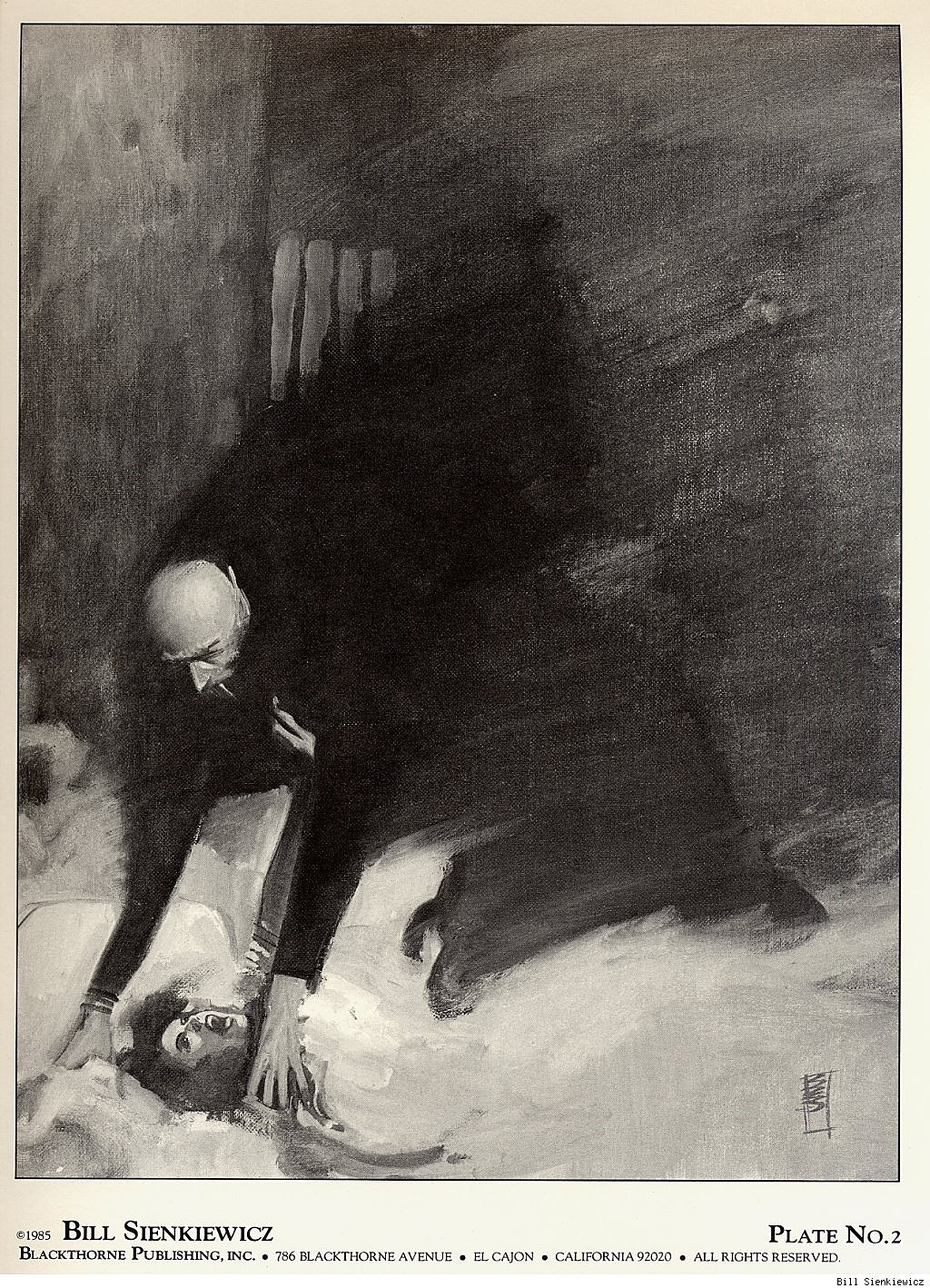
That’s my favorite line from one of my favorite comics, Alan Moore and Bill Sienkiewicz’s 1990 Big Numbers No. 1. The sentence appears on page 9, breaking a 57-panel sequence of wordless narration. Actually the shout, “AAA! Shit!” breaks the silence, after a rock breaks a window on a moving train. The shattering glass receives its own one-panel page, but Sienkiewicz doesn’t draw and presumably Moore didn’t script any sound bubble BOOM! or CRASH! over the image. It doesn’t need it. We get the picture.

bignumbersp8_thumb

The speaker is an old man upset by the main character’s profanity, but Moore is talking to us. This is two years after he and David Lloyd completed their V for Vendetta. When they started the project in the early 80s, Lloyd told Moore he didn’t want any thought bubbles. This was a radical idea at the time, and possibly the biggest moment in Moore’s growth as a writer, because he went further and cut captions too. If no one was speaking, the panel would be wordless.

I think at the time, the record for longest silent sequence was still held by Jim Steranko, for the opening three pages of the 1968 Nick Fury: Agent of S.H.E.I.L.D. No. 1, for which, Steranko claims, Marvel didn’t want to pay his writing fee because he didn’t “write” anything.

SHIELD1

SHIELD2

SHIELD3

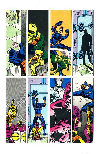
Moore took Steranko’s experiment and turned it into his M.O. The first Watchmen script he gave Dave Gibbons included a four-page, 31-panel sequence, wordless but for Rorschach’s inarticulate grunts. Flipping through my copy of From Hell, I see Eddie Campbell draws as many as 7 consecutive pages of word-free narration. It’s a paradoxical approach for Moore, since his scripts are some of the most verbose imaginable—almost literalizing the a-picture-is-worth-a-thousand-words exchange rate.

So when I started talking with my friend Carolyn Capps—a painter and former next door neighbor—about collaborating on a comic book, I had Moore in mind. Is his old man right? Is there any need to use language? I recently finished revising a 71,338-word novel and drafting a 93,935-word non-fiction book, so I may be suffering from some of Moore’s perversity. But I just don’t like words in my comic books.

I’d suspected this for a while, but I proved it to myself when I looked at Brian K. Vaughan and Marcos Martín’s webcomic, The Private Eye. The publisher, PanelSyndicate.com, offers previews, three pages of each 32-page issue. I opened the first and was struck by the absence of words. No captions, no thought bubbles, no dialogue balloons. Just unimpeded visual storytelling. I loved it. I strained over an occasional panel, uncertain what exact information was being implied, but the story was all there, its effect all the more visceral by the effort required to follow it, the bursts of action followed by extended moments of minimal movement made more evocative by their lingering silence.

Issue01.03pre

Issue01.13pre

And then I purchased the first issue.

Turns out PanelSyndicate deletes talk bubbles for previews. When I purchased and “read” the same pages again, I was annoyed by the redundancies. Yes, I gained lots of new information, but none of it was worth the trade-off. Following the words from panel to panel means I was no longer primarily focused on the panels themselves. The images were serving the language. (Though, for the record, The Private Eye is still quite a good comic—it’s the industry’s words-first norms I’m annoyed about.)

When Carolyn and I started exchanging brainstorming emails, and then preliminary sketches and sample treatments, I wanted our story to evolve visually. Instead of her illustrating my script, I wanted her images to dictate the characters, situation, and plot. Carolyn’s first drawings were unsequenced, each a separate experiment, a testing of style and content. So I started experimenting too, testing out the rhythms of visual logic, the what-does-it-mean-if-this-goes-here grammar of panel language.

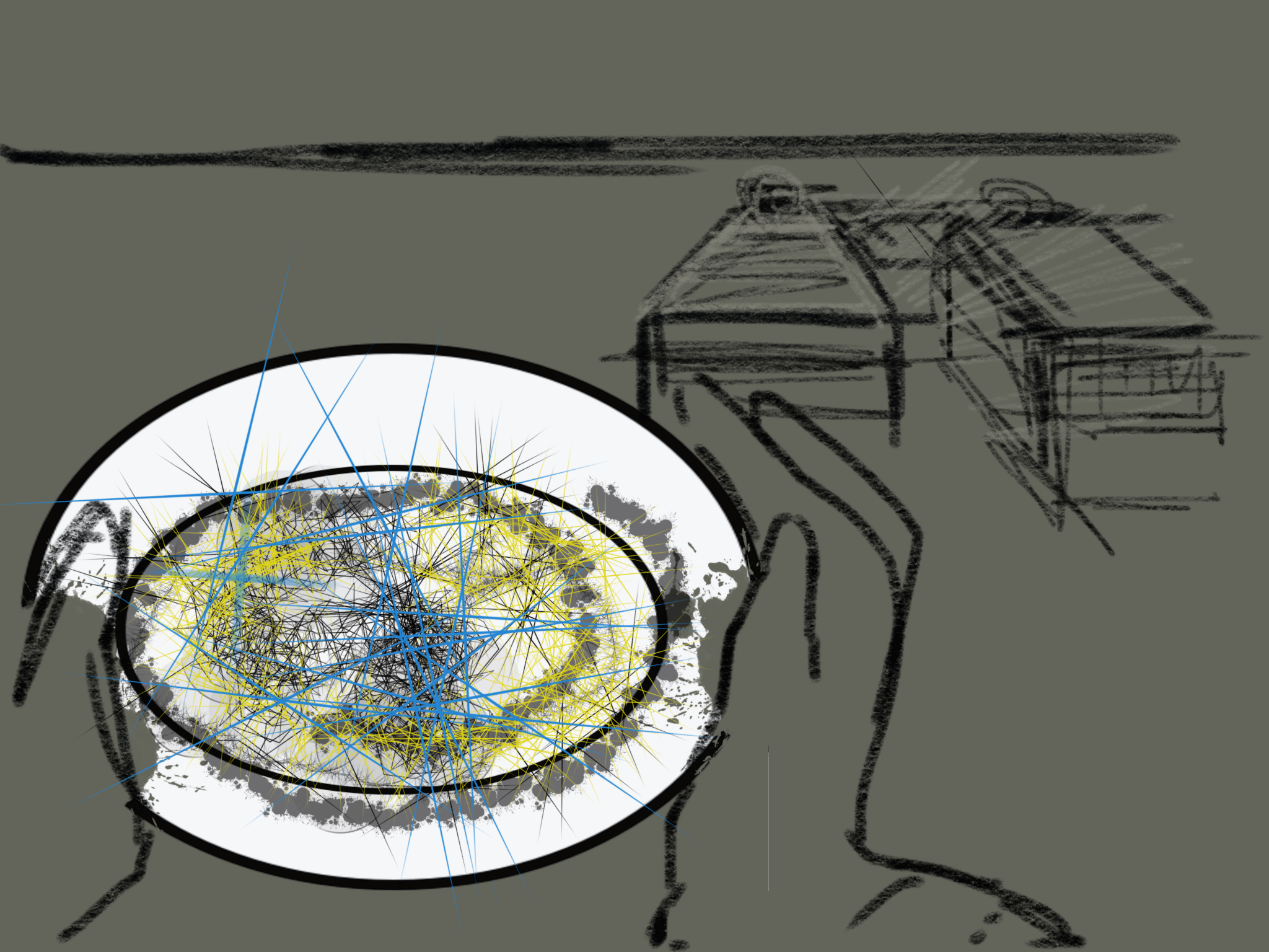
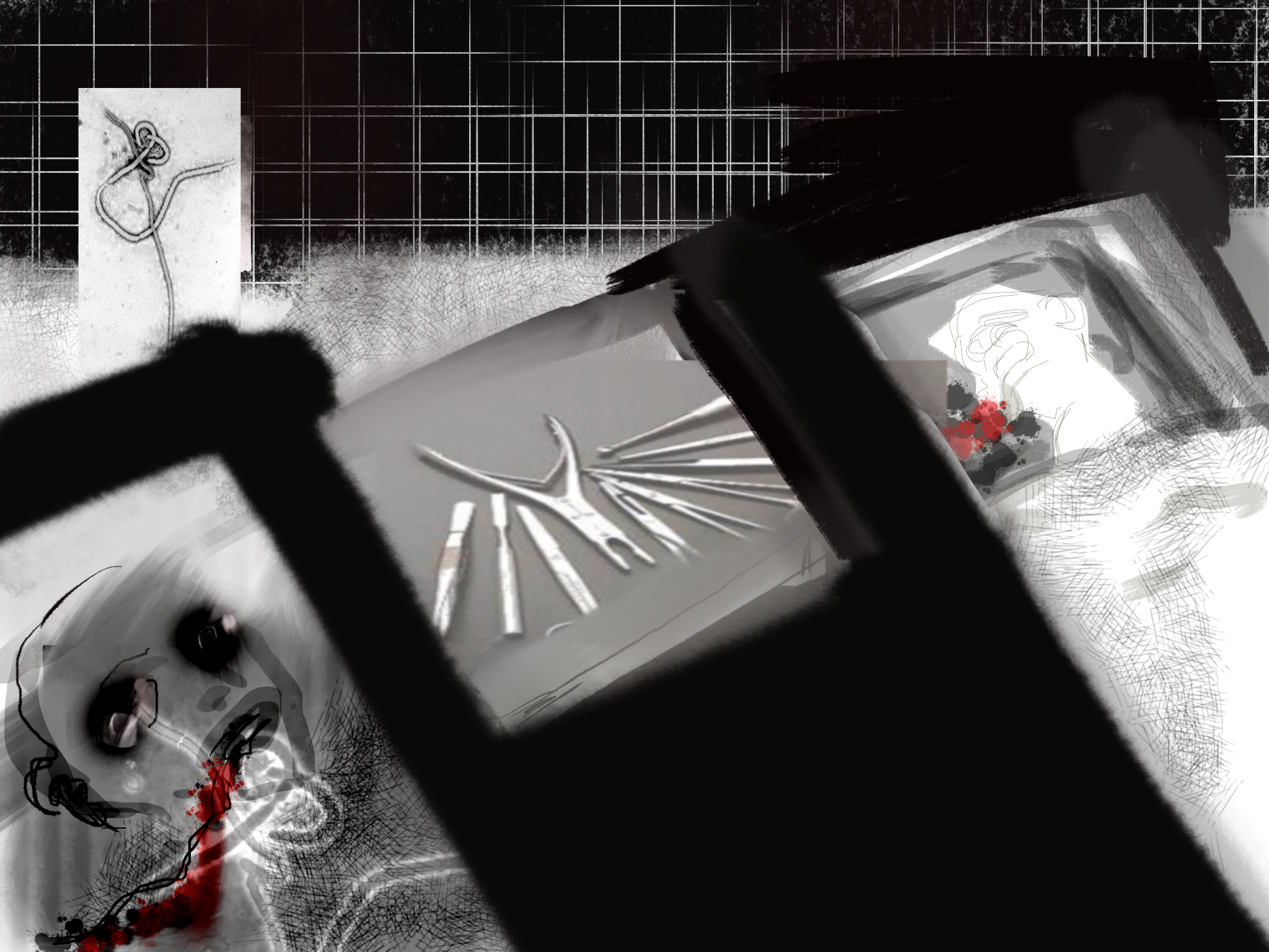
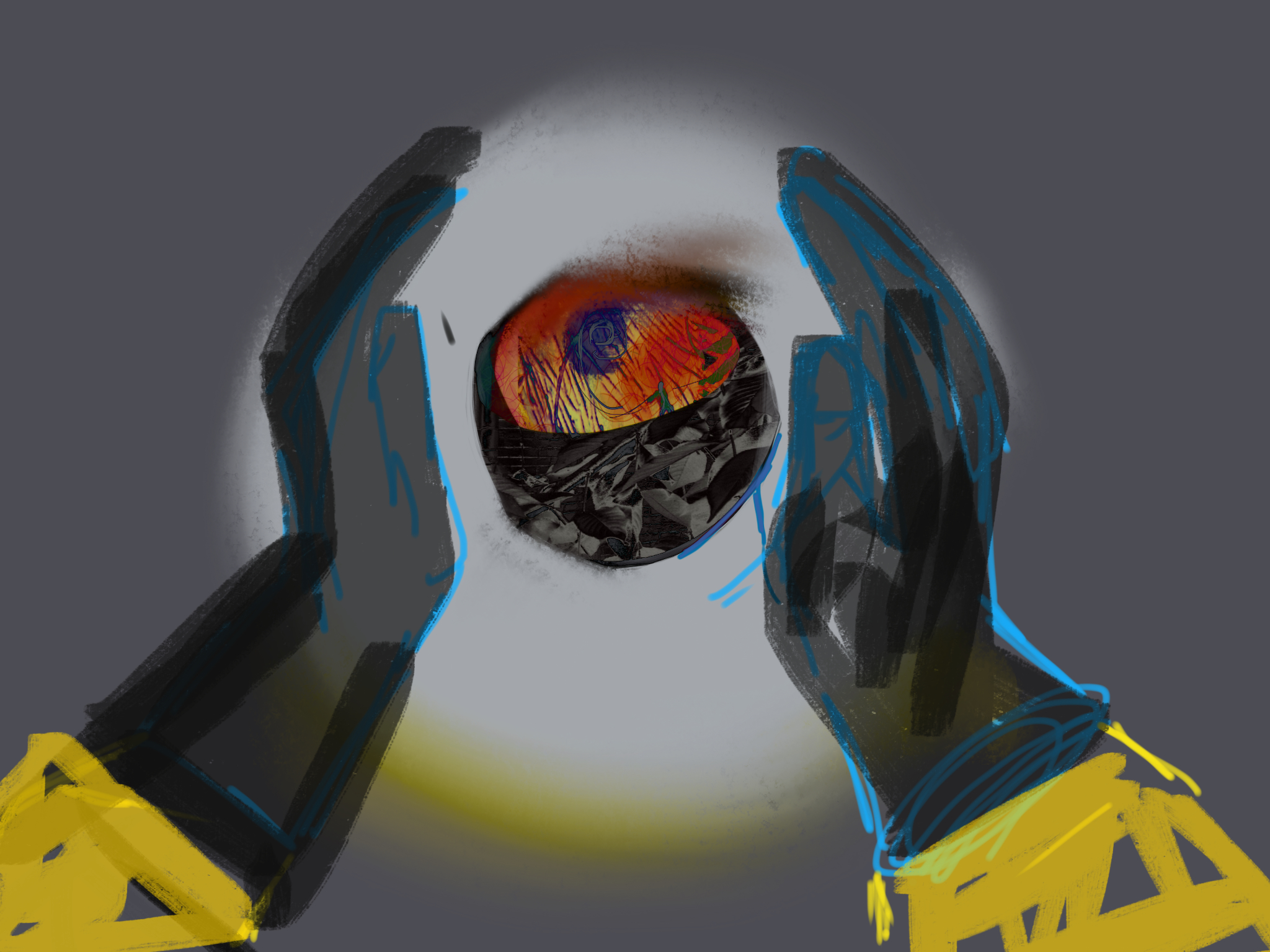
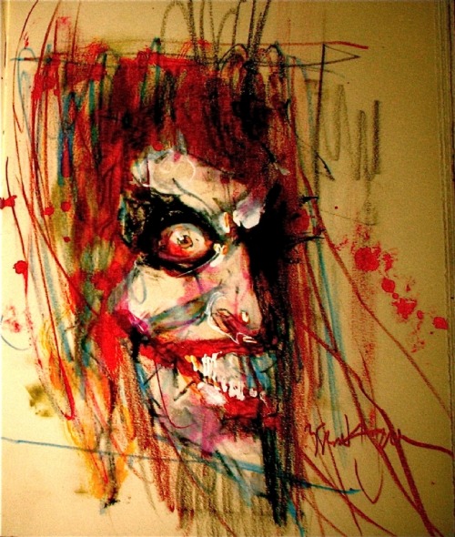
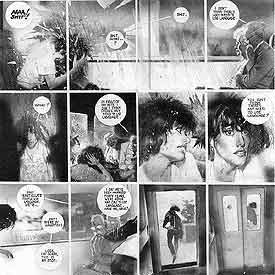
The results were pleasantly chaotic at times, the intended meanings subservient to the connotations of the actual images. Without explanatory captions or guiding dialogue, the pictures were the sole source of meaning, their tonal nuances more important than the scaffolding of the original script. No language also makes the reader a more active participant. Below is a six-panel sequence I cut and pasted from some of Carolyn’s earliest sketches. I knew what I wanted them to mean, but when I dragged my wife and daughter over to my laptop screen, they read them in their own ways.

Now you can decide what they say too:

3

2

1

6

4 (2)

Abstraction Bingo with Bill Sienkiewicz

First time I saw a comic book by Bill Sienkiewicz (I’m told it’s pronounced sinKAVitch), my tiny adolescent brain exploded. It must have been one of his early New Mutants, so summer of 1984, just moments before I stumbled off to college. It wasn’t just that the cover was painted (I’d seen New Defenders do that the year before) but how dizzyingly un-comic-book-like his art looked to me. It took thirty years, but I finally have the words to describe it.

Last week I offered an Abstraction Grid, a 5×5 breakdown of comic art according to amounts of detail and exaggerated contours.  It looks a lot like a bingo board, and since I know of no comic artist with a wider range of styles than Sienkiewicz, he’s my first player.


Bingo starts with a free space, that one right there in the middle, and comics do too. The middle square is 3-3 on the grid, the style of most superhero comics. It combines a medium amount of detail (I call it “translucent” to differentiate from the two ends of the scale, “opaque” and “transparent”) and a medium level of exaggeration (I call it “idealization,” that sweet spot nestled between line-softening “generalization” and shape-warping “intensification”). Sienkiewicz, like most comics artists, started his career in the middle square:

3-3


I vaguely remembering seeing some issues of Moon Knight as a kid, but the art didn’t register as anything special, because that was Marvel’s Bronze Age Prime Directive: draw like Neal Adams.

Perfectly good style, but if you slide over a square to the left, more detail is more interesting:

2-3 


Sliding to the less detailed right is fun too, stripping those idealized forms down to something a little more basic:

4-3 


Sienkiewicz can go even further, reducing subjects to minimal details, sometimes just undifferentiated outline shapes.

5-3:

tumblr_ma7xgf4fWF1r93mfqo1_1280  

1-3 is rare in comics, but disturbingly common in advertising. Photography provides the maximum amount of details, and Photoshop lets you idealize them:

The fourth row of the grid is intensification. Where idealization magnifies and compresses shapes but stays mostly within the bounds naturalism, intensification steps out of bounds, usually by throwing proportions out of whack.

Seinkeiwicz is a pro:

3-4


tumblr_mlsd1dwEtG1rcp7bmo1_1280

The exaggeration is more pronounced with more detail:

2-4


Less detail creates a more of a classic “cartoon” effect:

4-4


Meanwhile, the left half of this Stray Toasters face strips away eve more detail, so only the minimal number of lines remains:

5-4

And the sparse lines of this torso are impossibly regular too:

1-4 is rare, but sometimes a fashion ad blows it by Photoshopping beyond idealization and into inhuman intensification.

I call the top range of exaggeration hyperbole because it breaks reality completely. Sienkiewicz is one of the few comics artists who spends any time this high on the abstraction grid. His minutely detailed yet absurdly proportioned Kingpin from Daredevil: Love and War is one of my all-time favorites:

2-5 

The Demon Bear by itself is 3-4 intensification, and the figure of the New Mutant facing it is your standard 3-3, but the combination steps into hyperbole:

3-5

These scribbles of Joker’s face and body are simpler but exaggerated to a similar level of unreal.

4-5


And then there’s cartoonish chaos of Warlock’s Bill the Cat face:

But, like most superhero artists, Sienkiewicz spends almost no time up in 5-5. That’s South Park terrain:

For 1-5 photography, stop by Celebrity Photoshop Bobbleheads:

Moving back down the grid now, the second row of shape abstraction is generalization, just a slight tweaking of line quality. The New Mutants here have a typical level of detail for a comic book, but the those lines evoke real-world subjects.

3-2

Image result for new mutants 18 demon bear

Some of these New Mutants (not Fireball and Warlock though) look distantly photographic, though with even less detail:

4-2

While this portrait of Lance Henriksen is dense with detail:

2-2

Image result for Bill Sienkiewicz photography

5-2 is rare, a fully realistic human figure in outline only. And most 1-2 photography hides its Photoshopping so well it registers as undoctored photography.

Seinkeiwicz spends time in that photorealistic corner too though.

1-1

This next image from Big Numbers may be an altered photograph, with just a little detailed flattened.

1-2

1-3, 1-4, and 1-5 are rare since it defeats the point of photorealism to strip too many details away.

Finally, notice that many of Seinkeiwicz’s best effects are a result of using more than one kind of abstraction in a single image:

The overall figure is 3-4 intensification (humans are not roughly 2/3rds legs). But while the top half of the figure has a medium level of detail, the legs are flat with not a single line of shadings, so 4-4. And though the gun is intensified too, it is impossibly large in relation to the figure, and so 3-4.

Skim back up the other images for more of these combo effects.

Meanwhile, how well did Bill do on the Abstraction Board?  I count 16 out of 25 squares filled. Let me know if you find an artist with a higher score.

Re(Dis)membering Pushead, The Cheerful Blasphemer

The index to the Comics and Music roundtable is here.
_____________________
 
The album cover for Funeral Mist’s 2009 album Maranatha featured a dark chiaroscuro drawing of a cherub blowing his trumpet in the ear of a naked old woman, her eyes rolling back on her head as she masturbates for the apparent titillation of the viewer. Among the images within the liner is a very young girl, rendered in a similar style, holding a small, smooth stone delicately engraved with the word “Whore.” Really, no matter what you make of the message, it certainly qualifies as an attempt at humor, rendered with attention to traditional Western visual aesthetics.
 

funeral-mist-maranatha-2009-cvr

 
This cover was created by Funeral Mist’s only remaining original member, Mortuus, (nee Arioch), not by Brian Schroeder, a.k.a. Pushead, known best for his ‘80s and ‘90s illustration work for Thrasher magazine, Zorlac skateboards, Metallica and the Misfits. But the Maranatha art represents a revival of a Pushead-like appreciation of handicraft and fun that has been absent from Juxtapoz-style graphics for far too long. Despite his narrow range of subject matter (bones, skulls, bits of cloth or meat), Pushead’s work resonates with allegorical death tableaux from the northern European Renaissance, “ukiyo-e” Japan, revolutionary Mexico, and modern Symbolism, Expressionism, and Art Nouveau, realized in monochromatic tattoo-ready vignettes of sublime line and texture variation. Adorned with scarves, bandages, hair, wires, etc., Pushead’s skulls wink, leer, and grimace, eye sockets full of sparkly miasma and undead mirth.
 

pushead
 

pushead-neighborhood-211

 
I don’t know if there was any conscious influence, but when I first saw the work of German printmaker Horst Janssen, shortly after his death in 1996, I could not help but be overwhelmed by the formal similarities. Thorny tangles emerging from shadowy recesses, suffused in a particulate cloud of decay, to resolve into a mass that may have once been alive, always rendered with a delicate sense of slightly sadistic absurdity.
 

Horst Janssen

 
The other artist that Janssen, and perhaps by extension Pushead, recalled, was that other grotesque light of my teenage rendering pantheon, comics illustrator Bill Sienkiewicz. Which helps to make the point that this artwork is, at least at this point in history, “low” art. Not because it is in any way ignorant, but simply because it values craft over concept and fantasy over empiricism.
 

sienkiewicz_spideyvslizard

 
At least that’s what “low” art should value, according to me. The fact that so many design-based artists since the millenium want to cash in on their lack of craft or taste by painting a skateboard deck and hanging it in a gallery, and that the kind of trained, elegant modeling Pushead epitomized has been turned into pointless jungles of calligraphy screenprinted on to wraparound T-shirts at Kohl’s, is neither a judgment on “high” or “low,” fine art or illustration, but their troubled relationship. It’s a two-way sellout, much like the deliquescence of Metallica, post-Cliff-Burton, into therapy-empowered stadium-ready flight-simulator music, and the simultaneous aspirational decline of underground comics into faux-cinematic narratives of tortured magical-realist sincerity. The race for seriousness has done a lot of harm.

For years the door to my room sported a Thrasher page featuring Pushead’s Zorlac logo, a one-eyed pirate’s skull in which not only two locked cutlasses are embedded, but also a Christian cross formed by two bandage-bedecked bones.
 

zorlac1

 
It was (and is) a provocatively ridiculous image, but was never an issue for my churchgoing mother. This was years before black metal band members had to cut their bodies and smear themselves with entrails onstage in order to achieve cred– although Gwar had been using roughly similar tactics, equal parts Gallagher and G.G. Allin, for quite some time. This was when Slayer sang songs gleefully extolling murder and hellfire, but was fronted by a faithful Catholic, and Deicide was soon to take off, untroubled by its majority Christian lineup. Anti-racist skinheads were beating up Nazis, but thy weren’t jumping random people coming out of a bar. It was a less extreme time for extreme culture posturing.

This may have been partially because the censorious culture warriors were far more militant in the ‘80s. You could get in real trouble just for drawing a comic called “Boiled Angel.” Insofar as the retreat of assholes like Jerry Falwell, Tipper Gore, Jesse Helms, and Ed Meese means, say, more freedom for gay teenagers to come out and not kill themselves, we are in a far better place. But, in a way, Pushead had a kinship with the politically and viscerally confrontational artwork of the 1993 Whitney Biennial, when a sense of humor and detachment did not reduce the ferocity of a statement, but saved it from the pious, solipsistic irrelevance that has dogged visual culture since shortly after that time.
 

new-museum-family

“Family Romance” by Charles Ray from the 1993 Whitney Biennieal

 
Looking at Pushead again makes me think that it may be time to safety-pin a bloody banner to our genitalia and get back out in the street. I find hope in the fact that Mortuus from Funeral Mist, despite his grand statements about devil worship, obsessively quotes the Bible in his lyrics, thereby emphasizing in-between space over mere fidelity. Sometimes a stance is just an attitude, which may be far better than an ideology.
 

pusTheHammerSlaveMalletHS