“What are the elements that make a comic book a comic book?”
That was artist Carolyn Capps’ first question when we started emailing about creating a graphic novel together. It was the perfect place to begin a conversation about not just our collaboration but the nature and norms of the comics form in general.
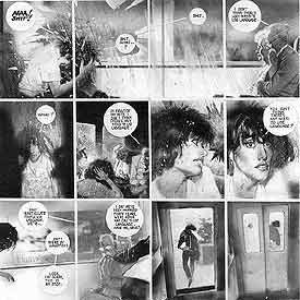
CHRIS: The technical term is ‘sequential art,’ because the key is the gutter, the space between the panels, and what conceptually is happening in that space. Usually some movement in time occurs, but not always, and it would be interesting to analyze any triptych as a comic strip, like yours from a few years back with the baby–maybe partly why I like it so much, it fires the comic book neurons in my head.

CAROLYN: Would we each work on something independently first then give it to the other. Would you write something and I would illustrate?
CHRIS: I’m thinking a back and forth process, especially in the preliminary stages. My interest is in narrative and genre tropes, but I don’t want to create something that makes complete conventional sense. Something between dream logic and conventional comic strip sequences.
CAROLYN: I am considering whether the work should be large and messy and then photographed and digitally manipulated or if they should be small pencil pieces and then photographed and perhaps digitally manipulated. Maybe the content will determine the choices.
CHRIS: I think both, especially if the different approaches coincide with a repeated element; for instance, location “A” might always be drawn small and then expanded, and “B: starts large and is shrunk. Any medium element (pencil vs. pastel vs. paint, etc) could be part of the identifying elements of locations and characters. So if you want to experiment with imagery, email me anything that strikes your own interest. Then, after we can decide together what a given character will consistently look like, we can see what directions they and locations suggest about potential story movement.
CAROLYN: Toying with the idea of a medical superhero.
CAROLYN: I also kind of like the idea of a fractal/chaotic superhero.

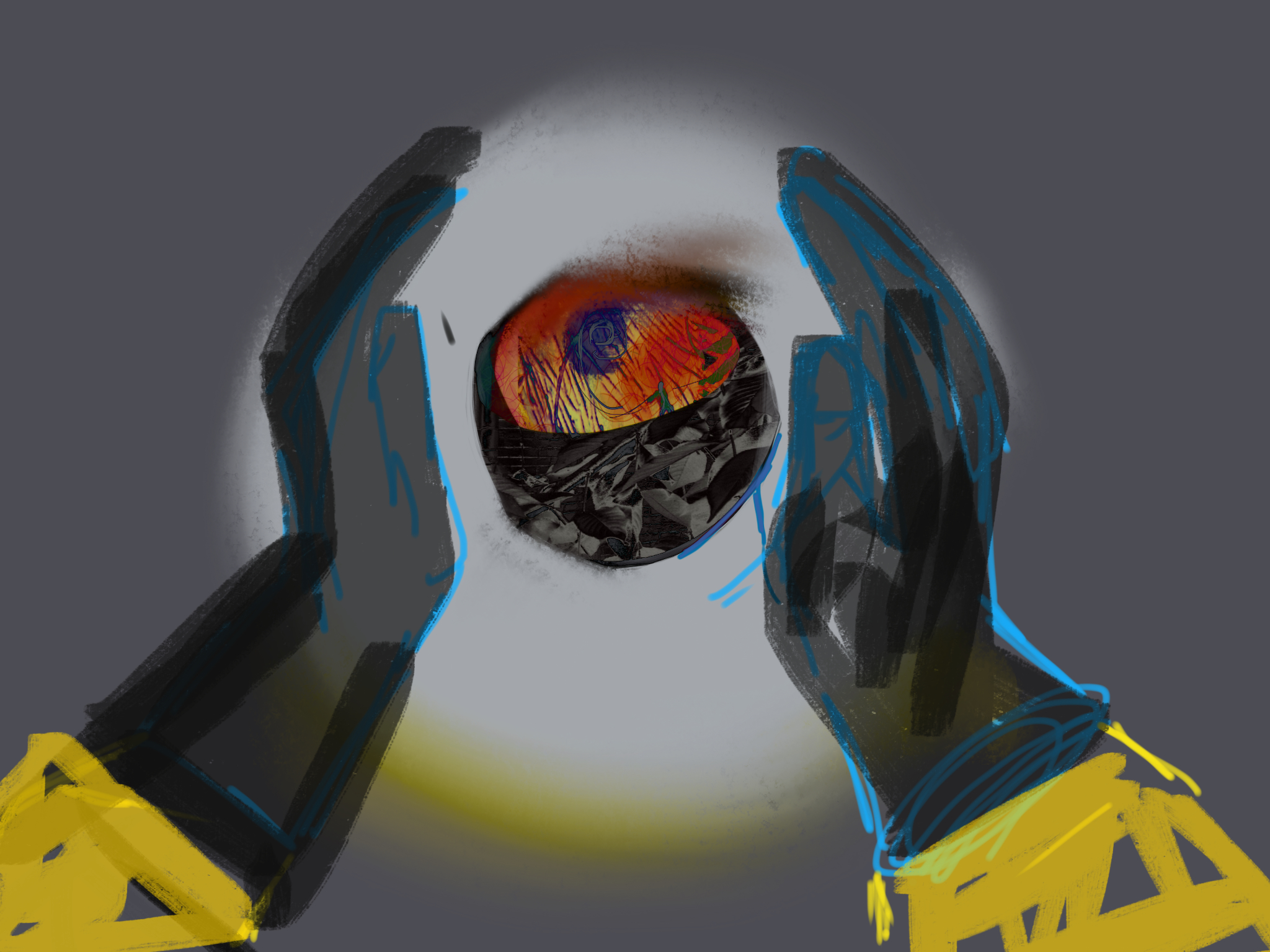
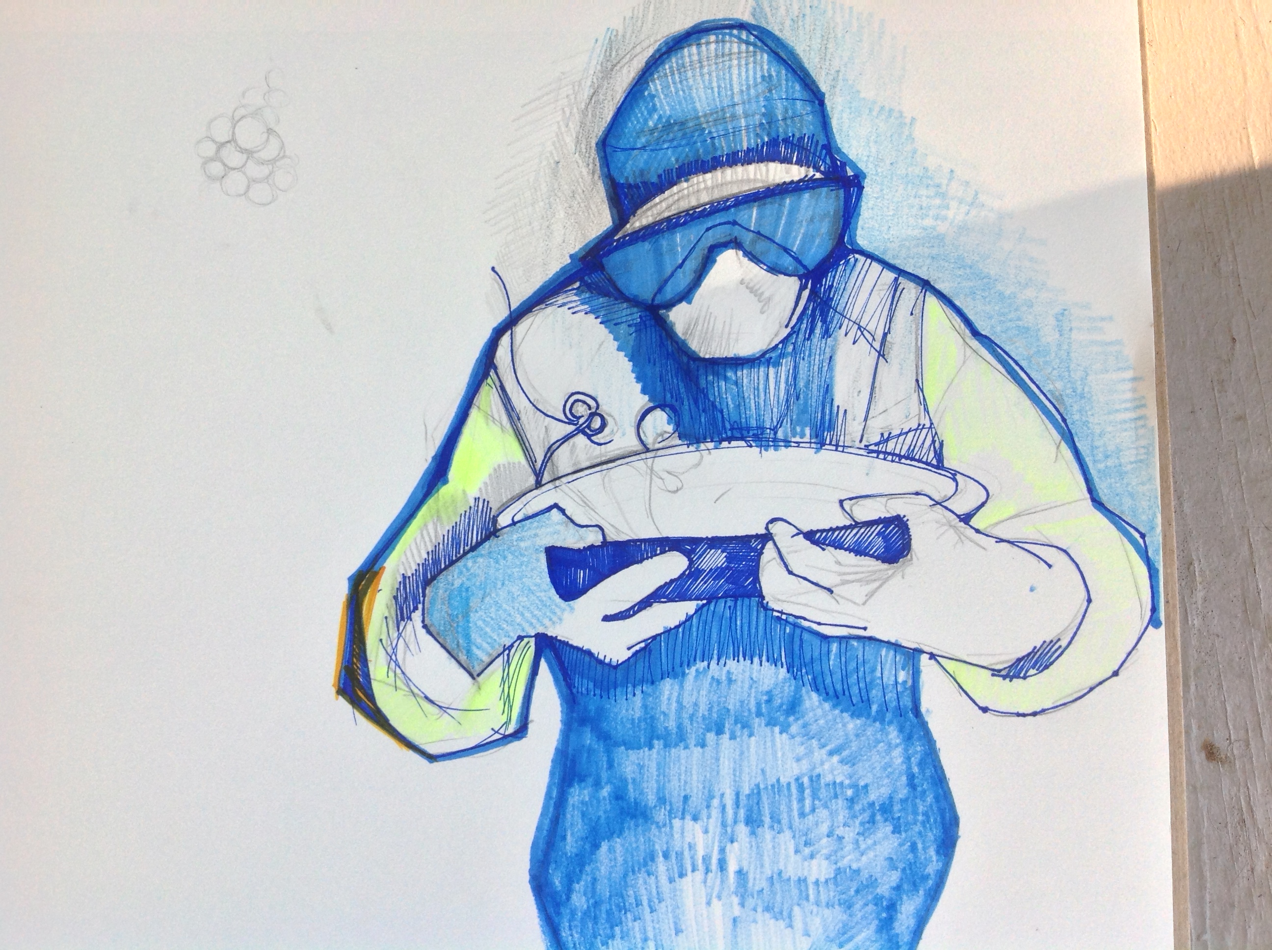
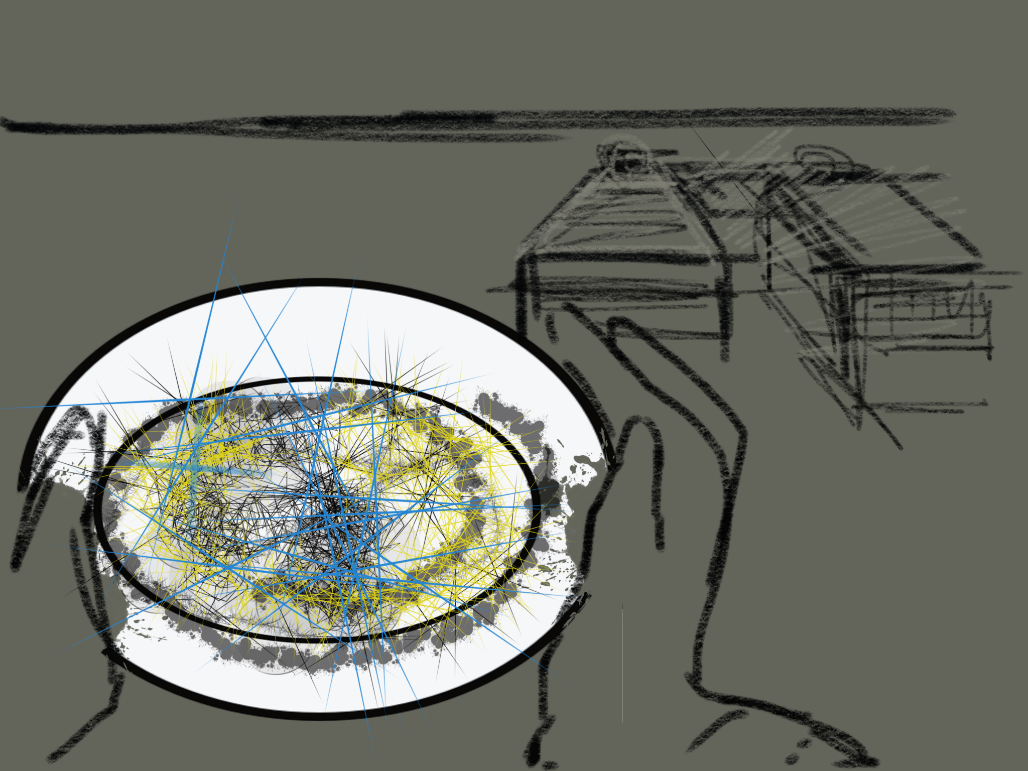
CHRIS: I love how skeletal the body is, and how that stripped away form is offset by the explosive energy of the space around it. And how the face of the medical figure is “masked” without using stereotypical superhero imagery, and how all of the body is covered and perhaps contained, which implies some other quality/identity inside. I’ve been analyzing the figure of the superhero as the product of two worlds, an idea I think your art is already exploring. The medical figure also suggests some immediate narrative possibilities. For example, I’m suddenly picturing a three panel sequence:
- aerial view looking straight down at the bowl so the rim is a full flat circle.
- pulled-back and slightly angled view so the bowl has three dimension as the figure’s hands (those are really cool hands by the way) enter the frame, about to pick up the bowl.
- the image you already created, straight on view, the mouth of the bowl angled so its content is obscured now.
So what’s inside the bowl? Something rendered in a different style maybe, something not of the same stylistic world as the rest of the panel, the fractal energy of the other images perhaps? Here’s a possible treatment:
The medical incarnation is always covered and masked. Underneath is her swirling fractal form that has to be contained or the character will disintegrate and/or release fractal havoc on the orderly world. I think stylistically she lives in a gray tone universe with sharply defined panels. Literally behind that world is the unframed fractal chaos background that she keeps contained under her medical covering. She is the literal opening into that world. Perhaps fractal elements can be glimpsed through her glasses, or in gaps in her clothes and mask. The fractals allow her to combat threats by combining with them.
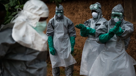
CAROLYN: So you might want to read the article I read. Just google New York Times Nurse and see a crying woman. There were also descriptions of young men who have stepped forward to dispose of the bodies. They are being ostracized by their families and communities for doing it. They can’t find places to live and sometimes they are not paid at all but do it because it has to be done.
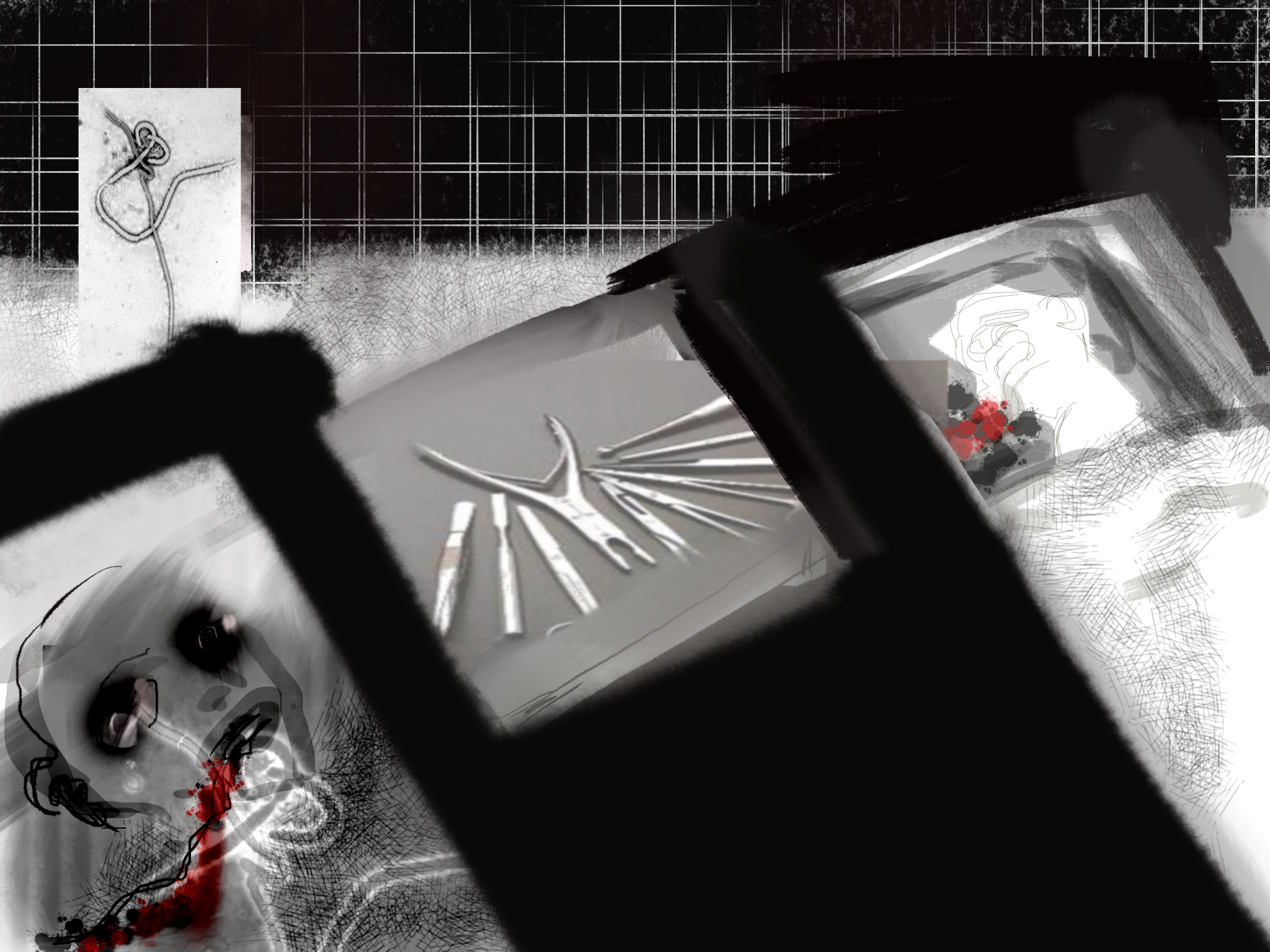
CHRIS: I can see how that would inspire you. And I understand that first image better. The trick is how to encapsulate the action, providing just the right number of panels. Too many and it’s redundant, not enough and the sequence is confusing. Plus the action is surreal, so more challenging to communicate clearly. Consider this sequence:
- a corpse dead from Ebola, represented with the superimposed Ebola cell
- a sick patient, also literally marked with Ebola
- medical figure enters carrying an empty bowl
- close-up revealing fractal elements through her goggles
- she removes a glove, exposing a fractal hand
- she lowers her hand into the bowl
- the bowl fills with fractals
CAROLYN:
CHRIS: “Oh man. That is creepy cool.
CAROLYN:
CHRIS: It’s interesting experimenting with how these could be sequenced on a page. It could be a layout with only three panels, or it could be the first three-panel row. Even the order leaves some possibilities, because all three images could be interpreted as aspects of the same simultaneous moment, with the gutter marking point of view changes. And yet there’s also an implication of time sequence as if the figure is moving toward the beds.
CAROLYN: So I will continue to play and then try to gradually get more serious about how they will fit together.
CHRIS: The fitting together part is something I know a little about, so I can be more helpful at that stage, while the insides of the panels is really all you anyway. So, yes, keep playing. I’m also still toying around with page layouts. This is my favorite so far:
CAROLYN: That layout looks great. Wow, I felt like These were just kind of preliminary get started pieces but they look pretty good. I am also interested by the way you have spliced them together to create a general story line.
CHRIS: “Yeah, narrative sort of happens by itself just through sequential juxtaposition. The preliminary quality of the images adds a narrative difficulty because baseline setting isn’t always consistent between panels, but that also adds something cool, and neither Les nor Mad had any trouble “reading” it and both come up with the same basic narrative. Here’s how Mad summed up the page one layout:
Scientist with bacteria in Petri dish, surgery gone wrong, scientist made something out of bacteria and a dead body, something not good, I don’t like him.
And Lesley agreed with the sinister quality:
A scientist is in a lab performing some sort of experiment in a Petri dish that involves some kind of nasty human experimentation and results in a magic orb thing.
So this looks like a bad guy up to something bad.
CAROLYN:

CHRIS: Totally different tone, and beautifully rendered. Because it combines a more realistic (is that the right term?) style with compassionate content, those two qualities are now associatively connected in contrast to the page one layout images which are more abstract and disturbing: abstract Dr. Frankenstein vs. realistic Nurse Healer.
CAROLYN: So if I am understanding you correctly this combination serves the same purpose as sinister music? Not really indicative of anything concrete but of something that is felt and alerts us to possible danger? So we need a real world situation colored by association with these images.
CHRIS: I like your connection to soundtrack. Yes, the sound of the imagery evokes as much meaning as the overt content.
CAROLYN: