Welcome to a second round of posts devoted to the artist Robert Binks. (The first series can be found here, and scans of his illustrations of poems by Ogden Nash are here.) During his half century as a professional cartoonist and illustrator, Robert Binks produced works of remarkable imagination, skill and charm. Now retired, he produces equally remarkable paintings and sculptures. We’re very happy to be presenting more samples of his work.
For this series of posts the artist himself chose the pictures and their order. Works done by Mr. Binks while on staff to the Canadian Broadcasting Corp. are © CBC/Bob Binks. His private works are © Bob Binks.
******

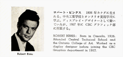
Robert Binks in his mid-30s, as presented in a Japanese graphic art magazine called Idea. The article appeared in 1961 and was about the graphic artists of the CBC, where Mr. Binks had been working for four years.
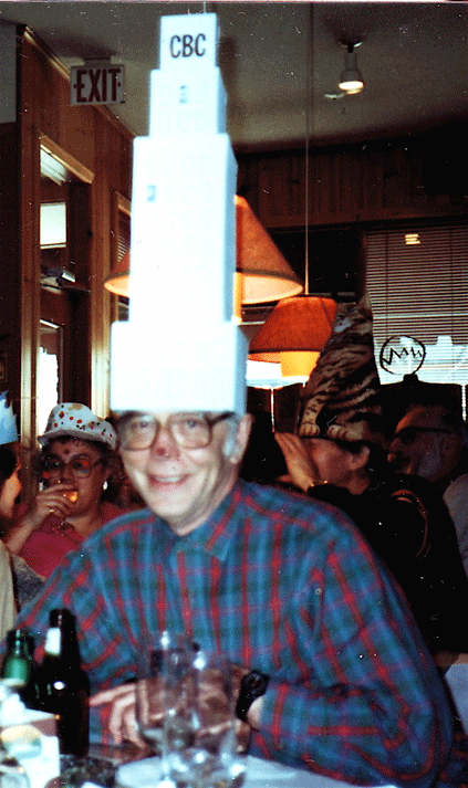
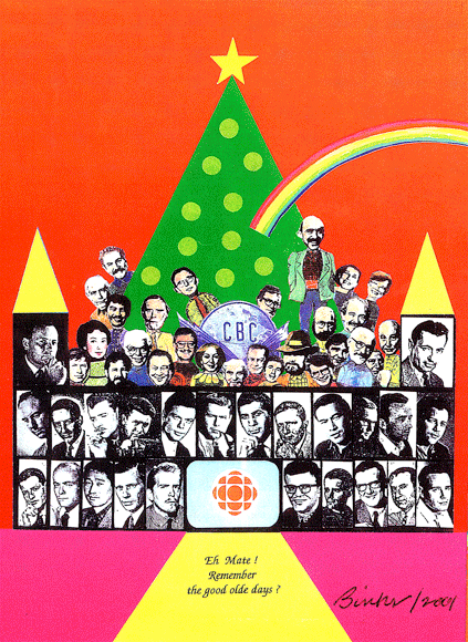
Below is a Christmas card, designed by Mr. Binks, that went out to active and retired CBC graphic designers in 2001. Mr. Binks himself had retired 10 years before, but he produced quite an extravaganza.

The photos are all of CBC designers. The black-and-white photos are from the issue of Idea mentioned above. You’ll see that Mr. Binks’ 1961 picture pops up just to the left of the CBC emblem. Of his CBC days, Mr. Binks recalls: “As designers we produced promotional slides, illustrated stories, title credits and animations. We were encouraged to be inventive and think outside the box.”
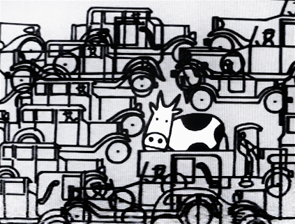
Now what can only be called a characteristic theme. Mr. Binks finds something funny about cows, especially cows that show up where they don’t belong.

The work above is from the project that got Mr. Binks started on the theme, an animation sequence for a program called All About Toronto. “In 1964 or so, back in the days of black-and-white television, I illustrated a story of a cow threatened by the bustle of the big city,” he wrote to me by email. “For this scene black line graphic cells were panned in opposite directions to create a busy traffic effect. To make the cow stand out visually, white cel paint was added.” (For more of Mr. Binks’ cow efforts, look at the posts here and here.)
I think the drawing is beautifully composed. The right-angled shapes and occasional rounded shapes and the patches of space and the busy parts — they’re all crowded together, but modulated and placed so that somehow they fit. The traffic’s busyness jumps at you, but there’s no jangle and your eye isn’t overwhelmed.
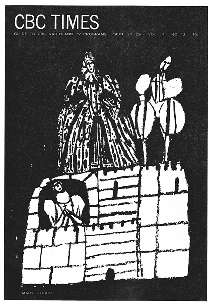
Below is a CBC Times cover depicting the CBC drama, Mary Stuart, Queen of Scots, circa 1961:

The late ’50s and early ’60s saw a lot of faux-naif treatments of high European art, or at least that’s my impression from album covers and theater programs of those days. This Mary Stuart is an especially nice example.
The picture is mocking but also wistful, a combination that I associate with such works. The figures here look like rag dolls locked into a high-vaulted drama that they don’t understand and that nobody else understands either. Mary Stuart emotes, hands clasped and head tilted. The Elizabethan gentleman sags and his head lists, as opposed to tilting. Elizabeth dangles. They’re all grouped around Loch Leven Castle, which is bone-white, and behind them is the black.
The drawing displays two traits that pop up in Mr. Binks’ work. There’s the patch of intricate patterning (Queen Elizabeth’s gown) and the block formed by repeated primary shapes (in this case, Loch Leven). Typically, the block seems to be pulling upward, as is the case here because of the way the shapes within the castle are arranged.
I think the arrangement of the castle’s shapes creates a grace note. The center pile of narrow rectangles abuts a pile of taller, bigger rectangles just to the right. The clash throws into relief the black gap between the two columns, and this gap acts as a line that runs straight up the castle to where Queen E’s foot is planted next to that of the listing gentleman.
To the left of the line, Loch Leven tilts away; to the right, the castle is a bit steadier. So the gap acts as a fault line, and the fault is elaborated on by the positioning of the two fgures. Queen E’s body tilts one way, the gentleman’s head and shoulders sag the other. Subliminally the two of them seem to be toppling away from each other. For what it’s worth, I find this effect underlines the sense of helplessness mentioned above. It’s part of the mocking undercurrent associated with presenting the high historical drama in a faux-childish way.
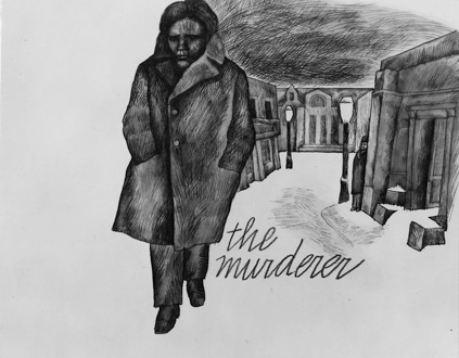
A promo slide graphic for a CBC drama, The Murderer, circa 1962:

The drawing is heavier than usual for Mr. Binks. “This graphic was done in an acrylic water color technique with India ink detail,” Mr. Binks wrote by email. “I was trying for a heavy dramatic feeling.” The characteristically lopsided, playful composition of the buildings takes up much less space than it normally would in one of his pictures, and the foreground figure, looking haunted, is broader faced and more somber than is typical of a Binks figure. The touch that looks most like the artist’s usual work is the popping out of the background figure, who is presumably on the main character’s trail.
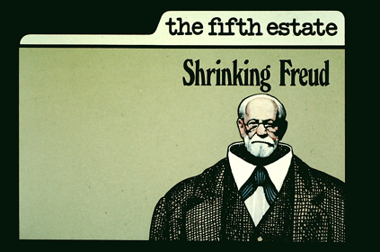
Next, from 1985, a background graphic used for The Fifth Estate, a public affairs program. On screen the host stood to one side of the image.

Shrinking Freud is an example of how Mr. Binks will sometimes play with the pride of place that normally goes to head or features. The eye falls inward from the giant collar and shoulders to find the miniature Freud head.
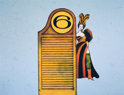
A subtler form of the trick is played by this station break graphic that Mr. Binks designed for Channel Six Toronto, a CBC television station, circa 1975. It shows a saloon door, a show girl and the station’s number. The 6 in its oval, planted atop a column, is like a face that turns out not to be a face; instead the only face in sight, also oval, turns out to be smaller off to one side:

The picture gives the viewer’s eye a strong anchor because the saloon door and show girl, standing side by side, form a vertical block that firms up the center of the picture. But at the same time that block is full of stylistic mismatches that somehow liven up the eye. They’re tricks similar to the head switcheroos mentioned above.
For example, the tight, horizontal rectangles in the door pull away from the big oval at its top, and the number itself is both prominent and a bit too high up for the eye to fall on it comfortably.
The number’s curves and the curves of the woman’s feathers are close together and therefore link up. But the number’s curves are horizontal and the feathers’ are vertical, so the two sets of curves pull against each other. And the feathers themselves push away from each, one set pointing left and the other right.
The symmetry of the feathers’ two arcs bounces against a lopsided echo further down, where a hulking set of curves (the woman’s dress) pushes off to the right.
As noted, these discordancies stimulate the eye instead of baffling it. But why that is I cannot say.
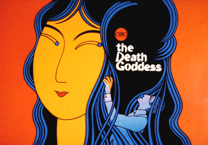
Circa 1982, a promotion graphic for a CBC drama, The Death Goddess. Mr. Binks writes “I used a photographic clear cel with black detail.”

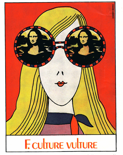
Here’s a non-CBC work. In the mid-1960s Mr. Binks freelanced this illustration for Chatelaine magazine. He describes the subject matter as “a young woman’s first solo trip to Europe.”

As with Shrinking Freud and the Channel 6 promo, there’s a disrupted face at the center of the drawing. Which is a heavy way of talking about a charming picture, but bear with me. Where the girl’s eyes should be, she disappears and one of the most famous faces in the world looks back, but miniaturized and doubled.
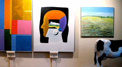
Finally, three of Mr. Binks’ post-retirement paintings, all displayed in his home. The right-hand painting and the accompanying cow sculpture were combined by Mr. Binks into a work called “Cowgratulations,” which can be seen in the post here.

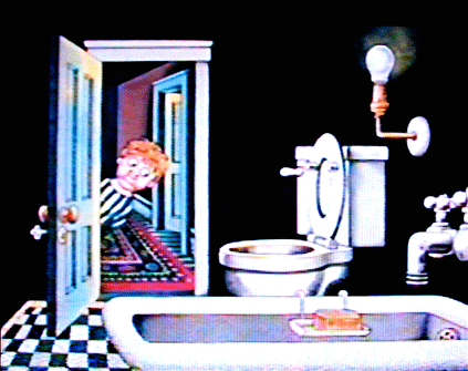
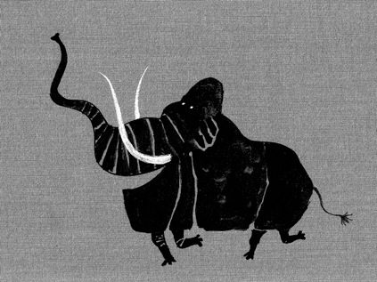
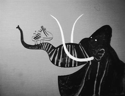
Next week: a black-and-white mastodon and color animation sequences about a fairy tale cat and the frightening beliefs of childhood. Be there!

