When I first came to live in New York City in the early 1980s, I worked for a while as a low-paid xerox temp at the World Trade Center. It wasn’t a job I loved. The WTC elevators were unnerving, the vertiginous stairwells even worse and both towers swayed perceptibly in the wind—and I wasn’t overly thrilled with my fellow laborers, at least not with the male “suits” who tended to elbow past the female workers to direct me to do their copy orders first. But in my off-time, I managed to do a little surreptitious production, of several street posters for bands and of art that would find its home in my roommate Seth’s then-new political comics zine World War 3 Illustrated—and also to print a few minicomics (well, I didn’t call them that, but that is what they were), which I consigned to St. Mark’s Comics for a dollar or two. I was eventually fired for serving secretaries before executives and after the WTC blew up the first time, I never went near the place again. That was the end of minicomics for me for some years.
A few weekends ago, I roadtripped with several cartoonists to Bethesda, Maryland for the Small Press Expo (SPX). Besides my usual occupation of Tom Kaczynski’s Uncivilized Books table to flog the ebbing supply of my collaboration with my son Crosby, Post York, I was there to debut my minicomic called “Daddy” written by the very, very scary Josh Simmons and published in two colors by Oily Comics. Also, I wanted to be present for the premiere of the print magazine Study Group #3D, for which I contributed a way-too-personally revealing essay/comics adaptation of a William Burroughs piece, a project that had its genesis in an aborted posting for this site. And these things I did do.
SPX resembles the MOCCA Festival and Comic Arts Brooklyn in that like them, it is bereft of the fetishistic superheroes that taint the American mainstream comics industry and also of the Hollywood movies, wrestlers and porn stars that tend to drown out comics at mainstream ComicCons. SPX and other alternative/literary comics gatherings are comprised of people who do comics apparently for the sheer love of the artform rather than to advance obviously mercantile impulses. A significant percentage of the audience at these shows is comprised of the vendors, who patronize each other and form mutual support networks. A good part of the product of these shows are minicomics, quite small xeroxed or offset pamphlets much like the ones I made at the WTC, but often printed on a copier called a risograph which allows for multiple colors. Occasionally, these budding talents will print a comic book “floppy” in full color on slick paper just like the slick output of DC, Marvel or Image, but the effect of alt/lit concept in mainstream drag can be disconcerting. As well, many publishers seem to do well with small prints, limited edition silkscreen booklets and also, many surprisingly young artists have completed graphic novels in a variety of styles, genres and formats.
Lord knows that I held back from long-form efforts for many years—I preferred to hone my skills in short stories. However, publishers balk at anthologies these days. “They don’t sell” is the mantra they chant, despite a comics history that includes such anthology “failures” as decades of romance, war and horror comics at many publishers, all of E.C.’s output including Mad, Warren’s Creepy, Eerie and Vampirella, Zap and other underground titles, Heavy Metal, Weirdo, Raw, MOME, Kramer’s Ergot, etc…in other words, many publications that not only sold well for extended runs, but moved the artform ahead. So people are expected to labor for years in isolation (since the default mode in the alternative is for cartoonists to work solo as auteurs) to make 100-page-plus books, for which they have few sounding boards and little or no income in the process.
At any rate, after an period spent in the mainstream in which I drew a few long books but under restrictive circumstances and unhappy with the results, I have forsaken page rates to regain control over my work. In order to immerse oneself in this brave new world of long or short literate art comics for the small press, one needs to frequent shows like SPX, and of course being who I am, I feel the need to share the details with everyone. And so, I present the following set of minireviews of minicomics and books, which represent but a fraction of what I came back with from my trip to Bethesda.
_________________________________________________________________
It Never Happened Again: two stories by Sam Alden
Uncivilized Books $11.99
I didn’t buy the book by this young cartoonist that won the Ignatz award at the show, Wicked Chicken Queen from Retrofit, but I got two of his earlier efforts, Haunter from Study Group and It Never Happened Again from Uncivilized Books. Both books have an improvisational feel; the bright yet moody watercolors of Haunter carry a large part of the impact of the narrative and the sweet and loose-appearing, but apparently lightboxed, pencil drawings of It Never Happened Again provide atmospheric effects that enhance the delicacy of Alden’s stories.
_________________________________________________________________
Houses of the Holy by Caitlan Skaalrud
Uncivilized Books $6.00
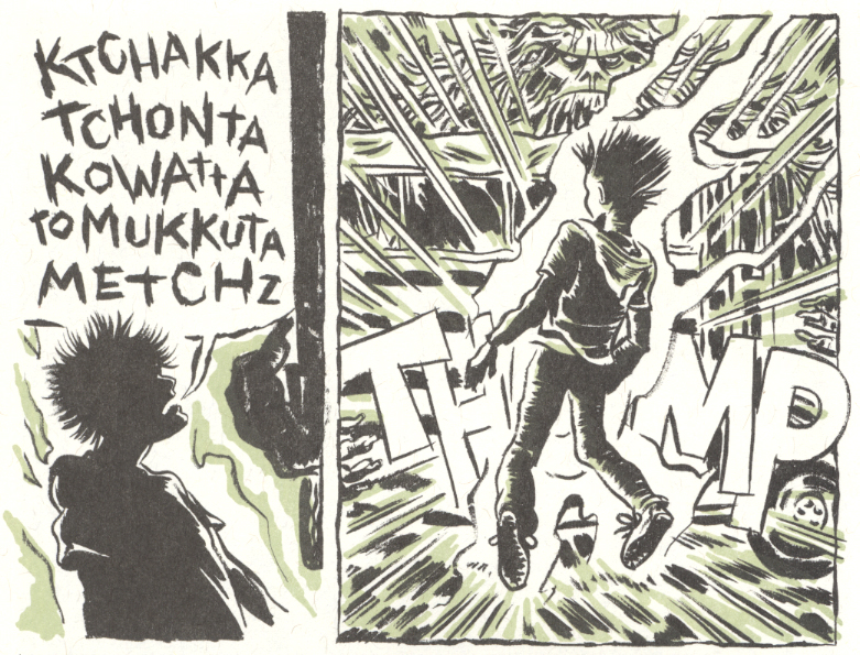
This mini is made up of a series of full-page, nicely rendered surreal drawings accompanied by poetic snatches of text and punctuated by regularly-paced numbered panels. They tell an oblique narrative that despite its title, doesn’t seem to have anything to do with Led Zeppelin. It is a dark fever dream, sort of on the order of The Cage, Martin Vaughn-James’s nightmarish masterwork that was recently reissued by Coach House Books. Tom K tells me that the artist of Houses of the Holy was an outstanding student of his at the Minneapolis College of Art and Design and that this is an excerpt from a much longer work that Skaalrud has in process. Uncivilized Books will publish it upon completion and I will be anticipating it.
_________________________________________________________________
Reptile Museum by Cody Pickrodt
RayRay Books #2: $4.00 #4: $2.00
Cody Pickrodt’s post-apocalyptic saga Reptile Museum reflects the artist’s knowledge of martial arts and his effective storytelling is comprised of pages that take the form of fluid series of free-hanging vignettes. The precise lines and rubbery high-speed physicality of Cody’s comics remind me of nothing so much as the frenetic crime stories of the tragic Plastic Man creator Jack Cole.
_________________________________________________________________
Eye Sees Eye by Kate Lacour
self-published $8.00
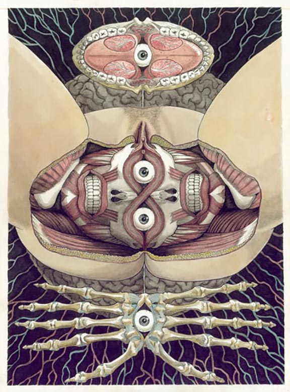
One of several people who felt the need to inform me of how fucked-up they found “Daddy” to be (I’m totally aware of this and in fact, it is why one would work with Josh Simmons!), this artist came to the Oily table to eyeball me and give me a creepy body-revulsion pamphlet called Hole/Human. Later I passed by her table and examined this book. I didn’t buy it, but it has stuck in my head enough to include it here because it reveals Lacour to be quite accomplished; her anatomical renderings are striking.
_________________________________________________________________
Little Tommy Lost by Cole Closser
Koyama Press $15.00
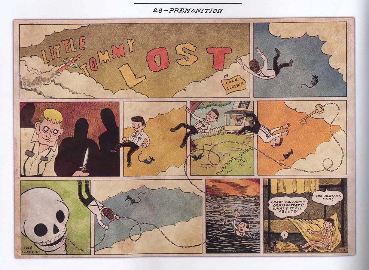
I got a copy of this at SPX, but I had perused it earlier this year when I was an Eisner judge. It ended up as a nominee and deservedly so: Little Tommy Lost replicates the look and tone of clippings of a daily/Sunday strip from the late 1930s quite beautifully. The story of abused urchins does seem as if it might well have been someone’s grampa’s favorite serial strip, now lovingly preserved for posterity.
_________________________________________________________________
Jesus Christ, Jared! by Rainy
self published $10.00
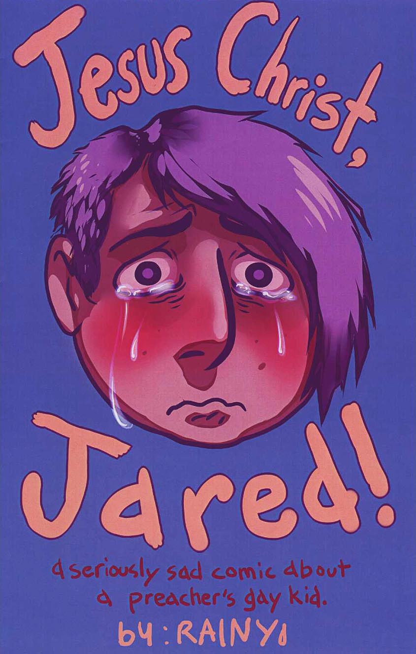
This comic is an example of slick printing applied to alternative content to odd effect, but the cover is a compelling use of Photoshop. Of course I am known to be not much of a fan of digital color; still, if it must be done, let it be used to render tears in such an extremely visceral way! The comic is a highly emotional reaction to the persecution of Middle American gay youth by fundamentalist Christians. It is disconcerting to see teenagers who are drawn to look otherwise hip ostracizing the protagonist for furthering the “gay agenda.” This also reflects a phenomena that I saw at SPX that I hadn’t noted at previous comics events: a preponderance of overtly LGBT participants who are finally welcomed to this most intimate and personal of mediums. Rainy and her also talented partner F. Lee positively glowed at their table. SPX’s aura of inclusivity was extended when later, the Ignatz awards ceremony was officiated by a host in drag.
_________________________________________________________________
Fuff #9 by Jeffrey Lewis
self published $2.50
I first met Jeffrey Lewis in the early 2000s, when he would visit my partner Marguerite Van Cook and I in our old studio in our building’s basement, a refuge that we lost when our landlord freaked out after 9/11 and decided that restaurants were preferable tenants. Even then, Jeffrey’s work had a fully developed sense of place and he would draw some of the most carefully-rendered buildings in comics. In the time since, Jeffrey has stayed the course to produce one of the last standing alt floppy comic books Fuff, while simultaneously pursuing a healthy career in music with his band The Jrams. His strong grasp of the urban landscape is on display, as well as an acute ability for self-caricature, as in the current issue wherein he engages in pitched discourse with his drawing table and imparts the complexities of his love life, in the grand tradition of revelatory alternative autobiographics.
_________________________________________________________________
It Will All Hurt #2 by Farel Dalrymple
Study Group Comics $8.00
Farel Dalrymple was selling the original art for his First Second book The Wrenchies at SPX and they are very pretty efforts indeed, complete in ink and watercolor. It Will All Hurt is a floppy edition of his ongoing webcomic at Zack Soto’s studygroupcomics.com, also executed in watercolors, but with a very extemporaneous storyline. Farel also did the art for a few of the most effective issues of Brandon Graham’s version of the Rob Liefeld Image Comics title Prophet, or at least I found them so; my feeling is that kids would totally love to pour over these comics again and again, each time finding new details in the densely packed pages.
_________________________________________________________________
Titus and the Cyber Sun by Lale Westvind
self published $7.00
I’m beginning to see other young alternative cartoonists who, like Dalrymple, are not afraid to use the trappings of science fiction and fantasy, as can be seen in the success of Prophet and other genre-ish efforts. The more recent books of Lale Westvind are in color; those brought to my mind something of the psychedelia of Victor Moscoso, but I was mainly drawn to her black and white comic Titus and the Cyber Sun, which in its ornate stipplings is reminiscent of the French cartoonists of Metal Hurlant and the underground works of the seminal graphic novelist George Metzger.
_________________________________________________________________
Captain Victory #2 by Joe Casey, Nathan Fox, Michel Fiffe and Brad Simpson
Dynamite $3.99
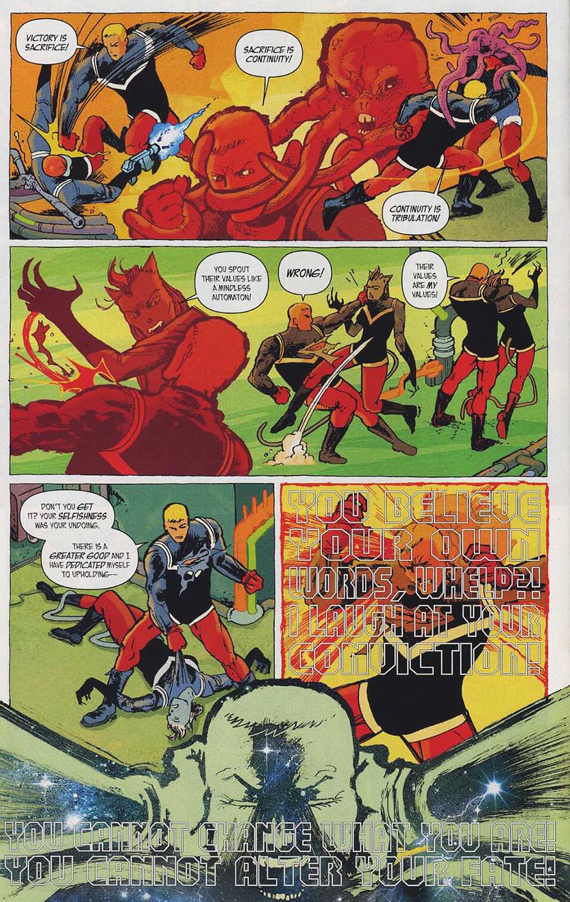
This isn’t a minicomic or even alternative per se, but it is a continuation of a title begun by Jack Kirby in the early 1980s for a fledgling publisher, Pacific Comics—-that just as I was making my little minicomics at the WTC, literally began the direct market in comics that led to the scene I am describing here—and Captain Victory was the final significant expression by that great cartoonist and brilliant founder of so many comics concepts, as I wrote on this site here. An earlier revamp of the title by Dynamite appeared a few years ago, but it was a cheesy regurgitation of Kirby overwhelmed by what I would term “rainbow unicorn barf” art by Alex Ross and others. This slick new version also seems a rehash of Kirby’s ideas, but the art this time out is done in a vigorously explosive fashion by SVA illustration czar Nathan Fox, working in tandem with some of the alt/lit scene’s more adventure-comics-oriented talents such as Jim Rugg, Ulises Farinas and (pictured) Michel Fiffe, maker of the popular sci-fi series Copra.
_________________________________________________________________
Middle School Missy by Daryl Seitchik
? $3.00

I’ve found Daryl’s Oily Comics work to be very amusing and well-drawn; this particular issue of her title Missy doesn’t name its publisher, but it manages the neat trick of being both slick and a minicomic at once! I wouldn’t be surprised to see her rolling in bucks like Scrooge McDuck after Missy becomes one of those edgy, not-really-for-kids animated shows on TV at some point.
_________________________________________________________________
Comics Workbook #5
Comics Workbook $1.00
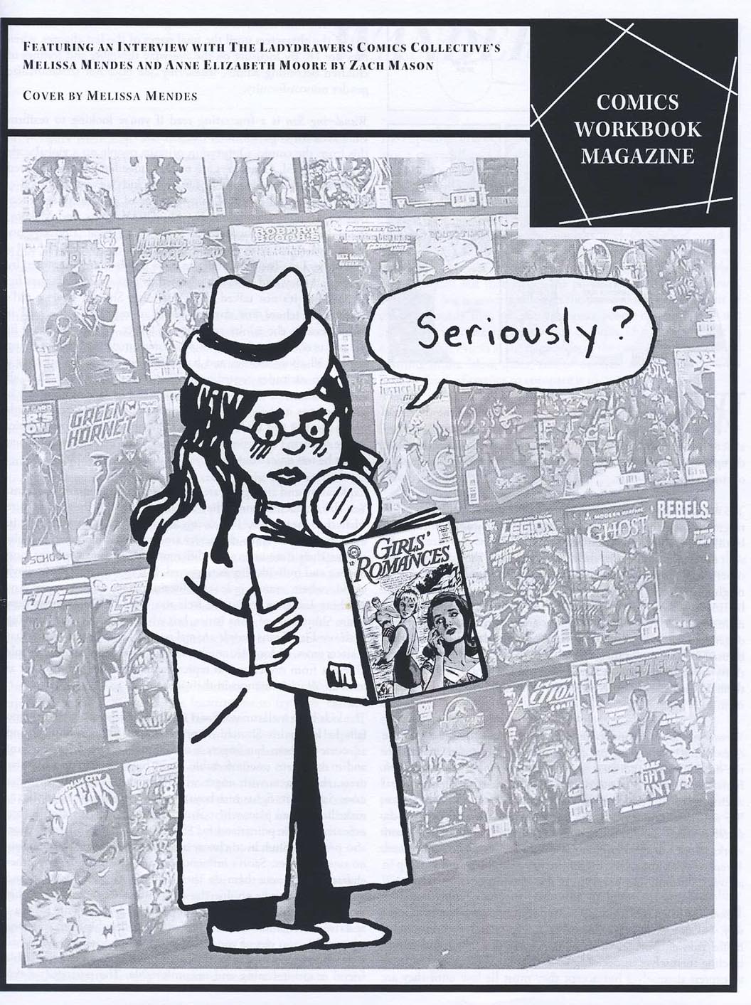
For five bucks, I was able to buy all five issues of this fascinating interview zine, which incidentally resembles my only other self-published effort, the xeroxed zine Comic Art Forum from the early 2000s that I produced with Marguerite. Comics Workbook is a by-product of Frank Santoro’s comics-making classes. The various issues include conversations with Sam Alden, Dash Shaw, Lala Albert and others as well as original comics by Derik Badman, Sarah Horrocks and more, plus articles and reviews by Warren Craghead, Nicole Rudick and the list goes on. In particular, I enjoyed Zach Mason’s exchange with “Ladydrawers” Melissa Mendes and Anne Elizabeth Moore about nonfictional activist comics. I also appreciate Melissa’s poignant Oily production Joey, which details a parental disruption and its effect on the children involved; the art is finished in watercolors and the book looks to be printed by color laserjet, pressing the limits of the minicomic format.
_________________________________________________________________
The Tiny Report: Micro-Press Yearbook 2013 by Robyn Chapman
Paper Rocket $3.00
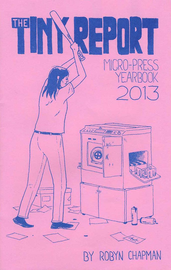
Unfortunately, I missed all of the panels at SPX and I especially regret not seeing artist and Paper Rocket publisher Robyn Chapman’s presentation about micropublishing, but her Tiny Report (cover above by Chuck Forsman) provides a well-organized orientation to the world of small press comics and independent publishing. Robyn rode back to NYC with us and so I was able to quiz her on the way about what is perhaps the most serious issue facing micropublishers today: distribution. Diamond distributes most mainstream comics, but they refuse to carry a lot of smaller publishers’ books, which makes their stranglehold on the business look monopolistic. In NYC, for instance, it seems that in Manhattan, minicomics and other products of the alt/lit scene are only carried by Forbidden Planet, Jim Hanley’s Universe and Carmine Street Comics and in Brooklyn, only Desert Island and Bergen Street Comics. Those are distributed mostly by the apparently overextended Tony Shenton. It sure looks from here like there is a void to be filled by some enterprising distributor, given the vitality of the micropublishing scene.
Some of the biggest mainstream comics publishers do not use Diamond for bookstore distribution of their graphic novels and collections; for instance, both DC Comics and Dark Horse have deals with Random House. More recently, the book trade distributor Consortium Books has been placing the graphic novels of alt/lit publishers Uncivilized Books and Koyama Press in major book retailers around the country—and the word is that the British artcomics imprint NoBrow and Françoise Mouly’s Toon Books have now joined with Consortium, which ups the ante somewhat.
_________________________________________________________________