I’m Lost: Path-Finding in Comics

I’ve never mastered the art of moving from one panel to the next. When I reach the end of a panel, I am pulled in multiple directions and clumsily leap towards whatever I feel is closest. Often I am forced to read for context and then sort out which panel occurs first in the sequence, like listening to a skipping CD and trying not to lose the beat.

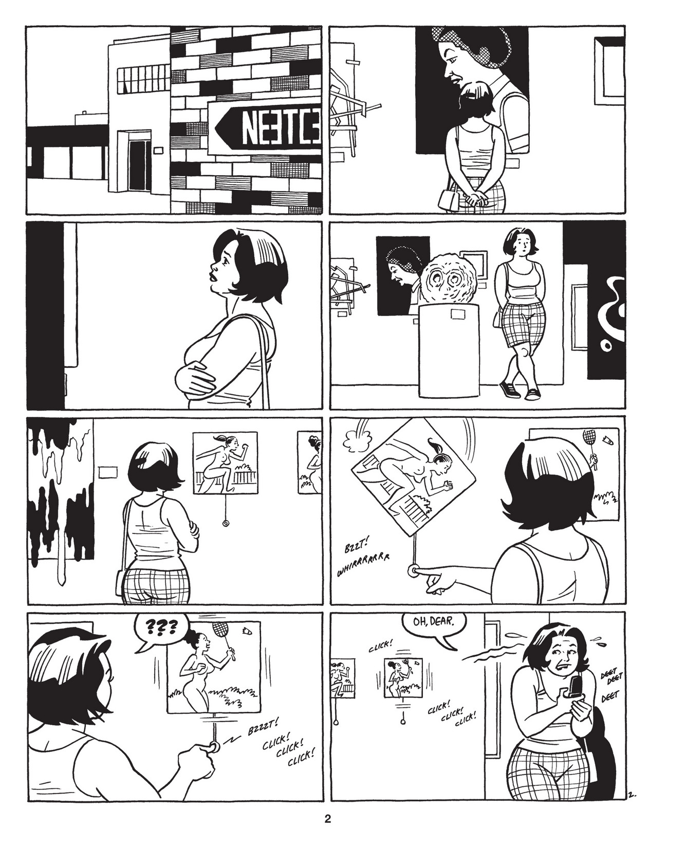
love bunglers

It’s impossible to get lost in Jaime Hernandez’s Love Bunglers.

 
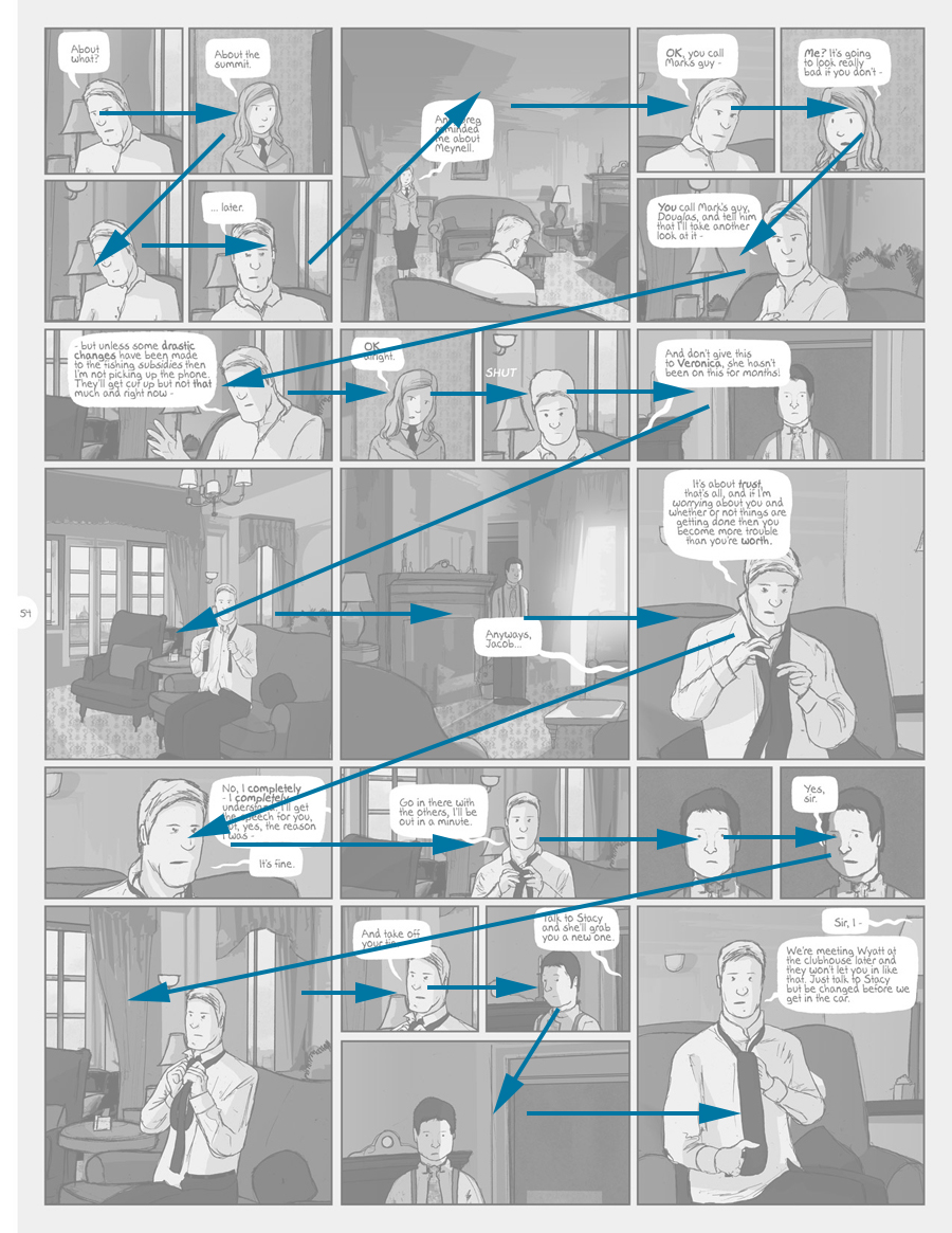
Not all comics are equally challenging. I appreciate the sturdy 2 by 3 layouts in the work of Chester Brown and the Hernandez Brothers. In these comics, the panel design disappears, much like the word “said” disappears in literature. On the other end of the spectrum is a book like Adam Hines’s Duncan the Wonderdog, in which I felt like I was constantly losing my way in a forest of nearly identical panels.

0054 - Jacob and Vollmann 2

Duncan the Wonderdog by Adam Hines

 
Each time I misread the sequence of panels, I experience a temporal hiccup in the flow of the story. It is not the foresight into the future that one gains from glancing at the bottom of the page, but a jarring experience of learning that something you have already witnessed has not yet happened.
 
ware

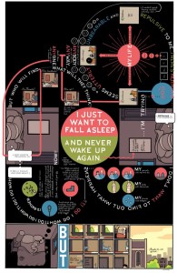
Building Stories by Chris Ware

Recently, while reading Chris Ware’s Building Stories, I found myself completely ignoring the path that he had imagined. Instead of a narrative progression, I read the pages as clouds of remembered moments, letting each fall into place in due time.

But what if an author embraced a more fluid, path-dependent story-telling style?

path dependent

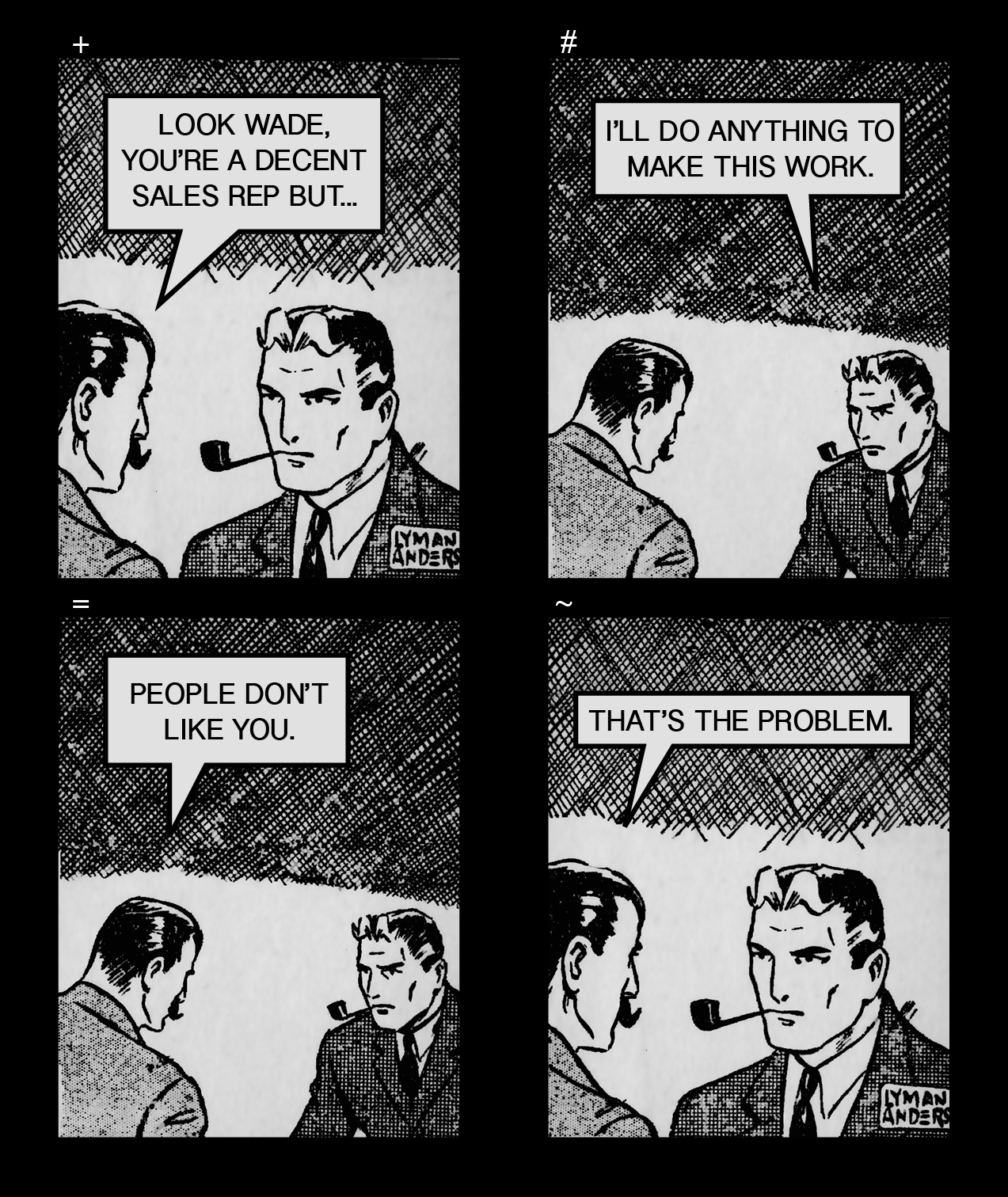
Image of path dependent comics: By Orion Martin

Art by Lyman Anderson

By traditional rules, the comic would be read in rows, +#=~. However, it can also be read in columns (+=#~) for a compatible, but different, meaning.

It seems bizarre to structure a page layout in multiple ways, but I’ve found some comics that can be read multi-directionally with only mild discomfort. Has anyone seen this technique used intentionally?

What’s In the Wonder Box

It’s very likely that Chris Ware’s Building Stories will be the most publicized alternative comic release of 2012. Like Habibi last year, it will be one of the few comics that the larger public will hear about, and will be encouraged to read.  NPR’s Glen Weldon thoughtfully reviews it, concluding that it “is beautiful.”  The Telegraph announces, “his new book, if one can call it that without being reductionist, is a work of such startling genius that it is difficult to know where to begin,” and that “Ware’s latest offering has elevated the graphic novel form to new heights.” EW’s Melissa Maerz gives the book an A+. Sam Leith, an author, journalist and occasional critic for the Guardian, relates, “There’s nobody else doing anything in this medium that remotely approaches Ware for originality, plangency, complexity and exactitude. Astonishment is an entirely appropriate response.” The New Yorker, in which Ware regularly contributes and in which an excerpt of Building Stories has been published, declared its release a “momentous event in the world of comics,” contextualizing the event in a way that’s hard to put a finger on. So is a ‘momentous event in the world of comics’ news or not? Required reading?

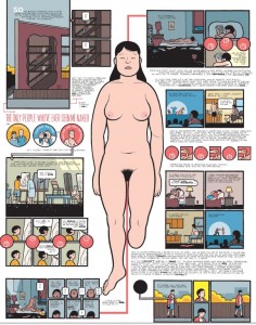
Building Stories will probably top bestseller charts for comics until Christmas, but it’ll still be a hard sell, even with reduced prejudice toward comics. Reading comics takes a lot of effort for those unaccustomed to it, and is a little ironic, considering comics’ association with instructional and children’s literature. And when a typical page looks like this:

On the other hand, the intense stylization and design of Ware’s work could make it easier to grasp what is “impressive” or “extraordinary” about it– no critical vocabulary or understanding of the comics medium is needed to “get it.” Still, picking up a Graphic Novel is an intellectual adventure for most people, and while they can be quicker reads, for an infrequent comics reader, Building Stories seems to require an intimidating amount of time and energy to absorb and reflect on.

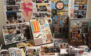
On top of that, Building Stories isn’t really a book as much as a box containing 14 intertwining narratives of varying length and form.

Photo courtesy of Julien Andrews and The Telegraph

It resists straightforward reading or easy transport. This could make the work even more daunting if it were to be consumed as a commute or a relaxing read. Except that it won’t be– Ware’s Building Stories rewards the casual reader’s belief that reading good comics is an experience worth having every now and then, but not a habit that can be integrated into one’s regular routine. Rather than challenge his audience’s preconceptions of the value of comics as something to build into one’s day-to-day, Building Stories reinforces the idea that worthwhile comics are blue moon events, and reading them is a temporary interruption in normal behavior.

In Building Stories’s defense, Ware champions the survival of print, and active reading habits. Building Stories is untranslatable to an ereader, and asserts the value of a book as an art object to be physically experienced and actively engaged. Building Stories also blurs the boundary between ‘comic books’ and the field of ‘artist’s books’ and ‘book arts’– this could be a post in itself, but still worth noting here. However, its worth wondering whether comics are already seen more as objects than vehicles for content, and whether their objecthood (and collectability) is supported by the American marketplace and culture.

Additionally, the publicity of Building Stories helps comics as a field more than it hinders it.  If more exceptional works are publicized, its harder to assume that they are only exceptions in an undistinguished industry.  Still, for most, reading a comic is an eccentricity, a curiosity, a ‘novelty,’ and the format of Building Stories plays into the sense of gimmickry that infrequent readers bring to reading comics.  If the merit of reading comics lies in the strangeness of doing it, why not make the experience increasingly elaborate and fanciful? As the form eclipses the content, mediocre storytelling runs the risk of being excused due to unfamiliarity or low expectations of comics in the first place. Fittingly, novelty is central to Ware’s work: ragtime aesthetics, and turn of the century advertising and consumerism abound throughout Building Stories and his career. Perhaps some of his success lies in his work’s resonance with occasional reader’s nostalgic, fanciful approaches to comics, evidenced in most press coverage of releases.  It’s worth noting that lifting the cover of Building Stories isn’t unlike opening a game box, or a trunk of childhood artifacts.

Beyond that, Ware presents a cabinet of curiosities, a wunderkammer. Its fragmented form compliments the fact that it follows several character’s perspectives, but is it overkill? Derik Badman wrote a few illuminating meditations here, including, “The narrative itself is already quite non-linear, most of the ‘chapters’ include movements through the time of memory/recall, and I think something of the protagonist’s story (and the emotional impact of it) is lost if you end up reading the later parts before the earlier parts (chronologically speaking).” On the other hand, the contributor’s to The Comic’s Journal ongoing, laudatory roundtable find the effect “sublime,” ” a kaleidoscopic vision of simultaneous human frailty and possibility”, “aspires to a graphic novel on the scale of James Joyce’s Ulysses,” and maybe most observantly, “showcases the comic medium itself by including representative examples of all its sundry forms: comic books, mini-comics, newspaper comics, chapbooks and picture books.”  Building Stories evades critical readings on its overall pacing and structure: these decisions are left up to the reader, who likely chooses what to read by chance. Without skimming the pages in advance for certain visual clues, (including Ware’s recent adoption of a Clowesian and somewhat creepy drawing style,) it’s hard to predict what each booklet will hold, and many events are revisited and re-evaluated as the main character ages. There are moments of poetry, and some great easter-egg moments as one stitches sequences from different volumes together (if that’s a motivator.)  Finally, a linear reading may not be the best– the later chapters of Building Stories are wearingly over-narrated, and would be a tedious way to finish the story. Building Stories as a whole is a very uneven work, and the question remains as to whether the box of stories approach enhances the material, hinders it, or if it simply cloaks the fact that, after a decade of waiting, this may not be Ware’s best work.

It’s probably unfair to say that Ware is invested in non-habituated comics reading any more so than Pantheon, crafting fetishistic, beautifully awkward and expensive book formats. But, isn’t every comics publisher following suit? Building Stories is a collector’s item by nature, and its multiple readings  will probably benefit multiple re-readings– a perfect and decorative addition to a home library collection, alongside Habibi and deluxe reprints of Prince Valiant and Pogo.

On the flip-side, the format of 2012’s other heralded release, Allison Bechdel’s Are You My Mother?, is hardly experimental, but perhaps more revolutionary considering comics industry’s focus on ‘the object.’  Interestingly, Are You My Mother? embraces a lot of qualities that made comics popular in the first place. As a pretty standard book, Are You My Mother? is expected to speak for itself, and it can easily be read at one’s convenience, and in public, (which matters more to some than others.)  Historically, as collection eclipsed disposability in the American market, comics’ status as an ‘object’ was magnified.

It’s possible that, despite comics’ greater acceptance as ‘literature’ than as ‘art,’ the industry is at a crossroads as to whether to pursue an ‘art object’ or ‘literature’ route. Building Stories exemplifies the former path, while Are You My Mother? follows the latter. Each route bears repurcussions for comics consumption, several of them class-based. In the United States, students are expected to graduate with some familiarity with a handful of great works, and their history, and to learn basic critical frameworks to apply to other books. Art, when not nixed from the curriculum altogether, is taught more often as a practice rather than as a history and theory. Those who learn about art are often those who can afford to, or do so at the expense of lifetimes of loans. Literature is transportable, and can fit itself into a variety of lifestyles (long bus and subway rides, for instance.) Art, focused as it is on physical, singular presences, (not duplicates,) must be approached in certain institutions, during certain hours. As a consumer, only the wealthy and initiated can participate in the collection of ‘the masters,’ while a paperback of Dostoevsky will not be less authentic than the leatherbound edition. The leather-bound is preferred when the discussion veers from literature to a subset of art collection– rare book collection. The repurcussions of Building Stories extends farther than just gimmickry, but also those of privilege. Purchased at a bookstore, Building Stories is a fifty dollar book. Will libraries, which have done so much to make comics available to the public, easily be able to loan it? And why resist digital reading? With the advent of e-readers, color comics can be as cheap to publish and as easy to find as a text book– one less hurdle in their production and accessibility. It’s worth crossing one’s fingers that, in its resentment of art-world prestige, comics will avoid enviously replicating the worst aspects of fine art. Bart Beatty’s Comics Versus Art delves much more fully into this idea– and is very much worth the read.

Perhaps making an experimental box of comics is truly an elevation of the form. Perhaps other visions of comics readership, where a handful of comics, both brilliant and bad, are sprinkled around the e-reader screens of a commuter car, is wishful, or unnecessary, (or found only in Japan.) (Apologies for the USA centrism of this piece– unfortunately, it will continue to the very end.) Comics may have a nice niche here in the States– the rare, quirky read for some of most people, and objects of obsession for few. But is there something urgent, something missing, that comics can bring to wider culture? Something that books and film and music or any other medium can’t or won’t contribute, that comics uniquely can? Something that is needed, and should be as accessible as possible? Would it matter if comics became more prevalent than they are– that comics became more accessible than inaccessible?  Those outside the industry may not care one way or another– they are probably waiting for comics to answer for that.

Flowers for the Smartest Kid on Earth

Excepting perhaps those of Metallica and Ridley Scott, there are few career arcs in recent American popular culture (an association he would despise) whose plummets have felt as sickeningly steep as that of Chris Ware. Ware more so for me, as a proto-budding comics artist at one point in my life, because he is uniquely responsible for dramatically re-enchanting and subsequently de-enchanting my relationship to the comics medium. I am willing to own my sour grapes. But there is only one reasons, in my mind, to direct aesthetic bile, which is that there is a consensus in support of a creation that deserves but has not received critical questioning. A corollary justification, which applies in this case, is when different portions of an artist’s work are not executed at the same standard, with no apparent effect on his popularity or legacy. This kind of brand-deterioration (or “falling-off”) is familiar in its causes and effects, but bears some contemplation nonetheless.

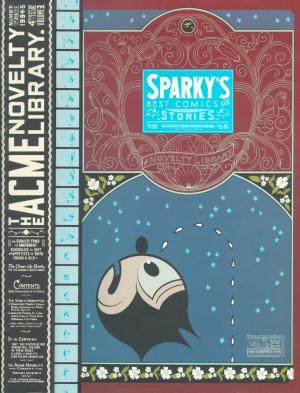
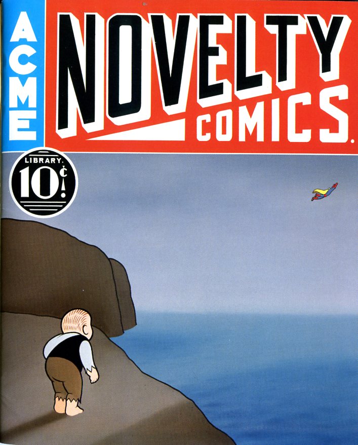
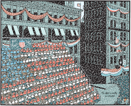
Ware’s Acme Novelty Library #4 was the first comic book I bought in Chicago in 1996, at a justifiably renowned bookstore dubbed “Quimby’s” in honor of Ware’s mouse character. AN #4 had tiny comic strips within massive comic strips, full of morose, bitter gags without punchlines, conveying mute anguish and casual cruelty. It had backwards comics. It had absurd advertisements in absurdly minute print. It had cut-and-fold sculptures. It had microscopic comics that read like animation filmstrips, and big morphing panormas, and everything rendered in a McCay-esque style that, despite its schematic depthlessness, made a flat page seem like a transdimensional portal rather than a surface. A compact exemplar of Kant’s “mathematical sublime,” it seemed to uniquely exploit everything that made comics different from books, art, or moving pictures of any kind, historically as well as formally.
 

Clearly I love Acme Novelty Library #4 and Ware deserves to be fondly remembered for it, along with pretty much all of his ‘90s output. No one can take that away from him. The advertisements alone: “Make Mistakes, Get Children, And Forever Alter The Flavor of Life!;” “Large Negro Storage Boxes!” (this an advertisement for prisons); “Sexual Partner Sent To You Within Six to Ten Days!”;” “Irony!;” the list of bleak, brutally sharp promotions goes on and on (all exclamation points implied). Allow me to take one excerpt from a bit more detail, from the staggeringly tongue-in-cheek “Popular Television Programs on Cassette!,” describing the tapes’ content as provided by “your own personal video tutor:” “You’ll trace a summary of major themes, characters, plot lines, and the particular qualities that make each show so appealing to the average Amercan dumbfuck.”
 

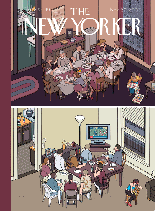
Well put. And it’s not that I only appreciated his work when it was vulgar– it was rarely vulgar. But it was unrelentingly harsh. Compare this with the November 27, 2006 New Yorker cover that featured two Thanksgiving dinner tables in Ware’s trademark orthogonal perspective. One was from America’s temporally-indeterminate innocent past, and featured people having interactions (meaningful ones, to be sure), while, at the contemporary table, everyone was staring at the flatscreen TV. It’s like an edgy version of Norman Rockwell, except that Ware’s blunt nostalgia faithfully emulates Rockwell’s nadirs of treacle and falls short of his occasional glimpses of epic drama. The Thanksgiving scene echoes Ware’s equally drab, generic, competently banal depictions of people staring at cell phones. Instead of, you know, each other. Or, even better, authentically old-timey print media.


The series Ware worked on after the first Acme Novelty books– Jimmy Corrigan the Smartest Kid on Earth, Bramford the Best Bee in the World, Rusty Brown, Building Stories, — have gone from grim to dismal to dull. Originally anchoring his stories in surprising juxtapositions of style and content, forcing the reader’s eye to maneuver through dense, clamorous riots of clean, graphic Constructivism, florid Art Nouveau, and moments from throughout the history of humor and fantasy comics, not to mention experimental animation, his mash-up of high and low culture worked much like Beckett’s interpretation of vaudeville in Waiting for Godot. The snarky pathos fed a battery of nihilistic tension, to be released in the searing vitriol of the avant-garde, a pathway to creative freedom in defiance of convention. How did we end up with lame bubble people barely mustering the strength to rehearse thoroughly unfunny but earnestly poignant tropes of modern literary realism? As one might have once imagined Ware himself saying when comparing sensual Art Deco rococo to arid Miesian modernism, “this is progress?”

Ware wasn’t quite a self-made artist, and may not be entirely to blame for disintegrating; he received an early break in Raw from Art Spiegelman (whose dive is only less impressive because of starting lower), but, at the millennium, Ware began networking in earnest with the insufferably ironically sincere elite of the patronizingly-educated-middlebrow culture industry– Dave Eggers, Ira Glass, and Chip Kidd, for starters. His autistic antics in interviews and panels didn’t flag in their ostentatious displays of repression– and in fact, he may have started becoming more of a performance artist (as all celebrities must be) and less of an unequaled craftsman of sequential art. “Twee” describes a current in vulnerable jangly indie-pop music, first British and then American, but came to stand in for the preciousness of a generation that hit on someone by knitting a cozy for their portable toy record player. I think twee killed Chris Ware.

In twee there is neither humor nor horror, neither conviction nor swagger, just feelings. Feelings and nostalgia for feelings. Chris Ware was sucked into this vortex, streamlining himself into a reliable product for easy digestibility by self-styled “nerds” everywhere, and so we ended up with emo comics garbage overflowing the microcosm of craft-fair entrepreneurship and spilling into Michel Gondry, Death Cab for Cutie, and overdetermined bangs (all much to Chris Ware’s chagrin, if he has any left). True, this infantile regression might have happened anyway. Maybe it was September 11th that whetted the American appetite for saccharine melancholia, but I blame Chris Ware. What twee had to offer that was positive– androgyny, sloppiness, magic– was latent but present in his flamboyant early work. He could have made different choices, But it is lost now, lost irrevocably in the sterile, commercially lubricated navel into which his vision has apparently gone to die.
 

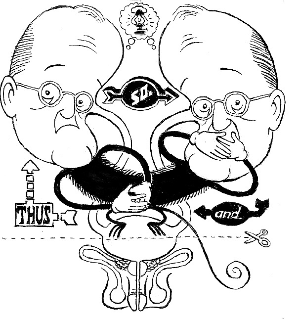
illustration by Bert Stabler

 
Click here for the Anniversary Index of Hate.

Oedipus Supes

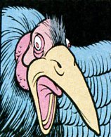
So can you guess? Who drew that?

Probably many of you know the answer. The clean perfection of it is a giveaway — but the fantasy touch, the almost flamboyant horror of it could maybe throw you off. The evocation of a too-brilliant gothic under some strange sun — this looks like it should be Herge, perhaps, not Chris Ware.

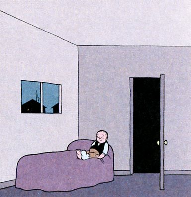
But Ware it is, from way back in Acme Novelty Library #10, before Jimmy was Jimmy Corrigan and before Ware had quite, quite decided that he wanted to become the poet of antiseptic blocks and middle-american repression. Those proclivities are there, of course, in the elegaic emptiness of Jimmy’s room:

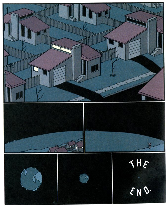
or of his town and world:

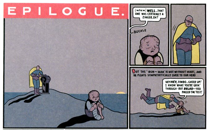
The cleanness here, though, is somewhat deceptive. It’s not the slack nothingness of ennui, but the overly perfect, charged landscape of surrealism. Ware’s later work often seems to fit most comfortably within literary fiction, but Acme #10 is closer to David Lynch…or even to Nightmare on Elm Street. Jimmy’s story is an Oedipal fever-dream; one of the few narratives to successfully meld superhero tropes with horror.

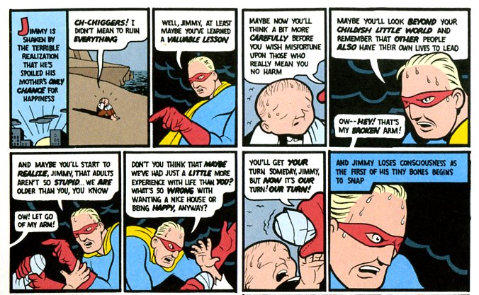
As in horror films, the plot is less a linear progression than a series of compulsive repetitions. Jimmy is repeatedly, sadistically betrayed and humiliated by father figures; his mother’s boyfriend, Nelson, and Superman. The reiteration of this trope starts out on a small scale — Nelson, playing with Jimmy, accidentally injures his arm. Soon, though, the pattern escalates:

Superman is both uberdad and castrating ogre; he’s the deranged and arbitrary law, sweating in his underwear, framed by ominous black clouds. The superhero is the monster; they’re not mirror images, but the same guy, the only father you get. Jimmy’s function, then, is to fail and be punished, over and over, for failing to live up to expectations and for trying to live up to them.

Ware’s even lines and bright colors, even the repetition of his perfect blocks, flatten anxiety and reality into a single seamless nightmare.

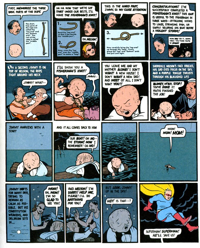
In this page, Ware starts out with a fun boy’s activity sequence. Jimmy’s head switches places with his mothers and then back again as Nelson describes the fisherman’s knot — starting with the three basic parts of the rope, a tripartite Oedipal snarl. Jimmy, goaded beyond endurance by Nelson’s condescension (forcing Jimmy in the fourth panel into a panel within a panel, dwindling into nothing) — does his Oedipal thing, and kills his (step father with the same rope. Punishment follows immediately; killing Nelson makes Jimmy an outcast, floating in nowhere, calling for the mother he was supposed to win and has instead lost. And then Superman appears to make everything better, or, rather worse. Again, the whole sequence — lesson, murder, punishment, Superman — slides one panel into another. I’m fairly sure Jimmy isn’t really supposed to have killed Nelson, and Superman does really show up, but the diegetic “reality” is less important than the fact that it all feels like it has the same oppressive weight. Symbols and dreams don’t so much blur together at sit up next to each other, each as hyper-real as the next, all pointing to the same overdetermined outcome:

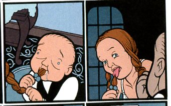
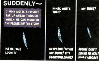
The first sequence there is a “dream” in which Jimmy imagines himself sucking on the hair of his (non-existent) sister. The second occurs a couple of pages later, when Jimmy is forced to watch through a slit in a cave wall as his boat (named Mom) sails away from the island on which Superman has left him. Shortly thereafter, Superman returns and reveals that the movie machine that Jimmy has spent his days and nights dreaming about, waiting for the moment when he might use his sole penny to watch it and relieve his boredom — that movie machine shows a pornographic film strip of Jimmy’s mother.

Jimmy is being punished, in other words, for the his desire, even if he won’t let himself know what that desire is. He wanted to see what was in that machine; he wants to reach through that slit in the wall, or suck his sister’s hair. He deserves what he gets; Superman is dispensing justice, just as he is supposed to.

The book, then, is shot through with compulsive sadism and perhaps even more compulsive masochism. It’s difficult even to know how the two could be separated. The whole point of the Oedipal triangle is that the son replaces the father, which means the son is the father, and so the castration of the son is ultimately performed by the son himself. Here, too, Superman is the father, but he’s also Jimmy — the childhood power fantasy. Superman sweating and declaring “we’re adults after all” — you don’t say that if you’re actually an adult and confident of it. Superman is Jimmy’s imaginary friend come to life, which means he’s Jimmy. And if he tortures Jimmy, it’s in part because Jimmy wants to be tortured — because he deserves to be punished, and because his torture is the way we (reader, author) identify with him and so enter the story.

Thus, the bitter pleasure when the comic’s narrative taunts Jimmy at various points:

That’s perhaps the most claustrophobic moment of this entire claustrophobic comic. The power fantasy becomes a fantasy of utter disempowerment; the adventure book expectations nail home the impotence.

This sequence, in particular, reminded me on this time through of Michael Haneke’s “Funny Games.” As with Ware, Haneke stacks the deck against his characters; his torturer is able to speak directly to the audience, somewhat as Ware’s (apparently complicit) narrator does. Like Ware, too, Haneke’s world is one of antiseptic bleakness. Particularly the scene immediately after the couple’s son has been killed, when the murderers leave the husband and wife alone in the empty house with the TV blaring — there’s a blank beauty there, an absolute devastation as the emptiness of the room becomes an unendurable weight.

Surely that’s what Ware is reaching for too in those sparse panels where Jimmy is isolated on one side, as if shoved to one side of the world.

“Funny Games”, though, compromises these moments precisely because they are moments. The perfect stillness should be there forever, but “Funny Games” has to go on, revving up its plot again and its series of more or less entertaining, and more or less tiresome, reversals. “Funny Games” is clever, but that cleverness often seems at war with the most striking aspects of his vision. (I think this is part of what Charles Reece is saying in this review.)

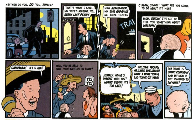
Ware is clever too. Consider, for example, this sequence again:

Notice we have Nelson stating “Every last penny!” two panels before we see Jimmy’s mom in what seems to be a state of semi-nudity, with Nelson waiting outside the door. On the island, Jimmy’s holds onto a sole penny in anticipation of looking in the movie machine…where, if he only knew, he could see his mother naked. The flickering recurrence of penny’s and nudity — or of father’s and arms…or indeed, the sadistic invention of Superman’s movie machine revelation — I’m sure Haneke would have liked to have come up with any of those.

The difference, though, I think, is precisely the way Ware divorces cause and effect. “Funny Games” is a game; it fits together like a puzzle. Acme #10 has puzzle-like aspects, but the pieces don’t actually go together — or at least not one after the other, in a sequence. Obviously you can read it straight through and you get a story of sorts. But there’s no satisfying resolution like, “everyone’s dead, start over.” Instead you’re left with images, themes, repetitions, blank spaces. Acme #10’s lack of narrative bloody-mindedness, the fact that Jimmy isn’t finished off, is why this isn’t really horror — and at the same time, perhaps, it’s the reason that it functions as a kind of distillation of horror. There’s no resolution here, no escape. He’s in hell — and not hell as metaphorical meaninglessness, but hell as intolerable meaning. Jimmy is always being punished, always deserving of punishment. He’s always on that island looking into that vulture’s beautiful, terrible maw.

___________________________

A couple days ago, Matthias Wivel said this in his reevaluation of Chris Ware’s Jimmy Corrigan.

There is a narcissistic aspect to it; the archetypical distillation of certain emotions inflicts the story with a crippling myopia that has consequences for its believability as a realistic narrative.

I would say that that’s right. And I would further say, in Acme #10, Ware got around this problem not by jettisoning the myopia, but rather by avoiding the realistic narrative. Acme #10 is narcissistic and monomaniacal as anything Ware has ever written. But that’s a strength, not a weakness, when you go for a cloistered dreamscape rather than for humanistic insight with occasional epiphany. Ware understands the inside of his own neurotic skull and he’s able, like Kafka, to give that interior the dread (and very funny) force of universal truth. Ware’s efforts to imagine real characters and real relationships, however, seem to me much less successful — and, ironically, much more solipsistic. I don’t follow Wareclosely anymore, but when I do check in, I only end up more convinced that Acme #10 will always be my favorite of his comics.

DWYCK: Jimmy Corrigan’s Spectacular Reality

It has now been over a decade since Chris Ware’s Jimmy Corrigan – The Smartest Kid on Earth was published in collected form, and almost two since he first drew the character in a number of short strips in the Chicago weekly New City. Through the nineties, as it was being republished for the first time in his ongoing serial the ACME Novelty Library, it was for many consistently the most anticipated serialized comic around; an indication that comics were experiencing an artistic renaissance and a harbinger of great things to come for the medium.

Its release in book form in 2000 has now come to be seen as an emblematic event in what certain commentators, such as yours truly, have termed the international “new wave” of comics, which has since only gained in force and momentum. And Chris Ware is still working somewhere at is center, simultaneously expanding and refining his approach to comics, most recently with ACME #20, or “Lint”, which provides as good a touchstone as any to chart his development since Jimmy Corrigan. The following is a re-examination of Ware’s seminal book, made with the benefit of a decade plus of hindsight, with attention paid to how it has contributed to the evolution of the art form of comics and how we think about them. Continue reading

Reading Drawings: Architecture and Comics

Following tardily on the heels of this month’s onslaught of architecture-based posts, welcome to a belated examination of the ways in which we read comics and architectural working drawings. Based on the merits of a comment I made on Alex Buchet’s first “Draw Buildings, Build Drawings” article, Noah invited me to elaborate on the topic in the form of a guest post. It’s something I’ve been thinking about for some time, but not necessarily something that has much practical value for anyone looking to analyze either comics or architecture.

As an architect and cartoonist, I can’t help but notice many similarities between comics and architectural construction documents. Superficially, the pages of both tend to convey information in similar ways: drawings of simplified pictograms are ordered into grids of panels, often in conjunction with text and an elaborate system of symbols and line weights. But is there a more fundamental way that we can understand each?

In this post, I will look at how we read both architectural drawings and comics, based on my own understanding of how each works. I’m going to apologise in advance for my limited knowledge of comics theory; I am going to base most of that segment on my own observations about how they function. Feel free to jump on me in the comments if anything doesn’t ring true.

A caveat: I will not be discussing architectural illustration/renderings, drawings meant for public consumption, publication in architectural journals, or intended for competitions. Rather, I will be taking a rather narrow look at architectural working drawings, and the commonalities and dissimilarities they share with comics. I will also not be considering single-panel gag strips, as it is really the act of reading a page of comics that I am interested in for the purposes of this post.
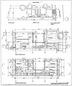
 

Barton Myers' Wolf Residence

Site Plan and Floor Plans: The Wolf Residence, by Barton Myers (Note that these architectural sheets are not from a construction set; rather, they are the metric system instructional drawings from Architectural Graphic Standards, and thus differ slightly from contract documents)


How We Read Architectural Drawings.

Architectural drawings are, at their essence, a series of iconic pictograms organized in such a way as to allow a third party to construct a building based on the designer’s concept. These drawings are typically depicted as “cuts” through the imaginary building, both horizontal (plans) and vertical (sections) – though some drawings, including elevations and roof plans, are not.
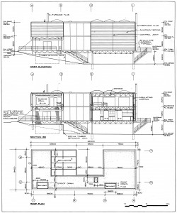
Barton Myers' Wolf Residence

Elevation, Section and Plan from Myers’ Wolf Residence

Architectural working drawings are generally organized by scale, smallest to largest. From a plan point of view, this usually entails starting with the site plan, then the building plan, plan enlargements, and plan details (this ordering system also applies to sections, as well). The benefit of this approach is that it allows the designer to identify important building elements that are focused on in more detail with each subsequent enlargement. It is also possible to indicate elevations or sectional details on plans, and vice versa. This is accomplished with a variety of identification tags and bubbles, conventional symbols that guide the reader to the appropriate page. While this method of navigation may seem difficult at first, it is possible for the diligent layperson to parse its meaning and “read” an architectural set.
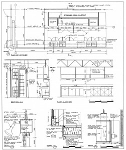
Plan Enlargements, Interior Elevations, and Details from the Wolf Residence

These pages are laid out in a grid of discreet drawings, each marked by an identification tag that marks the destination from the tags on the building-scale sheets. The smaller the scale (ie. the smaller the building appears on the page), the more of the sheet is taken up by the drawing; the converse is true of a large-scale detail. Thus a site plan usually appears by itself, while details can be twenty-four or more to a page. A page of details is a holistic field of drawings, with no one frame given more weight than any other; this allows the casual observer to jump in at any point and understand that part of the building, while simultaneously denying them the opportunity to construct a narrative from the panels. Daniel Worden made an interesting point in his essay “On Modernism’s Ruins: The Architecture of ‘Building Stories’ and Lost Buildings” (from the book The Comics of Chris Ware: Drawing is a Way of Thinking), when he talked about the “dialectical relation… between the fragment and the whole, the panel and the page, the page and the text…”. He was writing about Ware’s comics in “Building Stories”, but he could just as easily been discussing the tension between the sheet of details and the building as a whole.
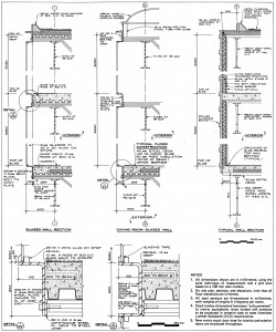
Barton Myers' Wolf Residence

Architectural details from the Wolf Residence

Unlike comics, architectural drawings cannot function as illustrations alone. Text is always required on these sheets, though it is necessarily descriptive, not narrative in nature. These notes call out materials and processes (ie. construction sequencing), generally accompanied by arrows indicating which elements are being described.


How We Read Comics

Comics are, at their essence, a series of composed iconic pictograms organized in such a way as to allow a third party to mentally construct a narrative. It is the purposeful sequential arrangement of these drawings that allows us, as readers, to decipher the cartoonist’s intent.

As mentioned earlier, comics share some general organizational principles with architectural drawings: in particular, the grid. A page of comics typically adheres to a strict grid of individual drawings bounded by panel borders and separated by gutters (negative space between the frames). Despite this superficial similarity to architectural drawings, the “rules” of cartooning are much less hard and fast than those of the construction documents. The direction of reading and the shape of panels need not be consistent as long as the narrative thrust is clear to the reader.
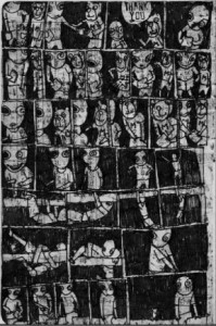
Maggots, by Brian Chippendale

For example, Brian Chippendale often uses a regular method of laying out panels so that we read “like a snake” back and forth down one page and up the next; Osamu Tezuka has been known to allow readers to move their eyes either horizontally or vertically, with both directions achieving the desired narrative effect.
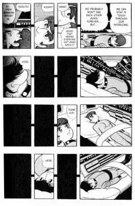
 

Osamu Tezuka’s “Space”, from Phoenix

In both cases, a patient reader can comprehend the writer’s intent and follow the prescribed narrative. On the other hand, scroll-like comics without borders (or comic-like scrolls), like the Bayeux Tapestry or portions of Dash Shaw’s Body World, direct the eye in such a way as to allow even the most visually unsophisticated reader to comprehend the author’s intent.
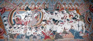
 

Wayang Beber: Indonesian narrative scrolls that function like comics


Body World, by Dash Shaw

But how do we know how to read a comic? We seem to inherently want to read panel-to-panel in the same way we read prose: left to right, top to bottom. However, even the most basic arrangement of panels does not always follow this pattern, with unusual arrangements of tall or wide frames that seem to disrupt the eye’s flow. Navigating a comics page is a learned skill, one that is arrived at through trial and error (often as a child, desperately trying to decipher a page of Bone or Tintin).

And how are we able to interpret the pictograms on the page: person, dog, house, movement, distress? Perhaps this too stems from our childhoods, and our own artistic inability to accurately depict the world around us; with our unskilled hands, we can only illustrate an over-simplification of what we see with our eyes. This is not dissimilar to the purposeful simplification of reality as filtered through a cartoonist’s pen, which may explain why so many of us are drawn to comics as children. Architectural drawings are not as intuitively understood. I would hazard to say that it is these very comics-decoding skills that would enable the casual observer to decipher a set of construction documents.

As has been mentioned previously, one of the primary features of the comics page is a bias towards narrative momentum. This generally involves the perception of time by the reader. This is manifestly different than an architectural set, where time is not a consideration in the drawings themselves. Rather, this points to the fundamental difference between these two modes of visual communication: the architectural set is a means to an end, while a comic is the final product itself. Narrative in architecture does not come into play until the drawings are read, understood, and constructed; buildings are meant to be experienced in four dimensions, not two-dimensionally on paper.

So all of this begs the question – why bring this up at all if these two art forms are so fundamentally different? How does architecture – on paper – relate to comics? Is there an approach to reading architectural drawings that can be applied to comics?

There are endless examples of similarities between comics and architectural renderings, most of which have been touched on in Alex’s previous posts (François Shuiten, Jiro Taniguchi, Hergé, etc.). However, I find that these illustrations stray somewhat from the practice of architecture as discussed in this essay. Architectural renderings are as much architecture as a cover illustration is a comic book; both are meant to grab the public’s attention and “sell” the content (either a comic or a building, as the case may be).
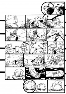
Rabbit Head

Rabbit Head, by Rebecca Dart

There are examples of cartoonists who are keen to play with the formal aspects of comics in such a way that their work begins to resemble modes of reading architectural drawings. Rebecca Dart’s Rabbit Head is perhaps a good starting place, as it makes use of several of the conventions mentioned above. Rabbit Head is a relatively standard comic, but one with a peculiar method of reading: a single narrative strand gradually splits into multiple narrative paths that are meant to be read at the same time to create a larger web of story. From the beginning, it is apparent to the reader how we are to follow the multiple plots; a system of symbols and tags clearly points our eyes to the simultaneous narratives. This system is extraordinarily similar to architectural navigational symbols, but it is perhaps more easily understood.

Like an architectural set, each of these narrative branches tends to literally increase in scale as it breaks from the central story. The further the split is from the primary narrative, the more the panels zoom in. This is not dissimilar from the progression from plan to detail in architectural drawings. There is even a map at the back of the book that provides an overall view of the action, and points out key narrative locations, much like an architectural “key plan”.
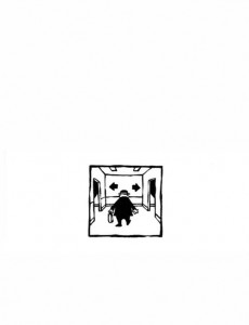
Page 9 of Morlac, by Leif Tande

Morlac, by Leif Tande, follows a similar narrative conceit to Rabbit Head. It is a “Choose Your Own Adventure” of sorts, one that begins with a single panel per page. As the main character is faced with directional choices, so to is the reader, and the narrative splits up, down, left and right. As a reader, the inclination is to follow only a single strand of narrative, but it quickly becomes evident that this is not how Morlac is intended to be read; the character begins to interact with the other “selves” on the page. The pages ebb and flow, apparently populated semi-randomly with a holistic field of discreet panels as the main character comes and goes. The effect is similar to opening an architectural set to a page of details and trying to discern the overall building from those few drawings. The “narrative” in Morlac is the equivalent of the “architecture” in a set of construction documents.
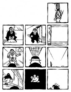
Page 25 of Morlac

There are other comics that explore similar territory (including some by Jason Shiga and Lewis Trondheim, among others), but I feel that none are able to capture this “architectural essence” as well as Tande and Dart.
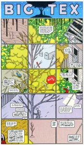
 

Big Tex, by Chris Ware

Chris Ware’s “Big Tex”

No discussion of architectural representation and comics is complete without Chris Ware.  Not only is he an adept draftsman, but he seems to grasp certain methods of architectural representation that have not really been exploited fully by anyone else. Take, for example, a “Big Tex” strip from the Acme Novelty Joke Book: the page as a whole illustrates a finite amount of space, which is subdivided into individual panels in order to depict a larger scene and drive a narrative. Architectural details are often laid out this way on a page, so the eye can travel around the perimeter of the building, for example, or down a façade in a way that the mind can easily comprehend. Ware exploits the narrative flow across the page and he composes the panels in such a way as to guide the reader across the page and back again, not always in the same direction. He also takes advantage of this unusual flow by running the strip back in time from top to bottom, following both Tex and the tree from middle age back into their respective youths. This is certainly an interesting and exciting approach to comics, echoing closely methods of laying out architectural details on a sheet. Though I cannot say with any certainty that Ware was influenced by architectural drawings, I feel that his chosen mode of representation in this instance is close enough to warrant a mention.
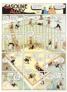
Gasoline Alley, 1934

“Gasoline Alley” 1934 Sunday page, by Frank King

Innovative as this page is, that’s not to say Ware’s work does not have precedent. Perhaps the most direct influence on this particular “Big Tex” page are the many similar pages from Frank King’s “Gasoline Alley”. King loved to lay out pages as a field of panels that together created an overall image, often returning to the same spot Sunday after Sunday to explore the building of a house over time, for example. However, King was as not as concerned with narrative experimentation as he was with pushing certain formal boundaries.
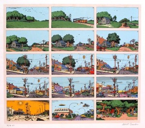
“A Short History of America”, by Robert Crumb

It wasn’t until almost half a century later that the extra layer of chronology was pushed into King’s formula; Robert Crumb built on King’s work with his one-page Short History of America, and Richard McGuire cracked it wide open with the brilliant and challenging Here.
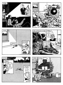
“Here”, by Richard McGuire

Ware synthesized each of these elements and produced an intriguing post-modern comic that is entirely his own voice, influences notwithstanding and, in fact, celebrated (this will probably be the only time I’ll ever compare him to Quentin Tarantino, but I think the comparison is apt in this case).
Chris Ware’s endpaper diagram for “Lint” (ACME Novelty Library No. 20)

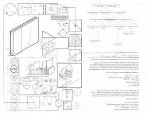
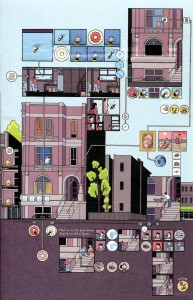
Ware also has a penchant for diagrams that function on the same level as architectural drawings. They can communicate a large amount of information that, if it was told as part of the narrative, would interrupt the flow of the story; some are even tangential to the narrative entirely. Ware often inserts these diagrams into and around the narrative in the least disruptive way possible; he tends to save the most elaborate ones for covers, endpapers, or frontispieces, while working the simpler ones into the body of the comic. Like an architect, he uses a standard set of symbols to signify a complex set of relationships in the clearest manner possible. Some would say that this is a masturbatory self-indulgence on Ware’s part, but I find his diagrams both edifying and entertaining. Anyone interested in exploring this topic further (from an information design point of view, rather than an architectural one) should have a look at Isaac Cates’ essay “Comics and the Grammar of Diagrams”, from the book The Comics of Chris Ware: Drawing is a Way of Thinking.
Building Stories Diagram

Endpaper diagram from Ware’s “Building Stories” (ACME Novelty Library No. 16)

Now, having examined a few examples of existing comics, what would my ideal architectural meta-comic look like? It would not necessarily be an abstract or non-linear piece; as I’ve stated previously, I feel that in one sense, the narrative (or simply a perceived temporal momentum) is to comics as the constructed building is to architectural drawings. To me, the perfect “architectural” comic would read something like Italo Calvino’s Invisible Cities. Let’s assume for a moment that it would be exactly like Invisible Cities: a literal cartoon adaptation. The book is structured around a central (sparse) narrative involving Marco Polo describing cities he has visited at the court of Kublai Kahn. The majority of the novel is taken up by these stories, and the Kahn slowly comes to realize that each tale is describing a different aspect of Venice, Marco Polo’s home. Kublai Kahn listens to Polo, not understanding yet somehow comprehending; a good portion of the book passes before Marco Polo learns to speak Mongolian. An adaptation of Invisible Cities might fare well as a wordless comic, benefiting from the extensive use of symbols and diagrams. To me, Invisible Cities is ideally suited to an “architectural comics” experiment such as those I have outlined in this post. The overarching narrative functions like a building’s plans, with each subsequent tale like another detail describing the whole. The sequence of stories could be entered randomly and understood individually, though they would not allow the reader to perceive the whole without approaching the narrative a particular way (chronologically, in this case). The descriptive nature of the stories within lend themselves naturally to illustration; with a little planning (and a whole lot of drawing), they could be arranged in such a way that they could function like an architectural drawing set. If anyone is up to the challenge, I will gladly read your comics interpretation of Invisible Cities.


Aaron Costain is an architect and cartoonist who lives and works in Toronto.

DWYCK: Hergé and the Order of Things

We’ve had a fair amount of discussion about how to approach comics critically here at HU lately, and I figured I’d expand a little upon some of the points I’ve made previously regarding cartooning as a visual phenomenon.

From a modernist critical perspective, it seems clear that comics’ artistic achievement through their modern history — i.e. the last 200 years or so — is predominantly visual, and it seems equally uncontroversial to say that the visual aspect of cartooning has generally been given higher priority by cartoonists as well as fans. This has to do with comics’ history as a low culture mass medium produced primarily to entertain and the genre constrictions this has placed upon its development.

The absence of a sophisticated, independent tradition for the appreciation of comics as art — in the broad sense, not just visual — means that critics have to start somewhere else, and given comics’ focus on narrative and their appeal to students of culture, the point of departure has more often than not been literary.

Unsurprisingly, comics have fared badly. Rote humor and trite genre exercises permeated by cliché and unfortunate stereotyping just don’t hold up to critical scrutiny when compared to the achievements of literature of the kind written in just words, no matter how pretty it looks.

To an extent, this is healthy. For comics appreciation — and indeed comics — to evolve, the medium needs to be subjected to the same probing scrutiny under which other artistic media have developed. Comics should be given no condescending breaks. However, they also need to be recognized and valued for what they are, for their particular synthesis of word and image and its fascinating cultural permutations.

Paradoxically for such a visually effective and attractive medium, very little attention is paid by critics to their visual aesthetics, and what little theory we’ve had — from McCloud to Groensteen — has concentrated primarily on their means of making narrative meaning.

Although it would certainly do some good, more criticism from a traditional visual arts perspective wouldn’t be sufficient. It would probably take to comics’ weird mix of simplification and exaggeration only slightly more charitably than has traditional literary criticism (consider the place satirical and gag cartoonists occupy in the art historical canon for reference). What we need is a new way of looking — one that doesn’t start by separating “story” and “art.”

Unsurprisingly, some of the most promising steps in such a direction have been taken by cartoonists, who have always been aware, if often only intuitively, of the special nature of their craft. In his recent foreword to the first volume of his collected Village Voice strips, Explainers, Jules Feiffer writes:

“I thought [the drawings] were stylistically subordinate; words and pictures are what a comic strip is all about, so you can’t say what’s more important or less. They work together. I wanted the focus on the language, and on where I was taking the reader in six or eight panels through this deceptive, inverse logic that I was using. The drawing had to be minimalist. If I used angle shots and complicated artwork, it would deflect the reader. I didn’t want the drawings to be noticed at all. I worked hard making sure that they wouldn’t be noticed.”

This notion is echoed in Chris Ware’s oft-repeated notion of cartooning as a kind of drawing that you read rather than look at, and in the old truism that great cartooning is akin to signature — the cartoonist’s handwriting. Think the inseparable entity that is Schulz and Peanuts and it pops.

Although it doesn’t apply equally to all forms of cartooning, this is an essential insight, not the least in that it connects the art form at a fairly basic level to the origins of the written word in ideograms. But it simultaneously runs the risk of devaluating aspects of comics’ visual life, once again making image subordinate to writing and reducing comics to “texts.”

Let me propose an example. Hergé’s Tintin is one of the most influential comics of the European tradition. It has entertained generations of readers all over the world and pretty much established the blueprint of clear storytelling in long-form comics, much like Schulz did for self-contained comic strips.

And while it is one of the rare comics that has been enshrined in high culture, at least in French-speaking countries, it still provides a good example of how great comics art may suffer in the encounter with traditional high culture criticism. It is very easy to reduce the Tintin stories to fairly unremarkable genre romps leavened with wholesome humor and only occasionally packing a certain and never particularly sophisticated satirical bite, all the while being stirred by troubling — if significantly also troubled — ideology.

The enduring popularity and greatness of Tintin, however, runs deeper, and it is inextricably bound up in the cartooning, not merely as storytelling but as personal handwriting. Peanuts wears Schulz’ emotions on its sleeve and is therefore more immediately appreciable as a work of literature than Tintin, which encrypts those of Hergé in a consciously dispassionate representational vocabulary.

The ligne claire, as it has become known, eschews hatching, downplays contrast, eliminates cast shadows, and maintains a uniformity of line throughout, paying equal attention to every element depicted. In his mature work, Hergé took great care to describe everything accurately, giving the reader a sense of authenticity and place. He did this not through naturalism, but rather through a careful distillation process, rendering every phenomenon in a carefully calibrated visual vocabulary that presents a seemingly egalitarian, ostensibly objective view of the world.

Reflecting his Catholic upbringing and the boy scout ethos which had been so formative to him, his cartooning is about imposing order on the world. His art is a moral endeavor that traces its roots back to the Enlightenment. At the same time, however, it reflects the futility of this endeavor, suggesting more mercurial forces at play.

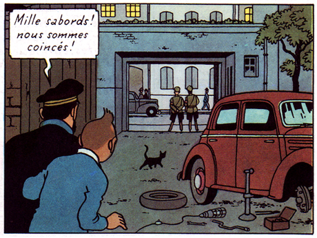
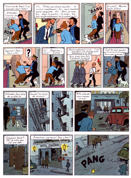
One of his most sophisticated works, The Calculus Affair (1954-56), articulates this tension beautifully. Page 50 is as fine example as any: the story is a fairly straightforward cold war cloak and dagger yarn, with the present sequence concerning Tintin, Haddock and Snowy’s escape from a police-guarded hotel in the Eastern Bloc country of Borduria.

The storytelling is characteristically clear and one might find sufficient an analysis of how the choice of viewpoint supports the action depicted, how the characters’ move from panel and how the space in which they move around is so clearly articulated, etc. But this would primarily be an analysis of how we read the sequence — what I’m interested in here is rather the vision it manifests.

As a comics maker, Hergé was acutely aware that he was speaking through fragments. Much of his art is concerned with this issue and the present book is among his most disciplined and intelligent treatments of this basic condition of comics. Framing clearly is the unsettling factor in his vision.

Most obviously, it occurs in his arrangement, both of the page — where the odd number of panels disrupts slightly its seemingly ordered construction — and in the composition of individual panels. He is an expert at this, keeping each panel interesting without cluttering it unduly: a cropped lamp and picture frame suggest a hotel room interior (panel 2), but also provide surface tension in an image of slight disorder. Tintin’s figure is disrupted by the outheld cap and line defining the wall paneling. Hergé’s is a controlled, subjectively ordering gaze.

The sequence is about movement and liberation by means of a metaphor of illumination. Dividing the page almost evenly between light (interior) and dark (exterior), Hergé (and his team) poignantly extend this concern to the images themselves. Every image is occupied by frame-like constructs — doors, windows, carpeting, gates — through which the characters move, or aspire to move. Diagonals suggest depth, but also deliver avenues of blockage or passage, both for the characters and the reader’s eye as it crosses the rectangular grid of the page. A black cat discretely blocks the path out (panel 12), while an immobile car meet the characters. A disarray of tools are left at their disposal on the ground.

The cable from an unlit lamp — the sixth on their path through the page — snakes its way towards them, literally and metaphorically embodying their ambition, in that it provides Tintin with the idea of using its bulb as a distraction for the guards, to move them away from the twin, (finally) lit lamps that frame his and Haddock’s eventual route of escape. The page ends the way it started, with sound signaling an opening.

Hergé was fascinated by psychoanalysis and worked through these years with an Increasing awareness of the subconscious. In his comics, he attempts to articulate the knowable and the unknowable with equal clarity in a rich world of signs, of meaning. By presenting his subjective choices, he offers us an an avenue by which to make sense of things.

For more thoughts on Hergé by yours truly and cartoonist Thomas Thorhauge, go here.

Update by Noah: I’ve added the Dyspeptic Ouroboros label to make this part of our ongoing series on meta-criticism.