
The index to the Comics and Music roundtable is here.
______________
Do D.I.Y. posters—the Xeroxed or silkscreened posters you find on lampposts and kiosks in big cities, advertising bands and events—constitute a form of comics? The question is at least arguable. In 1975, theorist Pierre Fresnault-Deruelle posited that a comics page (and the double-spread that occurs after the turn of a page) is understood by readers in both linear and tabular ways. The panels on a page are read one at a time, in order, as the reader follows the linear progress of a narrative, but the page can also be read as a table or a map, as a single image subdivided and organized to impart information. (There’s a tradition of artists, beginning perhaps with Frank King and including Jim Steranko, Neal Adams and J.H. Williams III, who emphasize the overall tabular design of their pages much more than typical cartoonists do.) Both comics pages and D.I.Y. posters, then, function as single-illustration “tables” according to Fresnault-Deruelle’s definition—they have that tabular dimension in common.
A related point: many comics artists have made posters, and vice versa. One excellent book on posters is the RISD Museum/Gingko Press exhibit catalog Wunderground: Providence, 1995 to the Present (2006), edited by Judith Tannenbaum and Maya Allison (with design by Helene Silverman and Dan Nadel). Wunderground assembles posters from the Fort Thunder renaissance of Providence’s underground, by such key Paper Rodeo/Kramers Ergot/Monster cartoonists as Mat Brinkman, Brian Chippendale, Jim Drain and Leif Goldberg. One of the first selections in Wunderground is Brinkman’s Eagle Square (2000), (Update: Eagle Square is actually by Brian Chippendale) an image designed to mobilize opposition to the construction of a new strip mall:
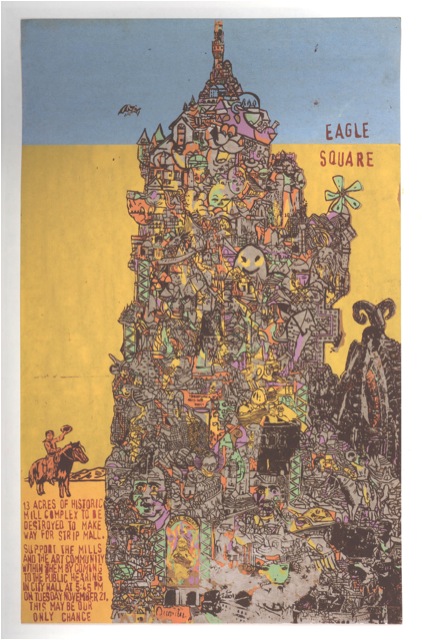
This poster has much in common with Brinkman comics like Teratoid Heights (2003) and Multiforce (2005), including the impossibly dense delineation of a surreal, maze-like environment and the focus on a single character navigating said environment (I imagine the cowboy on the left side of the poster following the path into the labyrinth). While I’m not sure how Eagle Square represents the cause—does the multi-colored tower represent the “historic mill complex,” the prospective strip mall, or neither?—the poster is an eye-catching companion to Brinkman’s sequential art. Robert Crumb’s album covers and comics reflect his love of “old-timey” music; Evan Dorkin channels his obsession with Ska music into his images for the American Skathic series of CDs and the milieu of his Hectic Planet series; and Mat Brinkman simultaneously makes comics, posters, and tapes of homgrown electronic music, ignoring distinctions between different media. Culture is culture.
I’m not writing this essay, however, to theorize the nature(s) of culture(s), even if such sweeping theories were possible. Instead, I want to tell a personal story about how comics enter into dialogue with music and with single-image posters. Teaching is part of the story too, since it happened during my “day job” teaching English at Appalachian State University in Boone, North Carolina.
In spring 2002 I taught my first class on comics and graphic novels, but it was a creative writing class, and I was charged with teaching the students the basics of visual storytelling. Which, frankly, was ridiculous: I can’t draw, I’m a mediocre fiction writer, and at that time the only comics theory and history I’d read was McCloud’s Understanding Comics. (No Feiffer, Kunzle, Witek: I hadn’t even seen Steranko’s History of Comics.) Still, I dove into the class because I was into comic books—especially, blindly, nostalgically, the 1960s Marvel comics of my childhood—and I got lucky: the students in that class were a ferociously sharp bunch, challenging me with controversial ideas (“Prince Valiant looks like book illustration to me, not comics!”) and generating better work than I expected.
One of the best students in that class was a junior named Chris Williams. Chris had been an Art major, but transferred to English when it became clear that his interest in cartooning (particularly Mike Allred’s American version of la ligne claire) didn’t jibe with the Art department’s emphasis on conceptual and abstract work. Some of my class assignments focused exclusively on writing—students were expected to write both a full-script comic and a Marvel-style plot—and Chris was very good at these. He truly excelled, though, when I asked the students to draw images to go along with their words. He put more background detail into his pictures than anyone else in the class, and his figure drawing, clearly inspired by Allred, was rubbery, expressive, and compulsively readable. My major critique of Chris’ art was that his images read too much like outlines, like ethereal diagrams of spaces and people, and I asked him to use cross-hatching and spot blacks to bring solidity to his pictures. Chris cheerfully ignored this suggestion, and even made a joke about my nagging; for one assignment, he turned in a splash page featuring a rocket blasting through outer space, but refused to paint the universe in shades of inky darkness. Chris’ astronauts flew instead through a field of white paper punctuated by lines indicating the bright areas of his fictional stars.
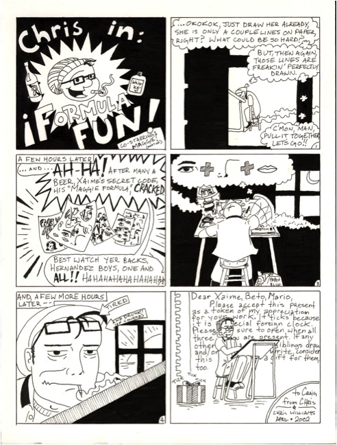
I did have an influence on Chris in one way, though: I loaned him all of my Love and Rockets collections (13 of the fifteen that collected the entire run of the original L & R magazine), and they blew his mind. He loved how Jaime Hernandez out-Allreded Allred, how Jaime stripped his drawings down until every line carried expressive meaning. (He also noticed that Jaime was a wiz at laying down big slabs of ink.) He fell for the stories too. Chris played guitar in a loud slow-core band called Maple Stave, and he connected with Los Bros’ love of rock and roll, and their attempts to import the speed and recklessness of the music (such as the out-of-control, almost abstract orgy in Gilbert’s “Bullnecks and Bracelets”) into verbal-visual terms. During this period, Chris drew and xeroxed a zine that combined an irreverent approach to the superhero genre, tonally very similar to “Mechanics,” with a stone-cold swipe of Jaime’s line-up cover to Love and Rockets #1 (which is itself—as revealed in The Art of Jaime Hernandez book [2010]—a riff on a Raymond Pettibon illustration on the back of a Black Flag 45). At the end of our class, Chris returned my L & R books, along with two surprises: he gave me the two volumes that I didn’t own (House of Raging Women and Hernandez Satyricon), and he drew me an original comic strip about what he’d learned (or tried to learn) from the art of Los Bros.
After Chris graduated from college, he went home to Raleigh and took a bookstore job. He also saw lots of bands in various Raleigh/Durham/Chapel Hill venues—Local 506, Nightlight, the legendary Cat’s Cradle—and Maple Stave occasionally opened for headliners like Port Huron Statement and Section Eight at these venues. Most importantly, he kept at his art, experimenting with screen printing and crafting images with splattery, phantasmagoric colors. Many of Chris’ interests collided in 2004 when bars and galleries started hiring him to screen-print gig posters, and he’s crafted over two hundred since, most of which can be seen at his Storenvy site here. I’m proud of the work he’s done, I delude myself that I had a little influence over his creative direction, and I’m impressed by anybody who can make art pay.
Chris has come back to ASU for visits (once to attend an opening reception for an exhibit of his work at the campus art gallery) and during these visits we’ll sometimes get together for a lunch that typically ends with Chris giving me copies of his newest posters. I like them all, but I have a favorite, an image of a soldier dressed in olive-green fatigues sitting in a field of red plants. The soldier is an immediately legible cartoon abstraction conventionally situated in the center of the composition, while the plants are a network of indistinct, slashing brush lines that represent energy as effectively and abstractly as Kirby Krackle: the result creates vibrant friction between two different modes of comic-book expressionism.
I’ve framed and hung this image on the wall of my living room, next to original art by Ben Towle and Richard Thompson, so I can’t scan it. My version of Chris’ image has no text on it, but he recycled the picture (and, presumably, the screen) for a 2008 gig poster, and it’s the following, without blue lettering, that greets guests as they walk into our parlor:
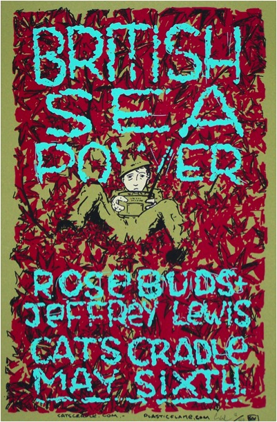
After decades of over-indulgent comic book reading, my default mode is to narrativize every image I see, wrap them in stories that tame their visual extravagance. Initially, the story I ascribed to Chris’ soldier-in-a-field was tragic: he’s manning a military radio, waiting for a message that’ll reassign him to the Front or bring him bad news about the point platoon. (Note the worn anxiety on his face.) Yet now I wonder if this original tale was too pessimistic. Maybe the soldier has exiled himself to the blood-red field, to tune a civilian radio and listen to stations and music banned in the barracks. Maybe his life was saved by rock and roll. Maybe a network of beats and notes link Jerusalem Crickets and Maple Stave, comics and posters, teacher and student, me and you.