How should we read Krazy Kat’s Christmas episodes?

Santa Kat 2

This being the last of our five-part roundtable on George Herriman’s seminal comic strip and coincidentally the last post before Christmas, I thought it might be fun to reflect on two Christmas episodes from Krazy Kat.

As consumers of pop culture, the holidays are a time for us to engage in uncritical enjoyment of TV Christmas specials. There’s something comforting about knowing that the fictional worlds of the shows we follow align with our own seasonal cycles. What’s more, television producers know that Christmas specials have to deliver more and newer viewing pleasures than the usual, so they tend to be worth watching. Christmas specials are always highly conscious of past Christmas specials, and even conscious of past Christmas specials from other shows, so they become uniquely citational, genre bending, and just generally “meta.” I’d like to think that Christmas specials are capable of “inoculating” their viewers against the undifferentiated time of those late-capitalist spaces associated with Christmas, such as big box stores and malls, by placing them into a more telluric time, even if through fiction. The same can be said of comic strips, which are published year-round, for typically longer runs, and which align perhaps even more neatly with the seasonal timeframe of their readerships than does TV.

Santa Kat 1

The fictional universe of Krazy Kat is weirdly both atemporal and attuned to the progression of months, seasons, and holidays. A number of episodes demonstrate this atemporality through an iterative structure according to which the panel in the top right corner and the last panel (bottom right corner) mirror one another perfectly save for one or two small differences but always to remind the reader that there will be a return to the status quo between Kat, Ignatz, and Officer Pup. Frequent visual references to the Sisyphus myth (Kat hauling a bowling ball or a wheel of cheese up a hill in order to please Ignatz who is always disappointed, etc.) echo this sense of atemporality in Krazy Kat‘s fictional universe. In one episode, dated March 25th, 1917, we see Ignatz just awakened and making a vow to himself to “make this a day of great memory.” He asks the brick dealer for his “grandest brick” but is caught in a storm and saved by Kat. In the bottom three panels we see Ignatz awaken only to decree once again that he will “do a most magnificent deed.” Strikingly, the dialogue of these three panels is word-for-word the same as the top three panels. Except perhaps that this time the reader understands the brick dealer is exploiting Ignatz’s sense of singularity by selling each new day’s brick as the brick he considers his “masterpiece.” Ignatz dramatizes a tension between the thought that “today is a special day” and the fear that “today is the same as any other day,” between the eventful and the everyday. If we read the Kat-Mouse-Pup love triangle as a kind of allegory of American life, as E.E. Cummings did, Ignatz’s willful ignorance of the repetition in his life speaks to a need to experience repetition in one’s lives as though each iteration were singular and different. But this willful blindness to the repetitiveness of his life also prevents Ignatz from appreciating the paradoxical temporality of the holidays wherein we allow ourselves to enjoy and revel in repetition by calling it tradition.

0251_001

In Krazy Kat‘s first Christmas episode (12/24/1916), the brick dealer begins selling “karbon briquets” instead of bricks for the season. His sign reads, “build a house or build a fire”. When Ignatz wakes to Krazy regaling him with Christmas carols he hurls briquets through the window at the besotted caroler. Krazy gives the “brickwets” to Senora Pelona Chiwawa, the Mexican war bride and her three “fatherless pups,” who use them to stay warm. The concluding panel shows Krazy sleeping under the mistletoe with a caption beneath him that says, “merry krismis and a heppy new year!!” Structurally, this episode is not too different from any other. Aside from the various holiday references and the transubstantiation of bricks to briquets that makes Ignatz into a foiled Scrooge figure, it’s business as usual. But the Christmas episode published two years later is much more self conscious about bringing the weird temporality of Krazy Kat’s fictional universe into dialogue with the equally weird temporality of Christmas. This next Christmas special opens with Kat spying on Ignatz as he verbalizes his disbelief in Santa Claus (“I don’t believe in “Santa Claus”, I’m too broad-minded, and advanced for such nonsense”), “a scene, rife with skepticism, and heresy,” as the caption reads. Kat endeavors to restore Ignatz’s faith and presents himself to the latter dressed as Santa. Ignatz bows down in humble apology to Kat-as-Santa whose tail and characteristic speech give him away almost immediately thereafter. The last panel shows Ignatz seated in the same position, saying word-for-word the same thing he utters in the first panel while the caption reads, “we close, with a scene, rife with skepticism, and heresy.” The ironic authorial tone enables the reader to partake in Kat’s uncritical enjoyment of Christmas while also partaking in Ignatz’s skepticism towards the holiday. In an atemporal fictional universe that nonetheless seems to follow the seasonal cycles of our own, there is room for such self-contradictory positions. There is room to be both cynical and credulous about the brick dealer’s claims, room to feel certain that today will be eventful while knowing that it won’t, room to enjoy Christmas even if we know it’s a scam.

Ignatz l'il unbelieva

On the 10th day of Christmas…

Christmas illustrations, like Christmas decorations, careen toward kitsch even when they’re relatively tasteful. Always reminiscent of childhood, the ultimate in nostalgia, the kitschiest ones are a sort of superhero pantheon for the masses – from Santa Claus to Santa Mouse, with some Wise Men and Nutcrackers thrown in for good measure. Even Norman Rockwell, who is rarely incisive but often effective at reflecting early-century American life, collapses into full-on kitsch when Christmas is the theme.

Not so for illustrator Ellen Raskin’s cool, evocative illustrations for the 1954 New Directions edition of Dylan Thomas’ “A Child’s Christmas in Wales”.

Raskin’s Christmas – unlike Thomas’! — is calm and still and festive. Her woodcuts create atmosphere and tone. They attempt no semiotic significance; their effects are independent of their sequence and even of the narrative’s sequence.

They are barely even “illustrative” – only vaguely representative of some key word or phrase on the page where they appear, like cats:

Or mittens:

And yet they influence the story — it is different in other editions, surrounded by different imagery. This edition, beloved, has remained continuously in print since its original publication. Raskin’s eloquent depictions have something to do with this, opening in their gentle abstraction a magical space for the little boys of Thomas’ narrative to throw their snowballs, attack their presents, brandish their candy cigarettes, eat and examine and explore.

Raskin worked as an illustrator from the mid-1950s through the 1970s, and wrote and illustrated her own children’s books beginning in 1966. At the age of 17, while a student at the University of Wisconsin, she visited an exhibition of abstract art at the Art Institute of Chicago and changed her major to fine art. Like many of her contemporaries in mid-century design, she often put elements and techniques from abstraction to work in loosely representative contexts; in her drawings it works consistently to create this evocative and palpable sense of space. Her most famous illustration, for the original cover of A Wrinkle in Time, evokes both the tesseract and the alienation of Camazotz.

In her own picture books, her through-drawn illustrations depict space in a more literal way, place, but setting is still foregrounded (as here, from her first book, Nothing Ever Happens on My Block.)

Likewise in her cover illustrations:

There is a sense of space and body even when the images are less about place:

(A Flickr set of covers is available from the Bennington College library.)

What is so marvelous, I think, about this illustration is that it draws from abstraction a kind of conceptual quality without aiming for narrative or semiotics – an embodied, tactile concept dominated by space and sensation. But never didactic, always suggestive and atmospheric. Even in a more conventionally “cartoony” book like The Mysterious Disappearance of Leon, she avoids caricature and thematic reduction and instead offers an embodied concept so compelling to a book-loving child — everything is literally made of words.

Raskin called herself a “bookmaker” rather than an illustrator, and her love of books and writing comes through in her art, even though she doesn’t ask her art to do the work of words. Her description of books reflects her heightened awareness of the vitality of imaginative space: “A book is a wonderful place to be. A book is a package, a gift package, a surprise package — and within the wrappings is a whole new world and beyond.”

Indeed.

Robert Binks: More Works by an Unassuming Master ( part 3 )

The above says it all, or pretty much. Welcome to the Christmas installment of our series on Robert Binks, the Canadian illustrator, painter, sculptor and greeting card designer who has spent more than half a century creating beautiful and playful works of art. His greeting cards, all made privately for friends and family, come in for special but not exclusive attention this go-around.

As always, Mr. Binks’ private works are © Bob Binks, and you can find all our posts to date here and Mr. Binks’ illustrations for the poet Ogden Nash here.

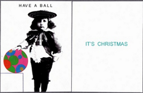
Our opening picture shows the offbeat way Mr. Binks likes to play with old images and contrasting styles in his cards. He says:  “I created this personal Xmas card in 2009. I tried to combine the old with the new — I love that old photograph and I had used it in one of my CBC animations circa 1980 about the history of Toronto.” The CBC is the Canadian Broadcasting Corp., where he worked for most of his career.

The card is a favorite of mine. The whiteness and the giant mod Christmas bulb set off the solemnity of that black-and-white child from long ago.  The combination is vivid and funny at the same time.

Now a pair of sculptures:


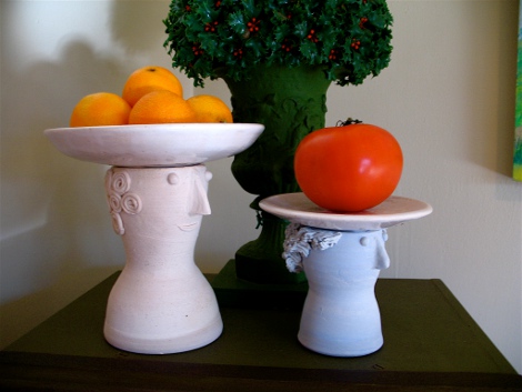
The artist calls these the “Goodie Gals.”  Mr. Binks:
“Back in the ’50s, while working as a display designer in Eaton’s Department Store, I created a graphic idea of a woman wearing a large brimmed hat filled with goodies. In 2010 I finally brought this idea to fruition creating these two ceramic heads with removable plates.” Take the plates off and the two women becomes vases for flowers.

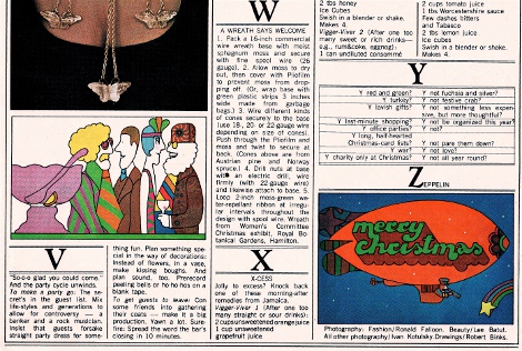
Next a very Canadian recipe page:


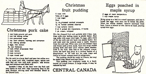
Mr. Binks drew the illustrations for the Globe and Mail, Canada’s leading newspaper, back in the early 1960s.  Like the “Good Girls,” they show his knack for generating feeling from a few simple lines. The two drawings also reflect his tendency to pile simple geometric shapes into a block, and to fill spaces with dense texture or textures (often ones that show a strong contrast, as with the tree’s bark and the little girl’s blanket).

Another greeting card, this one from 2008:


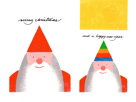
Santa’s red hat is actually a flap; you lift it up and there’s his party hat for New Year’s Eve. The balancing of the modest script greetings atop Santa Claus’ hat is very Binksian, if I may coin a term.

A trio of  wood statuettes:


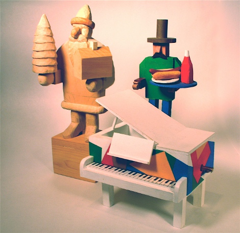
Mr. Binks:  “The hot dog man was made for my grandson. In the square base of the Santa is a music box movement that plays ‘Toy Land.’
The piano with the abstract design plays ‘Yesterday.'” I love the hot dog man’s mustache and matching hat-brim shadow, and the piano shows the same sort of splashy but clean-lined color arrangement that shows up in some of Mr. Binks’ paintings.

Two holiday-season cartoons with a distinct ’60s flavor:


Mr. Binks:  “This Christmas page was done for Chatelaine magazine circa 1965.” The party cartoon’s elongated shapes crowded together are again very Binksian. But what I like best is how the charm characteristic of Mr. Binks’ work coexists with the Peter Max trimmings.

And now a run of highly inventive Christmas cards. The first is from the mid-1990s:


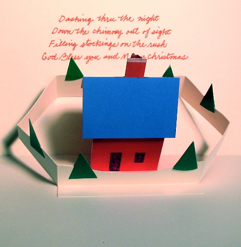
Mr. Binks:  “The card is received in a flat envelope. When opened, the house and trees pop up and Santa’s hat appears in the chimney. I wrote the poem to support the card.”

A card from 1986, this one with a uniquely adjustable Santa schnozz:


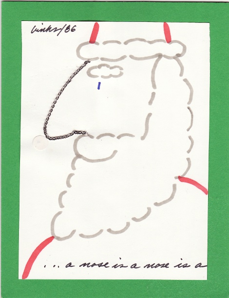
Nudge the chain and Santa gets a new profile. Caption:  “… a nose is a nose is a”

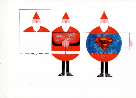
Next, a card from the mid-1980s. Mr. Binks:  “Card flaps open up in stages to reveal a Superman Santa.”


Finally, a combination Christmas and New Year’s card:

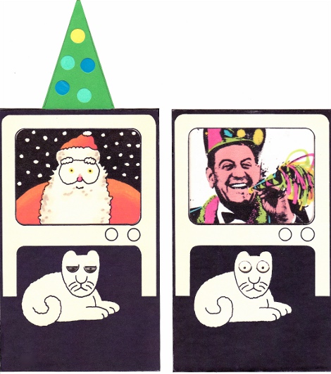
It’s from 1976. Mr. Binks: “I just had to do a card with Guy Lombardo ushering in the New Year. This is a multilayered card housing an elastic band to animate the action. When the Christmas tree is pushed down, the TV screen changes from Santa to Guy Lombardo. The cat wakes up to the sound of the New Year festivities.”

I think it’s fantastic: the concept, the drawing and the use of Lombardo’s lividly tinted photo. That poor cat!

And on that note, a Merry Christmas and Happy Hanukkah. Next week we’ll have the last entry in this round of posts. The focus will be dogs and cows — don’t miss it.