Blood in the Gutters

Editor’s Note: This is part of a series of student papers from Phillip Troutman’s class at George Washington University focusing on comics form in relation to Scott McCloud’s theories. For more information on the assignment, see Phillip’s introduction here.
__________________

Scott McCloud is quick to introduce the concept of closure as the defining aspect of comics and is nearly as quick to locate it as existing in “the gutter”, the blank space between the panels in comics.  This is a useful shorthand, but as he further develops these ideas it becomes clear that closure is actually a continuous involuntary act on the part of the reader that does not rely on the panel or gutter at all.  In fact, closure occurs within panels quite frequently and is the result of time being represented, usually implied by sound or motion.  As McCloud explains, in a purely visual medium like comics, time, or the motion and sound that implies time, can only be represented through the space on the page.  In comics, space and time are the same.  This reduces the panel and its negative space, the gutter, to icons that indicate that time and space is being divided.  In effect, the panel and gutter have less to do with the actual process of closure, that is, perceiving the whole from parts, and more to do with indicating what is a part.


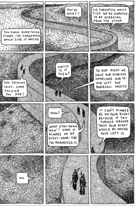
So as this image from McCloud’s Understanding Comics demonstrates, closure can occur without the use of intervening gutters to indicate the passage of time.  As McCloud explains, the movement of our eye across the page is enough for us to understand that time is passing and to make sense of what is happening.  Gutters are not necessary.  This leads me to conclude that it is the act of scanning the page that generates closure.  By scanning I mean the almost involuntary movement of our eyes across the page and the unconscious synthesis of the images on the page into a narrative.

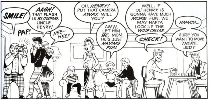
Consider the polyptych, a technique used in Guardians of the Kingdom by Tom Gauld.  A polyptych in the comics world is where “a moving figure or figures is imposed over a continuous background” (McCloud pg 115).  The polyptych provides an example of closure occurring in one setting, likely with one subject or a small group acting or talking (that is, providing sound or motion to imply time and generate closure), but it is a technique that requires the use of panels as an organizational framework, despite the fact that all the closure-generating action of a character occurring within one setting could only logically be explained as a passage of time.  Otherwise it would appear as the sudden multiplication of one character into many copies, something I think it is safe to say could easily be ruled out through context.


For example, this polyptych from Gauld’s aforementioned work uses one scene and only two characters, both moving and speaking and thereby implying the passage of time.  It also has a very basic set of panels dividing the image which helps to emphasize and clarify the passage of time.  The panels help to organize the image on the page, but they are not necessary to understand the image, which is to say, to generate closure.  If there is some doubt about this assertion, imagine the page without the panels.  Although it might be momentarily confusing, reading the whole page would provide the necessary context for closure to occur.  In fact, in this particular instance, even that much probably wouldn’t be necessary, as the reader would be aware that there are only two characters in this book. Nonetheless, the panels do help and McCloud’s characterization of them as icons for the division of time seems to make sense, although they might be more accurately described as indices.  An icon bears a visual similarity to the thing it represents, whereas an index does not necessarily resemble anything, but indicates that what it represents is occurring. As panels and gutters can’t be said to visually resemble the passage of time, but instead indicate that it is happening, they are indices.

Why, if they are not necessary, do we see panels and gutters so often in comics?  The answer is that while they are not necessary for closure, they are necessary for comics as a format.  They help us to organize the page and are the author’s means of steering our scanning of the images.  Imagine, once more, the page above without panels.  But this time imagine that it is huge, far larger than any book would allow, so large that it would take some time to scan the whole image from top to bottom.  In that case, the winding wall and real time needed to scan the page would provide all the indication of the passage
of time necessary.  Closure would certainly occur without the panels.  In essence, panels are not necessary for closure; they are an accident of the format that has been developed by authors as a means of directing the process of closure, thereby shaping the meaning we draw from the comic.

There is further evidence to suggest that while closure doesn’t strictly require panels, comics do.  More broadly, any visual narrative art requires panels and if those panels are not explicitly drawn, they are implied.  The Bayeux tapestry, an 11th century embroidery depicting William the Conqueror’s successful invasion of England, although clearly not a comic in the modern form, works just like one.  It combines images, definitively on the iconic side of the spectrum, and words to tell a story.  It scans from left to right and is
broken down into a number of scenes, although none are explicitly numbered or
otherwise differentiated.  But the fact remains that the panels are implied.  The need for organization in the images was still present and panels, or in this case scenes, are apparently the instinctual way to depict this.

It is my contention that closure occurs constantly through our scanning of the images and the involuntary creation of meaning out of the juxtaposed images on the page.  The panels and their negative space, the gutters, act only as a way of organizing these images for, no doubt according to the author, more meaningful scanning.  Further, I would argue that panels are actually just a formalization of our natural scanning and is due mostly to the physical format that comics take.  The fact that comics generally come in books, that
is on pages read left to right, top to bottom, has necessitated the use of panels. Specifically it solves the problem of moving down the page, something the Bayeux tapestry doesn’t have to deal with and consequently didn’t create a system like explicit panels to direct the reader.  I do not disagree with McCloud that “closure is comics”, indeed any visual narrative must have closure because that’s how we make sense of them. And I would go farther, perhaps, than McCloud by stating that comics are panels, whether those panels are implied or explicit, because the format demands it.  But, as I believe I have shown, there is no transitive property at work here; panels and their gutters are comics, comics is closure, but panels and gutters are not closure.

The Color Question

Editor’s Note: This is part of a series of student papers from Phillip Troutman’s class at George Washington University focusing on comics form in relation to Scott McCloud’s theories. For more information on the assignment, see Phillip’s introduction here.
_______________________
 
Color remains a question rather than an answer in comics: Some artist’s embrace it, while others continue to ignore it. Whatever its use, color plays an important role in forwarding the message of the artist. Yet such a message is ambiguous. In his analysis Understanding Comics, Scott McCloud notes that color promotes comics by reaching toward reality, making a panel appear to be a much more relatable image to the reader, who lives in a world beyond black and white. Mirroring life itself, which is far from flat, colored images add an extra dimension to the page. But is this the true purpose of color in comics? McCloud suggests otherwise; however, due to the brevity of his designated chapter, he never explains why. Indisputably, comics serve to simplify life, easing the ability to communicate some sort of integral message to the reader. Breaking the fourth wall, color magnifies the author’s claim. Minute tidbits of otherwise unseen details reveal themselves through the additional lens of color.

The following image derives from Doug Murray and Russ Heath’s “Hearts and Minds: A Vietnam Love Story.” The panel displays the death and destruction caused by the detonation of a grenade during a battle in the Vietnam War.

Throughout my analysis, I will revisit this image in order to touch upon the overlooked meanings that color specifically reveals.

Color magnifies important details that forward the cartoon’s claim. Though images may appear more realistic, the purpose of color remains for graphics to appear more simplistic. Noting the simplicity of cartoons, McCloud emphasizes that, overall, cartooning is a form of “amplification through simplification” (30). Comics pride themselves in exaggeration, which empowers a point rather than detracts from it. In this sense, color is yet another mouth for exaggeration. Heath’s image exhibits excessive exaggeration due to the use of color. Studying certain features of Heath’s panel, readers must digest uncomfortable truths that the artist is emphasizing. For instance, the two Vietnamese corpses expose gruesome depictions to readers.

In the first image, color contrasts the white bone protruding from the dead man’s neck from the background. Clean and crisp, this bone appears as though it is out of place. Looking as though it were a plastic piece in the board game Operation, the bone could easily slide back into the dead man’s body. Though, in reality, this bone would be muddled with blood and dirt rather than in this immaculate condition. Instead of showcasing visual reality, color emphasizes a statement: Another man’s bullet pierced a bone through another man’s throat. The same argument is displayed in the second image. Here, color bolds the blood that pours from the man’s dislocated torso. Yet this blood is pure red. In reality, such blood would not beam from a corpse; it would be dirtied and dried. Color again simplifies reality, highlighting to readers what happens during war.

When the same images are displayed in black and white, such an effect is lost. Though readers may understand that the two men are dead, they do not see death’s marks etched in the corpses. The bone is barely visible, and the blood blends with the shading. The colored images are blatant to readers, who inherently understand what each detail represents. Such a technique attests to McCloud’s claim about drawing style: “By stripping down an image to its essential ‘meaning,’ an artist can amplify that meaning in a way that realistic art can’t” (30). Heath’s color truly “strips down” the panel to its bare essentials.

By simplifying a panel to its bare essentials, Heath presents color as an icon. As McCloud defines the term, an icon is an image that represents a person, place, thing, or idea (27). Cartoonists rely on icons to transmit a clear and obvious message to readers. In the case of this panel, the clearest example of an icon is the color red, which represents blood. Readers immediately connect the image of blood with its more powerful meaning: carnage. Heath chooses to depict such carnage through the visual device of an icon, and such an icon is displayed through color.

Beyond functioning as an icon, color breaks the flow of sequential art, emphasizing the subject matter of an image rather than the panel transitions on the page. Referring to the purposeful placement of juxtaposed panels, sequential art stresses the movement from one panel to the next, which, in turn, unconsciously forwards the plot. Looked at as an abridged filmstrip, sequential art carries readers from one important scene to the next. Yet, color seemingly cuts this artificial current.

The selected image comes from a page with three separate panels. Despite the wholeness of the story, color slows the sequential flow of these transitions. The first panel encompasses over a half of the page, warranting some sort of inherent importance in its size. Obviously, the artist wants readers to not only look at this image, but to study it in detail. Despite its size, readers may easily browse from one panel to the next. However, Heath installs color to prevent such an easy transition. After reading this page in its entirety, readers are inclined to revisit the first panel due to its colorful graphic content. The secret to such a phenomenon lies in the highlighter-like quality of color.

For example, moving left to right in the first panel, the focus shifts from the line of soldiers to the sprawl of bloodied corpses. Bold outlines of blood and flesh segment each corpse from the next, hinting that each image has a different story to tell. In fact, each body could be a separate panel. In the panel, four separate Vietnamese bodies are macabrely drawn: An American soldier tests the pulse of a clearly lifeless Vietnamese shell; another American soldier picks at a mangled corpse with his gun; and the final two corpses, torn and shattered, lay brutally close to the reader at the front of the panel. Subject-to-subject transitions would individually highlight each corpse and its features; yet, Heath decides to include multiple scenes in one panel, separating them by color. By choosing this method, color simplifies four possible panels (one panel for each corpse) and gift-wraps them for the reader. Realistically, each corpse deserves its own panel in order to communicate its graphic content, but color simplifies such reality into a single cartoonish image.

By segmenting sequential art, color also simplifies the significance of McCloud’s illustrious gutter. McCloud defines the gutter as the space between panels where closure occurs in reader’s minds. Through closure, McCloud suggests that the message of the comic is conveyed to readers. Such a claim raises the possibility that closure could be misconstrued: Reader’s could interpret a different idea than the artist intended from the panels. Color counteracts such discrepancy. Creating its own sense of closure, color illustrates the artist’s message clearly to the reader. Revisiting the panel sequence, I have manipulated the colors to a black and white format.

Reading the page, readers find that it is naturally much easier to follow the storyline in black and white. The first panel describes the recent conflict, and the gutter to the bottom left panel suggests to readers that such a massacre is a daily display for soldiers, as the sergeant plans to move out to another town. But, in color, such a transition is not so smooth. Color isolates the first panel, giving the gutter transition between the first and second panel a much different meaning. Studying the images in color, readers realize that the comic is exposing the absurdity of death through battles in war. The gutter seemingly empowers this statement, as it quickly introduces another future conflict that promises to be just as gruesome. Murray and Heath seem to be showing readers the horrifying realities of war. Graphic imagery, highlighted by color, communicates a “War as Hell” message to readers, who must digest an unnerving panel. Such closure can only be deduced when the panels appear in color. Without the red blood and displaced flesh, which are both only noticeable through color, the comic’s philanthropic message is lost in translation. Clarifying these important details, color simplifies Murray and Heath’s message. Rather than using words to communicate a difficult idea to readers, Murray and Heath rely on the simple but powerful effects of color.

Rather than making comics more realistic, color is highlighting the simple message of the images. Comic artists utilize color to highlight their ideas rather than bring them closer to reality. Magnifying minute details, colors strip down panels to their bare essentials, successfully forwarding the message of the artist. Manipulating the flow of sequential art, color simplifies complex depictions into a single panel. And, transforming the gutter, color clarifies a complex idea through universally understood graphics rather than confusing words. As viewed in a single page of Murray and Heath’s “Hearts and Minds,” a war related comic promises to introduce many ideas to readers. With so many themes floating throughout the comic, some sort of technique should aim to clarify and polish the author’s intended message. With that said, color in comics aims to simplify ideas so that readers better understand the artist’s message. Highlighting death and the absolute brutalities of war, color serves as a trail-marker for the artist, who only hopes to easily communicate some sort of message.

When an artist prepares to finalize his product, he must ask himself the color question: Could color simplify life more so than the comic already does? Heath’s artwork answers such a question. Indeed, even with color, simplification proves to be the root goal of comics. Color thereby is not so much an aesthetic choice to the artist as much as a literary tool.

Comics Criticism 101: An Introduction

This essay was written in my first-year composition course at the George Washington University. University Writing Program faculty draw on a variety of disciplinary backgrounds (my Ph.D. is in American history, with current research on abolitionist visual rhetoric) to teach students to “enter the conversation” of academic research—to do detailed analysis and to engage existing scholarship rather than simply regurgitate it. This particular assignment arose out of the cross-fertilization that Craig Fischer argues is emblematic of comics scholarship, where academics, fans, practitioners, and popular critics seed each others’ ideas and produce more interesting work.

I had been teaching a “five-page paper” version of this exercise, where students analyze specific visual elements of a chosen comic or graphic novel in order to develop a claim in response to Scott McCloud’s Understanding Comics. This served as an introduction to comics (McCloud is great for that) but also to claim-making, because, as a foundational text, McCloud is the perfect foil: authoritative, comprehensive, and eminently fallible. Students always find interesting exceptions to his rules, new categories of panel transition or image/text interaction, and concrete ways to develop his vague generalizations.  But the papers still felt academic in the pejorative sense: they represented a school genre that addressed only the professor as audience.

To move away from that, I consulted the Comix-Scholars Discussion List, fishing for ideas about formal criticism in the blogosphere: hence Noah. Noah was very interested in the project, helped me rethink the genre of comics criticism, and very kindly loaded me up with examples, many of which went onto the assigned reading list as a diverse set of models we read and discussed in class. Students now have a broader range of rhetorical choices to make regarding introductions, integration of images, organization, descriptive language, and analytical tone—not to mention examples of how to make a claim that might matter to someone outside the classroom.

As a final gesture, Noah asked me if he could publish some of the best examples students produced. I am most grateful for his generosity and I hope you enjoy the ones we’ve selected. The students are excited about sharing their work and, I trust, will be watching the comments closely. Please welcome them to the conversation.

_____
Phillip Troutman is Assistant Professor of Writing at The George Washington University, trout@gwu.edu