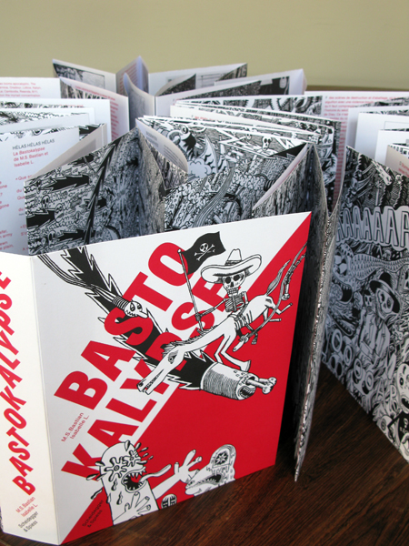
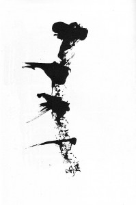
Diário Rasgado [torn diary] by Marco Mendes
(1) Politics
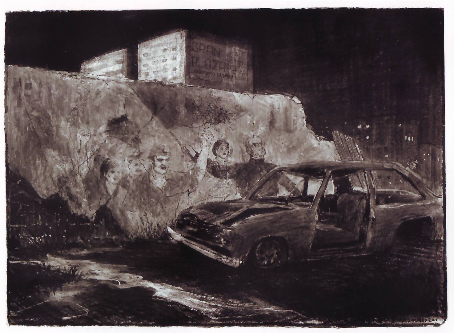
Marco Mendes, Diário Rasgado, May 2012.
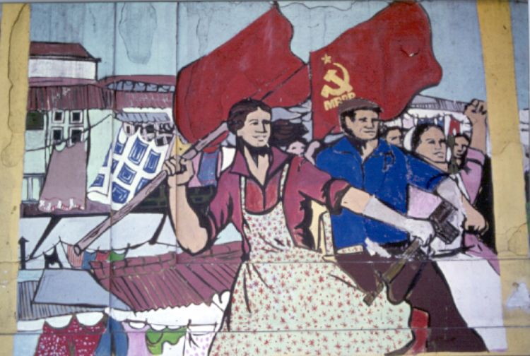
What do you see above?
A dark, moonless night… two buildings on the middleground, more on the background on the right hand of the drawing… a wall and what seems to be the remains of a wooden door… a mural (or graffiti, if you prefer) on said wall… a wrecked car…
Examining the mural we can see people in some kind of demonstration. The one on the right is waving a flag…
If the sky is pitch black what is the light source? Most probably an out of frame street lamp. This is, unmistakably, the inospitable landscape of the human beehives: proletarian suburbia, the projects…
So far so good, right? My point though is that images aren’t as universal as some people seem to think. In order to fully decode them some context is needed. In this particular case you may also have guessed that this is political art… And highly sophisticated political art at that. Marco Mendes is a Portuguese comics artist and this is the last, and, not the most powerful, by any means, image of his uneven (more on that later), but great book Diário Rasgado…
Going back to the image above lets concentrate now on the wall. What’s it doing there? If we go back a century or so Portugal’s economy relied mostly on backward agriculture. Portugal’s Industrial Revolution was insipid at best. Forty eight years (1926 – 1974) of a right wing conservative regime didn’t help to change anything. On the contrary: Salazar, the dictator, was an extremely religious fellow who wanted a country culturally stuck on the ancien régime. The popaganda of his time spread the image of an idylic rural community life (pretty much like the apple pie visions of America).
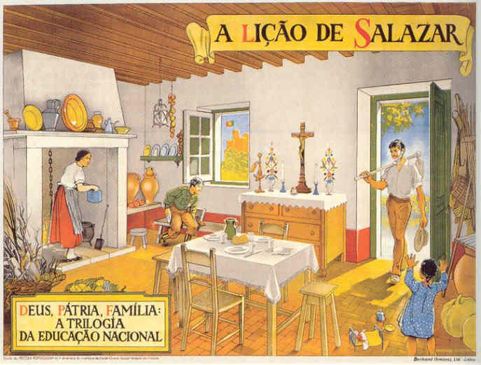
Jaime Martins Barata, Salazar’s Lesson: God, the Fatherland, Family, the Trilogy of National Education, 1938.
The above watercolor is a perfect example of Salazar’s ideology: after a day’s (or a morning’s) work the rural worker (using an archaic tool) comes back to his patriarcal, poor, but highly organized and clean, happy home. At the center of everyday life, holding the boat and assuring law and order, were the Catholic and State religions (look through the window at the Portuguese flag on top of a Medieval castle representing our glorious forefathers). Needless to say, such popaganda did hide a grim reality of exploitation, hunger, and gender inequality.
But I digress, maybe?… What about the wall in Marco Mendes’ drawing, then? It’s there because in the above described rural Portugal some wealthy families owned farms around the main cities. In time those farms were dismantled and invaded by greedy real estate entrepeneurs. Projects for the rich and not so rich multiplied like mushrooms because of a complete absense of planning policies (not to mention political corruption). Poor rural workers fled hunger-ridden rural areas hoping for a better urban life and each one of them needed a place to live after all (it’s a well know story everywhere). Maybe that wall is a standing mute witness to those old days when beautiful farms were part of the urban landscape. Because of the mural on it it’s also a witness to radical changes in Portuguese society after the Revolution of April 25, 1974.
Anonymous political mural in Lisbon, 1977. Photo copyright Yves Benaroch.
Marco Mendes used a bit of a poetical license in his drawing because the murals of the revolution didn’t survive. Maybe there’s one or two still around, who knows?, but I don’t think so. I can’t imagine one in 2012 at least. For a couple of reasons: a left wing mural, reminincent of the Maoist one above has a different reading in Beijing and Lisbon. It can only mean what I think it means in Diário Rasgado, shattered hopes, because we are suffering by far the worst dictatorship that ever existed: the dictatorship of the financial markets, the dictatorship of the wolves disguised as lambs; the dictatorship of the Plutocracies disguised as Democracies. In Beijing the image could mean the exact same thing with a crucial difference: the people could say with propriety: beware with what you wish for!… Even if no one believes in future times of milk and honey now, the fact is that many Idealistic people did back then just to slowly fall into the (as Luís de Camões – 16th century – put it in one of the best poems ever written) “disarrangement of the world” again…
Two final notes: the woman on the mural above should liberate herself (getting rid of the pinafore apron) before trying to liberate others; Marco’s drawing is a Deleuzian image-time linking the past and the future (time is cyclical): the wrecked car may be warning us that popular upheavals, like the ones that happened all over France in 2005 and the UK in 2011, are bound to happen in Portugal.
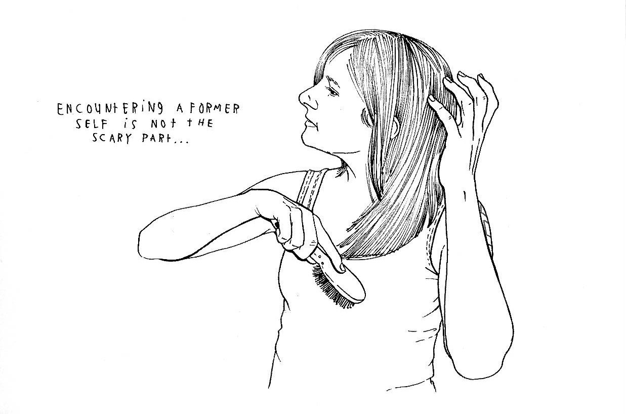
(2) Autobiography?
Well… not exactly…
It’s true that the title of Marco’s book mentions a diary… Plus: the characters who appear in the book are the personas of Marco, his friends (Miguel Carneiro, with whom Marco co-founded A Mula – the mule – art collective among them) and girlfriend, Lígia Paz, but that’s almost it… Marcos’ private life certainly inspires him, but that’s true for every artist, so, there’s almost no autobiography in Diário Rasgado (the exceptions being the stories including his family, his grandfather, mainly). Maybe Lynda Barry’s autobiofictionalography is what I’m talking about, after all… It doesn’t really matter though… We’ve long past those maverick days in which autobio meant being a mature and serious artist.
Marco Mendes’ first book (a mini-comic), Tomorrow The Chinese Will Deliver the Pandas (June, 2008), was published in English with translations by Pedro Moura and Elisabete Pinto. There’s an imediacy in his first work that, as Lígia Paz put it in “The Introduction [to said mini-comic] Marco Made Me Write”:
In [Marcos’] comics work, the exploration goes to the rhythmic possibilities inherent to the format, the drawings are more explosive, emotional, and surprisingly funny. There is a vivid concern in letting words and events flow, in a continuous and frequently corrected, scratched, and unaltered text, as if there is no [erasing] rubber.
The drawing is sketchy and the little vignettes describe what happens in a house where bohemian art students live. The language is often coarse. Unfortunately some homophobia (still pervasive in Portuguese society), ableism and misogyny rear their ugly heads in Marco’s friends’ and girlfriend’s jokes. A light humor and a friendly atmosphere is the general tone of these early strips (Lígia Paz, again).
There was a house […] with a mythical living room: the setting of multiple parties, a ping-pong table, a famous sofa where so many have slept and [have] been portrayed, not to mention the walls, covered with drawings and several forms of confessions. […] In all the rawness of his social realism, without tricks or self-complacency, the representations and portraits of the surrounding friends are also a testimony of our current times and of his generation. There is also a very clear sense of sharing, identity and belonging to a community, united by common values, experiences, and eighty cent beer.
Lígia also mentions the “distance between the portrayed individual and the fictional character.” Which, methinks, is revealing and should be used to describe autobio artists. As Arthur Rimbaud put it: “je est un autre” (“me is another”).
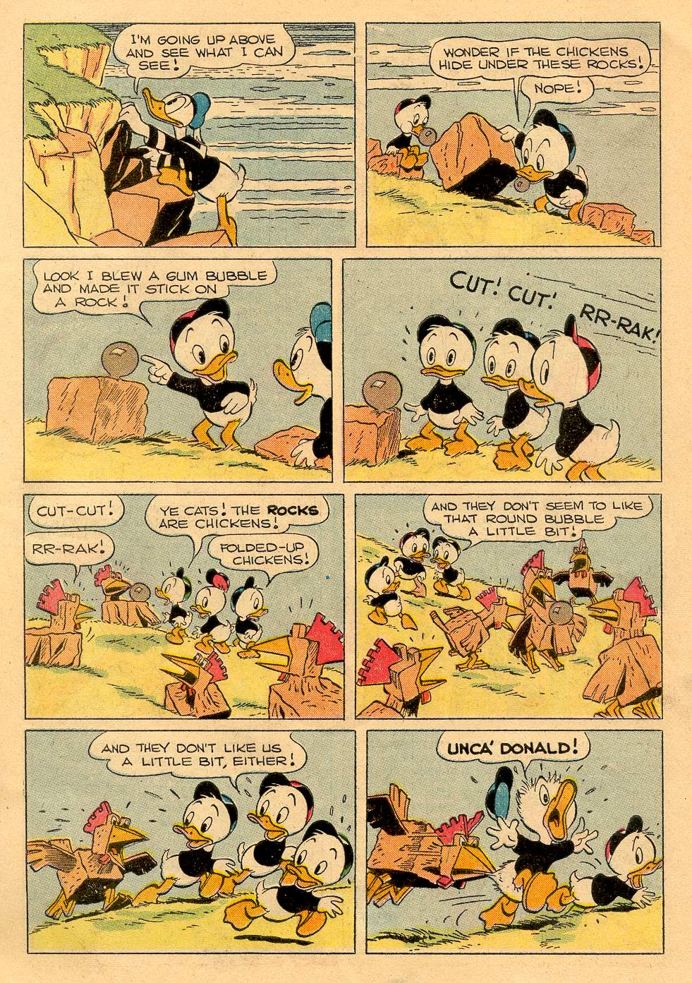
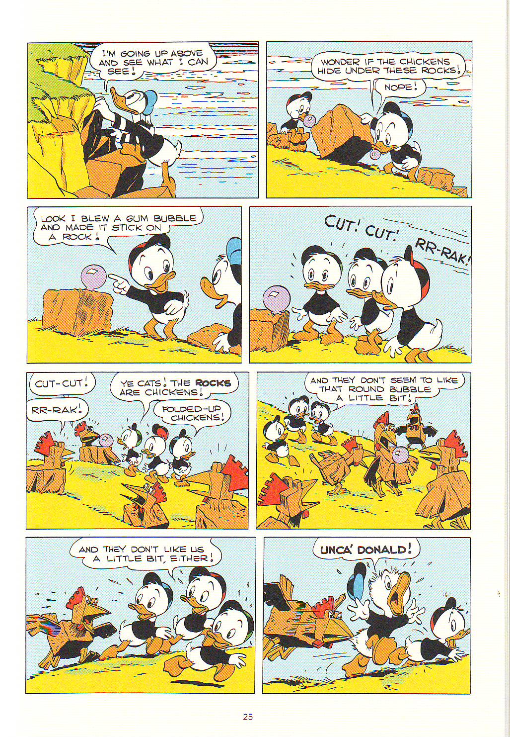
Marco Mendes, Tomorrow The Chinese Will Deliver the Pandas, June 2008.
Marco Mendes, Diário Rasgado, May 2012.
The small but significant differences between the two versions of the same page above are also symptoms of two different editorial policies. The first page (which can also be seen in Marco Mendes’ blog) is more messy: there are no gutters, graphic noise wasn’t cleaned up. The original layout was destroyed in the book version (the page was cut in half to become two landscape formatted pages); everything is a bit more clean. It’s the difference between a DIY punk aesthetic and a more professional, slicker look.
And yet… Even as early as 2007, there are quiet, melancholy moments in Marcos’ oeuvre. His better work to date, done in the last couple of years, was created in that tone. (To be perfectly candid about it, even if I find Marco’s earlier work fine enough this post wouldn’t probably exist without the quality leap that are his amazing, more recent, color, mostly wordless, pages.)
Asked what genre interested him more, humor or drama, Marco answered: “They’re both too close. I see no way of separating them.” What we can infer from his words is that Marco Mendes is attracted to pathos (see below)… Even so, pure drama also happens, but Marcos manages to avoid sentimentality…
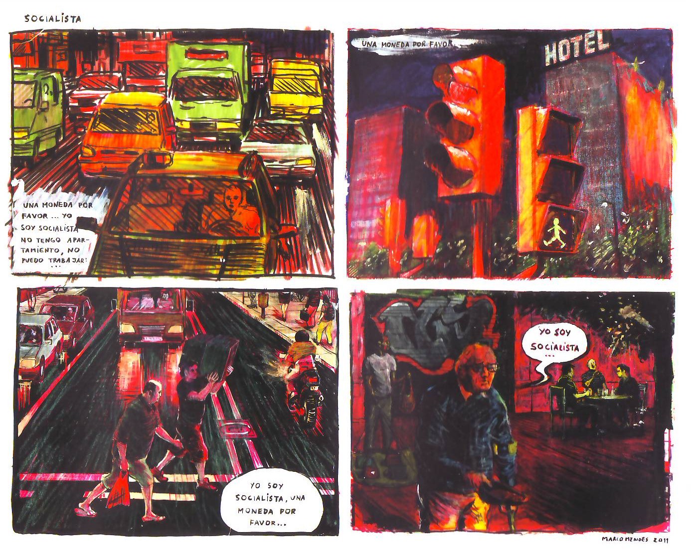
In Barcelona: “Socialist: ‘Give me a coin/ please… I’m/ a socialist/ I have no/ apartment, I/ can’t work…’ /’a coin please’ /’I’m/ a socialist, a /coin please…’/ ‘I’m a socialist…’,” Diário Rasgado, May 2012.
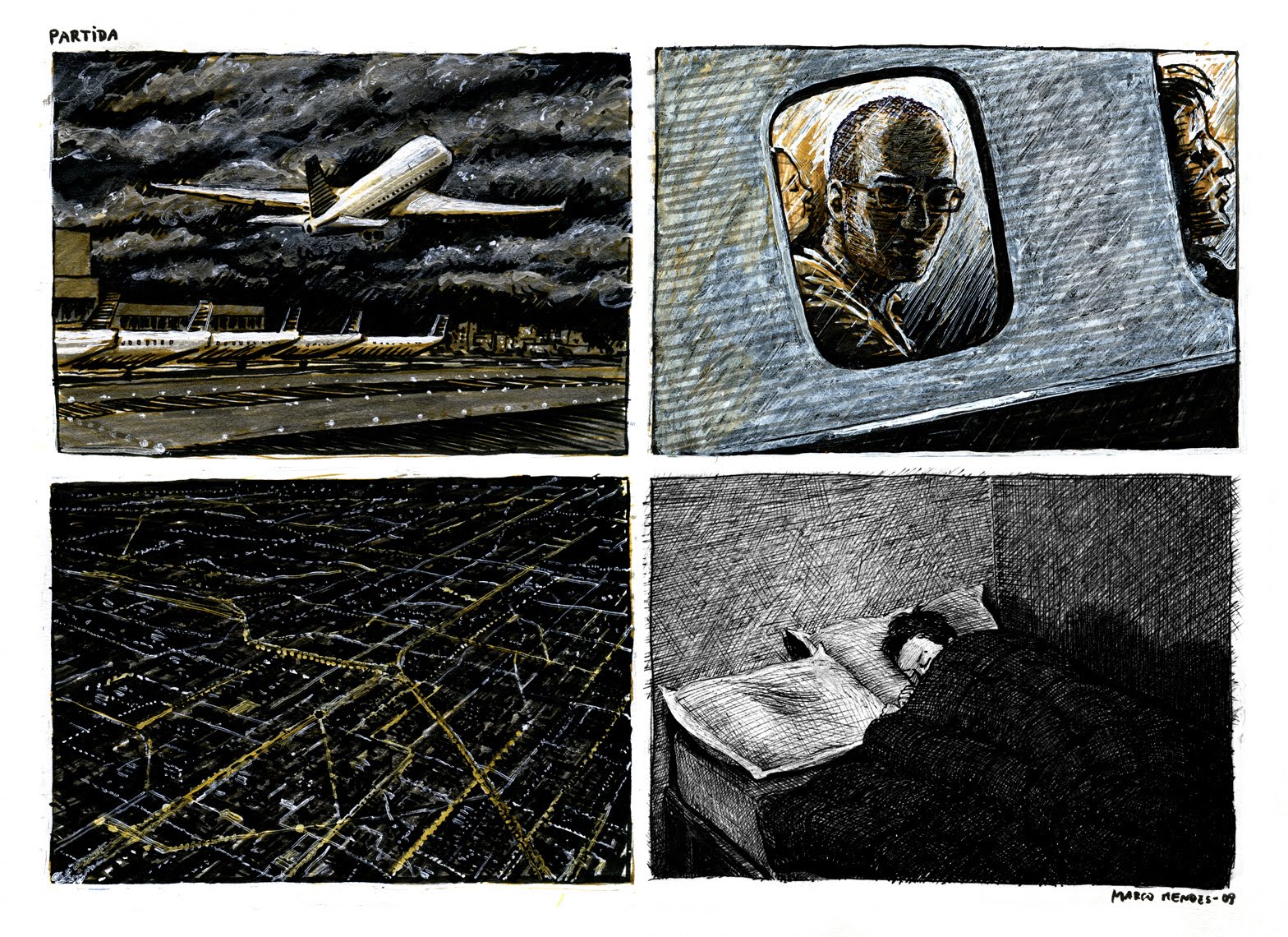
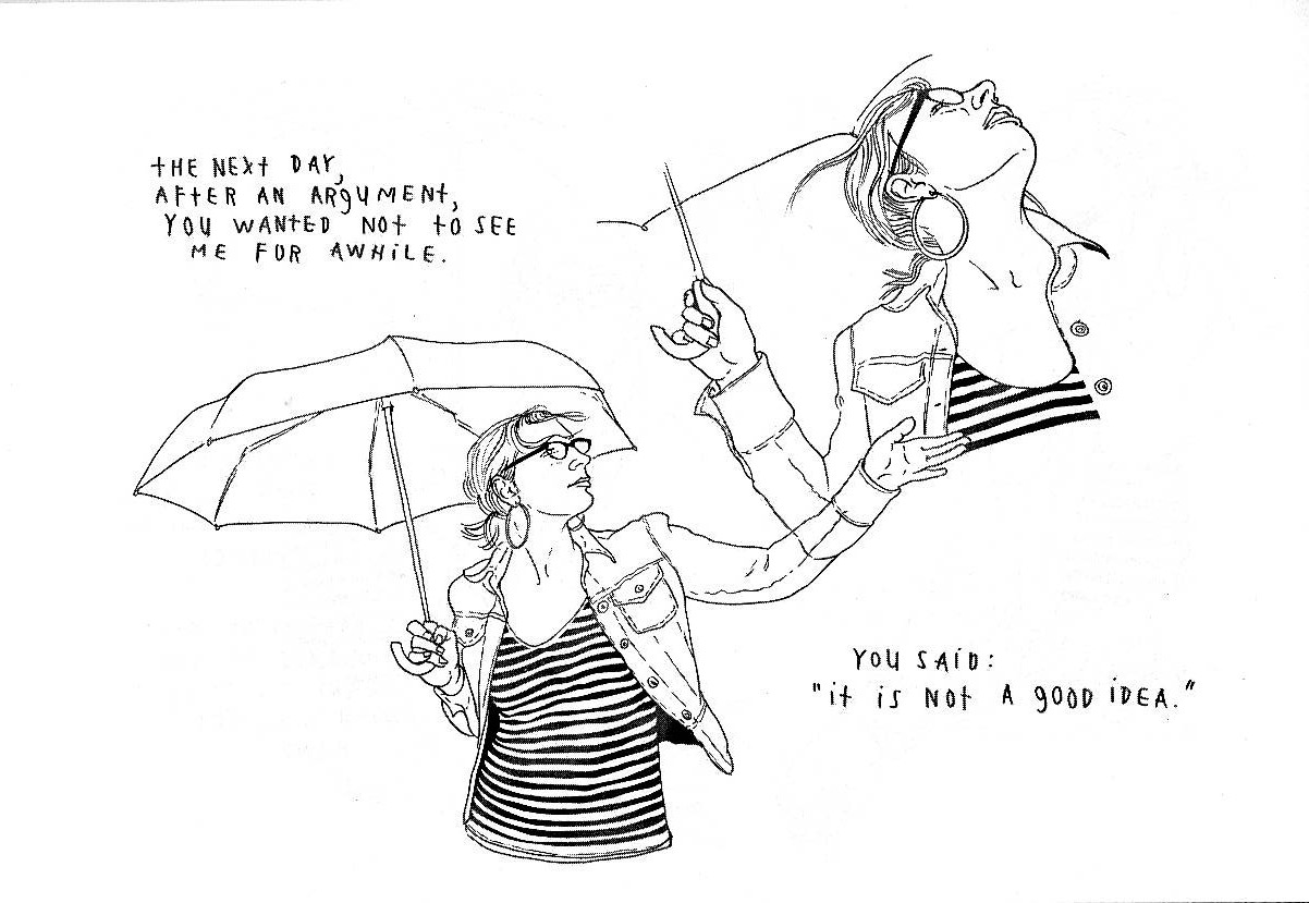
Melancholia: The ending of a long distance relationship: “Departure,” blog post, September 16, 2010.
At some point Marco started to mostly use a regular layout of four panels in which the last one is a kind of punch line. He prepares it by developing a situation which he then procedes to twist a bit at the end (a process that’s akin to Usamaru Furuya’s four panel comic Palepoli). In “Socialist” above he used a palette of warm slightly sickly colors and changing points of view to convey movement and disorientation. (Other times the city is a cold pale blue – see below.) Since Edward Hopper is one of Marcos’ biggest influences I can’t think of many comics artists who can convey as well as he does the feeling of loneliness in a big city. The self-deluded beggar, thinking that he’s entitled to a coin because he’s a socialist is one of those things that, I suspect, can’t be created from scratch (life has a lot more imagination than we do)… I may be wrong though, of course…
In “Departure” Marcos used the visual idea of shadowing the face of his character to convey his state of mind. Between him and his girlfriend we know who lost the most emotionaly when they broke up…
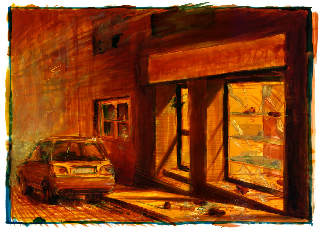
Marco Mendes, “Mutiny,” blog post, December 19, 2011. An Edward Hopper inspired shoe shop after a riot: another example of urban pathos?
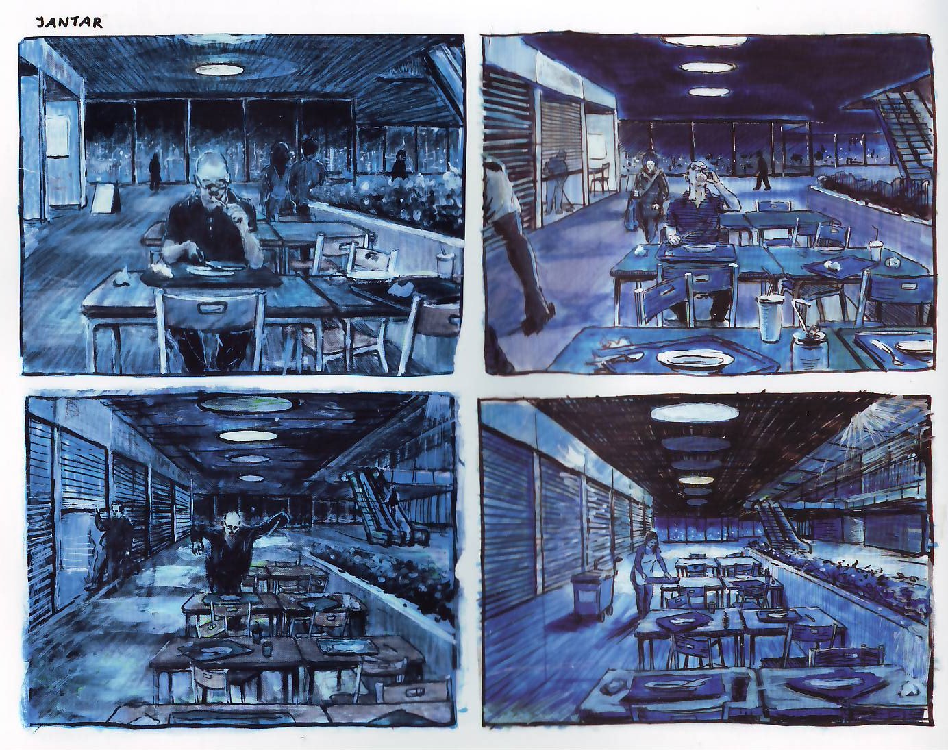
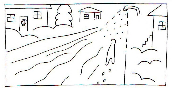
A zoom out, but can we really escape these non-places? Marco Mendes, Diário Rasgado, May 2012.