DWYCK: Critiquing a Lively Art


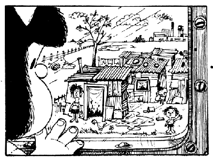
For this column, I’d like to return to the subject of comics criticism. A while back, HU hosted a Popeye roundtable, which raised some interesting general questions, but seemed to stop from lack of enthusiasm before it went very far. Not being in a position to contribute at the time, I would like to resurrect it for the purpose of raising a number of issues pertaining to how we talk about comics and art.

Noah in his ambiguous essay on E. C. Segar’s strip expresses frustration at what he perceives to be its shallowness:

Though I enjoyed the energy of the drawing, and the Sea Hag and Goon provided some evocatively creepy moments early on, the limited range of the humor, and its empty-headedness, quickly becomes numbing. Wimpy is lazy, Wimpy eats a lot, Popeye is noble, defends the underdog, and always wins.

Robert, in his piece, which references a series of earlier, excellent reviews on his own site, concludes that the strip is “largely of historical interest”, writing:

The challenge I gave the work was for it to transcend that description. It occasionally did; there were flashes of satirical and absurdist genius every now and then. “The One-Way Bank” storyline from Volume II and the finale of “The Eighth Sea” storyline from Volume III stood out, and I was especially taken with Volume II’s “The Nazilia-Tonsylania War” — its treatment of state and military folly ranks with Dr. Strangelove (almost) and Duck Soup. (No pun was intended with the name “Nazilia,” by the way.) However, Segar was generally far more enamored with farce and slapstick for their own sake than he was with satire. That greatly limits the appeal of his work, at least for this adult reader. Farce and slapstick that don’t connect with anything deeper are best in small doses; they tend to wear out their welcome fairly quickly.

So the strip is less than great because it is simplistically conceived and primarily concerns itself with slapstick and farce, only rarely ‘transcending’ these. For Robert, this happens when it becomes satirical, because that somehow connects ‘deeper’ than mere laffs.

This seems to me a holdover from modernist conceptions of aesthetic value that privilege the framework provided by the ‘high’ arts. Robert even spells out this bias:

No reasonable person would consider it on the level of Faulkner, Kandinsky, or Jean Renoir’s work, but it looks right at home when viewed alongside the efforts of Mae West, W.C. Fields, and the Marx Brothers. I have nothing against the popular-entertainment standard for determining “good” comics, by the way. If a comic entertains people, it’s doing its job. And if it’s entertaining people to the extent that it becomes a pop-culture phenomenon, which Segar’s Popeye certainly did, then it’s doing its job terrifically well.

…But it still isn’t as great as Faulkner, Kandinsky or Renoir. Invoking the consummate elitist Harold Bloom’s definition of the canon as what should be taught in our schools, Robert judges Popeye out. But why? He has himself conceded that it gripped more than one generation of readers and became a pop-culture phenomenon. Isn’t that worth teaching in schools? And what about those great humorists cited? Irrelevant to the understanding of our culture?

My intention here is not to claim that Popeye – or Thimble Theater if we want to be correct – is the equal of the best high art had to offer at its time (conversely I’m not saying that it ain’t either). What I am saying is that it will necessarily look impoverished when judged in the framework of high culture, and that I find such a yardstick unhelpful in assessing its qualities — qualities that clearly resonated widely and persistently. Although we have now for several decades described our times as postmodern, with everything that entails, the elitist legacy of modernity is amazingly hard to shake.

Noah recognizes this, essentially framing his dismissal of the strip as personal preference. He compares with another low-culture medium, which has received even less high-culture acclaim: television, concluding that,

…what is and isn’t considered art is really arbitrary. Comics critics have spent a lot of energy for the past decades trying to get comics accepted as high art. They’ve had definite (if not unqualified) success, and now even frankly pulp, unpretentious works like Popeye can be put up in galleries, given lavish reissues, and hailed as canonical examples of the form.

I would guess that someone like Noah, who spends a fair amount of energy as a critic acclaiming the qualities of some of the most commercial iterations of contemporary pop music, would be unsatisfied with the kind of high-culture point of view brought to bear on comics by some of its more assiduous critics at this current, mercurial juncture in their history.

Having long regarded hip hop as one of the most inspiring cultural manifestations of the last 30 years, I sympathize. It has been interesting to watch its fortuna critica in the cultural establishment as it has evolved: regarded initially as a fad, its staying power has come to be recognized and it is now classified as a legitimate musical genre, but it still isn’t considered an art form on the level of, say, rock music. “Gangsta Gangsta” by N.W.A simply doesn’t cut it when measured by the yardstick of “Like a Rolling Stone”, but it is undeniably a hugely resonant piece of work, every bit as influential on the generation from which it sprang.

Similarly, at the time of Thimble Theater, surely ‘no reasonable person’ would consider something like ragtime or jazz on the level of opera. Yet, today, these forms and their progeny are regarded as entirely respectable art forms, capable of greatness akin to that achieved in classical music. Music unites us in ways that other art forms don’t, and we seem to be more receptive to “shallow” qualities there than we do in literature, fine art, or even comics. Perhaps this is not so surprising, since music generally is less cerebral than those forms, making us appreciate — and intellectualize — our emotional and visceral responses to a higher degree.

And actually at least one perfectly reasonable person did consider ragtime and jazz, and with them a whole range of other popular forms such as vaudeville, the movies, and yes, comics, on the level of high culture. A cultural critic and New York correspondent of T. S. Eliot’s Criterion, his name was Gilbert Seldes (1873-1970). In his precocious defense of popular culture, The Seven Lively Arts (1924), he wrote:

If you can bring into focus, simultaneously, a good revue and a production of grand opera at the Metropolitan Opera House, the superiority of the lesser art is striking. Like the revue, grand opera is composed of elements drawn from many sources; like the revue, success depends on the fusion of these elements into a new unit, through the highest skill in production. And this sort of perfection the Metropolitan not only never achieves — it is actually absolved in advance from the necessity of attempting it. I am aware that it has the highest-paid singers, the best orchestra, some of the best conductors, dancers and stage hands, and the worst scenery in the world, in addition to an exceptionally astute impresario; but the production of these elements is so haphazard and clumsy that if any revue-producer hit as low a level in his work, he would be stoned off Broadway. Yet the Metropolitan is considered a great institution and complacently permitted to run at a loss, because its material is ART. (pp. 132-133)

Lest he be dismissed offhand as the kind of contrarian philistine such statements might evoke in us today, I hasten to supply the following; during a visit to Picasso’s studio in Paris, he was shown a fresh canvas by the master, which prompted in him a synthesis:

I shall make no effort to describe that painting. It isn’t even important to know that I am right in my judgement. The significant and overwhelming thing to me was that I held the work a masterpiece and knew it to be contemporary. It is a pleasure to come upon an accredited masterpiece which preserve its authority, to mount the stairs and see the Winged Victory and know that it is good. But to have the same conviction about something finished a month ago, contemporaneous in every aspect, yet associated with the great tradition of painting, with the indescribable thing we think of as the high seriousness of art and with a relevance not only to our life, but to life itself — that is a different thing entirely. For of course the first effect — after one had gone away and begun to be aware of effects — was to make one wonder whether it is worth thinking or writing or feeling about anything else. Whether, since the great arts are so capable of being practised today, it isn’t sheer perversity to be satisfied with less. Whether praise of the minor arts isn’t, at bottom, treachery to the great. I had always believed that there exists no such hostility between the two divisions of the arts which are honest — that the real opposition is between them, allied, and the polished fake. (pp. 345-346)

I think we could do worse than take a cue from Seldes’ notion of the ‘lively arts’ in our current reassessment of comics as cultural phenomena and art. About the comic strip:

Of all the lively arts the Comic Strip is the most despised, and with the exception of the movies it is the most popular. Some twenty million people follow with interest, curiosity, and amusement the daily fortunes of five or ten heroes of the comic strip, and that they do this is considered by all those who have any pretentions to taste and culture as a symptom of crass vulgarity, of dullness, and, for all I know, of defeated and inhibited lives. I need hardly add that those who feel so about the comic strip only infrequently regard the object of their distaste.

Certainly there is a great deal of monotonous stupidity in the comic strip, a cheap jocosity, a life-of-the-party humour which is extraordinarily dreary. There is also a quantity of bad drawing and the intellectual level, if that matters, is sometimes not high. Yet we are not actually a dull people; we take our fun where we find it, and we have an exceptional capacity for liking the things which show us off in ridiculous postures — a counterpart to our inveterate passion for seeing ourselves in stained-glass attitudes. (p. 213)

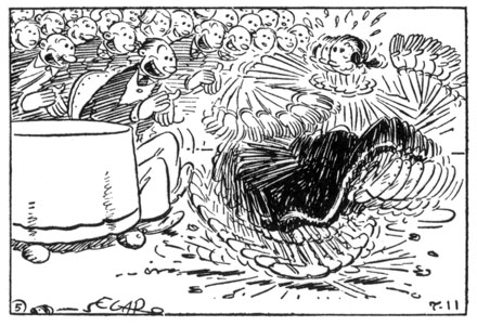
Seldes doesn’t mention Thimble Theater, and couldn’t have known Popeye (on account of he hadn’t been born’d yet), but he regarded highly its neighbor in the New York World, Krazy Kat, whose creator George Herriman he considered one of the two genuine artistic geniuses in America at the time (the other was Charles Chaplin). In his famous essay on that strip, he wrote:

With those who hold that a comic strip cannot be a work of art I shall not traffic. The qualities of Krazy Kat are irony and fantasy — exactly the same, it would appear, as distinguish The Revolt of the Angels; it is wholly beside the point to indicate a preference for the work of Anatole France, which is in the great line, in the major arts. It happens that in America iron and fantasy are practised in the major arts by only one or two men, producing high-class trash; and Mr Herriman, working in a despised medium, without an atom of pretentiousness, is day after day producing something essentially fine. (p. 231)

Granted, Krazy Kat has received greater high-culture recognition than any other strip of its day, and seems more effortlessly to accommodate a fine arts perspective, but I don’t see why one couldn’t formulate something along similar lines for Thimble Theater. Noah suggests that one might compare the strip with the cinema of Buster Keaton, which strikes me as particularly instructive:

Keaton’s work rightly occupies an important place in the cinematic canon, despite it being similarly resistant to the kind of interpretative framework that eschews slapstick. As the New Wave filmmakers recognized, however, his auteurial presence is acutely felt throughout his work, and it gives us a highly original, fatalistic and uncannily comic conception of depersonalized action in a world of strange, fickle serendipity.

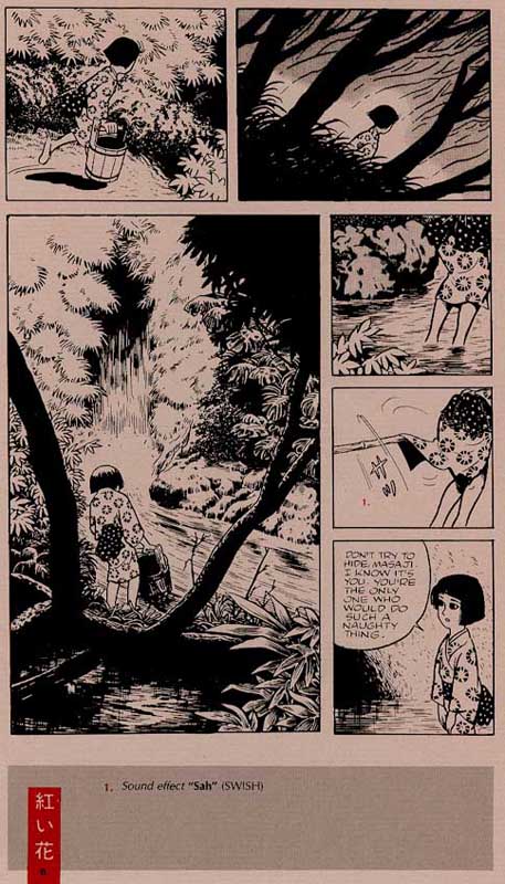
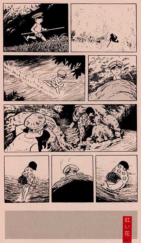
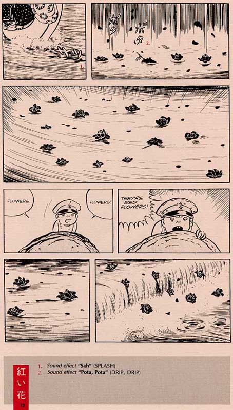
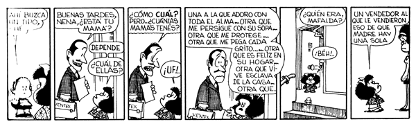
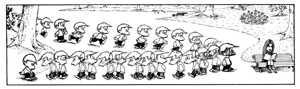
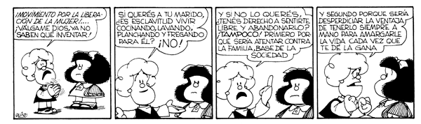
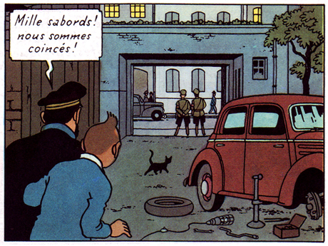
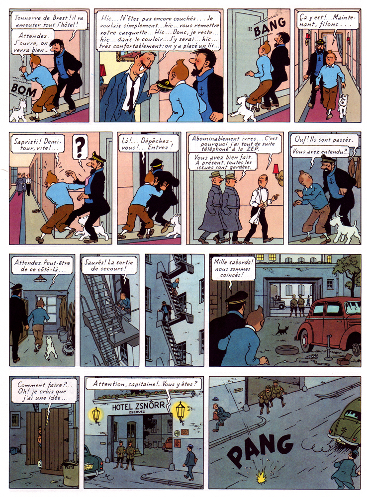
Now, let’s look at fairly typical, self-contained Sunday page from Thimble Theater (sep. 30th, 1934):

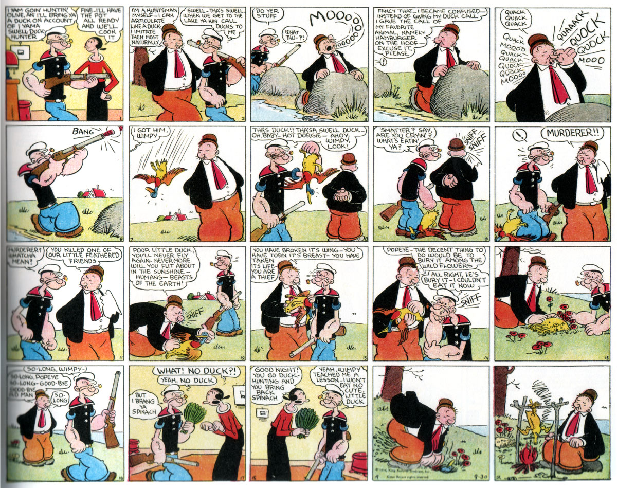
On the surface, it delivers a straightforward gag pitting, as is so often the case, Popeye’s morality against Wimpy’s lack of same. But Segar is anything but a utilitarian gang man; he proceeds like a cartoon behaviorist, generously packing in as much character detail and humorous instance to create a highly seasoned repast, all the while unfolding a strongly intuited moral ethos.

Watch his unaffectedly plump line and vernacular wit unfold across the page: Wimpy insinuating himself into the frame and the duck hunt, bodily/verbally; his mention of his favorite animal, “hamburger on the hoof”; the manner in which he splays his three surplus fingers while pressing his nose to quack (and, inevitably, to hamburger moo); his poker face registering the hit, turning to sniff; the derision on his face against Popeye’s soon-to-vanish irascible scowl; the silent burial bookending Popeye’s contrition, Wimpy empathetically yet efficiently settling the mound; the exchange: “WHAT! NO DUCK?!” — “Yeah, no duck”; the unchanged expression on Wimpy’s face as he kneels caninely to exhume the duck with speed, his coattails waving; it remains unchanged as he sits at the end, counter to the left-right flow, roasting the kill.

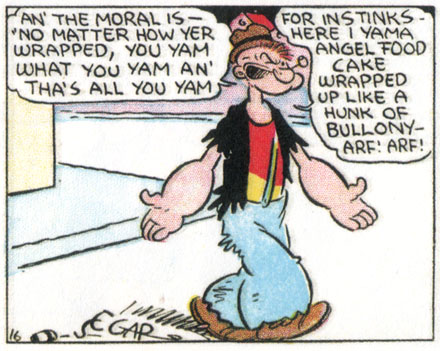
Clear in presentation, yet richly studied, this sequence is a perfect summation of the profane reality of Thimble Theater. A true comedic hero, Popeye is pugnaciously selfless in a world governed by selfishness. He always restores order around him (often, disturbingly, by violence), but is simultaneously given enough of a tragic edge — his morality is rarely reciprocated — to keep us involved. As with Keaton, there’s a fatalistic undertone to his and, by its frequent extension to the rest of the cast, the strip’s indomitable catchphrase: “I yam what I yam, an’ that’s all I yam!” It’s trenchantly inspirational and it is great fun, so why can’t it be great art?

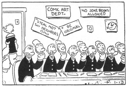
Part of the answer, if one compares with cinema, is that it has taken comics much longer to expand its field beyond a fairly restricted set of idioms and genres, all of which are candidly low culture. It hasn’t had its James Agee, though people like Donald Phelps, R. Fiore and Art Spiegelman have done their best in recent decades; they haven’t had their Raymond Rohauer and have only recently begun experiencing comprehensive restoration and republication, and they haven’t had their new wave until now.

Which brings us to the matter at hand: this is a time of redefinition for comics, which is not only manifest in contemporary cartooning, but naturally extends back to encompass its history. Neglected by critics and historians, and forgotten even by most cartoonists, the classics now demand our attention for what they teach us about their time and the evolution of the form, but ultimately also as works of art. Though it is surely healthy to assess comics in the expanded field of cultural production being opened up as distinctions between high and low are collapsing, to not cut them any exceptionalist slack, it would seem ill advised to judge them according to antiquated systems of hierarchical exclusion.

PS — Because Noah mentioned them as part of his high-low concordances, I can’t help bringing in the Coen brothers here. While it is correct that they are becoming canonized as directors, it is remarkable that their best loved, and arguably best though not most critically acclaimed film, The Big Lebowski, is so unabashedly shallow. It totally fails the modernist test as a work of art, and yet there it is, and it’s glorious.

Squint, imagine some more punching, and it might almost play at the Thimble.

DWYCK: Ishoku

The opening page of "Screw-Style"

This is a slightly edited and translated version of a piece on the great mangaka Yoshiharu Tsuge that I wrote for the Danish comics magazine Strip! and my website Rackham back in 2004. Considering his importance to Japanese comics, Tsuge remains sadly underrepresented in translation. Plus his name has come up in discussions here at HU several times, so I figured an introduction to his work would be an interesting addition to the mix here.

A boy emerges from the sea in the shadow of a C-47. He presses his right arm against his side where a deadly jellyfish has torn apart one of his veins. Whenever he releases the pressure, blood trickles to the cold ground, which he treads like a sleepwalker, searching for a doctor to help him. He passes a forest of shirts, is trampled by the silhouettes of a marching band, wanders along railway tracks bordered by empty signs. A rusty locomotive runs backward, steered by a boy wearing a cat’s mask. The protagonist hears the faint tingle of a chime in the wind, reminding him of summer. With an old lady who may be his mother, he eats phallic sticks of kintaro candy topped by small, disgruntled faces.

In a bombed-out bunker, he finds a female gynecologist dressed in a kimono and sporting a head mirror. She speaks in white as empty as the signs along the tracks and they play doctor against the backdrop of a Midway-like naval battle. A wrench, seen earlier in the hands of a suit who “almost knew what he meant”, suddenly reappears in the hands of the woman who uses it to fit his torn vein with a safety valve. Thus saved, he sails away in a motorboat with the parting words “And so, whenever I tighten the screw, my arm grows numb.”

This happens in Yoshiharu Tsuge’s most famous manga, the 22-page ”Nejishiki” (”Screw-Style”) from 1968. Like most of his comics, it was published in the legendary alternative comics magazine Garo. It is regarded as a central work in Japanese comics history and its creator has gone from cult-figure to eccentric celebrity in Japan. Born in 1937, he retired from cartooning in 1987, leaving behind a modest but highly significant body of work: around 150 short stories produced over three decades or so.

These are comics of such strange originality that he is often given the sobriquet “ishoku” (‘unique’); it has contributed crucially to the understanding in Japan of comics as a personal and artistic means of expression. Only a few of his comics have been translated into Western languages, but the ones available still enable us to assess the contours of an oeuvre that one might imprecisely but poignantly compare to that of Robert Crumb in America.

“Screw-Style” reportedly records a nightmare Tsuge had one day while sleeping on his tenement rooftop. Characteristically for his generation of cartoonists, perhaps most notably his one-time teacher Shigeru Mizuki (b. 1922), he integrates cartoon characters, whose appearance often changes from panel to panel, into backgrounds that vary from the loosely defined to the carefully rendered, often photo-referenced. The story is a surreal tour de force, strong in its critique of civilization and deeply pessimistic, with the central metaphor being a open wound exposed to a denaturalized, filthy industrial environment darkened by ash clouds and haunted by the shadow of war. It exemplifies Tsuge’s preoccupation with the pollution of the soul, shown through bodily metaphor: the protagonist’s only salvation lies in fusion with a metallic object—the safety valve that numbs his arm.

From "Screw-Style"

Making his debut as a cartoonist in 1954, Tsuge spent the next couple of decades producing genre comics for the large rental comics market, which in the postwar decades functioned as a different and very substantial alternative to the Tokyo-based mainstream publishers who would eventually eliminate it and evolve into the manga industry we know today. From the beginning, his comics operated within the more realistic tradition nurtured in the rental market. These comics were dubbed gekiga by Yoshihiru Tatsumi (b. 1935), which translates roughly into ‘dramatic pictures’, marking a contrast with the ‘whimsical pictures’ of manga as published by the commercial industry and shaped significantly by its great creative dynamo, the “God of Manga” Osamu Tezuka (1926-1989).

“Screw-Style” however marked a shift towards the allegorical and the surreal. This has led to a frequent distinction between his “surreal” and “realistic” modes, both of which he continued practicing. But this seems an artificial categorization: his mature (1960s onward) work invariably hews closely to lived life, but simultaneously imbues it with allegory or poetry. His unique blend of these different levels of representation is central to his fame as the originator of so-called watakushi manga, or ”I-comics”—the manga version of literature’s shishôsetsu, the ’I-novel’. It is related to what we understand as ’autobiography’, but considerably broader in scope.

In the sense that it derives quite significantly from its author’s internal life to create a deeply-felt critique of his Japan, ”Screw-Style” is bona fide watakushi manga. In fact, Tsuge’s life and work generally seem so interconnected that his comics, as well as his illustrated travel diaries and other published writings, provide an access point for the public to a more or less consciously constructed mythological narrative of his life. Its foundation is his Tokyo childhood during the war and its aftermath, and in contrast to the post-war optimism of much of his generation, engendered as it was by the country’s reconstruction and modernization, he is strongly pessimistic, at times borderline nihilistic.

From "Screw-Style"

In comics one might compare his contemporary Keiji Nakazawa (b. 1939), who as a child experienced firsthand the bombing of Hiroshima and its consequences and told his story in his masterpiece Hadashi no Gen (Barefoot Gen; original serialization 1973-1974—later continued). Though strongly indignant, Gen is a deeply humanistic work. Tsuge, on the other hand, eschews this optimisim and instead charts the equally pervasive meaninglessness and alienation of post-war Japan, as well as the subsequent boom decades of the urbanized, high-tech 60s and 70s.

The Tsuge myth also includes the story of an absentee father and of a rebellious youth spent in abject poverty and haunted by bouts of depression. Dreams of escape pervade it: when he was 14, he was arrested by the coast guard for stowing away on a ship bound for America; when he was 20, he attempted suicide after a failed romantic relationship.

His 24-page story from 1973, ”Oba denki mekki Kôgyôsho” (“Oba’s Electroplate Factory”) is directly based on his brother’s experiences working at a factory as a child, having left school after the primary years. We witness the appalling work conditions and the inevitable cadmium poisoning suffered by the workers. One older worker literally excretes his life through a hole in floor of his shed while his children look on.


In contrast to the people around him, the young protagonist—who is portrayed with a mixture of sarcasm and genuine affection—is characterized by indomitable optimism. This despite the severe burns he suffers one day from acid used at the factory to sharpen shrapnel for American bombs. Even his eventual abandonment at the hands of the female supervisor, when she finally leaves the factory along with its only other surviving worker, does not faze him.

Among Tsuge’s most finely realized self-portraits in comics is the 200-page graphic novel Munô no Hito (’The Man Without Qualities’, with a possible nod to Robert Musil?). It was serialized in the magazine Comic Baku from 1984-1985 in 6 separate episodes and narrates the life of a man incapable of providing for his family. He dreams of making things work, and his dreams as rendered on the paper are beautiful, but reality ruthlessly confounds him. He simply cannot succeed. He is unable to take responsibility and continually rejects his only real source of income, comics, as a possibility. Instead he attempts unsuccessfully to make his way as a dealer, initially of second-hand cameras, then of rocks found along the banks of the nearby river. This “business” encapsulates the hopelessness of his industry and is—as his increasingly dejected wife never hesitates to tell him—emblematic of his life as a whole.

Tsuge renders this life in fragments, chapter by chapter. Each episode is self-contained, but when read together they form a beautifully structured narrative. The presentation, whether between chapters or within them, is not linear and a clear chronology never emerges. It opens at the nadir of the story, a moment of almost total hopelessness. The man and his wife are utterly estranged—Tsuge never show us her face, and in a heartbreaking scene she passes him on the street as if he were a stranger. The night closes in, the shrieks of the crows sound to him like “Looooser! Looooser!”, and he is drawn to leap into oblivion. His only lifeline is his young son, who every night comes down to his rockseller’s stall on the riverbank and takes him home before dark.

In later chapters we return to earlier times and come better to understand the disintegration of the small family. We meet them in happier times, when moments of warmth, tenderness and fun still occurred, despite the boy already exhibiting disturbing signs of neurotic behavior. We see the wife’s face, but already sense that her esteem for her husband is on the wane. Awareness of where it is all going make these passages painful reading.

Tsuge here renders the curse of poverty as intensely as in his earlier stories, but he is less emphatic in his social critique. The central tragedy is internal, self-inflicted—the story is a subtle, grinding portrayal of depression as both a mental state and a physical condition. It never delivers a conclusive diagnosis, being more self-contemplation than self-criticism. It describes a person in crisis by means of stark realism joined to flights of dreamy allegory, and typically for Tsuge, its poetic tenor is borne of equal parts irreverence and empathy. A fairly long, rather flowery exegesis on Buddhist notions of equilibrium and salvation between the protagonist and an acquaintance is rudely interrupted by a drawn-out fart from the latter’s sleeping wife.


And finally, parable of an alcoholic, flea-ridden mendicant who breathes his last breath reciting an enigmatic poem, his body covered in his own dried-up excrement, becomes the metaphorical shot in the dark that lifts the story from where it started, letting it transcend precariously its own circularity.

Tsuge’s work is animated by this combination of prosaic entropy and contemplative longing. His pessimism is tempered by fleeting moments of possible beauty. Sometimes the feeling is one of nostalgia, as if borne by a sense of loss, but ultimately his position seems to be that beauty, though acutely present, is unfathomable.

A particularly fine evocation of this is the 15-page 1967 story ”Akai hana” (”Red Flowers”). The protagonist is a young girl who has dropped out of school to manage her family’s tea house in a beautifully lush corner of the land, visited only by a lucky few. A man from the big city—apparently a wistful stand-in for Tsuge himself—is there to fish and comes to observe the unfolding relationship between the girl and a little boy two years her junior. He teases her because of her emerging pubic hair and voyeuristically observes her first menstruation. She lets the blood run into the river where it appears to transform into beautiful, red flowers before it disappears into a maelstrom.

With its vibrant depiction of the surrounding environment, its nostalgic but ultimately optimistic tone, and its loving portrayal of its characters, “Red Flowers” seems a distillation of the beauty present in all of Tsuge’s work, even the bleakest. As always, sex is an incontrovertible presence; as in “Screw-Style”, it is the catalyst that resolves the story. In contrast to that dark masterpiece, however, it is here the heart of a poetic celebration of change as a human condition. Tsuge drew these two stories within a year of each other and they combine to reveal the promise of his art.


Tsuge in translation

”Red Flowers” (”Akai hana”, 1967), in Raw vol. 1 #7. New York: Raw Books, 1985.

”Oba’s Electroplate Factory” (”Oba denki mekki Kôgyôsho”, 1973), in Raw vol. 2 #2. New York: Penguin Books, 1990.

”Screw-Style” (”Nejishiki”, 1968), in The Comics Journal #250. Seattle: Fantagraphics, 2003.

L’Homme sans talent (Munô no Hito, 1984-85). Angoulême: Ego comme X, 2004.

Links

List of works (Japanese language)

Great 1987 interview with Tsuge (French language)

Béatrice Marechal on Tsuge from The Comics Journal 2005 Special Edition.

Domingos on Tsuge and “Nejishiki”.

Gilles Laborderie on Munô no Hito for Indy Magazine.

Images from Tsuge’s early comics.
__________
Update by Noah: Ng Suat Tong just posted another lengthy essay on Tsuge.

DWYCK: The Dreams of Children


The mellow mood of being on holiday has made me decide to shift tack from the more theoretical stuff I’ve been on about and instead dig into my archives for a post about a comic I love, and which despite its great fame bafflingly still seems virtually unknown in the English-speaking world. The article is a slightly edited version of a review I wrote back in 2005 for my website rackham.dk. I apologize for some of the scruffy scans and hope you’ll enjoy the piece anyway!

“Quino exists and Mafalda is his Prophet.” Those are the words the Argentine cartoonist Fernando Sendra has his best-known character, Matías, speak in an homage to his older colleague and countryman. It fairly precisely encapsulates the status enjoyed by Joaquín Salvador Lavado, better known as Quino (b. 1932), not just in his own country, but throughout the Spanish-speaking world. Quino, who made his debut in the mid-50s is today regarded as one of Latin America’s greatest cartoonists and his sophisticated satirical and gag cartoons indeed count amongst the best in their genres, but it was his comic strip about the small, critically insightful girl Mafalda and her friends that made him a household name beyond the borders of Argentina.

After an innocuous start as a never-implemented advertising campaign for a home appliance company, the strip debuted in the weekly paper Primera Plana in 1964; it moved to the daily El Mundo the following year, and upon the closure of that paper in 1967 ended up in the weekly Siete días in 1968, where it stayed until Quino decided to end it without further explanation in 1973, when it was at the height of its popularity and had emigrated into television and merchandizing. Quino has since continued his work as an editorial- and gag cartoonist, but has never returned to the strip format. In spite of this, generations of Latin Americans have grown up with Mafalda, which has been endlessly rerun and reprinted.

In the Spanish-speaking world the strip is considered amongst the greatest classics of comics and, because their obvious similarities, is often compared with Charles M. Schulz’ Peanuts, frequently to the disadvantage of the latter. Regardless of one’s personal preference in this matter, it is an apt comparison and Mafalda quite obviously occupies a similar position in Latin America to Peanuts in the United States and parts of Europe. Unfortunately, only over the last few years has it been seeing full publication in English, in a shoddily produced book series released by its Argentine publisher, to deafening silence.


“Do you improvise or plan our upbringing?”

What kind of strip is Mafalda? It makes sense to start with its similarities with Peanuts. In its conception, it was obviously indebted to Schulz’ strip, conceived as it was along the same lines—small philosophical, poignant and funny incidents between a group of wise middleclass children—but the strip is clearly its own thing. Where Peanuts is a suburban strip, Mafalda takes place in the big city; where Peanuts exclusively focuses on its child characters, who stand-in for the adult world, the relationship between children and grownups is one of the central themes in Mafalda; Where Peanuts delivers its punchlines in an almost timeless environment, Mafalda continually comments on and critiques its time, although it does this without ever becoming acutely topical. At a more fundamental level, however, the strips are different in tone: Peanuts takes place in a sleepy no-mans land, where dreams and aspirations dissipate in the emptiness above the trimmed lawns and white picket fences, while Mafalda—though not without melancholy undertones—is warm, friendly and vibrantly immersed in life as lived.


“All cops are nice”

Mafalda is the child of a troubled moment of her homeland’s history. During the period Quino chronicled her daily doings, the country saw six changes of government, all variations on the military regime. Political violence was rampant and democratic overtures were few and far between. During this period, most of Latin America was plagued by political unrest and repressive governments, the war in Vietnam was escalating, the Chinese Cultural Revolution started, and the arms race between East and West was running at full bore. All of this is reflected in the strip, even if only occasionally mentioned directly, as is the spirit of 68, women’s liberation and the rise of youth culture, with the Beatles as an incontrovertible primary exponent. Quino is basically a disillusioned humanist, deeply skeptical of all kinds of authority, whether the brutal hegemony of capitalism or the crushing grip of communism.


“Just imagine how peaceful the world would be, if Marx hadn’t been served soup as a child”

And as mentioned, Mafalda is his prophet—she embodies her creator’s skepticism, his sense of justice and his indignation. She’s her “irrepressible heroine, who rejects the order of things… and demands her right as a child not merely to live as debris in the wreckage of the world of her fathers” as Umberto Eco—Quino’s first Italian editor—writes. But at the same time, she is human and therefore susceptible to the same weaknesses as everyone else. While the sweep of history provides subtext, her world is quietly quotidian—school, TV, play, holidays, etc. The big questions are reflected in daily reality by way of recurring motifs of conflict and cognition, such as her distaste for the soup insistently served by her mother; her naïve questions to her parents about the world at large, which invariably result in quiet embarrassment; the absurdities picked up from passersby when one sits on the curb in the sun, or from the radio; the multitude of ways a kid may confound a door-to-door salesman, etc.


How you drive a door-to-door salesman crazy

Mafalda is the closest we get in the strip to ideal human representation, but as is typical in comedies of type, she is made whole only by the characters that surround her, which provide the spectrum of distilled human traits and qualities that make the work resonate. One of Quino’s masterstrokes is the introduction, about halfway through the strip’s life, of a little brother to Mafalda, Guille, who is manifestly anarchic in character of towards whom she is forced to reproduce the friendly but firm authoritarian disposition she herself encounters in her parents.


Mafalda ends up reproducing her parents’ reaction to the mercilessly inquisitive Guille.

Around the same time, we meet the tiny tot Liberdad, whose analytical sharpness and ability to see the Big Picture and always align herself with the People suppresses somewhat these traits in Mafalda herself and gives her more natural social insights room to breathe on the page.

Liberdad corrects her friends: money isn’t everything, but perhaps it is, after all, for those who don’t have it?

In the circle of friends we also find buck-toothed Felipe, the perpetual dreamer and just as perpetual loser:

Characteristically, his greatest hero is the Lone Ranger, but when he plays cowboys and Indians with the other, more realistically disposed kids, things never work out as he had hoped. We do not know whether the attractive—attractive, we have no idea whether she is actually sweet—girl on whose blind side he suffers has red hair, but the relation to Charlie Brown is evident, even if Felipe—typically for the strip—is more actively engaged with life than his North American brother by another father.

Miguelito is a child of nature with a prodigious imagination—wherever he goes, he sees a magical, different world. He is fundamentally inquisitive and his thoughts on reality are original and unexpected:

“My mirror image evaporates and spreads a little of me all over the city”

Characteristically for Quino’s subtle approach, it is never spelled out just how devastating the presence of this little visionary must be for Felipe, whose imagination always comes up short:

Contrast: Miguelito and Felipe on their way to school.

And at the same time, without it ever being addressed, one sense that Miguelito’s rather loose grip on reality has its reasons: only a few times do we meet his neat freak mother—cleaning her way through life obsessedly—to whom visiting children feel like an invasion, and she remains off screen, but the contours of an unstable home are felt.


Another home of unarticulated tension is that of the slightly dense, overweight Manolito. He only rarely has time to play because he must help out in his dad’s grocery store. He works hard to imitate his hard-working immigrant father, and is clearly expected to do so. The result is a one-track preoccupation with business, which ultimately shuts out other aspects of life for him. Manolito is socially inept to a degree where he drives away his friends with his constant pitching for ’Almacén Don Manolo’ and the advertising he scrawls all over the city.

It makes sense that the character who has the hardest time with Manolito is the other socially awkward child in the group: Susanita, the prim, and rather dim, little bourgeoise. She represents the old order in the most square fashion, spending most of her time dreaming about her future husband and family life while avoiding anything that rocks the boat, whether it is the upstart capitalist Manolito or the Beatles.


Susanita addresses women’s lib.

By such description of the characters, Mafalda might come across as rather bleak social satire, but far from it. Despite all their differences, the kids are friends and always end up accommodating each other. Quino’s belief in human beings as fundamentally social and moral is manifest. Mafaldas world—the local—is a benign community in a chaotic world and it is the belief in such community that makes Mafalda the humanist and idealist vision of society that it is.

At times, it flirts with banality—a recurring and slightly forced motif has Mafalda sharing the stage with a globe, which triggers all kinds of “poignant” and frequently rather trite observations about the madness of the world:

The world is sick, it’s hurting in Asia

At other times, it veers into the bourgeois—this happens especially when it describes small, cute episodes of family life. But most of the time, Quino maintains a level head, a sharp pen, and is very, very funny. His masterful character work is augmented by a refined sense of comic timing and dialogue:

It makes sense when he describes the cartoonists Sempé and Saul Steinberg as two of his main sources of inspiration, because his line precisely synthesizes central aspects of their very different approaches into an organically animated, personal “handwriting.” Sempé’s sweetness and cheek animates the sensitively captured facial expressions of Mafalda and her friends; his Parisian elegance is apparent in such details as a fugaciously suggested lamppost in the background of a park scene:

…while his atmospheric liveliness comes out when Quino draws the family’s messy, lived-in bathroom:

Quino has not only adapted his angular line from Steinberg, but also its intelligent use in the delineation of graphic elements such as the dexterous doodles Mafalda draw on the floor to denote her life:

…or the hatching on a policeman’s pistol holster, or the scrawl of inventive, messy childish graffiti on the angular, ordered walls of the family home, with their banally decorative paintings. Quino is conscious that every line, if drawn with attention, has its own life:

It is this vitality that stays with you as a reader of Mafalda, which focuses on the rejection by childhood of all forms of predetermination, insisting on free agency as essential. When the strip ended, Argentina seemed on course to better times with the return of the long-exiled former president and dictator, Péron, but the military coup in 1976 put an end to any optimism engendered by the new government and instead led the country into its darkest period in modern history. This happened without the companionship of Mafalda and one can only guess at Quino’s motivations. Beyond the basic wisdom of quitting at the height of your powers, his decision might indeed reflect the strip’s insistence that the world can be a better place and that the choice is in our hands. An insistence that makes eminent sense amongst children and which is too important for us to let it weaken as we grow older, into disillusion.


“In thirty years, the world will be a much better place, because we, the children, will rule.”

DWYCK: Hergé and the Order of Things

We’ve had a fair amount of discussion about how to approach comics critically here at HU lately, and I figured I’d expand a little upon some of the points I’ve made previously regarding cartooning as a visual phenomenon.

From a modernist critical perspective, it seems clear that comics’ artistic achievement through their modern history — i.e. the last 200 years or so — is predominantly visual, and it seems equally uncontroversial to say that the visual aspect of cartooning has generally been given higher priority by cartoonists as well as fans. This has to do with comics’ history as a low culture mass medium produced primarily to entertain and the genre constrictions this has placed upon its development.

The absence of a sophisticated, independent tradition for the appreciation of comics as art — in the broad sense, not just visual — means that critics have to start somewhere else, and given comics’ focus on narrative and their appeal to students of culture, the point of departure has more often than not been literary.

Unsurprisingly, comics have fared badly. Rote humor and trite genre exercises permeated by cliché and unfortunate stereotyping just don’t hold up to critical scrutiny when compared to the achievements of literature of the kind written in just words, no matter how pretty it looks.

To an extent, this is healthy. For comics appreciation — and indeed comics — to evolve, the medium needs to be subjected to the same probing scrutiny under which other artistic media have developed. Comics should be given no condescending breaks. However, they also need to be recognized and valued for what they are, for their particular synthesis of word and image and its fascinating cultural permutations.

Paradoxically for such a visually effective and attractive medium, very little attention is paid by critics to their visual aesthetics, and what little theory we’ve had — from McCloud to Groensteen — has concentrated primarily on their means of making narrative meaning.

Although it would certainly do some good, more criticism from a traditional visual arts perspective wouldn’t be sufficient. It would probably take to comics’ weird mix of simplification and exaggeration only slightly more charitably than has traditional literary criticism (consider the place satirical and gag cartoonists occupy in the art historical canon for reference). What we need is a new way of looking — one that doesn’t start by separating “story” and “art.”

Unsurprisingly, some of the most promising steps in such a direction have been taken by cartoonists, who have always been aware, if often only intuitively, of the special nature of their craft. In his recent foreword to the first volume of his collected Village Voice strips, Explainers, Jules Feiffer writes:

“I thought [the drawings] were stylistically subordinate; words and pictures are what a comic strip is all about, so you can’t say what’s more important or less. They work together. I wanted the focus on the language, and on where I was taking the reader in six or eight panels through this deceptive, inverse logic that I was using. The drawing had to be minimalist. If I used angle shots and complicated artwork, it would deflect the reader. I didn’t want the drawings to be noticed at all. I worked hard making sure that they wouldn’t be noticed.”

This notion is echoed in Chris Ware’s oft-repeated notion of cartooning as a kind of drawing that you read rather than look at, and in the old truism that great cartooning is akin to signature — the cartoonist’s handwriting. Think the inseparable entity that is Schulz and Peanuts and it pops.

Although it doesn’t apply equally to all forms of cartooning, this is an essential insight, not the least in that it connects the art form at a fairly basic level to the origins of the written word in ideograms. But it simultaneously runs the risk of devaluating aspects of comics’ visual life, once again making image subordinate to writing and reducing comics to “texts.”

Let me propose an example. Hergé’s Tintin is one of the most influential comics of the European tradition. It has entertained generations of readers all over the world and pretty much established the blueprint of clear storytelling in long-form comics, much like Schulz did for self-contained comic strips.

And while it is one of the rare comics that has been enshrined in high culture, at least in French-speaking countries, it still provides a good example of how great comics art may suffer in the encounter with traditional high culture criticism. It is very easy to reduce the Tintin stories to fairly unremarkable genre romps leavened with wholesome humor and only occasionally packing a certain and never particularly sophisticated satirical bite, all the while being stirred by troubling — if significantly also troubled — ideology.

The enduring popularity and greatness of Tintin, however, runs deeper, and it is inextricably bound up in the cartooning, not merely as storytelling but as personal handwriting. Peanuts wears Schulz’ emotions on its sleeve and is therefore more immediately appreciable as a work of literature than Tintin, which encrypts those of Hergé in a consciously dispassionate representational vocabulary.

The ligne claire, as it has become known, eschews hatching, downplays contrast, eliminates cast shadows, and maintains a uniformity of line throughout, paying equal attention to every element depicted. In his mature work, Hergé took great care to describe everything accurately, giving the reader a sense of authenticity and place. He did this not through naturalism, but rather through a careful distillation process, rendering every phenomenon in a carefully calibrated visual vocabulary that presents a seemingly egalitarian, ostensibly objective view of the world.

Reflecting his Catholic upbringing and the boy scout ethos which had been so formative to him, his cartooning is about imposing order on the world. His art is a moral endeavor that traces its roots back to the Enlightenment. At the same time, however, it reflects the futility of this endeavor, suggesting more mercurial forces at play.

One of his most sophisticated works, The Calculus Affair (1954-56), articulates this tension beautifully. Page 50 is as fine example as any: the story is a fairly straightforward cold war cloak and dagger yarn, with the present sequence concerning Tintin, Haddock and Snowy’s escape from a police-guarded hotel in the Eastern Bloc country of Borduria.

The storytelling is characteristically clear and one might find sufficient an analysis of how the choice of viewpoint supports the action depicted, how the characters’ move from panel and how the space in which they move around is so clearly articulated, etc. But this would primarily be an analysis of how we read the sequence — what I’m interested in here is rather the vision it manifests.

As a comics maker, Hergé was acutely aware that he was speaking through fragments. Much of his art is concerned with this issue and the present book is among his most disciplined and intelligent treatments of this basic condition of comics. Framing clearly is the unsettling factor in his vision.

Most obviously, it occurs in his arrangement, both of the page — where the odd number of panels disrupts slightly its seemingly ordered construction — and in the composition of individual panels. He is an expert at this, keeping each panel interesting without cluttering it unduly: a cropped lamp and picture frame suggest a hotel room interior (panel 2), but also provide surface tension in an image of slight disorder. Tintin’s figure is disrupted by the outheld cap and line defining the wall paneling. Hergé’s is a controlled, subjectively ordering gaze.

The sequence is about movement and liberation by means of a metaphor of illumination. Dividing the page almost evenly between light (interior) and dark (exterior), Hergé (and his team) poignantly extend this concern to the images themselves. Every image is occupied by frame-like constructs — doors, windows, carpeting, gates — through which the characters move, or aspire to move. Diagonals suggest depth, but also deliver avenues of blockage or passage, both for the characters and the reader’s eye as it crosses the rectangular grid of the page. A black cat discretely blocks the path out (panel 12), while an immobile car meet the characters. A disarray of tools are left at their disposal on the ground.

The cable from an unlit lamp — the sixth on their path through the page — snakes its way towards them, literally and metaphorically embodying their ambition, in that it provides Tintin with the idea of using its bulb as a distraction for the guards, to move them away from the twin, (finally) lit lamps that frame his and Haddock’s eventual route of escape. The page ends the way it started, with sound signaling an opening.

Hergé was fascinated by psychoanalysis and worked through these years with an Increasing awareness of the subconscious. In his comics, he attempts to articulate the knowable and the unknowable with equal clarity in a rich world of signs, of meaning. By presenting his subjective choices, he offers us an an avenue by which to make sense of things.

For more thoughts on Hergé by yours truly and cartoonist Thomas Thorhauge, go here.

Update by Noah: I’ve added the Dyspeptic Ouroboros label to make this part of our ongoing series on meta-criticism.

DWYCK: Flipping the Script — Cartoons and Classical Art

A perhaps unlikely, but nevertheless useful starting point for discussing cartooning is classical art—not seen as its polar opposite, but rather as its elevated obverse, similarly aspiring toward truth.

Polykleitos’ famous Doryphoros, or spear-bearer (c. 450-440 BC), as it survives in a Roman copy, is a good example. Acutely aware of the particulars of human anatomy, the sculptor distilled from empirical study a now-lost canon of perfect proportion, which applied mathematical principles to the creation of beautiful form. Neither the body, nor the face of the statue appear to us as an unadorned depiction of a man, but nevertheless convinces us of its truthfulness to nature through the sculptor’s evident, careful attention to the human form. It works as a rational prototype unto which we can easily map ourselves.


We learn from Pliny that the Greek painter Zeuxis (late 5th century BC) had similar concerns. Famously having to paint Helen of Troy, he took from five individual models their most beautiful traits and combined them to render that historic beauty. His painting, then, was an abstraction from nature used to project a recognizable prototype. An approach that has as much to do with Aristotelian cognition as it does with Platonic idea.


In his groundbreaking Essai du physiognomonie of 1845, the cartoonist Rodolphe Töpffer describes cartooning as a way of portraying the soul of the individual through the condensation of traits into archetype. He further noted that it does not require systematic study of nature, but rather works through a system of almost sign-like notation, immediately identifiable to us.

Sound familiar? To be sure, there are important differences between classic and cartoon form, and the latter has indeed been regarded as an irrational mockery of the former through the modern age, but their fundamental endeavor seems to me strikingly similar. One deals with rational prototype, while the other focuses on profane archetype; one necessitates a detailed understanding of nature’s principles, while the other requires a good eye for human physiognomy and behavior.

Essentially, however, they are both idealist endeavors, distilling experience into visual forms, and thus appealing to what is described by neuroscience as our understanding of phenomena through prototypes synthesized in our brain, into which new experiences are integrated and thereby processed.

Töpffer was writing at a time when the cartoon was more pervasive in society than it had ever been, but as a way of drawing it is as old as representational mark-making. In the renaissance, the kind of notational, linear, and exaggerated drawing today associated with it, appears in marginalia, on the backs of canvases, and in other places one would expect to find doodles.

A compelling example is the suite of heads on the back of Titian’s so-called Gozzi Altarpiece in Ancona (c. 1520). Surely drawn by the master, and probably his assistants, when the huge panel was still in the workshop, they run the gamut from naturalistic to grotesque, and in places approximate minimalist abstraction. And several of them, most notably the female profile on the right, recall classical form.

Leonardo, Profiles of an old and a young man, red chalk, Florence, Uffizi


The most famous doodler of the age was, of course, Leonardo, who throughout his life would populate the margins of his manuscripts with a variety of grotesque heads. An outgrowth of investigations into human morphology and the spectrum of human emotions not unlike Töpffer’s, they embody his notion that an artist would invariably express his self, resorting to its subconscious typology if his attention veered from manifest nature.

It is surely no coincidence that Leonardo’s two most repeated heads, the grotesque so-called ‘old warrior’ and the beautiful young ephebe, invoke classical models—the former is adapted from portraits of the Roman Emperor Galba, while the latter clearly reflects the Hellenistic ideal of beauty. As with Titian, it seems a natural impulse on the part of the artist, reminding us of the strategies of simplification integral to classical art, and of the fact that all art, from the exalted to the grotesque, seeks a synthesis of idea and form in its search for truth.