Excess Meaning

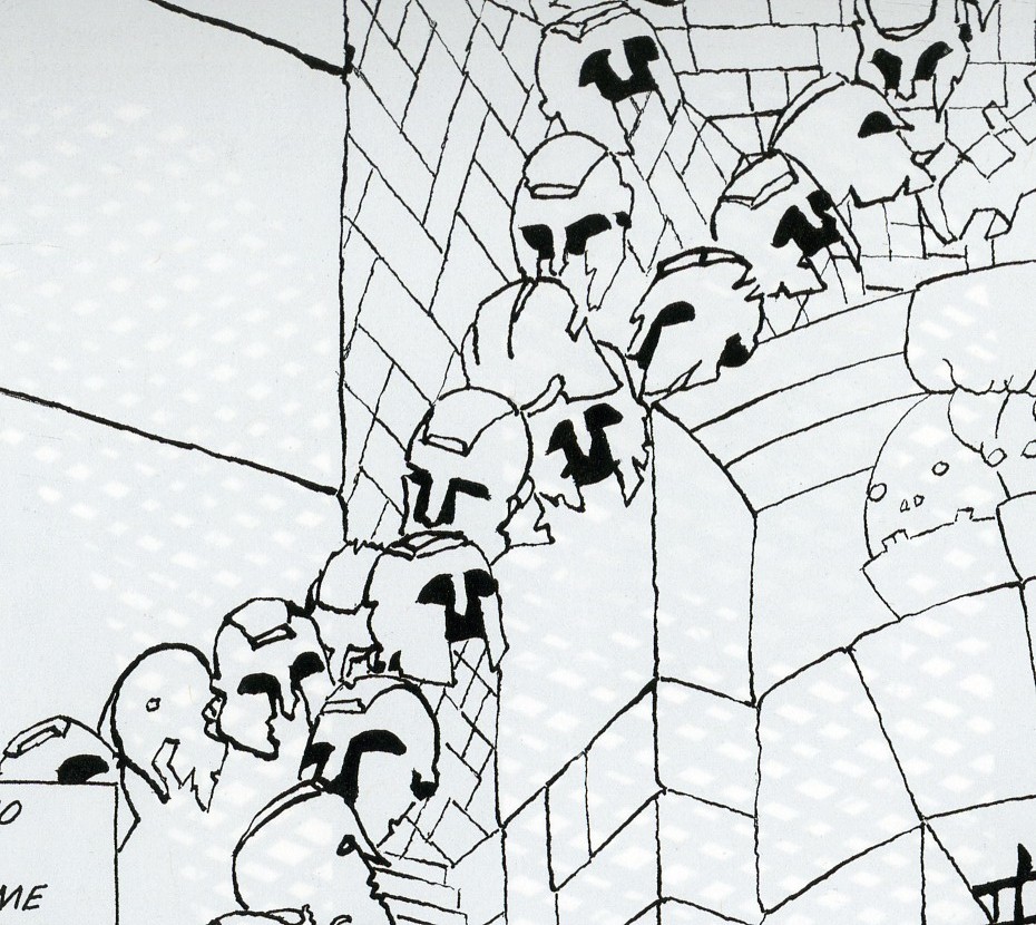
Above is a art project Bert Stabler and I worked on together. I wrote the words and he drew the image.

Except, as you’ve probably noticed, there are no words. When it came down to it, Bert decided that the pictures looked better without the text. So he took them out.

In some versions of comicdom, this could be seen as a cardinal sin. As Joe Matt says, “”I’ve gotta draw minimally to serve the storytelling! The writing always comes before the art!” Similarly, Ed Brubaker argues “I’ve always felt that the writing was far more important than the artwork… As long as the art supports the story…” It’s hard to see how Bert could have more thoroughly violated these precepts.Not only does his art not serve the storytelling, but in the name of the art, he actually went ahead and removed the words altogether!

Of course, in our project, the words were always subordinated to the drawing; Bert did the artwork first, then I provided words…and then he decided the words didn’t fit (in some cases literally — too much text for the boxes.) But that merely underlines the point that art here was not subordinated to storytelling.

Bert’s piece takes several steps towards abstract comics. Appropriately enough, Andrei Molotiu has taken on a lot of these issues at his Abstract Comics blog (from which I pinched the Matt and Brubaker quotes). Specifically, Andrei has argued that art in comics should not be, and often is not, subordinated to the demands of text or narrative. Speaking of the art-must-follow-story meme, Andrei says

This is exactly the logic of illustration–which is a form of logocentrism… And here we can expand the discussion beyond abstract comics, which occupy only the extreme position (like “purely harmonic music”) in a wider range of art that exceeds narrative demands.

In another post, Andrei goes on to look at some examples of non-abstract, art-superfluous comics.

For instance, he talks about a Bob Kane story from 1941, in which Kane used a ton of circular panels, as Andrei shows:

Andrei goes on to say:

Now, what does this mean? Probably nothing. (Which is not to say it’s not significant; just that it’s probably not meant to mean.) One can obviously draw the parallel between the circular panels and the moon–but the resulting interpretation (Batman as creature of the night, etc.), would be generally valid for ANY Batman story: so why specifically this one? Similarly, one can find some connection to the closing words of the story, where Bruce Wayne, with a wink, tells Commissioner Gordon: “I guess the life of Bruce Wayne does depend quite a bit on the existence of the Batman!” There is a kind of circularity implied there, I guess, and we can then claim the circularity is echoed formally in the art… And yet, if that’s the great realization, the theme of the story–again, the Bruce Wayne/Batman dichotomy is a constant throughout the strip. Why this story specifically?

I don’t know. Maybe Bob Kane had a brand new compass he had purchased the day he drew this story, and he was just dying to use it. But my point here is: I’m not so much interested in fully motivated signs, portentous (a la Wagner) leitmotifs charged with meaning as you can find in, say, “Watchmen” or “The Dark Knight Returns”–works in which their creators seem fully in control of their formal language, in which every single (or almost) signifier can be seen as adding something to the story’s theme. Rather, I’m interested in what, at this point, may be called automatisms, tics perhaps, that nevertheless affect our experience of the comic.

Andrei is drawing a distinction between formal elements that can be collapsed into the theme and formal elements that are tics, excesses over meaning. As an example formal elements linked to theme, you could perhaps take this Gruenwald painting, where the idiosyncratic formal use of scale illustrates the phrase “He must increase, but I must decrease.”

And as an example of formal tics that do not link to theme, you could take the insistent circular repetitions in the Frank Miller Spider-Man/Daredevil crossover which Andrei analyzes.

In Gruenwald, the formal elements relate directly to the spiritual meaning; in the Frank Miller, the circles are just a way of organizing space; an abstract, musical surplus, which contribute to pleasure or experience without, Andrei says, contributing to narrative or meaning.

The question I have here though, is this: are narrative and meaning synonymous? Obviously they aren’t; Gruenwald’s painting isn’t a narrative, but it’s intended as an illustration of a thought or a metaphysical insight. But what about in Miller?

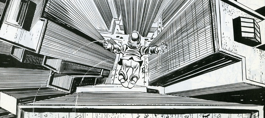
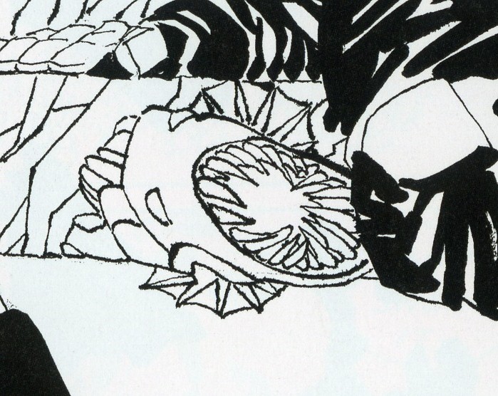
Perhaps one thing that the circular motif does is to insist on its own integrity. It draws a border; looking at those images, it’s hard to avoid the sense of space. In both of the sequences form Miller above, the words are literally pushed off to the edge, allowing the circles to spread — Daredevil’s senses, his “sight”, reaches out across the page, marginalizing the text. Logocentrism is (again, literally) replaced by iconocentrism. This is the case even in instances where the text is more interspersed with the circles, as below.

The spinning multiple figures against the whiteness demand attention. It draws you down into an excessive, vertiginous whirl of motion that makes the banal text (“Got you fella! Hang tight!”) seem like the superfluous bit.

Thus, the image spilling over the words does not exceed meaning. Rather, its meaning (or one meaning) is the excess itself. When Andrei says illustration is excess, he is not illustrating the way in which illustration does not mean; rather, he’s illustrating that very meaning, which is excess. The circle is a hole in narrative — a vortex that escapes the story’s staid linearity and in its place spins out an ever-expanding circumference of pleasure.

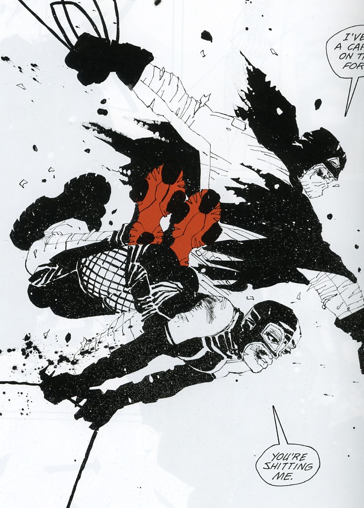
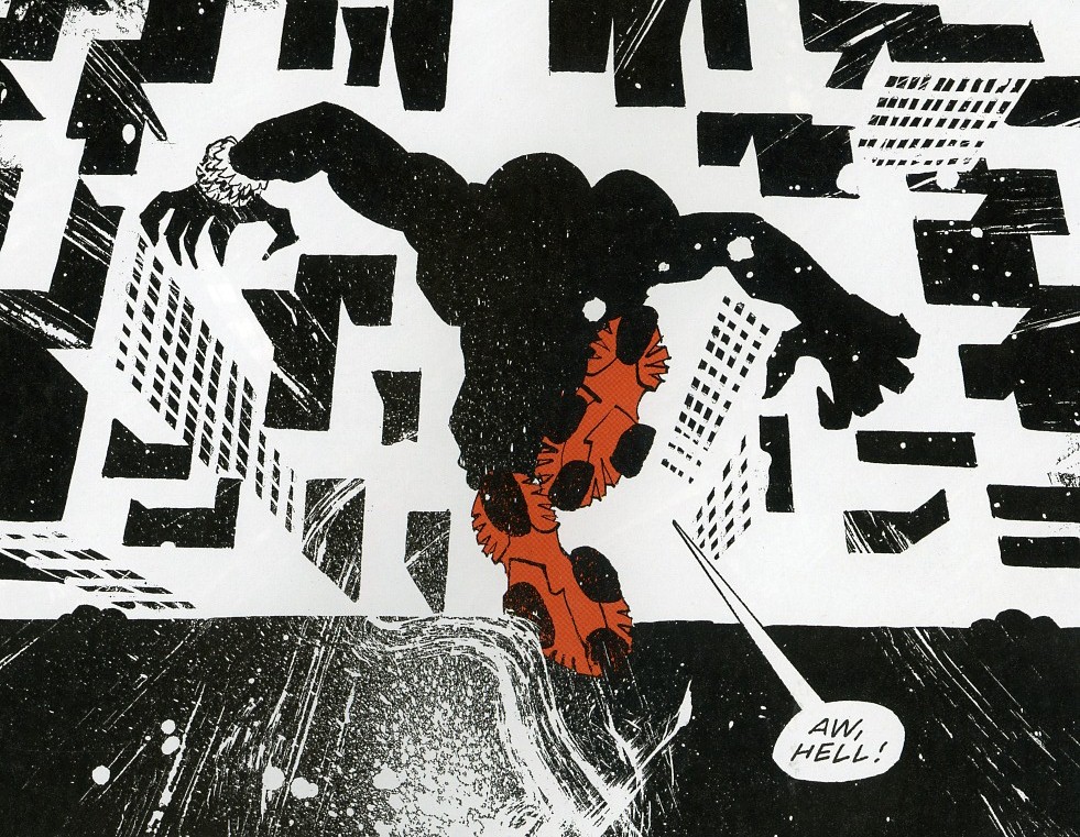
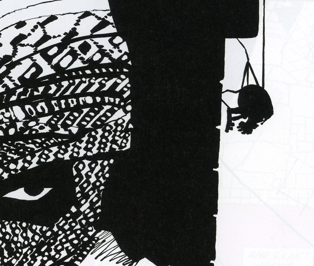
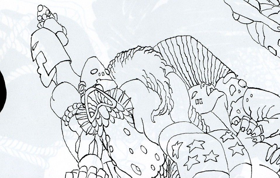
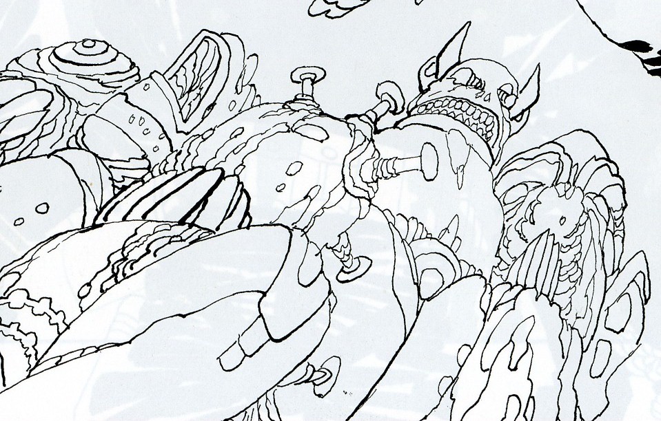
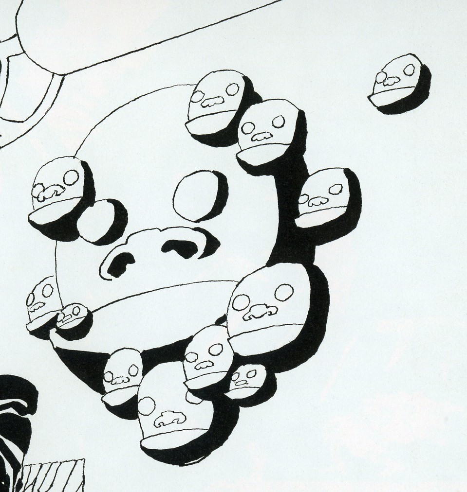
Bert’s excision of text can also be seen as a kind of deliberate overtopping, or annihilation, of narrative content.

In Bert’s drawing, the Peanuts characters flow and morph, losing their coherence as they dissolve into a kind of post-modern iconic glop. They don’t cease to mean; rather, their meaning is unanchored from its original context and sent oozing along the chain of signifiers. So Schroeder turns into a guitar which turns into tombstones haunted by a cute little death and Linus and Lucy fuse into a single terrified/terrifying blob of torment and tormenter. It’s a violent detournement — and the violence is not only in the drawing, but in the (lack of) text. The Peanuts characters are all caught in the boiling cauldron of narrative meltdown, and their blank, stunned, failed efforts at speech only emphasize their tortured transformation. The speech bubbles hang emptily in the design — the last, sad trace of the vanished stability of logos, as around them rages the free-associative chaos of the image.

_____________
In the examples so far, Andrei’s conception of the visual as excess (beyond meaning in his formulation, of meaning in mine) has worked fairly well. I think it is possible to find instances that call it into question though. For example:

This is one of Hokusai’s One Hundred Views of Mt. Fuji. It’s title of this particular plate is “Fuji as a Mirror Stand.” The point, or meaning, is, then, a kind of visual pun — the image of Fuji in the background with the sun sitting on top of it recalls a mirror sitting on its base.

If that image is what the print is about, though, what to make of all that action in the foreground? The man with his dog crossing over the bridge can be seen as a visual mirror of the mirror, perhaps — but Hokusai makes it very difficult to see the action there as pure formal doubling. Instead, we want to see it as narrative. What (we ask with the dog) does he have in that bucket? Where is he going, and where are those boatmen going under the bridge? Will they speak to each other? Do they see each other? What’s their story?

In this case, we might say that the narrative, or the demand of narrative, acts as an excess; an addition balancing on top of the mountain. Human stories pass over and pull under the image; what you see is disturbed by the demands of what happens. You can look for your reflection in the serene and distant mountain, and you may even see it, but your dog is still beside you, excessively nuzzling, demanding that you move on.

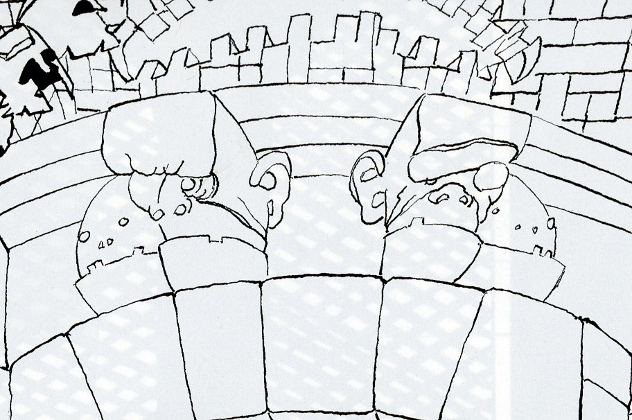
Here’s another view from the same series which works in somewhat similar ways.

The title is “The Appearance of Mt. Fuji in the Fifth Year of Korei.” It is supposed to show the actual date of the appearance of the mountain. Befitting such a momentous occasion, the figures gathered here are intently focused on Fuji. On the left, government officials stare, their attention riveted — so much so that their hands imitate the curve of the mountain’s top. On the right, a group of villagers gaze with similar single-mindedness…for the most part.

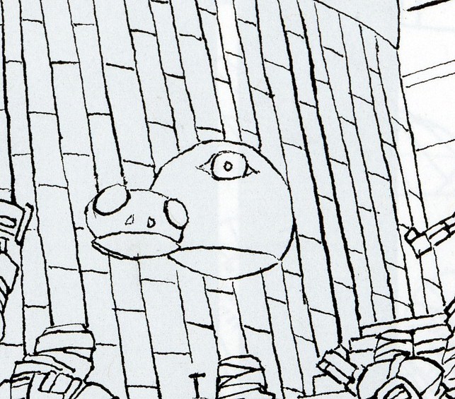
There is one exception though. A single villager has been distracted; he points off to the side at…what? A bird? Falling bird poop? Godzilla?

You could easily read this as in line with the last image. The meaning of the drawing — its purpose and point — is the view of the mountain itself as miraculous and devotional presence. But there’s a story in excess of that image; something has happened, and though we don’t know what it is, it draws us away from the image and on to the next panel, even though, in comic-book terms, there isn’t one.

But while you could read this as narrative excess over the meaning of the image, you could also read it as image excess over the meaning of narrative. The scribe next to the pointing man has been recording the story of the mountain on the day of its new creation. But he is distracted by sight — first of the pointing finger, and then, presumably, of whatever it is over there that we can’t see. For us, the hint of a story is a distraction from the view. But for the writer in the image, the hint of a view is a distraction from the story.

Of course, outside the print, there isn’t really a view or a story — just a mystery waiting to be charged with meaning. Narrative and image both leap at the chance, climbing one on the other, each over each, like Mt. Fuji rising through Hokusai’s frame.

“Built By a Race of Madmen”

Ok, here’s the deal. At Noah’s request I’m publishing here (in blockquotes below) what is largely an unrevised text of a rant I posted on the comixscholars listserv, a rant written as fast as my fingers could type. I would have liked seriously to revise it, but time is, as always, in short supply, and besides Noah says he likes the energy of the original post, so I’ll let it go with just minimal copy-editing and corrections of typos, plus the expansion of a few points I’m not sure were clear enough in the first version.

First, though, I should explain where it came from. When Holy Terror first came out, I didn’t bother to pick it up; no matter how much I’d admired Miller in the past, and how important most of his work from his early run on Daredevil to Batman Year One and Elektra Assassin had been and still is to me, I had been burned too many times since then, especially by the nadir that was The Dark Knight Strikes Again. Nevertheless, I soon found myself in a bookstore, skimming the new book; and though I didn’t purchase it on the spot, it stayed with me, an unscratchable itch to explore it in more depth (it certainly looked better than DKSA—none of those horrid gradients!—or the recent installments of Sin City). I finally gave in, bought it, and meant to review it—but by that time two things had happened: first, consensus had built up online that it was a disastrous career-ender, and hideously paranoid and anti-Muslim to boot; and secondly, Miller posted his notorious blog post fulminating against the Occupy movement, which brought even more contempt rained down upon him. Honestly, at that point I didn’t care about the book so much that I wanted to take the plunge into these muddy waters, and to brave the comment-shitstorm that would have been sure to ensue.

So I decided not to review: yet, even after that decision, I found myself turning back to Holy Terror, and in a strange way my fascination with it grew. And then—and then, two more things happened. A strangely belated discussion about it started a couple of weeks ago on the said comixscholars listserv; and Ken Parille posted a review of the book on the Comics Journal website. Ken’s post was the first I had seen that had something both positive and articulate to say about it (though in the end I didn’t quite agree with him), and that managed to see past its (perceived or real) paranoia and xenophobia to address the substance and artistic achievement of the book itself.

When the thread on comixscholars-l started, I first dipped a toe in with the following remark, appended to a commentary on its supposed “Orientalism” (a question to which I return below):

“Holy Terror” … is an utter mess (and politically abominable, I hasten to add, to shore up my bien-pensant credentials) but in a way kind of a fascinating one. I keep meaning to write about it somewhere.

Ken then chimed in to say he agreed with me, and linked to his TCJ review. However, while I had called it “an utter mess” he discussed it there in terms that made it seem much more conventionally successful: “It’s a fascinating hard-boiled love story, an attractively designed romance set against the backdrop of a post-9/11 America in which love is a disease… Holy Terror’s artistry triumphs over its political will.” He also ended up giving it an A—higher than Habibi, Carnet de Voyage, and Asterios Polyp (relative judgments with which, I should add, I don’t disagree). When the discrepancy between his and my verdicts was pointed out, he explained that he found it a mess ideologically, but successful artistically. This was the immediate cause for my rant, which, none too soon, follows (images added for the sake of clarification):

Now I’m wondering if we read the same book… :) As I said, I do find it fascinating–and I’ll get to that in a second–but it is a mess far beyond just its ideological message. To begin with, the plotting is so rudimentary as not even to deserve to be termed “plotting.” Notice how the book is divided exactly in half, presumably originally for publication in two installments, but also corresponding to the two periods in which Miller is supposed to have worked on it, and easily distinguishable from each other by the utterly different inking treatment (first half, splashy; second half, mostly linework and large areas of solid black). So. First half: Not-Batman chases Not-Catwoman across the rooftops of Not-Gotham City. They fight. They have sex. Bomb explodes. Nail ends up in Not-Catwoman’s leg. It hurts. It really hurts. It really REALLY hurts. We hear about it for pages on end. Flashback to suicide bomber. Same bomb explodes again–NAILS! The city lies in ruins. Not-B and Not-C swear revenge. As does Not-Commissioner Gordon.
[Note: I borrowed the “Not-Batman” and “Not-Catwoman” coinage from other reviews I had seen across the web. Indeed, soon after writing the original rant, I googled the two terms, and found a review that contained a sentence extremely close to the one right before this note, including the term “Not-Gotham.” I honestly don’t think I had read that review previously, and maybe it was just a case of serendipity, but I may also have indeed read it, and forgotten all but that one phrase that remained stuck somewhere in the back of my mind. To the writer of said review: apologies for my unintentional borrowing.]

Second half (interspersed with montages of terrorists and various US and international political and public figures): Not-B and Not-C (who has quickly gotten over her wound–and, by the way, may I ask why she’s supposed to be wearing Christian Louboutin sneakers?) swing over the rooftops.


They kill some bad guys, capture one and torture him… He talks and then they blow him up. Meanwhile a Muslim woman is being stoned and Americans are watching “Transformers.” More bombs–Not-Statue of Liberty is blown up. Ex-Mossad agent, whom we know is Israeli because he has the Star of David tattooed on his face (always a good choice, tattooing your country’s flag on your face when you’re trying to be a spy) tells them about the Not-Gotham City mosque, center of terrorism. Bizarre undeveloped subplot about Not-B falling in love with Not-C. Generic Muslim man beating up his wife. Not-C goes into the mosque. Is captured and taken to the leader of the terrorists who turns out to be, umm, Irish? They want to kill her, Not-B swings in and blows their heads off, big scary bomb explodes but somehow they manage to get out. Six weeks later: Not-Commissioner Gordon is shivering in his bed. “No wonder we call it terror.” The end.

There is no narrative arc, no suspense, no attempt to develop the characters beyond the purely convenient labels of their names. All of these things Miller would have been able to do quite masterfully back in the Daredevil or DKR days, but by now any hints in such directions have become nothing but narrative tics, empty gestures. Maybe Batman telling Catwoman that he is falling in love with her might have meant something–a tiny tiny something–if those had been the actual characters speaking, with decades of history behind them, but replacing them with Not-Batman and Not-Catwoman, simple place-holders undeveloped in any way beyond simply being not-the-characters they had started off as being, reveals how whatever romantic punch this narrative element was supposed to carry would have been totally unearned, as it relied *entirely* on the readers’ previous knowledge of the characters. Same goes for Not-B’s constant reference to “my city.” If this had been Batman speaking, ok, it might have resonated with Miller’s earlier work–but since it’s not, it again reveals Miller’s reliance upon shorthand and the readers’ previous emotional cathexes, and it comes off as–I don’t know how to put it exactly, but not plotting, simply the emotional exploitation of stereotypes stored in fans’ psyches.

Then there are all the narrative tricks which, once again, seem like foggy reminiscences of when Miller knew how to tell a story: the thought-captions in the first section come directly from DKR, but, again, seem blank, just storytelling tics that carry none of the psychological weight that they carried two and a half decades ago…

So, what do we have instead? Things happen, done by blank characters who are brought on stage for the sole purpose of enacting a revenge fantasy. For that reason, I suppose, they need have no more personality than figures in a masturbatory, erotic fantasy need have one. The plot again (shorter version): Terrorists do bad things to us. We kill them. The end.

That’s also why, I should add, I was saying there is little actual “Orientalism” in there: the bad guys are as much blank placeholders as the good guys. There is none of the Orientalist texture of, say, “300.” Everything is just… empty.

Further issues with the storytelling? How about the strange crosscutting, in the second half, between Not-B and Not-C’s doings, and the montages of characters from Bush and Cheney to Obama? Is this happening in one night or over a decade? I suppose a sympathetic reading might make one of those strands extra-diegetical, as if the book reflects both the time of its story (one night) and the time of its making (ten years)–but, if so, I don’t particularly see that as intentional on Miller’s part.[Note: on second thought, maybe it is, or maybe the book itself knows, and says, things more clearly than its author might.]

Ok, the positive (not yet the fascinating): yes, there is all the narrative energy in the first half, a mastery of dynamic art, etc.–everything that Ken pointed out–but, while not as bleached out as the narrative tics I was talking about, it still reads like Miller on auto-pilot. All the splashed ink and white-out in the first half seem like an attempt to go in the direction of more “artsy,” painterly artists such as Sienkiewicz or McKean, and it’s fine, well-done, but again, to me not earth-shattering in any way.

I actually like the second half much better, which does away with such painterly tricks (and which has been criticized, as a consequence, as Miller forgetting how to draw or not giving a damn anymore). And here we are getting to the fascinating part–because, well–there’s that snail. Huh? In the panel of Not-C deciding to go into the mosque, there is a beautifully drawn, purely built out of uninflected lines, snail–a giant snail, obviously, given the perspective of the drawing:

It is in no way given a narrative reason for being there. It just is. At this point, Miller enters a mode of strange narrative excess, going well beyond the requirements of the story–and he continues with it, the snail is not just a one-off. Look at the large, almost page-sized panel of the tower-like structure underground:

First of all, it’s important to realize it’s a swipe–from one of Piranesi’s “Carceri” (Miller at least gets points for creativity in swiping)–specifically this one:

Now, interestingly, this is not the first time that Piranesi has been swiped in comics recently–see the cover of the Act-I-Vate primer–but this is a much more, shall we call it, original kind of swiping. It’s also a much more interesting swiping than the one he practices in the first half of the book, where this panel of Not-C leaping off a building:

is clearly intended to evoke this famous image from “The Story of Gerhard Shnobble,” by Miller’s hero, Will Eisner:

The swipe from Eisner is clear fan-service, intended to give the thrill of recognition to the literate comics reader, and to help Miller claim for himself, one more time, Eisner’s mantle. I don’t think any such kind of knowing reference and recognition is intended with the Piranesi borrowing—it is not an homage, but neither is it done out of laziness or for simple convenience. The image is transformed, worked over too much for that to be the case. Look at the brackets holding up the tower’s cornice: In Miller, they have been replaced by symmetrical pairs of faces–one Gahan Wilson-like, the other best described as Humpty-Dumpty-as-dying-Vader:

Again, what??? Then there are the strange ovoid faces toward the bottom of the tower:

and the double garland of Spartan helmets festooned across the upper left corner of the panel:

Miller makes a gesture toward explanation in a caption (“The old city–built by long forgotten ancients. Archaeologists have only been able to shake their heads, bewildered by its ornaments. Some say it was built by a race of madmen”)–and, if in the context of the book, that seems like just a convenient excuse to doodle whatever he feels like in the images, it’s also strangely self-referential: yes, we too can only shake our heads, bewildered by the book’s ornaments which are completely unrelated to the book’s overt message. “A race of madmen”–and we almost feel that Miller’s gone nuts.

Then–then there are the strange Cheshire cat grins on the brick walls:

the gargoyles and dinosaurs sticking their heads out:


the strange silhouetted ball-with–feet-and-hands rappelling down the wall behind one of the terrorists:

There’s the deep-ocean angler fish in the few feet of water into which Not-C jumps:

There’s the monocled Erich-von-Stroheim-in-The-Grand-Illusion half-face on the ground, behind the short veiled “highly-verbal” Persian-looking guy:

There are the Pop accumulations of figures, including a woman, from the back, in star-spangled hotpants and some kind of viking-monster, in the panel where Not-B leaps in:


There is the monumental statue of Buddha (recalling Bamiyam? But again, why? If the Taliban blew it up there, why would Al Qaeda live with it here?) behind a sound effect of–har har–“Budda”:

There are all those accumulated faces and grins behind Not-B when he fires his bazooka thing:


… and so on.

There is, overall, a strange, unsettling kind of image excess over the requirements of the story. It’s as if Miller couldn’t stay faithful to his ideological convictions, or even his hatred of terrorists, and began doodling. Is it some kind of Baroque horror vacui, or–more appropriately, perhaps–some kind of outsider art horror vacui? At times, and mutatis mutandis, it almost reminds me of Rory Hayes. I like how at this point Miller’s mastery fails: the slick paintwork of the first half gives way to the red-background two-panel of Not-B and Not-C waiting for the bomb to explode, that looks so awkward, almost untaught, as to completely negate the slickness of the first half:

It’s a mad, bizarre book. I had hated Dark Knight Strikes Back, thinking Miller had gone crazy, but now I realize it’s just that he had not gone crazy enough. I have no idea where he can go next–but there is a strange breakthrough here (maybe with no exit, with nowhere to go) that is more interesting than any other comic I’ve read this year, and hinting at a kind of artistic madness that most artcomics can only aim toward, but not quite reach.

Whew. I’ll stop here.

And stop I did. After my rant, in response to a post by Charles Hatfield who declared himself so morally outraged by the book and by my discussion of it that he refused to engage it critically formally (even seemed to see it as immoral for anyone to do so), I responded:

Hey, Ken’s response to Holy Terror was much more positive than mine! Why is it mine that warrants this rant?

I’d be happy to explain, at length, what Miller’s work has meant to me over the last two and a half decades–in view of which, at least, he still does warrant my critical attention, whatever his current political positions. I’d also be happy to get into a discussion whether any artist’s political positions that you (or I, for that matter) may disagree with are enough to put their work beyond the pale of critical discussion (Ditko, anyone? T.S. Eliot? Ezra Pound? Seurat, for that matter, who had clear left-anarchist associations? Where do we draw the line?). But I’ll just say that I was addressing the work, not the man, and the work definitely does warrant such critical attention. And given that the work is intended to convey a certain political position, and that many of the elements I discussed actually end up undermining, deconstructing in some way, that position, I’d say it is exactly analyzing it in such “art terms” that can provide a constructive critical, and even political, perspective on the book.

(I’m quoting my response to provide some shield, some defense against similar critiques that may be raised. And, ok, maybe I’m being paranoid too, in a different way.)

If I were to expand this and properly re-write it, I would emphasize further the strange self-consciousness of the book that I hinted at on one or two occasions: the apparently braided diegetic and non-diegetic strands (the only way it seems to me the book’s temporal contradictions can be resolved) and the comment about “the race of madmen.” Holy Terror feels like a strangely self-knowing book, but one that in the same gesture paradoxically foregrounds the lack of self-reflection on the part of the artist, the contradiction between the resulting work and its intended ideological functioning. I would also tone down my criticism of the rudimentary plot: it more and more seems to me that Miller’s abandonment of the (genre-based, admittedly, I say to preempt any griping) narrative sophistication of his ‘80s work is fully intentional; and the fascinating bizarreries I point out here would have been impossible had such sophistication not been abandoned. I would also compare the book to Miller’s contribution to 9/11: Artists Respond, which refreshingly rejected any and all ideologies:

(Homework assignment: what happened?)

Also, as I’ve been thinking a lot about Kirby lately, I can’t help but feel that the rhetoric of visual excess I use here to discuss Holy Terror is not all that different from what I and others have said to defend the King’s work of the seventies and after. I don’t know if that constitutes some kind of redemption for Miller; I don’t know if connecting the two in such a way is at all legitimate (I am only referring to my own rhetoric, which I do know is strangely similar)—but I know for a fact that my just bringing up the notion is sure to prompt yet another, additional, shitstorm in the comments. (James? Charles?) Have at it, all.
__________________

Editor’s note: Andrei writes more on Frank Miller at his own blog here.

Original Art: Conspicuous Consumption

It’s been about a week since the close of the May Heritage Comics Art Auction and the dust is settling on another set of controversial results. The topic has been talked out on various list and message boards and collectors have moved on to the next spectacle. The rest of the comics world remains largely oblivious to these very insular and obsessive goings on. I present the following news brief as a kind of time capsule and, as with many such things, perhaps it will be looked upon with mirth and a sense of irony in years to come.

Two covers in particular set tongues wagging at this auction. The first was the cover art to Miracleman #15 which sold for $53,775 (with commission).

Continue reading

Frank Miller’s Not Dead, But That Doesn’t Mean We Can’t Dance On His Grave

I’ve been sort of half meaning to read the Long Halloween for a while. I’ve seen some of Tim Sale’s art before…mainly when he did that Comics Journal cover a little while back, I think. Anyway, I like his work; he has a nice clean design sense, with good use of blacks and dark areas especially. His character designs are striking too; he manages to be cartoony in a way that doesn’t seem to come either from manga or from humor comics. Instead he seems more directly influenced by art nouveau…or perhaps it’s just Frank Miller. I don’t necessarily love everything he does. I find his Catwoman design kind of meh, for example; the purple suit seems overly angular and drab, and I don’t share his obsession with abs for all.

But even so, the panel is competently blocked and consistently stylized. It’s professional, damn it. And some moments are in fact inspired, like this Joker as Christmas- Grinch sequence…

The way the Joker’s body is all folded up in that first panel, and then the veins in his eye shot through the magnifying glass…that’s fine storytelling. It’s worth looking at.

And then there’s the story. I think that, maybe, if you really want to appreciate Dark Knight, you should read The Long Halloween. It’s easy to look back at Frank Miller’s writing and sneer at the grim and gritty Batman, the hard-boiled repetitive dialogue (“this would be a good death”), etc. etc. But, damn it, there was a ton of humor and energy there as well; his Joker, for example, was genuinely, viciously funny (dressing Selina Kyle up as Wonder Woman — what the hell? or calmly stating “I’m going to kill everyone in this room” — to which the David Lettermen analog gives the pitch-perfect response, “Now that’s darn rude!”) And his Batman had a real voice and inner life — stolen from all those pulp sources, of course, and over-the-top, but still, in part for those reasons, memorable and even nuanced. I loved that moment at the end of the book where he tells Robin to sit up straight for example; he’s both this grim avenger and this crotchety father figure. He’s perfect, and the perfection is played as a cantankerous tic. Certainly, the book is dark in that people get killed and there’s blood and it’s for grown-ups, more or less. But it’s not dark in the sense of being dreary. It’s filled with ideas and weird jokes and satire and a lot of love for the characters and for imaginative possibilities.

The Long Halloween, on the other hand, has no imaginative possibilities to offer. Forget Miller’s occasional forays into society and politics and mortality — Jeph Loeb doesn’t even have anything to say about Batman or his rogues gallery. Sale makes sure everyone looks great, but that can’t hide the fact that the designated writer has the proportional spunk and gumption of an actuary on quaaludes. The Scarecrow wears straw and the Mad Hatter speaks wiTh FuNny caPs — that’s about as much personality as Loeb can offer. They might as well all just stand around telling each other, “Um…die, Batman. I’m really nuts. No, no, I am. Die.” Except that would be marginally entertaining, wouldn’t it? Instead the Joker laughs and the Catwoman does her Catwoman ooh-I’m-ambivalently-evil thing, and Batman wanders around stiffly, sticking out his muscles, muttering the same few lines over and over (“I believe in Harvey Dent.”), and painfully clanking forth some insight from the old Frank Miller scripts he probably reads before going to bed (don’t wear the costume in the day — check. Got that in Year One. Thanks.) The mafia guys are similarly lackluster,the third-hand Godfather cliches played with so little sense of irony that the best joke in the book ( instead of the good-guy mafiosos refusing to move into drugs, they refuse to move into super-villains) just sort of sits there looking confused and pitiful.

Plopped down in the middle of such dreary, derivative schlock, the book’s iterated tagline, “I believe in Gotham City,” comes across as neither inspiration nor bittersweet aspiration, but as callow fanboy special pleading. Because you know what? This is going to come as something of a shock, but…Gotham City? It’s not real. You want me to suspend disbelief, you need to put in some effort and some genius. Because simply asserting that your little corporate fan-fic fantasyland has profound meaning makes you seem like some kind of aesthetic mosquito, battened desperately on the decaying carcasses of past minimally talented Batscripters. Suck mightily as you will, though, that juice is gone. All you can get out of those corpses is a dry slurping noise, which sounds mighty empty as it echoes about in your doddering edifice of piffle.

And of course since no character in the entire exercise has anything like an actual personality, the inevitable twist ending comes across as utterly gratuitous. Oh my God, the killer is — Harvey Dent’s wife! That’s so profound because, like, she was such an utterly boring, stereotypical whiny wife throughout the whole book, and now…she’s still an utterly boring, stereotypical whiny wife, but with a plot arc cribbed from Scott Turow.

Oh, wait, did I spoil the end? Sorry. Guess you won’t want to read it now.

Maybe you could just look at the art?