Thierry Groentseen, densité, and Carol Swain’s Gast

Scan 2 

Carol Swain’s new graphic novel Gast (Fantagraphics, 2014)

 
After finishing Carol Swain’s Gast a few days ago, I found myself returning to Thierry Groensteen’s discussion of densité from Chapter 3 of Bande dessinée et narration (see pages 44 and 45 of the original French edition and page 44 of Comics and Narration, Ann Miller’s English translation). Gast, like Elisha Lim’s 100 Crushes (which I hope to write about soon), is a comic I’ve been enthusiastically recommending to friends. Swain tells the story of a young girl name Helen who, with the help of two dogs, a sheep, and a few birds, searches for clues about her neighbor Emrys and his sudden death.

I want to say very little about Helen and the small Welsh village where she and her family live. The mystery of Emrys’s life and death should reveal itself to the reader in the same slow, deliberate fashion that Helen comes to understand it. I’ll focus my attention instead on some of Swain’s page designs so as not to give away too much of the story. In Gast, the “density” of Swain’s compositions suggest the distance between Helen and Emyrs, a character who haunts the narrative. Like the protagonist of Chris Ware’s Jimmy Corrigan or Art Spiegelman’s Maus, Helen has the impossible task of piecing together the fragments left behind by a man reluctant to tell his story. Swain conveys Helen’s joy and confusion in a series of regular, nine-panel grids. These repetitions convey the density, I think, of Helen’s curiosity and of Emrys’s loneliness. At times, in fact, it is not clear where one begins and the other ends—an important point to consider, especially for the reader, who, like Helen, is left to decide why Emrys took his own life.

In order to apply Groensteen’s idea of densité to Gast I am thinking phenomenologically. Doing so opens up a number of theoretical possibilities, especially if the densité Groensteen describes can be read as synonymous, for example, with the density philosopher George Yancy examines in his recent book Look, a White! First, let me quote from Ann Miller’s English translation of Bande dessinée et narration before I consider density in relation to Yancy’s discussion of race: “A further consideration for the critical appreciation of page layout needs to be introduced,” Groensteen explains.

This is density, alluded to above. By this I mean the variability in the number of panels that make up the page. It is obvious that a page composed of five panels will appear less dense (as potential reading matter) than a page that has three times as many. (Groensteen 44)

What role does density serve, then, for both the artist and for the reader? Later in the chapter, Groensteen argues that, in Chris Ware’s comics, these dense and complex page designs have an expressive purpose: “Symmetry, in particular,” Groensteen argues, “is used by Ware to heighten the legibility of the binary oppositions that structure the spatio-temporal development of the story, such as interior/exterior, past/present, or day/night. But when two large images mirror each other on facing pages,” Groensteen adds, “this can also signify other oppositions or correspondences” (49-50). The “binary oppositions” Groensteen discusses here are also present in Gast: male/female, old/young, urban/rural, animal/human. The use of words and pictures to convey meaning in comics also implies the phenomenological density of consciousness itself: the sudden awareness of the self in relation to the other.

In Chapter 1 of Look, a White!, Yancy argues that what he describes as “the lived density of race” (17) demands new forms of expression. Although he is writing here about philosophy, I am interested in how we might apply his ideas to the  comics we create, read, and study:

To communicate an experience that is difficult to express, the very medium itself may need to change. On this score, perhaps philosophers need to write poetry or make films. When it comes to a deeper, thicker philosophical engagement with issues of race, the medium has to change to something dynamically expressive, something that forces the reader/listener to feel what is being communicated, to empathize with greater ability, to imagine with greater fullness and power. (Yancy 30)

Notice that in his second sentence Yancy refers to poetry and film, two forms with close ties to comics (see, for example, Hillary Chute’s recent essay from Poetry Magazine). How might a page filled with words and pictures, for example, enable “the reader/listener to feel” with greater intensity? For Yancy, of course, this affective experience must accompany or inspire real change. Feeling something is one thing. Acting on a feeling of identification requires radical selflessness and love.
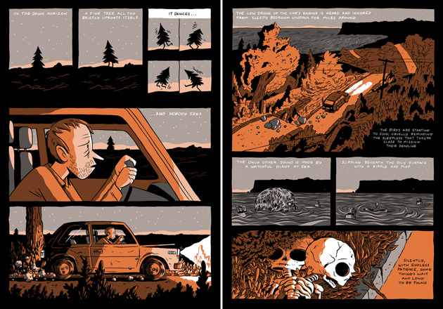
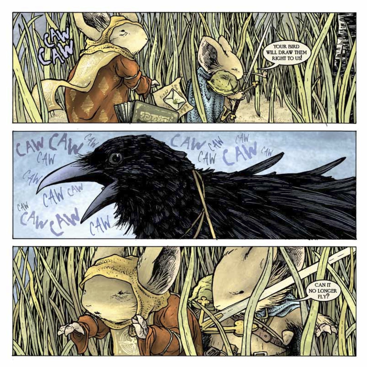
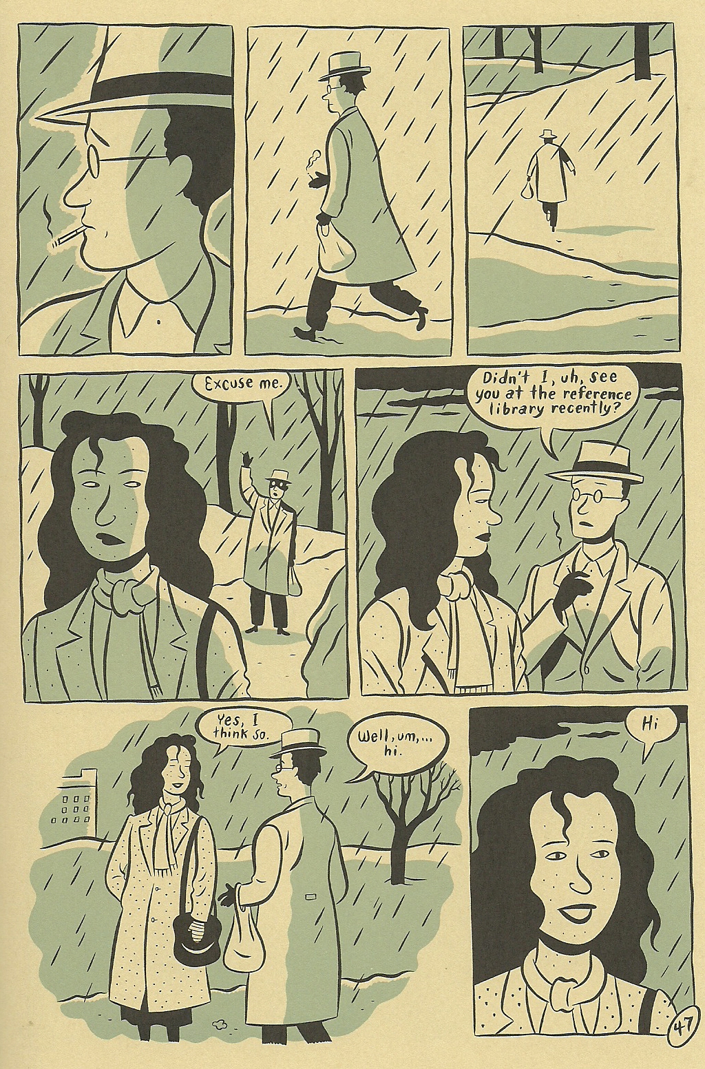
 

Scan 5

Page 127 of Gast

 
For Helen, the gradual shift from theory—her curiosity about Emrys’s life and death—to praxis takes shape on page 127, where she finds one of her neighbor’s books. In the first panel, we see a copy of Zane Grey’s Riders of the Purple Sage. The book is fragile. In the second panel, she tears the illustrated cover from its binding. “This book belongs to Emrys Bowen,” reads a note written on the back of the cover. In the fourth panel, she tucks that slip of paper beneath her arm, and holds the book in her hand in panel #5. She runs her fingers across the pages. Bits of paper fall like leaves.

Like Gatsby’s worn edition of Hopalong Cassidy in the final pages of Fitzgerald’s novel, Emrys’s copy of Riders of the Purple Sage reveals, perhaps, the dream image he cherished of himself. But, then again, no—as Helen tosses the book aside in the next panel, she implies that Emrys refused to play the role of the rugged cowboy. She conceals the torn cover in her bag.

Swain implies that, as readers, we would be wise to be suspicious of allusions. This sudden reference to another text cannot convey the full complexity of Emrys’s consciousness. As I read Gast, I thought of another writer who spent his career recording the silences of rural spaces. Most of the late John McGahern’s novels are set in Country Leitrim in northwest Ireland, not far from Yeats’s home of Sligo. In the introduction to his 1974 novel The Leavetaking, McGahern, who revised the novel in 1984, discusses the challenges of writing both self and other. “The Leavetaking was written as a love story,” McGahern explains,

its two parts deliberately different in style. It was an attempt to reflect the purity of feeling with which all the remembered “I” comes to us, the banal and the precious alike; and yet how that more than “I”—the beloved, the “otherest,” the most trusted moments of that life—stumbles continually away from us as poor reportage, and to see if these disparates could in any way be made true to one another. (McGahern 5)

Like Yancy, McGahern suggests other terms we might use to describe the density of experience expressed on page 127 of Gast: where do the “I” and “the ‘otherest’” meet?

As I study the last three panels on page 127, I find myself wishing I could retrieve Emrys’s copy of Riders of the Purple Sage. What if we missed something? What if the book contains the key to understanding Emrys? But the grid prevents me from turning back. I must follow Helen as she walks to Emrys’s house, just as I must follow McGahern’s narrator as he moves from rural Ireland to Dublin to London and back again (as I try to disentangle the real from the imagined in McGahern’s autobiographical fiction, most of which takes place in the same region of Ireland where my paternal grandmother, Mary Anne Bohan, was born in 1910).

Both McGahern and Swain tell their stories with clarity and compassion. Swain’s use of the grid, I think, is a reminder of the inevitable barriers between the subject and the object being observed. These barriers, like the borders that separate one panel from the next, suggest that densité is both an aesthetic choice and a phenomenological imperative: the storyteller and the reader must take into account what McGahern calls “the banal and the precious alike” in order to make less terrifying the space between the “I” and “the ‘otherest.'”

Can we read Groensteen’s densité, then, as a synonym for the density that Yancy describes? Can you think of other page designs that seek to express the phenomenology of the self? Do comics provide a means of eliminating the distance between the two?

References

Groensteen, Thierry. Bande dessinée et narration: Système de la bande dessinée 2. Paris: Presses Universitaires de France, 2011. Print.

Groensteen, Thierry. Comics and Narration. Trans. Ann Miller. Jackson: UP of Mississippi, 2013. Print.

McGahern, John. The Leavetaking. London: Faber and Faber, 1984. Print.

Swain, Carol. Gast. Seattle: Fantagraphics, 2014. Print.

Yancy, George. Look, a White! Philosophical Essays on Whiteness. Philadelphia: Temple University Press, 2012. Print.

This is a cross-post from my blog. Thanks to Qiana and Adrielle for inviting me! Thanks also to my dad’s cousin Oliver Gilhooley of Mohill, Co. Leitrim, for taking us to the John McGahern Library at Lough Rynn Castle in the summer of 2012. Oliver, a great storyteller himself, also gave us a suggested reading list of McGahern’s fiction.
 

>photo

The McGahern Library at Lough Rynn. Photo courtesy of Allison Felus.

An Erotics of Page Layout?

This is the fourth in a five-part roundtable on page layout in comics. I recommend reading the first three here if you haven’t already. And be sure to scroll down to the comments where you’ll find some good discussion about the merits of various approaches (neutral vs. baroque, artificial vs. natural, narratively-driven vs. dream-rebus-like) to layout. It seems the terminology we use to describe different layouts (“rhetorical,” “neutral,” “regular,” etc.) poses some problems, as does the assumption that there is such a thing as “natural” or “easy” reading. This is perhaps the result of the fact that we tend to experience our ingrained reading habits as natural even though they are shaped by the reading culture we were raised in. But there is no such thing as a layout that is not “rhetorical” (i.e. “motivated”) or “artificial” in this sense. The most challenging layouts force readers to confront the cultural constructedness of their reading habits in ways that can feel discomfiting. Comics scholars and artists, in trying to identify an underlying grammar or semiotics of comics, do often conflate pure description with prescription. And we should be suspicious of “pure” description since there cannot be such a thing, rigorously speaking.

In any case, I don’t have much more to add to the debate(s). But, picking up on Adrielle Mitchell’s discussion of rhetorical panel layout experimentation, I thought it might be fun to reflect on the example of Guido Crepax, the Italian comics artist known specifically for his erotic narratives and his surreal McCay-esque experimentations with page layout.

tumblr_mjk2o90FBw1qi7w1po3_500

 
As phallocentric and macho as he appears to readers today, Crepax was a great innovator of narrative and visual techniques meant to delay the reader’s erotic gratification. His experimentation with page layout seems to have been intended to slow time down, to break the erotic moment and the body into endless fragments. Belgian comics scholar and Tintin specialist, Pierre Sterckx, describes Crepax’s work in these terms:

Commençons notre analyse en nous intéressant au retardement par le dessin : Crepax faisait son dessin en noir et blanc, ce qui produit un retardement du plaisir par rapport à un dessin colorisé et en volumes. Faites un dessin en couleurs et en volumes et ça devient du porno. Crepax a un trait extraordinaire, qui oscille entre la caresse et la flagellation.

Il existe un très beau texte de Roland Barthes consacré à l’œuvre de Crepax et dans lequel il dit qu’en parlant, les personnages retardaient leurs actes. Il y a une sorte de contrat qui s’installe entre ses personnages : entre la femme et son bourreau ou entre le maître et l’esclave. Dans ce contrat entre les deux, il y a la parole. C’est une autre manière de retarder l’action, qui est une méthode scénaristique chez Crepax. C’est quelque chose d’assez rare dans la BD. Ainsi, Crepax exalte le masochisme car il sépare le désir du plaisir et il place la douleur entre les deux.

Let’s begin our analysis [of Crepax] by paying attention to the delay [of gratification] through drawing: Crepax drew in black and white, which brings about a delay in pleasure compared to a colored drawing with depth. If you draw something in color and with depth, it becomes pornography. Crepax has an extraordinary line that wavers between a caress and a whipping. 

There’s a lovely text by Roland Barthes devoted to Crepax’s work and in which he say that the characters delay their [sexual] acts by speaking. A sort of contract emerges between these characters: between the woman and her executioner or between master and slave. In this contract between the two there is speech. This is [yet] another way of delaying action; it is a plotting method for Crepax. And this is quite rare in comics. In this way Crepax exalts masochism because he separates desire from pleasure and places pain between the two. 


2_Emmanuelle

 
His page layouts are superb and often disturbing. I love how the round panel superposed on the rectangular panel, where a Concord jet is foregrounded by a heron-like bird in flight, suggests an organic erotics of acceleration. The gravity of the page layout centers on Emmanuelle’s pelvis where the reader is compelled to share in her erotic enjoyment of the Concord’s takeoff. More than just delaying gratification, the page layout here mirrors the reader’s body, directs the reader’s corporeal response down to the pelvis. Meanwhile, the bottom of the page opposes three sets of eyes and three sets of lips in two columns of three panels between which we see a single panel that frames the flight attendant’s face as an erotic object caught incommensurably between the scopic and oral drives.
 

tumblr_lu3forNv8Q1qzekceo1_500


Valentina-by-Guido-Crepax

 
The panel above juxtaposed with the page layout above it (where the proliferation of panels slows the apprehension of even a highly explicit BDSM scene) suggests an interesting rapport between the constraints of panel arrangement and the techniques of BDSM. The cages and intersecting lines in the above panel echo comic book page layouts of various sorts, ranging from the geometrical to the organic. The vegetal art nouveau lines of the bed seem to refer visually to some of the page layouts we see in Windsor McCay’s work while the superposed grids as cages (or decoration?) seem much more autoreferential.
 

maurymoore-2010073131656-021-original

 
I wanted to conclude with at least one (rare) example of a regular waffle iron type layout in Crepax’s work. The above page layout, composed of twelve evenly spaced cube-shaped panels, is far from neutral. If anything, the geometric regularity of this page layout points to the synechdotal/fetishistic violence of (masculine?) desire and links that violence to the comics art form. More specifically, it links the representational violence of the medium to cadrage, or framing. The top three panels of the above page layout present what looks at first to be a relatively spatially coherent presentation of Valentina’s body (two outwardly pointing high-heel clad feet framing her bust) but the rest of the panels flit from erotic liminal zone to erotic liminal zone, from parted lips to a single erect nipple, from the edge of a lace bra to a hairline. The overall effect is one of scopic violence, as erotically compelling as it is disturbing, but it also reads as experimental and “rhetorical” (or “motivated”) in its imposition of a fetishistic erotic gaze onto a regular grid layout.

When is a Grid Not Just a Grid? (Groensteen and Page Layout Roundtable)

pekar

The previous contributions to our roundtable have raised important questions about Thierry Groensteen’s approach to page layout in Comics and Narration. While a rich array of images in Adrielle Mitchell’s post encouraged us to consider how frame irregularities produce meaning, Roy Cook set the stage for an important conversation about the values comics readers attribute to different panel arrangements. Roy’s post really got me thinking about the way Groensteen privileges the layout pattern of the “waffle-iron” by identifying stability, simplicity, and transparency as fundamental attributes of the orthogonal shapes. Groensteen further conceptualizes the grid in the narrative rhythm of comics as the “basic beat” against which the visual and verbal elements of comics can improvise.

From this perspective, it’s not difficult to see how one might characterize the grid as “regular” or “neutral” or “invisible,” but I remain troubled by the relative nature of these terms, who defines them and in what context. To complicate the issue, my first instinct was to seek out comics that delight in the wildly experimental layouts that Groensteen might find “more sophisticated (or more hysterical),” but Adrielle’s post provides several excellent examples already. So I thought I would ask instead about comics that use the grid, but in unexpected ways: how do comics adapt the basic panel layout in order to stray from what Roy described as Groensteen’s “waffle-iron way of truth”? When is a grid not just a grid?

I wonder, for example, how a comic like “The Harvey Pekar Name Story” fits into our understanding of frame regularity and rhythm. Though we may be inclined to make assumptions about its uniformity at first glance, R. Crumb has not simply drawn 48 identical copies of the same man in the squares of this four-page comic about the different Harvey Pekars listed in the phonebook.


PekarNameStory

The text varies and so too do the hand-drawn panels that reveal each frame’s scratchy imperfections. The careful reader’s eye becomes attune to the nuances of Harvey’s expression and posture. It is a “basic layout pattern” and yet it has “irregularity as a common feature” (43) — a fitting contradiction for a story about Harvey Pekar’s search for his own unique identity. It seems to me that a comic like this one actually exposes the illusion of neutrality by calling attention to the grid’s own constructedness.

Another example that comes to mind for me is a two-page spread from Percy Carey’s graphic novel memoir Sentences: The Life of M.F. Grimm with art by Ron Wimberly. During Carey’s time in prison on a drug conviction, Wimberly uses the bars of the jail cell to structure the layout of the page, building barriers between us and the detained bodies, the narrative boxes, and the armed guards

sentences

Groensteen describes the thick borders that Chris Ware uses in Jimmy Corrigan as having “an almost carceral appearance” (48) and given the emotional constrictions of multiple generations of the Corrigan family, Ware’s panel choices aid in the production of that meaning. Alternatively, Sentences is a comic that has an unpredictably fluid design with layered panels and splash pages to convey the early days of hip-hop and Carey’s experience with music, drugs, and violence during the 1990s. The waffle-iron pattern is not the norm by any means; when the grid above appears, it actually disrupts a narrative rhythm that the writer and artist have already established. The uniformity of the panels might also be said to reflect the carceral lens that would continue to follow Carey after being released from prison.

Is this frame neutral or invisible? How might the perspectives of these two comics help us to reconsider the notion of the “basic panel layout” in other comics?

Are Some Panel Layouts Inherently Superior to Others? (Groensteen and Page Layout Roundtable)

This is the second installment in the PencilPanelPage roundtable on panel layout and Theirry Groensteen’s work (The System of Comics, Comics and Narration). Check out Adrielle Mitchell’s first installement in the series here!
 
ComicsNarrationIn Comics and Narration Thierry Groensteen introduces a four-part taxonomy by which we (or at least he) categorizes comics in terms of the nature and structure of panel layout. The taxonomy consists of different ways in which the payout of the panels might be more or less regular:

  1. Do all pages have the same panel layout (or are they all variations on a single such template, etc.)?
  2. Are all the tiers of panels on a particular page (or all the tiers in the comic, etc.) the same height?
  3. Are all the panels within a single tier (or all the panels on a page, or all the panels in the comic, etc.) the same width?
  4. What is the number of panels placed on each page (i.e. what is the density of the page)?

A page for which the answer to (2) and (3) is affirmative is a waffle-iron grid. Further, the more variation with respect to (2) and (3) found on a page, the more irregular the page. Factoring in (1), we also have a criterion for measuring (roughly) the regularity of the panel layout of an entire comic.

WaffleThe density of panels on a particular page – i.e. criterion (4) – while discussed at the same time as the first three criteria, is somewhat orthogonal to measuring the regularity of a page although variation in density from page to page obviously increases the irregularity of the comic in the relevant sense. Clearly, however, if the number of panels on a page varies from page to page, then as a matter of geometrical fact their layout must as well – thus, with regard to measuring regularity criterion (4) is redundant, subsumed under criterion (1).

This taxonomy is interesting, and allows us to categorize comics in terms of three distinct (although not completely independent) dimensions: the regularity of panel height (on a page), the regularity of panel width (in a tier or on a page), and the uniformity of these when considered page-to-page. Taxonomy is, of course, a wonderful tool for analysis and explanation, but a taxonomy is only as good as the explanation of, and analysis of, the relevant phenomena that it provides.

McCloudLayoutDigression: One pet peeve of mine is the tendency of scholar in the humanities – comics scholars definitely included – who propose taxonomies as if a system of categories is an intellectual end in and of itself (and as if they are following a more ‘scientific’ methodology). A taxonomy is a tool, however, not a result.

So, the obvious question is this: Are there any theoretical questions that can be answered by attending to the complex geometrical framework for analyzing comics panel layout provided by Groensteen? Groensteen seems to think so: he argues that, in general, the more regular the panel layout, the better the comic and its narrative (all else being equal). His argument for this claim is somewhat indirect – he identifies a regularity-eschewing ‘movement’ in comics, which he calls the neo-baroque and characterizes as preferring:

… the destructuring of the hyperframe by images that bleed off the edge of the page and intrusions into the gutter, the use of multiple insets, the maximization of the contrast between large background images and the inset panels, the vertical or horizontal elongation of panels (as if to achieve a shape as far removed from the square as possible!), and the frequent stacking of very narrow horizontal panels… (Comics and Narration p. 47).

Groensteen stridently disapproves of such strayings from the waffle-iron way of truth:

It is as if the simple succession of panels was no longer deemed sufficient to ensure the production of meaning: the apparatus must become more sophisticated (or more hysterical) by piling special effect upon special effect (Comics and Narration, p. 47).

It is worth noting that Groensteen’s complaints have a bit of a Euro-elitist tone to them: He explicitly blames the neo-baroque movement on the pernicious influence of manga (pp. 47, 61) and 1980s American superhero comics (p. 47, fn. 17, p. 61).

Setting this aside, however, it is worth asking whether Groensteen could be right: Are some panel layouts (and maximally regular waffle-iron grids in particular) better suited for effective narratives than others? There are two possible questions one could ask here:

  • In general, are comics better the more regular their panel layout?
  • If comics had to restrict itself to a single layout, would a more regular layout be better than a less regular one?

WareLayoutGroensteen seems to think the answer to the first question is affirmative, but I just can’t see how this could be the case. As many scholars have argued (and see the predecessor to this post by Adrielle for some evidence) panel layout can be carefully attuned to the type of story being told and the way in which the teller is telling it, resulting in narrative effects that are both theoretically interesting and likely unachievable by other, more ‘traditional’ means. Chris Ware’s work, for example, would be far less compelling had it been produced in a regular 3×3 grid (interestingly, Ware somehow gets a pass from Groensteen, despite his vast deviations from panel regularity in Groensteen’s sense.)

More promising, perhaps, is the second question (although it is not, I think, what Groensteen himself has in mind): If all comics had to be produced with the exact same panel layout, would a regular one be preferable? The answer here might be affirmative – it might be the case that a regular waffle-grid is neutral in a certain formal sense, so that it is amenable to functioning in all sorts of different narrative environments in a non-interfering manner (although the positive contributions of panel layout of the sort mentioned in the previous paragraph would be ruled out). Of course, certain metafictional comics that make direct use of panel layout would be impossible. But the second weaker claim regarding super-regular waffle grids does not seem immediately absurd in the way the first does.

So, are some panel layouts inherently superior to others?
 

Can Rhetorical Layout Modulate Narrative Momentum? (Groensteen and Page Layout Roundtable 1)

The entire Groensteen and Page Layout roundtable is here/


lp everything2


“…[T]he experience of reading a comic is a function not only of what is contained within each panel, but also of the size, shape, and design of the panels themselves as well as the spatial relations among them.” (Joseph Witek, “The Arrow and the Grid,” in Heer and Worcester’s A Comics Studies Reader, 155)

 
I have a foundational question to ask before heading into the first of our five Pencil Panel Page posts responding to Thierry Groensteen’s exploration of page layout and rhythm in his recently translated work, Comics and Narration (Mississippi UP, 2013, trans. Ann Miller), especially Chapter Two, “On a Few Theories of Page Layout.” Are we selling traditional (i.e. non-abstract) comics short by foregrounding them as “sequential narratives” first and foremost? I wonder if, by privileging narrative momentum, that forward-thrusting gesture of story that we are so wired to detect and to favor, we have occluded the equally compelling possibility of nonlinear composition and meaning-making on the comics page. So many discussions of page layout, including Groensteen’s to a great extent, are predicated on propulsion, i.e. asking how the reader’s eye is drawn from panel to panel to make sense of the narrative. This narrative accretes; if the layout is effective, the story is built up (Ware allusion intentional, yes) from its component parts (the panels), and the reader is drawn across the pages, actively cooperating in its construction: “The multiframe lures the reader ever onwards, it designates in advance the images still to come; the reader therefore feels summoned by them and rushes headlong after the forthcoming narrative segments, as if running down a flight of stairs.” (“The Rhythms of Comics,” Comics and Narration, 136)

This underlying metaphor is seductive. Why wouldn’t we favor a formal model that upholds comics as a vigorous, agentic medium that grabs readers visually and verbally and carries them into the story? Why wouldn’t we favor a formal model that applauds the skilled comics reader for his/her ability to catch the wave and move in rhythm with the text? Kinda sexy, no?

‘Cept maybe it’s not the only game in town. Groensteen’s exploration of the multiframe (the page; in System of Comics, this was sometimes translated as “hyperframe”) in Chapter Two relies on the privileging of narrative thrust, but it does gesture at another possibility, even if it doesn’t explore it fully. This possibility is not limited to abstract or wordless comics, which in a later chapter (Chapter 7) are offered as the [only?] comics forms that escape the regular “beat” of linear progression (“In narrative comic art, rhythm is no longer part of the content itself [as it may be on some pages of abstract comic art] but merely a mode of narration.” 135). The possibility that intrigues me is the page composed of “rhetorical” panels: “the technique that molds the shape or size of the panel to the action that it encloses.” (46). Groensteen attributes this term and concept to Benoît Peeters (Lire la bande dessinée [Reading Comics]) and suggests (too briefly) that interesting tensions can be created when regular patterns are interrupted to visually echo diegetic material (e.g. dialogue that extends beyond a panel border or the occasional use of symbolic panel shapes). Joseph (Rusty) Witek, in his important essay, “The Arrow and the Grid,” (in Heer and Worcester’s A Comics Studies Reader, Mississippi UP, 2009), offers another term–“gestalt” — for such panels, defining this layout process as one in which the “overall shapes of the panels take on narrative or thematic significance” (154). Witek offers early Jack Kirby Captain America pages as an example, and here’s a simple example from David B.’s Epileptic:
 

epileptic_page

 
(Incidentally, these two pieces of criticism work beautifully in conversation with each other, though neither references the theory of the other; perhaps this is one answer to a question posed for the forthcoming Comics/Graphic Narratives Discussion Group MLA 2015 roundtable on comics theory: “Now that many Franco-Belgian works of comics criticism are available in translation—The System of Comics, Comics and Narration by Groensteen, to name two—are we beginning to see a blending of Anglo and French comics theories, or do these seem to be two separate lines of thought?”)

Both Groensteen and Witek see the regular pattern of layout as the basic structure of the comics page (for Witek, it’s a “grid,” for Groensteen it is the “waffle-iron”) and both discern relative degrees of complexity in any disruptions offered by comics creators, beginning with the “easiest,” which is based on the simple “elimination” of vertical or horizontal borders to create larger panels that still adhere to the basic structure, and in a modular form, insert smaller or larger panels into the given space of the grid. Groensteen conceives of this as “nested regularity,” and offers Chris Ware’s work as the quintessential example:
 

U_21_390066527146_ACME_20_sample

 
Interestingly, there is a bit of tension here: on one hand, Ware is acknowledged as tightly controlling the rhythm by disciplining the reader to recognize the basic pattern and then follow it as it shrinks Fibonacci-style, yet readers can and do fight this highly controlled regularity, as Orion Martin did in his June 6, 2014 Hooded Utilitarian post, “I’m Lost: Path-Finding in Comics“:

“Recently, while reading Chris Ware’s Building Stories, I found myself completely ignoring the path that he had imagined. Instead of a narrative progression, I read the pages as clouds of remembered moments, letting each fall into place in due time.”

(Here, Martin has hinted at exactly what I’m hoping for: perhaps we don’t have to stay narratively inclined while reading narratives!)

More sophisticated versions of experimental layout that still do not reach the gestalt/rhetorical stage are other types of play on the regular grid; for example, occasionally altering the expected number of panels (“density”) in an otherwise regular album (book)–splash pages, landscape panels, etc.–, changing the very shape of the page from the usual rectangle to another shape,
 

mouse-guard-v3-the-black-axe-preview-pg11

 
(see David Petersen’s enlightening discussion of why he believes the square page works best for his Mouse Guard), or making the grid slightly irregular– an “offset grid,” offers Witek—as Alison Bechdel uses here:
 

alison-bechdel_fun-home_oven

 
Or how about combining bordered and borderless panels, while also varying the number of panels per line, as Seth does here:
 

scan0011

Here’s Joe Sacco doing even more clever things with the offset grid:
 

footnotes_in_gaza_

 
Finally, we approach rhetorical panel layout, which not only takes into account what is happening diegetically, but also assists the reader in exploring thematic and tangential meaning on the page (i.e. keeps us on the page, and perhaps beyond the page/beyond the comic, rather than simply propelled forward in the narrative), as in this fine example from Jason Smith’s The Jumper:
 

20130205-OnTheVerge-TheJumper-38

“…I mean what happens when the story actually calls for some kind of different layout?” Smith wonders in his meditation on the layout choices he made for The Jumper.

“The layout actually gets the reader to do two things that most comics don’t normally ask you to do: 1. read up the page from top to bottom [sic; I think he meant bottom to top], and 2. read from right-to-left.”

Though he doesn’t explore this gesture fully in his blog post, Smith does show how it is possible to significantly break with the grid in order to exemplify something fundamental to the story. I’ll be interested to see what Barbara Postema has to say about this in her chapter, “Concerning the In-Between: Layout in Frames and Gutters,” in the promising Narrative Structure in Comics: Making Sense of Fragments (RIT Press, 2013), which I’m hoping to get to before (*#$^!) the fall semester crashes into me.

Want to hear a comic artist think about rhetorical panel layout experimentation in a complex, legible way, without even once mentioning Groensteen? Read the creator of Dresden Codak, Aaron Diaz’s post, “Advanced Layouts: Paneling Outside the Box,” on his blog, Indistinguishable from Magic. Diaz offers us clear and compelling examples of nontraditional layout in order of difficulty. It’s a far less turgid exploration of the topic than the post you are currently reading, and well worth the jump. Go now.