Strange Windows: The Adventures of Tintin in Otherland, Part 4

After three installments criticising Hergé for rampant racism and xenophobia, I uneasily picture his ghost appearing before me, with a quizzical smile.

« So, » says the ghost, « you’ve really dragged me through the mud, eh ? But what about yourself, Alex? Are you a racist?”

“No!” I answer. ”No, but…”

New York, Washington Square Park. I loiter around a chess game – I’m a rotten player, but I enjoy it as a spectator sport. Somebody grabs my arm—a muscular young Black man. I tense up with a fight-or-flight boost of adrenaline…

“You want a game?” he asks.

He didn’t want to mug me, he wanted to play chess.

Many another middle-class, middle-aged White man can attest to such embarrassing moments, where — despite professed liberalism– racist instincts seem to kick in at the worst times. It’s good that our conscious selves master our subconscious. The fact is, for one of my generation (I was born in 1954), urban African-Americans were synonymous with danger; an unofficial apartheid divided the city; and despite the fact that I was never hurt or even threatened by a Black man (the few times I was mugged were by Whites), I had internalised this detestable racist prejudice, one that went unspoken

Yet, would I have reacted the same had the incident occurred in Paris? I doubt it.

I was born to a French father and an American mother, growing up bi-cultural in America with long stays in France, where I now live. Like many bi-culturals, I have something of a split personality: there’s an American Alex and a French Alex.

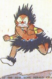
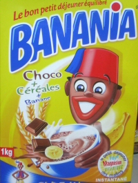
French Alex has no doubt internalised quite different prejudices towards Black people. Consider this poster for a chocolate drink known to all French kids:

That soldier is a Tirailleur Sénégalais, one of hundreds of thousands of colonial soldiers sent to the front in World War One. Note his joyful laugh, over his exclamation “Y’a bon!”, which can roughly be translated as “Sho’nuff good!” The slogan is still heard as a racist taunt.

This was the French cliché of the Black man: a merry, childlike creature eager to serve his master. And I wonder if somewhere deep in my subconscious, that stereotype shamefully thrives.

(The image itself is still used:)

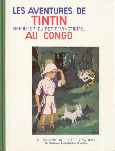
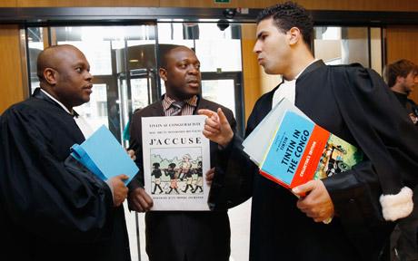
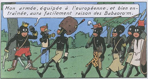
This is the context in which we should consider Tintin au Congo, and Hergé’s various racist lapses: they won’t in themselves convert a kid to racism, but they will confirm the mentally and morally lazy stereotypes that pervade every culture. And it’s hard to underestimate the ubiquity of Tintin in Europe. So, the librarians who remove Tintin au Congo to the adult stacks are doing their duty.

Myself, I got a bit of a jolt reading Tintin en Amérique. Even as an eight-year-old, I knew this America was just a comic fantasy:

…and no American I knew was remotely like the greed-crazed, thuggish citizens depicted therein.

I was, for once, at the sharp end of Hergés stick.

So, Tintin to the incinerator?

No. Other powerful and positive forces of Hergé’s approach to the Other are the attraction and wonder of foreign lands, foreign people. How many youths have set out to explore the world inspired by Tintin? And aren’t the values embodied by the plucky little reporter worthwhile ones—courage, loyalty, justice?

Besides which, the Tintin albums are simply wonderful yarns, crammed with suspense, comedy that is often uproarious, lovely art. They are about as fun as comics can get.

As for Chang, the young student who opened Hergé’s eyes to Chinese civilisation, he returned to Shanghai in 1936 to open a drawing school, which he managed for thirty years. He was purged by the Cultural Revolution, in which he suffered badly. Hergé never stopped trying to help him, and finally was able to bring him back to Belgium in 1981. The two friends were speechless at their reunion, 44 years after their separation.


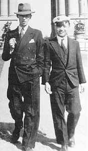
Herge and Chang in 1931…


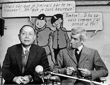
…Chang and Herge in 1981.

Let’s conclude where we started four chapters ago : with Tintin au Congo.

How do Africans feel about it?

It is, in fact, a perennial seller in Francophone Africa. Hergé was delighted that it was serialised in 1969 in the prestigious African Zaïre magazine.

That may sound like another depressing example of internalising one’s oppression…but not so fast. Here’s what Zaïre had to say about the strip:

“If certain caricatures of the Congolese people in Tintin au Congo make White people laugh, they also made the Congolese readers laugh because they found plenty to mock in the White man who saw them that way!”

In other words, they are laughing at, not with, the whites.

Three examples of African appropriation of Hergé’s imagery:


Sculpture from Kinshasha, Zaire


Kinshasha street mural

From  Benin: Tintin, Congolese, and a missionary.
All Tintin art and images copyright Moulinsart

The entire Tintin in Otherland series is here.

Strange Windows:The Adventures of Tintin in Otherland, Part 3

The entire Tintin in Otherland series is here.
____________________

The immediate aftermath of the war was harsh for Hergé, even though he could be accused, at worst, of passivity.

He learned his lesson – what political satire there was in his books would henceforth be muted; minorities treated with greater respect. The books would be revised and whitewashed.

Of course, there was little that could be done to arrange Tintin au Congo. The Black’s pidgin was made somewhat more grammatical. And, tellingly, the album was “de-Belgified”. References to Belgium and Tintin’s own ‘Belgianness’ were excised.

This can partly be due to the great winds of de-colonisation that were stirring in the postwar world that Hergé sensed; more likely, with Tintin becoming more and more an international success, Hergé was loath to keep his hero tied down to one nationality. (Tintin au Congo was renamed Tim-tim em Angola by his Portuguese publisher – Angola being, of course, Portugal’s colony – and Tintin dans la Brousse — Tintin in the Bush – by one French publisher.)

Note the difference between the 1931 (top) and 1946 (bottom) versions.

Originally, Tintin was dispensing a geography lesson: “My dear friends, I shall speak to you today about your homeland: Belgium!” In 1946, he’s giving a maths lesson.

We’ve already seen how Hergé whitened the Blacks in his pre-war albums. He was to go further and de-Judaise his Jews. Blumenstein became Bohlwinkel in L’Ile Mystérieuse. And he went even further with Tintin au pays de l’or noir.

This adventure takes place in the Middle East, starting in Palestine. The album was first begun in 1939, when Palestine was under British mandate, then set aside when Belgium was invaded—obviously a bad time to show sympathetic British cops. The story was reworked and published in 1950.

The Stern group and the Irgun were escalating an often violent campaign to drive the British out and establish a Jewish state. In the album, a sub-plot has Tintin mixing it up with the British police and members of the Irgun due to a case of mistaken identity.

The Jews in this book are treated neutrally, even sympathetically.

Captured Irgun militants

However, at the request of his British publisher, Methuen, Hergé excised Palestine and Jews from the book : Palestine becomes the fictional Khemed, Haifa is now Khemkhâh, and the British police are Arabs; the fight for Israel becomes a mere power struggle between different factions. It is noteworthy that Hergé made these changes as late as 1971, showing an ongoing hypersensitivity to any possible accusation of racism, even when unjustified.

He was especially leery of charges that his master villain, Roberto Rastapopoulos, was an anti-Semitic caricature:

« Rastapopoulos, for me,” wrote Hergé, “is more or less Greek, a shady Levantine character, without a country, that is without faith or ethical code. Another detail, he is not Jewish!”

The oily “Levantine” is, of course, another nasty stereotype; and the contempt shown for the cosmopolitan is another reactionary mainstay.

Already, during the war years, Hergé had switched to innocuous escapism for his books. Le secret de la ‘Licorne’/Le Trésor de Rackham le Rouge are grand treasure-hunts in the South Seas. The last of the wartime books was also meant to be an escape from the troubled times, involving neutral South America : Les sept Boules de Cristal, a two-part adventure paired with its sequel Le Temple du Soleil.

This is one of the more interesting books from our standpoint. It shows Hergé slowly being weaned from the xenophobia and racism that marred so much of his earlier work; but the process is far from completed.

Basically, it’s a variation on the “curse of Tutankhamen” chestnut, with Peru and Incas taking the place of Egypt and Pharaohs. The scientists who have brought the mummy of the Inca Rascar Capac to Europe are being struck down by a mysterious illness. They are in fact being targeted for punishment for blasphemy by descendants of the Incas living in a secret Andean enclave. When Professor Tournesol is kidnapped, Tintin and Haddock follow his captors to South America, where they are taken prisoner and sentenced to die. Tintin saves the day by the old “eclipse” ruse, terrifying the natives by seeming to blot out the sun. Our friends are released with a warning.

The first thing that strikes one is that the villains here aren’t really villains. They have an authentic grievance against the White man, who comes and despoils their heritage. As one character remarks to Tintin , how would we feel if Egyptian or Peruvian archaeologists came to Europe and opened the tombs of our kings to rob them? Hergé was beginning to empathise with the so-called savage; quite an improvement on the album L’oreille cassée, wherein Amazonian Indians are portrayed as weird and barbarous.

In Peru, Tintin picks up another sidekick of the Chang type, an Indian child named Zorrino. Tintin rescues him from a beating by two White bullies:

Zorrino is brave, loyal and dignified.

Overall, then, we can see that the Indians—the Other – are treated with a measure of respect.

And yet, they remain the Other, an insidious source of dread. The avenging Incas are lured to Europe by the stolen mummy: it’s as much a contamination as a curse. Keep away from the Other, and keep the Other away from us.

Tintin’s ruse would never have worked: the Quechua Incas were superb astronomers. It is insulting to suppose them stupid enough to fall for it.

Finally, the trappings of exoticism remain, alluring, alienating:

Hergé himself was changing. His former reactionary colleagues were no longer there to influence him ; his assistants included such cosmopolitan men as artists E.P.Jacobs or Jacques Martin (who assured Hergé of the reality of the death camps, which he’d seen.)

The grip of Catholicism on his was relaxing; in time, he would become an agnostic, fascinated by Buddhism and especially Taoism. He collected modern and contemporary art: Calder, Rauschenberg, Lichtenstein, Frank Stella.

Herge with Andy Warhol, who cited him as an influence

He travelled extensively—finally discovering the foreign parts he’d drawn for decades. Hergé was evolving.

Not that he didn’t slip up. In Coke en Stock (The Red Sea sharks), the Black victims of the slavers are shown to be dignified in their Muslim faith, but fairly stupid as well.

Up till this point, one might suppose that Hergé’s turn away from racism and xenophobia was dictated as much by political fears and commercial considerations. His next album—considered by many (including me) to be his finest work—would prove that his personal evolution was sincere. And, fittingly, it would feature again Chang, the young Chinese who first opened Hergé’s eyes to other cultures.

In Tintin au Tibet, again, there is no villain: the adversary is nature itself, in the forbidding snows of the Himalayas. The Tibetans are depicted with admiration and respect, whether sherpa guides:

or lamas :

or kids:

But the ultimate image of the Other is that of the Monster, such as the Yeti, or Abominable Snowman :

Yet we come to learn that the Yeti is a being of kindness, even love.

Hergé took the side of the Other in Les Bijoux de la Castafiore, wherein a group of Roma (“Gypsies”) are unjustly accused of theft. Haddock protects them and gives them shelter, though Hergé wisely shows them to be skeptical.

And in Hergé’s last album, Tintin et les Picaros, we can feel his indignation at the treatment meted out to the Amazon natives, deliberately kept enslaved by the White man with lashings of free alcohol .

So, yes, the man matured and evolved beyond his prejudices.

Can I say the same for myself?

Next instalment: the Tintin reader on trial.

All Tintin art copyright Moulinsart

_______________________
The entire Tintin in Otherland series is here.


Strange Windows: The Adventures of Tintin in Otherland, Part 2

[Part One here.]

Wherever you look, you come face-to-face with the Other.

Other race, other religion, other sex, other age, other individual… you name it.

Reactions to the Other are complex and often self-contradictory: they run the gamut from instinctive loathing to fascinated attraction. The same person may be viciously hostile to, say, Indian immigrants, yet long to visit the Taj Mahal. (Excellent examples of this paradox are found in Edward Said’s book Orientalism.)

To deal with the Other, we can say that the best and most mature approach is empathy – fellow-feeling – as the common trope has it, putting yourself in another’s shoes. But there are far more common strategies: you can demonise the Other, as Hitler did to the Jews; you can ridicule him, categorise him, patronise him: in short, re-define him.

This range of responses is fully on display in Tintin ; perhaps more so than in any other popular entertainment of a like longevity. It’s telling, for instance, that (apart from the Bird brothers in The secret of the Unicorn), every single villain in the 23 albums is a foreigner.

To understand this, we can look at Tintin author Hergé’s life and career, and chart his evolution from rampant xenophobia to the empathy that emerges in his late works.

Georges Rémi—Hergé – was born in 1907 to a lower-middle class couple in Brussels, Belgium. He himself characterised his childhood as being ‘gray’, by which we may understand conventional and boring. He was a fervent Catholic.

Belgium harbors a culture that could pass for a caricature of normalcy and respectability, though not without its dark side. Hergé was comfortable in the most banal backwaters of this culture, never questioning its prejudices (something he looked back on, late in life, with a sort of rueful self-contempt.) He attended a Catholic school, and upon graduating age 18 went to work for a Catholic newspaper, Le Vingtième Siècle.

The brand of Catholicism that embraced him was deeply reactionary, royalist, violently anti-Communist, strongly anti-Capitalist (Moscow and Wall Street being seen as two sides of the same Judeo-Masonic coin ), unthinkingly imperialist. Hey, the Belgian Empire allowed the missionaries to convert all those benighted pagan Blacks.

The Vingtième was edited my a man who would have an immense and lifelong influence on Hergé, Father Norbert Wallez: an enemy of democracy which was seen as hopelessly corrupted by foreigners, Jews and Freemasons, an admirer of Mussolini.

Wallez tasked young Hergé with creating a children’s supplement for the paper, called Le Petit Vingtième. And it was here that Tintin was born.

The first adventure was Tintin au pays des Soviets, a rollicking anti-Communist screed:


Next was the currently notorious Tintin au Congo.


When we think about the European colonial empires we remember those of Britain, France and Spain; in fact, even Denmark and Portugal had their colonies.

Little Belgium was dwarfed by its holdings in the Congo. It was infamous for the reign of atrocity inflicted on the Congolese by king Leopold II. You’d not think so reading young Hergé’s version: his Congo is a little paradise of merry, foolish darkies who love their benevolent Belgian overlords. (In 1946, though, Hergé had to tone down the imperialistic slant in his revision.)

Then  came Tintin in America, trotting out more stereotypes: a land of gangsters, greed-crazed businessmen, and tomahawk-toting Indians. (The latter, however, receive sympathy for their ill-treatment at the hands of despoiling Whites.)

Then Cigars of the Pharoah, whizzing through Egypt and India (fakirs, snake-charmers, etc.)

“In reality” said Hergé, “my early works are books by a young Belgian filled with the prejudices and ideas of a Catholic […] they are not very intelligent, I know, and they do me no honor.”

Herge at work


But the next book would show the beginning of Hergé’s move away from mediocre stereotypes.

He had announced the next Tintin adventure would take place in China. A monk with knowledge of the country sent him a young Chinese art student: Chang Chong-Chen.

Chang had a profound influence on Hergé.

Here, for the first time in his life, the cartoonist met the Other he  depicted,  face-to-face. Chang exhorted Hergé to abandon his clichéd ideas of Chinese people and culture, to research seriously his subject. In return, Hergé put Chang into the strip:

Here, remarkable for its time and context, Tintin and Chang share a good laugh over the stereotypes Europeans bear about the Chinese – stereotypes that would have been typical of Hergé, had Chang not come along:

click image to enlarge

This Shanghai street scene shows a new feel for realism:

click image to enlarge

…but Hergè is not quite able to shake off the snares of cheap exoticism and cliché:

Hergé also seems, at this time, to be moving towards the political center, alarmed by Fascism and Nazism and Belgium’s own Rexism. Le Sceptre d’Ottokar depicts an idyllic Ruritanian-type kingdom threatened by a demagogue named Müsstler (Mussolini + Hitler).

But Belgium plunged into the cataclysm of World War II and German occupation, Le Vingtième Siècle disappeared, and Hergé began running Tintin in the ‘stolen’  collaborationist newspaper Le Soir. A move that would haunt him all his life.

The first Tintin adventure under the occupation was L’Ile Mystérieuse. This is the work that would dog Hergé with accusations of anti-Semitism, and small wonder:

« You heard that, Isaac ? The end of the world !…What if it’s true?”

“Heh! Heh! It vould be good for business, Salomon! I owe 50 000 francs to my zuppliers… zis vay I von’t haff to pay…

That panel appeared only in Le Soir, and was excised from the 1942 album…for reasons of pacing, not of taste. (This was while the Jews of Belgium were being rounded up and sent to the camps by the thousand.)

The plot concerns the race to get to an asteroid that has crashed into the Arctic. On one side is a European expedition, with Tintin & co along for the ride; on the other is the villainous American expedition, with no thought for anything but profit. It is bankrolled by a New York banker named Blumenstein. After the war, he was renamed Bohlwinkel and America became ‘Sao Rico’:

At left, the original, at right the postwar version

Top, nasty Yanks, bottom, nasty Sao Ricans

In 1969, Hergé would write:

“… you are a little too severe with me for this Blumenstein from the year 1940. I admit that I was wrong, but (and I hope that you will believe me) I was far from imagining that the Jewish stories that people told (and still tell today, like stories about people from Marseille, or the Scots […] would lead to such horrors.”

There’s more than a little cluelessness on display here, after Auschwitz. Hergé would always protest that “he didn’t know”, but was lucid enough to add:

“Perhaps I didn’t want to know”.

After the liberation of Belgium, Hergé was roundly reviled for propping up a collaborationist paper, and he was lucky to escape with his neck; as it was, he was banned for two years from any work in the press. It was this enforced idleness, and, no doubt, the need to put distance between him and his ultra-conservative views, that set him on the integral redaction of his albums – shovelling the dirt under the carpet, in the process.

Next: Approaching redemption.

All Tintin art copyright Studios Hergé/Moulinsart

_______________
The entire Tintin in Otherland is here.

Strange Windows: The Adventures of Tintin in Otherland, Part 1

The children’s comics album Tintin au Congo, by the  Belgian cartoonist Hergé, has been much in the news of late– and not in a good way.

In Britain, the Commission for Racial Equality has condemned the book’s “abominable” racism (and proving once more that there’s no such thing as bad publicity, its sales have jumped 5000% on Amazon UK). It’s been banished from the children’s section in bookshops and libraries across America and the UK, in chains such as Border’s.

Finally, following a lawsuit brought by a Congolese student, Bienvenu Mbutu Mondondo, a court in Brussels is to determine whether the book should be banned in Belgium. Similar lawsuits have been brought in France and in Britain.


So: just how racist is Tintin au Congo?

“And to say that in Belgium all the li’l Whites are like Tintin!”

“Me find Tintin’s machine…”

“If him no come in 1 year and 1 day it for you…”

“And if you no be good you’ll never be like Tintin!”

“Never again me him see a boula-matari [stone-breaker– the title given to Stanley, the white, conqueror of the Congo] like Tintin”

(Dog) “That Snowy…what a guy!”

Note in the upper left-hand corner: fetish statues of Tintin and Snowy before which a Black man kneels in worship.

I could post many more cringe-worthy excerpts, but why bother?

Yes, Tintin au Congo is racist. Whether it should be restricted or banned is a debate I’ll leave to others, although I certainly wouldn’t allow a child of mine near it.

“So what?” the informed comics reader might object.

It’s no new discovery that throughout comics history racist and bigoted content has permeated the art form. The Imp in Little Nemo:

Connie in Terry and the Pirates:

Ebony in The Spirit:

The first appearance of Ebony White; art by Will Eisner


…the list of offensive stereotypes is endless.

One balances a historical approach with a rejection of such inadmissible values, and one moves on.

But the case of Tintin — and of his creator, Hergé — warrants more thought.

First, unlike the vast majority of popular comics with racist elements, Tintin remains relevant.

The series of 23 albums has sold, to date, over 200 million copies in sixty languages and still sells briskly. It has spun off magazines, toys, television shows, feature films; Stephen Spielberg is now in post-production of a blockbuster adaptation of The secret of the Unicorn. Tintin isn’t enjoyed only by middle-aged fans, either; children respond just as eagerly to his adventures today as they did eighty years ago.

So a certain level of scrutiny is justified, simply because of Tintin’s effect on the culture, and on young minds in particular. Tintin au Congo is the most egregiously racist, but most of the other albums have disturbing aspects as well.

I’m interested in Tintin’s racism, xenophobia, and general fear of the Other for different reasons.

Tintin changed over the years. By which I mean that the individual albums were redrawn, rewritten, compressed and otherwise redacted, some more than once: L’Ile Noire (The Black Island) exists in three versions, from 1938, 1943, and 1965.

And in these redactions, the racism has been drastically toned down. Take this example, from (top) the original, and (bottom) the revised versions of Le Crabe aux Pinces d’Or:


And the above shows why I speak of a toning down of the racism, not of its elimination. The caricature of a brutal black is replaced, true – by the caricature of a brutal Arab.

Note that the above change was not made at Hergé’s initiative: it was his American publisher, Simon and Schuster, who demanded it (as well as the ‘whitewashing’ of four Black characters from Tintin in America. ) As Hergé sardonically remarked,

“What the American editor wanted was the following: No Blacks. Neither good Blacks nor bad Blacks. Because Blacks are neither good nor bad: they don’t exist (as everyone knows, in the USA.)”

Thus a racism of caricature is displaced by a racism of denial.

Indeed, the revised editions function as palimpsests—and as with all palimpsests, the ghost of the original text is sensed. Or shall I make a psychiatric analogy and speak of the return of the repressed? Whichever — I find the tension between the clean images and cleaner morals of the modern editions, and the nasty energy of the originals, gives the strip much of its strange and seductive flavor; something subterranean, something I only intuited until I came face-to-face with the older, rougher, uglier incarnation of the strip.

But the other changes in Tintin over time were rooted in the personal evolution of its creator. He progressed from a narrow-minded petty bourgeois stuffed with the ignorant prejudices of his time and caste, to a far more generous spirit eager to engage the world—and the Other—as it truly is. It took him a mere forty years.

In the next instalment (Update: now posted here), we’ll review the background of Georges Rémi aka Hergé, and the shocks to his world that caused his long climb away from simple bigotry; and in particular his meeting with a young artist from China.

____

The entire Tintin in Otherland is here.

All art copyright Studio Hergé/Moulinsart.

Monthly Stumblings # 2: Frans Masereel

Frans Masereel’s Route des hommes (men’s path)

In my humble opinion the best Belgian comics artist is not Hergé… The best Belgian comics artist is Frans Masereel…

I vaguely remember mentioning this to a couple of Masereel’s fellow countrymen and I’ve got two different answers (I must add that, in my view, of course, I chose my collocutors well): (1) a nod of approval; (2) something like: In Belgium we don’t view Frans Masereel as a comics artist.

(Needless to say that, besides some puzzled expressions asking “who are those?,” most of my possible Belgian interlocutors would react in a third way calling me a lunatic, or worse, depending on the person’s degree of Tintinophily.)

The first reaction was understandable because said person is an artist himself and what he does is akin to Masereeel’s work. The latter one is more interesting to me at this particular moment because it permits me to enter one of the muddiest territories in comics scholarship once again (when will I learn, right?…), the old conundrum: what is a comic?…

I’m not going to answer that question because it can’t be done. All the answers that one can come up with are rigged because they depend on a previous particular view of what’s essential in a comic (and that’s not only prescriptive, that’s also arbitrary). To Bill Blackbeard, for instance, speech balloons and image sequences are essential so (even if there are older examples, namely, here or even, here) comics started with Richard Felton Outcault’s Yellow Kid in 1896.

Saying this though, doesn’t get us very far (my thoughts on the subject, are here, by the way). What interests me right now are two related points: (1) the sociological side of the problem; (2) anachronism. (1) Words have a (social) commonly agreed meaning. The dictionary tries to stabilize it, but significations aren’t fixed. There’s a reason why we call Maus a “comic.” The sense evolved to include serious work while the signifier stood still. Even so I accept that “comics,” to most people, don’t include Frans Masereel’s oeuvre. Perhaps it will, someday… (2) Frans Masereel didn’t view himself as a comics artist. As far as he was concerned he did wood engravings, that’s all… To call his cycles “comics” is an anachronism. Maybe so, but it seems to me that we are guilty of anachronism all the time and nobody cares. To go back to Tintin, the expression “bande dessinée” didn’t exist when Hergé started doing comics. Why do we continue to say that he did comics, then?… Did the Lascaux painters call what they did “painting?” Is that important? How logocentric can we get?…

As you can see in this 1915 illustration above Frans Masereel was a naturalist. But working for the pacifist newspaper La feuille in Geneva as a political cartoonist during WWI Masereel needed a less detailed, more urgent, style. As Josef Herman put it:

Working for La Feuille posed two main problems for [Masereel], both of a technical nature. One was that the drawing had to be done quickly, leaving no time for the careful, detailed draughtsmanship he had practised until then. The other was how to achieve maximum effect using poor quality paper, on which thin lines were simply lost. He solved these two problems with the true instinct of a man of genius. He avoided drawing with a fine pen and took a thick brush, in the process giving up the search for tonal texture. He now used large planes of intense black, drawing lines wherever needed with a brush. The emotional effect he achieved was staggering.

Maybe the times weren’t right for nuanced views of the world (?). I love Frans Masereel’s verve and variety (he did manga in the original sense of roaming drawings), but his ideological views and Expressionist style push him into a less than complex view of the world sometimes (the fat, jeweled, cigar-chomping capitalist, for instance, is a regrettable stereotype). You can see one of Frans Masereel’s political cartoons as published in La feuille below:

Frans Masereel was 75 years old when he published Route des hommes (1964). He did “novels without words” all his life (more than 50, according to David Beronä). Route des hommes is far from being one of his best (that would be Passionate Journey – 1918 – and, my personal favorite, The City – 1925).

Route des hommes is about the horrible and great things that happen to humankind. We find in the book Masereel’s usual topics: war, famine, exploitation, but also progress, team work, joy, etc…

The greatest thing about this edition of the Musée des Arts Contemporains au Grand-Hornu and La Lettre volée (2006) is that it shows both Masereel’s prep drawings and his wood engravings. In this way we have access to the artist’s creative process as never before.

We can see above how Frans Masereel cites another Belgian painter, James Ensor (ditto Jacques Callot at some point). It’s interesting how what seems to be a tree in the foreground of the drawing becomes a sinister figure in the wood engraving (death waits us all at the end). His composition changes (increasing the two background figures’ size) greatly improve his work.

Masereel used allegory a lot. In this drawing the cars represent careless rich people. The city lights aren’t just that, they connote poor people’s acceptance of the status quo: they’re hypnotized, alienated (as Marxists liked to say)…


…But, to tell you the truth, I prefer allegoryless Masereel. He could be very poetic, as we can see above…

DWYCK: Hergé and the Order of Things

We’ve had a fair amount of discussion about how to approach comics critically here at HU lately, and I figured I’d expand a little upon some of the points I’ve made previously regarding cartooning as a visual phenomenon.

From a modernist critical perspective, it seems clear that comics’ artistic achievement through their modern history — i.e. the last 200 years or so — is predominantly visual, and it seems equally uncontroversial to say that the visual aspect of cartooning has generally been given higher priority by cartoonists as well as fans. This has to do with comics’ history as a low culture mass medium produced primarily to entertain and the genre constrictions this has placed upon its development.

The absence of a sophisticated, independent tradition for the appreciation of comics as art — in the broad sense, not just visual — means that critics have to start somewhere else, and given comics’ focus on narrative and their appeal to students of culture, the point of departure has more often than not been literary.

Unsurprisingly, comics have fared badly. Rote humor and trite genre exercises permeated by cliché and unfortunate stereotyping just don’t hold up to critical scrutiny when compared to the achievements of literature of the kind written in just words, no matter how pretty it looks.

To an extent, this is healthy. For comics appreciation — and indeed comics — to evolve, the medium needs to be subjected to the same probing scrutiny under which other artistic media have developed. Comics should be given no condescending breaks. However, they also need to be recognized and valued for what they are, for their particular synthesis of word and image and its fascinating cultural permutations.

Paradoxically for such a visually effective and attractive medium, very little attention is paid by critics to their visual aesthetics, and what little theory we’ve had — from McCloud to Groensteen — has concentrated primarily on their means of making narrative meaning.

Although it would certainly do some good, more criticism from a traditional visual arts perspective wouldn’t be sufficient. It would probably take to comics’ weird mix of simplification and exaggeration only slightly more charitably than has traditional literary criticism (consider the place satirical and gag cartoonists occupy in the art historical canon for reference). What we need is a new way of looking — one that doesn’t start by separating “story” and “art.”

Unsurprisingly, some of the most promising steps in such a direction have been taken by cartoonists, who have always been aware, if often only intuitively, of the special nature of their craft. In his recent foreword to the first volume of his collected Village Voice strips, Explainers, Jules Feiffer writes:

“I thought [the drawings] were stylistically subordinate; words and pictures are what a comic strip is all about, so you can’t say what’s more important or less. They work together. I wanted the focus on the language, and on where I was taking the reader in six or eight panels through this deceptive, inverse logic that I was using. The drawing had to be minimalist. If I used angle shots and complicated artwork, it would deflect the reader. I didn’t want the drawings to be noticed at all. I worked hard making sure that they wouldn’t be noticed.”

This notion is echoed in Chris Ware’s oft-repeated notion of cartooning as a kind of drawing that you read rather than look at, and in the old truism that great cartooning is akin to signature — the cartoonist’s handwriting. Think the inseparable entity that is Schulz and Peanuts and it pops.

Although it doesn’t apply equally to all forms of cartooning, this is an essential insight, not the least in that it connects the art form at a fairly basic level to the origins of the written word in ideograms. But it simultaneously runs the risk of devaluating aspects of comics’ visual life, once again making image subordinate to writing and reducing comics to “texts.”

Let me propose an example. Hergé’s Tintin is one of the most influential comics of the European tradition. It has entertained generations of readers all over the world and pretty much established the blueprint of clear storytelling in long-form comics, much like Schulz did for self-contained comic strips.

And while it is one of the rare comics that has been enshrined in high culture, at least in French-speaking countries, it still provides a good example of how great comics art may suffer in the encounter with traditional high culture criticism. It is very easy to reduce the Tintin stories to fairly unremarkable genre romps leavened with wholesome humor and only occasionally packing a certain and never particularly sophisticated satirical bite, all the while being stirred by troubling — if significantly also troubled — ideology.

The enduring popularity and greatness of Tintin, however, runs deeper, and it is inextricably bound up in the cartooning, not merely as storytelling but as personal handwriting. Peanuts wears Schulz’ emotions on its sleeve and is therefore more immediately appreciable as a work of literature than Tintin, which encrypts those of Hergé in a consciously dispassionate representational vocabulary.

The ligne claire, as it has become known, eschews hatching, downplays contrast, eliminates cast shadows, and maintains a uniformity of line throughout, paying equal attention to every element depicted. In his mature work, Hergé took great care to describe everything accurately, giving the reader a sense of authenticity and place. He did this not through naturalism, but rather through a careful distillation process, rendering every phenomenon in a carefully calibrated visual vocabulary that presents a seemingly egalitarian, ostensibly objective view of the world.

Reflecting his Catholic upbringing and the boy scout ethos which had been so formative to him, his cartooning is about imposing order on the world. His art is a moral endeavor that traces its roots back to the Enlightenment. At the same time, however, it reflects the futility of this endeavor, suggesting more mercurial forces at play.

One of his most sophisticated works, The Calculus Affair (1954-56), articulates this tension beautifully. Page 50 is as fine example as any: the story is a fairly straightforward cold war cloak and dagger yarn, with the present sequence concerning Tintin, Haddock and Snowy’s escape from a police-guarded hotel in the Eastern Bloc country of Borduria.

The storytelling is characteristically clear and one might find sufficient an analysis of how the choice of viewpoint supports the action depicted, how the characters’ move from panel and how the space in which they move around is so clearly articulated, etc. But this would primarily be an analysis of how we read the sequence — what I’m interested in here is rather the vision it manifests.

As a comics maker, Hergé was acutely aware that he was speaking through fragments. Much of his art is concerned with this issue and the present book is among his most disciplined and intelligent treatments of this basic condition of comics. Framing clearly is the unsettling factor in his vision.

Most obviously, it occurs in his arrangement, both of the page — where the odd number of panels disrupts slightly its seemingly ordered construction — and in the composition of individual panels. He is an expert at this, keeping each panel interesting without cluttering it unduly: a cropped lamp and picture frame suggest a hotel room interior (panel 2), but also provide surface tension in an image of slight disorder. Tintin’s figure is disrupted by the outheld cap and line defining the wall paneling. Hergé’s is a controlled, subjectively ordering gaze.

The sequence is about movement and liberation by means of a metaphor of illumination. Dividing the page almost evenly between light (interior) and dark (exterior), Hergé (and his team) poignantly extend this concern to the images themselves. Every image is occupied by frame-like constructs — doors, windows, carpeting, gates — through which the characters move, or aspire to move. Diagonals suggest depth, but also deliver avenues of blockage or passage, both for the characters and the reader’s eye as it crosses the rectangular grid of the page. A black cat discretely blocks the path out (panel 12), while an immobile car meet the characters. A disarray of tools are left at their disposal on the ground.

The cable from an unlit lamp — the sixth on their path through the page — snakes its way towards them, literally and metaphorically embodying their ambition, in that it provides Tintin with the idea of using its bulb as a distraction for the guards, to move them away from the twin, (finally) lit lamps that frame his and Haddock’s eventual route of escape. The page ends the way it started, with sound signaling an opening.

Hergé was fascinated by psychoanalysis and worked through these years with an Increasing awareness of the subconscious. In his comics, he attempts to articulate the knowable and the unknowable with equal clarity in a rich world of signs, of meaning. By presenting his subjective choices, he offers us an an avenue by which to make sense of things.

For more thoughts on Hergé by yours truly and cartoonist Thomas Thorhauge, go here.

Update by Noah: I’ve added the Dyspeptic Ouroboros label to make this part of our ongoing series on meta-criticism.

Tintin and the Racist Dream

Bert Stabler was talking over in another thread about imperialism, art, and taste and how the three interact. In that vein, I thought I’d reprint one of my favorite sequences from Tintin.

This is an avenging Inca Mummy, summoned by the conflation of ancient magic and the sacrilege of European explorers.

The moments I most like in Tintin are almost invariably the creepy, surreal ones. I find Herge’s humor repetitive and precious in general — and for me the clear line style only emphasizes the clean, scrubbed, antiseptic cuteness of the slapstick. The weird dream moments, on the other hand, are all the weirder for their pristine perfection. The clarity itself becomes frightening. In the second panel above from “The Seven Crystal Balls,” the Inca mummy’s face at the window, almost unnoticeable but still preternaturally distinct, seems more real than real, it’s perfect finish giving it an undeniability. Even though this is (sort of) only a dream, as it turns out, the dream looks as solid as the mundane window the mummy climbs thorugh. The fact that different content is presented so rigorously through the same form becomes in itself uncanny.

But what is the difference in form? Well, it’s pretty clearly racial difference. A lot of pulp narratives, from Sherlock Holmes to Fu Manchu, draw much of their spark from colonial fever dreams, and that’s certainly the case for Tintin as well. In “Seven Crystal Balls,” the Inca curse, and the mummy itself, are the parts of the story I remembered best from my childhood, and still find most compelling. They’re creepy and cool and unsettling, with an emotional depth that isn’t there, for me at least, in, say, the drawing room comedy of the Castafiore Emerald.

This, then, is really a case where I don’t like the sequence despite its racism and imperialism. As far as I can tell, I like it because of them. The fascination/repulsion Herge feels towards the strange gods of colonized cultures generates real creative frisson. Which makes me wonder if maybe that’s true of racism and stereotypes in general. It seems like, beyond their other uses, they sometimes have an appeal which might be called aesthetic. A certain amount of cultural creativity goes into shaping the person in front of you into a phantom monstrosity, and that creativity can itself be exciting and fascinating. The dream’s appeal is its vividly imagined ugliness; the exhilaration of imposing on the world the gothic products of one’s skull.