
I’ve been reading the conversation about fascism and superheroes here at HU with a lot of interest. As I argue in my piece on Howard Chaykin’s Blackhawk revival that recently appeared in ImageTexT, a defining feature of Chaykin’s career is his sustained, thoughtful engagement of the relationship between fascism and comic books — including, but not limited to, superhero comics. Chaykin is matter-of-fact in acknowledging that the allure of fascism is at the heart of heroic-fantasy genre comics. As I discuss in that essay, he notes that “[Blackhawk is] clearly an important book in the memories of men my age, who remember the Blackhawks as flying fascists on our side” (Conversations 112-13). He puts it even more bluntly in another interview: “[Blackhawk was] a protofascist comic book. It is Nazis fighting for us – these guys in leather outfits, you know” (Conversations). OK, the Blackhawks are low-hanging fruit — even Will Eisner described them as “fascistic,” and he had a hand in creating them — but a cursory examination of superhero comics from nearly any era reveals a plethora of characters, imagery, and stories that resonate broadly with the ideals and aesthetics associated with historical fascist movements in the twentieth century, whatever the ideals or intentions of the writers and artists of those comics.(Please note that, like Noah in his post, I am not necessarily saying superheroes = fascist.)
Chaykin’s comics that focus on fascism tend to place the authoritarian, might-makes-right aspects of fascist ideology within a larger project of fascist aesthetics — what Walter Benjamin characterized as the aestheticization of political life, the process by which a state-sponsored fantasy of heroic struggle overwrites and replaces real social, economic, and political anxieties. Much like Frankfurt School critics such as Theodor Adorno, Chaykin’s work draws connections between the effects of fascist aesthetics and the effects of contemporary popular culture — though I wouldn’t say that Chaykin and Adorno are exactly marching in lockstep when it comes to the value of pop culture — including and especially superhero comics. As he remarked to one interviewer, “We live in a world that has been so completely filtered through filters of unreality because the real world is so much more difficult to deal with than a fantasy version of it” (Conversations 177). For Chaykin, superhero comics are a prime vehicle for this kind of fantasy. Of the typical comic book reader, he remarks, “They feel completely impotent, they feel completely unable to make any effect on their own world, and it’s easier to turn it over to a superhero” (Conversations 170).
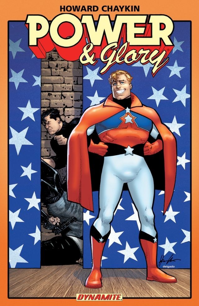
Blackhawk is maybe his best-realized take on the relationship between mass culture and fascist aesthetics, but that dynamic is at the heart of his most interesting superhero work, too. I wrote a bit about this topic in the context of Chaykin’s Batman comics here. His 1994 superhero satire Power & Glory (four-issues and a one-shot special) offers a slightly different spin on this theme, placing the ideal of the fascist superbody in the context of the critique of the pleasures and perils of mass culture that is at the heart of all his work (and that is the focus of my ongoing book project on Chaykin). Power & Glory is about what happens when the U.S. government decides to abandon its futile attempt to compete with China, Germany, and the rest of the world in the production of tangible consumer goods and to devote all its efforts to the one thing it’s always done well: the production of nationalist fantasy. To this end, government scientists create a new superhero called A-Pex to fill America’s hearts with pride through acts of (staged but spectacular) derring-do. Michael Gorski, the government operative assigned to be A-Pex’s handler, makes the connection between superheroes and fascism explicit when he complains to his bosses, “Face it — the real world isn’t a god damned comic book. But you had to make an ubermensch — a fantasy solution to real problems” (#3).
A-Pex proves initially to be a resounding success — his licensed image proliferates like a virus. But there’s trouble behind the scenes. Gorksi and Allan Powell, the man in the A-Pex suit, loathe each other. Gorski is another iteration of the familiar Chaykin protagonist — not just dark-haired, left-handed, and Jewish, as Chaykin likes to say (Conversations 21), but also self-righteous and a little romantic about his own ideals, if not totally above corruption. By contrast, Powell, blonde and blue-eyed, is an amoral, narcissistic sociopath who has volunteered to become A-Pex for very particular reasons having little to do with American greatness. Powell is terrified of contracting AIDS or any other STD; indeed, he has a downright horror of even being touched. (In the first issue we see him masturbating with gloved hands while two prostitutes frolic in front of him; when they attempt to draw him into the action, he panics — “Who knows where you’ve been?”) Powell is only attracted to the program because it renders him impervious to disease and bullets alike, safely protected by his “invulnerable body of throbbing pink steel” (Holiday Special). No matter how many times he is reassured of his invulnerability, his fears are so intense that Gorski ends up having to complete most of Powell’s missions from behind the scenes. (Chaykin has pointed to a documentary about puppeteering as an inspiration for the series, but you could make the case that there’s a riff on comics history here, with Gorski as a stand-in for Jewish creators from the superhero’s early days who struggled to maintain control — legal and financial but also maybe interpretive — over the Aryan overmen they created.)
It’s in the contrast between Powell’s hyper-masculine physique and his debilitating horror of infection that Chaykin develops his critique of the superhero’s superbody, an aspect of the genre that alarmed anti-fascist cultural watchdogs including Walter Ong, who disliked the way that the superhero genre combined a simple-minded nationalism with a celebration of the powerful male body — or, as Ong puts it, the “permanent orgy of muscularity” (39). Such super-men played an important role in the fascist aesthetics of Nazi Germany, of course. In his study Male Fantasies, Klaus Theweleit traces the veneration of the, steel-hard body of the soldier-male back to the proto-fascist Freikorps literature of the 1920s and 1930s. The writers of the Freikorps dealt with their anxiety over the dissolution of the body and the nation by valorizing the ideal of the armored soldier-male, repeatedly and insistently describing iron-hard, even mechanized bodies standing proud and erect against the floods, mires, and swamps (non-Aryans, communists, women) that threaten to engulf and penetrate them. As Theweleit writes, “The most urgent task of the man of steel is to pursue, to dam in, and to subdue any force that threatens to transform him back into the horrible disorganized jumble of flesh, hair, skin, bones, intestines, and feelings that calls itself human” (160). He does so by “defend[ing] himself with a kind of sustained erection of his whole body, of whole cities, of whole troop units” (244).
As a steel-hard superhero shill for American exceptionalism whose image is endlessly replicated across popular culture, from movies to video games to fish-stick packaging, Powell is a perfect vehicle for Chaykin’s satire of the anxieties and neuroses that underlie fantasies such as the ones Theweleit describes. Despite his incredible power, he flees in panic whenever he perceives any threat of contagion or contamination, whenever he confronts anything that would threaten the ideal of masculinity that he literally embodies — especially more fluid notions of gender and sexuality. In fact, this is what his superhero image is founded on: the event that gets him over with the American public is when he flips his lid upon discovering that a suspected drug courier is a transvestite, shrieking “No touching!! Who knows where she’s been?” and snapping his victim’s neck when he flails his arms in panic (#3). His reflexive violence is spun as the utmost heroism by the government and a compliant media, and a superstar is born.
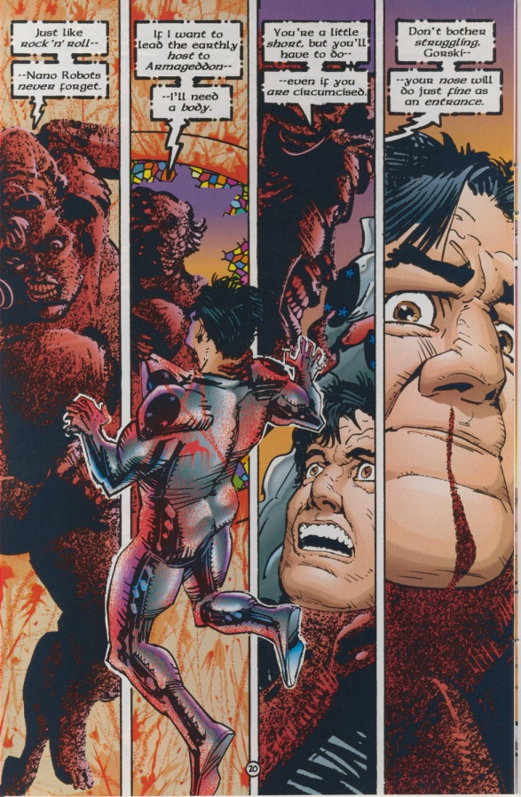
That tension between Powell’s invulnerability and his horror of contamination runs throughout the background of the main Power & Glory series, but it is central to the Power & Glory Holiday Special. In this final installment of the series, Powell and Gorski have severed their ties with the government and have separately ended up at work for a private corporation. Their new employer, PLEX/Biomatrix, is pioneering a new process to give ordinary people powers like Powell’s. P/B is promoting its brand through a lottery whose winner will receive a superbody for one week (after which point the nanobots that keep one’s body steel-hard will be turned off). But the lottery’s winner, an “infonet gospel guru” named Epiphany St. McMiracle, has other plans. Already infected with HIV by a philandering husband, St. McMiracle has decided to use her new powers to take the rest of the world down with her. Gorski and Powell think they’ve bested her at first, overloading the nanobots in her bloodstream until she explodes, spraying blood and tissue all over them, much to Powell’s dismay. But she quickly returns, this time as the embodiment of the fears that Theweleit described: a sentient, flowing mass of blood, capable of taking human form but also of extending its tendrils to wash over, penetrate, and absorb its victims. When St. McMiracle announces that she intends to slither up Gorski’s nose and make his body her own, Chaykin’s page layout drives home the radical nature of her threat. Chaykin divides the page into four narrow vertical panels, but in the second panel St. McMiracle grips Gorski by the front of his suit and thrusts him outward, toward the reader, violating the rigid borders of the other panels with his body and thus undermining the strict divisions on the page in the same way that she prepares to violate his body. The fact that she is planning literally to become a woman in a man’s body only underscores the way in which St. McMiracle threatens the fantasy of heroic masculinity that is so fundamental to the superhero ideal.
It’s an interesting, potentially problematic moment for the series. On the one hand, Power and Glory is clearly a critique of the superbody ideal and holds Powell in contempt for his horror of being infected by women. Yet despite the series’ disdain for Powell, the villain here is literally a giant oozing blood woman who, ridiculous as it sounds, poses a real threat to the world within the context of the story. (Here I should probably stress that St. McMiracle and the prostitutes I mentioned earlier are not the only women in the series, which includes two female characters, Avis Catlett and Vanessa Cheng, who are well developed within the limitations of their supporting roles.) It’s the age-old tension inherent in parody, which inevitably reproduces the thing it wishes to mock.
It’s significant that Gorski and Powell don’t triumph over St. McMiracle through the virtue of their erect steeliness but through an alternative notion of the body that embraces the very truth that Theweleit claims the soldier-male stands against. At a crucial moment, Gorski recalls that the scientists who designed the nano-bots created a failsafe: the ‘bots will go inert at the eleven notes of “great gray gobs of greasy grimy gopher guts.” It’s an odd choice but thematically apt: the children’s song is all about humorously acknowledging and jokingly embracing the “disorganized jumble,” to use Theweleit’s phrase, of oozing, messy body parts.
The paradox of the book’s climax is that by singing the song and forcing St. McMiracle to discorporate while she holds him high above the ground, Gorski is forced to fall back on Powell and, implicitly, the superheroic fantasy he embodies. (Powell punches through a wall to catch him.) Thus, the Holiday Special ends on a curious note of reconciliation between two men who despise each other. Or maybe it’s just resignation. It’s tempting to read Gorski’s grudging rapprochement with Powell as reflecting Chaykin’s own resigned acceptance of the dominance of superhero narratives over the so-called mainstream comics marketplace. After all, Power & Glory came out in 1994, in the midst of the Image Boom. The Image books enjoyed massive commercial success based on speculation and a visual style that favored Awesomeness over draftsmanship or visual storytelling. At the time, Chaykin described them as “posing comics” and “trading-card comics” (Conversations 170). It was an ethos that couldn’t be further from that which informed the formally ambitious, narratively dense, deeply individual work that Chaykin produced throughout the 1980s. The fact that this work, while often critically acclaimed, didn’t lead to the kind of financial rewards that some of his peers enjoyed is part of what led Chaykin to shift his efforts away from comics and toward screenwriting throughout most of the 1990s.
The prospect of empty-headed, fascist-friendly superhero narratives taking over the marketplace where he spent most of his career to that point may have been frustrating to Chaykin. But Power & Glory — one of the very few comics that he produced as writer/artist in the 1990s — works as a way for Chaykin to redefine those narratives on his own terms. For Chaykin, what superhero comics are not about the insidious, sinister power of fascist fantasies; rather, they’re about the anxiety, weakness, and neurosis that underlie them.
—
Brannon Costello is Associate Professor of English at Louisiana State University, where he teaches and writes about southern literature and comics. He is currently at work on Lost in the Futurama: The Comics Art of Howard Chaykin for LSU Press.
Costello, Brannon, ed. Howard Chaykin: Conversations. Jackson: UP of Mississippi, 2011.
Ong, Walter. “The Comics and the Super State.” Arizona Quarterly 1.3 (1945): 34-48.
Theweleit, Klaus. Male Fantasies volume 1: Women, Floods, Bodies, History. Trans. Stephen Conway. Minneapolis: U of Minnesota P, 1987


