The Singing Inks: Some Lovely YouTube Inking Videos

I love art.  While I don’t get to play as often as I’d like, I thoroughly enjoy the hell out of it when I can.

One of the joys of committing art is playing with ink and paper.

And if I can’t play with the paper and ink myself, I often like to watch how others do so.  Watching other active artists work is a wonderful learning tool–and it brings me great joy. Of course in the past, one needed to personally know an artist in order to watch their process, but these days it can be possible to see it on YouTube in videos or on DeviantArt in tutorials.

Today I wanted to share some of my favorite videos.

First is Nyek! Video Blog #64

Pencils by Whilce Portacio and Inks by Ed Tadeo.

I find this very restful to watch, actually. I’m always fascinated by which portions of an image an artist chooses to begin working on. Then, which portion they choose to highlight with their tools, and what parts they come back to.

I’ve watched this video several times, and while I don’t always follow the capes, I do have considerable affection for many of them, so this is a satisfying piece for me. There is often a difference between a working artist on deadline (using Photoshop to black things in, for example) and a teacher showing an exhibition piece. Both very valuable. Just different.

The second video is an illustrator, Francis Vallejo, who has made a longer how to video:


This video is a short series of demonstrations–it’s not a working piece (as in the first video), it’s a demonstration piece. He does several versions-one with pencil, then with nibs, then with brush work, and another with gray washes. It’s useful and interesting.

And while the one below is actually speed painting, not inking, I wanted to share it anyway:


No, I have no idea what the words say. I think the artist’s name is hatsune miku, but that is an educated guess (Update by Noah: Hatsune Miku is the character being drawn, apparently).  What I wanted to talk about is the approach–it’s interesting and the results are lovely. I’ve never seen an artist begin with a silhouette and then move to the darker to lighter shapes–different and fun. So many ways to reach the end point of a figure drawn and beautiful.

This other next one is also not ink. It’s Liang Yue demoing Corel Painter 9, but I couldn’t resist, because holy shit.


That one speaks for itself.

This last one is Ayano Yamane inking her work and then doing watercolors. It’s ever so slightly naughty, so children cover your eyes, and adults, scoot closer. But seriously, Ayano’s inks are absolutely gorgeous. Her pencils, of course, are top notch, but it takes a great deal of control to do this sort of inking because (if you’ve never done watercolors or wet ink a la Dr Martens inks) you need to know that you can’t actually erase on that paper or Bad Things Will Happen (you’ll get all sorts of hideous splotches) and you can’t exactly correct skipping nibs or spatters. It requires a very steady hand, and unlike cape comics, yaoi comics (like shojo comics) require quite a thin line. It’s beautiful, yes, and my favorite kind of ink, but it takes practice and skill.

Ayano Yamane:

 
I hope you’ve enjoyed these.  One of my favorite things about living in the future is getting a chance to watch the creation and sharing of amazing art.

White Ink: A New Player in Town

Sally Hansen Nail Art Pen, White: recommended

I’m still slowly working on my Great Inking Project wherein I review the black drawing inks in my stash, but in the meantime, I ran across a fabulous white ink and wanted to rush to tell everyone about it.

As some of you know by now, I am wee bit obsessed with ink.  In drawing comics or manga, which admittedly I do only as a hobby, I primarily use black ink on white paper, but like many (most) artists, I also use white ink to add highlights, correct marks, or do various techniques.

The problem is that white ink does not behave like black ink (which dyes paper, among other things).  There are several white ink options available, but most of them are more paint than ink, since it’s very difficult to get good opaque coverage with fine white liquid.  I’ve used the usual White-out, Copic white, and various white inks. There are several problems with these: one must use a brush or sponge and the lay-down of the ink/white-out is gloopy thick and thus makes making marks over it again in black rather difficult or the white ink is smooth but covers not a whit.

I’ve also tried various correction pens in white.  Correction pens are such a lovely idea.  Unfortunately, they either suck or they give me a vicious headache.  Or both.

Which is why when I ran across this nifty little white pen, I was so pleased I had to share as soon as possible.  This is a white ink pen, has no discernable smell (to me), lays down good coverage, creates smooth lines that could easily be covered over (ie, is not goopy whatsoever), and generally behaves like a dream.  You have to buy it in the nail polish section of the drugstore instead of an art supply shop, but such are the trials and tribulations of being an artist.  Unlike many white-pens, the tip is quite fine and it does not have a maximum number of purchases or other anti-graffiti or anti-huffing retail restrictions, at least in my state.

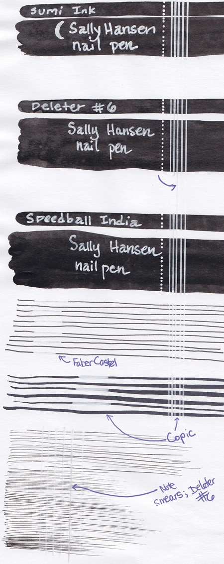
Below you will find the results of my trial.  I took three kinds of ink and laid down thick dark swathes.  I used two kinds of pens and made lines.  Finally, I used a single drawing ink and made very fine effects lines.  Then I used the white pen over each of them.

I used three kinds of ink for the swathes.  The first is a Sumi ink (you can tell it is not rich, extra-dark black).  The second ink is, I believe, alcohol based, but I cannot be certain because it is Japanese; it is however, alcohol soluble when dry but not water soluble when dry.   It’s called Deleter #6 and is my favorite drawing ink.  The final ink is an India type ink, which is not water soluble or alcohol soluble when dry; (this particular India ink is Speedball).

The marker/pen lines are first, Faber Castel pen in size small, black.  The second is a brush-nib Copic.

The effects lines are done with Deleter #6 and my trusty G-nib, because those are my favorites.

Going from top to bottom, you’ll notice that the Sumi ink isn’t all that black, and that the white pen covered it pretty well.

The Deleter #6 is darker ink, but the white covered it OK when writing/highlighting but began to smear, especially during the line marks.

The Speedball India Ink is the darkest of the inks, and the white pen covers it the best.  Unlike the Deleter, there is no smearing whatever.

The first set of marking pens is the Faber Castel and the white pen covered the marks pretty well, but might have benefited from a second coat.

The second set of marking pens is the Copic, and you can begin to see more smearage and poor coverage.

The final set of effects lines shows the worst of the smearing.  That was done with the Deleter.

As far as I can tell, this white pen does very, very well on any ink except that which is alcohol based.  If you use a Sumi style or an India style, you should be just fine.  If you want to do some minor, very fine correction work on an alcohol based ink (because you’re addicted, like me, to Deleter #6 or Copics or for some other reason) you may find it usable with some tweaking.