
At the ‘old’ Pencilpanelpage location I began my contribution to our reign of comic scholar awesomeness with three posts about when distinct versions of a comic are, or are not, really the same comic in the relevant aesthetic/interpretational/etc. sense (see When Are Two Comics the Same Comic Part I, Part II, and Part III, which focus on rearrangement of panels, recoloring, and redrawing ‘lost’ portions of old comics, respectively). Those posts focused on issues having to do with ontology – determining whether or not we have one work of art, or many – with an eye towards how these issues affect our reception of, and overall assessment of, these comics (and comics like them) as works of narrative art. This post is a continuation, of sorts, to that investigation.
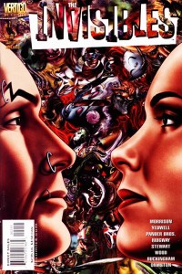
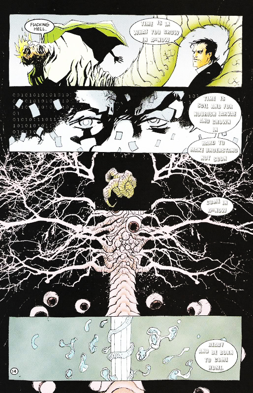 Here, however, I would like to take a slightly different approach to the general question, but one which is motivated by the same phenomenon: multiple, aesthetically distinct versions of the same comic. The instance in question is well-known – Issue #2 of The Invisibles Volume 3, “The Moment of the Blitz” (which is actually the 11th, and second-to-last, issue in this volume – the numbering counts down from 12 to 1). In the original comic, pages 12 – 14 are drawn by Ashley Wood. These (especially page 14) are critical pages, summing up major metaphysical themes underlying The Invisibles in little more than a dozen panels. In the tradepaperback collection, however, Ashley Wood’s pages are jettisoned in favor of a re-drawing of this critical passage by Cameron Stewart, who had also drawn a number of pages of this issue in the original floppy version. I have included scans of the critical page 14 here – first the Wood version, then the Stewart version.
Now, the reason the pages were redrawn is simple enough, and well-known: Morrison felt that Wood had not properly captured his ideas on the page, and Stewart was asked to ‘do it right’ for the trade paperback version. Patrick Meaney described the Stewart pages as follows:
Cameron Stewart deserves credit for redrawing pages originally illustrated by Ashley Wood for the trade paperback version. Those original pages can be quite confusing, obscuring thematic points that Morrison had been building toward throughout the series (Our Sentence is Up: Seeing Grant Morrison’s The Invisibles, 2011, p. 250)
and an entry on comicvine.com described the situation as follows:
The Cameron Stewart pages are considered the true version since they were redone for the Trade. Ashley Wood’s pages are interesting because they were a different interpretation of the same script.
 These sorts of descriptions, however, pose a serious issue for comic scholars (and for anyone who wants to understand how comics work as an art form, and anyone who thinks such an understanding might enrich our experiences with structurally rich comics like The Invisibles). Comics scholars like to talk about comics (at least, mainstream comics, as opposed to single-creator auteur works) as a medium of genuine collaboration – the thought is that the distinct artistic visions of writer and artist ‘blend’ somehow into something greater than the sum of the invididual contributions. Regardless of how, exactly, the details of this work, the central idea – that comics are a collaboration between writer and artist (and perhaps others) is almost a truism of work on comics, if anything is.
The redrawn pages of The Invisibles Volume 3, however, suggest that comics is not a collaborative endeavor – at least, it isn’t a collaboration between two creators whose endeavors are equally valued and whose endeavors contribute equally to the identity of the work. Instead, the picture we obtain from this incident is that artists are merely journeymen (or journeywomen) of a sort who toil away in service to someone else’s artistic vision (and whose work can be thrown away, and replaced by the work of another, if it does not fit that vision).
In short: There seem to be two accounts regarding how writer-artist interaction might (and more importantly, should) be viewed. On the first account, writers and artists are equal collaborators on a single artistic work whose final characteristics are determined in roughly equal part by each. The second account of writer-artist interaction is suggested by the use of the word ‘interpretation’ in the quote from comicvine.com. This view has it that the artist is not an equal collaborator, but is instead interpreting the writer’s story (in much the same way that a performing musician might interpret a piece of composed music). Note that we would not usually call a performer interpreting a composed piece of music an instance of collaboration!
Now, on the one hand this seems to be merely a question of how the business of comics works, and in this particular case it is not surprising that a creator of Morrison’s caliber would be allowed so much control over ‘his’ work (the scarequotes are very important, since the appropriateness of this term, rather than ‘their’, is exactly what is at issue). But there are also deep theoretical issues lurking hereabouts – ones deeply connected to the title of this post. If Morrison and Stewart (and hence Morrison and Wood) are genuine collaborators, then replacing Wood’s pages with Stewart’s amounts to replacing one collaborative work with another one entirely. If, however, Stewart and Wood are not creators of the artwork, but are merely interpreters of it, then the situation amounts to replacing one interpretation of the work with another interpretation of that same work.
So the question really is this: Do we have two distinct works here, or merely two different interpretations of a single work of art? Or, alternatively, are artists more like composers, or more like performers interpreting composed music?


