Only Connect

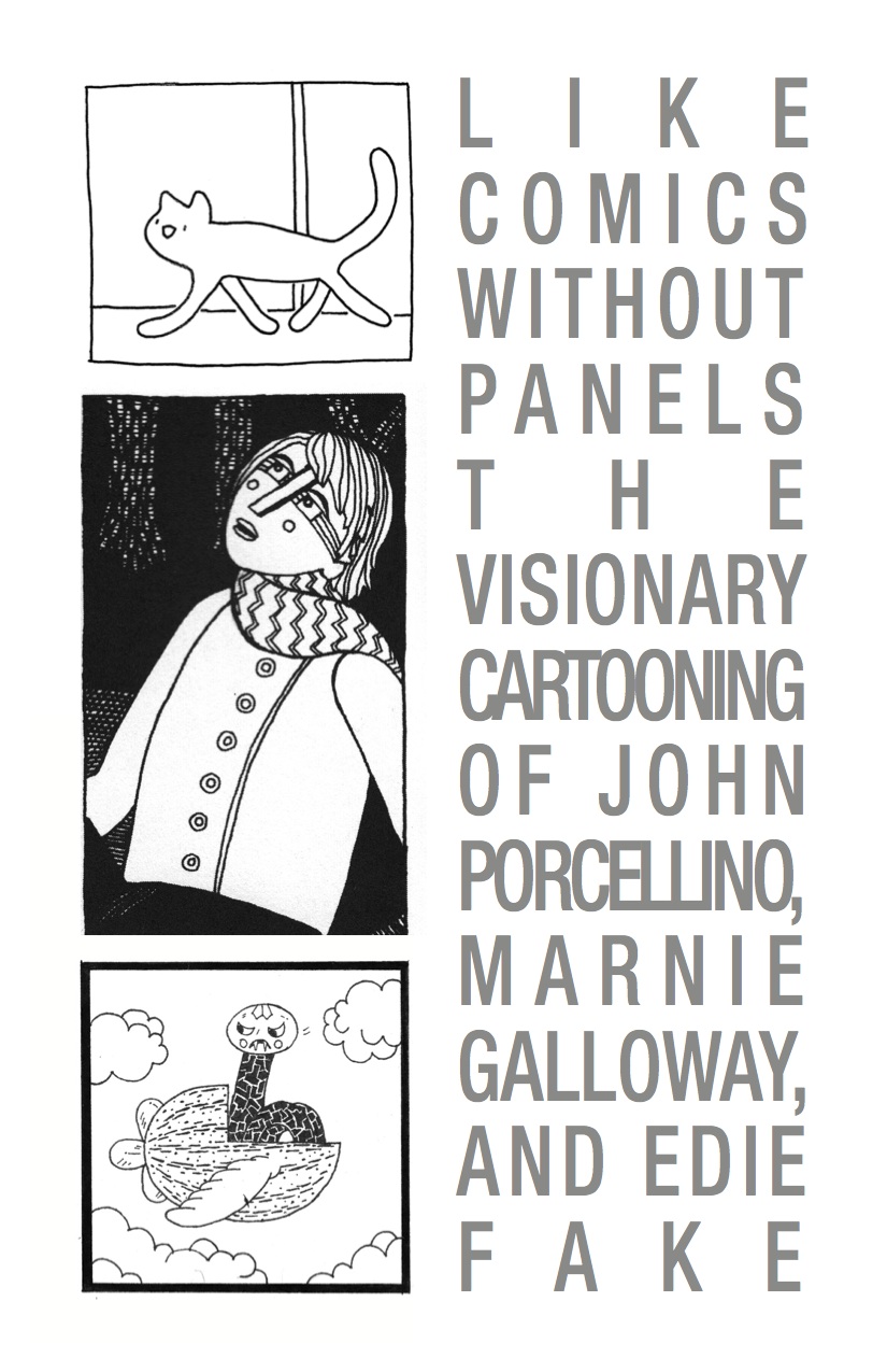
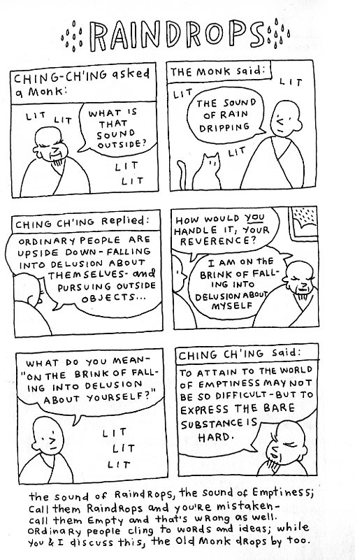
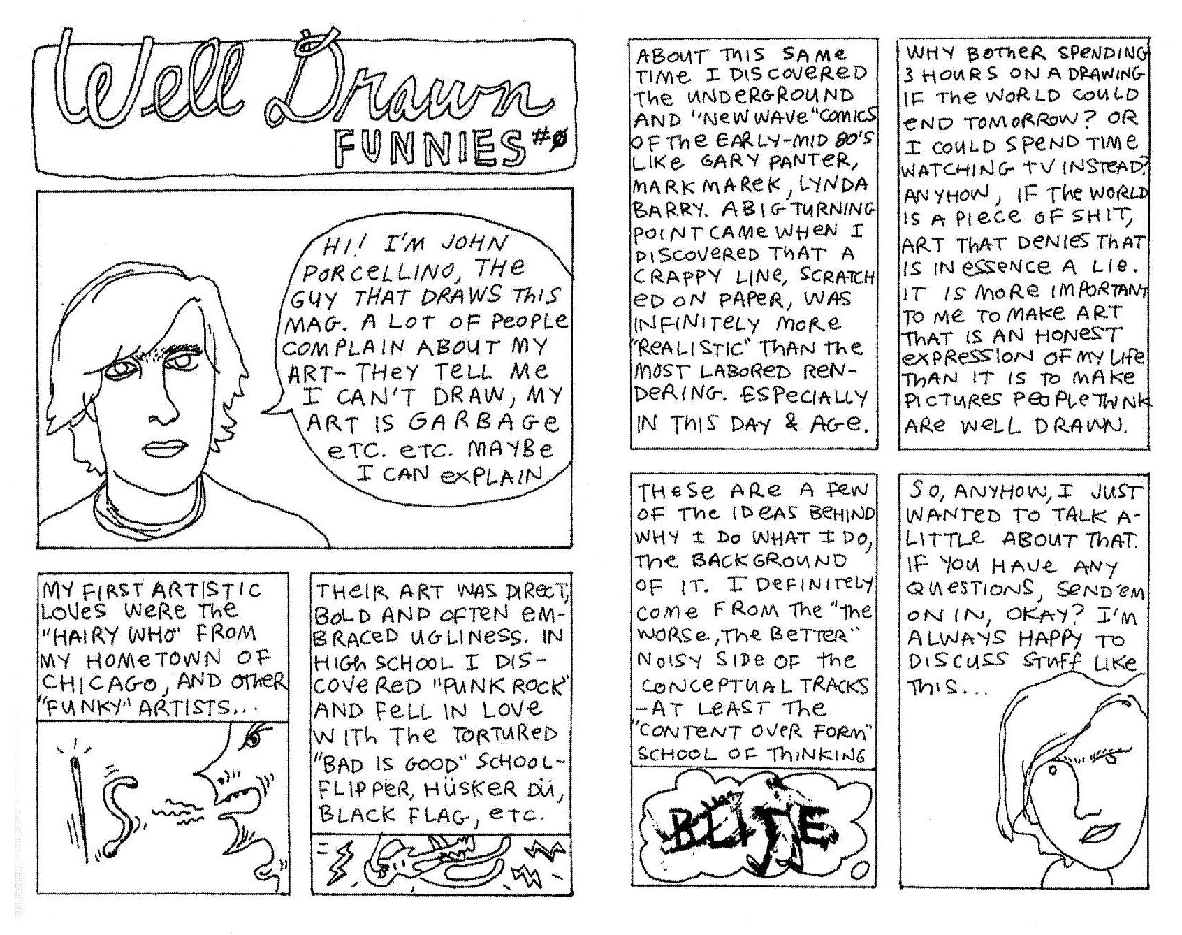
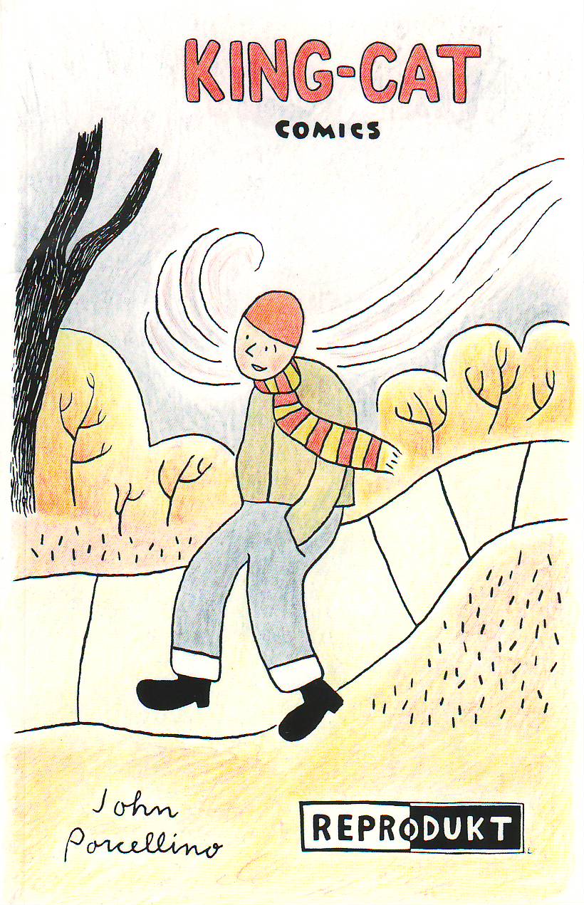
Before I read The Hospital Suite, I was only vaguely aware of John Porcellino as a sort of folk hero. He packed up and left Chicago near the turn of the century (around the time I moved here myself), and some 15 years on still seems to be the patron saint of comics in this city, or maybe the Midwest in general. Cartoonist laureate of a Carl Sandburg poem. Any place where folks work hard and make the best of it.

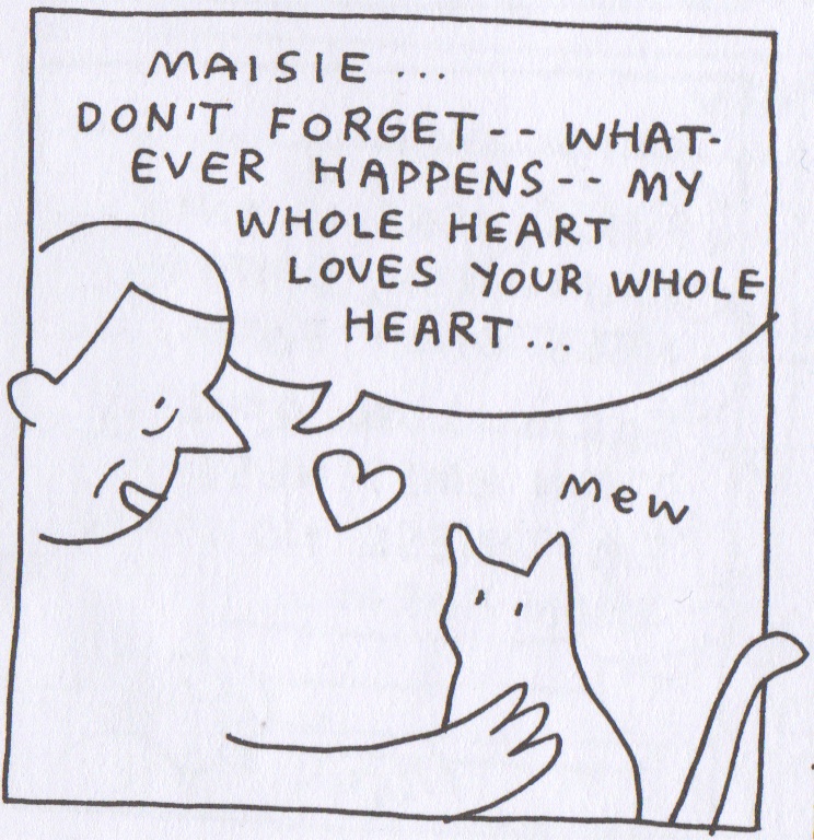
Paul Bunyan had an ox. John Porcellino, a cat. Her name was Maisie. She’s been memorialized in no less than three Sufjan Stevens songs—more if you count the b-sides. I recently learned that a cabal of suburban mail carriers named her a minor deity. They want to get her on a stamp. They say that on clear winter days, at first light, you can feel the spirit of the cat making copies of out-of-print comics at the Wicker Park Kinko’s. I met some guy at Quimby’s who claims he communed with her there. Three beers in he admitted she had to correct his pronunciation of Kukoc.

I don’t know, I guess you read comics. You probably know the lore. But all I really knew up until I read The Hospital Suite was that Porcellino has a pure punk heart and a 90s-era webstore, and I confess that my more cynical side wondered if that wasn’t, on some level, super fucking ridiculous. I’d like to be the kind of person who buys mail-order zines, but the truth of my life is that I read celebrity gossip magazines and persist in ordering almost everything from Amazon even though I know it’s evil. I truly wish I cared.

In any case, I’m grateful to the good people at Drawn & Quarterly for publishing this work in a format that feels accessible to jerks like me. While I could see Porcellino’s appeal from page one, there were moments early on when I worried The Hospital Suite was another “good patient” story. I also found the current of what I’d reluctantly call spiritual comics to be a bit much—not a deal breaker, but always off-putting. (I love Ron Regé Jr, but there is no plane to which I could ascend where I would be inured to the hilarity of his wizard robe.) Slowly, though, it dawned on me that I was reading something rare and real and special, and not at all ridiculous, and by the end of The Hospital Suite I felt for Porcellino a sort of affection that is a rare sensation in reading comics, or really all of literature, or maybe life. I’d compare it to how I feel about David Foster Wallace or Lynda Barry. I mean to say he shines a light.
 

JP_1

 
Autobio is a crowded category, not just in its number of practitioners but also in its sensibility. It’s often a jaundiced genre—frenetic, claustrophobic, uncomfortable. Neurotic. Obsessive. Tortured. Overwrought. Within The Hospital Suite, there are traces of all the classic themes: ambivalence toward the responsibilities of adulthood, depression, masturbation, being broke. The chief difference is, despite a grueling fight for his life and nigh on a decade’s worth of catastrophic diarrhea, John Porcellino somehow seems to be the least miserable bastard in comics. Of course—and this is critical—he’s not quite happy, either. He’s something else. And whatever you want to call it, it’s a breath of fresh air.

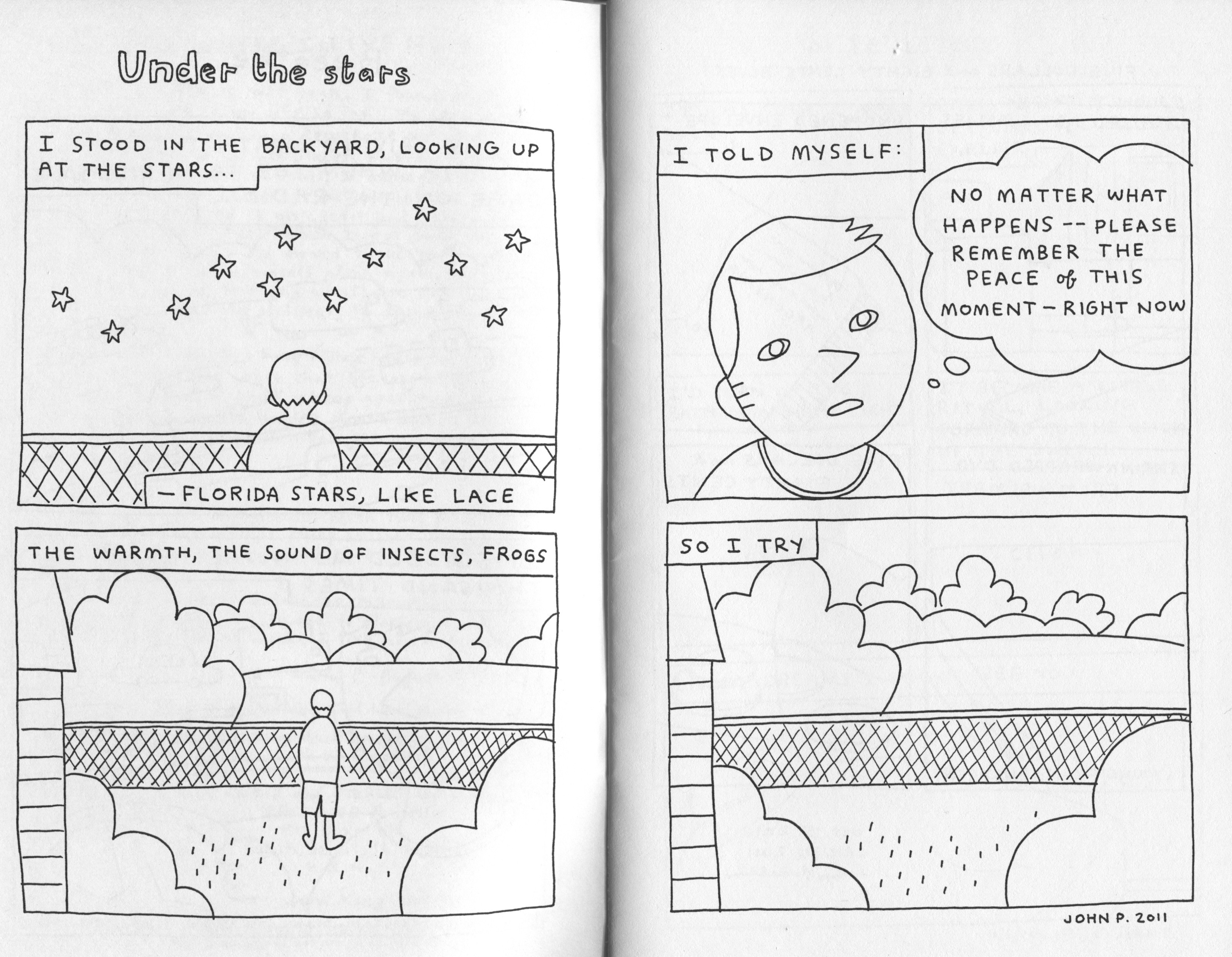
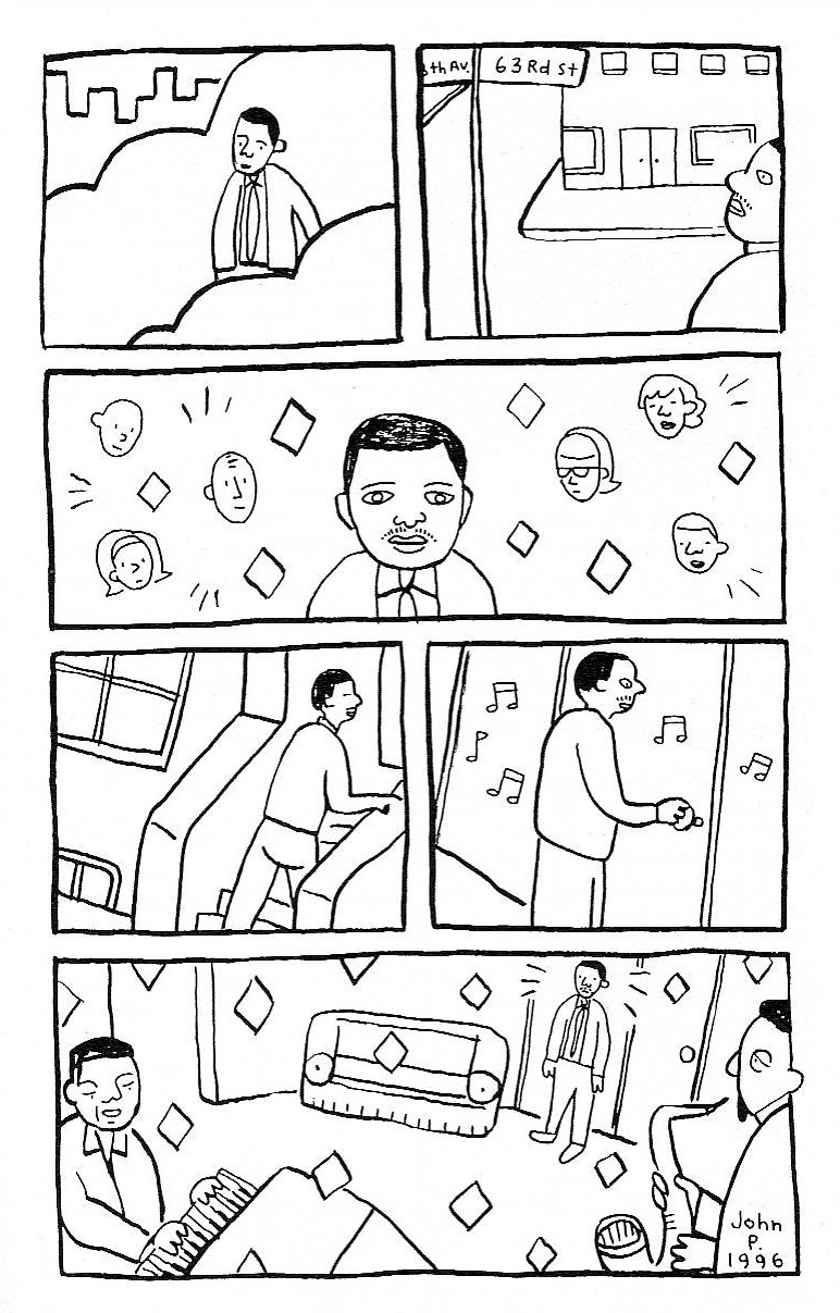
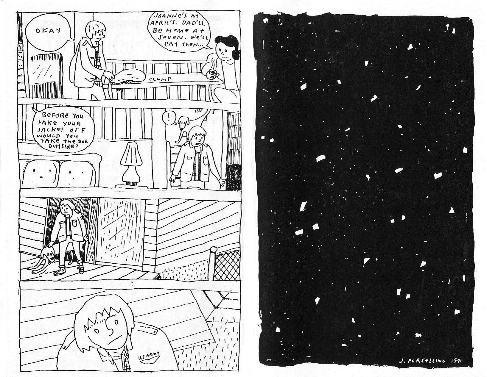
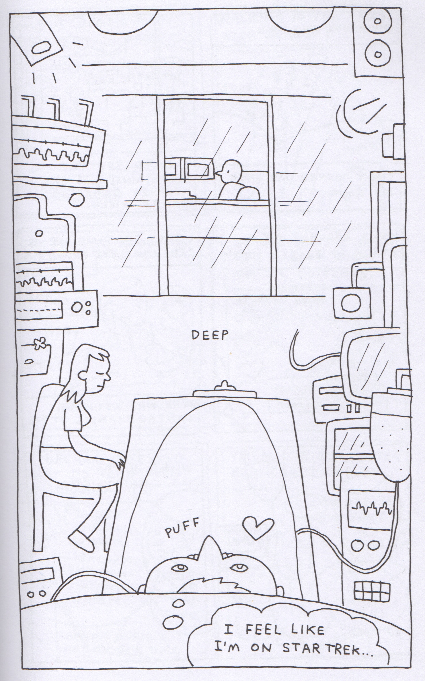
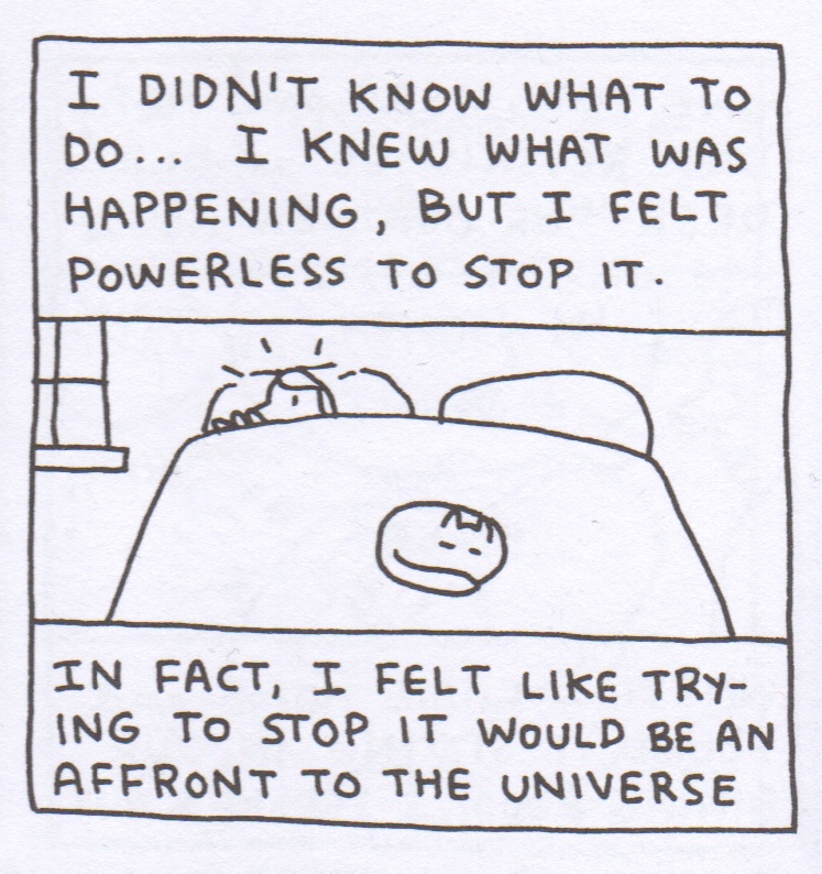
There is a palpable sense of calm conveyed by Porcellino’s simple aesthetic. I gather that’s just how he draws, but it suits the subject matter here very well, offsetting the intense distress he depicts throughout The Hospital Suite. I’ve heard him say that his drawing is sometimes referred to as bad. I find that astonishing, but it certainly sounds like something my dad would say. Of course anyone who has aspired to minimalism in any area of life, artistic or otherwise, will recognize the sophistication required to draw stripped-down pictures like these. It’s advanced iconography—a very high level of graphic design—and that Porcellino manages to pack so much charm into drawings this spare is remarkable, if not unheard of (cf. Allie Brosh). Occasionally he flashes his chops in a cool composition, like this scene from his sickbed that captures the whole Starship Enterprise vibe of being in the hospital.
 

JP_3

 
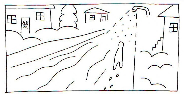
But I think Porcellino is at his best when he keeps things simple. He has developed an idiosyncratic shorthand to convey outsized feelings—the good, the bad, and even the ineffable. Probably my favorite thing about the book is the little hearts he draws to convey all the love he feels in the universe. He seems to tap into it almost everywhere, including the post office.
 

JP_2

 
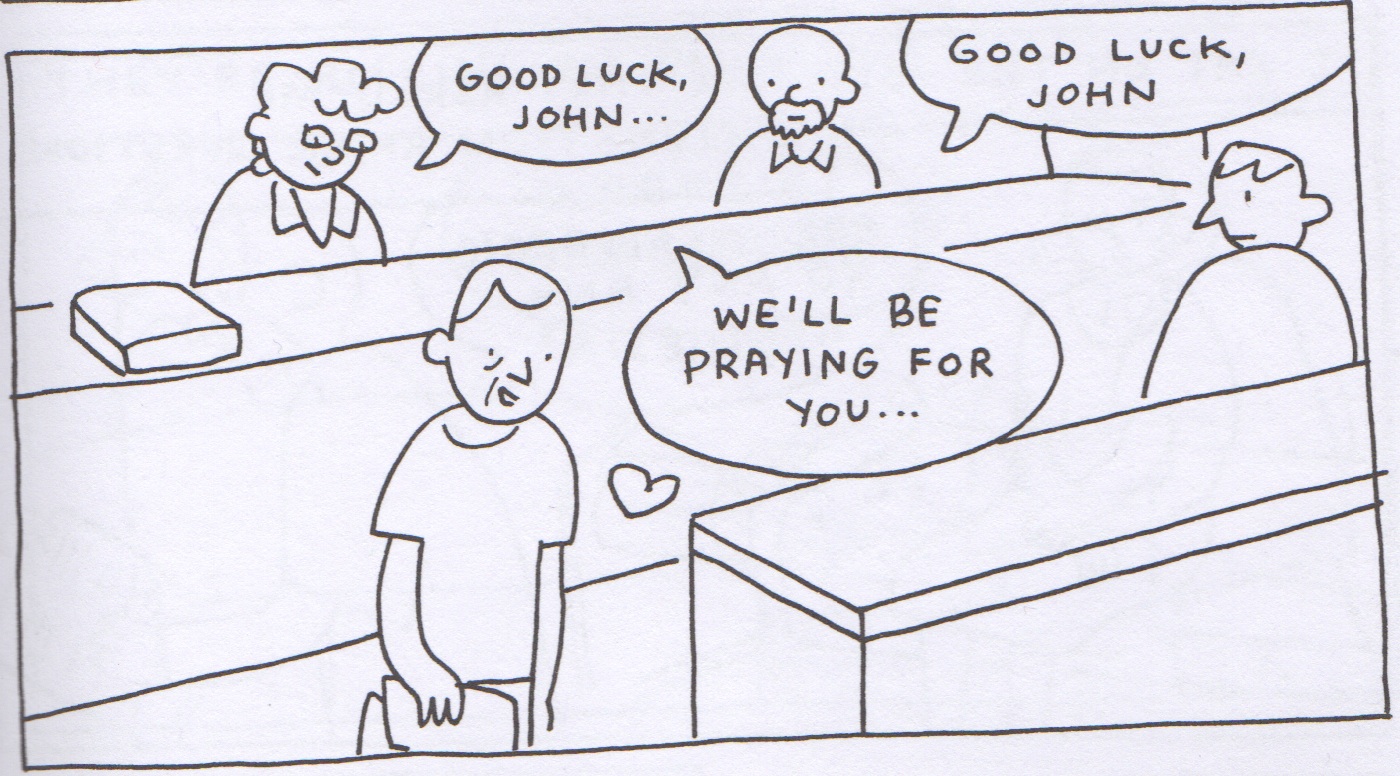
Reader, I don’t know about you, but this does not even remotely resemble any interaction I’ve ever had with USPS.
 

JP_7

 
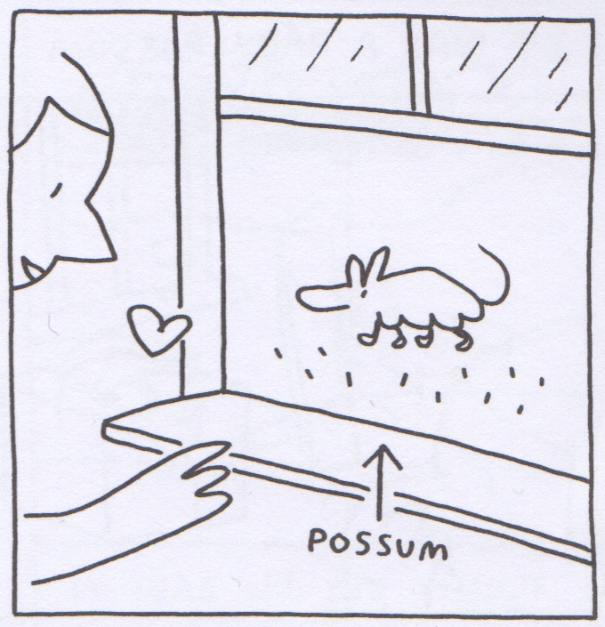
Or possums?     ~~oO{:>     ……..(/*o*/)

Structurally, The Hospital Suite isn’t quite sound. On one hand, Porcellino does an excellent job of distilling a narrative from an incredibly complex system of mental and physical illnesses that span a long period of time. On the other, we have the book’s clumsy division into three distinct, but overlapping, sections, plus several wholly unnecessary appendices. The central paradox of Porcellino is that his stories are very processed—aggressively reduced and refined—but feel entirely organic. Untouched. In sharp contrast, the section breaks feel artificial and distracting, and it messes with the magic just a little. One of the advantages of comics as a medium is the ease with which they can accommodate more than one timeline. These stories should have been stitched together with more care.

Overarching the structural concerns is the book’s lack of dramatic tension; the terror of the Mystery Illness is offset by the reader’s sure knowledge that Porcellino did in fact survive this experience. Even when emotions run high, the stakes feel low. Some stories are so engrossing that you feel “worried” even when you know the outcome, but The Hospital Suite never quite manages to transcend its own inevitability. I don’t know, it might be unfair to expect a Zen Buddhist to ratchet up the drama.

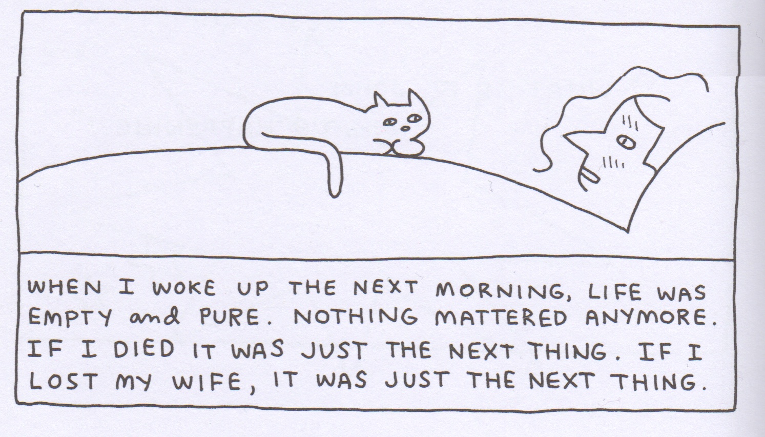
Admittedly, this is where we brush up against my limitations as a critic: the places in the text where I wondered if its “deficiencies” were areas in which there was real room for improvement, or just a different way of looking at the world. Often I admire Porcellino’s clear perspective. (Even when he’s talking about the shame spirals of obsessive-compulsive disorder, his gaze is cool and level.) But sometimes I get the sense that he simply hasn’t done the hard work of what Justin Green has described as presenting the self as a “specimen.” The world of The Hospital Suite is a place in which things happen to John Porcellino. There is no real sense that he assumes any agency in life.
 

JP_6

 
Whether that lack of agency is a personal problem, a spiritual belief, or a syndrome borne of years coping with a debilitating, unpredictable illness is difficult to discern. (Maybe it’s all of those things.) I’ve read that the events in The Hospital Suite span two divorces and three relationships—something that wasn’t quite clear to me from reading the book. It’s understandable that Porcellino didn’t want to delve into the particulars; these are real women in the world, after all, and in some ways the dissolution of those relationships seems tangential to the story he’s trying to tell. But I found myself giving him the side eye, hard, in some of the sequences about his first wife.
 

JP_4a

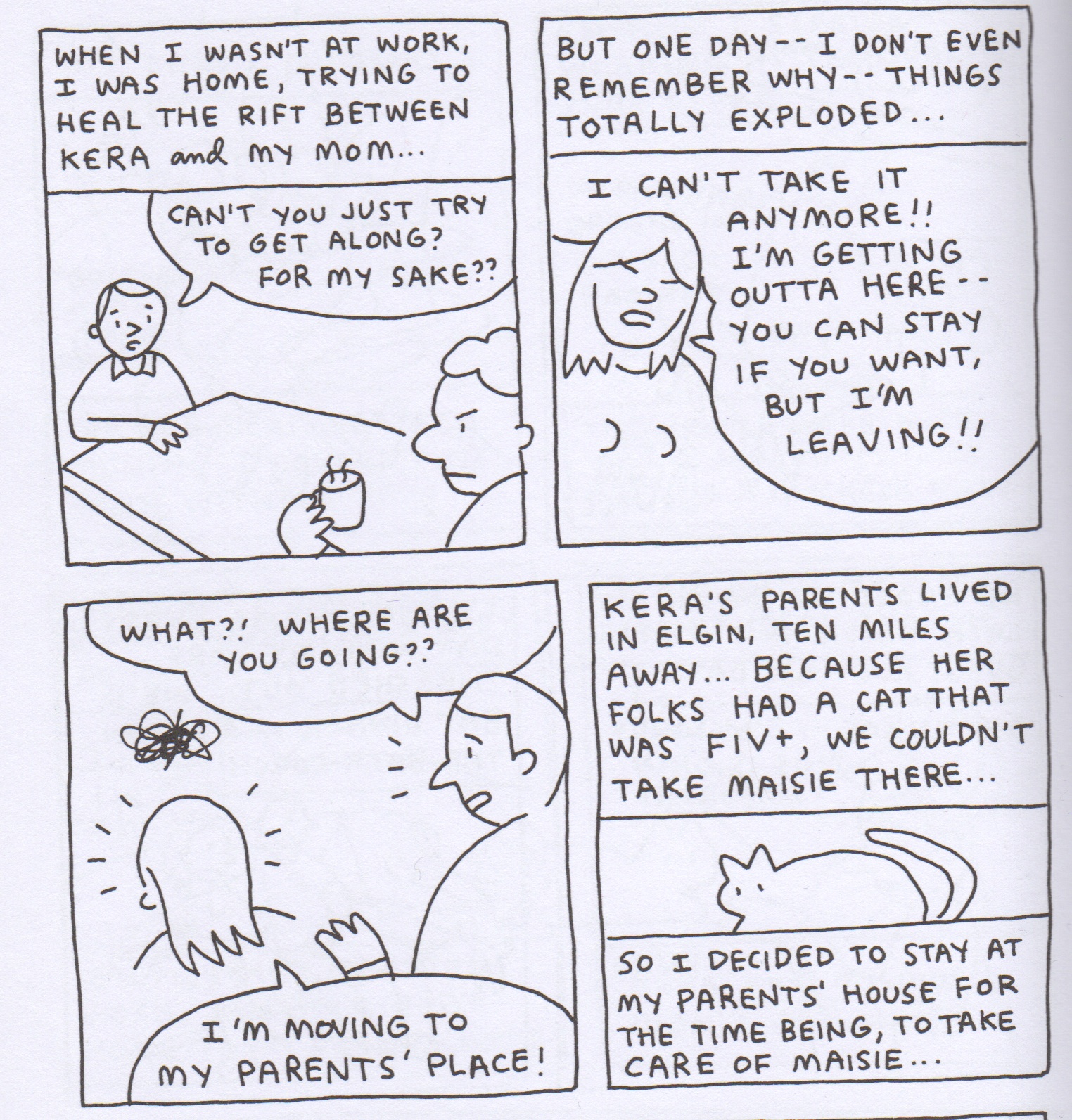
I wonder if, as an autobiographer, the decision to do what was best for his cat instead of his relationship was something that Porcellino could have delved into more deeply.
 

JP_5

 
But no one’s perfect, you know? And as much as I love autobiographical comics, they tend to celebrate imperfection in a way that’s slyly self-congratulatory. They relish rolling around in the shit. Whatever flaws are in The Hospital Suite, the author seems to come by them without ego or agenda. Which all sounds rather humorless, doesn’t it? He’s very funny, though.
 

JP_8

 
I’m not a spiritual person, or the kind of girl who has easy access to all the love in the universe. Frankly, I’m more disdainful and suspicious of those things than I’d like. As much as I wish I were a special disgruntled snowflake, this perspective is, increasingly, a cultural norm. From the milieu of autobiographical comics to television’s recent obsession with antiheroes, drama isn’t really about Good People right now. It’s hard to make them seem compelling, or even believable. As a creator, it’s all too easy to explore the nuance of being a garbage person. It’s also easy, from a reader’s point of view, to sigh in relief that someone else in the world is just as bad (or, better, worse) than you are.

It’s more difficult and brave, I think, to make art that takes people outside themselves and shows them something larger. More than craft or even sheer likeability, it is that reach that makes John Porcellino’s comics remarkable. It’s a quality I can’t quite hope to convey in these 1,500 words. This is where I’d draw the heart.
 

“Like Comics Without Panels”

“How are you with math?”

“What kind of math?”

Math math. Numbers.”

I have a standard response to this question: “I haven’t taken a math course since the original line-up of Guns N’ Roses was together.”

“How about a level?”

“No idea what you’re talking about right now.”

When I began work with my colleague Jason Peot on the comics gallery show that opened at Harper College this week, I had no idea I’d have to employ my rusty math skills. The show features beautiful work from John Porcellino, Marnie Galloway, and Edie Fake. Friends have asked me about my first experience as a co-curator. How do I feel about original comic book pages hanging from the white walls of a small gallery? How did Jason and I select the pieces? What are we trying to say about the relationship between comic book narratives and the fine arts? I find myself wanting to talk instead about dusting frames, centering images, and learning about Plexiglas and L-shaped nails. I even got to sandpaper the edges of the plex we used to cover pages from John and Marnie’s books. Actually, I’m pretty happy with myself right now for using the word plex in that last sentence.

>Gallery Show program cover copy

The cover of the program booklet for our show.

I’ll admit that I’m hesitant to call myself a co-curator. A couple of years ago, my writing students and I attended a lecture by two fairly well-known rock critics. One of them kept talking about “the curated experience.” The critic, he explained, is like a guide in a museum. Don’t we all look for a “curated experience” to know what’s good and what’s bad, especially in the arts? (I guess? Maybe? I don’t know.) He then asked the students in the audience how many of them liked the new Radiohead album. A room of vacant, late adolescent stares. “None of you listen to Radiohead?” Later that morning, one of my students confided in me: “Radiohead is music for old people.” I think she meant me, and she was right (right about the oldness but not about my favorite bands. I’ve never been much of a Radiohead fan. Or Wilco or Tom Waits or any of the music I’m supposed to like. I do enjoy the Radiohead song about the fishes, though). The phrase curated experience brought back a memory: my sister as a kid touching a Warhol on the wall of the Yale University Art Gallery in New Haven. The guard yelled at her. She withdrew her hand but she continued to stare at the painting. That image of her is fixed. In fact, it’s more durable than my memory of the Warhol. A brief gesture, a touch. I wondered if Jason and I might provide that moment of wonder for our students.

Our idea for the show is driven by two ideas Edie Fake has expressed in recent interviews. The title of the show comes from a conversation with Megan Milks published in Mildred Pierce in 2011, not long after Secret Acres released the complete Gaylord Phoenix. “I think I’m interested in space without panels, I guess, or things that are like comics without panels,” he explains. “I hardly use a space break on my pages. Things just kind of move from one thing to the next” (Milks 6). I picked up Issue #5 of Gaylord Phoenix at Quimby’s in 2010 because of the cover. The blue clouds and flowers reminded me of a still from a Jack Smith film. I carried Issue 5 in my messenger bag for the next several weeks. It was as magic and dear to me as that phantom memory of my sister and the Warhol. I wanted to live in the spaces inhabited by the book’s protagonist. If I carried it with me long enough, I thought, maybe the Court of the Gaylord would manifest itself, as lovely and ornate as it appears in the book itself. I also loved the colors, gold and orange and black and red.

Space without panels.” It could be a line in a poem, a note jotted in the margins of a commonplace book, or one of Brian Eno’s Oblique Strategies.

GP cover

The cover of Gaylord Phoenix Issue 5 (2010).

The second quotation that shaped our vision of the show is from another interview, this time from early last year. Edie’s show Memory Palaces, now also a book from Secret Acres, debuted at the Thomas Robertello Gallery here in Chicago last winter. In April 2013, Edie spoke with Thea Liberty Nichols about the show and about his artistic practice:

For as long as I’ve been an artist, I have felt part of communities where bartering and collaborating are critical parts of growth. Cross-pollinating is how ideas get spread and get expanded upon. Sharing what we can is how we help each other thrive on this messed up planet.

When Maryellen in our marketing office at school was editing the gallery program, she asked me for a quotation to introduce my essay, so I sent her a few choices. We both liked this one best. The community described here, the one Edie also talked about on the closing night of Memory Palaces when he discussed the influence of Samuel R. Delany’s Times Square Red, Times Square Blue on his art, is the community we’ve tried to imagine and celebrate in our gallery. A space of welcome, maybe a space of return. Always one of possibility and of love.

Before these possibilities could take shape, however, and before we could frame and hang each of these drawings, I had to bring a change of clothes. I started teaching when I was in my early 20s as a grad student at the University of Connecticut. I learned quick that to earn the respect of my students, especially the ones older than me, I’d have to dress up. This was ok. I’d gone to Catholic school for twelve years, kindergarten through college, so I was used to wearing a shirt and tie (my first day of college, I didn’t know what to wear. I felt overwhelmed. I decided to dress like one of The Replacements on the cover of Let It Be from 1984. Chuck Taylors and flannel. Cheap and simple). But, as I cleaned the frames for Marnie’s pages from In the Sounds and Seas, Volume I, I realized I’d made a mistake. My tie was getting in the way. I had plexi dust all over the place. I looked like an accountant or maybe (if I was lucky) somebody’s tour manager. The next day, I looked like Tommy Stinson (only not as cool, and only after I’d finished teaching my classes).

photo (21) copy 2

Two pages from Marnie Galloway’s In the Sounds and Seas, printed on large sheets of fabric (please note: hammer not included).

That was the day Jason figured out a system to frame and hang most of the loose pages, including selections from King-Cat Comics and Stories No. 73. I finally admitted the truth: “I’m not good at math.” He measured and leveled each image with meticulous care. We drilled pilot holes, a few of which were too wide for the thin, delicate L-nails that hold each piece of Plexiglas, each drawing, and each backing board to the wall. We had some wire left over from one of the frames. Maybe we could use that, wrap the nails in it? That would might give the nails some friction, Jason said. It worked.

Now John’s and Marnie’s images appear to float behind the clear, custom-cut pieces of clear plastic. Lights from the ceiling cast faint shadows.

A pedestal in the center of the gallery is covered with copies of Memory Palaces, In the Sounds and Seas, King-Cat. Leaf through the pages, read a few stories, but please return the books to the pedestal so other visitors can read them, too.

When I was in grade school my mom took a few art classes at Naugatuck Valley Community College in Waterbury, Connecticut, just a few miles from our house in Oakville. I’d sit and watch her draw still-lifes and perspective studies. I especially liked her portraits, drawn with Berol Turquoise HB pencils, each one so precise and perfect that, the next time I looked in a mirror, I saw more clearly the shape of my face, my ears, my eyelashes, my nose, my mouth. Maybe it was that sense of touch again—the feel of the sketchbook’s white pages covered in pencil and eraser shavings. These memories, like the one of my sister, flooded back as Jason and I hung the final set of drawings last Thursday.

photo (21) copy

On one wall of our show, you’ll see Edie’s original illustrations for Wallace Stevens’s poem “Floral Decorations for Bananas,” from the “Illustrated Wallace Stevens” roundtable right here at The Hooded Utilitarian, July 26, 2011. This series of drawings was also published as a zine in 2011.

And here’s the best part: for the next few weeks, when the gallery first opens in the morning, and before most of our students and other faculty have arrived at school (I commute from Chicago, so I’m on the road and in my office by 6 am to beat the traffic), I get to spend a little time with these precious and fragile works of art. If you find yourself in the northwest suburbs of Chicago in the new few weeks, look me up and I’ll give you a tour. But I don’t promise that I’m any better at math than I was two weeks ago.

Like Comics Without Panels: The Visionary Cartooning of John Porcellino, Marnie Galloway, and Edie Fake runs from now until November 13, 2014 in the Harper College Art Exhibition Space. Harper College is in Palatine, Illinois, just northwest of Chicago. All three artists will join Jason Peot and me for a Q&A on Thursday, October 30 from 12:30 until 2:00 pm. Contact me or visit this link for more details. The Q&A is free and open to the public. If you can’t make it to the show, email me and I’ll send you the program which includes images from the gallery and a short essay.   

>photo (21)

Another photo from the gallery: selections from Galloway’s In the Sounds and Seas, Volume I and Edie Fake’s “Stay Dead” (2007)

Work Cited: Milks, Megan. “Edie Fake’s Radical Bloodlust: The Comics Artist on Gaylord Phoenix, Queer Cartography, etc.” Mildred Pierce Issue 4 (February 2011): 6-10. Print.

Thanks to Allison for suggesting a way to approach writing about the gallery. Also, part of this post was inspired by Marnie Galloway’s fabulous essay on her dad. Read it here, and also pick up In the Sounds and Seas, Volume II, which was released last month.

Twee Nostalgia

“Twee” and “nostalgia” are two terms of critical obloquy that fit together naturally, like (dainty) dog shit on (soggy) twinky. Apart and even more together, they connote precious, precocious inauthenticity, packaged emotion in the name of infantile regression and souls suffocated in cat pics.

Bob Dylan’s much-lauded, latter-day song/video “Duquesne Whistle” from 2012 is a self-referential exercise in cutesy laurel-resting — and/or a biting satiric refutation of same, depending on which side of the smirk you come at it from.


Dylan’s voice is a ravaged shell of its former ravaged shell; the music a winking Tin Pan alley revival of former Tin Pan Alley folk revival; if there wasn’t a video, you’d imagine a chorus line of hobos knocking their legs together and swapping their hands from kneecap to kneecap while pursing their lips in impish surprise.

Instead, though, the video we’ve got shows us a dapper hipster sartorially channeling ragamuffin classic Dylan channeling Woody Guthrie, while flirting with an attractive passerby. The flirtation shades into stalking and our picaresque hero gets maced…and then his day goes downhill from there. Meanwhile, old Bob in a straw hat walks along with a posse of assorted cool folks, swaggering and eventually stepping over young, stalkery, beat up Bob.

The whole video is an exercise in having your twee nostalgia and spitting on it too; you get to see young Bob dream of handing a rose to his sweetheart, and then get to see him thrown to the curb while old Bob’s vocals mug on and on knowingly. The sepia trickster persona of 60s Zimmerman is rejected for the ironic, up-to-date, uber trickster hipster persona of grandmaster Robert. The old witticism is swallowed by the new witticism; the old smug grin swallowed within a bigger, smugger grin, like one of those James Cameron aliens doing a stand-up comedy routine. “You old rascal, I know exactly where you’re going,” the singer smarms, projecting realism via mime show and mime show via realism. Next album, you can be sure, he’ll bring the Blue Man Group out to convey some hard truths.

John Porcellino’s “Under the Stars” is a lot less coy about its twee; Donovan seems like the soundtrack rather than Dylan. The story, from King Cat 72, is just two pages long.
 
porcellino
 
The nostalgia here is a lot less ironized as well; in fact, the whole meaning and function of the art is explicitly presented as nostalgic. “No matter what happens — please remember the peace of this moment — right now” Porcellino, as narrator, thinks, and then the last panel declares “So I try,” while showing the same scene as in the panel at the bottom of the second page. The comic is Porcellino’s effort not to forget this moment, right now; the artless, unshaded, uniform line weight cartoon preserves the memory, as memory, in deliberately un-virtuosic delicacy. Stars, warmth, insects, frogs, all turn into quiet, lacey reproductions of themselves.

In “Duquesne Whistle,” the multiplication, or reproduction, of Bobs, past and present, is a form of control; Bob past, in all his memeness, is firmly in the gargled throat of Bob senior. Porcellino (or Porcellinos) place in “Under the Stars” is a little less certain. Obviously, it’s the artist’s hand drawing the image. But the memory, the thing he draws second after drawing it first, lacks himself. On the first page, he’s in the panel; when he repeats the drawing, labeling it as memory, he’s not there. The vanishing Porcellino could be seen as a kind of completion of the first image, where the narrator, armless, seems made of the same stuff as the trees; composed, like them, of smooth curved outlines, as if he’s about to disappear or merge into the landscape. But the figure not being there could also mean, not a transcendent onenness, but a failure; trying to capture the moment means putting yourself outside the moment. Porcellino wants to remember, but the act of doing so automatically self-recursively distances him from the memory. He doesn’t get the truth of the moment (including his presence), but only a kind of outline; a surface cartoon scribble.

“Under the Stars” tweely mourns its own tweeness and nostalgically mourns its own nostalgia, just as “Duquesne Whistle” tweely celebrates its distance from tweeness and nostalgically venerates its puncturing of nostalgia. If art is smaller than the world, and if art is always already part of a moment that is past, the ominous takeaway seems to be that all representation, and all consciousness, are always already buried in that time capsule adorned with microscopic calligraphy spelling out the names of your favorite Brit pop bands and lost loves. Under the stars that Duquesne whistle will long ago have blown, serenading that same old stupid self in the backyard of your heart.

What Do You Mean, Raindrops?

rain003

I like the cat. It’s barely there; just a single line dividing inside and outside. And then it’s bound by the bottom of the panel, so the something inside and the nothing outside seem equally arbitrary. The tail is a separate thing; it could be a raindrop sliding down the surface of the panel. The cat’s eyes and nose could be raindrops too. The lit lit lit is the sound of the cat tail raindrop hitting the panel, and the sound of the eye and nose raindrop hitting the cat. One lit for each, the sound of rain dripping.

The window in the corner could just as easily be a painting, or a drawing. In fact, it is a drawing. Is that the delusion? Or the bare substance? The raindrops in the window, or the picture, are not raindrops. But they aren’t empty either. Ideas, not clinging, but falling…at least in theory.

I think the comics almost makes more sense if you rearrange the panels, or drop some of the panels. The monk’s questions and answers don’t really seem to add anything; it’s less a socratic dialogue than a monologue with more or less distracting interjections. The fact that there’s a pretense of communication almost makes the thing more hermetic. If Ching-Ch’ing doesn’t have an interlocutor, then some of the contradictory statements seem less like things you have to parse, more like he’s vacillating inside his own head. Instead of setting his own conduct up in opposition to that of ordinary people, you could read him, without the monk, as saying that he, too, is an ordinary person, on the brink of falling into delusion about himself. In fact, treating the rain as a metaphor could be seen as a step into delusion. The rain is not people upside down falling into delusion about themselves. The rain is the rain. But the bare substance is hard to express. It turns into deluded people, or into the word “lit” (like “literature”?) or into the picture of a picture of rain. To express the bare substance, all you’ve got is representation.

The title design, with the little raindrops on either side, is pretty clearly twee. Maybe it’s the title Ching Ch’ing is referring to when he says that ordinary people pursue outside objects; the title is outside the comic, labeling it, and providing the one real drawing of rain (if you don’t count the cat’s tale as a raindrop, and count the window as a picture.) The unnecessary fillip of design, and of such an unassumingly finicky design. The little “lits”, the cat, the bald-headed monk tilting his head just so, and the world in which equal line weight and lack of shading means that bodies and backgrounds fail to become each other only through the delicacy of reader and creator’s mutual forbearance — all of these seem to try to find profundity through ostentatious smallness. You wonder if the bare truth of Zen is a tea cosy.

In the first panel, the sound outside is the sound outside might be seen, not as the sound outside the room (wherever that is) but rather as the sound outside the speech bubble itself. But the speech bubble has a sound inside itself too — or at least as much of one as the sound outside. If Ching Ch’ing is seen as a shape, then the sounds — his speech, the lit lit — are all outside him. Pursuing outside objects could be the words running outside the self, chasing those lit lits.

Or perhaps what’s outside is us, looking down, upside down over the page, falling into delusions, or on the brink of doing so, by trying to avoid falling into delusion by reading about avoiding falling into delusion.

In the little additional text at the bottom, Porecellino says you and I discuss how people cling to words and ideas when the Old Monk drops by. That makes the monk the rain, falling from outside to inside. But which monk is this? Is it Ching Ch’ing? Or is it the monk talking to Ching Ching? I think it’s probably supposed to be the first, but I kind of like the idea of the straight man monk showing up, maybe with the cat, and all of us standing around confused together. No rain.

Nothing Special

The monk Tao-hsin was walking in the forest with the sage Fa-yung, who lived alone in the temple on Mount Niu-t’ou, and was so holy that the birds used to bring him offerings of flowers. As the two men were walking, the roar of a wild animal sounded nearby, making Tao-hsin jump frightfully. Fa-yung said, “I see it is still with you!” (attachment to the Earthly illusion). Later on, the two were sitting on two stones next to the temple when Fa-yung went inside to fetch the tea. While he was gone, Tao-hsin wrote the Chinese character for Buddha on the rock where Fa-yung had been sitting. When Fa-yung returned to sit down again, he saw the sacred Name written there and hesitated to sit. “I see,” said Tao-hsin, “it is still with you!” And thus Fa-yung became fully awakened…and the birds brought flowers no more.

__________________

The thing I first noticed about John Porcellino’s short comic, “Christmas Eve” is the breathing.

Because of the simplicity of his style — unvaried line weights, the lack of shading — the bulbous breath hanging in the air is as solid as everything else around it. It could be a distended snow flake, or some sort of alien critter curiously contemplating the (no more or less weighty) human nose. In that third panel, it even has an oddly solid sound effect appended to it — the “klump” is probably supposed to be a car door closing, but it could just as easily be the sound of the tadpole-like-breath bumping up against the panel border. Snow, air, beard-stubble, panel gutter — flesh or vapor, diegetic or un, everything exists in the same flat, empty whiteness, teetering on that thin line between something and nothing.

“Christmas Eve” wanders or drifts back and forth across that line repeatedly. The shapeless blob of breath seems, in that bottom left panel, to actually become the human figure, or the human figure becomes it. Breath out, and breath is gone; breath in and breath is you, breath out and the breath is gone. The self is lost, and found, and lost…or possibly found and lost and found. Drawing is breathing is creation, as long as what’s created is almost indistinguishable from nothing being created, or from nothing being erased.

Domingos Isabelinho highlighted this drawing in an earlier post, and it’s still my favorite in the comic; I love the way the lampost just ends, as if Porcellino got tired of drawing it…and the way the snow looks like its embodied light, falling in grainy dots only a little smaller than the footprints below. I think the wavery lines in the middle are supposed to be drifts of snow…but they also read as the lamplight, so what you see and how you see it, perception and perceived, merge into one.

On the penultimate page of the six page story, Porcellino writes the first words of the story: “I don’t want to be alive anymore”. At first I took this as a melodramatic suicide wish, which was irritating…and also seemed to clash with the comics gentle, almost devotional quiet. Thinking about it, though, it seems like it’s less a wish for death than a statement about his relationship to life. Wanting floats off like breath — or maybe the self is the breath that leaves wanting behind. In either case, what goes is desire and what’s left is the self as a kind of gift, that returns after being let go.

Porcellino seems, with probable intent, to be teetering on the verge of Zen. His wavery outline figures even recall Zen calligraphy, like this drawing by Buddhist priest Jiun Onko.

I’m not sure the comparison necessarily redounds to Porcellino’s credit, unfortunately. Onko’s brush strokes provide a dramatic, intense sense of creation as process which Porcellino’s figures can’t approach, for one thing. And, perhaps more importantly, the single image, summoning something out of nothing, with that one calligraphic statement (which means “Not Know”) seems to resonate much more powerfully, and simultaneously more subtly, than Porcellino’s short but still somehow too long narrative. Really, everything Porcellino had to say is on that first page, or in that image with the lamp. When he gets to the end, and we’re seeing man-looking-at-clouds we start to verge on treacly transcendence and Hollywood clichés. The moment’s too big and too small at the same time, the impetus for narrative closure and meaning overwhelming the earlier pages’ careful not-knowing.

On the other hand, though…there is something very Zen about art that fails in being Zen. Onko’s drawing is almost too good. I think it’s arguably one of the greatest comics ever, actually, but the very greatness perhaps makes it less Zen-like — it’s so holy that the birds flock around it.

Porcellino, on the other hand, flirts with greatness, but ends instead with comfortable banality. It is just a typical story about taking a walk on Christmas Eve, after all. The breath is just breath, the light is just light. There’s nothing special, and the blank space at the bottom of the last page is just there because Porcellino didn’t have enough story to fill it.

______________


The Snow Man
Wallace Stevens

One must have a mind of winter
To regard the frost and the boughs
Of the pine-trees crusted with snow;

And have been cold a long time
To behold the junipers shagged with ice,
The spruces rough in the distant glitter

Of the January sun; and not to think
Of any misery in the sound of the wind,
In the sound of a few leaves,

Which is the sound of the land
Full of the same wind
That is blowing in the same bare place

For the listener, who listens in the snow,
And, nothing himself, beholds
Nothing that is not there and the nothing that is.


Monthly Stumblings # 15: John Porcellino

“Christmas Eve” by John Porcellino in King-Cat Comics & Stories # 72

John Porcellino’s mini-comic series King-Cat Comics & Stories is approaching issue # 75. At the current pace it probably will reach that unusual landmark, in the world of zines, in time to celebrate 25 years of continuous publication.

When it started, in 1989, John Porcellino was an art student attending Northern Illinois University. He graduated, but, in his own words in an interview with Zak Sally (The Comics Journal # 241, February 2002, 49):

[…]making paintings involves a lot of stuff I don’t want to be involved with. In order to have that process, you’re dependent on all these other people and institutions[…]

To tell you the truth, I’ve been there too so, I empathize with someone who stopped painting. Like John Porcellino, though, I can’t fully understand why I stopped either. Here’s what he has to say in the next page of the aforementioned interview:

[…]I was a crazy painter, I loved painting. I loved art. And, at some point I just panicked or freaked out or something. I started tearing it all down instead of putting it together. I still wonder about what happened and what was I afraid of.

Artists with poor social skills tend to avoid competition. They may also view the art market as a morally corrupt place eager for them to sell-out. Anyway, what’s interesting is that the rarefied world of self-published comics was, for John Porcellino, an affirmation of integrity, a cry of freedom and a sign of a life style (an attitude), more than anything else: “Drawing your own comic and putting it together in this day and age really is a revolutionary act” (John P. dixit).

I can’t remember when my eyes crossed a Porcellino drawing, but I’m quite sure that his apparent art training and the complete lack of mainstream comics tropes in his work attracted me immediately. John P. cites many influences: the Chicago 60s funk art scene (the Hairy Who group with Jim Nutt et al), post-punk music (Husker Dü, whose song Perfect Example gave John’s first graphic novel its title, etc…). On the comics side of things John Porcellino cites Lynda Barry, Matt Groening, Gary Panter, and a few Fantagraphics publications, but, above all, because of the self-publishing and DIY total control involved, Julie Doucet’s Dirty Plotte (the zine, not the comic).

Well Wread Whead by Jim Nutt, 1967.

John Porcellino’s minimalist art style is a reason for some incomprehension. This is understandable because the comics subculture is incredibly conservative vis-à-vis art styles. Being anti-intellectual it doesn’t accept concepts behind the visual style. John P. felt this and justified himself in a two-pager published in King-Cat # 21 (September 1991): “Well Drawn Funnies # Ø.”

John Porcellino justifies himself in King-Cat # 21.

In an interview with Jeff LeVine (Destroy All Comics # 3, August 1995, 6) Porcellino said that his art style was a conscious choice aimed at a straight-forward, easy to understand, simple, reading. He also characterized his art as populist distancing himself from the high art market. There are two mistakes in the above statements: the first one Porcellino corrected quite humorously in the Sally interview (64) when he said: “People do not say, “Oh, I can’t figure this out, it’s got shading!””; the second mistake is the fact that Porcellino’s art is not populist, on the contrary (his assumption that the average Joe, Porcellino’s words, prefers simpler drawings is completely wrong: most people are more easily attracted by naturalistic, detailed, art showing a display of technique proficiency than to simple, if elegant, drawings).  Because that’s what John Porcellino’s best drawings are: well balanced compositions where graphic patterns (leaves, grass, the asphalt) play a slow rhythm. There’s a low-key sweet, quiet,  melancholic visual music playing in Porcellino’s backgrounds. As he put it, better than I ever could, it’s: “A really simple grace.” A Schulzian ode to suburbia…

John P.’s art style is a delicate balance. So delicate that it stops working (or stops fully working) if some of the components disappears: the supra-mentioned patterns;  the childish descriptive geometry like perspective; the cartoonish, very simple, characters; the transparency given to the drawings by the negative space; the continuous thin lines that always maintain the same width.

Page from “In Walked Bud,” King-Kat Comics and Stories # 50, May 1996.

In the above page, for example, the simple fact that the lines’ width changes changed everything. In my humble opinion these are no longer great Porcellino drawings. On the other hand, the addition of color on the cover below (the use of colored pencils is a smart move on Porcellino’s part because it’s in accordance with the childish perspective) adds a lot to the Porcellino feel of the image.

A German anthology of Porcellino’s comics, September 1998.

The first thirty issues of King-Cat are heavily indebted to Punk aesthetics, but the story “October” in King-Cat # 30, changed it all. According to Porcellino, again (51):

There was a real sensibility shift there… before that story, King-Cat was a little goofier, more of a catch-all, here’s-what-I’m-up-to kind of thing. That strip really marked a shift from the more spontaneous work to a more reflective style of looking back at my life. I remember thinking when I did that story that it was different, in a way that I liked. The mood of that strip was very true. To me. My mentality changed with that strip, about comics and what I could do with them…


Porcellino’s Punk phase: King-Cat Classix Vol. 1, 1990.

 The poetic, quiet, ending of “October” as published in King-Cat Classix Vol. 3, September 1994 (originally published in 1991).

Zen Buddhism entered the picture at some point improving Porcellino’s stories immensely. From then on his little vignettes are like haikus. Tom Gill was kind enough to answer a question of mine about the Zen Buddhist concept of evaporation related to the work of Yoshiharu Tsuge. To quote him:

Evaporation, or jôhatsu in Japanese, is an important cultural trope in Japan. Certainly it relates to the Zen Buddhist idealization of “nothingness” (mu) […]. To disappear, to become nothing: that is the dream of Zen thinkers. In Tsuge’s works, (1) death, (2) escape, (3) enlightenment, (4) laziness/irresponsibility, are intertwined concepts. To evaporate is to die, to escape from responsibility, to disappear to a perhaps more enlightened elsewhere. As well as the philosophical/religious aspect of this metaphor there is also a political/sociological one. Tsuge’s semi-autobiographical heroes reject the materialism of mainstream society, or simply cannot relate to it. To be lazy, to refuse/fail to conform to the socially sanctioned image of the “salaryman” is a kind of statement, aligning one with a romantic, escapist, world-renouncing strand in Japanese culture.

All of the above could be said about the political implications of John Porcellino’s mini-comics run, but it fits like a glove to his story “Christmas Eve” published in King-Cat Comics and Stories # 72. I’ll end this post with the comparison below. As Tsuge put it (in an interview with Susumu Gondô, 1993):

[I travel] not only to get free from daily life, [the point of travel for me] is also in the relationship with nature to become oneself a point in the landscape.

Adding pantheism to the mix it’s difficult to find two more kindred spirits.

 Panel from “Christmas Eve,” King Cat Comics and Stories # 72, November 2011.

Illustration by Yoshiharu Tsuge as published in a special volume of his complete works, 1994.