
We’ve had a fair amount of discussion about how to approach comics critically here at HU lately, and I figured I’d expand a little upon some of the points I’ve made previously regarding cartooning as a visual phenomenon.
From a modernist critical perspective, it seems clear that comics’ artistic achievement through their modern history — i.e. the last 200 years or so — is predominantly visual, and it seems equally uncontroversial to say that the visual aspect of cartooning has generally been given higher priority by cartoonists as well as fans. This has to do with comics’ history as a low culture mass medium produced primarily to entertain and the genre constrictions this has placed upon its development.
The absence of a sophisticated, independent tradition for the appreciation of comics as art — in the broad sense, not just visual — means that critics have to start somewhere else, and given comics’ focus on narrative and their appeal to students of culture, the point of departure has more often than not been literary.
Unsurprisingly, comics have fared badly. Rote humor and trite genre exercises permeated by cliché and unfortunate stereotyping just don’t hold up to critical scrutiny when compared to the achievements of literature of the kind written in just words, no matter how pretty it looks.
To an extent, this is healthy. For comics appreciation — and indeed comics — to evolve, the medium needs to be subjected to the same probing scrutiny under which other artistic media have developed. Comics should be given no condescending breaks. However, they also need to be recognized and valued for what they are, for their particular synthesis of word and image and its fascinating cultural permutations.
Paradoxically for such a visually effective and attractive medium, very little attention is paid by critics to their visual aesthetics, and what little theory we’ve had — from McCloud to Groensteen — has concentrated primarily on their means of making narrative meaning.
Although it would certainly do some good, more criticism from a traditional visual arts perspective wouldn’t be sufficient. It would probably take to comics’ weird mix of simplification and exaggeration only slightly more charitably than has traditional literary criticism (consider the place satirical and gag cartoonists occupy in the art historical canon for reference). What we need is a new way of looking — one that doesn’t start by separating “story” and “art.”
Unsurprisingly, some of the most promising steps in such a direction have been taken by cartoonists, who have always been aware, if often only intuitively, of the special nature of their craft. In his recent foreword to the first volume of his collected Village Voice strips, Explainers, Jules Feiffer writes:
“I thought [the drawings] were stylistically subordinate; words and pictures are what a comic strip is all about, so you can’t say what’s more important or less. They work together. I wanted the focus on the language, and on where I was taking the reader in six or eight panels through this deceptive, inverse logic that I was using. The drawing had to be minimalist. If I used angle shots and complicated artwork, it would deflect the reader. I didn’t want the drawings to be noticed at all. I worked hard making sure that they wouldn’t be noticed.”
This notion is echoed in Chris Ware’s oft-repeated notion of cartooning as a kind of drawing that you read rather than look at, and in the old truism that great cartooning is akin to signature — the cartoonist’s handwriting. Think the inseparable entity that is Schulz and Peanuts and it pops.
Although it doesn’t apply equally to all forms of cartooning, this is an essential insight, not the least in that it connects the art form at a fairly basic level to the origins of the written word in ideograms. But it simultaneously runs the risk of devaluating aspects of comics’ visual life, once again making image subordinate to writing and reducing comics to “texts.”
Let me propose an example. Hergé’s Tintin is one of the most influential comics of the European tradition. It has entertained generations of readers all over the world and pretty much established the blueprint of clear storytelling in long-form comics, much like Schulz did for self-contained comic strips.
And while it is one of the rare comics that has been enshrined in high culture, at least in French-speaking countries, it still provides a good example of how great comics art may suffer in the encounter with traditional high culture criticism. It is very easy to reduce the Tintin stories to fairly unremarkable genre romps leavened with wholesome humor and only occasionally packing a certain and never particularly sophisticated satirical bite, all the while being stirred by troubling — if significantly also troubled — ideology.
The enduring popularity and greatness of Tintin, however, runs deeper, and it is inextricably bound up in the cartooning, not merely as storytelling but as personal handwriting. Peanuts wears Schulz’ emotions on its sleeve and is therefore more immediately appreciable as a work of literature than Tintin, which encrypts those of Hergé in a consciously dispassionate representational vocabulary.
The ligne claire, as it has become known, eschews hatching, downplays contrast, eliminates cast shadows, and maintains a uniformity of line throughout, paying equal attention to every element depicted. In his mature work, Hergé took great care to describe everything accurately, giving the reader a sense of authenticity and place. He did this not through naturalism, but rather through a careful distillation process, rendering every phenomenon in a carefully calibrated visual vocabulary that presents a seemingly egalitarian, ostensibly objective view of the world.
Reflecting his Catholic upbringing and the boy scout ethos which had been so formative to him, his cartooning is about imposing order on the world. His art is a moral endeavor that traces its roots back to the Enlightenment. At the same time, however, it reflects the futility of this endeavor, suggesting more mercurial forces at play.
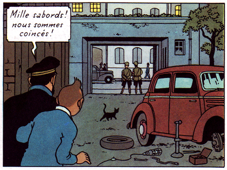
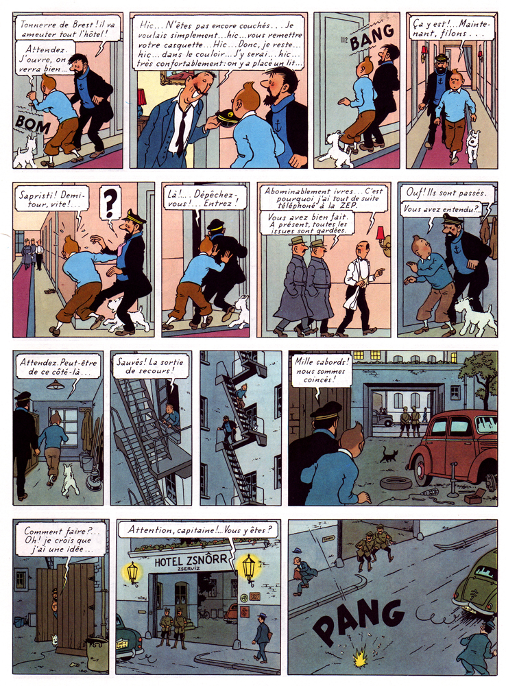
One of his most sophisticated works, The Calculus Affair (1954-56), articulates this tension beautifully. Page 50 is as fine example as any: the story is a fairly straightforward cold war cloak and dagger yarn, with the present sequence concerning Tintin, Haddock and Snowy’s escape from a police-guarded hotel in the Eastern Bloc country of Borduria.
The storytelling is characteristically clear and one might find sufficient an analysis of how the choice of viewpoint supports the action depicted, how the characters’ move from panel and how the space in which they move around is so clearly articulated, etc. But this would primarily be an analysis of how we read the sequence — what I’m interested in here is rather the vision it manifests.
As a comics maker, Hergé was acutely aware that he was speaking through fragments. Much of his art is concerned with this issue and the present book is among his most disciplined and intelligent treatments of this basic condition of comics. Framing clearly is the unsettling factor in his vision.
Most obviously, it occurs in his arrangement, both of the page — where the odd number of panels disrupts slightly its seemingly ordered construction — and in the composition of individual panels. He is an expert at this, keeping each panel interesting without cluttering it unduly: a cropped lamp and picture frame suggest a hotel room interior (panel 2), but also provide surface tension in an image of slight disorder. Tintin’s figure is disrupted by the outheld cap and line defining the wall paneling. Hergé’s is a controlled, subjectively ordering gaze.
The sequence is about movement and liberation by means of a metaphor of illumination. Dividing the page almost evenly between light (interior) and dark (exterior), Hergé (and his team) poignantly extend this concern to the images themselves. Every image is occupied by frame-like constructs — doors, windows, carpeting, gates — through which the characters move, or aspire to move. Diagonals suggest depth, but also deliver avenues of blockage or passage, both for the characters and the reader’s eye as it crosses the rectangular grid of the page. A black cat discretely blocks the path out (panel 12), while an immobile car meet the characters. A disarray of tools are left at their disposal on the ground.
The cable from an unlit lamp — the sixth on their path through the page — snakes its way towards them, literally and metaphorically embodying their ambition, in that it provides Tintin with the idea of using its bulb as a distraction for the guards, to move them away from the twin, (finally) lit lamps that frame his and Haddock’s eventual route of escape. The page ends the way it started, with sound signaling an opening.
Hergé was fascinated by psychoanalysis and worked through these years with an Increasing awareness of the subconscious. In his comics, he attempts to articulate the knowable and the unknowable with equal clarity in a rich world of signs, of meaning. By presenting his subjective choices, he offers us an an avenue by which to make sense of things.
For more thoughts on Hergé by yours truly and cartoonist Thomas Thorhauge, go here.
Update by Noah: I’ve added the Dyspeptic Ouroboros label to make this part of our ongoing series on meta-criticism.